
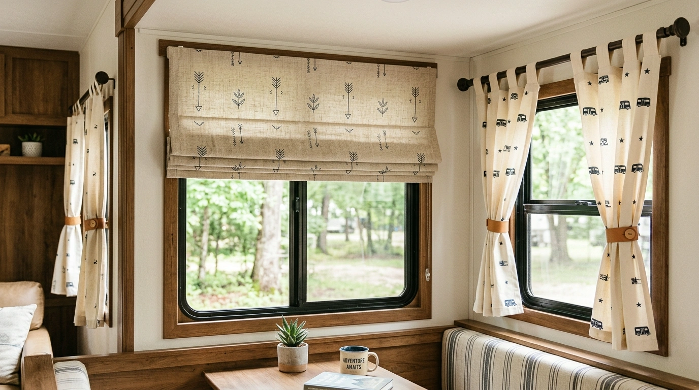
Some RV interiors have perfectly decent cabinets, comfortable seating, and surprisingly nice flooring, yet the whole thing still looks unfinished.
The windows are often where the problem starts. Curtains that clash with the upholstery, fight the cabinetry, or hang like they were grabbed at the last possible second can make the entire interior feel cheaper than it actually is.
That gets even trickier in an RV because everything sits close together. A sofa, window, cabinet, flooring, trim, and collection of tiny doors can all end up competing within a few feet. A curtain that seems harmless in a large house can suddenly become the loudest feature in a much smaller space.
Before You Blame the Curtains, Look at the Whole RV
RV Curtain Ideas
Striped Curtains With Shiplap RV Walls
These simple striped curtains bring a relaxed, earthy rhythm to an all-white shiplap wall without overwhelming the compact space. Thin lines of gold, taupe, and charcoal repeat across the lightweight fabric, echoing the subtle tones found in the nearby throw pillow and seating.
The black curtain rod and clip rings add just enough contrast to anchor the window treatment, tying into the modern hardware trend without feeling harsh. It is a clean, intentional look that keeps the small window area feeling bright and open.
Keep surrounding accessories minimal to let the delicate stripe pattern stand out against the textured wood walls.
Soft Cream Curtains With Warm Oak RV Cabinetry
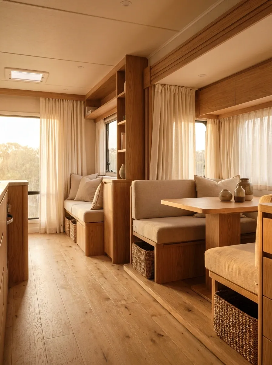
This is the RV interior that proves neutral doesn’t have to mean boring. Full, soft cream curtains sit against warm oak cabinetry, beige seating, and lightly textured flooring, creating a continuous warm palette from ceiling to floor. The curtains don’t demand attention, but they make the whole interior look calmer and more finished.
The important part is the relationship between the materials. Cream fabric echoes the upholstery, while the oak introduces enough warmth to keep everything from becoming one giant bowl of beige. Woven baskets and a few natural textures add depth without turning the RV into a craft-store explosion.
Keep the surrounding decor restrained. The wood and fabric already provide plenty of visual character.
Blushing Pink Curtains in a Retro Camper
This unapologetically pink RV interior leans fully into a playful vintage aesthetic with matching pastel cabinetry, polka-dot curtains, and a statement chandelier. The soft pink panels frame the windows against cream walls, while cream seating and light flooring balance the saturation.
The magic lies in the complete commitment to the color palette, where every textile and cabinet door works together to create a cohesive theme. Instead of looking chaotic, the repeated pink hues make the small space feel cheerful and thoughtfully designed.
Embrace the theme fully with matching pillows and accessories, but keep the core furniture shapes simple so the room remains functional.
Charcoal Blackout Curtains in a Modern White RV
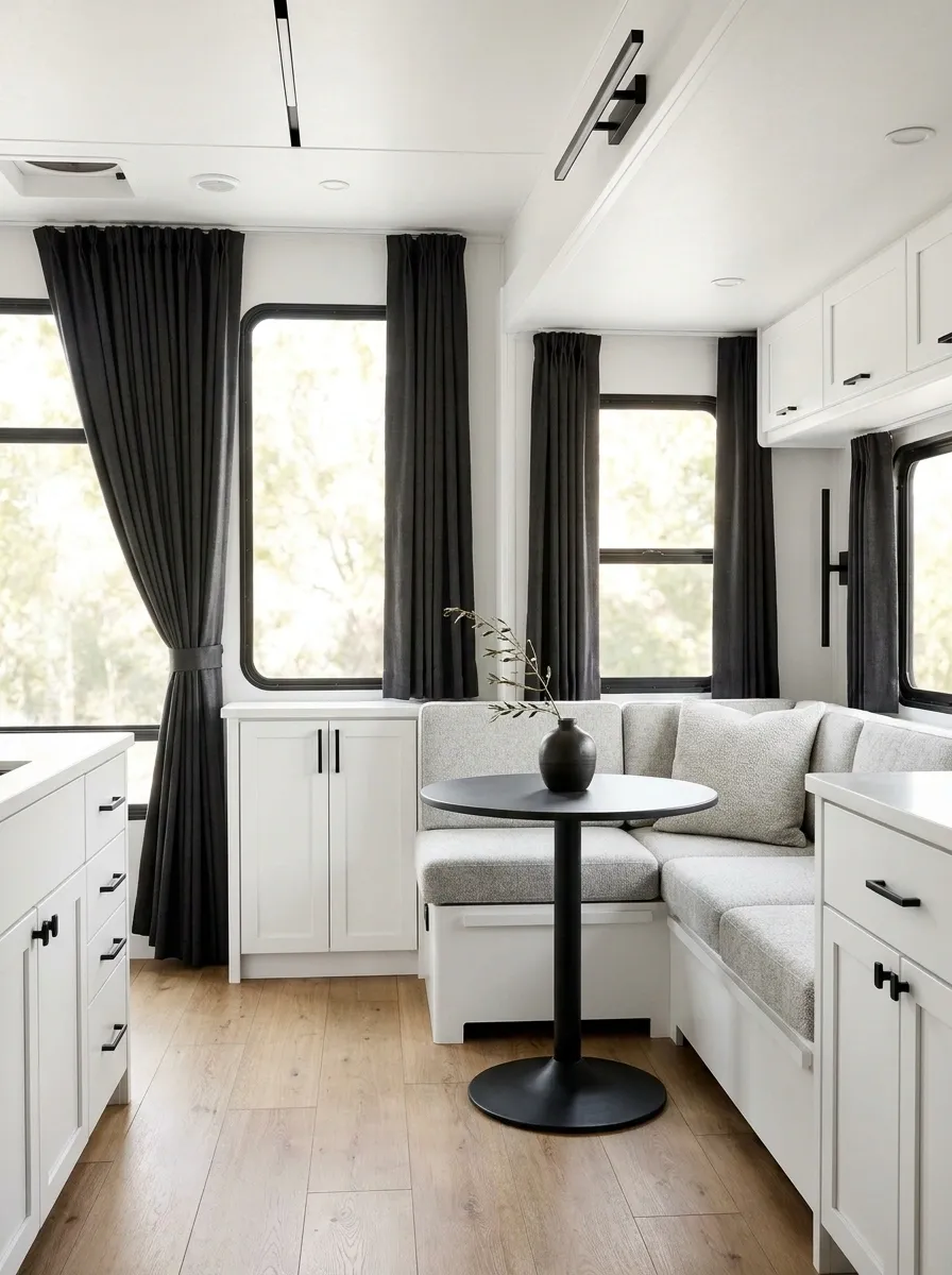
A bright white RV can look clean until every surface starts blending into one giant blank rectangle. Charcoal curtains solve that problem by giving the windows real visual weight. The result is crisp rather than stark, especially when the dark fabric is repeated through matte black hardware, a small table base, or modern light fixtures.
The seating stays light gray, while the cabinetry remains white so the charcoal panels become the deliberate contrast. This makes the windows feel architectural instead of forgotten.
The trick is restraint. Once dark curtains are doing the heavy lifting, there is no need to scatter black accents around every corner like someone is trying to win a monochrome decorating contest.
Vintage Floral Curtains With Retro Camper Styling
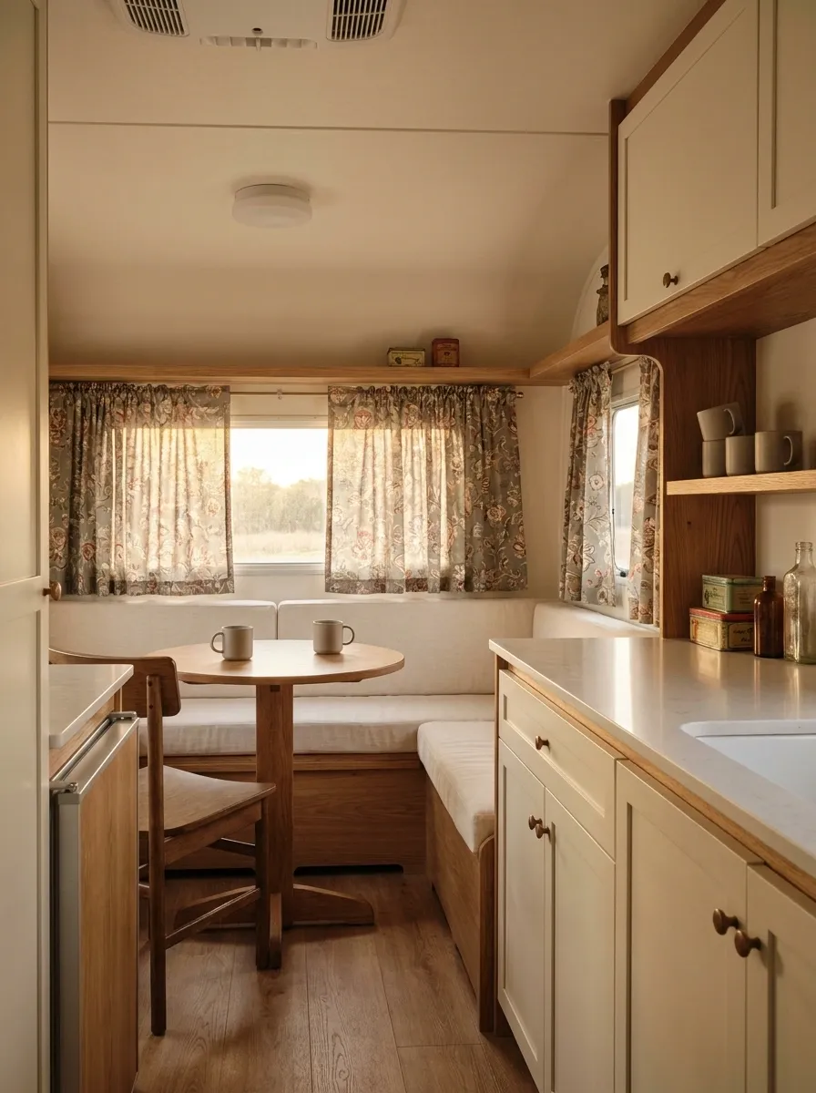
Small RVs can handle pattern beautifully when the pattern actually belongs to the design. Here, vintage floral curtains bring muted sage, faded red, cream, and dusty brown into a compact camper with retro-inspired cabinetry and warm wood details.
The floral fabric becomes the personality of the room, while the rest of the finishes stay deliberately simple. Cream seating gives the eye somewhere to rest, and small vintage accessories reinforce the period-inspired character without making the interior look like a themed movie set.
The floral print should stay relatively small in scale. Huge flowers can swallow a narrow RV window and make the entire wall feel busier than it needs to be.
visual breathing room Sage
soft contrast Faded red
controlled accent Brown
wood connection
Relaxed Linen Curtains in a Coastal RV Interior
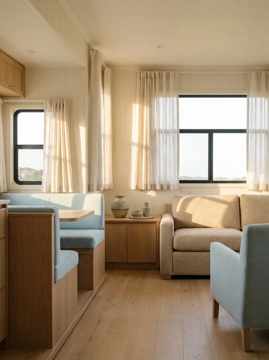
This coastal RV skips the obvious nautical gimmicks and lets texture do the work. Loose linen-look curtains frame the windows beside pale blue seating, sandy upholstery, light wood, and warm off-white walls. Nothing screams “beach theme,” which is exactly why the room feels more sophisticated.
The curtain fabric adds softness to the hard cabinet surfaces while the blue remains concentrated in the seating and a few smaller textiles. Natural wood keeps the cooler colors from making the interior feel washed out.
That balance matters in an RV. Too much blue, rope, striped fabric, and seashell nonsense can send the room straight into souvenir-shop territory.
Olive Green Curtains With Warm Neutral Upholstery
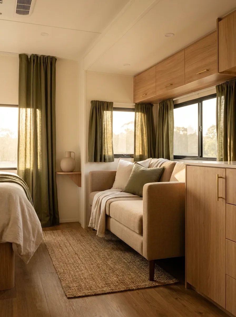
Olive curtains bring a deeper, earthy note to this RV without making the compact interior feel gloomy. The panels frame the windows against cream walls and warm cabinetry, while tan seating and medium wood flooring keep the overall composition grounded.
The strongest visual relationship is between the olive fabric and the warm neutrals. They sit close enough in mood to feel connected, but the green still has enough contrast to make the windows interesting.
This works particularly well when the rest of the RV already contains warm finishes. The curtains then feel like part of the original design rather than a random color brought home from a completely different house.
accent
support
visual base
Floor-to-Ceiling Curtains in a Tall Class C RV
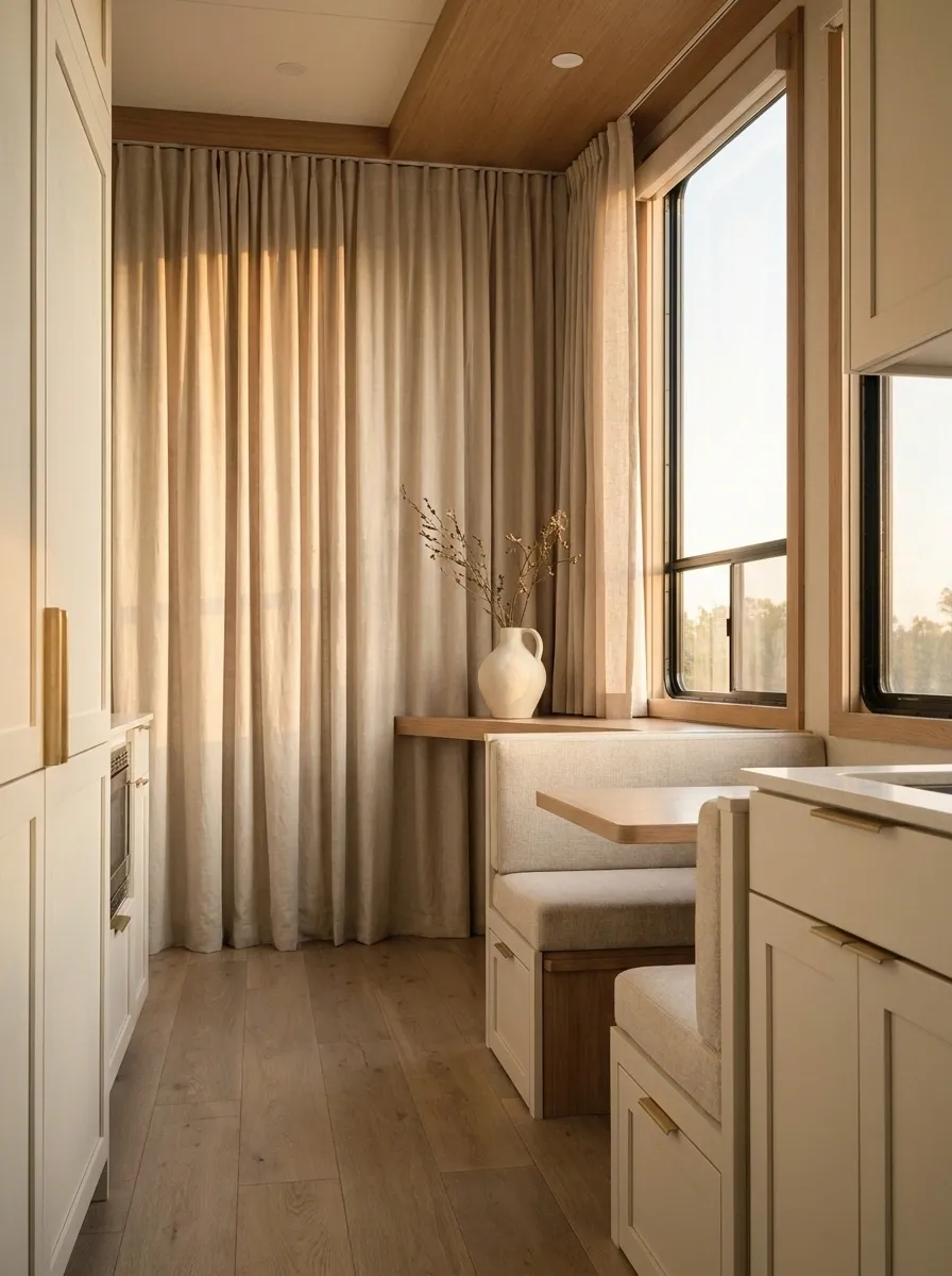
In a taller Class C interior, short curtains can make the windows look oddly disconnected from the rest of the room. Floor-to-ceiling panels fix that by giving the entire window wall a stronger vertical line. Soft beige fabric runs from high above the windows toward the floor, while pale cabinetry, light upholstery, and warm flooring keep the interior airy.
The result feels more like a deliberately designed small room and less like a vehicle that happens to contain furniture. The higher curtain placement also draws the eye upward, which suits an RV with decent ceiling height.
Keep the curtain fabric fairly simple. Once the full wall has that much visual length, a loud pattern would be doing entirely too much.
cuts the wall
pulls the eye upward
Tiny Gingham Curtains in a Cozy Compact Camper
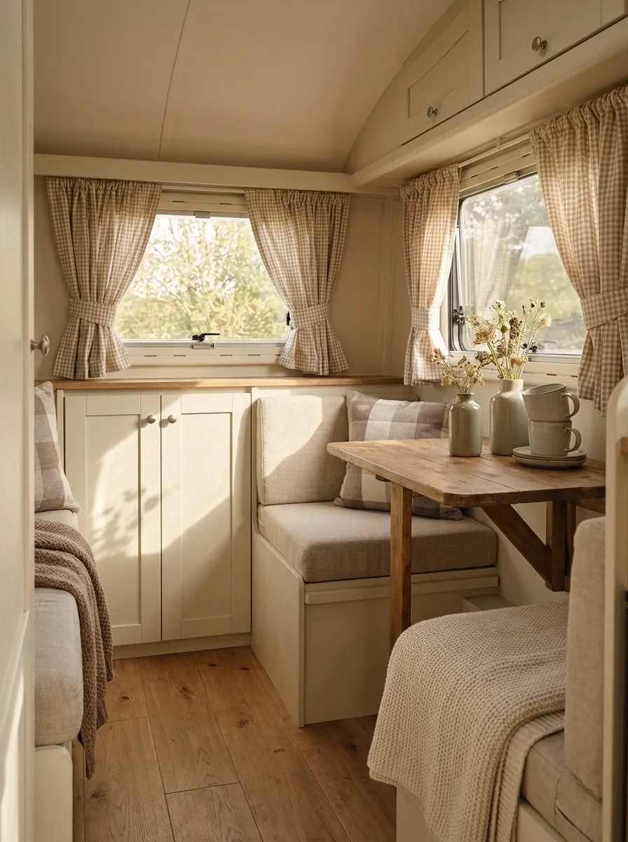
A tiny camper can actually handle pattern better than a large RV when the print is kept small. Here, little gingham curtains frame the windows of a compact cream-and-wood interior, bringing in a subtle country character without making the limited space feel busy.
The small checks sit comfortably beside simple cabinetry, warm flooring, and compact upholstered seating. Because the fabric pattern is repeated only around the windows, it becomes a recognizable feature rather than visual wallpaper.
The rest of the room should stay relatively quiet. A few warm wood pieces and one or two related textiles are enough. Cover every available surface with checks and suddenly the camper starts looking like it lost a bet.
Warm Terracotta Curtains With Cream RV Seating
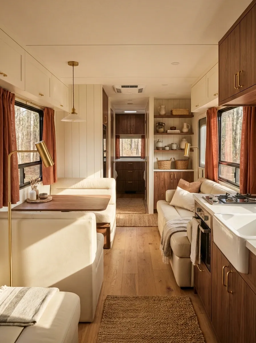
Terracotta curtains give this RV a richer personality without turning the interior dark. The panels sit beside cream seating and warm off-white walls, while walnut-toned cabinetry and soft lamps reinforce the earthy color story.
What makes this composition work is the distribution of warmth. The terracotta gets the largest color hit around the windows, while the cream upholstery prevents the room from becoming visually dense. Wood then bridges the two.
This is a strong direction for an RV that already has warm flooring or medium-to-dark cabinets. Cool gray furniture would fight the mood and leave the curtains looking strangely disconnected.
window statement Wood
visual bridge Cream
breathing room
White-on-White Curtains for a Small Bright RV
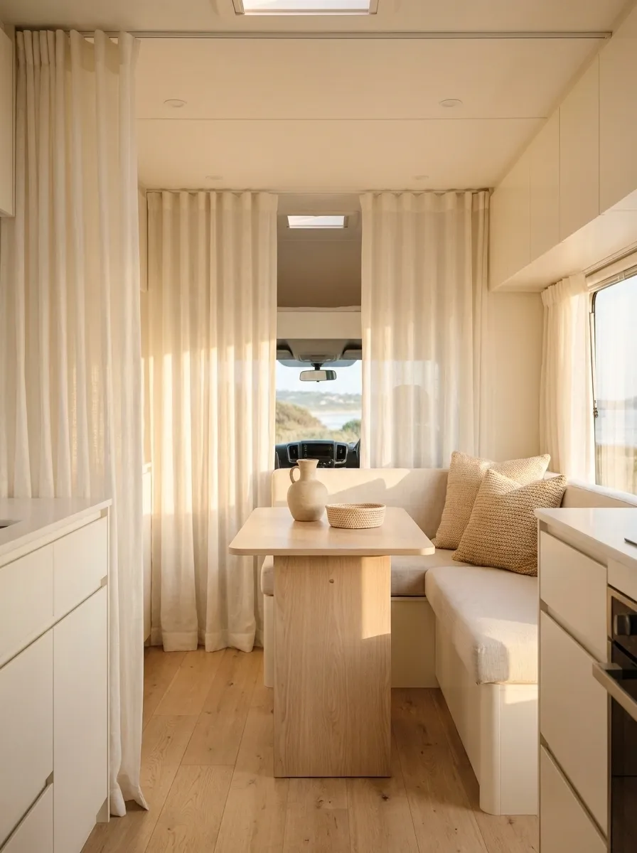
White curtains can make a small RV feel beautifully open when the room already has strong natural light. This version uses warm white curtain panels against white or ivory cabinetry, pale upholstery, and lightly textured surfaces. The curtains nearly disappear into the architecture, which is exactly the point.
Instead of creating contrast, the window treatment creates continuity. Subtle fabric texture keeps the room from looking flat, while a few warm wood or woven details provide enough variation to stop the interior from becoming a giant white rectangle.
The smartest move here is resisting the urge to decorate every blank surface. The light palette needs breathing room, not seventeen decorative objects trying to prove it isn’t boring.
Navy Curtains in a Classic Family RV Interior
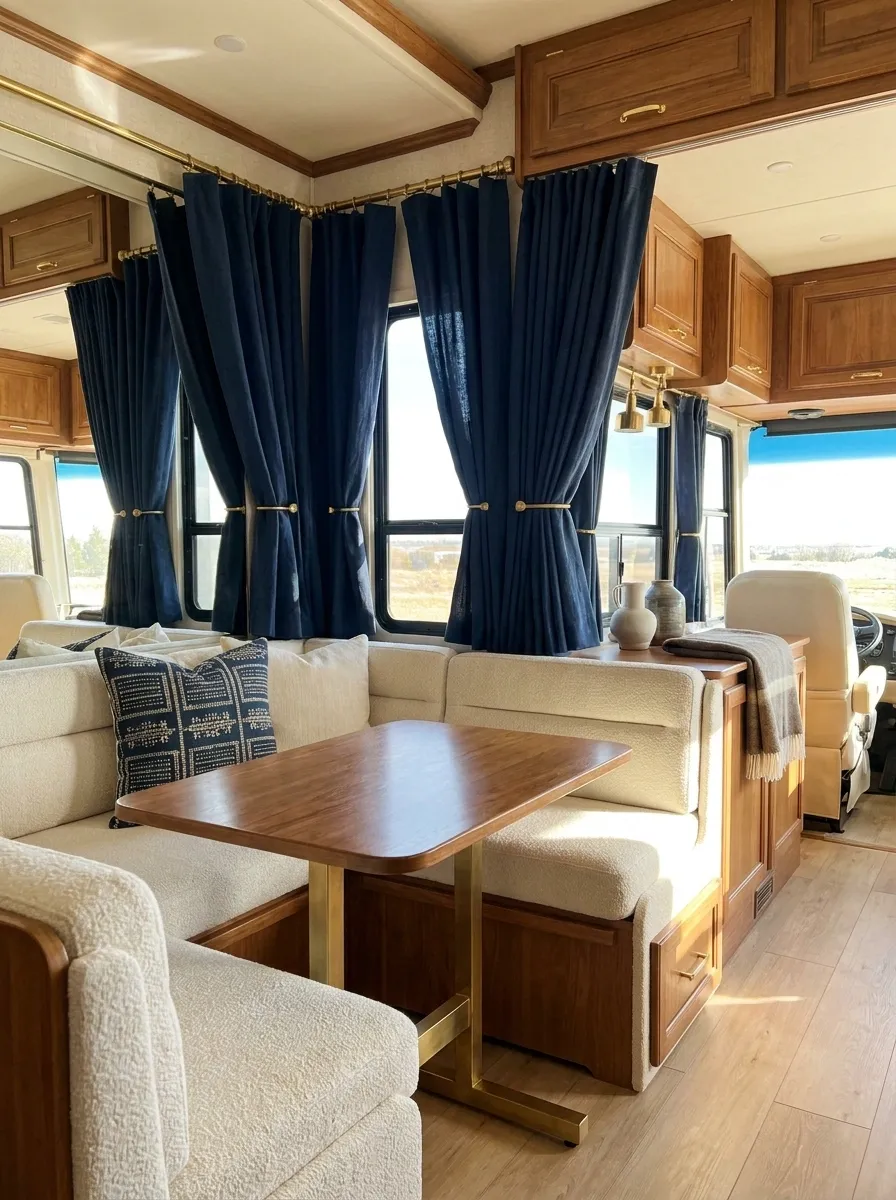
Navy curtains give a family RV enough contrast to feel finished without demanding a complete redesign. Deep blue fabric frames the windows while cream seating, medium wood cabinetry, and warm brass-toned details establish a classic foundation.
The navy works especially well because it has a clear visual job. It gives the windows definition while the lighter seating keeps the interior from feeling heavy. A little navy repeated in a cushion or throw is enough to connect the room. There is no reason for every accessory to suddenly become blue.
This composition also has a practical visual advantage: the darker fabric feels substantial against the lighter interior and gives the window wall a more intentional presence.
define the windows Cream
keep the center light Wood + brass
warm the composition
Boho Taupe Curtains With Woven RV Textures
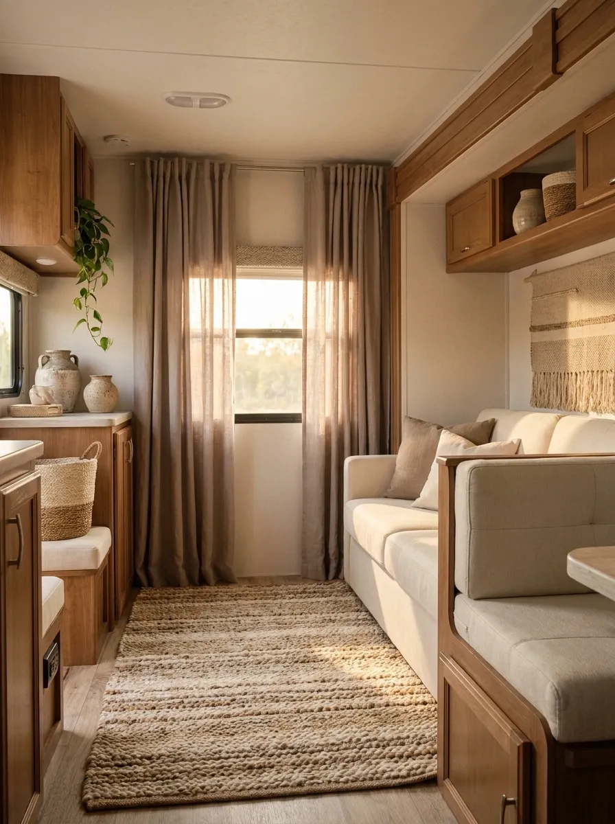
Taupe curtains give this RV a soft, earthy base while woven textures keep the neutral palette from falling flat. The finished interior combines warm wood cabinetry, cream seating, a textured rug, woven storage, and a few handmade-looking accents. The curtains sit comfortably inside that mix instead of becoming a separate decorating decision.
The important distinction is texture. The room has visual interest without relying on a pile of colors. Smooth cabinetry contrasts with softer fabric, woven pieces, and slightly rougher natural materials.
Keep the accessories edited. Boho styling can go downhill very quickly once every available corner gets a basket, tassel, plant, and mysterious little object.
Rust Stripe Curtains With Mid-Century RV Furniture
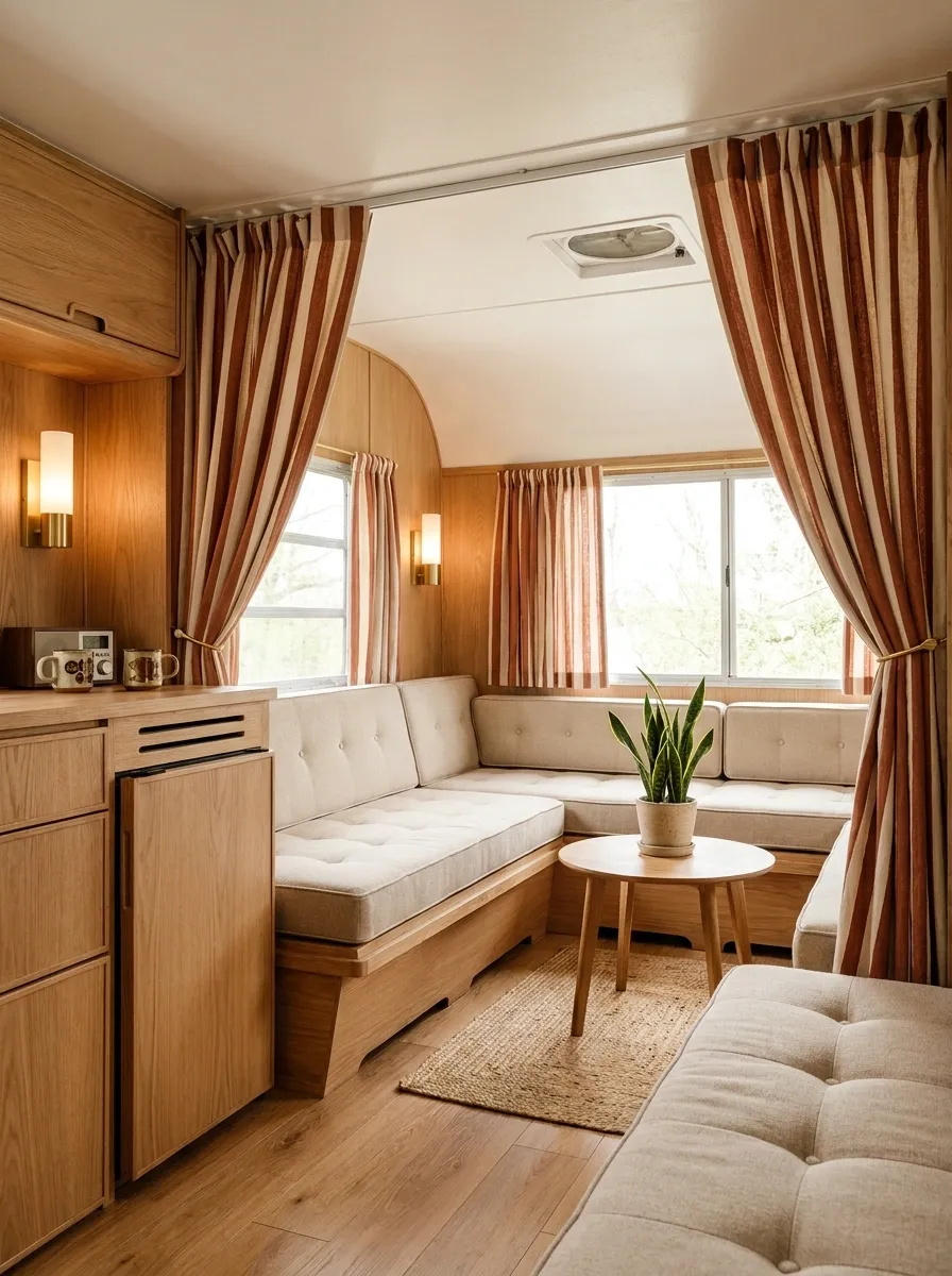
Rust-and-cream striped curtains give this RV a strong retro direction without making the whole space look like a dated rental. The vertical stripes frame the windows while simple wood cabinetry, low-profile seating, warm flooring, and understated lighting create a mid-century-inspired backdrop.
The stripes are the memorable part, but they work because the furniture stays visually clean. There are no competing patterns and very few decorative colors. The curtain fabric gets to be expressive without having to fight a dozen other statements.
Vertical striping also suits a compact interior because it reinforces the height of the window wall. Keep horizontal patterns elsewhere to a minimum if the goal is a clean composition.
supports height Horizontal
adds width emphasis
Soft Sage Curtains in a Scandinavian-Inspired RV
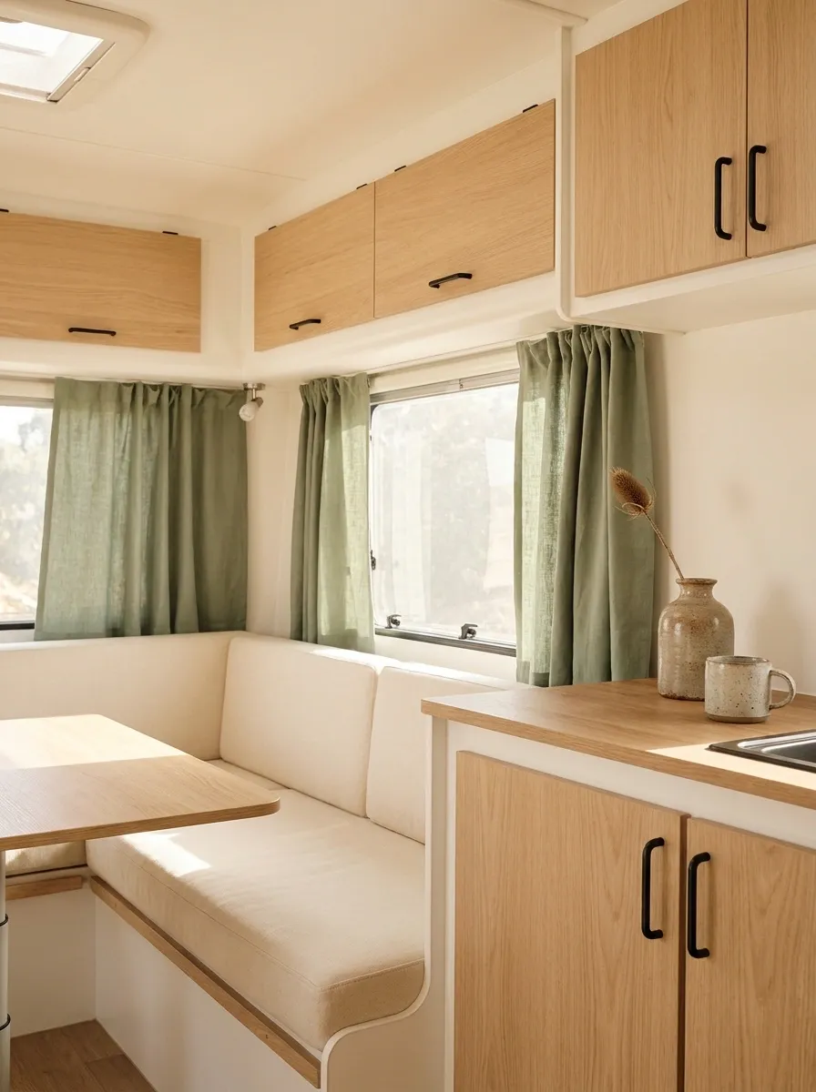
Soft sage curtains bring just enough color into this bright RV without breaking its calm Scandinavian character. Pale wood cabinetry, warm white walls, cream seating, and simple black fixtures create the foundation, while the muted green panels give the windows a gentle focal point.
The design feels fresh because the green is dusty rather than highly saturated. That lets it work with natural wood and warm neutrals instead of looking like an accent color that wandered in from another room.
The window fabric should remain simple and matte. Glossy or heavily patterned material would push this composition away from its restrained Nordic influence.
keeps the interior open.
adds color without shouting.
Moody Forest Green Curtains With Walnut Cabinets
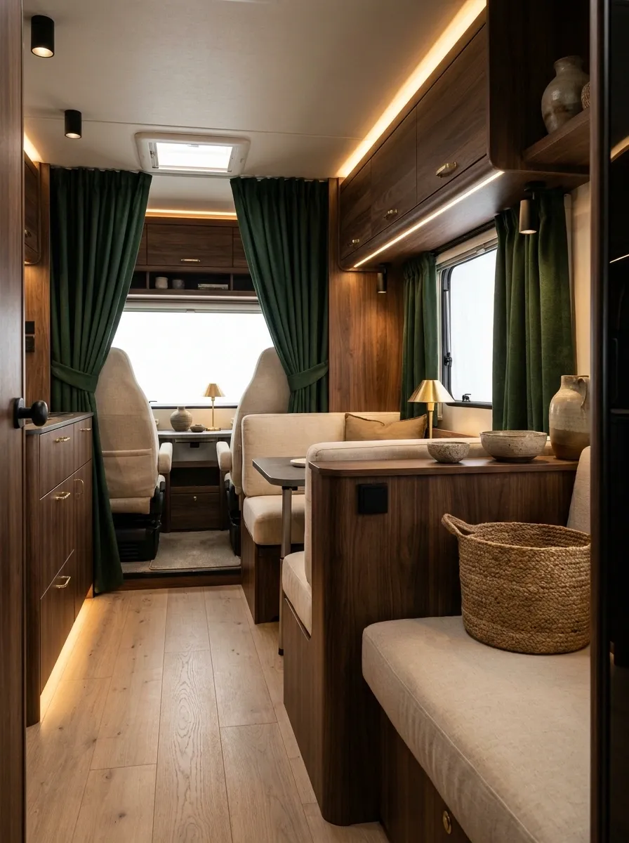
Deep forest green completely changes the personality of this RV. The curtains sit against walnut-toned cabinetry and warm cream seating, creating a richer interior that feels intentionally dramatic rather than simply dark.
Warm lamps become especially important here. Their glow picks up the brown and green tones and prevents the heavier curtain fabric from feeling cold. Cream upholstery breaks up the darker surfaces, while small black details sharpen the composition.
This design needs some discipline. Dark curtains, dark seating, dark cabinets, dark rugs, and dark accessories would turn a compact RV into a very expensive-looking cave. Keep at least one major surface noticeably lighter.
Cafe Curtains for a Tiny RV Kitchen Window
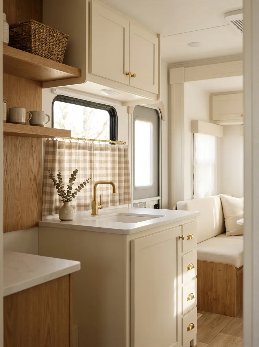
A tiny RV kitchen window doesn’t need full-length panels competing with cabinets and counters. This finished composition uses simple cafe curtains across the lower portion of the window, leaving the upper glass open to daylight. Cream cabinetry, warm wood accents, compact counters, and a small dining nook make the treatment feel built into the room.
The shorter fabric works because the window is part of a busy working zone. It provides a softer visual break without eating into usable counter or floor space.
Choose a fabric that connects with the rest of the kitchen. A small check, subtle stripe, or quiet neutral works better here than a dramatic full-room print.
keeps daylight visible Lower fabric
softens the kitchen zone
Minimal Sand-Colored Curtains in a Modern RV
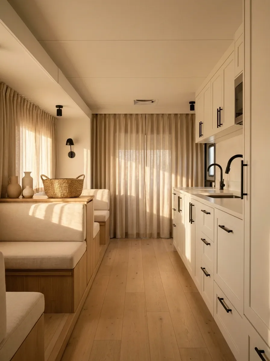
Sand-colored curtains give this modern RV a quiet, expensive-looking finish without relying on dramatic contrast. The interior combines warm white cabinetry, pale oak flooring, streamlined seating, and simple black fixtures. The curtains sit somewhere between the walls and the wood, creating a soft transition rather than another visual event.
That subtlety is what makes the design work. In a compact RV, every strong color takes up a surprising amount of visual space. A muted sand fabric adds warmth while allowing the architecture and furniture to remain visible.
The surrounding decor should stay deliberately restrained. This design works because nothing is desperately trying to become the main character.
Dark Taupe Curtains With Black RV Fixtures
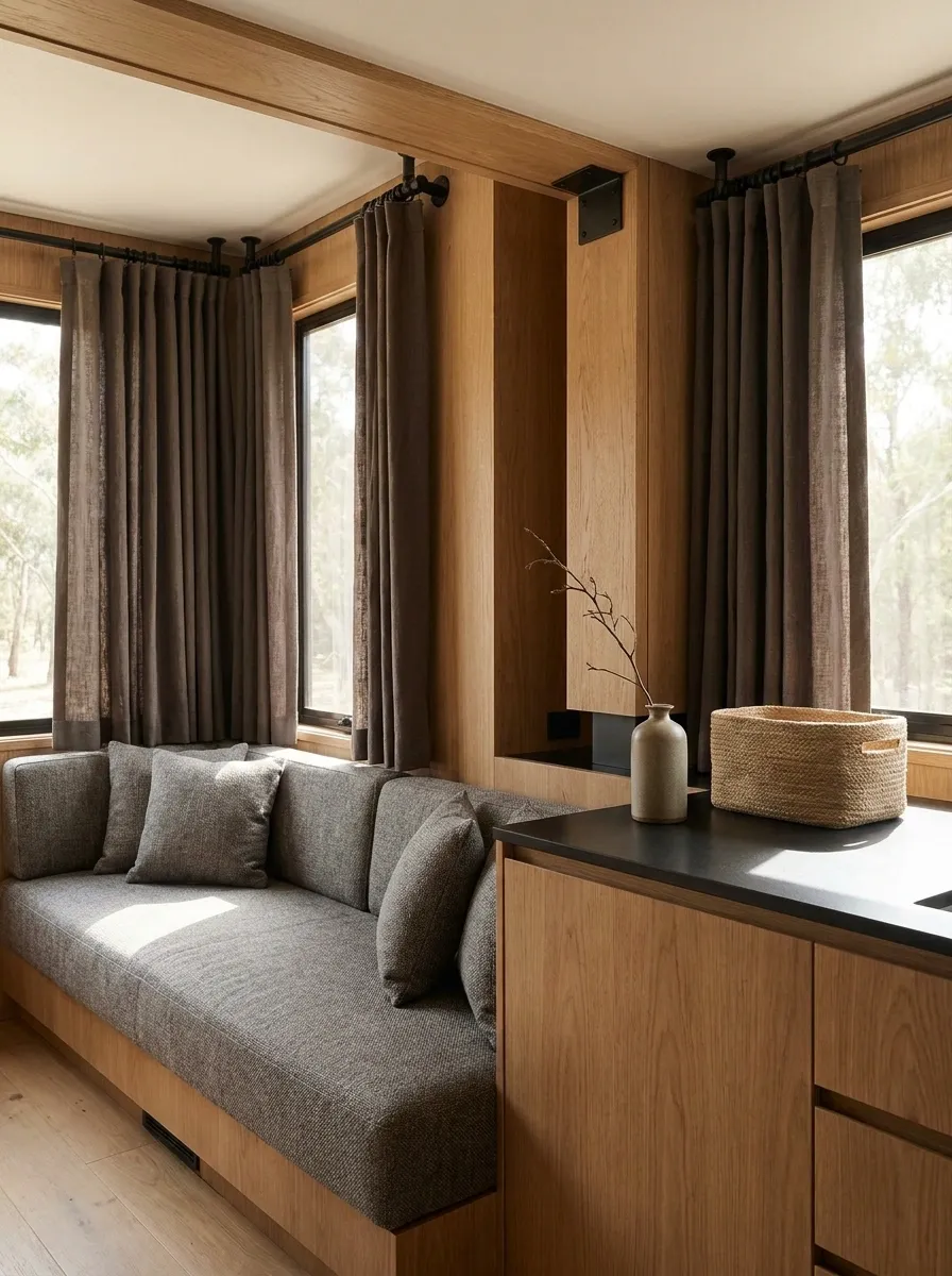
Dark taupe gives this RV a warmer alternative to charcoal. The curtains frame the windows in a rich neutral while medium-gray upholstery, warm wood, and matte black fixtures build a contemporary interior around them.
The combination feels grounded because the taupe connects the warmth of the wood with the coolness of the gray seating. Black hardware then adds sharper definition without taking over the room.
This is a strong choice when the RV already has beige or brown flooring but needs a more modern edge. The trick is keeping the curtain color clearly deeper than the upholstery. Otherwise, everything starts blending together and the carefully planned contrast disappears.
window weight
soft contrast
sharp definition
Tiny Floral Curtains in a Soft Cottage Camper
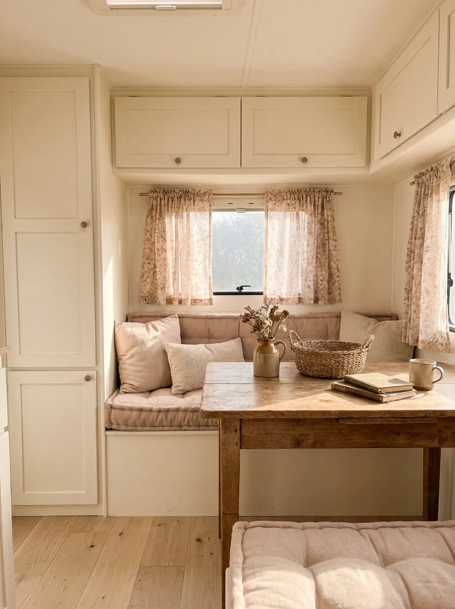
A small floral print can make a compact camper feel surprisingly personal. Here, delicate flowers appear on short curtain panels against creamy cabinetry, soft blush-beige seating, pale wood, and a handful of vintage-inspired details.
The pattern is the star, but its small scale keeps it from overwhelming the narrow interior. Cream and warm beige surrounding the print give the eye enough quiet space to absorb it.
The cottage character should feel relaxed rather than overly precious. Natural wood, simple upholstery, and a few practical objects make the design believable. There is no need to turn every surface pink just because the curtains discovered flowers.
Ivory Curtains With Deep Blue RV Seating
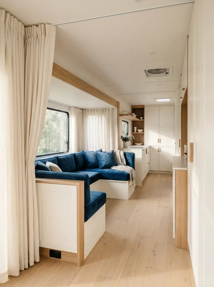
This RV keeps the windows intentionally quiet and lets deep blue seating carry the visual weight. Ivory curtains soften the windows while warm white cabinetry, pale flooring, and natural wood keep the rest of the interior bright.
The contrast between the dark seating and light curtains gives the room a clear hierarchy. The eye lands on the seating first, then moves naturally toward the windows and cabinetry rather than being confronted by competing colors.
This arrangement works particularly well when the upholstery is already the strongest feature in the RV. The curtains don’t need to fight for attention. They simply make the focal point look more deliberate.
Black-and-Cream Geometric Curtains in a Contemporary RV
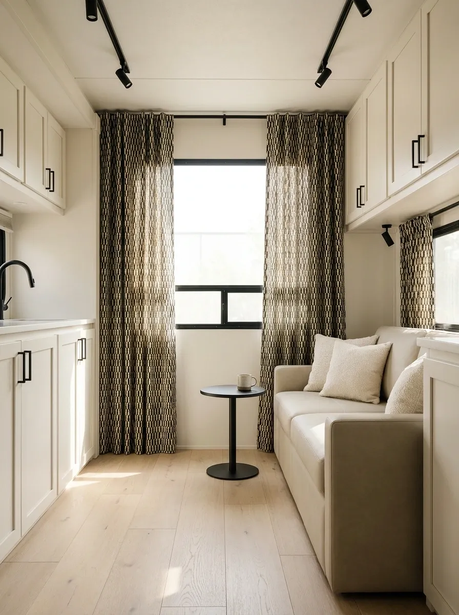
Bold geometric curtains can make a contemporary RV look far more intentional, but only when the rest of the room knows when to be quiet. This composition uses black-and-cream geometric panels against warm white cabinetry, simple seating, pale wood, and restrained black fixtures.
The pattern creates structure around the windows and gives the otherwise simple interior a stronger graphic identity. Cream within the print also connects the fabric to the cabinetry, keeping the black from feeling too severe.
Everything surrounding the curtains stays relatively solid. That’s essential. Add patterned cushions, busy rugs, and decorative prints to the same room and the windows stop looking architectural and start looking noisy.
Muted Plaid Curtains in a Rustic RV Interior
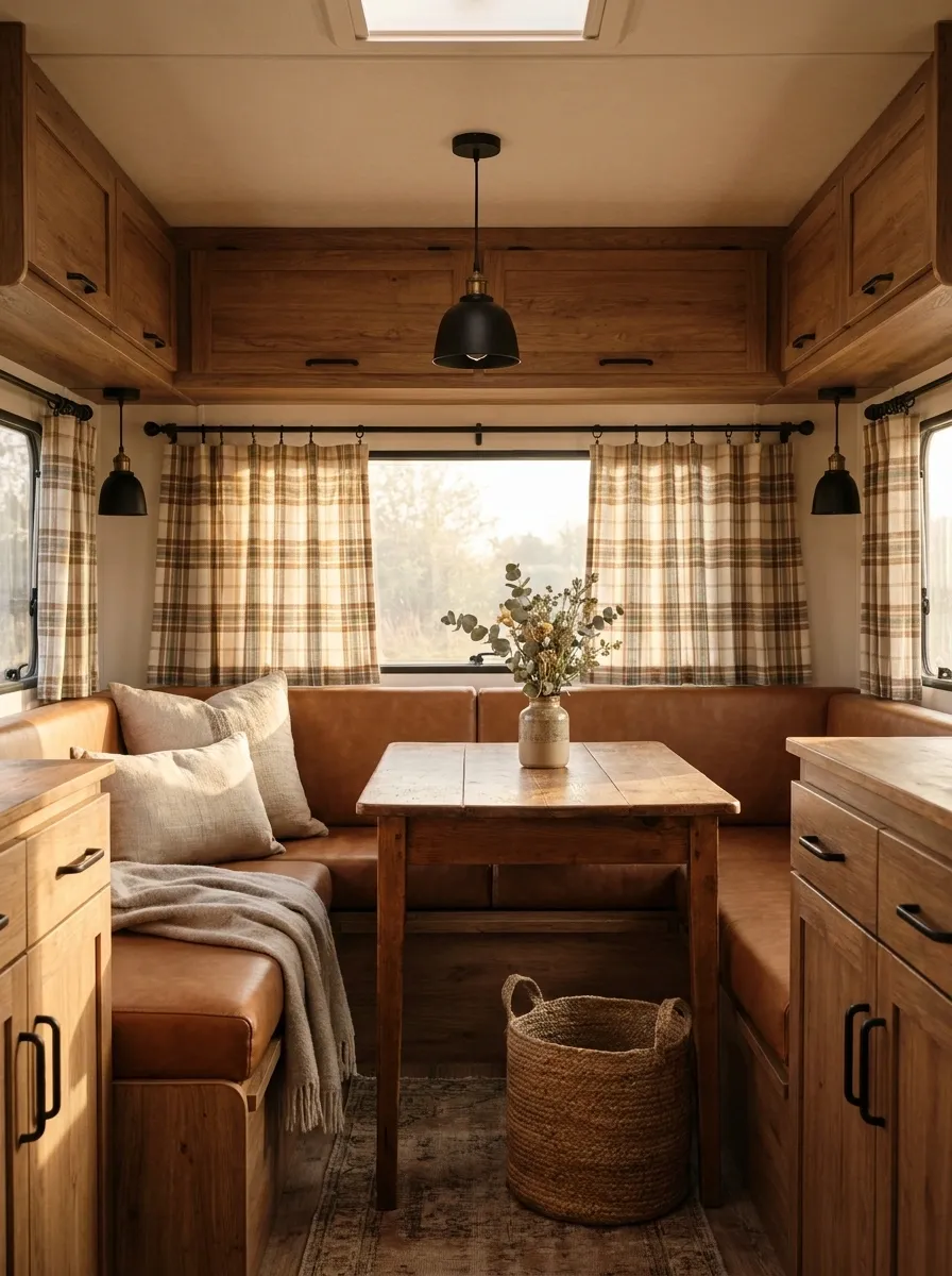
Muted plaid curtains give this RV a rustic character without pushing it into full cabin cosplay. Soft brown, cream, and faded green tones appear in the curtain fabric, while warm wood cabinetry, leather-toned seating, and simple black fixtures create a solid backdrop.
The pattern works because it has several colors already present elsewhere in the interior. Nothing feels pasted on. The curtain becomes part of the same visual story as the wood and upholstery.
A rustic design benefits from a little imperfection. Textured fabrics, natural wood grain, and relaxed styling feel more convincing than a collection of perfectly matched accessories. The goal is warm and collected, not “someone discovered plaid yesterday.”
lightens the pattern
connects with wood
adds quiet contrast
Dusty Blue Curtains With Light Gray Upholstery
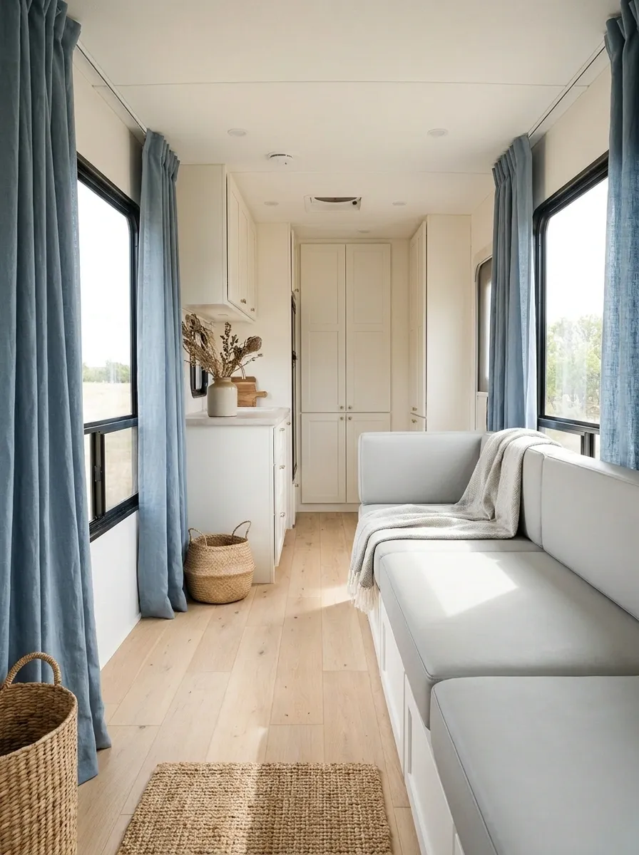
Dusty blue curtains soften the cooler side of this RV while light gray seating keeps the composition modern. Pale oak flooring and warm white cabinetry introduce just enough warmth to stop the room from looking icy.
The curtain color is intentionally muted. A bright blue would dominate the small space, while this softer shade creates a calm focal point around the windows. The gray upholstery picks up the curtain’s cool tone without matching it exactly, which gives the room more depth.
This is a particularly clean direction for an RV with plenty of daylight. Add a few warm wood details and leave the rest of the palette alone. There is no need to introduce five more colors simply because the walls look “empty.”
window focus Light gray
soft support Oak warmth
visual balance
Layered Sheer and Linen Curtains in a Luxury RV
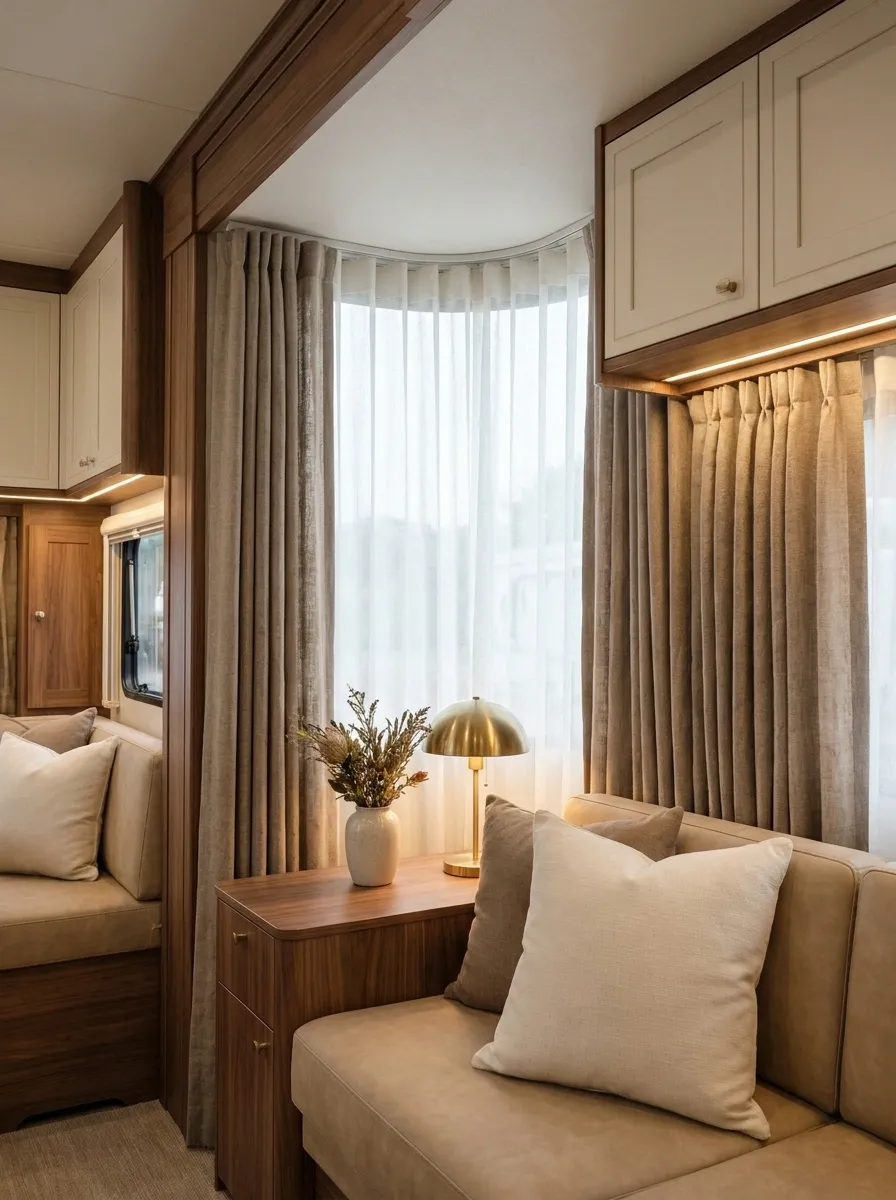
This interior treats the windows almost like a hotel suite, but without sacrificing the practical scale of an RV. Lightweight sheer panels sit closest to the glass, while heavier linen-look side curtains create softness and a more finished frame around the windows. Warm neutral upholstery, refined wood cabinetry, and soft evening lamps complete the setting.
The two fabrics serve different visual roles. The sheers keep the windows light and airy during the day, while the heavier panels introduce depth and privacy when closed.
The key is letting the materials look related. Similar warm undertones keep the layers sophisticated. Mixing unrelated whites would make the window treatment look assembled from leftovers.
Rustic Cream Check Curtains With Farmhouse RV Styling
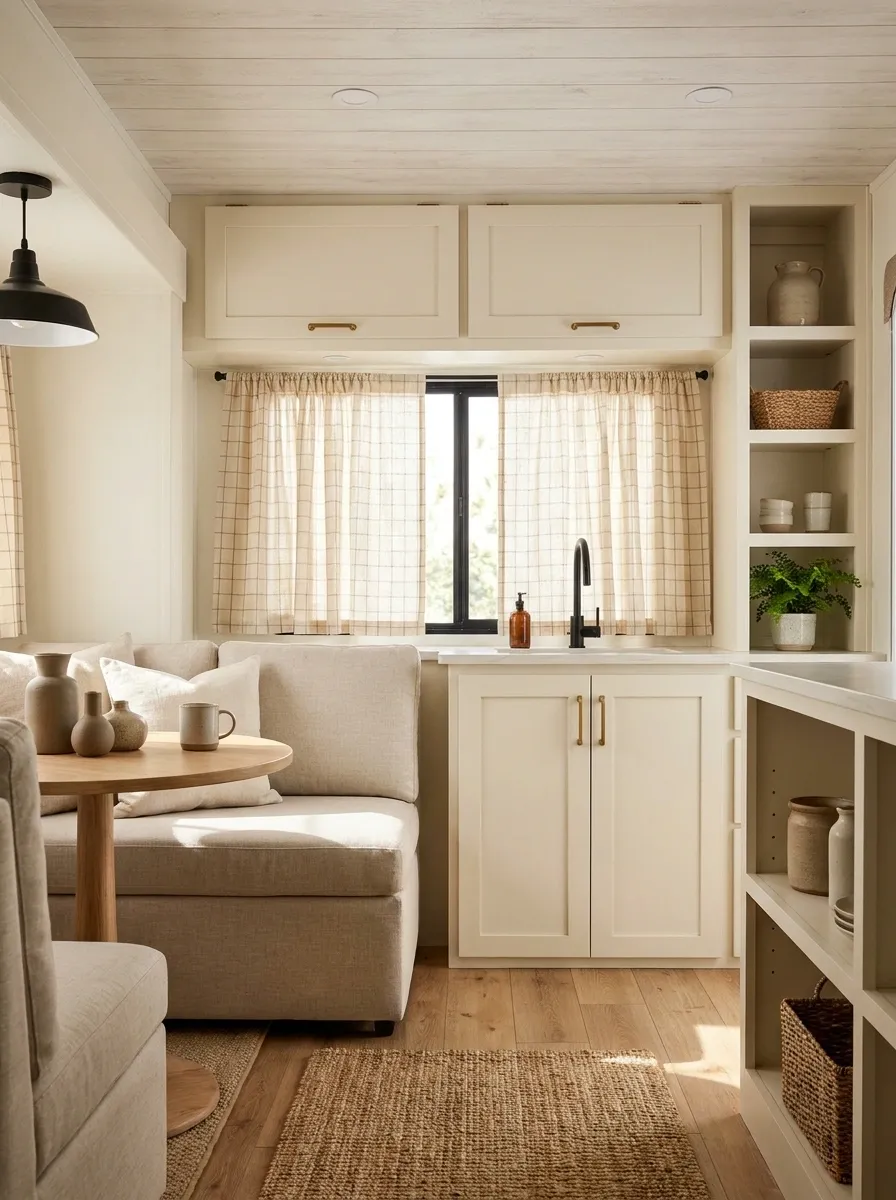
Cream check curtains bring a softer farmhouse feeling to this RV while keeping the overall interior bright. The window fabric uses a restrained grid pattern against creamy cabinetry, warm wood, simple black hardware, and light upholstered seating.
The beauty of this composition is its simplicity. The checks give the window character, but the rest of the room doesn’t compete. A wood surface here, a black fixture there, and comfortable neutral upholstery are enough to support the pattern.
This look works best when the checks remain relatively subtle. A giant high-contrast buffalo check would become the room’s entire personality, and the RV has probably already endured enough personality.
quieter
balanced
louder
Mustard Curtains in a Playful Family Camper
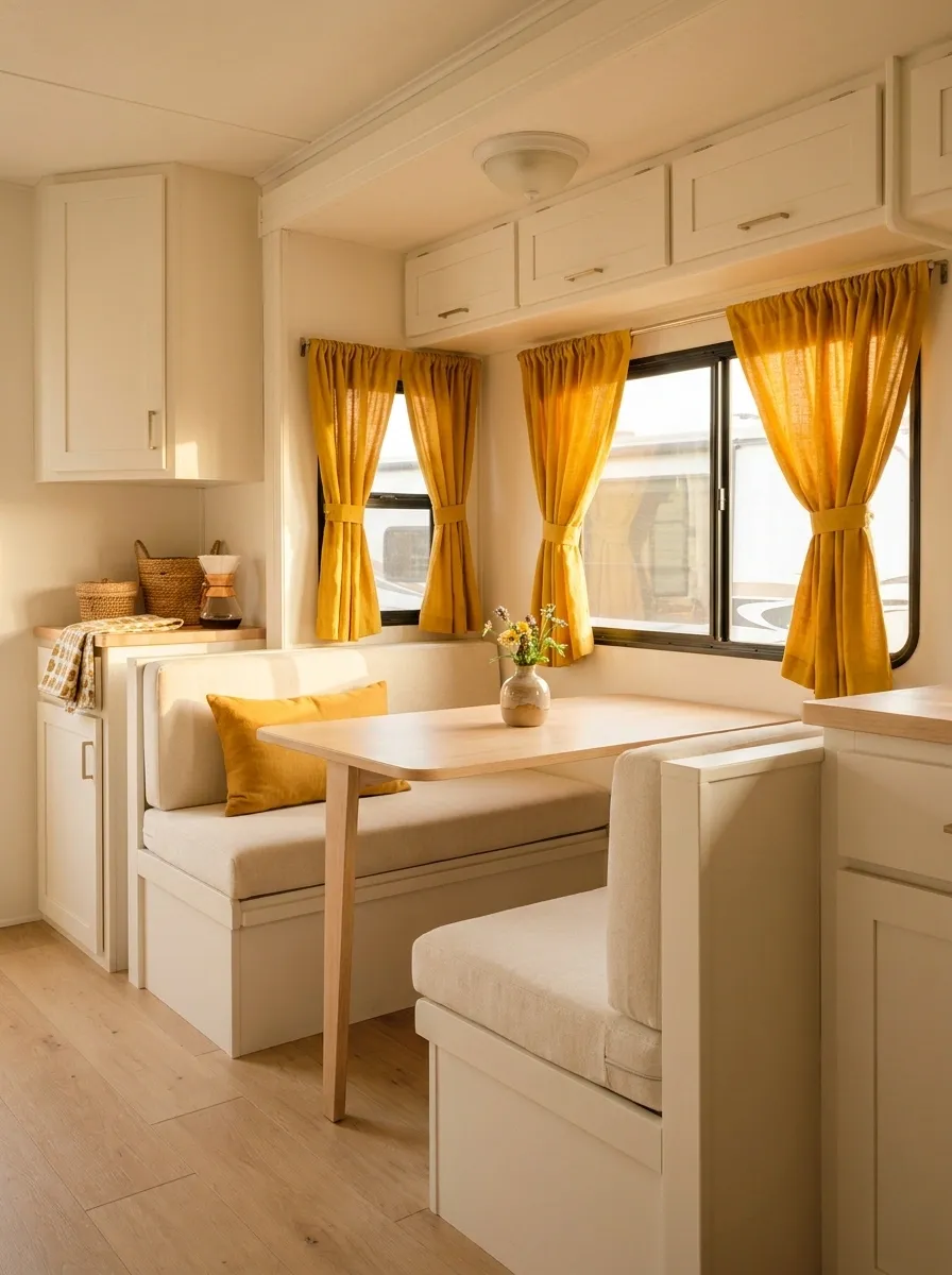
Mustard curtains give this family camper an instant hit of personality. The finished space combines warm white cabinetry, cream seating, pale wood, and a handful of playful accents, while the golden fabric creates a clear visual anchor around the windows.
The color is cheerful without requiring the entire RV to become colorful. That’s the important part. One confident curtain color can make a compact interior feel intentional, while repeating that same mustard on every cushion and accessory would quickly become exhausting.
Keep the surrounding pieces simple and practical. The strongest version of this design feels happy and lived-in, not like a children’s playroom escaped into the camper.
Ivory Curtains With Deep Blue RV Seating
This RV keeps the windows intentionally quiet and lets deep blue seating carry the visual weight. Ivory curtains soften the windows while warm white cabinetry, pale flooring, and natural wood keep the rest of the interior bright.
The contrast between the dark seating and light curtains gives the room a clear hierarchy. The eye lands on the seating first, then moves naturally toward the windows and cabinetry rather than being confronted by competing colors.
This arrangement works particularly well when the upholstery is already the strongest feature in the RV. The curtains don’t need to fight for attention. They simply make the focal point look more deliberate.
Black-and-Cream Geometric Curtains in a Contemporary RV
Bold geometric curtains can make a contemporary RV look far more intentional, but only when the rest of the room knows when to be quiet. This composition uses black-and-cream geometric panels against warm white cabinetry, simple seating, pale wood, and restrained black fixtures.
The pattern creates structure around the windows and gives the otherwise simple interior a stronger graphic identity. Cream within the print also connects the fabric to the cabinetry, keeping the black from feeling too severe.
Everything surrounding the curtains stays relatively solid. That’s essential. Add patterned cushions, busy rugs, and decorative prints to the same room and the windows stop looking architectural and start looking noisy.