
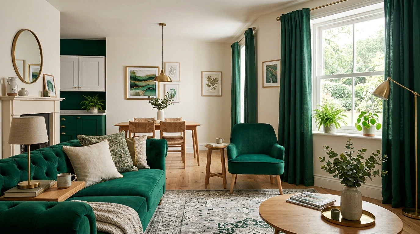
Emerald green has a very specific problem. It looks incredible in a room, then someone gets excited and suddenly the curtains, cushions, rug, lamp, vase, and artwork are all competing to prove they’re green too.
That’s where the look falls apart.
Emerald works best when it has something to push against. Cream walls make it richer. Warm wood makes it less severe. Brass brings out its warmth. Black gives it definition. Pale stone keeps it from swallowing a small room whole.
The other mistake is treating emerald like a theme instead of a design color. A room doesn’t need to announce its color scheme from the doorway. It needs one strong visual decision, a few supporting materials, and enough empty space for everything to actually register.
These ideas take emerald into living rooms, bedrooms, kitchens, bathrooms, dining spaces, home offices, entryways, and those awkward corners that usually end up holding a random chair. The common thread is simple: use the green with confidence, then stop before the room starts begging for mercy.
Emerald Green Ideas
Layer Emerald Velvet for Ultimate Drama
A deep emerald velvet sofa against a dark, moody backdrop creates an immediate impact that doesn’t need extra convincing.
Surround the seating with textured black cushions and a large-scale botanical artwork that echoes the rich green tones without feeling overly matched. A simple, patterned neutral rug helps anchor the deep colors so the room stays grounded.
The secret is letting the textures do the heavy lifting. Rich velvet, dark walls, and botanical prints create a layered luxury that feels entirely effortless.
Paint One Living Room Wall Emerald and Keep Everything Else Quiet
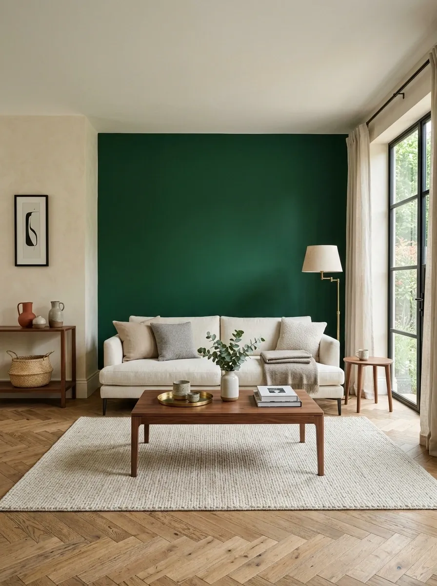
A single emerald wall gives the room enough drama without turning every piece of furniture into part of the same color scheme.
Use the strongest wall behind the sofa, fireplace, or main seating area. Keep the other walls warm white, ivory, or a soft beige. Then bring in walnut, cream upholstery, and a little aged brass.
The important part: don’t immediately start buying green candles, green cushions, green vases, and green art because the wall looks good. The wall already did its job.
Create a Moody Panelled Sanctuary
Rich emerald walls paired with traditional wall paneling bring a sense of historical weight and quiet luxury to a bedroom.
Keep the large surfaces restrained, then introduce subtle metallic touches like hanging pendant lights and delicate gold botanical line art. A crisp white and cream bed setup keeps the room from feeling like a dark cave.
Balance is everything here. The deep green paint works because the surrounding textiles and floor remain light, airy, and inviting.
Pair an Emerald Sofa With Warm Cream Walls
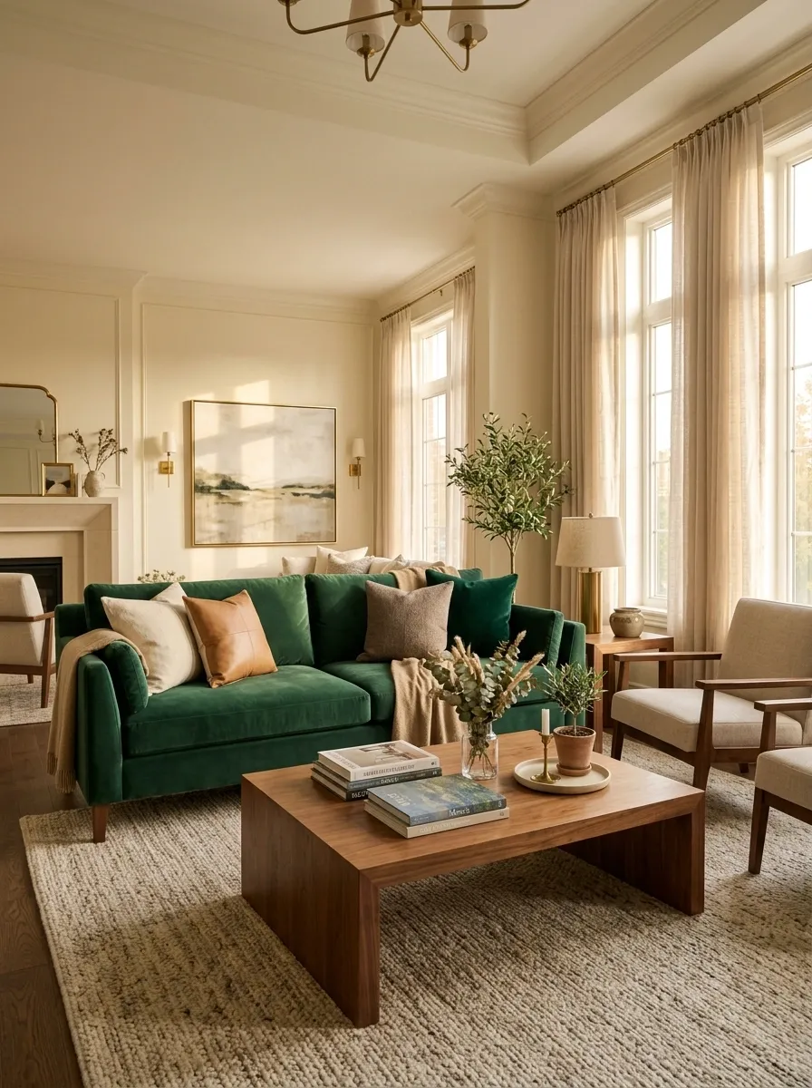
The sofa becomes the statement, so the walls need to behave.
Choose a substantial emerald sofa with clean lines, then surround it with warm cream walls, a textured neutral rug, and simple wood furniture. Linen-look curtains work especially well here because they soften the sharp contrast without introducing another competing color.
For the cushions, don’t create a green cushion convention. Mix cream, tan, muted brown, and one deeper green accent instead.
Best rule: let the sofa own the green. Everything else gets supporting-cast status.
Warm cream, ivory, or soft beige
Quiet texture in a warm neutral
Medium to deep warm timber
Cream, tan, brown, plus one green accent
Embrace the Two-Tone Living Space
Dividing a room between a bright neutral side and a deeply saturated emerald side creates a brilliant visual push-and-pull.
Use crisp off-white walls on one half for an open, airy feel, and transition into rich emerald green paint, matching velvet upholstery, and dark accents on the other. A fireplace and matching artwork bridge the two distinct zones seamlessly.
The rule of thumb: let the contrast tell the story. You don’t need excessive decor when the architectural color blocking does all the work for you.
Give White Kitchen Cabinets an Emerald Green Island
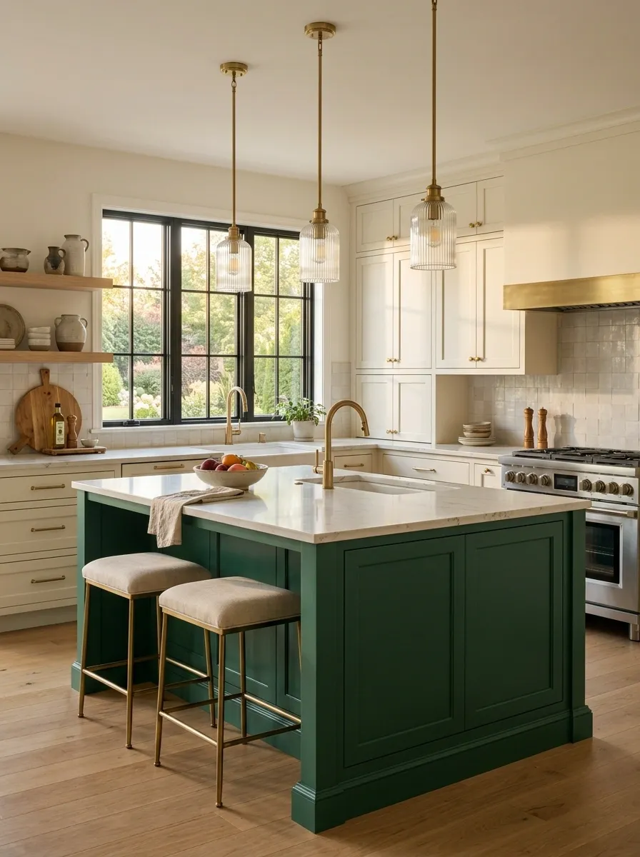
A white kitchen can get very polite very quickly. An emerald island fixes that without forcing the entire kitchen into a color scheme.
Paint the island a deep emerald and keep the surrounding cabinets warm white. Add a pale stone countertop, simple hardware, and wood accents where the kitchen already needs warmth.
The island should read as furniture, not as a random green rectangle in the middle of the room.
Skip shiny finishes that scream under overhead lighting. A soft satin or similarly restrained finish keeps the color substantial.
Elevate Your Entryway With Emerald Molding
An emerald green hallway with classic trim work and gold accents instantly sets an elevated tone the moment you walk through the door.
Pair the saturated walls with a sleek marble-top console table, an ornate antique mirror, and a simple vase of fresh greenery. A dark doorway leading into an equally rich room creates a sense of continuous flow.
Keep the accessories minimal and intentional. A single statement mirror and a clean table surface keep the dramatic paint looking sharp rather than cluttered.
Use Emerald Curtains to Frame a Neutral Bedroom
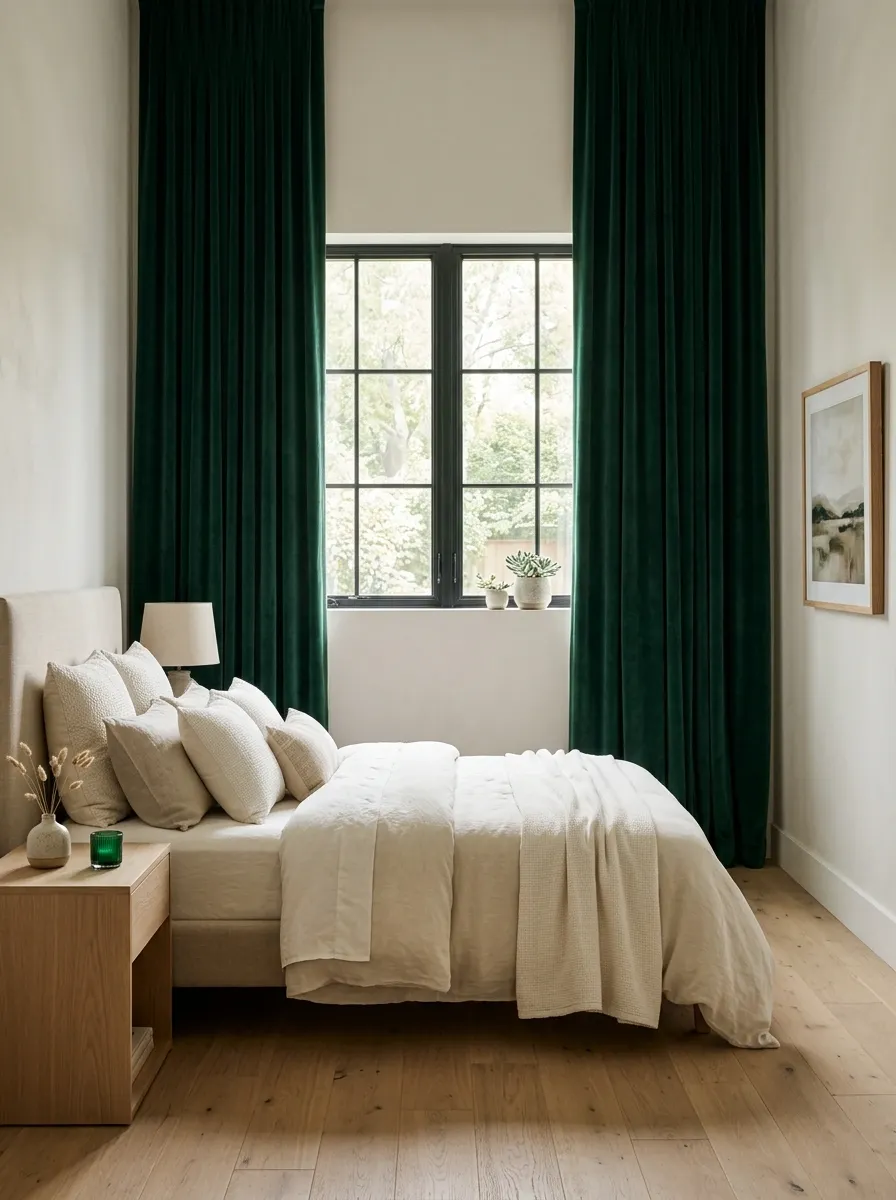
Emerald curtains are especially effective when the room itself is deliberately restrained.
Hang full-length panels from near the ceiling so the green reads as a strong vertical frame rather than a low strip of color beside the window. Keep the bedding creamy and the walls light.
Check these four things before buying the fabric:
- The curtain rod should sit high enough to create height.
- The panels should reach the floor.
- The bedding should stay mostly neutral.
- One additional green accent is enough.
That last rule matters. Matching green curtains, bedding, bench, and lampshades is how a bedroom starts looking suspiciously coordinated.
- Hang high: place the rod well above the window frame.
- Go long: let the fabric reach the floor instead of stopping at the sill.
- Keep bedding calm: cream, ivory, oatmeal, or soft beige works.
- Repeat sparingly: one small emerald detail elsewhere is enough.
Design a Moody Green Tile Shower
Green herringbone tiles in a shower alcove add an unexpected splash of richness to a bathroom without overwhelming the entire floor plan.
Combine the high-gloss emerald tiles with sleek black grid shower doors, warm brass fixtures, and a dark vanity. A botanical wallpaper accent wall outside the shower ties the entire nature-inspired palette together.
The trick is mixing finishes. Matte black metalwork contrasts beautifully against the glossy green tiles and warm metallic hardware for a finished look.
Build a Moody Emerald Bedroom With Walnut Wood
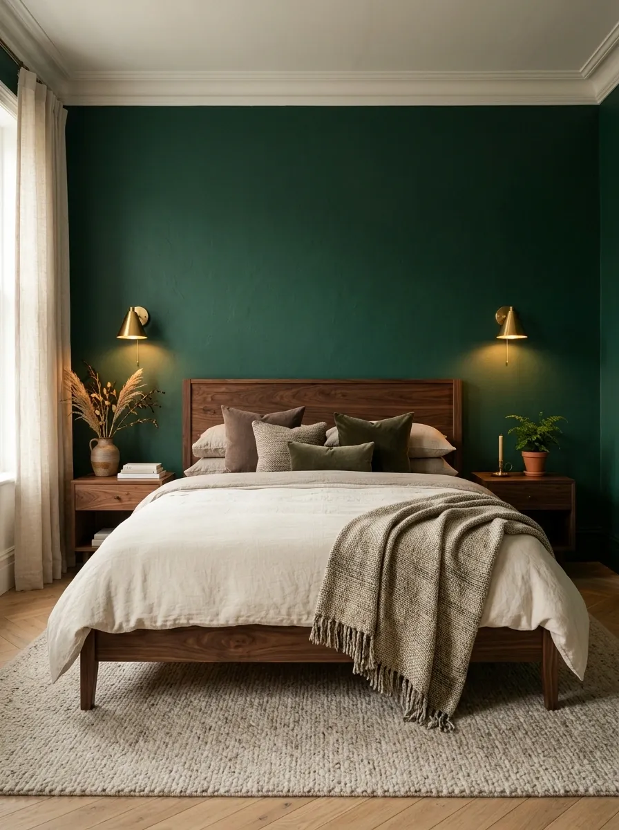
Emerald and walnut make sense together because neither one needs to pretend to be delicate.
Use emerald on the wall behind the bed, then bring in a substantial walnut bed frame or nightstands. Keep the bedding layered in cream, oatmeal, and muted brown. Add warm bedside lighting rather than icy white bulbs.
The room should feel deep, not gloomy.
Material mix:
Cream bedding + emerald wall + walnut furniture + warm metal + soft woven texture.
That combination has enough contrast to feel finished without filling every empty corner with another accessory.
Style an Emerald Credenza With Confidence
A solid emerald green credenza topped with matching green ceramics and a coordinating table lamp creates a masterclass in monochromatic styling.
Ground the look against dark panelled walls, then soften the corner with textured cacti in ceramic vases and a warm wooden floor. A simple, tailored curtain frames the vignette without stealing focus.
The golden rule: when working within a single color family, vary your textures and heights so the display feels curated rather than crowded.
Add Emerald Green Dining Chairs Around a Simple Wood Table
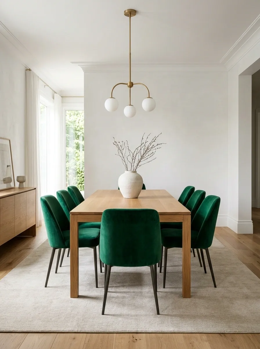
A dining room doesn’t need an emerald table, green walls, and a chandelier trying to prove a point.
Use emerald chairs around a simple oak, walnut, or medium-tone wood table instead. The shape stays classic while the green does the visual heavy lifting. Keep the rug quiet and let the lighting bring in another material rather than another color.
Set it up in this order:
- Start with a plain wood table.
- Add emerald upholstered or painted chairs.
- Keep the rug in cream, beige, or natural fiber.
- Finish with warm metal or ceramic lighting.
The result feels intentional instead of overly decorated.
Turn a Small Bathroom Into an Emerald Statement Room
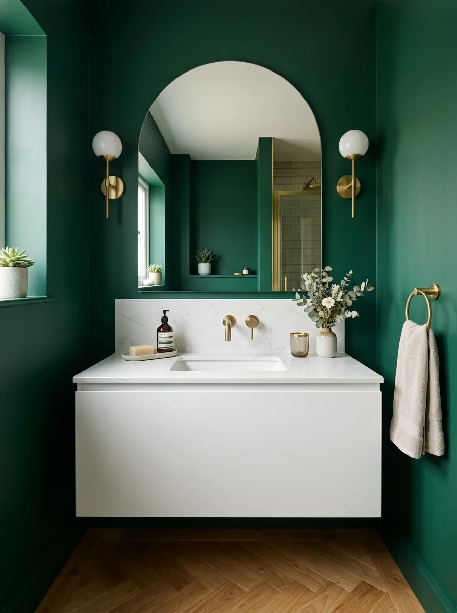
Small bathrooms don’t need to play it safe. In fact, the limited footprint makes a bold green finish easier to control.
Use emerald on the walls or a strong vertical section around the vanity, then keep the vanity, countertop, and towels restrained. A large mirror helps break up the darker color, while warm metal hardware keeps the room from feeling cold.
The smaller the room, the more useful contrast becomes.
Don’t fill the vanity with a lineup of matching green bottles. A deep green wall already has plenty to say.
Use Emerald Throw Pillows to Wake Up a Beige Sofa
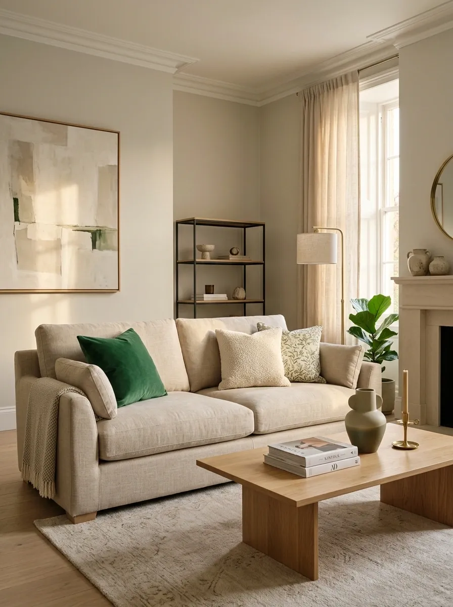
A beige sofa isn’t boring. Beige plus twelve nearly identical beige accessories, though, starts heading in that direction.
Add emerald through a small group of pillows instead. Mix one solid emerald pillow with a textured neutral and a pattern that includes a little green. The trick is variation, not quantity.
Keep these pieces neutral: the rug, coffee table, curtains, and most of the wall decor.
That lets the green feel deliberate.
And no, every cushion on the sofa doesn’t need to match. Coordinated is useful. Cloned is not.
Mix Emerald Green With Brass for a Warm, Polished Look
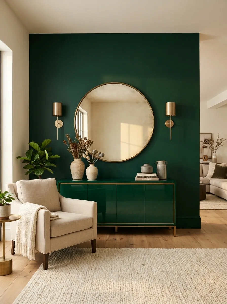
Emerald can lean cold when the surrounding finishes are too stark. Brass fixes that quickly.
Use the pairing where it matters most: a brass mirror above an emerald console, brass sconces against green walls, or warm cabinet hardware against emerald fronts. Keep the brass finish slightly muted rather than mirror-bright.
The winning combination is rich green + warm metal + soft neutral.
That third ingredient matters. Without it, the room can become a competition between two loud finishes, and nobody asked for that.
Style Emerald Bedding With Crisp White Sheets
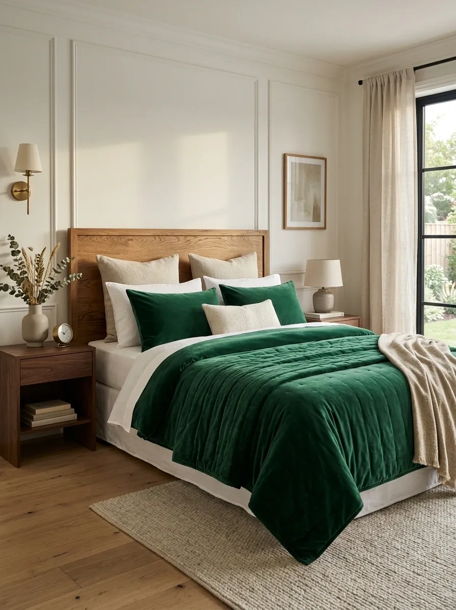
Emerald bedding looks its best when the bed isn’t trying to wear five colors at once.
Use an emerald duvet cover, quilt, or large blanket as the main layer. Keep the sheets bright white and add one warm neutral through the shams or throw. A wood headboard makes the whole arrangement feel less formal.
The white sheets are doing more work than they look like they’re doing.
They cut through the deep green and keep the bed looking fresh, especially in rooms with warm floors or darker furniture.
Skip the urge to match the lamps, curtains, and bench to the bedding. The bed already has the headline.
Put Emerald Lower Cabinets Under Open Wood Shelving
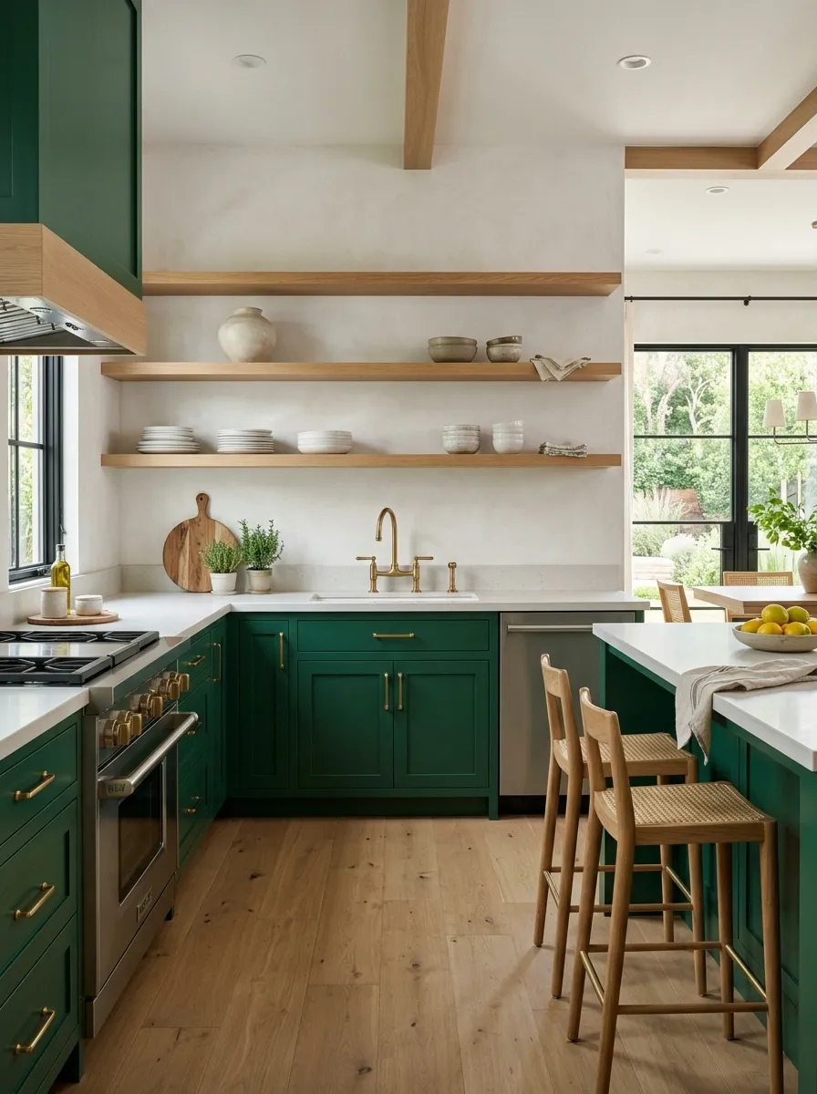
Open shelving already brings visual warmth into a kitchen. Emerald lower cabinets give that warmth some backbone.
Keep the upper portion light and uncomplicated. Then let the green sit below the counter while wood shelves break up the vertical cabinetry above. The contrast makes the kitchen feel layered instead of flat.
A smart combination looks like this:
- Emerald lower cabinets
- Warm white wall cabinets or open shelving
- Natural wood shelves
- Pale countertop
- Simple metal hardware
Don’t make every shelf a display case. A few everyday bowls, stacked plates, and one or two larger pieces are enough.
Use One Large Emerald Rug Instead of Lots of Small Green Accents
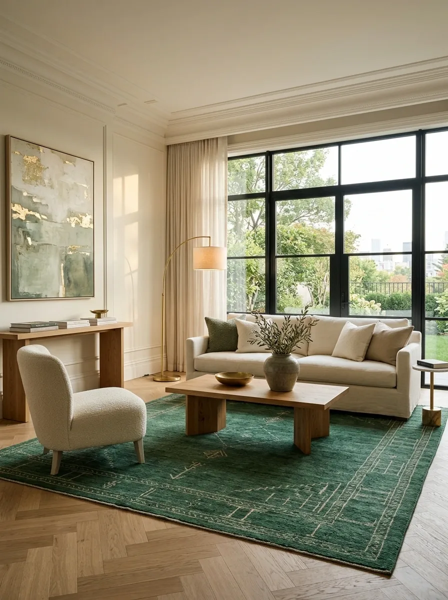
Here’s a decorating shortcut that saves a room from accessory overload: use one substantial emerald rug instead of scattering little green objects everywhere.
A large rug connects the furniture and gives the color enough visual weight to make sense. This works especially well beneath a neutral sofa, dining table, or bed.
Skip: tiny green vase + green candle + green tray + green cushion + green art.
That’s not layering. That’s a scavenger hunt.
Choose one large rug with enough neutral detail to keep it from looking like a giant block of paint. Keep the furniture mostly neutral and let the rug tie the room together from underneath.
Create an Emerald Green Reading Corner With a Comfortable Chair
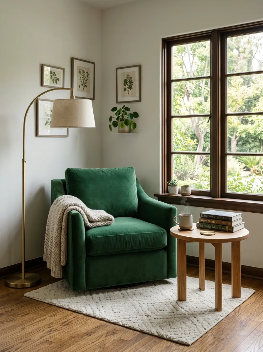
A neglected corner doesn’t need a giant furniture arrangement to become useful.
Place an emerald accent chair where natural light reaches it, then add a small side table and a floor lamp. A compact rug underneath helps define the zone without making it feel boxed in.
The key is scale. A chair that’s too small looks lost. A huge chair swallows the corner.
Use this simple formula:
Emerald chair + warm wood table + soft neutral rug + floor lamp.
Keep the surrounding walls quiet. The corner should feel like a deliberate little destination, not a pile of furniture that happened to fit beside a window.
Bring Emerald Into a Neutral Entryway With a Console and Art
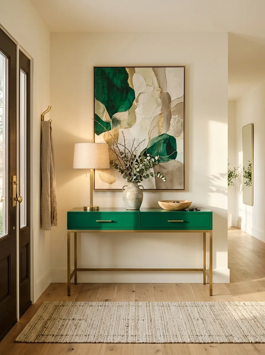
Entryways are often treated like the place where random furniture goes to retire. Don’t do that.
Use an emerald console as the anchor, then hang one substantial piece of artwork above it. A mirror can work too, but the proportions need to relate to the console instead of floating awkwardly above it.
Keep the floor clear except for a slim runner or a simple basket.
Entryway formula:
- Emerald console
- Oversized art or mirror
- One warm lamp
- Small ceramic or wood object
- Clear walking path
That’s enough. The front door isn’t supposed to open into a gift shop.
Emerald console
Large wall piece
Warm lamp
One natural accent
Use Emerald Tile Behind a Bathroom Vanity
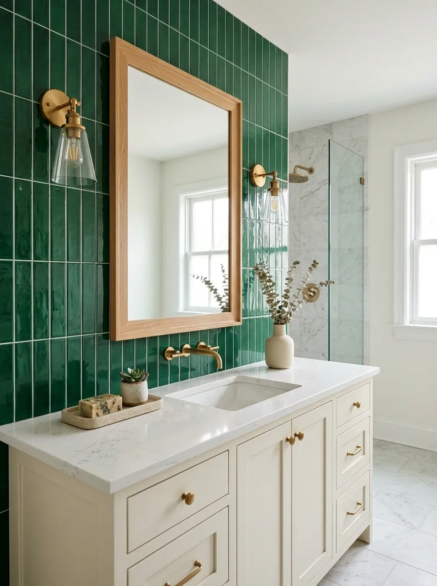
Emerald tile can make an ordinary vanity look deliberately designed, especially when the rest of the bathroom stays restrained.
Run the tile behind the vanity and keep the pattern simple enough that the color remains the main event. A white or pale stone countertop gives the dark green something bright to push against.
Then bring in one warm material, such as brass hardware or a wood-framed mirror.
Don’t mix several competing tile patterns here. Emerald already has enough personality.
A narrow bathroom benefits from vertical tile placement because it draws the eye upward. In a wider vanity area, a horizontal layout can feel calmer and more expansive.
Add an Emerald Accent Chair to a Soft Neutral Living Room
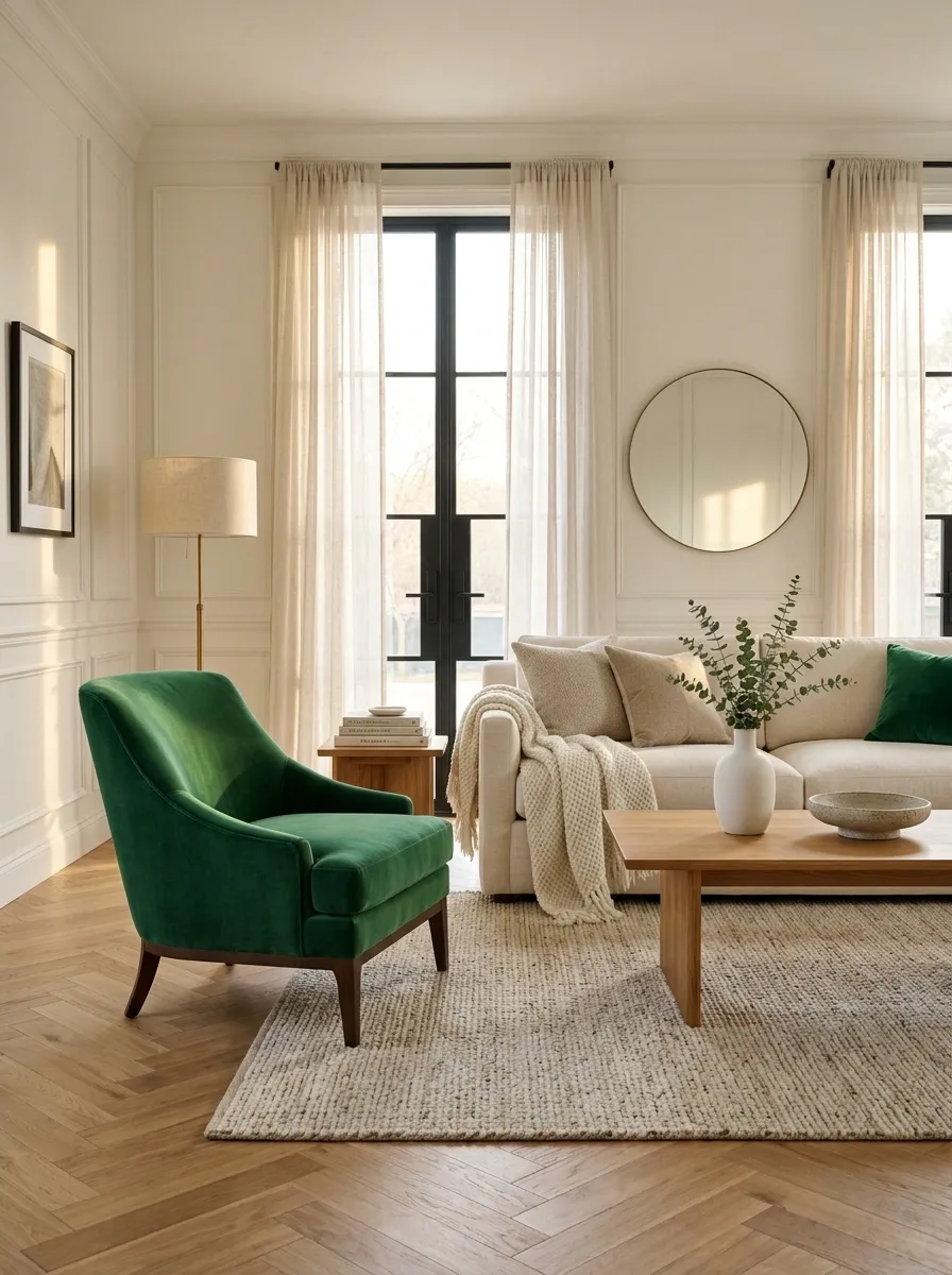
Sometimes a room doesn’t need a green sofa. It needs one chair that refuses to be ignored.
Place an emerald accent chair beside a neutral sofa, near a window, or opposite the main seating area. Keep its shape simple so the color gets to do the talking. A curved chair works beautifully with softer rooms, while a boxier silhouette suits modern spaces.
Build the pairing with three pieces:
- Emerald chair for the color.
- Cream or beige sofa for the calm.
- Warm wood table for the middle ground.
That’s enough contrast to make the chair feel intentional without turning the living room into a color-matching exercise.
Make an Emerald Green Home Office Feel Focused, Not Dark
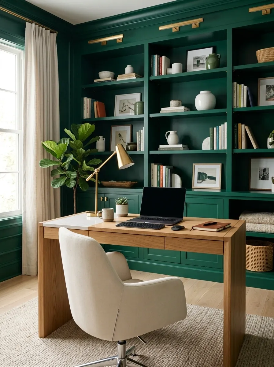
Dark green can make a home office feel grounded. Done badly, it can also make a perfectly innocent Tuesday afternoon feel like a cave.
Use emerald behind the desk or across built-in shelving, then keep the desk surface light enough to reflect some brightness. Add warm wood, cream fabric, and task lighting that actually illuminates the work surface.
The goal is contrast, not darkness.
Keep the floor and larger furniture pieces on the lighter side if the room doesn’t get much daylight. The emerald should create depth while the rest of the office keeps things visually open.
Use Emerald Table Linens With Natural Wood for the Dining Room
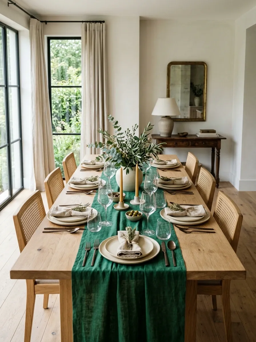
Natural wood and emerald green work because they don’t look like they’re trying too hard.
Start with a bare or lightly finished wood table. Add an emerald runner or tablecloth, then keep the plates simple in white, cream, or stone. Linen napkins can bring in a softer texture without adding another strong color.
For the centerpiece, think low and loose.
A few branches, a simple ceramic vessel, or a restrained arrangement keeps sightlines across the table open. Nobody needs to lean sideways at dinner just to find the person sitting opposite them.
Let the table feel collected, not staged within an inch of its life.
Frame an Emerald Wall With Simple Cream Trim
Emerald becomes even stronger when there’s a clean architectural line around it.
Paint a feature wall deep emerald and keep the trim, molding, doors, or built-in edges warm cream. The contrast creates definition without needing another decorative element to explain what’s going on.
This works particularly well around fireplaces, dining areas, stair walls, and bedrooms.
The important detail is the undertone. A creamy trim usually feels more connected to deep green than a cold, stark white.
Keep the rest of the room fairly edited. Once the wall has a strong outline, adding a dozen decorative objects underneath it is just visual noise wearing expensive clothes.
Mix Emerald Green With Terracotta for a Warmer Room
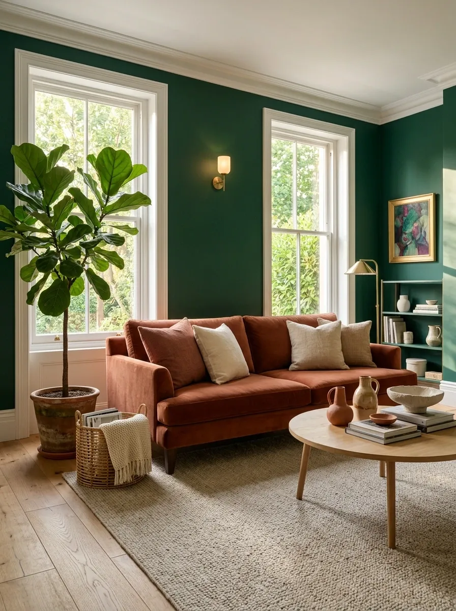
Emerald doesn’t always need brass to feel warm. Terracotta does the job with a lot more personality.
Use emerald on one substantial piece, then introduce terracotta through a rug, ceramic pieces, cushions, or a single upholstered accent. The earthy orange-red tones make the green feel less formal and more relaxed.
Keep one of the two colors dominant.
Emerald walls with tiny terracotta details feel balanced. Emerald walls, terracotta sofa, patterned rug, orange curtains, and ten matching accessories start looking like the color wheel got left unsupervised.
Natural wood makes this combination even easier to live with.
| Dominant color | Supporting color | Best use |
|---|---|---|
| Emerald | Terracotta | Walls, sofa, or cabinetry with warm accessories |
| Terracotta | Emerald | Earthy rooms where green appears through textiles and accents |
| Both with warm wood | Cream or beige | Rooms that need a calmer visual base |
Use Emerald Built-Ins to Create a Strong Focal Point
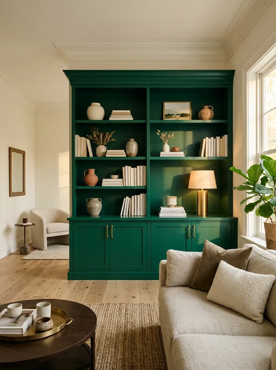
Built-ins already command attention. Emerald makes sure nobody misses them.
Paint the entire shelving unit or cabinetry in a deep emerald, then keep the surrounding walls lighter so the furniture-like structure stands out. The shelves don’t need to be packed. A few books, ceramics, framed art, and one warm lamp will give the color enough context.
Think of the shelves as a composition, not storage.
Leave some open space between objects. Mix tall and short pieces. Bring in wood, cream, and brass rather than repeating more green.
A fully loaded shelf isn’t impressive. It just looks busy.
Add Small Emerald Details to a Scandinavian-Inspired Room
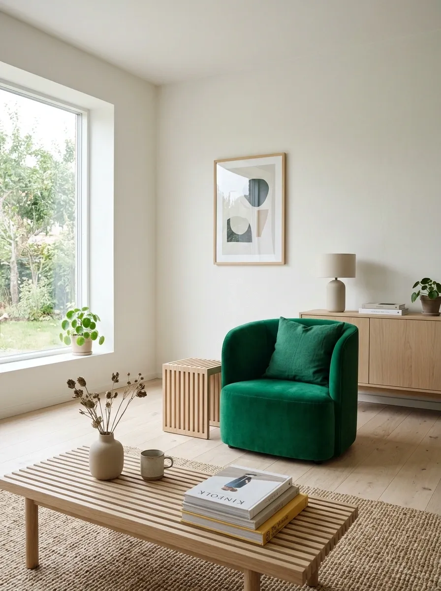
Minimal rooms don’t need to stay completely colorless. They just need discipline.
Add emerald through a single cushion, a small ceramic piece, a simple art print, or a compact upholstered chair. Keep the furniture light, the wood natural, and the walls soft.
The goal is one clear interruption in an otherwise quiet room.
Don’t add six different emerald objects because the first cushion looked good. Scandinavian-inspired rooms depend on restraint. One saturated detail can carry more visual weight than a collection of tiny decorations ever will.
The result feels fresh instead of overly styled.
One emerald anchor
Natural wood
Soft neutrals
Open space
Pair Emerald Green With Black for a Dramatic Modern Look
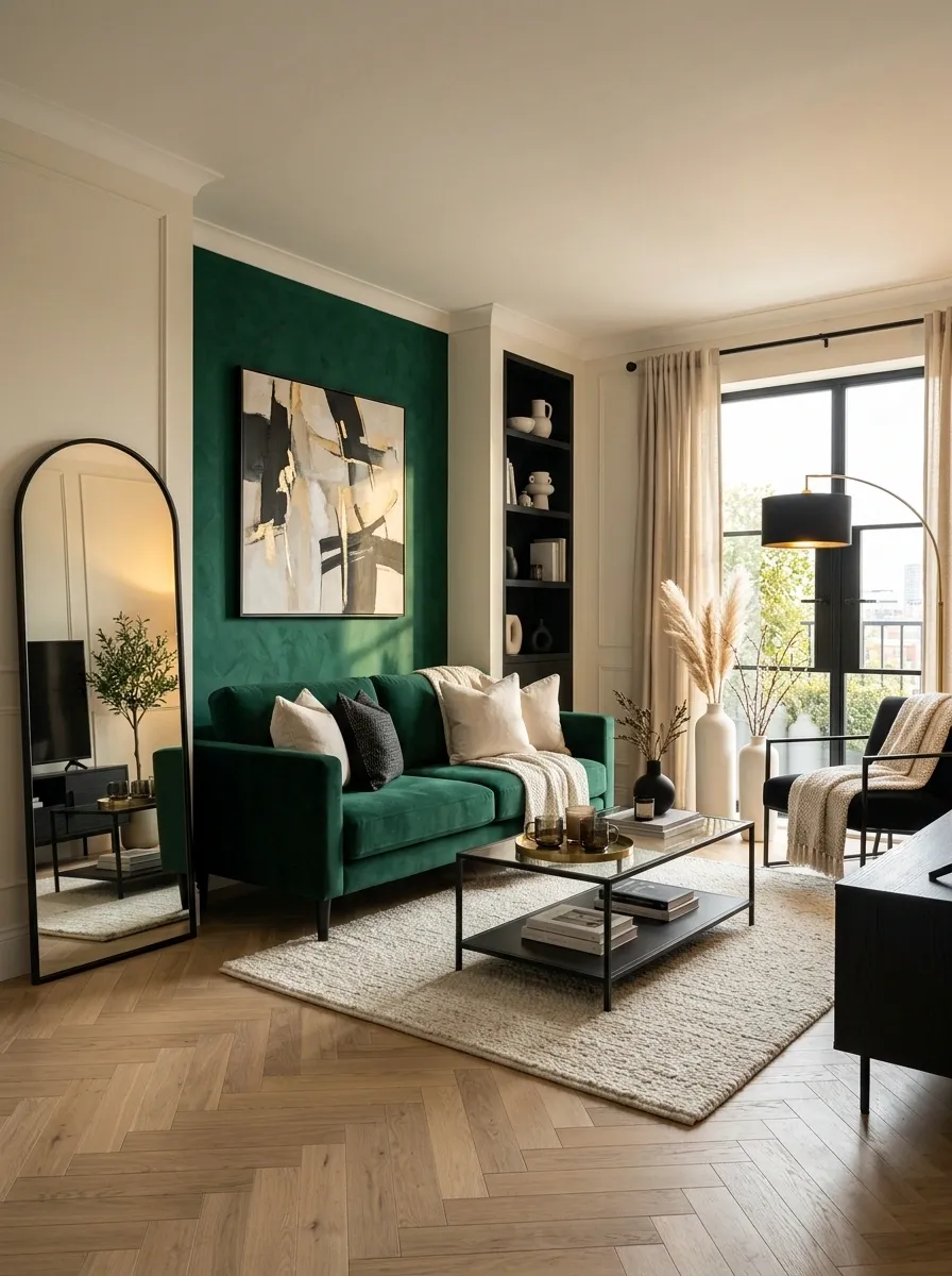
Black makes emerald look sharper. Emerald keeps black from making the room feel severe.
Use the combination in a modern living room, bedroom, bathroom, or home office. Think emerald cabinetry with black hardware, an emerald wall with a black-framed mirror, or a green sofa with a black metal coffee table.
The trick is keeping the large surfaces balanced.
Use emerald for depth. Use black for definition.
Then add a light neutral somewhere obvious, such as a cream rug, pale walls, or a light countertop. Without that break, the room can quickly become one large block of dark finishes.
Drama is useful. Darkness for its own sake isn’t.
Use Emerald Artwork Instead of Painting the Walls
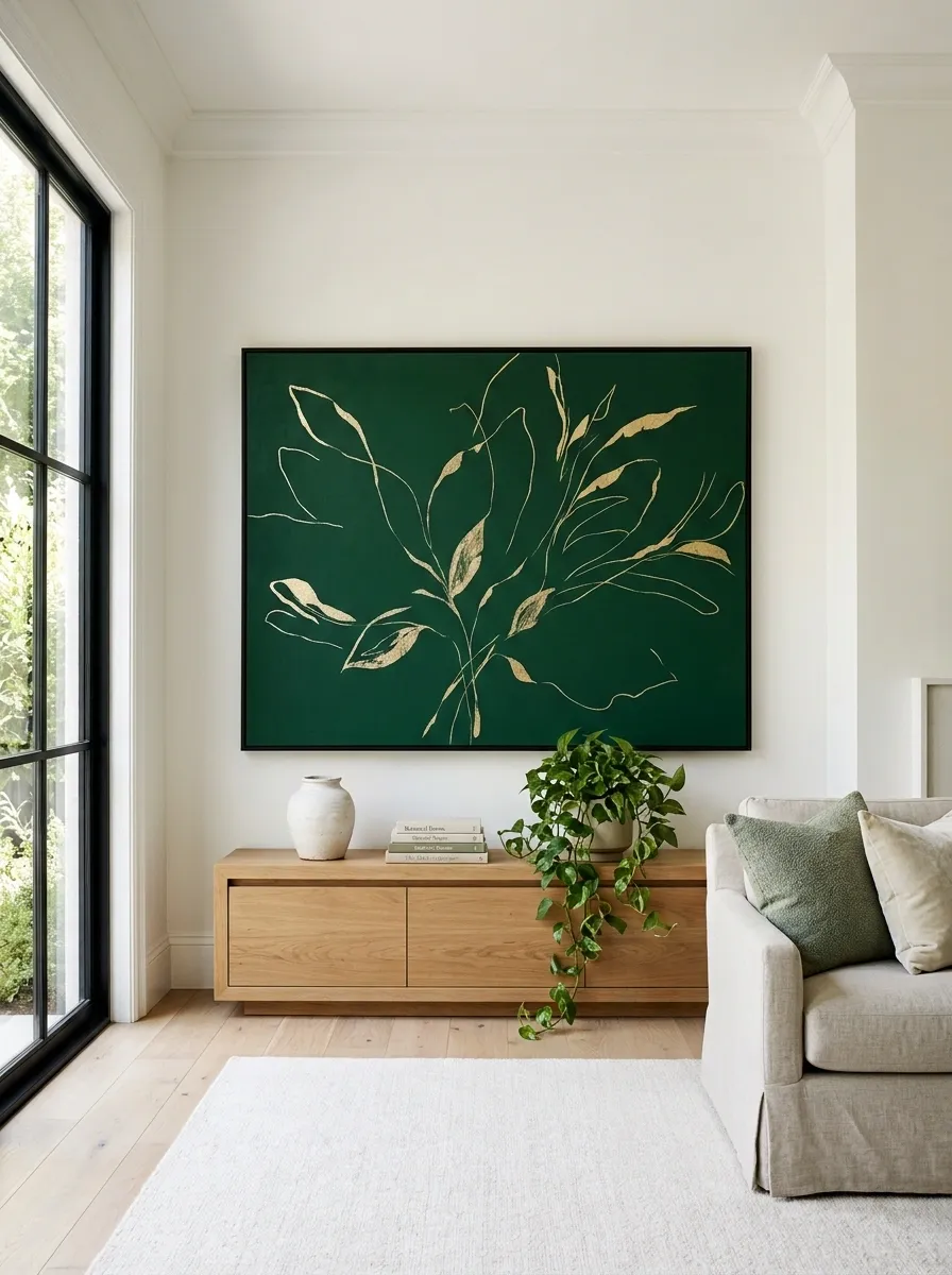
Not every room needs an emerald wall. Sometimes the smarter move is hanging one oversized piece of artwork that carries the color instead.
Look for art with a strong emerald field, botanical-inspired shapes, abstract forms, or deep green accents against a light background. Hang it above a console, sofa, bed, or dining sideboard where it has enough surrounding space to breathe.
Go larger rather than creating a gallery wall of tiny pieces.
A substantial artwork gives the room a focal point without committing to a permanent wall color.
Keep the frame simple. The emerald already has enough personality without an ornate frame trying to join the conversation.
Build a Layered Emerald Living Room With Green in Three Different Textures
The easiest way to make emerald feel sophisticated is to stop treating it like one flat color.
Use emerald upholstery on the sofa or chair, then repeat it through a softer textile and one smaller textured object. Velvet, woven fabric, linen, boucle, ceramic, and painted wood all catch the same green differently.
The color stays consistent while the surfaces change.
That difference matters. A room where every green item has the same finish looks assembled from one shopping trip. A room with varied textures feels considered.
Keep the remaining palette simple. Cream, walnut, warm brass, black, and natural fibers are more than enough to finish the room.
The Emerald Green Look Is Mostly About What You Leave Out
Emerald gets the attention. The rest of the room decides whether that attention feels sophisticated or exhausting.
A strong room usually has one obvious emerald anchor, a quieter backdrop, and a few materials that keep the color from floating on its own. That’s why cream, wood, stone, brass, black, and warm textiles keep showing up. They’re not filler. They’re what make the green believable.
The smartest move is also the least glamorous one: stop adding things once the composition works.
A gorgeous green wall doesn’t need a matching vase sitting under it. A beautiful emerald sofa doesn’t need a green rug, green curtains, and green artwork to justify itself.
Let the color have its moment. Then leave some room around it.
Save this list for the next decorating project that needs more color and considerably less nonsense.