
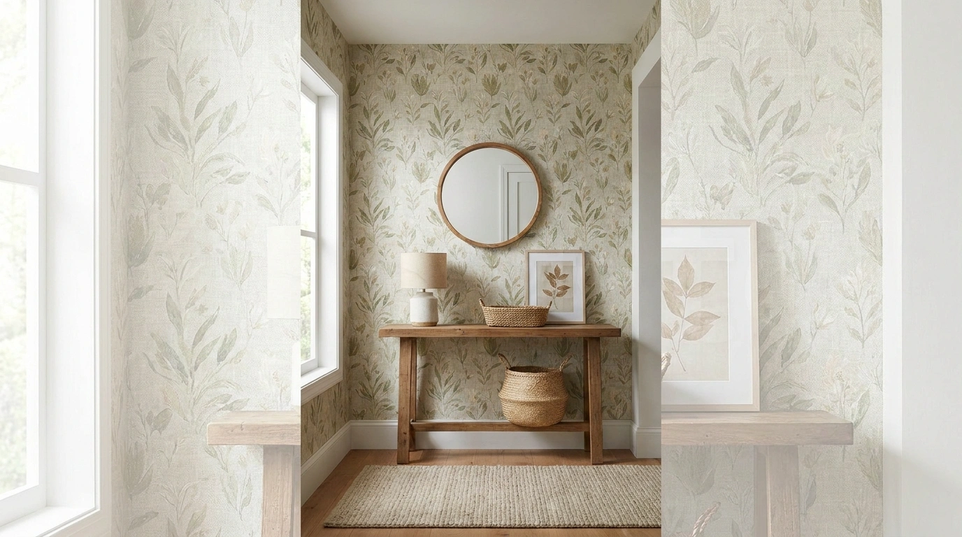
Some entryways have the furniture, the mirror, the runner, the little bowl for keys, and somehow still look like nobody has officially decided what the room is supposed to be.
The wall is often where the whole thing falls apart. A plain entry can feel unfinished, while an overly complicated wallpaper can make a narrow entrance look even busier.
Then there is the other problem: choosing wallpaper in isolation usually sounds much easier than choosing wallpaper for an actual room with floors, furniture, lighting, doors, trim, and approximately twelve things that somehow need somewhere to go.
Entryway Wallpaper Ideas
Soft Botanical Wallpaper With a Natural Oak Console
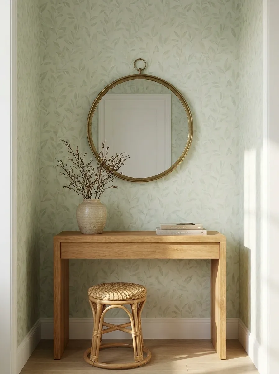
Pale botanical wallpaper gives this entryway a gentle start without turning the house into a garden center. The print stays light and slightly imperfect, while a warm oak console adds enough weight underneath it. A round aged-brass mirror breaks up the vertical wall pattern, and a woven stool tucked below keeps the floor from looking forgotten.
The magic is in the restraint. The wallpaper has plenty of personality, so the furniture stays simple and useful. Warm wood also stops the pale greens from becoming cold and washed out.
This is the sort of entrance that looks collected rather than decorated within an inch of its life.
Moody Floral Entryway With Dark Wood Furniture
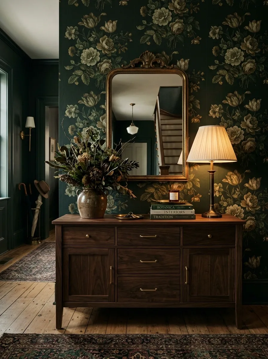
Deep green floral wallpaper changes the entire attitude of an entryway. Here, the pattern runs behind a substantial walnut console with a traditional mirror above it, while a warm table lamp provides the kind of glow that makes dark walls feel intentional rather than gloomy.
The trick is giving the wallpaper something substantial to sit behind. Lightweight furniture would disappear against such a rich background, while the walnut adds enough visual depth to make the composition feel balanced.
The hallway does not need ten accessories either. A lamp, a ceramic vessel, and one small stack of books are enough. Anything more starts looking like the console is applying for a second mortgage.
Blue Chinoiserie Wallpaper With Classic White Trim
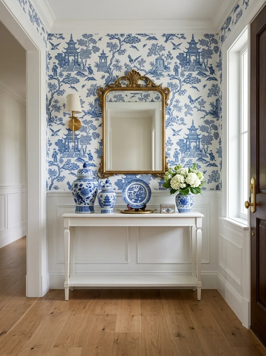
A detailed blue-and-white chinoiserie print makes this entryway feel almost architectural because the wallpaper establishes such a clear visual identity. Crisp white trim frames the pattern, while a painted console and traditional mirror reinforce the classic direction.
The important part is the relationship between the pattern and the trim. The wallpaper can be busy because the white edges give the eye a clean stopping point. A few blue-and-white ceramics echo the wall without creating a matching-set situation.
This concept works especially well in an entry with good daylight. Natural light lets the fine pattern details remain visible instead of turning the wall into one giant blue blob.
Warm Geometric Wallpaper With Mid-Century Furniture
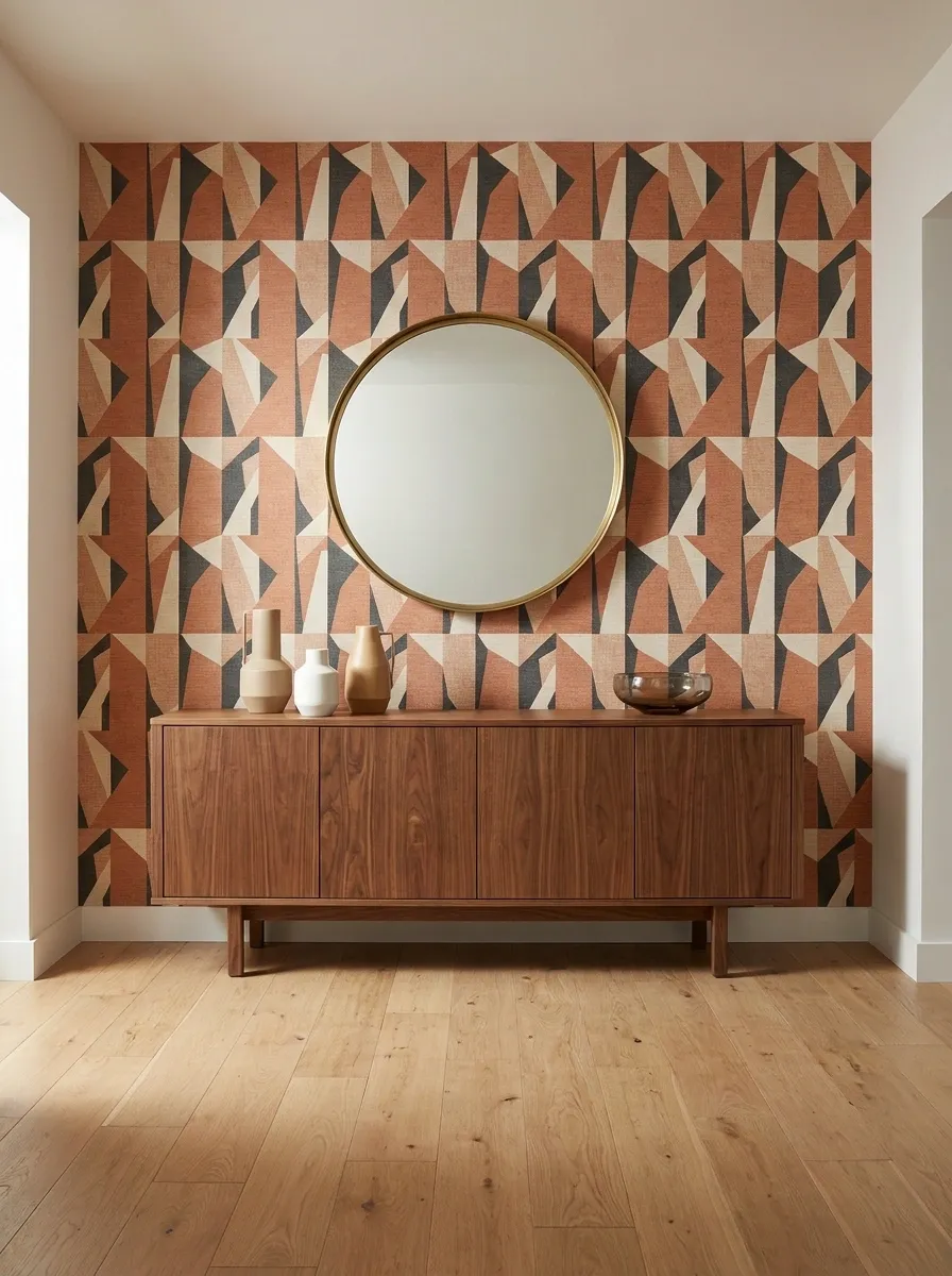
Terracotta, cream, and walnut give this geometric entryway a warmer personality than the usual black-and-white modern hallway. The wallpaper uses clean repeated shapes, but the mid-century credenza underneath brings in softer wood grain and tapered proportions. Above it, a sculptural round mirror interrupts the geometry.
The composition works because the furniture does not copy the wallpaper. It responds to it. The angular wall pattern gets softer against curved edges and natural timber.
Keep the floor quiet here. Once the wallpaper, credenza, and mirror are all bringing shape into the room, a heavily patterned rug would be trying very hard to become the main character.
Small Entryway With Soft Small-Scale Floral Wallpaper
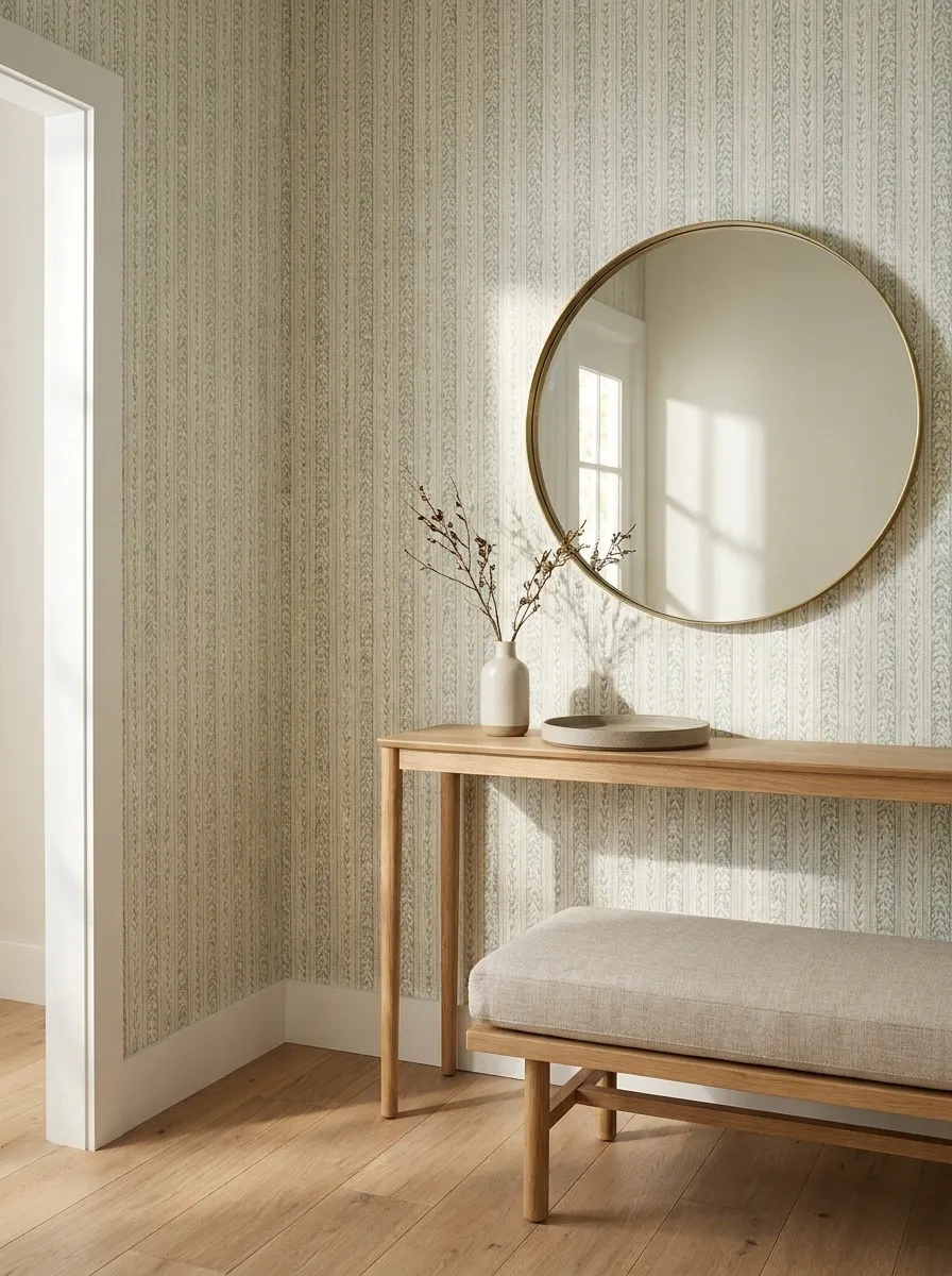
Tiny entrances are where wallpaper can either save the composition or expose every awkward proportion in the room. Soft vertical direction and a delicate floral print keep this compact space detailed without letting the walls feel oversized. A slim oak console sits below a round mirror, while a small bench gives the room a practical landing spot.
The furniture stays narrow enough to preserve the walkway, which is doing something wildly underrated in entryway design: remaining usable.
The small-scale wallpaper creates detail without needing a mountain of accessories. That means the wall can carry the decorative load while the floor stays relatively open.
Small does not need to mean sad little hallway energy.
+
slim furniture
+
open floor
Muted Green Grasscloth Look With Vintage Furniture
This entryway skips a busy print and lets texture do the heavy lifting. Muted green grasscloth-style wallpaper covers the walls behind a slim vintage wood table, while an aged brass lamp and a framed mirror give the space a collected, slightly old-world feel. A patterned runner adds just enough movement underfoot.
The wall texture matters here because the rest of the room is fairly restrained. Without it, the green could feel plain. With it, the wall has depth even when the light changes.
There is also no need to fill every inch of the console. One lamp, one vessel, and a little breathing room look far more intentional than the classic “every surface must hold seven objects” approach.
Black-and-Cream Wallpaper With Sculptural Lighting
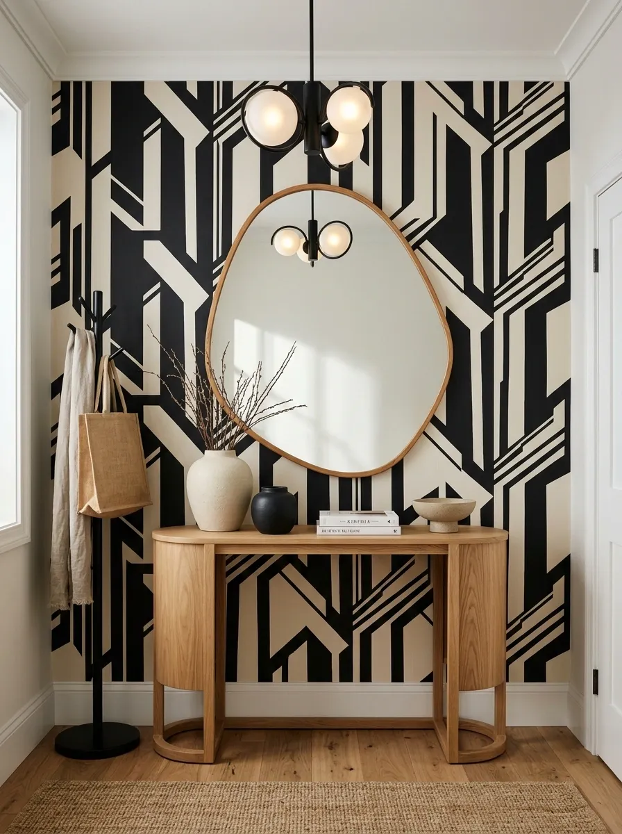
A graphic black-and-cream wallpaper gives this entrance a strong architectural edge, but the furniture deliberately goes in the opposite direction. A curved console, oversized organic mirror, and sculptural pendant soften all those sharp wallpaper lines.
That contrast is what keeps the room interesting. The wall supplies structure. The furniture supplies movement.
The color palette also stays disciplined. Black, cream, and warm wood are enough. Adding another loud accent would start turning a very clean composition into a group project where nobody knows who is in charge.
Let the wallpaper remain the strongest graphic element and keep everything around it comparatively quiet.
Tiny Entryway With Soft Small-Scale Floral Wallpaper
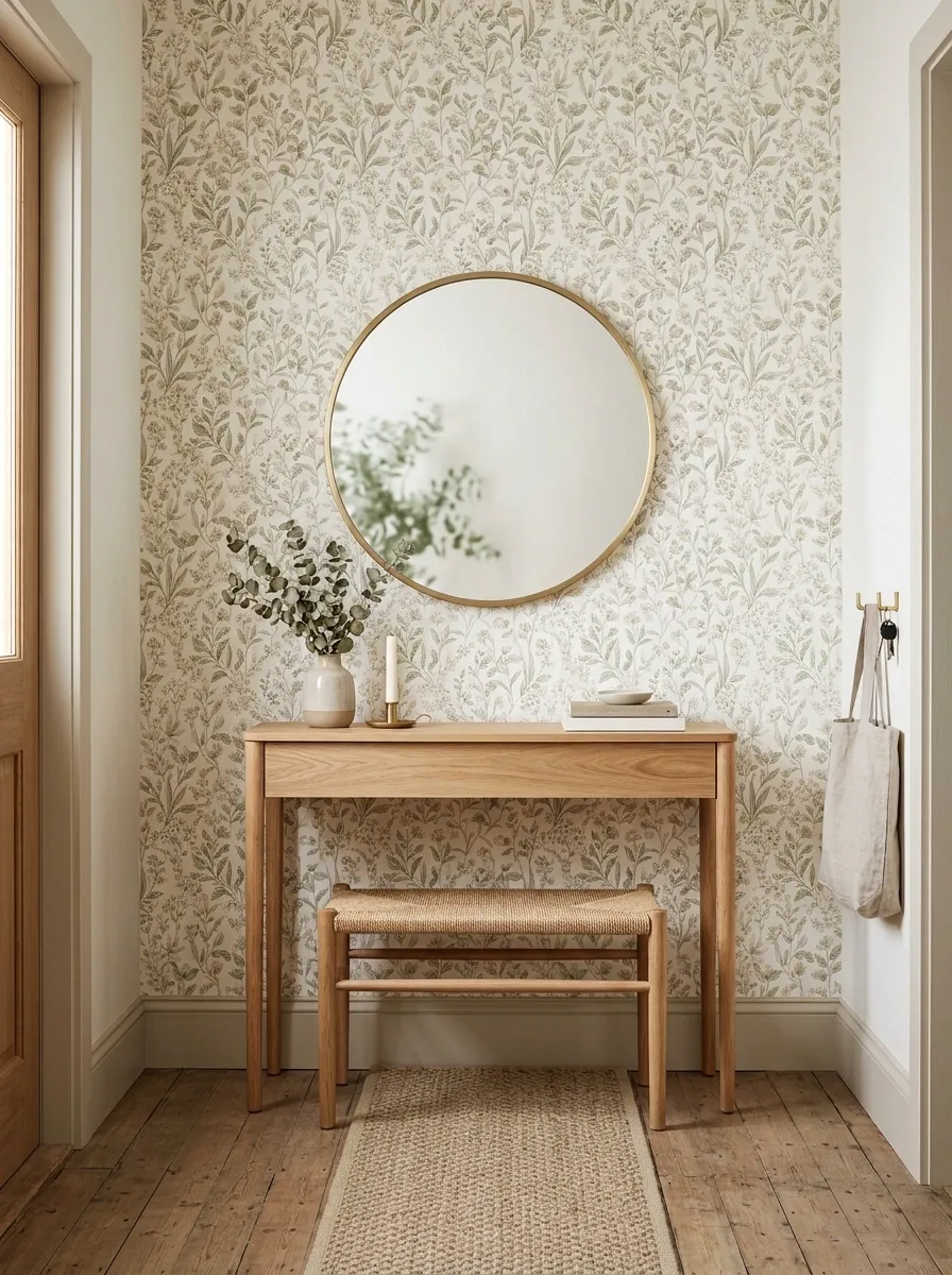
A delicate floral print gives this very compact entrance plenty of character without turning the wall into the visual equivalent of shouting in a library. A petite wood console, wall-mounted round mirror, and narrow bench keep the furniture footprint small, while a restrained runner finishes the floor.
The wallpaper carries most of the decorative information, which means the furniture can stay almost suspiciously sensible. That is exactly what a tiny entry needs.
Keeping the mirror relatively simple also matters. A highly ornate frame would add another competing shape to a room that already has a detailed wall.
Small-space decorating gets much easier once every object stops demanding its own moment.
Warm Vintage Entryway With Sepia Botanical Wallpaper
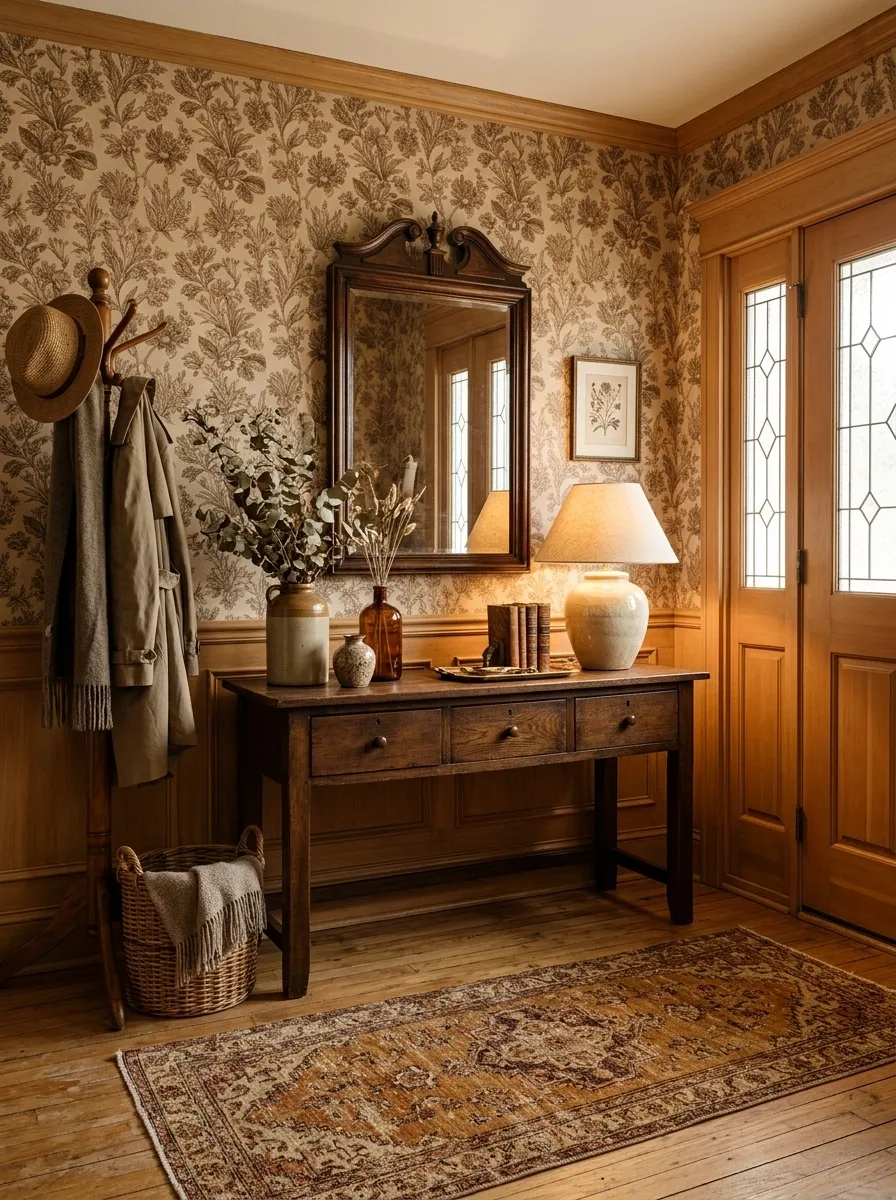
Sepia botanical wallpaper sets a warmer, nostalgic tone here, especially against honey-toned wood and an old-fashioned framed mirror. The furniture feels substantial but not oversized, while a traditional lamp creates a pool of warm light across the console.
A faded patterned runner connects everything back to the floor, keeping the vintage feeling from stopping abruptly at the walls.
The strongest part of this composition is the color continuity. The wallpaper, wood, rug, and lighting all live in the same warm family, but their textures are different enough to keep the space from becoming one giant beige rectangle.
Vintage works better when it looks collected rather than when every object looks like it came from the same suspiciously committed antique shop.
Contemporary Entryway With Oversized Abstract Wallpaper
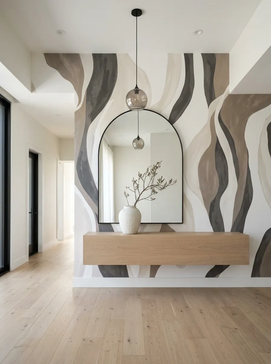
This one lets the wallpaper take up serious visual space. Large abstract shapes move across the wall behind a low floating console, while an oversized mirror and minimal pendant keep the rest of the composition crisp.
The room works because the large pattern has actual breathing room around it. The furniture does not crowd the wall, and the floor stays quiet enough for the artwork-like wallpaper to remain the focus.
This is a strong direction for a contemporary home where the entryway needs some personality without turning into a showroom of decorative objects. The wallpaper already has something to say.
Adding five more statement pieces afterward would be the interior-design equivalent of replying “same” to your own comment.
Soft Blue Entryway With Coastal Botanical Wallpaper
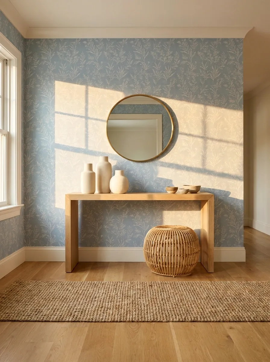
Soft blue botanical wallpaper gives this entrance a relaxed coastal direction without falling into the seashell-everywhere trap. White oak furniture keeps the room warm, while a woven stool and natural-fiber runner bring in subtle texture. A simple round mirror breaks up the rectangular console and patterned wall.
The palette works because the blue is softened rather than pushed into bright beach-house territory. The wood also matters. Without it, the cooler wall color could leave the room looking a little too crisp and unfinished.
Keep the accessories natural and understated. The wallpaper already provides enough movement.
sets the visual temperature
keeps the entrance grounded
Traditional Entryway With Damask Wallpaper and Walnut Furniture
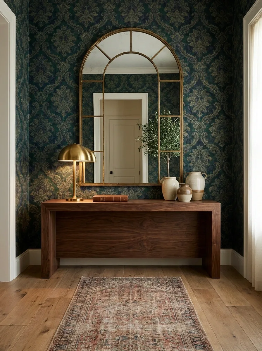
A traditional damask wallpaper deserves furniture with enough visual weight to keep the room from feeling top-heavy. This composition pairs a rich patterned wall with a substantial walnut console, framed mirror, brass lamp, and a narrow runner beneath.
Everything has some presence, but nothing is screaming for attention. That is what keeps the room formal instead of fussy.
The walnut is particularly useful because its darker tone visually connects with the deeper parts of the wallpaper. A lighter console could still work, but it would create a much sharper contrast and change the entire mood.
This is traditional entryway design without the museum-house energy.
Terracotta Wallpaper With Cream and Dark Brown Accents
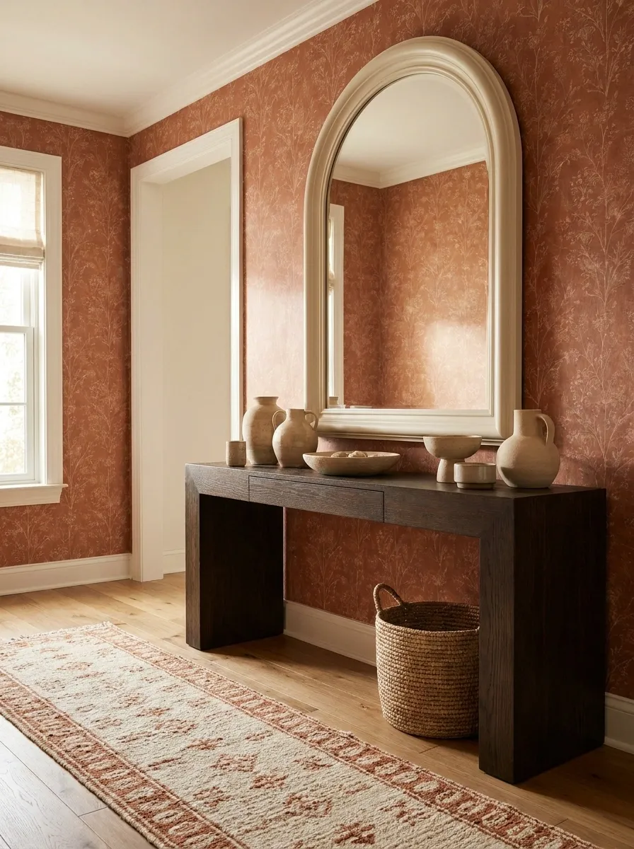
Terracotta wallpaper instantly gives the entryway some warmth, especially when paired with a deep brown console and cream-colored mirror. A few handmade-looking ceramics and a softly patterned runner make the entrance feel relaxed rather than overly polished.
The color combination is doing most of the decorating here. Terracotta creates the strongest field of color, cream gives the eye a break, and dark brown anchors the lower half of the room.
That hierarchy matters. When every color competes equally, a warm palette can quickly become visual soup. This one has a clear leader, supporting players, and absolutely no need for an eleventh accent color to enter the chat.
terracotta wall Support
soft cream Anchor
dark brown
Scandinavian Entryway With Subtle Linear Wallpaper
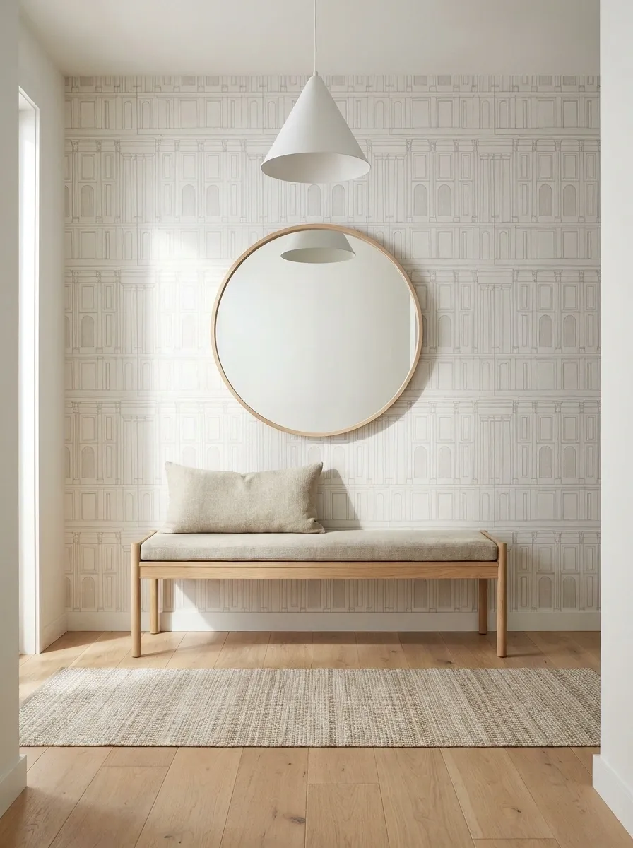
This Scandinavian-inspired entrance keeps the wallpaper almost architectural. A pale linear pattern runs behind a blonde oak bench, simple round mirror, and understated pendant. A light runner adds texture without introducing another loud pattern.
The room has very little visual clutter, so small decisions become more noticeable. The wood grain warms the pale palette, while the repeated lines in the wallpaper provide structure without demanding attention.
This is a strong direction for anyone who likes an entryway to feel calm without leaving the walls completely blank. It has detail, just not the kind that walks into the room wearing a neon sign.
Dark Navy Wallpaper With Warm Brass Details
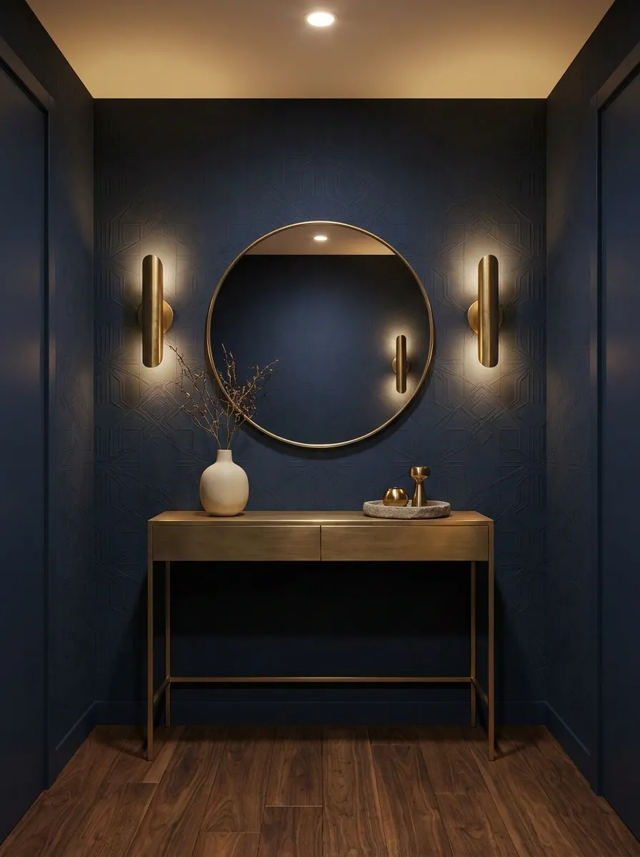
Deep navy wallpaper gives this entryway a dramatic backdrop, but the warmth comes from the details layered over it. A slim brass console, round mirror, warm wall lights, and dark wood flooring create a richer composition without making the space feel heavy.
The lighting is the secret weapon. Cool lighting would flatten the navy and make the room feel much harsher. Warm illumination creates contrast against the deep wall while keeping the metallic finishes soft.
The rest of the accessories stay restrained. Against a dark patterned wall, every shiny object gets louder. This room understands the assignment.
English Country Entryway With Tiny Floral Wallpaper
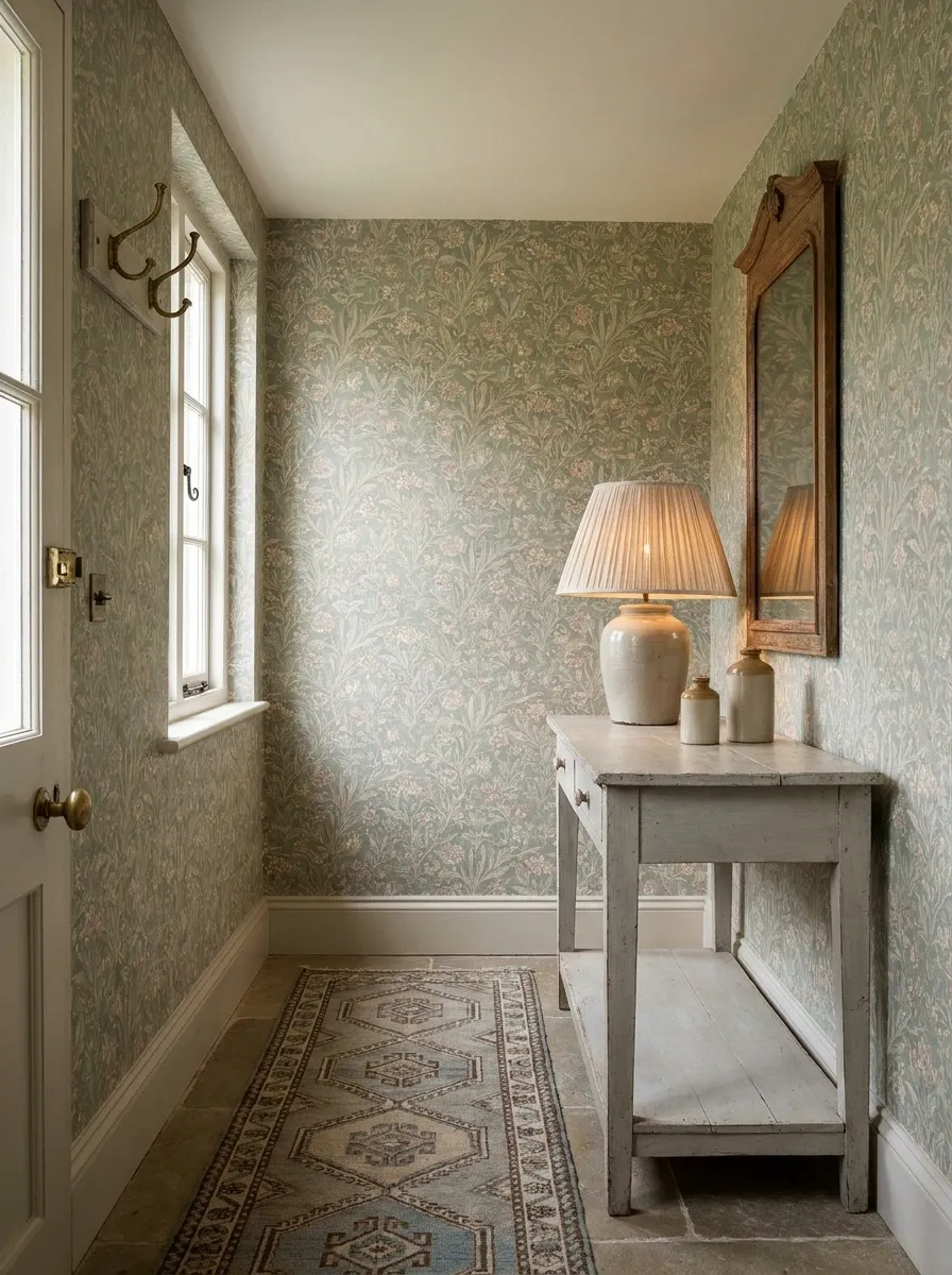
Tiny floral wallpaper gives this entrance that slightly old-fashioned English country character without requiring every object in the room to look like it survived three generations. The walls carry a small botanical print, while a painted console, traditional lamp, patterned runner, and simple framed mirror build the rest of the composition.
The trick is layering patterns at different scales. The wallpaper is delicate, the runner is broader and more grounded, and the furniture remains mostly solid. That keeps the eye moving without creating visual static.
A little imperfection actually helps here. A vintage-looking wood finish and softly worn metal feel more convincing than a collection of suspiciously pristine pieces.
Modern Organic Entryway With Stone-Look Wallpaper
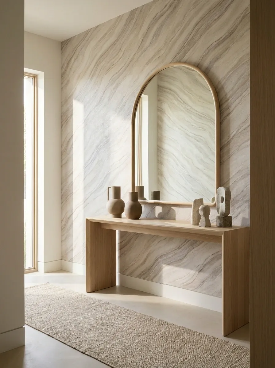
This entryway takes a more architectural route with mineral-inspired wallpaper that resembles softly veined stone. A pale oak console, curved mirror, stone-toned accessories, and a neutral floor keep the room earthy without making it rustic.
The wallpaper is doing something useful beyond adding pattern. Its subtle variation gives a mostly neutral room some depth, particularly where natural light moves across the wall.
Curved furniture keeps the stone-like pattern from becoming too hard and formal. The result feels modern but grounded, with texture doing more work than color.
This is a good reminder that “neutral” does not have to mean three shades of nearly identical beige staring at each other across the hallway.
Peach and Cream Entryway With Delicate Floral Wallpaper
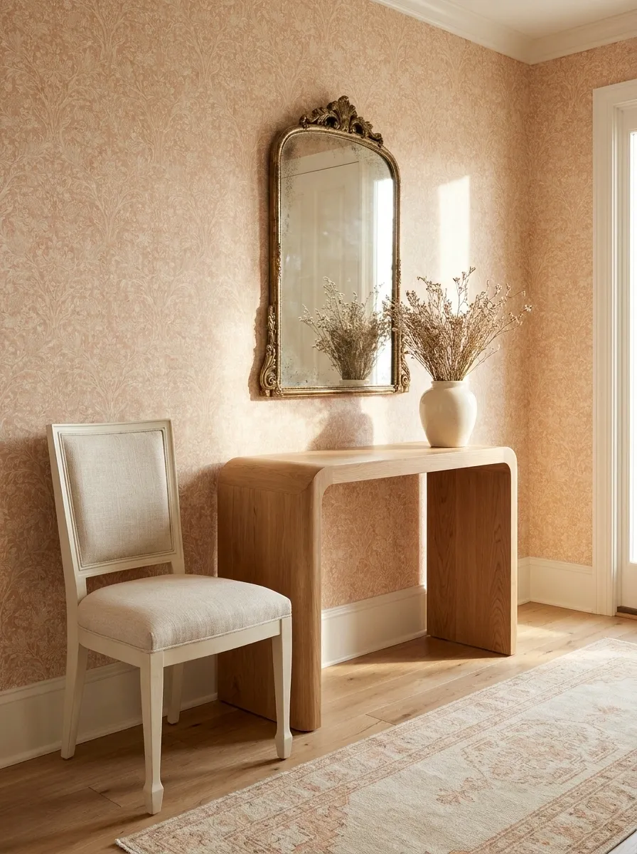
Soft peach wallpaper changes the mood immediately, especially when paired with cream furniture and a curved wooden console. An antique-style mirror adds a little character above the console, while a softly patterned runner keeps the floor connected to the warm wall color.
The palette works because the peach is muted rather than sugary. Cream furniture gives the stronger wall color somewhere to settle, while natural wood introduces a slightly darker note that prevents the room from becoming visually weightless.
This is a softer entryway, but it still has structure. The curved console, round mirror, and botanical pattern create enough shape variation to keep the composition from feeling like one enormous pastel greeting card.
Charcoal Entryway With Large-Scale Leaf Wallpaper
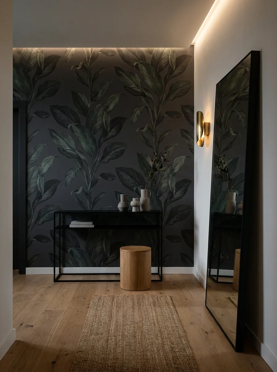
Large leafy shapes on a charcoal background give this entrance a dramatic focal wall without needing much extra decoration. A black console keeps the lower portion grounded, while a warm oak stool and oversized mirror introduce lighter materials into the composition.
The scale of the wallpaper is what makes the room memorable. Small furniture does not mean the pattern needs to be small too. In fact, the oversized leaves give a compact wall more visual confidence.
The rest of the room stays deliberately edited. A narrow runner and warm lighting are enough. Add too many little decorative objects and the large-scale pattern starts looking trapped beneath a pile of accessories.
Classic Blue Stripe Entryway With Painted Furniture
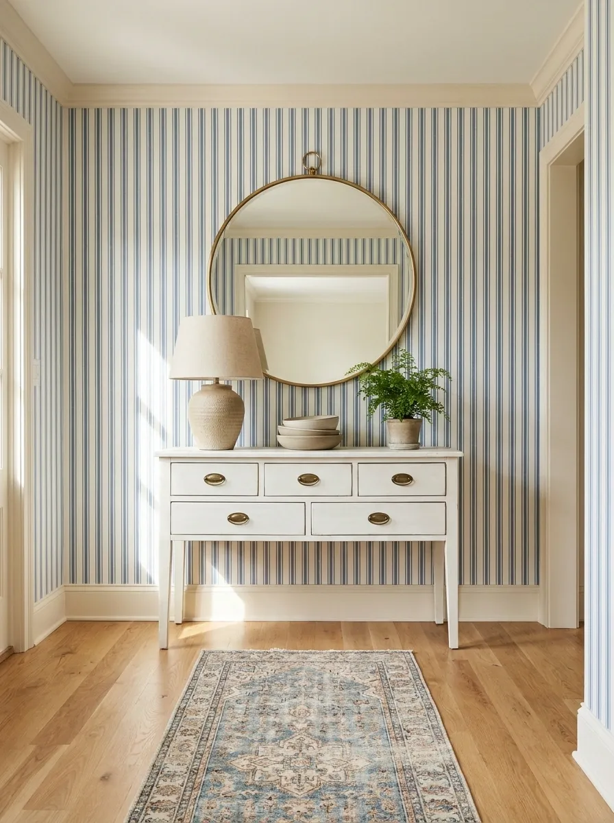
Blue striped wallpaper gives this traditional entryway a strong vertical rhythm, while a white painted console keeps the lower half of the room bright. A classic mirror sits above it, and a ceramic lamp and patterned runner bring in just enough detail to stop the room feeling overly formal.
The stripes are the backbone of the composition. The mirror interrupts that repetition, while the horizontal console creates a useful counterpoint underneath. That mix of directions makes the wall feel designed rather than simply covered.
The blue also works beautifully with warm off-whites instead of stark white. The slight warmth keeps the entryway from looking like it has been trapped inside a catalog page.
Renter-Friendly Entryway With a Wallpapered Accent Wall
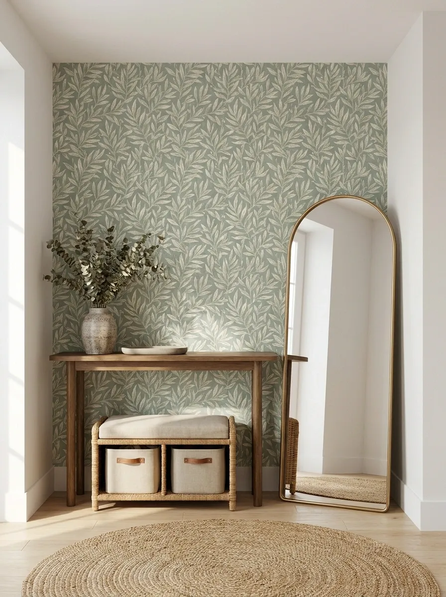
This apartment entryway puts the wallpaper exactly where it can make the biggest difference: the main arrival wall. A leafy pattern sits behind a freestanding console and leaning mirror, while a compact storage bench handles shoes and bags underneath. Nothing is built in or pretending to be permanent.
That makes the composition especially useful for rentals, where the surrounding furniture has to carry more of the visual structure. The wallpaper creates the backdrop, while movable pieces define the actual entry zone.
The best part is that the wall still looks intentional without requiring a full renovation. Sometimes the lease just needs to mind its business.
+
freestanding console
+
leaning mirror
+
movable storage bench
Warm Maximalist Entryway With Layered Pattern
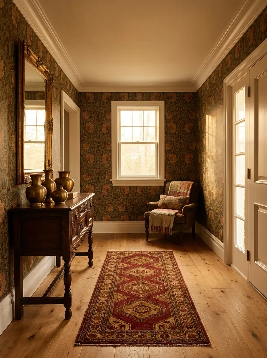
This entryway fully commits to pattern, pairing botanical wallpaper with a patterned runner, antique console, framed mirror, and smaller decorative textiles. It is maximalist, but not chaotic.
The secret is hierarchy. The wallpaper carries the largest visual presence. The runner has its own pattern, but it is lower in the composition and visually broken up by the furniture. The accessories are mostly solid, allowing the patterned surfaces to remain readable.
The colors also share related undertones, which stops several patterns from looking like they were arguing over who gets to be the main character.
Maximalism does not mean putting every interesting object in the same eight square feet.
Minimal Entryway With Textured Neutral Wallpaper
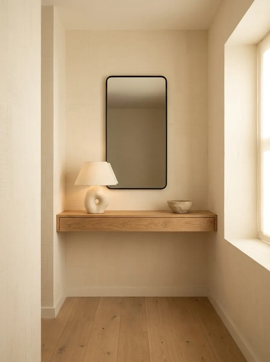
There is no dramatic print here. Instead, warm ivory textured wallpaper gives the walls subtle movement behind a slim oak console, black-framed mirror, and single sculptural lamp. The floor remains open, and the accessories are deliberately sparse.
Texture becomes the feature because there is so little else competing with it. Natural wood brings warmth, the black frame adds a small amount of contrast, and the lamp introduces an interesting shape without covering the console in clutter.
This kind of entryway proves that minimal does not mean blank. It just means every object has to earn its square footage.
Classic Black-and-White Floral Entryway With Warm Wood
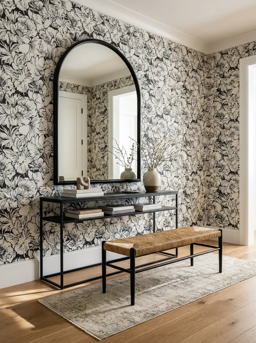
High-contrast floral wallpaper brings drama to this entryway, but warm honey oak keeps the black-and-white palette from becoming too severe. A black-framed mirror echoes the darkest parts of the print, while a woven seat and soft runner introduce texture lower down.
The furniture does not try to match the wallpaper literally. Instead, each piece borrows one quality from it. Black repeats the contrast, wood introduces warmth, and woven materials soften the hard graphic edges.
That is why the room feels layered instead of themed.
Black and white can absolutely work without making the entrance look like it is about to announce a corporate quarterly meeting.
Olive Botanical Entryway With a Rustic Wood Bench
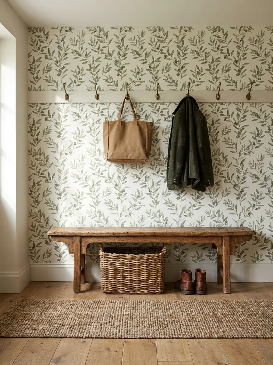
Olive botanical wallpaper gives this entryway a grounded, earthy backdrop, while a rustic wood bench creates a stronger horizontal element than the slimmer console designs elsewhere in the collection. Antique hooks, a woven basket, and a natural runner reinforce the practical country-house direction.
The bench is important because it makes the design feel like a real arrival space instead of a decorative wall arranged solely for photographs. Shoes, bags, and coats have somewhere to land, while the wallpaper still provides the visual character.
The olive green and weathered wood share a natural quality, so the room does not need much extra decoration to feel complete.
Useful and attractive. Wild concept, apparently.
Soft Gray Geometric Entryway With Curved Furniture
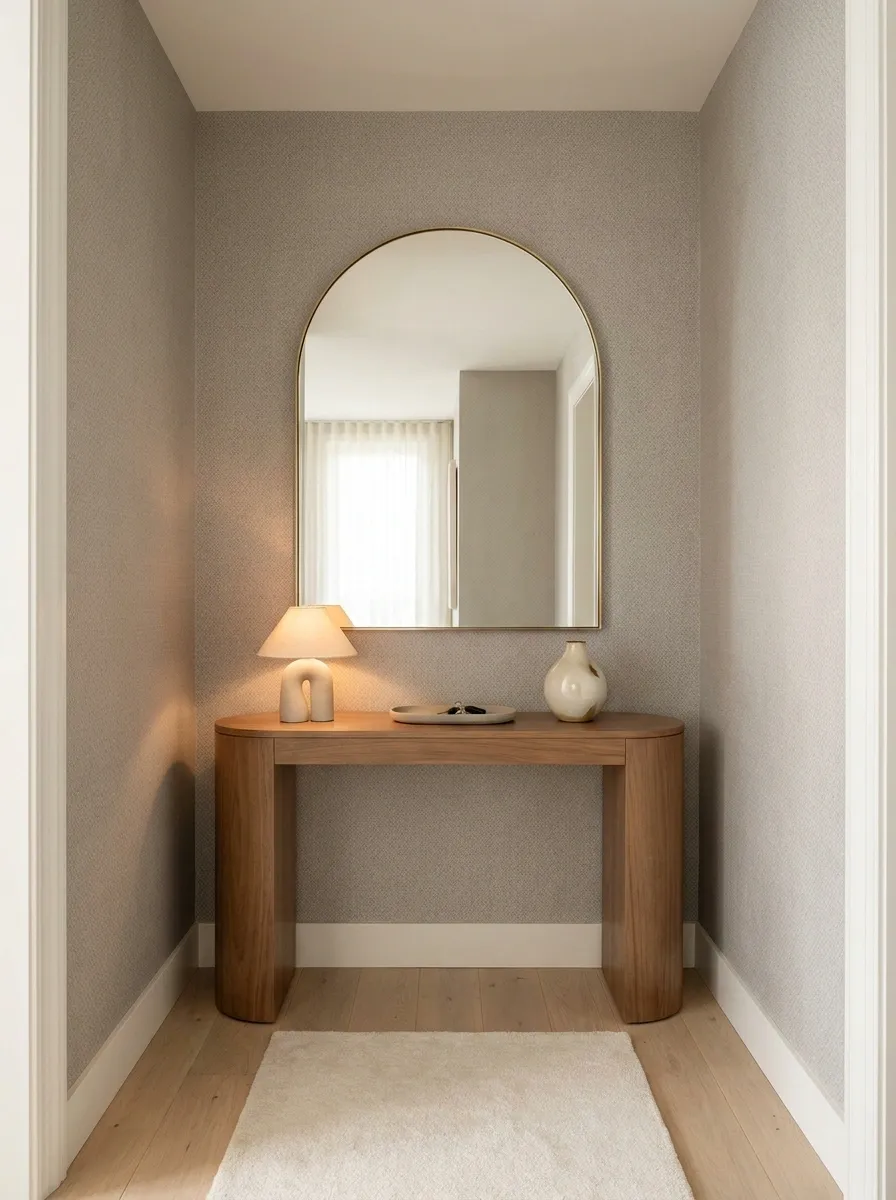
Soft gray geometric wallpaper gives this entryway structure without pushing it into stark modern territory. A curved console, rounded mirror, pale wood flooring, and a small sculptural lamp soften the repeated lines on the wall.
The contrast between geometry and curves is what makes the room work. The wallpaper is orderly, while the furniture breaks up that order with softer silhouettes. Nothing feels overly decorated because the shapes themselves provide enough visual interest.
A warm gray with slightly beige undertones works especially well here. An icy gray would pull the whole composition in a colder direction and make the wood look disconnected.
Basically, the wall brought the ruler. The furniture brought personality.
Warm Beige Entryway With Architectural Patterned Wallpaper
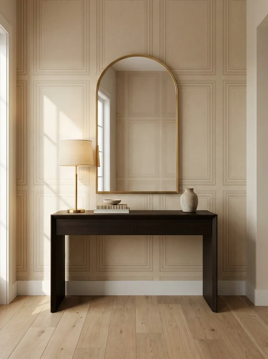
An architectural wallpaper in warm beige gives this entrance the look of subtle paneling without actually adding heavy architectural detail. A dark wood console sits below an arched mirror, while a brass lamp adds a small warm highlight against the neutral wall.
The key here is the relationship between the wallpaper and the mirror. Both have strong shapes, but the wallpaper provides repetition while the mirror provides one larger, singular curve.
That keeps the wall interesting without turning it into a competition between patterns.
The dark console also gives the lower half of the entryway enough weight to balance the lighter walls. Beige does not have to mean everything disappears into the same color.
Dramatic Jewel-Tone Entryway With Layered Lighting
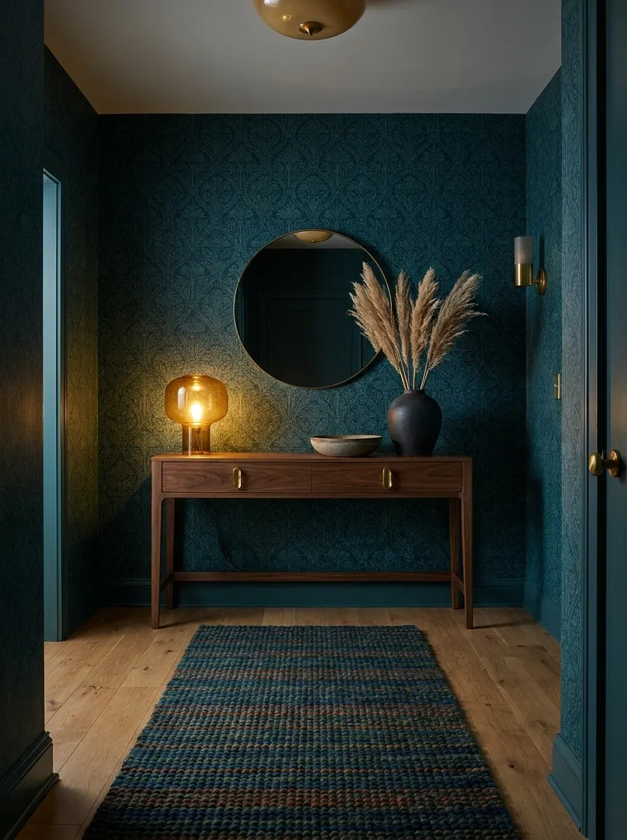
Deep teal wallpaper gives this entrance a saturated, dramatic backdrop, with walnut furniture and warm brass details bringing in enough warmth to stop the color from becoming overwhelming. An amber-glass lamp adds another layer of warmth, while a patterned runner carries the richer palette toward the floor.
Lighting is especially important with a deep wall. One overhead fixture would leave the lower part of the composition feeling disconnected, so the room uses multiple warm sources at different heights.
The result feels atmospheric but still readable. The wallpaper remains visible, the furniture has definition, and the metallic details catch the light without looking like someone emptied the brass aisle onto the console.
Apartment Entryway With Wallpapered Accent Wall and Clean Storage
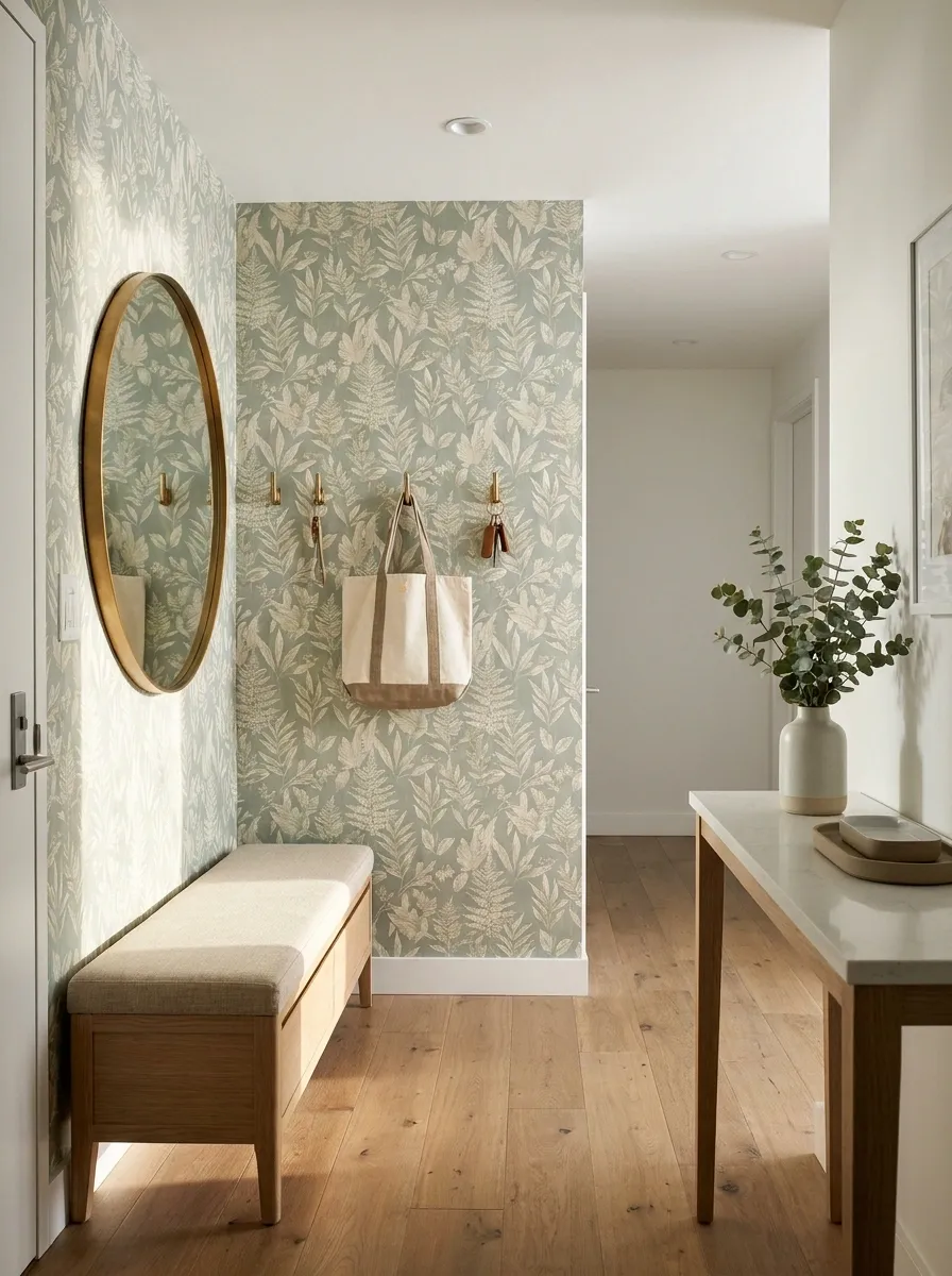
This apartment entryway keeps the wallpaper focused on one main wall, where it frames the actual arrival zone. A slim storage bench sits beneath a mirror, hooks provide a practical landing spot for daily essentials, and a narrow console fills the remaining wall without choking the walkway.
The composition works because function and decoration occupy clearly defined areas. The wallpaper marks the visual destination when entering the apartment, while the bench and hooks handle the less glamorous but very real business of keys, shoes, and bags.
That separation keeps the space tidy without pretending people walk through their front door carrying only a beautifully styled tote.
Elegant Neutral Entryway With Textured Grasscloth Wallpaper
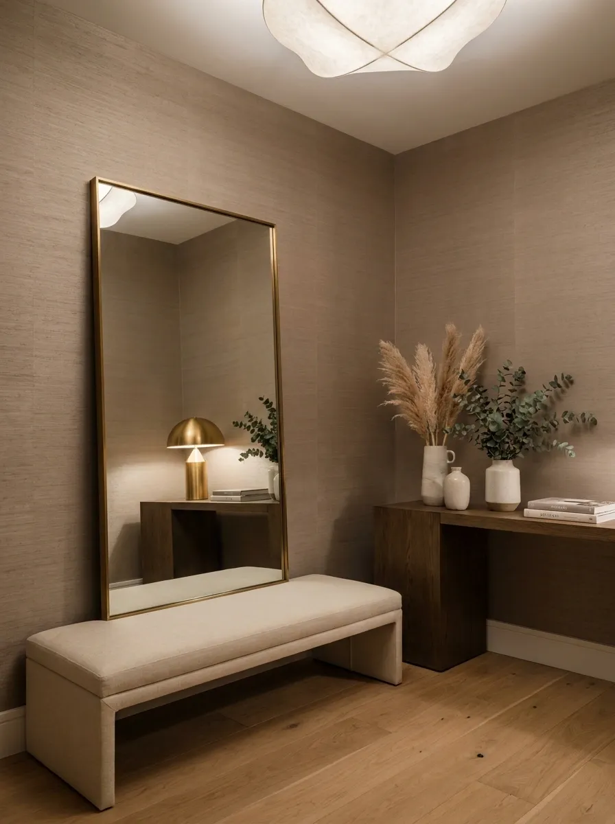
Warm taupe grasscloth-style wallpaper creates a quiet, sophisticated backdrop for dark oak furniture, a linen-upholstered bench, oversized mirror, and soft lighting. There is very little color contrast here, so the richness comes from changes in texture and scale.
The dark oak anchors the room, linen softens it, and the textured wall gives the neutral palette enough variation to stay interesting. The oversized mirror adds another large surface without introducing a competing pattern.
This design is proof that a neutral entryway does not need a giant list of beige accessories to feel finished. Texture can do the heavy lifting while the room keeps its visual volume under control.
Basically, beige got a promotion and started taking its job seriously.
Making the Wallpaper Work With the Actual Entryway
Let the Architecture Have a Say
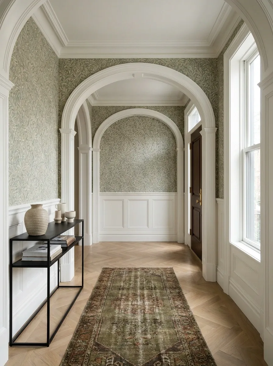
Doors, arches, stairs, trim, ceiling height, and awkward little wall returns all matter more than a wallpaper sample viewed by itself. A pattern that looks calm across a flat showroom panel can become surprisingly busy once it wraps around doorways or disappears behind furniture.
The strongest spaces treat those architectural quirks as part of the composition instead of trying to pretend they do not exist.
Match the Furniture’s Visual Weight
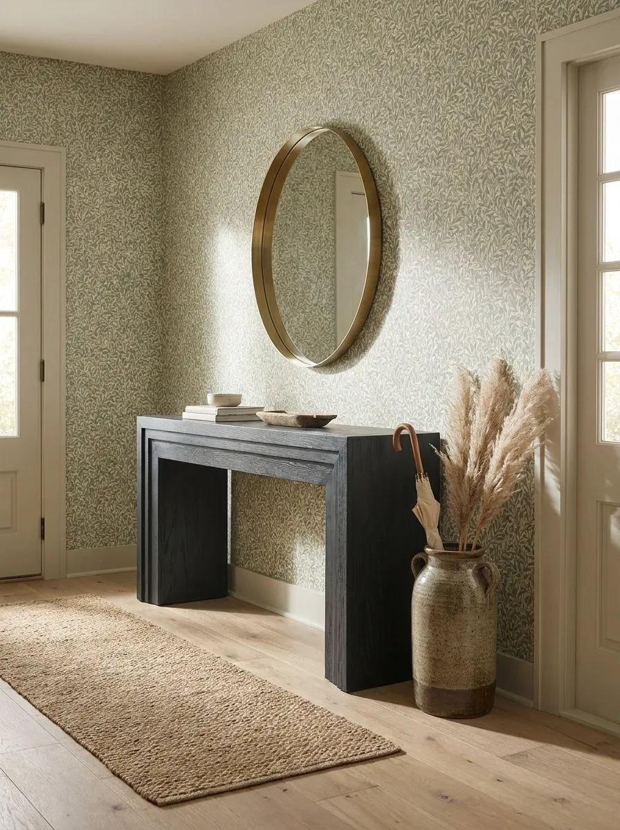
A tiny console can disappear against a large-scale floral wallpaper. A bulky dark cabinet can overwhelm a delicate pattern. The furniture and wallpaper do not need to match, but they do need to make sense together.
Think in terms of visual weight rather than matching colors.
Give the Pattern Somewhere to Rest
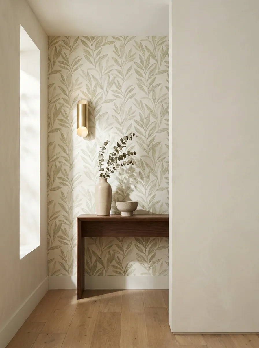
Wallpaper does not need competition from every other surface. Quiet flooring, solid furniture, simple lighting, or a large patch of open wall can give a busy pattern room to breathe.
Because apparently not every square foot needs to be doing a TED Talk.
Think About How the Entryway Looks at Night
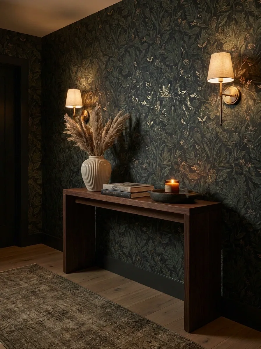
A wallpaper that looks rich in daylight can become much flatter under a single ceiling fixture. Warm lamps, sconces, or strategically placed lighting can change the depth and contrast of the entire wall.
This matters most with dark colors, dense botanical prints, and wallpapers with metallic or textured details.
Renter-Friendly Entryway With a Wallpapered Accent Wall
This apartment entryway puts the wallpaper exactly where it can make the biggest difference: the main arrival wall. A leafy pattern sits behind a freestanding console and leaning mirror, while a compact storage bench handles shoes and bags underneath. Nothing is built in or pretending to be permanent.
That makes the composition especially useful for rentals, where the surrounding furniture has to carry more of the visual structure. The wallpaper creates the backdrop, while movable pieces define the actual entry zone.
The best part is that the wall still looks intentional without requiring a full renovation. Sometimes the lease just needs to mind its business.
+
freestanding console
+
leaning mirror
+
movable storage bench
Warm Maximalist Entryway With Layered Pattern
This entryway fully commits to pattern, pairing botanical wallpaper with a patterned runner, antique console, framed mirror, and smaller decorative textiles. It is maximalist, but not chaotic.
The secret is hierarchy. The wallpaper carries the largest visual presence. The runner has its own pattern, but it is lower in the composition and visually broken up by the furniture. The accessories are mostly solid, allowing the patterned surfaces to remain readable.
The colors also share related undertones, which stops several patterns from looking like they were arguing over who gets to be the main character.
Maximalism does not mean putting every interesting object in the same eight square feet.
Minimal Entryway With Textured Neutral Wallpaper
There is no dramatic print here. Instead, warm ivory textured wallpaper gives the walls subtle movement behind a slim oak console, black-framed mirror, and single sculptural lamp. The floor remains open, and the accessories are deliberately sparse.
Texture becomes the feature because there is so little else competing with it. Natural wood brings warmth, the black frame adds a small amount of contrast, and the lamp introduces an interesting shape without covering the console in clutter.
This kind of entryway proves that minimal does not mean blank. It just means every object has to earn its square footage.
Classic Black-and-White Floral Entryway With Warm Wood
High-contrast floral wallpaper brings drama to this entryway, but warm honey oak keeps the black-and-white palette from becoming too severe. A black-framed mirror echoes the darkest parts of the print, while a woven seat and soft runner introduce texture lower down.
The furniture does not try to match the wallpaper literally. Instead, each piece borrows one quality from it. Black repeats the contrast, wood introduces warmth, and woven materials soften the hard graphic edges.
That is why the room feels layered instead of themed.
Black and white can absolutely work without making the entrance look like it is about to announce a corporate quarterly meeting.
Olive Botanical Entryway With a Rustic Wood Bench
Olive botanical wallpaper gives this entryway a grounded, earthy backdrop, while a rustic wood bench creates a stronger horizontal element than the slimmer console designs elsewhere in the collection. Antique hooks, a woven basket, and a natural runner reinforce the practical country-house direction.
The bench is important because it makes the design feel like a real arrival space instead of a decorative wall arranged solely for photographs. Shoes, bags, and coats have somewhere to land, while the wallpaper still provides the visual character.
The olive green and weathered wood share a natural quality, so the room does not need much extra decoration to feel complete.
Useful and attractive. Wild concept, apparently.
Soft Gray Geometric Entryway With Curved Furniture
Soft gray geometric wallpaper gives this entryway structure without pushing it into stark modern territory. A curved console, rounded mirror, pale wood flooring, and a small sculptural lamp soften the repeated lines on the wall.
The contrast between geometry and curves is what makes the room work. The wallpaper is orderly, while the furniture breaks up that order with softer silhouettes. Nothing feels overly decorated because the shapes themselves provide enough visual interest.
A warm gray with slightly beige undertones works especially well here. An icy gray would pull the whole composition in a colder direction and make the wood look disconnected.
Basically, the wall brought the ruler. The furniture brought personality.
Warm Beige Entryway With Architectural Patterned Wallpaper
An architectural wallpaper in warm beige gives this entrance the look of subtle paneling without actually adding heavy architectural detail. A dark wood console sits below an arched mirror, while a brass lamp adds a small warm highlight against the neutral wall.
The key here is the relationship between the wallpaper and the mirror. Both have strong shapes, but the wallpaper provides repetition while the mirror provides one larger, singular curve.
That keeps the wall interesting without turning it into a competition between patterns.
The dark console also gives the lower half of the entryway enough weight to balance the lighter walls. Beige does not have to mean everything disappears into the same color.
Dramatic Jewel-Tone Entryway With Layered Lighting
Deep teal wallpaper gives this entrance a saturated, dramatic backdrop, with walnut furniture and warm brass details bringing in enough warmth to stop the color from becoming overwhelming. An amber-glass lamp adds another layer of warmth, while a patterned runner carries the richer palette toward the floor.
Lighting is especially important with a deep wall. One overhead fixture would leave the lower part of the composition feeling disconnected, so the room uses multiple warm sources at different heights.
The result feels atmospheric but still readable. The wallpaper remains visible, the furniture has definition, and the metallic details catch the light without looking like someone emptied the brass aisle onto the console.
Apartment Entryway With Wallpapered Accent Wall and Clean Storage
This apartment entryway keeps the wallpaper focused on one main wall, where it frames the actual arrival zone. A slim storage bench sits beneath a mirror, hooks provide a practical landing spot for daily essentials, and a narrow console fills the remaining wall without choking the walkway.
The composition works because function and decoration occupy clearly defined areas. The wallpaper marks the visual destination when entering the apartment, while the bench and hooks handle the less glamorous but very real business of keys, shoes, and bags.
That separation keeps the space tidy without pretending people walk through their front door carrying only a beautifully styled tote.
Elegant Neutral Entryway With Textured Grasscloth Wallpaper
Warm taupe grasscloth-style wallpaper creates a quiet, sophisticated backdrop for dark oak furniture, a linen-upholstered bench, oversized mirror, and soft lighting. There is very little color contrast here, so the richness comes from changes in texture and scale.
The dark oak anchors the room, linen softens it, and the textured wall gives the neutral palette enough variation to stay interesting. The oversized mirror adds another large surface without introducing a competing pattern.
This design is proof that a neutral entryway does not need a giant list of beige accessories to feel finished. Texture can do the heavy lifting while the room keeps its visual volume under control.
Basically, beige got a promotion and started taking its job seriously.
A Few More Entryway Wallpaper Directions Worth Saving
Wallpaper becomes much easier to choose once the entire room has a direction. A floral print can feel traditional, contemporary, romantic, dramatic, earthy, or downright chaotic depending on what surrounds it.
The same applies to stripes, geometric patterns, textured papers, and large botanical prints. The wallpaper itself is only one part of the finished look.
When choosing between designs, pay attention to the whole scene. Does the furniture have enough visual weight? Does the flooring calm the pattern down? Does the lighting flatter the wall? Is there enough open space around the main feature? Does the entry still work when real-life bags, coats, shoes, and keys inevitably arrive?
That last question tends to ruin a lot of pretty Pinterest fantasies.
The strongest entryways do not merely photograph well. They make sense as rooms.
Save the designs that actually resemble the kind of entrance you want to walk into every day. A wallpaper sample can tell you what a pattern looks like. A complete room tells you whether you actually want to live with it.