
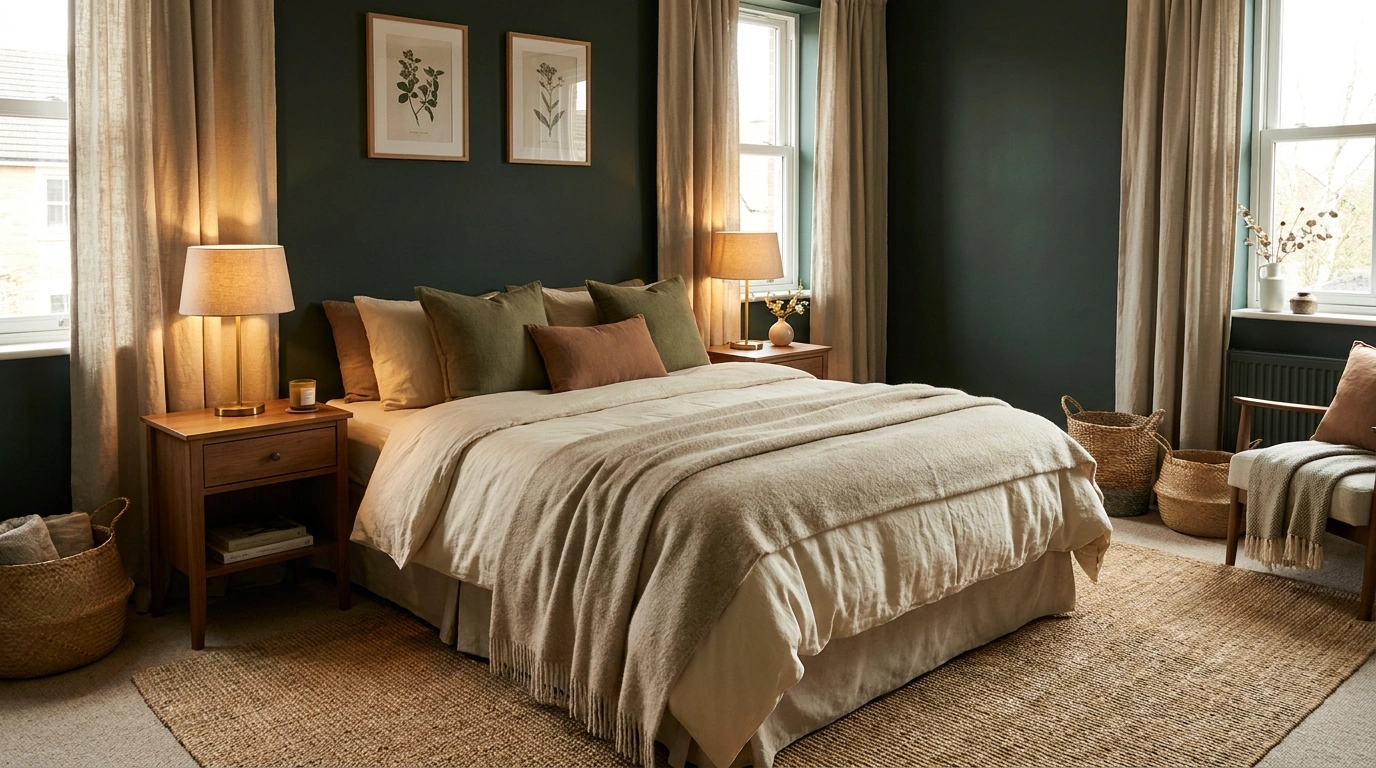
Dark green has a talent for making a bedroom look expensive right up until someone adds too much of it.
Then the room goes from rich and cozy to “forest-themed Airbnb that discovered velvet.” The color itself isn’t the problem. It’s the pileup of dark furniture, heavy curtains, matching accessories and random shades of green fighting for attention.
A deep green bedroom works because the color has weight. It creates instant depth and gives even basic furniture a stronger backdrop. But that also means the rest of the room has to know when to shut up.
Cream bedding keeps the bed crisp. Warm wood keeps the palette from feeling cold. Brass lighting catches the eye against a dark wall. Pale rugs and curtains keep the room from looking like it gets approximately four minutes of daylight per year.
Before the Green Goes on the Walls, Read This
Dark green needs something lighter around it
Dark green already has plenty of visual weight. Pair it with equally dark bedding, curtains, flooring and furniture, and the room starts looking like it pays rent in candlelight.
Cream, warm white and light natural shades give the green somewhere to stand out.
The furniture decides how expensive the green look
Paint gets attention, but furniture controls the composition.
Walnut, oak, linen, brushed brass and soft upholstery make deep green feel layered. Too much black makes it severe. Too much matching green makes the room look like a showroom display that lost the plot.
DARK GREEN BEDROOM REALITY CHECK
Dark Green Bedroom Ideas
Put Crisp Cream Bedding Against Forest Green Walls
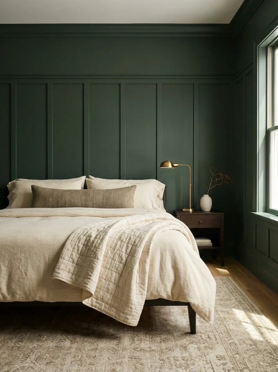
The fastest way to make forest green look polished is to give it something clean to contrast with.
White can feel too sharp. Cream feels warmer and makes the green look deeper.
Use layered bedding rather than one flat duvet. Try a cream quilt, ivory sheets and one textured lumbar pillow. That’s enough.
Keep the bedding palette tight:
- Warm white
- Cream
- Soft beige
- One muted accent
Skip: five pillows screaming for separate jobs. The bed isn’t a hotel lobby.
Cream or ivory duvet
Quilted or linen layer
One muted earthy shade
Fluffed, not overstuffed
The result feels relaxed, not staged.
Bring in Walnut Wood Before the Room Gets Too Cold
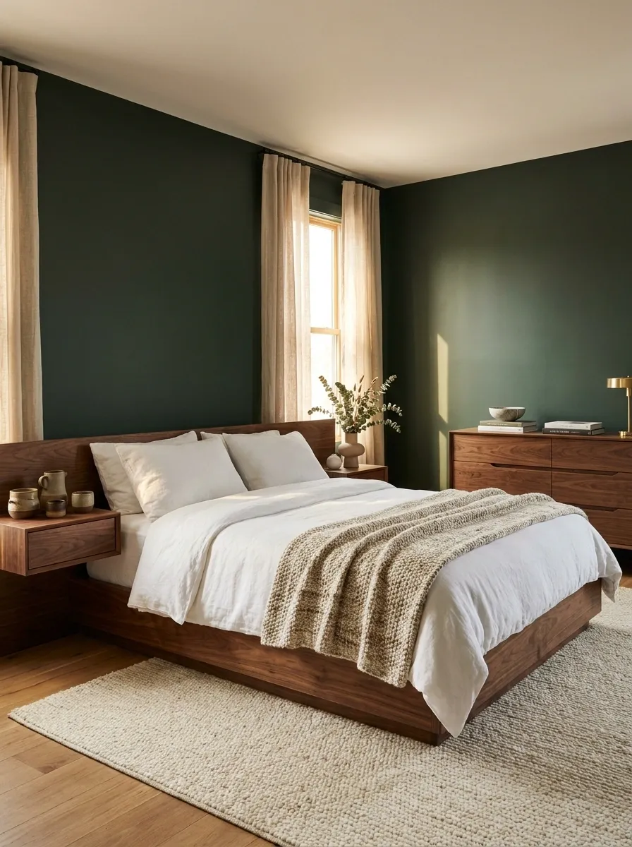
Green and walnut are basically doing each other’s jobs.
The green provides depth. Walnut adds warmth and a visible grain, which keeps a dark bedroom from feeling flat and overly painted.
A walnut bed frame, nightstand or long dresser is enough to establish the combination.
Don’t add walnut to every possible surface. That’s how a bedroom turns into a furniture catalogue.
The wood doesn’t need to match every other piece. A little variation keeps the room looking lived in.
Add Muted Blush Without Turning the Bedroom Pink
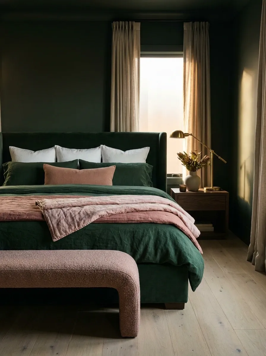
Blush works surprisingly well with dark green because it softens the palette without fighting the wall color.
The trick is to keep it dusty and muted. Think faded rose, clay-pink or warm blush rather than bright candy pink.
Use it in one obvious place, such as a quilt, cushion or small upholstered bench.
Use blush like seasoning. A little changes the whole dish. Dumping in the bag ruins it.
Throw, lumbar pillow or small bench
Dusty rose, clay pink, muted blush
Bright bubblegum pink
With deep green behind it, a muted pink accent feels collected rather than sugary.
Use Brass Lighting to Break Up the Green
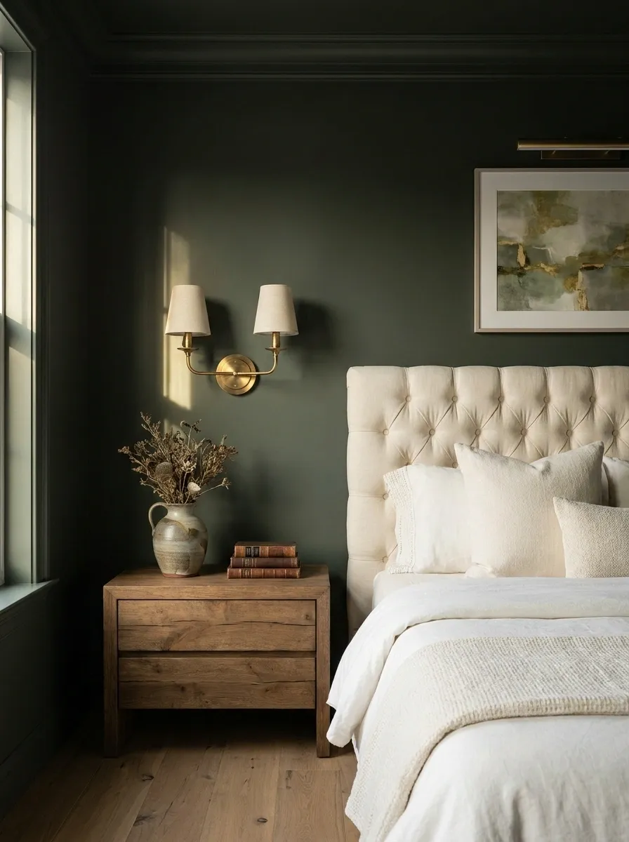
Brass is especially useful when the green wall feels visually massive.
A brass wall sconce, pendant or table lamp creates a small warm focal point that catches light against the darker backdrop. Suddenly the wall has depth instead of just being a giant rectangle of green.
Go for aged or brushed brass rather than mirror-shiny gold. The latter can make a calm bedroom look like it has ambitions of becoming a casino.
One well-placed brass fixture does more than a pile of random metallic accessories ever will.
Let a Light Upholstered Headboard Soften Deep Green
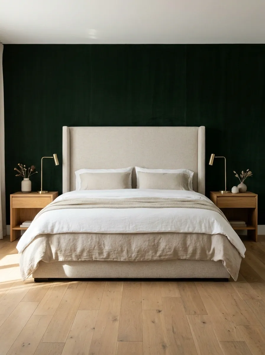
A dark green wall looks instantly softer when the bed has a pale upholstered headboard in front of it.
Choose oatmeal, ivory or warm beige. The fabric creates a visual break between the wall and bedding, so the green doesn’t feel like it’s swallowing the whole bed.
The contrast is especially good with simple furniture. Dark wall, light headboard, warm wood nightstands is enough composition without adding seven decorative pillows and a chair nobody sits in.
Deep forest green
Oatmeal or ivory upholstery
Warm natural wood
The pale headboard keeps the bed visually important without competing with the wall.
Layer Olive and Forest Green Instead of Matching Everything
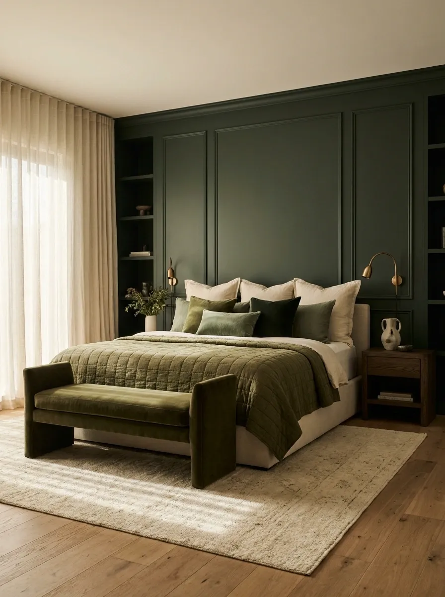
Same-color rooms don’t need everything in the exact same shade.
Use a deep forest green on the wall, then bring in softer olive through the quilt, cushions or a bench. The slight shift in tone gives the room depth without introducing another major color.
Try this combination:
- Forest green wall
- Olive quilt
- Cream sheets
- Natural wood furniture
The shades relate without looking like they were ordered as a matching set.
Keep the Curtains Cream, Because Matching Green Curtains Is Doing Too Much
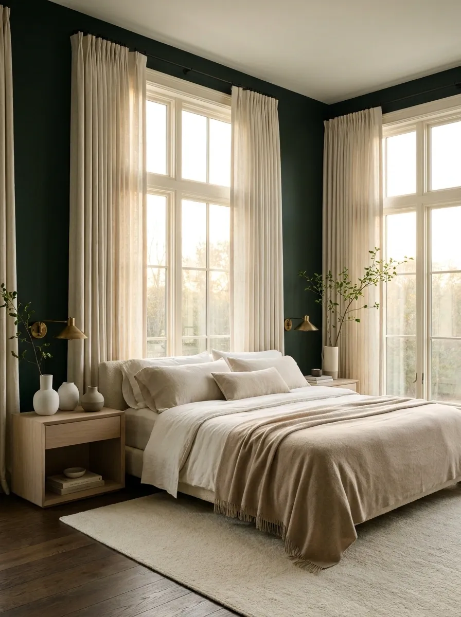
Dark green curtains on dark green walls can look dramatic, but they also remove one of the easiest sources of contrast.
Cream curtains are the smarter move. They pull daylight around the window and keep the wall color from taking over the entire room.
A heavier linen-look fabric works especially well because it has enough texture to feel substantial without making the window look gloomy.
⚠️ Quick rule:
If the walls are doing the drama, let the curtains do the breathing.
Cream, ivory or warm beige
Soft texture and gentle drape
Head-to-toe matching green
The lighter window treatment keeps the room moody without making it feel closed in.
Mix Charcoal With Green for a Proper Moody Bedroom
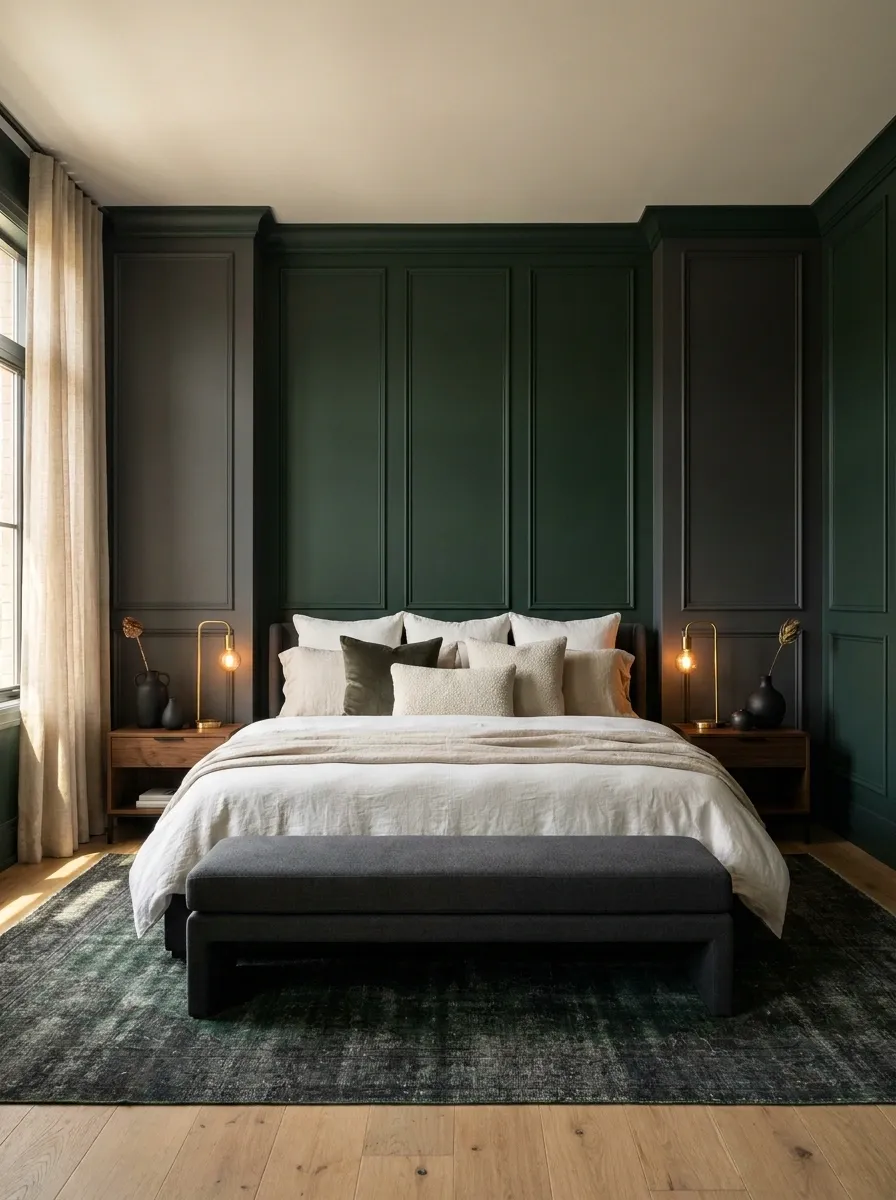
Green doesn’t need to be paired with endless cream to look sophisticated.
For a darker bedroom, add charcoal through the rug, upholstered bench or small bedding accents while keeping the main textiles lighter. The result feels moody and modern rather than overly rustic.
The important part is distribution. Let green occupy the wall, use charcoal sparingly, then bring in warm lighting to stop the palette from becoming visually flat.
This combination works particularly well with simple silhouettes and warm bedside lamps.
Use One Green Wall in a Small Bedroom
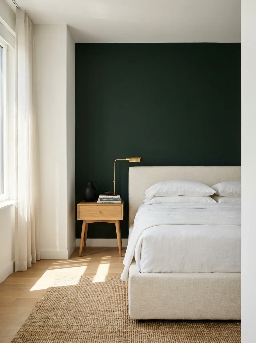
Small bedrooms don’t automatically need white walls everywhere.
One dark green wall can actually give a compact room a stronger focal point, especially behind the bed. Keep the remaining walls light, use furniture with visible floor space underneath, and avoid filling every corner.
For a small room, keep the visual weight here:
- Green behind the bed
- Pale bedding
- Light floor or rug
- Slim nightstands
- Minimal window treatment
A compact bedroom doesn’t need ten competing focal points. Give the green wall one job and let it do it well.
Add Linen So the Green Feels Soft, Not Formal
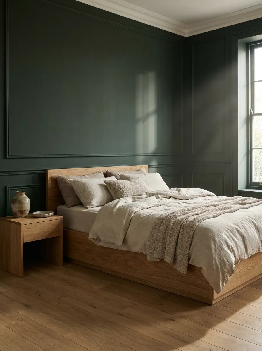
Dark green walls can look polished without becoming stiff.
Linen bedding is the trick because its slightly rumpled texture breaks up the solid block of color. Choose oatmeal, stone or soft cream rather than bright white, then keep the rest of the bed fairly simple.
The contrast between rougher linen and a deep painted wall makes the room feel relaxed. No need for a mountain of throws.
Soft, slightly rumpled bedding
Visible grain and warm tones
Deep painted backdrop
This combination makes a dramatic wall feel comfortable enough for everyday life.
Put Black Frames Against Green Walls for Clean Contrast
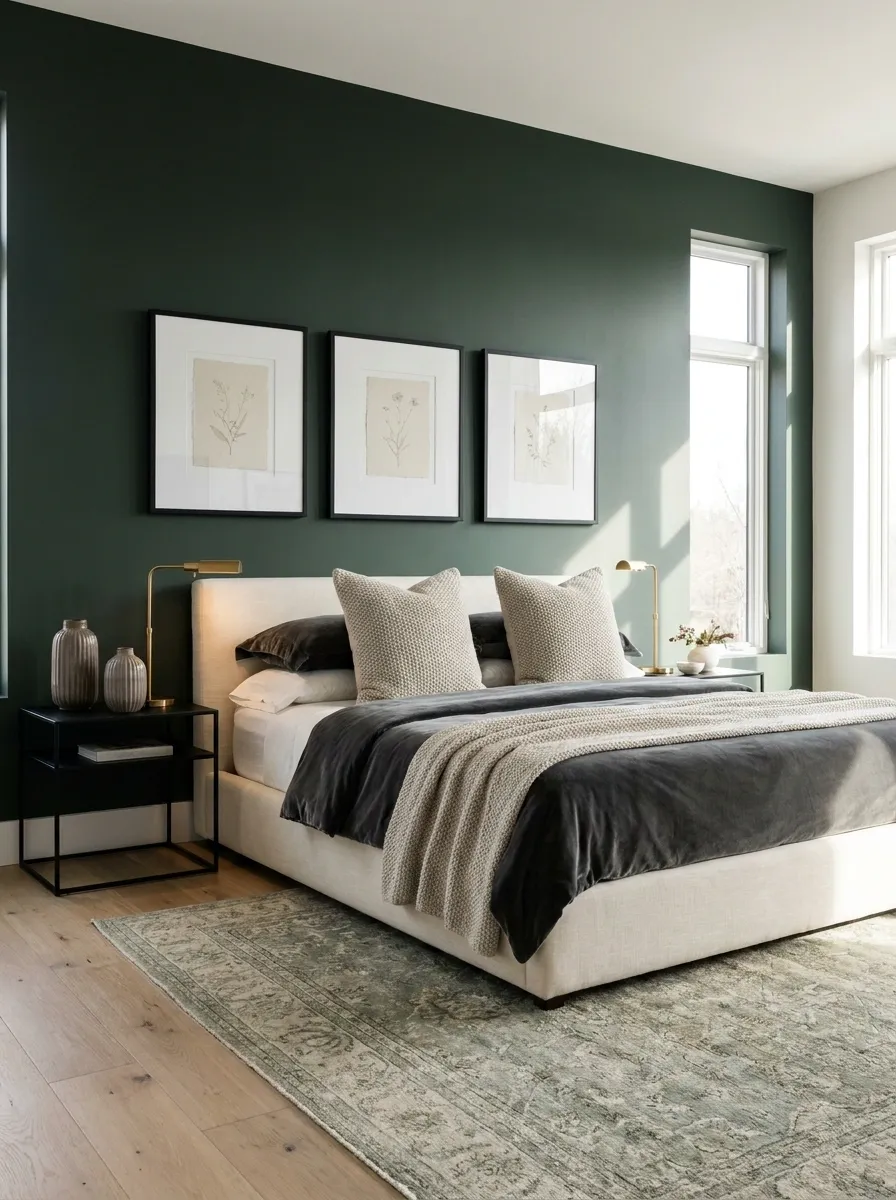
Black artwork frames look sharp against deep green, especially when the artwork itself stays light and simple.
The mistake is making the gallery wall enormous. A few properly spaced frames create a cleaner focal point than a packed collection fighting with the bed.
Keep the frame treatment consistent, then let the artwork vary.
Matte or soft black
Pale, neutral or earthy
Leave visible green around each piece
That last part matters. The green should still read as part of the design, not disappear behind twenty tiny frames.
Slip Terracotta Into the Bedding for Warmth
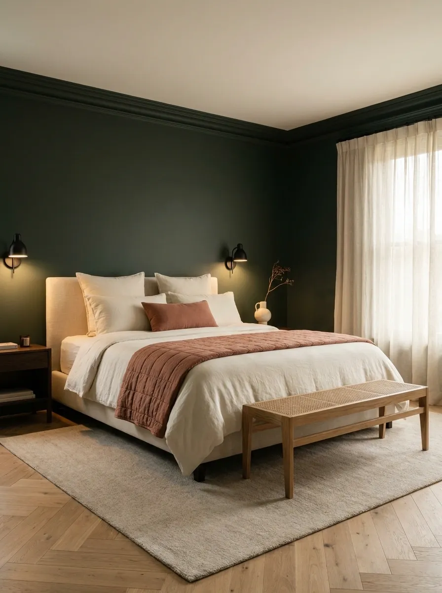
Terracotta gives dark green a warmer, earthier direction.
Use it through a quilt, throw, cushion or small bench. Keep the shade dusty and clay-like so it works with the richness of the wall instead of looking like a random orange object wandered in.
A cream base keeps the whole combination from becoming too intense.
Deep wall color
Warm textile accent
Light base for balance
The result feels warm and grounded instead of overly botanical.
Use White Trim to Make Dark Green Look Sharper
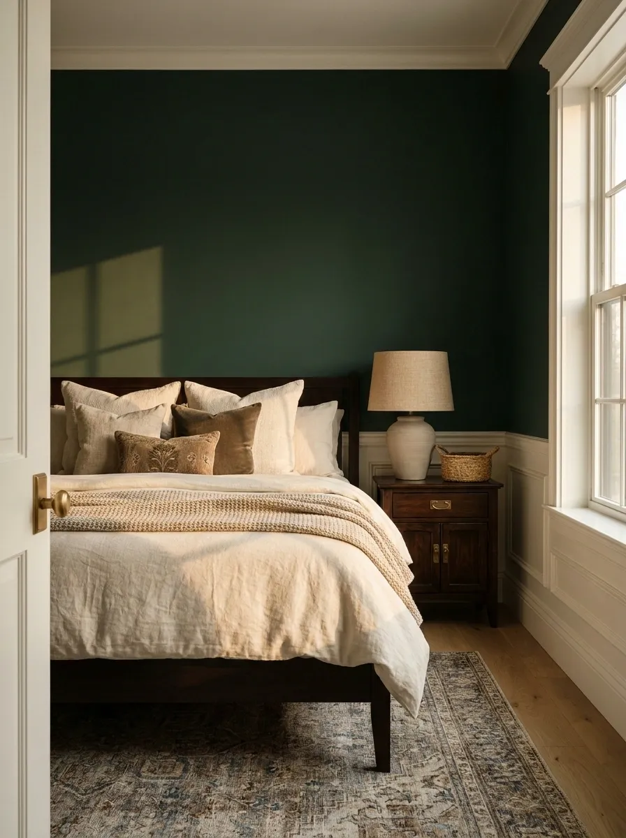
Dark green looks particularly crisp when the doors, baseboards or window trim stay light.
It’s a small architectural detail, but it creates a clean outline around the deeper color. This is especially useful when the room has traditional molding or a prominent window.
Don’t paint every architectural detail green just because the paint can is already open. Some contrast is doing the heavy lifting.
Best match: warm white rather than icy blue-white.
The green looks deeper because the trim gives the eye a clean boundary.
Break Up Solid Bedding With One Pattern
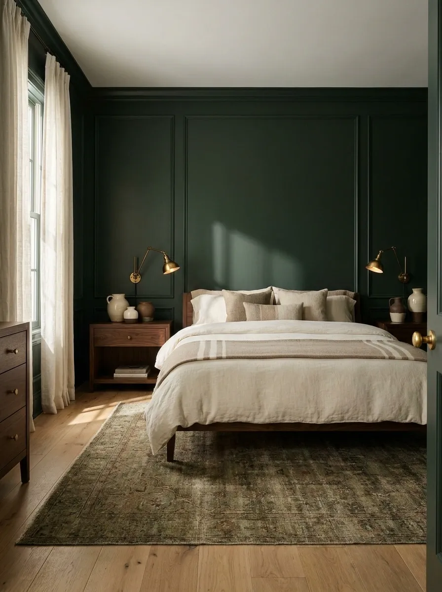
A completely solid bed can make a dark green bedroom feel visually flat.
One patterned textile fixes that without turning the bed into a fabric convention.
Choose a restrained stripe, small check, botanical motif or vintage-inspired print. Keep the background cream or beige so it connects back to the lighter elements in the room.
One pattern is enough. Two can work. Four is where things start filing for separation.
A small pattern gives the bed enough visual interest while the green wall remains the main event.
Pair Deep Green With Light Oak for a Fresher Look
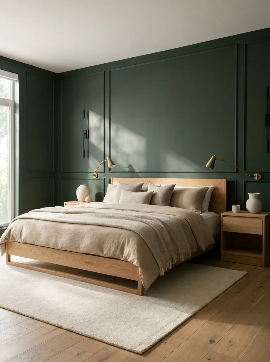
Light oak changes the whole personality of a dark green bedroom.
Instead of the heavy, library-like feeling that can happen with dark wood, pale oak gives the room a fresher and more modern edge. Use it on the bed frame, nightstands or dresser, then keep the textiles warm and quiet.
The contrast is strongest when the wood grain stays visible.
| Wood | Effect With Green | Best Use |
|---|---|---|
| Light oak | Fresh and airy | Modern bedrooms |
| Walnut | Warm and rich | Moody bedrooms |
| Pale ash | Light and clean | Smaller rooms |
Choose the wood based on the mood of the room, not because the internet declared one finish “timeless” this Tuesday.
Layer Warm Lamps Instead of Flooding the Room With Ceiling Light
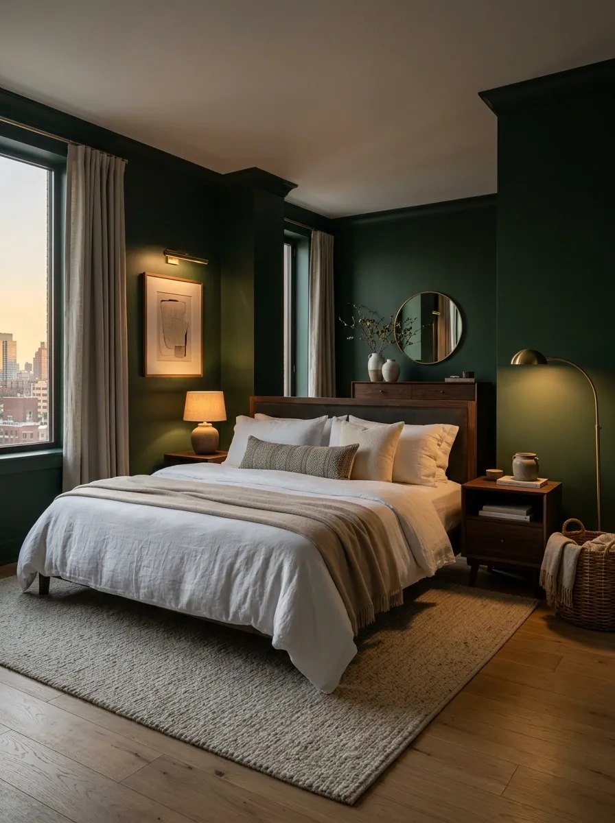
Dark green looks completely different under harsh white ceiling light. Not in a good way.
Use warm bedside lamps, a small floor lamp or a wall sconce to create pools of light around the room. The darker wall then becomes a rich backdrop instead of a flat slab of color.
The goal is layered light, not maximum brightness. A bedroom doesn’t need to resemble a supermarket aisle.
Small warm-glow lamp
Floor lamp for softer fill
Sconce near the bed or artwork
Warm light brings out the softer side of the green and makes wood finishes look richer too.
Paint the Ceiling Green Instead of Adding Green Everywhere
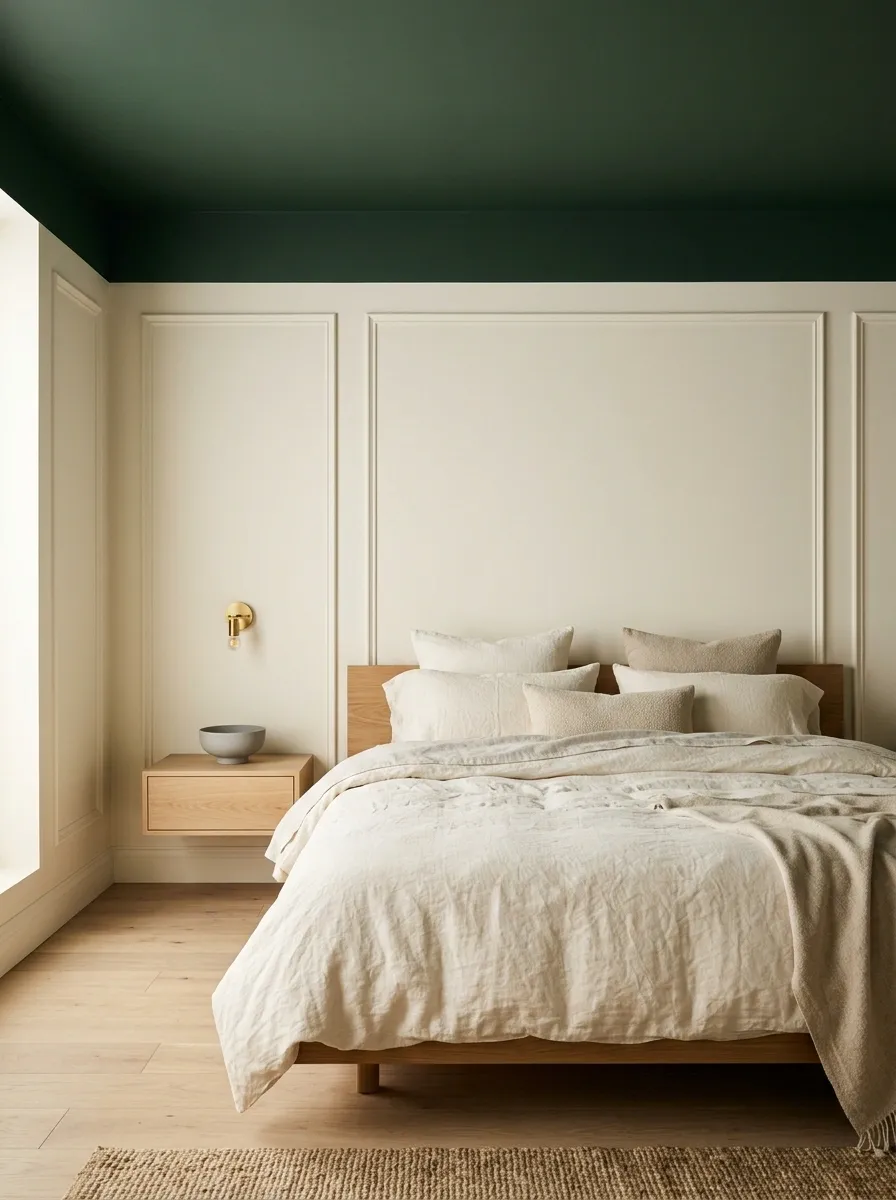
The ceiling is usually ignored, which is exactly why this move works.
Keep the walls lighter and carry the dark green onto the ceiling above the bed. It creates a cozy, wrapped-in color effect without making every wall compete for attention.
This works best with simple bedding and a fairly uncluttered room.
The move:
Keep the walls light. Put the drama overhead. Let the ceiling become the unexpected feature.
Warm white or soft cream
Deep green
Pale, textured textiles
It’s a much more interesting use of green than adding another green vase because apparently the room didn’t have enough green already.
Use Beige to Keep the Bedroom Grounded
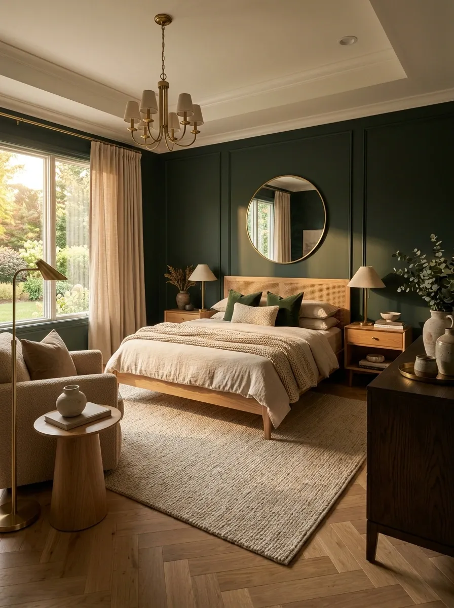
Beige works beautifully with dark green because it softens the overall contrast without washing the green out.
Use beige through a rug, upholstered chair, bedding or curtains. Keep the undertone warm, especially when the bedroom already has wood furniture.
The strongest version doesn’t use beige everywhere. Let beige support the green rather than compete with it.
The palette feels earthy without forcing the bedroom into farmhouse territory.
Let a Large Light Rug Stop the Room From Feeling Heavy
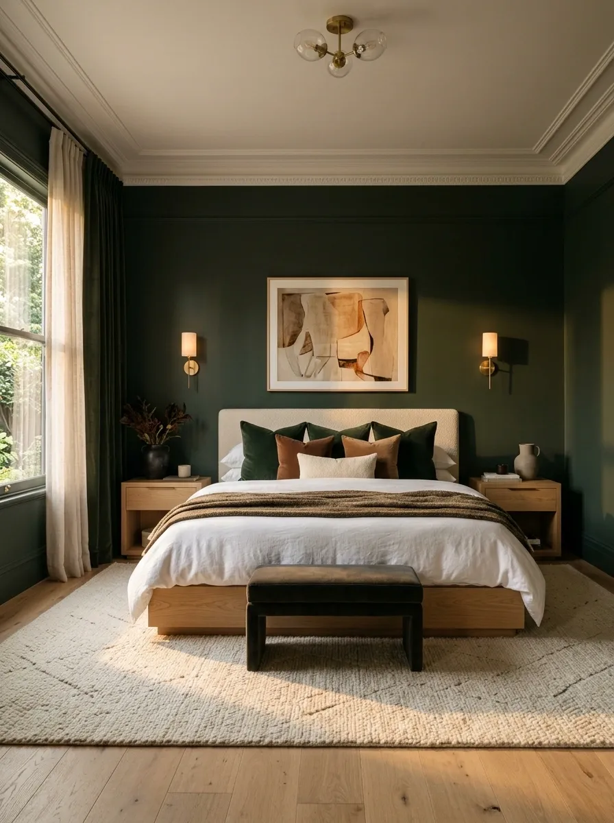
A pale rug under the bed creates a visual reset when the walls and furniture are already carrying dark colors.
Choose cream, oatmeal, ivory or a soft beige. A textured rug works better than a completely flat one because it adds another layer without introducing a new color.
Put the lightest large surface near the floor. It gives the dark green something to visually bounce off.
Cream, ivory or oatmeal
Woven, plush or gently patterned
Large enough to visually anchor the bed
A light rug can make the entire room feel less dense without changing the paint, furniture or bedding.
Use a Green Headboard Instead of Green Walls
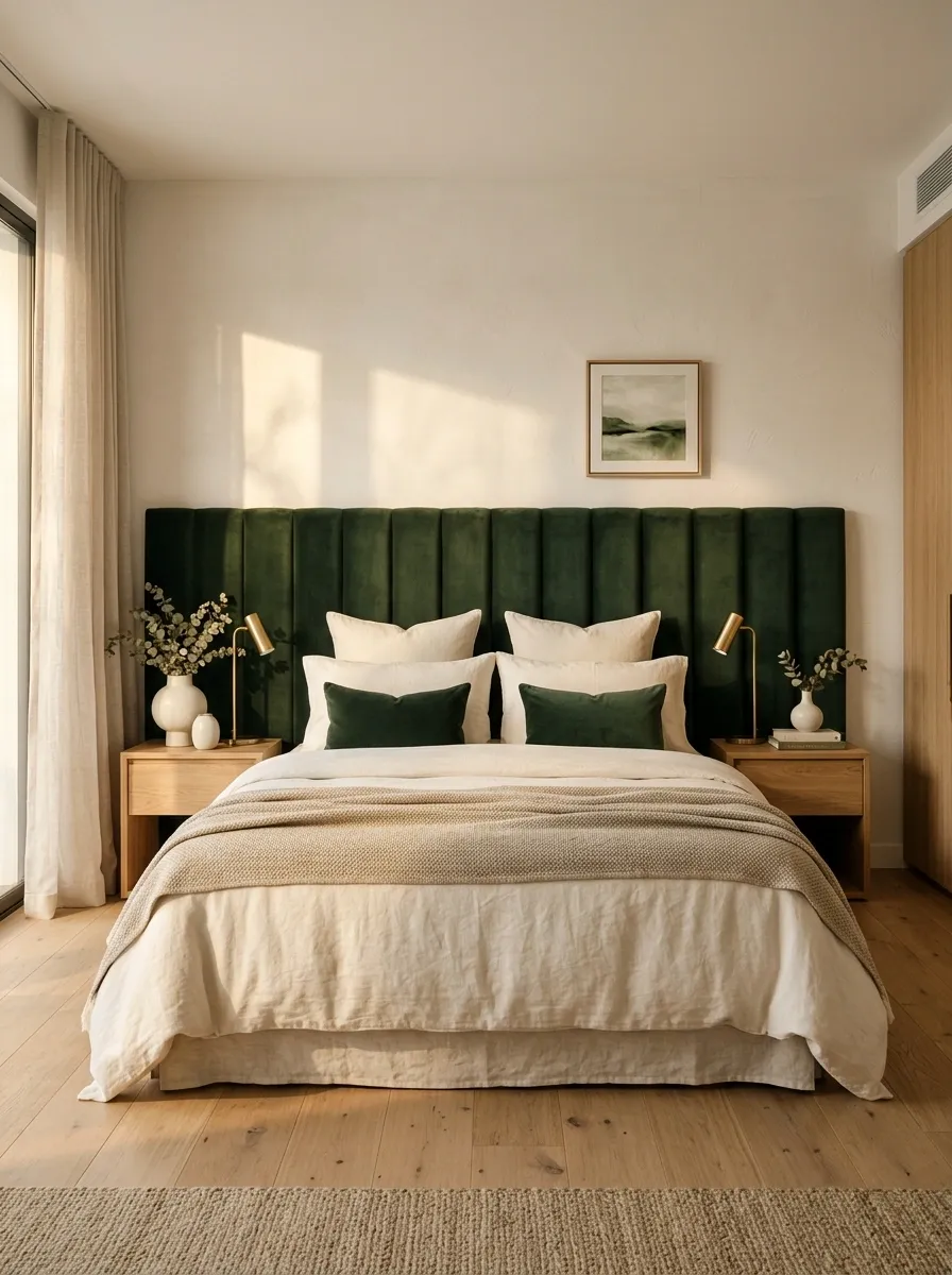
Not every bedroom needs painted walls.
A deep green upholstered headboard gives almost the same visual impact while keeping the surrounding walls light. It’s especially useful in rentals or rooms where repainting isn’t worth the hassle.
Choose a tall, simple headboard and let it become the main color statement. Pair it with cream bedding and pale walls for a softer look.
Deep green upholstery
Warm white wall
Cream and natural linen
Oak, walnut or natural wood
It also makes changing the color later far easier. No repainting drama required.
Add Green Velvet Without Painting the Walls
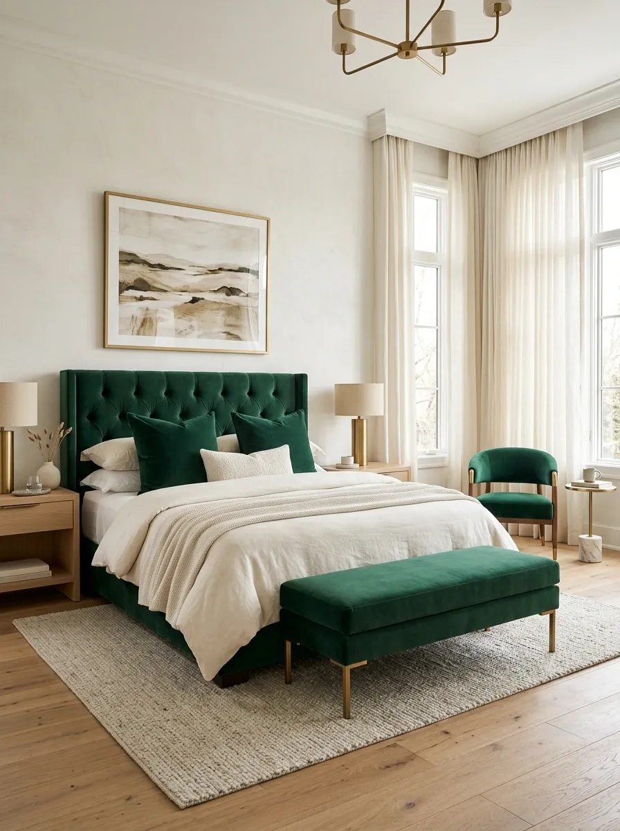
Deep green velvet can bring the color into the room without turning the entire bedroom dark.
Use it on a bench at the foot of the bed, a small accent chair or a simple headboard. Keep the walls warm white and let the fabric provide the richness.
Velvet already has shine and depth, so the rest of the room doesn’t need more dramatic finishes.
Don’t pile luxury materials on luxury materials.
Velvet + brass + marble + mirrored furniture can go from bedroom to boutique hotel lobby very quickly.
Bench, chair or headboard
Cream, ivory and warm wood
More dramatic finishes everywhere
The velvet supplies enough richness on its own. Let it have the spotlight.
Mix Green With Soft Blue for a Less Expected Bedroom
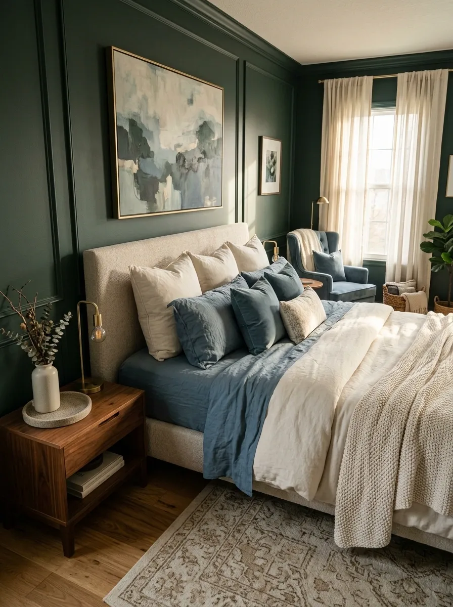
Green and blue don’t need to look nautical.
Choose a dusty, muted blue and use it in the bedding, art or a small upholstered piece. Against dark green walls, the blue creates a layered cool palette while warm wood and cream keep it from feeling icy.
This pairing works best when both colors look slightly softened rather than bright and saturated.
Main wall color
Bedding or accent upholstery
Keeps the palette open
Adds needed warmth
It’s quieter than the usual green-and-pink combination and feels especially good in modern bedrooms.
Keep the Room to Three Main Materials
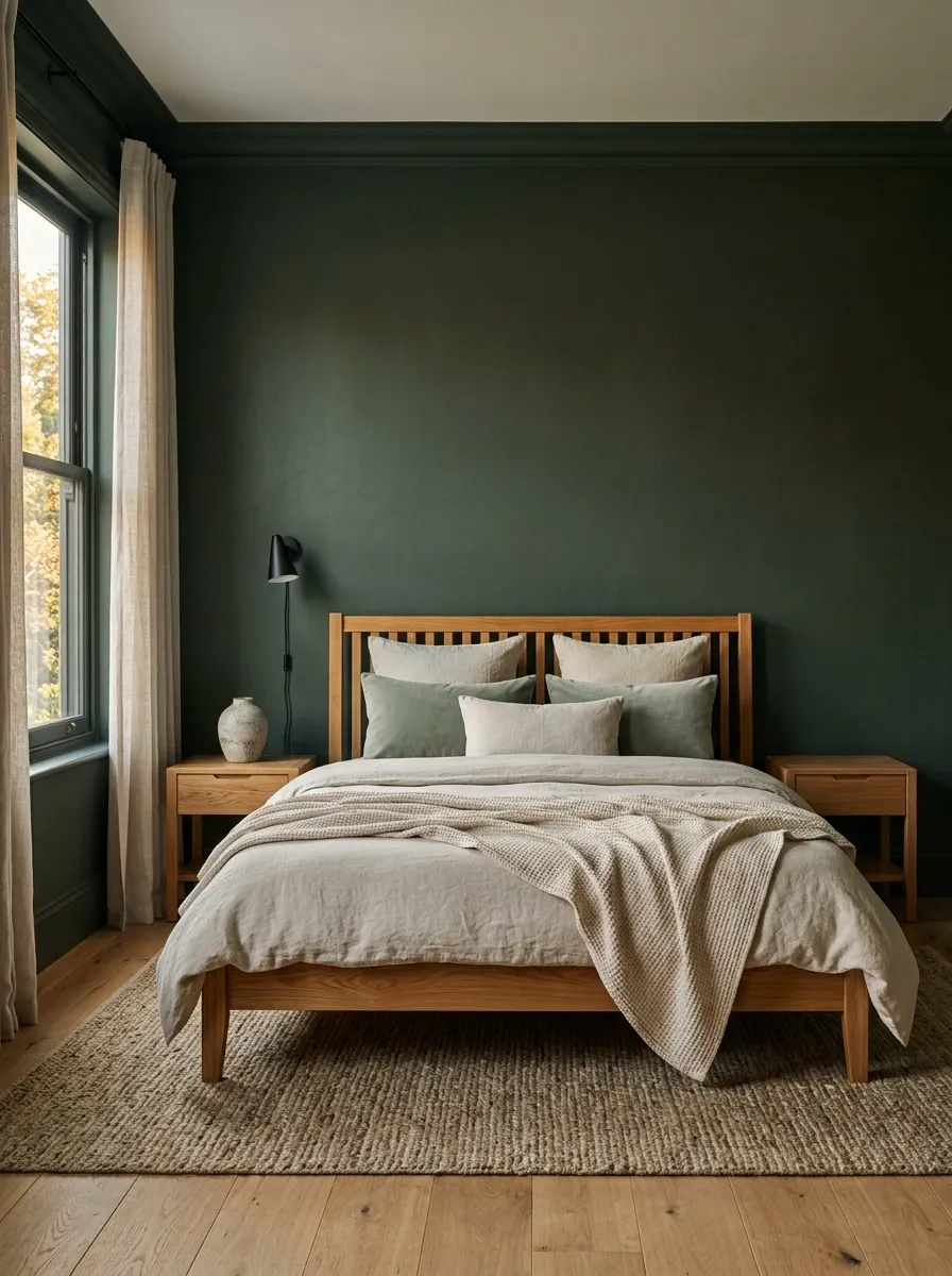
A dark green bedroom already has a strong visual element, so too many finishes create clutter fast.
Pick three dominant materials and repeat them throughout the room. For example, painted walls, warm wood and natural fabric. Everything else stays secondary.
Three strong materials beat eight random textures.
Now every extra object has to earn its place. Ruthless, but the bedroom will thank you.
Repeat Green in Small Details Instead of Matching Everything
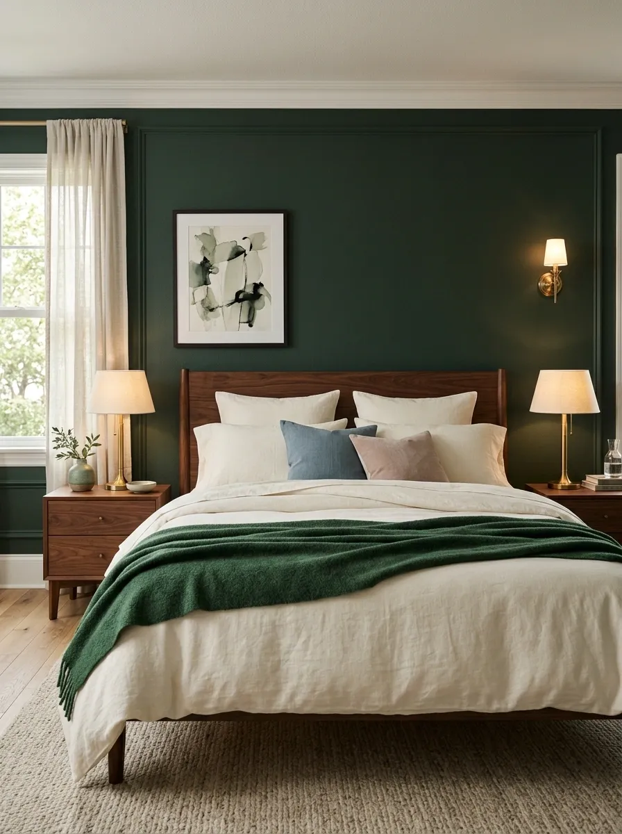
The final trick is restraint.
A green bedroom doesn’t need every accessory to match the walls. Repeat the color in two or three smaller places, such as a cushion, artwork detail, throw or ceramic piece.
That repetition connects the room without making it feel coordinated within an inch of its life.
Green throw on the bed
Small green accent in artwork
One small decorative object
That little bit of repetition ties everything together while keeping the bedroom visually relaxed.
The Look to Keep
Dark green doesn’t need to be toned down until it’s barely visible. It needs a proper supporting cast.
Pair it with cream when the room needs brightness. Use walnut when you want richness. Bring in light oak when the bedroom needs a fresher edge. Add dusty blue or muted blush when the palette needs personality. Use warm lamps when the walls start feeling too heavy.
Most importantly, stop decorating once the room looks finished.
That’s where good bedrooms separate themselves from rooms that look like every Pinterest trend was invited to the same party.
A strong green wall, a believable bed, warm materials and a few repeated details are enough. The room should feel like an actual bedroom first, with a beautiful color doing the heavy lifting.
Save these dark green bedroom ideas for the next time a paint color starts looking suspiciously irresistible.