
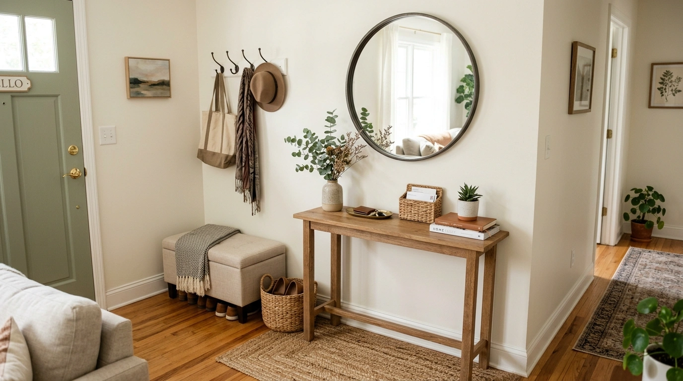
A very small entryway has one especially annoying habit: it exposes bad furniture decisions immediately. Put a console three inches too deep into the walkway and suddenly opening the front door becomes a daily obstacle course.
Add too many baskets, hooks, frames, shoes, and decorative objects, and the entrance starts looking less like a finished room and more like everything in the house got dropped there on the way through.
The answer isn’t stripping the personality out of the space. It’s giving the entire composition a job. A bench needs to relate to the wall above it.
Storage needs to respect the walkway. A mirror needs to sit where it actually helps the room. Even an empty patch of wall matters because visual breathing room is one of the few luxuries a tiny entrance can have.
That does not mean every inch needs furniture.
Very Small Entryway Ideas
Warm White Entryway With a Narrow Oak Bench and Peg Rail
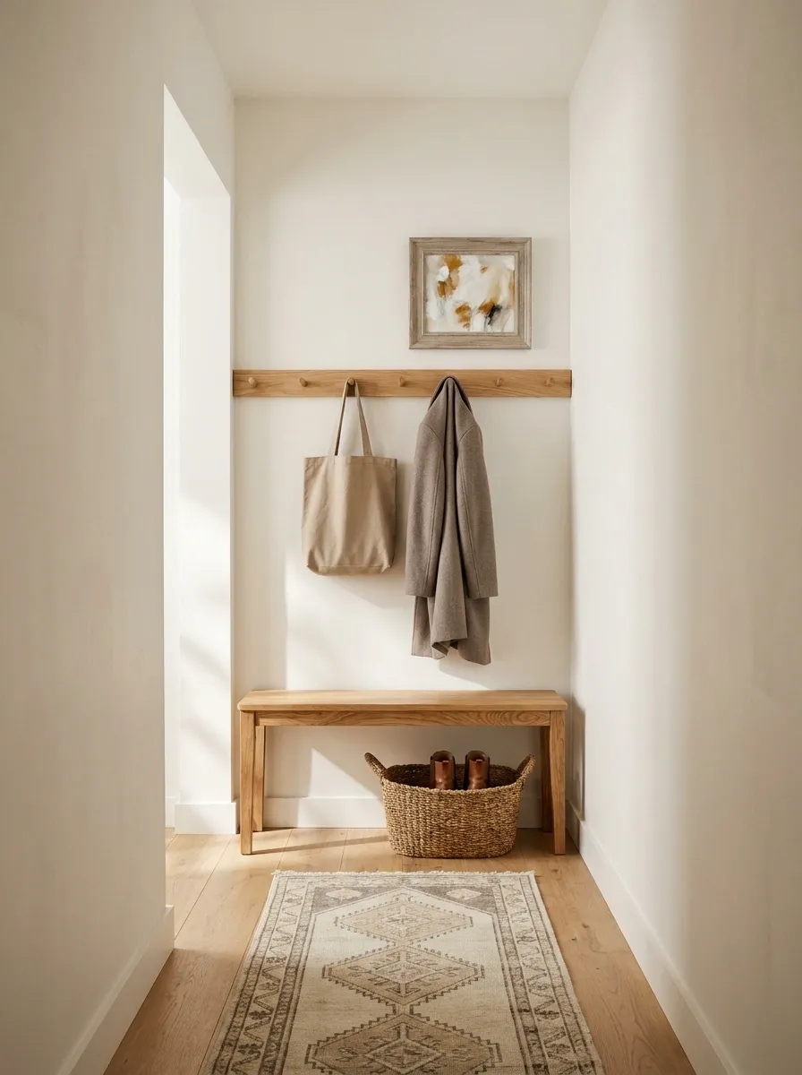
This entryway keeps things warm, airy, and deliberately simple. Soft white walls create a clean backdrop while a narrow oak bench adds just enough furniture to make the entrance feel finished. Above it, a compact row of wooden pegs handles coats and bags without building a bulky storage wall.
A woven basket tucked beneath the bench gives shoes and smaller items somewhere to disappear. A slim runner adds texture without swallowing the floor, while one small piece of artwork keeps the wall from looking forgotten.
The oak is the important move here. Against the white, it gives the tiny space warmth and prevents the whole composition from feeling like a waiting room.
Moody Charcoal Entryway With Light Wood and Brass Details
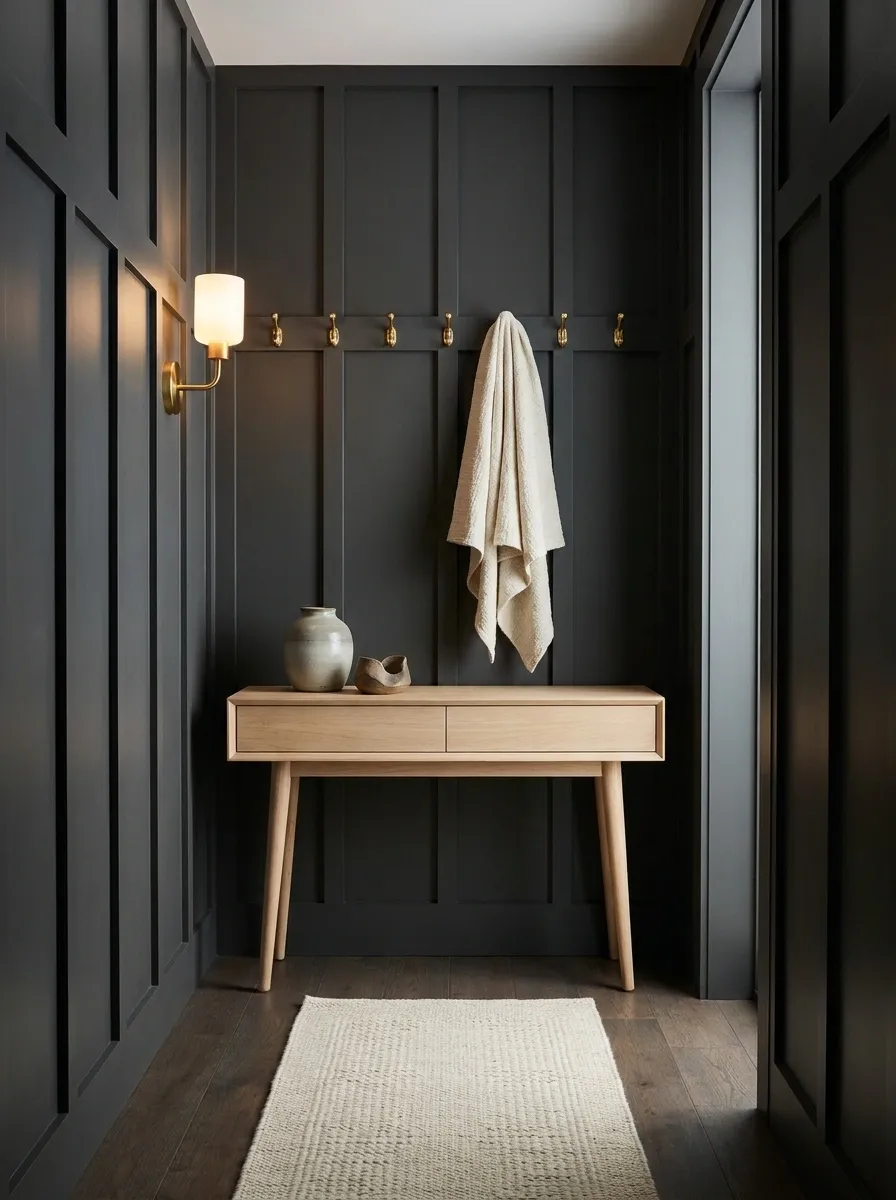
A tiny entryway doesn’t have to be painted white to feel larger. This version goes in the opposite direction with charcoal walls, pale wood furniture, and warm brass accents.
The dark backdrop gives the entrance more architectural presence, while a light wood console keeps the furniture from visually disappearing into the wall. A narrow cream textile softens the darker palette and breaks up the hard surfaces. Brass hooks and a warm light source add a little glow without turning the whole space into a shiny hotel lobby.
This works best when the surrounding home can support the darker wall color. The design succeeds because the contrast is intentional. Dark wall, light furniture, warm metal. Done. No need to invite twelve accent colors to the meeting.
Light wood keeps the furniture visible.
Warm neutral softens the contrast.
Scandinavian Tiny Entryway With a Wall-Mounted Bench
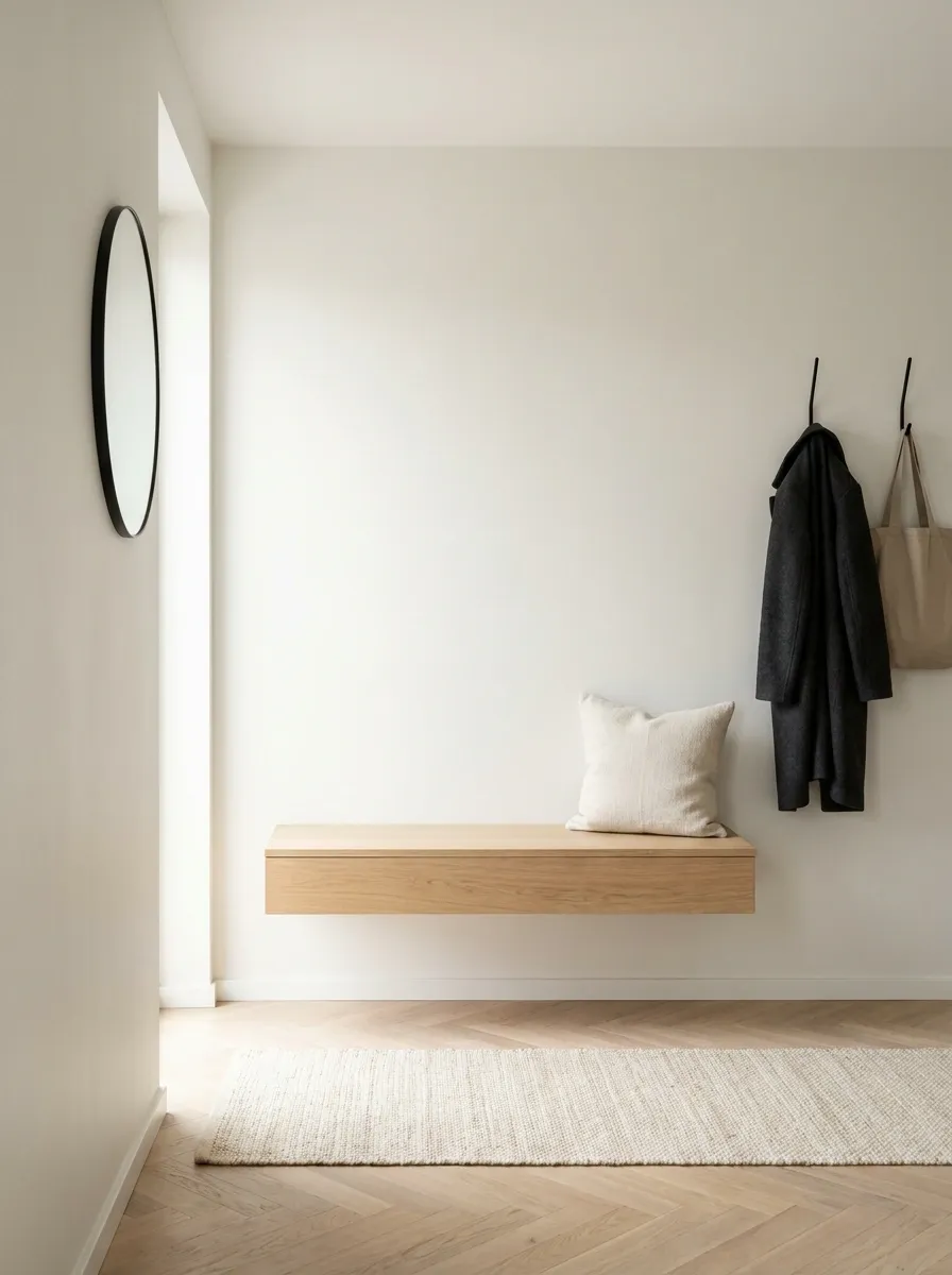
This Scandinavian-inspired entrance makes the floor feel noticeably more open by lifting the bench off it. Pale walls, light oak, simple hooks, and a soft neutral runner create a calm composition without filling every available surface.
The floating bench has a practical advantage beyond looking neat. Shoes can sit underneath without the area becoming a heavy block of furniture. A small cushion adds softness, while a few uncomplicated hooks handle coats and bags above.
The proportions matter more than the number of accessories. Keeping the bench visually thin and the wall storage modest makes the entire entrance feel lighter. The tiny room doesn’t need more stuff. It needs fewer things that are better scaled.
Soft Green Entryway With Vintage Wood Furniture
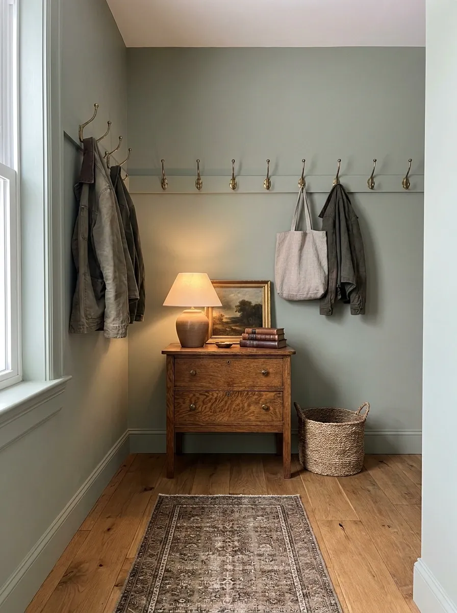
Muted sage-green walls give this tiny entrance a softer, more collected character. Instead of modern white furniture, the composition uses a petite vintage-style wood chest with visible grain, aged brass hooks, a small framed artwork, and a narrow runner.
The furniture has enough personality to carry the room, so the surrounding pieces stay quiet. A woven basket near the floor adds texture without competing with the wood, while warm flooring connects the whole palette.
The charm comes from mixing finishes that look like they belong to different moments rather than buying everything from the same set. The result feels lived-in instead of showroom-perfect. And thankfully, the entryway doesn’t need a motivational quote hanging above it to prove everyone here has good taste.
Narrow Entryway With a Built-In Coat Wall That Stays Visually Light
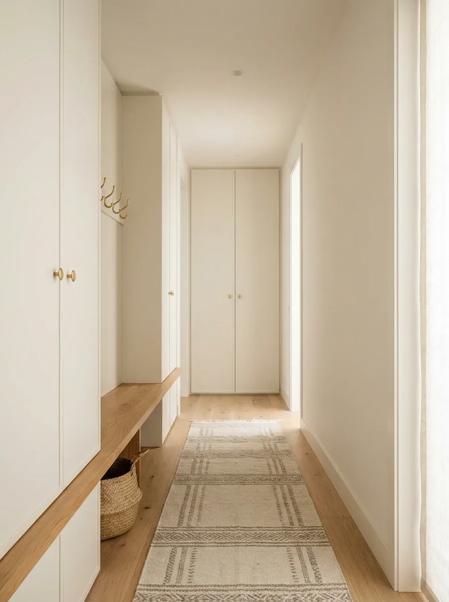
This narrow entrance uses built-in storage without making the wall look like a giant wardrobe. Shallow cabinetry runs along one side, with an open row of hooks above and a slim oak bench below. The storage stays visually quiet because the doors match the wall, while the oak gives the composition some warmth.
A small basket handles everyday footwear, and a simple runner keeps the long floor from feeling forgotten. The real win is the shallow depth. Deep cabinets would turn this passage into an obstacle course with better hardware.
Keep bulky seasonal items elsewhere. This space should handle the things used constantly, not become the family museum of abandoned jackets.
keeps the passage visually open.
eats into the walkway fast.
Tiny Apartment Entry With a Slim Black Console and Round Mirror
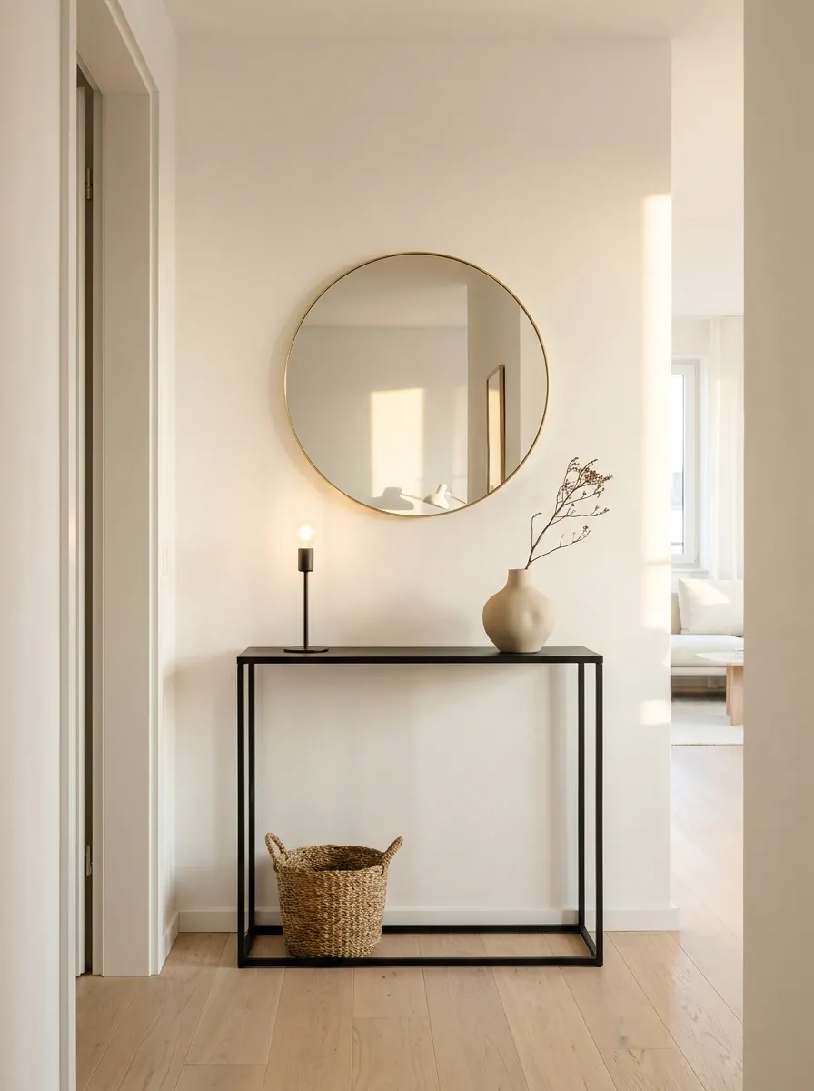
This compact apartment entrance gets its personality from shape rather than quantity. A slim black console sits beneath a round mirror, with a tiny lamp and one restrained accessory completing the arrangement.
The circular mirror breaks up all the straight lines created by the doorway, console, and flooring. Black furniture adds definition against warm white walls, while a small woven basket prevents the lower half of the composition from feeling too empty.
The furniture stays narrow enough to preserve circulation, which is the entire point. A console that technically fits but forces everyone to walk sideways is not a successful console. It is a hallway tax.
Blue-Grey Entryway With Closed Shoe Storage and Open Wall Hooks
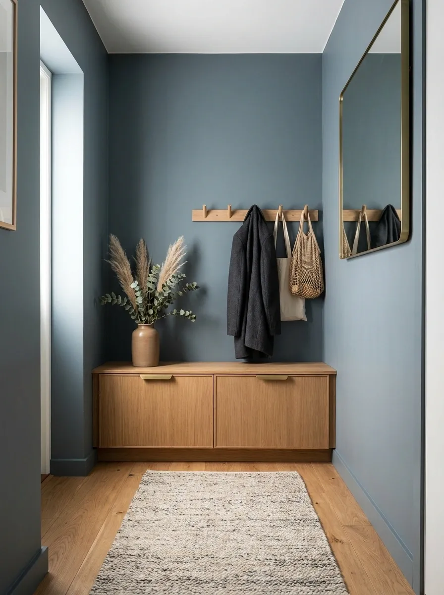
This design separates everyday mess from the things that should stay visually quiet. Blue-grey walls create a cool, polished backdrop, while a compact closed shoe cabinet keeps the lower half of the entrance tidy. Above it, simple oak hooks hold the items that need to be grabbed on the way out.
A mirror fills the remaining wall area, and a muted runner softens the transition between the entry and the rest of the home. Because the storage below is enclosed, the wall can remain visually calm even when the household is not.
That distinction matters. Open storage is useful until every single thing becomes part of the decor.
Narrow Entryway With a Slim Console Positioned Around the Door Swing
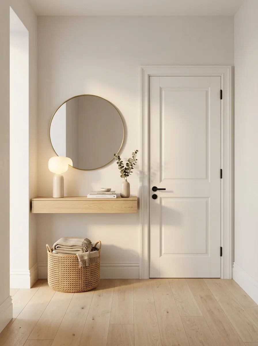
This layout is built around a very specific problem: the doorway needs its own operating space. Instead of forcing a console into the most obvious spot, the furniture sits where it can work alongside the door path without stealing the main passage.
The scene pairs a shallow console with a simple framed mirror, a small lamp, and one basket below. Warm flooring and off-white walls keep the architecture quiet so the unusual furniture placement feels deliberate rather than accidental.
The result is proof that awkward architecture doesn’t always need to be disguised. Sometimes the smartest design simply works around it.
Minimal White Entryway With One Oversized Artwork
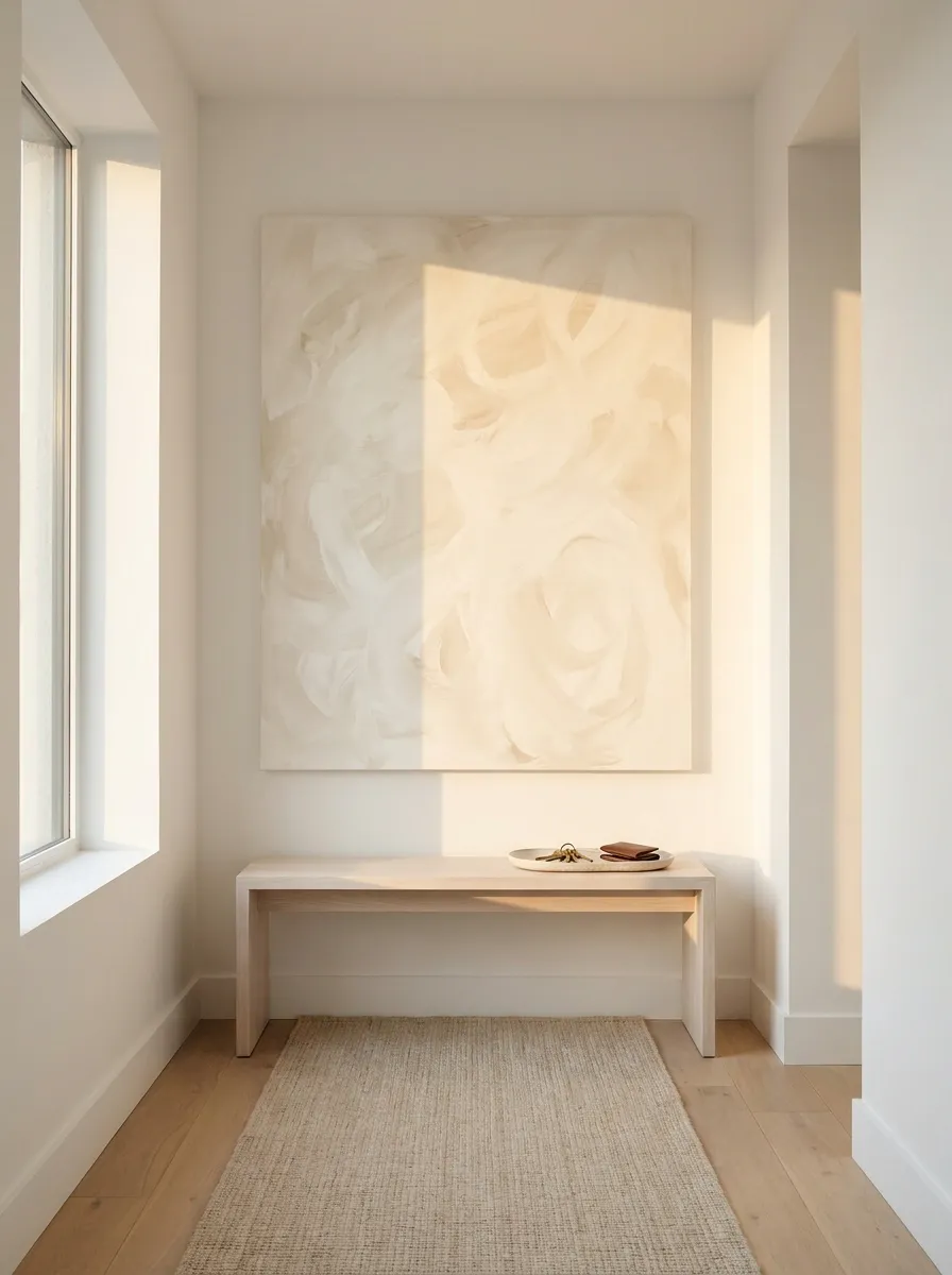
Instead of covering every inch with tiny frames, this entryway gives one large artwork the entire wall. A slim light-wood bench sits below it, accompanied by a narrow runner and a tiny tray for the things that actually need somewhere to land.
The oversized artwork creates a strong focal point without requiring a pile of decorative objects. That’s especially useful in a tiny entrance, where several small pieces can quickly turn into visual static.
The rest of the room stays deliberately quiet. White walls, pale wood, and simple flooring let the artwork carry the personality. One confident piece beats a wall full of “well, there was an empty spot” decisions.
FOCAL
POINT
Dark Wood Entryway With Cream Walls and a Small Leather Bench
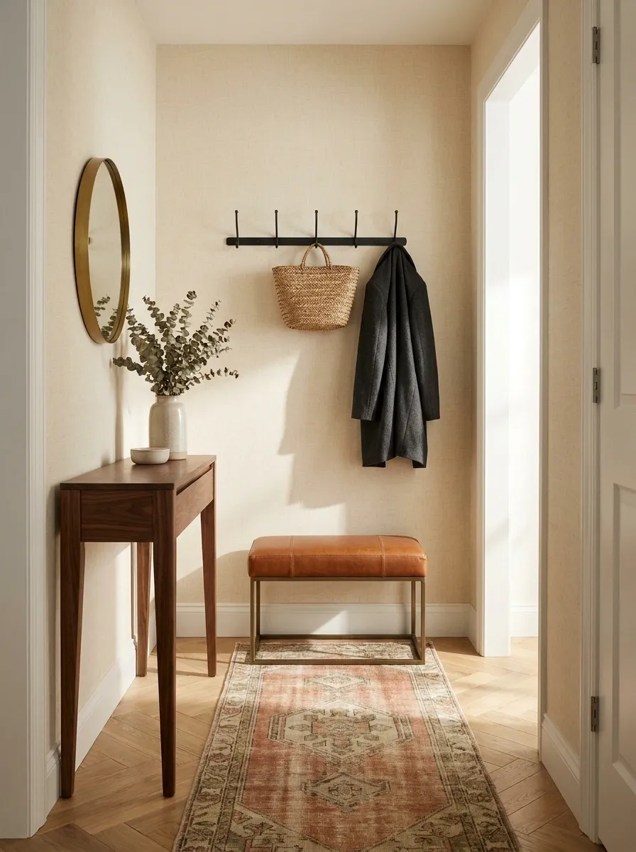
Rich walnut gives this compact entrance a grounded, grown-up feel. Cream walls keep the background light while a small leather bench introduces another warm material without adding visual bulk.
A slim black hook rail sits above the bench, with a muted patterned runner connecting the furniture to the floor. The wood, leather, and cream palette creates enough contrast to make the tiny space interesting without resorting to loud color.
The trick is keeping the furniture compact. Dark wood can feel heavy in a narrow entrance when there’s too much of it, so one substantial wood piece is enough. The entryway gets character without looking like the walnut furniture section had a minor organizational incident.
Renter-Friendly Small Entry With Freestanding Furniture
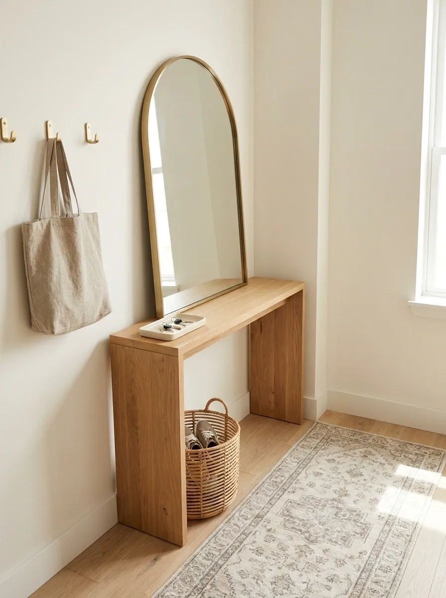
A rental entryway can still look finished without drilling into every available wall. This design combines a narrow freestanding console, a large leaning mirror, removable wall hooks, a woven basket, and a slim runner.
The mirror adds height while remaining completely movable. The console gives keys and small everyday items a landing zone, while the basket takes care of footwear or bags underneath.
The palette stays warm and neutral so every piece can move with the room later. That’s the advantage of treating the entry as a composition rather than buying one giant piece specifically for one awkward wall.
And yes, the landlord can survive without discovering a surprise built-in cabinet during the final inspection.
Very Small Entryway With a Curved Console and Arched Mirror
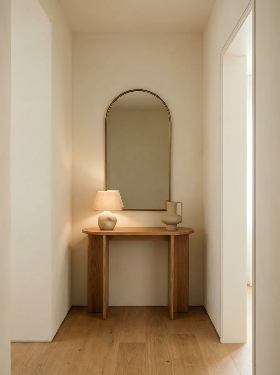
Soft curves give this tiny entrance a more relaxed silhouette. A petite curved console sits beneath a tall arched mirror, while warm wood flooring and pale plaster-toned walls keep the setting restrained.
A small lamp adds a warm pool of light, and one sculptural accessory gives the console enough personality without creating a cluttered arrangement. The rounded furniture contrasts with the rectangular doorway and straight wall edges, which keeps the architecture from feeling too severe.
The shapes do most of the decorating here. That’s useful when square footage is limited because the room can feel distinctive without requiring more objects.
Basically, the entryway gets personality through geometry instead of collecting decorative souvenirs like they’re going through a phase.
Tiny Entryway With a Narrow Black-and-White Checkerboard Floor
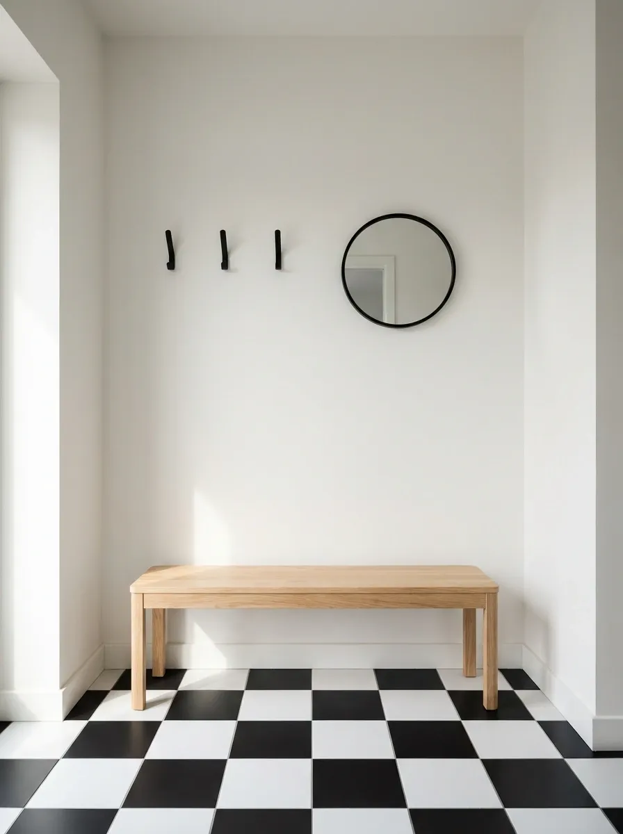
Here, the floor becomes the personality. A crisp black-and-white checkerboard pattern anchors the tiny entrance while the walls and furniture remain intentionally quiet.
A pale wood bench sits against the wall with simple black hooks above it. A small framed mirror adds reflection without competing with the flooring, and warm wood tones stop the monochrome palette from becoming too stark.
Because the pattern is concentrated at floor level, the upper half of the room can stay visually calm. That balance is what makes the bold flooring work in such a small area.
The checkerboard gets the attention. The furniture doesn’t need to audition for it.
Compact Entryway With a Long Narrow Runner and Wall Sconce
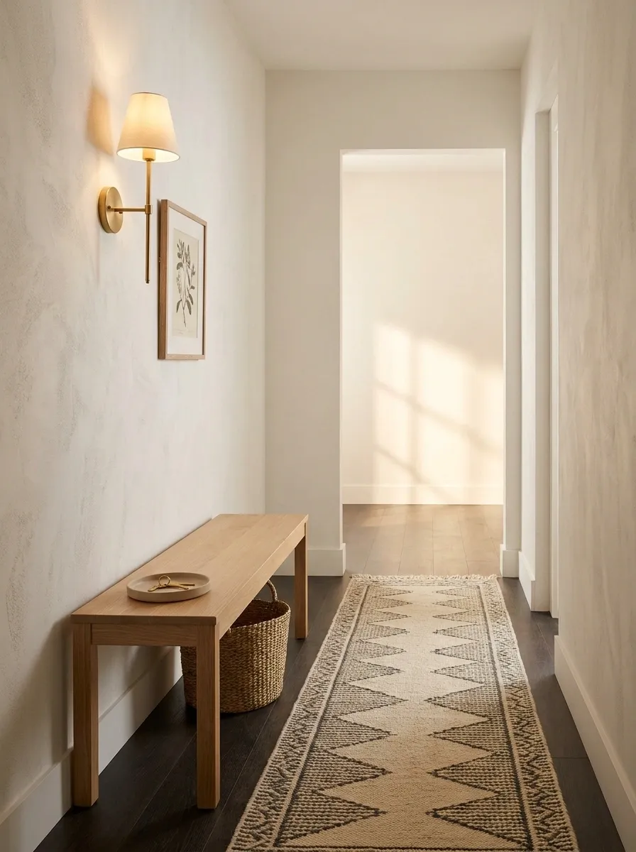
This tiny hallway uses length as its main design asset. A slim bench sits close to the wall, while a long narrow runner visually connects the front door to the adjoining room. Above the bench, a single wall sconce casts warm light across the wall and gives the entrance a more finished architectural feel.
The furniture stays deliberately modest. There is no oversized console trying to become the main character. The runner and lighting create movement instead, while a small framed print adds just enough detail.
This arrangement works especially well in a narrow passage where width is limited but wall length is generous. The floor stays usable, the walkway remains obvious, and the whole thing looks intentional.
Warm Terracotta Entryway With Natural Wood and Cream Textiles
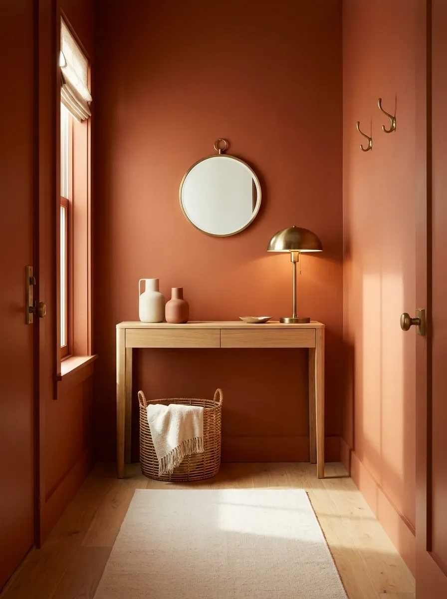
Terracotta walls immediately give this tiny entrance a rich, earthy identity. A light oak console balances the deeper wall color, while a cream runner, woven basket, and aged brass details soften the overall composition.
The palette feels warm without becoming visually heavy because the lighter wood and textiles break up the saturated wall. A small mirror brings reflection near the doorway, while a simple lamp introduces a warm glow in the evening.
The important part is keeping the color concentrated. Once the terracotta wall is doing the talking, every other finish needs to speak a little quieter.
The room has approximately zero square feet for color chaos.
Tiny Entryway With a Built-In Bench Under a Window
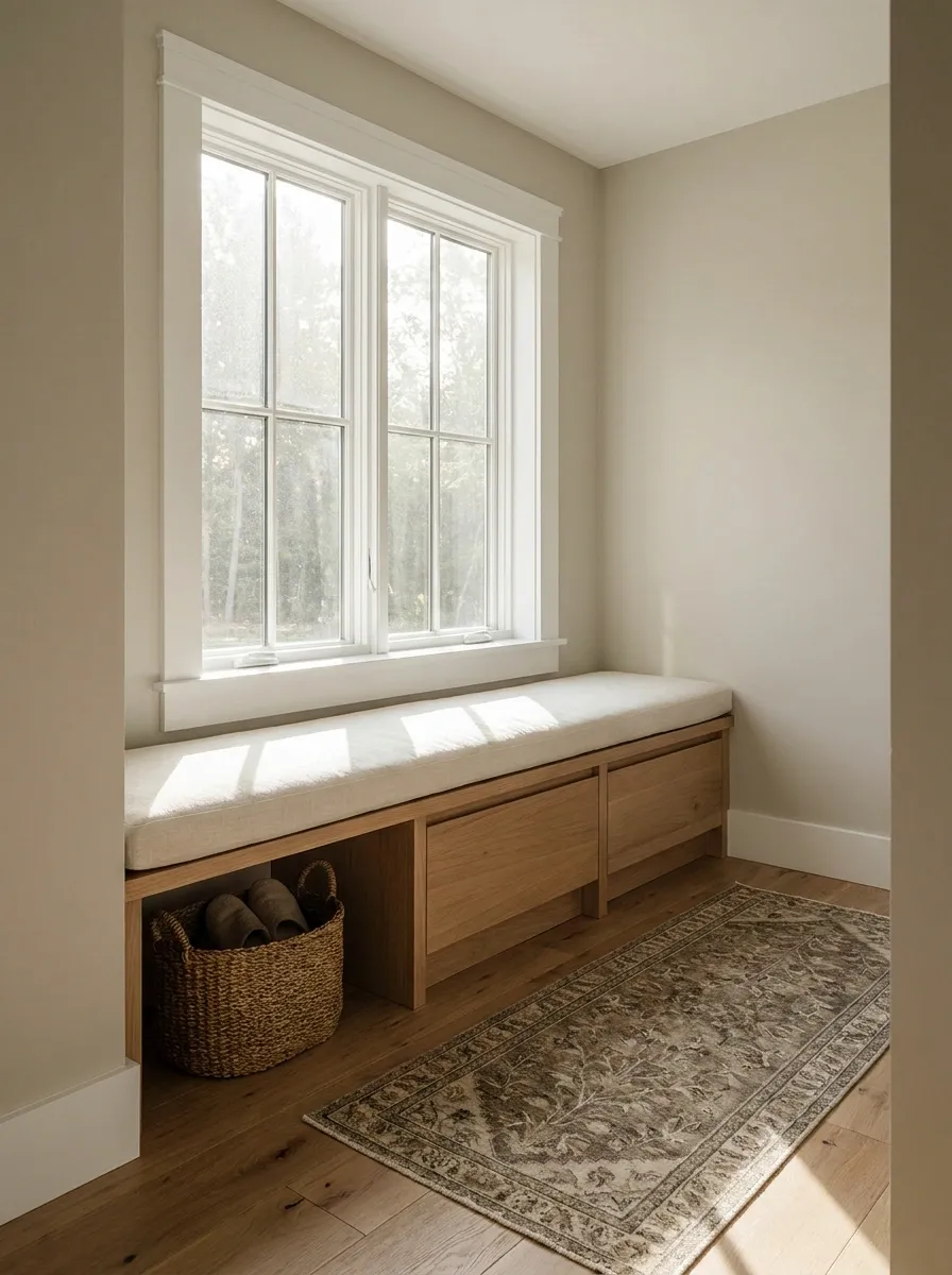
A window becomes the natural centerpiece in this arrangement, with a low built-in bench fitted directly beneath it. The bench provides seating and concealed storage while leaving the upper wall and glass completely open.
A soft cushion introduces texture, and a narrow basket can hold frequently used shoes underneath. The surrounding walls remain simple, allowing the natural light to do most of the visual work. A slim runner connects the window zone with the entrance.
This is a particularly useful layout when the doorway sits close to a window and there isn’t enough room for a separate console. Rather than fighting the architecture, the design makes the window part of the furniture arrangement.
Sometimes the awkward bit of the floor plan was waiting to be useful. Rude, but true.
Classic Small Entryway With Panelled Walls and a Petite Console
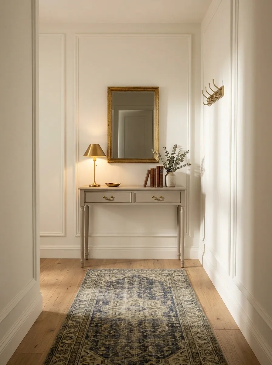
This traditional entryway gets its character from the walls rather than a mountain of accessories. Simple panel moulding frames a petite painted console, with a framed mirror and small brass lamp creating a classic focal point.
A patterned runner adds softness beneath the furniture, while the console stays shallow enough to preserve the walkway. Warm white walls and restrained brass keep the traditional details from becoming overly formal.
The paneling gives the tiny entrance architectural depth even though the furniture footprint remains small. That’s especially useful in older homes where the doorway already has some character worth showing off.
The goal isn’t to make the entrance look like a hotel lobby from 1987. Just enough tradition, thank you.
Tiny Entryway With a Hidden Shoe Drawer Under a Floating Bench
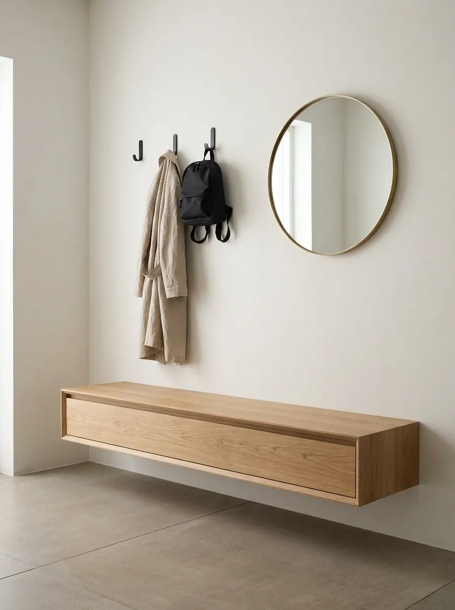
This design keeps the lower half of the entry almost suspiciously clean. A wall-mounted bench contains a concealed shoe drawer, while a few hooks above provide quick access to everyday outerwear.
A simple mirror sits nearby, and warm oak gives the otherwise minimal composition a natural texture. The area underneath the bench stays mostly open, making the storage feel integrated rather than like another piece shoved against the wall.
The real design feature is the hidden storage. Shoes still exist, obviously. They just aren’t making themselves part of the interior styling.
This works especially well for homes where the entrance needs daily storage but the available floor area is too limited for a conventional shoe cabinet.
Warm Lighting Entryway With Layered Neutral Textures
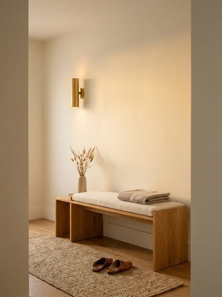
This entryway relies more on atmosphere than architectural drama. Cream walls create a soft backdrop for a small oak bench, woven runner, linen cushion, and warm wall light.
Nothing has a loud pattern. Instead, the design gets depth by putting slightly different textures beside one another. Smooth wall, visible wood grain, woven textile, soft upholstery, warm light.
The evening lighting becomes especially important. A wall fixture placed near eye level gives the entrance a gentle glow without taking up precious floor space.
The result feels finished even though the furniture list is tiny. Texture is doing the job that ten decorative objects usually get bullied into doing.
warm wood
woven textile
soft upholstery
Small Entryway With a Bold Black Door and Quiet Surroundings
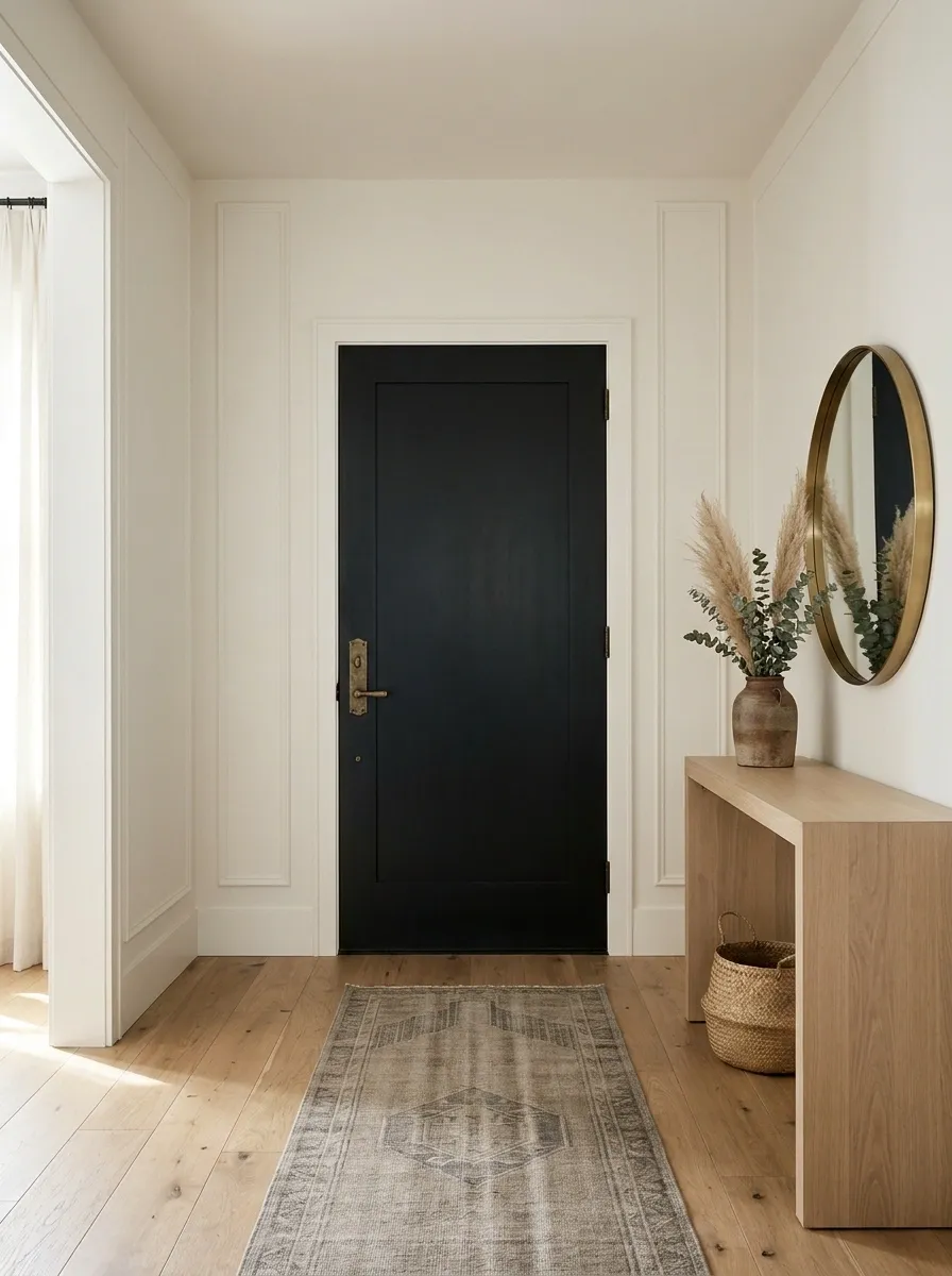
The front door becomes the focal point in this entrance, finished in a deep black that contrasts strongly with warm white walls. Everything surrounding it remains deliberately restrained.
A pale oak console sits along one adjacent wall, accompanied by a simple mirror, a narrow runner, and one small basket. The furniture supports the doorway rather than fighting for attention.
This approach is especially effective when the architecture already offers a strong feature worth emphasizing. Instead of adding color everywhere, keep most of the room quiet and let the door carry the contrast.
A tiny entryway doesn’t need five focal points. It barely has enough wall for one.
Tiny Entryway With a Narrow Gallery Wall Above a Bench
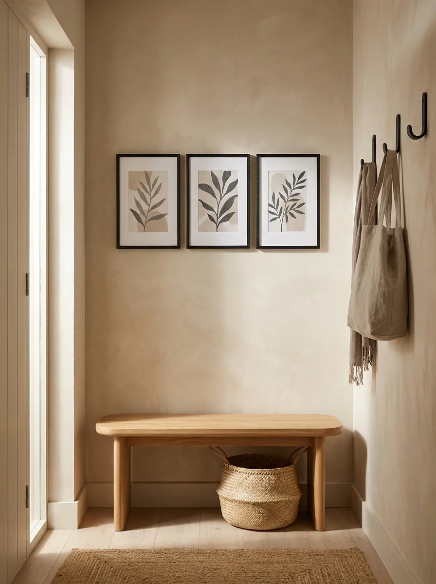
A small collection of artwork can work in a tiny entrance when it is treated as one composition. Three similarly scaled frames sit neatly above a compact bench, creating a narrow vertical gallery rather than scattering artwork around the room.
The bench stays simple, with a basket underneath and a few hooks placed nearby for everyday use. A warm neutral wall color gives the frames enough contrast without making the entrance feel busy.
The grouping works because the artwork has a defined zone. Nothing else is competing for the same wall.
The key is editing. Three considered frames look intentional. Fifteen frames look like the wall lost an argument.
Soft Pink Entryway With Walnut Furniture and Aged Brass
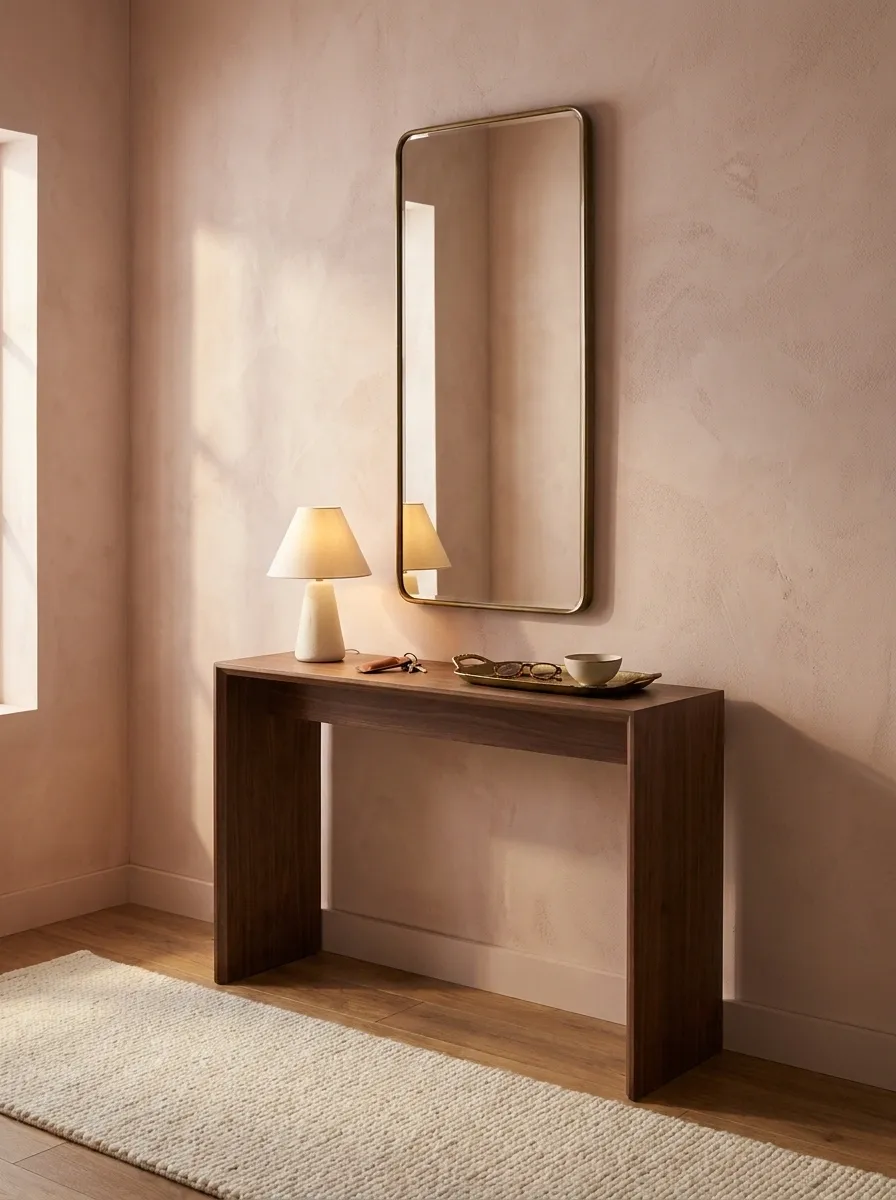
A dusty blush wall gives this tiny entrance a surprisingly warm backdrop, especially when paired with deep walnut and aged brass. A narrow walnut console sits below a slim brass-framed mirror, with one small lamp and a shallow tray keeping the surface useful without crowding it.
The cream runner prevents the darker furniture from feeling too heavy, while the warm wood floor ties everything together. Nothing needs to match exactly. The wall, wood, metal, and textile simply need to share the same warm temperature.
The result feels colorful without becoming sugary. There is a difference between soft pink and a room that looks like it was decorated exclusively at the dessert counter.
Very Small Entryway With a Deeply Contrasting Runner
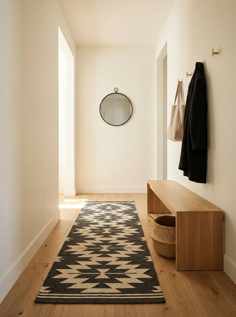
This entrance keeps almost everything quiet so the floor can carry the visual impact. Warm off-white walls, a simple wood bench, understated hooks, and a small mirror create a calm backdrop for a runner with a much stronger pattern.
The concentrated contrast gives the tiny space an obvious focal point without taking up extra wall or furniture space. The bench remains visually simple, and a single woven basket underneath adds useful texture.
This is a smart direction when the architecture is plain and there isn’t room for a statement console, gallery wall, and dramatic lighting fixture all competing at once.
The rug gets to be dramatic. Everyone else can simply behave.
Rustic Entryway With a Reclaimed Wood Bench and Stone-Colored Walls
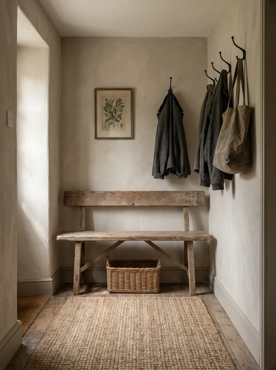
A slightly weathered wood bench becomes the anchor in this rustic entrance. Stone-colored walls give the backdrop a soft earthy quality, while simple iron hooks, a woven basket, and a natural-fiber runner reinforce the texture.
The furniture isn’t perfectly polished, and that’s exactly why the composition works. The visible grain and minor imperfections keep the tiny space from feeling overly staged. A small framed botanical-style print completes the wall without overwhelming it.
Rustic doesn’t need to mean “every surface purchased from a farm-themed gift shop.” Keeping the palette controlled makes the materials feel intentional rather than costume-like.
This direction suits older homes, cottages, and entrances where natural texture already feels at home.
Tiny Entryway Built Around a Tall Storage Cabinet
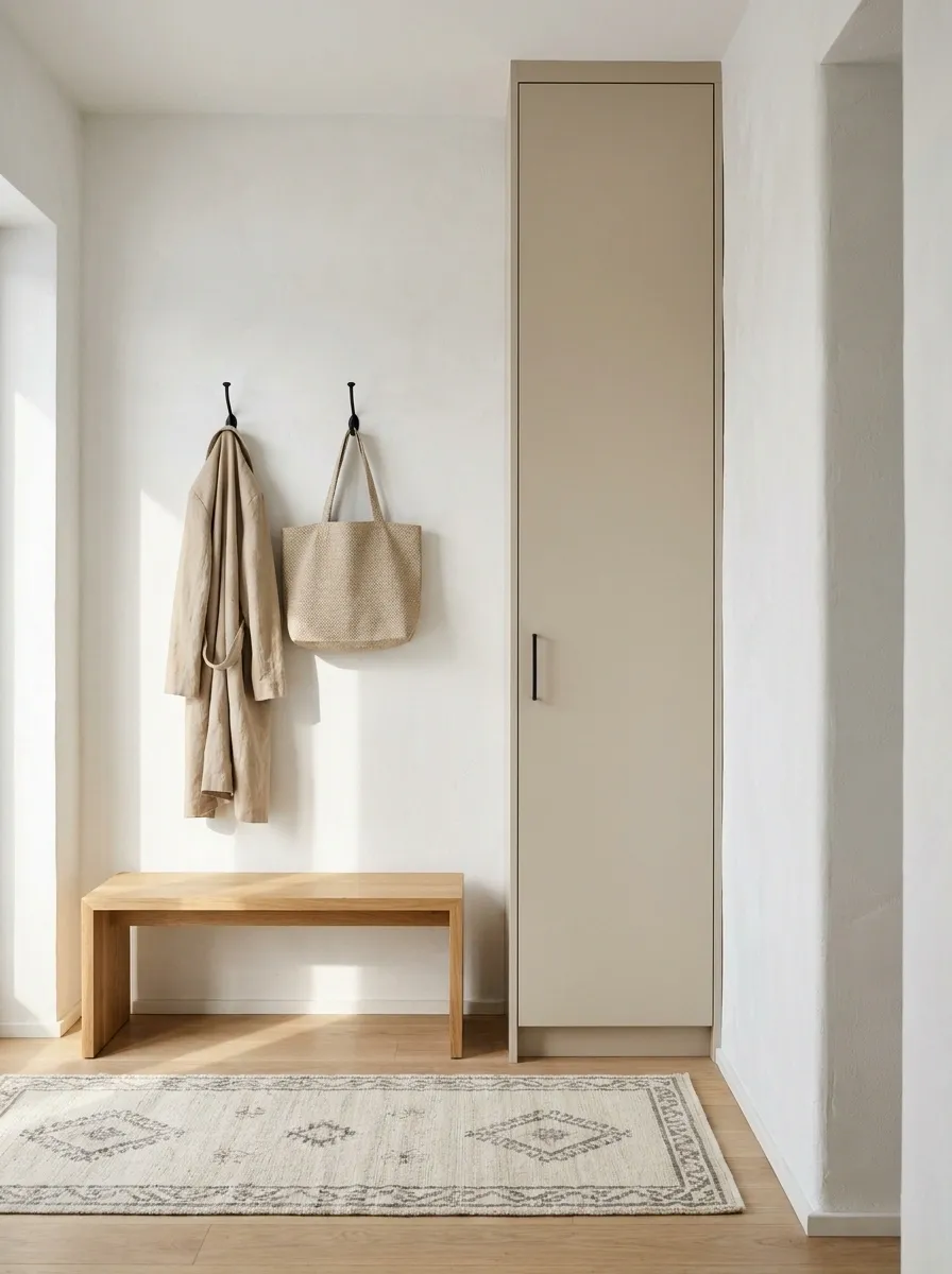
When floor space is painfully limited, storage can move upward. This entry uses one slim tall cabinet as its main piece, finished in a warm neutral that blends into the wall rather than demanding attention.
A tiny bench sits beside it, creating a compact seating zone without competing with the cabinet. Above the bench, two simple hooks handle daily coats and bags, while a narrow runner gives the floor some softness.
The cabinet provides the visual mass, so everything else stays deliberately sparse. This creates a very different look from the usual console-and-mirror setup and makes use of vertical space instead of spreading furniture across the floor.
The entryway basically says: yes, storage exists. No, it doesn’t need to occupy the entire postcode.
Narrow Entryway With a Split-Level Storage Wall
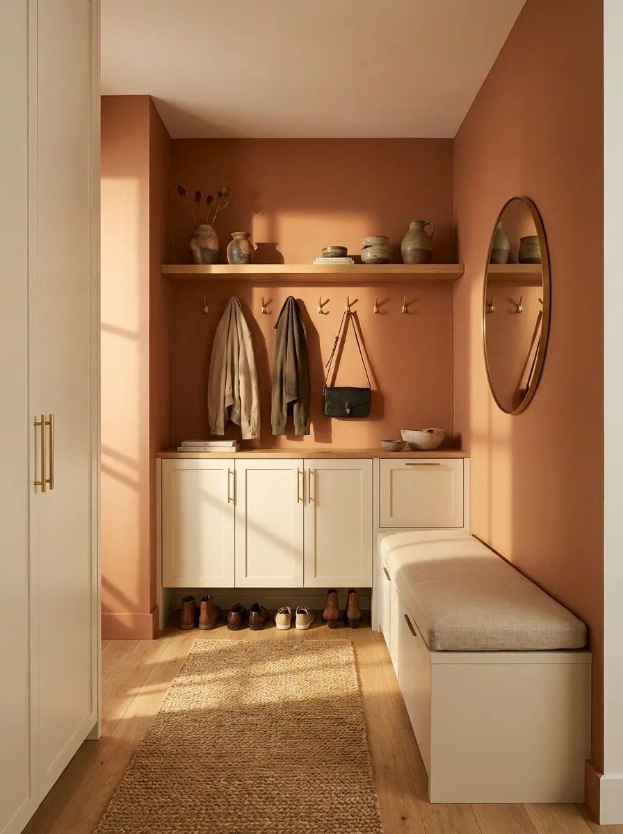
This design turns one narrow wall into three useful visual zones. The lower section uses a compact closed cabinet for shoes and less attractive essentials, while the upper portion has open hooks and a small shelf for items used daily.
A warm painted wall ties the zones together, and a slim bench bridges the storage and seating functions without becoming bulky. A small round mirror adds a soft shape to the otherwise linear arrangement.
The layout feels custom because every vertical section has a job. That’s especially valuable in a very small entrance, where random furniture placement can make the room feel even narrower.
Storage is finally taking the hint and going vertical.
Soft Neutral Entryway With a Built-In Ledge Instead of a Console
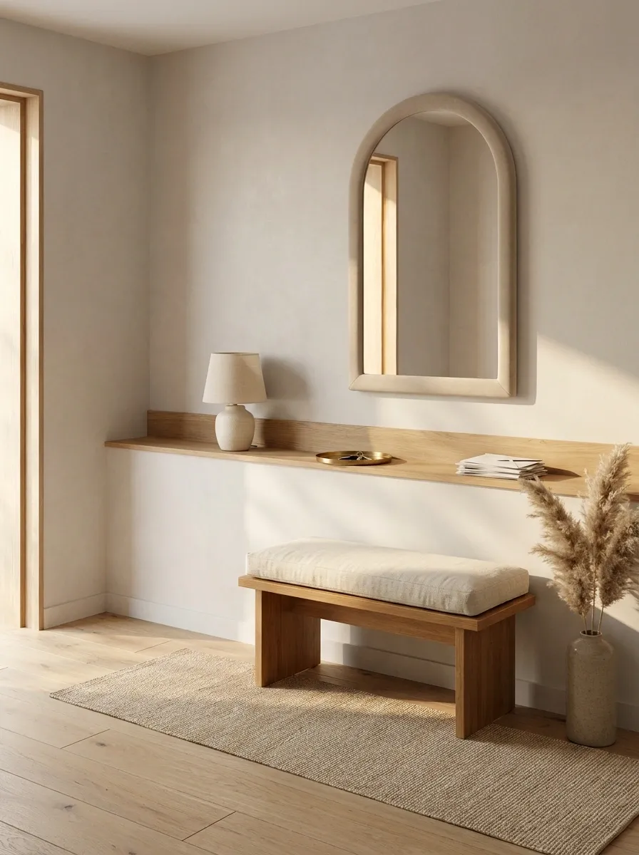
This version skips the traditional console entirely. A slim built-in ledge runs along the wall at a comfortable height, giving the entrance a place for keys, mail, and a small lamp without bringing a full piece of furniture into the walkway.
Below it, a compact bench provides seating, while a large softly framed mirror fills the wall vertically. The ledge and bench share the same warm oak tone, making the composition feel intentional rather than assembled from unrelated pieces.
The lack of a bulky console is what makes the design interesting. The wall carries the function while the floor remains visually open.
Basically, the furniture budget went straight to the wall and refused to apologize.
Tiny Entryway With a Deep Blue Wall and Pale Oak Bench
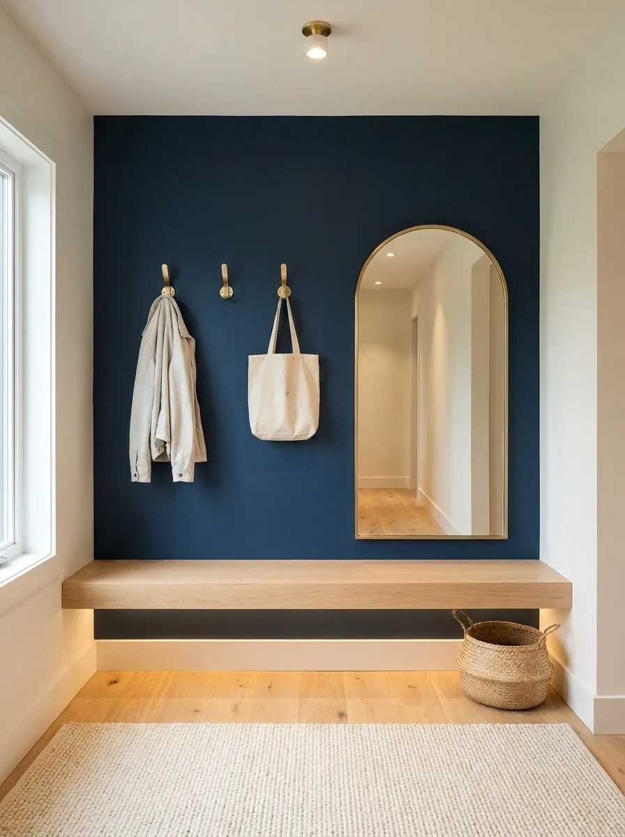
A deep blue wall creates a strong backdrop for a pale oak bench, simple brass hooks, and a softly framed mirror. Instead of adding multiple colors, the design lets the blue and oak form the main visual relationship.
The pale wood catches light against the darker wall, giving the tiny entrance a crisp contrast without looking severe. A cream runner and small woven basket soften the lower portion of the space, while warm lighting keeps the blue from feeling cold at night.
This composition works particularly well when the entrance opens directly into a neutral home. The darker wall marks the threshold visually and gives the entry a little identity of its own.
Apparently, the smallest room in the house was tired of being beige.
Tiny Entryway With a Narrow Bench Between Two Doorways
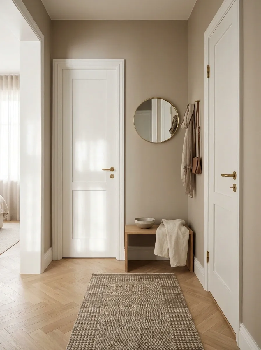
When an entry sits between two interior doorways, the wall may feel like an impossible place for furniture. This composition solves the problem by using a very narrow bench centered between the openings, with a compact mirror above and tiny hooks tucked into the remaining wall space.
The furniture stays low enough that both doorways remain visually prominent. A slim runner follows the direction of the circulation, while warm neutral walls keep the architecture unified instead of chopping it into separate pieces.
The result makes an awkward transition zone feel intentional. The bench becomes a visual bridge between the two openings rather than another object squeezed into the middle.
A hallway with commitment issues finally gets a layout that makes sense.
Warm Minimal Entryway With a Narrow Oak Cabinet and Linen Bench
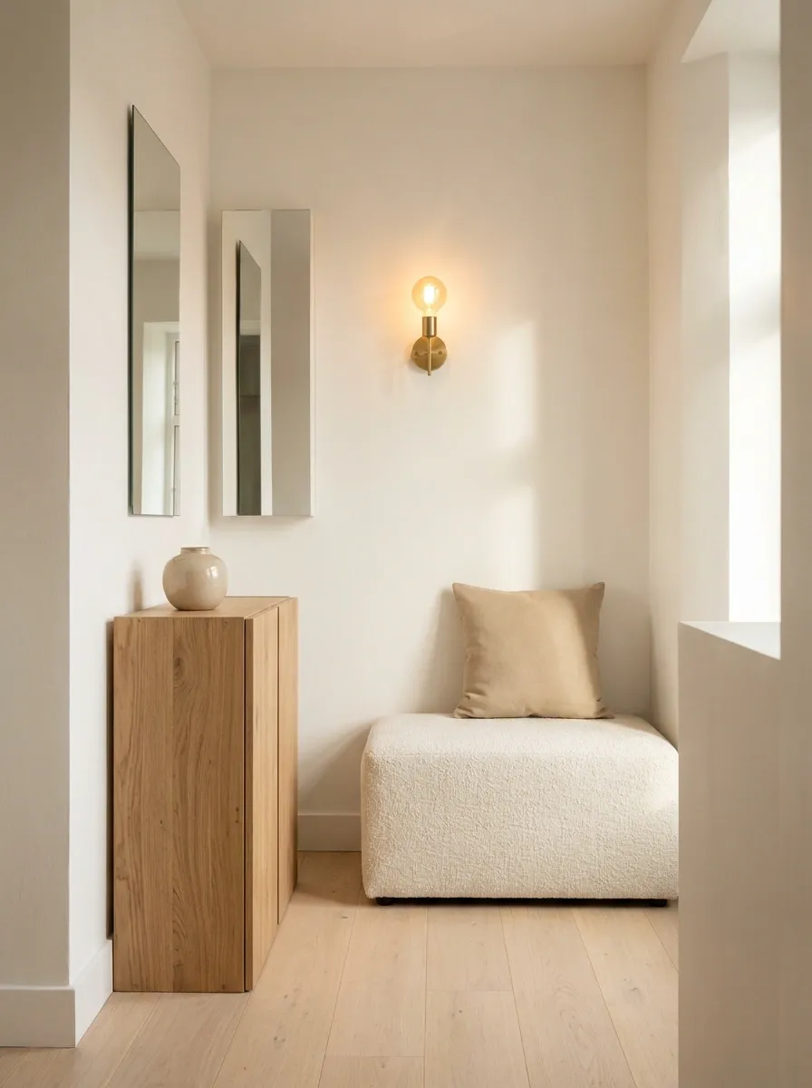
This design combines a slim oak cabinet with a separate upholstered bench, creating two distinct vertical masses instead of one bulky block. Warm white walls keep the background light, while linen upholstery softens the harder wood surface.
A narrow mirror sits above the cabinet, and a small wall light provides gentle evening illumination. The bench stays visually quiet with one neutral cushion and no decorative pile underneath.
The two pieces work because they aren’t fighting for the same role. One handles storage. One handles seating. The gap between them gives the wall some breathing room.
In a tiny entryway, breathing room is basically premium real estate.
Tiny Entryway With a Single Tall Plant and Natural Wood Furniture
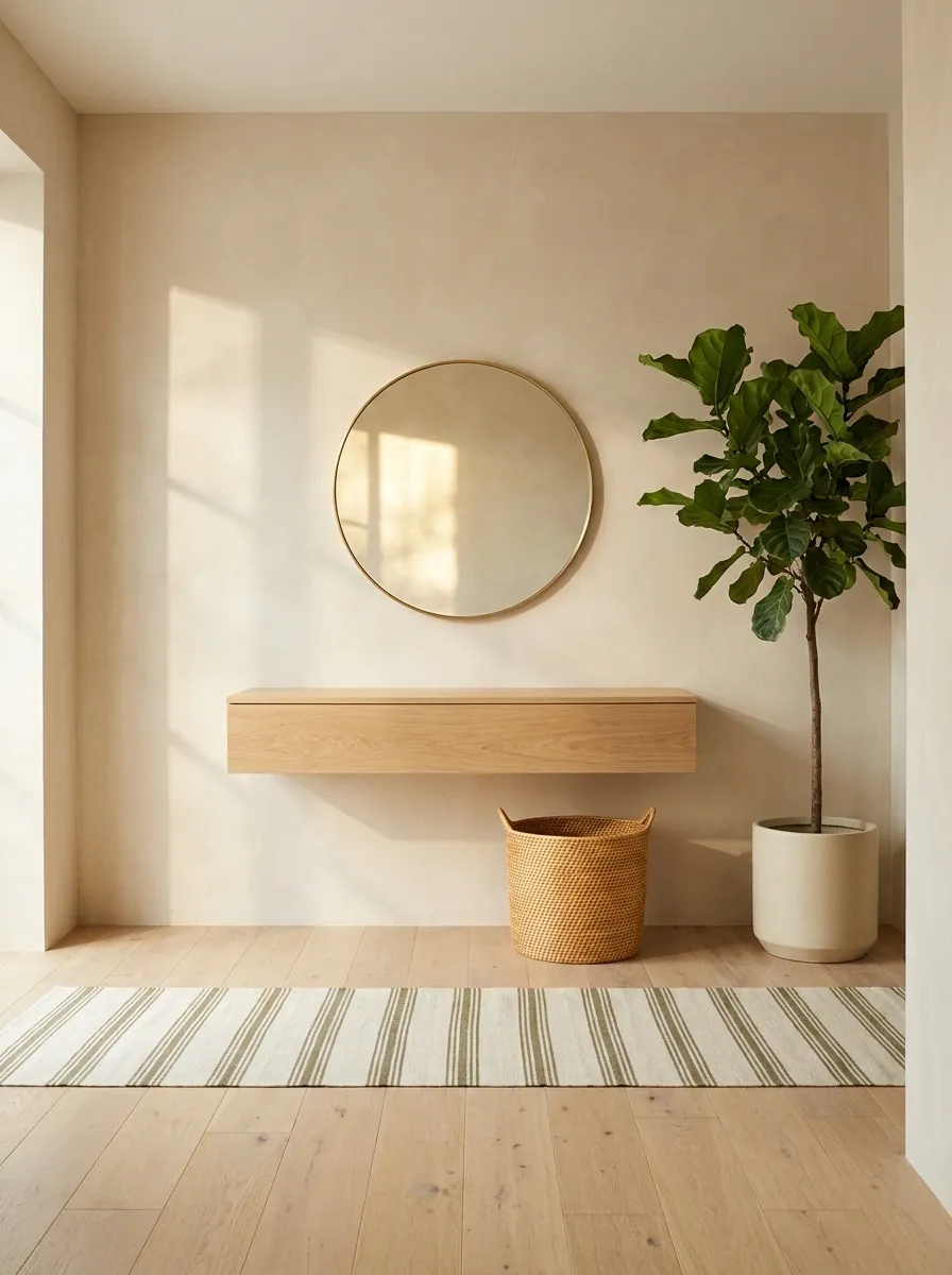
This entrance uses greenery as the one softer decorative note. A slim natural-wood console, simple round mirror, and warm neutral wall establish the structure, while one tall plant occupies an otherwise empty corner.
The plant adds height and organic texture without requiring several decorative objects across the console. A woven basket underneath provides practical storage, and a narrow runner keeps the floor visually connected.
The important distinction is scale. One appropriately sized plant can make the entrance feel alive without turning the floor into a miniature indoor jungle. Small plants scattered everywhere would have the opposite effect.
One plant. Not twelve. The fern committee has been officially dismissed.
Earthy Taupe Entryway With Black Hooks and a Curved Bench
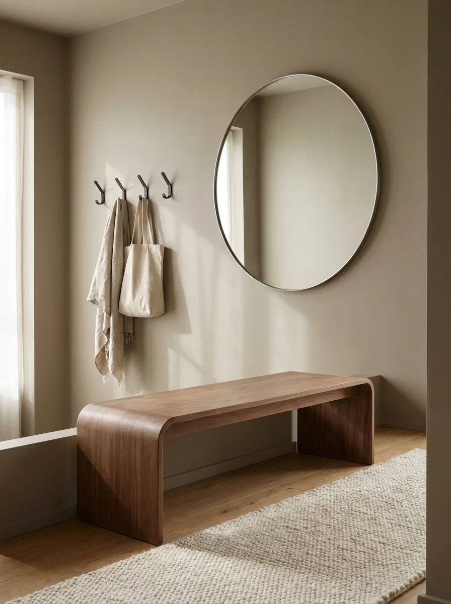
An earthy taupe wall creates a calm backdrop for a compact curved bench, matte black hooks, and a rounded mirror. The furniture has softened edges, while the hooks provide a small amount of crisp contrast.
A cream runner breaks up the darker floor, and warm wood appears in the bench and flooring rather than across every accessory. This keeps the palette grounded without making every surface brown.
The curved bench gives the tiny entrance a less rigid silhouette, especially when the surrounding architecture is full of rectangular doorways and corners. It is a small design decision with a surprisingly strong visual effect.
Because apparently even a tiny hallway deserves a little curve drama.
Very Small Entryway With a Hidden Cabinet Behind Matching Wall Panels
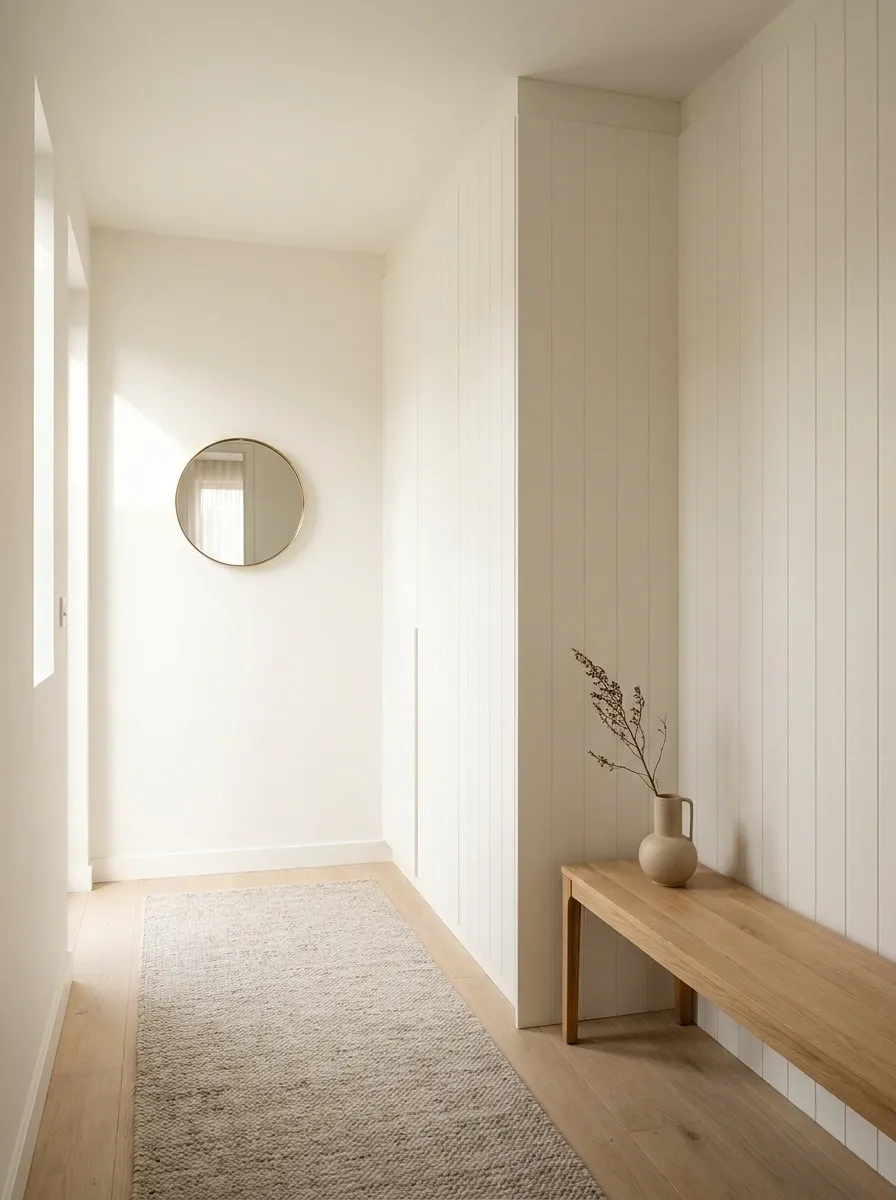
Here, storage almost disappears into the architecture. A tall cabinet is finished in the same warm white as the surrounding wall panels, creating a continuous surface instead of a visible furniture block.
A slim oak bench breaks up the wall at lower level, while a small round mirror adds shape opposite the taller storage mass. A muted runner carries a little warmth through the floor without competing with the paneling.
The finished effect is polished but quiet. The cabinet can hold the practical mess, while the wall continues reading as one clean architectural surface.
This is what happens when storage learns basic camouflage.
Compact Entryway With a Warm Brick Wall and Slim Black Furniture
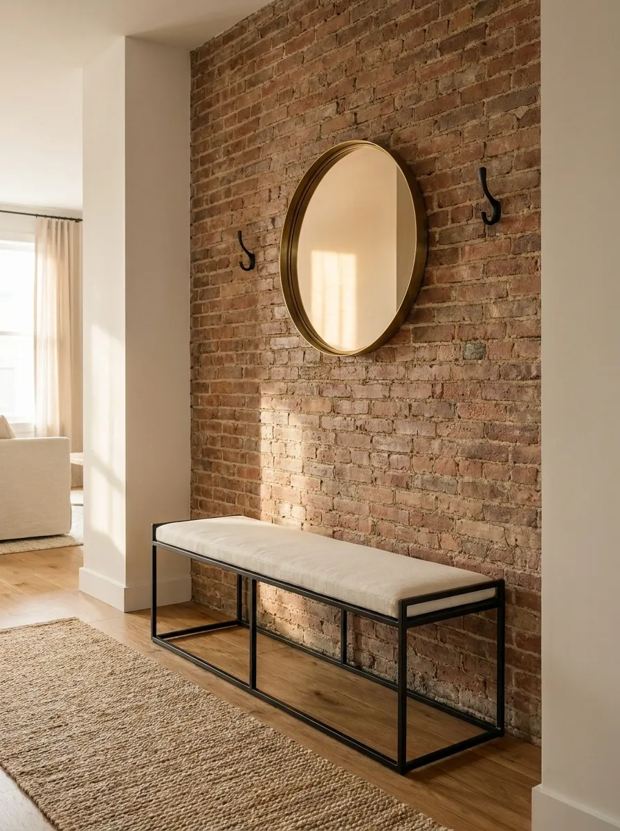
A small exposed-brick wall becomes the natural centerpiece here. Instead of adding another decorative treatment, the design lets the brick provide texture while slim black furniture adds contrast.
A narrow bench sits below a simple round mirror, with black hooks mounted directly onto the brick surface. A cream cushion and natural-fiber runner introduce warmth without competing with the rougher wall material.
The beauty of this composition is its restraint. Brick already has plenty of visual information, so the furniture stays simple and graphic.
The wall has texture. It doesn’t need backup dancers.
Minimal Entryway With a Tall Mirror, Tiny Stool, and Almost Empty Floor
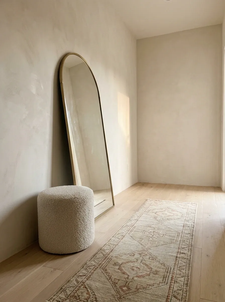
This composition strips the entrance down to three visual elements: a tall mirror, a tiny upholstered stool, and a narrow runner. Everything else is kept almost completely out of sight.
The stool provides a place to pause without becoming a permanent furniture block. The mirror fills the vertical wall and gives the room a strong focal point, while the open floor around both pieces creates a deliberately spacious feel.
A warm neutral palette prevents the minimalism from becoming stark. The design works because every element is scaled to the room, and there is enough empty space for each piece to register.
The empty floor isn’t unfinished. It is the entire point.
Seat.
Space.
Tiny Entryway With a Layered Frame Around the Door
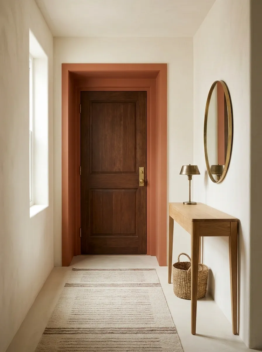
Instead of decorating the wall beside the entrance, this design makes the doorway itself the visual feature. A warm painted trim frames the door, with a narrow console, simple mirror, and small basket positioned nearby.
The trim adds architectural definition without consuming floor area. Warm oak furniture softens the structured framing, while a neutral runner leads the eye toward the door.
This works especially well where the entry lacks a natural focal point. The architecture creates one without requiring a large piece of furniture.
The door finally gets a supporting cast instead of being treated like the backstage entrance.
Calm Minimal Entryway With a Tall Cabinet and Almost No Decor
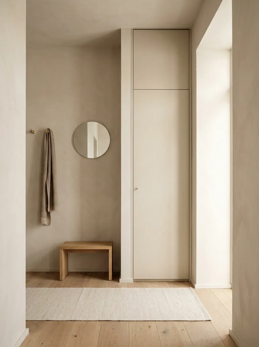
This final look puts storage first but keeps it visually quiet. One slim tall cabinet occupies a narrow portion of the wall, finished in the same warm neutral family as the surrounding paint.
A tiny bench sits nearby, while two discreet hooks and a very small mirror complete the practical side of the entrance. The floor remains open, with only a narrow runner adding softness underfoot.
The cabinet gives the room enough function to handle everyday life without spreading storage across every wall. The design feels calm because there is no pressure to decorate every available surface.
Sometimes the most attractive entryway is the one that knows when to stop.
Protect the floor.
Bringing a Very Small Entryway Together
A tiny entryway doesn’t need to look empty, but it does need to look edited. The strongest designs in this collection aren’t defined by how many pieces they manage to squeeze into the room. They’re defined by how clearly each element relates to the next one.
A narrow bench can work beautifully when the wall above it stays open. A dramatic wall color works when the furniture underneath is quieter. A gallery wall can feel intentional when it has a clear boundary. Even concealed storage becomes part of the design when its depth and placement protect the walkway.
Start with the shape of the room, then decide what deserves the visual attention. Once that is settled, the furniture, lighting, materials, and decoration become much easier to control.
Save these ideas before rearranging the entryway, especially the ones that solve the exact awkward corner or narrow wall causing all the trouble.