
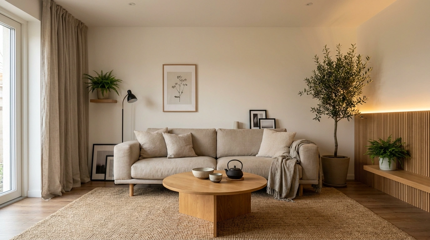
Wood finishes don’t have to match. They just need to look like they belong in the same room.
That sounds obvious until a space ends up with a honey-oak floor, an orange-toned cabinet, a dark walnut table, and one reddish sideboard quietly ruining everyone’s afternoon.
The problem usually isn’t that the woods are different. It’s that they all demand attention in slightly different ways, with nothing around them tying the composition together.
That’s why finished rooms are more useful than endless advice about “matching undertones.” Once furniture, flooring, walls, lighting, upholstery, stone, and architecture enter the picture, the same wood combination can look completely different.
Rooms usually look more intentional when one wood takes the lead, another adds depth, and the rest of the space gives both finishes some breathing room. Matching everything exactly is optional. Looking deliberate is not.
Wood Tone Combinations
Warm Oak Living Room With Deep Walnut Furniture
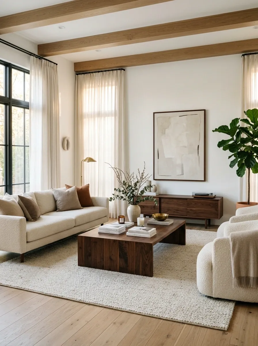
Warm oak flooring gives this living room its broad, sunlit base, while a deep walnut coffee table and media console bring in the darker notes. Cream boucle seating, soft linen curtains, and an off-white rug sit between the two woods, so the contrast feels layered instead of abrupt.
The important part is the hierarchy. Oak covers a large visual area, while walnut appears in fewer but heavier pieces. That makes the darker wood feel like punctuation instead of shouting over the entire sentence.
The room also avoids stacking too many additional brown accessories around the furniture. Once the floor and walnut pieces have done their job, the rest can stay quiet.
Nobody needs seventeen different shades of brown auditioning for the same role.
Light Oak Kitchen With a Dark Walnut Island
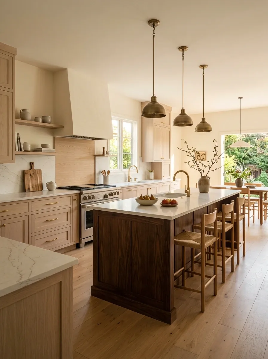
The perimeter of this kitchen stays pale and airy with light oak cabinetry, warm cream walls, and a softly veined stone countertop. In the center, a substantial walnut island introduces a much deeper tone and gives the open room a visual anchor.
This works because the dark wood is concentrated in one clear zone. The eye reads the island as a deliberate centerpiece rather than wondering why the cabinets and island couldn’t agree on a finish.
Natural light keeps the contrast warm instead of harsh. Simple stools, restrained hardware, and minimal countertop clutter keep the composition architectural.
And yes, the island is allowed to be darker. Matching the entire kitchen would actually remove some of the depth that makes this version interesting.
Scandinavian Bedroom With Oak, Ash, and Soft White
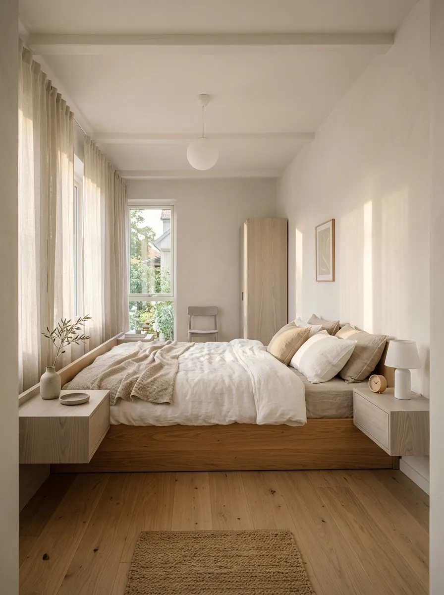
This bedroom keeps its wood tones close rather than making contrast the main event. Pale oak appears in the bed frame and flooring, slightly cooler ash shows up in the bedside furniture, and nearly everything else stays in soft white, oatmeal, and muted beige.
The difference between the woods is subtle, but it still creates useful depth. Oak brings warmth. Ash introduces a slightly quieter, cooler note. The textiles then soften the transition so the room never feels like a color chart exploded across the floor.
A low bed, simple furniture, and uncluttered walls are important here. With this much pale wood, adding a dozen decorative objects would ruin the calm immediately.
This is proof that mixed wood does not always need dramatic contrast. Sometimes the smartest combination is barely showing off at all.
adds softness
adds quiet contrast
joins the two visually
Moody Dining Room With Espresso Wood and Honey Oak
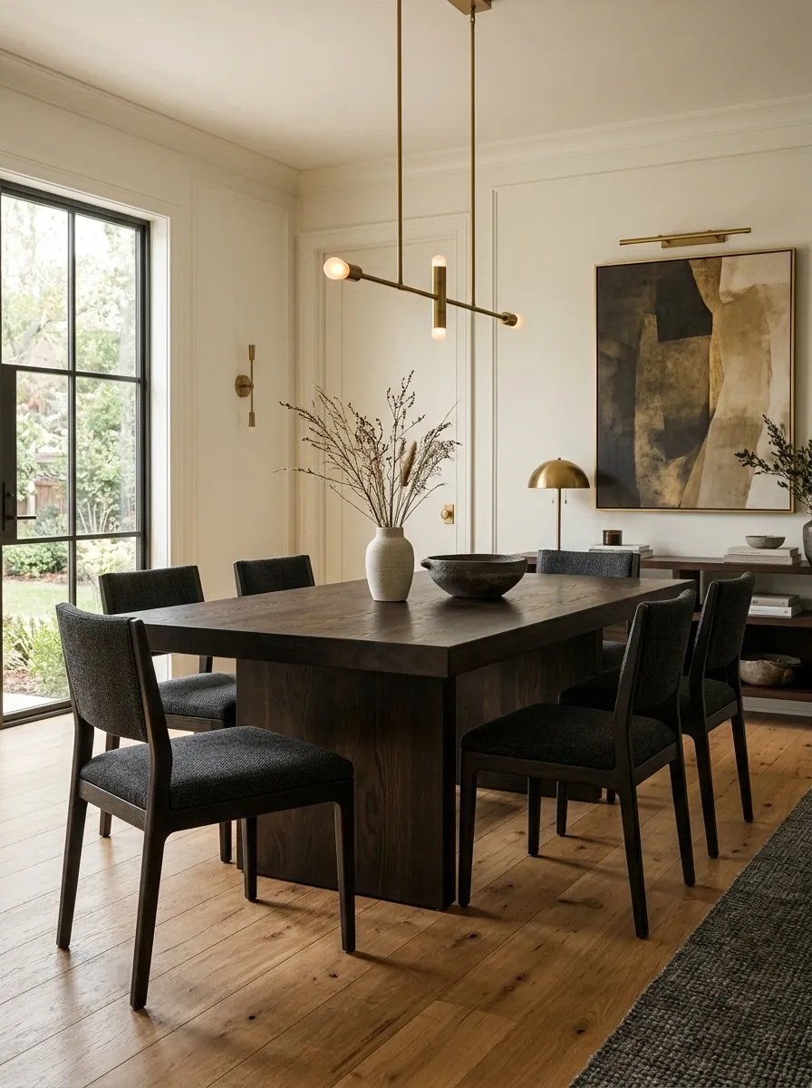
A dark espresso dining table sits over warm honey-oak flooring in this moodier composition, surrounded by charcoal upholstered chairs, creamy walls, and warm brass lighting. The contrast is obvious, which is exactly why it works.
The floor supplies warmth from below while the table creates a darker center. Instead of trying to disguise the difference, the room gives each wood enough visual space to hold its own.
The charcoal upholstery is doing more work than it first appears to. It connects with the deep table, while the lighter walls keep the room from becoming overwhelmingly dark.
Strong contrast can look intentional when the surrounding materials acknowledge both sides. Throwing two unrelated wood finishes into a room and hoping for friendship is a different strategy entirely.
Mid-Century Living Room With Teak and Walnut
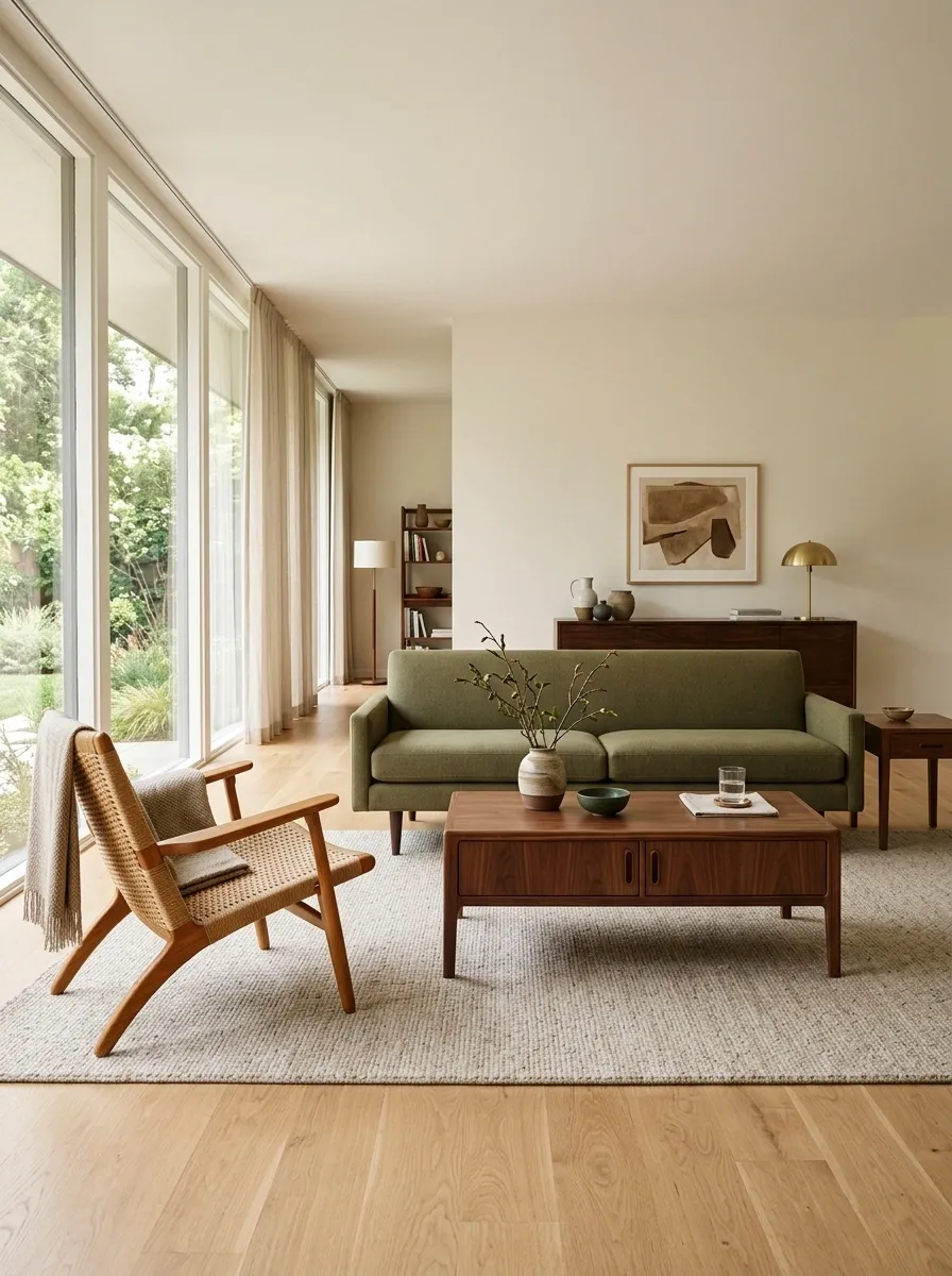
Teak brings the warm, honeyed character in this mid-century living room, while walnut appears through the coffee table, cabinet details, and darker furniture accents. An olive sofa, low-profile seating, a muted rug, and warm indirect lighting complete the composition.
The woods are different, but they belong to the same broader brown family. That shared warmth keeps the room cohesive while their grain patterns and values provide enough variation to stop everything from looking like one giant matching furniture set.
The silhouette matters too. Mid-century forms are clean and low, so the mixed woods feel connected through shape as much as color.
This kind of room benefits from restraint. Let the teak and walnut carry the material story, then keep the accessories edited.
The furniture already has enough personality to avoid needing a supporting cast of 46 decorative objects.
Teak brings the lighter honey tone, walnut supplies deeper brown notes, and the olive upholstery sits between them as a visual bridge. The woods don’t match. Their overall warmth does enough of the connecting.
Rich Rustic Kitchen With Reclaimed Timber and Natural Oak
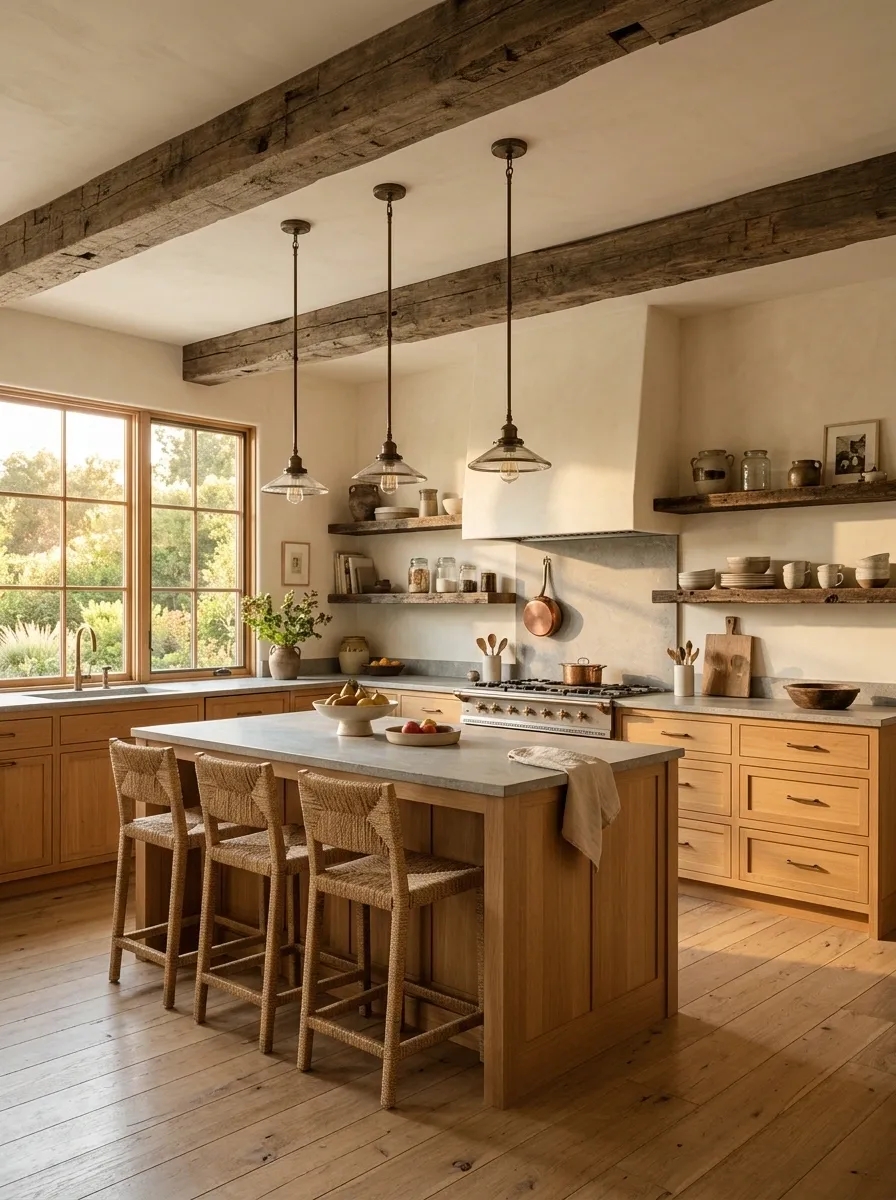
This kitchen doesn’t try to make every wooden surface look related by force. Natural oak cabinetry carries most of the room, while reclaimed timber appears in ceiling beams and open shelving, giving the architecture a rougher, older layer. Limestone counters, creamy walls, aged bronze lighting, and woven stools soften the contrast.
The trick is giving the reclaimed wood a different job. It feels architectural and weathered, while the oak feels refined and substantial. That distinction makes the combination look intentional.
Keep the rest of the finishes quiet. Once the timber starts doing this much visual work, another dramatic wood accent would just be furniture joining a group chat nobody invited it to.
Japandi Living Room With Blonde Oak and Smoked Oak
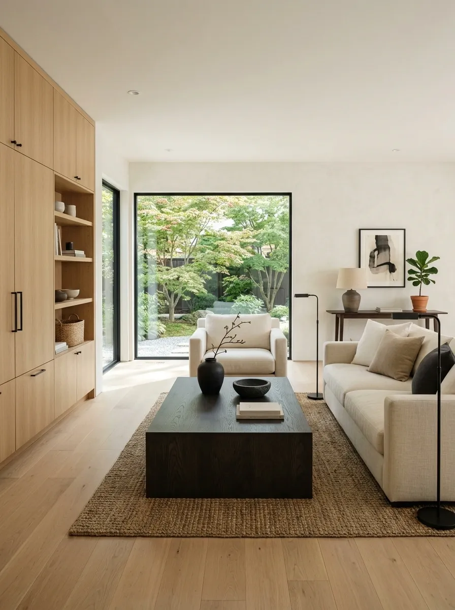
Blonde oak flooring and cabinetry make this Japandi living room feel light and open, while a smoked-oak coffee table introduces a deeper, almost charcoal-brown note. Low cream seating, textured plaster walls, and a few black accents keep the darker wood from feeling disconnected.
The contrast is strongest at the center of the room, so it reads as a deliberate focal point. Everything around it stays restrained, letting the different woods remain visible without turning the space into a wood-tone convention.
This works particularly well with simple furniture silhouettes. Heavy ornament would compete with the clean material story.
The overall effect is calm, but not bland. The dark table gives the pale room somewhere interesting to look.
light foundation
dark focal point
soft transition
small punctuation
Traditional Dining Room With Cherry, Oak, and Painted Cabinetry
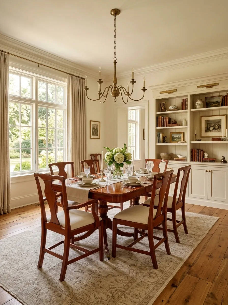
This traditional dining room mixes reddish cherry furniture with a warmer oak floor, but the room never turns into a sea of competing brown surfaces. Cream-painted built-ins interrupt the wood, while ivory upholstery, soft drapery, and aged brass lighting keep the palette warm.
Cherry and oak already have enough difference in color to create separation. The painted cabinetry then gives the eye a clean resting point between them.
That is what makes this composition work. The room isn’t pretending the woods match. It is giving the difference some breathing room.
A restrained palette around the furniture matters here. Adding another strong wood stain would make an already detailed traditional room feel unnecessarily busy.
Modern Bedroom With Walnut Bed and Pale Oak Floors
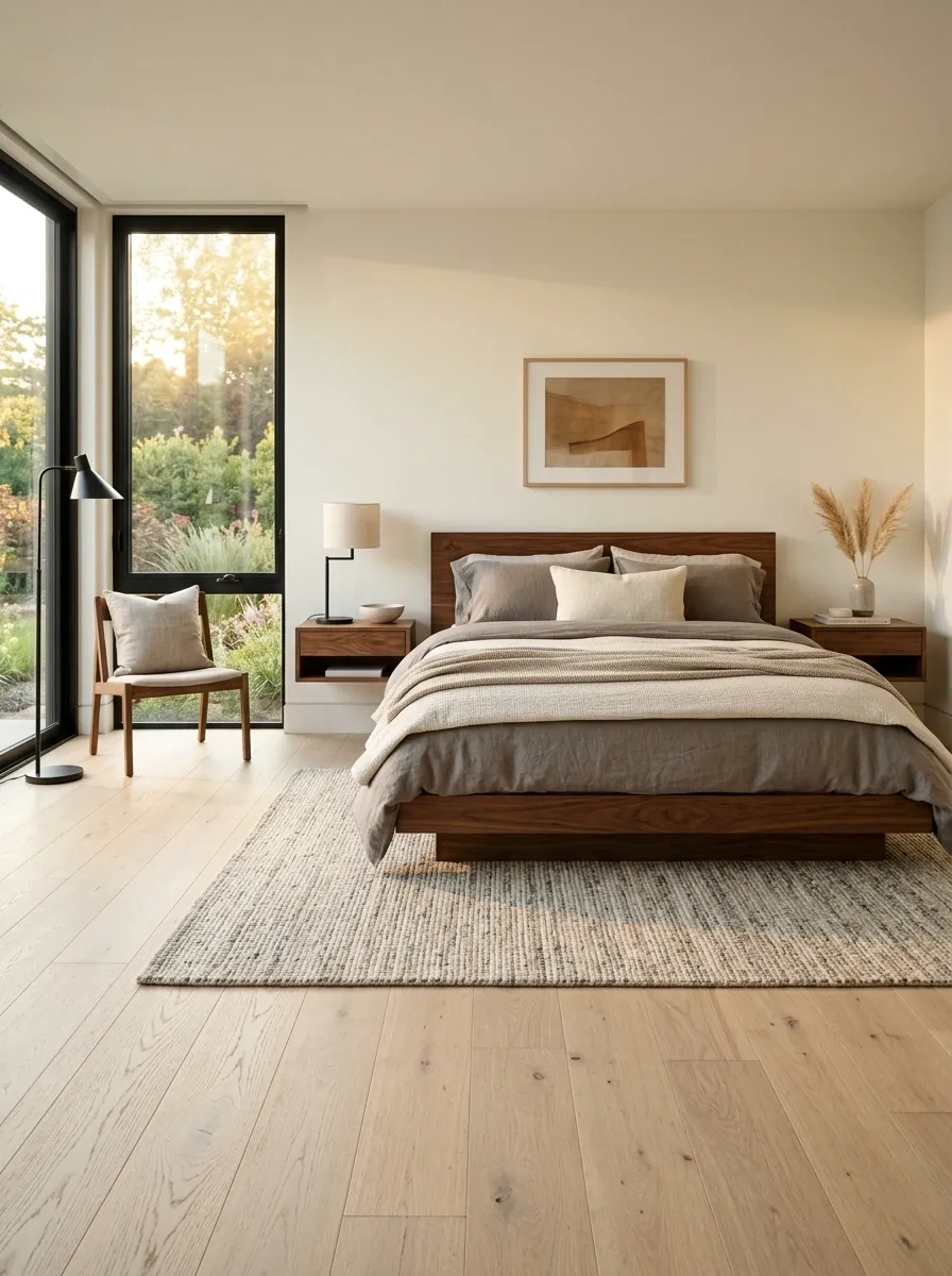
A low walnut platform bed sits against pale oak flooring in this modern bedroom, creating a strong dark-light contrast without making the room feel heavy. Warm gray bedding, creamy walls, simple black lighting, and a quiet rug fill in the spaces between those two wood tones.
The floor works almost like a backdrop. It covers a large area but stays visually light, allowing the walnut bed to become the obvious focal point.
That balance is what keeps the room sophisticated rather than busy. The surrounding pieces don’t need to introduce more wood because the main two finishes already have a clear relationship.
A room like this proves that contrast isn’t the enemy.
Random contrast is.
Coastal Dining Room With White Oak and Weathered Driftwood
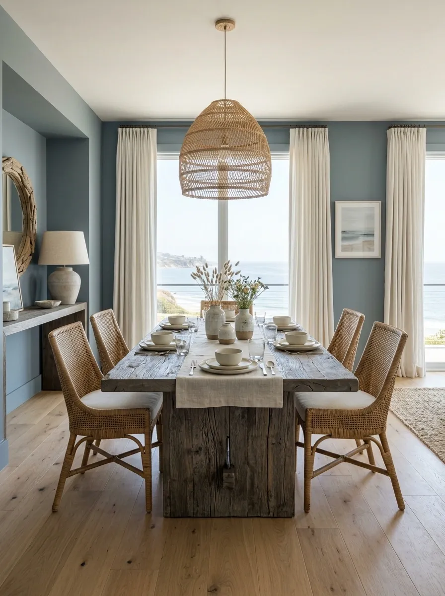
White oak flooring gives this dining area a clean, pale foundation, while the dining table uses a weathered driftwood finish with soft gray-brown coloring. Woven chairs, linen curtains, muted blue-gray walls, and a natural pendant keep the setting relaxed without pushing it into beach-theme territory.
The difference between the clean oak and aged table is actually what gives the room character. One looks refined and fresh, the other carries texture and visual history.
Keeping the rest of the palette pale matters. The weathered table has enough personality to hold the room together without adding seashells, ropes, and approximately twelve decorative references to the ocean.
This version feels coastal because of its materials and restraint, not because a starfish got involved.
clean, pale, refined
aged, textured, grounded
Organic Modern Kitchen With Oak and Dark Timber
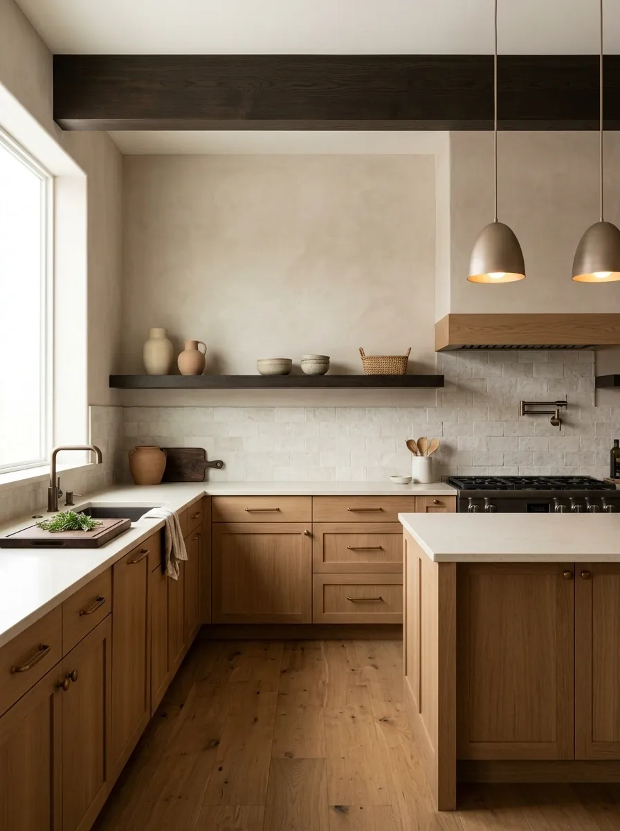
This kitchen keeps the cabinetry warm and natural with medium oak, then sends the darker wood upward into a ceiling beam and a slim architectural shelf. Creamy stone counters, clay-toned walls, and soft bronze lighting fill the space between those two wood notes.
The placement matters more than perfect color matching. The oak occupies the largest furniture area, while the dark timber becomes part of the architecture. Because they live in different visual zones, the contrast feels deliberate.
The rest of the room stays fairly quiet, which keeps the ceiling detail from competing with the kitchen below.
It’s basically the interior-design version of knowing when to stop talking.
Small Apartment Living Room With Oak, Walnut, and Maple
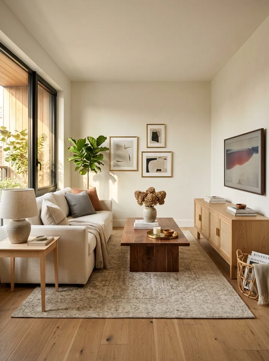
This compact living room uses three wood tones without letting any of them become visually overwhelming. Warm oak flooring forms the base, a walnut coffee table supplies depth, and a small maple side table adds a lighter note near the sofa.
The room works because the differences are controlled. There is no enormous dark cabinet competing with the floor, and the third wood appears in a smaller dose.
Cream seating, pale walls, and a muted rug keep the composition open, which matters in a smaller room.
The lesson isn’t that three woods are automatically fine. It’s that three woods can work when they have different jobs and different amounts of visual weight.
Otherwise, the room starts looking like the wood aisle at a home improvement store had a little too much freedom.
largest surface
strongest contrast
smallest accent
Black and Walnut Home Office With Warm Oak Floors
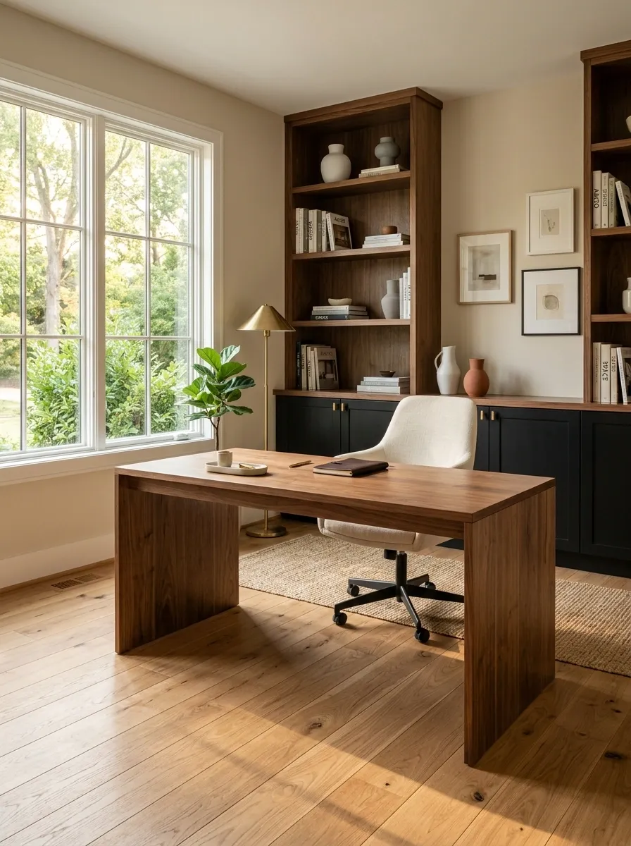
A tailored home office combines warm oak flooring with a walnut desk and shelving, while black cabinetry gives the darker furniture a visual partner. Cream upholstery and a soft neutral wall color keep the space from becoming too dense.
The black is important because it helps separate the walnut from the oak. Instead of asking two brown finishes to create all the contrast themselves, the room introduces a stronger neutral that gives the woods some breathing room.
The result feels structured without becoming overly formal.
Keep the desk area visually clean here. Walnut already brings plenty of warmth and grain. Covering it with piles of cables and seventeen mugs would be a different design concept entirely.
Mid-Century Dining Room With Teak, Walnut, and Olive
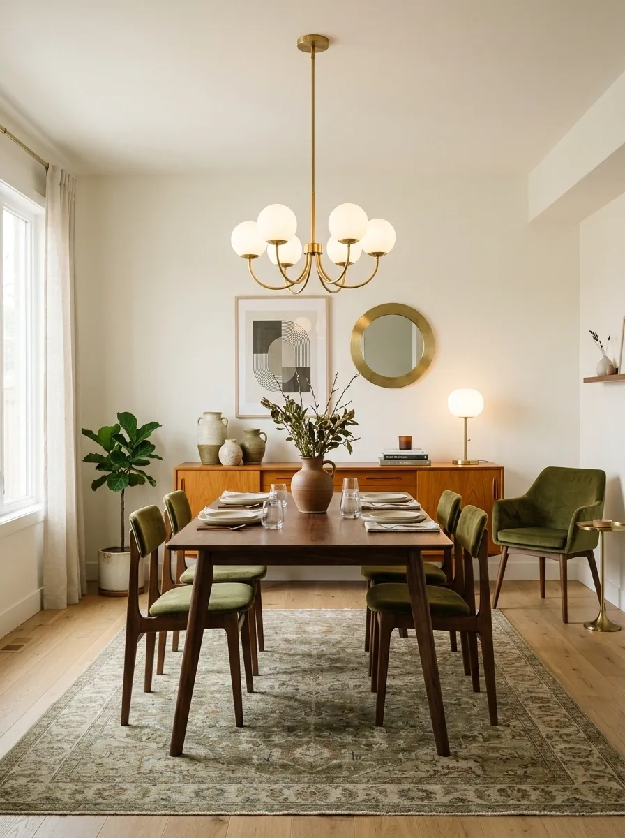
Teak brings a honey-gold warmth to this dining room through the sideboard and seating details, while walnut anchors the dining table in a deeper brown. An olive upholstered chair, a muted rug, creamy walls, and soft globe lighting tie the two finishes into one mid-century composition.
The woods don’t have to match because the silhouettes already belong to the same visual language. Low furniture, tapered forms, and simple geometry create another layer of connection.
The olive upholstery also prevents the room from becoming a parade of brown.
That’s the part worth stealing from the design. Not the exact furniture. The idea that color and shape can do some of the blending when wood finishes clearly differ.
warm grain and honey tones
deeper visual weight
color bridge around the furniture
Dark Green Dining Room With Warm Walnut and Light Oak
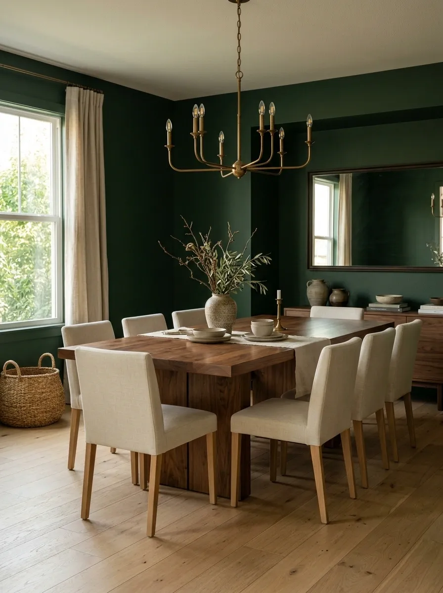
Deep green walls give this dining room a rich backdrop for a warm walnut table and lighter oak flooring. Upholstered chairs in muted cream soften the contrast, while aged brass lighting adds just enough warmth to stop the palette from becoming too serious.
The wall color is what makes the woods feel connected. Instead of asking walnut and oak to blend together, the deep green sits behind both and gives each finish its own space.
The contrast is strong, but the composition doesn’t feel chaotic because the furniture shapes stay simple.
This is where the wall does the diplomatic work.
Earthy Bedroom With White Oak, Teak, and Clay Textiles
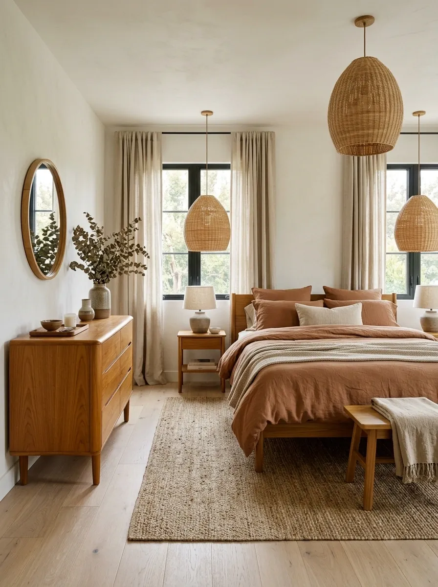
Pale white oak floors create a soft foundation in this bedroom, while a teak dresser brings in a warmer, more golden brown. Clay-colored bedding, cream walls, woven lamps, and natural fabric curtains fill the room with earthy tones that make the woods feel related.
The bedding is doing some serious diplomatic work here. Its warm clay color sits comfortably between the pale floor and richer teak, so the difference never feels abrupt.
The furniture remains simple and slightly rounded, which keeps the room relaxed rather than rustic.
This is a strong direction for anyone who wants several wood finishes but doesn’t want obvious high contrast.
The trick is surrounding them with warm neutrals instead of introducing five more materials just because one corner looks lonely.
Contemporary Dining Room With Pale Ash and Blackened Oak
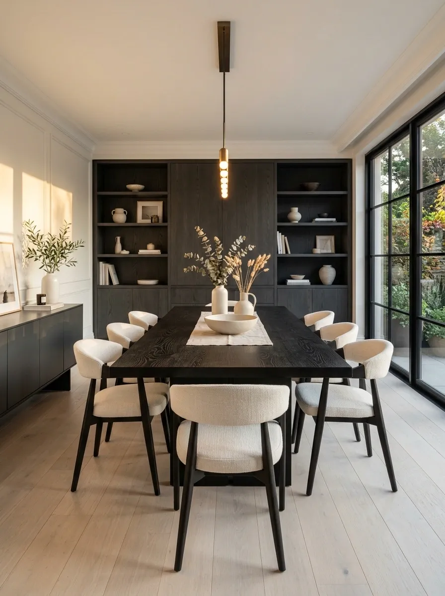
Pale ash cabinetry and flooring keep this contemporary dining room bright, while a blackened oak dining table provides a dramatic center. Sculptural chairs, warm white walls, and soft architectural lighting prevent the dark table from looking like it wandered in from another house.
The difference between the woods is extreme, but there’s no confusion about what is happening. The ash establishes the background and the blackened oak claims the focal position.
That makes this composition feel far more intentional than a collection of medium-brown finishes that all compete at the same visual level.
The important move is leaving enough light around the dark wood.
A blackened table needs some breathing room.
Compact Bedroom With Warm Oak at Different Depths
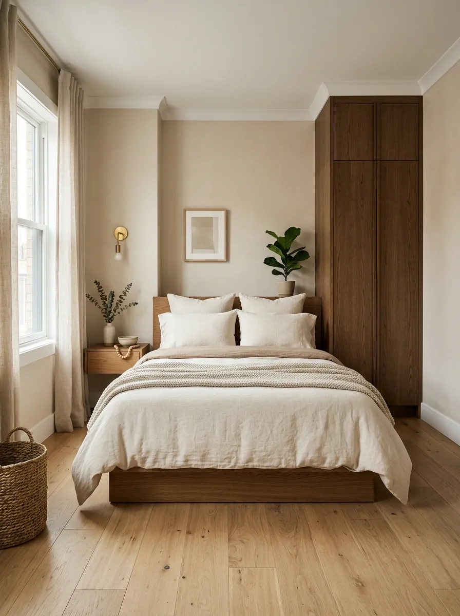
This small bedroom uses warm oak throughout, but not in exactly the same shade. A medium oak bed sits on a slightly lighter oak floor, with deeper oak storage tucked against one wall. Cream bedding and warm beige walls soften the shifts in depth.
There is no dramatic wood contrast here, and that is precisely the point. The room gets variation from value and grain while staying within one warm family.
Using related finishes at different depths works especially well when the room is too small for a lot of visual contrast. The eye gets enough variation to keep things interesting without having to process a dozen competing colors.
Basically, the woods are related.
Nobody had to check the family tree.
floor Medium oak
bed Deep oak
storage
Industrial Loft With Reclaimed Timber and Smooth Walnut
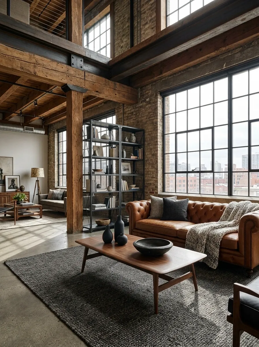
A loft-style interior pairs rough reclaimed timber beams with smooth walnut furniture, concrete flooring, black steel framing, and warm leather seating. The wood finishes aren’t similar in surface character, and that’s what gives the room its personality.
The reclaimed timber feels architectural and irregular. Walnut feels finished and refined. Concrete and steel sit between the two, reinforcing the industrial language and preventing the room from becoming overly warm.
This is a case where texture matters just as much as color. Trying to make the reclaimed boards match the walnut would actually remove some of the contrast that gives the room its edge.
Let the materials look like themselves.
Fake matching is not the assignment.
Cream Kitchen With Rift Oak and Rich Walnut Accents
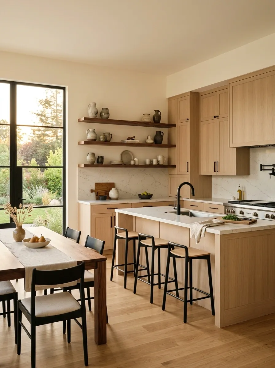
Rift oak cabinetry gives this kitchen a pale, linear look, while walnut appears in the dining table and selected open shelving. Cream walls, light stone counters, and restrained black fixtures keep the composition clean and contemporary.
The straight grain of rift oak creates a very different visual rhythm from walnut, which makes the contrast noticeable without relying only on color.
That’s important in a neutral kitchen. When everything is beige, even grain direction becomes part of the design language.
The walnut should stay selective here. A little gives the kitchen depth. Covering every available surface in walnut would turn the carefully balanced composition into an enthusiastic woodworking project.
more expressive grain
Warm Minimalist Living Room With Oak and Cedar Details
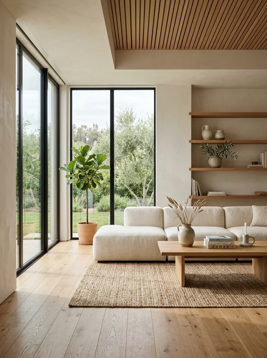
Oak flooring establishes the warm base of this minimalist living room, while subtle cedar appears through shelving and a ceiling detail. Warm white walls, low furniture, soft textiles, and gentle lighting keep the room restrained enough for both woods to breathe.
The cedar doesn’t try to become another major surface. It appears in smaller repeated moments, which makes the room feel layered without becoming visually crowded.
This is a useful approach when the main wood finish is already strong. Instead of introducing a second dramatic furniture piece, the supporting wood can live in architectural details.
Minimalism has officially decided that empty space is useful.
Finally, some good news for the vacuum cleaner.
Classic Sitting Room With Dark Floors and Lighter Oak Furniture
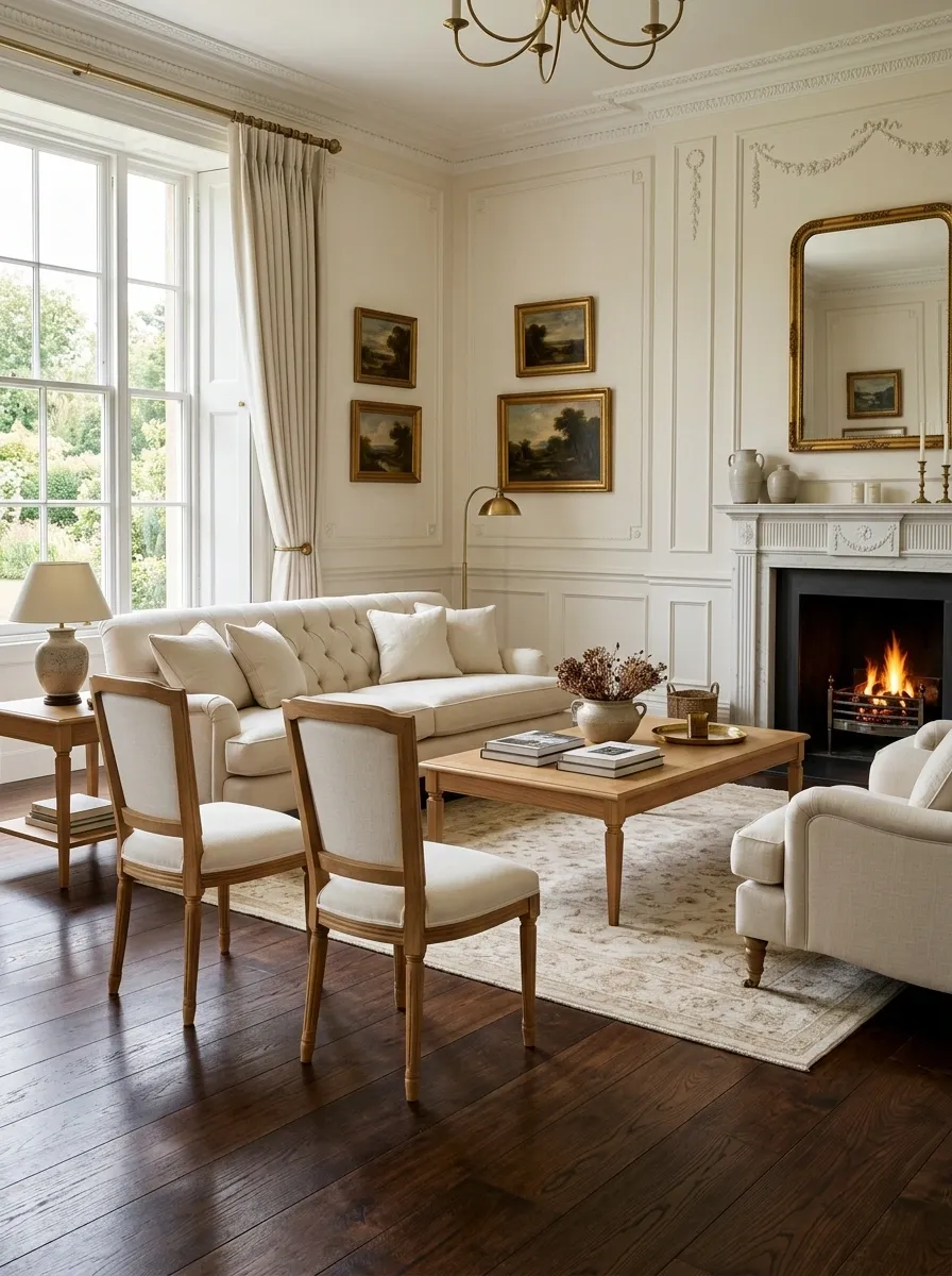
Deep walnut-toned flooring creates a dramatic foundation in this classic sitting room, while lighter natural oak furniture stands clearly against it. Cream upholstery, traditional wall paneling, warm lighting, and restrained brass details fill the room without adding more heavy wood.
The usual instinct is to put dark furniture on a light floor. Flipping that arrangement produces a richer effect and gives the furniture more visual lift.
The lighter oak pieces feel especially crisp because the dark floor provides such strong contrast underneath them.
The composition also benefits from keeping the walls fairly light. A dark floor plus dark furniture plus dark walls would be less classic sitting room and more someone-is-hiding-a-secret-passage.
Scandinavian Kitchen With Natural Oak and Muted Blue Cabinets
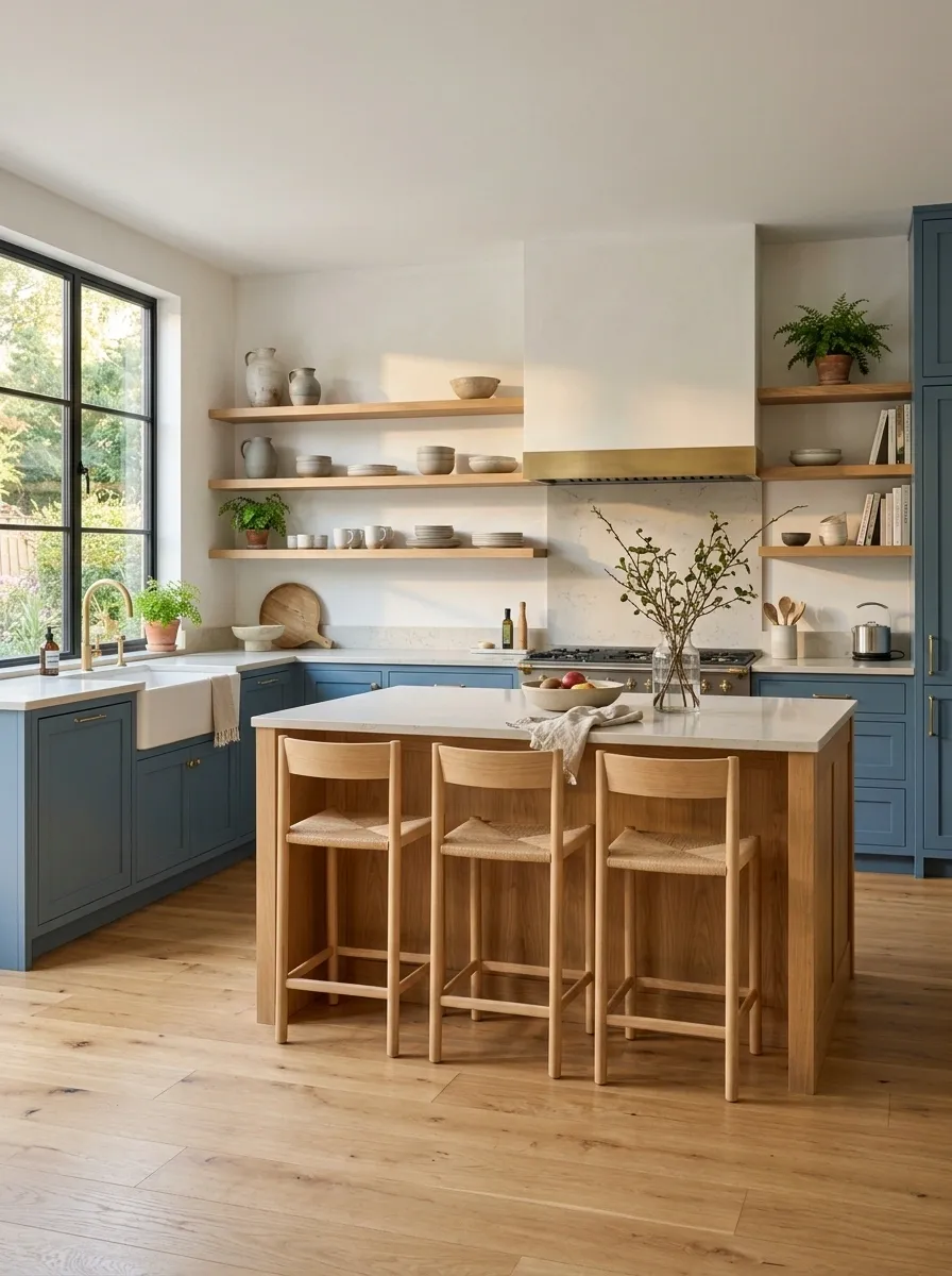
Natural oak flooring and open shelving bring warmth to this Scandinavian kitchen, while muted blue cabinetry gives the larger surfaces a painted finish rather than another competing wood tone. Pale countertops, simple wood stools, and soft white walls complete the room.
The blue cabinets are valuable because they interrupt the natural wood without fighting it. Oak remains visible where it matters, but the painted surfaces keep the overall composition airy.
This is one of the easiest ways to mix several natural wood pieces without making the kitchen feel overly brown. The color acts as the divider.
And honestly, the kitchen does not need another wood surface just because one wall is looking a little lonely.
Warm Contemporary Kitchen With Oak Cabinets and Walnut Shelving
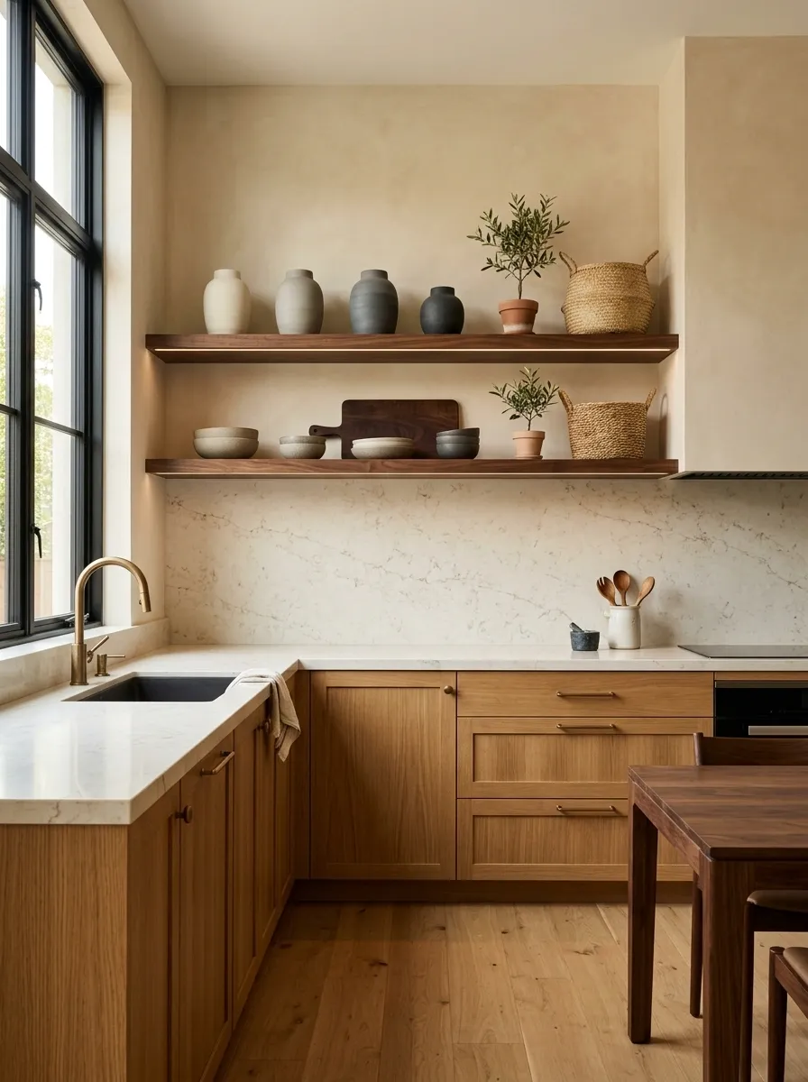
Medium oak cabinetry keeps this kitchen warm and substantial, while darker walnut appears in open shelving and a nearby dining table. Cream stone counters, warm beige walls, and understated bronze hardware soften the transition between the two woods.
The shelving is intentionally darker, but because it sits above the lighter cabinetry, the contrast feels layered rather than mismatched. There is also enough empty wall and countertop space around it to stop the darker grain from becoming visually noisy.
This approach works especially well in open kitchens where the same wood tone doesn’t need to dominate every surface.
The walnut gets the interesting job. The oak gets the big job.
Everyone goes home happy.
Vintage-Inspired Living Room With Honey Oak and Deep Mahogany
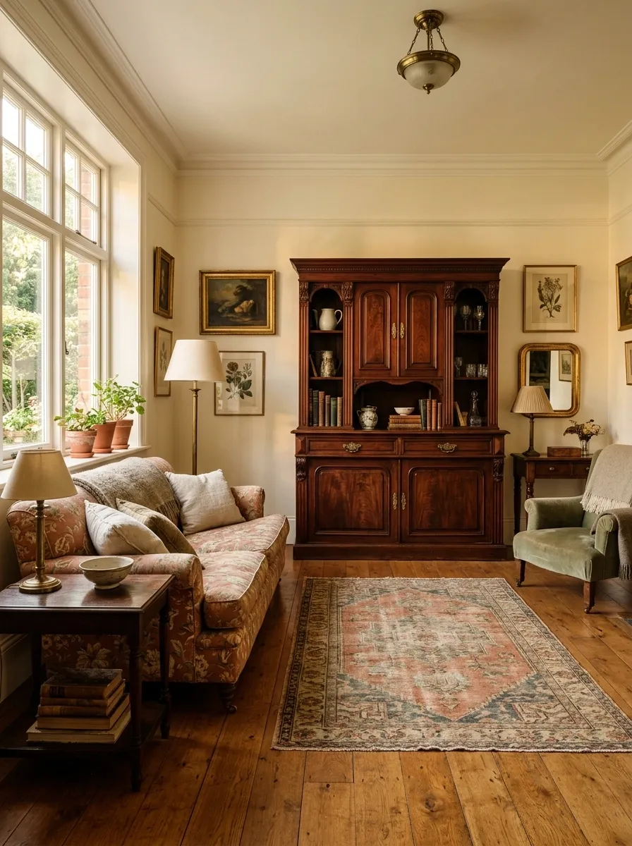
Honey oak flooring brings a lighter golden base to this vintage-inspired living room, while a deep mahogany cabinet creates a richer focal point. Faded patterned upholstery, warm ivory walls, aged brass lighting, and a muted rug keep the room from becoming overly formal.
The different woods work because they share an aged, warm character. Neither finish feels ultra-modern or freshly manufactured, so the contrast reads as part of the room’s collected history.
The surrounding fabrics are intentionally muted. They let the woods provide the stronger color story without piling more saturated tones into an already detailed space.
A room like this should feel collected, not like every antique shop in town emptied itself into one living room.
Soft Transitional Kitchen With Walnut Island and Oak Floors
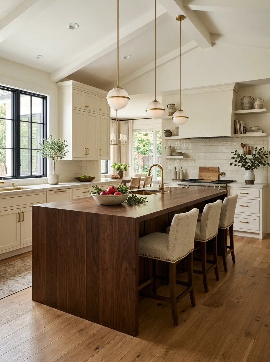
A warm oak floor runs through this transitional kitchen while a large walnut island takes center stage. Cream-painted perimeter cabinetry frames the room, with pale stone counters, upholstered stools, and understated lighting keeping the heavier island balanced.
The painted cabinets are crucial. They create a large visual break between the floor and the island, so the walnut doesn’t appear to be competing with another brown cabinet finish.
The island is also substantial enough to deserve its darker tone. A tiny walnut object would not create the same sense of structure.
This composition feels polished because the contrast has a clear purpose.
The island isn’t “the different wood.” It’s the center of the room.
PERIMETER
ISLAND
FLOOR
Dark Green Bedroom With Warm Walnut and Natural Oak
Deep green walls wrap this bedroom in a saturated backdrop, with warm oak flooring and walnut furniture creating two distinct wood levels. Cream bedding, linen curtains, and soft brass lighting prevent the darker palette from becoming overly dense.
Walnut appears mostly around the bed and storage, while the oak stays broad and relatively quiet underfoot. That difference in scale makes the woods easy to read.
The green wall also gives both finishes a common setting. Instead of blending the woods together, the room lets the background unify them.
This is where contrast starts looking expensive instead of accidental.
The secret is not “more wood.” Please, nobody add another wooden stool.
Eclectic Living Room With Honey Oak, Walnut, and Teak
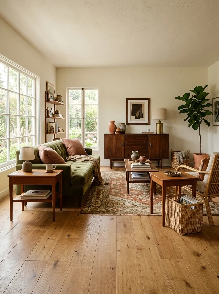
This eclectic living room embraces three distinct woods: honey oak flooring, a walnut cabinet, and medium-toned teak furniture. The surrounding palette stays restrained with cream walls, olive upholstery, muted rust textiles, and natural woven pieces.
The woods don’t match, and they aren’t supposed to. Their colors sit within a warm range, while their furniture shapes and placement keep each one visually distinct.
The room also avoids giving every wood equal attention. The floor is the broadest element, walnut provides a darker anchor, and teak fills in smaller furniture moments.
That hierarchy keeps the eclectic look from becoming random.
Eclectic is supposed to look collected. It is not supposed to look like the furniture section was sorted by “add to cart” button speed.
background
anchor
smaller accents
Light-Filled Home With Maple, Oak, and Natural Stone
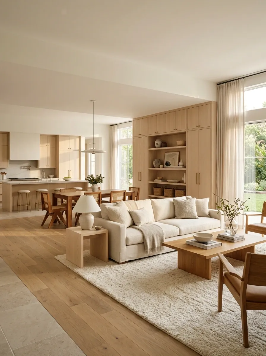
A bright open-plan room brings together pale maple cabinetry, warm oak furniture, and light natural stone flooring. Soft cream upholstery, warm white walls, and large windows keep the entire composition luminous.
The woods are close in value, but not identical. Maple feels lighter and cleaner, while oak introduces just enough warmth to prevent the room from looking washed out.
The stone provides another important layer because it separates the natural wood elements across the room. Instead of having wood everywhere, there are clear quiet zones between the furniture pieces.
This is the softer approach to mixing wood tones.
No dramatic black table required. No design emergency declared.
Moody Home Office With Walnut Shelving and Dark Oak Floors
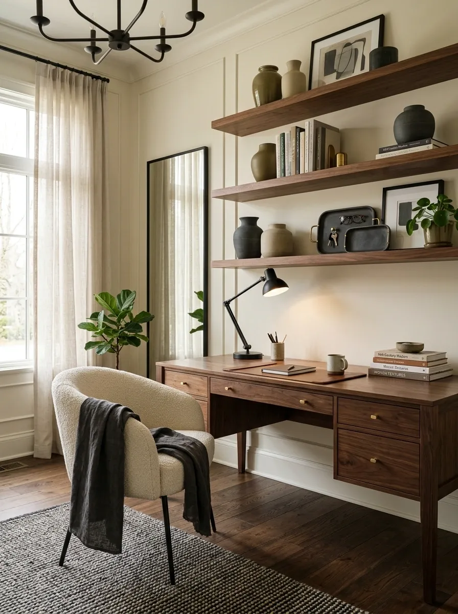
Dark oak flooring and rich walnut shelving create a deep, tailored foundation for this home office. Warm ivory walls, an upholstered cream chair, and soft directional lighting introduce enough light to keep the room from feeling enclosed.
The two woods are both dark, so the room relies more heavily on contrast from the surrounding finishes. The ivory chair and walls act as visual relief, while black accents quietly reinforce the darker furniture.
This is less about making the woods stand apart and more about making sure the whole composition has enough tonal range.
Dark wood looks sophisticated when there is somewhere for the eye to rest.
Cover every surface in brown and suddenly the room has entered its villain era.
Transitional Open Plan With Oak Floors and Walnut Dining Furniture
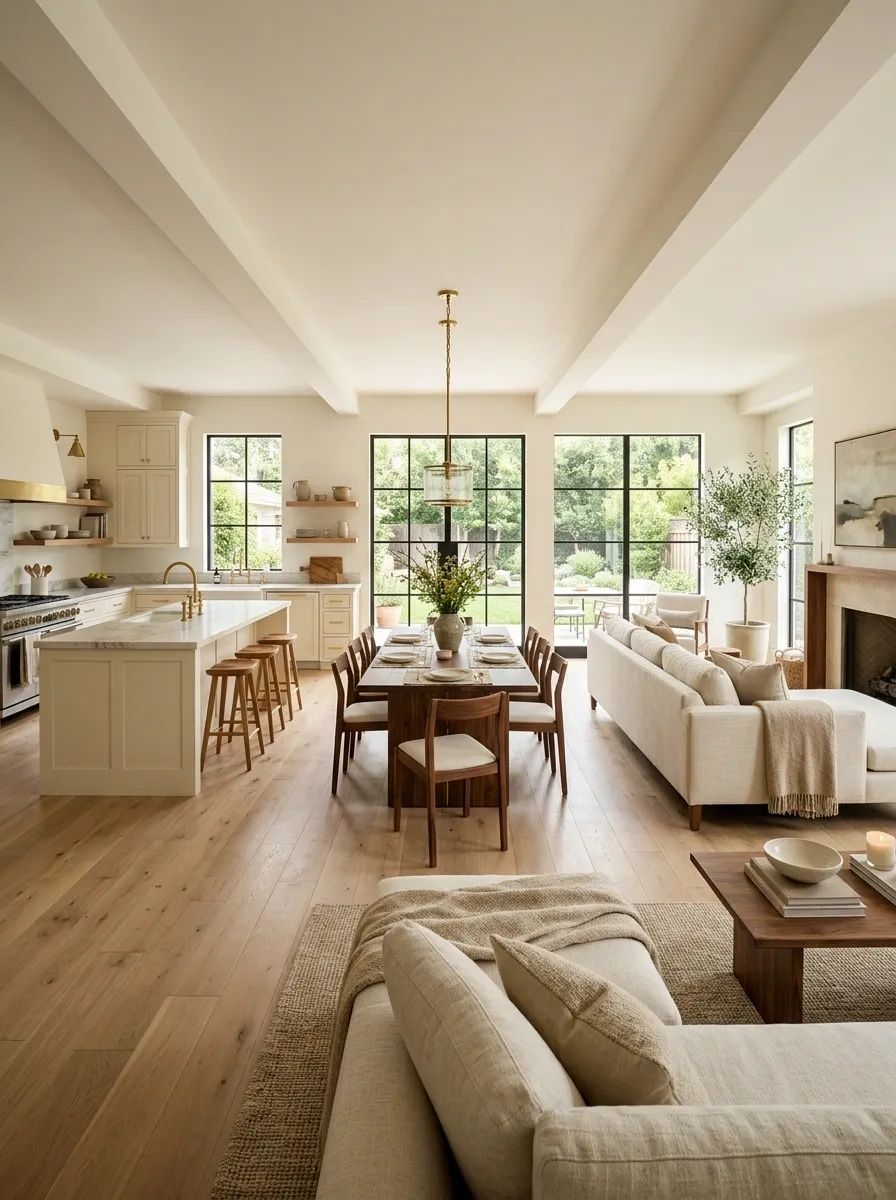
Warm oak flooring runs continuously through this open-plan space, linking the kitchen, dining area, and living zone. A walnut dining table and chairs occupy the central eating area, while the kitchen uses soft painted cabinetry and the living room stays light with cream upholstery.
The continuous flooring is what makes the walnut feel naturally connected to the rest of the home. It acts as the visual thread, while the darker dining set marks the dining zone without requiring another wall or structural divider.
The result is cohesive without being matchy-matchy.
And this is one of those cases where the floor really does deserve the supporting-character award.
KITCHEN
CONTINUES
DINING
LIVING
Collected Neutral Home With Oak, Walnut, and Aged Timber
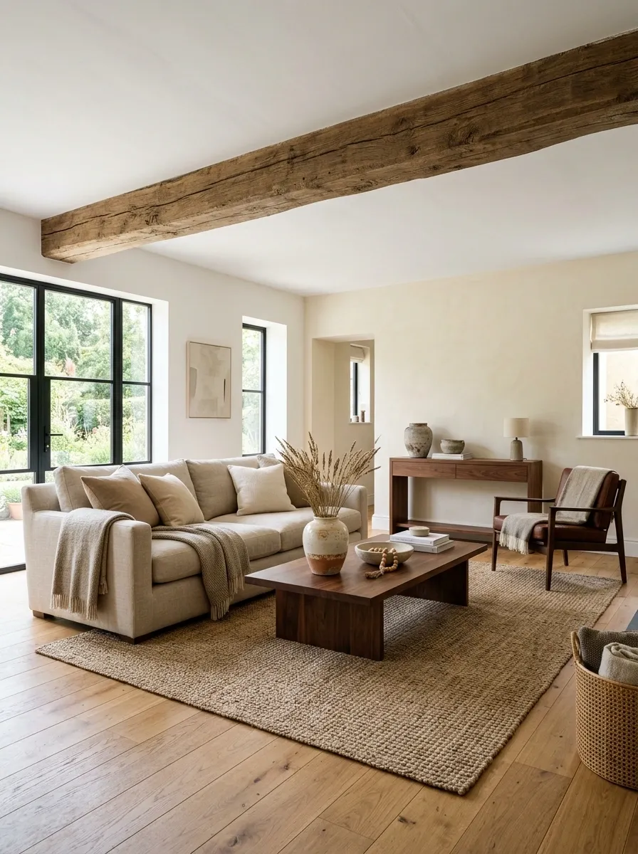
This relaxed interior combines warm oak flooring, walnut furniture, and one aged timber architectural feature. Cream walls, natural linen, woven textures, and a few muted vintage pieces create a soft neutral setting where the three woods can coexist without competing.
The aged timber has the strongest texture, so it appears in a smaller architectural area rather than across another major furniture piece. Walnut brings depth through furniture, while oak keeps the room grounded across the floor.
The result feels collected because the woods share warmth but differ in role, scale, and texture.
In other words, they look like they’ve met before.
That’s the whole assignment.
broadest surface and warm foundation
dark furniture and visual depth
texture and architectural character
Luxe Bedroom With Smoked Walnut and Light Oak
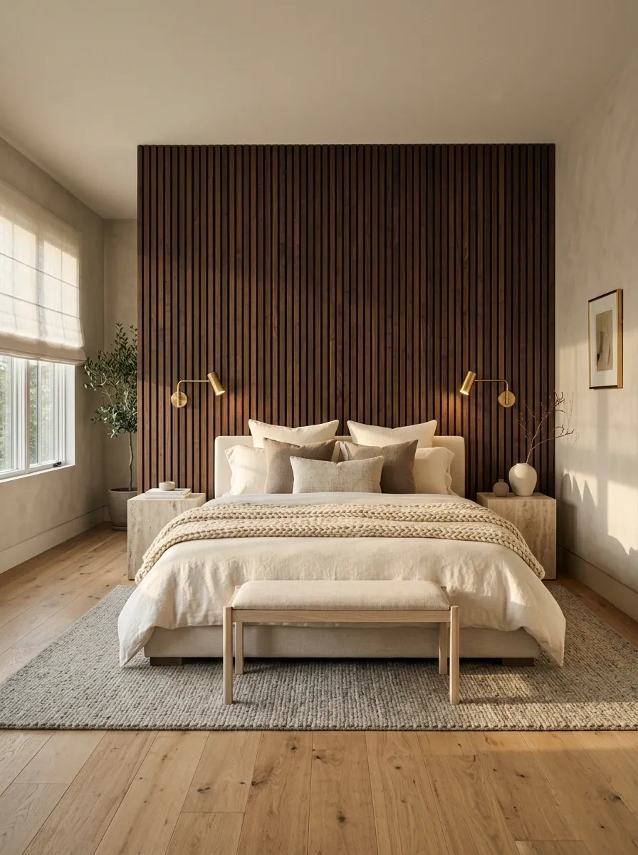
A dramatic smoked walnut headboard wall creates the focal point of this bedroom, while light oak flooring keeps the room visually open beneath it. Cream bedding, stone-colored walls, soft textiles, and restrained metal lighting fill the remaining space.
The darkest wood is concentrated behind the bed rather than scattered throughout the room. That makes the walnut feel architectural and intentional, almost like a built-in backdrop.
The light oak floor provides the contrast needed to keep all that dark wood from becoming visually heavy.
This is how to use a dramatic wood tone without letting it eat the room alive. Give it one major moment, then let everything else breathe.
focal headboard wall
visual relief underfoot
The Final Look Matters More Than the Swatches
Mixing wood tones gets much easier once the entire room is judged as one composition instead of a collection of finish samples. The floor, furniture, walls, lighting, textiles, stone, and architecture all change how the woods are perceived.
The most convincing combinations tend to have a clear visual hierarchy. One wood occupies more space, another creates contrast or character, and the surrounding materials keep everything from competing at once.
So don’t hold two samples next to each other and declare a family feud before the room even exists. Look at the finished picture. Look at the amount of each wood. Look at what sits between them.
Then choose the combination that gives the whole room a point of view.
Save the designs that make the wood combinations click, especially the ones that solve the exact kind of room you’re working with. Your future furniture decisions will thank you.