
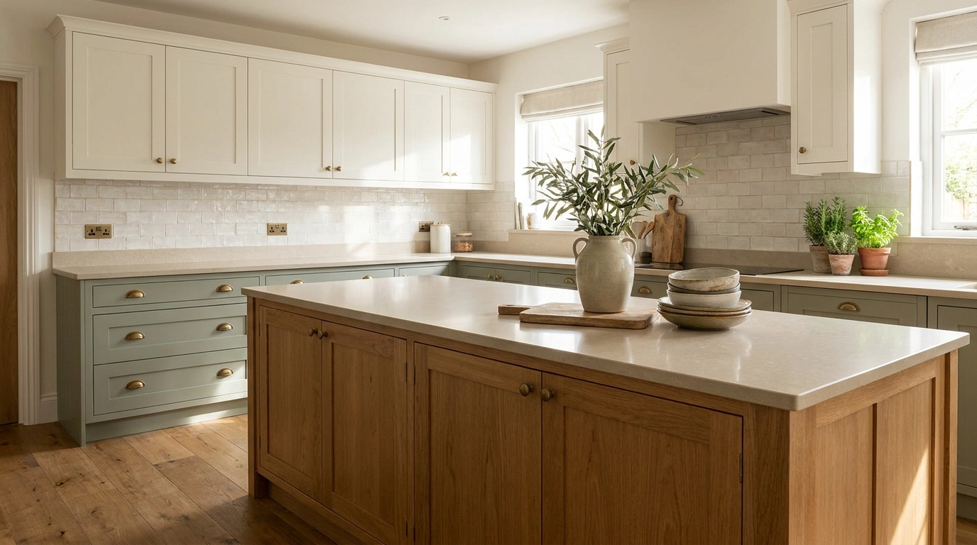
Three cabinet colors sound like a terrible idea right up until the right three colors meet in the same kitchen. Then suddenly the cabinets are doing more than providing storage.
They are dividing the room, creating a focal point, warming up awkward architecture, and giving an otherwise ordinary kitchen an actual point of view.
The tricky part is that three colors can also go sideways very quickly. Pick three unrelated shades and the kitchen starts looking like every cabinet was ordered from a different house. Pick three versions of nearly the same neutral and the “three tone” idea becomes difficult to see in the first place.
What Makes Three Cabinet Colors Look Intentional?
nothing looks intentional.
Warm White, Natural Oak, and Forest Green Kitchen
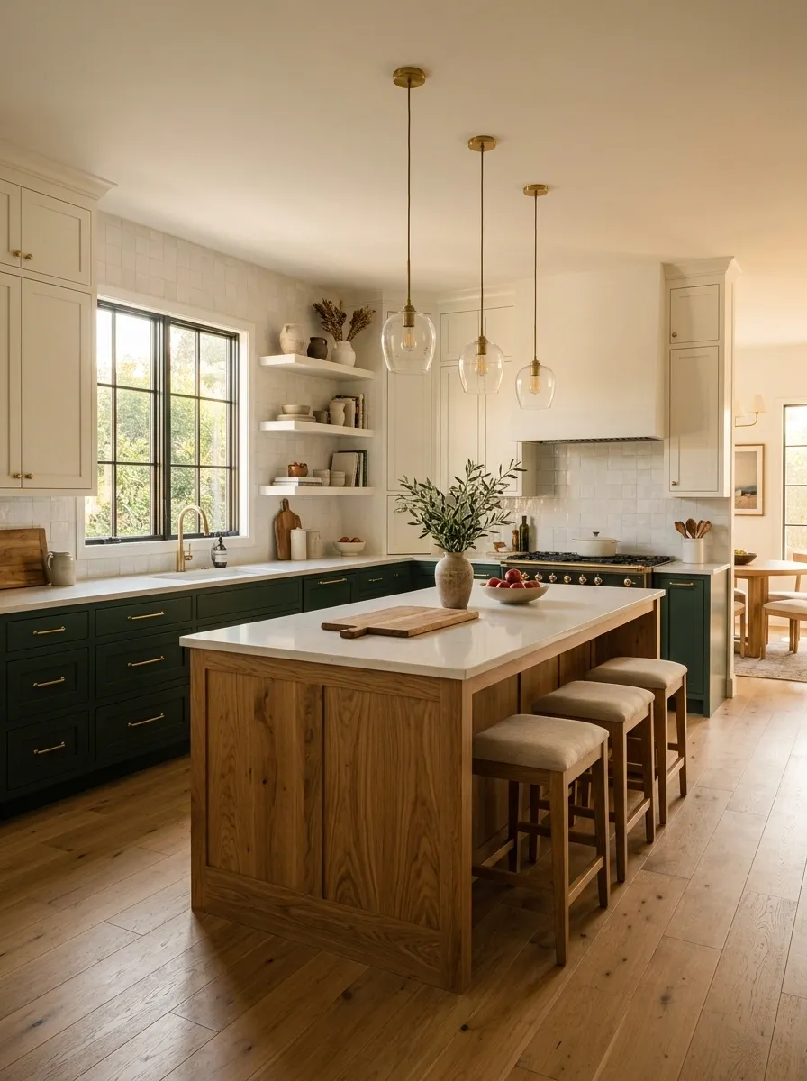
Warm white cabinetry creates a calm backdrop, natural oak takes over the island and selected tall storage, and forest green grounds the lower cabinets around the main work zone. Pale stone counters, warm flooring, and simple lighting keep the darker green from making the room feel heavy.
The oak is what makes this combination work. It sits between the clean white and deep green, giving the palette a natural middle layer instead of letting the colors fight across the room. Keep the backsplash quiet and let the island’s wood grain remain visible.
The result feels layered without looking like three unrelated cabinet samples were brought into a meeting and told to figure it out.Charcoal, Cream, and Light Oak Contemporary Kitchen
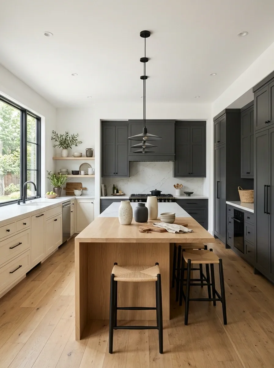
Charcoal cabinetry frames the main cooking wall, cream cabinets soften the surrounding storage, and light oak defines a long island with a simple waterfall edge. Pale counters, understated hardware, and broad open circulation keep the composition crisp.
The key here is scale. Charcoal works because it is concentrated around the strongest architectural section instead of appearing randomly on every other cabinet. Cream then fills the larger background areas, while light oak creates a warmer horizontal center.
The kitchen feels contemporary without relying on a room full of glossy surfaces. That’s important because three colors already provide plenty of visual information. The cabinets don’t need to start performing tricks too.LIGHT STORAGE
WARM CENTER
Sage Green, Cream, and Walnut Heritage Kitchen
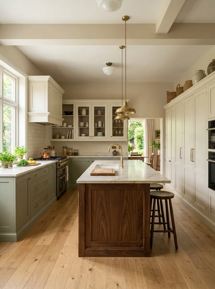
Sage green cabinets establish the lower perimeter, cream cabinetry fills the upper and tall sections, and walnut brings weight to a substantial island. Traditional trim, warm stone counters, simple pendant lighting, and a few glass-front doors give the kitchen a heritage character without turning it into a museum of farmhouse clichés.
The walnut island is the visual anchor. Its darker grain gives the softer sage and cream something substantial to sit beside. Keep the wall finishes warm and avoid introducing a fourth cabinet color.
This composition works especially well when the architecture already has some character. Let the cabinetry respond to it rather than trying to make every surface look brand new.Navy Blue, Pale Gray, and Warm Walnut Kitchen
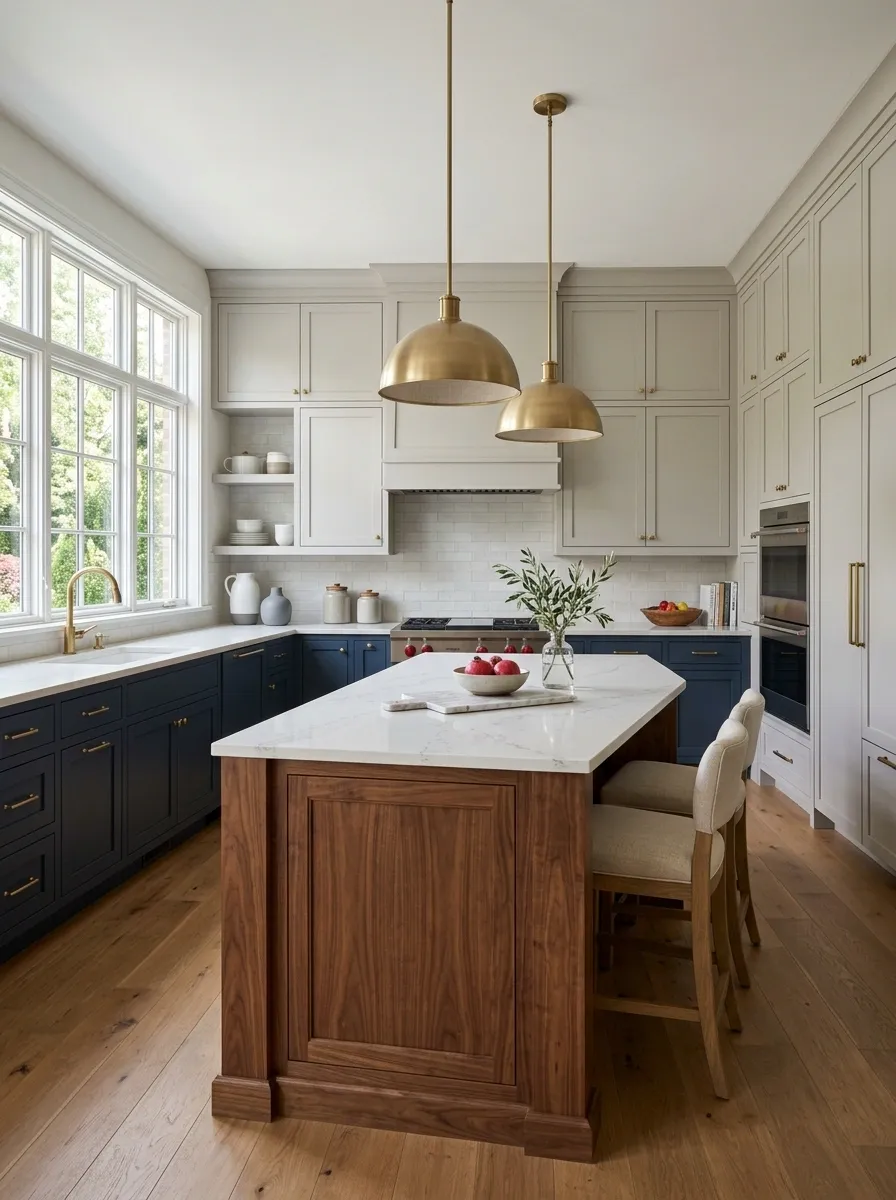
Navy blue cabinetry wraps the lower working areas, pale gray fills the upper cabinets and pantry wall, and warm walnut forms the island. Brushed metal lighting, pale counters, and medium-tone flooring complete the composition.
The navy creates the strongest visual identity, but the gray keeps the upper half of the kitchen from feeling too dark. Walnut then warms the center and prevents the palette from becoming overly cool.
The trick is to keep the gray genuinely pale and warm. A cold gray would push the blue further into icy territory, while the walnut is trying to take the room in the opposite direction. Kitchens have enough arguments about appliances. The colors don’t need one too.Terracotta, Cream, and Olive Mediterranean Kitchen
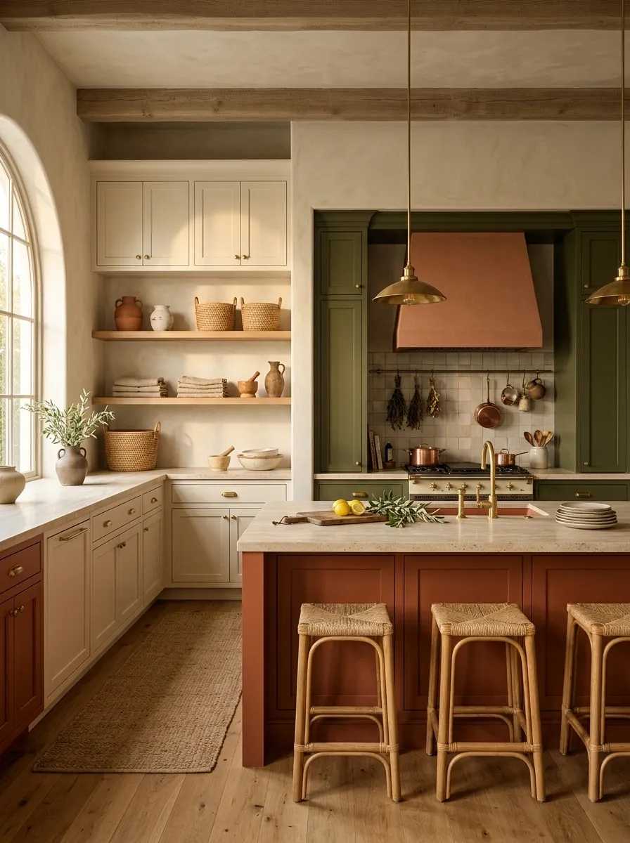
Cream cabinetry forms the main envelope, terracotta defines the island and selected lower cabinets, and olive green frames the cooking wall and pantry storage. Natural stone, warm wood, textured plaster, and simple ceramics complete the Mediterranean-inspired setting.
Terracotta is the visual spark here, but it needs the cream around it to stay sophisticated. Olive then gives the room a darker architectural edge, creating enough contrast for the warmer center to stand out.
Keep the stone and walls relatively quiet. Once the cabinet colors and natural materials are working together, adding another bold pattern would be like adding a drum solo to a conversation that was already going pretty well.Cobalt Blue, Warm White, and Medium Walnut Statement Kitchen
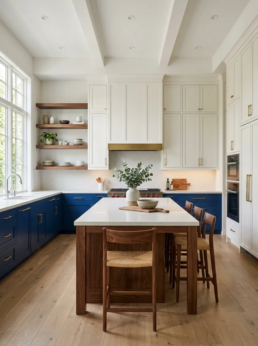
Cobalt blue cabinetry gives the kitchen its unmistakable identity, while warm white handles the tall storage and upper cabinets. Medium walnut takes over the island, open shelving, and a few furniture details, adding enough warmth to keep the blue from feeling cold.
The strongest part of this composition is the color hierarchy. Blue gets to be loud, white gets to be calm, and walnut gets to be warm. That’s enough drama for one room. Keep the counters pale and avoid introducing a heavily patterned backsplash. Once the cabinets have reached this volume, another statement surface would be like bringing a megaphone to a conversation.Burgundy, Putty, and Natural Oak Dramatic Kitchen
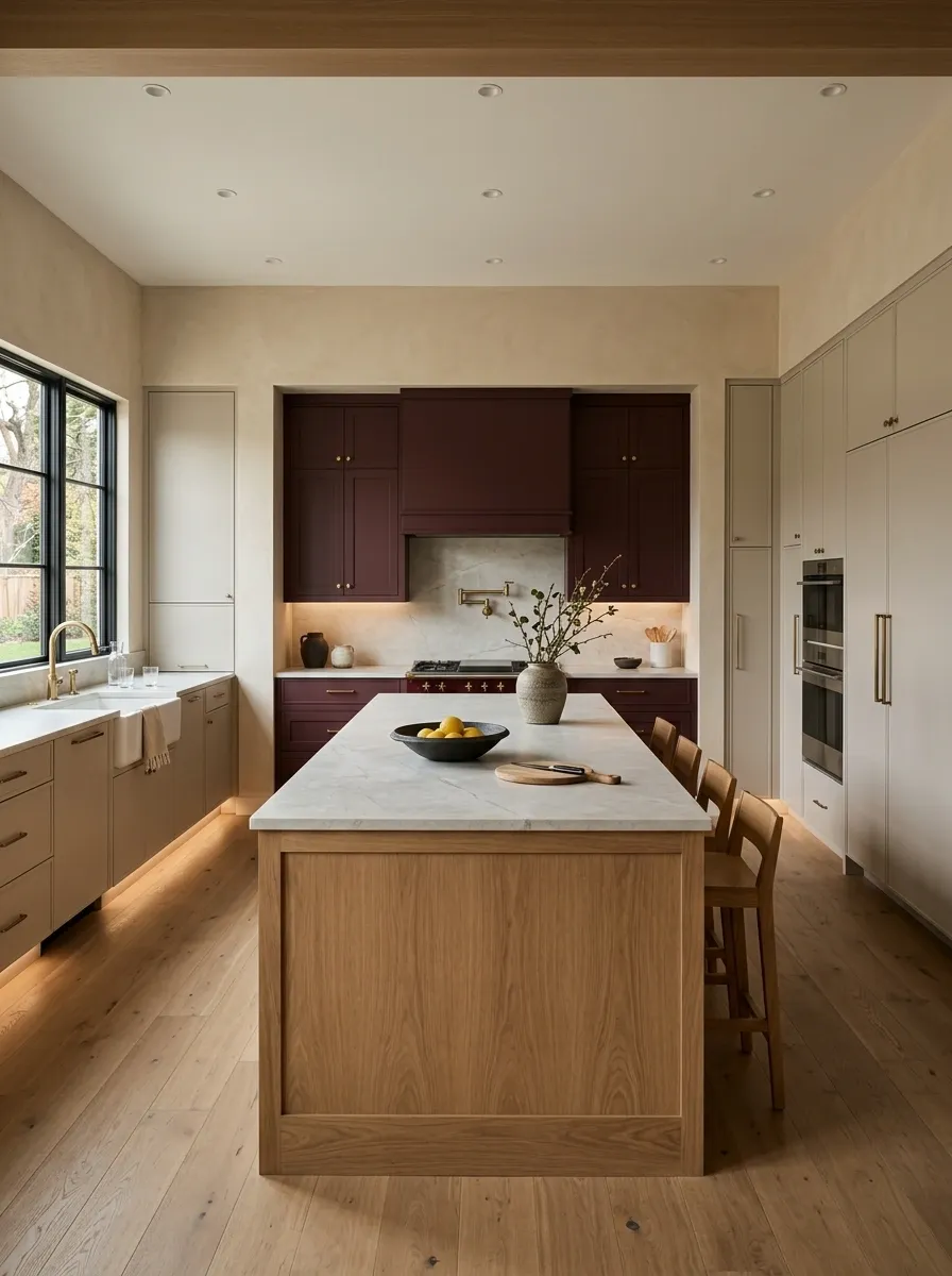
Burgundy cabinetry surrounds the main cooking zone, putty cabinets soften the tall storage, and natural oak defines a long central island. Pale stone counters, warm lighting, and plaster-toned walls make the deep burgundy feel rich rather than theatrical.
This kitchen is dramatic without relying on glossy finishes or excessive decoration. The oak is essential because it breaks up the deeper tones with visible grain and a lighter center. Keep the lighting warm but controlled, especially around the cooking wall. Burgundy already has enough presence. It doesn’t need a spotlight and a standing ovation.Sage Green, Butter Yellow, and Soft White Playful Kitchen
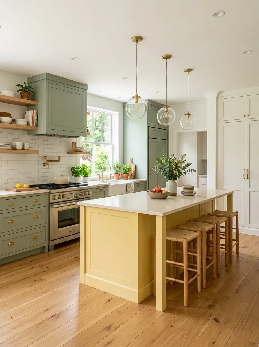
Sage green cabinetry forms the main perimeter, butter yellow takes over the island, and soft white fills the tall storage and upper sections. Creamy counters, pale flooring, simple stools, and vintage-style glass lighting make the palette cheerful while keeping the overall room mature.
The yellow is most effective when it stays concentrated in the middle. That gives the kitchen a memorable focal point without turning every cabinet into a different color story. Let the walls and counters remain quiet, and avoid adding another strong accent elsewhere. The island has already made its point. Loudly. Politely, but loudly.Main field
Center focal point
Visual relief
Mushroom, Ink Blue, and Oak Shaker Kitchen
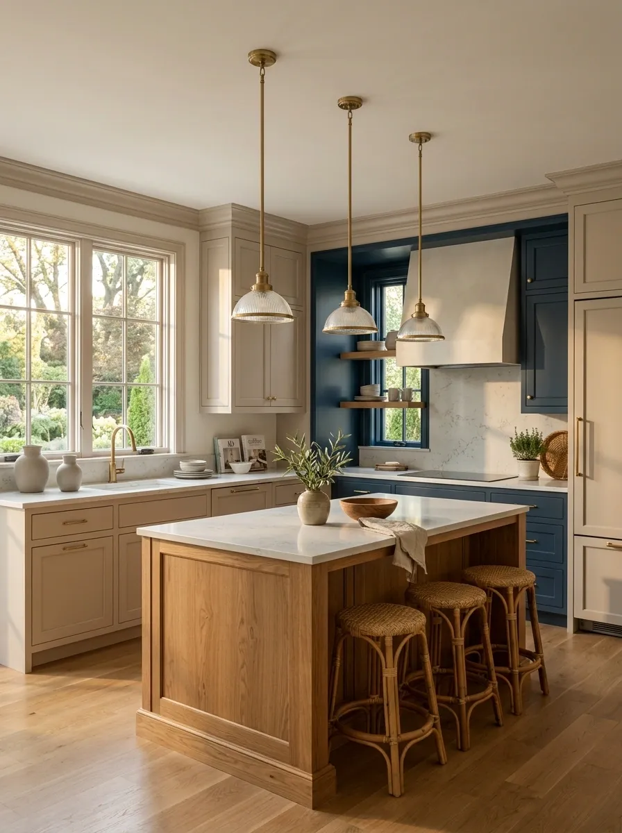
Mushroom Shaker cabinetry creates a soft main envelope, ink blue frames the cooking wall, and warm oak takes over the island. Pale stone counters, traditional trim, and understated metal lighting connect the classic cabinet style with a cleaner contemporary layout.
The ink blue is strongest when it marks one architectural area rather than appearing everywhere. Mushroom then becomes the quiet bridge between blue and oak, while the island adds warmth at eye level. Keep the range wall relatively uncluttered so the blue cabinetry reads as a deliberate architectural move. Three colors, one clear idea. Miraculously, nobody needs a fourth cabinet shade.Olive, Cream, and Black Modern Farmhouse Kitchen
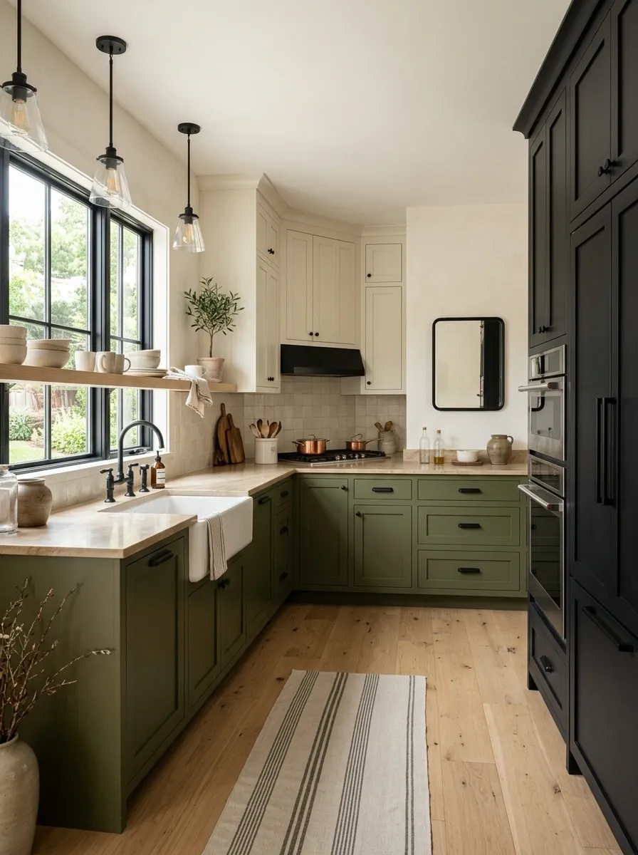
Olive green lower cabinets wrap the working perimeter, cream cabinetry keeps the upper areas soft, and black cabinetry frames a tall pantry wall. White oak flooring, a broad farmhouse sink, simple black lighting, and warm stone counters keep the composition modern rather than overly rustic.
The olive provides the color, black provides the structure, and cream prevents the room from feeling crowded. That division makes the palette easy to understand at a glance. Keep wood tones limited to the flooring, island or furniture, rather than adding timber to every available surface. The farmhouse part can stay charming. It doesn’t need to cosplay as a barn.Natural Oak, Dusty Blue, and Terracotta European Inspired Kitchen
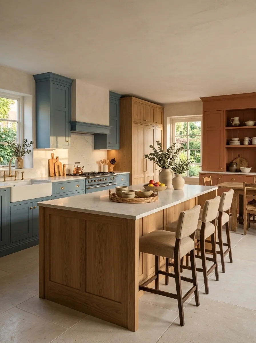
Natural oak covers the island and tall cabinetry, dusty blue runs through the lower perimeter, and muted terracotta appears on selected cabinets near the dining side. Limestone flooring, softly textured walls, simple ceramics, and warm linen stools give the room a relaxed European character.
The terracotta is deliberately limited to one side of the composition, which keeps it interesting without making the whole kitchen feel color-blocked. Oak then links that warmer section with the cooler blue cabinetry. Keep the counters pale and let the flooring stay close to the wall tones. The palette already has enough going on. The backsplash doesn’t need to submit a résumé too.Walnut, Plaster White, and Dusty Green Long Galley Kitchen
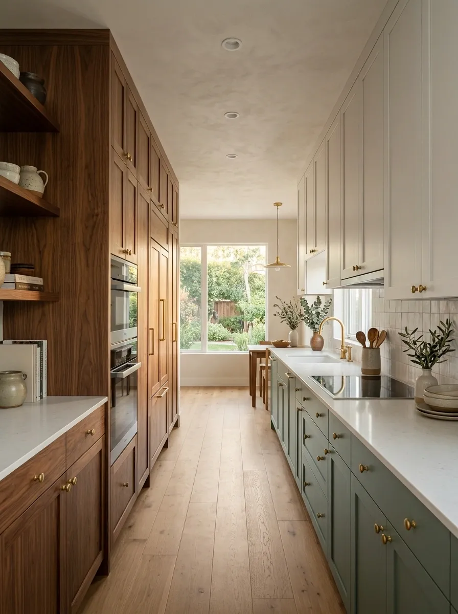
A long galley kitchen gets a warmer, more layered treatment with walnut cabinetry along one side, plaster white across the opposite wall, and dusty green on the lower working run. Pale counters and continuous flooring keep the narrow passage visually connected from end to end.
The important move here is resisting the urge to make both sides equally busy. Walnut gives one wall depth, green adds color at the working level, and white keeps the opposite side visually quiet. That balance matters in a narrow room where every cabinet is already very close to the next one. A galley kitchen doesn’t need an identity crisis and a traffic jam at the same time.Charcoal, Warm Beige, and Chestnut Open Plan Kitchen
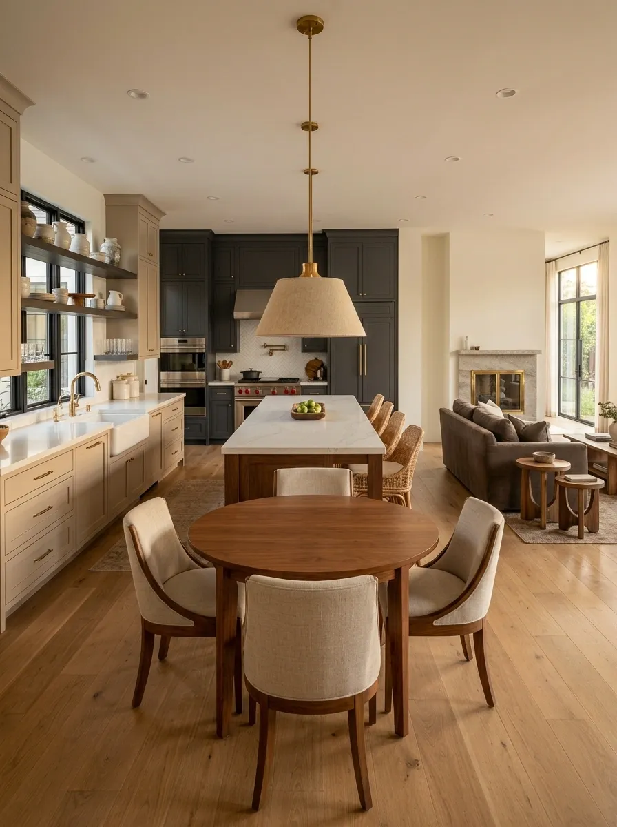
Charcoal cabinetry defines the cooking and appliance wall, warm beige handles the main cabinetry, and chestnut wood takes over the island and nearby breakfast area. The same flooring continues into the dining and living spaces, making the kitchen feel like part of the larger room instead of a separate visual box.
This is where three-tone cabinetry can solve an open-plan problem beautifully. The charcoal gives the kitchen a strong boundary, beige keeps the main mass restrained, and chestnut carries warmth toward the living area. The cabinet palette should connect with nearby furniture rather than stop abruptly at the kitchen edge. Otherwise the room starts looking like two apartments accidentally signed the same lease.Sand, Caramel, and Soft White Tonal Kitchen
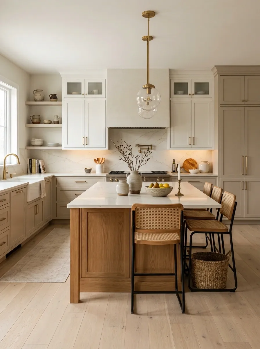
Sand-colored cabinetry creates the main envelope, caramel cabinetry adds depth around the island, and soft white is reserved for the upper and tall storage areas. Cream stone, pale wood flooring, and warm lighting keep the room layered even though the cabinet colors stay within a restrained family.
This is proof that three tones don’t need three loud colors. The difference comes from temperature, depth, and where each tone sits in the room. Caramel gives the island enough presence to feel intentional, while soft white prevents the taller cabinetry from becoming heavy. The kitchen stays calm without drifting into bland territory. Beige-on-beige has finally been allowed to have a personality.Upper and tall storage
Main cabinet envelope
Island and visual depth
Deep Teal, Natural Oak, and Cream Transitional Kitchen
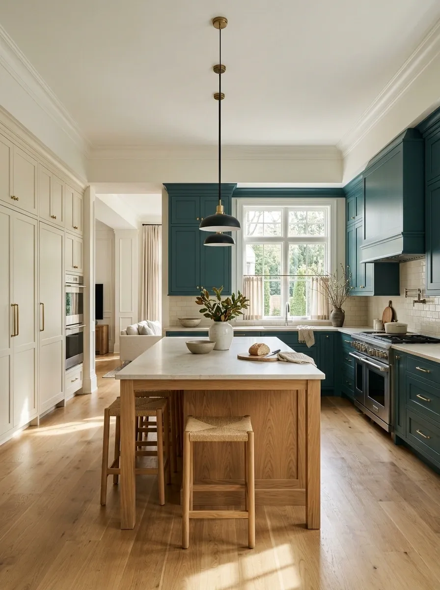
Deep teal cabinetry wraps the primary work areas, cream cabinets lighten the tall storage wall, and natural oak defines a broad central island. Traditional trim, clean-lined stools, simple pendants, and pale stone counters create a transitional kitchen where classic architecture meets fresher furniture.
The teal gets to be the memorable part, but it doesn’t dominate because cream controls the vertical storage and oak softens the center. That contrast gives the room structure without making it feel overly formal. Keep the decorative styling edited and let the cabinet shapes do some of the talking. A good kitchen can have character without putting every personality trait on display.Light Gray, Walnut, and Dusty Rose Kitchen With Vintage Character
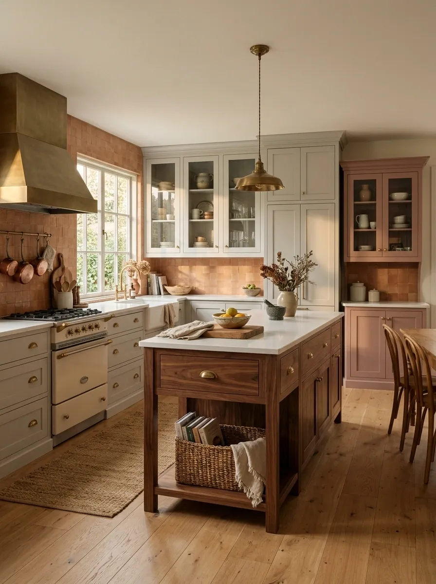
Soft light gray cabinetry establishes the main envelope, walnut gives the island and lower furniture a warmer visual weight, and dusty rose appears across a smaller cabinet run near the dining side. Warm tile, a vintage-inspired range, aged metal details, and glass-front storage make the kitchen feel collected without becoming overly nostalgic.
The dusty rose works because it isn’t asked to carry the entire room. Gray keeps the background quiet while walnut gives the palette enough depth to feel substantial. Keep the vintage details selective too. A few well-placed pieces create character. Filling every shelf with “vintage charm” is how a kitchen goes from old-fashioned to antique-store clearance aisle.Cream, Olive, and Smoked Oak Vintage Kitchen
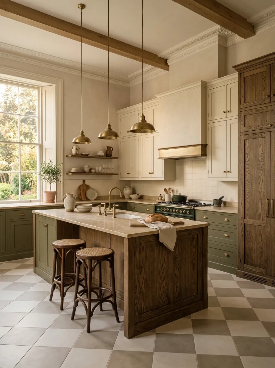
Cream cabinetry brightens the upper walls, olive green anchors the lower cabinets, and smoked oak defines the island and tall storage. Checkerboard flooring, aged-style lighting, warm stone, and simple framed doors create a vintage-inspired room with enough restraint to still feel current.
The smoked oak adds the depth that keeps olive from looking too fresh or cottage-like. Cream then gives the room a lighter upper edge. The flooring can carry pattern, but the backsplash should stay quieter so the room has one clear visual rhythm instead of five competing ones. Apparently kitchens do not earn bonus points for making the eye work overtime.Black, Rust, and Warm White Industrial Kitchen
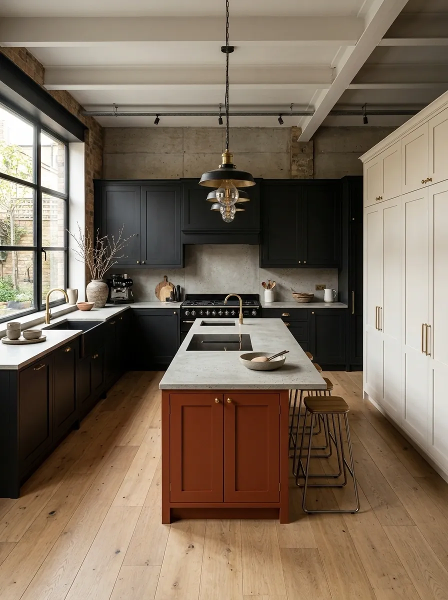
Black cabinetry creates the main architectural frame, rust-colored cabinets bring warmth to the island and breakfast zone, and warm white fills the tall storage wall. Concrete-look counters, timber flooring, exposed-style lighting, and simple stools reinforce the industrial character while keeping the kitchen comfortable.
The black handles the structure, rust handles warmth, and white creates visual relief. That makes the palette feel intentional even with harder materials such as stone and metal. Keep appliance finishes consistent and resist adding too much open shelving. Industrial design already has enough opportunities to show off every random object ever purchased.Pale Green, Natural Maple, and Cream Scandinavian Kitchen
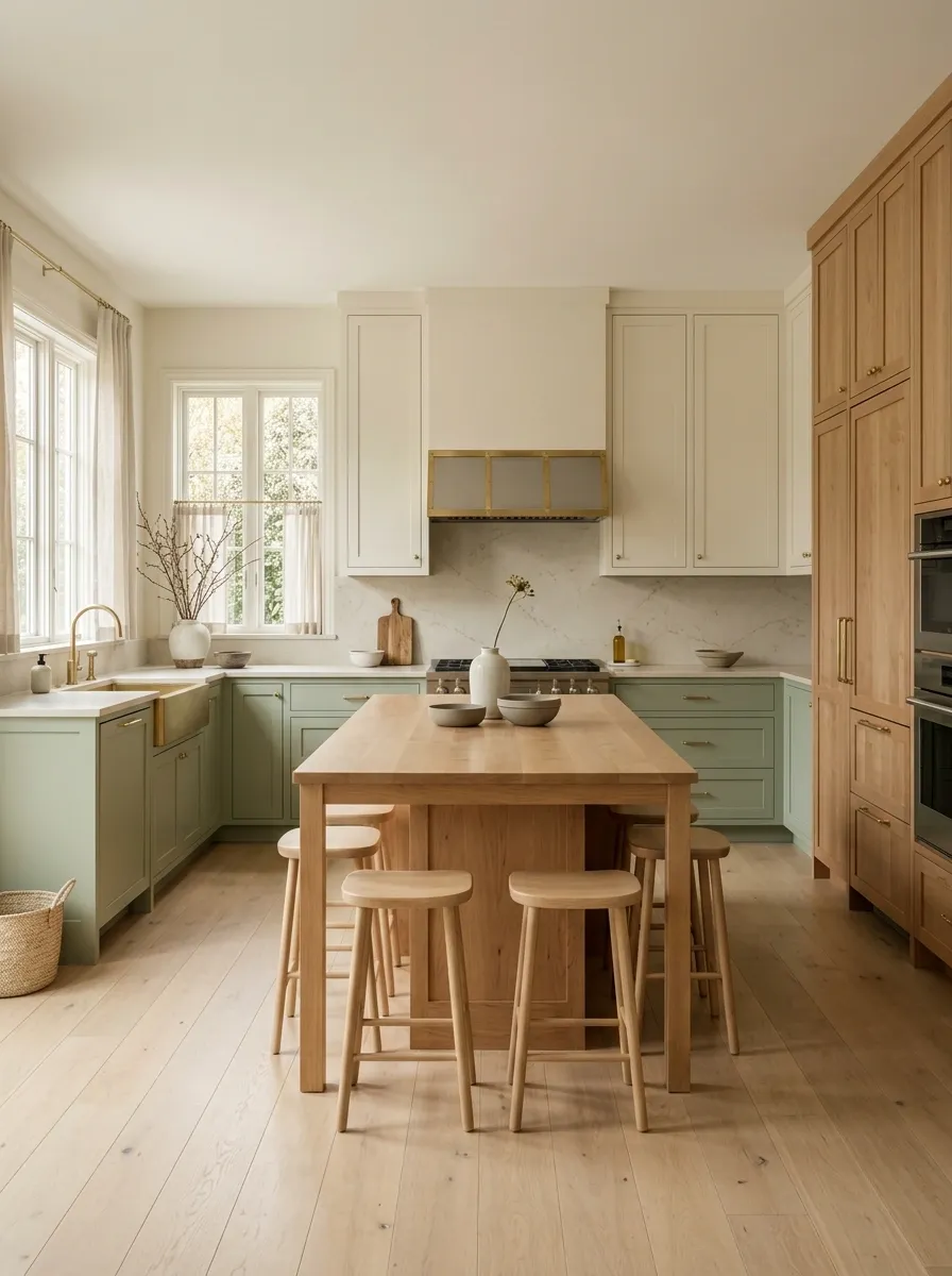
Pale green lower cabinetry wraps the working area, natural maple forms the island and tall storage, and cream cabinetry disappears softly into the surrounding walls. Simple stools, pale flooring, understated lighting, and warm counters give the room a Scandinavian feel without making it look like a showroom assembled from the same six products.
Natural maple is the key to the composition. Its warm grain gives the pale green something to play against, while cream keeps the upper areas visually light. Keep hardware simple and let the wood grain remain visible. This style works because almost nothing is trying to be the star, which is exactly why the room looks so considered.Cooler visual layer
Warm center and grain
Soft surrounding field
Royal Blue, Ivory, and Dark Walnut Eclectic Kitchen
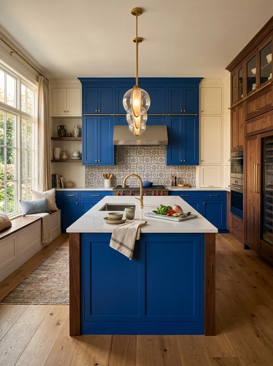
Royal blue cabinetry creates a saturated focal point, ivory cabinetry fills the surrounding wall space, and dark walnut adds depth around the island and pantry. Patterned tile appears in a limited area, while warm flooring and sculptural lighting keep the kitchen expressive without letting every surface compete.
The palette works because the ivory acts as a reset between the stronger blue and darker wood. Walnut then adds a grounded middle layer that keeps the blue from feeling too playful. Keep patterned surfaces contained and let one architectural wall carry most of the visual energy. Otherwise the kitchen starts looking like every decorating decision was made during separate group chats.Soft Black, Sage, and Limestone Beige Kitchen
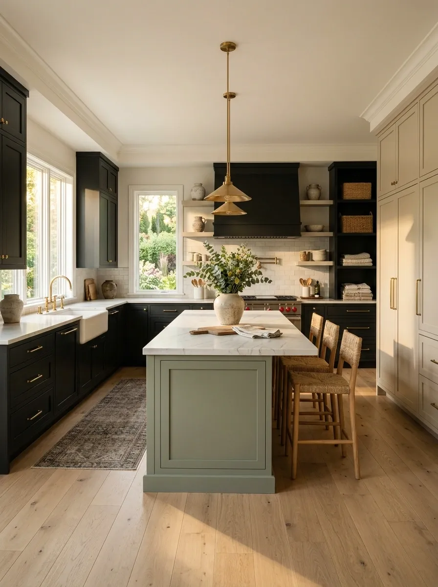
Soft black cabinetry creates a strong perimeter, sage green takes over the island and selected lower cabinets, and limestone beige keeps the tall storage visually lighter. Natural stone counters, oak flooring, and warm lighting soften the darker cabinetry and keep the room from feeling severe.
The strongest move here is putting sage in the center instead of spreading all three tones evenly around the room. That creates a clear focal point while the black acts almost like a frame. Beige then keeps the vertical surfaces from becoming too heavy. It is a simple composition with a lot of presence. Three colors, three jobs, remarkably little drama from the cabinets themselves.Outer frame
Tall storage
Center focal point
Tall storage
Outer frame
Muted Plum, Almond, and Oak Artistic Kitchen
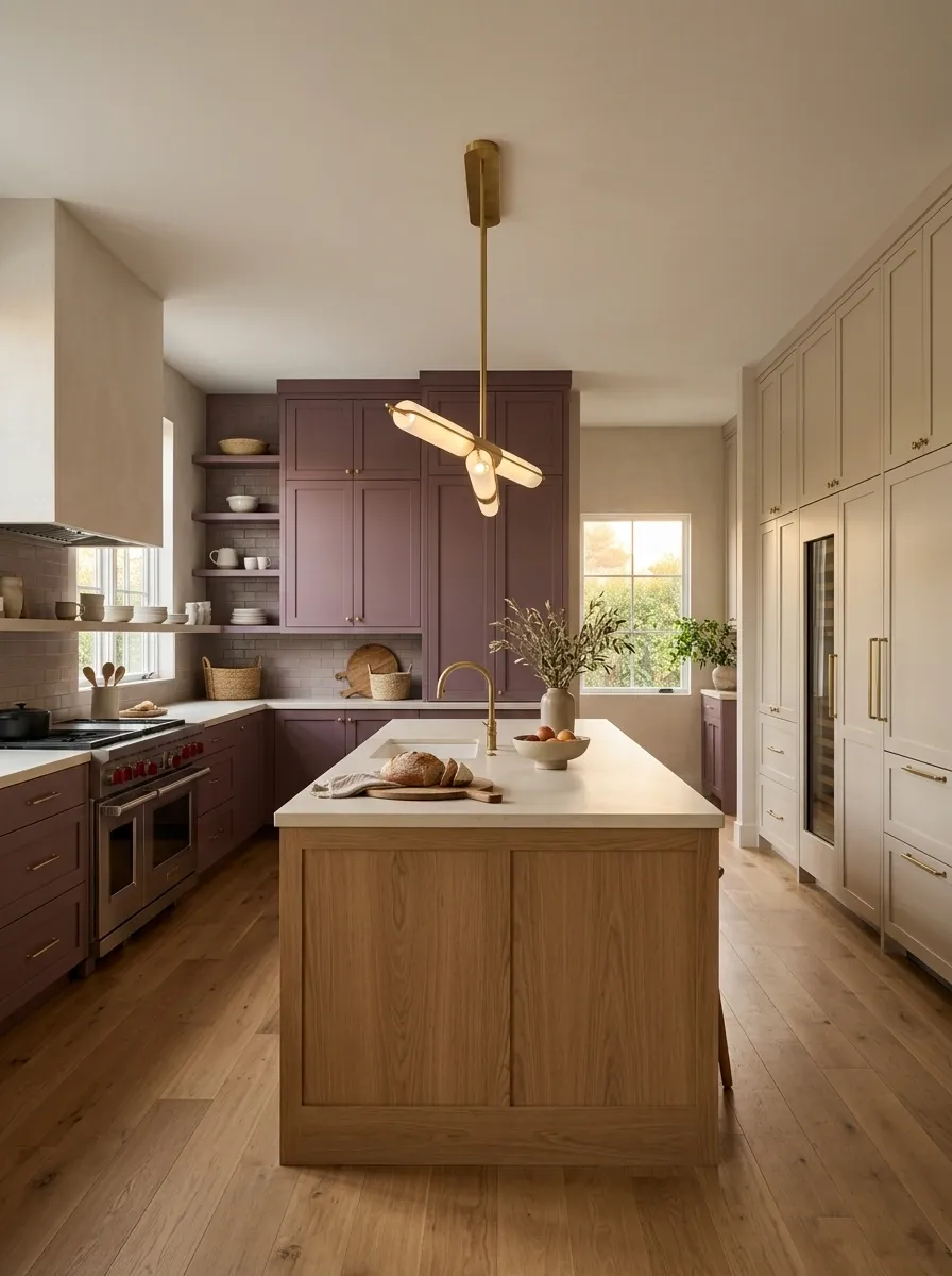
Muted plum cabinetry gives the cooking wall a rich point of color, almond cabinetry keeps the tall storage understated, and oak forms a broad central island. Cream stone counters, warm flooring, plaster-toned walls, and sculptural lighting keep the unusual palette grounded.
Plum works best when it has a defined territory. The almond cabinetry then acts as a visual pause, while oak brings texture into the center rather than another painted surface. Keep the surrounding decor restrained and let the color carry the personality. This is already the interesting kitchen at the party. It doesn’t need to arrive wearing sequins too.Powder Blue, Cream, and Medium Oak Family Kitchen
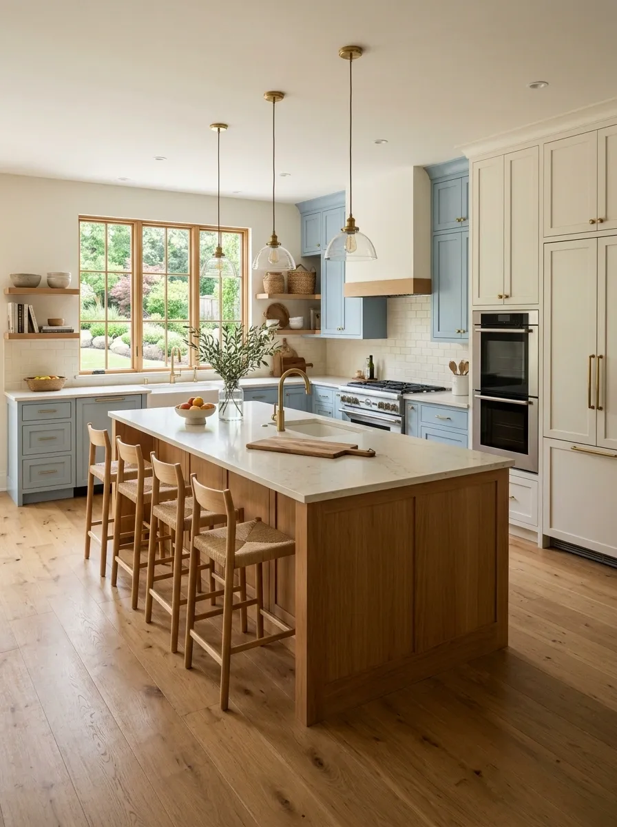
Powder blue cabinetry creates the main color field, cream cabinetry fills the pantry and upper areas, and medium oak anchors a practical island with generous prep space. Warm stone counters, simple stools, broad circulation paths, and uncomplicated lighting make the kitchen feel welcoming without looking overly styled.
The three tones are distributed according to the way the kitchen functions. Blue carries the everyday cabinetry, cream visually reduces the taller storage, and oak marks the gathering zone. That distinction gives the room a natural rhythm instead of making the colors feel decorative. Good family kitchens need somewhere to chop vegetables, dump groceries, and apparently leave one water bottle for six hours.Warm White, Chocolate Brown, and Moss Green Kitchen
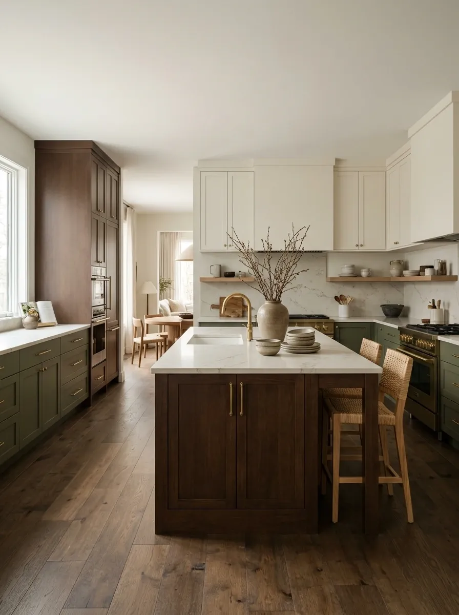
Warm white cabinetry keeps the room open, chocolate brown adds depth through the island and tall units, and moss green defines the lower perimeter. Cream stone, dark wood flooring, and soft woven textures give the palette a grounded look without making the kitchen feel overly dark.
Chocolate brown is doing more than providing contrast. It connects the pale cabinetry to the moss green through a warmer, deeper middle layer. The result feels earthy without relying on a dozen shades of beige. Keep the walls and backsplash close to the warm white family so the room doesn’t become visually dense. Earth tones are wonderful. Earth does not require every color it has ever invented.↓
DEEP CENTER
↓
GREEN WORKING ZONE
Terracotta, Oatmeal, and Deep Olive Mediterranean Kitchen
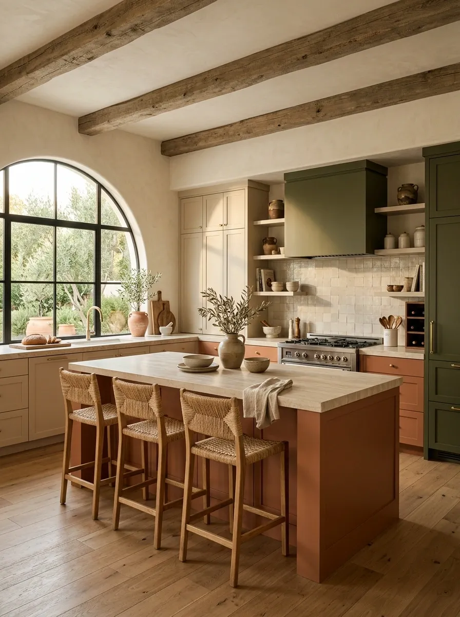
Oatmeal cabinetry forms the main envelope, terracotta cabinetry defines the island and selected lower sections, and deep olive frames the cooking and pantry zones. Natural stone, warm wood, textured plaster walls, and restrained ceramic styling complete the Mediterranean composition.
The final palette works because each color arrives with a different visual role. Oatmeal keeps the room soft, terracotta gives the center warmth, and olive supplies the darker architectural edge. Natural materials then repeat those same temperatures through the countertops, flooring, and furniture. That repetition is what makes the room feel finished. Three cabinet tones are plenty. The kitchen has officially declined the invitation from the fourth.Making Three Cabinet Colors Feel Like One Kitchen
The strongest three tone kitchens aren’t built around three cabinet colors alone. They work because the colors have different jobs, and those jobs continue through the rest of the room.
A darker cabinet tone can frame an architectural wall. A warmer wood can give the island more visual weight. A pale painted finish can keep tall storage from closing in the room. Flooring, counters, lighting, stools, walls, and even nearby dining furniture can repeat those same temperatures without copying the cabinet colors exactly.
That’s the part worth stealing from these designs.
Don’t start by asking which three colors look good together on a screen. Start with the finished kitchen. Decide where the eye should land, which areas need visual weight, which walls should feel quieter, and where warmth needs to enter the room. Then the cabinet palette has a reason to exist.
And if a fourth color suddenly seems necessary, take a breath. The cabinets have survived this long without it.
Save the kitchen combinations that make you stop scrolling, then come back to them when you’re ready to choose the actual cabinet finishes.