
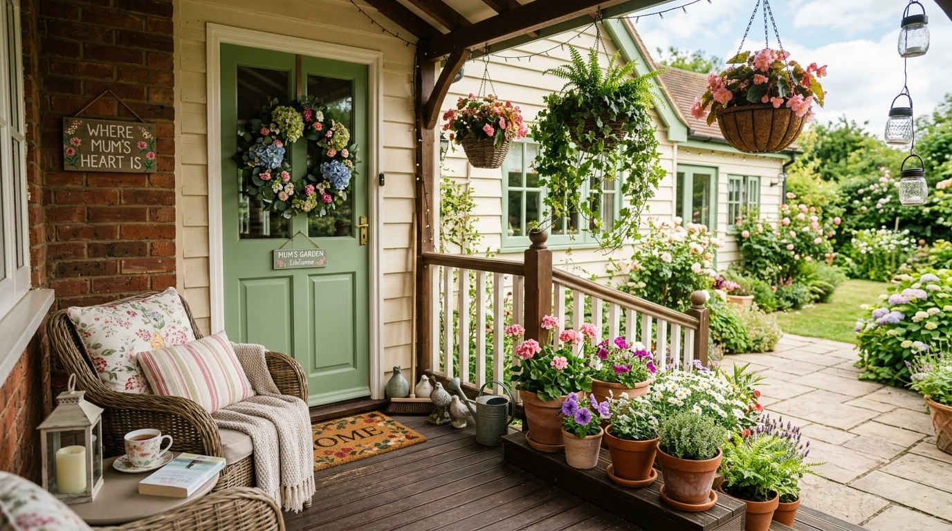
A front porch can go from charming to completely chaotic with surprisingly little effort. Put a few mums by the door and everything looks great. Add pumpkins, lanterns, baskets, signs, garlands, another mum, and somehow the front steps are now hosting the entire fall section of a garden center.
The flowers aren’t usually the problem. Scale, spacing, color, and what the porch already has to work with make the bigger difference.
A large porch can handle substantial floral groupings, while a narrow entry needs height and breathing room. A dark door can make light mums pop, while a colorful exterior may need a quieter arrangement.
Mums Front Porch Ideas
Classic Mums and Pumpkins
A striking black door gets the ultimate seasonal treatment with crisp white mums stacked high in galvanized containers. The vertical symmetry creates an inviting frame that makes the entryway instantly pop against light stone siding.
A generous scattering of heirloom and traditional pumpkins anchors the base of the display, blending soft sage greens with classic orange tones. It is a foolproof formula that feels timeless without a hint of fuss.
Sometimes sticking to the classics is the smartest design move you can make. Let the crisp contrast do all the heavy lifting.
Golden Mums With Weathered Terracotta on a Soft White Porch
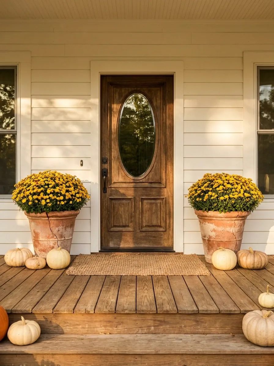
A warm farmhouse porch gets its character from contrast rather than a pile of seasonal accessories. Large golden mums sit in weathered terracotta pots on either side of a natural wood front door, while creamy white siding keeps the flowers looking rich without making the entrance feel loud.
A simple woven mat, a few pale pumpkins, and warm wood steps complete the composition. The terracotta matters here because it repeats the earthy warmth of the mums and keeps the arrangement from feeling too polished.
Symmetry gives the doorway structure, but the aged finishes stop it from looking staged within an inch of its life.
Fall Garland and Mums
Why stop at the doorway when you can wrap your entire entryway in autumn abundance? Richly hued mums in shades of crimson, gold, and magenta spill across the porch floor below a lush garland of falling leaves.
A matching wreath completes the immersive harvest experience, making the double doors feel deeply welcoming and thoroughly dressed for the season. The eclectic mix of containers and vibrant blooms brings serious personality to the scene.
It is delightfully over-the-top in the best possible way. Because if you cannot turn your front porch into a botanical wonderland in October, when can you?
Burgundy Mums Framing a Deep Green Front Door
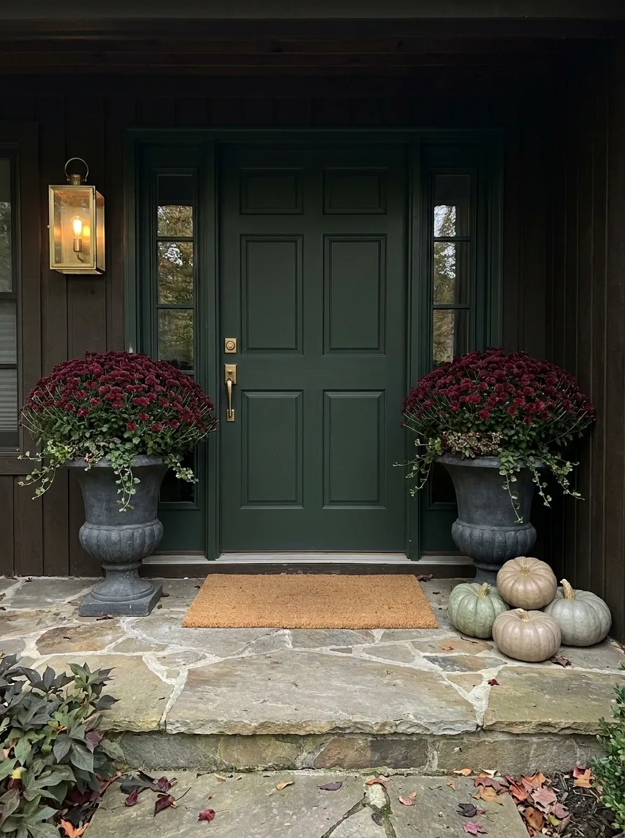
This porch leans into darker autumn color with a deep green door, rich burgundy mums, and heavy stone or charcoal planters. The result feels traditional without relying on the usual orange overload.
Place the flowers close enough to the door to visually frame the entrance, then keep the rest of the porch quiet. A warm brass lantern and a handful of muted pumpkins are enough to finish the scene.
The contrast works because the door, flowers, and containers each have a clear visual role. Nothing is fighting to become the star.
And honestly, the pumpkins can sit this one out of the spotlight.
Brick Porch Autumn Warmth
Warm red brick provides the ideal backdrop for a cozy, rustic fall setup centered around a charming wooden bench. Potted mums and cheerful pumpkins create a welcoming path right up to the front door.
Textured layers like plaid pillows and a woven doormat add instant tactile interest to the porch floor. Everything feels collected, comfortable, and ready for crisp autumn mornings with a cup of coffee.
This is how you make a brick exterior feel extra inviting. Just add flowers, pumpkins, and a place to sit awhile.
White Mums and Natural Wood on a Minimal Porch
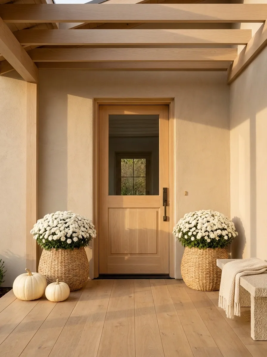
Not every fall porch needs orange. This quieter composition pairs oversized white mums with blond wood, warm beige walls, a simple natural door, and one or two creamy pumpkins.
The flowers provide the seasonal change while the rest of the porch stays restrained. Large natural-fiber containers or simple textured planters help the arrangement feel substantial without adding another strong color.
This works especially well on a porch that already has attractive architecture. There is no need to decorate over it. Let the wood, light, and flower volume carry the image.
Fall decor doesn’t always need to announce itself from the next zip code.
keeps the scene open
adds warmth
adds depth
carry the season
Monochromatic White Mums
For a sleek, modern take on autumn decor, this setup leans entirely into moody neutrals and snowy white blossoms. Cascading white mums nestled in woven baskets soften the dark charcoal front door beautifully.
A moody mix of muted green, gray, and ivory pumpkins pools naturally across the porch boards. The restrained palette keeps the entryway feeling calm, sophisticated, and remarkably intentional.
Who says fall has to shout in bright orange? Sometimes a quiet, curated monochromatic moment speaks volumes.
Layered Staircase With Mums on Every Landing
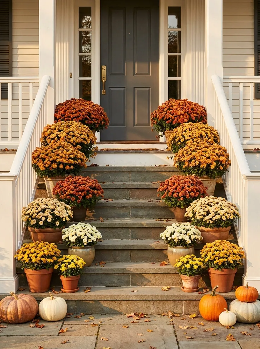
A broad staircase gives the flowers room to travel upward, so the design doesn’t have to pile everything beside the front door. Smaller mums begin near the lower steps, medium arrangements sit higher, and the largest floral masses gather around the entry.
Mix warm orange, golden, and cream blooms so the staircase feels connected from bottom to top. A few pumpkins can tuck into the gaps, but the flowers should remain the main visual rhythm.
The biggest mistake here would be using identical pots at identical heights. Stairs already create repetition. The plants should add movement, not copy it.
In other words, the staircase already knows how to line things up. Let the flowers have some personality.
Terracotta, Orange Mums, and a Warm Wood Door
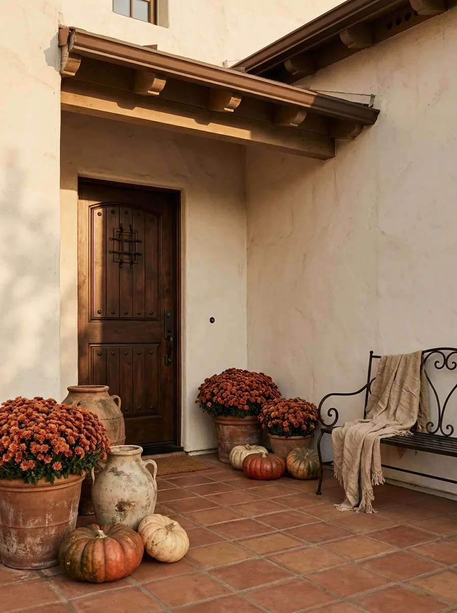
This warmer porch takes its cues from Mediterranean and Spanish-inspired architecture. Burnt orange mums sit in substantial terracotta pots against textured stucco, a stained wood door, and aged ceramic accents.
The materials already share earthy undertones, so the flowers feel built into the architecture rather than placed on top of it. Keep the pumpkins muted and irregular, and let the terracotta do some of the seasonal heavy lifting.
A few imperfections actually help here. Slightly weathered pots, uneven textures, and natural variation make the arrangement feel collected over time instead of assembled during one extremely productive Saturday.
Oversized Cream Mums Beside a Black Door
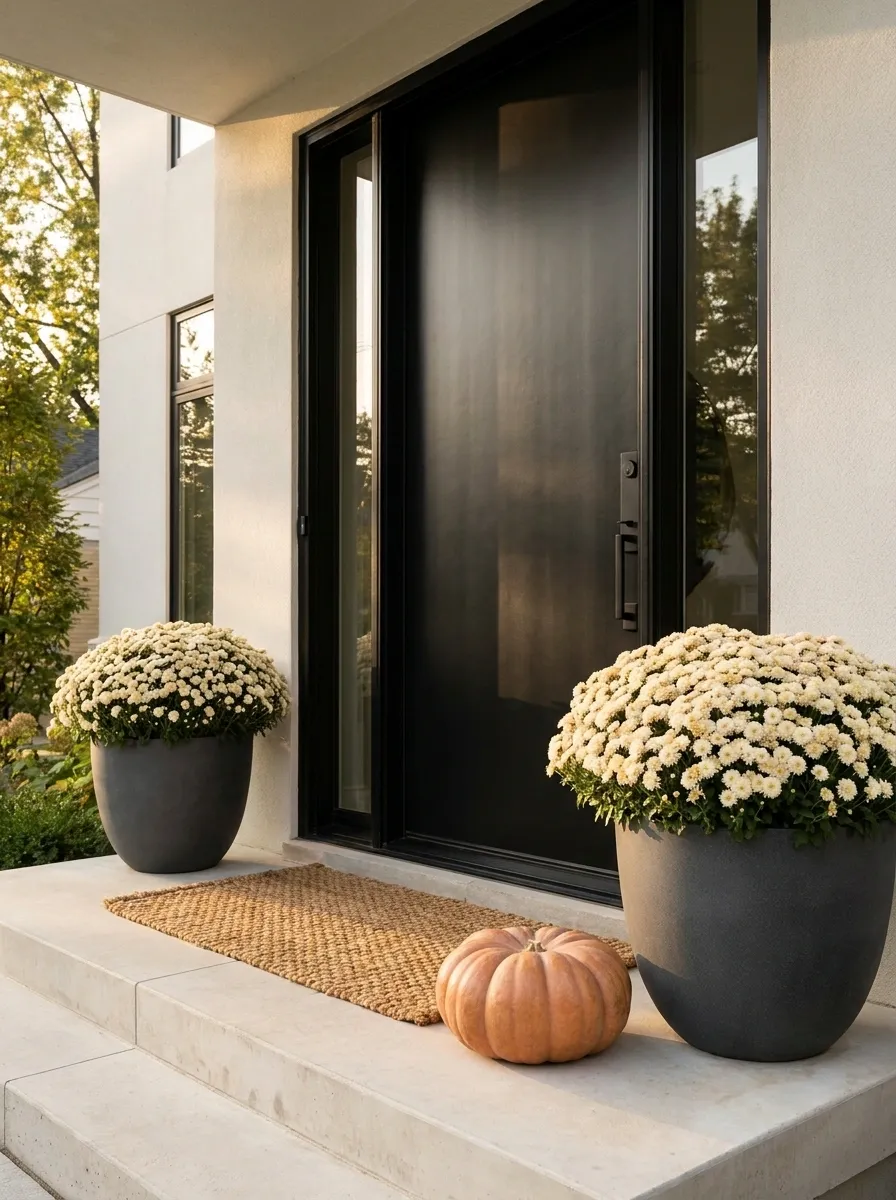
A matte black front door gives this porch a strong architectural center, while oversized cream mums soften the contrast without introducing another loud color. Tall charcoal planters keep the flowers grounded, and pale concrete or stone steps reinforce the modern setting.
The rest of the styling stays deliberately sparse. One substantial pumpkin and a simple textured doormat are enough. The flowers should look generous, but the space around them should remain open so the entry still feels architectural.
The trick is scale. A tiny pot beside a tall black door would look less “minimalist” and more “forgot the shopping list.”
Soft Pink Mums on a Cottage Porch With Sage Accents
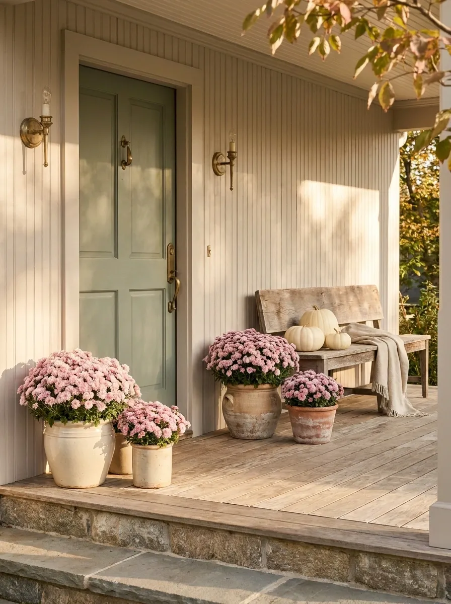
This cottage-inspired porch skips the traditional orange-heavy fall palette and leans into dusty pink, muted sage, cream, and natural wood. Medium-sized mums sit in varied ceramic containers around a pale painted door, while a weathered bench and a few ivory pumpkins complete the setting.
The result feels seasonal without looking like the porch has been decorated according to a color chart labeled “AUTUMN.” The softer palette also works beautifully with gardens that already contain green foliage.
Keep the containers varied but related. Matching everything would take away the relaxed cottage character.
floral focus
garden link
visual breathing room
natural warmth
Formal White Columns With Twin Mum Towers
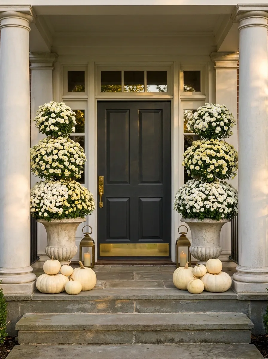
For a larger, more formal porch, the flowers become architectural anchors. Two tall planters overflowing with white and pale-yellow mums sit on either side of a centered dark door, visually echoing the symmetry of the porch columns.
Matching lanterns and a restrained scattering of creamy pumpkins reinforce the formal arrangement. Nothing needs to be especially elaborate because the architecture already supplies the drama.
This is one of those cases where symmetry actually earns its keep. The porch has enough structure to support it without feeling stiff.
And yes, there is such a thing as too much symmetry. This just isn’t the porch to prove it.
Narrow Front Porch With Vertical Mum Grouping
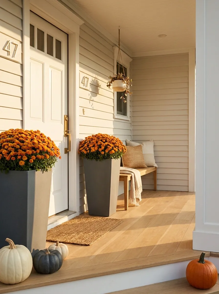
A narrow porch doesn’t have much floor space to waste, so the design works upward instead of outward. Tall, slim planters hold compact mums beside the doorway, while one smaller hanging arrangement adds height without shrinking the walkway.
The color scheme stays simple, with warm orange or golden flowers against a neutral exterior. A narrow bench or chair can sit farther from the entrance if there is enough clearance, but the path remains visually obvious.
This is a useful example of decorating the vertical space instead of trying to make six things occupy a spot designed for two.
The porch has already made its position clear. Believe it.
Rustic Porch With Copper Pots and Burnt Orange Mums
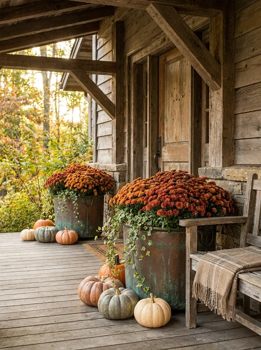
This design gets its personality from material rather than excessive decoration. Burnt-orange mums fill aged copper containers on a timber porch with weathered wood, warm brown furniture, and a few imperfect pumpkins.
The copper introduces a soft metallic note that catches daylight without looking shiny or formal. Because the materials already have so much texture, the seasonal accessories can stay simple.
Let some surfaces look genuinely weathered. Rustic design falls apart quickly when every object appears to have been purchased yesterday in matching packaging.
Mums and Pumpkins Along a Broad Wraparound Porch
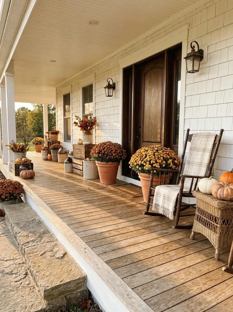
A large wraparound porch can handle repetition, but that doesn’t mean every few feet need another identical decoration station. Here, substantial mums and pumpkins are placed at several points along the porch, connecting the entry, seating area, and outer corner into one seasonal composition.
The flower groupings repeat loosely rather than perfectly. A larger arrangement anchors the front door, while smaller clusters guide the eye toward the rest of the porch.
This approach makes a sprawling porch feel intentional without decorating every available surface.
Because apparently even a very large porch can become cluttered when every empty corner gets promoted to “decor opportunity.”
smaller cluster
largest anchor
secondary cluster
Deep Red Mums With Natural Stone and Cedar
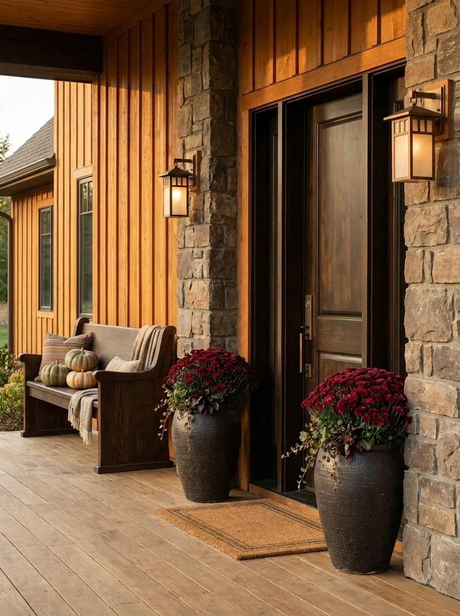
A craftsman-style porch already has plenty of texture, so the best approach is to make the mums reinforce what’s there. Deep red flowers sit in substantial dark containers against cedar siding, natural stone columns, and bronze-toned fixtures.
The flower color adds autumn contrast without fighting the warm wood and masonry. Keep the pumpkins earthy and limited, using them as supporting shapes rather than additional focal points.
The entire composition feels grounded because the materials all have visual weight. Lightweight plastic pots would completely ruin that conversation.
Some porches simply do not tolerate flimsy decor. They know what they’re worth.
Blue-Gray House With Mustard Mums
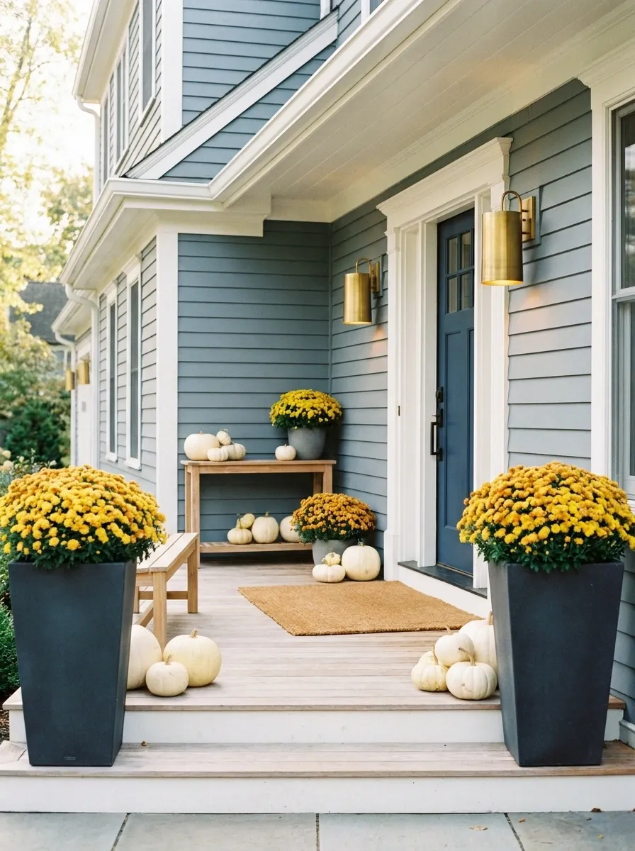
Cool exterior colors can make warm autumn flowers look even richer. This porch pairs blue-gray siding with mustard-yellow mums, charcoal containers, pale wood accents, and a few creamy pumpkins.
The contrast is the main event. Rather than trying to match the flowers to the house, the design lets them push against the cooler exterior.
A soft natural doormat and warm porch lighting keep the palette from becoming too crisp. The result feels seasonal but doesn’t disappear into the usual orange-and-brown formula.
The house is blue-gray. The mums are mustard. Everyone survived the disagreement.
Cottage Steps Filled With Loose, Natural Mum Clusters
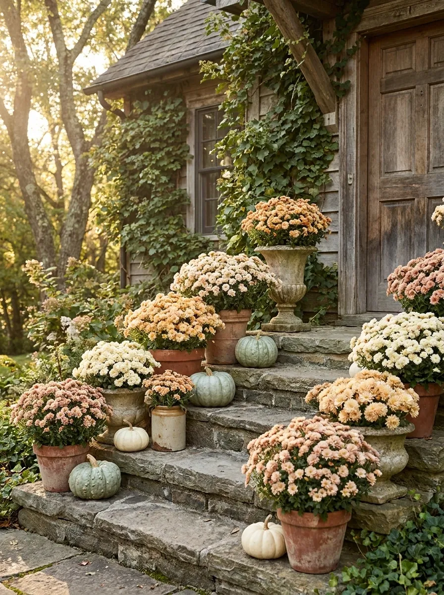
Instead of placing matching pots on every step, this cottage porch uses clusters that vary in height, container shape, and flower color. Cream, pale orange, and muted blush mums sit among small pumpkins and weathered ceramic vessels.
The arrangement feels more like a garden naturally spilling onto the staircase than a collection of identical seasonal displays. Leave some steps visually open so the planting has room to breathe.
The irregularity is what makes it convincing. Too much matching would turn the cottage charm into a spreadsheet.
And nobody asked the mums to attend a corporate team-building exercise.
Black Planters, White Mums, and Orange Pumpkins
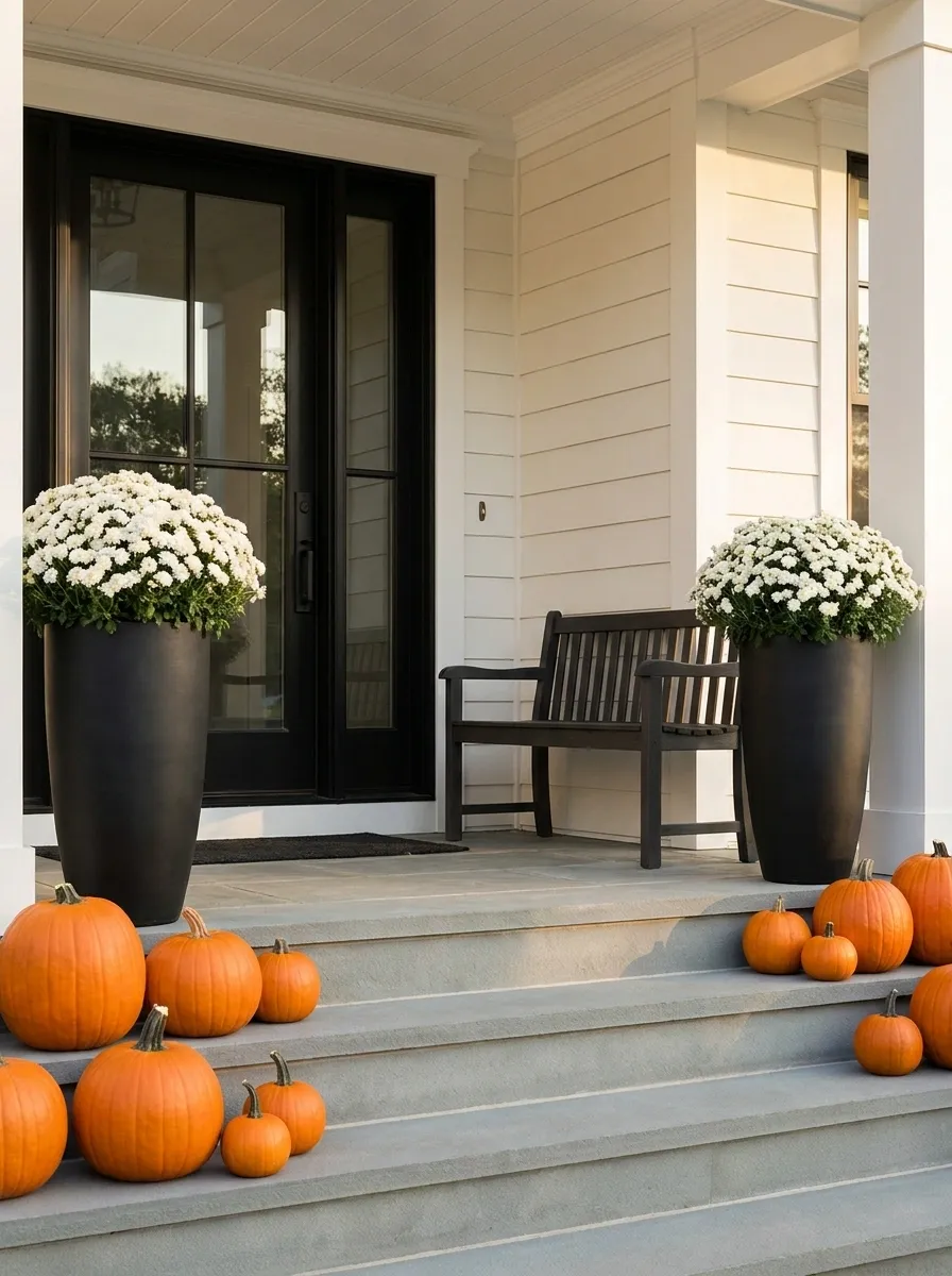
This porch uses a simple three-part composition: crisp white mums, strong black planters, and controlled orange pumpkins. The architecture remains neutral so the three elements can carry the seasonal look.
Tall black containers create structure around the entry while the white flower heads provide a softer, fuller shape above them. A few pumpkins sit lower to the ground, creating a second visual layer without competing with the flowers.
The strongest move here is restraint. Once the three colors are established, adding every other fall accessory in existence would weaken the whole composition.
The porch already has a color scheme. It doesn’t need a committee meeting.
Vintage Porch With Antique Ceramic Mum Pots
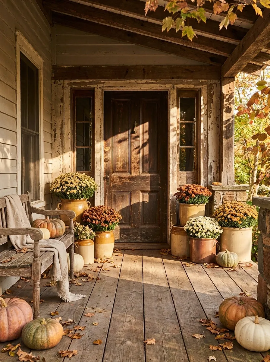
A character-filled older porch suits containers with a little history. Muted yellow, copper, and cream mums sit in aged ceramic pots around a vintage front door, joined by weathered wood furniture and a few faded pumpkins.
The key is variation without chaos. The pots don’t need to match, but they should share a similar level of warmth and age. A slightly worn finish actually makes the flowers feel more believable because the porch looks collected rather than freshly assembled.
Keep the seasonal accessories restrained. Once the containers and architecture have personality, adding twenty more decorative objects is mostly just giving the dust more places to settle.
Minimalist Concrete Entry With One Massive Mum Arrangement
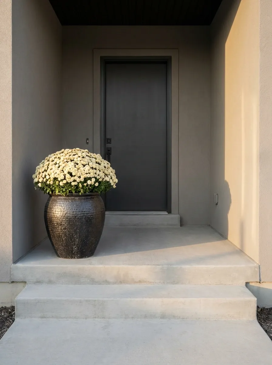
A contemporary porch can make one strong floral statement feel more dramatic than a collection of smaller decorations. This design uses a clean concrete entry, a simple architectural door, and one oversized planter overflowing with cream mums.
There are no pumpkins stacked beside the door and no tiny accessories filling every blank area. The flower mass gets room to breathe, while the surrounding concrete and neutral walls create a quiet backdrop.
The design works because the eye knows exactly where to go. The rest of the porch politely minds its business.
A surprisingly useful skill in decorating: knowing when to stop.
Warm Farmhouse Entry With Mixed Orange and Cream Mums
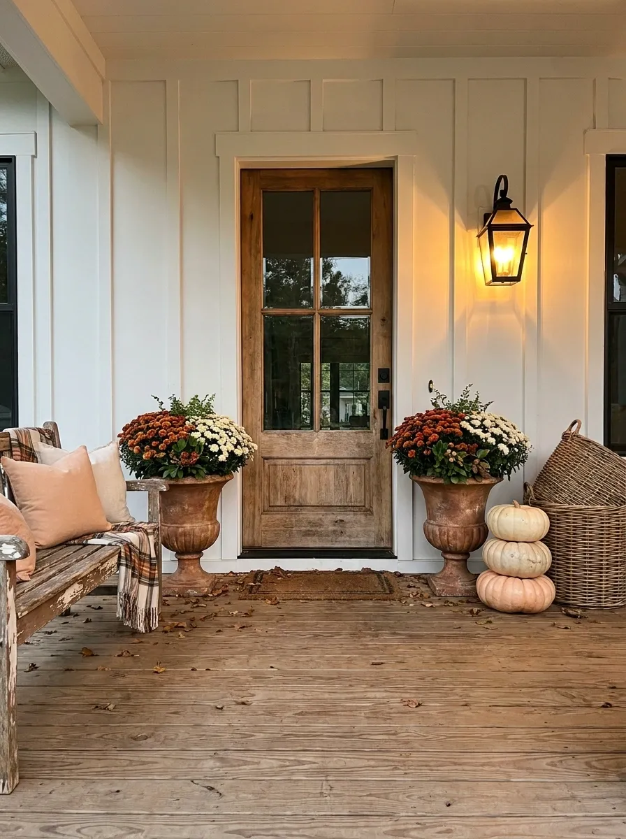
This farmhouse porch uses several layers, but they all point toward the same entrance. Orange and cream mums fill large containers around a natural wood door, while woven baskets, pale pumpkins, a wooden bench, and warm lantern light build out the surrounding setting.
The trick is to vary texture rather than endlessly adding color. The flowers are full and warm, while the wood and woven materials keep the scene grounded.
A bench gives the porch another purpose, making the whole arrangement feel like part of a living home instead of a backdrop waiting for a Pinterest photographer.
Decorating every inch isn’t the same thing as decorating well.
Stair Rail Framed by Mums and Layered Entry Decor
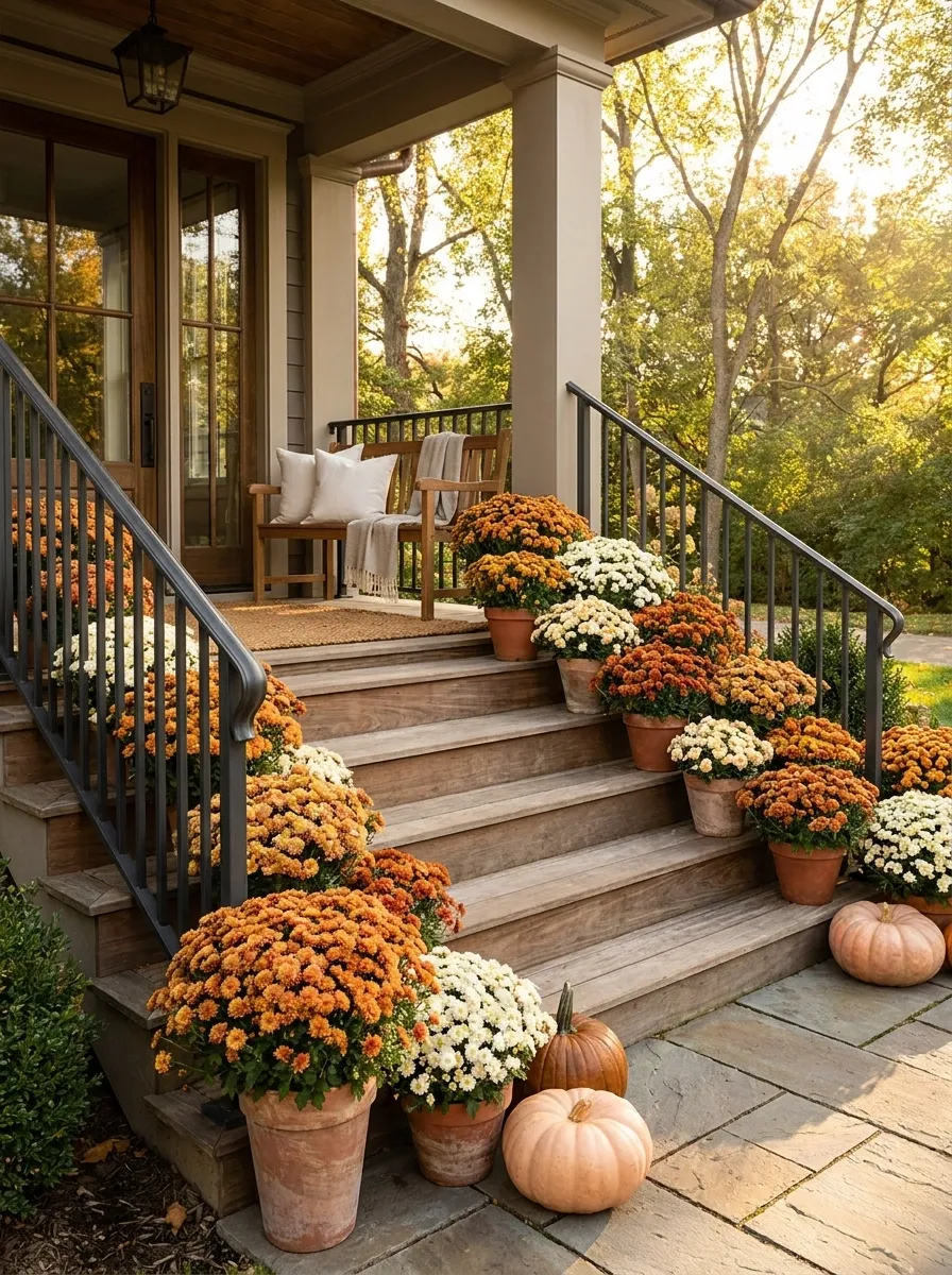
Instead of treating the stairs, railing, and doorway as separate zones, this porch connects them into one visual path. Mums cluster near the lower steps, continue along the railing, and become fuller as they approach the front door.
Warm orange and cream blooms work with natural wood, dark metal, and a scattering of low pumpkins. The arrangement guides the eye upward without blocking the staircase itself.
The railing becomes part of the composition rather than an afterthought.
And yes, the stairs are still for walking. A shocking concept in some fall decorating photos.
Sage Green Door With Cream and Rust Mums
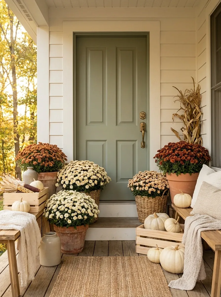
A muted sage door creates a soft backdrop for cream and rust-colored mums, especially when paired with aged terracotta, blond wood, and pale pumpkins. The colors feel autumnal without depending on bright orange everywhere.
Place the cream blooms closer to the doorway and let the rust tones sit slightly farther out. This creates a gentle transition from the quiet architectural center into warmer seasonal accents.
The palette works because the green stays calm while the flowers bring the energy.
Autumn doesn’t legally require pumpkin-orange everything. The color police have been notified.
Grand Brick Porch With Repeated Large Mums
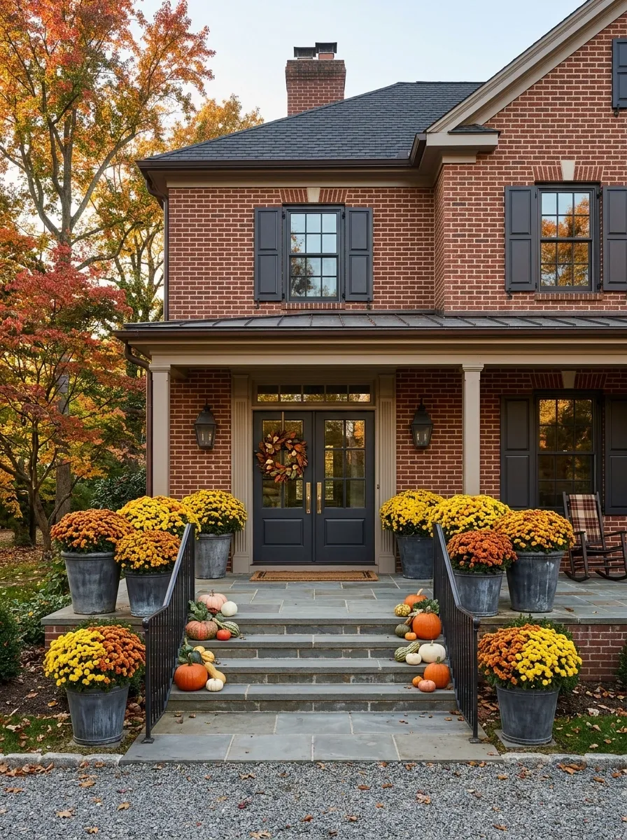
A substantial brick porch can swallow tiny seasonal decorations, so this design uses oversized mums in broad, grounded planters to match the scale of the architecture. Rich yellow and orange flowers sit against red brick, wide stone steps, and dark-framed doors.
The planters repeat along the entry rather than being squeezed into one little cluster beside the door. That repetition creates rhythm across the facade and makes the flowers feel intentional from a distance.
Keep the accessories low and secondary. The masonry already has plenty going on.
A giant brick porch with miniature flower pots is basically architectural bullying. The pots never win.
Small Bungalow Porch With Compact Mum Pairings
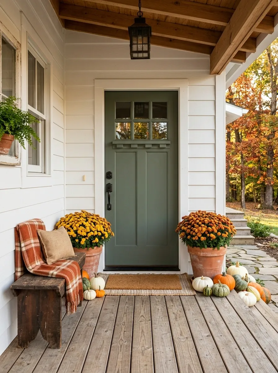
A small bungalow porch needs a lighter touch. Two medium mums frame the front door, while a short bench, simple doormat, and several low pumpkins create a finished entry without crowding the narrow footprint.
The plants stay close to the doorway so the composition feels concentrated rather than scattered. Containers with some height add presence without demanding much floor area.
There is also a practical advantage to this arrangement: the walkway remains obvious.
Small porch decorating has one very important rule. There needs to be somewhere for feet to go.
Moody Autumn Porch With Plum Mums and Charcoal Finishes
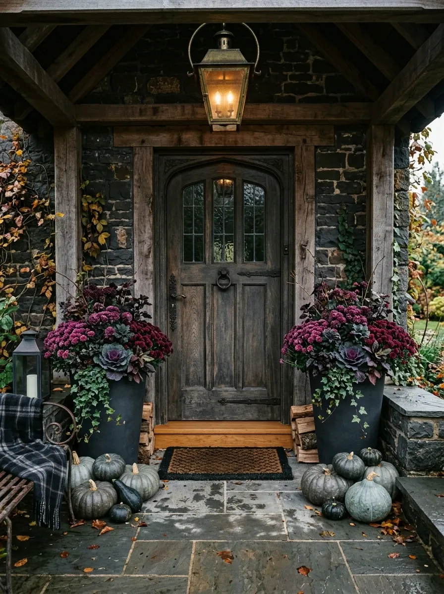
This darker porch takes a very different route from classic bright fall decorating. Plum and burgundy mums fill charcoal planters against a dark exterior, with smoky gray pumpkins and warm wood accents providing subtle contrast.
Instead of relying on bright seasonal color, the design gets its depth from overlapping dark tones. A warm porch light keeps the entry from becoming flat, while the mums provide just enough saturation to draw attention.
The palette is dramatic without becoming theatrical.
Somewhere between “autumn porch” and “gothic mansion audition” is exactly where this one wants to live.
Natural Prairie Porch With Mums and Dried Grasses
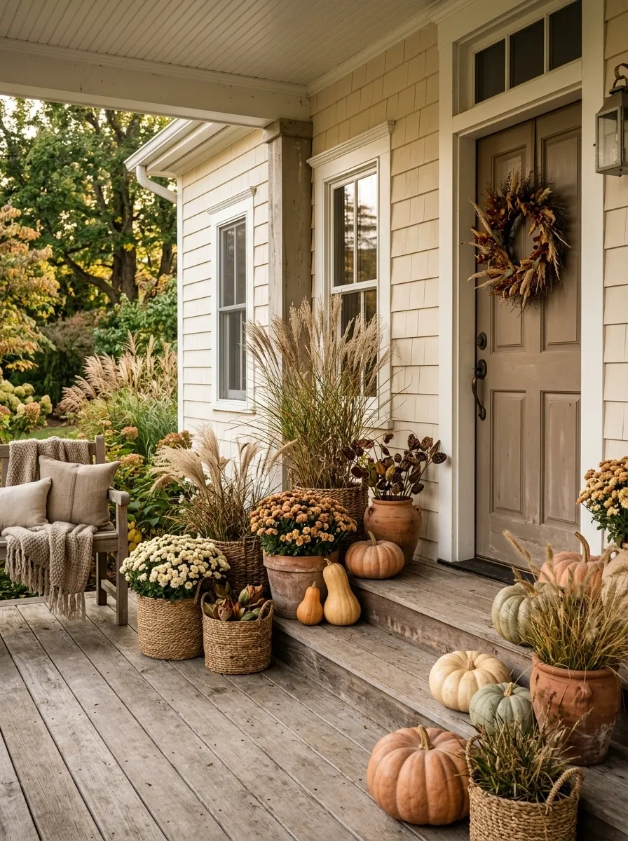
This relaxed entry treats mums as part of the surrounding landscape rather than as standalone seasonal ornaments. Cream and muted orange flowers mix with dried grasses, woven containers, weathered timber, and a few understated pumpkins.
The textures are intentionally loose. Some stems rise higher than the flowers, some containers are imperfect, and the arrangement isn’t mirrored from one side of the porch to the other.
That looseness gives the design its personality while the restrained color palette keeps it from looking chaotic.
Basically, it says “fall garden” without screaming “I purchased 47 fall garden accessories.”
Farmhouse Porch With Mums Framing a Seating Nook
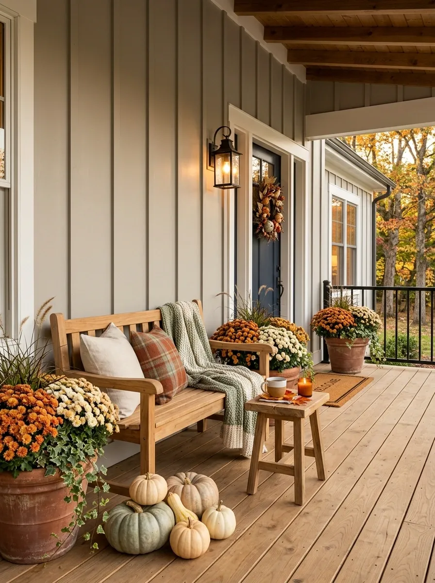
This porch is designed around a place to actually sit. A wood bench or pair of simple chairs sits slightly away from the entry, framed by large mums in warm orange and cream. A small side table, soft textiles, woven texture, and a few low pumpkins complete the scene.
The flowers aren’t packed directly around the door because the seating area is the secondary destination. Their placement creates a visual frame around the furniture while keeping the path into the house clear.
It looks decorative, but it also looks usable.
A revolutionary decorating concept: sometimes the porch furniture can remain furniture.
Cream House With Deep Orange Mum Masses
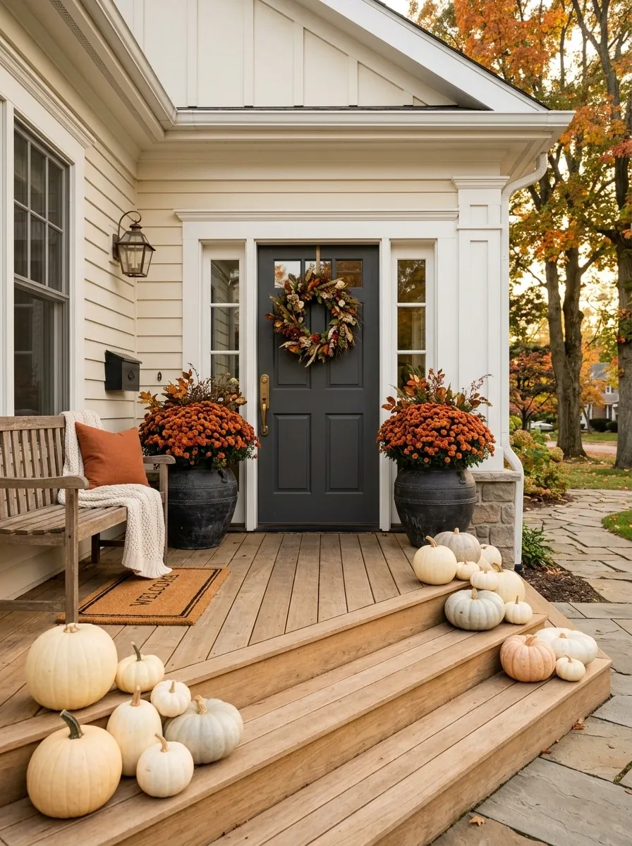
A pale cream exterior makes saturated orange mums feel especially vivid. This porch uses large dark containers filled with dense orange blooms beside the entrance, then softens the scene with pale pumpkins and natural wood accents.
The flowers provide almost all of the strong color, while everything around them stays quieter. That balance lets the porch feel unmistakably autumnal without turning every object orange.
The dark containers also matter. They visually ground the large flower heads and give the composition enough weight against the light exterior.
Orange mums against a cream house are basically autumn showing up with no intention of being subtle. At least the rest of the porch knows when to stop talking.
Asymmetrical Porch With One Heavy Side and a Quiet Side
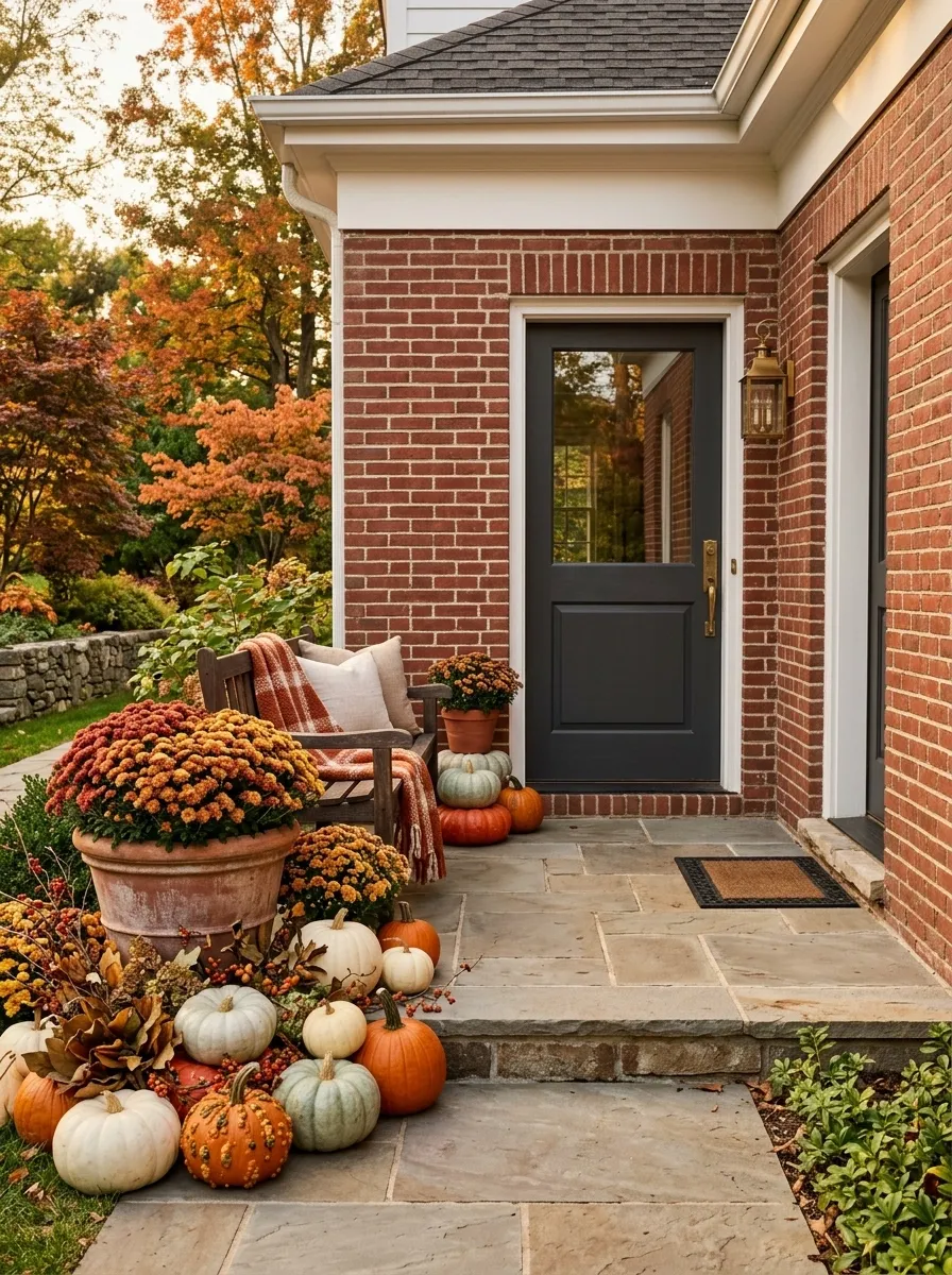
Symmetry isn’t mandatory, especially when the architecture already has enough balance. This porch places a large collection of mums, pumpkins, and a substantial planter on one side of the door while leaving the opposite side noticeably calmer.
The heavier side carries the visual interest, while the open side gives the arrangement somewhere to breathe. The door remains centered, so the asymmetry feels intentional instead of accidental.
This is especially effective when one side of the entrance has a column, wall return, window, or other architectural feature that already creates visual weight.
One side got the decorations. The other side got peace and quiet. Somehow, the porch still looks balanced.
flowers + containers + pumpkins
negative space
Layered Black-and-Natural Entry With Yellow Mums
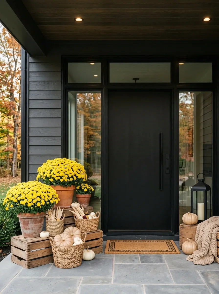
This modern entry combines a black door and dark framing with sunny yellow mums, natural wood crates, woven baskets, and soft beige pumpkins. The strong contrast gives the porch a contemporary structure while the natural materials prevent it from becoming too stark.
The yellow flowers should remain the brightest element. Keep the woven and wood pieces close in tone so they add texture without creating competing color blocks.
This composition is especially effective on a fairly simple facade where the door and surrounding frame can act as a strong visual backdrop.
Black gives the structure. Yellow brings the drama. The baskets are just happy to be invited.
structure
focal color
texture
softness
Neutral Porch With Pale Peach Mums
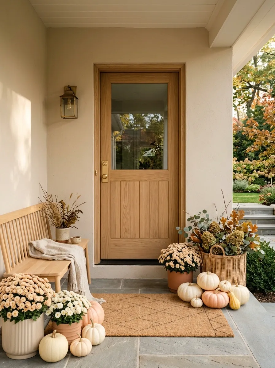
A softer autumn palette can still feel seasonal. This porch uses pale peach mums, ivory pumpkins, blond wood, warm beige walls, and a natural-toned door. Everything sits close together in value, creating a calm tonal composition.
The flowers provide just enough color to distinguish the season, while the neutral surroundings keep the entire entrance light and relaxed. Textured containers and wood surfaces give the restrained palette enough variation to avoid looking flat.
This approach works particularly well when the house already has a soft neutral exterior and strong natural light.
The porch is doing fall quietly. No megaphone required.
Full Fall Entry With Mums, Pumpkins, Lanterns, and Garlands
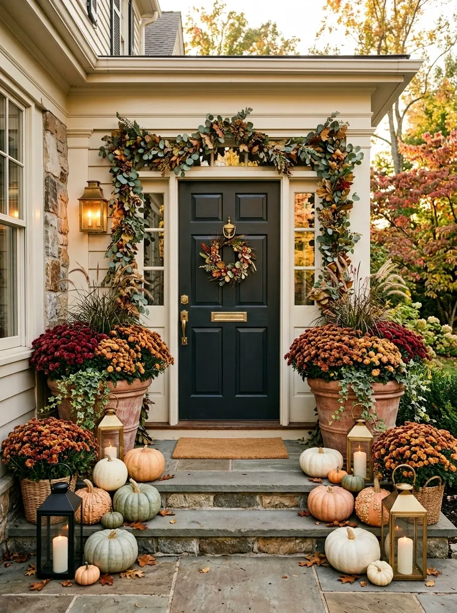
The final composition embraces a fuller fall porch without letting every decoration fight for the same spotlight. Large mums anchor the doorway, pumpkins fill the lower layers, warm lanterns add evening glow, and a restrained garland connects the upper part of the entrance.
The key is hierarchy. The doorway remains the center, the mums provide the strongest visual mass, and the smaller seasonal elements support the composition around them.
Use a limited range of container materials and repeat the same few colors throughout the porch. Abundance works when the elements feel related.
This is the “yes, more” porch. But importantly, it knows where the comma goes.
Conclusion
The most memorable fall porches usually aren’t the ones with the most decorations. They’re the ones where the flowers, containers, door, architecture, and seasonal details look like they belong to the same scene.
That might mean two enormous mums framing a dark doorway, a loose cluster winding up old cottage steps, or a single oversized planter sitting confidently in an otherwise quiet modern entry. There isn’t one formula that works for every porch. The architecture, scale, and existing colors should decide how much visual weight the flowers need.
Start with the porch itself. Notice where the eye naturally lands, where people actually walk, and which materials are already doing the visual work. Then build the mums around that instead of trying to make the porch resemble every fall pin at once.