
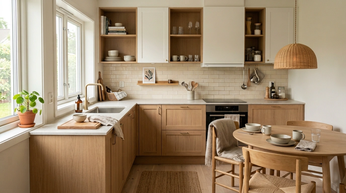
Scandinavian kitchens get ruined by trying too hard to look Scandinavian. Suddenly every surface is beige, every bowl is handmade, every cabinet is pale oak, and the whole room starts looking like a waiting room that sells candles.
The real trick is restraint with structure. White and wood alone don’t create the look. Proportion, lighting, hardware, storage, contrast, and the little decisions around the sink and island do most of the work.
A kitchen can be simple without looking empty, warm without becoming rustic, and minimal without making morning coffee feel like a hostage negotiation.
The Scandinavian Kitchen Test: If Everything Is Competing, Nothing Is Winning
Before adding another shelf, stool, vase, tray, or suspiciously expensive-looking cutting board, run the room through one simple filter.
Scandinavian design works because some things are deliberately quiet. The cabinetry doesn’t need to fight the pendant. The backsplash doesn’t need to compete with the island. The countertop doesn’t need a decorative collection sitting on every available inch.
The easiest way to keep the room under control is to decide what deserves attention and what needs to behave itself.
Use that filter throughout the kitchen. The goal isn’t to make every Scandinavian kitchen identical. It’s to make every choice look like it belongs.
Scandinavian Kitchen Ideas
Ground the Space With Bold Contrast
A Scandinavian kitchen doesn’t have to be entirely muted to feel sophisticated. Introducing a dark range hood and matching appliances instantly anchors a bright white setup without ruining the calm atmosphere.
Balance the dramatic vertical lines of the dark elements with abundant natural wood accents. Arranging cutting boards along the splash zone and utilizing open shelving brings warmth right back into the heavy-contrast zones.
Keep surrounding furniture organic and tactile to bridge the gap between stark darks and clean whites. Woven seating and blonde wood tables ensure the room feels deeply grounded rather than stark or clinical.
Start With Warm White Instead of Stark White
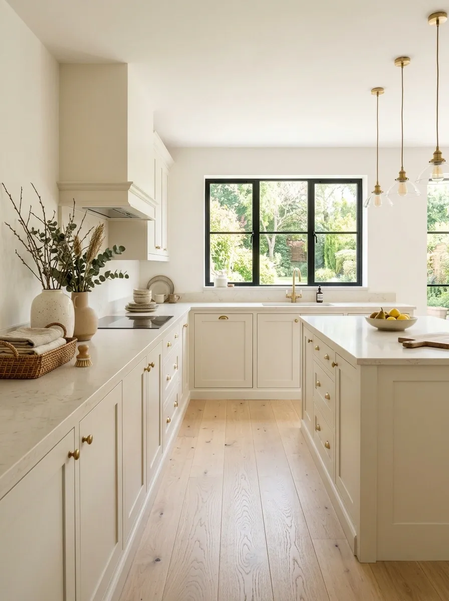
Pure white can make a kitchen feel sharp, cold, and strangely unfinished. Warm white has a softer relationship with pale wood, stone, linen, and natural daylight. It also gives the room more visual depth without adding another obvious color.
Look for cabinetry with creamy or slightly off-white undertones rather than a blue-white finish. Pair it with pale oak and a countertop that has a little warmth in it.
The difference sounds tiny on a paint sample. Across an entire kitchen, it’s huge. Stark white says showroom. Warm white says someone actually cooks here, which is generally the more attractive option.
Soft with oak
Works with warm lighting
Light stone
Natural textiles
Layer Textures With Woven Elements
When your kitchen relies heavily on clean white cabinetry, texture becomes your best friend. A large pendant crafted from natural rattan draws the eye upward and instantly warms the entire room from above.
Carry that tactile energy down to the dining level with textured placemats and mismatched chairs. Combining smooth ceramics with rough-hewn fibers creates a layered look that feels collected over time rather than styled in a single afternoon.
Allow everyday objects to double as decor by leaving wooden boards and ceramic pitchers within arm’s reach. It makes a functional workspace look like a charming, lived-in heart of the home.
Let Pale Oak Do More Than One Job
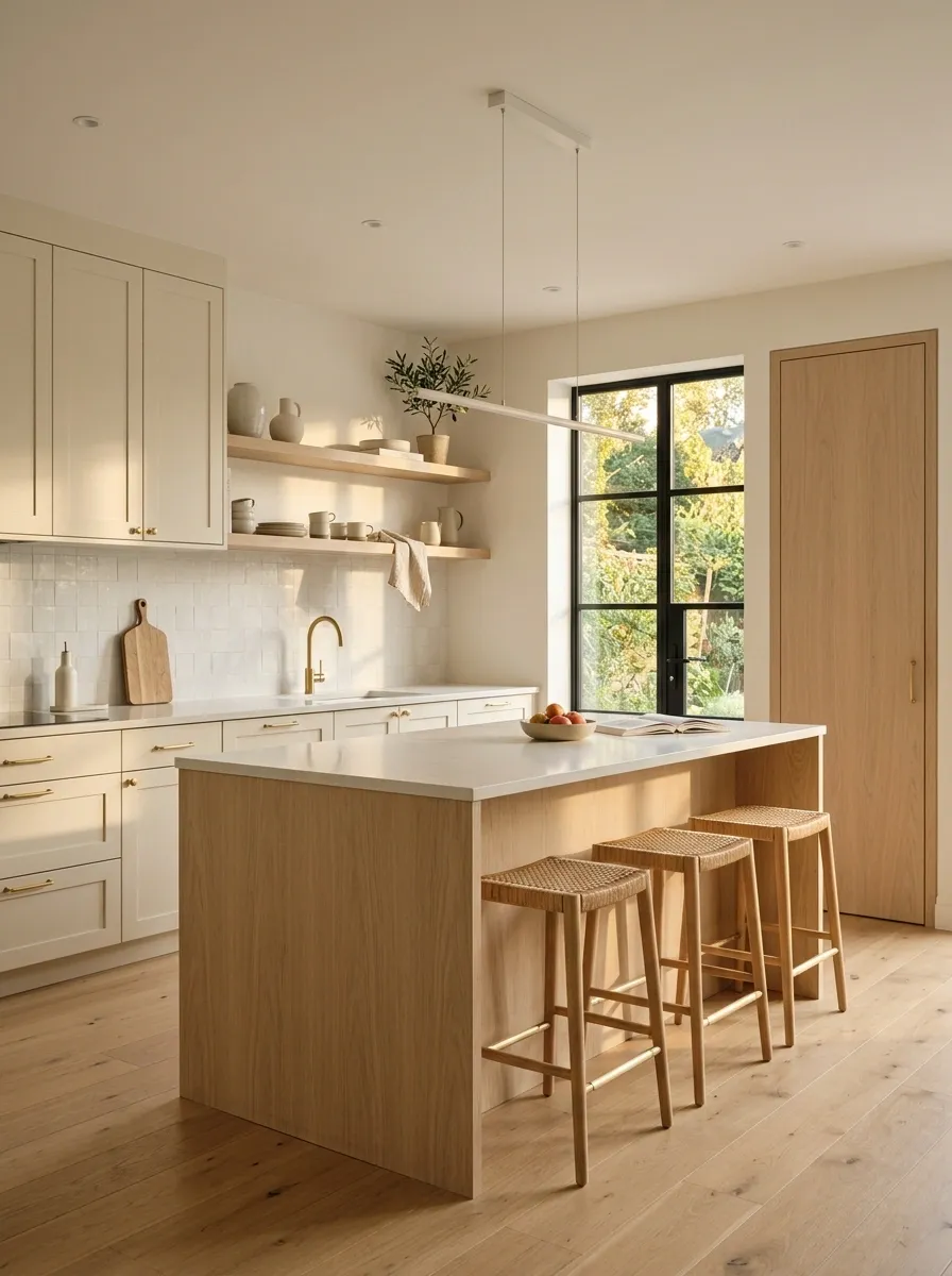
Pale oak becomes much more convincing when it appears in several places instead of being trapped on the island.
Repeat it through shelving, a pantry door, stool seats, a cabinet section, or even a small piece of furniture. The repetition creates a visual thread that makes the kitchen feel designed instead of assembled from unrelated purchases.
The important part is consistency. Don’t introduce five different wood tones and expect them to become friends. One dominant pale wood finish can quietly connect the whole room.
Embrace Vertical Plants and Pendant Lighting
Lighting in a compact Scandinavian kitchen should be both functional and poetic. A trio of slim pendant lights creates a glowing focal point over the counter, drawing attention to neatly arranged pottery on the back shelf.
Introduce cascading greenery to soften the clean geometry of white cabinetry and subway tiles. Plants act as a living sculpture, bringing a splash of organic vitality into corners that might otherwise feel tight or underutilized.
Maximize your vertical space by keeping counters remarkably clear and letting the walls do the talking. A simple stool or a tall plant stand adds height variation, making even a tiny galley kitchen feel thoughtfully proportioned.
Pair Cream Cabinets With Muted Sage
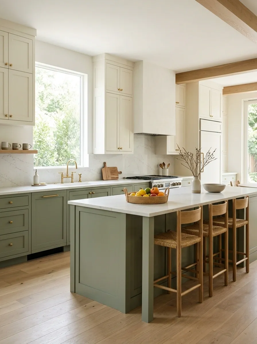
Muted sage works beautifully in a Scandinavian kitchen because it introduces color without turning the cabinetry into the main event.
Keep the green dusty and restrained. Pale sage, gray-green, or an earthy olive undertone works better than a saturated botanical green. The cabinet color should feel like it belongs beside oak, stone, and warm white.
Use the color across lower cabinets, an island, or a single cabinet run. Then let the rest of the room stay quiet.
Create Atmosphere With Warm Lighting
The fastest way to make a simple kitchen feel expensive is to master the art of evening lighting. Ditch harsh overhead glare in favor of subtle cabinet-top candles and ambient shelf glows that highlight the room’s architecture.
Frame your functional work zones with warm, low-level illumination that reflects softly off pale wooden flooring. This approach turns routine evening cleanup into a calming ritual rather than a chore.
Keep the hardware understated so it doesn’t distract from the gentle play of light across the surfaces. When the shadows are this well-designed, you barely need any decoration at all.
Keep Cabinet Hardware Slim and Quiet
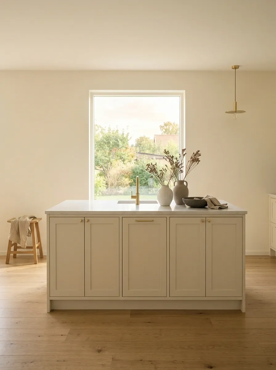
Hardware can either finish a kitchen or announce itself from three rooms away.
Scandinavian kitchens usually benefit from slim pulls, small knobs, or understated integrated handles. Brushed metal works particularly well because it adds a little contrast without creating a shiny focal point.
The shape matters too. Avoid oversized decorative hardware if the cabinetry already has strong lines. The hardware should help the hand open the cabinet and then disappear visually.
Slim pulls
Small knobs
Brushed finishes
Oversized shapes
Too much shine
Decorative detailing
Anchor With Patterned Vintage Rugs
Hardwood floors and crisp cabinets are a Scandinavian staple, but they occasionally need a shot of soul. Laying down a worn, patterned runner introduces unexpected color and softens the hard acoustic lines of the kitchen.
Echo the organic tones of the rug by suspending trailing plants near the window and stacking rustic wooden shelves overhead. Nature and textiles working together will always elevate a modest kitchen into something extraordinary.
Let sunlight pour across these mixed textures to highlight the depth in your materials. When every element—from the apron sink to the antique runner—shares a relaxed aesthetic, the whole room simply sings.
Give Open Shelving One Specific Job
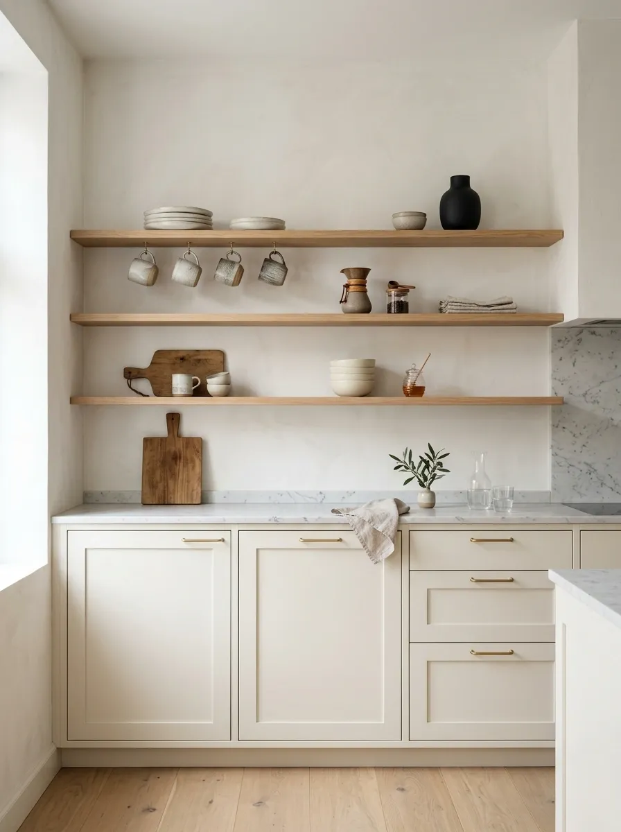
Open shelving looks wonderful until it becomes the place where every random kitchen object goes to retire.
Give each shelf a clear purpose. A coffee station can hold mugs and a few bowls. A cooking zone can hold everyday ceramics. A breakfast area can display glassware and one small decorative piece.
The secret is leaving gaps. The shelf should never look packed just because there happens to be available space.
Small bowls
One ceramic accent
Useful bowls
One cutting board
Make the Island Look Like Furniture
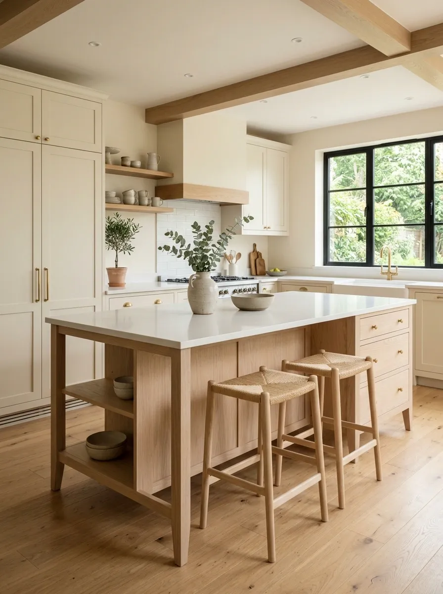
A kitchen island doesn’t always need to look like another giant block of cabinetry.
A furniture-style island with a pale wood base, visible legs, an overhanging counter, or a slightly different finish can make the kitchen feel warmer and less built-in from wall to wall.
This works especially well when the surrounding cabinetry is simple. The island becomes a piece of furniture inside the kitchen instead of another wall of storage.
Repeat One Wood Tone Across the Kitchen
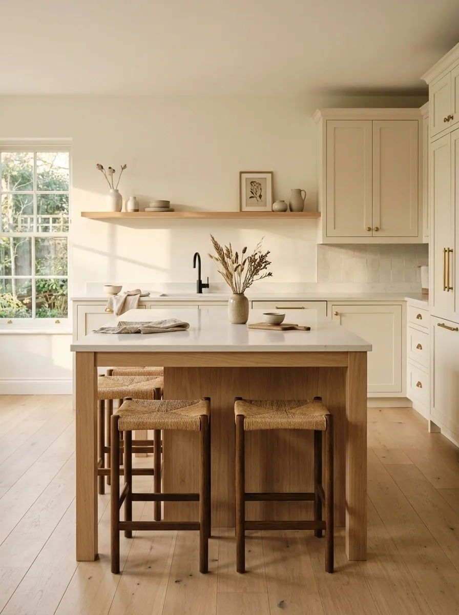
Wood repetition creates rhythm.
If pale oak appears on the island, echo it somewhere else. An open shelf, pantry door, stool seat, cabinet insert, or small table can carry the same visual language.
This doesn’t mean every wood surface needs to match perfectly. It means the overall warmth should feel related. A Scandinavian kitchen gets its calm from repetition, not from throwing six unrelated materials into the room and hoping the algorithm calls it eclectic.
Use a Soft Stone Backsplash Instead of Busy Tile
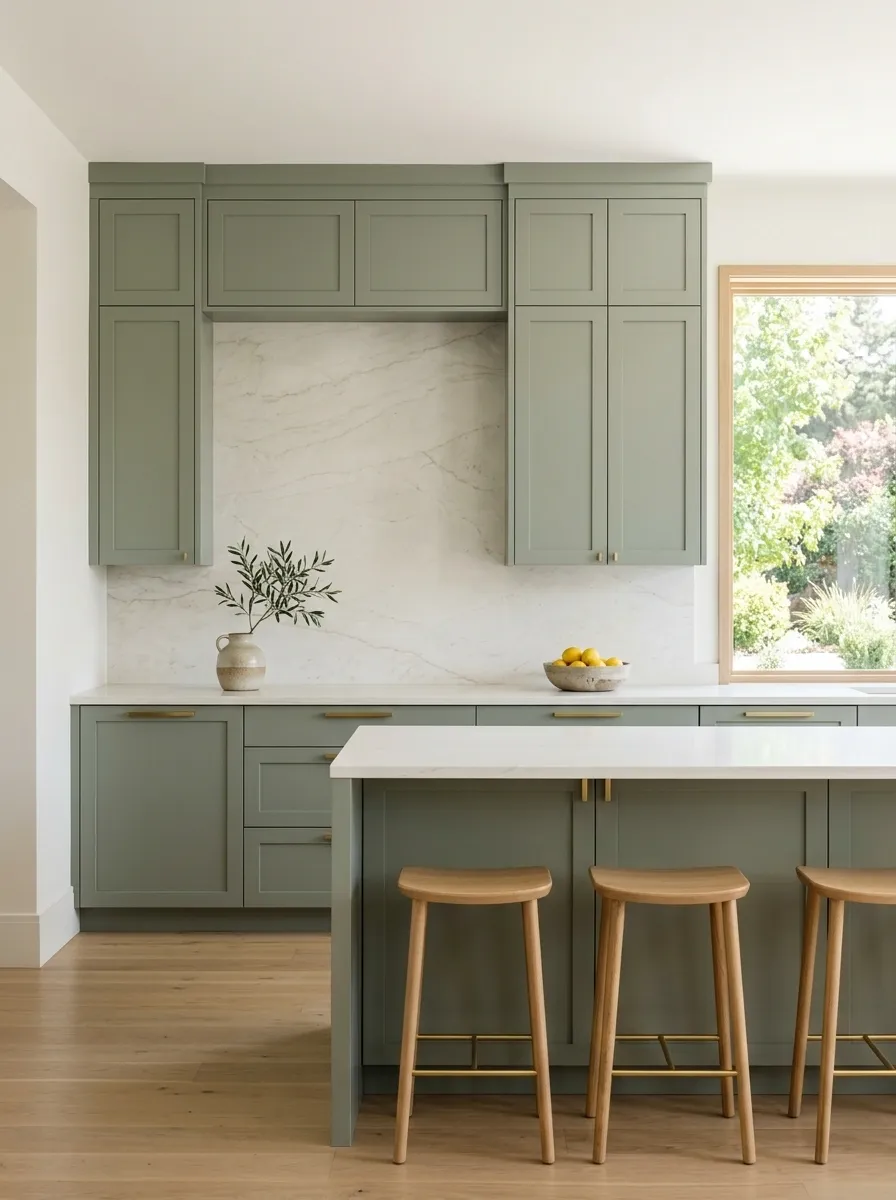
A light stone backsplash keeps the kitchen feeling architectural rather than overly decorated.
Choose a finish with subtle movement, warm white undertones, or barely visible beige-gray veining. The backsplash should support the cabinetry and countertop instead of becoming a separate art installation.
This is especially useful when the room already has pale wood, colored cabinets, or distinctive lighting. Let the stone provide texture without demanding attention.
Warm undertones
Easy with oak
High contrast
Needs more restraint elsewhere
Add a Small Pattern Where It Can Breathe
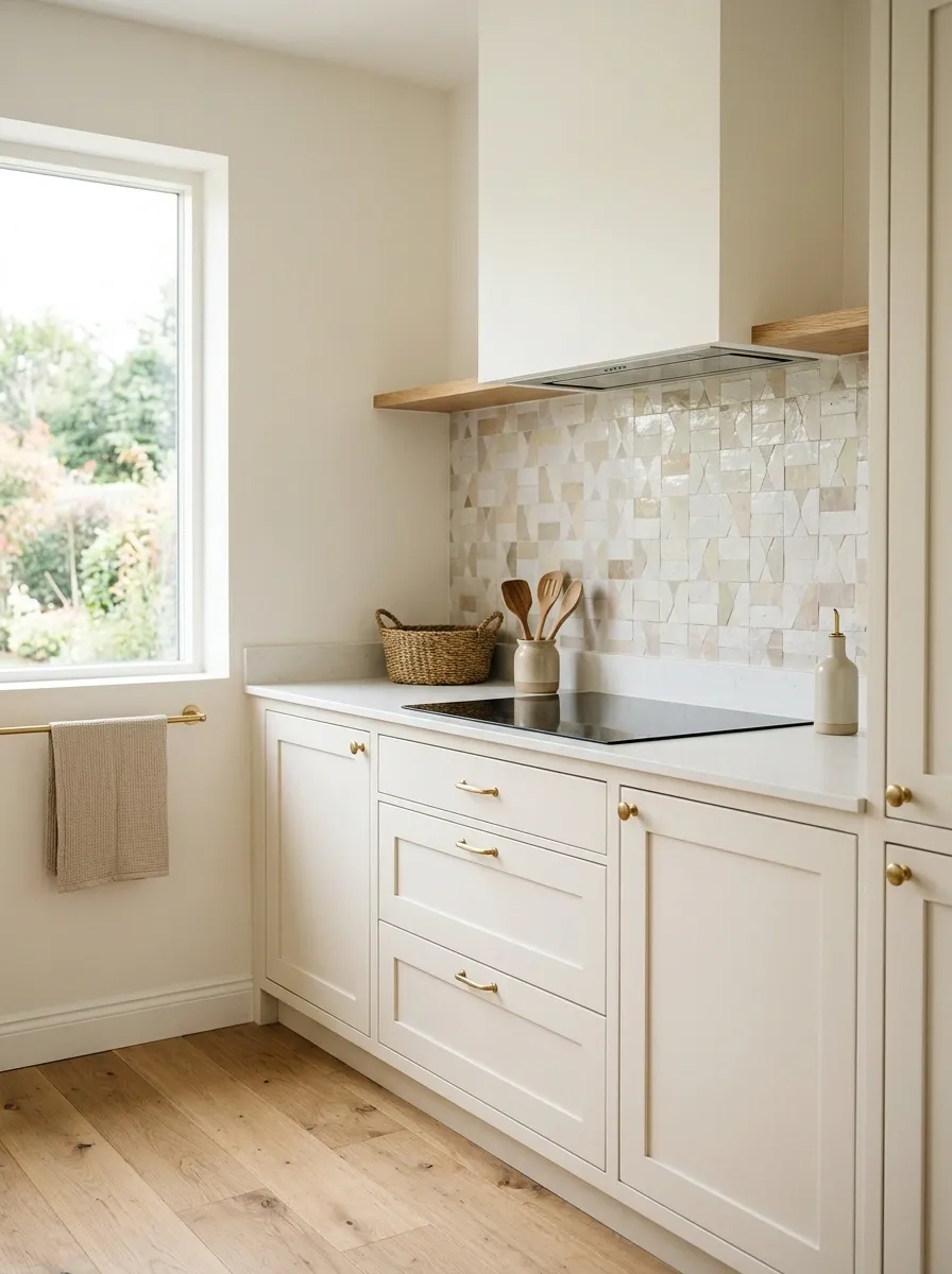
Scandinavian kitchens don’t have to be completely pattern-free.
A small handmade-look tile, quiet geometric backsplash, narrow stripe, or subtly patterned textile can break up a large run of simple cabinetry. The trick is scale and placement.
Keep the pattern contained. A small backsplash area can handle more visual interest than an entire wall. Pair it with simple cabinet fronts and quiet countertops so the pattern has room to register.
Soft contrast
Large breathing room
Distinct pattern
Simple surroundings
Strong contrast
Needs everything else quieter
Build a Calm Range Wall
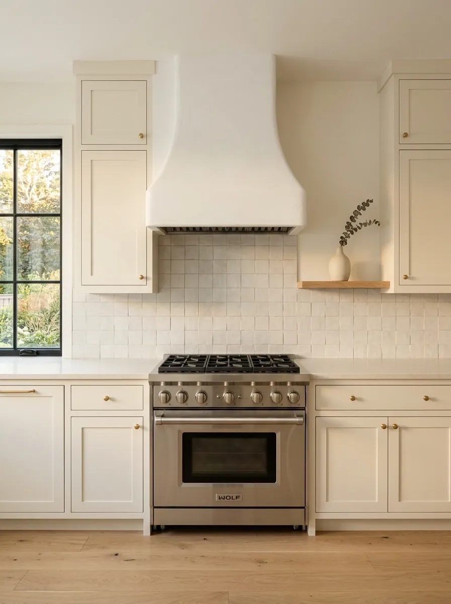
The range wall often becomes the visual center of a kitchen, so it deserves restraint.
A simple plaster-style hood, quiet backsplash, balanced cabinetry, and a clear counter around the stove create a strong architectural composition without relying on decoration.
Keep the hood shape simple. Let the materials do the work. If the range wall already has symmetry and good proportions, there isn’t much reason to cover it with objects.
Hide the Appliances That Create Visual Noise
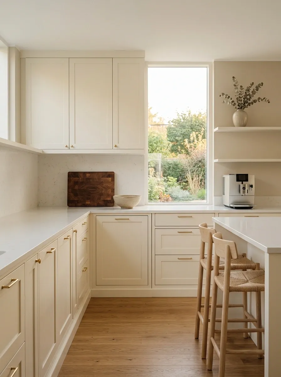
The most beautiful Scandinavian kitchen can lose its composure when every appliance is sitting on the counter.
Coffee machines, air fryers, toasters, blenders, chargers, paper towels, and whatever mysterious gadget was purchased at two in the morning all contribute visual noise.
Keep daily-use appliances accessible, but give them a home. A pantry shelf, appliance garage, concealed cabinet, or dedicated coffee zone can dramatically improve the appearance of the room without changing the cabinetry.
Use Tall Cabinetry to Make a Small Kitchen Feel Taller
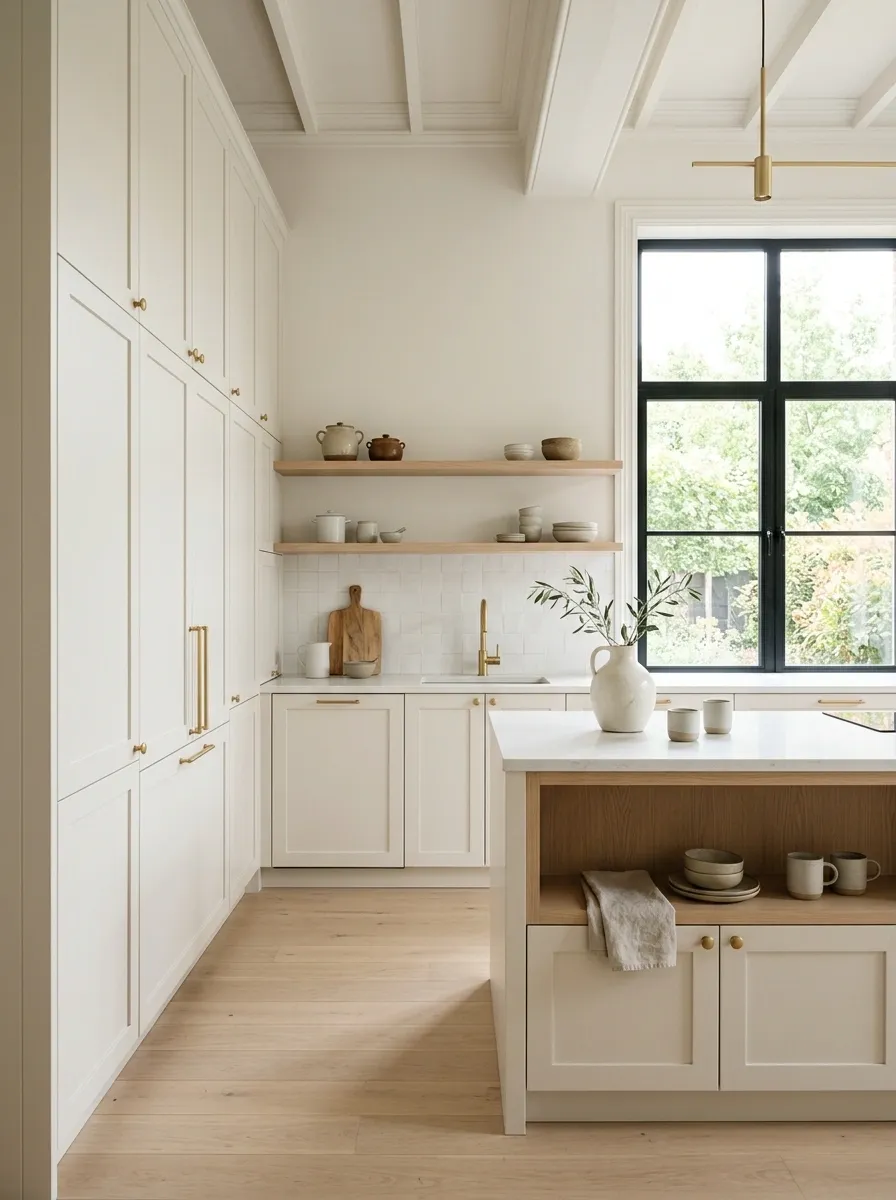
Vertical cabinetry can make a compact kitchen feel more substantial without adding visual clutter.
Floor-to-ceiling pantry units, tall appliance cabinets, or full-height storage draw the eye upward and use space that often gets wasted above standard cabinets.
Keep the finish simple so the vertical wall doesn’t become visually heavy. Warm white cabinetry with pale oak details and a narrow island can make a small kitchen feel much more intentional.
Keep the Countertop Mostly Empty
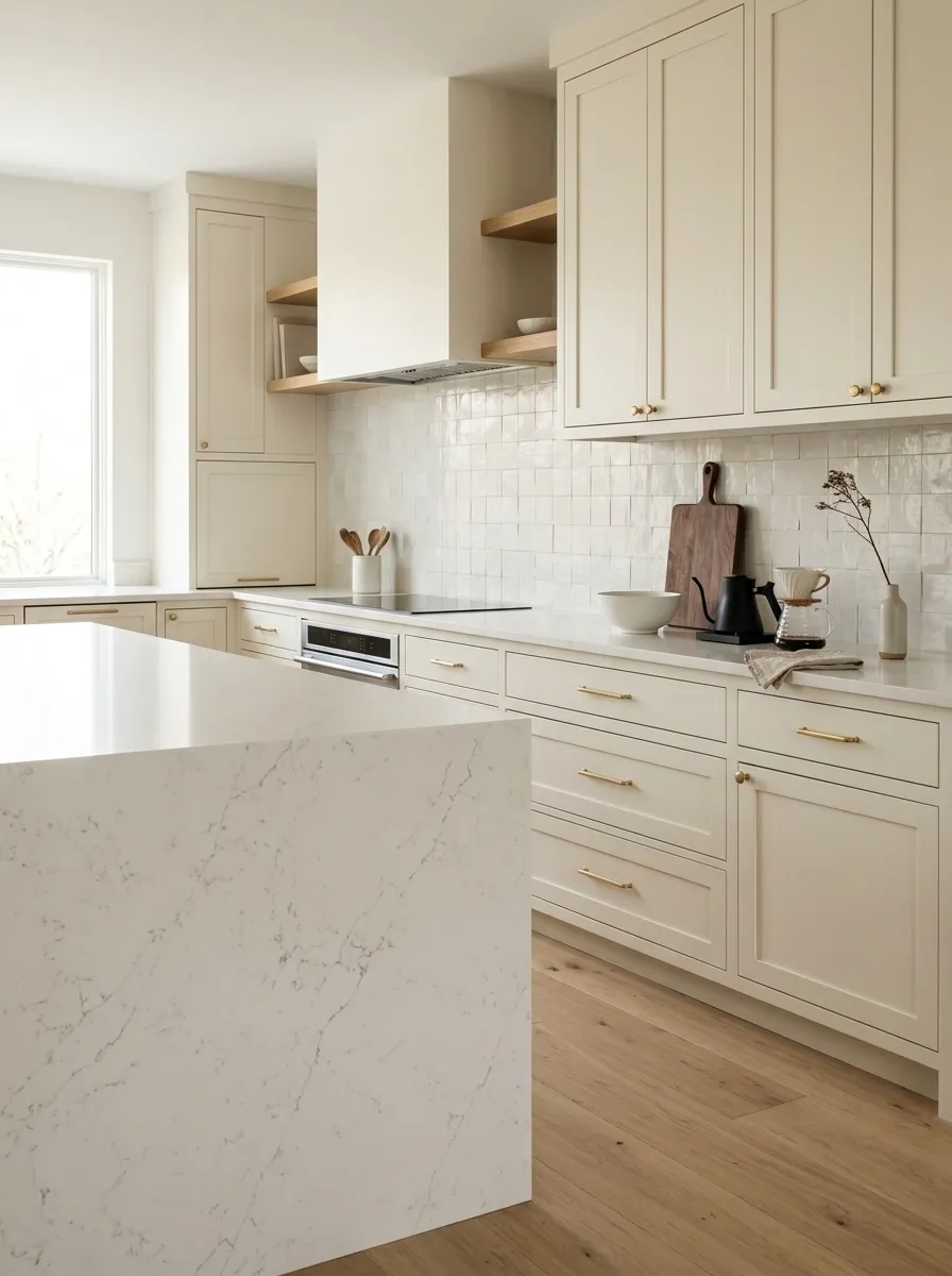
A quiet countertop is one of the easiest ways to make a kitchen look expensive.
That doesn’t mean the room needs to look unused. A wooden board, ceramic bowl, coffee setup, or small vase can stay. The difference is giving those objects space around them.
Empty counter space creates visual punctuation. It lets the stone, cabinetry, and backsplash actually be seen instead of becoming background material underneath a collection of stuff.
Treat the Pantry Like a Piece of Furniture
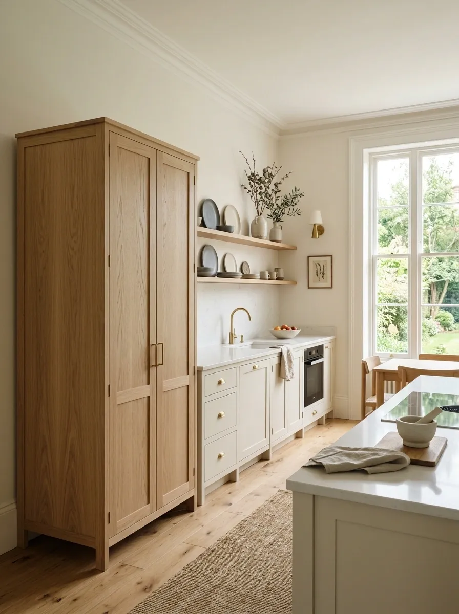
A pantry doesn’t have to disappear visually just because it stores a ridiculous amount of cereal.
A tall freestanding pantry in pale oak can become part of the kitchen’s furniture language. It adds warmth, storage, and vertical interest without requiring another wall of identical cabinets.
Use simple hardware and keep the surrounding cabinetry restrained. The pantry should look intentional rather than like a large storage box that accidentally wandered into the kitchen.
Choose Stone With Quiet Movement
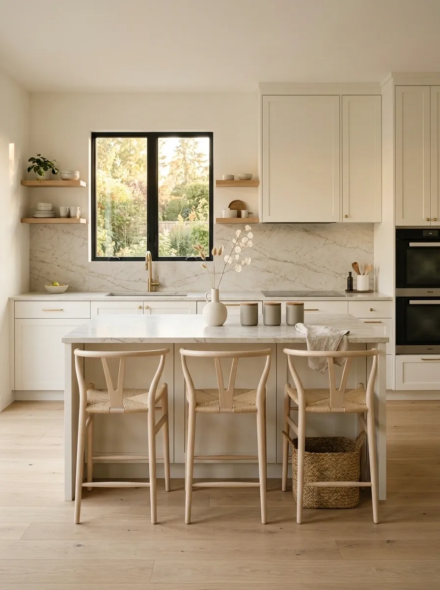
Stone can bring plenty of character without becoming the loudest thing in the kitchen.
Look for light surfaces with subtle beige, gray, or warm cream veining. The movement should be visible when someone looks closely, not from halfway across the room.
This works especially well with warm white cabinets and pale oak because the stone becomes a middle layer between the two. It adds texture without creating another competing color.
Warm undertone
Soft visual rhythm
Still restrained
Works as a subtle feature
Large movement
Needs quieter surroundings
Use Black as Punctuation, Not a Whole Sentence
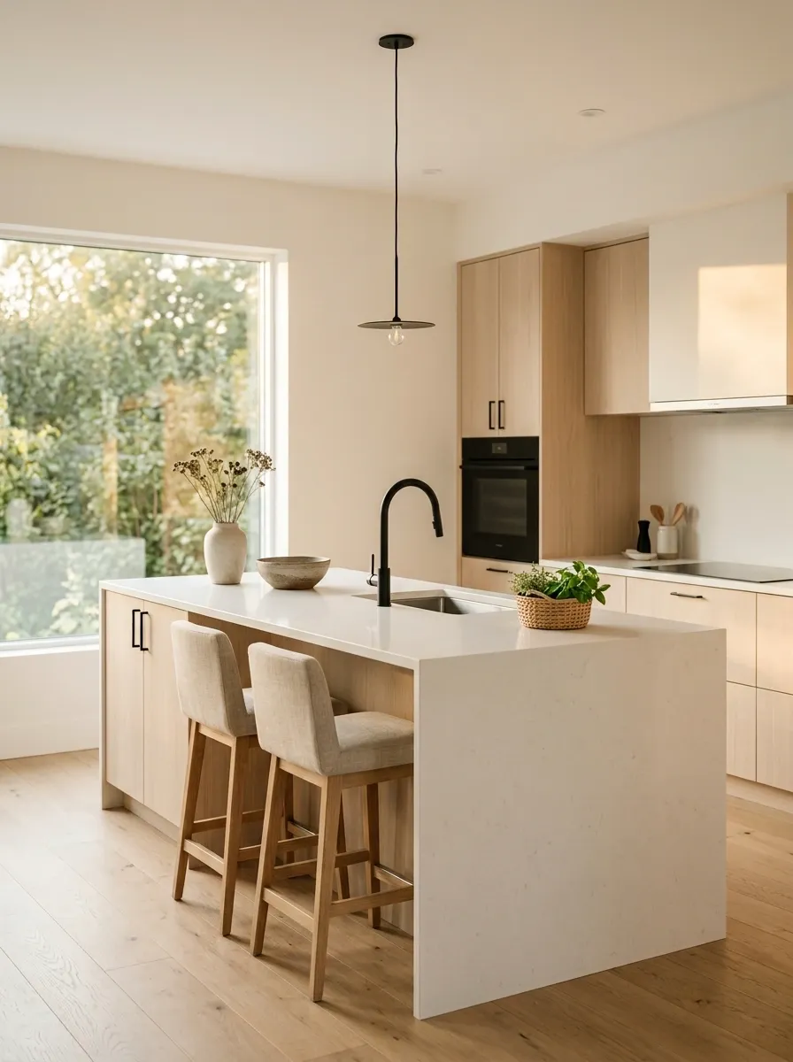
Black details can sharpen a Scandinavian kitchen beautifully when they’re used sparingly.
A black faucet, pendant cord, slim cabinet pull, or a few small fixtures can create definition against warm white and pale wood. The mistake is repeating black everywhere until the room becomes a black-and-white graphic instead of a warm kitchen.
Think punctuation. A few dark marks help the eye move around the room. Too many turn the punctuation into the entire sentence.
Give the Sink a Proper Design Moment
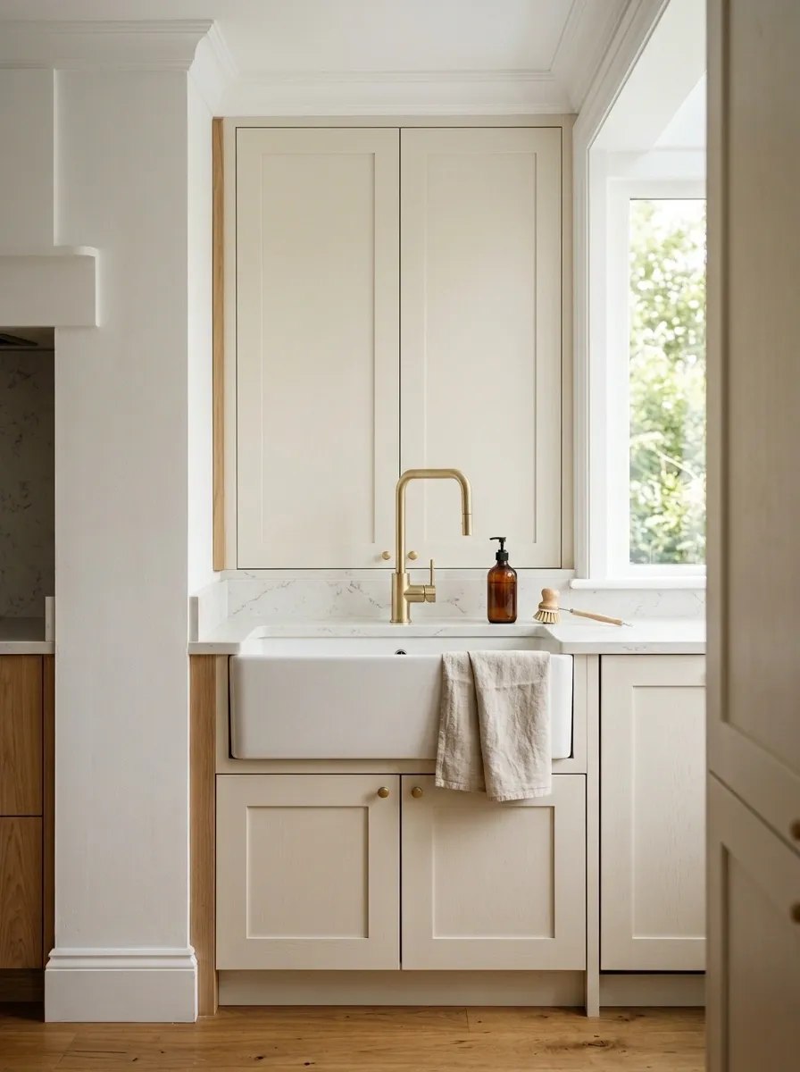
The sink zone gets used constantly, so it deserves more thought than a random faucet and whatever soap bottle happened to be closest to the checkout.
A deep sink, simple brushed faucet, neutral soap dispenser, and linen towel can create a compact composition that feels intentional without looking decorated.
Keep the area around the sink relatively clear. The practical zone should still be practical.
Create One Open Display Zone
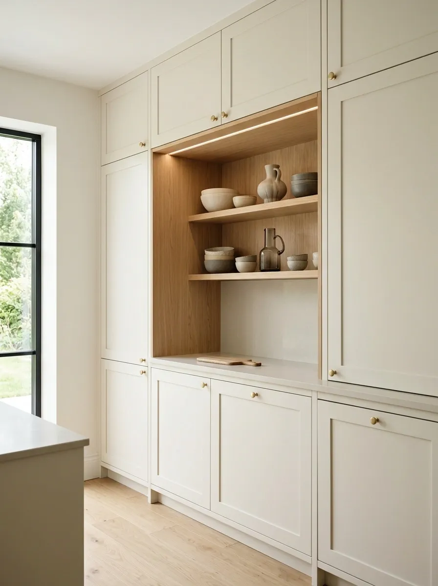
A kitchen doesn’t need open shelving everywhere to feel relaxed.
One intentional display niche can actually be more effective. Place it between closed cabinets, beside a coffee station, or at the end of a cabinet run.
Use a few bowls, ceramics, or glass pieces that repeat the kitchen’s existing colors. The contrast between closed storage and one open area creates rhythm without making the entire room feel exposed.
Layer Linen, Ceramic, and Wood
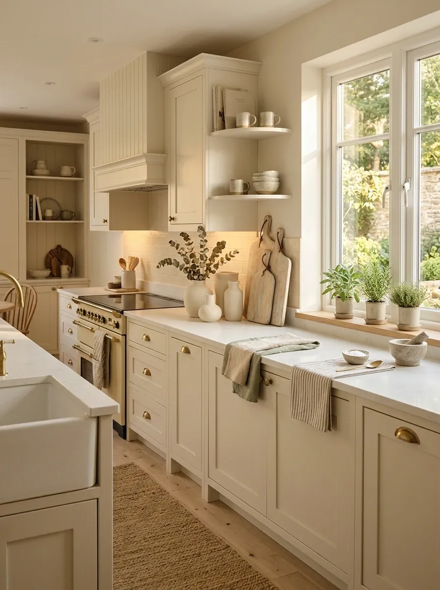
The warmth in Scandinavian kitchens doesn’t come from adding piles of decoration. It comes from mixing a few tactile materials.
Linen tea towels, handmade-looking cream ceramics, pale wood boards, woven runners, and natural textures make a simple kitchen feel comfortable without filling it with objects.
Keep the colors related. Cream, beige, pale oak, soft sage, and warm gray can sit together without creating visual chaos.
Use a Narrow Coffee Station Instead of Random Counter Clutter
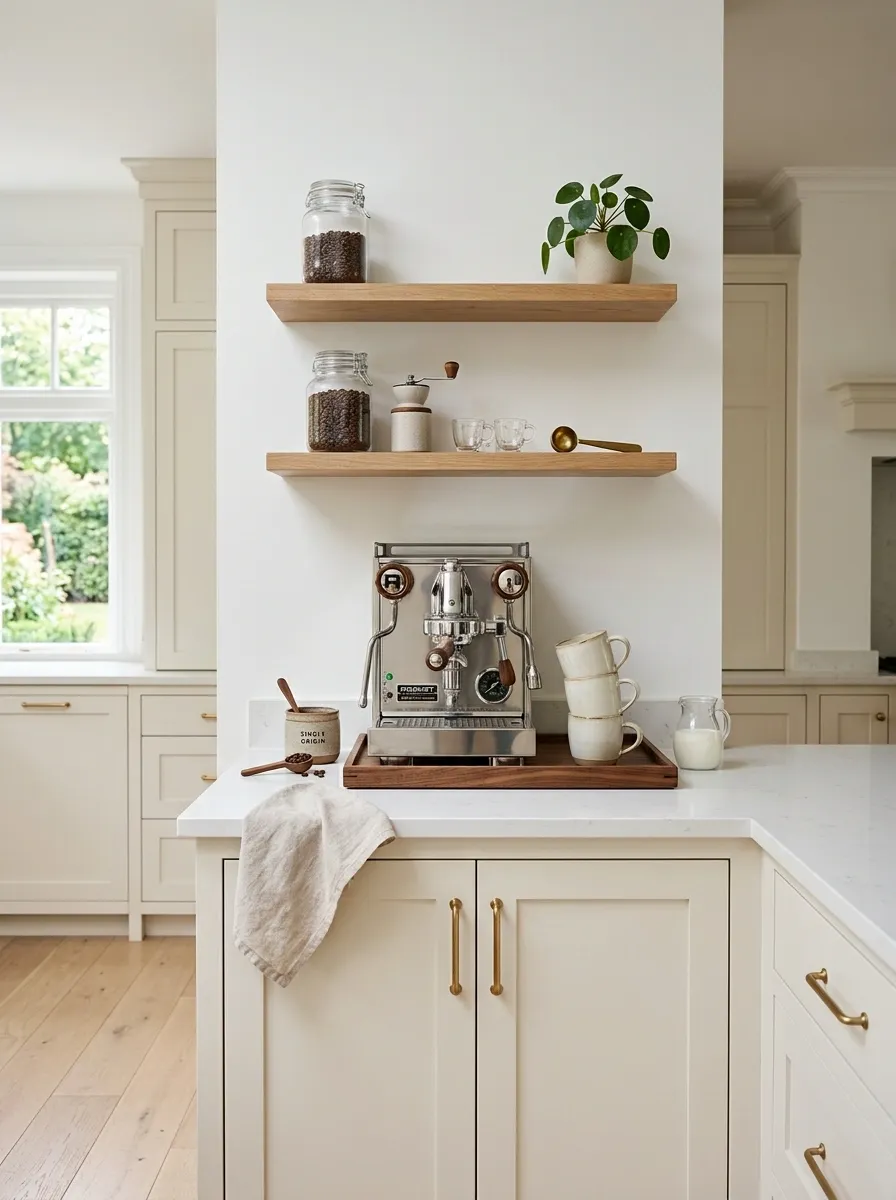
A small coffee station can make a kitchen feel more personal without turning the counter into a café supply closet.
Keep the zone compact. One machine, a few mugs, a small tray, and perhaps a ceramic container are enough. Open shelving above it can hold the things that actually belong there.
The trick is containment. Once the coffee setup has a defined home, the rest of the countertop gets easier to keep clear.
Squeeze in a Scandinavian Cafe Corner Without Turning It Into a Restaurant
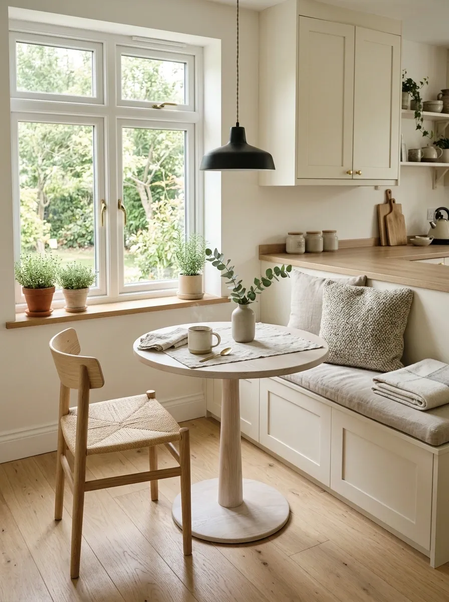
A tiny breakfast corner can make a Scandinavian kitchen feel much more lived in. A built-in bench, slim wooden table, or small round café table gives an unused edge of the room a clear purpose.
Keep the furniture light and the styling even lighter. One compact table, streamlined seating, warm wood somewhere in the zone, and a simple pendant or wall light are enough.
This works especially well near a window, where daylight does half the decorating. The area should feel like a quiet little place to drink coffee, not a full restaurant concept squeezed between the fridge and a wall.
Use Warm Under-Cabinet Lighting So the Kitchen Doesn’t Die After Sunset
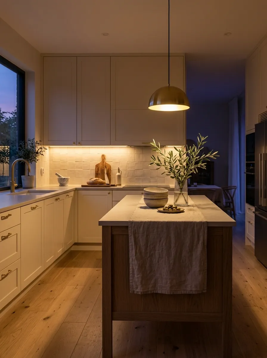
A kitchen can look beautiful at noon and strangely depressing at eight p.m. The lighting usually gets the blame because, well, the lighting deserves it.
Warm under-cabinet illumination adds a soft layer beneath upper cabinets and makes the backsplash, counters, and lower surfaces easier to read at night.
Keep the evening lighting simple. Use warm light under the upper cabinets. Let pendant lights create a second layer over the island. Keep the rest of the room slightly quieter.
The goal is depth, not brightness everywhere. A Scandinavian kitchen should feel softer as the evening goes on, not like someone accidentally turned on every bulb in a supermarket.
Pair Pale Wood With One Deep Cabinet Color for Controlled Contrast
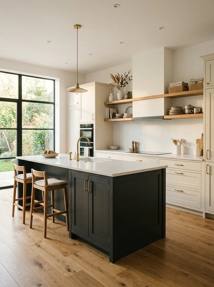
Two-tone kitchens can look incredibly refined when the contrast has a clear hierarchy.
Keep pale oak or another light wood as the warm foundation, then introduce one deeper cabinet color such as charcoal, muted forest green, deep blue, or a brown-black shade.
Don’t split the room into visual warfare. One finish should clearly dominate while the darker tone creates a focused block, usually on the island or a tall cabinet section.
That gives the kitchen structure without making every wall compete for attention. The best versions feel almost architectural. Light wood carries the room, deep cabinetry adds weight, and the lighter walls keep everything from becoming moody enough to require dramatic violin music.
Add a Simple Runner for Texture Without Starting a Pattern War
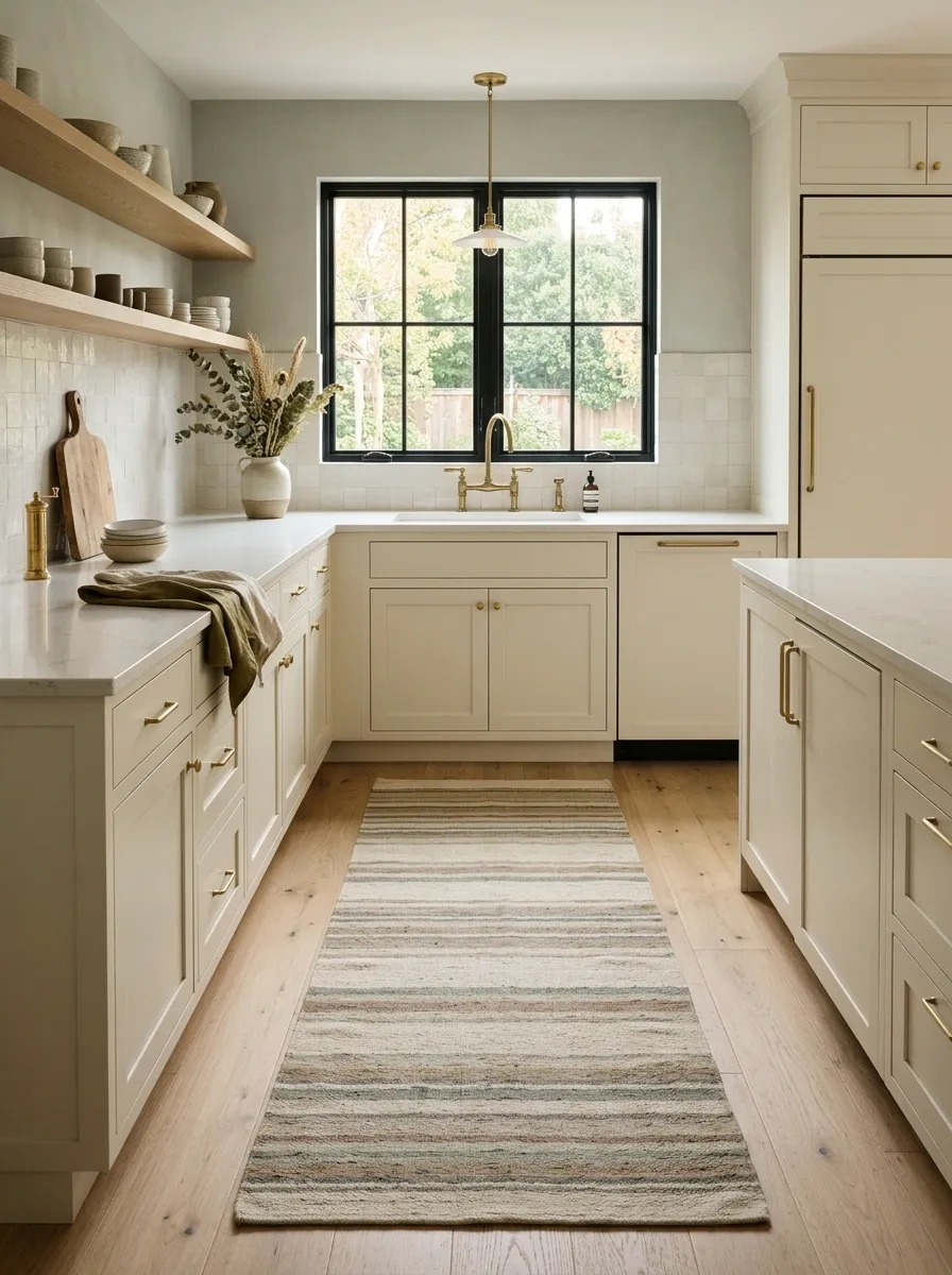
A runner can make a kitchen feel softer without changing a single cabinet.
Choose a low-key pattern, faded stripe, muted geometric print, or solid textured weave. Natural-looking tones work especially well with oak, cream, sage, and stone.
Placement matters more than people think. Run it along the main work zone or in front of the sink, keeping enough exposed flooring around it that the kitchen still feels open.
A runner that’s too short looks accidental. One that’s too loud makes the floor look like it was decorated separately from the rest of the room.
Finish With One Natural Focal Point and Then Stop Adding Stuff
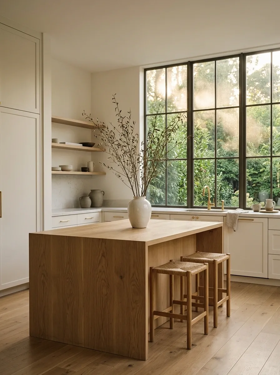
The final layer should be the easiest one.
Choose one natural element that gives the kitchen a clear visual anchor. It could be a large oak island, an aged wood table, a stone hood, a tall window overlooking greenery, or a single oversized branch arrangement.
Then stop. Seriously.
Scandinavian kitchens look strongest when every material has enough room to register. Once the main composition works, adding five more decorative pieces doesn’t make it richer. It usually just buries the good parts.
The finished room should have one thing that catches the eye first, several quieter details worth noticing second, and enough empty space for everything to breathe. That’s the whole trick.
The Kitchen Should Feel Calm, Not Bare
The best Scandinavian kitchens aren’t trying to prove that nobody owns anything.
They simply give every material enough room to look good. Warm white cabinetry gets paired with wood instead of buried under decoration. Stone gets to show its texture. Lighting creates atmosphere instead of blasting the whole room equally. Storage keeps the useful mess out of sight, while a few natural materials make the kitchen feel like an actual part of a home.
That’s the sweet spot.
Use Scandinavian kitchen ideas as a framework, not a costume. Keep the palette restrained, repeat materials where they make sense, give contrast a specific job, and stop decorating once the room already looks finished.
Then leave the countertop alone.
It has suffered enough.