
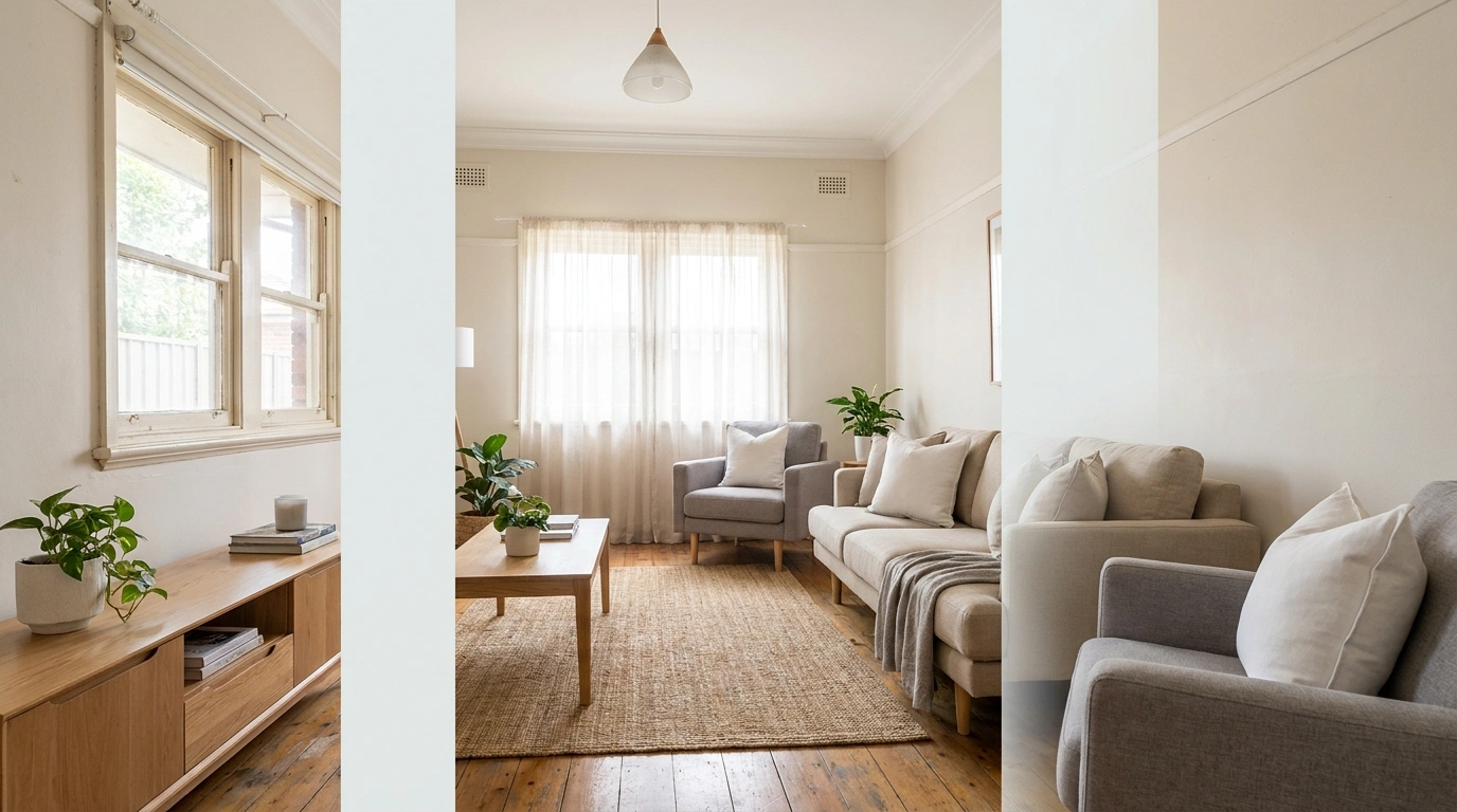
A house can be spotless and still look completely unready to sell.
That’s the annoying part. People scrub the floors, fluff a few cushions, light a candle, and assume the job is done. Then the listing photos go live and the rooms somehow look smaller, darker, and more crowded than they do in real life.
The good news is that the biggest improvements usually come from editing, rearranging, cleaning, borrowing, and temporarily storing things. Those moves cost little or nothing, but they can completely change how a room photographs and feels.
Before buying anything, start taking things away.
A STAGING REALITY CHECK
Clean Isn’t the Same as Camera Ready
A home can be genuinely clean and still photograph like the decor department lost an argument.
The problem is usually visual noise. Mail stays on the console. Small appliances live permanently on the kitchen counter. Shelves carry twenty tiny objects because removing any of them feels rude. The house is tidy, but every surface keeps asking for attention.
Staging requires another layer of editing. Look for blocked sightlines, crowded furniture, dark corners, and surfaces that are technically organized but still visually busy.
The goal isn’t sterile. It’s readable. A buyer should understand the room within seconds.
Buyers Notice Space Before Decor
Pretty accessories can’t rescue a room that feels cramped.
Furniture scale, walking paths, open floor area, window access, and the view from the doorway all affect how large a room appears. That’s why adding more decor usually isn’t the first answer.
A large chair shoved into a corner still takes up visual space. A narrow walkway still feels narrow. A crowded shelf still reads as clutter, even when every object is expensive.
Before changing the decor, stand in the doorway and ask one blunt question: What is blocking the room from looking bigger?
That’s usually where the useful fix is hiding.
The Cheapest Staging Trick Is Editing
Before buying another basket, candle, vase, or suspiciously beige throw, remove things.
Use this order:
Pack it → Relocate it → Borrow it → Rearrange it → Buy only when absolutely necessary
That sequence protects the budget and forces better decisions. A lamp from another room may solve the problem. A chair moved six inches may solve the problem. Three boxes of decorative objects packed away may solve the problem.
Shopping should be the last move, not the first reflex.
Budget-Friendly Home Staging Moves
Clear the Entryway Until the Front Door Has Breathing Room
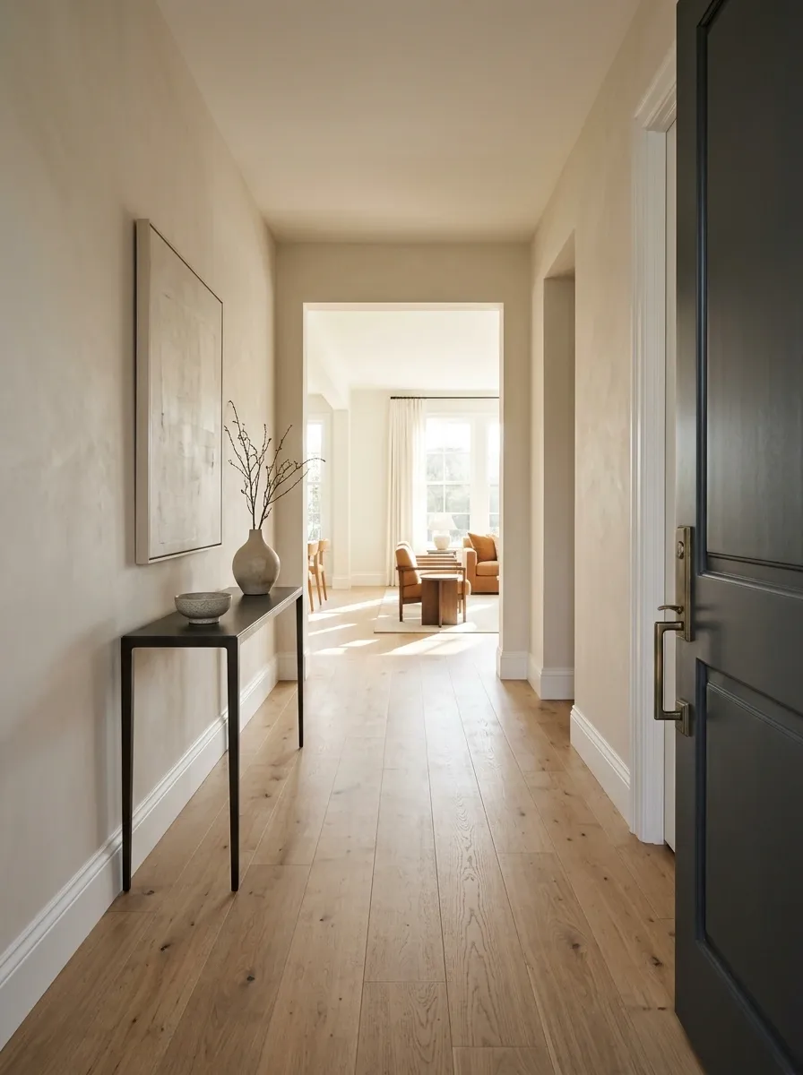
The entryway sets the tone before the living room gets a vote.
Move shoes, bags, umbrellas, baskets, random parcels, and anything else collecting near the front door. Keep the console surface restrained and make sure the path from the door into the house feels obvious.
The quick entry edit:
- Clear the floor first.
- Remove oversized accessories.
- Keep one useful or decorative anchor on the console.
- Straighten the mat and clean the door area.
- Make the next room visible.
The first few seconds matter. A clear entrance makes the rest of the house feel more intentional before anyone has inspected a single cabinet.
Pack Away Half the Stuff Sitting on Open Shelves
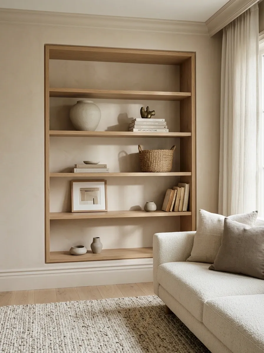
Open shelving exposes everything, including the objects that should have been quietly minding their business in storage.
Take everything off the shelves and put back only the pieces that help with scale, texture, or balance. Mix books with one or two larger objects instead of lining up a collection of tiny pieces.
Shelf editing checklist
☐ Remove duplicate decor
☐ Pack sentimental collections
☐ Group books instead of scattering them
☐ Keep visible gaps between groups
☐ Leave some shelf space completely empty
A shelf looks more expensive when the eye can actually rest on it.
Pull Living Room Furniture Away From the Walls
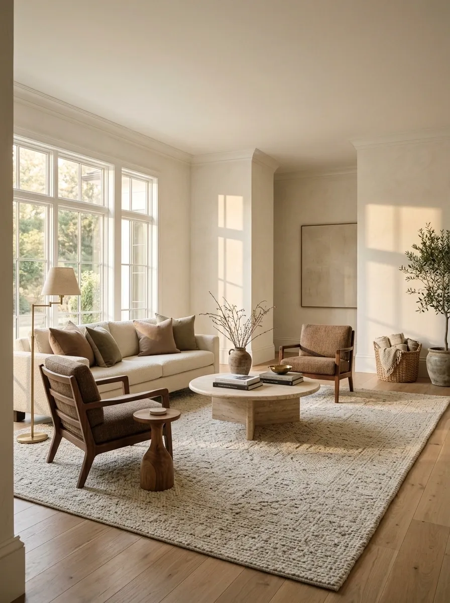
Pushing every sofa and chair against the walls often makes a room look oddly flat.
Bring the main seating slightly inward so the furniture creates a real conversation area. Leave enough space to walk around it, then check the room again from the doorway.
Look for three things:
- A defined seating zone
- A clear route through the room
- More visible floor around the furniture
This works especially well when the center of the room feels empty but the perimeter feels overcrowded. The solution isn’t another table. It’s a better relationship between the pieces already there.
Make the Sofa the Obvious Focal Point
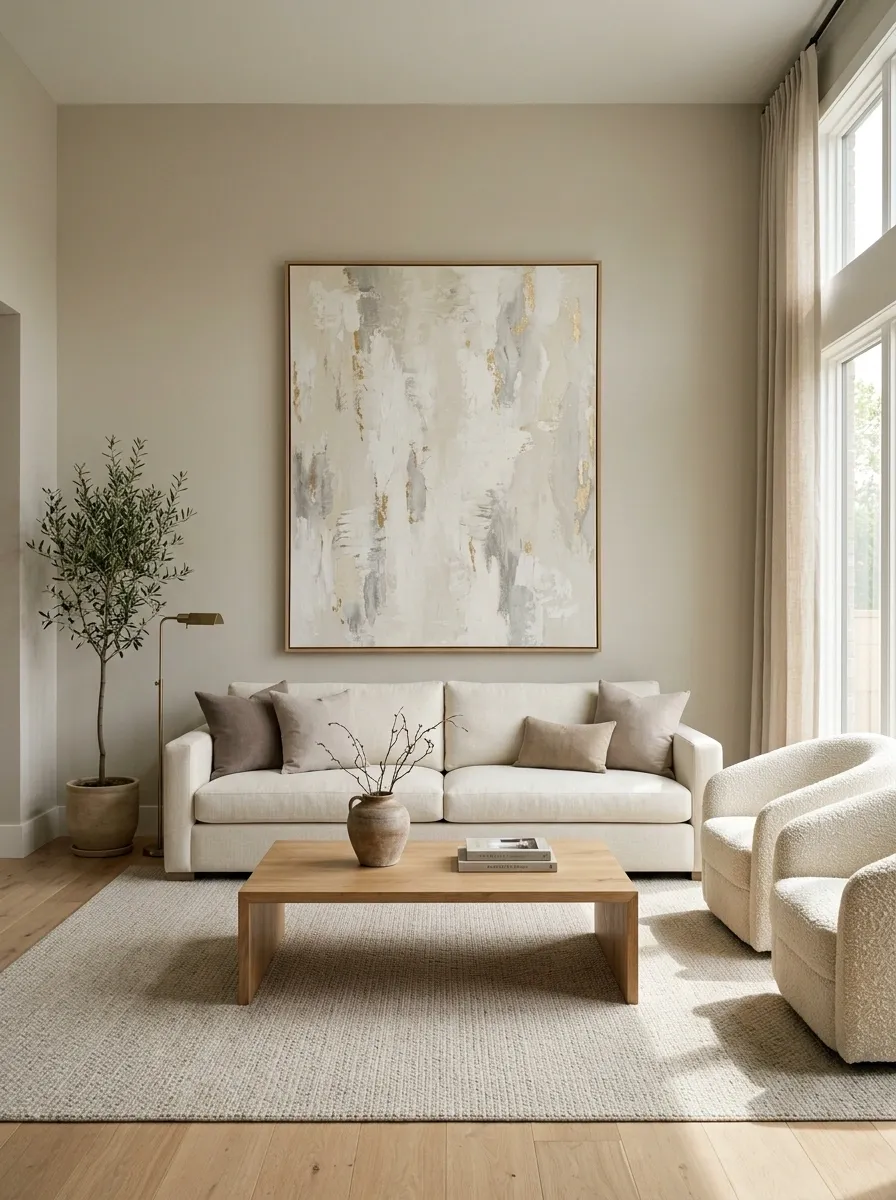
A living room usually needs one visual leader.
Make the sofa part of that story by removing small pieces competing with it. Keep the coffee table simple, edit the cushions, and position nearby furniture so the eye lands on the seating instead of bouncing around the room like it missed an exit.
The room should instantly communicate sit here. That’s much stronger than making every object scream, “Look at me too.”
FOCAL POINT RULE: Keep the seating clear, keep the coffee table restrained, and give one strong piece of artwork or lighting enough room to support the sofa instead of competing with it.
Strip Kitchen Counters Down to the Few Things Worth Showing
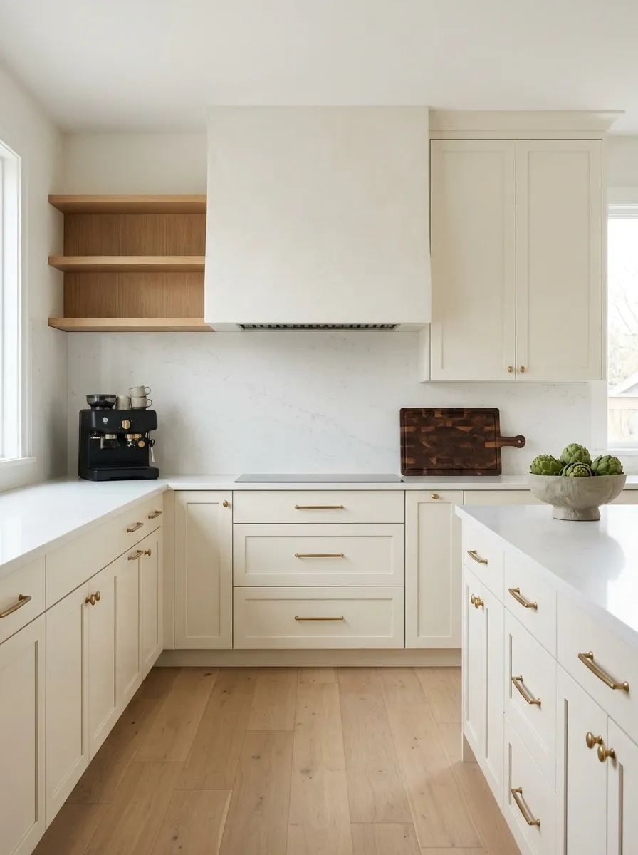
Kitchen counters collect clutter with terrifying efficiency.
Leave out the items that make the kitchen feel functional and attractive, then pack the rest. A coffee maker can stay. So can a clean cutting board or a simple bowl of produce. The stack of unopened mail absolutely does not need a cameo.
Use the counter in three visual zones:
Work zone: one useful appliance
Prep zone: one restrained accessory
Decor zone: one simple natural element
More empty counter means more visible workspace. That’s exactly what a buyer wants to see.
Use One Large Table Centerpiece Instead of Several Tiny Ones
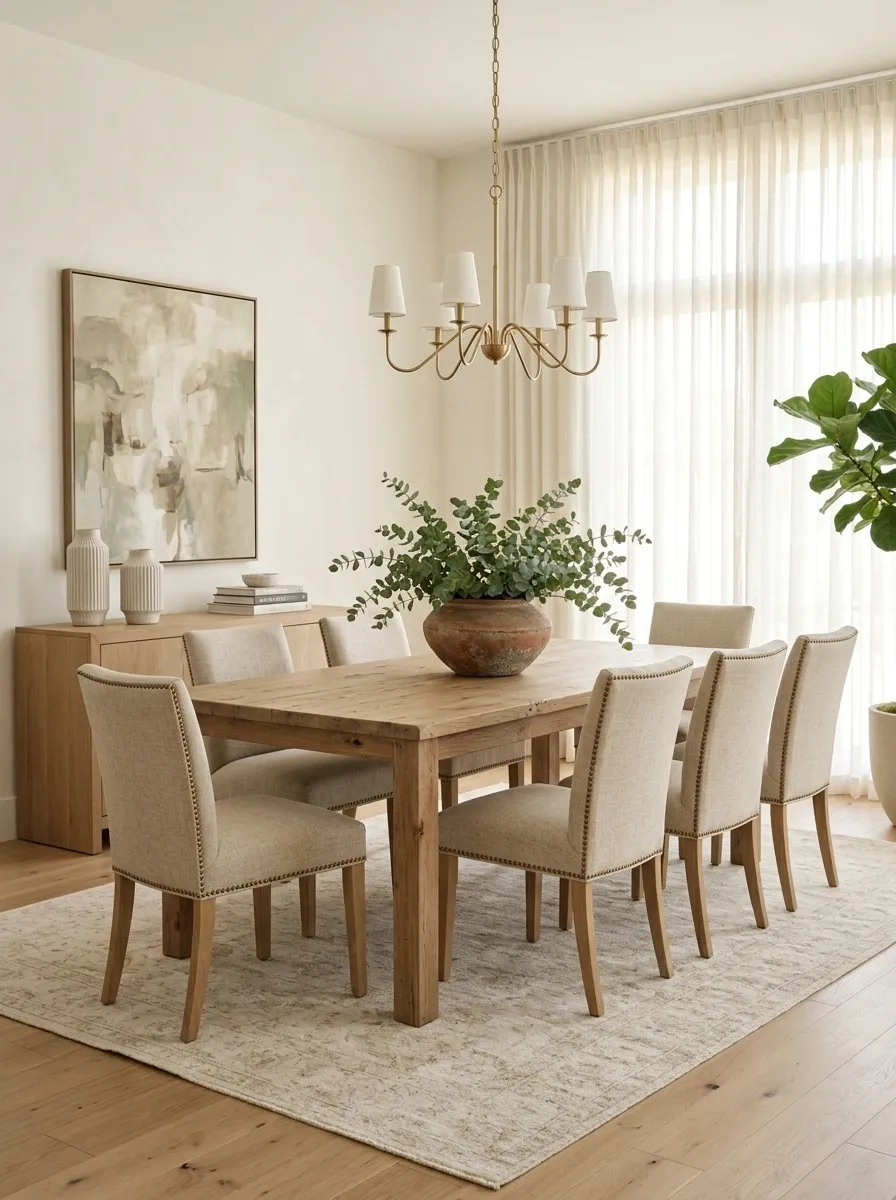
A dining table gets messy-looking fast when every inch has a decorative opinion.
Pick one larger centerpiece with enough visual weight to anchor the table. A low bowl, simple branch arrangement, or restrained arrangement of greenery works better than a collection of tiny objects that makes the table look like a craft fair checkout counter.
Set it up in this order:
- Clear the entire table.
- Place the largest central piece first.
- Add only one supporting detail if the table still feels unfinished.
- Step back and check the view from the doorway.
The goal is a finished table that still looks usable. Buyers should see dinner happening there, not a museum exhibit they aren’t allowed to touch.
Open Every Curtain and Let Natural Light Do the Work
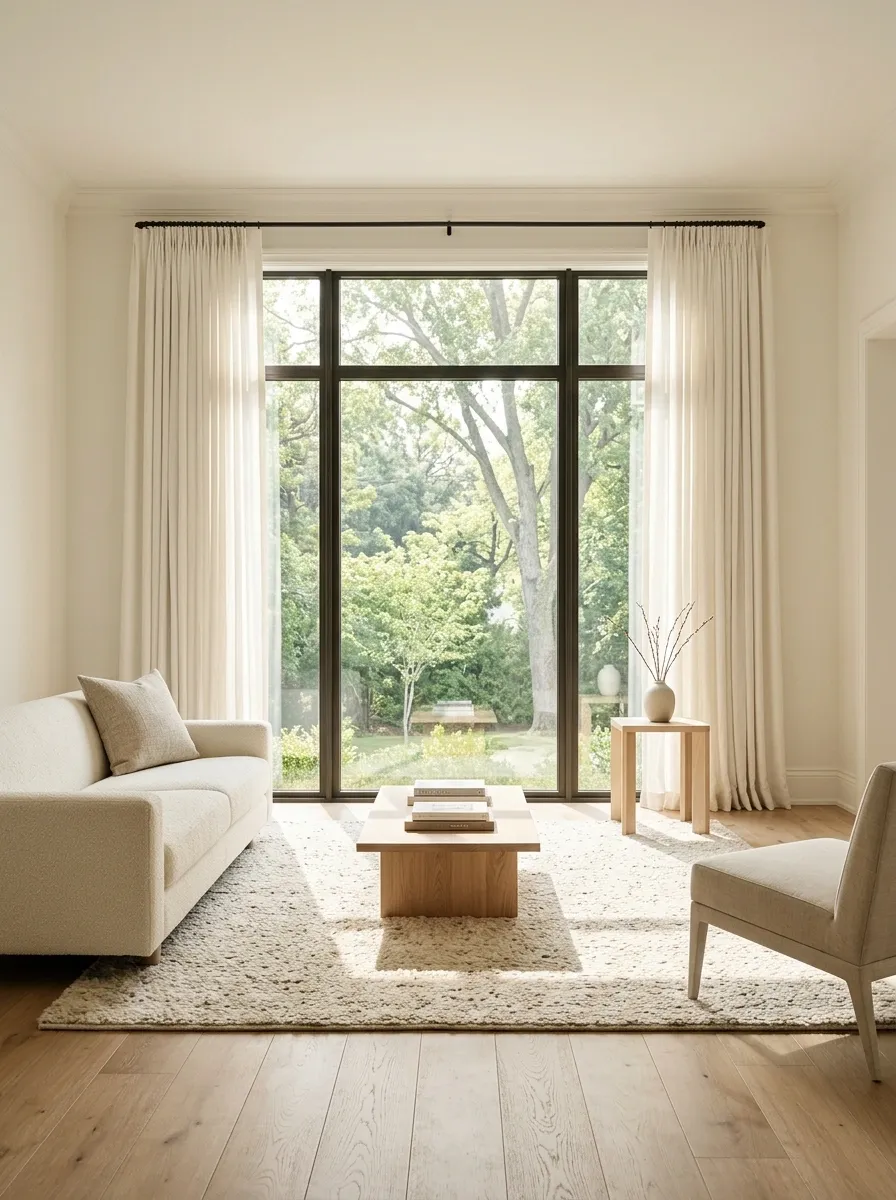
Dark rooms photograph smaller. That’s not a decorating mystery.
Open curtains fully, raise blinds, clean the glass, and move anything blocking the window. Let daylight reach the corners before reaching for more accessories.
A bright room also exposes clutter, which is useful. Staging isn’t the time to negotiate with a pile of stuff that has been sitting on the windowsill since last winter.
Replace Mismatched Bulbs With Consistent Warm Lighting
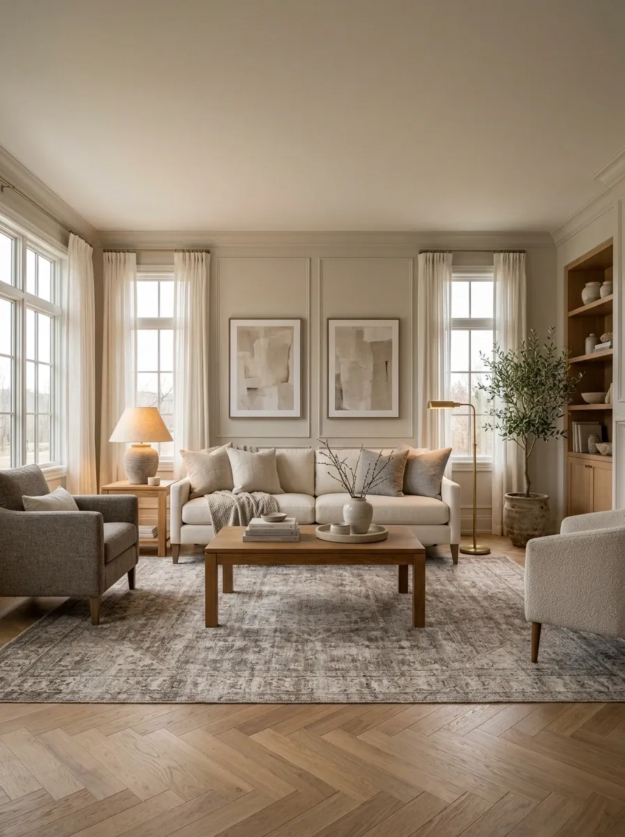
A room can have expensive furniture and still look strange under three different shades of artificial light.
Check the bulbs in the same room together. If one lamp looks yellow, another looks blue, and the ceiling light is doing something completely unrelated, replace the obvious mismatches with bulbs that create a consistent warm appearance.
The point isn’t to make every lamp identical. The light should feel like it belongs to the same room.
| Lighting Problem | Better Staging Move |
|---|---|
| Mixed color temperatures | Use a consistent warm tone |
| One harsh overhead light | Layer lamps where available |
| Dead, dark corners | Add a working lamp nearby |
| Burnt-out or mismatched bulbs | Replace them before photos |
Give the Dining Table a Clean, Finished Look
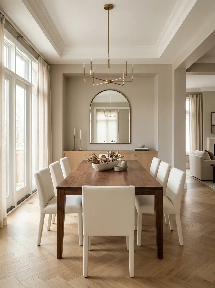
Dining areas photograph best when the furniture reads immediately and the table doesn’t disappear beneath accessories.
Start with the table itself. Wipe the surface, remove unnecessary chairs if they crowd the walkway, and keep the centerpiece low enough that it doesn’t block the view across the room.
Aim for this visual balance:
Remove Rugs That Make the Room Look Smaller
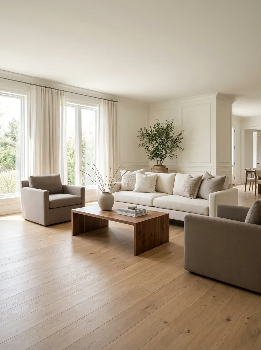
Not every rug deserves to survive the staging process.
A rug that’s too small can chop up a room visually, especially when the furniture barely relates to it. Another problem is excessive pattern in a room that already has busy upholstery, artwork, or flooring.
Pull the rug temporarily and check three things:
- Does the room feel more open?
- Do the furniture pieces relate better?
- Does the floor now create a cleaner sightline?
If the answer is yes across the board, the rug wasn’t helping. It was just occupying square footage and collecting dust with confidence.
Make the Bed Look Bigger With Simple Layering
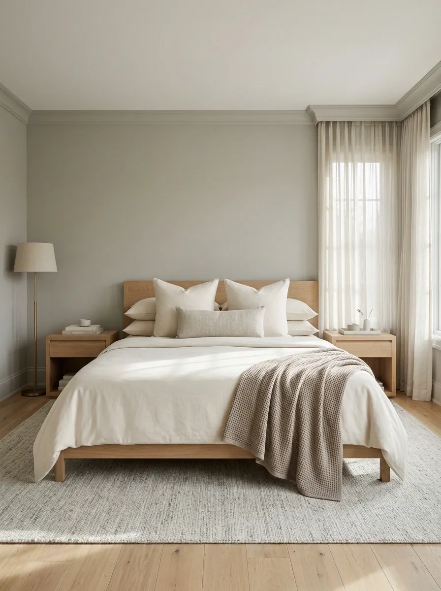
The bed is usually the largest thing in a bedroom, so it gets judged first.
Strip away the clutter and build the bed in layers that make the mattress look substantial without turning it into a pillow showroom. Start with smooth bedding, add a neatly folded throw near the foot, then use a small number of pillows with different heights.
The visual order matters:
- Main bedding stays clean and smooth.
- Sleeping pillows sit behind the decorative layer.
- One folded throw adds texture at the bottom.
Keep the colors related to the room. Too many patterns make the bed look smaller and busier, which is the exact opposite of the assignment.
Clear Bedroom Nightstands Without Making Them Look Bare
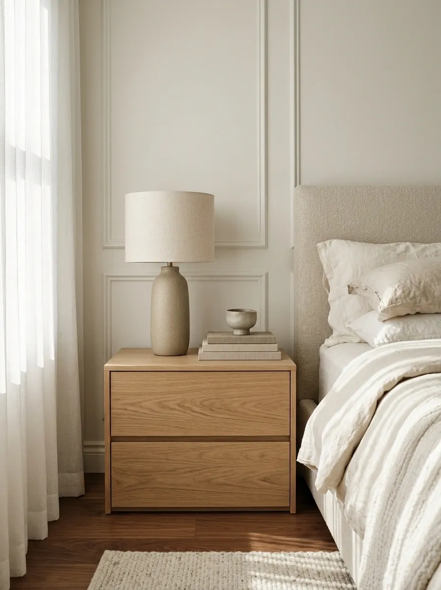
Nightstands don’t need to be empty. They need to stop looking like command centers.
Keep only the pieces that add scale or warmth, such as a lamp, a small book stack, or one restrained decorative object. Everything else gets packed away.
Keep:
Lamp, one book, one small accent
Relocate:
Chargers, medication bottles, receipts, hair products, half-full water glasses
A clean nightstand creates visual calm without making the bedroom feel sterile. The trick is restraint. A completely bare surface can feel staged in the wrong way, while six objects make the room look like Tuesday morning.
STAGING RULE: Leave enough visible tabletop that the furniture itself still reads clearly.
Turn the Bathroom Counter Into a Nearly Empty Surface
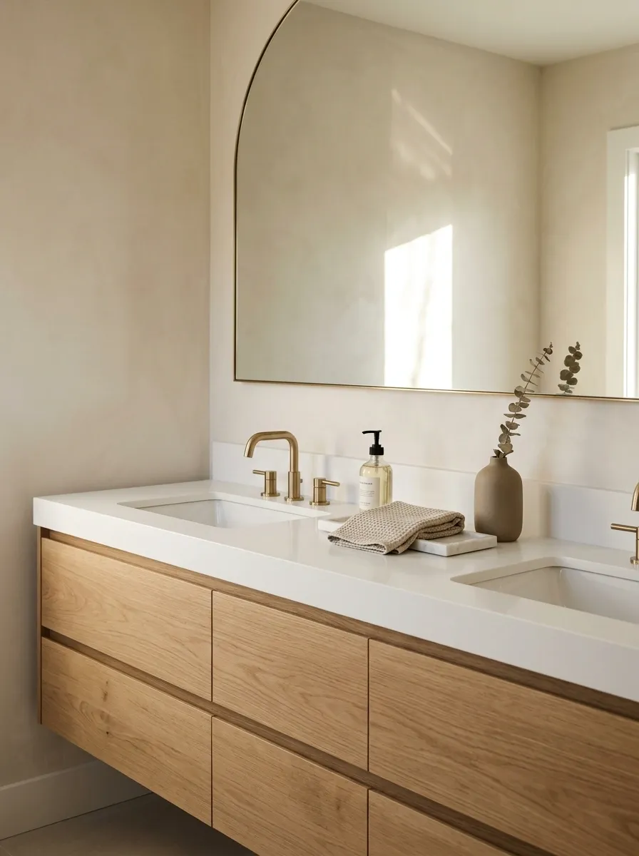
Bathrooms are unforgiving. Tiny clutter looks huge once it’s sitting beside a sink.
Clear the counter until only a few deliberate pieces remain. Hand soap, a folded hand towel, and one simple accessory are enough. Hide toothbrushes, skincare bottles, makeup, hair tools, and anything that announces the bathroom is actively being used five minutes ago.
The sink should become a clean focal point rather than a storage shelf with plumbing.
Hide Daily-Use Toiletries Before Every Showing
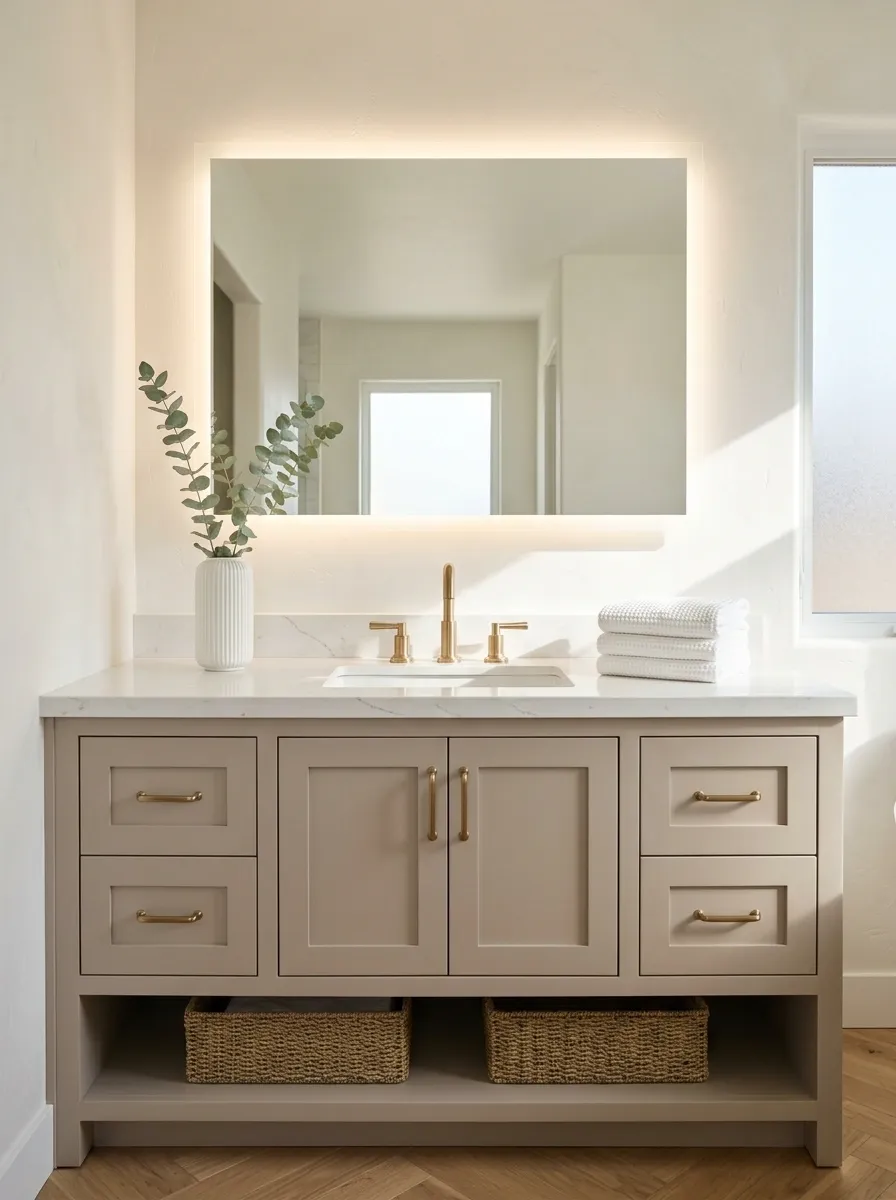
The fastest bathroom staging win costs nothing.
Grab one container and make a single sweep before a showing. Anything used during the morning routine goes inside it. Keep the container somewhere buyers won’t inspect immediately, such as a cabinet or storage area.
Quick bathroom sweep
- Toothbrushes and toothpaste
- Hairbrushes and styling tools
- Makeup
- Razors and grooming products
- Extra toilet paper and cleaning supplies
This isn’t about pretending nobody lives there. It’s about removing the evidence of yesterday morning’s rush. Buyers need to notice the bathroom, not conduct an inventory.
Make Small Rooms Feel Larger by Removing One Piece of Furniture
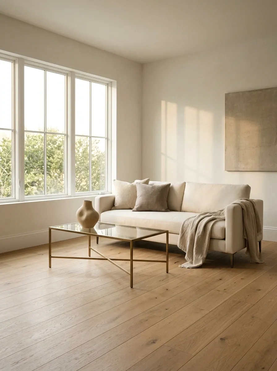
Sometimes the room doesn’t need a new layout. It needs one less thing.
Remove the least useful furniture piece and photograph the room again. An extra chair, bulky side table, oversized cabinet, or decorative bench can consume more visual space than expected.
Use the subtraction test:
- Remove the piece.
- Clear the area completely.
- Walk through the room again.
- Check the main photo angle.
If the walkway opens up and more floor becomes visible, keep the furniture out during showings. Empty space isn’t wasted space here. It’s what makes a small room feel like it can actually function.
Leave Hallways Wide and Easy to Walk Through
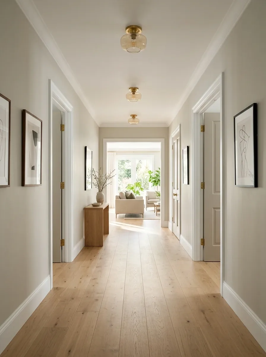
A hallway should move people through the house without making them perform a furniture obstacle course.
Remove anything narrowing the path, especially narrow benches, baskets, floor plants, and decorative pieces that have slowly migrated into the walkway. Keep wall decor simple too. A clear passage makes nearby rooms feel more connected.
Do this before showings:
- Move floor-level clutter into storage.
- Reposition furniture that sticks into the path.
- Remove anything that forces a sideways shuffle.
- Keep the sightline toward the next room open.
That last one matters. A hallway that leads cleanly into a bright room makes the house feel more open before anyone has even reached it.
Group Decorative Objects in Uneven Heights
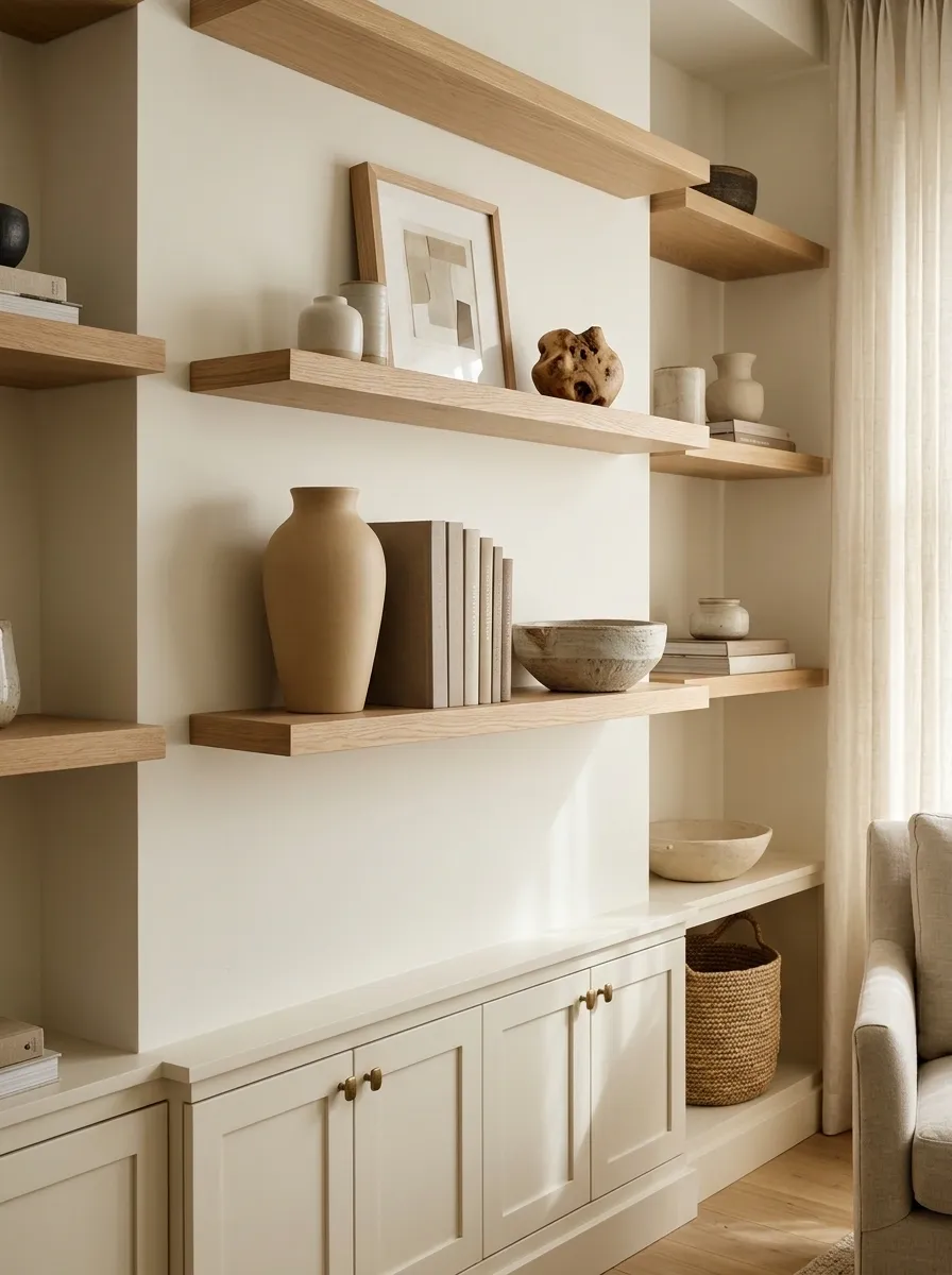
Flat arrangements look flat. That’s why a shelf full of objects all sitting at the same height can feel oddly lifeless, even when every piece is nice.
Build small groups with different heights and shapes. Pair a taller vase with a lower bowl, then add a medium object that bridges the gap. Leave some breathing room between groups instead of pushing everything together.
The trick isn’t adding more. It’s creating a better rhythm with what already exists.
Stop Filling Every Corner Just Because It Is Empty
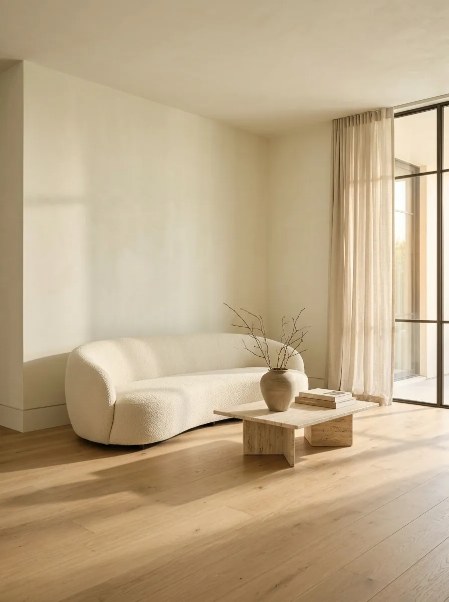
Empty space isn’t a decorating emergency.
A bare corner can make furniture feel intentional, give the room better balance, and create a cleaner photo. Adding another chair, plant, basket, or little table simply because there is technically room for it often makes the whole space feel smaller.
Leave it empty when:
- The room already has enough furniture.
- The corner improves the sightline.
- Adding something would block movement.
- The empty area gives a larger piece room to breathe.
Staging isn’t a scavenger hunt where every square foot needs a prize.
WARNING: Don’t fill an empty corner until you know the room actually looks better with something there.
Create a Simple Focal Point Above the Fireplace or TV
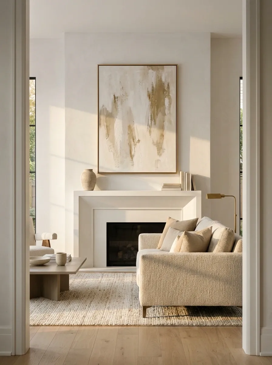
The wall above a fireplace or TV can become visual chaos very quickly.
Pick one clear anchor. A large artwork piece, a restrained mirror, or a simple arrangement gives the eye somewhere to land without competing with the furniture below.
The biggest mistake is putting several medium-sized pieces together and hoping they magically read as one statement. They usually read as several unrelated objects having a meeting.
Use scale first, then decoration.
Borrow Better-Looking Accessories Instead of Buying New Ones
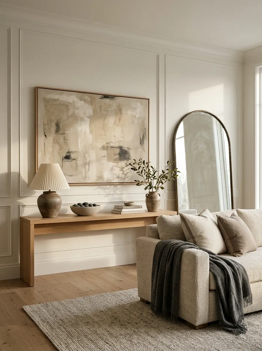
Budget staging doesn’t mean every room needs to survive on whatever is already in the house.
Borrow selectively from another room, a family member, or a friend. Look for pieces that improve scale and finish without introducing another style into the mix.
Borrow these first:
- Large neutral artwork
- Better-looking lamps
- Simple throw blankets
- Clean decorative bowls
- Neutral cushions
- Oversized mirrors
Skip anything overly personal, heavily themed, or obviously mismatched. One borrowed lamp that finally fits the console is more useful than a cart full of cheap accessories bought in a panic.
Use Bedding and Throws to Make Neutral Rooms Feel Finished
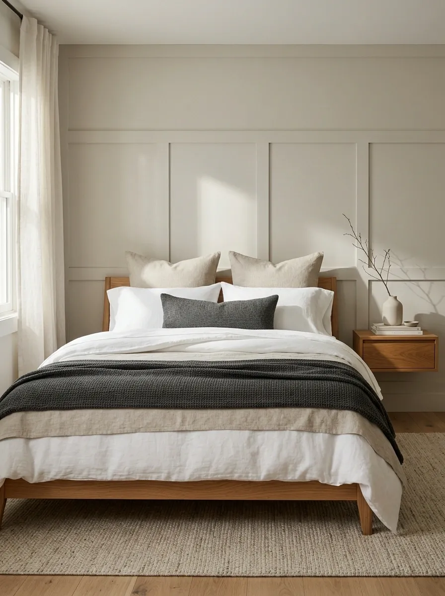
Neutral rooms don’t need a pile of accessories to feel complete. They need texture and contrast in the right places.
Keep the main bedding simple, then introduce softness with one folded throw and restrained pillow layering. A subtle change in texture can give a plain bedroom more depth without adding visual clutter.
The trick is to keep the palette tight. Mix linen-like texture, a woven throw, or a slightly heavier blanket while letting the walls and larger furniture stay quiet.
Remove Personal Collections From the Most Visible Surfaces
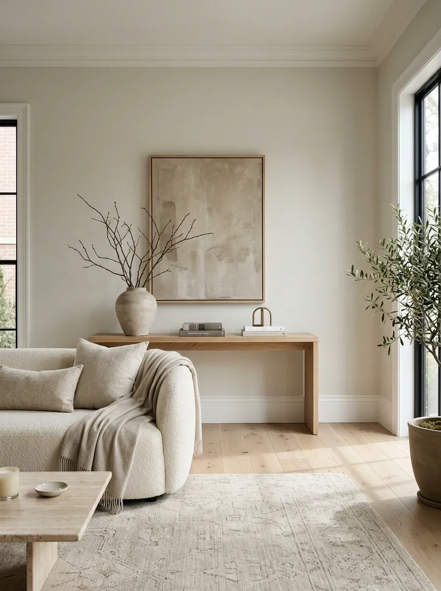
The family photos, souvenir collection, sports memorabilia, and sentimental shelf display may mean a lot at home. During staging, they pull attention toward the people who already live there.
Start with the surfaces buyers see first.
Pack first:
Family-photo clusters
Travel souvenirs
Collections
Personal awards
Highly specific themed decor
Don’t strip every room until it feels lifeless. The goal is simply to leave enough personality for the house to feel warm while removing the details that make it harder for someone else to picture their own life there.
EDITING RULE: Keep the character of the room. Remove the biography.
Give the Front Yard the Same Attention as the Living Room
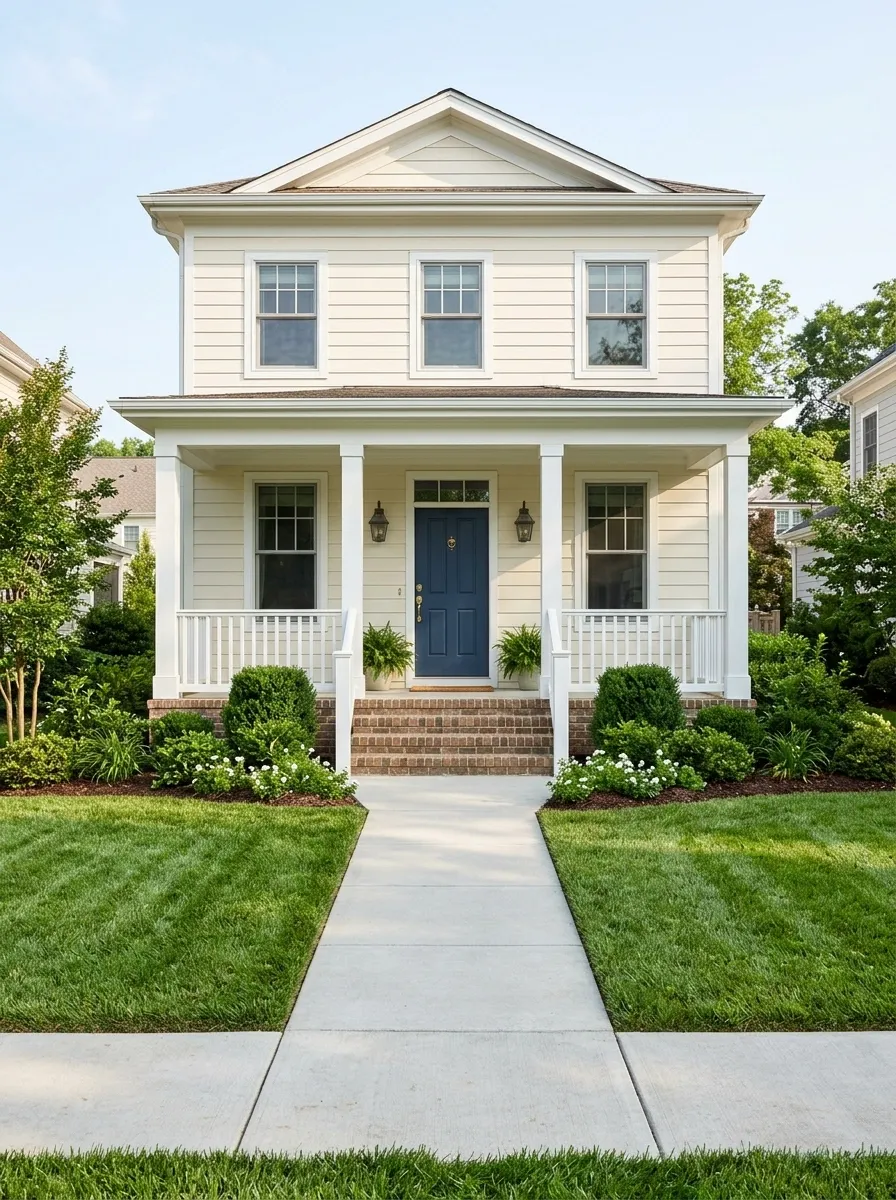
A buyer starts judging the house before reaching the front door.
The front yard doesn’t need an expensive makeover. It needs to look maintained, intentional, and easy to approach. Sweep the path, trim overgrown edges, remove dead plants, hide bins, and clear random objects from the porch.
Look at the entrance from the street, not from inside the house. That’s the view that matters first.
Wash the Front Door and Clean the Hardware
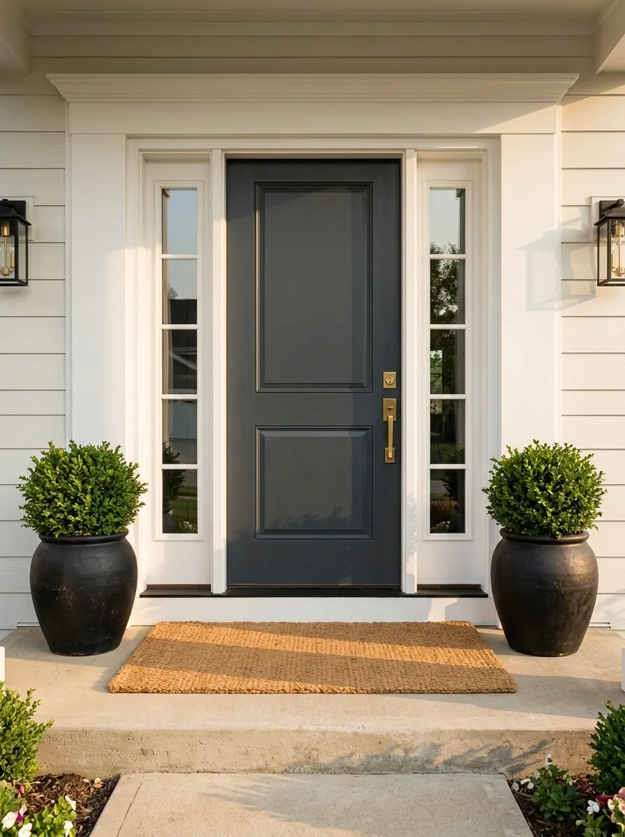
The front door gets judged before the sofa even gets a chance.
Wash the door, wipe the frame, clean the glass, and polish or properly clean the handle and lockset. Remove cobwebs around the entrance too. These aren’t glamorous jobs, which is exactly why they’re so often ignored.
Front-door check:
- Door surface looks clean
- Glass is streak-free
- Handle and hardware are free of grime
- Porch light is clean
- Cobwebs are gone
- Welcome mat is straight and in decent condition
A dirty handle is a tiny detail with a very large “nobody maintained this” energy.
DON’T BUY FIRST: Clean the entrance before shopping for decorative pieces. A spotless door beats another sign that says HOME in giant letters.
Use Mirrors to Fix a Dark or Awkward Sightline
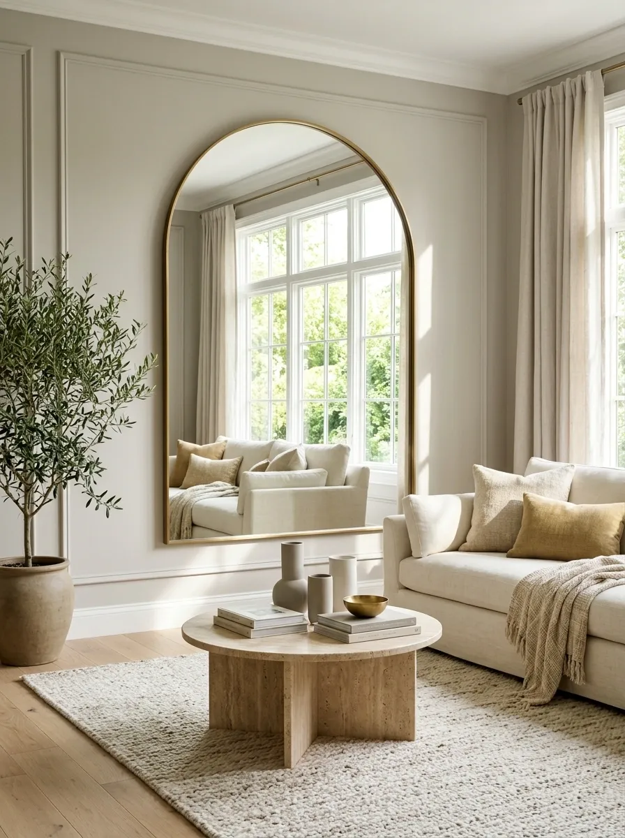
A mirror is useful during staging when it solves a visual problem, not when it’s simply occupying a wall.
Place one where it can reflect daylight, a pleasant view, or a brighter part of the room. Avoid aiming it directly at visual clutter. That’s just giving the clutter a second appearance and nobody asked for the sequel.
The best placement often makes a room feel more connected because the reflected light and space extend the view.
Move Distracting Furniture Out of the Best Photo Angle
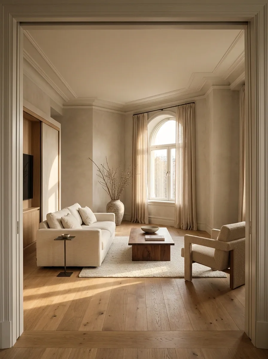
The best everyday furniture arrangement isn’t always the best arrangement for listing photos.
Take a photo from the doorway and study what lands closest to the camera. A tall chair, bulky lamp, oversized side table, or random ottoman can block the room’s strongest feature.
Compare the two views:
| Everyday Layout | Photo-Friendly Layout |
|---|---|
| Prioritizes daily convenience | Prioritizes the room’s visual flow |
| Furniture can overlap the frame | Major pieces have clearer separation |
| Corners may be filled | Strong corners stay visible |
| TV may dominate the shot | Architecture or seating can lead |
Move the distracting piece temporarily. Take another photo. The camera is brutally honest, which is useful when staging.
Pack Decorative Clutter Room by Room, Not All at Once
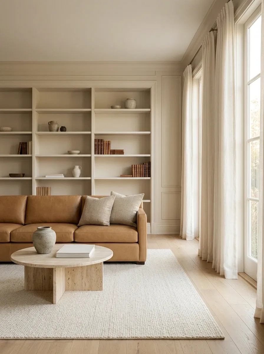
Trying to declutter the entire house in one giant session is how people end up standing in the hallway holding a lamp and questioning every life choice.
Work room by room. Finish one space completely before touching the next.
The House Doesn’t Need More Stuff. It Needs Better Editing.
Good staging is mostly about making the home easier to understand.
Clear the entrance. Open the windows. Pull furniture into a better arrangement. Let the floors show. Hide the daily clutter. Edit the shelves. Simplify the kitchen. Give the bed some breathing room. Then take photos and judge the rooms through the camera instead of through habit.
That is where most budget staging wins come from.
The expensive-looking result isn’t created by stuffing every corner with new decor. It’s created by space, proportion, light, restraint, and intentional placement.
The next time the house starts looking cluttered before a showing, don’t reach for the shopping cart. Reach for a storage box.
Save this list for the week before photos or showings, when every random basket in the house suddenly starts looking suspicious.