
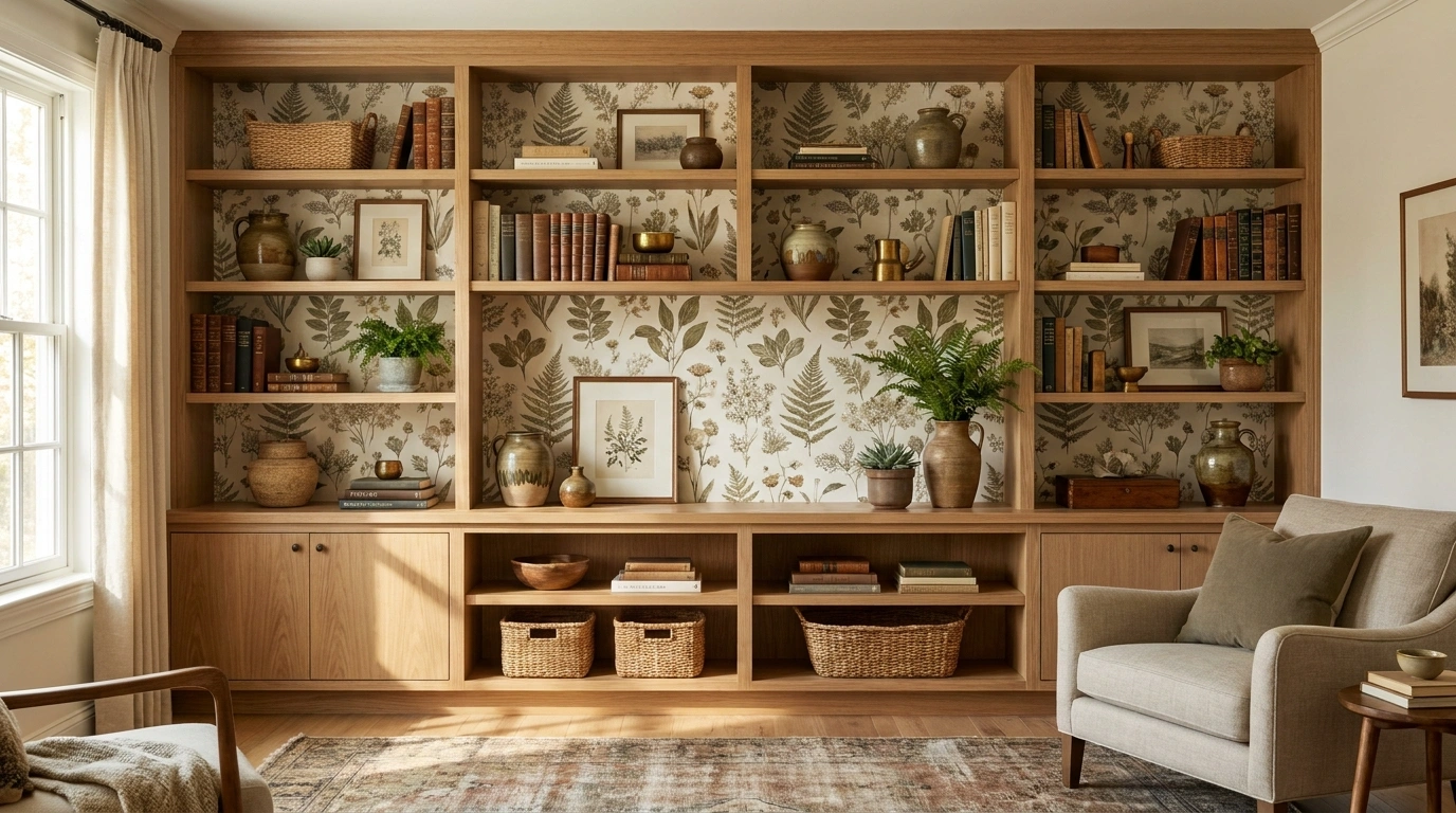
A shelf wall can have beautiful wood, expensive-looking objects, and enough books to suggest a very serious relationship with reading, yet somehow still look unfinished.
The culprit is often the space behind the shelves. Leave it plain, and the entire installation can read like a collection of furniture placed against a wall instead of one finished architectural feature.
That’s where wallpaper gets interesting.
The right pattern can give recessed shelves depth, connect cabinetry to the rest of the room, soften dark wood, sharpen painted shelving, or make an awkward little nook feel like it was designed that way from the beginning.
The wrong pattern can do the exact opposite and make an already busy wall look like it has joined a decorating argument.
Shelf Wallpaper Ideas
Classic White Cabinets With Neutral Botanical Wallpaper
Crisp white cabinetry creates a traditional foundation, while neutral botanical wallpaper fills the recessed backing to give the display corner an effortless, lived-in charm. Floating white shelves bridge the space, holding framed photos, delicate vases, and a cheerful arrangement of white orchids that soften the entire vignette.
The subtle earthy tones in the wallpaper pattern prevent the crisp white surround from feeling sterile or stark. It adds a gentle layer of texture that works hand-in-hand with the woven basketry and simple cream ceramics scattered across the shelves.
This approach proves that neutral doesn’t have to mean boring when pattern enters the equation. By keeping the objects understated, the delicate background pattern gets the attention it deserves without overwhelming the cozy corner.
Natural Wood Shelves With Vibrant Botanical Wallpaper
Warm natural wood shelving brings organic depth to this home office setup, while vibrant botanical wallpaper featuring lush greenery and tropical birds creates an unexpected backdrop of color and life. A sleek monitor and blue-toned workspace anchor the scene, proving that functional zones can be exceptionally stylish.
The rich botanical print breathes energy into the built-in nook, contrasting beautifully with the clean lines of the surrounding cabinetry and desk. Every decorative element on the shelves feels intentional, placed carefully against the bustling background pattern.
Natural daylight streams across the space, highlighting the intricate details of the wallpaper and the warmth of the wooden ledges. It is a brilliant masterclass in blending productivity with bold, personality-driven design.
Warm Oak Built-In With Soft Botanical Wallpaper and Cream Ceramics
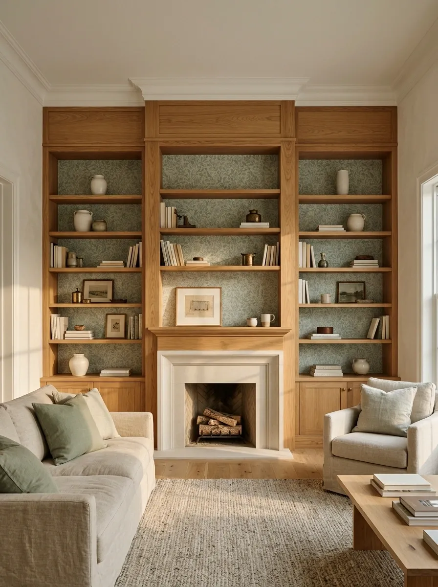
Warm white walls, natural oak shelving, and a muted botanical print create the kind of living room that feels collected rather than overly decorated. The shelving runs around a fireplace, while the wallpaper sits inside each recessed section and quietly ties the books, cream ceramics, linen seating, and warm flooring together.
The important part is the relationship between the soft green pattern and the honeyed oak. Neither one needs to shout. The greenery in the wallpaper also gives the room some movement without turning the shelves into a botanical showroom.
The ceramics stay mostly cream because there is already enough happening behind them. The wallpaper is doing the visual work here, and adding fifteen more decorative objects would simply interrupt it.
Art Deco Bar With Moody Geometric Wallpaper
This home bar setup leans into dramatic elegance, featuring rich wooden shelves mounted against striking black-and-silver geometric wallpaper with an undeniable Art Deco flair. Rows of crystal glassware, warm metallic accents, and a curated collection of bottles turn a simple niche into a sophisticated entertaining station.
The repeating fan pattern adds instant architectural polish, making the shallow nook feel expansive and luxurious. The contrast between the dark graphic wallpaper and the warm wood tones gives the entire display a grounded, high-end weight.
Crisp white lower cabinets keep the station feeling balanced, ensuring the bold pattern above remains the star of the show. It is the kind of stylish little corner that practically begs you to pour a drink and admire the view.
Moody Library Shelves With Charcoal Floral Wallpaper and Walnut Furniture
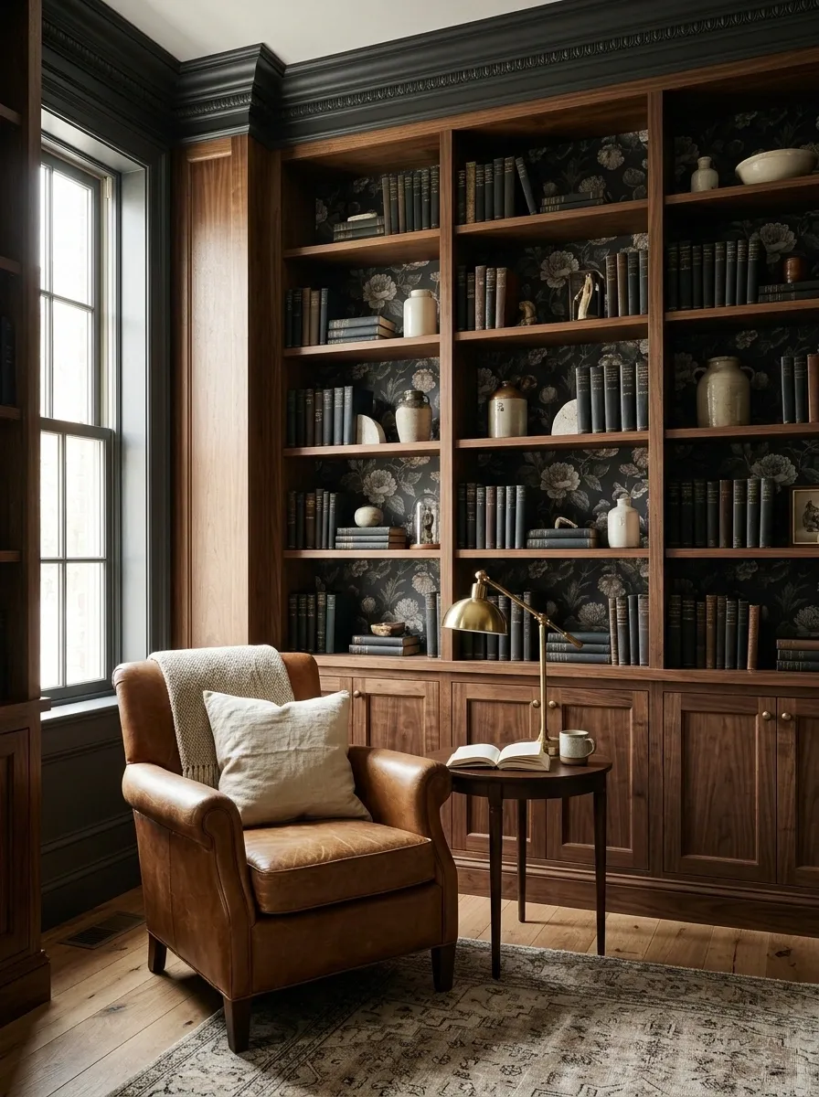
This room leans all the way into the dark side, and thankfully it doesn’t apologize for it. Charcoal floral wallpaper fills the backs of tall walnut bookcases, creating a deep backdrop for leather seating, a warm brass lamp, dark books, and a few lighter objects that catch the eye.
The wallpaper keeps the shelves from looking flat against the darker wood. Its floral pattern has enough variation to stop the wall from becoming a giant block of charcoal, while the walnut gives the whole composition a rich architectural weight.
Natural light from one side keeps the room from becoming visually dense. The lighter upholstery matters too. Without it, the room would start looking like a very serious office where laughter requires written permission.
Soft Blue Built-Ins With Traditional Chinoiserie Wallpaper
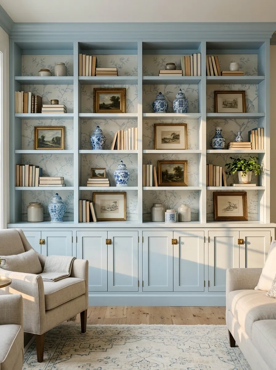
Pale blue cabinetry gives this living room a fresh shell, while delicate chinoiserie wallpaper turns the shelving recesses into something much more interesting than painted rectangles. Porcelain pieces, framed artwork, classic books, and tailored upholstery keep the room traditional without making it feel frozen in another decade.
The pattern stays relatively delicate, which matters because the shelving is already visually busy. Blue-and-white ceramics echo the color family of the wallpaper instead of competing with it, so the shelves feel layered rather than crowded.
This concept shines when the surrounding room has plenty of daylight. The pale cabinetry reflects that light while the patterned recesses add enough contrast to give the wall definition.
Modern White Shelves With Graphic Black-and-Cream Wallpaper
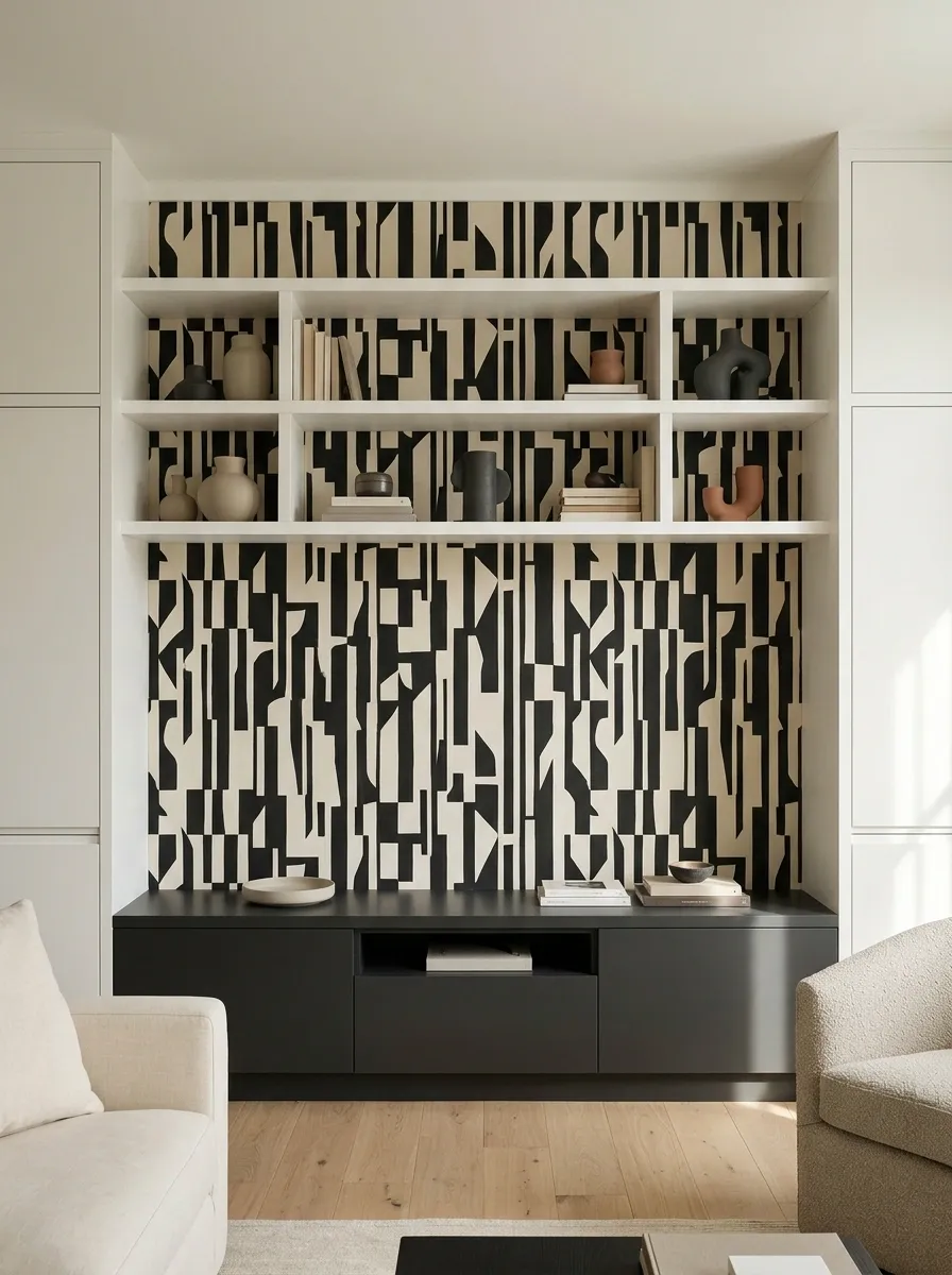
White shelving can look crisp, but without a strong backdrop it can also give off that “the furniture is here, the design is still loading” feeling. This version fixes that with bold black-and-cream geometric wallpaper behind clean built-ins.
A low contemporary media console anchors the wall, while the shelving above stays lightly styled with ceramics, books, and a few sculptural pieces. The graphic wallpaper provides the contrast, so everything else can stay disciplined.
The key is restraint. The pattern already brings movement and structure to the room. Adding multiple competing finishes would muddy the composition fast. Keep the floor, upholstery, and larger furniture pieces quiet, and let the geometry hold the wall together.
GRAPHIC BACKDROP.
DARK ANCHOR.
Terracotta Nook With Arched Shelves and Muted Mediterranean Wallpaper
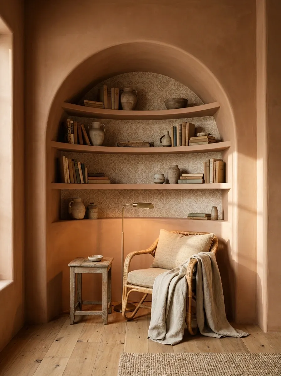
This reading nook feels architectural before it feels decorative. Warm terracotta walls wrap around curved built-in shelves, while muted Mediterranean wallpaper fills the arches and introduces sandy beige, faded clay, and soft earthy pattern.
A woven chair sits low in the nook, paired with aged wood and a simple floor lamp. Nothing feels oversized because the curves already give the corner plenty of presence. The wallpaper adds detail without fighting the shape of the shelves.
The combination works especially well when the room has natural texture elsewhere, such as plaster walls, timber floors, or woven furniture. Too many polished surfaces would weaken the relaxed character. And yes, the curved shelves are allowed to be dramatic. They earned it.
Olive Green Bookcases With Warm Geometric Wallpaper
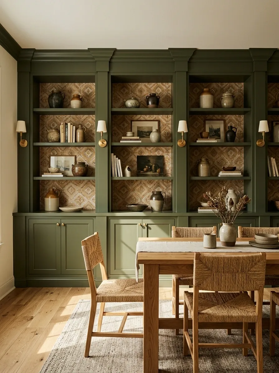
Deep olive built-ins bring a strong architectural presence to this dining room, while warm geometric wallpaper fills the backs of the shelves with a pattern that feels earthy rather than flashy. An oak dining table sits in front, joined by woven chairs and restrained brass lighting.
The wallpaper pulls together the green cabinetry and warm timber, which keeps the room from splitting into separate color zones. The result feels rich without becoming dark.
The trick here is letting the green carry the heavier visual weight. The wallpaper supports it rather than competing with it, and the oak furniture gives the darker palette somewhere warm to land.
That balance matters. Otherwise the room starts looking like every color known to humanity was invited to dinner.
Navy Library Wall With Vintage Map Wallpaper Behind Open Shelves
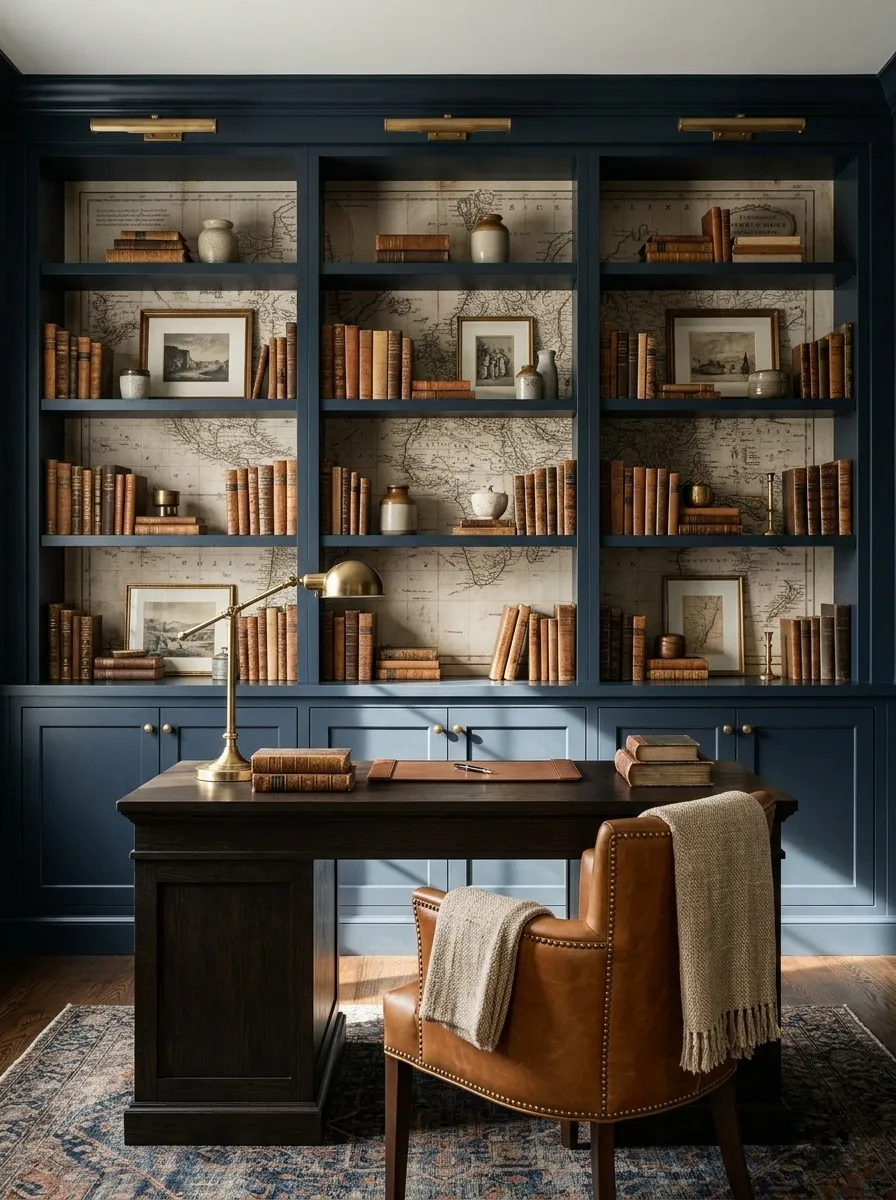
A navy library wall gives this room a strong, traditional backbone, while vintage map wallpaper inside the shelving recesses adds an unexpected layer of visual history. A writing desk sits below the books, joined by a leather chair, brass lamp, framed pieces, and dark timber details.
The map pattern works because it has a clear relationship with the room’s purpose. Books, writing furniture, and travel-inspired imagery all belong to the same visual story, so the wallpaper doesn’t feel randomly decorative.
Keep the surrounding objects fairly edited. The wallpaper already provides plenty of detail, and the navy cabinetry gives all that information a strong frame.
There is no need to ask what the room is about. The wall has already submitted its thesis.
Pink Powder Room Shelves With Tiny Botanical Print
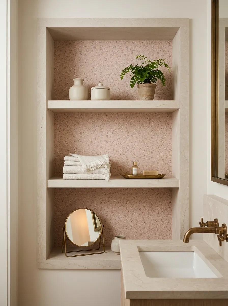
A compact powder room gets a much more finished look when the shelf recesses carry the wallpaper all the way through. Here, dusty blush shelving surrounds a tiny botanical print, with pale stone surfaces, aged brass fixtures, a compact mirror, and carefully edited accessories.
The small pattern is important because the room has limited visual distance. A dense oversized motif would dominate almost immediately, while the finer botanical design creates detail that can still be appreciated at close range.
The shelving should remain useful rather than decorative for decoration’s sake. Folded towels, a small tray, a few ceramics, and practical pieces keep the composition believable.
SPACE
Black Built-Ins With Warm Neutral Grasscloth-Effect Wallpaper
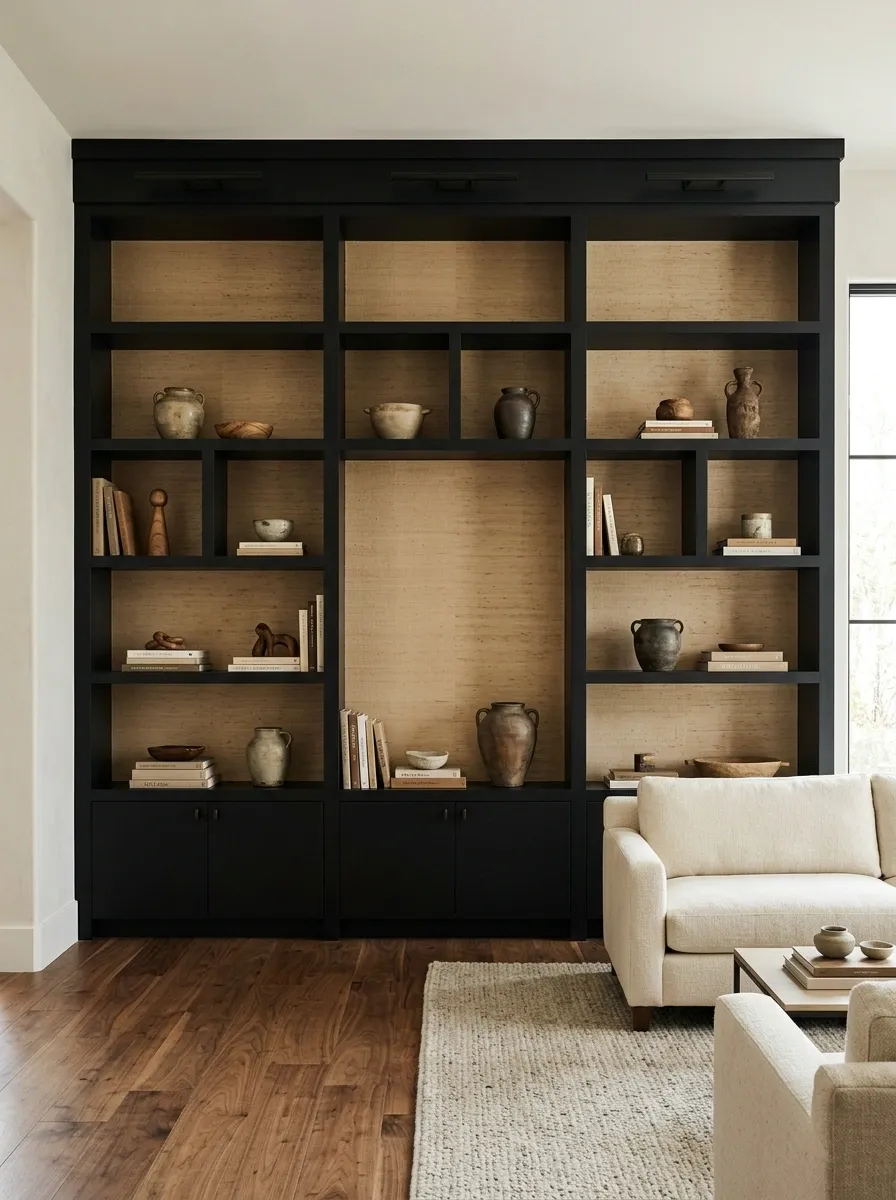
Matte black built-ins can make a room feel wonderfully architectural, but they need something warm behind them or the whole wall can become one very serious rectangle. This version uses a warm beige grasscloth-effect wallpaper inside the shelving, with cream upholstery, walnut flooring, aged ceramics, and soft lighting.
The textured backdrop breaks up the black without introducing another obvious pattern. Instead of competing for attention, it gives the recesses a tactile quality that becomes more noticeable as the light changes.
Keep the objects in warm neutrals, natural wood, and a few muted tones. Bright white accessories would create too much contrast and make the wall feel harsher than intended.
Black shelving with beige texture is proof that contrast doesn’t always need to involve color. Sometimes texture is enough to start the conversation.
Grandmillennial Shelves With Ribbon-Striped Wallpaper and Blue China
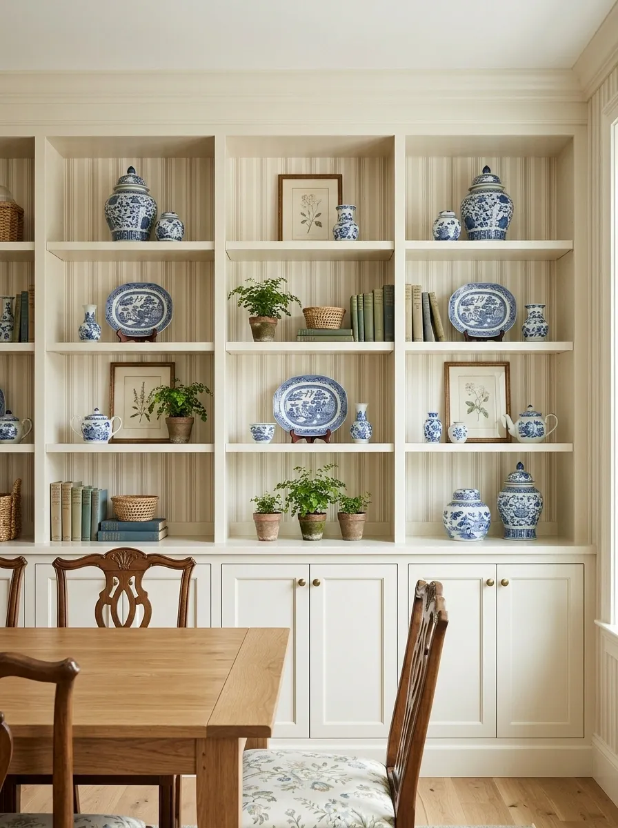
Cream-painted shelves, narrow ribbon stripes, blue-and-white china, framed botanical artwork, and floral upholstery give this dining room a distinctly traditional personality. The vertical wallpaper creates rhythm behind the open shelving and makes the entire wall feel taller and more connected.
The stripe is deliberately simple because the accessories bring plenty of detail. Blue ceramics repeat the cooler tones without requiring everything in the room to match exactly, while warm wood furniture prevents the scheme from feeling too sugary.
This look is especially strong when the shelving has a classic profile, such as framed cabinetry or traditional trim. Ultra-modern furniture would create a visual argument that nobody asked for.
The stripes provide the structure. The china gets the gossip.
Earthy Home Office With Clay-Toned Wallpaper Behind Floating Shelves
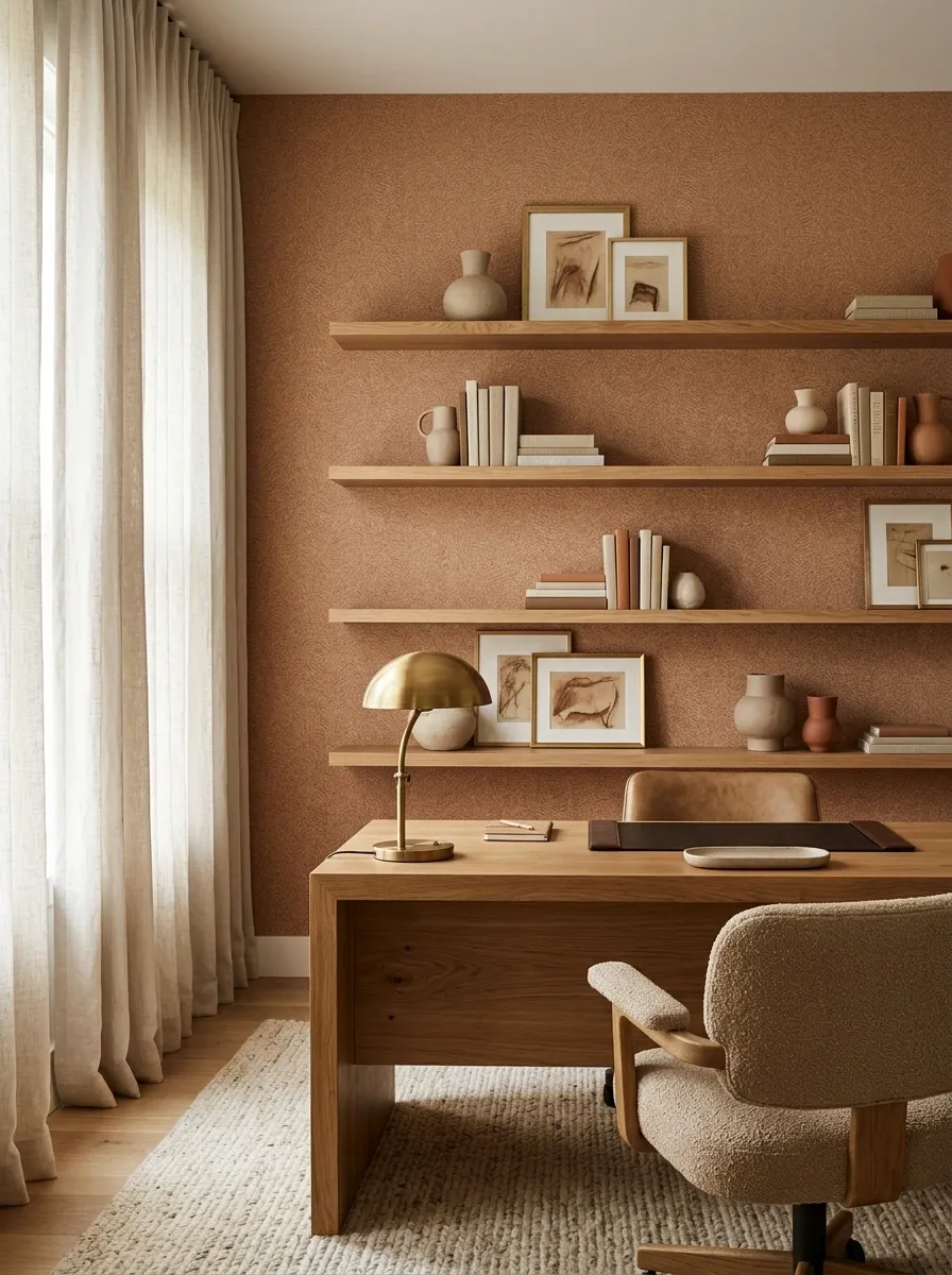
This home office trades the usual bright white workspace for a warmer composition. Floating oak shelves sit against clay-toned patterned wallpaper above a substantial desk, with linen curtains, handmade pottery, framed art, and warm task lighting completing the scene.
The wallpaper gives the desk wall enough visual depth to feel finished without requiring a large gallery wall. Oak repeats the warmth of the clay tones, while the pale linen keeps the darker elements from making the workspace feel enclosed.
The shelves should stay selective. A few books, useful objects, ceramics, and one or two personal-looking pieces make more sense here than decorative clutter.
The office doesn’t need to look like a coworking space that discovered beige last Tuesday.
Emerald Green Alcove Shelves With Painterly Botanical Wallpaper
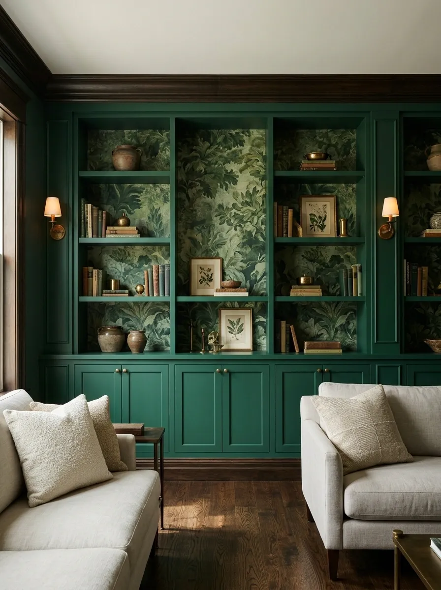
This alcove goes deliberately dramatic. Emerald green shelving wraps around a richly painted botanical wallpaper, with dark timber, antique brass lighting, framed artwork, and carefully edited books filling the surrounding room.
The important detail is that the wallpaper and cabinetry share a similar color family without being identical. That creates depth inside the alcove while keeping the whole composition visually connected.
The brass lighting introduces a small amount of warmth, and the dark wood keeps the saturated green from feeling too crisp or contemporary. Pale neutral furniture nearby gives the eye somewhere to rest.
This is the kind of wall that makes the rest of the room behave itself. Suddenly the throw pillows don’t need a career in entertainment.
Minimalist Dining Room With Stone-Look Wallpaper Behind Oak Shelves
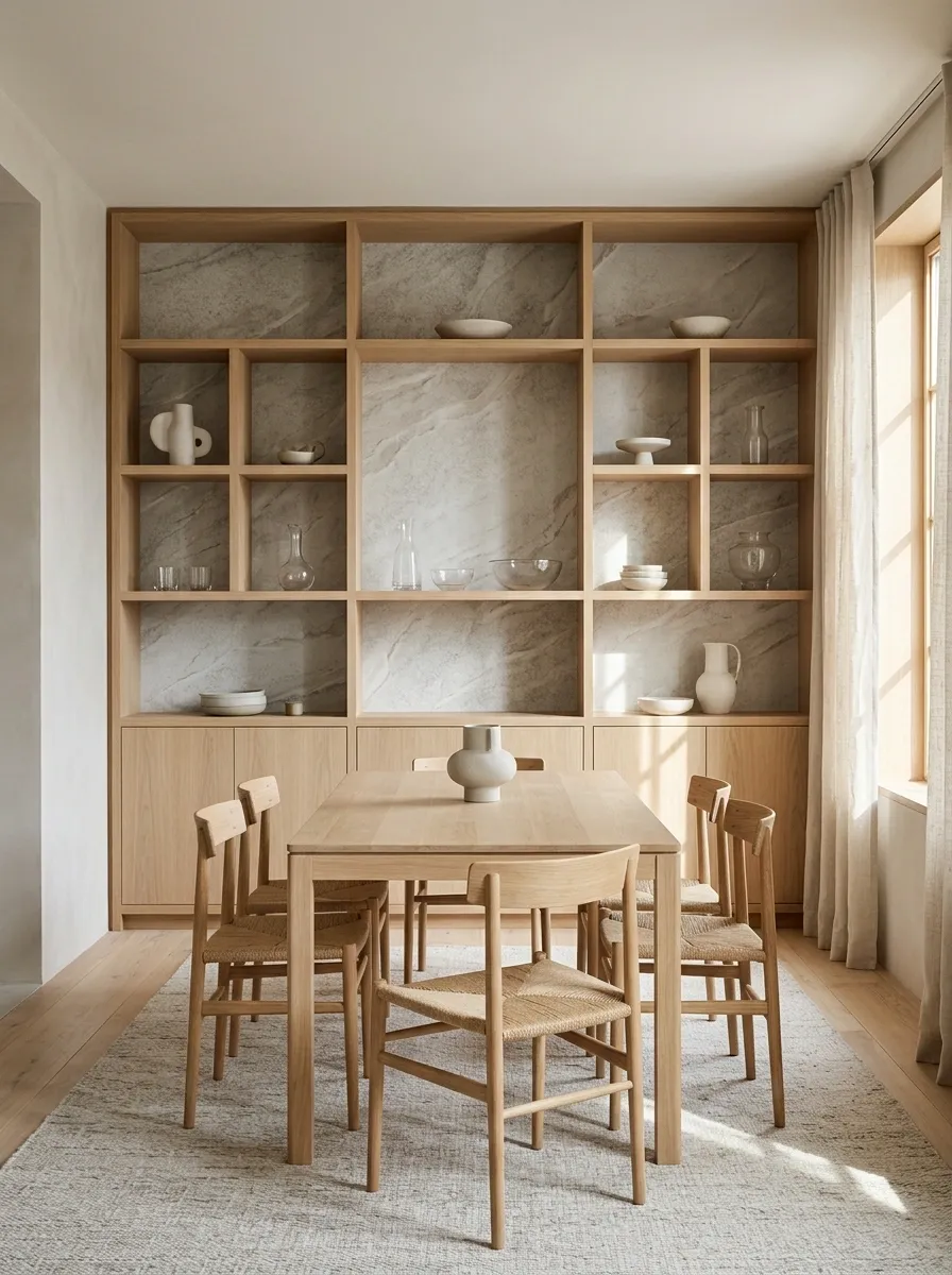
A pale oak shelving wall brings warmth to this minimalist dining room, while stone-look wallpaper inside the recesses introduces subtle movement that a flat painted backdrop simply wouldn’t provide. Sculptural ceramics, clear glassware, a simple dining table, and uncluttered furniture keep the room calm.
The wallpaper should have a restrained stone pattern rather than dramatic veining. Its job is to create visual depth behind the shelves, not pretend the dining room has been built inside a geological museum.
The oak adds enough contrast to keep the pale palette from becoming washed out. Glass and ceramic pieces introduce small changes in texture while staying visually light.
This design works because almost everything is quiet, but nothing is completely flat.
Vintage-Inspired Built-In With Faded Bird Wallpaper and Painted Shelves
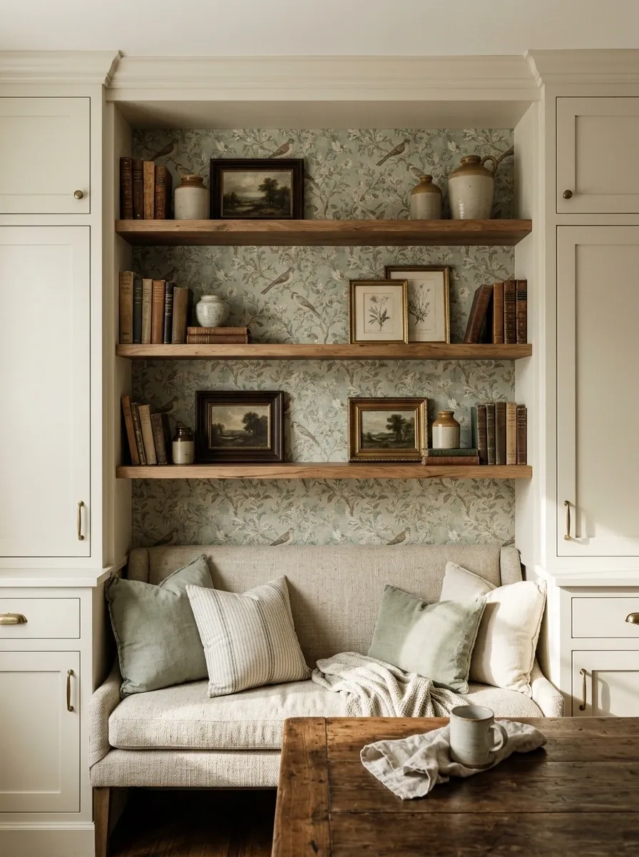
A breakfast nook gets its character from softly painted shelves, faded bird wallpaper, warm timber, vintage-style artwork, and a compact upholstered bench. The wallpaper has an old-world quality, with muted greens, dusty creams, and soft brown details that look naturally at home beside worn wood and traditional frames.
The painted shelving keeps the arrangement from becoming too dark, while the wallpaper gives the recessed areas a sense of depth. A few ceramics and old-looking books fill the shelves without making the entire wall look staged for a catalog photograph.
This composition suits rooms where the finishes already have some warmth or age. Glossy modern furniture would fight the wallpaper instead of supporting it.
The birds can have personality. The rest of the room doesn’t need to audition alongside them.
Rust-Colored Shelves With Cream Scallop Wallpaper in a Reading Corner
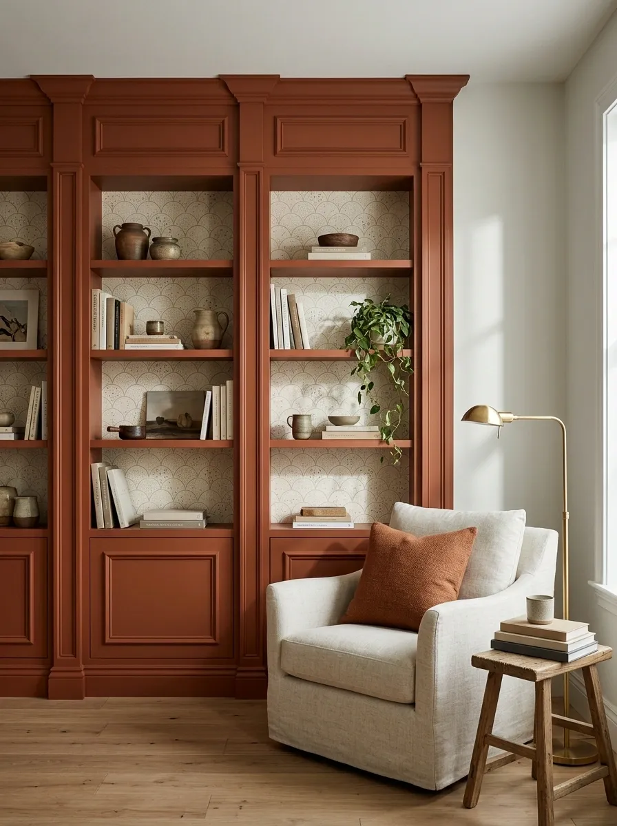
Rich rust shelving gives this reading corner its architectural color, while a cream scallop-pattern wallpaper creates a softer layer inside the recesses. A deep upholstered chair, warm floor lamp, small timber table, and a short collection of books make the space feel designed for actual use rather than merely admired.
The scallop motif is playful, but the restrained cream background keeps it from becoming sugary. Rust adds enough depth to make the pattern feel sophisticated, especially when repeated through a small cushion or nearby textile.
The surrounding walls should stay calm. Once the shelving, wallpaper, chair, and lamp are working together, another strong pattern would be where the design starts filing a noise complaint.
Contemporary Walnut Media Wall With Textured Sand Wallpaper
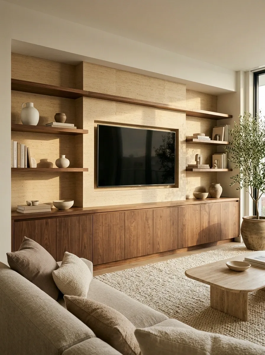
This media wall uses a stronger horizontal composition. Walnut cabinetry runs across the lower portion of the wall, while open shelves rise above it with warm sand-colored textured wallpaper tucked into the recesses.
The result is contemporary without relying on an oversized television wall or a stack of decorative objects doing all the visual lifting. The lower cabinetry gives the room a solid base, while the lighter wallpaper makes the upper shelving feel less dense.
Neutral upholstery and a simple rug keep the rest of the room quiet, allowing the walnut and textured backdrop to define the wall.
This is a useful setup for rooms where storage needs to look intentional too. Apparently cabinets are allowed to be attractive. Society can move forward now.
French Country Shelves With Pale Toile Wallpaper and Limestone Tones
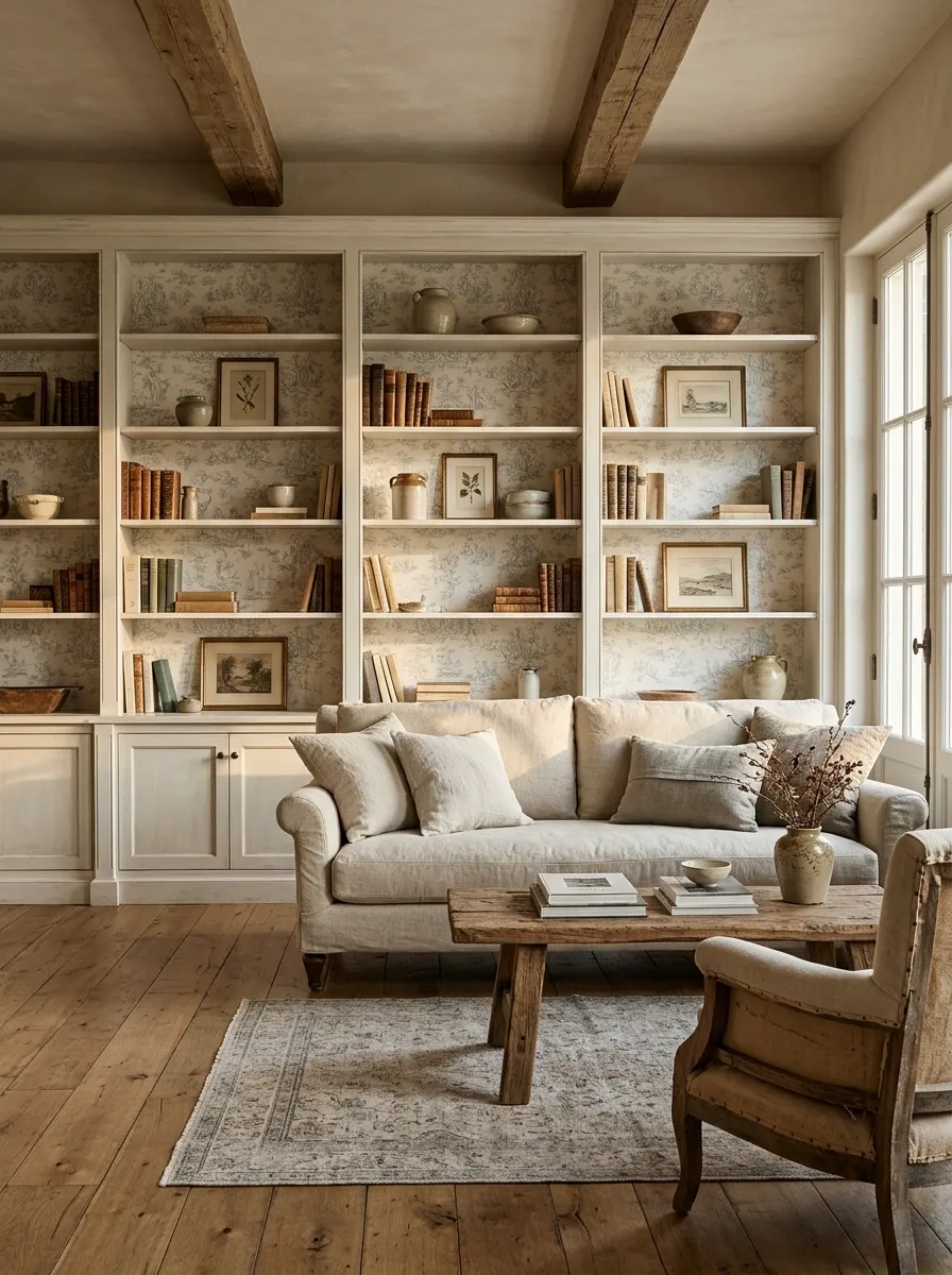
Soft painted built-ins frame this French country living room, with pale toile wallpaper tucked behind the shelves and a palette of limestone, linen, aged timber, and muted cream. A traditional sofa sits nearby, while simple artwork, ceramics, and old-style books add just enough detail.
The toile gives the wall a recognizable pattern, but the room avoids becoming overly decorative by keeping the larger furniture quiet. Limestone-colored upholstery is especially useful because it echoes the softer parts of the wallpaper without copying it exactly.
Aged wood adds texture and makes the whole composition feel less polished. That slight imperfection is important. Everything matching perfectly would drain the room of the character that makes this style work.
The wallpaper brings the romance. The worn wood keeps it from becoming a costume.
Coastal Mudroom Shelves With Faded Stripe Wallpaper and White Oak
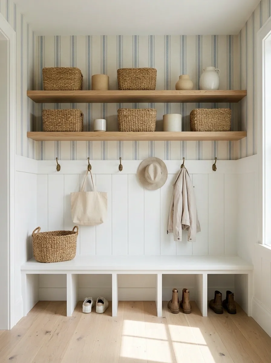
A practical mudroom gets a softer finish with white oak shelving, faded blue stripe wallpaper, woven baskets, a built-in bench, simple hooks, and pale flooring. The wallpaper adds personality without making the room feel precious, which matters in a space that actually has to deal with shoes, bags, coats, and the occasional mystery object nobody wants to claim.
The stripes give the wall a little vertical rhythm while the oak keeps the palette warm. Woven storage fits naturally into the composition and brings enough texture to stop the white oak from feeling too polished.
Keep the wallpaper above the busiest areas and let the practical finishes do the hard work below. A mudroom can look considered without pretending nobody ever uses it.
Because apparently storage is allowed to have standards too.
Kids’ Reading Wall With Storybook Wallpaper and Painted Arch Shelves
A child’s reading corner becomes much more memorable when the shelving and wallpaper are designed as one composition. Here, playful storybook wallpaper fills the wall behind softly painted arched shelves, with picture books, floor cushions, a small rug, and warm lighting creating a low, welcoming reading zone.
The arches soften the shelving and give the wall a more playful architectural shape without relying on oversized cartoon graphics everywhere. The wallpaper supplies the storytelling, while the furniture stays simple enough that the room can grow with the child.
Keep the lowest shelves easy to reach and avoid filling every opening. Empty space matters here because the wallpaper itself becomes part of the visual story.
The books have the main character energy. The wallpaper is clearly the supporting cast.
Maximalist Dining Built-In With Jewel-Toned Floral Wallpaper
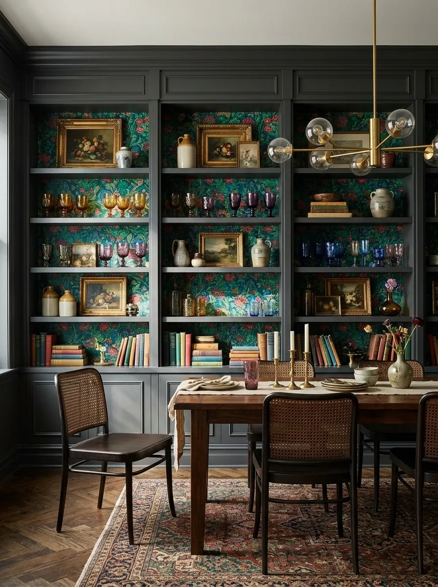
This dining room doesn’t believe in whispering. Jewel-toned floral wallpaper fills a tall built-in wall, surrounded by painted cabinetry, dark timber, artwork, colored glassware, and statement lighting. The composition is rich, layered, and intentionally expressive.
The difference between maximalism and visual chaos is repetition. Colors from the wallpaper appear again in the glassware and artwork, while the darker cabinetry gives the pattern a strong architectural boundary. The objects aren’t matched perfectly, but they belong to the same visual conversation.
Because the wallpaper is already dense, the furniture should have clear silhouettes. Too many fussy shapes would compete with the pattern and make the wall feel cramped.
More is absolutely happening here. It just isn’t happening randomly.
Cream Transitional Shelves With Marble Vein Wallpaper
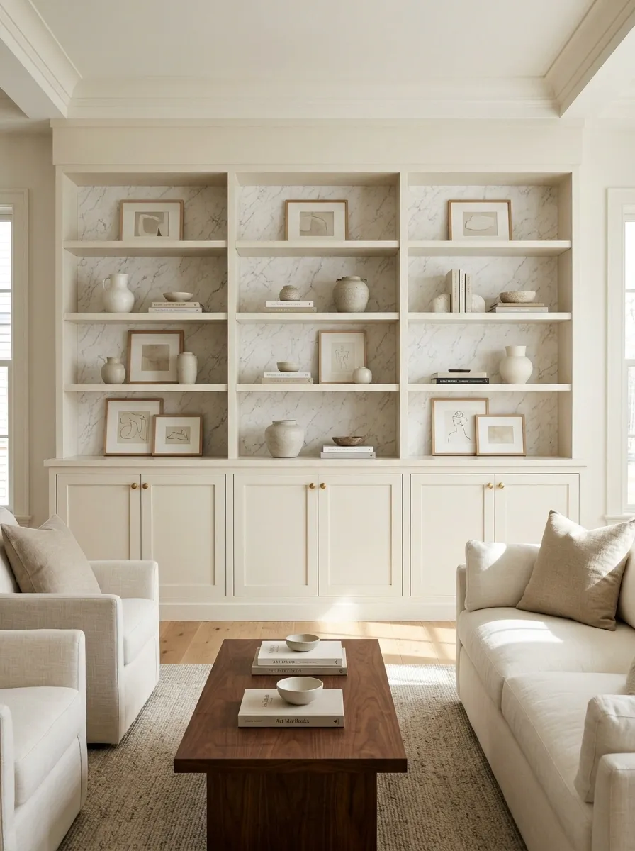
Soft cream built-ins bring a quieter direction to this living room, while marble-vein wallpaper adds movement inside the shelving recesses. Walnut furniture, tailored upholstery, restrained brass details, and neutral artwork keep the rest of the room polished without making it feel overly formal.
The marble pattern works because it follows the same kind of directional movement already found in the architecture and furniture. Long shelf lines and clean furniture edges give the swirling backdrop some structure.
Keep the veining relatively subtle. High-contrast marble effects can dominate a room very quickly, especially when repeated across several shelving recesses.
This is polished without being precious. Quite the achievement for a wall covered in fake marble, honestly.
Japandi Shelving Wall With Muddy Beige Organic Pattern
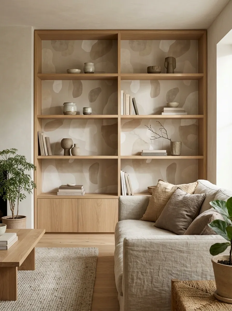
Simple oak shelving, muddy beige organic-pattern wallpaper, low furniture, handmade ceramics, linen textiles, and carefully limited decor create a calm Japandi-inspired living room. The wallpaper is intentionally softer than the furniture, with irregular shapes that add visual interest without introducing a busy focal point.
The shelving remains open and lightly styled. Natural ceramics, a few books, and one or two sculptural pieces are enough because the wallpaper already provides subtle movement behind everything.
The room’s strength comes from contrast between repetition and restraint. The wallpaper has a recurring motif, while the rest of the room uses simple shapes and quiet materials.
Minimalism with pattern sounds contradictory until the pattern behaves itself.
Black-and-Wood Built-In With Soft Abstract Wallpaper Behind the Shelves
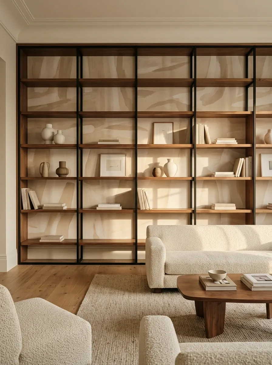
A contemporary lounge takes a softer approach to contrast with black framing, warm walnut shelving, and a muted abstract wallpaper in beige and cream. Low upholstered seating, sculptural ceramics, and simple artwork complete the room without adding another strong pattern.
The abstract backdrop is deliberately irregular. Those soft shapes keep the black framework from feeling too rigid while the walnut introduces enough warmth to stop the composition becoming stark.
Furniture silhouettes stay clean, which helps the wall retain its architectural character. The strongest objects are placed with breathing room between them rather than packed into every available shelf.
The black frame is serious. The wallpaper clearly did not receive the memo.
Sunlit Conservatory Shelves With Botanical Wallpaper and Woven Furniture
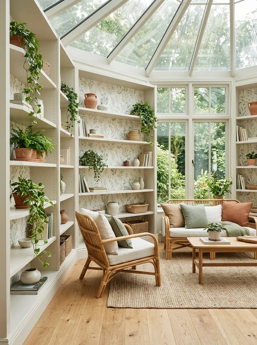
Tall shelving wraps around this bright conservatory, with pale botanical wallpaper bringing the garden theme indoors. Rattan seating, natural oak, terracotta planters, soft textiles, and filtered daylight complete the composition.
The wallpaper is lighter and more open in pattern than the dramatic botanical designs elsewhere in the collection. That’s important here because the room already gets visual richness from sunlight, plants, woven texture, and views outdoors.
Natural materials reinforce the connection between the shelving and the surrounding garden. Pale wood keeps the composition airy, while terracotta introduces just enough earthy color to ground the lighter palette.
This room is allowed to have plants everywhere. Finally, someone understood the assignment and didn’t stop at one sad fern.
Layered Neutral Living Room With Linen-Texture Wallpaper and Built-In Display Shelves
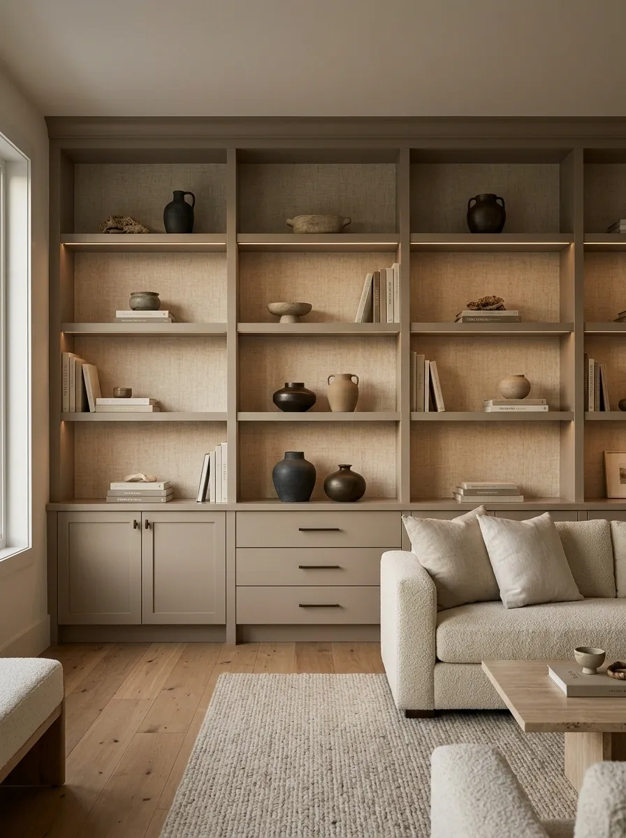
This living room keeps the palette quiet but gives every surface a slightly different role. Taupe built-ins frame linen-texture wallpaper, while warm oak flooring, low neutral furniture, books, ceramics, and soft evening lighting create depth without relying on strong color.
The wallpaper behaves almost like fabric on the wall. It adds texture behind the shelving while the larger furniture stays smooth and simple. Warm oak prevents the taupe palette from becoming too gray, and a few darker objects give the shelves enough definition to remain visible.
The secret is variation within the neutral palette. Different textures and slightly different tones do much more than adding another decorative object.
Neutral rooms aren’t boring. Bad neutral rooms are boring. There’s a difference.
Compact Apartment Niche With Graphic Wallpaper and Slim Oak Shelves
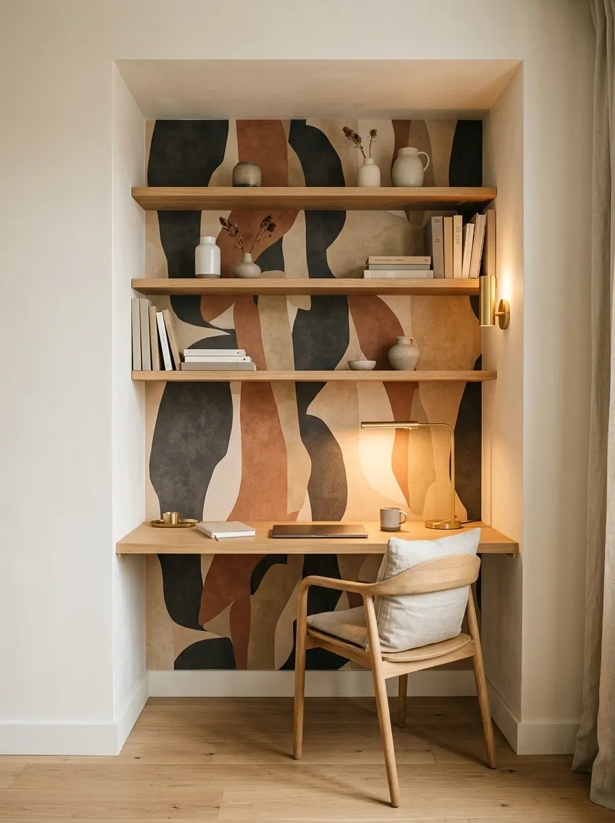
A narrow apartment niche becomes a proper design feature with slim oak shelving, expressive graphic wallpaper, a compact desk surface, practical storage, and focused lighting. The shelving stays shallow enough to preserve the walking path, while the wallpaper gives the little wall an identity far beyond its size.
The rest of the apartment should remain relatively restrained so the niche feels connected to the larger room rather than dropped into it. Warm oak keeps the graphic pattern approachable, while a narrow desk gives the composition a useful purpose.
This is especially effective when a small apartment has awkward leftover wall space that isn’t quite large enough for a full piece of furniture.
Tiny footprint. Extremely loud opinion.
Choosing the Shelf Wallpaper Look That Actually Fits the Room
The biggest mistake with shelf wallpaper is choosing the paper first and trying to force the room around it afterward. That’s how a gorgeous print ends up looking oddly stranded inside a wall full of mismatched finishes.
Start with the whole composition instead.
Look at the shelving shape, the nearby furniture, the flooring, the amount of natural light, and the visual weight already sitting in the room. A tiny reading nook can handle a stronger pattern when the furniture stays simple. A large living-room built-in may look better with a quieter texture because the shelves themselves already create plenty of lines.
The same wallpaper can also behave completely differently behind pale oak, dark walnut, painted cabinetry, black framing, or warm cream shelving. Context changes everything. A pattern that looks subtle in a sample can become the loudest thing in the room once it fills every recessed shelf.
The best reference isn’t a wallpaper swatch floating on a product page. It’s a finished room where the wallpaper is already working with everything around it.
So save the full compositions.
Save the ones where the shelving, pattern, lighting, furniture, and objects actually look like they belong together. Those references are far more useful when it is time to make real decisions, because the goal isn’t to own a pretty roll of wallpaper.
The goal is to create a wall that looks finished.