
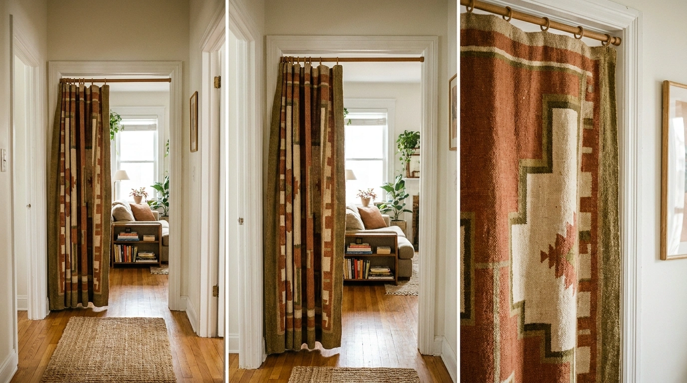
Some doorways have a strange talent for making an otherwise finished room look like something is still waiting to happen. The furniture is there. The rug is there. The lighting is behaving.
Then there’s the giant empty rectangle connecting two spaces, looking less like an intentional feature and more like a decision that got postponed indefinitely.
That’s why creative ways to cover a doorway without a door are so useful. The goal isn’t simply to hide the opening. A good treatment should make the transition feel deliberate, while still making sense with the room’s architecture, furniture, light, materials, and everyday traffic.
A linen curtain can soften a hard opening. A timber screen can divide two rooms without closing them off. An arched partition can make the doorway feel built into the architecture itself. Even a little pattern can work when the rest of the room knows how to behave.
Creative Ways to Cover a Doorway
Trailing Greenery Framing a Bright Kitchen Opening
Sometimes the best way to define a doorway is to let nature do the architectural lifting. A row of potted pothos plants sitting neatly on a high wooden shelf creates a living portal between rooms, sending long, trailing tendrils down the sides of a warm plaster archway.
The real trick here is the shelf placement. By mounting the timber ledge just below the curve of the opening, you give the plants a stage while visually lowering the ceiling plane just enough to make the transition into the kitchen feel intimate and grounded.
The bright white cabinets and warm wooden floors on the other side provide a clean backdrop that lets the vibrant green foliage take center stage. It turns an ordinary walk-through into an experience without sacrificing an ounce of sunlight.
Full-Length Natural Linen Curtains Framing a Warm Neutral Opening
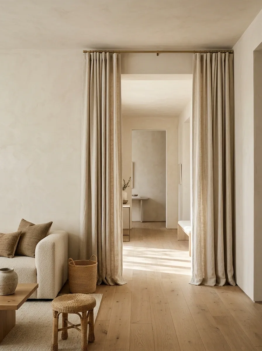
This is the kind of doorway that makes a room feel softer without announcing that a curtain has entered the chat. Ceiling-height oatmeal linen panels frame the opening between a warm living room and hallway, with pale plaster walls, oak flooring, a low neutral sofa, and woven accents continuing the same relaxed palette on both sides.
The important part is the height. Hanging the fabric close to the ceiling gives the opening more architectural presence and keeps the curtain from looking like a random rectangle attached to a rod. Let the panels sit just outside the main walking path so they frame the transition without becoming an obstacle.
The room doesn’t need much else competing for attention. The linen already has the texture.
Beaded Wooden Strands Creating a Textured Passage
A doorway doesn’t need heavy fabric or solid wood to feel complete; sometimes a bit of rhythmic movement is all the architecture asks for. Vertical wooden beaded strands line this opening, filtering the view into the room beyond while adding a layer of tactile warmth to the neutral walls.
The clever part is how the linear pattern echoes the surrounding traditional details. The warm tones of the wooden beads tie in seamlessly with the framed artwork and dark flooring, making the hanging screen feel like an intentional design choice rather than a nostalgic throwback.
The room stays bright and airy because the light travels freely between the strands. The texture does the heavy lifting, giving the transitional space depth and personality.
Arched Plaster Opening With a Soft Interior Curtain
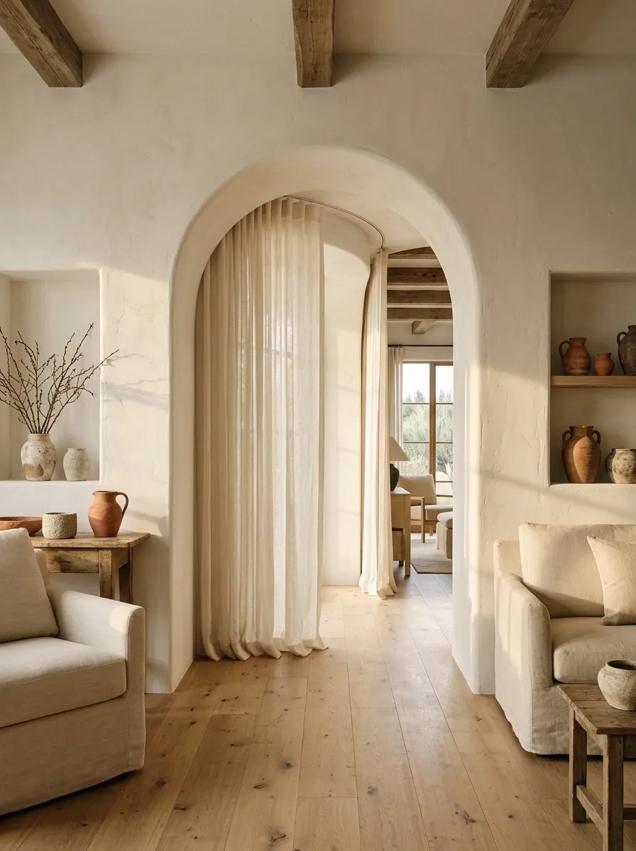
A hard rectangular opening can feel oddly abrupt in a room full of soft shapes. An arched opening changes that immediately. Here, warm off-white plaster creates a rounded transition between spaces, while a lightweight cream curtain sits inside the arch instead of hanging out in front of it.
Terracotta accents, aged timber, simple upholstery, and warm flooring give the whole composition a relaxed Mediterranean character. The curved architecture does most of the visual work, so the furniture stays fairly quiet.
The recessed curtain is what makes this feel considered. The fabric follows the architecture rather than fighting it. A curtain outside the opening would make the shape feel secondary. Inside the arch, it becomes part of the architecture.
And yes, the rectangle had a good run.
Floor-to-Ceiling Slatted Wood Screen Between Living and Dining Areas
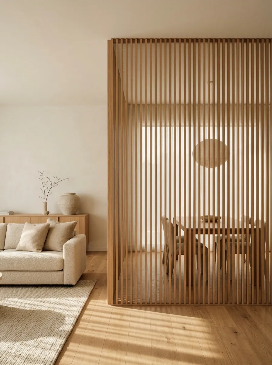
Open-plan rooms don’t always need another solid wall. Sometimes the better move is to separate the spaces just enough to make each one feel intentional. A floor-to-ceiling timber screen does exactly that here.
Slim vertical oak slats sit between the living and dining areas, filtering the sightline while allowing daylight and movement to continue through the opening. A neutral sofa on one side and a simple dining table on the other make the purpose of the screen obvious without making the room feel chopped in half.
The warm wood also gives the architecture more presence. It connects naturally with oak flooring and furniture, so the divider reads as part of the room rather than an oversized freestanding object.
The walls stay quiet. The slats get the main character role.
Built-In Open Bookcase Creating a Doorway Passage
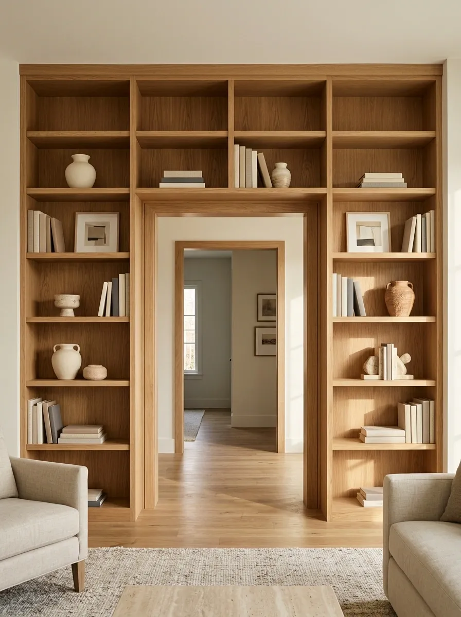
Sometimes the best way to cover a doorway visually is to stop treating it like an empty doorway at all. A wall-to-wall open bookcase can frame the passage and make the opening feel deliberate, especially in a home where books, art, and collected objects already belong in the room.
Picture the shelving continuing around the opening, with warm timber, stacked books, ceramics, framed artwork, and a few carefully chosen decorative pieces. The opening remains completely usable, but the surrounding architecture now gives it context.
The secret is leaving enough breathing room around the passage. Stuffing every shelf because there is technically space for another vase is how a thoughtful built-in becomes visual traffic.
The empty opening is part of the composition too.
Keep the shelves useful and collected.
PASSAGE
Leave visible gaps so the opening can breathe.
Woven Cane Folding Screen Paired With a Calm Japandi Room
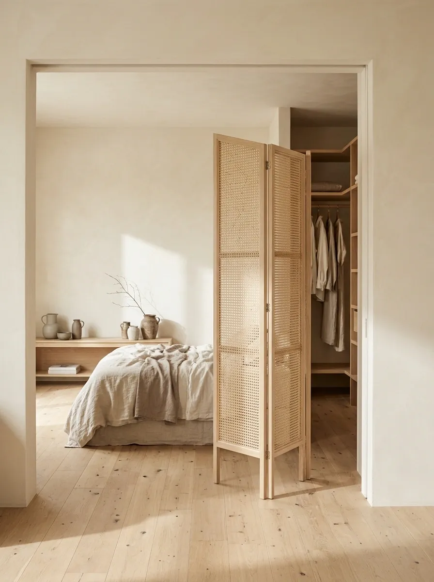
A folding screen can make a doorway feel softer without permanently changing the architecture. This version uses a pale oak frame with woven cane panels, positioned at an angle between a quiet bedroom and a dressing area. Low furniture, creamy walls, linen bedding, and restrained pottery keep the room calm.
The angled placement matters. It gives the screen enough presence to define the threshold while leaving a comfortable route around it. The open weave also keeps the two areas visually connected, which makes the room feel larger than it would with a solid barrier.
And unlike a giant piece of furniture parked in the doorway, this one can actually move when the room needs to change.
Soft Cotton Café Curtain With a Low Half-Wall Below
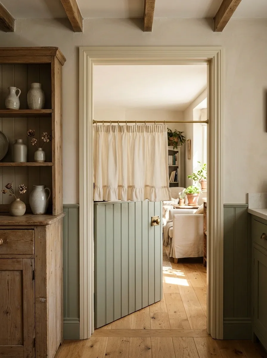
A full curtain isn’t the only way to soften a doorway. This cottage-inspired arrangement uses a low painted half-wall beneath a short gathered cotton curtain, creating a charming threshold between a kitchen and adjoining room.
The solid lower section gives the opening some visual weight, while the fabric above keeps the passage open and bright. Warm timber, handmade ceramics, vintage furniture, and a muted painted wall color reinforce the relaxed character.
The shorter curtain also changes the mood completely. It feels less formal than floor-length drapery and works especially well where the doorway needs a little separation without becoming a serious privacy barrier.
Basically, the bottom half handles architecture and the top half handles charm. Teamwork.
Makes the opening feel anchored.
Keeps the transition light and informal.
Beaded Wood Curtain Creating a Warm Bohemian Threshold
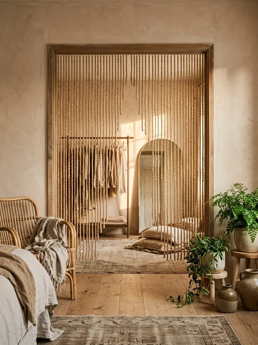
A doorway can have movement without becoming visually chaotic. This warm bohemian composition uses strands of natural wood beads across the opening between a bedroom and dressing area, with rattan furniture, layered rugs, clay-colored accents, greenery, and soft ambient lighting.
The beads create a shifting visual screen instead of a solid boundary. From one room, the space beyond remains visible in fragments, which gives the transition a little depth and movement.
The surrounding materials are important here. Wood beads look much more intentional when the room already contains timber, woven surfaces, natural fibers, or handmade details. Drop them into a glossy modern room with no supporting texture and the doorway may start looking like it wandered in from another decade.
Let the room commit to the idea.
Black-Framed Reeded Glass Partition Around an Interior Opening
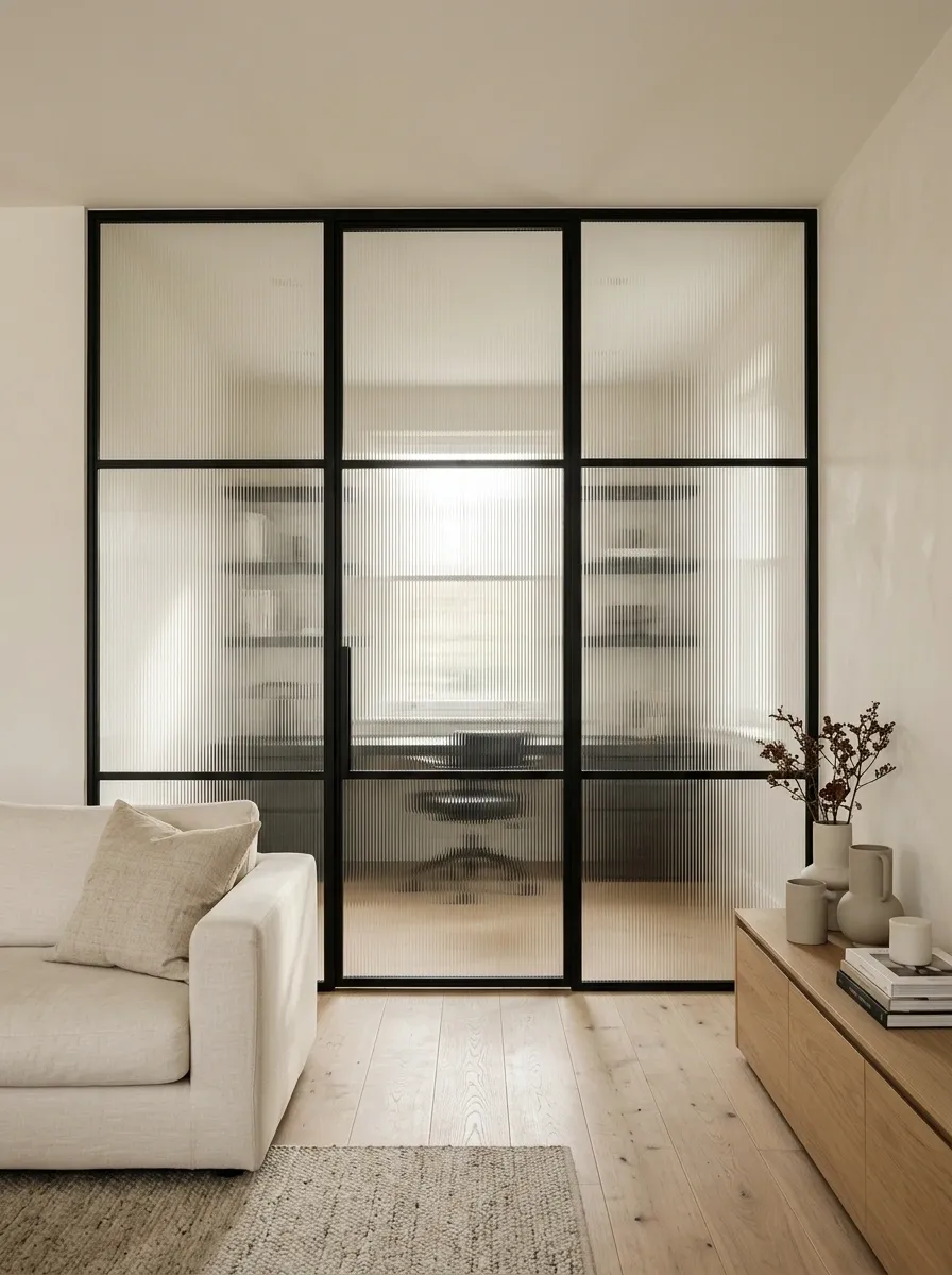
For a cleaner, more architectural look, reeded glass brings privacy and separation without making the opening visually heavy. A slim black frame surrounds translucent glass panels between a modern living space and home office, with pale oak floors, warm white walls, and restrained furniture keeping the composition crisp.
The ribbed glass is what makes the design especially useful. It softens the view into the neighboring room while still allowing daylight to move through the partition. The black framing gives the opening enough definition to read as architecture rather than a temporary divider.
Keep the rest of the room relatively calm. The frame already has strong lines, and there is no prize for making every other surface compete with it.
Wide Gauzy Curtain Wall Softening a Large Double Doorway
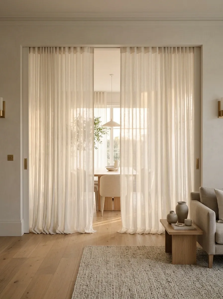
Some openings are simply too wide for one ordinary curtain panel to look convincing. This design treats the entire transition as a soft curtain wall, using broad sheer warm-white panels across a large double doorway between a sitting room and dining area.
Daylight filters through the fabric, furniture remains visible in soft silhouettes, and the room keeps its open-plan feel even when the panels are drawn. A neutral sofa, natural wood dining furniture, subtle rugs, and warm walls keep the atmosphere light.
The key is fullness and width. Narrow panels stretched across a huge opening can look stingy and unfinished. Generous fabric gives the composition enough visual weight to match the architecture.
That doorway wanted drama. It just didn’t need a door.
Macramé Curtain With Earthy Layered Textiles in a Relaxed Bedroom
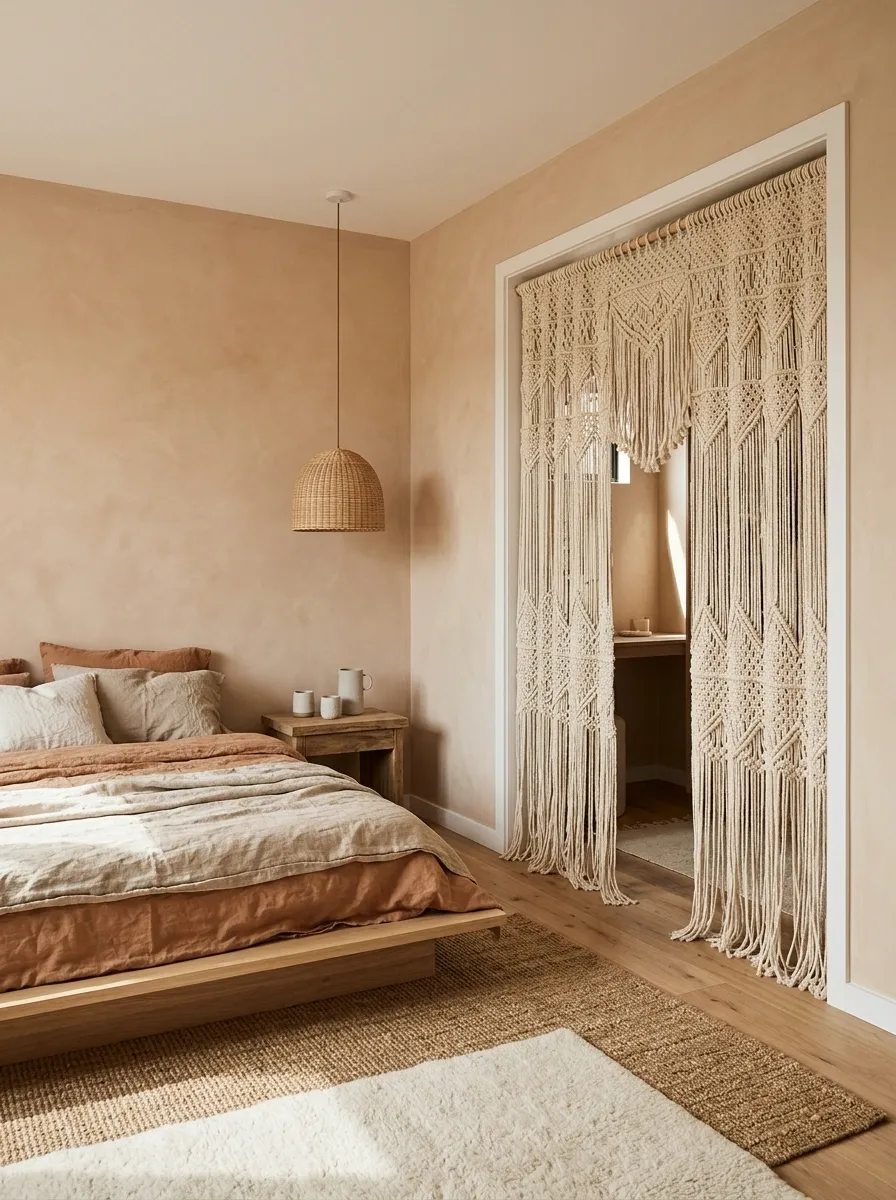
This bedroom leans fully into texture, using a substantial macramé curtain across the doorway to a small dressing area. Clay-toned walls, light timber furniture, linen bedding, woven lighting, and layered rugs give the room a warm, handmade character.
The curtain works because it doesn’t arrive alone. The knotted textile echoes the other tactile surfaces in the room, creating a visual rhythm from the bed to the doorway and back again.
The rest of the composition stays relatively simple. Too many intricate patterns would compete with the macramé and turn the room into a craft market with a bed in it.
The opening becomes decorative, but it still feels useful.
Paint-Matched Accordion Screen That Almost Disappears Into the Wall
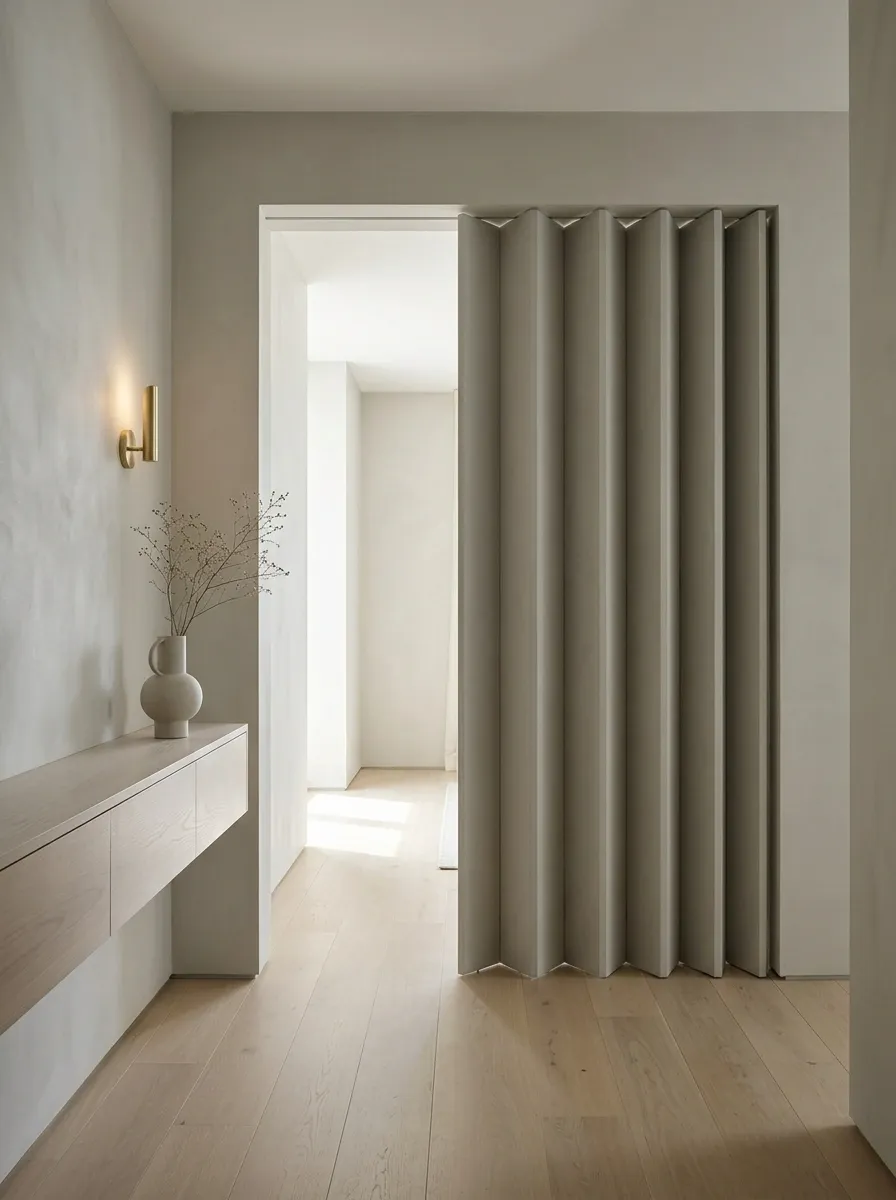
A folding screen doesn’t have to become a new piece of furniture screaming for attention. In this compact hallway, a tailored accordion screen is painted the same muted shade as the surrounding walls, creating separation while visually blending into the architecture.
When the screen is folded back, the passage stays open. When extended, it creates a quiet visual boundary between the hallway and adjoining room. Because the color remains consistent, the eye reads the whole treatment as one continuous surface.
This approach works especially well in spaces where introducing another strong material would make the room feel busy.
The screen basically chooses stealth mode.
Keeps the screen visually connected to the architecture.
The passage can change from open to screened without adding visual bulk.
Curved Timber Portal Framing a Small Reading Nook
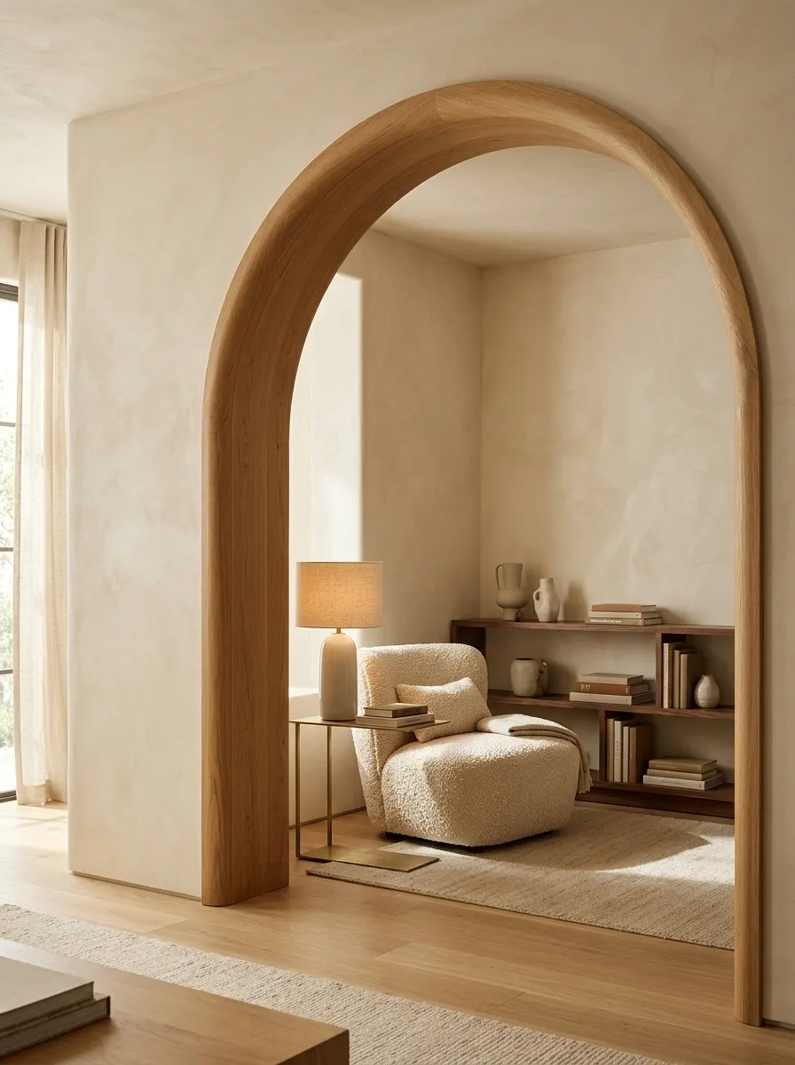
Here, the doorway itself becomes the feature. A rounded timber portal reshapes a simple opening into a soft architectural transition leading to a compact reading nook with a lounge chair, small side table, warm lamp, and low shelf of books.
The timber edge introduces warmth against pale walls while the curved silhouette breaks up the harder rectangular geometry elsewhere in the room. Because the reading area beyond is intentionally simple, the portal gets enough visual space to register.
This is a stronger direction for homes where the opening doesn’t need heavy privacy but does need more character.
The rectangle had one job. The curve showed up and got promoted.
Heavy Velvet Curtain Creating a Dramatic Bedroom Transition
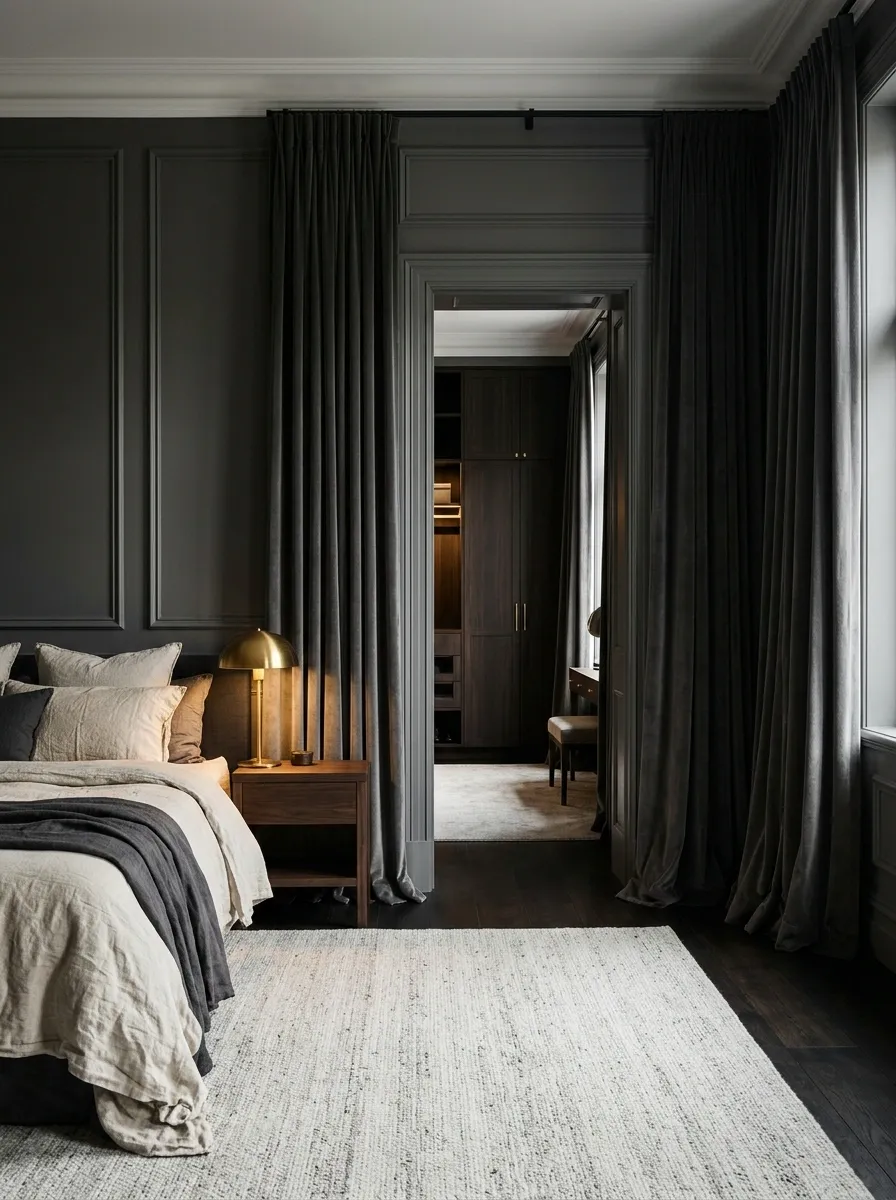
A bedroom doorway can handle more drama than a hallway, especially when the goal is to create a distinct sleeping zone. This composition uses full velvet curtains in a deep muted tone to separate the bedroom from an adjoining dressing area.
Dark timber furniture, warm lamps, a restrained rug, and layered bedding give the fabric enough surrounding weight to feel intentional. When the curtain is open, it frames the transition. When drawn, it creates a much stronger visual boundary.
Velvet changes the mood quickly, so the rest of the room shouldn’t fight for attention. Keep the lighting warm and the palette restrained.
Because apparently the bedroom did not have enough main-character energy already.
Open Timber Grid Partition Between Kitchen and Dining Space
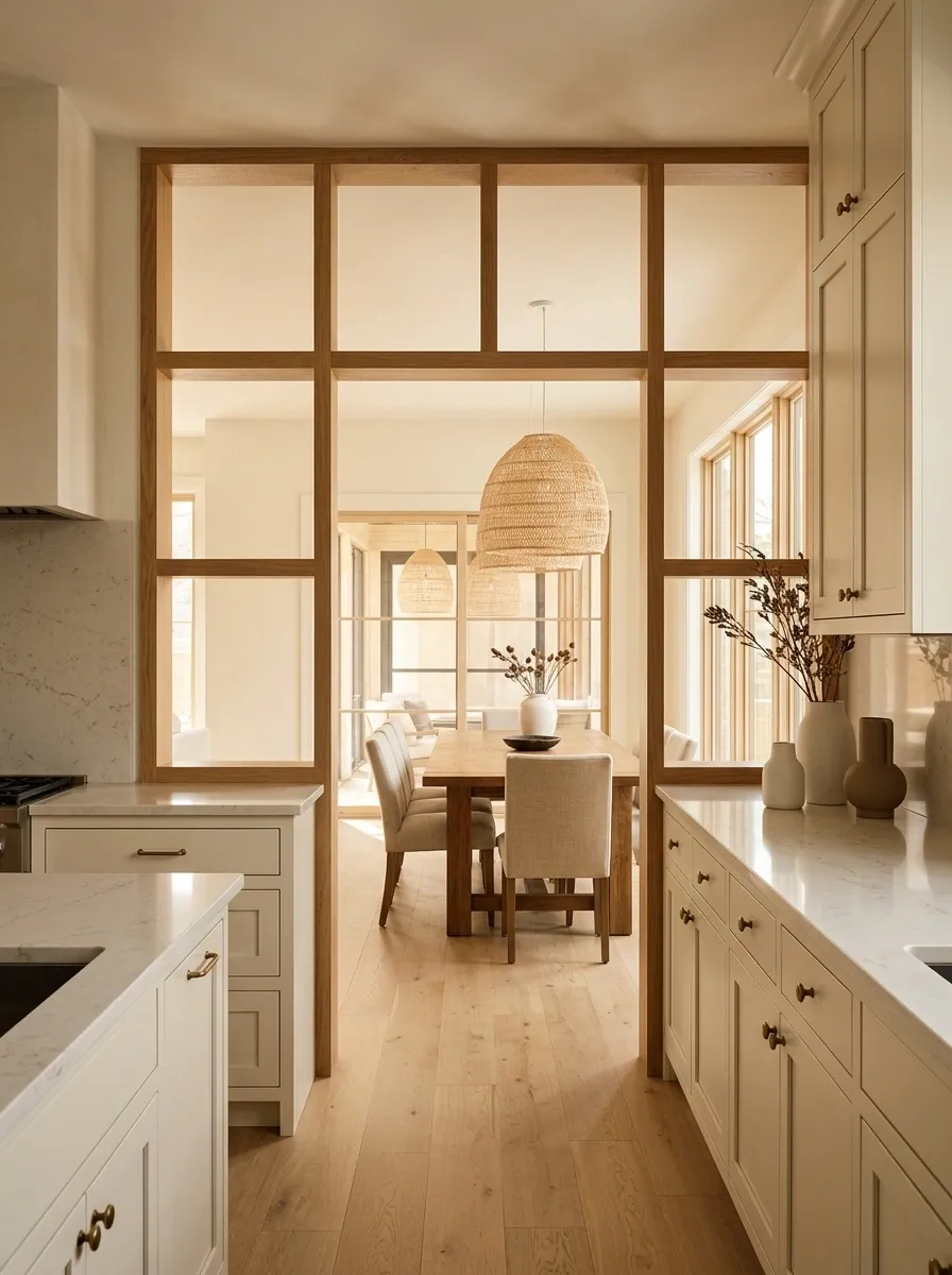
A wide opening between a kitchen and dining area doesn’t always need to be closed. A timber grid can give the two spaces a stronger relationship while still letting them borrow light and visual space from each other.
This version uses a warm wood framework with large rectangular openings, positioned between a simple kitchen and a dining area with a long timber table, upholstered chairs, and soft pendant lighting. The repeated geometry gives the transition a structured look without making it feel industrial.
The trick is keeping the grid proportionate to the opening. Huge chunky sections can make the room feel boxed in, while tiny divisions start looking busy.
It’s basically a wall that remembered it had somewhere else to be.
Furniture, light, and movement between the two spaces.
The opening gets a clear architectural boundary.
Tall Bamboo Screen Used as a Flexible Tropical Room Divider
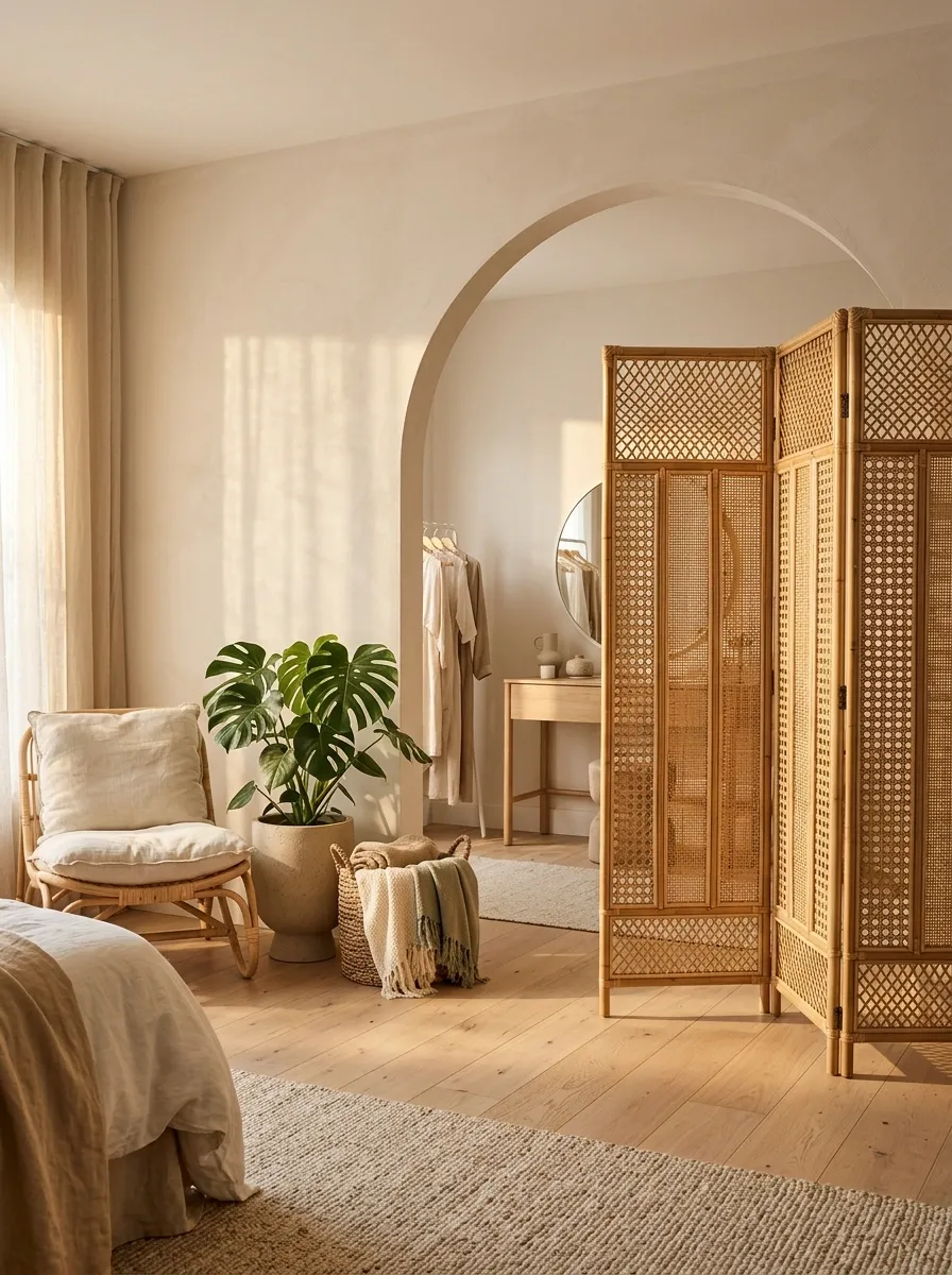
A bamboo screen can make an open doorway feel like part of a relaxed, natural interior rather than a blank transition between rooms. This composition places tall woven bamboo panels between a bright bedroom and dressing zone, pairing them with pale timber, rattan furniture, leafy greenery, and breathable neutral fabrics.
The screen remains tall enough to give the doorway clear definition but light enough to preserve the feeling of airflow and daylight. Its natural texture also works with the other organic surfaces in the room rather than introducing an unrelated finish.
Keep the plant styling concentrated around the transition instead of scattering greenery everywhere. Otherwise the doorway starts looking less tropical and more like a hostage situation involving houseplants.
Half Wall With Arched Cutout and Built-In Display Shelf
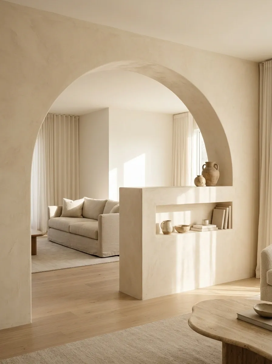
A half wall can separate two areas without turning the home into a maze of solid barriers. This design uses a warm plaster-toned partition with a broad arched cutout, plus a small built-in shelf carrying a few ceramics and books.
The lower wall gives the doorway visual weight and a sense of permanence. The arched cutout keeps the upper portion open, allowing light and views to pass through. Because the finish matches the surrounding walls, the partition feels like part of the architecture rather than furniture parked in the opening.
This is a particularly strong choice when a completely open doorway feels too exposed but a full partition would make the rooms feel cramped.
The wall takes a little space. The room gets a lot more intention in return.
Layered Double Curtain With Sheer Inner Panel and Linen Outer Panel
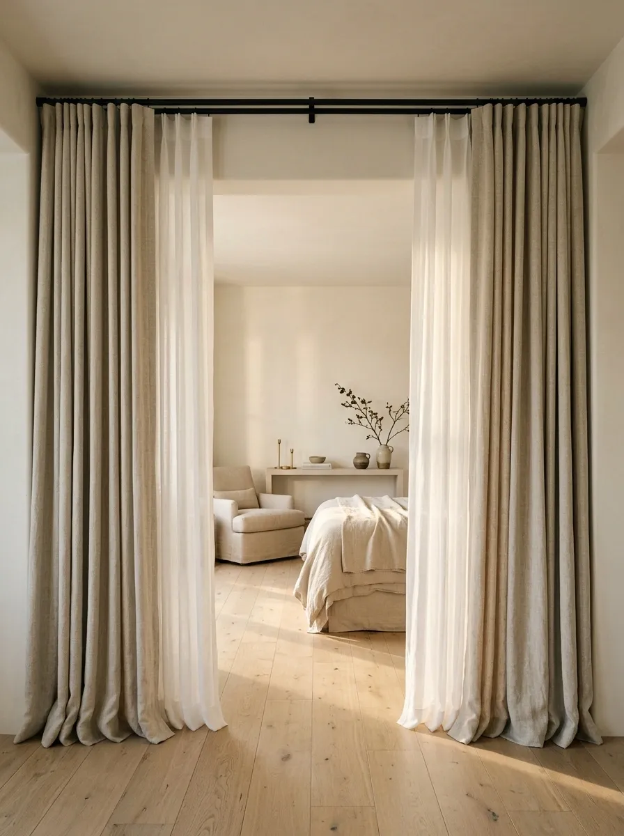
One curtain can soften a doorway. Two layers can make the whole transition feel much more intentional. This bedroom uses a sheer inner panel with a heavier linen outer curtain, creating a doorway that can shift from completely open to softly filtered to visually closed.
The outer linen establishes the main look, while the sheer fabric handles the lighter, more delicate layer underneath. Warm white walls, pale oak, upholstered furniture, and soft bedding keep the composition restrained enough for the layered fabrics to stand out.
The important detail is that the two fabrics don’t compete. One provides structure and color. The other provides lightness.
It’s basically the doorway version of wearing a good jacket over an even better shirt.
Traditional Fabric Portière With Decorative Trim in a Formal Dining Room
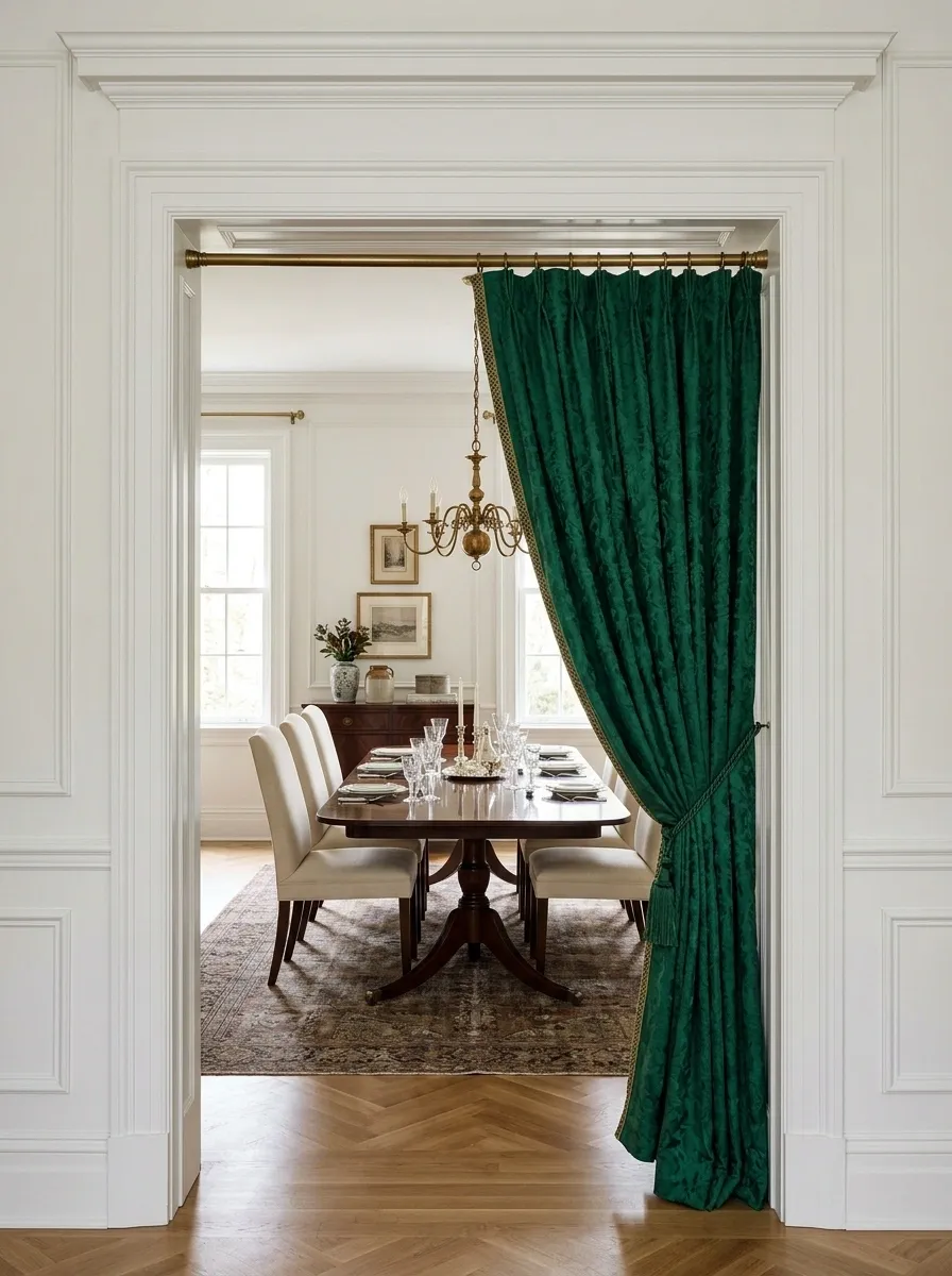
A formal dining room can take a doorway curtain with a little more tailoring. This version uses a substantial fabric portière with restrained decorative trim, framed by painted millwork and warm wood furniture. A long dining table, upholstered chairs, and a warm pendant reinforce the traditional setting.
The trim gives the fabric a clear finished edge, making the doorway feel more like part of the room’s millwork language. The curtain color should relate to the dining room rather than introducing an unrelated statement shade.
This is not the place for floppy fabric casually pushed to one side.
The whole composition works because every line is doing something.
frames the opening
fills the opening
finishes the edge
Wide Sheer Panels
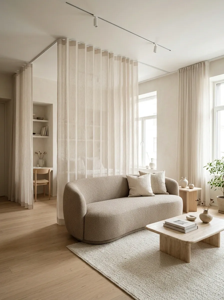
A small apartment doesn’t need a heavy divider just because one area needs a little separation. Here, wide sheer panels run behind a curved sofa, creating a soft boundary between the living area and a tucked-away sleeping or work zone.
The sofa gives the fabric a clear foreground relationship, while the translucent panels keep daylight moving through the apartment. Pale flooring, warm neutral upholstery, and a few carefully placed wood pieces keep the setting light enough that the curtains don’t visually shrink the room.
The walking route stays outside the curtain line, which matters in a compact space. A divider that makes everyone perform an obstacle course has technically failed the assignment.
This one defines the zones without making the apartment feel chopped apart.
The curved sofa anchors the front of the composition.
The curtain line stays outside the main walking path.
Japanese-Inspired Rice-Paper Screen Across a Calm Passage
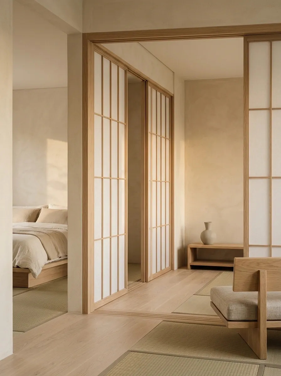
A translucent screen can change the character of a doorway without making the neighboring room disappear. This Japanese-inspired composition uses tall rice-paper-style panels within a simple timber frame, placed between a quiet bedroom and a small sitting area.
Pale wood, warm plaster, low furniture, minimal ceramics, and soft daylight keep the surroundings intentionally restrained. The screen filters shapes and movement instead of presenting a hard visual wall, giving the passage a sense of privacy while preserving the calm connection between rooms.
The beauty here comes from restraint. There isn’t a pile of decoration trying to explain the concept.
The doorway understood the assignment and brought fewer things.
Color-Blocked Curtain Opening in a Playful Eclectic Home
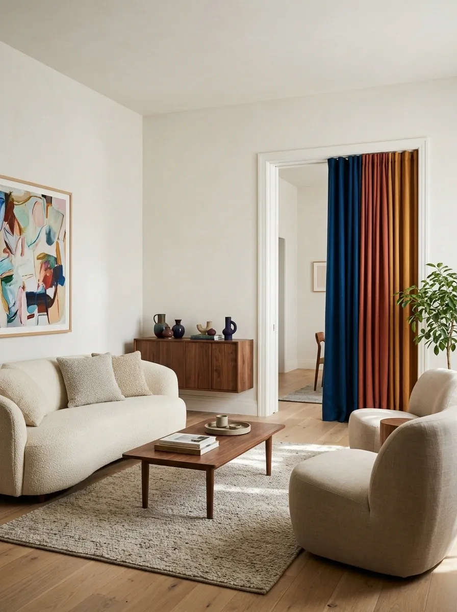
A doorway can carry color without turning the whole room into a rainbow experiment. This eclectic interior uses one saturated curtain across the opening, surrounded by mostly controlled neutrals, sculptural furniture, colorful artwork, and small repeated accents that quietly echo the curtain.
The result feels deliberate because the strong color has somewhere to go. A few smaller objects repeat its tone, while the walls and larger furniture pieces stay calmer.
The curtain becomes the punctuation mark of the room rather than another sentence yelling for attention.
One bold opening is plenty. There is no need to give every cushion a speaking role.
Tall Upholstered Screen Creating a Soft Bedroom Dressing Zone
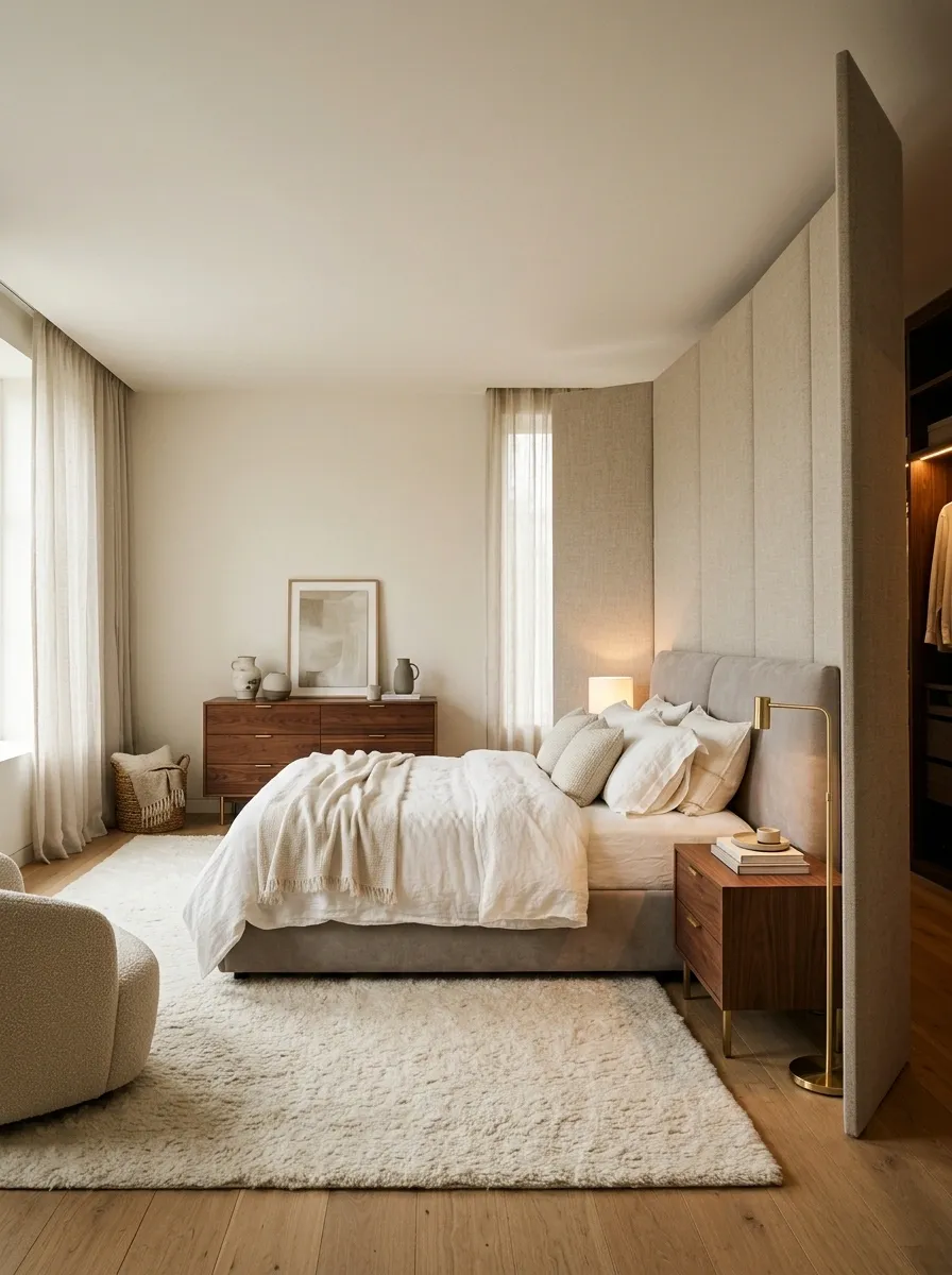
A dressing area doesn’t always need a permanent wall. This bedroom uses a tall upholstered folding screen to conceal the dressing zone while maintaining a softer relationship with the main sleeping area.
The screen has enough height and visual weight to create genuine separation, but its fabric surface keeps the room warmer than a hard partition would. A full-length rug, upholstered bed, walnut furniture, and low warm lighting reinforce the boutique-hotel character.
The most important detail is placement. The screen should conceal the visually busiest part of the dressing area while leaving the main bedroom open and comfortable.
Because sometimes the clothing pile deserves privacy too.
SCREEN
Plaster Arch, Timber Curtain Rod, and Full Linen Panels in a Warm European Interior
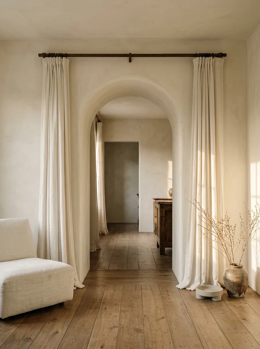
The final concept combines several of the strongest ideas in the collection without making the doorway feel overdesigned. A broad plaster arch defines the passage, a simple timber rod adds warmth above it, and full natural linen panels soften the opening when privacy is needed.
Aged wood flooring, understated upholstered furniture, warm plaster walls, and directional lighting give the composition an old-world European character without becoming overly formal. The materials are intentionally simple, but their proportions make the doorway feel substantial.
The arch establishes the shape. The timber adds warmth. The linen adds movement. The surrounding furniture stays quiet enough to let the architecture breathe.
A surprisingly convincing amount of design can happen in one doorway.
Let the doorway have a point of view
An open doorway doesn’t automatically need to be hidden. Sometimes it needs framing. Sometimes it needs softness. Sometimes it needs privacy. And sometimes it just needs enough architectural character to stop looking like a giant unfinished rectangle.
That’s what makes the strongest solutions interesting. The curtain, screen, partition, arch, or built-in isn’t working alone. It belongs to a larger composition with the flooring, walls, furniture, light, materials, and circulation all contributing to the same visual direction.
Before choosing a treatment, look at the room as one complete scene. Notice what already has visual weight, where people actually walk, how much light needs to pass through, and whether the opening needs genuine privacy or simply a stronger sense of definition.
The goal isn’t to make the doorway disappear.
It’s to make someone look at it and think, “Obviously. That’s exactly how this room was supposed to look.”
Save the designs that make the whole room click, then keep those references close when the doorway gets its turn in the decorating decisions.