
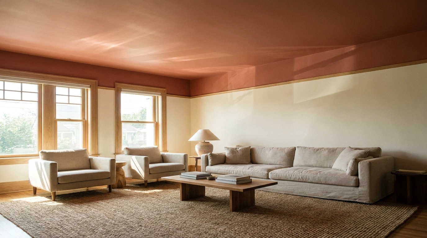
A room can have beautiful furniture, carefully chosen wall colors, and expensive-looking finishes and still feel oddly unfinished. Sometimes the missing piece is right overhead.
Ceilings are often painted white without much thought, even when the rest of the room has a very specific color palette. White can absolutely work, but the wrong shade can make warm walls look yellow, cool walls look muddy, or a thoughtfully decorated room feel strangely disconnected.
The better approach is to choose ceiling paint alongside the walls, flooring, furniture, and lighting. A pale blue ceiling can bring freshness to a traditional kitchen, while a deep green ceiling can make an entire library feel more intimate. Both work because the color belongs to the room rather than floating around without a purpose.
The designs below explore everything from understated neutrals to dramatic dark ceilings, architectural paint treatments, and playful colors. The goal isn’t to paint every ceiling a different color just for the sake of it. It’s to find a combination that makes the entire space feel intentional.
Ceiling Paint Ideas for Complete, Cohesive Rooms
Warm White Ceiling With Greige Walls and Natural Oak
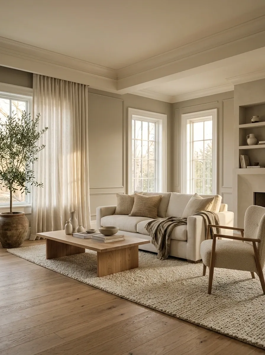
A warm white ceiling, greige walls, and natural oak flooring make a living room feel calm without draining all the personality out of it. Add a linen sofa, textured curtains, and a coffee table with a soft wood grain.
White trim provides a clear boundary around the windows and doors, while the warm ceiling connects the walls to the floor. A creamy white works alongside warm greige, whereas a stark blue-white can make the walls look muddy by comparison.
The room doesn’t need six more beige accessories to prove it has a palette. A few differences in texture will do the job.
Color-Drenched Sage Ceiling With Matching Walls
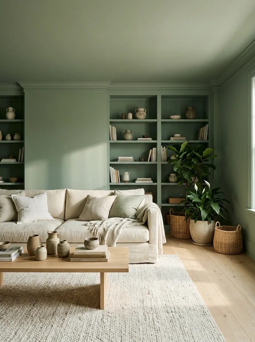
A sage living room feels more enveloping when the ceiling and walls share the same muted green. Pale oak flooring, a creamy sofa, woven accents, and a leafy plant introduce enough contrast to keep the space from looking like a green paint showroom.
Built-in shelving painted in the same shade can make the arrangement feel even more intentional. The continuous color softens the visual boundary between the wall and ceiling, particularly when the architecture has awkward corners or several short wall sections.
Check how the shade changes throughout the day. Natural light can make sage look dustier, brighter, or more yellow, and the little sample card has never paid rent in this room.
Powder Blue Ceiling in a Classic White Kitchen
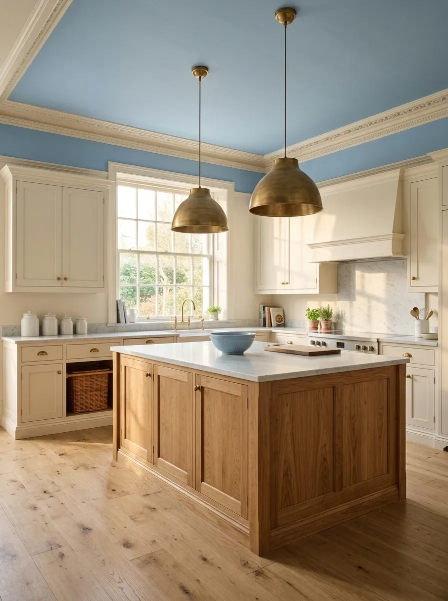
A powder blue ceiling brings a gentle shift to a classic kitchen filled with white shaker cabinets, pale marble, and a warm oak island. Brass pendants and simple hardware give the room a warmer note, while the blue keeps the upper half from feeling like one enormous blank sheet of paper.
This combination feels traditional without getting stuck in another decade. Keep the cabinetry neutral and repeat the ceiling color only in small details, such as a ceramic bowl or a subtle textile.
Matching every accessory would make the kitchen feel less collected and more like a very committed paint advertisement.
Pale Blush Ceiling With Taupe Walls and Walnut Furniture
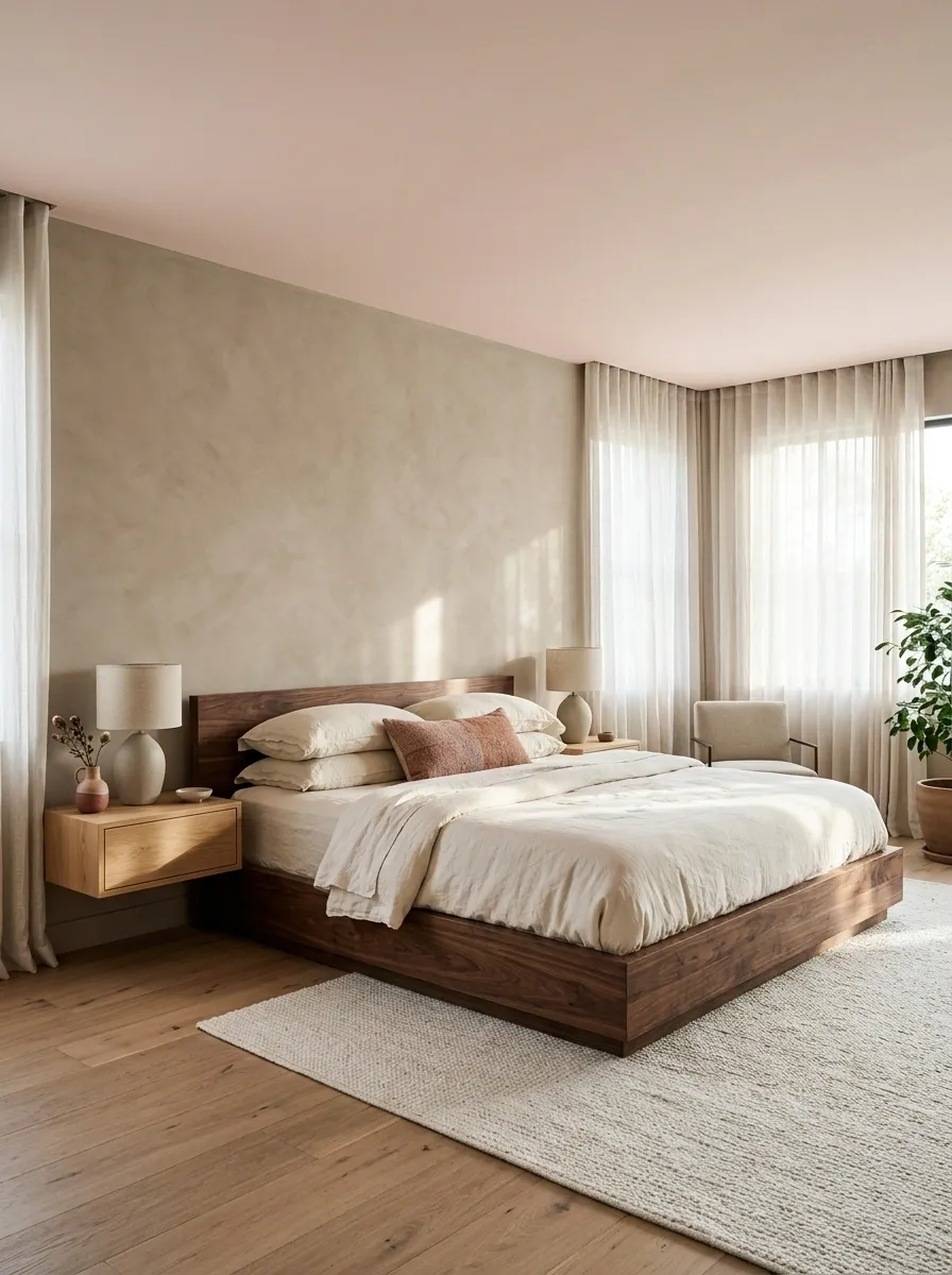
A pale blush ceiling adds softness to a bedroom with warm taupe walls, a walnut bed, cream bedding, and understated bedside lighting. The pink is subtle enough to read almost like a warm neutral, especially when there isn’t a lot of bright white competing with it.
Dark wood grounds the palette and prevents the room from drifting into sugary territory. Choose a muted blush rather than a bright bubblegum finish, then use dusty rose or terracotta in one or two smaller accents.
The contrast between a delicate ceiling color and substantial walnut furniture is what makes the room interesting. Without that contrast, everything risks blending into one giant beige nap.
Soft Ivory Ceiling in a Limestone-Inspired Minimalist Room
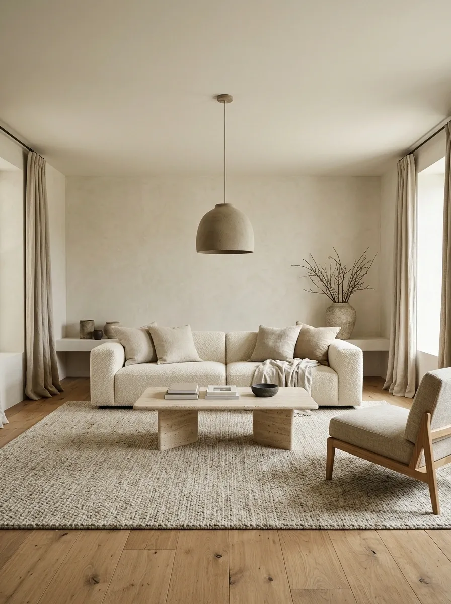
A soft ivory ceiling blends into pale stone-inspired walls, travertine surfaces, and a warm oak floor. A low cream sofa, sculptural coffee table, and simple pendant keep the living room quiet, but the materials add enough variation to stop it feeling flat.
The ceiling doesn’t compete for attention because the composition relies on texture and proportion instead of a bold paint contrast. Ivory, limestone, and natural oak should feel related without becoming identical.
Small differences in grain, weave, and surface finish provide the visual interest that extra decor would only clutter. Let daylight reveal the materials instead of filling every empty corner with another accessory.
Deep Navy Ceiling With Light Walls and a Brass Chandelier
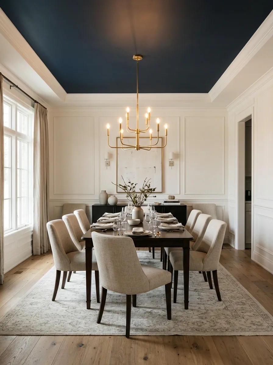
A deep navy ceiling gives a dining room immediate character, especially when the walls stay warm white and the furniture features dark wood, upholstered chairs, and a brass chandelier. The contrast draws attention upward while keeping the table firmly in the spotlight.
A patterned rug and a few restrained accessories complete the room without turning dinner into a competition between decorative objects. Navy can look rich under warm illumination, but a poorly lit ceiling may appear almost black.
Let the chandelier provide a focal point, then add softer light around the room so the corners don’t disappear into darkness. The goal is sophisticated drama, not an accidental audition for a haunted mansion.
Muted Terracotta Ceiling in a Mediterranean Living Room
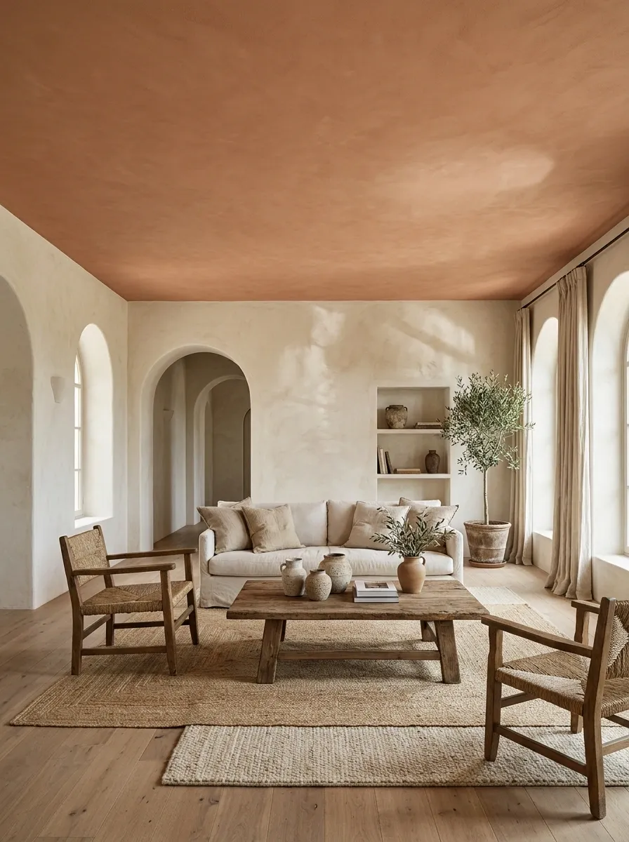
A muted terracotta ceiling pairs beautifully with creamy plaster walls, arched doorways, rustic oak furniture, and relaxed linen upholstery. Woven rugs and handmade ceramic pieces reinforce the earthy feel, while daylight brings out the ceiling’s dusty orange and brown undertones.
The room feels collected because the colors relate to the architecture and materials, rather than relying on a pile of matching decorations. Keep terracotta restrained, choosing a softened clay-like shade rather than a loud orange-red.
Let timber and woven textures supply the other earthy notes. Add too many competing rust shades and the living room may start looking like a pumpkin enthusiast took over the entire property.
Buttery Yellow Ceiling in a Sunlit Breakfast Nook
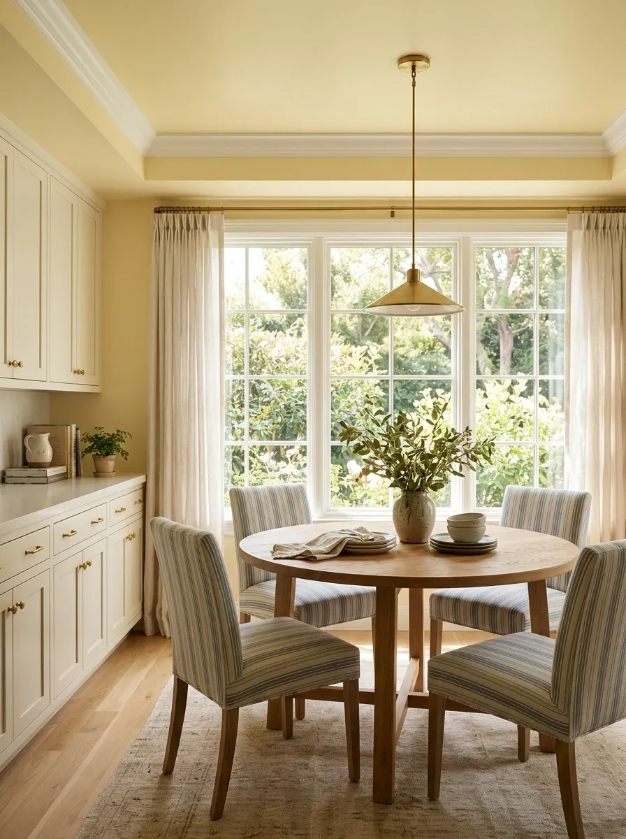
A buttery yellow ceiling gives a breakfast nook a sunny character, especially alongside cream cabinets, a round oak table, and relaxed striped upholstery. A garden-facing window brings in natural light, while a simple pendant creates a defined dining area without crowding the ceiling with unnecessary fixtures.
Choose a soft, creamy yellow rather than a sharp lemon shade. The difference becomes especially obvious in artificial light, which can make saturated yellows look much stronger by evening.
Test the sample near the actual window and check it again after sunset. A breakfast nook should feel cheerful, not like someone accidentally painted it with highlighter ink.
Charcoal Ceiling in a Contemporary Media Lounge
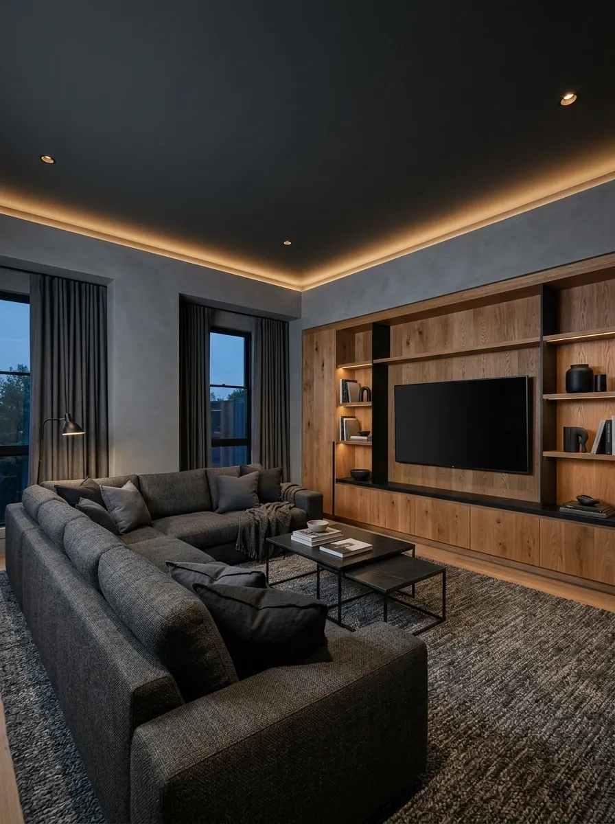
A charcoal ceiling can give a media lounge a more intimate feel, especially when paired with grey walls, a deep sectional, black steel details, and a warm oak entertainment wall. Low-profile furniture keeps the room grounded, while layered lamps and indirect lighting prevent the corners from becoming one giant shadow.
The wood feature introduces warmth and stops the palette from reading as monochrome. A room with small windows, a low ceiling, and a single weak bulb may feel heavier with dark paint overhead.
Keep the walls lighter when contrast is the goal, and use the darker ceiling when the room has enough illumination to retain depth. Movie-night atmosphere is good. Searching for the remote by echolocation is less appealing.
Crisp White Ceiling Above Saturated Emerald Walls
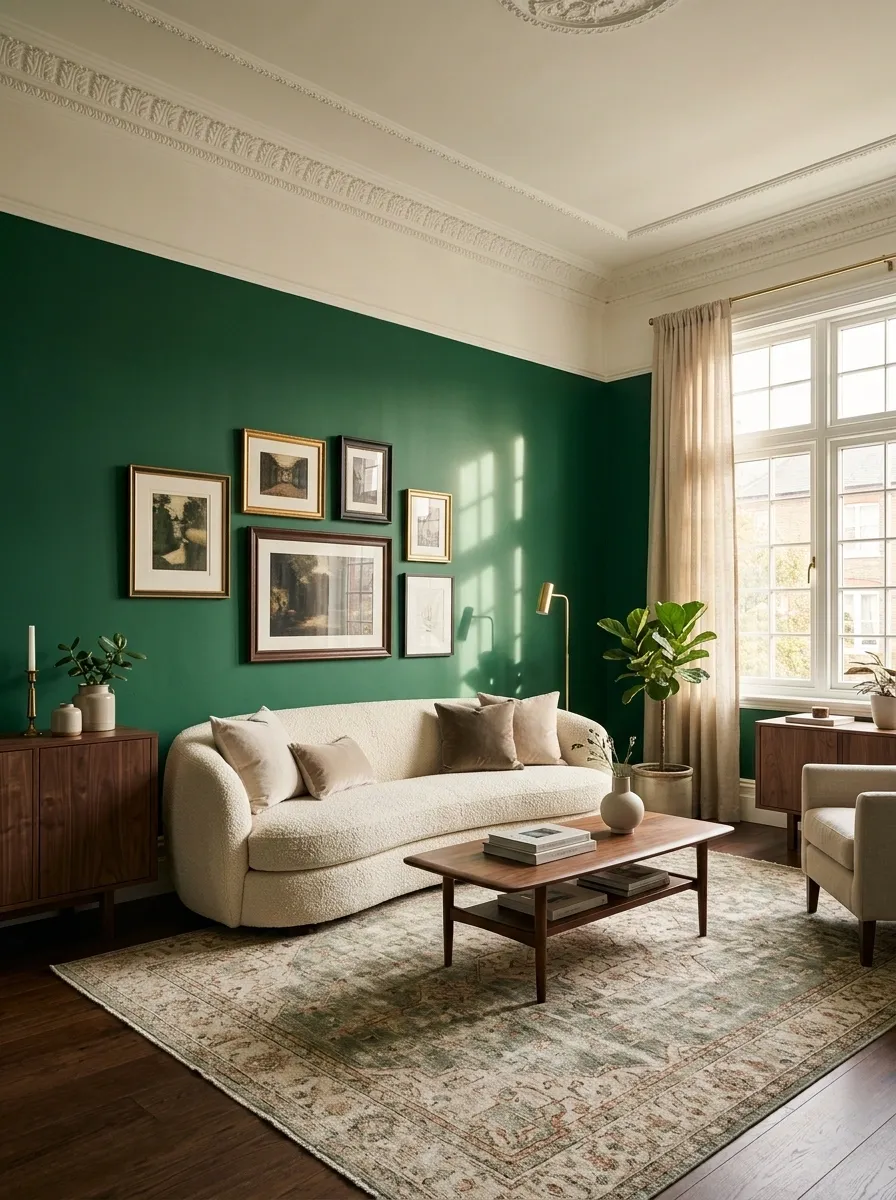
Emerald walls already bring plenty of visual weight, so a crisp white ceiling gives the room a clean break overhead. A curved sofa, dark wood furniture, framed art, and a vintage-inspired rug add character without forcing every accessory into the same shade of green.
White trim reinforces the boundary between walls and ceiling, making the architecture feel clear and deliberate. The contrast is especially useful when the room has decorative molding or a distinct ceiling line.
Choose a white that relates to the room’s other light finishes rather than introducing an unrelated icy tone. The emerald should remain the main color statement, with the ceiling providing relief.
Blue Ceiling Connected to a Two-Tone Dining Room
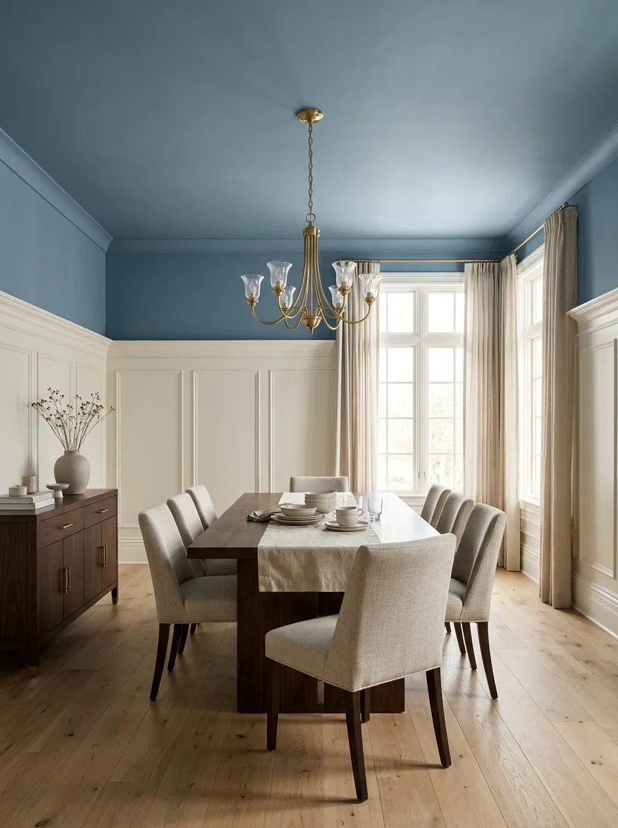
A muted blue ceiling flows into the upper walls of this dining room, while ivory paint covers the lower walls beneath a substantial picture rail. A dark wood dining table, upholstered chairs, and a traditional chandelier give the room enough weight to balance the softer color overhead.
The paint transition feels intentional because it follows the architecture instead of cutting across the wall at some random height. This approach works particularly well in rooms with existing molding or paneling.
The blue connects the upper surfaces, while the lighter lower walls keep the dining area from feeling enclosed. Match the trim carefully, though. A beautiful two-tone scheme can lose its polish when the boundaries between colors look accidental.
Forest Green Ceiling in a Full-Color-Drenched Library
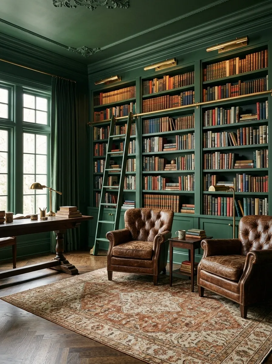
Forest green covers the ceiling, walls, and built-in bookshelves in this traditional library, creating one continuous architectural composition. Leather armchairs, a patterned rug, dark timber, and warm brass lamps break up the green with materials that feel substantial rather than flashy.
The painted surfaces recede into a unified background, allowing the books, furniture, and lighting to provide the finer details. The strongest version uses variation in texture instead of introducing several competing accent colors.
Leather develops a different richness from painted wood, and the rug adds movement underfoot. Before committing to a deep green overhead, check the room’s daylight and lighting arrangement. Enveloping is the goal, not creating a cave where the book titles vanish.
Matte Black Ceiling Above a Soft Neutral Bedroom
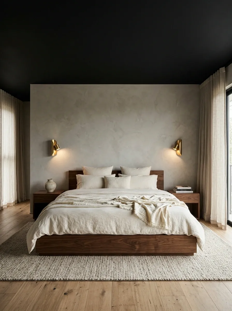
A matte black ceiling creates a dramatic overhead plane above warm grey walls, a low walnut bed, cream linen bedding, and understated bedside tables. Sculptural pendants or carefully positioned wall lights establish pools of illumination, while the pale bedding prevents the room from becoming visually heavy.
Dark overhead paint gives the bedroom a more architectural character than simply adding another dark accent cushion. Check how much natural light enters the room and make sure the lighting remains practical for reading, dressing, and moving around at night.
The contrast between black, walnut, and cream is the whole point. Covering every remaining surface in black would be like putting sunglasses on a room and calling it a day.
Pale Ceiling and Closely Matched Walls in a Low Room
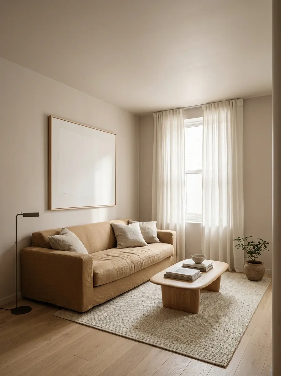
A compact living room with a low ceiling benefits from a pale ceiling color that sits close to the wall paint. Light oak flooring, a low-profile sofa, simple window treatments, and restrained wall art keep the visual composition open.
Instead of creating a sharp white border overhead, the near-matching colors soften the transition between the vertical and horizontal surfaces. This doesn’t magically increase the ceiling height, despite what certain decorating hacks promise. It simply reduces one strong visual break, which can make the room feel more unified.
Keep tall furniture and bulky lighting under control, too. Painting the ceiling pale won’t rescue a room where an oversized bookcase blocks half the window and the chandelier is trying to greet everyone personally.
Dusty Blue Ceiling Framed by White Crown Molding
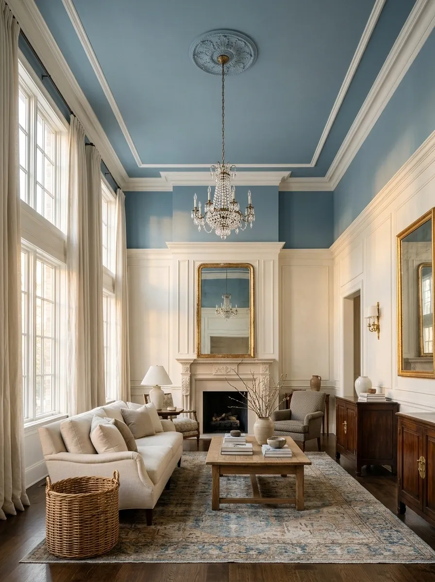
A dusty blue ceiling framed by white crown molding adds color while preserving the room’s architectural structure. Warm white walls, tall windows, a classic chandelier, and antique-inspired wood furniture complete the living room without crowding the details.
The molding gives the blue a clear outline, making the ceiling feel like a deliberate feature rather than a leftover paint experiment. The effect is particularly attractive in rooms with higher ceilings or well-defined trim.
A muted blue tends to sit comfortably beside warm white, while a very bright blue can make the molding look stark by comparison. Let the ceiling have its moment and keep the other finishes controlled.
Blue-Green Ceiling in a Bright Tiled Bathroom
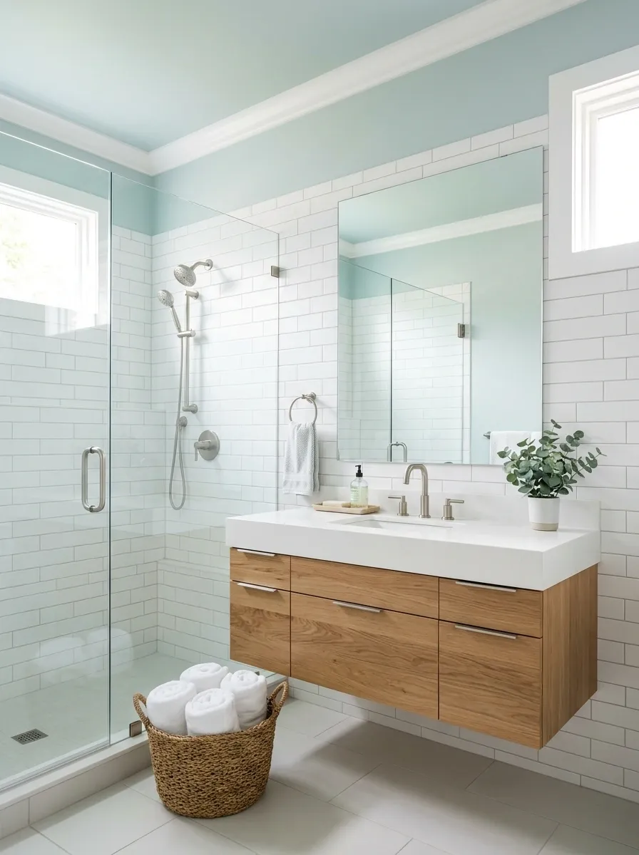
A pale blue-green ceiling adds a refreshing note to a bathroom with white tile, a floating oak vanity, brushed nickel fixtures, and a glass shower enclosure. The cool overhead color relates naturally to the bathroom’s water-friendly materials, while the oak introduces enough warmth to prevent the space from feeling clinical.
Large mirrors and carefully placed lighting help bounce light around the room. The shade should stay soft enough to work with the tile rather than compete with it, so pay attention to the undertones in the grout, countertop, and metal finishes.
Bathrooms also need suitable paint and proper ventilation because moisture has absolutely no respect for a newly decorated ceiling.
Pale Lavender Ceiling in a Playful Children’s Bedroom
A pale lavender ceiling gives a children’s bedroom a playful look while the walls stay warm white. Birch storage, colorful bedding, framed artwork, and a simple bed keep the room flexible as tastes change.
The lavender creates a recognizable color story without forcing every toy, cushion, and lampshade to participate in a coordinated purple convention. A muted lavender works especially well when the room already has colorful objects competing for attention.
Keep the larger furniture neutral, then use bedding or artwork to introduce stronger colors that can change over time. The ceiling can stay while the dinosaur duvet inevitably gets replaced by something involving space exploration.
Mushroom-Toned Paint Across an Attic Ceiling and Sloped Walls
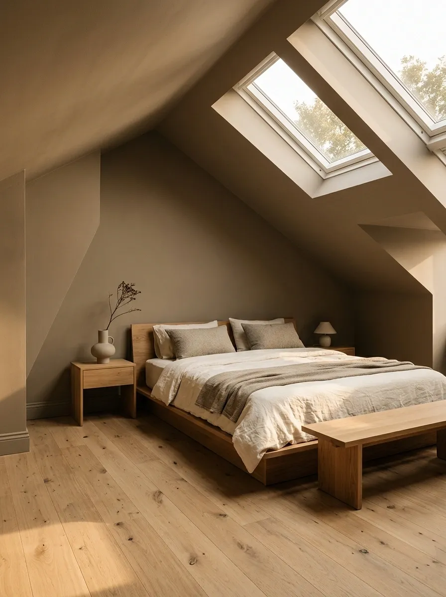
A warm mushroom shade covers the ceiling and sloped walls of this attic bedroom, creating a continuous envelope around the unusual roofline. A low platform bed, oak nightstands, cream bedding, and a skylight keep the space from feeling visually crowded.
Instead of emphasizing every angle with a different color, the paint lets the room’s shape become a quieter part of the overall composition. Keeping the color continuous reduces visual interruptions, while low furniture respects the limited headroom near the eaves.
Check how the mushroom shade looks beside the flooring and bedding, since some versions lean pink and others lean grey. The roofline is already doing enough gymnastics.
Soft Mint Ceiling in a Garden-Facing Sunroom
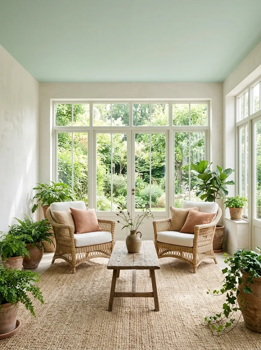
A soft mint ceiling makes a sunroom feel connected to the greenery outside. Large garden-facing windows, wicker seating, a natural fiber rug, and leafy plants complete the composition, while pale walls allow daylight to move through the space.
The mint provides a quiet color link between the garden and the furniture without requiring a matching green on every surface. Keep the furniture relaxed and the accessories restrained so the outside landscape remains part of the room’s composition.
Mint can appear much cooler in shadow than it does in direct sunlight, so compare samples at different times of day. Nobody needs a ceiling that changes from delicate spring leaf to unexpected dentist’s office between breakfast and lunch.
Muted Ochre Ceiling in a Modern Entryway
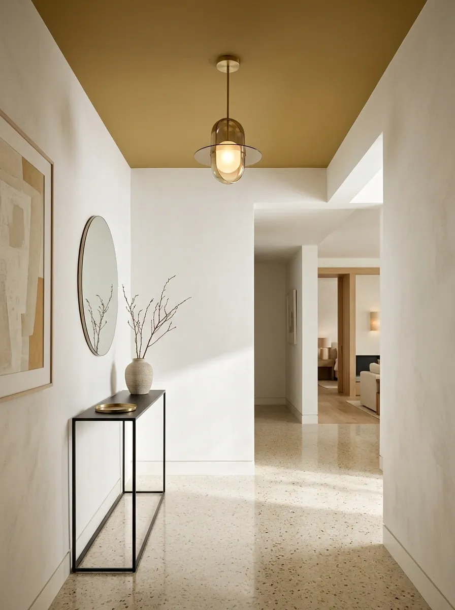
A muted ochre ceiling gives a modern entryway a clear identity without requiring a complicated wall treatment. Warm white walls, terrazzo flooring, a slim console, and a sculptural pendant keep the small space feeling open.
A simple mirror and one substantial piece of art provide enough detail, allowing the ceiling color to become the main feature rather than another item fighting for attention. Choose a dusty golden tone rather than a highly saturated yellow if the hallway lacks natural light.
Because entryways often connect several rooms, check how the ceiling color relates to the paint visible through nearby doorways. The front hall should make a confident first impression, not introduce three unrelated color schemes before anyone reaches the living room.
Sea-Glass Blue Ceiling in a Relaxed Coastal Bedroom
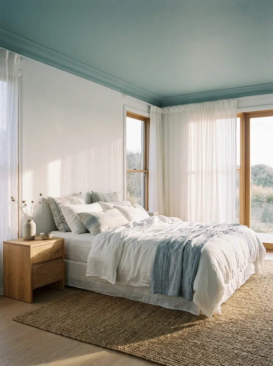
A sea-glass blue ceiling brings a quiet coastal influence to a bedroom with white walls, pale oak furniture, relaxed linen bedding, and a natural fiber rug. Blue-striped textiles repeat the overhead color without turning the entire room into a nautical gift shop.
Wide windows and lightweight curtains keep the composition airy, while oak adds enough warmth to balance the cool blue. Use a slightly muted blue-green rather than a vivid turquoise so the ceiling feels like an extension of the natural materials.
Keep the larger pieces neutral and let the ceiling establish the color story. The ocean doesn’t need to be represented by an anchor cushion in every corner.
Warm Cream Ceiling With Exposed Timber Beams
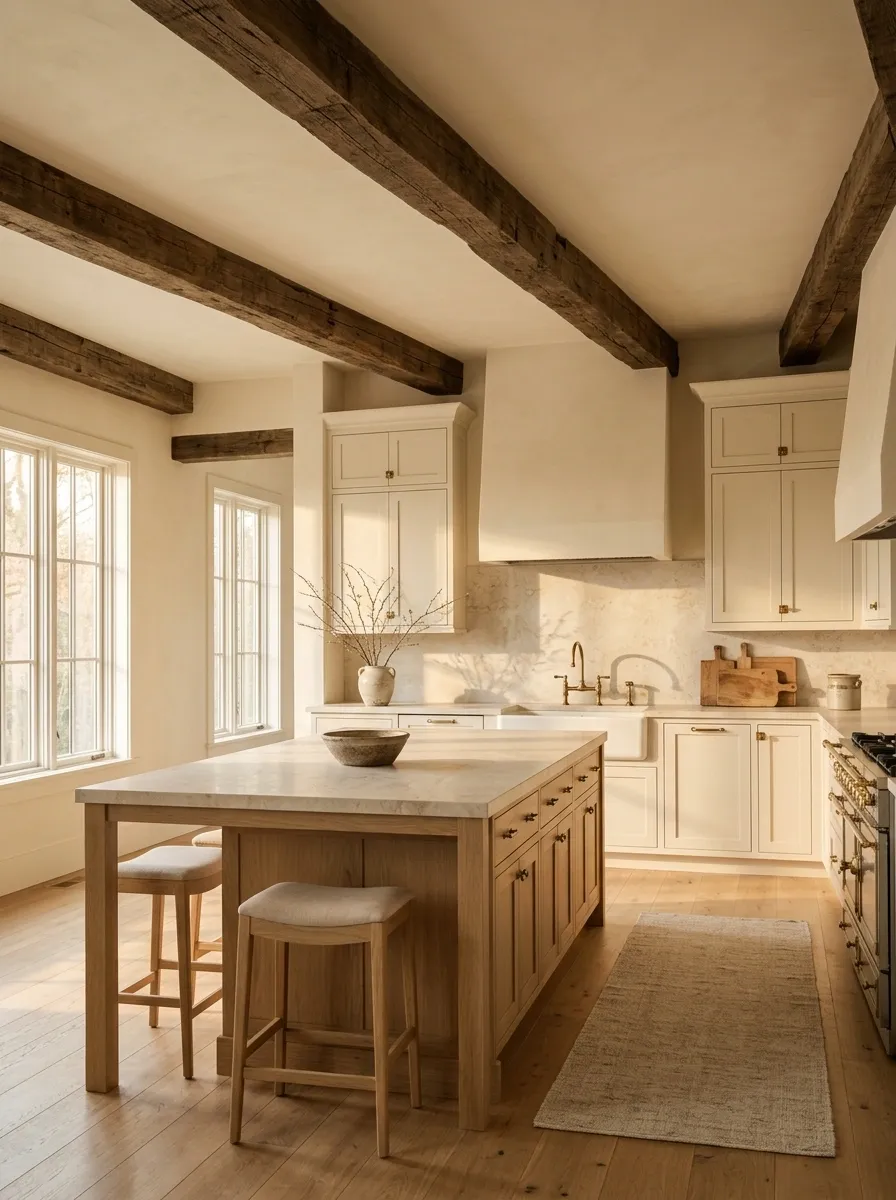
A warm cream ceiling between exposed timber beams gives a farmhouse kitchen a softer, more connected appearance. Pale cabinetry, a substantial oak island, a stone backsplash, and aged brass fixtures reinforce the natural palette.
The beams supply architectural definition, while the cream paint prevents the overhead surfaces from feeling too stark against the wood. Matching the ceiling paint to the undertones in the cabinetry can create a cohesive finish, even when the timber itself is considerably darker.
The beams already have a strong presence, so keep the accessories edited and the countertops practical. Rustic style doesn’t require seventeen chopping boards displayed like members of an extremely competitive wooden-plank society.
Bronze-Taupe Ceiling in an Elegant Formal Sitting Room
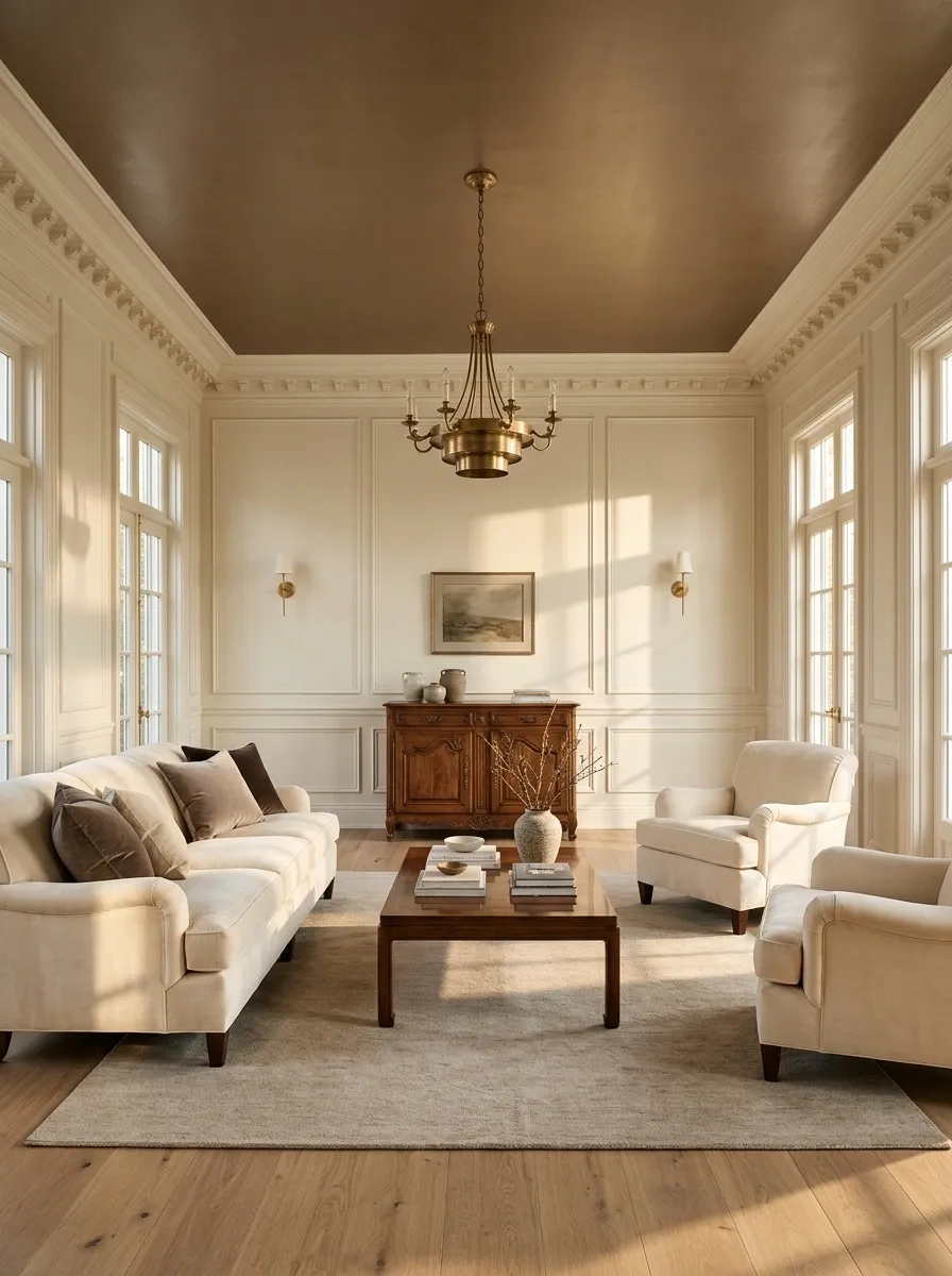
A bronze-taupe ceiling adds quiet depth to a formal sitting room with creamy walls, velvet seating, dark wood furniture, and brass lighting. The color has more richness than a conventional beige but stays subtle enough to work with traditional architecture.
Soft upholstery and a restrained rug keep the room comfortable, while the metallic finishes pick up the ceiling’s warmth without making everything shine. The undertone matters more than the name on the paint tin.
A bronze-taupe with a warm base will sit naturally beside walnut and antique brass, while a cooler grey-taupe may make those materials look disconnected. Sample the paint beside the actual furniture and trim before committing.
Pale Greige Ceiling in a Contemporary Minimalist Interior
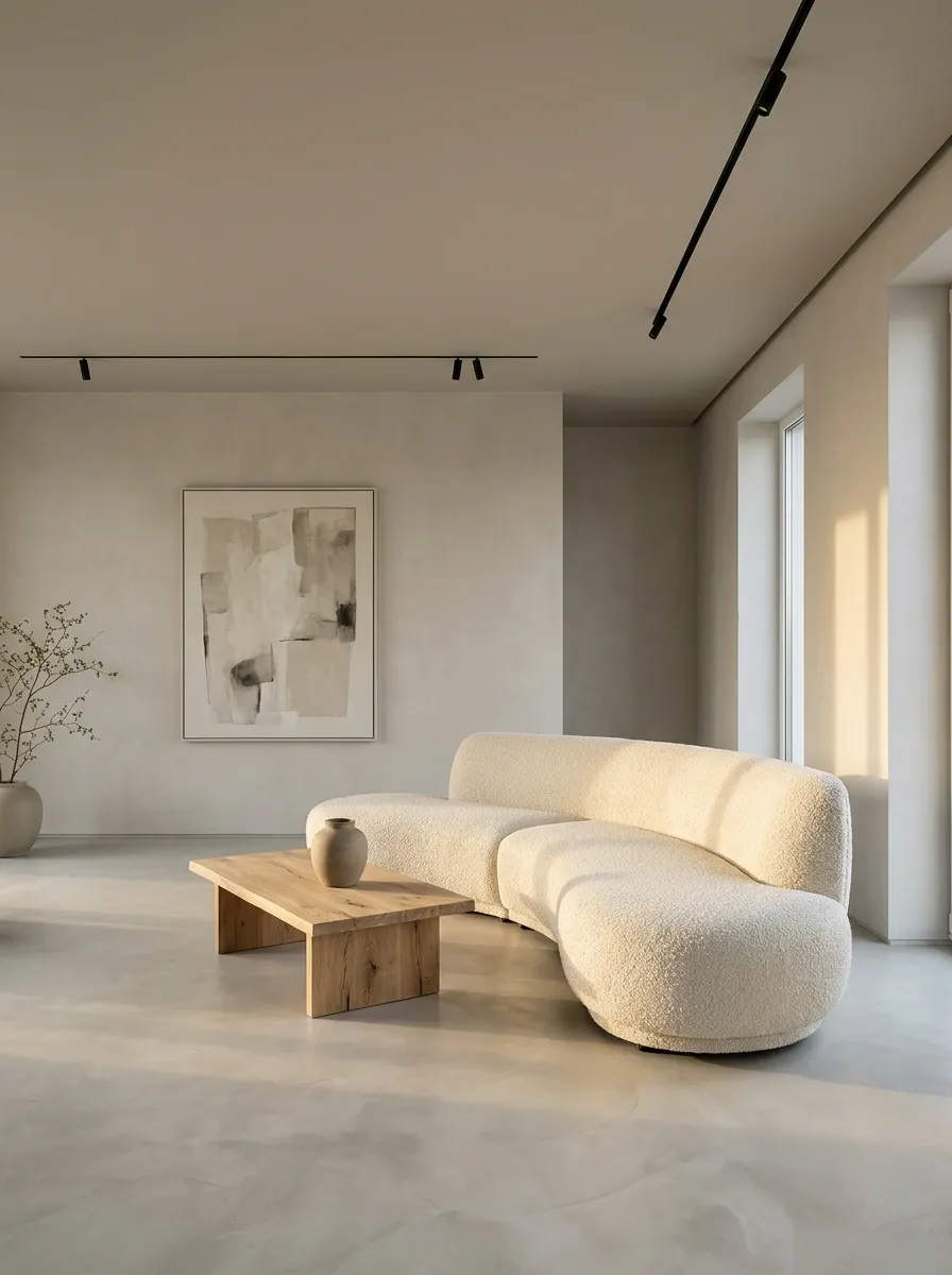
Pale greige paint across the ceiling and selected walls creates a quiet backdrop for a contemporary living room with a microcement floor, sculptural cream sofa, black linear lighting, and restrained artwork.
The closely related colors reduce sharp boundaries, while changes in texture give the room definition. A few carefully chosen objects provide interest without breaking the calm, architectural composition.
This design depends on finish and proportion rather than decorative abundance. Avoid choosing every surface in exactly the same shade, because the result can look more unfinished than minimalist. There is a difference between deliberate simplicity and an empty room waiting for the furniture delivery.
Pale Sage Ceiling With Floral Wallpaper in a Garden Dining Room
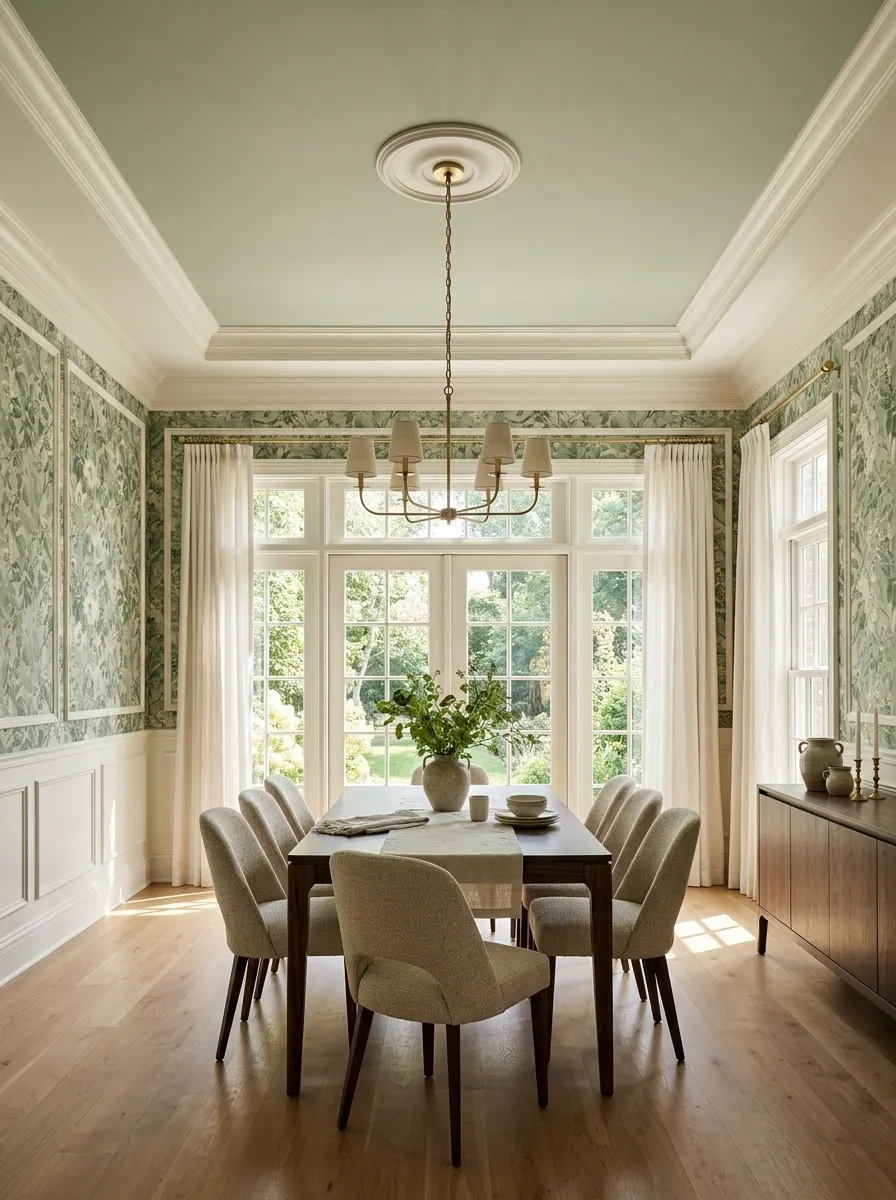
A pale sage ceiling pulls a quieter green from the floral wallpaper in this garden-facing dining room. Ivory trim frames the patterned walls, while a walnut table and upholstered chairs bring depth to the lower half of the space.
Natural light connects the botanical print to the garden outside, giving the entire room a coherent color story. Choose a sage that appears in the print without matching its strongest green exactly. A softer version provides a calm overhead finish and leaves the wallpaper room to shine.
Keep the remaining accessories simple, especially if the pattern is large or detailed. The room already has plenty of visual information, so the ceiling should add cohesion rather than another competing feature.
Choosing a Ceiling Color That Works With the Whole Room
The strongest ceiling colors don’t work alone. They connect the walls to the furniture, reinforce an architectural detail, or provide contrast where the room needs it.
Before settling on a shade, sample it against the existing finishes and view it in both daylight and artificial light. A color that looks subtle on a tiny chip can behave very differently across an entire ceiling.
Start with the overall feeling the room needs, then choose the paint that supports it. There’s no medal for keeping every ceiling white, and there isn’t one for painting every surface dark, either.
The winning scheme is the one that makes the entire room feel intentional without creating twenty new problems to solve.
Save your favorite ceiling paint combinations to Pinterest so they’re easy to revisit when it’s time to choose colors, compare finishes, or finally give that forgotten fifth wall some attention.