
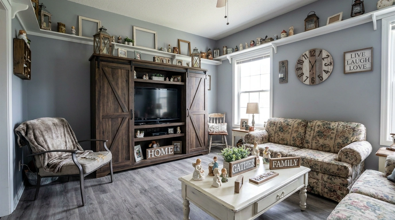
A room can have expensive furniture, fresh paint, and all the accessories Pinterest recommends, yet still look like it hasn’t been redecorated in years. Sometimes, the problem isn’t what’s missing. It’s what’s been repeated, overdone, or chosen without considering the rest of the room.
Matching furniture, cold lighting, fussy wall finishes, and accessories that all look like they came from the same shopping cart can make a home feel strangely generic. Add a few trends that have overstayed their welcome, and suddenly the room is giving “renovated during a different internet era.”
The solution isn’t throwing everything away whenever a new decorating trend appears. That’s how a perfectly good home becomes an expensive revolving door of purchases.
Instead, focus on what makes a room feel dated, what still works when styled thoughtfully, and what deserves an upgrade. Some changes cost almost nothing. Others are worth planning for when a renovation finally makes sense.
A little honest decorating advice can save a lot of money, questionable purchases, and regretful scrolling.
Outdated Home Trends and What to Choose Instead
Barn Doors Where a Traditional Door Works Better
Barn doors had a good run. But sliding a plank of wood across a wall doesn’t automatically make a room look thoughtfully designed. Sometimes it just makes the bathroom feel like a converted horse stable.
They’re also not ideal when sound privacy matters, and the exposed track can collect dust. Keep one if it genuinely suits the architecture, but stop treating it as the mandatory entrance to every room.
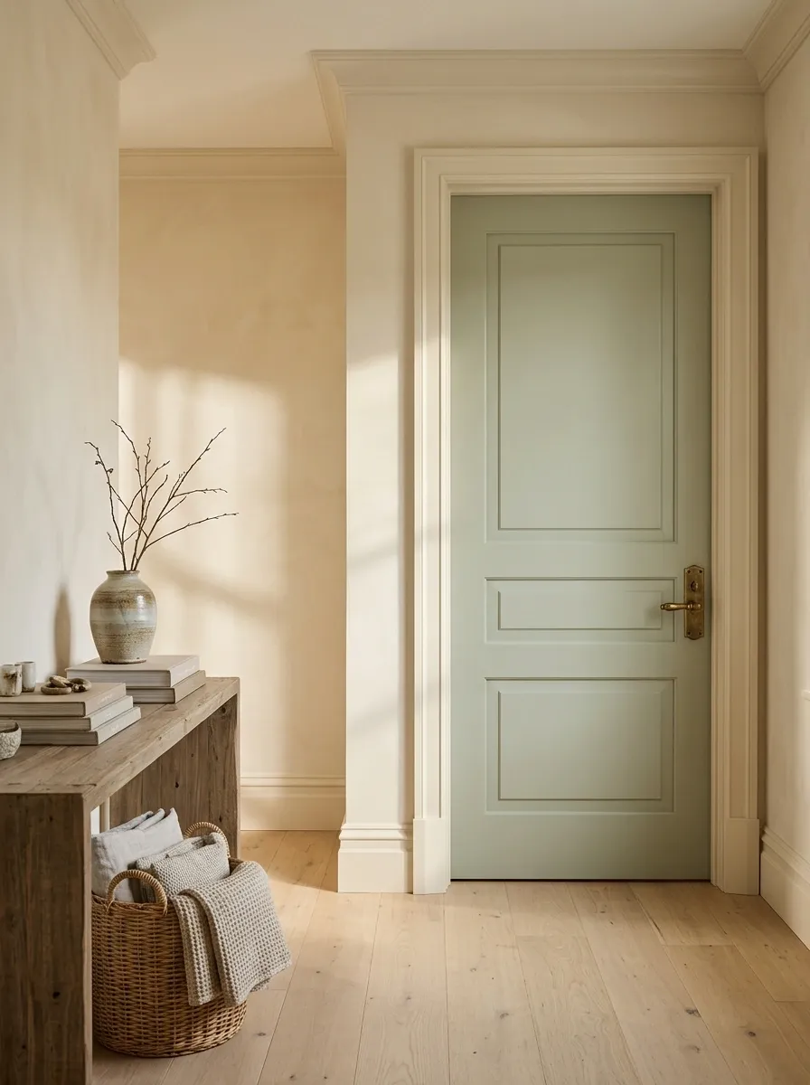
Better choices: A simple hinged door, a pocket door where wall construction allows, or a well-fitted sliding panel that complements the interior.
Choose the door for the room, not the trend.
Best for bedrooms and bathrooms where privacy matters. Straightforward, familiar, and easy to coordinate.
Best when a swinging door gets in the way. It slides into the wall when suitable construction permits.
Best when the exposed track suits the design and there’s enough clear wall space. Check privacy and clearance first.
Gray-on-Gray Rooms With No Warmth or Contrast
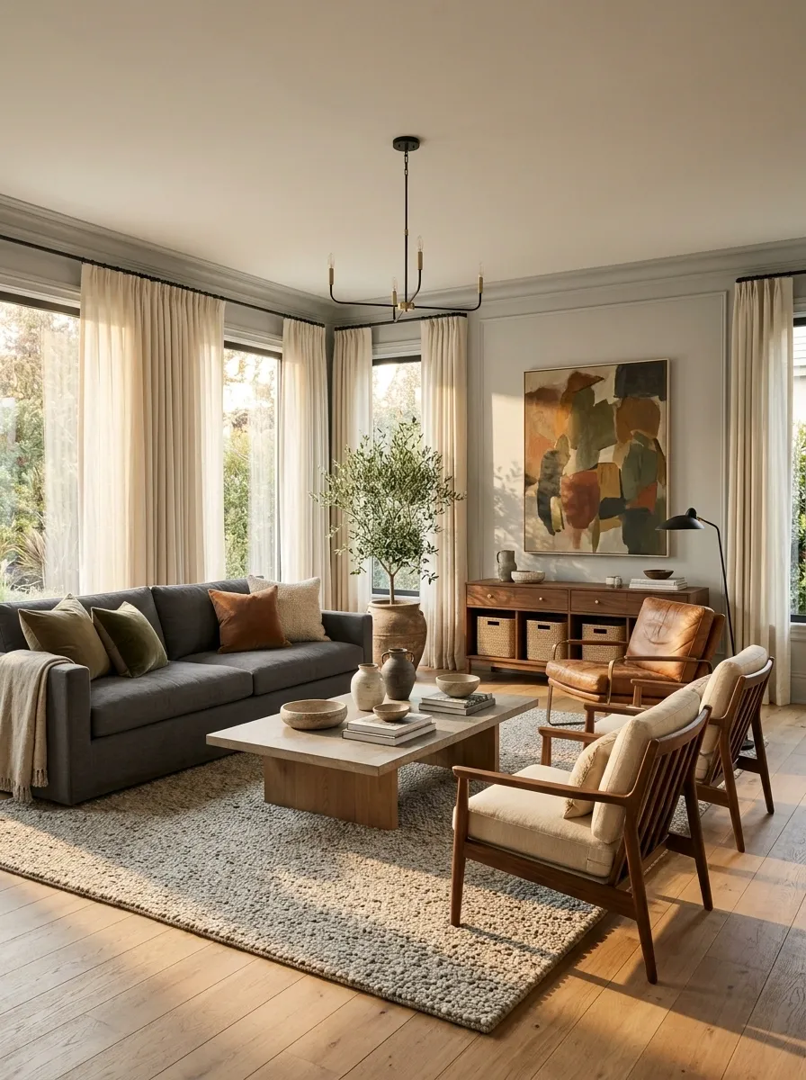
Gray isn’t the villain. A charcoal sofa, a soft gray wall, or a stone-gray kitchen can look sophisticated. The trouble starts when the flooring, walls, sofa, curtains, and rug all sit in nearly identical shades of cool gray.
Suddenly, the room has all the personality of a cloudy Tuesday.
The fix isn’t necessarily repainting everything. Add contrast with materials that bring warmth and depth.
Start with these combinations:
- Warm oak or walnut furniture.
- Cream or ivory upholstery.
- Muted olive, rust, or deep blue accents.
- Linen, wool, stone, and other distinct textures.
Keep some gray if you like it. Just give it a supporting cast.
Gray needs contrast, not a matching committee.
A sofa, wall, rug, or other anchor that gives the room structure.
Oak, walnut, cane, or warm leather to soften cool finishes.
Olive, muted blue, or earthy rust for a little depth.
Cream textiles and varied natural textures break up flat surfaces.
Matching Furniture Sets That Make a Room Feel Like a Showroom
Buying the entire matching bedroom or living room set feels convenient. One delivery, one receipt, zero decisions. Unfortunately, the finished room can look like the furniture department arranged itself and called it interior design.
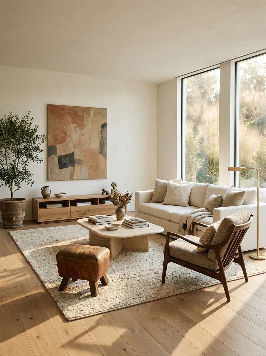
Furniture should coordinate, but it doesn’t need to be identical. Different silhouettes and materials make a room feel collected over time rather than purchased during a single very enthusiastic shopping trip.
Start with one anchor piece, then choose complementary items that share a finish, tone, or shape without copying one another.
Before buying another matching piece, check this:
Coordinated, not cloned.
Pair a clean-lined sofa with a curved chair or a coffee table with a different profile.
Echo a wood tone or metal detail in a couple of places to make the mix feel intentional.
Keep bulky pieces from crowding smaller furniture or blocking walkways.
Distressed Farmhouse Finishes on Every Piece of Furniture
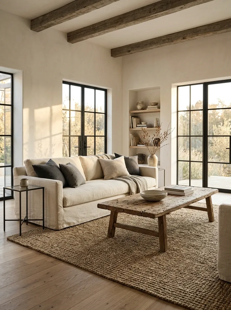
A little worn wood can add character. A whole room full of fake scratches, chipped paint, and distressed furniture can look like everything was rescued from the same pretend barn.
The problem isn’t farmhouse style. It’s forcing every piece to look old, even when the rest of the room doesn’t support it. That distressed coffee table doesn’t need three equally distressed side tables and a weathered console to feel included.
Keep the character, lose the costume.
- Choose natural wood grain instead of artificial scratches.
- Mix one rustic piece with cleaner, simpler furniture.
- Let aged brass, woven baskets, or vintage artwork provide the lived-in details.
The best rustic rooms feel collected, not aggressively pre-aged.
Rustic character, minus the fake history.
Distress everything
Matching chipped finishes and imitation wear on furniture that looks like it survived a small disaster.
Mix old and clean
Natural wood, a vintage piece, simple upholstery, and a few honest signs of age.
Cold Blue-White Light Throughout the Home
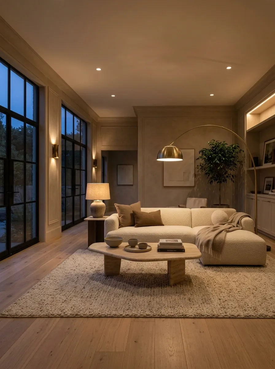
That icy overhead lighting might be useful for spotting a stain, but it does absolutely nothing for a relaxed living room. Suddenly, the evening feels like a waiting room where someone misplaced the appointment schedule.
The problem is using the same harsh light everywhere instead of matching the lighting to what happens in each space. Kitchens need clear task lighting. Bedrooms and living rooms benefit from softer ambient light.
Give each room a lighting job:
- Living room: warm ambient light from lamps and ceiling fixtures.
- Kitchen: clear task lighting over counters.
- Bathroom: even, useful light around the mirror.
Check the bulb’s color temperature before buying it. Brightness and warmth aren’t the same thing.
Function comes before the bulb trend.
Living room
Warm lamps and layered light help the room feel restful after sunset.
Kitchen
Choose clear light for food preparation and counters, with warmer lighting where people gather.
Bathroom
Balanced mirror lighting helps with daily grooming without relying on one harsh ceiling bulb.
Around 2700K to 3000K is commonly used for warmer residential lighting. Task areas may need a different balance depending on the job.
Stark All-White Rooms Without Texture or Depth
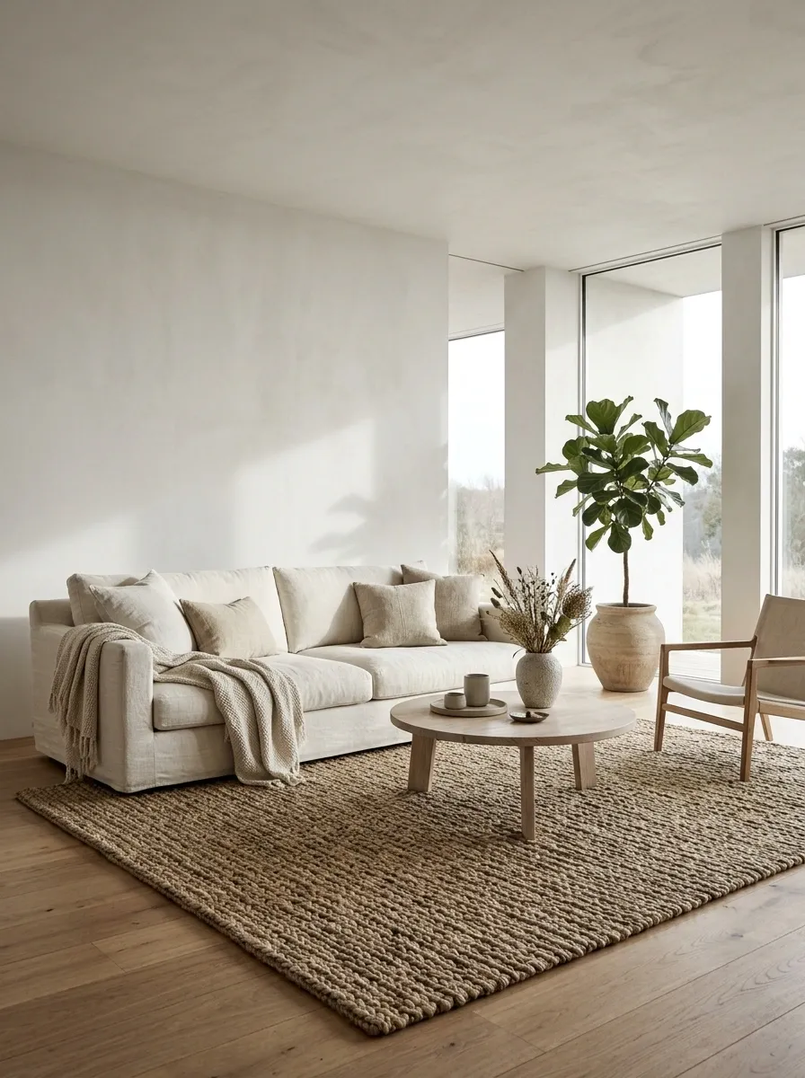
White walls aren’t outdated. White everything, with no visible texture or variation, can make a room feel unfinished rather than beautifully minimal.
There’s a difference between a calm, light-filled interior and a space that looks like the furniture hasn’t arrived yet. The answer isn’t to panic-buy colorful accessories. It’s to introduce subtle differences that the eye can actually notice.
Build depth with materials, not clutter:
- Linen curtains instead of shiny synthetic panels.
- Natural wood to warm up white furniture.
- A textured rug to break up a plain floor.
- Cream, ivory, and warm white instead of one identical shade everywhere.
Minimalism still needs something interesting to look at.
Same light palette. More visual depth.
Keep the walls light and calm.
Introduce natural color through furniture.
Add rugs, baskets, or tactile fabrics.
Use a little green or another soft accent.
Open Shelving That Replaces Too Much Kitchen Storage
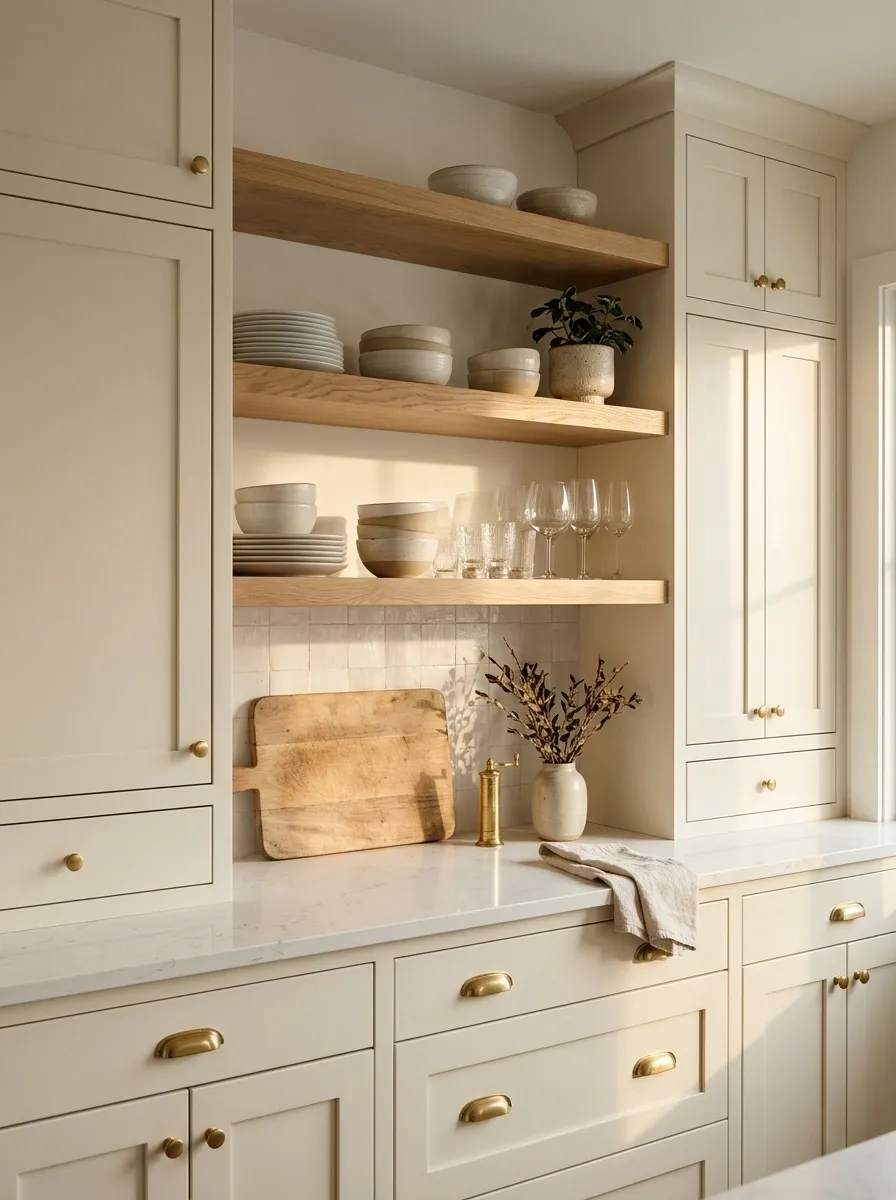
Open shelving looks wonderful when the shelves hold a few beautiful bowls, neatly stacked plates, and the occasional decorative piece. Real kitchens also contain mismatched mugs, snack packets, travel cups, and that one appliance nobody knows where to store.
When every cabinet door disappears, everyday clutter becomes the kitchen’s main design feature. That’s a lot of unwanted screen time for a collection of cereal boxes.
Open shelving works best as a small, deliberate display area rather than a replacement for all closed storage.
Use the mix that fits daily life: Keep frequently used or unattractive items behind doors. Display the pieces that are easy to reach, easy to clean, and worth seeing.
Display the good stuff. Hide the chaos.
Mirrored Furniture as the Main Feature of Every Room
Mirrored furniture can reflect light and make a small room feel more open. The trouble starts when the bedside tables, dresser, console, and coffee table all reflect the same room back at itself.
At that point, the furniture isn’t adding much character. It’s just multiplying everything around it, including the clutter.
Use reflective finishes selectively. A mirrored console can work beautifully against a quiet wall, especially when the rest of the room includes matte paint, natural wood, and soft upholstery.
The better mix: Keep one reflective statement piece, then balance it with tactile materials that don’t compete for attention.
Let one piece shine. Give the rest a different job.
Reflective accent
A mirrored console or side table catches light and acts as the focal point.
Matte materials
Wood, linen, textured upholstery, and ceramics keep the room grounded.
Clear surfaces
Keep nearby shelves and tabletops edited so reflective finishes aren’t doubling the clutter.
Sponge-Painted Walls and Heavy Faux Finishes
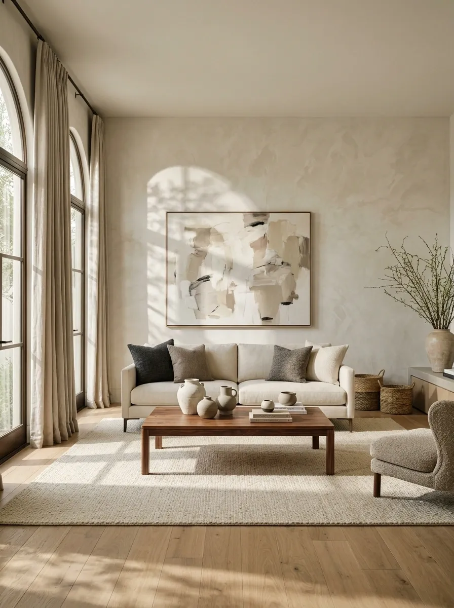
Remember walls that tried to look like marble, stone, or some mysterious sponge-generated cloud formation? Some techniques have their place, but heavy imitation finishes can make a room feel stuck in a renovation time capsule.
The biggest problem is contrast. Strong faux patterns compete with furniture, artwork, and flooring instead of letting those elements work together. A surface pretending to be a different material rarely has the depth of the real thing.
Better alternatives include smooth paint, subtle limewash, understated plaster finishes, or authentic stone where the budget allows.
The goal isn’t to make every wall plain. It’s to let texture look intentional, not like a weekend experiment that got wildly out of hand.
Texture is good. Fake everything is not.
Heavy faux marbling
Bold imitation veins and busy patterns can overpower an already detailed room.
Subtle plaster texture
Soft surface variation adds depth without demanding attention from every angle.
Quality painted walls
A good color and clean finish leave room for art, furniture, and architectural details.
Chevron Patterns Repeated Across Floors, Fabrics, and Walls
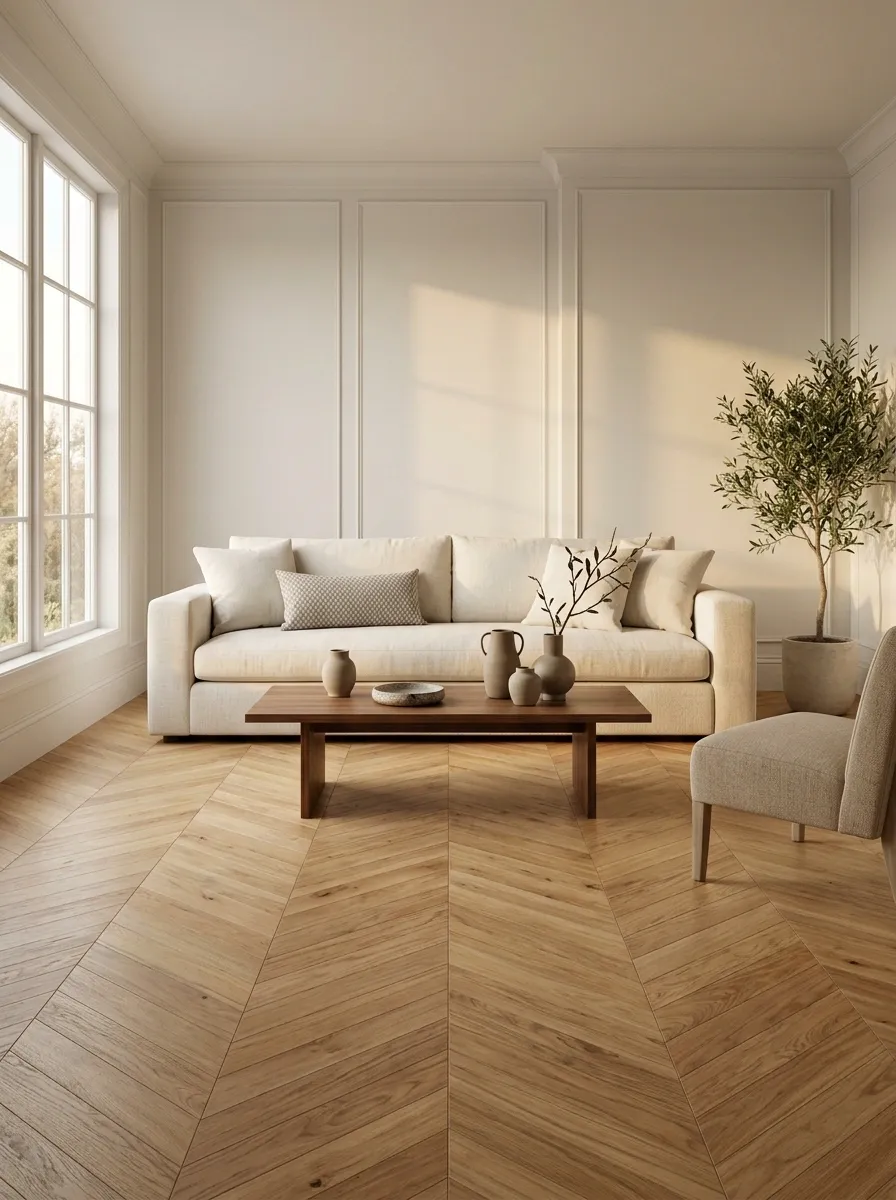
Chevron isn’t automatically dated. Used thoughtfully, it adds movement and direction. The trouble starts when the floor has chevrons, the cushions have zigzags, the wallpaper has another geometric pattern, and the rug joins the competition.
That’s no longer a design motif. That’s a room trying to win an argument.
Choose one strong pattern and let the surrounding surfaces support it. A chevron floor works well with simpler upholstery. A patterned cushion can look sharper against a plain sofa.
Use this quick pattern check before buying anything new.
One pattern leads. The others behave.
Choose a main pattern
Let the floor, wallpaper, or one large textile carry the stronger design.
Vary the scale
Combine a larger print with a smaller, quieter motif rather than repeating equal-sized graphics.
Add solid surfaces
Plain upholstery, simple curtains, and uncomplicated wall colors give patterns breathing room.
Busy Mosaic Backsplash Borders in an Otherwise Simple Kitchen
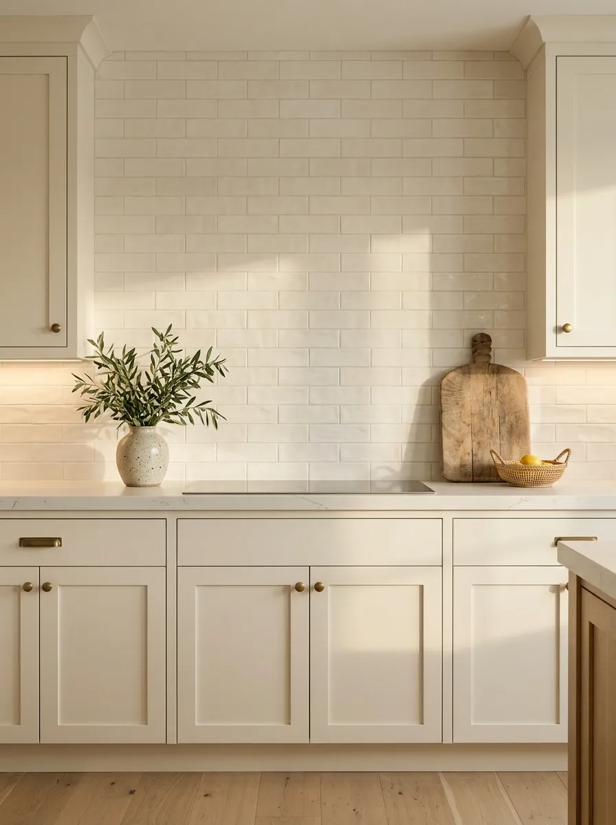
A decorative tile border can make sense in a traditional kitchen or a design built around intricate craftsmanship. Dropping a busy mosaic strip between simple cabinets and plain subway tile just because the catalog suggested it? That’s a different story.
The border can interrupt the wall, compete with the countertops, and make the entire kitchen feel tied to a specific decorating era.
A cleaner backsplash lets cabinet color, hardware, lighting, and countertop material work together. Handmade-look tiles can still bring character without introducing several competing patterns.
Better choices: A simple full-height backsplash, restrained tile with visible texture, or a quiet stone surface that connects to the countertop.
Let the kitchen have one clear focal point.
Competing detail
A strong patterned stripe can break up a clean wall and compete with countertops or cabinet hardware.
Connected surfaces
Simple tiles or understated stone let the cabinetry, materials, and proportions carry the design.
Rose Gold on Nearly Every Fixture and Accessory
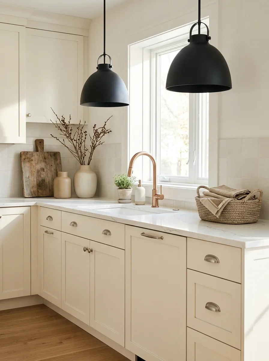
Rose gold had its moment. Then it migrated from faucets to drawer pulls, pendant lights, mirror frames, soap dispensers, and probably someone’s emergency kitchen scissors.
The finish itself isn’t forbidden. A restrained metallic accent can still look lovely. What dates a room is repeating a trendy finish so heavily that it becomes the only thing you notice.
Rather than ripping out perfectly functional fixtures, start by removing the smaller matching accessories. Then bring in other materials, such as brushed nickel, darker metal, wood, and ceramic, where replacement makes sense.
A useful rule: Repeat a finish deliberately, but don’t buy every object in that finish just because it exists.
A finish should be an accent, not a uniform.
Rose gold
Keep a favorite accent, rather than repeating it on every small accessory.
Brushed silver
A quieter metal for fixtures and hardware when the palette needs balance.
Matte black
Adds contrast when it complements the other finishes instead of competing with them.
Oversized Recliners That Swallow the Living Room
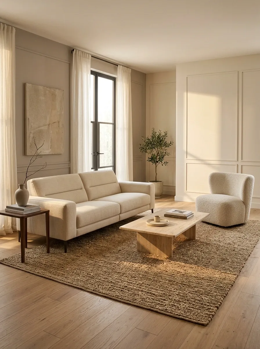
A recliner should help someone relax, not take possession of the entire living room. Some oversized models extend so far into the space that the coffee table becomes unreachable and everyone else gets assigned whatever seat is left.
Comfort matters. So does scale. A bulky chair can work in a large room, but in a compact apartment it can block sightlines and squeeze the walking path into an obstacle course.
Measure the chair in its fully reclined position, not just when it’s upright. Leave space for people to pass and for nearby tables to remain usable.
Better direction: A compact recliner, a well-proportioned lounge chair, or a streamlined sofa with built-in reclining seats.
A chair shouldn’t eat the floor plan.
Oversized recliner
Can take over compact rooms and block useful paths when fully extended.
Compact lounge chair
Offers a comfortable seat while leaving more room for side tables and circulation.
Measure it open
Check extension depth, walking clearance, door swings, and the distance to the coffee table.
Tiny Area Rugs That Float in the Middle of the Room
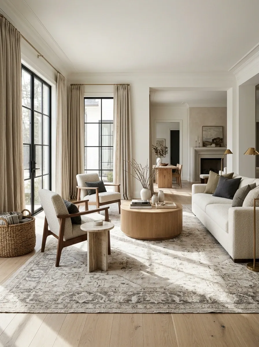
A rug that barely reaches the coffee table while the sofa and chairs sit miles away isn’t anchoring the room. It’s trying to survive in it.
The wrong rug size can make perfectly good furniture look disconnected, especially in an open-plan living room. A larger rug usually creates a clearer seating zone and helps the furniture feel like one arrangement instead of several unrelated purchases.
Before buying another rug, check these details:
- Living room: aim for a size that reaches under at least the front legs of the main seating pieces.
- Dining room: allow enough rug around the table for chairs to slide out without catching the edge.
- Bedroom: choose a layout that gives your feet a comfortable landing beside the bed.
Measure first. Rug regret takes up a surprising amount of floor space.
Anchor the furniture, not just the coffee table.
Living room
Let the rug extend beneath the front legs of the sofa and chairs whenever the space allows.
Dining room
Check that pulled-out chairs stay on the rug instead of catching its edge.
Curtains Hung Too Low and Too Narrow for the Windows
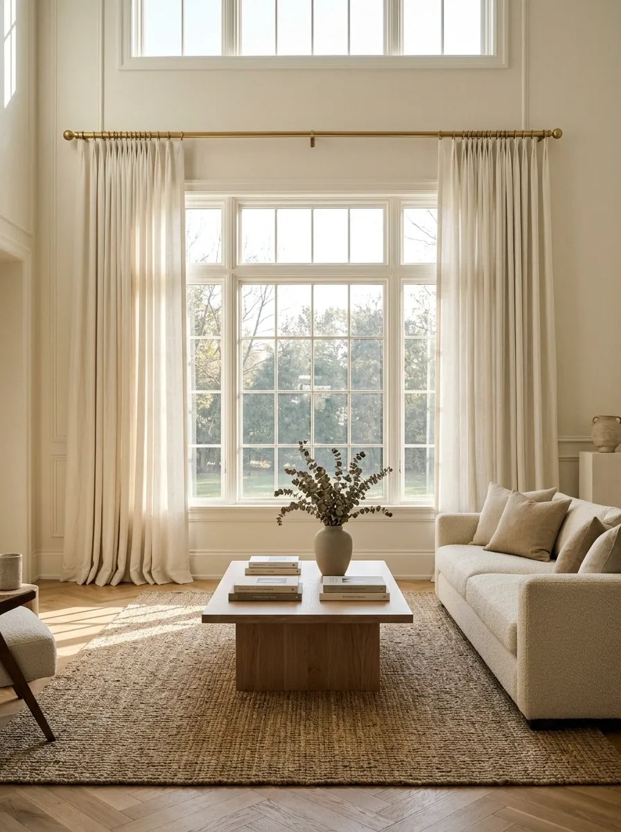
Curtains shouldn’t look like they’re standing on tiptoe to reach the window.
When the rod sits right on top of the frame and the panels barely cover the glass, the window can seem smaller and the whole wall can feel cramped. This is one decorating mistake that doesn’t require new furniture or a dramatic renovation to fix.
Hang the rod higher and wider than the window frame when the wall and hardware allow. That lets the panels sit mostly outside the glass when open, making the window feel more generous.
The details that matter:
- Keep the rod high enough to draw the eye upward.
- Give the panels enough width to hang in soft folds.
- Choose a length that suits the floor and the room’s daily use.
Let the window look generous, not squeezed.
Low rod, narrow panels
The curtains cover the glass and make the opening feel smaller than it is.
Higher rod, wider panels
The rod extends beyond the window, with more glass visible when the curtains are open.
Matching Every Cushion, Curtain, and Throw in One Print
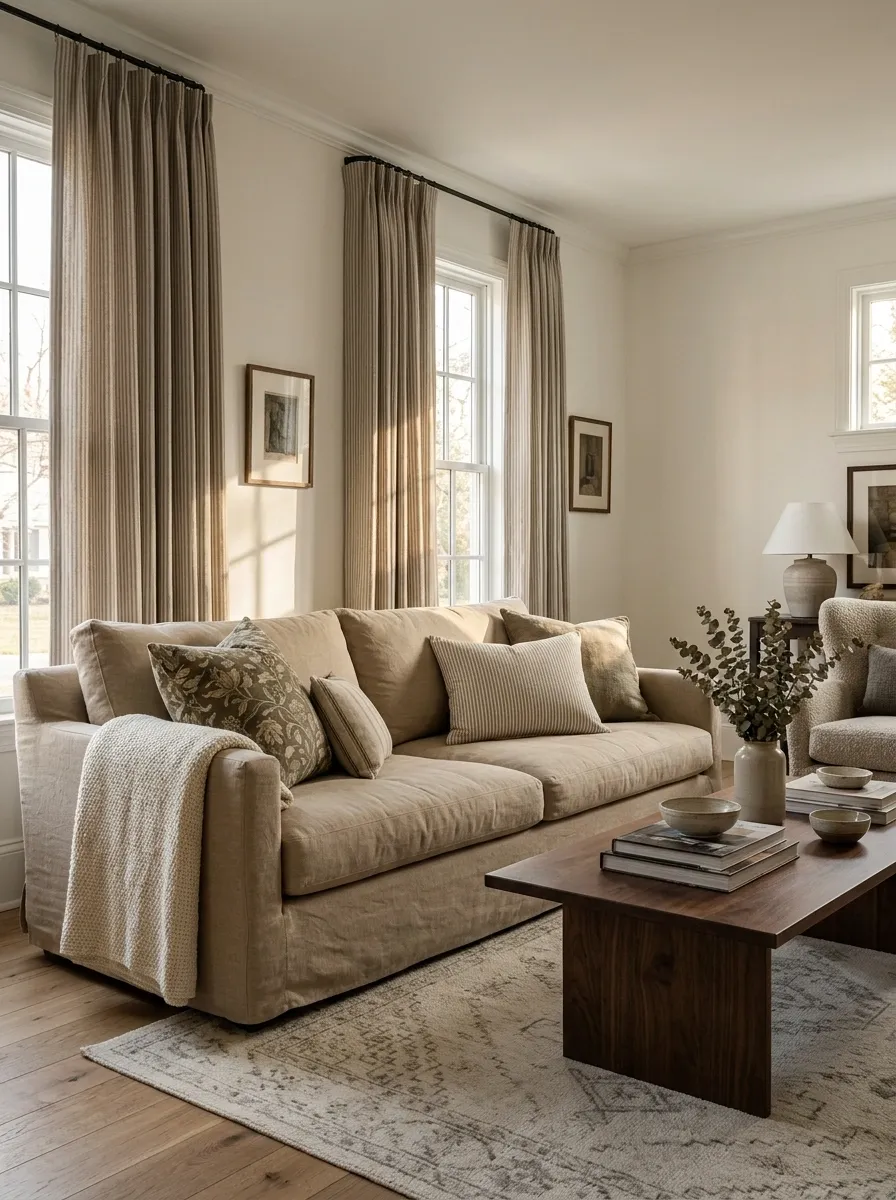
There’s coordinated, and then there’s a living room that looks like the sofa ordered matching curtains, hired a matching rug, and demanded matching cushions as part of the contract.
Repeating a fabric can make a room feel cohesive, but repeating the exact same print everywhere removes contrast. The room starts looking more like a showroom display than a place where anyone actually lives.
Keep the colors connected and let the patterns vary. A floral cushion can sit beside a solid linen throw. Striped curtains can work with a subtly textured rug, provided the colors play nicely together.
Use this textile mix instead:
- One main pattern for personality.
- One smaller-scale pattern for variation.
- Solid fabrics to give the eye a break.
Coordinate the colors. Mix the prints.
Main pattern
A larger floral, botanical, or geometric print that sets the direction.
Supporting pattern
A finer stripe or smaller motif that shares a color with the main print.
Solid texture
Plain linen, woven fabric, or subtle texture that lets the patterns breathe.
Industrial Pipe Shelving in Homes That Don’t Suit the Style
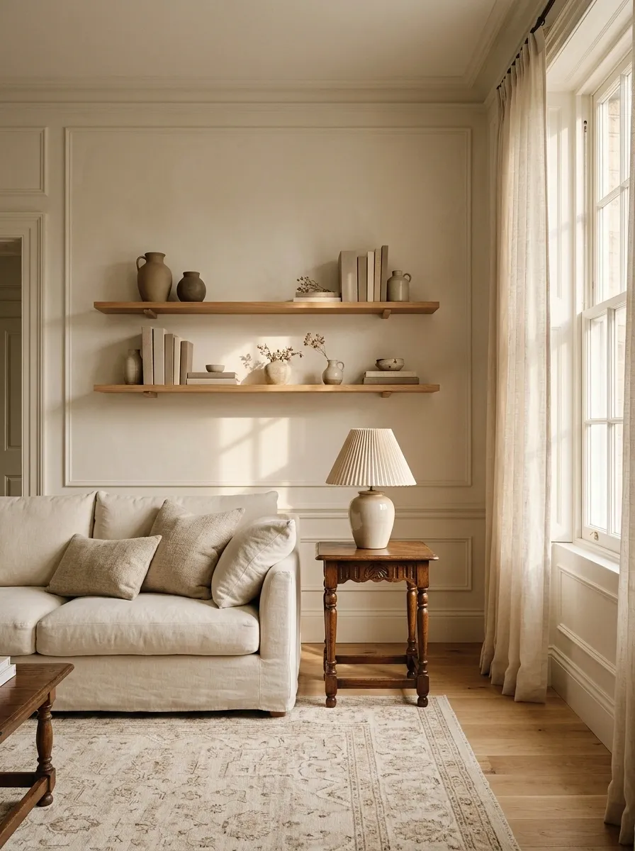
Black metal pipes and chunky wood shelves can look right in a loft, workshop-inspired interior, or a room with enough industrial character to support them. In a delicate, traditional, or softly decorated home, the same shelving can feel like the plumbing department wandered off the job site.
The problem isn’t metal shelving. It’s forcing a strong industrial detail into a room that speaks a completely different design language.
Choose shelving that works with the architecture and the objects it needs to hold.
Better alternatives: Slim metal brackets with natural wood, concealed brackets for a cleaner look, or built-in shelves painted to match the walls.
The shelf should display the collection, not become the most aggressive personality in it.
Industrial doesn’t have to mean pipes everywhere.
Pipe shelving
Works best when metal, wood, and sturdy forms already belong in the room.
Slim wood shelves
Pairs easily with softer interiors, classic furniture, and restrained finishes.
Built-in shelving
Blends into the wall when you want storage to feel integrated rather than separate.
Gray Faux-Wood Flooring in Every Room Without Variation
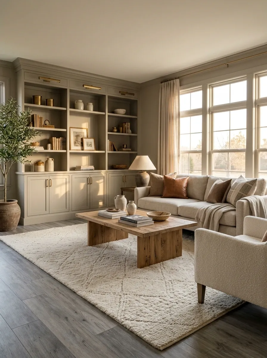
Gray wood-look flooring became popular because it feels modern and easy to coordinate. But when every room has the same cool gray planks, gray walls, gray furniture, and silver accessories, the whole house can start looking strangely flat.
The issue isn’t the flooring by itself. It’s the undertone and how it works with everything around it. Cool gray floors can clash with warm wood cabinets, creamy paint, or furniture with yellow undertones.
Before replacing an entire floor, test the colors together in natural and evening light. Sometimes changing the wall color, rugs, or wood finishes solves the mismatch without an expensive renovation.
A smarter flooring check:
Don’t replace the floor before checking the palette.
Cool gray floor
Test it against the existing wall paint, cabinet finish, and upholstery before adding more gray.
Warm wood tones
Use natural wood or wood-look finishes that connect comfortably with the room’s overall warmth.
Before spending on new flooring
Check samples beside the actual cabinets and wall color, look at them in daylight and at night, and compare the undertones. A room can need a color correction, not a demolition budget.
Farmhouse X-Shaped Details on Every Furniture Piece
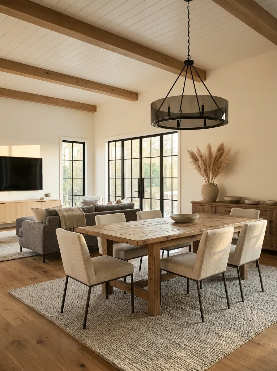
The classic X-shaped farmhouse detail isn’t automatically bad. A trestle table or a thoughtfully designed console can still look excellent. But when every chair, cabinet, coffee table, bench, and decorative accessory gets the same crisscross treatment, the room begins to look like it’s following a very strict farm-themed uniform policy.
A little repetition creates cohesion. Too much makes the furniture feel interchangeable.
Keep the rustic character through natural wood, textured fabrics, and one or two pieces with traditional detailing. Let the remaining furniture have simpler lines.
A better combination: One farmhouse-inspired statement piece, modern or classic supporting furniture, and a restrained mix of materials.
Keep the rustic details. Lose the repetition.
Keep
A characterful farmhouse table, authentic wood grain, or one traditional piece.
Mix in
Simple chairs, clean-lined cabinets, and understated lighting to create contrast.
Reduce
Repeated X-shaped bases and matching rustic details on every available surface.
Fake Greenery Filling Every Empty Corner
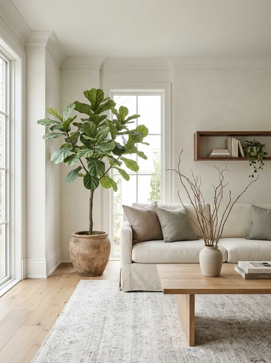
Artificial plants aren’t the enemy. Good ones can be practical in dim rooms, rental homes, or spaces where real plants won’t survive. The problem is filling every empty corner with the same plastic leaves until the house starts looking like a garden center after closing time.
A few convincing pieces can work. Endless identical arrangements tend to collect dust and make the decor feel repetitive.
Give greenery a purpose. Use one larger plant to anchor an empty corner, a smaller plant on a shelf, or natural branches in a simple vase. Choose artificial foliage with believable leaf shapes and a finish that doesn’t look shiny under indoor lighting.
The rule: Greenery should soften the room, not become a substitute for editing it.
A little greenery goes further when it’s placed well.
One statement plant
Use it to soften an empty corner or balance a large piece of furniture.
Natural branches
Add height and organic shape without filling every surface with leaves.
Convincing artificial foliage
Choose realistic finishes and dust them regularly. Shiny plastic leaves rarely fool anyone up close.
Relying on a Single Ceiling Light for the Entire Room
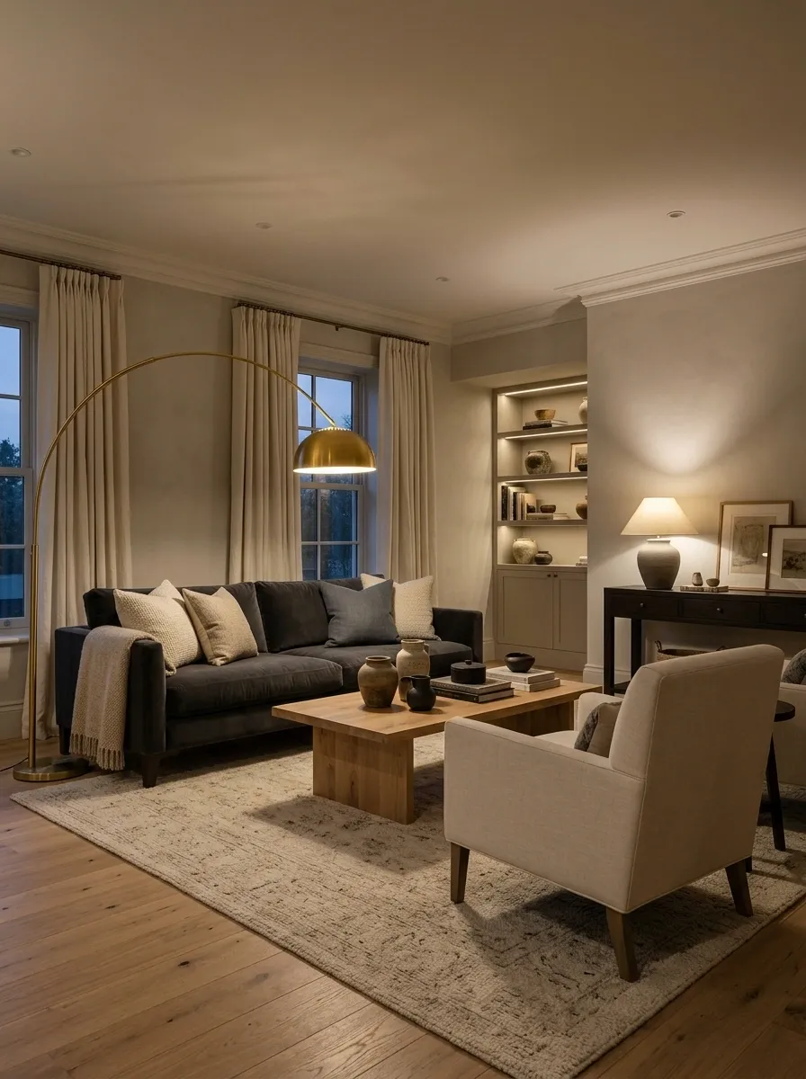
One ceiling fixture trying to light an entire room is doing an unreasonable amount of unpaid labor.
It may brighten the center of the space while leaving the corners gloomy, creating glare on screens, and making every evening activity happen under the same flat light. Reading, cooking, entertaining, and relaxing don’t all need identical lighting.
Layer the light instead. Combine general illumination with task lighting and a few softer sources at different heights.
A practical setup:
- Ceiling light for general visibility.
- Table or floor lamp for reading and relaxing.
- Focused lighting where work happens.
- Accent lighting to highlight artwork or architectural features.
The room should work after dark without depending on one bright bulb and a prayer.
One fixture can’t do every job.
Ambient
Ceiling fixtures or general lighting provide the room’s base level of brightness.
Task
Desk lamps, reading lamps, and under-cabinet fixtures light specific activities.
Accent
Smaller lights emphasize artwork, shelves, or architectural details.
Over-Themed Rooms Where Every Object Matches
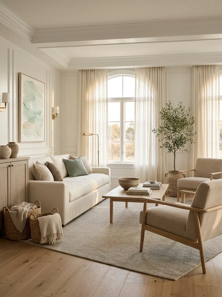
A coastal living room doesn’t need a collection of anchors, shells, rope handles, driftwood signs, and blue stripes on practically every surface. A movie-themed bedroom doesn’t need every accessory to reference the same franchise, either.
Themes become a problem when they replace personal style. Instead of a room that hints at a favorite place or interest, everything starts looking like it came with a gift-shop receipt.
Keep the inspiration, but let it guide the palette and a few selected details rather than dictate every purchase.
Try this approach:
- Pick two or three colors that support the theme.
- Choose one recognizable statement piece.
- Mix in simple furniture and natural materials.
- Keep personal objects that have real meaning.
The best themed rooms suggest a story. They don’t recite the entire plot.
Keep the inspiration. Lose the costume.
Every item follows the theme
Matching accessories, repeated motifs, and little room for anything unexpected.
A theme with breathing room
A connected palette, one or two statement pieces, and supporting decor that doesn’t compete.
Accent Walls That Don’t Connect to the Rest of the Room
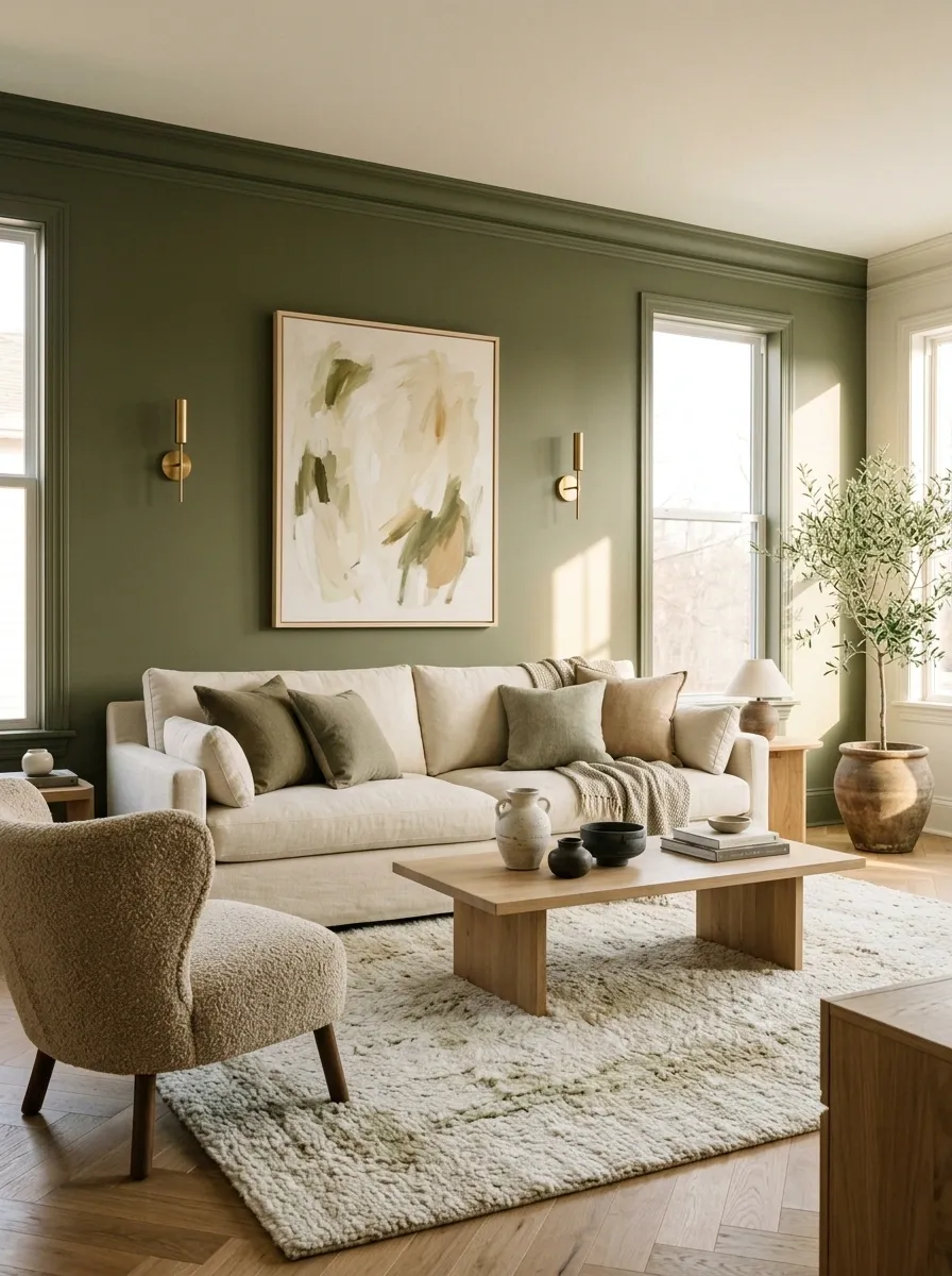
An accent wall can be an excellent design choice. A random dark wall surrounded by unrelated colors and finishes, however, can look like the paint ran out halfway through the decorating plan.
The issue isn’t using a bold color. It’s failing to connect that color to anything else in the room.
An accent wall works better when its shade relates to the rug, upholstery, artwork, or another architectural detail. That doesn’t mean everything needs to match. A few deliberate references are enough to make the color feel intentional.
Before painting, test samples in daylight and at night. A shade that looks subtle on a small swatch can become surprisingly dominant across an entire wall.
Better approach: Choose the accent color first, then repeat it sparingly through a cushion, a piece of art, or a smaller accessory.
A strong wall color needs a supporting cast.
Wall
Choose a color that suits the light, architecture, and mood of the room.
Textiles
Repeat a related tone in a cushion, throw, or rug without matching everything exactly.
Artwork and accents
Use smaller elements to link the accent wall to the rest of the room.
Give Your Home a Better Edit, Not an Expensive Overhaul
The fastest way to make a home feel more current isn’t to follow every new trend. It’s to notice what no longer works, remove visual clutter, and make deliberate choices about lighting, scale, texture, and color.
A matching furniture set can stay if you love it. Gray flooring doesn’t need to be ripped out tomorrow. That old farmhouse table can still earn its place. Good decorating isn’t about following a list of forbidden purchases.
Start with the change that’s bothering you most. Adjust the lighting, hang the curtains properly, edit the accessories, or bring a little warmth into an overly cool room.