
The oak dresser isn’t the problem. Neither is the walnut bed. The problem is the chilly gray paint beside them, making every warm grain look as though it has turned up to the wrong party.
Wood already contributes color to a bedroom. Honey pine brings yellow, cherry leans red, and dark walnut adds a brown that can look warmer or cooler depending on its finish and surroundings. Ignoring that contribution is how a perfectly decent room ends up with walls and furniture conducting separate conversations.
Keep the pieces you actually like. Then choose a palette that makes them look intentional, rather than shopping for an entirely new bedroom because a paint sample made a suspicious promise under showroom lighting.
Read the Wood Before You Read the Paint Name
Look at the largest wooden piece beside plain white paper in your own room. Notice the yellow, red, orange, or muted brown that becomes clearer. You aren’t diagnosing a tree. You’re finding the color the walls will have to live with.
Test paint beside the furniture vertically, then check it again under your evening lights. A sample lying on the bed tells you remarkably little about a wall.
Color Palettes Worth Building a Bedroom Around
Warm Gray, Amber, and Blonde Wood
Anchor your blonde wood furniture against sophisticated warm gray walls, layering crisp white bedding with amber throw pillows for a welcoming focal point. A rustic wooden bench at the foot of the bed and simple ceramic accents create a harmonious, tactile environment.
The gray backdrop provides a contemporary edge that keeps the lighter timber from feeling washed out. Introduce varying textures through knitted textiles and natural wood grains to add depth without cluttering the space.
Keep styling intentional by letting the natural warmth of the wood take center stage. Avoid overloading surfaces with unnecessary decor, allowing the serene color palette to do the heavy lifting.
Sage, Oatmeal, and Natural Oak
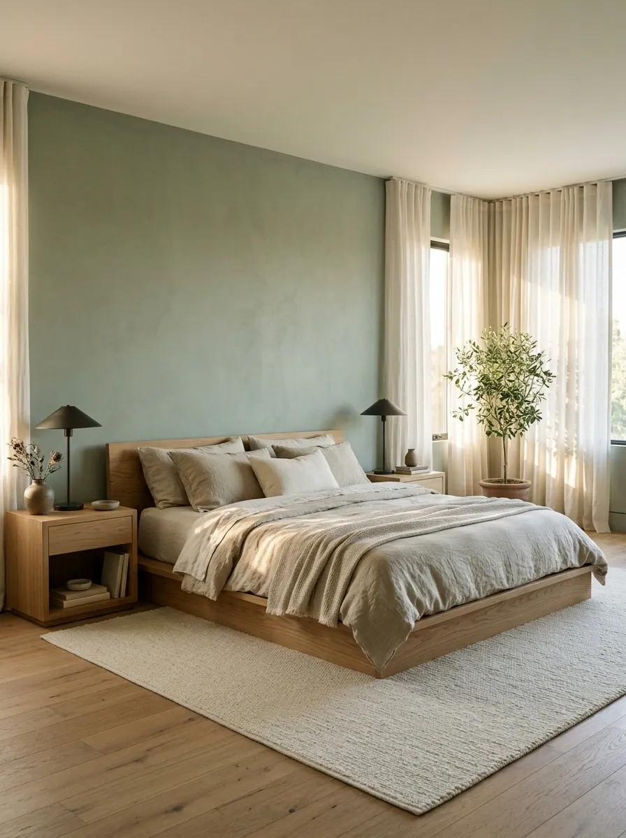
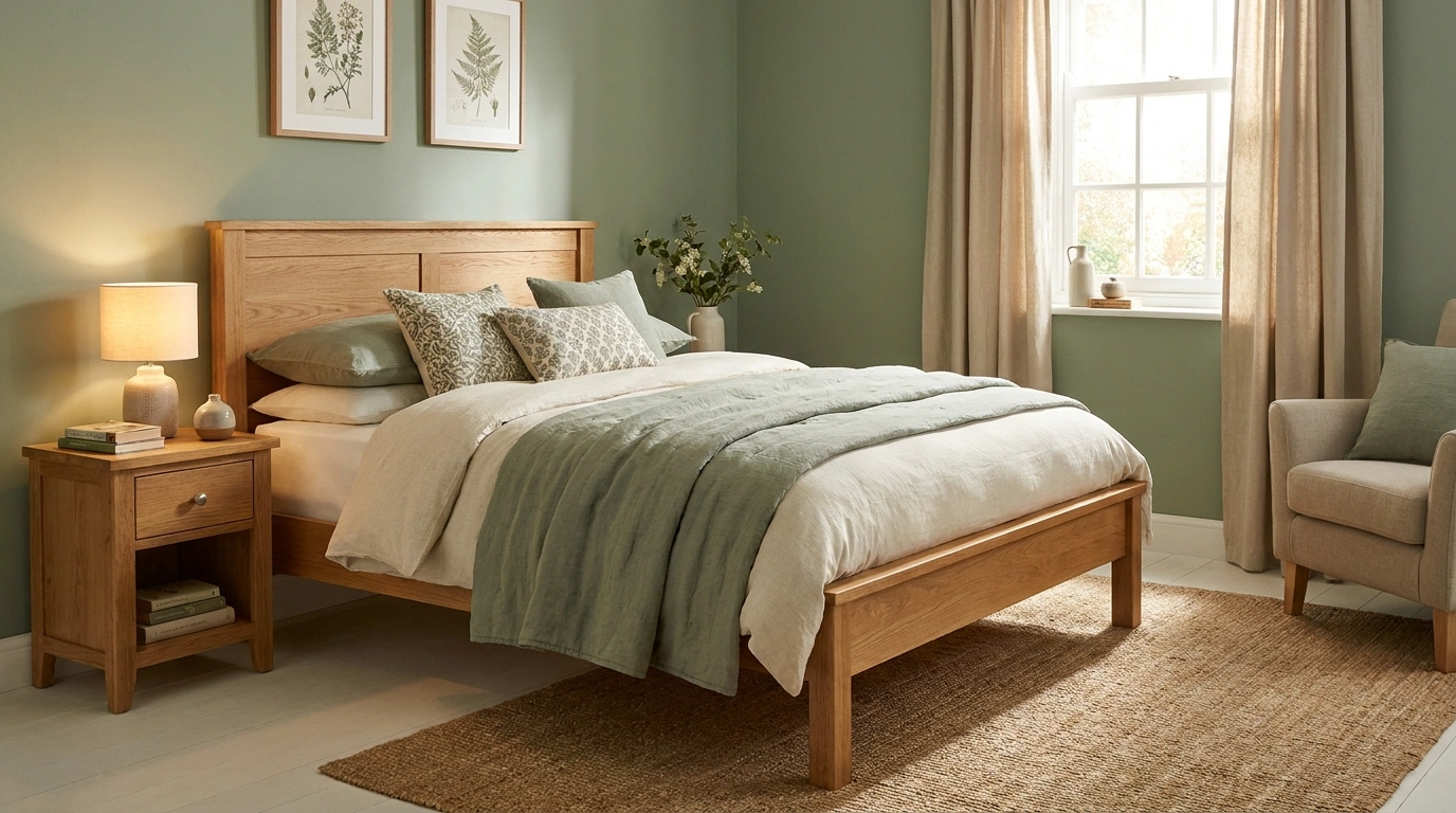
Pair muted sage walls with a natural oak bed, oatmeal bedding, and warm white curtains. A pale rug separates the bed from timber flooring, while dark metal lamps add enough definition to keep everything from dissolving into beige mist.
Sage gives yellowish oak a cooler neighbor without making the bedroom feel icy. Keep the green muted, especially if the furniture has a pronounced golden finish. Bright mint changes the conversation entirely, and the oak did not sign up to live inside a toothpaste advertisement.
Balance the warm wood.
Wall field
Textile bridge
Definition
Illustrative colors; test physical samples beside your oak.
Taupe, Espresso, and Rich Walnut
Surround a rich walnut bed with moody taupe walls, pairing dark wooden wardrobes with creamy layered bedding and a lush green olive tree. A textured jute rug grounds the room while warm lighting highlights the deep wood tones.
The dark cabinetry demands a balanced foreground, which is easily achieved with light-toned linens and soft, dappled light. Every element works together to create a cohesive sanctuary that feels both grounded and luxurious.
Let the rich walnut grain shine by keeping surrounding patterns minimal and relying on natural textures. A well-placed accent chair and simple wall art complete the space without creating visual competition.
Ink Blue, Chalk White, and Walnut
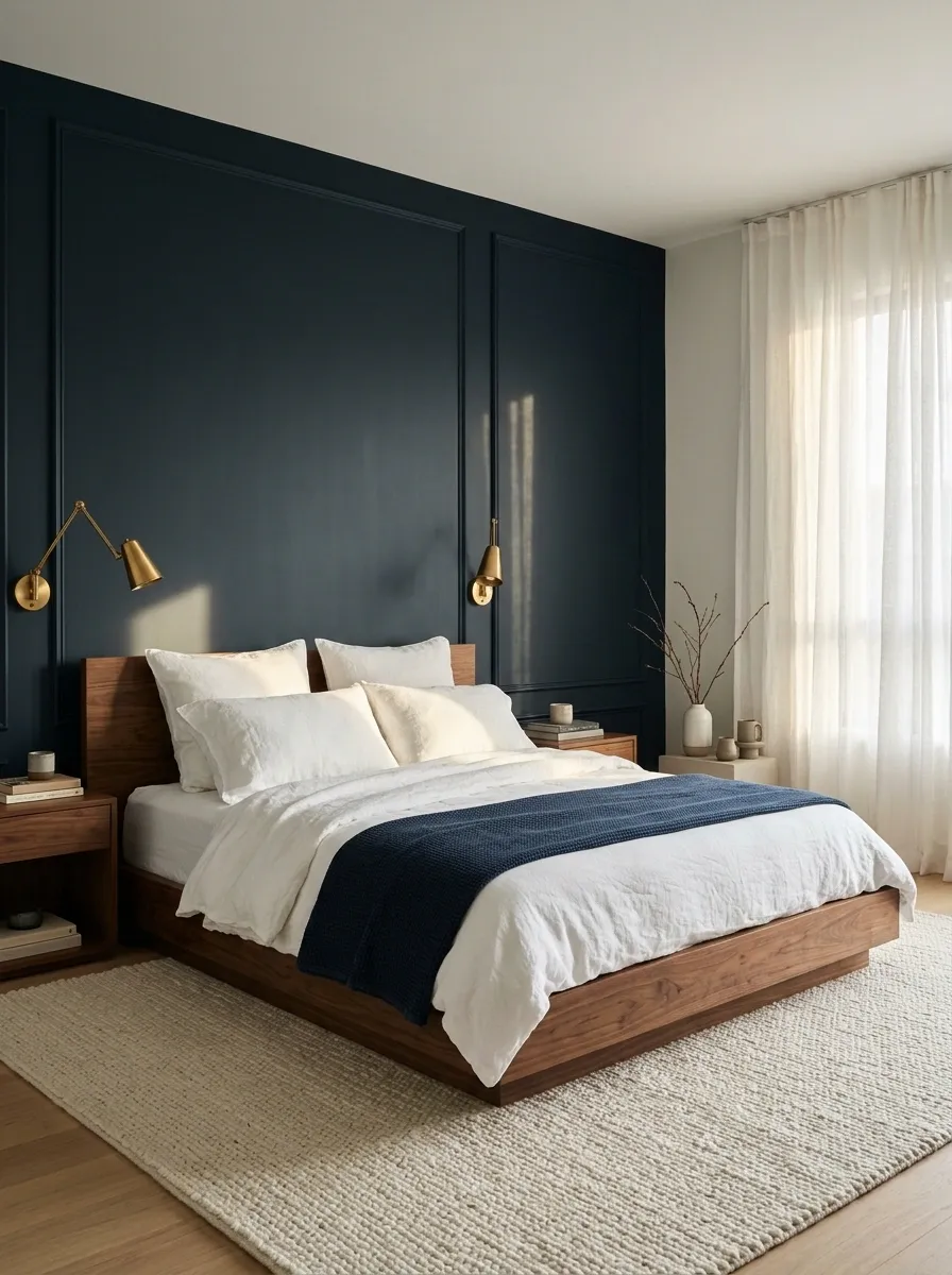
Give a walnut bed an ink-blue backdrop, then lighten the foreground with chalk-white bedding and a broad pale rug. Simple curtains keep the window bright; warm brass-toned reading lights connect the dark wall to the timber.
The blue needs enough depth to distinguish itself from walnut rather than becoming another ambiguous dark patch. Let the sheets supply the strongest light-dark contrast. A navy duvet, navy curtains, and navy rug would bury the furniture in a coordinated cave. Matching has limits. Even bedrooms deserve landmarks.
Dark wall + dark wood needs a clearly lighter bed surface or floor textile to separate the shapes.
Charcoal, Caramel, and Rustic Pine
Frame a rustic pine bed with deep charcoal walls, adding a caramel throw blanket and crisp white sheets to soften the heavy contrast. A warm wooden dresser and soft ambient lighting complete the cozy, inviting atmosphere.
The dark wall color makes the golden tones of the pine pop without overwhelming the room. Simple framing and uncluttered surfaces ensure the furniture remains the undisputed star of the space.
Embrace the natural character of the timber by keeping additional decor understated and organic. A neutral rug and sheer curtains pull the entire room together effortlessly.
Dusty Rose, Cocoa, and Cherry
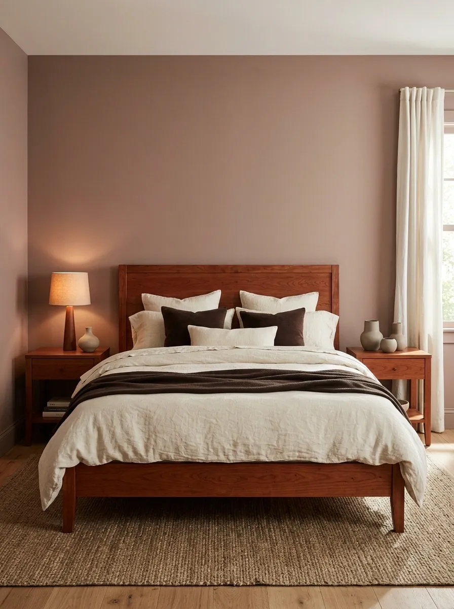
Dusty rose walls can make cherry furniture feel deliberately warm rather than embarrassingly red. Add cocoa cushions, cream bedding, and a plain woven rug, keeping the bedside lighting soft and the curtain fabric simple.
Choose a rose with a muted brown character rather than a sugary pink. The point is to give the furniture a related backdrop, not to host a competition between red undertones. A dark cocoa throw adds depth without introducing another strong color. Cherry gets to be cherry. Nobody needs to paint a sound dresser just to appease a trend.
Use the dresser front or headboard, not a tiny drawer side hidden from normal view.
Muted Olive, Taupe, and Dark Wood
Pair muted olive walls with a stately dark wood bed and matching nightstands, adding taupe bedding and a patterned accent pillow for subtle contrast. Classic wall sconces and traditional framed art enhance the timeless elegance of the room.
The olive green tone offers a sophisticated backdrop that complements the deep wood finish beautifully. A neutral jute rug underneath breaks up the expanse of flooring and ties the earthy color scheme together.
Keep the overall styling balanced by sticking to a restrained palette of greens, creams, and dark timbers. Let the architectural details and classic furniture silhouettes speak for themselves without unnecessary embellishments.
Warm White, Denim, and Honey Pine
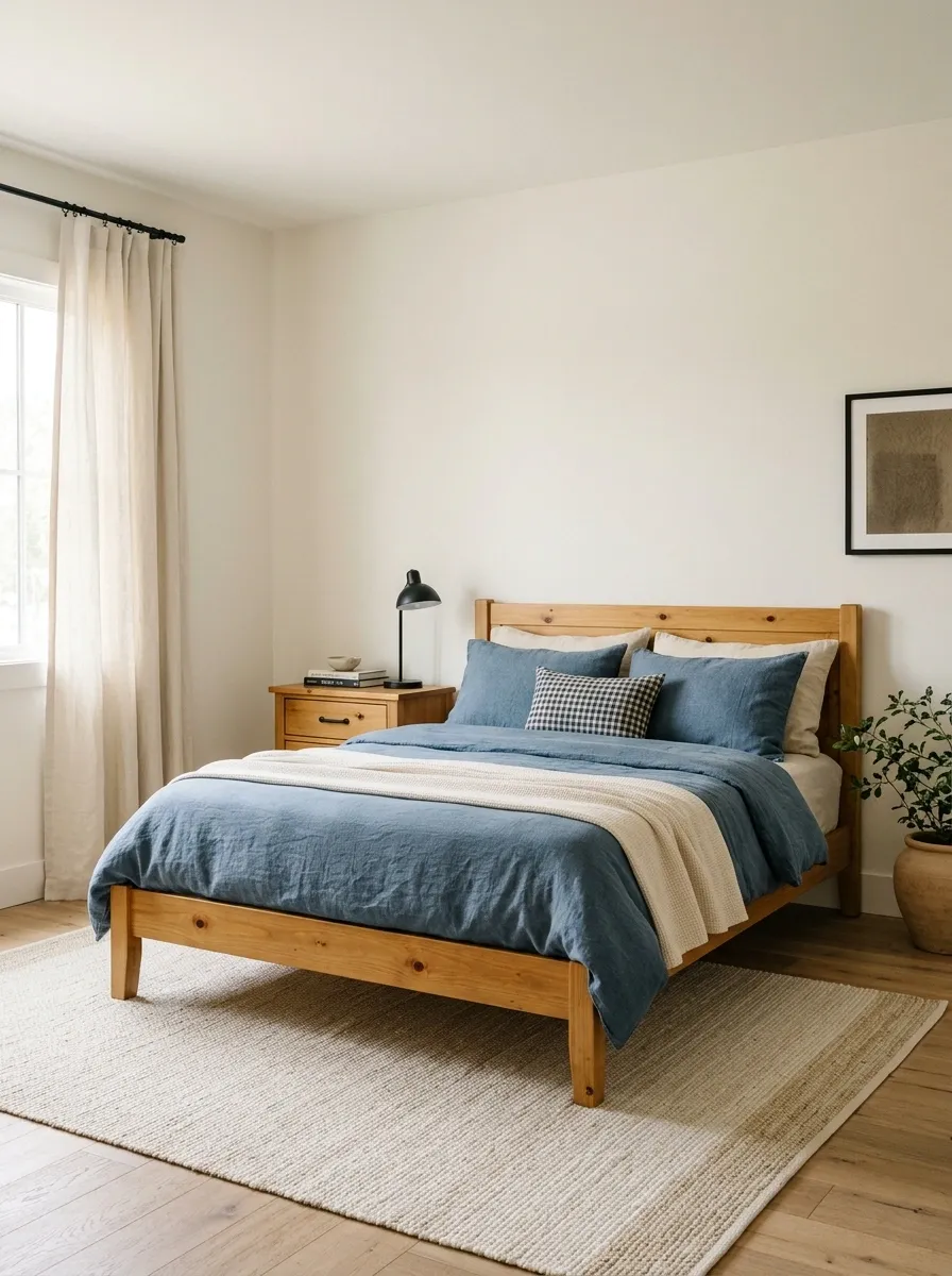
Warm white walls give honey pine breathing space, while denim-blue bedding supplies a cooler center. Add cream curtains, a simple checked cushion, and a light rug so the golden furniture doesn’t merge into a similarly golden floor.
The blue should feel worn and softened rather than electric. Pine often has enough knots and grain to provide its own visual activity. Keep the big fabrics plain and let one small pattern do the talking. Buying a different print for every surface is a surprisingly expensive way to make the furniture look busier than it is.
Plain warm white and denim.
One check or stripe, repeated only if useful.
Olive, Cream, and Dark Mahogany
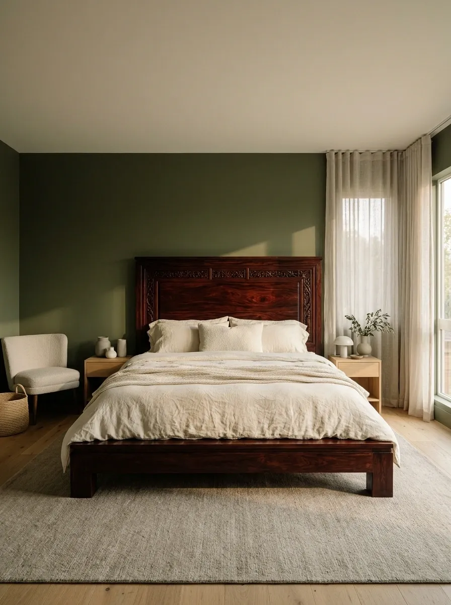
Use olive walls around a dark mahogany bed, with cream linen and a pale upholstered chair breaking up the heavier timber. A muted floor covering and simple window treatment keep the bedroom grounded without making it feel ceremonial.
Mahogany already brings presence. It doesn’t need a chandelier, ornate mirror, and decorative cushion committee to establish that fact. Let olive soften the red-brown finish, then give the bed plenty of lighter fabric around it. Keep bedside pieces simpler than the headboard if its shape is elaborate; the room needs supporting furniture, not rival candidates.
Heavy furniture, lighter surroundings.
Check the whole bed silhouette against the wall. Cream bedding should separate the dark timber from the olive perimeter.
Mushroom, Aubergine, and Pale Ash
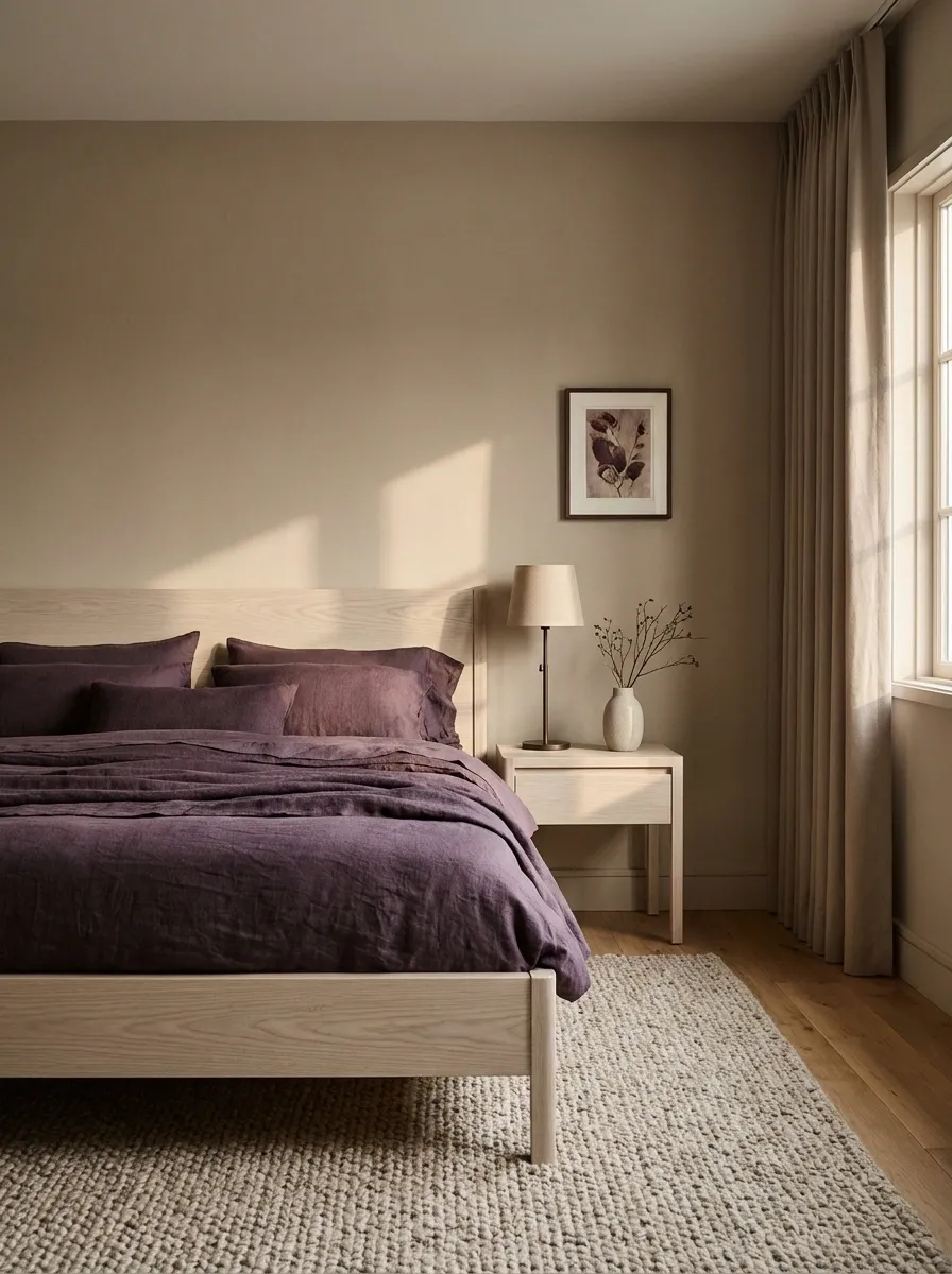
Mushroom walls and pale ash furniture make a quiet foundation; aubergine bedding gives that foundation something to do. Keep curtains close to the wall color, then add a slim dark lamp and a textured neutral rug.
Ash’s relatively pale appearance lets the purple carry the depth without fighting a strong orange wood tone. Repeat aubergine in a small artwork detail rather than across every accessory. The bedding can be the main event. The lampshade, vase, and laundry basket don’t all need supporting roles in the same purple production.
Keep the strongest accent on a replaceable textile if you’re testing the palette.
Clay, Soft White, and Teak
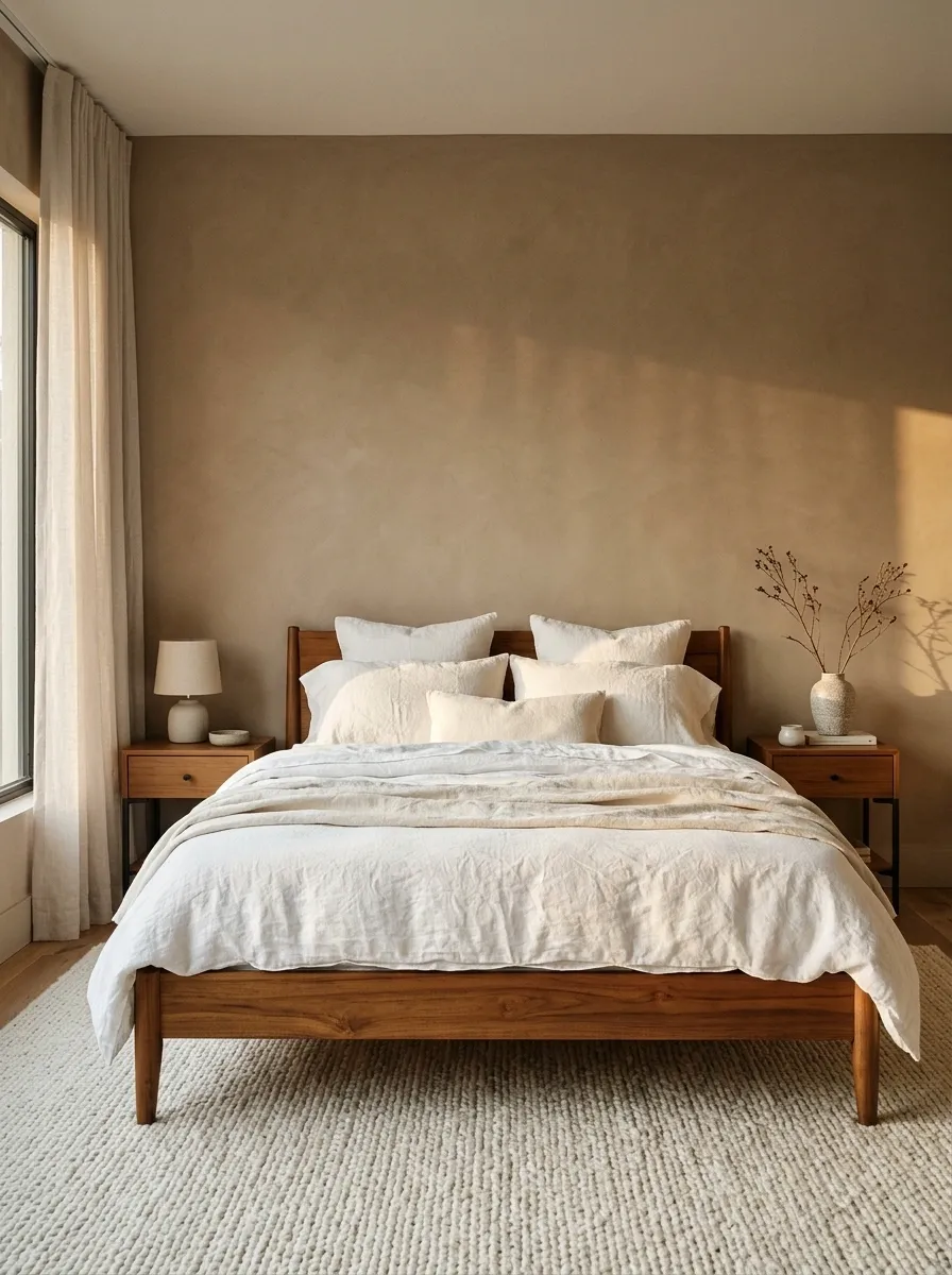
Clay-colored walls suit teak’s warm character, particularly with soft white bedding and restrained dark hardware. Choose an ivory rug rather than more orange on the floor, and keep the curtains pale enough to distinguish the window from the wall.
Let the teak grain remain visible against a matte paint finish. Several glossy warm surfaces can turn the bedroom into one continuous amber reflection. Use clay as the main wall color or on a bed recess, depending on how enclosed you want the room to feel. Warmth doesn’t require every surface to resemble sunset.
Compare the wall sample with the teak under side lighting. Similar colors behave differently on matte paint and polished wood.
Charcoal, Flax, and Reclaimed Timber
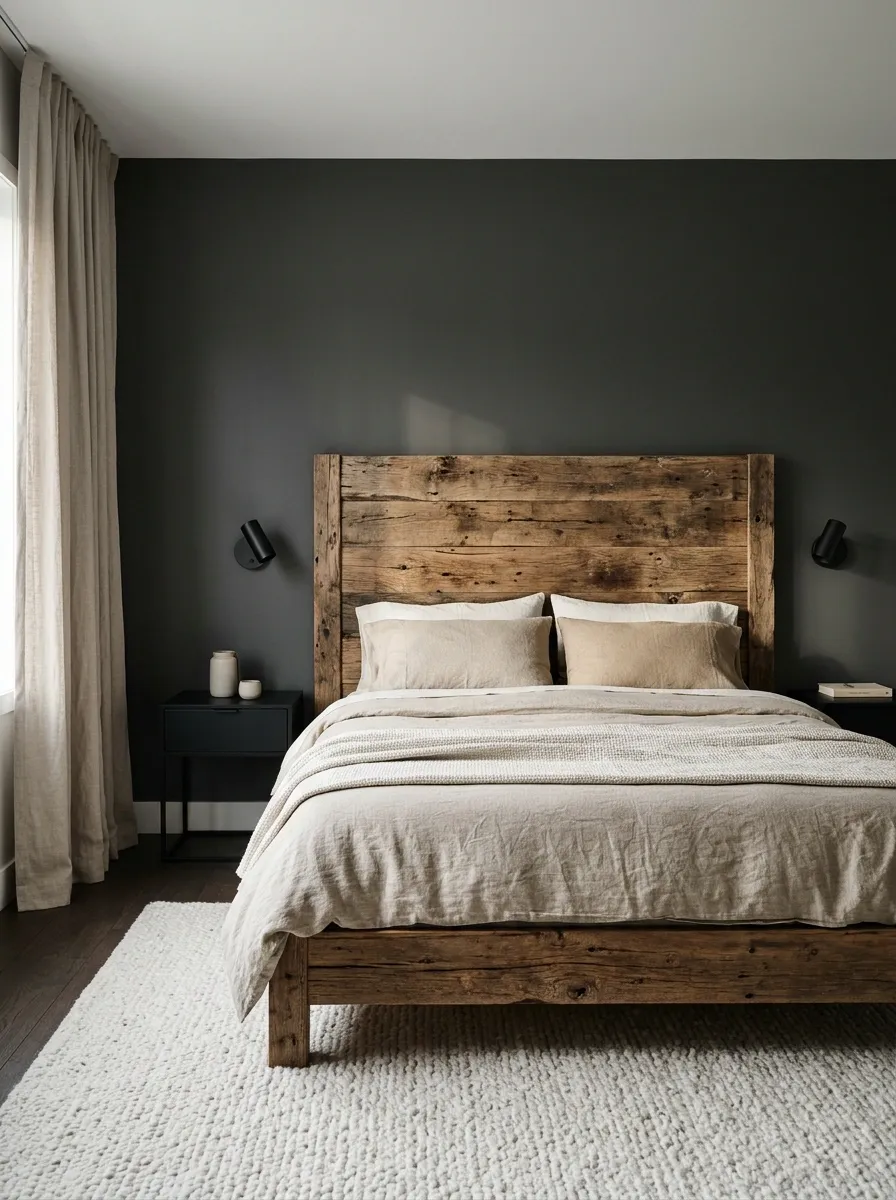
Charcoal walls give irregular reclaimed furniture a deliberate backdrop. Flax bedding, plain curtains, and a soft rug keep the room comfortable, while simple reading lights stop the rough wood from dragging everything into rustic-theatre territory.
Reclaimed timber often contains several colors at once. Choose a charcoal that sits comfortably beside the darkest grain rather than matching a random pale patch. Keep other furniture outlines clean. A bed made from characterful old boards does not also require barrel nightstands and a wagon wheel. The wood has already told the story.
Grain, wear, irregular color.
Lighting shapes and surrounding furniture.
Powder Blue, Tobacco, and Midtone Oak
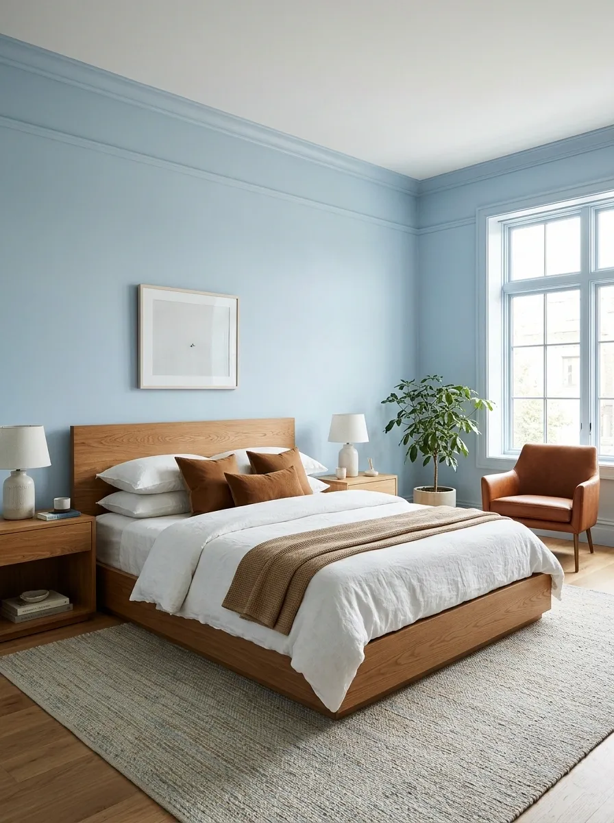
Powder blue walls cool a midtone oak bed without making it look stranded. Tobacco-colored cushions or a leather chair bring the timber warmth into the fabrics, while white bedding keeps the room clear and fresh.
Keep the tobacco accent contained if the oak already leans orange. You’re linking the palette, not marinating the room in brown. This pairing works especially well when the furniture has simple shapes and the wall color can provide most of the softness. Choose a rug with both pale and warm threads if the floor feels disconnected from the bed.
Blue wall → warm accent textile → oak furniture. You don’t need another large brown surface.
Ivory, Bottle Green, and Black-Stained Wood
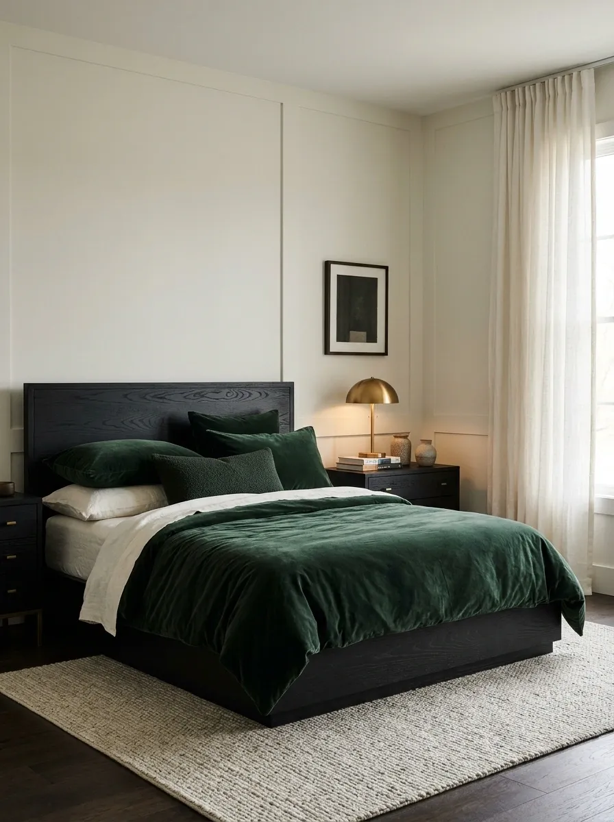
Ivory walls stop black-stained furniture from turning the bedroom severe. Bottle-green bedding adds color with enough depth to stand beside the dark frames, and a light rug breaks up the lower half. Use warm metal or ceramic lamps for a gentler bedside edge.
Keep visible grain where the stained finish allows it; a little material variation helps distinguish the furniture from painted black objects. Avoid repeating black in every curtain pole, cushion, frame, and basket. Definition is useful. Drawing an outline around everything you own is a separate hobby.
- Ivory
- Room envelope.
- Green
- Bed surface and softness.
Greige, Rust, and Mixed Vintage Woods
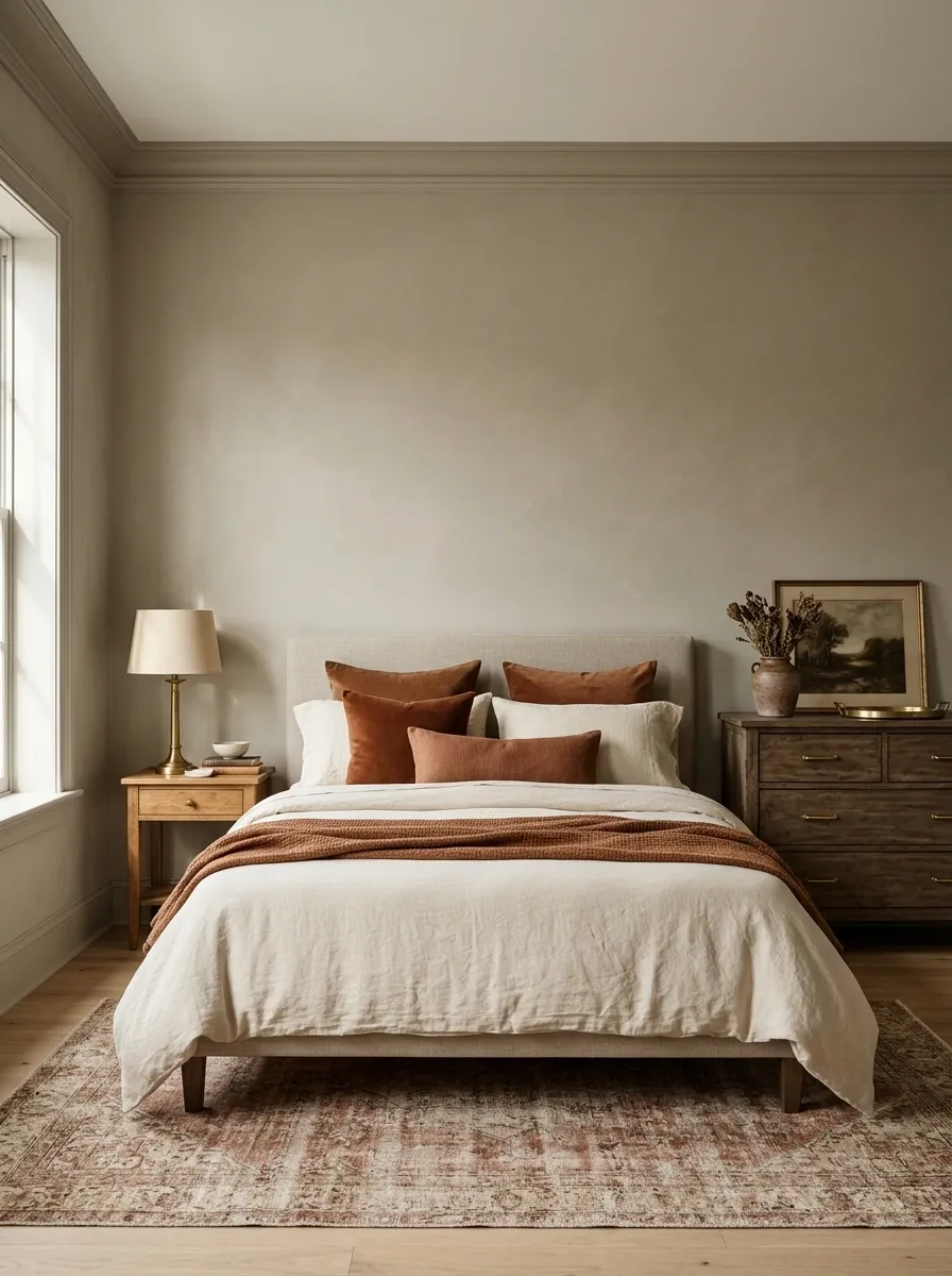
Different dressers and bedside tables don’t need to match, but they do need something in common. Put mixed vintage woods against warm greige walls, use rust as the principal textile accent, and choose plain cream bedding to create a shared center.
Repeat one metal finish in the lights or handles, then stop auditioning more furniture colors. The greige should be warm enough to sit beside the reddest piece without making the palest one look dirty. A patterned rug can collect several timber tones, provided its background stays quiet. Collected furniture deserves a coherent room, not a forensic matching exercise.
Test paint beside your lightest and reddest pieces. A shade that flatters only the middle tone hasn’t finished the job.
Pale Peach, Burgundy, and Beech
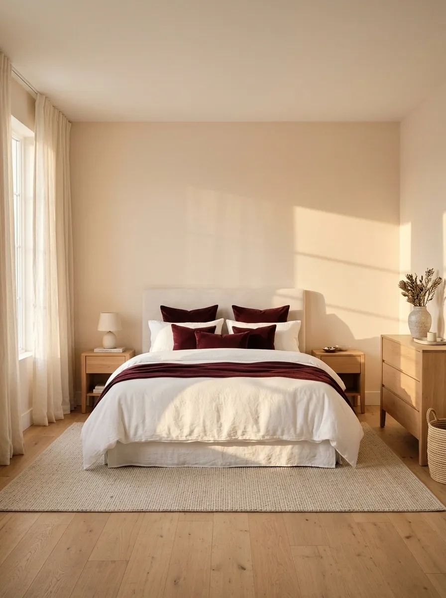
Pale peach walls bring softness to beech, while burgundy cushions and a bed throw prevent the palette from becoming blandly sweet. Use warm white curtains and a pale upholstered headboard if the room contains several beech storage pieces.
The darker accent needs a clear home: the bed, a reading chair, or both in restrained amounts. Keep peach off the large bedding surface if the walls already carry it. Otherwise the furniture and fabrics can blur into one warm wash. Small changes in depth matter more here than introducing yet another color to solve the blur.
Where does the eye land?
If peach walls, beech furniture, and pale bedding merge, give burgundy one larger position before adding more small accessories.
Slate, Warm Linen, and Acacia
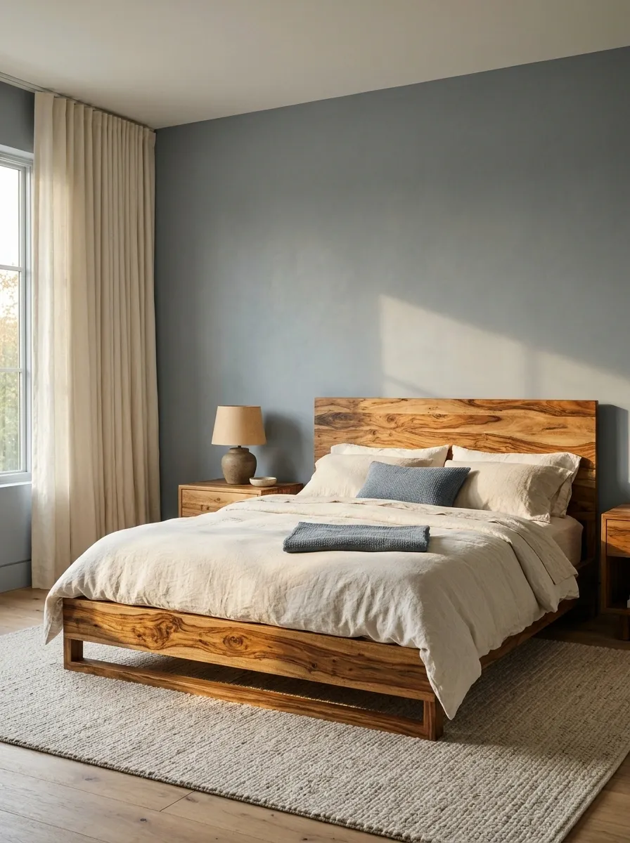
Acacia’s varied grain can handle a plain slate backdrop, warm linen bedding, and simple cream curtains. Choose a broad neutral rug and a modest bedside lamp shape so the timber stays interesting without competing against decorative noise.
Make the bed and largest cabinet the main wood features. Extra patterned furniture is rarely the missing ingredient beside strongly figured acacia. Check whether your slate reads blue or green in the room, then repeat that direction in a small textile detail. The aim is a deliberate relationship, not a paint shade that keeps changing sides.
Strong acacia grain + plain bed linen is already a layered pairing. Additional prints are optional.
Ochre, Cream, and Smoked Oak
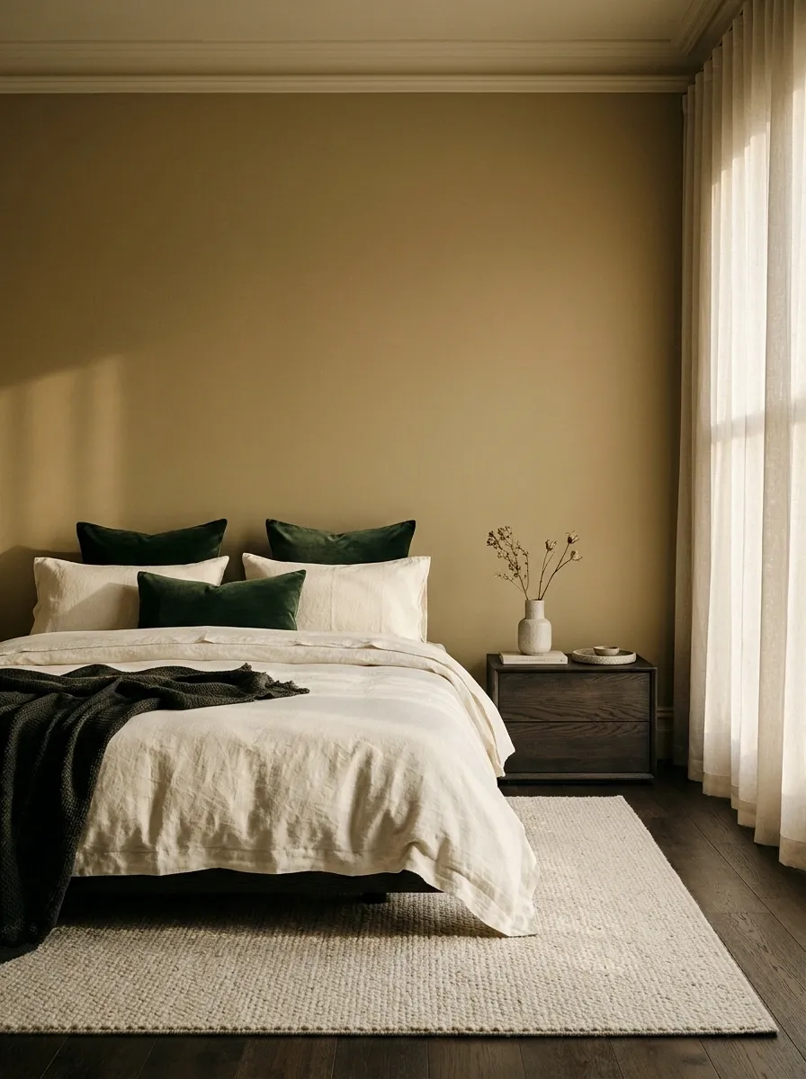
Smoked oak looks especially settled beside a muted ochre wall, cream bedding, and dark green cushions. Let a pale rug interrupt the dark floor-and-furniture relationship, then keep the window treatment close to cream.
Ochre is the wall color here, not a license to buy mustard versions of everything. Pick a muted shade rather than a bright yellow, and check it against the actual smoked finish. Some boards read cool brown; others carry more warmth. Give the wall enough depth to feel intentional while keeping the bed surface light and comfortable.
A muted field around the wood.
Keep the bed distinct.
Lavender Gray, White, and Maple
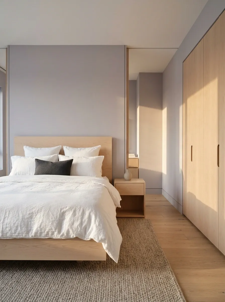
Lavender gray gives pale maple a cooler setting, while white bedding keeps the bedroom crisp. A warm neutral rug stops the scheme feeling clinical, and a small darker cushion gives the bed enough definition. Keep the wardrobe fronts simple if the furniture set is extensive.
This palette depends on the lavender staying muted. A bright violet wall changes the whole mood, and the maple will not rescue it through the power of being tasteful. Sample the paint under your evening bulbs before committing. White bedding is the anchor that lets the purple-gray remain a color choice rather than a lighting accident.
Does the wall look unexpectedly pink at night?
Compare another sample under the same lamp before replacing the bedding. The paint-light relationship may be the issue.
Petrol Blue, Camel, and Rosewood
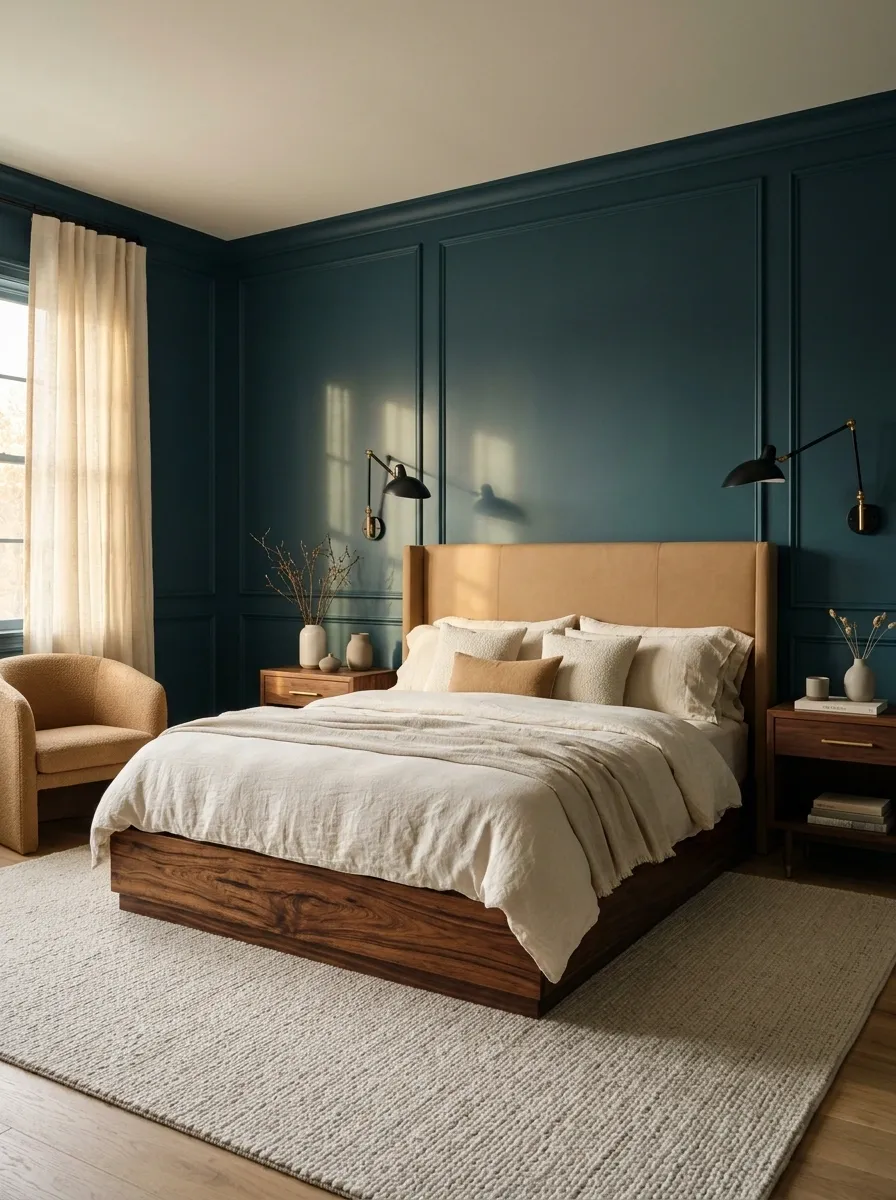
Petrol-blue walls give richly figured rosewood a deep backdrop, while camel upholstery and ivory bedding bring the foreground forward. A plain rug and restrained metal lighting keep the bedroom from resembling a furniture showroom with theatrical ambitions.
Use the rosewood as the warm focal material, especially if it has strong dark streaks. Keep the blue solid rather than adding a second busy wall treatment. Camel works best on a chair, headboard, or substantial cushion where it can actually connect the wood and bedding. A tiny decorative tassel is not doing that much emotional labor.
Camel needs a meaningful textile surface to link pale bedding with dark patterned wood.
Warm Sand, Black, and Bamboo
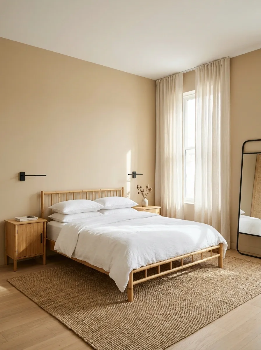
Sand-colored walls, white bedding, and a few black accents make bamboo furniture feel settled rather than temporary. Choose linen-like curtains and a broad flatwoven rug, keeping small storage enclosed so the lighter furniture lines remain visible.
The black should define useful objects: reading lights, a mirror frame, or simple hardware. Scatter it across every accessory and the room starts looking pointlessly outlined. Let sand provide warmth without matching the bamboo exactly. A slight difference between wall and furniture is what allows the pieces to remain distinct, especially beside a similarly light floor.
Contrast can be small and still useful.
Choose a darker lamp before choosing a darker wall if the bamboo simply needs a clearer outline.
Cream, Cobalt, and Pale Plywood
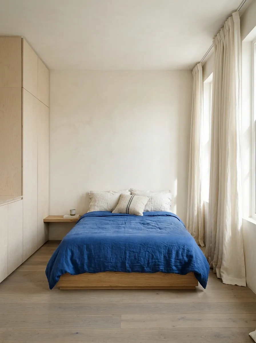
Cream walls and pale plywood storage create a simple shell for a cobalt bedspread. Keep the curtains warm white, add a timber bedside ledge, and use one small striped cushion if the bed needs more texture.
Cobalt works because the rest of the room gives it space. Avoid turning cabinet interiors, handles, artwork, and lighting into a blue scavenger hunt. The plywood can stay plain, with its edges and grain providing quiet detail. This is a practical direction for a small bedroom where one bold fabric choice can establish character without requiring elaborate joinery or several patterned surfaces.
Walls, storage, curtains.
Bed textile.
Plum, Taupe, and Medium Brown Furniture
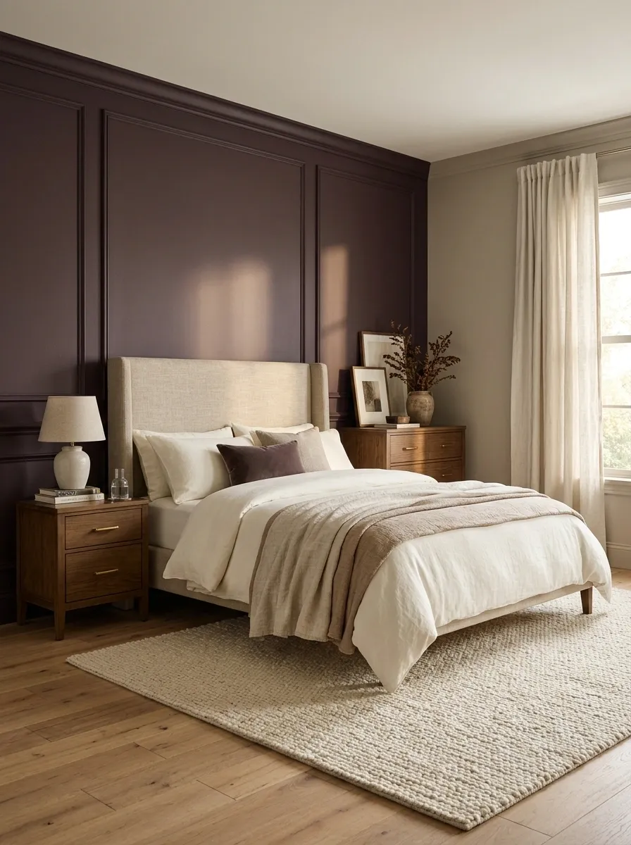
Use plum on the bed wall, with taupe across the remaining walls and plain warm-white bedding. Medium brown furniture grounds the room without competing against the color change. A softly textured rug and simple curtains make the split feel deliberate.
Let the plum wall contain the headboard and enough surrounding space to read as a full backdrop. A tiny painted rectangle trapped behind the bed tends to look more like indecision than a feature. Check that the taupe doesn’t turn yellow beside the plum. The two paints need to cooperate before the cushions enter negotiations.
Paint the plum and taupe samples next to each other at the corner where the actual walls will meet.
Soft Teal, Ivory, and Red-Toned Stained Pine
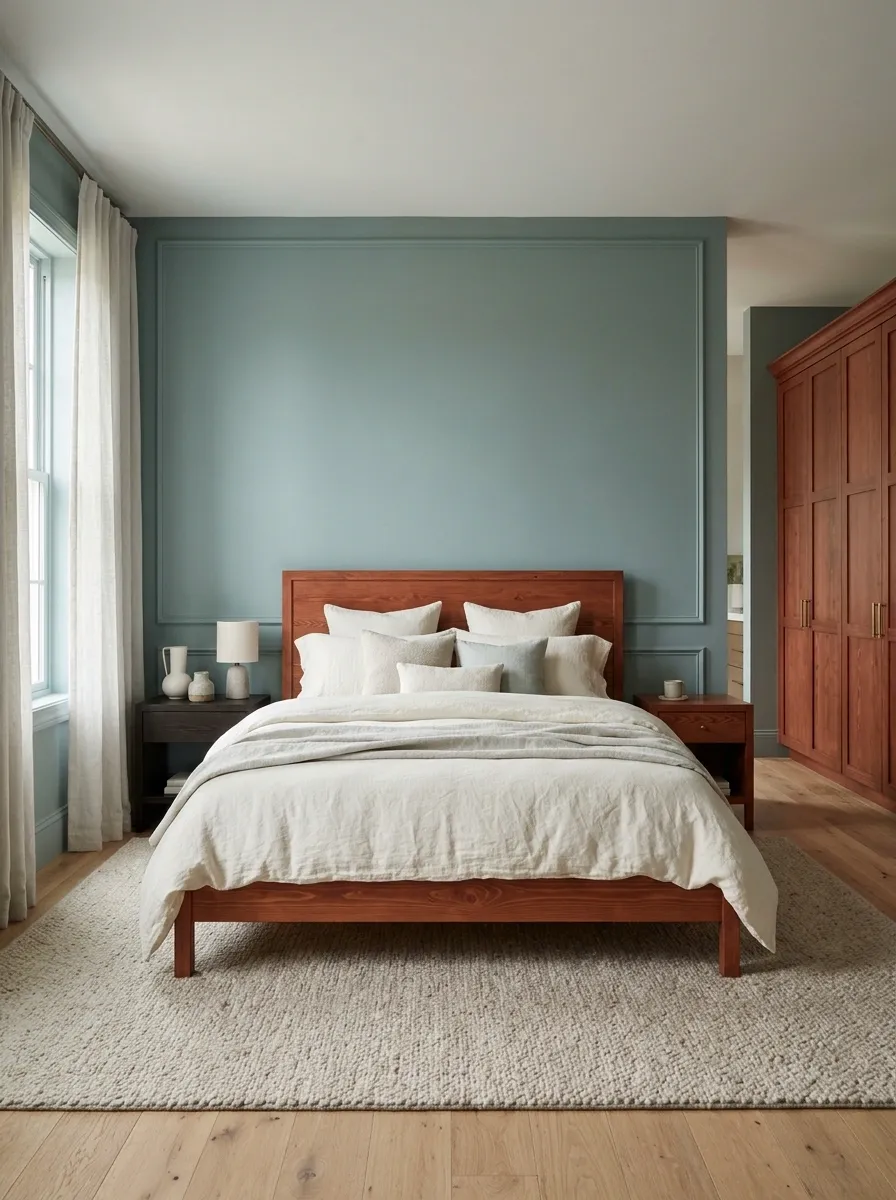
Muted teal gives red-stained pine a cooler setting, with ivory bedding and pale curtains keeping the scheme open. A simple dark bedside table can break up a large matching pine set, while a warm neutral rug links the different pieces.
The teal needs restraint. Bright turquoise beside red wood creates a much louder contrast than many people expect from a small paint card. Start with a gray-softened version and test it beside the largest cabinet. Keep accent fabrics mostly neutral until the wall and wood relationship feels settled. You can always add color; removing an entire competing palette is more annoying.
A teal that suits a small nightstand may feel much stronger beside a full red-toned wardrobe.
Putty, Forest Green, and Pale Oak
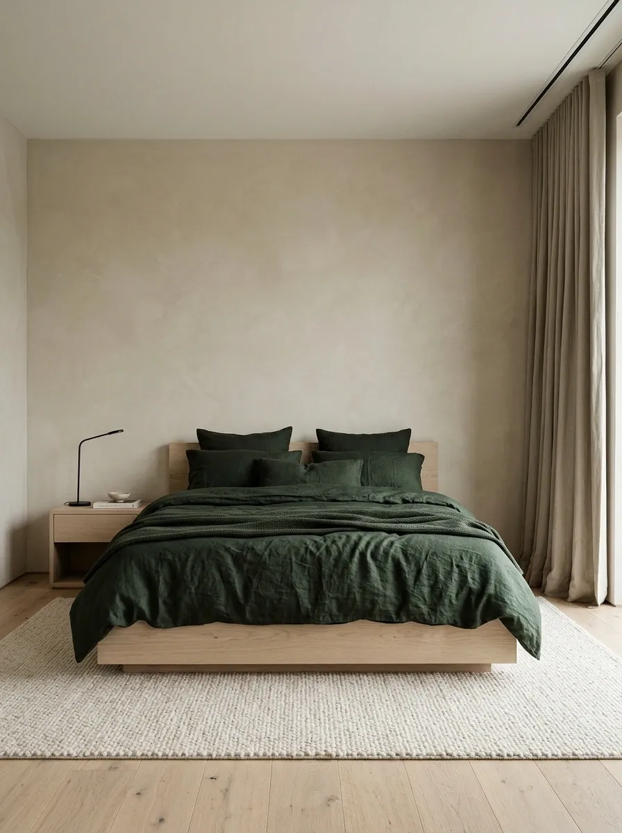
Putty walls give pale oak a warmer backdrop than stark white, while forest-green bedding adds a dark center. Choose a pale rug and a small black reading light, keeping the curtains close to the wall color for a quieter perimeter.
This pairing is useful when pale furniture disappears against white walls. The putty provides separation without adding a strong competing hue. Keep the green in the bedding or a chair rather than painting every large surface dark. The room needs a relationship between light and dark; it doesn’t need to pick a side and abolish the other.
Warm Gray, Marigold, and Weathered Wood

Weathered timber gets a more cheerful setting beside warm gray walls and marigold bedding. Cream curtains and plain bedside lamps keep the room from leaning too heavily on rustic texture, while a simple rug supplies a softer floor surface.
Choose a yellow that feels rich rather than fluorescent, and keep it largely on the bed. Weathered wood often has gray and brown variations already, so a warm gray wall can collect those differences. Skip the distressed signs. The furniture has earned its wear; a brand-new plaque pretending to have survived a century is less convincing.
A warm gray wall can connect weathered surfaces while smooth lamps and plain fabric keep the bedroom comfortable.
White, Terracotta, and a Mixed-Wood Bedroom
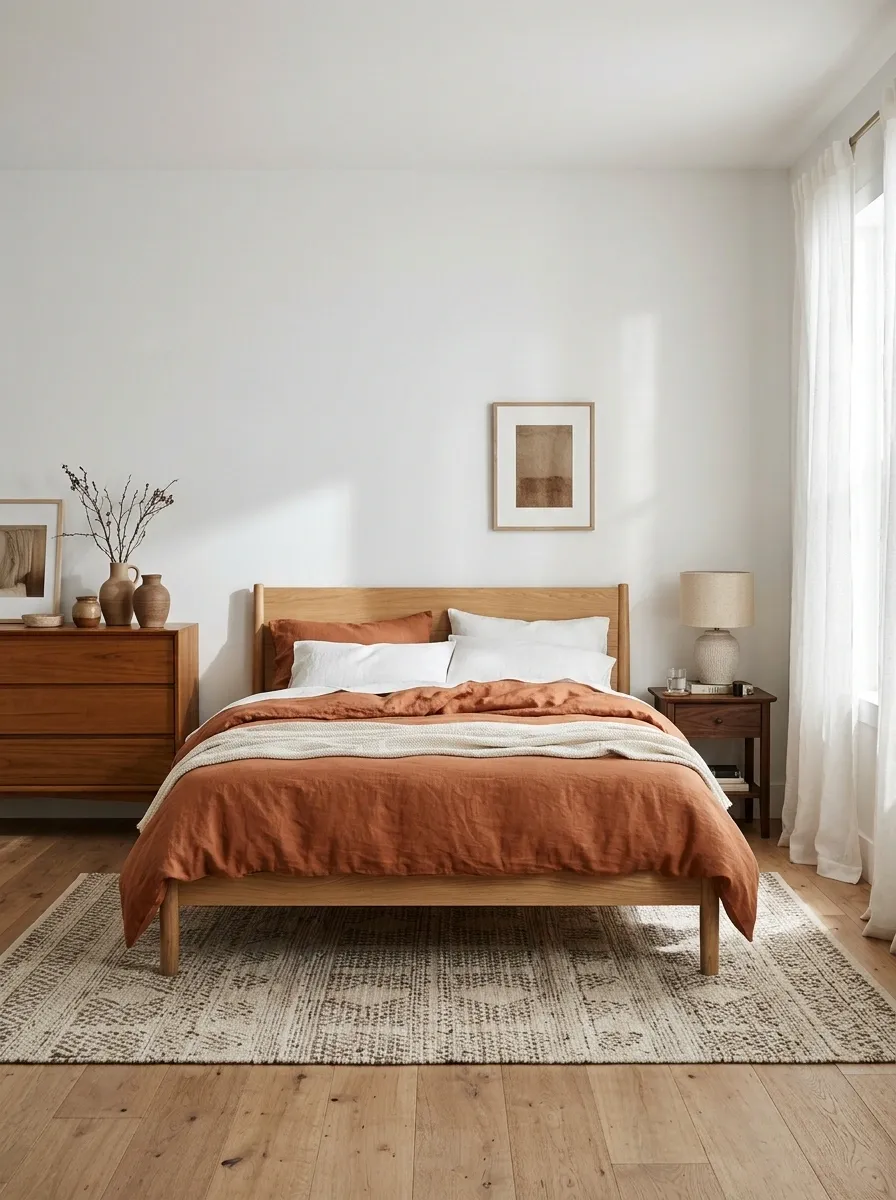
White walls give mixed timber furniture a shared background, while terracotta bedding connects warmer grains across the room. Add a rug with muted cream and brown threads, and keep the curtains simple rather than trying to match every furniture finish.
Choose a dominant wooden piece, usually the bed or wardrobe, then let the smaller pieces differ. Repeating a material is useful; forcing an exact match across unrelated furniture can make the room feel purchased in one exhausted afternoon. Terracotta belongs on a meaningful textile surface so it can link the warm pieces without swallowing the whole scheme.
Give mixed woods a hierarchy.
Supporting pieces: smaller timber variations.
Shared thread: terracotta textile and a quiet rug.
Deep Brown, Pale Blue, and Light Timber
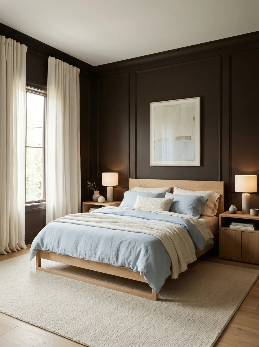
Paint the walls a deep brown and bring light timber furniture forward with pale blue bedding. Ivory curtains preserve a bright window opening, and a quiet rug softens the floor. Keep the lighting warm enough to make the brown feel intentional rather than murky.
The pale blue prevents this from becoming a bedroom composed entirely of different versions of toast. It also distinguishes light timber from the darker perimeter. Choose simple cabinet forms and keep decorative surfaces limited. The stronger wall color can do most of the work, leaving furniture grain and fabric texture to supply the smaller details.
Enclosing wall
Lift the foreground
Stone, Blackcurrant, and an Upholstered Bed With Wood Storage
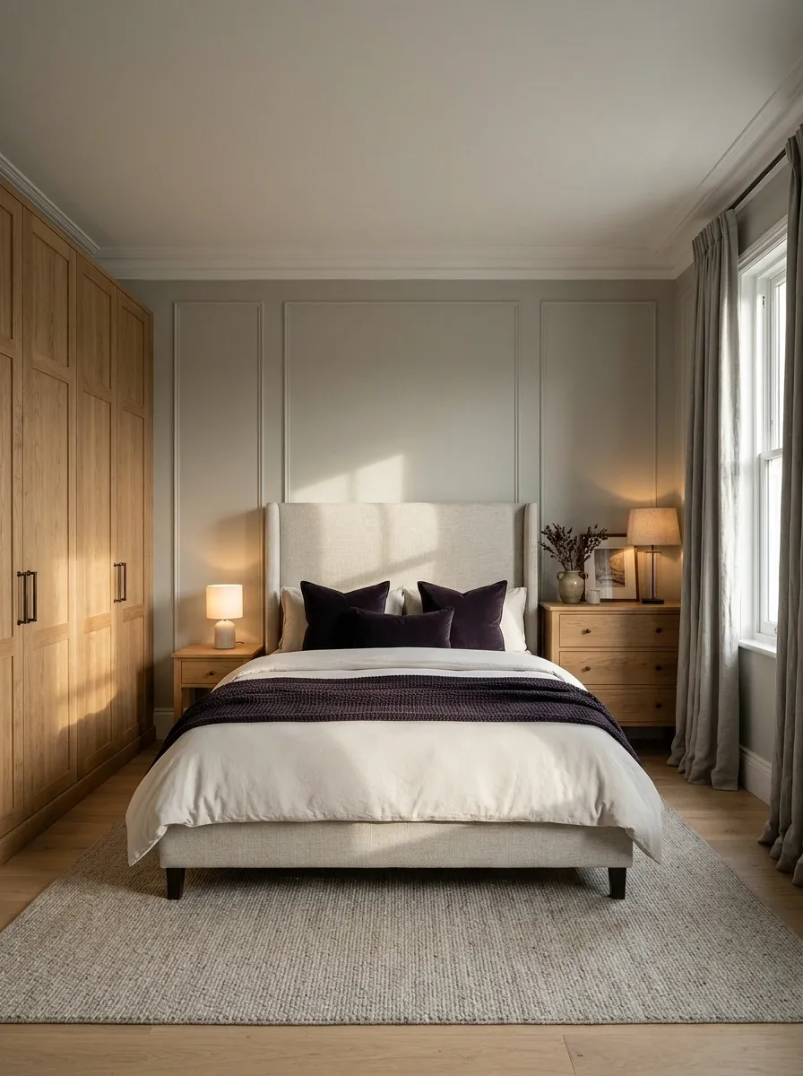
When the bed is upholstered but the wardrobe and dresser are timber, use stone walls to connect the larger surfaces. Blackcurrant cushions and a throw add depth to pale bedding, while simple curtains repeat the stone background. Let the wooden storage supply the warmth.
This arrangement is useful when you don’t want every substantial piece made from the same material. Keep the upholstered headboard distinct from the wall through texture or depth rather than a competing print. The dark accent can stay concentrated on the bed, giving the room a clear center without repainting the wardrobe or buying matching nightstands.
Sample wall paint beside both the headboard fabric and the largest wood panel. The room has more than one undertone to accommodate.
Let the Furniture Keep Its Personality
Put your shortlisted paint samples beside the wood and live with them through a normal day. Make the bed with a fabric close to your planned bedding, switch the lamps on, and judge the whole relationship. That is more useful than finding a paint name that sounds soothing enough to cure insomnia.
You don’t need to neutralize every grain or match every dresser. Give the strongest wood tone a compatible wall, make the bed a clear textile decision, and leave the room some breathing space.