
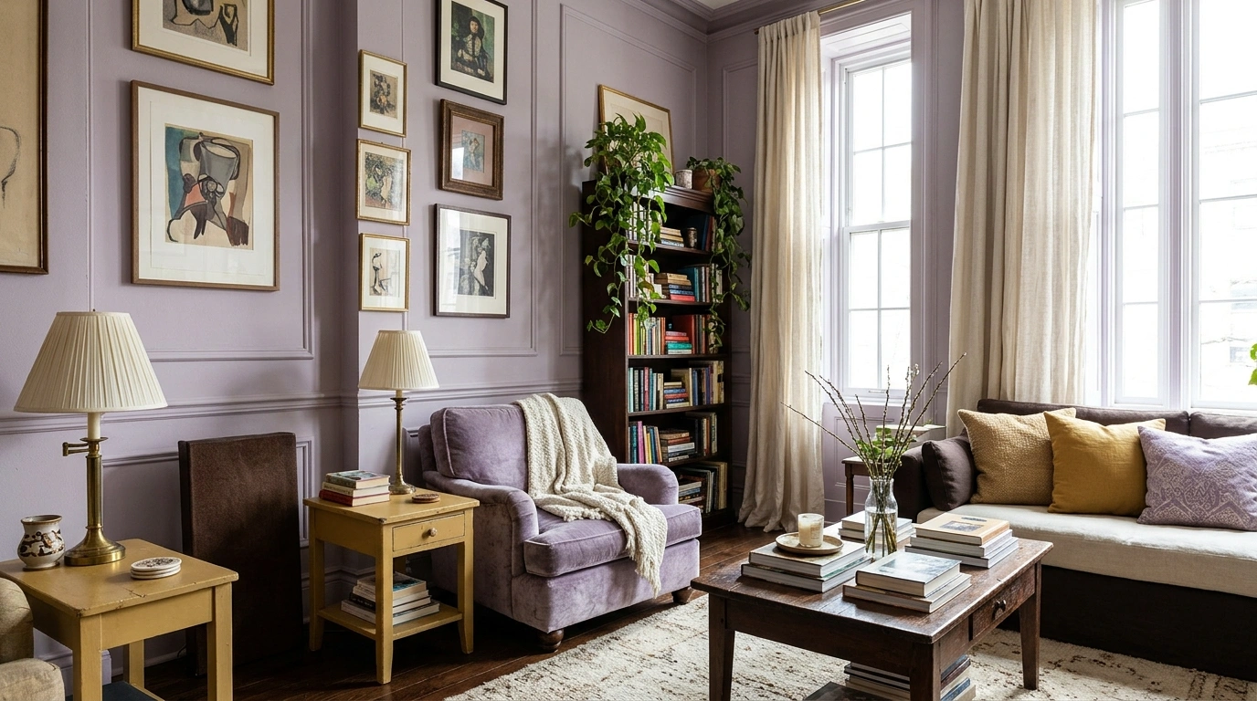
Tomato red and lilac. Oxblood and swimming-pool blue. Olive with a flash of hot pink.
These are not beige palettes wearing a colorful cushion for the photograph. The colors have a proper role: cabinetry, upholstery, curtains, a door, a broad wall. The surprise works because the room gives each color somewhere convincing to live.
Use the combinations as starting points, not exact paint matches. Test physical samples beside the floor and furniture you are keeping. A real home has existing materials, changing light, and objects collected over time; that is part of what makes an unusual palette interesting.
Unexpected Color Combo Ideas
Ultramarine and Dusty Rose
Rich ultramarine walls can make dusty rose feel grounded rather than overly delicate.
Try painting a bathroom or living space in saturated ultramarine while introducing dusty rose through soft velvet upholstery or warm ceramic fixtures. Keep the surrounding textures matte and natural, but do not shy away from the intensity of the blue. The depth is the entire point.
A pale wood floor or earthy basin gives this pairing a calm and welcoming foundation.
Aubergine and Acid Chartreuse
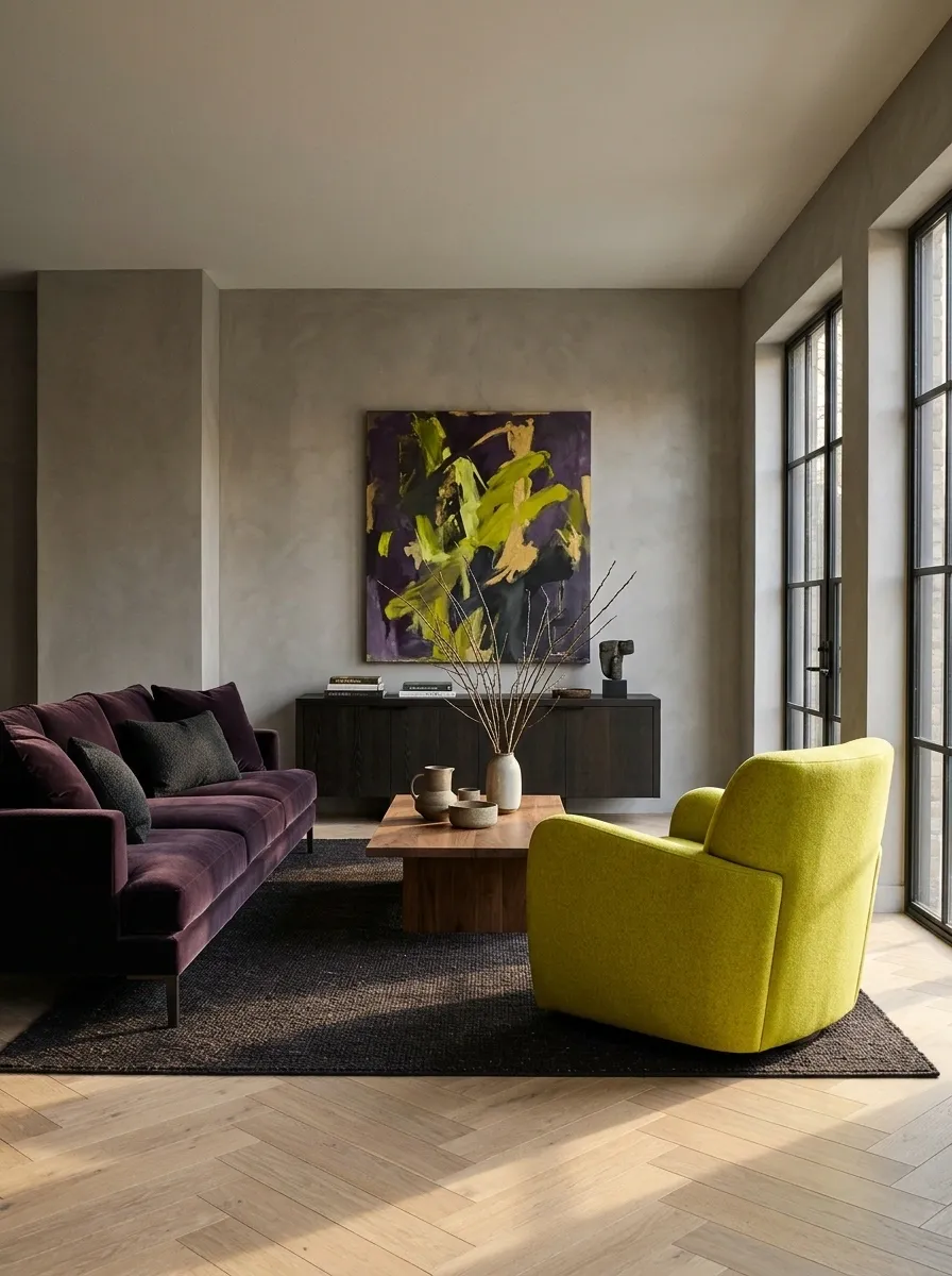
Deep aubergine makes chartreuse feel luminous rather than random.
Try an aubergine sofa with a substantial chartreuse chair, or dark-purple cabinetry beside yellow-green artwork. Keep the surrounding materials relatively quiet, but do not dilute the chartreuse until it becomes ordinary sage. The sharpness is the point. A warm wooden floor can give the pairing a familiar foundation.
Prussian Blue and Burnt Saffron
Deep Prussian blue allows burnt saffron to glow with warmth instead of shouting for attention.
Set a mustard-yellow bed frame or golden lighting against dark indigo walls, letting the contrasting temperatures play off each other naturally. Use the saffron tones generously in textiles or statement furniture rather than scattering them in tiny dabs.
The resulting atmosphere feels both dramatic and remarkably restful, anchored by traditional patterned flooring.
Tomato Red and Lilac
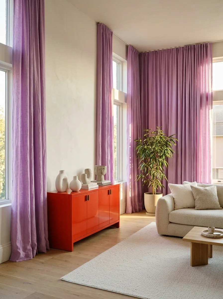
Lilac can make tomato red feel unexpectedly playful rather than purely retro.
Use lilac on a larger soft surface and red in a cabinet, chair, or table base. Keep both colors recognizable. If the red becomes rust and the lilac becomes gray, you have quietly left the interesting part of the proposal behind.
| Larger field | Stronger interruption |
|---|---|
| Lilac curtain or wall | Tomato-red furniture |
| Soft, plain fabric | A clear, simple silhouette |
Plum Purple and Rust Orange
Plum purple gives rust orange a sophisticated edge that feels completely current.
Combine a rich plum wall with a comfortable rust-colored modular sofa, connecting them with warm wood tones and ambient lighting. Keep the purple enveloping and deep, allowing the terracotta and rust accents to provide an inviting counterpoint.
This pairing thrives on texture, so lean into plush fabrics and sculptural elements to give the room a truly layered feel.
Cobalt and Cantaloupe
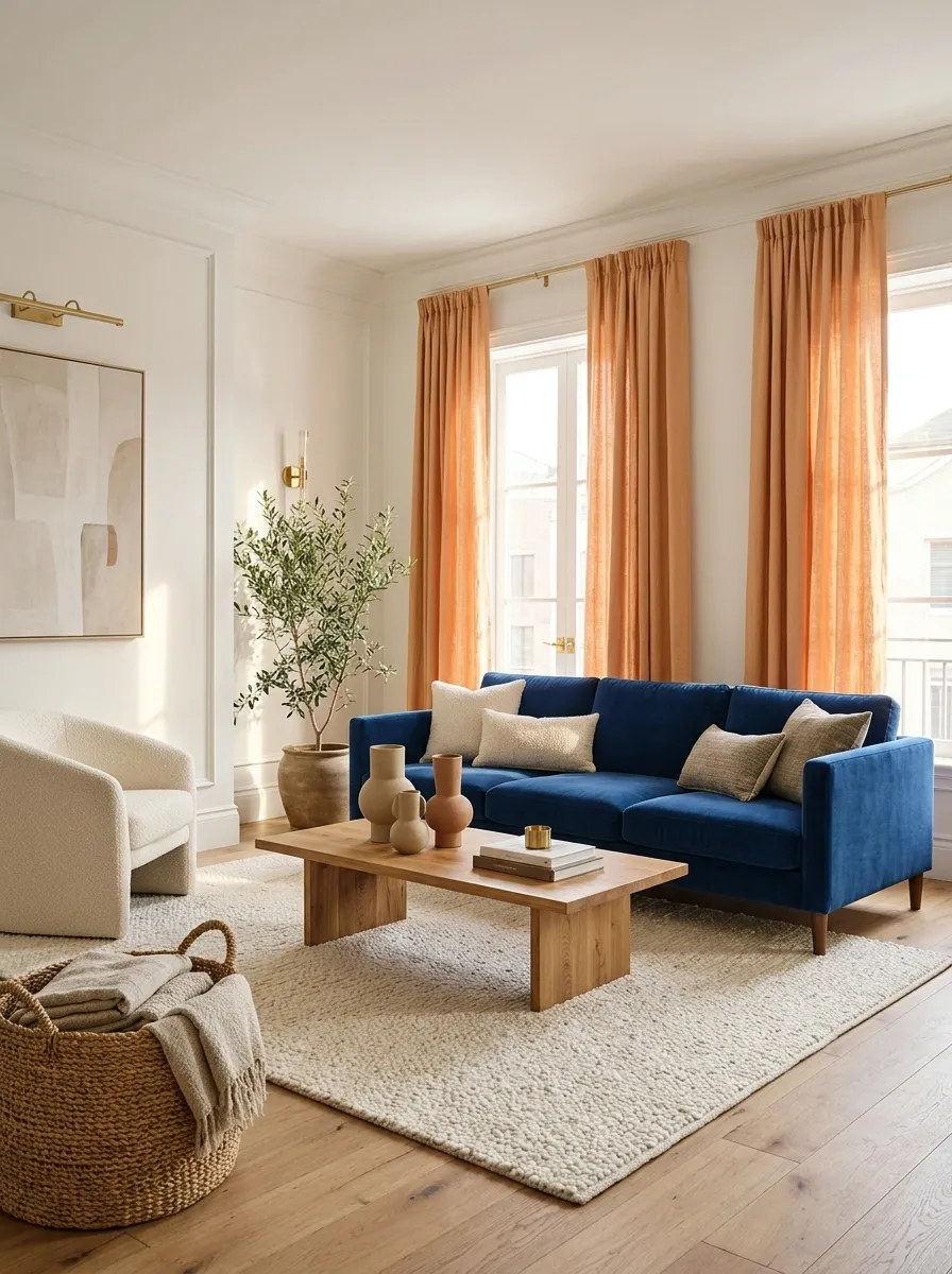
Cantaloupe has enough warmth to make cobalt feel less severe.
Imagine peach-orange curtains beside a cobalt sofa, with a restrained timber table connecting them. Use the melon color generously enough to register, rather than as a tiny accessory. The contrast feels more settled when both colors occupy useful objects already needed in the room.
Chocolate Brown and Butter Yellow
Dark chocolate brown walls make butter yellow feel luminous and modern rather than old-fashioned.
Float a buttery curved sofa in a cocoa-drenched room, punctuated by metallic accents and pale stone surfaces. Let the creamy yellow upholstery occupy a significant footprint so it registers as a bold choice rather than a timid neutral.
The dark envelope creates a cocooning effect, allowing the lighter furniture to pop with effortless style.
Oxblood and Pool Blue
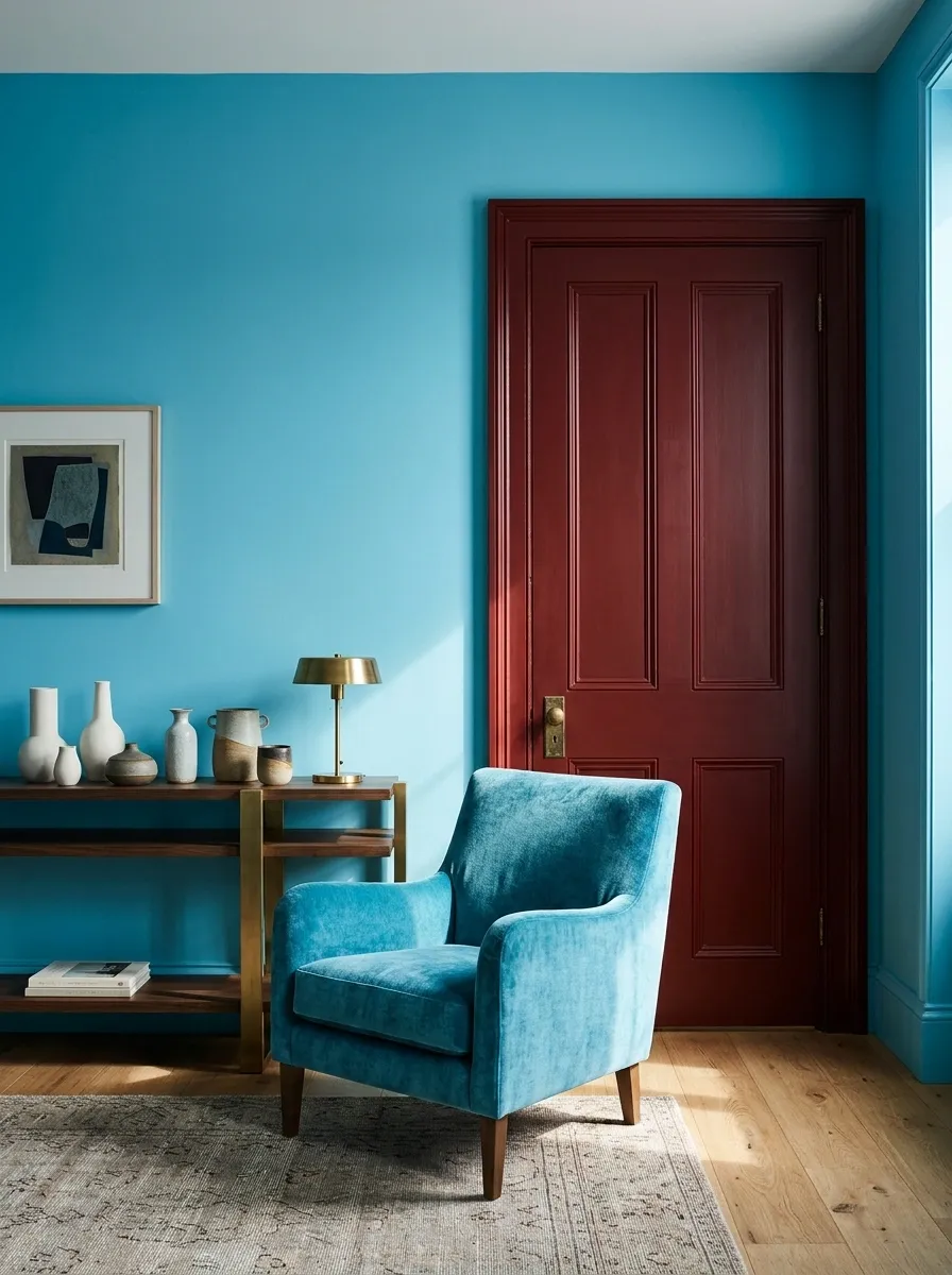
Oxblood and clear turquoise-blue create a sharper relationship than the familiar burgundy-and-cream combination.
Try an oxblood cabinet against a pool-blue wall, or blue upholstery beside a deep-red painted door. Keep the blue fresh rather than heavily gray. The red supplies weight, allowing the lighter color to feel deliberate instead of simply bright.
A useful room context: a hallway or dining corner with simple architecture and a little dark timber.
Olive and Hot Pink
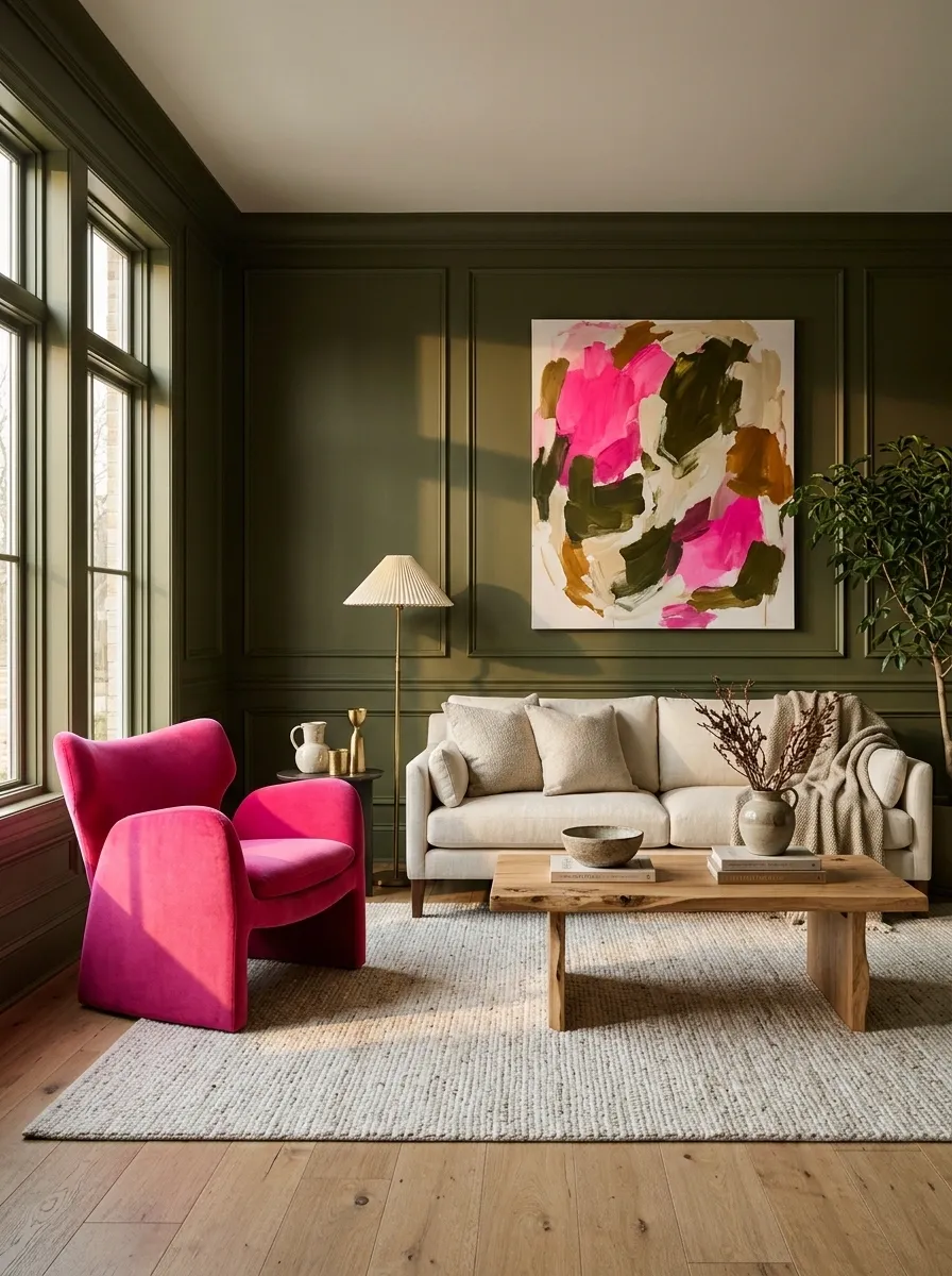
Olive can make vivid pink look like a considered design choice rather than an accessory that wandered in.
Use olive on cabinetry or a wall and hot pink on an upholstered chair, artwork, or a strong textile. Keep the pink concentrated but visible. This pairing is more convincing when the pink has a real footprint, not just a decorative dot.
Chocolate Brown and Electric Blue
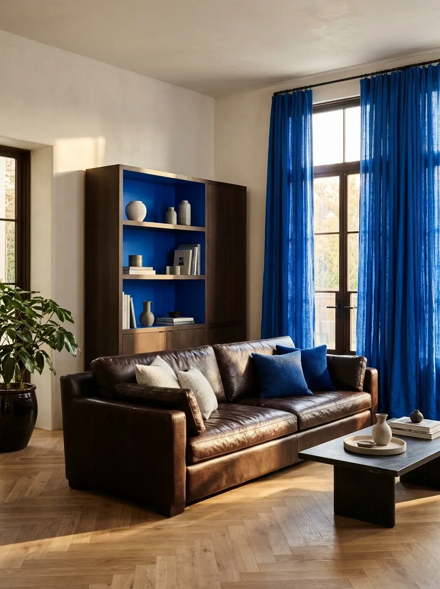
Electric blue can revive a room with substantial brown furniture.
Try a blue curtain or painted bookcase beside a chocolate sofa. The blue needs clarity, not a dusty wash. Keep the brown rich and visible; hiding it under pale throws removes the contrast that makes the combination work.
| Existing piece | Unexpected companion |
|---|---|
| Dark brown sofa | Electric-blue curtains |
| Brown cabinet | A vivid-blue painted background |
Plum and Spearmint
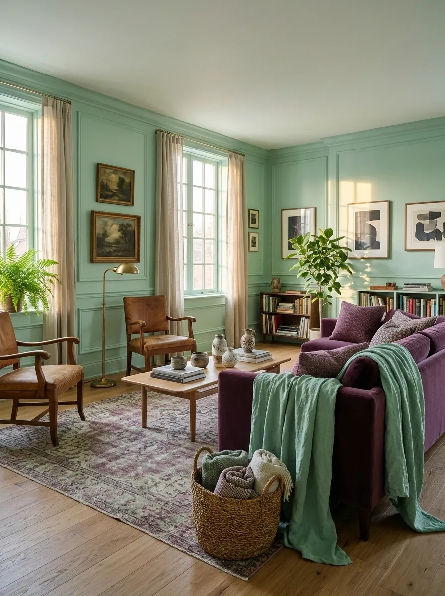
Spearmint gives plum a fresher, slightly mischievous partner.
Use plum in upholstery and mint on a painted surface or generous textile. Keep the furniture shapes uncomplicated so the palette can do the work. A room with older wood furniture can carry this combination particularly well because the timber adds something familiar between the cooler colors.
Burgundy and Persimmon Orange
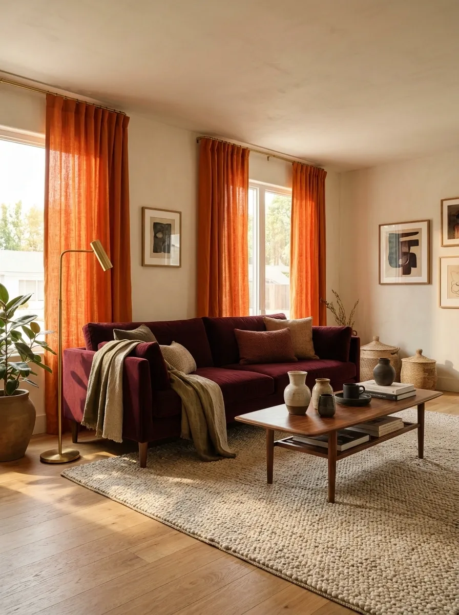
Burgundy and persimmon are close enough in warmth to feel related, yet different enough to create a punchy room.
Try orange curtains with a burgundy sofa, leaving larger backgrounds relatively plain. The pairing does not need a contrasting cool color to be interesting. Different depths and materials can provide the separation.
Keep the distinction clear: a deep wine tone beside an unmistakably orange surface.
Coral and Petrol Blue
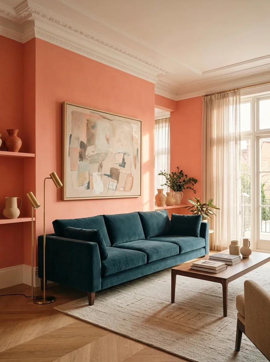
Coral and petrol blue work particularly well when the blue is deep and the coral remains warm and clear.
A petrol cabinet can sit against coral walls, or the relationship can happen between two substantial fabrics. Keep pattern limited if both colors already have strong personalities. They are having a conversation; the rug does not need to interrupt every sentence.
Saffron and Periwinkle
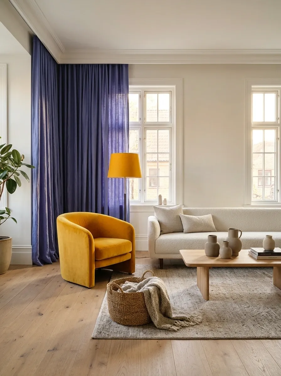
Saffron brings warmth to periwinkle’s blue-violet character.
Use periwinkle across a wall or curtain and saffron in a chair, bench, or lampshade. Keep the yellow rich rather than pastel if you want the contrast to stay unusual. A plain off-white surface can provide a pause without becoming the main palette.
| Periwinkle supplies | Saffron supplies |
|---|---|
| A cool surrounding field | A warm focal object |
| Softness across a broad surface | A sharper note of color |
Vermilion and Pale Jade
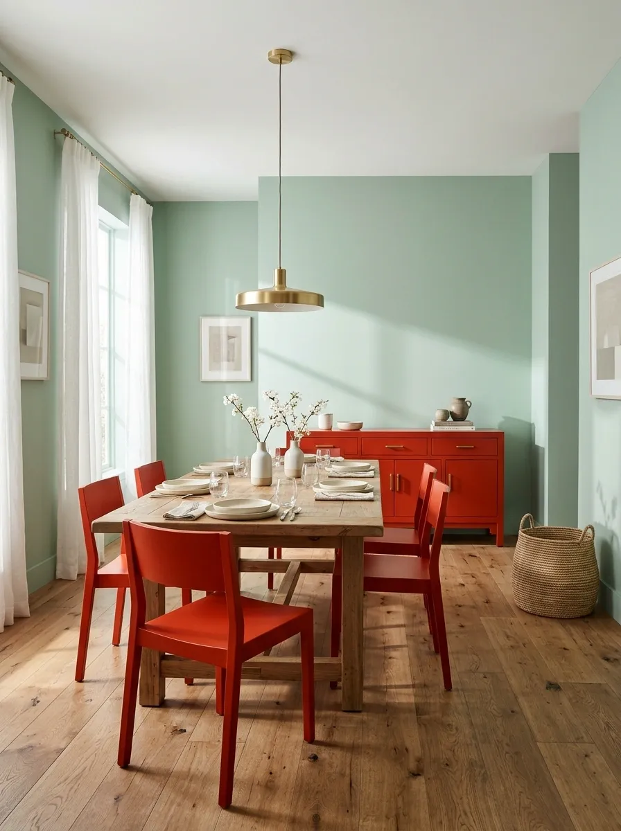
A pale jade room can support a vermilion-red object beautifully.
Try a red sideboard or set of dining chairs, with the green carrying the wall or larger fabric. Keep the red saturated enough to read clearly. The jade’s softness gives it room without requiring the whole room to become a high-contrast graphic scheme.
Graphite and Bright Orange
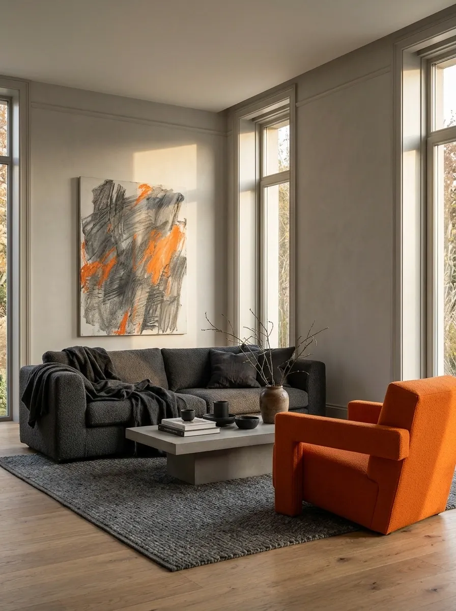
Bright orange can make graphite feel energetic instead of solemn.
Use a clearly orange chair or a large artwork beside charcoal-gray upholstery. Choose a simple, substantial shape so the color feels integrated with the furniture. This can work in a modern room with restrained materials, where the orange becomes the useful disruption rather than the start of an entire theme.
Avoid the accessory swarm: one convincing orange object is stronger than a dozen unrelated orange bits.
Emerald and Ice Pink
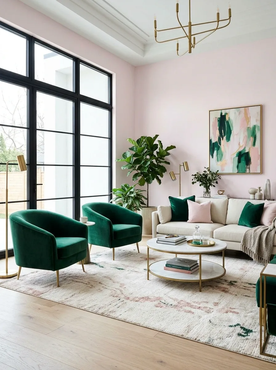
Ice pink has a cooler character than blush, which makes the contrast with emerald feel less familiar.
Try emerald seating against pale pink walls, or pink curtains beside a green cabinet. Keep the pink sufficiently clear that it does not turn into beige. A little visible wood can make the combination easier to connect with an existing room.
Dusty Teal and Grape Purple
Teal and grape are an unusual pair when both are allowed to occupy more than accessory space.
Use dusty teal as the larger field and grape in a sofa or substantial curtain. Let their textures differ: a quieter painted wall beside a richer upholstery surface works well. Keep supporting finishes calm so the combination remains readable.
| Main role | Supporting role |
|---|---|
| Dusty-teal wall or cabinetry | Grape-purple fabric |
| Broad, quiet surface | A more expressive texture |
Pistachio and Marigold
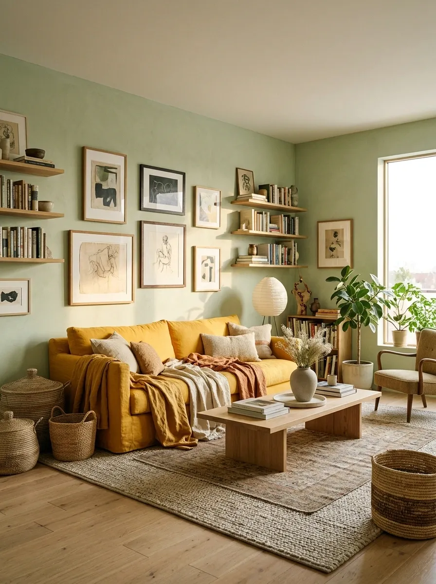
Pistachio and marigold create a sunny palette with a slightly odd, appealing edge.
Try green cabinetry with yellow seating or a warm yellow textile against pale green walls. The colors need a clear difference in depth so they do not merge into a general yellow-green haze. Simple wood and quiet surfaces help the combination feel domestic rather than theatrical.
Navy and Orchid Pink
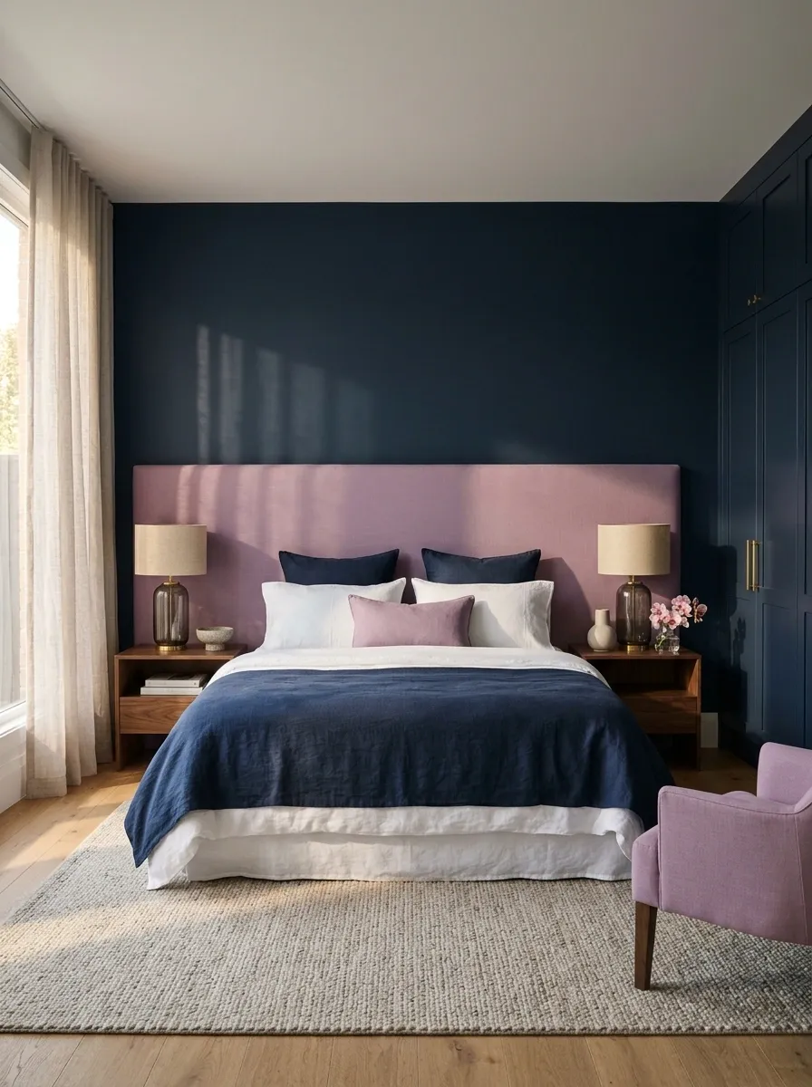
Orchid pink gives navy a cooler, less expected partner than warm blush.
Use it in a curtain, broad upholstered headboard, or chair beside navy. Keep the pink slightly violet rather than peachy. This difference matters: the palette becomes more surprising because the pink has a cool clarity against the deep blue.
Try the fabrics together first, especially if the navy already exists in the room.
Raspberry and Cinnamon
Raspberry and cinnamon can feel rich without becoming formal.
A cinnamon leather sofa beside raspberry fabric or painted joinery gives the room warmth from two different directions. Keep the raspberry recognizable and the brown warm. A pale wall or quieter floor can provide enough breathing room without taking the color away from the main pieces.
Turquoise and Oxide Red
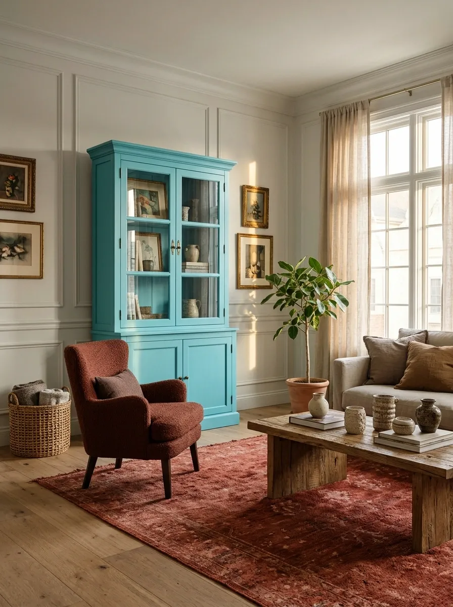
Turquoise beside a dusty mineral red can make a room feel collected rather than conventionally coordinated.
Use one color in a painted cabinet and the other in a rug or upholstered piece. The different material character helps: clear painted turquoise against textured red-brown fabric feels less flat than two smooth matching finishes.
| Clearer surface | More textured surface |
|---|---|
| Turquoise painted furniture | Oxide-red textile |
| A crisp silhouette | A softer surrounding texture |
Fuchsia and Tangerine
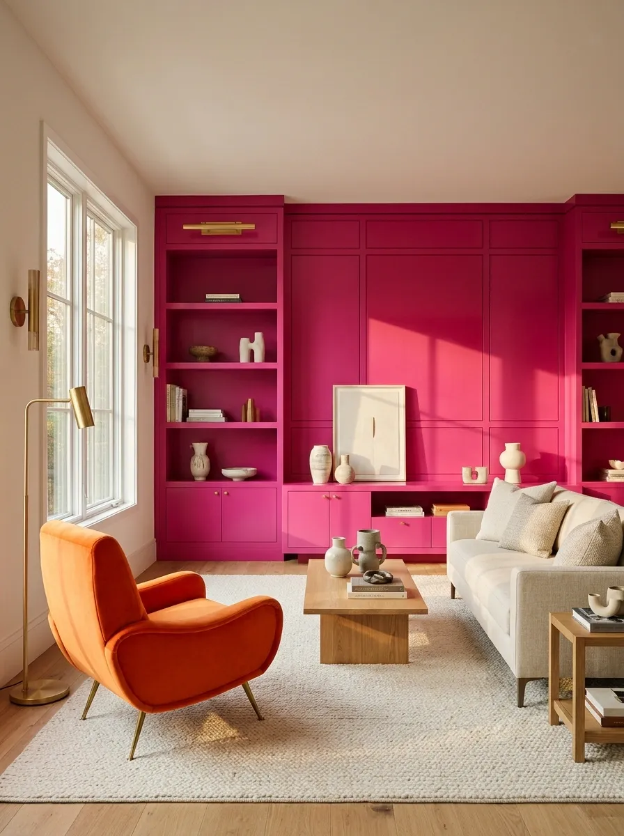
This is a high-energy pairing. Let it be one.
It suits a vivid dining corner, creative workspace, or expressive sitting area. Give the colors different jobs:
- One larger surrounding field.
- One smaller but substantial companion.
- Simple furniture shapes and some quiet surfaces left visible.
Reducing both to pastel would remove much of the point.
Acid Yellow and Pale Pink
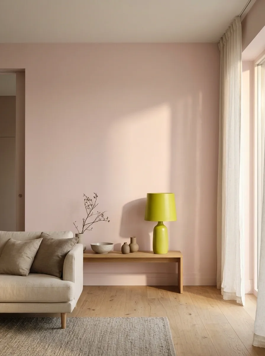
Acid yellow gives pale pink a sharper edge than gold or cream.
Try a yellow cabinet or lamp shape beside a generous pink wall. Keep the yellow slightly green-leaning if you want that unusual tension. This works well when the room contains straightforward furniture, allowing the color relationship to provide the decoration.
Use a real shape: a cabinet, chair, or broad shade makes the yellow look chosen rather than incidental.
Forest Green and Electric Cyan
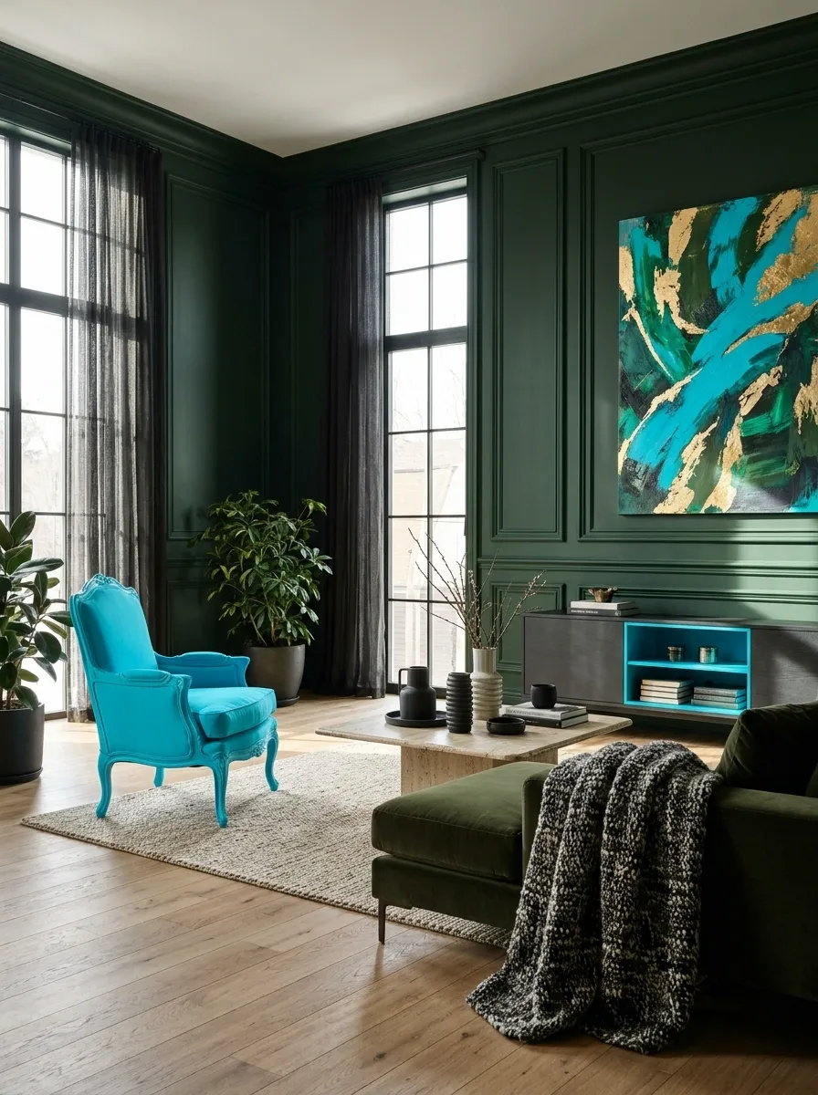
Deep green and electric cyan are close enough to relate but different enough to surprise.
Use forest green on a substantial background and cyan in an artwork, painted chair, or defined cabinet interior. Keep the cyan clear. The darker green allows the bright blue to register without needing an all-white room around it.
Silver Gray, Ultraviolet, and Rust
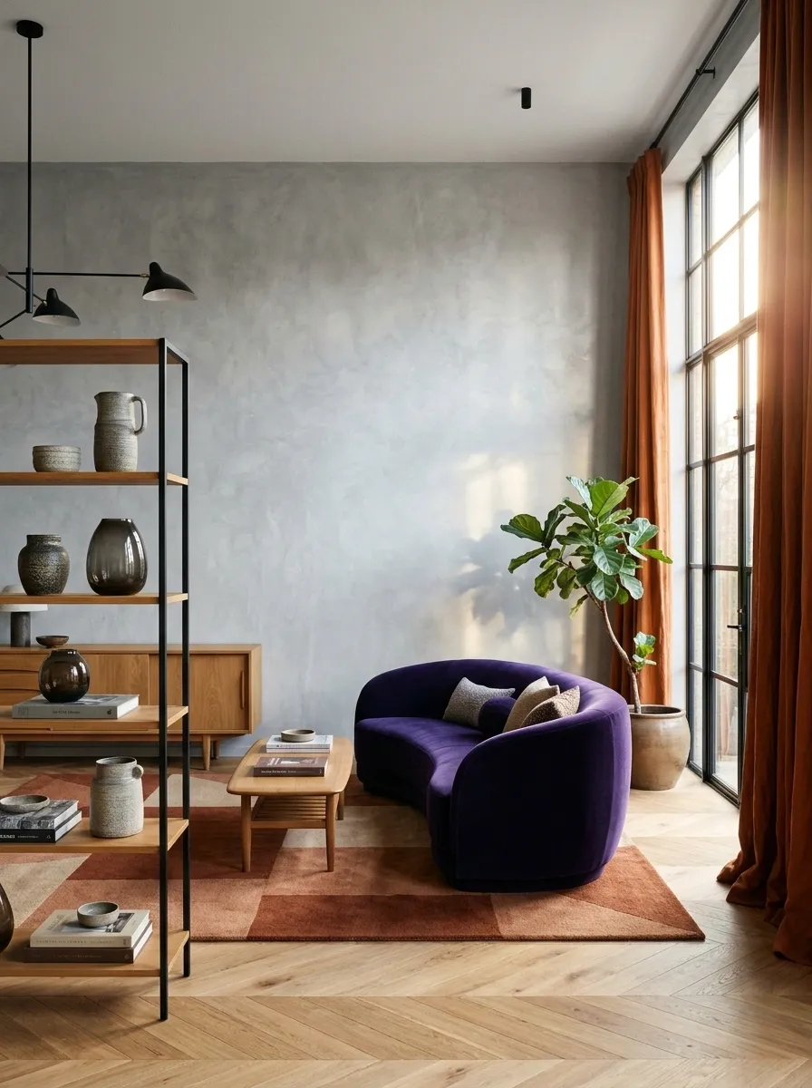
A cool gray background can hold both violet and rust when the two accents have clear jobs.
Try violet upholstery with a rust curtain or rug detail. Keep the gray as the larger surrounding field, with enough texture to avoid a sterile result. The warm rust makes the violet feel more connected to ordinary furniture and timber.
| Surrounding field | Main colored piece | Warm connecting note |
|---|---|---|
| Silver gray | Ultraviolet | Rust |
Chocolate, Strawberry Pink, and Mustard
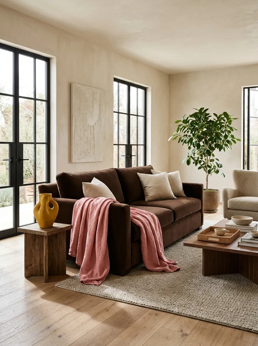
Chocolate and pink are familiar enough; mustard changes the conversation.
Keep brown in the main furniture, pink in a generous textile, and mustard in a clear secondary object. Use different scales so the colors do not compete equally. The mustard should feel intentional, not like one cushion accidentally escaped from another room.
Cobalt, Red, and Lilac
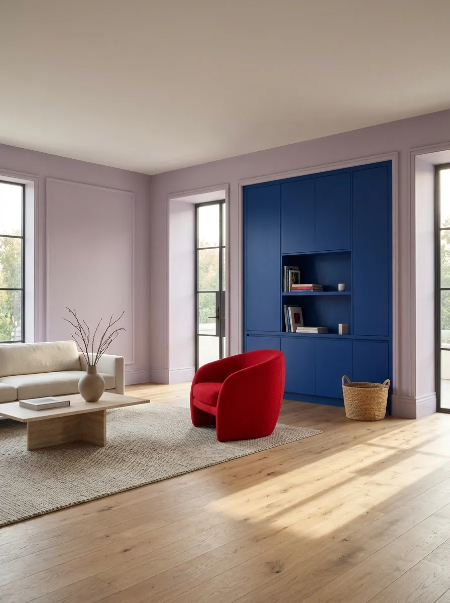
Cobalt and red can feel very graphic. Lilac softens the relationship without turning it neutral.
Try cobalt cabinetry, lilac walls, and a restrained red chair or artwork. Keep the red as the smallest major role and let the other colors establish the room. Simple surfaces help the combination stay legible.
Before committing: view the whole palette at room scale, including the floor and any timber you are keeping.
Pea Green, Peach, and Oxblood
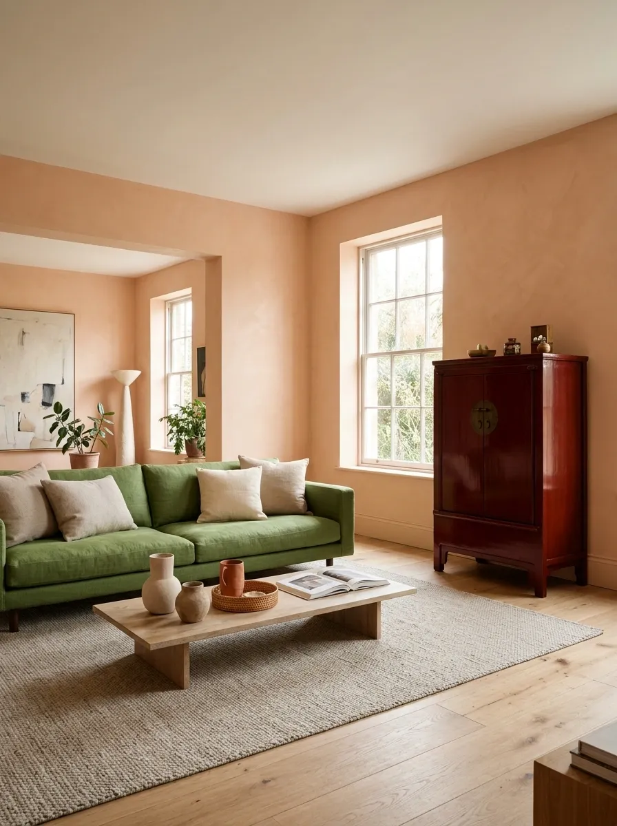
Pea green and peach create an unusual soft background, while oxblood gives the room a point of depth.
Try peach walls, green upholstery, and a deep-red cabinet or table base. Keep the oxblood concentrated so it anchors rather than overwhelms. This is the sort of palette that becomes more convincing when it includes a few personal objects and an ordinary wooden floor.
The room does not need to be universally agreeable. Choose a relationship you enjoy, give the colors proper roles, and let the existing materials help it feel like a home rather than a color exercise.