
Your sofa has a problem. It’s not the fabric or the legs or even the fact that you picked it because it was on sale. It’s the pillows. Two matching square cushions, same colour, same size, perfectly symmetrical, absolutely soulless.
Bohemian style gets misread constantly. People slap a tasselled throw on a cream couch and call it a day. That is not bohemian. That is a tasselled throw on a cream couch.
Real boho is about accumulated warmth. Texture meeting texture. Handcraft sitting next to print sitting next to solid. It looks casual because it took thought. That’s the trick most people miss.
This post is about fixing your pillows properly — not by buying the right ones blindly, but by understanding the logic underneath the look so whatever you put together actually works.
Texture Is the Architecture Your Sofa Is Missing
Most rooms are visually flat. Everything is smooth, woven, machine-finished. The eye has nothing to land on. Bohemian pillows solve this not through colour but through surface.
Knotwork That Earns Its Place
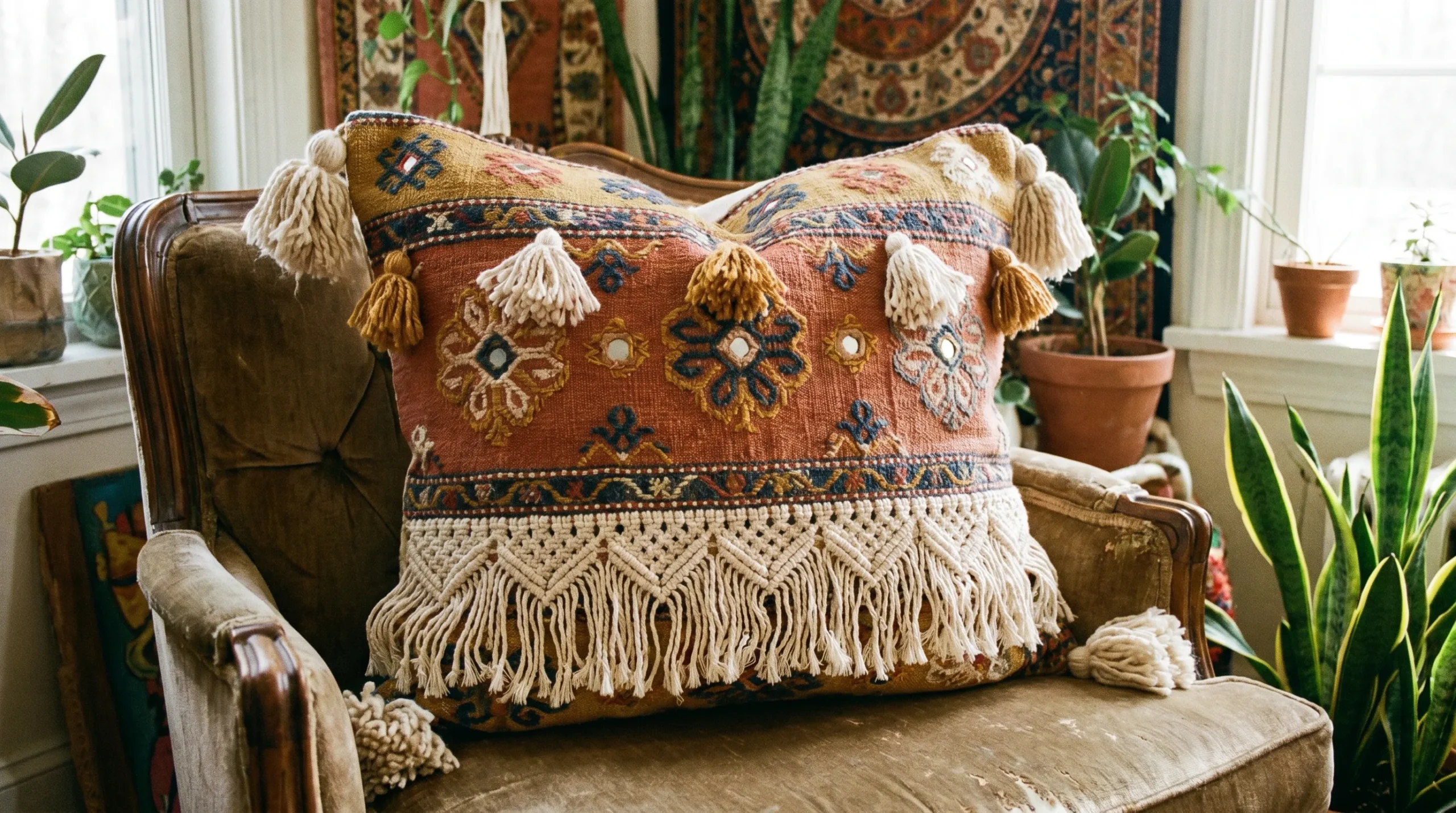
Macramé pillows are everywhere right now, which means most of them are terrible. A thin square of looped cotton dropped on a sofa doesn’t do much. You need density and pattern complexity for macramé to actually contribute something.
Look for pieces where the knotwork creates raised geometry — diamond lattices, interlocking chevrons, concentric shapes that cast shadow. The knots should be tight and intentional, not scattered. When done right, the pillow reads as sculpture before it reads as textile.
The colour almost doesn’t matter. Natural undyed cotton rope, terracotta cotton cord, even deep teal — what matters is that the knotwork has enough structure to hold up visually against a patterned sofa.
Woven Stripe and Surface Dimension
A flat woven stripe is fine. A woven stripe with multiple surface techniques running through it — raised honeycomb sections, open-weave bands, pom-pom trim, tassels at opposite corners in contrasting shades — is something else entirely.
The key is that different weaving techniques create different light-catching surfaces. Dark navy at the base transitions to powder blue mid-body, finished with a cream braided border at the top. Each band handles light differently. The pillow becomes interesting from across the room.
The Role of Fringe
Fringe is not decoration. It is punctuation. A bed runner or lumbar pillow that ends in long, dense fringe brings the eye down, extends the visual weight of the piece, and softens the edge between textile and surface.
The mistake is choosing fringe that is too sparse or too short to register. Fringe needs to be generous. It needs to move slightly. That slight movement is what makes a made bed look lived-in rather than staged.
Colour Without the Chaos
Bohemian colour palettes look chaotic from a distance. Up close, they follow rules most people haven’t been told about.
The Anchor Colour Principle
Pick one colour that appears in every single pillow, either as the main colour or as a detail. In terracotta arrangements, that anchor is rust — it shows up as the dominant shade in solid pillows, as the background tone in printed ones, as the fringe colour in woven ones. Everything else can vary wildly as long as that thread runs through.
On a dark charcoal sofa, the anchor might be teal — appearing in velvet, in a macramé lumbar piece, and in a small geometric accent. The cream and burgundy and rust pillows feel connected because teal keeps surfacing.
Jewel Tones on Dark Grounds
A dark sofa is an opportunity, not a limitation. Deep teal velvet, dusty rose velvet, burgundy velvet — against a near-black upholstery, these colours read like precious stones. They don’t compete. They glow.
Velvet needs no pattern to do its job. The way it catches and absorbs light at different angles is texture enough. Place one macramé piece with long fringe in front of velvet pillows and you’ve got the contrast that makes the whole arrangement interesting.
When Print Meets Print
Two different prints on the same sofa or bed work when they share a colour but differ completely in scale and type. A large geometric tribal print next to a small floral print doesn’t fight because the languages are different. They just happen to speak the same colour.
Where people go wrong is pairing prints of similar scale. Two medium-sized geometric prints sitting side by side create noise. One large, one small — that’s the rule.
Bohemian Pillow Ideas
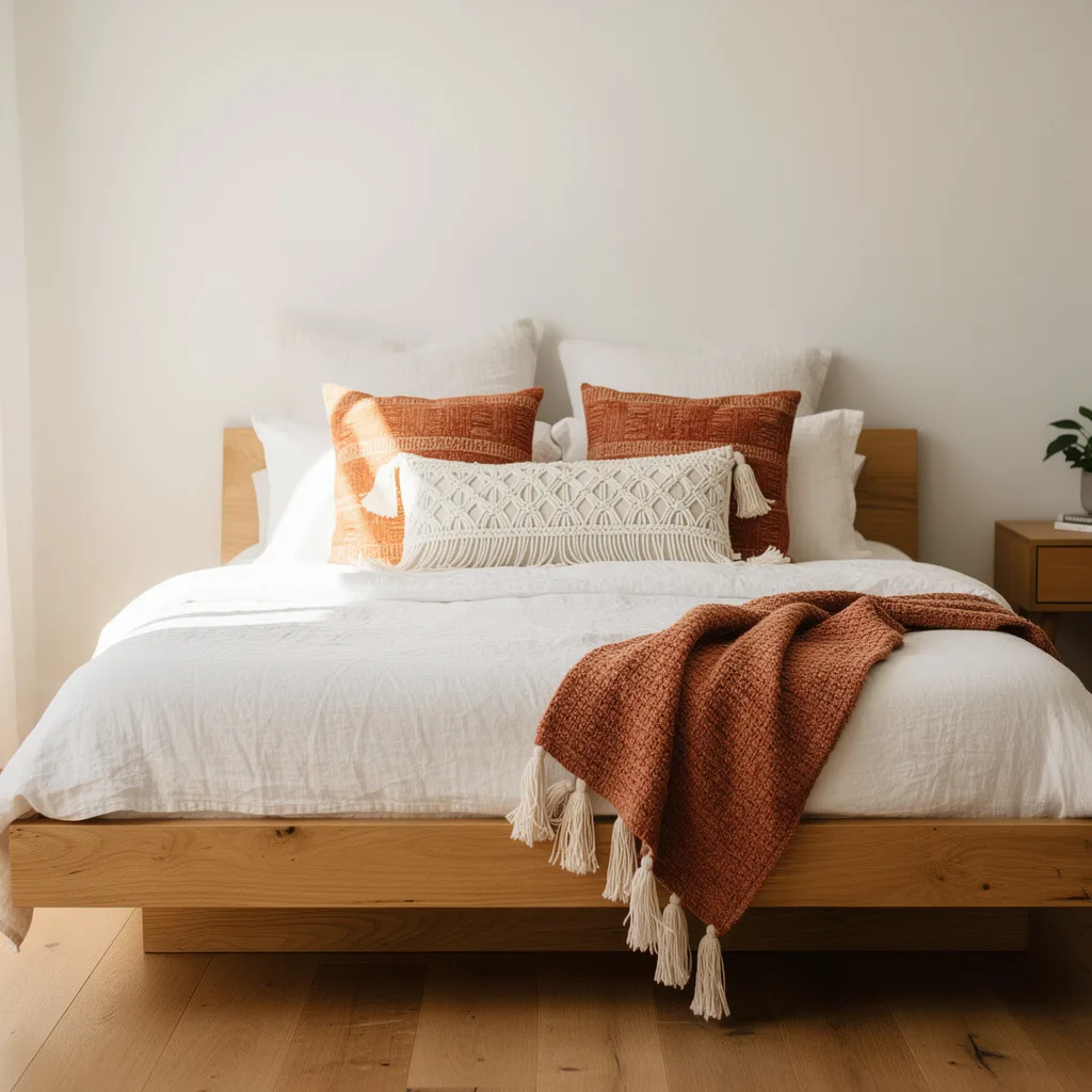
The Terracotta Macramé Bed Set
Source cotton macramé cord in a burnt orange or rust coloured dye — something warm but not neon, closer to fired clay than pumpkin. Work the cushion covers in a dense diamond-lattice pattern with knotted centres, and make a matching bed runner with the same stitch pattern running down the length and a generous fringe at the foot end — at least 15 cm of loose cord.
Back the covers with a plain cotton in the same rust tone. The texture of the knotwork against the flat backing is part of the effect. Pair with cream cotton bedding on a dark walnut slatted headboard and leave everything else neutral. The macramé does all the work.
The Blue Tonal Weave Statement
Choose a pillow cover woven in graduating shades of blue — light chambray at the top, deep navy at the bottom, with the colour shifting through four or five distinct bands. Within each band, use a different weave structure: honeycomb, open diamond, tight flat weave, a row of raised pom-poms, a section of loose finger-weave. Finish with corner tassels in cream at the top and navy at the bottom.
The contrast between the corner tassels reinforces the tonal shift in the body of the pillow. Photograph this against a cloud-grey linen sofa with a cream chunky throw draped beside it and it reads as coastal without being cliché.
The Triangle Macramé Cover
Take a plain cream or oatmeal cotton cushion cover and crochet or macramé a triangular overlay in undyed natural rope. The triangle should span from the top two corners down to a central point two-thirds of the way down the pillow face, leaving the lower portion of plain fabric showing.
End the triangle with five or six thick cord tassels of different lengths hanging from the bottom point and along the lower edge. The effect is a pillow that looks half-finished in the best possible way — deliberate exposure of the plain base makes the knotwork feel more intentional, not less.
Style it on a cream linen sofa with a wooden tray in front holding a book, a small plant, and a jar candle. The warmth of the candlelight against the cream rope is the whole image.
The Ruffle Print Boho Pile
Cut ruffle trim from a contrasting fabric — approximately five centimetres wide, gathered tightly — and stitch it along all four edges of a pillow cover made from bold printed cotton fabric. The print itself should be maximalist: dense geometric medallions, saturated colour, multiple competing motifs all within the same pattern. Think Rajasthani block print or Ottoman tile reproduction.
Make two covers in different colourways — warm red-orange and cool teal-turquoise work well together. Stack or pile them casually rather than propping them upright. The ruffle breaks the hard edge of the pillow and keeps a heavily printed fabric from feeling stiff.
The Tile Print Floor Pillow
Find or commission a fabric printed in a patchwork of traditional tile motifs — each square a different pattern within a shared colour family of cobalt, gold, terracotta, and cream. Have covers made in a large floor cushion size, 60 cm square minimum.
Place this on a richly layered bed with a matching woven kilim bedspread and an ornate iron headboard hung with fabric bunting. The pillow does not need to be subtle. It needs to hold its ground against a room full of pattern, and a tile-print in these proportions will.
The Mediterranean Outdoor Arrangement
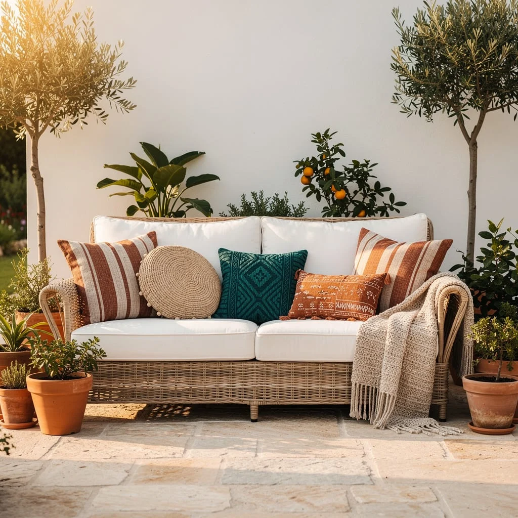
On a wicker or rattan outdoor sofa with white or cream seat cushions, build a pillow stack using three shapes: two large rust-and-cream striped rectangles on the outside, one round woven jute circle in the centre, one small teal geometric square in front, and one terracotta embroidered lumbar at the front. Lay a cream cotton fringe throw over one arm.
The outdoor context means you can go bolder with colour because daylight flattens intensity. What reads as bright terracotta indoors reads as warm natural tone outside. Don’t mute it.
The Warm Pom-Pom and Tassel Mix
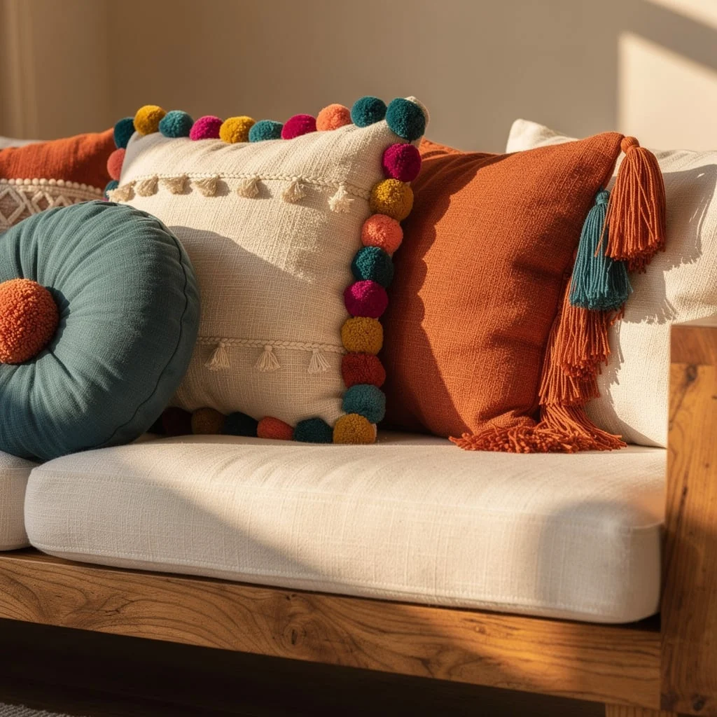
On a raw wood-framed sofa with plain cream upholstery, place three pillows in close contact: one teal round cushion to the left, one cream natural linen square trimmed with a dense border of multicoloured pom-poms in the centre, one rust boucle square with corner tassels in two different tones to the right.
The pom-pom border is the thing. Make it yourself by sourcing large wool pom-poms in teal, mustard, hot pink, rust, and cream and hand-stitching them densely enough that they touch each other. The trim should be so saturated with colour that it reads almost as a pattern in its own right.
The Monochrome Texture Sofa
On a cream linen sofa, place two large cream macramé pillows with identical diamond knotwork on the outside, one deep teal macramé square in the exact same diamond pattern at the centre, and drape a loose cream knit throw over the left arm.
The logic here is that colour contrast is doing none of the work — the two cream pillows and the one teal pillow are in the same family of surface technique. The sofa stays calm. What you’re selling is texture and restraint, and the single teal pillow is bold enough to be the feature without destabilising everything else.
The Dark Velvet Drama
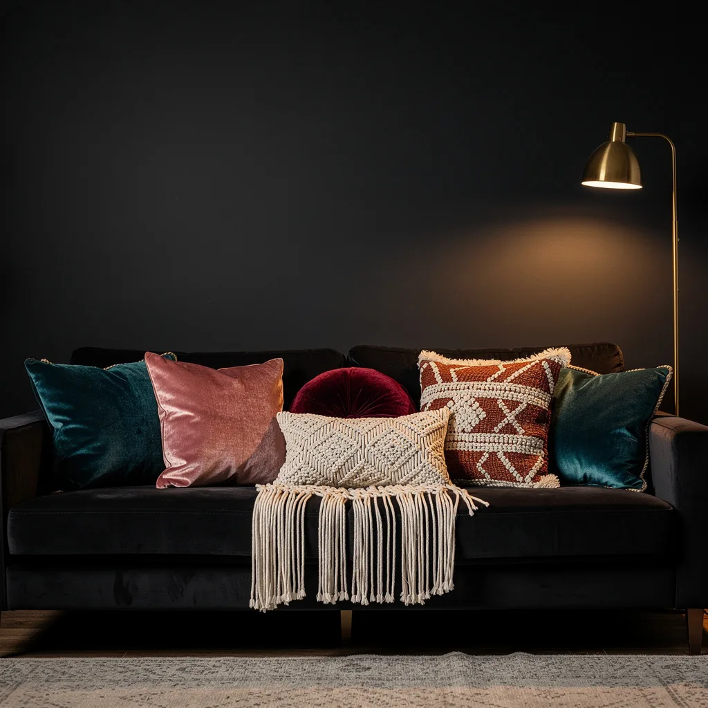
On a near-black sofa, place teal velvet squares on the outer edges, dusty rose velvet squares overlapping slightly toward the centre, a burgundy velvet round in the middle, and a cream macramé lumbar with long fringe laid across the front. Add a brass floor lamp to one side.
The macramé lumbar against the velvet pillows is the critical contrast. Without it, the arrangement is just velvet cushions on a dark sofa — luxurious but static. The handmade quality of the macramé adds roughness that keeps the velvet from looking too composed.
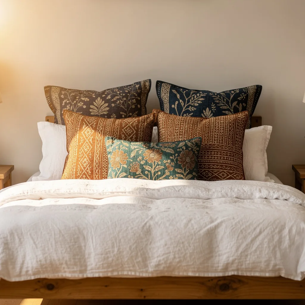
The Linen and Sun Embroidery Bed
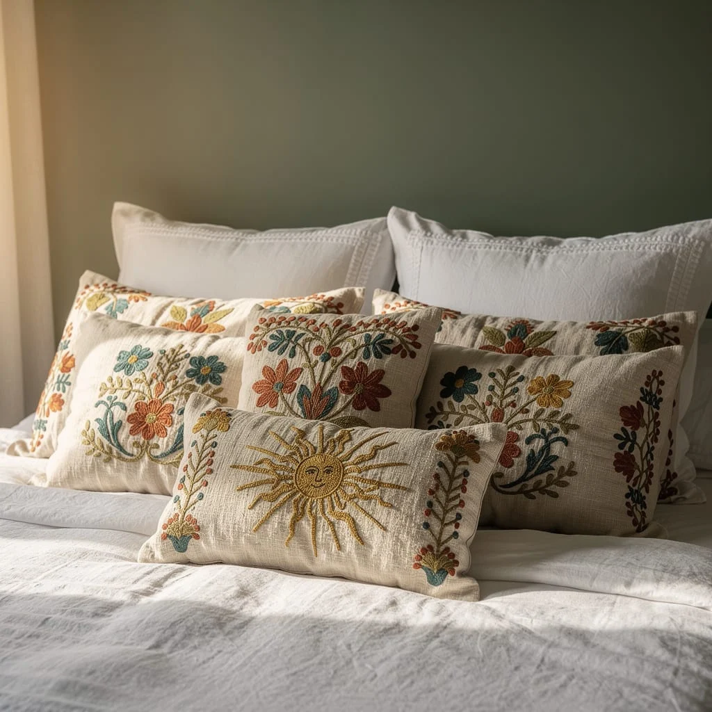
Layer plain linen pillowcases in pale grey at the back. In front, place two cream linen oblong pillows hand-embroidered with botanical sprigs in rust, teal, mustard, and sage — loose stems and open flowers, not tight needlepoint. At the front centre, position one small lumbar pillow embroidered with a single large sun motif in gold and amber thread.
The embroidery colours should appear in the bedding or the wall behind it somewhere. Sage green wall paint makes the teal embroidery look intentional. The sun motif lumbar is the one thing on the bed that reads as a conscious choice rather than a collection.
The Boho Floor Seating Room
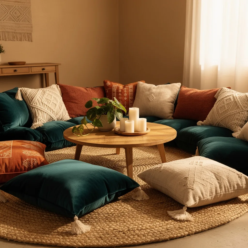
On a deep teal velvet sectional or floor cushion arrangement, layer outward-facing pillows in rust, cream macramé, and printed rust-and-cream. Place large teal velvet floor cushions directly on a jute rug as overflow seating. Centre a small round wooden table with a plant, three pillar candles on a wooden disc, and nothing else.
The floor cushions extend the pillow logic of the sofa to the whole room. Teal and rust reappear in the floor pieces, so the room reads as a single cohesive decision rather than a sofa with a rug in front of it.
The Macramé Hammock Moment
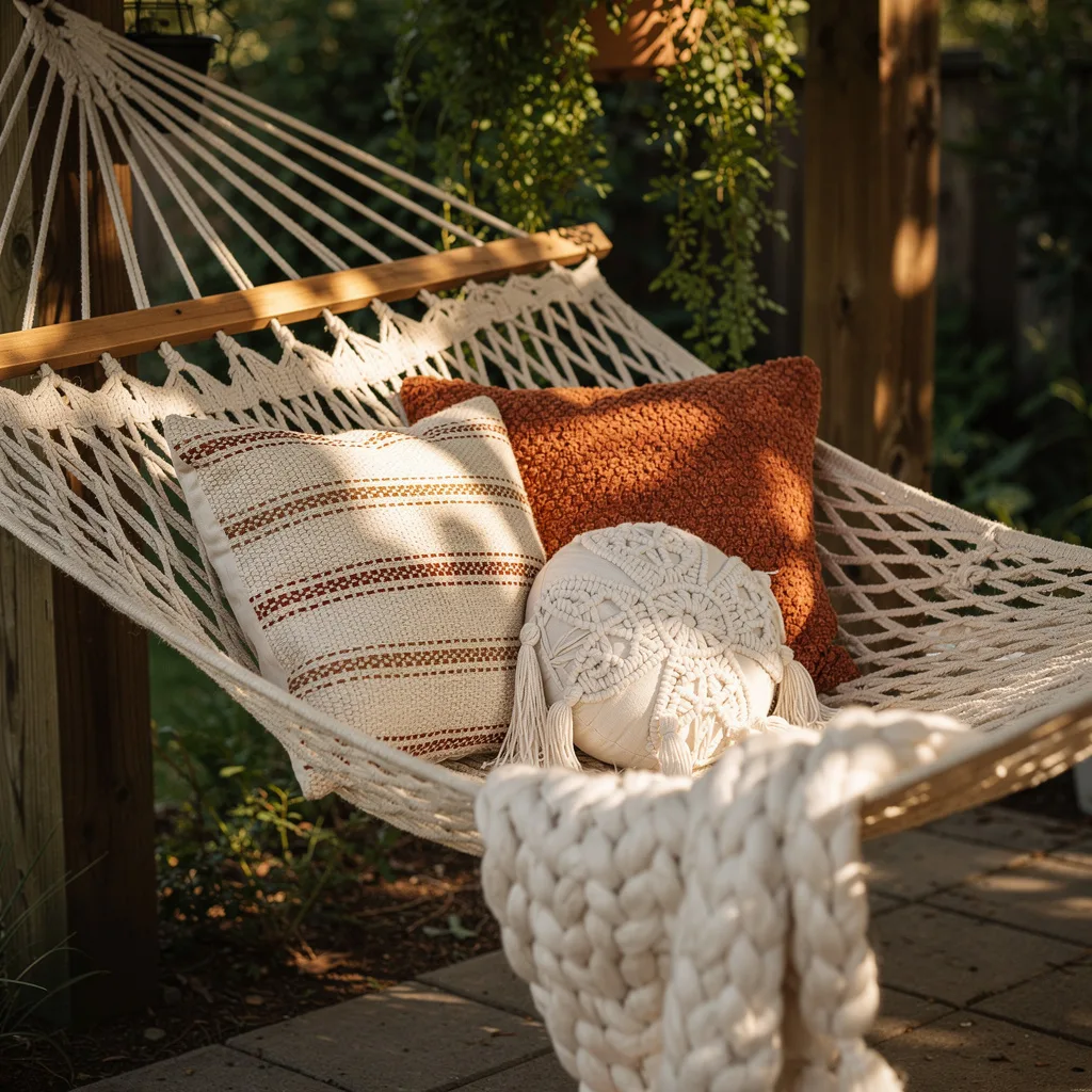
In a woven rope hammock strung between timber posts, place three pillows: one large cream and rust stripe weave, one rust chunky-knit square, and one cream macramé round with tassel detailing. Drape a chunky cream arm-knit blanket over one end.
The key to this working is that every textile shares a family resemblance — natural fibres, open-weave structures, ivory and rust tones. The hammock itself is part of the composition. Don’t use anything plastic or synthetic in this arrangement.
The Kantha Quilt Bedroom
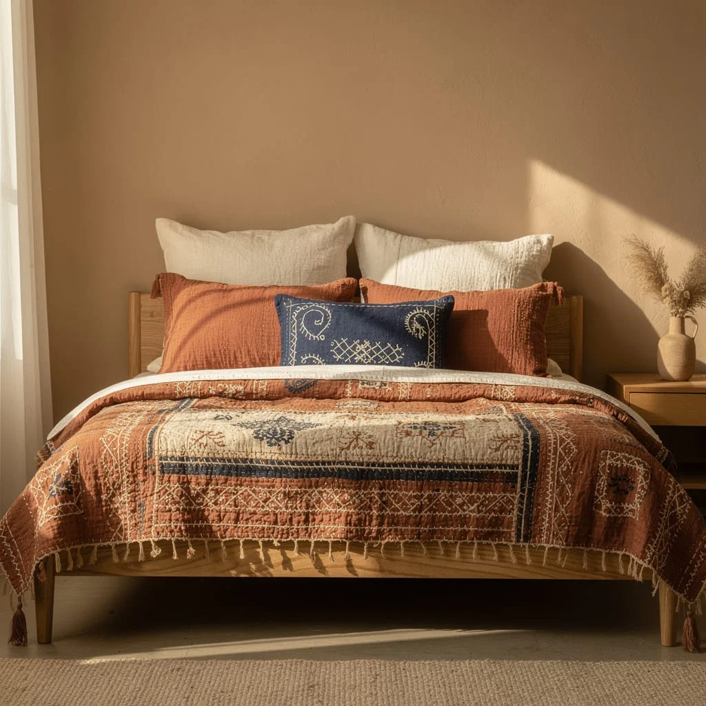
Dress the bed in a rust and indigo block-printed kantha quilt — the traditional running stitch visible across the surface, the quilt slightly crinkled rather than pressed flat. Use rust cotton gauze pillowcases on the sleeping pillows. In front, place one indigo cotton lumbar pillow embroidered with stitched folk motifs in cream and coral.
The kantha quilt does the heavy lifting. Everything else needs to step back. The fringe at the foot of the quilt matters — make sure it hangs evenly and isn’t tucked under the mattress.
The Nordic Minimal Bed
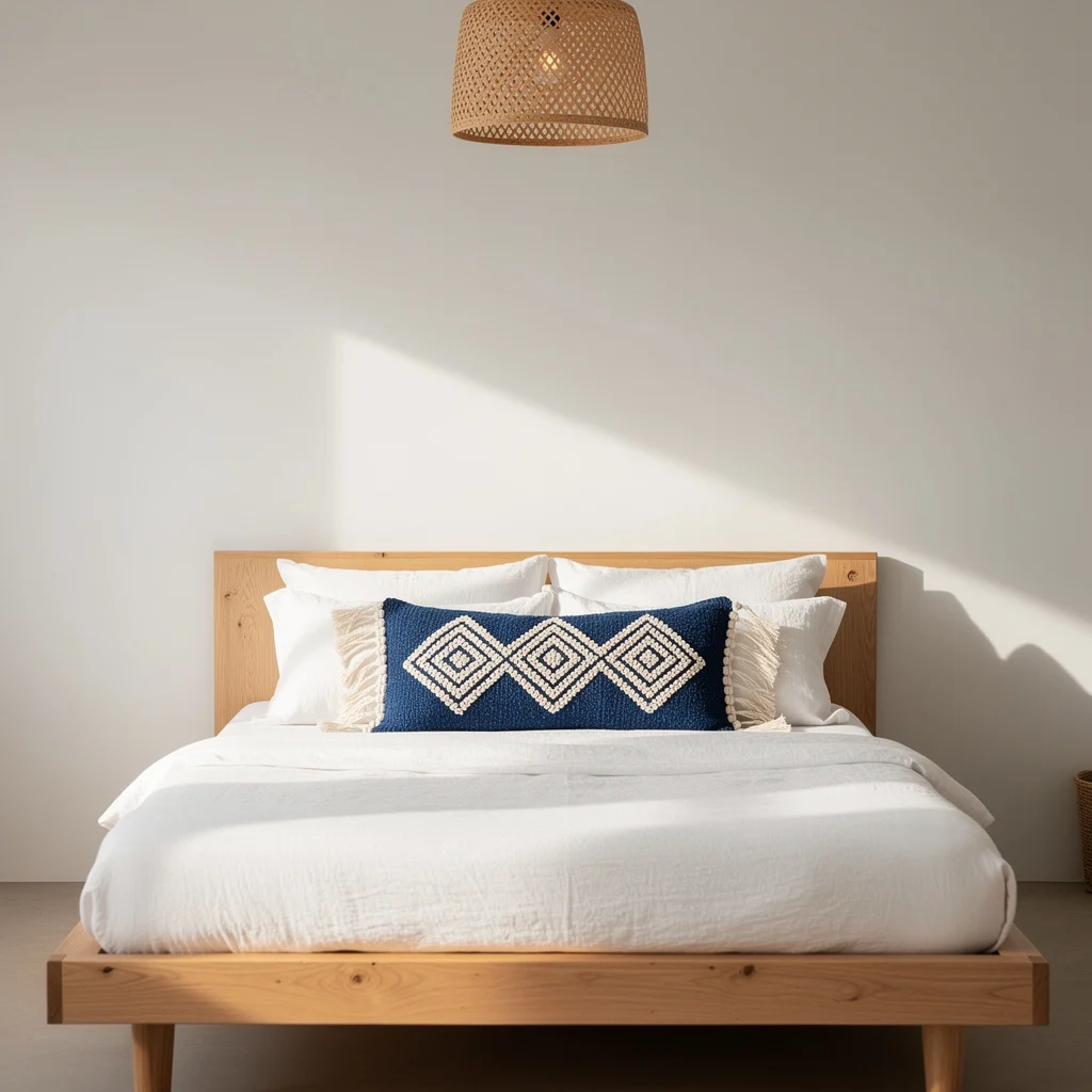
On a flat-platform oak bed with white linen bedding, place two white textured square pillows on either side — woven cotton with subtle raised detail and cream tassels. In the centre, place one navy blue lumbar pillow with three raised cream diamond motifs worked in looped pile or punch needle. Above, hang a woven rattan pendant light.
The restraint here is the point. One print, one accent colour, and everything else white. The diamond motifs on navy read as confident rather than fussy. Resist adding more.
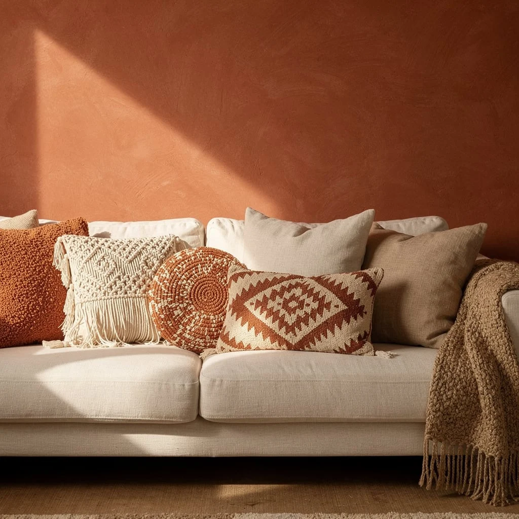
The Cream Macramé Tonal Sofa
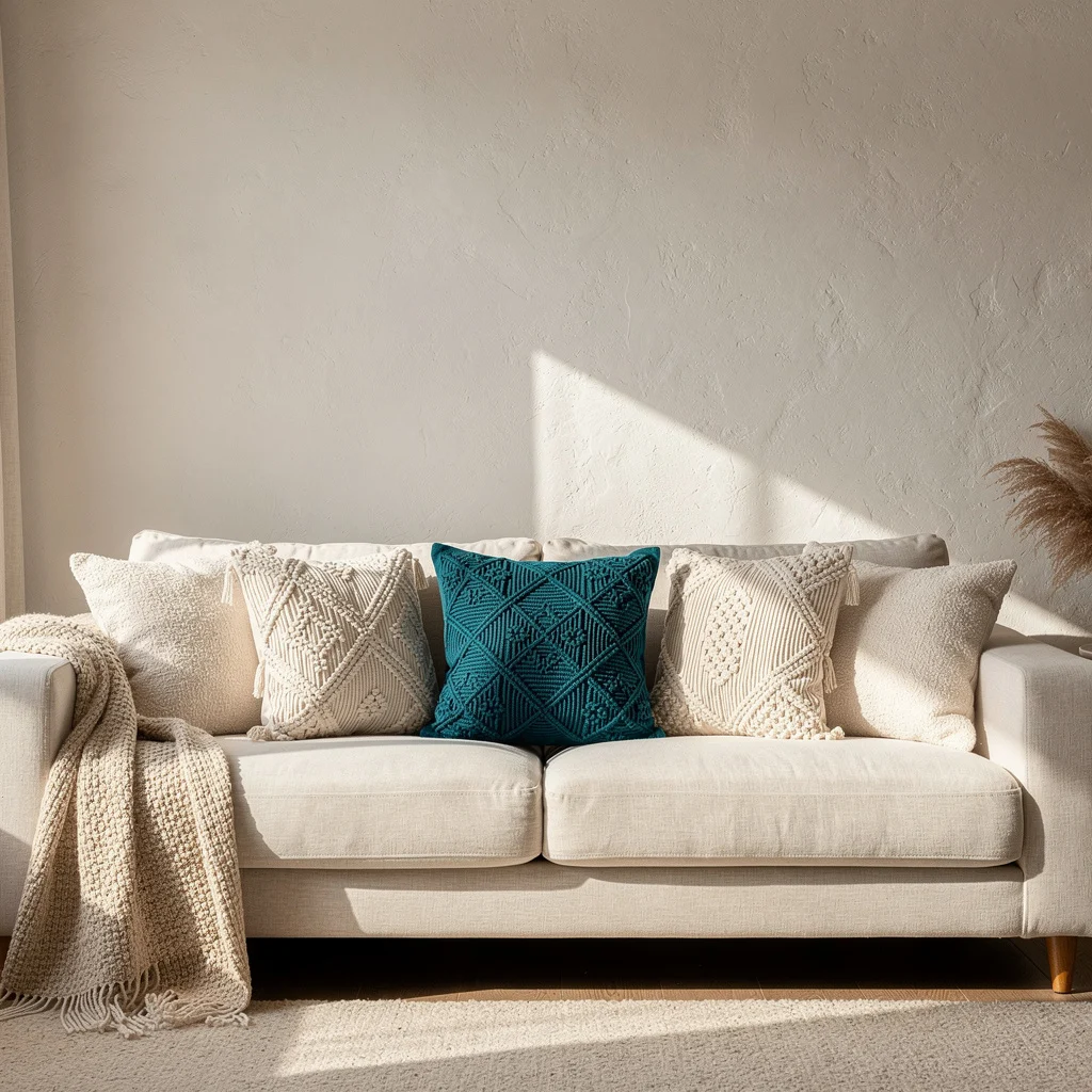
On a cream or off-white sofa, stack two cream macramé diamond-knotwork squares on either side and one deep teal macramé square of the same pattern in the centre. Leave a cream throw draped over the left arm.
This is a tone-on-tone arrangement disrupted by one colour decision. The teal has to be genuinely deep — not aqua, not mint, not turquoise-leaning. A dark teal that almost reads as green-black in shadow is what keeps this from looking washed out.
The Block Print Layers Bed
On a white washed-linen bed with a raw timber frame, build the pillow stack from the back: two large pillowcases in deep charcoal brown with gold leaf-print motifs, two in midnight navy with gold botanical print. In front, two medium orange-amber pillows with geometric stripe print in rust and cream. At the very front centre, one small lumbar in deep teal with a large printed chrysanthemum in burnt gold.
The architecture is back-to-front in terms of size and warmth — darkest and largest at the back, warmest and smallest at the front. This gradient creates depth. The bed looks like something you pulled together over time, not a set you bought all at once.
The Kids’ Boho Bedroom
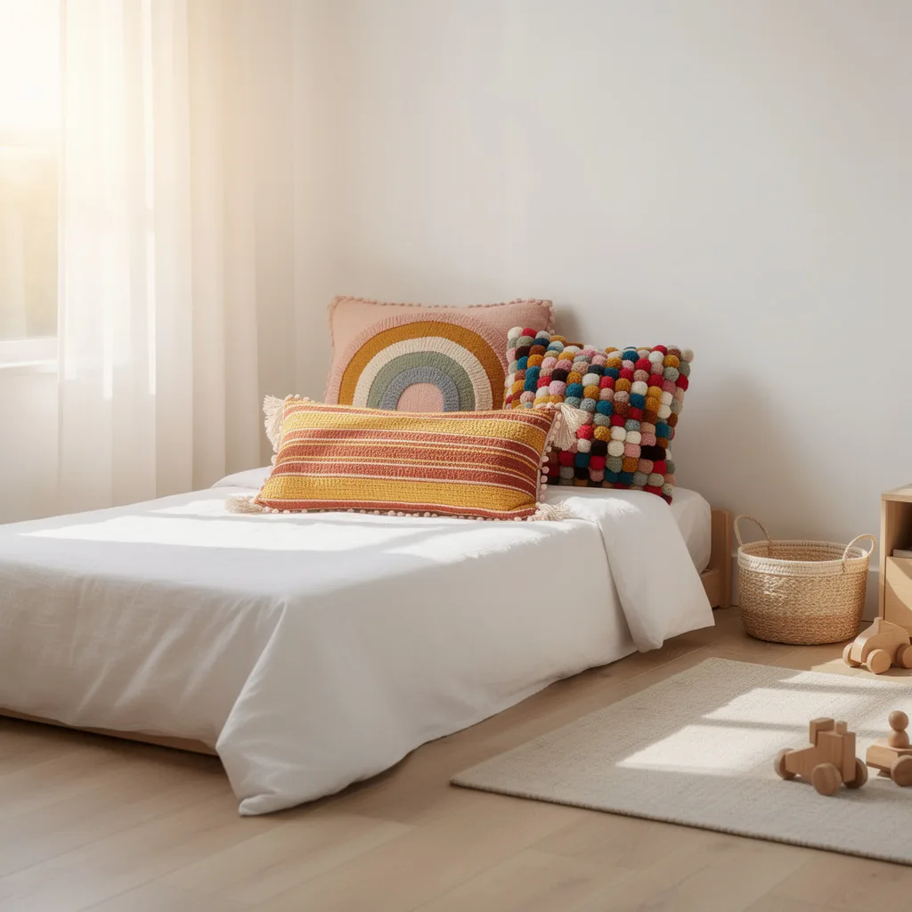
On a low floor-bed in a white room, place a yellow and rust striped lumbar pillow with pom-pom trim along one long edge, a large round pillow with a concentric rainbow motif worked in tufted wool from blush to sage, and a square grid-format pillow built entirely from multicoloured wool pom-poms in rows. Pair with light wood toys on the floor and a natural rattan storage basket.
The pom-pom grid pillow is the key piece. Source or make it using large 5 cm wool pom-poms in ten or more different shades stitched into a grid on a plain canvas backing. It is a pillow that is also a colour chart, and children will fixate on it.
The Window Seat Floor Cushion Nook
On a large teal woven floor cushion, layer two back pillows: one cream macramé diamond-weave with corner fringe tassels, and one rust-and-cream kilim-style geometric square. Add one rust round knitted cushion behind them. Stack a small collection of hardcover books to the left and place a trailing pothos plant in a plain pot on the right windowsill.
The floor cushion carries the room’s interest when there’s no sofa. It needs to be large enough — at least 80 cm square — to hold the pillow arrangement comfortably and still have visible teal surface showing around them.
The Rattan Sofa with Chunky Throw
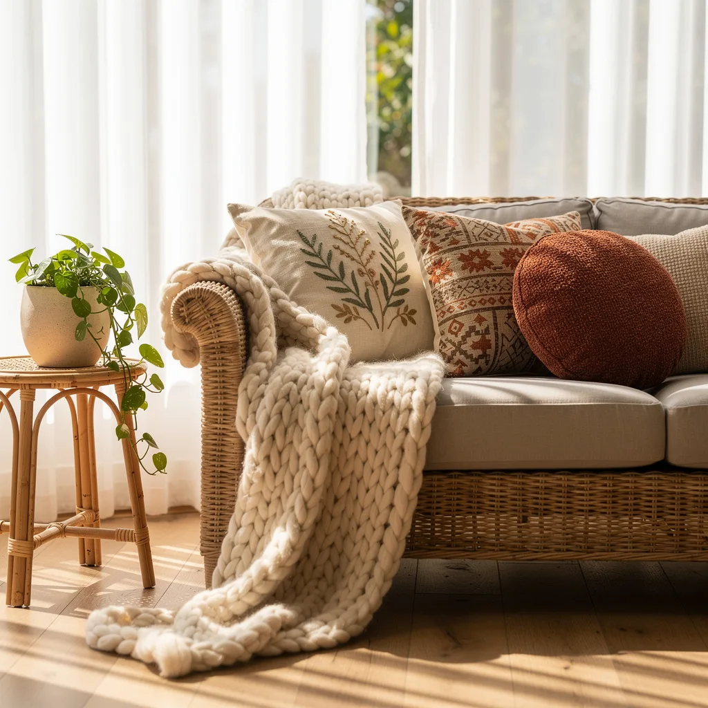
On a wicker or rattan-wrapped sofa with grey or greige cushions, position a cream linen square pillow with a simple embroidered botanical sprig near the arm, a rust-and-cream Aztec-print medium pillow in the centre, and a rust boucle round toward the other arm. Drape an oversized arm-knit cream blanket — the kind made from merino roving in very thick loops — over the arm and onto the seat. Place a pothos in a white ceramic pot on a rattan side table.
The arm-knit blanket changes the reading of the whole arrangement. It makes the sofa look occupied and comfortable even when empty. The loops should be large enough to show the twist of the fibre.
The Minimal Warm Bedroom
On a solid-plank oak platform bed with white linen, place rust textured pillow shams on the sleeping pillows. Layer one cream macramé lumbar with arched diamond motifs and corner tassels centred in front. Casually fold a rust boucle knit throw and let it fall over one corner of the bed foot.
Nothing else. No artwork, no throw blanket spread across the whole bed, no additional pillows. The rust throw at the foot is the permission slip for the warm tones up top. Without it, the rust pillows look accidental. With it, they look like a decision.
What All of This Is Really About
The rooms that work aren’t the rooms with the best individual pieces. They’re the rooms where every piece is in conversation with something else — colour echoing colour, texture answering texture, shape balanced by a different shape.
Bohemian style is not about quantity. It’s about connection. A single macramé pillow on an empty white sofa is an ornament. That same pillow beside a printed cotton, beside a velvet solid, beside a knit round — now it’s part of a language.
The pillows in this post share almost nothing on the surface. Terracotta macramé and blue woven stripe and embroidered linen sun cushions would seem to have little in common. But every single one has a handmade quality, a visible process, a surface you want to touch. That is the thread.
Stop shopping for individual pillows. Start building a collection that has something to say.