
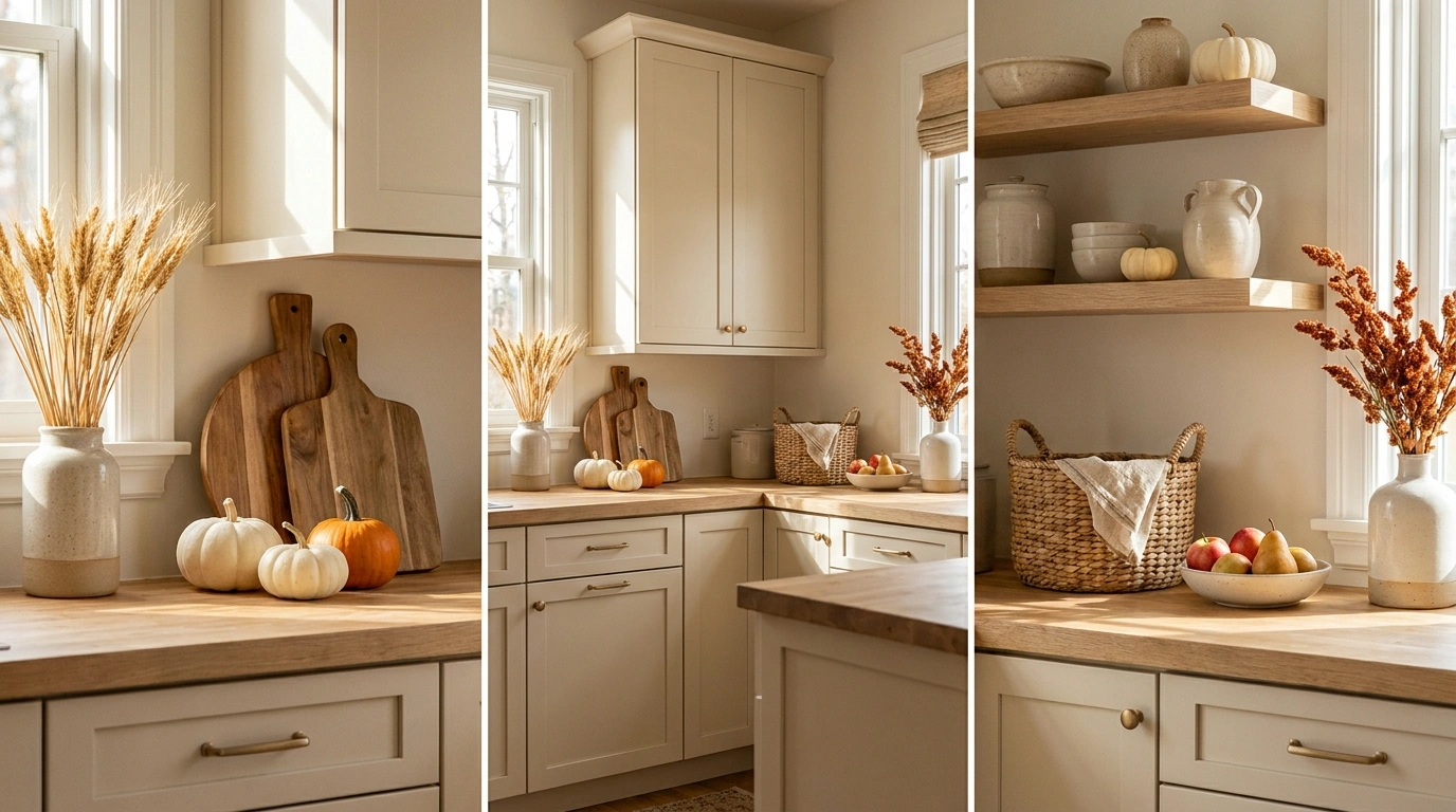
A kitchen doesn’t need to look like a pumpkin display to feel like fall. In fact, the best seasonal counters usually do the opposite. They leave plenty of the kitchen visible and let a few well-chosen materials, colors, and natural textures change the mood.
The problem is that countertop space disappears quickly. A cutting board becomes a tray. The tray gets a candle. Then comes a pumpkin, a sign, a vase, another pumpkin, and suddenly the counter you actually cook on has become a decorative obstacle course.
That’s what makes complete styling references useful. You can see how a kitchen actually handles seasonal color, texture, height, and empty space before you start moving things around.
Complete Fall Kitchen Countertop Looks
Cozy Tray With Fall Blooms
This setup takes the cozy kitchen aesthetic to an entirely new level without feeling cluttered.
The base features a bright marble countertop with a simple wooden tray anchoring the scene. Inside, a rustic pitcher overflows with rich purple and cream dried florals, flanked by white pumpkins and a warm, glowing candle that adds instant ambiance.
The magic here is in the lighting and layering. The soft candlelight reflecting off the marble creates a deeply inviting space that feels like a quiet autumn evening captured right on your kitchen island.
Pumpkin Trough on Warm White Quartz
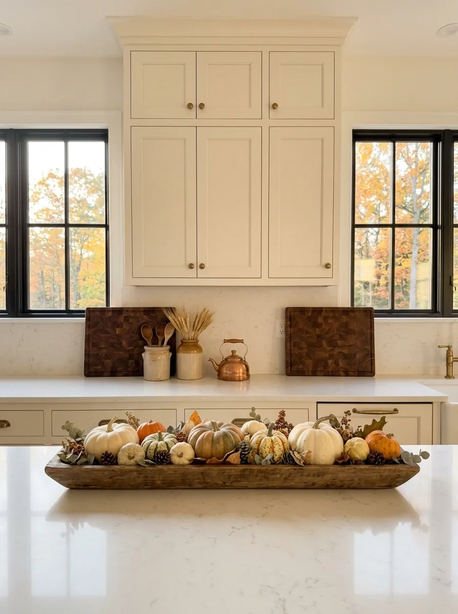
This is the classic autumn kitchen, but done with enough restraint to keep it from looking like a seasonal aisle at a craft store.
The base is a bright transitional kitchen with warm white quartz, creamy cabinets, antique brass hardware, and a little natural oak. Along the main counter sits a long reclaimed-wood trough filled with cream, muted orange, and pale green pumpkins. A pair of ceramic crocks adds height at one end, while two oversized cutting boards lean against the backsplash.
The trick is the low, horizontal shape of the centerpiece. It gives the counter a strong seasonal focal point without blocking the kitchen’s architecture. I’d keep the area around the sink fairly clear. The trough already has the job.
Warm Autumn Coffee Corner
A dedicated coffee station naturally becomes the heart of the kitchen when the weather turns crisp.
Here, creamy cabinetry and rich wood counters frame a sleek espresso machine. The autumn update arrives through an abundance of amber glassware, a basket of freshly baked pastries, and deep rust-toned foliage arranged casually in a vintage vessel.
The styling is both gorgeous and completely practical. You get a fully functional morning routine wrapped in warm seasonal colors that make every cup of coffee feel like a weekend ritual.
Moody Kitchen With Burnt Orange Ceramic
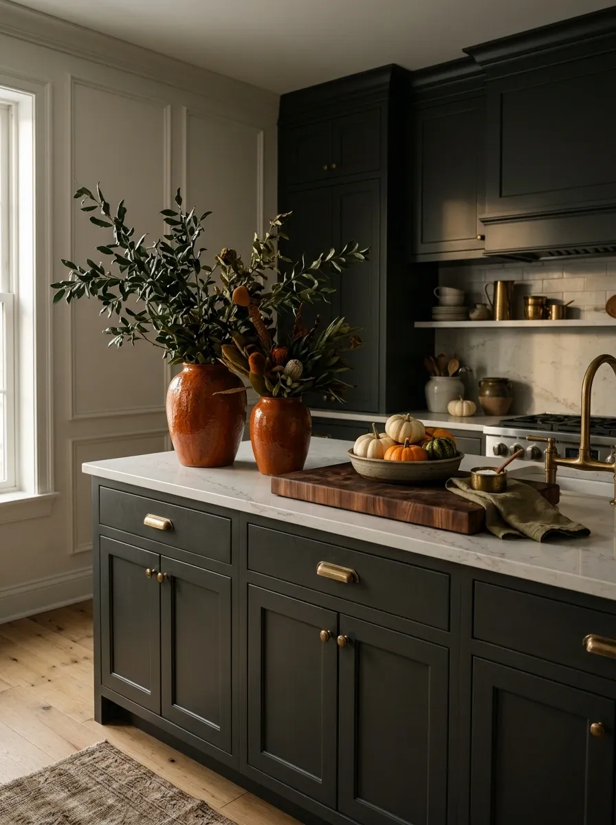
Dark kitchens can handle autumn colors beautifully because the background does most of the visual heavy lifting.
Here, charcoal cabinetry meets softly veined stone counters and aged brass lighting. Instead of covering the counter in orange, the seasonal color arrives through a few substantial ceramic vessels in burnt orange. Dark green branches, a thick walnut board, and one low bowl of small pumpkins fill out the composition.
The result is richer than the usual orange-and-white fall formula. The dark cabinetry also keeps the ceramics from looking overly sweet. This is the direction I’d choose for a kitchen that already has strong architecture and doesn’t need decorative noise.
Harvest Floral Kitchen Island
Sometimes the best countertop styling relies on a single, show-stopping focal point.
A classic wood surface serves as the backdrop for a dramatic arrangement of golden leaves, deep burgundy florals, and nestled white pumpkins. The composition bursts outward with rich, natural textures that instantly command attention.
The trick is letting the centerpiece do all the heavy lifting. Keeping the surrounding space simple allows the vibrant autumn colors and organic shapes to shine without overwhelming the entire room.
Scandinavian Fall Breakfast Counter
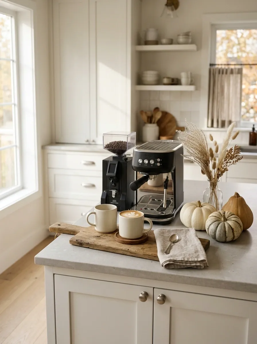
Nothing here screams autumn, which is exactly why it works.
The kitchen starts with pale oak, soft white cabinetry, simple hardware, and a clean stone counter. A compact coffee station occupies one side, layered with handmade cream mugs, a wooden serving board, a folded linen towel, and a small arrangement of dried grasses. A handful of pale pumpkins sits nearby, mixed with one or two warmer pieces so the palette doesn’t become completely washed out.
The styling is calm and useful. Most of what you see could stay on the counter after October, which makes the seasonal pieces feel integrated rather than temporary.
Vintage Farmhouse Baking Station
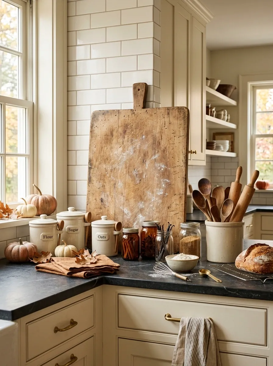
This one works because the countertop looks like it was meant to be used.
A farmhouse kitchen with painted cabinetry and darker counters becomes an autumn baking station with a broad wooden bread board, vintage brass details, cream flour canisters, amber glass jars, and a few cinnamon-toned textiles. Small pumpkins tuck around the practical pieces rather than taking center stage. A ceramic crock holds wooden utensils, while a linen towel hangs casually nearby.
The seasonal styling feels convincing because the objects have jobs. The counter isn’t decorated first and explained later. It already looks like somewhere you’d bake bread on a cool afternoon.
Olive Green and Terracotta Harvest Counter
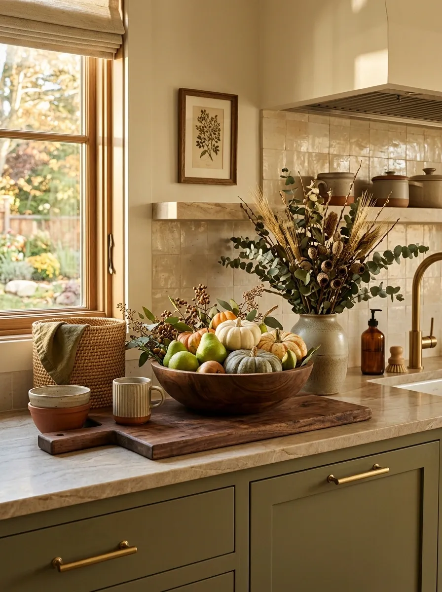
This is where fall color gets earthy instead of pumpkin-orange-heavy.
Muted olive cabinetry sets the base, with warm stone counters and terracotta ceramics bringing in the autumn warmth. A large wooden bowl holds pears and a few small pumpkins, while woven baskets, dried eucalyptus, and a broad cutting board create layers around it.
The strongest part is the color relationship. Olive and terracotta have enough contrast to make the countertop interesting without looking loud. The wood bridges the two and keeps the whole scene grounded.
I’d resist adding more orange here. The terracotta already gives the kitchen its seasonal warmth, and another strong seasonal color would muddy the composition.
Minimal White Kitchen With One Dramatic Harvest Bowl
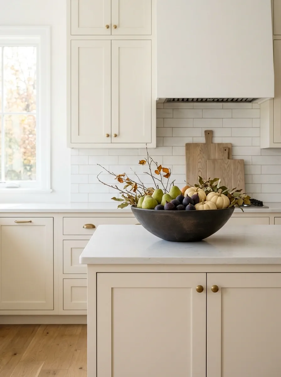
The cleanest fall kitchen in the room might be the one with the fewest decorations.
A bright white kitchen with pale counters, simple cabinetry, and restrained brass fixtures gets one oversized dark ceramic bowl filled with pears, figs, cream pumpkins, and a few dried branches. A pair of pale wood boards leans against the backsplash, and that’s about it.
The oversized bowl gives the counter a clear focal point while the rest of the space stays quiet. This is especially effective when the kitchen already has good cabinetry or attractive stone. Adding more would only compete with the architecture.
Rustic Countertop With Copper and Apples
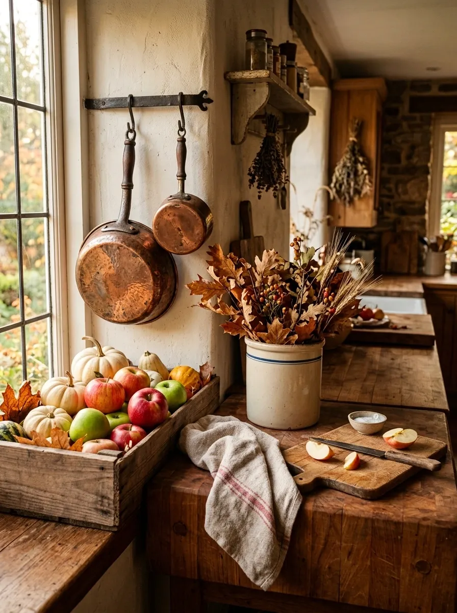
Warm wood and copper already have enough autumn character that the seasonal pieces can stay simple.
A rustic kitchen with butcher block counters becomes a harvest-inspired scene with aged copper cookware, a wooden crate of red and green apples, pale pumpkins, a vintage ceramic crock, and a loose arrangement of autumn leaves. A thick linen towel rests near the prep area, making the scene feel genuinely used rather than staged for a photograph.
The apples matter here. They bring color and life without relying entirely on decorative pumpkins, and the copper adds a warm metallic layer that plays beautifully against the wood.
Soft Blue Kitchen With Dusty Pumpkin Tones
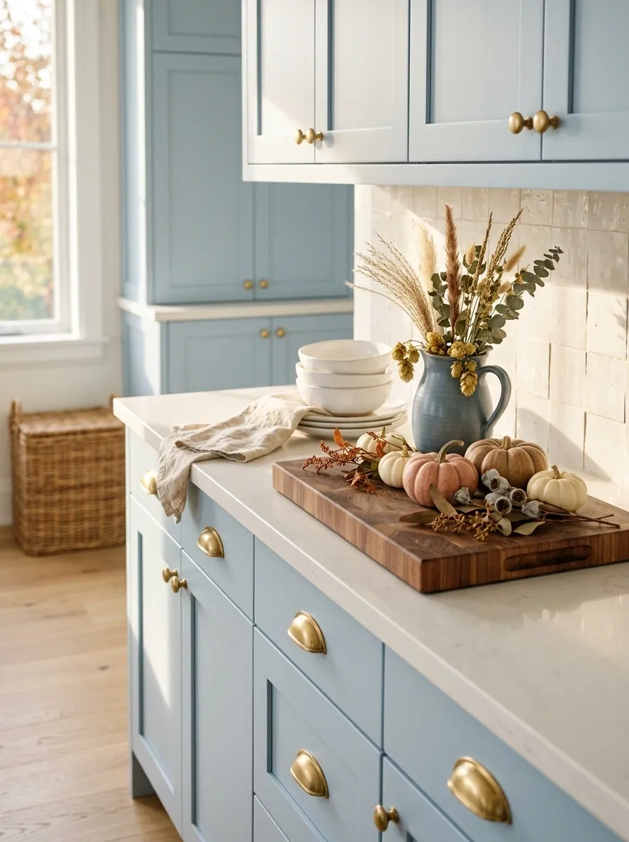
Autumn doesn’t have to mean turning the entire kitchen orange.
A pale blue kitchen with creamy quartz counters, unlacquered brass, blue-gray ceramics, and light wood gets its seasonal character from dusty peach and muted pumpkin tones. A loose cluster of small pumpkins sits beside a wide wooden cutting board, while dried stems rise from a simple ceramic pitcher.
The cool cabinetry actually makes the warm seasonal colors look more interesting. They have contrast without becoming harsh. This is a useful direction for anyone who likes fall decor but doesn’t want their kitchen to suddenly look completely different from the rest of the house.
English Country Counter With Pears and Brass
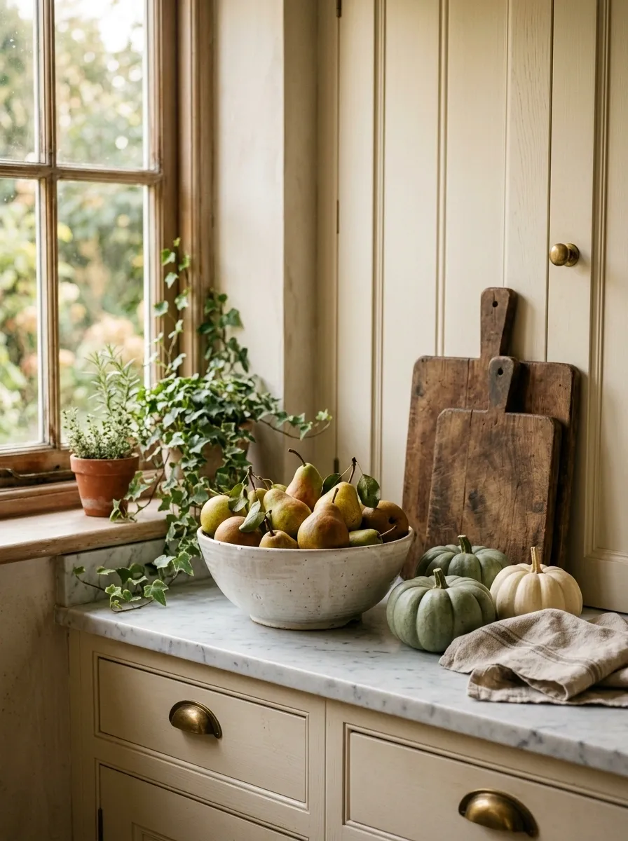
This kitchen looks collected instead of decorated.
Cream cabinetry, marble counters, aged brass hardware, and vintage-inspired ceramics create the foundation. A deep ceramic bowl filled with pears becomes the focal point, supported by small green pumpkins, folded linen, dark wooden boards, and trailing greenery.
The pears are doing more work than a collection of tiny pumpkins ever could. Their natural shape softens the straight lines of the cabinetry and adds an edible, slightly imperfect quality to the scene.
Keep the seasonal styling loose. The charm comes from the slight asymmetry.
Black Countertop With Cream Pumpkin Cluster
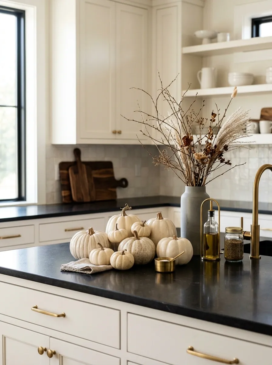
Black counters give you a strong background, so the seasonal palette can stay surprisingly soft.
A modern kitchen with warm white cabinetry, black countertops, and restrained brass details gets its fall update from cream pumpkins in different sizes. Dark wood cutting boards, a matte stone vessel, and a handful of dried branches add depth without introducing a lot of competing colors.
Cream works particularly well here because it creates a crisp contrast against the counter while still relating to the surrounding cabinetry. Bright orange would push the composition in a much louder direction.
Open Shelf Coffee Corner With Autumn Layers
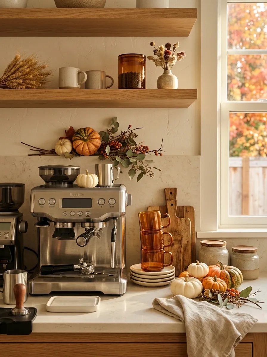
A coffee station already has a natural visual rhythm, which makes it an easy place to build a fall composition.
Here, warm oak shelving sits above a creamy countertop with an espresso machine, amber mugs, handmade ceramics, and stacked wooden boards. A small pumpkin arrangement fills the open space beside the coffee setup while a folded linen towel adds softness.
The useful pieces do most of the styling. That keeps the area believable and stops the seasonal accents from feeling pasted onto an otherwise unrelated coffee bar.
Deep Burgundy and Walnut Kitchen
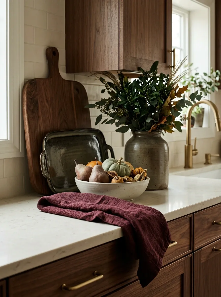
If traditional orange feels too obvious, bring fall in through darker color.
This kitchen uses deep burgundy textiles, walnut boards, creamy stone, dark green foliage, and brass hardware. A simple ceramic bowl holds muted autumn produce, while a folded burgundy linen towel gives the counter its strongest seasonal note.
The palette is richer and less literal than a pumpkin-heavy setup. Walnut keeps the burgundy from becoming too dramatic, while the cream stone stops the composition from sinking into darkness.
The biggest mistake here would be adding more color. The burgundy already tells the story.
Cottage Kitchen With Dried Sunflowers
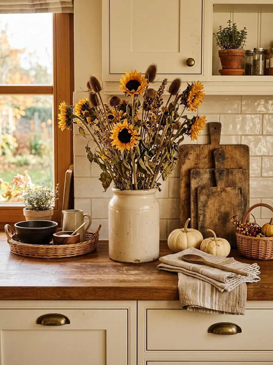
This is the relaxed country version, where the counter feels a little imperfect and all the better for it.
Cream cabinetry and butcher block counters form the base. A vintage crock holds dried sunflowers, while pale pumpkins, woven baskets, linen towels, and a stack of old-looking baking boards fill out the surrounding space. Nothing is perfectly centered.
The height comes mostly from the sunflowers, which keeps the counter visually interesting without needing a lot of objects. That’s important in a smaller kitchen. Let one element rise instead of raising everything.
Modern Marble Counter With Sculptural Pumpkins
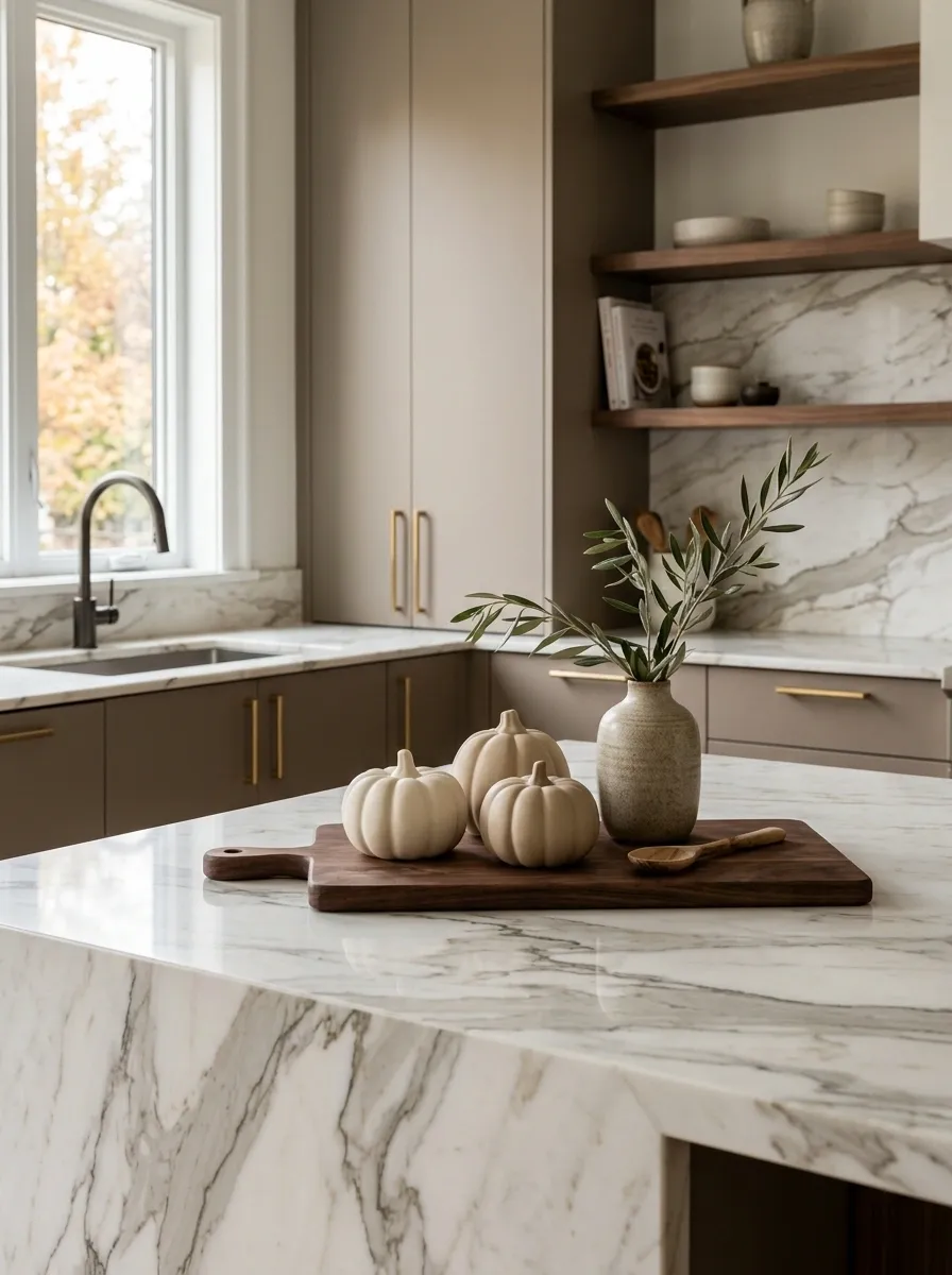
Let the stone be the star and decorate around it.
A contemporary kitchen with dramatic marble veining, taupe flat-front cabinetry, and restrained hardware gets just a few matte ceramic pumpkins, a single olive branch arrangement, and a dark wood accent. The objects are quiet enough to let the marble remain visible.
This is the fall kitchen for people who don’t want their seasonal decor to compete with expensive architectural finishes. Everything is sculptural, simple, and intentionally spaced.
Harvest Produce Display With Wooden Crates
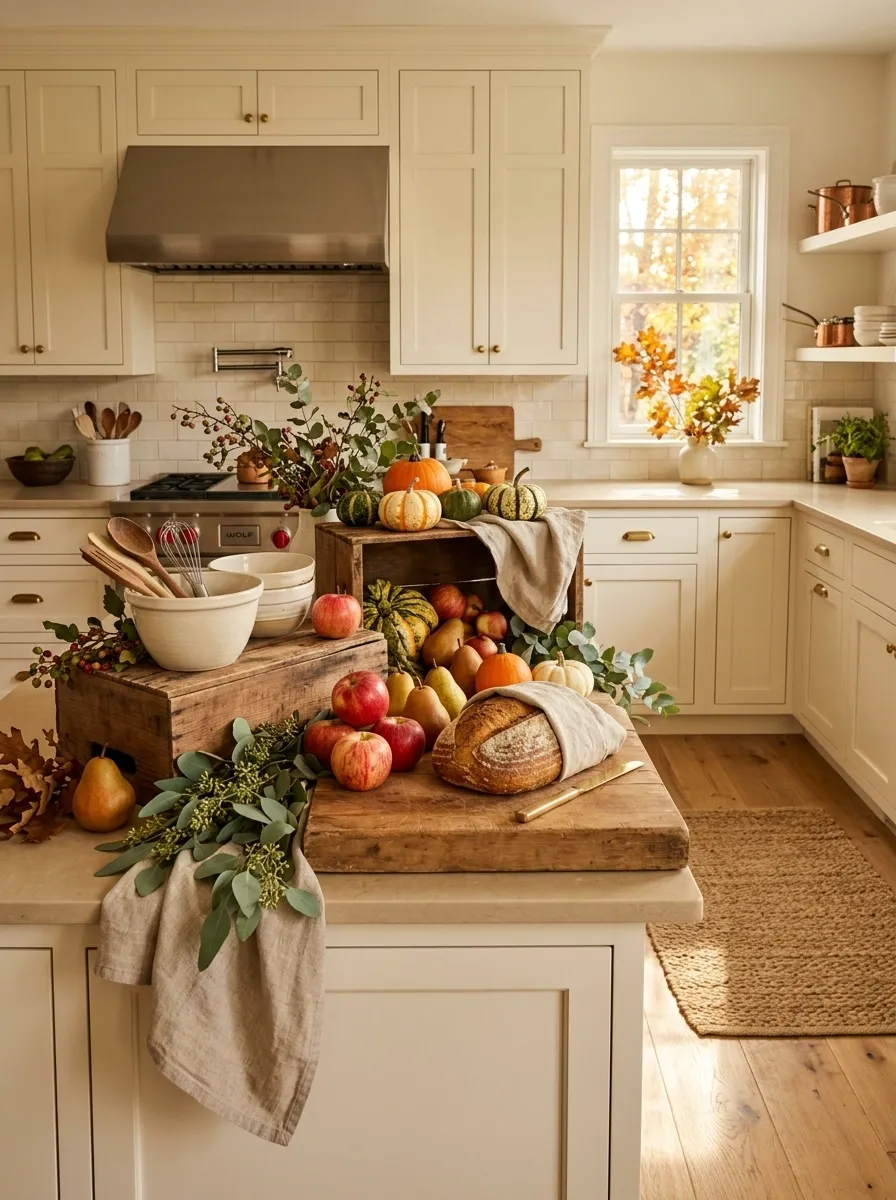
This composition treats the countertop like a working harvest table rather than a decorative shelf.
A large family kitchen uses wooden crates, pears, apples, pumpkins, bread, ceramic bowls, greenery, and everyday kitchen tools to create several connected layers. The produce provides the strongest color, while the wooden crates establish height and structure.
The key is grouping. The objects are clustered into a few related zones instead of spread evenly across the entire counter. That creates visual movement while preserving useful prep space.
Neutral Linen and Dried Grass Kitchen
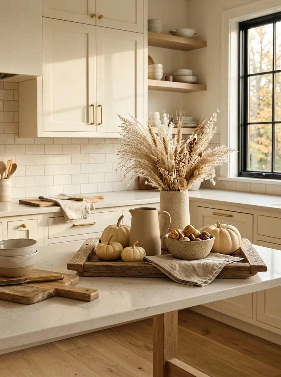
The autumn feeling here comes almost entirely from texture.
A soft neutral kitchen uses creamy cabinets, light oak, pale stone, flax linen, beige pumpkins, dried grasses, and handmade stoneware. A low wooden tray anchors the main countertop vignette, while a tall ceramic vessel adds just enough height near the backsplash.
There isn’t much orange, and that’s intentional. The linen, dried grasses, and warm wood create the seasonal shift without forcing the kitchen into a traditional fall palette. It’s a good direction when the rest of the home already leans neutral.
The important detail is texture. Without it, this much beige would get flat very quickly.
Copper, Cream, and Sage Autumn Vignette
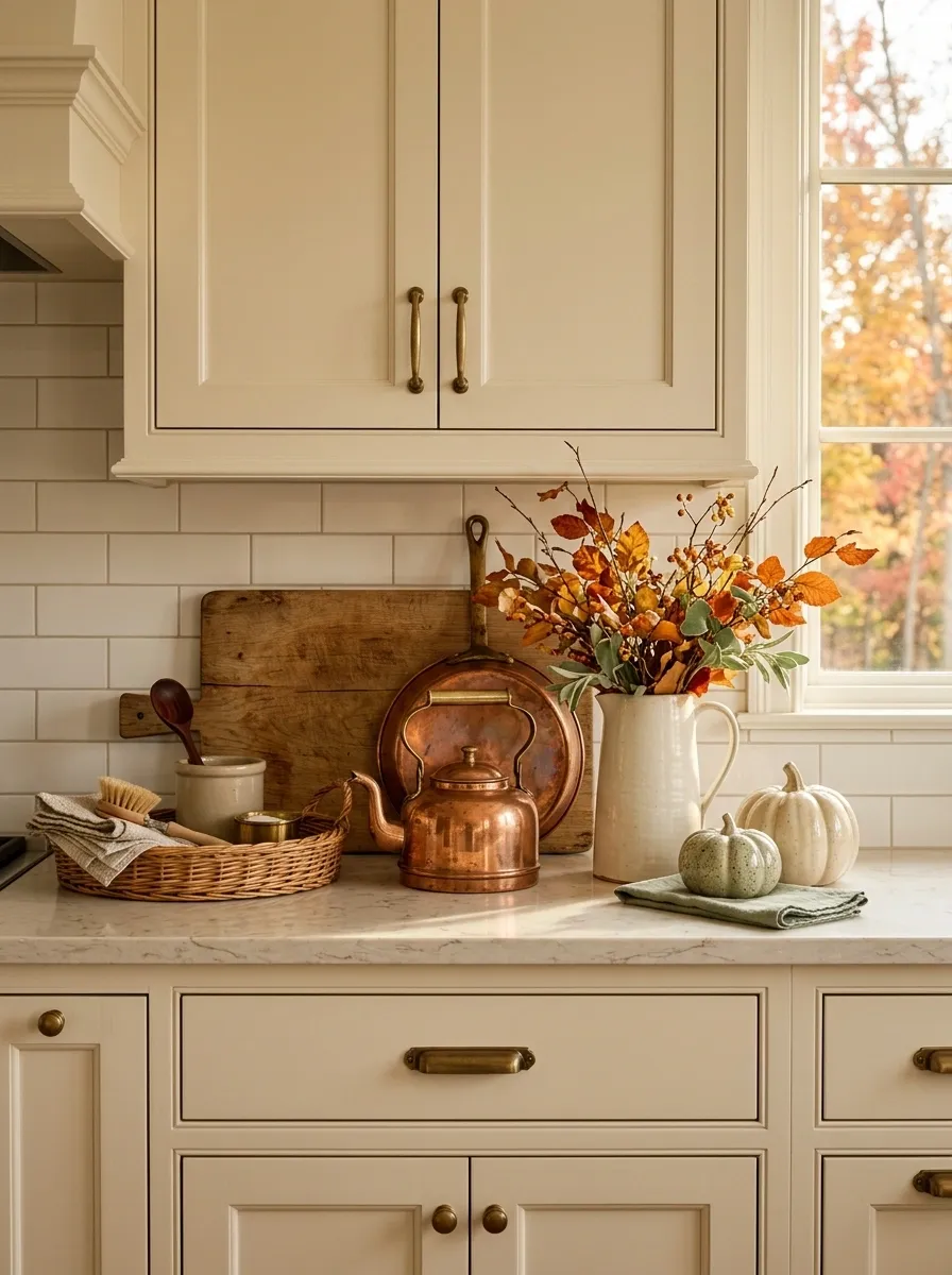
Copper already has a natural relationship with autumn, so the rest of the palette can stay soft.
A warm traditional kitchen combines cream cabinetry with pale counters, aged copper cookware, sage greenery, cream pumpkins, and a broad wooden board leaning against the backsplash. A ceramic pitcher filled with loose branches creates the tallest point in the arrangement.
The copper gives you that warm seasonal glow, while sage stops the composition from becoming a wall of orange and brown. Wood sits between the two, making the whole palette feel connected.
I’d keep the copper pieces useful. A pan, kettle, or utensil holder feels much more convincing than decorative copper objects placed only for color.
Dark Wood and Candlelit Fall Counter
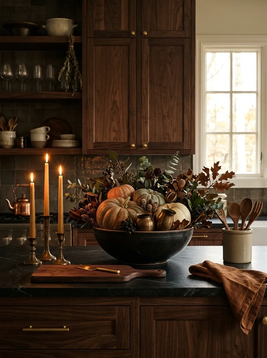
This version is made for late afternoon light.
Dark walnut cabinetry and warm stone counters create a deeper background, while low amber lighting, bronze-toned vessels, taper candles, dark greenery, and muted orange pumpkins build a layered autumn scene. A large dark ceramic bowl keeps the arrangement grounded.
The lighting is what separates this concept from a typical dark kitchen. The countertop isn’t trying to look bright. Instead, the warm pools of light bring out the wood grain and coppery seasonal tones.
Keep the surrounding counter relatively quiet. Darkness already adds visual weight, so every additional object matters more.
Tiny Apartment Counter With Vertical Styling
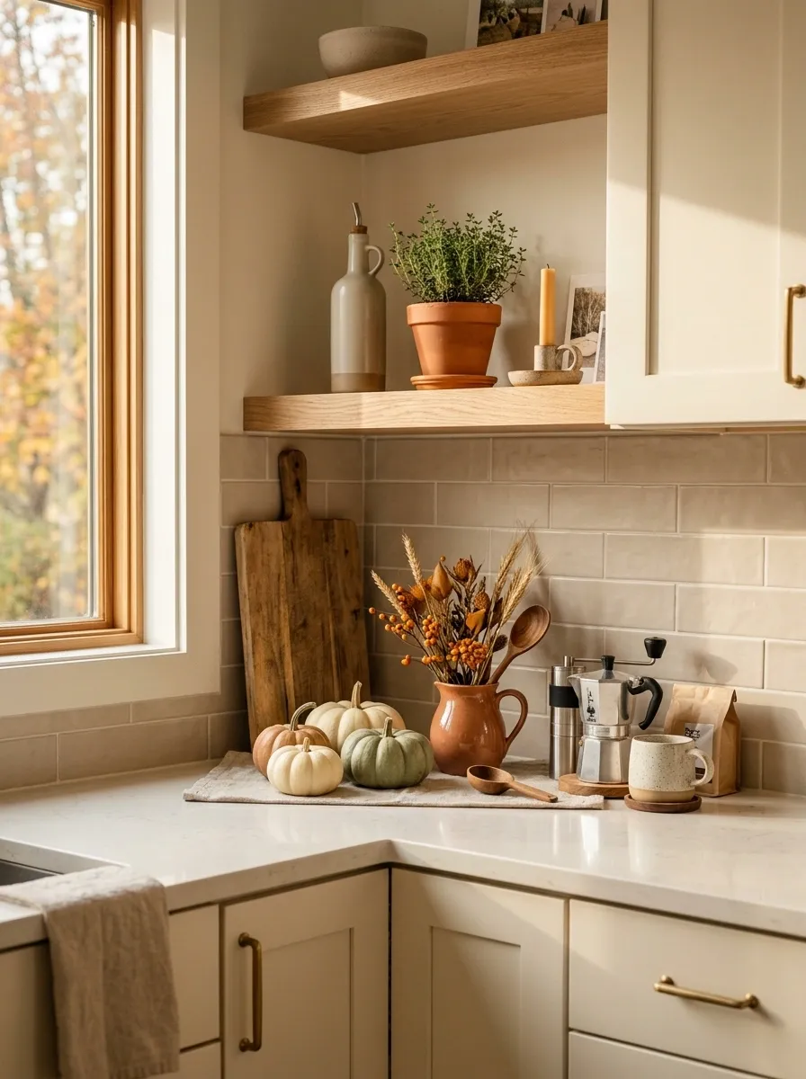
A small kitchen doesn’t need a miniature version of a large kitchen. It needs a better layout.
This compact apartment counter uses vertical ceramic pitchers, a small wall shelf, one slim wooden board, tiny pumpkins, a little herb pot, and a compact coffee setup. Seasonal accents stay concentrated in one corner, leaving the primary prep area open.
The vertical pieces create height without taking much counter depth. That’s the real trick. In a small kitchen, the backsplash and wall become part of the composition.
Don’t fill the available surface just because it’s available. Empty counter space is useful here, not decorative failure.
Classic Cream Kitchen With Cranberry Accents
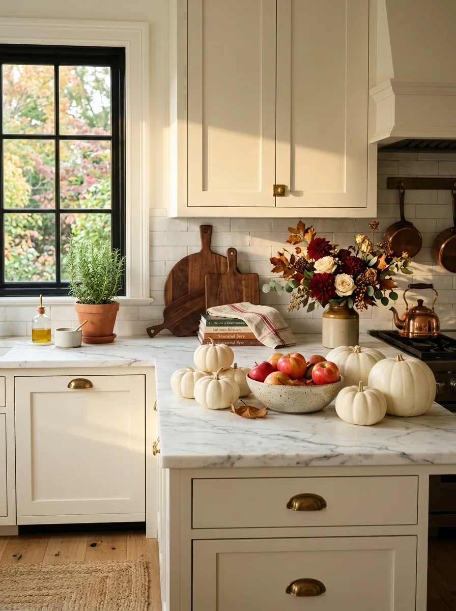
Cranberry gives this traditional kitchen a more collected fall palette than the usual pumpkin-heavy approach.
Cream cabinetry, marble counters, antique brass hardware, and dark wood boards form the foundation. White pumpkins sit alongside a bowl of apples, while cranberry linen and a small seasonal arrangement provide controlled hits of color.
The white pumpkins matter because they keep the countertop connected to the cream cabinetry. The cranberry then has room to stand out without the whole arrangement becoming visually loud.
This is a good example of using one strong accent color rather than trying to represent every autumn shade at once.
Collected European-Style Countertop
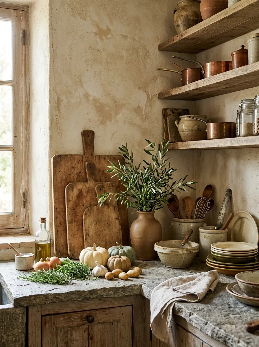
This one refuses to look newly decorated.
A character-filled kitchen with aged plaster walls, natural stone counters, open shelving, rustic cutting boards, handmade ceramics, green produce, small pumpkins, olive branches, and casually stacked kitchenware creates a collected European feel. Nothing sits in a perfect row. Some objects overlap, some lean, and a few practical pieces remain visible.
The architecture is doing a lot of the work. That’s why the decor can stay loose. The uneven textures, worn wood, stone, and handmade ceramics give the countertop depth before the fall accents even arrive.
The mistake would be trying to make this arrangement too polished. A little imperfection is what keeps it believable.
Warm Modern Kitchen With Terracotta Bowl
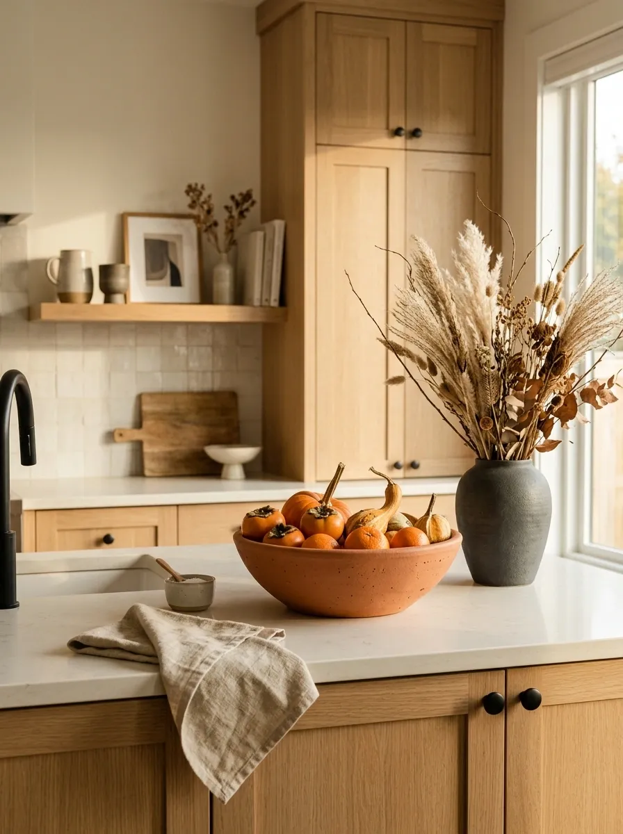
This is the clean modern version with a little more personality.
Light oak cabinetry, creamy stone, simple black accents, and a large terracotta fruit bowl create the foundation. Muted orange produce, a folded linen towel, and a sculptural dried arrangement introduce the seasonal layer without covering the counter in themed objects.
The terracotta bowl is the bridge between modern restraint and autumn warmth. Its handmade-looking surface adds softness to the straight lines of the cabinetry.
Keep the rest of the styling deliberately plain. The bowl has enough shape and color to carry the composition.
Harvest Baking Counter With Flour and Spice Jars
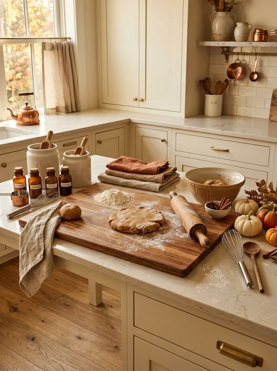
Here, the autumn styling grows out of an actual baking setup.
A spacious counter holds ceramic flour jars, glass spice containers, rolling pins, a broad wooden pastry board, warm linen, cinnamon-colored pottery, miniature pumpkins, and a plate of fresh baked goods. The objects are grouped around the baking area instead of scattered across the whole kitchen.
The setup feels seasonal because the colors and textures naturally belong to baking. Cream ceramic, warm wood, amber glass, and cinnamon tones already tell the story.
Don’t hide every practical item. The rolling pin and flour jar help make the scene feel real.
Green Cabinetry With Warm Brass and Pumpkin Orange
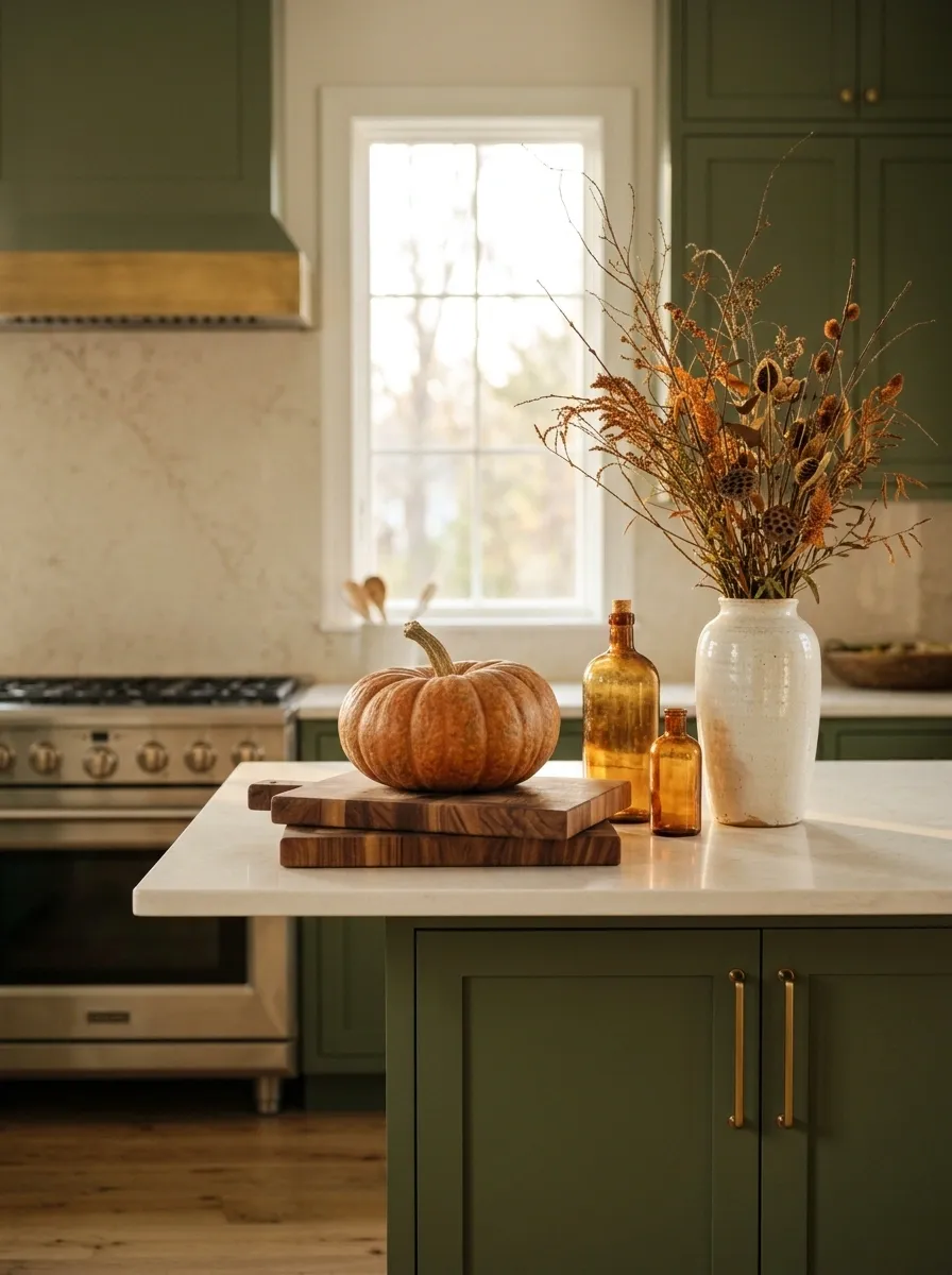
Green and orange can become painfully loud when both are used at full strength. This version keeps the relationship controlled.
Rich moss or forest-green cabinetry meets creamy counters, warm brass, walnut boards, amber glass, and a few substantial orange pumpkins. A tall ceramic vase filled with autumn branches creates the vertical focal point while the lower objects stay grounded.
The orange works because it appears selectively. The green is the dominant color, brass adds warmth, and walnut provides the visual bridge.
I’d avoid adding orange textiles, orange signs, and orange ceramics on top of the pumpkins. The palette is already doing enough.
Restrained Autumn Counter With Architectural Calm
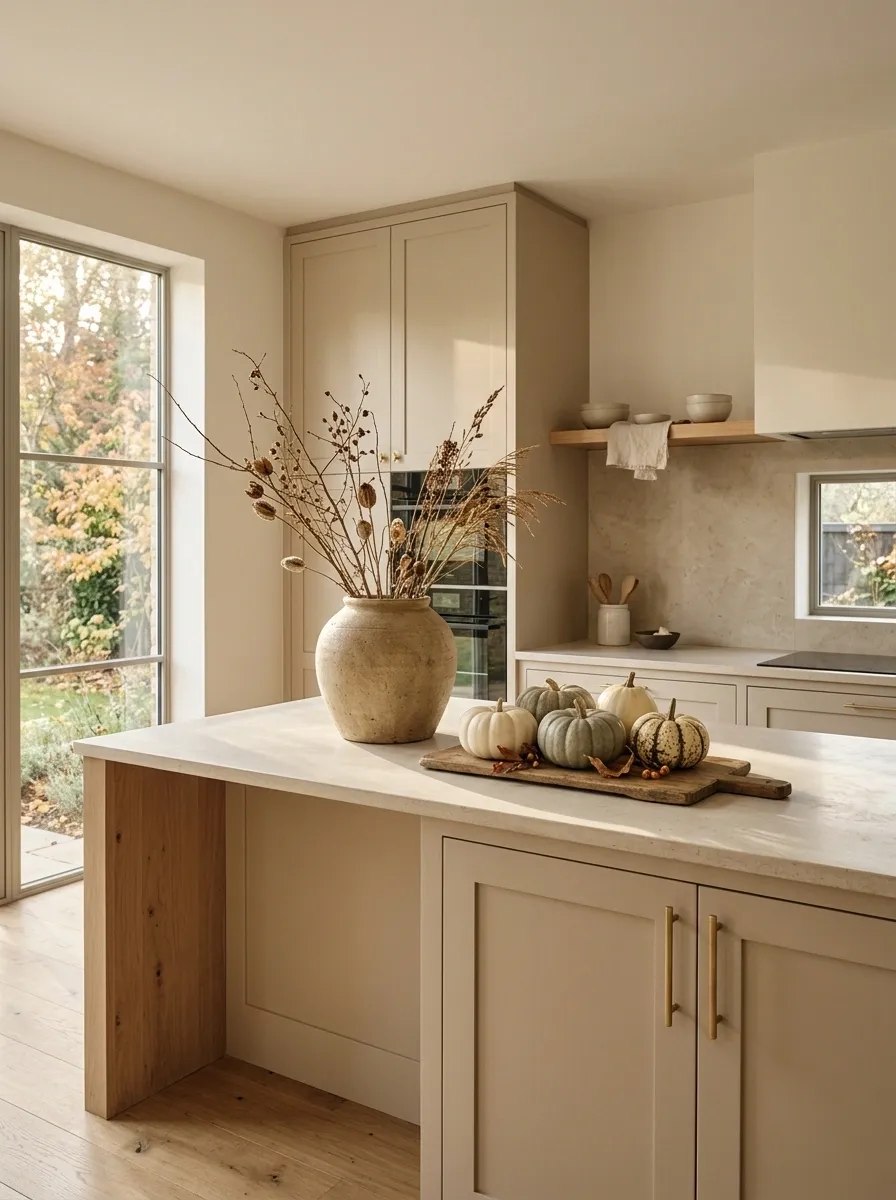
The final direction is the quietest, and honestly, that can be the hardest one to get right.
A warm beige kitchen with limestone counters, natural oak, understated cabinetry, and generous empty workspace gets only a few seasonal touches. One oversized stoneware vessel holds dried branches. A handful of muted pumpkins sits nearby, supported by a low wooden board and a little natural texture.
There are no signs, no crowded trays, and no attempt to make every corner announce October. The architecture stays visible, the materials stay important, and the fall accents simply shift the mood.
That’s the point. Seasonal decor should support a kitchen, not take possession of it.
Conclusion
Fall styling gets better when you stop trying to make every seasonal object visible.
A kitchen already has a visual language. Cabinets, counters, backsplash, hardware, wood, stone, appliances, and natural light establish the room before a single pumpkin arrives. The smartest seasonal decorating works with those elements instead of covering them up.
That can mean a long wooden trough in a warm white kitchen, burnt-orange ceramics against charcoal cabinetry, pears in an English country setting, or almost no traditional fall color at all. What matters is the relationship between the pieces.
Start with one area of the counter. Choose a clear focal point, give it a supporting palette, add one or two textures, then stop before the room starts looking busy. The restraint is usually what makes the finished kitchen feel expensive.
Save the designs that make you stop scrolling, not the ones that simply contain more decorations. Those are the references worth coming back to when you actually start styling the counter.