
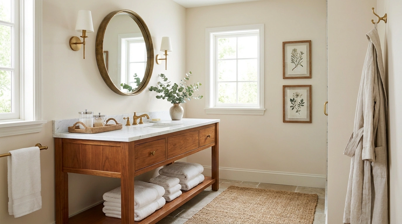
The guest bathroom is usually the room people decorate last, and it shows. There’s often a nice mirror, a clean vanity, and a towel or two, but the space still feels like nobody really decided what it was supposed to be. Adding more little decorations rarely fixes that. It usually makes the problem louder.
A good mirror can carry the sink wall. The right towels can make a basic vanity feel finished. Better lighting changes the way every surface looks. Even the practical things, like soap and spare toilet paper, can be handled without turning the room into a supply closet.
That’s what good guest bathroom decor does. It makes a small room feel considered, comfortable, and ready for company without making it precious or overworked. The ideas below focus on the details that actually change the room, not the filler that just takes up space.
Guest Bathroom Decor Ideas
Embrace Moody Dark Tones
A moody color palette transforms a compact guest bathroom into an intimate, high-end escape instead of just a basic functional space. Deep charcoal walls paired with warm wood slats create an immediate sense of depth and luxury.
Layer in sophisticated ambient lighting with a backlit mirror and sleek sconces to highlight the rich textures of marble and stone without overpowering the room’s serene atmosphere.
Cohesion rule: keep your hardware and accessories within the same dark metallic family to maintain that seamless, designer-curated look.
Frame the Mirror With a Finish That Looks Custom
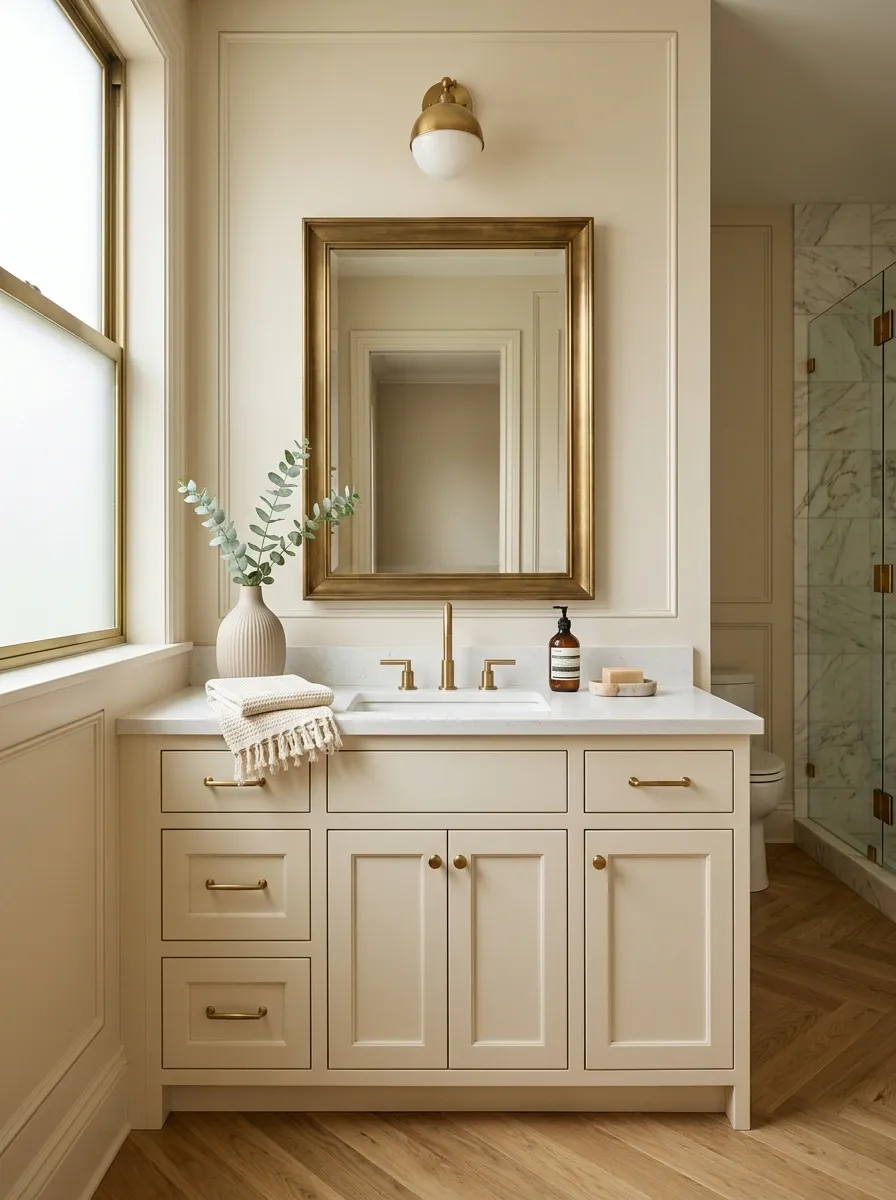
A plain builder mirror is usually the first thing that makes a guest bathroom feel unfinished. The glass isn’t the problem. The lack of a visual frame is.
Choose a substantial frame in wood, brushed brass, aged bronze, or a painted finish that connects to the vanity. Keep the profile simple so it doesn’t compete with the rest of the room.
Do this:
- Match the frame undertone to one existing finish.
- Skip an ultra-thin frame if the vanity feels visually heavy.
- Leave enough wall around the mirror for it to breathe.
That small perimeter detail can make the entire sink wall look more intentional.
Oak or walnut frames
Brass or aged bronze
Simple painted profiles
Make a Statement Door
The entry to your guest bathroom is prime real estate for a standout design detail that sets the tone before guests even step inside. A striking frosted glass door featuring intricate golden scrollwork adds instant architectural interest and old-world charm.
Pair the ornate door insert with sleek, modern black frames to balance traditional elegance with contemporary clean lines. It keeps the space feeling sophisticated and layered rather than predictable.
Design tip: let one extraordinary architectural element take center stage so the rest of the surrounding neutral walls can simply support the visual story.
Give the Vanity Counter One Deliberate Focal Point
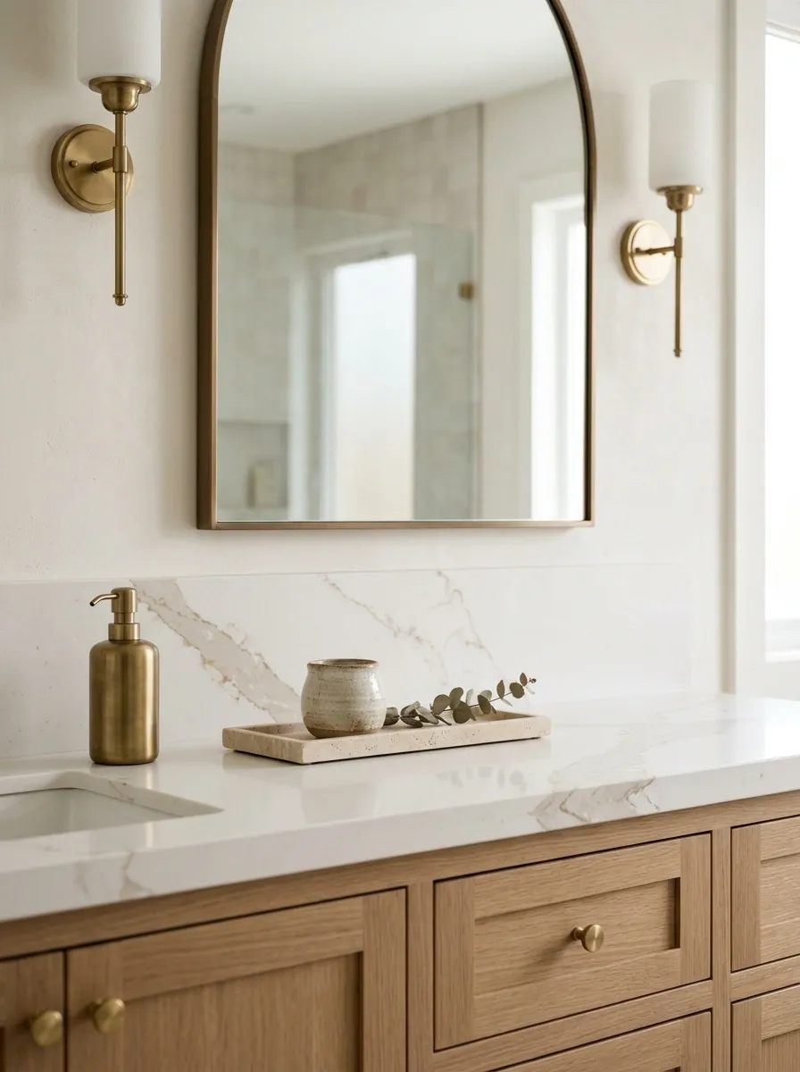
The guest bathroom counter shouldn’t look like someone emptied a drawer onto it. Keep the surface useful, then give one object permission to be decorative.
A stone tray, small ceramic vessel, substantial soap dispenser, or low arrangement can do the job. The trick is scale. Tiny pieces look accidental.
Counter formula
- One useful item guests can reach
- One decorative object with visible weight
- Clear space around the sink
That negative space matters more than another accessory. It makes the vanity feel cleaner, calmer, and far more expensive.
Soap or hand lotion
Tray, vessel, or small object
Let the counter breathe
Layer Organic Textures Everywhere
A dark, moody bathroom can easily feel cold if you rely solely on sleek surfaces and minimalist fixtures. Introduce warmth and life by layering natural wood tones, woven baskets, and lush green botanicals throughout the space.
A textured jute rug and a statement woven pendant light draw the eye upward, while a towering snake plant in a rustic pot softens the crisp lines of the dark vanity and mirror.
Balance rule: rich, dark walls demand plenty of organic elements to keep the room feeling inviting, lived-in, and wonderfully cozy for your guests.
Use Oversized Art to Give a Tiny Bathroom More Presence
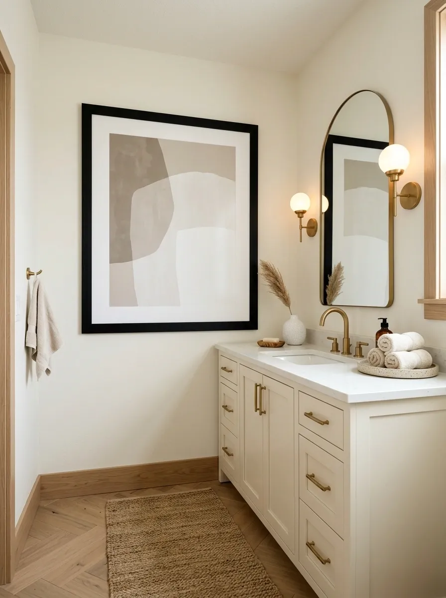
Small bathrooms don’t need tiny art. That instinct usually makes the walls feel even busier because several little pieces compete for attention.
Choose one oversized print or a pair of tightly grouped pieces for the largest blank wall. Keep the subject simple and the frame substantial enough to hold its own beside the vanity and mirror.
Placement rule: Hang the center of the artwork around eye level, then adjust for the furniture underneath it.
A large piece gives a compact room one visual anchor instead of a collection of random wall fillers.
STRONG
PIECE
Utilize Classic Patterned Wallpaper
Sloped ceilings and tight architectural layouts are actually a blessing in disguise for a charming powder room. A classic blue and white botanical wallpaper wraps the entire compact space in cohesive pattern, making awkward angles feel intentional and cozy.
Anchor the walls with crisp white wainscoting and pair it with a gleaming green-shaded wall sconce to add a layer of tailored British sensibility.
Styling trick: choose a timeless print with a repeating motif so the small room feels jewel-box polished rather than visually chaotic.
Upgrade the Hand Towels Instead of Piling on More Decor
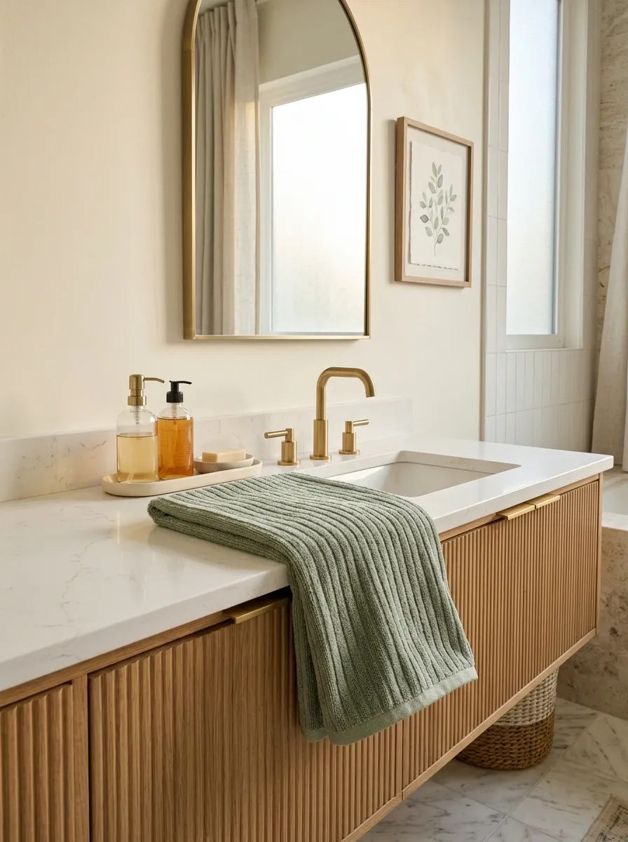
Guests notice towels because they actually use them. A decorative stool nobody touches can’t compete with a thick, well-presented hand towel.
Fold one neatly and hang or drape it where the sink makes sense. Choose a color that repeats somewhere else in the room, even if it’s only in the artwork or a small accessory.
Designer rule: one visible towel stack looks intentional. Five towels in different shades look like leftovers from the linen closet.
Spend the effort here. It’s useful, visible, and easy to change with the season.
Create Drama With Botanical Prints
Dark, dramatic walls provide the ultimate backdrop for bold botanical prints that pop with unexpected vibrance. A statement wallpaper featuring lush tropical leaves creates an immersive, high-impact jewel box effect in a tiny powder room.
Pair the statement wall with a sleek arched mirror and a minimalist floating sink setup to let the dramatic pattern do all the heavy lifting.
Finishing touch: ground the space with a simple textured floor mat so the eye has a moment to rest amidst all that gorgeous pattern.
Match the Metal Finishes So the Room Feels Intentional
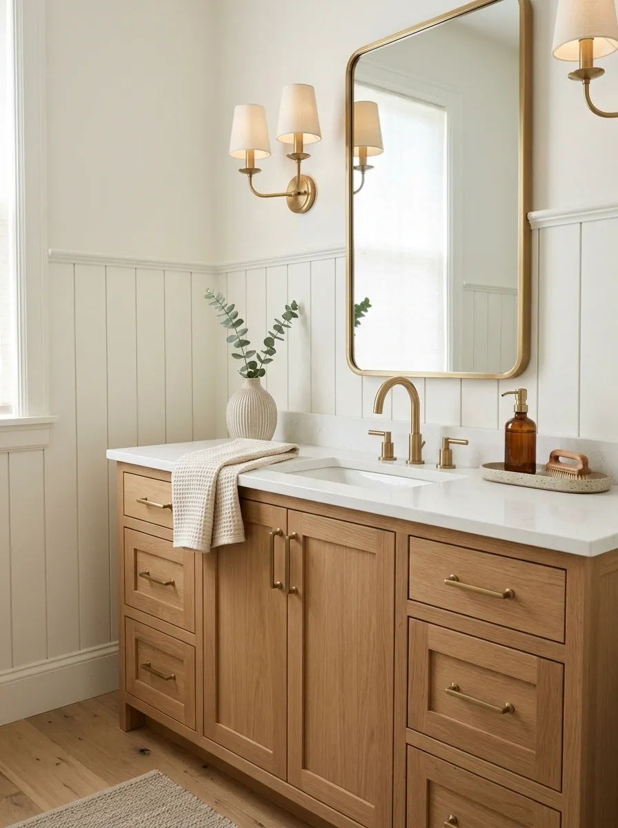
Mixing metals isn’t the mistake. Mixing them without a plan is.
Choose one dominant finish for the faucet, mirror detail, lighting, and cabinet hardware. A second metal can work as an accent, but it needs to appear deliberately rather than showing up once in one random corner.
Simple hierarchy
- Dominant: the finish you see most
- Secondary: a small supporting finish
- Skip: a third metal competing for attention
Brushed brass with warm wood feels very different from polished chrome with cool white surfaces. Pick the family first, then repeat it.
Create a Simple Scent Moment Guests Can Actually Notice
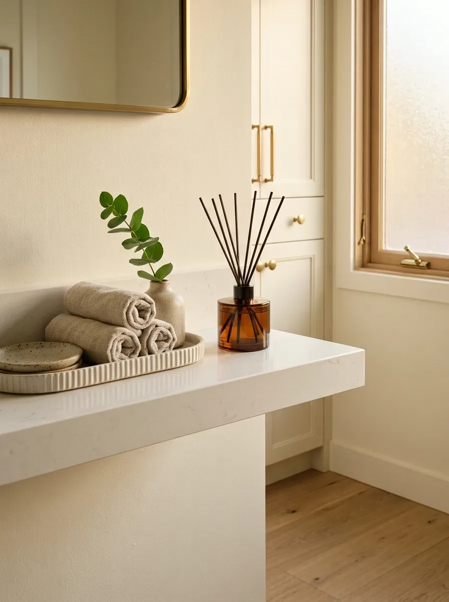
A guest bathroom should smell clean without smelling like someone attacked it with five different sprays. Choose one scent family and give it a proper home.
A small reed diffuser on a shelf or a discreet room spray beside a guest towel works better than a lineup of bottles around the sink.
Set it up like this:
- Pick one scent with a fresh, subtle profile.
- Place it away from the splash zone.
- Keep the container attractive enough to leave visible.
The result feels intentional rather than perfumed. That’s exactly the balance you want when someone walks in and immediately notices the room.
Add a Small Stool Where It Solves a Real Problem
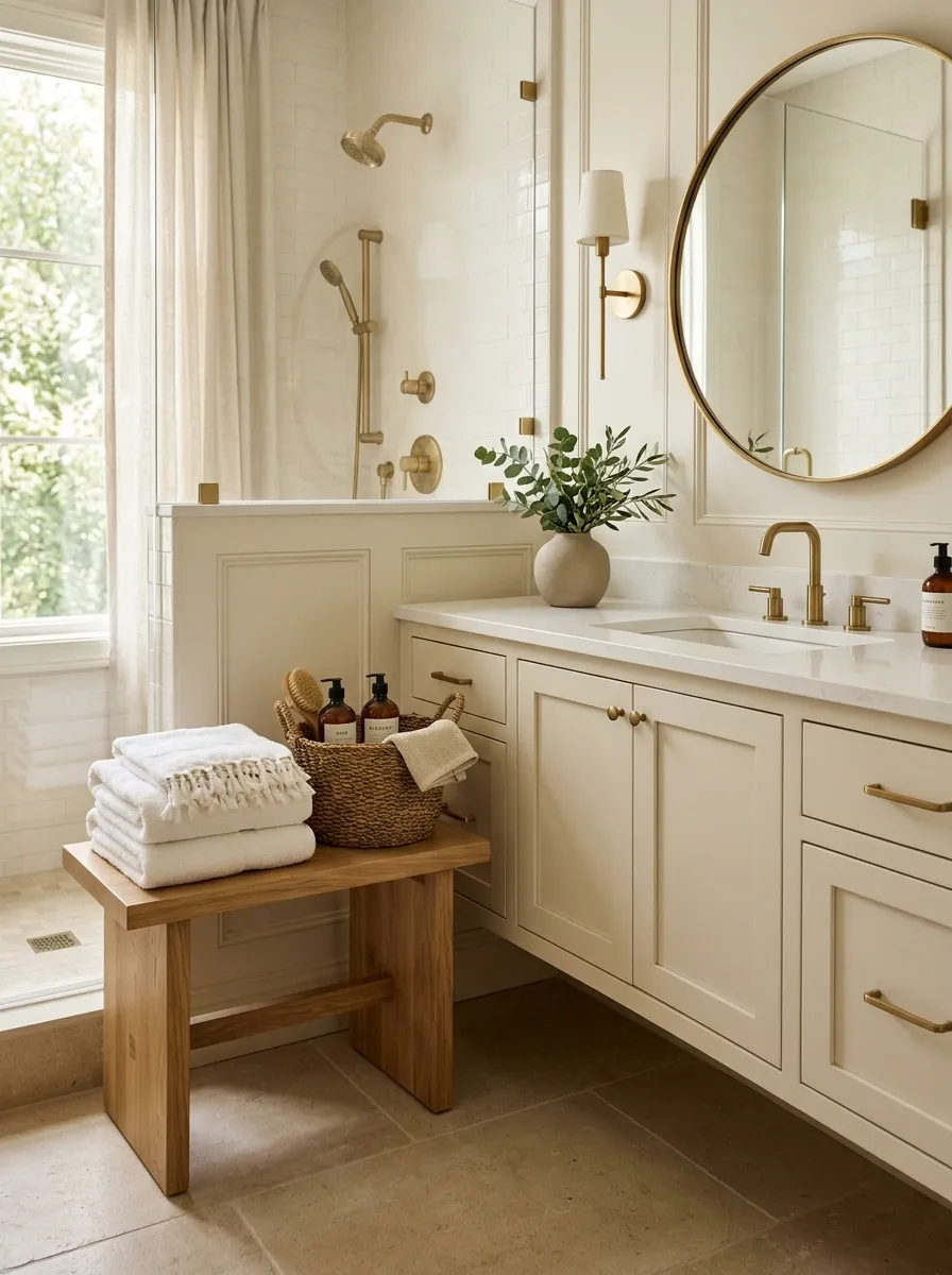
A stool earns its place when it does more than sit there looking decorative. In a guest bathroom, that usually means creating a perch for folded towels, a toiletry bag, or a simple basket.
Look for a compact wood or upholstered piece that tucks under the vanity edge or sits beside an open wall without blocking movement.
Best placement: near the vanity, outside the main walking path.
A good stool adds warmth to a room full of tile, glass, and porcelain. It also gives guests somewhere to set things down, which makes the bathroom more comfortable without making it look crowded.
Turn an Empty Wall Into a Slim Storage Statement
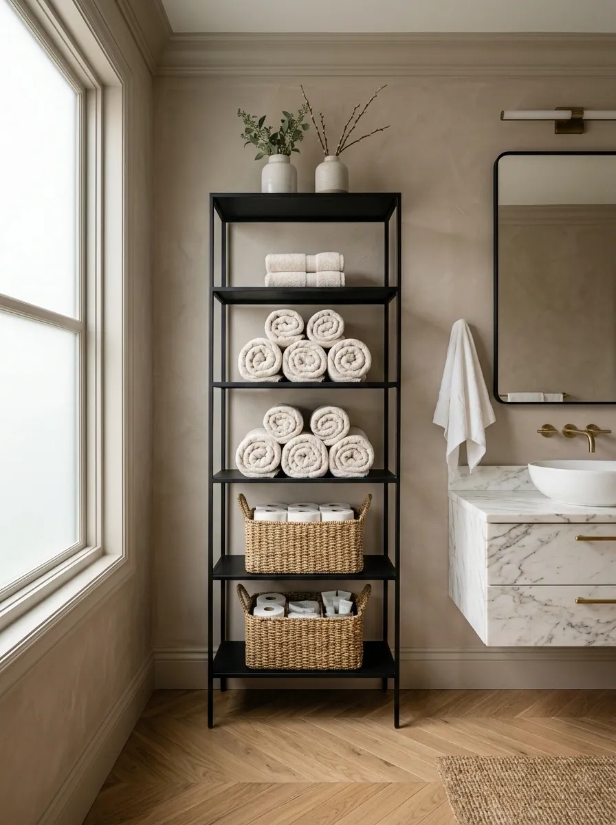
That awkward blank wall doesn’t need another framed quote. Give it a job.
A narrow etagere, slim cabinet, or wall-mounted shelf can hold spare towels, paper goods, and one or two decorative pieces while keeping the floor mostly open.
Before you buy anything, check:
- The depth won’t pinch the walkway
- The shelves fit your actual towels
- The finish connects to the vanity or mirror
- The lower section can hide less attractive supplies
Good storage makes the room feel calmer because the useful things finally have somewhere to go. That’s a much better use of wall space than adding decoration for decoration’s sake.
Keep it shallow enough to preserve walking space.
Make sure it holds the towels and supplies you actually use.
Repeat one existing room material or metal.
Use a Statement Mirror to Change the Whole Room
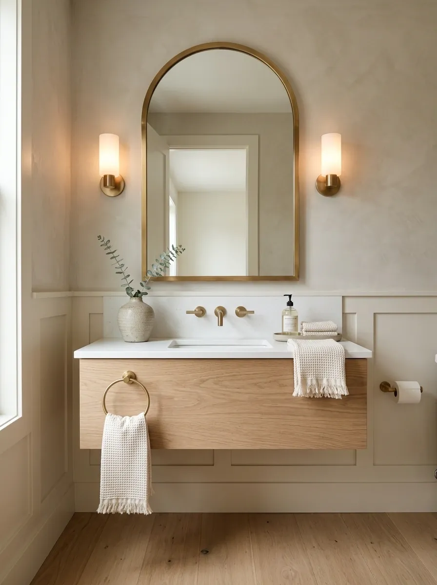
A mirror can be more than a utility piece. In a small guest bathroom, it’s one of the biggest visual surfaces you control.
Round mirrors soften a boxy room. Arched silhouettes add shape without requiring extra artwork. Rectangular mirrors feel crisp and especially strong above a wider vanity.
Don’t choose the shape first. Choose the mood and scale first, then pick the silhouette that supports it.
Layer the Lighting Instead of Relying on One Harsh Fixture
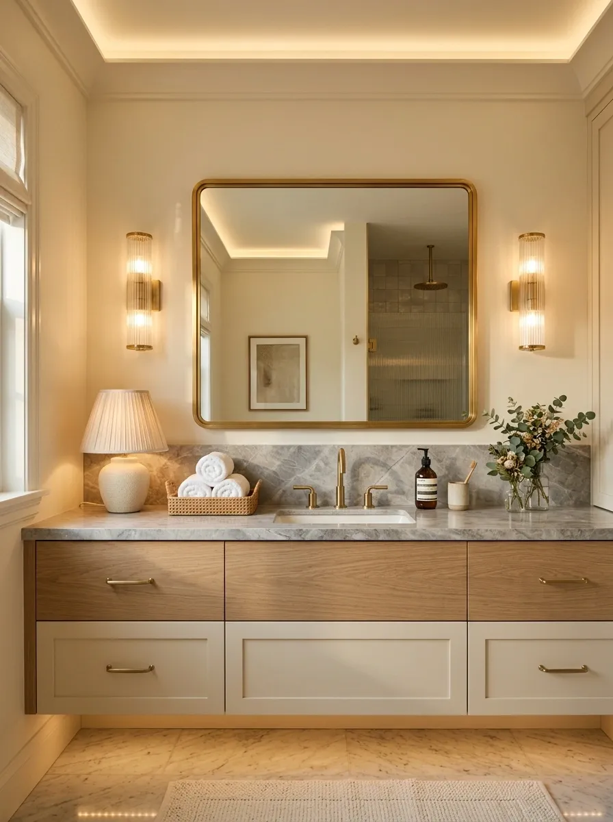
Nobody looks their best under one overhead light blasting directly down from the ceiling. The same thing happens to your bathroom.
Use the main fixture for general illumination, then add a stronger source around the mirror where practical tasks happen. A warm-toned lamp or decorative sconce can also soften the room at night.
Lighting priorities: mirror first, ambient second, decorative third.
You don’t need a complicated electrical overhaul to improve the effect. Better fixture placement and warmer-looking light can completely change how the tile, vanity, mirror, and towels read.
Style the Toilet Area Without Making It Look Staged
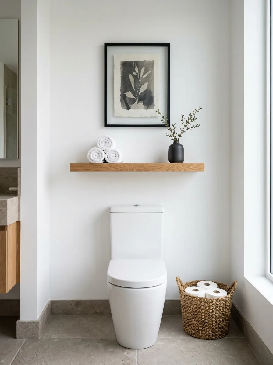
The wall above a toilet often becomes the dumping ground for whatever decor didn’t have another home. Skip that trap.
Use the space for one useful shelf, one framed piece, or a slim cabinet. Keep the composition compact and leave plenty of empty wall around it. A small basket can hold spare rolls, but it should look like storage first and decoration second.
Keep: one practical piece plus one decorative accent.
Skip: a crowded stack of signs, candles, plants, and tiny objects.
The toilet zone should support the room, not become its loudest feature.
Bring in One Natural Material to Warm Up Hard Surfaces
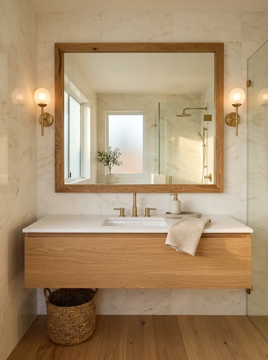
Guest bathrooms can become a sea of hard finishes. Tile, stone, glass, porcelain, and metal all look polished, but too much of them can make the room feel cold.
Add one natural material with visible texture. A wood-framed mirror, woven basket, stone vessel, or teak stool is enough.
Easy pairings:
- Warm wood + pale tile
- Woven fiber + smooth stone
- Natural stone + painted cabinetry
- Oak + brushed metal
Don’t scatter natural materials everywhere. One strong texture creates contrast without turning the room into a collection of themes.
Balances glossy tile.
Softens hard edges.
Adds weight and texture.
Brings warmth near water.
Choose a Shower Curtain That Carries Real Visual Weight
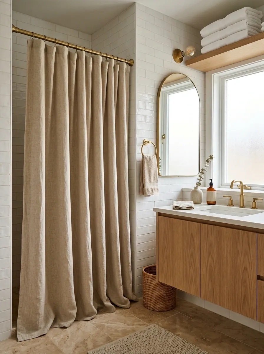
A thin, flimsy shower curtain can make an otherwise polished guest bathroom feel cheap in seconds. The curtain occupies a huge visual area, so treat it like a major design decision.
Go for a fabric with enough weight to hang neatly. Keep the length generous and use a pattern only when the rest of the bathroom is relatively quiet.
A restrained stripe, small-scale botanical, subtle geometric print, or solid linen-look fabric can anchor the shower wall without taking over the room.
The rule: if the curtain is visually loud, everything else needs to calm down.
Use a Tray to Keep Small Guest Essentials Under Control
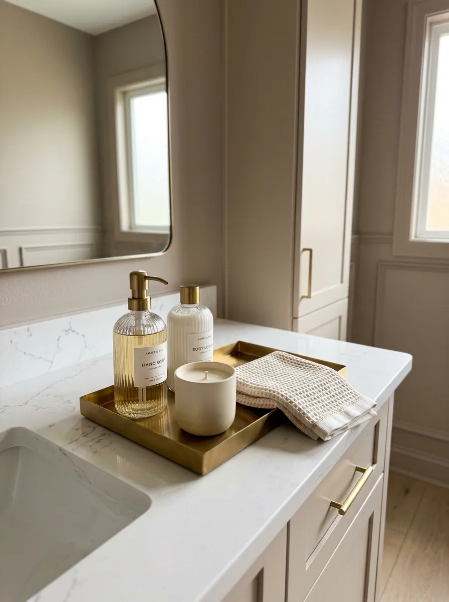
A tray is one of those rare bathroom accessories that actually earns its footprint.
Put guest soap, lotion, a small candle, or a spare hand towel inside it and suddenly the counter looks organized instead of busy. The tray also creates a clear boundary, which makes it easier to wipe the counter around it.
Choose stone, wood, ceramic, or metal that repeats another finish in the room.
Good tray test: if everything inside it looks like it belongs together, you’ve got the right grouping.
Soap, lotion, or folded hand towel
One vessel, candle, or small object
Don’t fill every inch of the tray
Make the Vanity Feel Expensive With Better Hardware
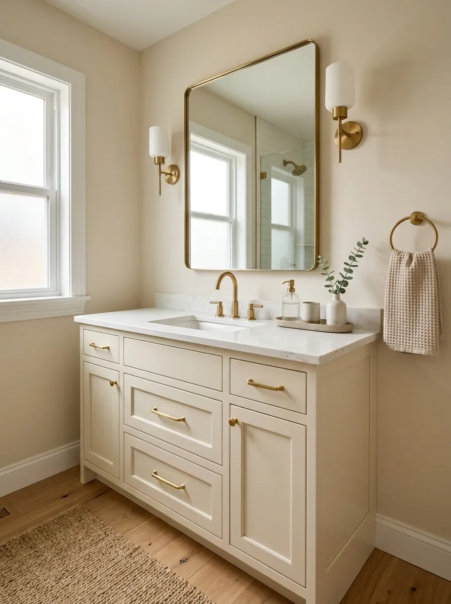
Cabinet hardware is tiny, but guests see it every time they reach for a drawer. Cheap knobs can quietly drag down an otherwise polished vanity.
Replace them with a finish that feels substantial and coordinates with your faucet or lighting. Pulls work especially well on wide drawers, while knobs can keep smaller doors from looking overworked.
Choose hardware by the vanity’s proportions: long drawers need enough visual weight to balance their width.
This is one of the easiest upgrades because you don’t need to replace the cabinet itself. The box stays. The details finally catch up.
Add Greenery That Fits the Bathroom Instead of Fighting It
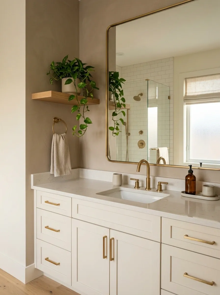
A plant can soften a bathroom instantly, but the wrong one looks like an afterthought. Skip the giant leafy jungle in a tight guest bath.
Choose one compact plant or a simple branch arrangement that fits the room’s scale. Put it near natural light when possible, or use a realistic faux option when the bathroom doesn’t get enough sun.
Choose by placement:
- Vanity corner: small and upright
- Open shelf: trailing and compact
- Stool or floor: one taller statement plant
Keep the container simple. A ceramic or stone planter lets the greenery do the work without creating another visual distraction.
Use a Rug That Defines the Vanity Zone
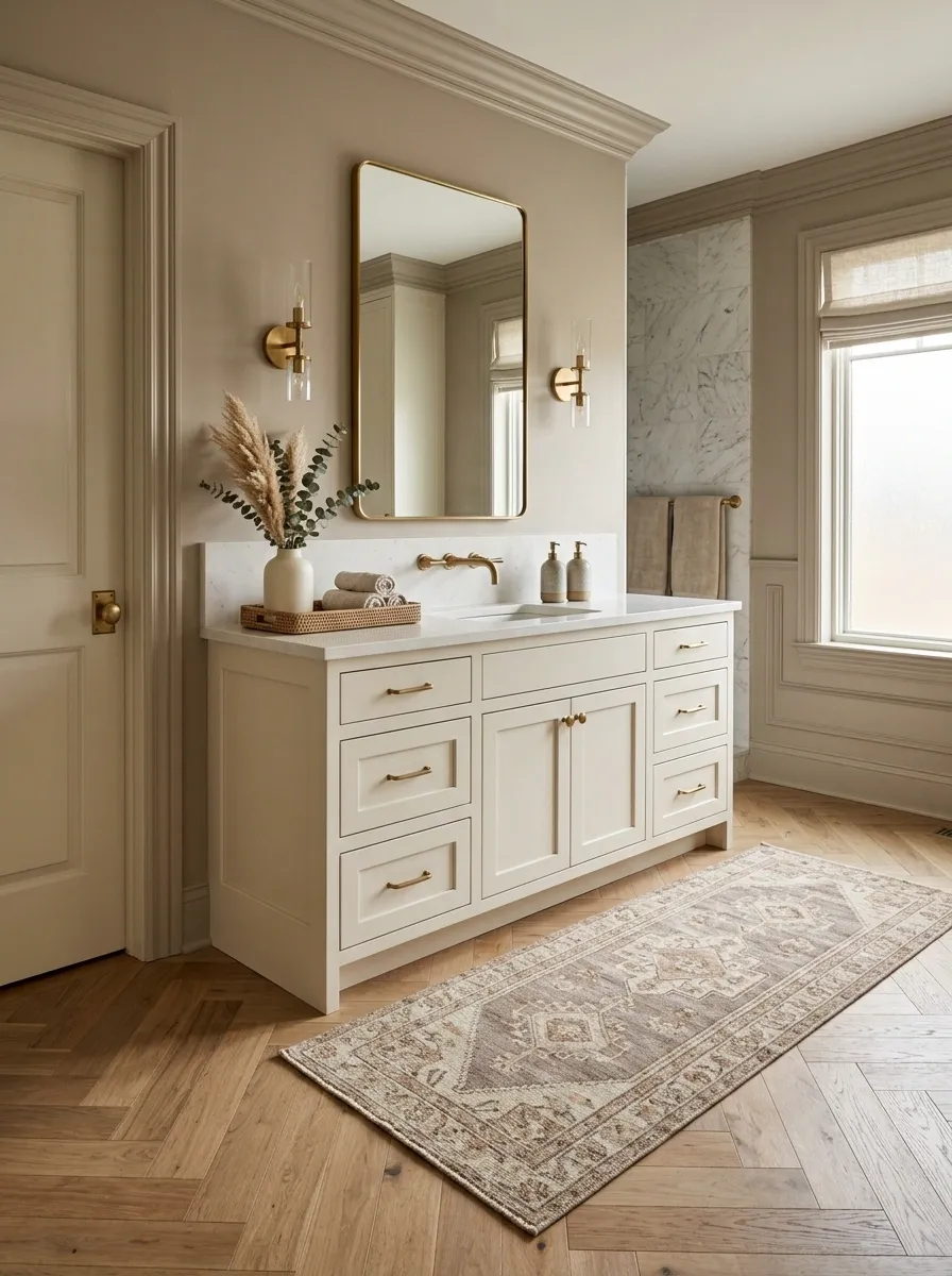
A bathroom rug should do more than protect your feet from a cold floor. It should visually connect the vanity to the rest of the room.
Choose a runner or small rug that sits comfortably in front of the vanity without swallowing the entire floor. Texture matters, but so does proportion. A tiny mat floating in a large room looks disconnected.
Best move: repeat one color already visible in the room, then let the rug add softness through texture or pattern.
Keep the edge clear of doors and drawers. A rug that catches on everything isn’t decor. It’s an obstacle.
Create a Guest-Ready Shelf Without Filling Every Inch
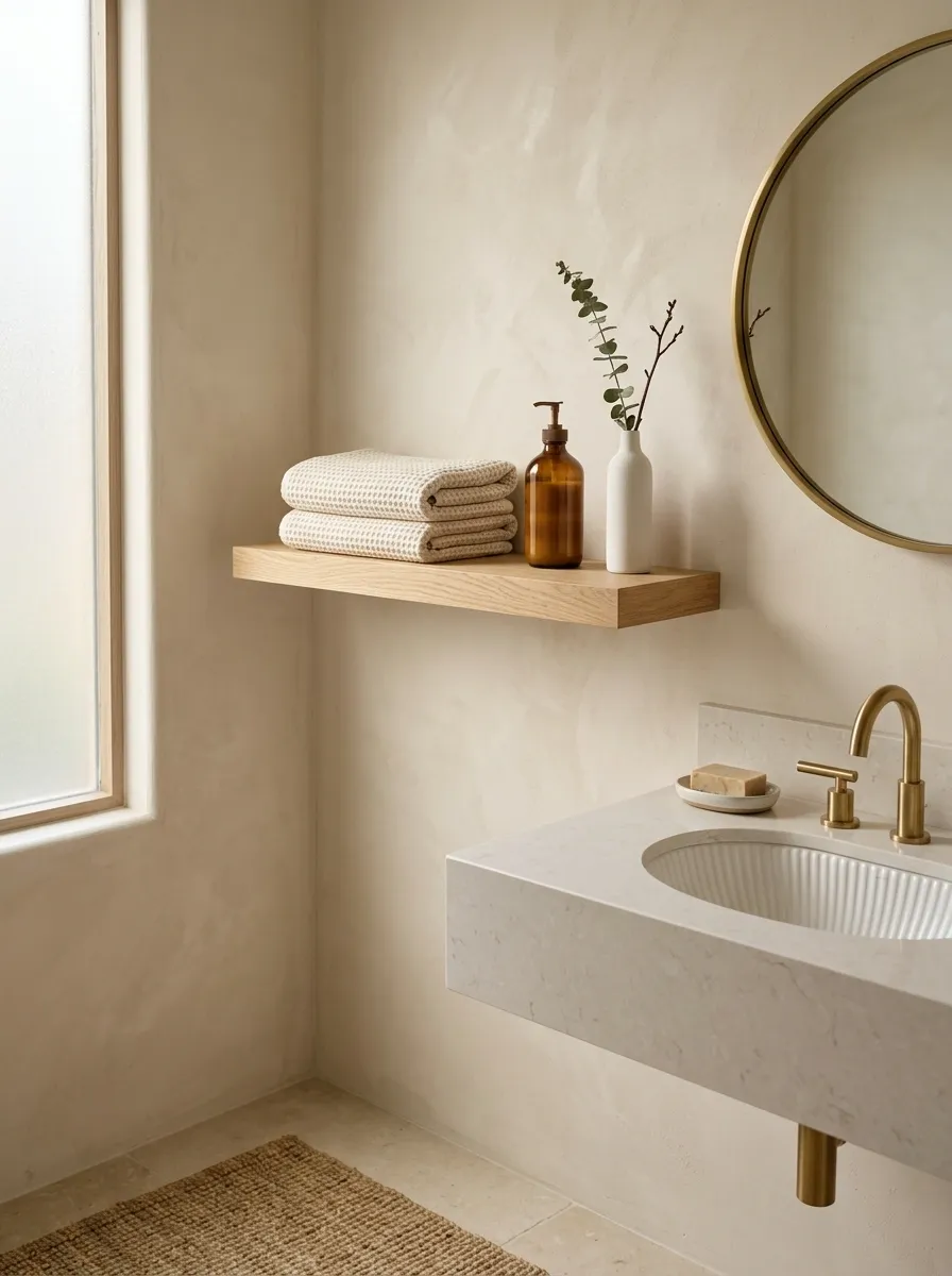
Open shelving gets messy fast when every inch becomes a place to put something. Guests don’t need a wall of accessories.
Give the shelf a simple structure instead. Stack two or three folded towels, add one container for a useful item, then leave deliberate open space around them.
Try the three-layer formula:
- Something tall
- Something horizontal
- Empty space
That final layer isn’t wasted space. It keeps the arrangement from looking like a storage closet. Rotate the decorative piece when you want a seasonal refresh, but keep the basic composition intact.
- Tall: a bottle, vase, or small plant.
- Horizontal: folded towels, a tray, or a small box.
- Open: leave visible shelf space around the objects.
Use Wallpaper to Give a Small Bathroom a Strong Identity
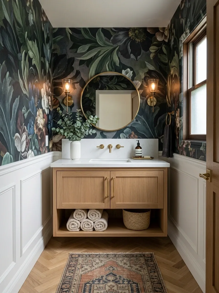
Wallpaper is especially effective in a guest bathroom because you can take a bigger design risk without committing to it across the whole home.
Use it on the main vanity wall, all four walls in a compact powder room, or above a simple wainscoting treatment. The pattern should work with your existing mirror and lighting, not fight them.
Small botanical prints feel softer. Geometric patterns feel sharper. Large-scale motifs create drama quickly.
Keep the rest of the room restrained. Once the walls have a strong voice, the vanity doesn’t need ten decorative extras competing for attention.
Hide the Practical Stuff That Guests Don’t Need to See
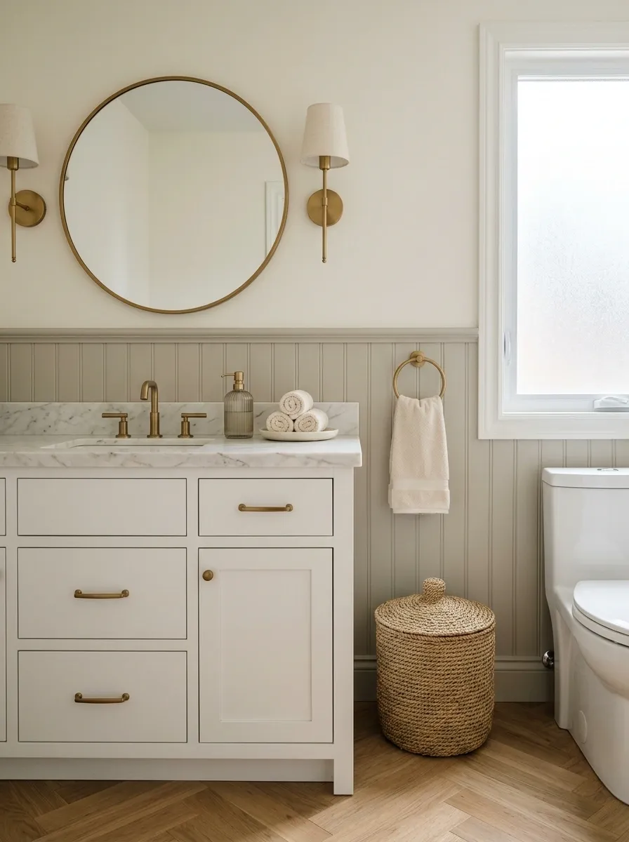
Every guest bathroom needs boring supplies. Toilet paper, cleaning products, extra toiletries, tissues, and spare soap all have to live somewhere.
They don’t all need to live in plain sight.
Use closed vanity storage, a lidded basket, or a cabinet for the things that keep the room functioning but don’t add anything visually. Display the few practical pieces guests actually need, then hide the rest.
The goal isn’t to pretend the bathroom isn’t functional. It’s to keep the useful stuff accessible without turning every surface into a supply station.
Choose One Accent Color and Repeat It in Three Places
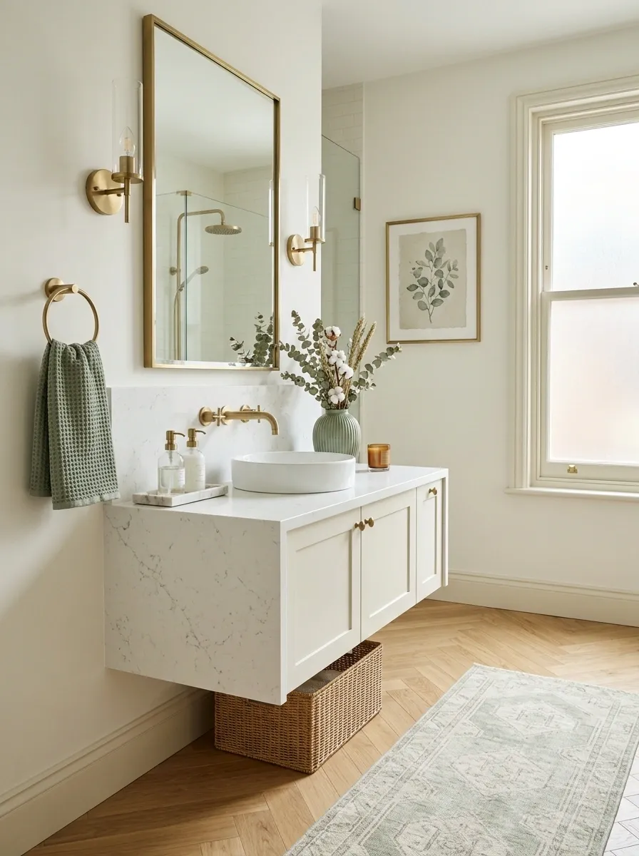
A guest bathroom starts looking disconnected when every decorative object introduces another color. Pick one accent and repeat it with purpose.
Use it in the hand towels, one piece of artwork, and a small accessory. Or repeat it through the rug, hardware detail, and a ceramic vessel.
The three-point rule: the color should appear in at least three visible places, but those places don’t need to match exactly.
This creates a quiet thread through the room. Guests may not consciously notice why it works, but the bathroom will feel far more pulled together.
Add a Small Decorative Object That Looks Collected, Not Random
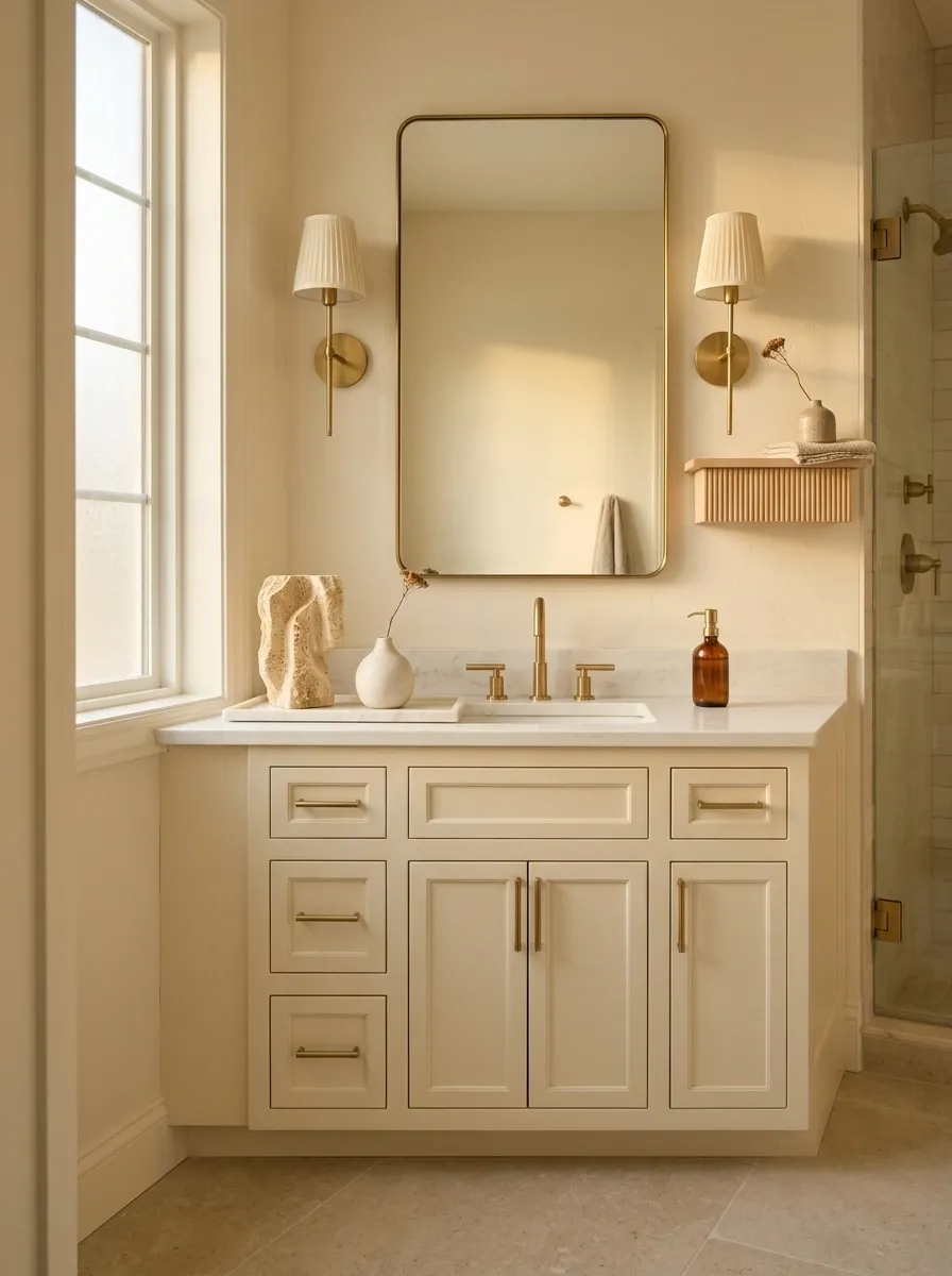
The best guest bathrooms usually have one little object that makes you wonder where it came from. That’s the feeling to chase.
Choose something with shape or texture, such as a carved stone, vintage-looking vessel, small ceramic piece, or sculptural object. Keep it on a tray, shelf, or other defined surface.
Skip the generic filler. A random figurine or tiny sign doesn’t give the room character. One substantial little object can.
Place it where guests can see it from the doorway. The right piece should feel like part of the room’s design language, not something you remembered to buy at the checkout line.
Make the Floor Work Harder With Pattern or Texture
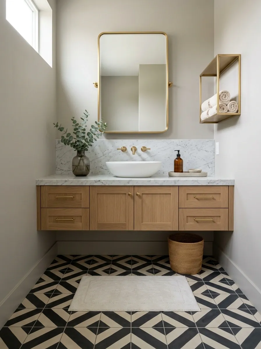
The floor is easy to ignore, which is exactly why it’s such a useful place to add character.
Patterned tile can give a small guest bathroom a strong foundation, while textured or subtly varied surfaces add interest without taking over the walls.
If the floor already has a bold pattern, keep the walls quieter. If the walls are doing the talking with wallpaper or dramatic artwork, a calmer floor makes more sense.
Think in terms of competition: only one major surface should demand attention at full volume.
Make the Guest Bathroom Feel Finished, Not Filled
A framed mirror gives the vanity weight. A good towel makes the room feel cared for. A tray controls the small essentials. Better lighting makes everything else look more deliberate.
Start with the largest visual problem instead of buying accessories at random. Fix the mirror, walls, lighting, or vanity first. Then layer in the smaller details only where they actually improve the room.
That’s the difference between a bathroom that simply looks decorated and one that feels ready when guests walk through the door. Save this list for the next time your guest bath needs a reset, and come back to it before your next gathering.