
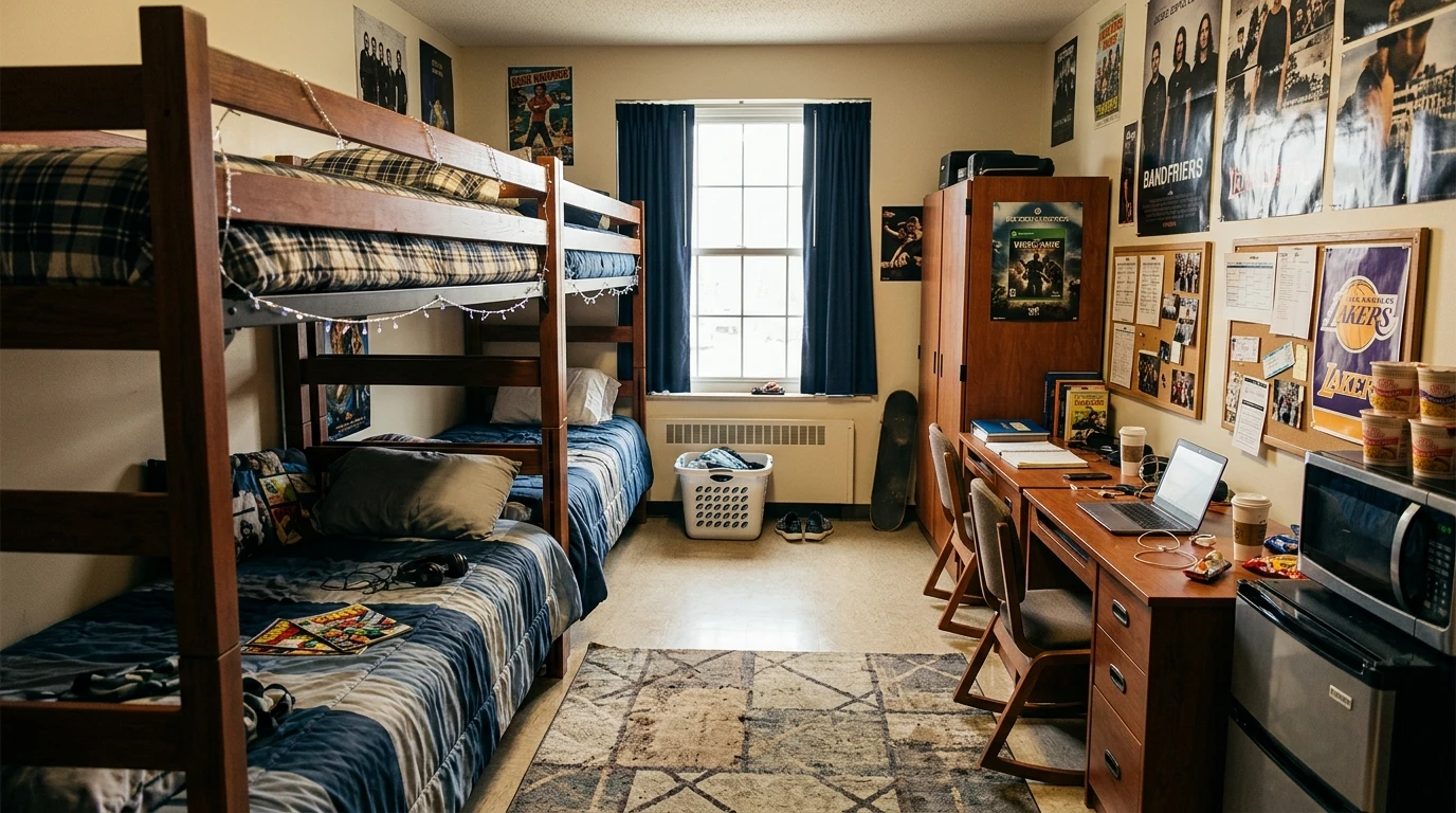
The dorm room is the first space you’ve ever had full control over. No parents, no siblings, no one to tell you the shelving is wrong. And somehow, the majority of guys walk in, shove a sports flag above the bed, and call it done.
The flag is not a design plan. It’s a placeholder.
The rooms in this list prove that a cinder block box can be something you’re genuinely proud of. Not just livable. Not just functional. Actually considered. Here’s what separates the ones that work from the ones that don’t.
Why Most Guy Dorm Rooms Look Like Furniture Holding Cells
The room doesn’t feel bad because it’s small. It feels bad because nothing in it was chosen with any intention.
The “Whatever Came in the Box” Problem
Most guys arrive at college with whatever their parents ordered off a checklist. Beige comforter, particle board shelves, a lamp from a big box store. These items all technically function. None of them do anything for the room.
Functional and considered are not the same thing. A lamp can light your desk. It can also anchor the entire mood of the room. The lamp you grabbed on the way to checkout does the first thing only.
Treating the Walls Like a Crime Scene
Nothing on the walls is one option. It creates a very specific atmosphere — interrogation room.
Too much on the walls, applied without logic, is not better. A tapestry tacked up in one corner, a flag in another, two unrelated posters in between. The eye has nowhere to go. It just moves around, confused.
Walls need an anchor. One dominant element — a large map, a photo grid, a collection displayed with intention — and then subordinate pieces that support it. Not four separate thoughts competing for attention.
The Light Problem Nobody Talks About
Every dorm room comes with fluorescent overhead lighting. That lighting is designed for productivity in the most clinical sense of the word. It’s hospital lighting. Correctional facility lighting.
No one room has ever felt good under that overhead fluorescent. Not one.
The fix is not complicated. It’s just a lamp. One lamp on the desk and one near the bed changes the entire atmosphere of a room. The overhead stays off after 6pm. This is non-negotiable.
Guy Dorm Room Ideas
The Ocean Tapestry Room with an Industrial Pendant and String Lights
Source the tapestry first and build the room around it. A large-format wave photograph printed on fabric — available through print-on-demand services at almost any size — should span the full width of the wall behind the bed and run from just above the pillow line up toward the ceiling. Use command strips or tension rods to hang it without putting holes in the wall.
The pendant lamp is the second defining decision. Find a cage or mesh industrial pendant with a visible Edison bulb, hung from the ceiling with a long cord. Centre it over the head of the bed or slightly to the side, low enough that the bulb filament is visible at eye level when you’re seated on the mattress. This replaces the overhead fluorescent as the room’s primary light source for evenings and creates a completely different atmosphere.
Globe string lights run along the top edge of the ceiling, single plane only. Use warm white bulbs, not multi-colour. The goal is campfire temperature light, not festivity.
The bedding goes dark and soft: navy duvet, white base sheet, a couple of pillows in grey and white stripe. Keep it calm against the drama of the tapestry. The wall art is the show — the bed just has to not compete.
A dark wooden nightstand handles the bedside. One small lamp or salt lamp for a second warm light source at mattress level. On the desk wall, a photo display clipped to a wire grid adds personal texture without fighting the tapestry wall.
The All-White Minimalist Room That Understood the Assignment
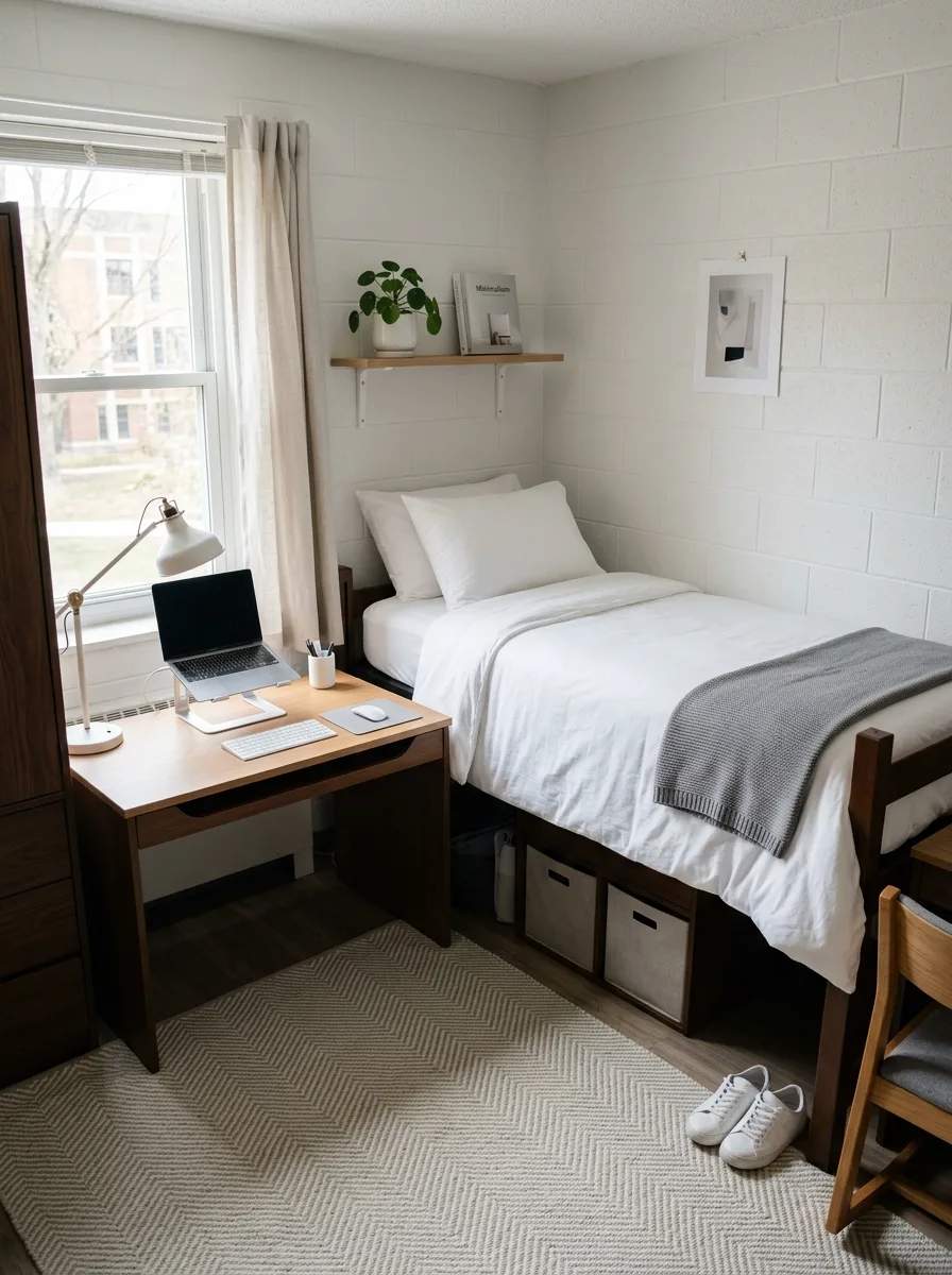
Start with white bedding and refuse to negotiate. White duvet cover. White fitted sheet. White pillowcases. The only texture variation allowed is fabric weight — a slightly heavier duvet, a loosely knit throw in pale grey draped at the foot. That’s it.
One floating shelf above the headboard wall, installed level with a single bracket on each side. On the shelf: one small potted plant, one book facing outward, one small object. Three items. Not four. The shelf is not storage — it’s punctuation.
The desk goes light wood, as light as you can find. The lamp goes white or cream, angled over the left side of the work surface. The laptop sits centered. One pencil cup. Clear desk otherwise.
The rug goes in a herringbone or diamond weave in oatmeal or light sand — a pattern that reads as texture from a distance without introducing a second colour. It defines the floor zone without complicating it.
One piece of art on the wall, framed in thin black or natural wood. Black and white abstract or architectural. Centred on the wall to the right of the bed. Nothing else on the walls.
Everything that doesn’t have a permanent home lives in a storage bin, under the bed, or in the wardrobe. The room’s whole argument rests on surfaces staying empty.
The Sneakerhead Room That Turned a Collection into the Architecture
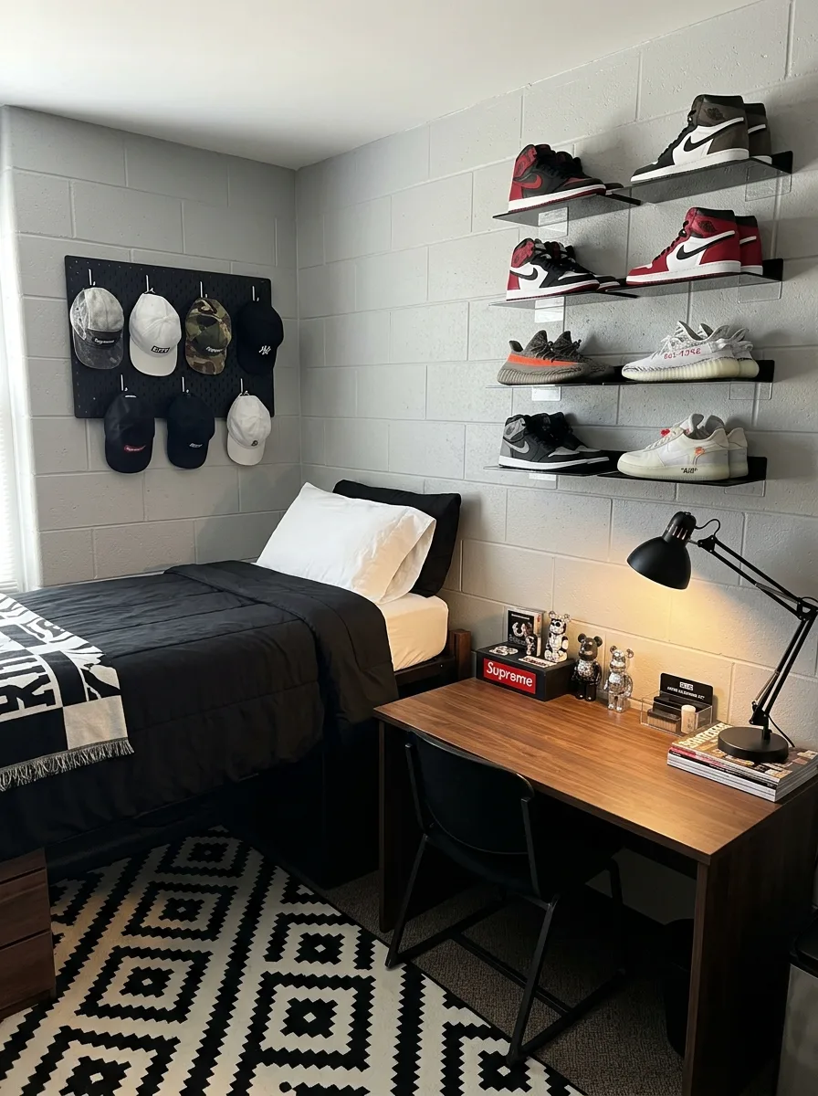
Install floating acrylic display shelves — the kind that are nearly invisible from the front, leaving only the shoe visible against the wall. These typically attach with two screws into a wall anchor or, for cinder block, with heavy-duty adhesive anchor strips rated for the weight. Run four to five rows in a consistent grid: equal spacing horizontally between each shoe, equal vertical intervals between rows.
Each pair goes heel-side back, toe facing out. High tops stay laced and tongued. Low tops sit flat. Consistency of presentation matters more than you think — a shelf of neatly presented pairs reads as a gallery. The same shoes in a shoebox pile looks like a storage problem.
On the adjacent wall, mount a square pegboard panel in black. Add individual hooks evenly spaced in a grid formation. Caps hang from each hook, arranged by colour or by brand. The panel should be large enough to display at least six caps without crowding. The black pegboard on cinder block wall is a clean, intentional pairing.
The bedding goes entirely black. Comforter, pillow covers, fitted sheet. White on one visible edge of the fitted sheet creates contrast without disrupting the palette. A bold graphic throw across the bottom of the bed adds the one decorative element in an otherwise strictly minimal scheme.
The rug runs black and white in a bold diamond or Aztec pattern. The contrast is high. It anchors the room’s palette and gives the floor a presence that matches the walls.
The Photographer’s Gallery Room Built on a Wire Grid and Black and White Prints
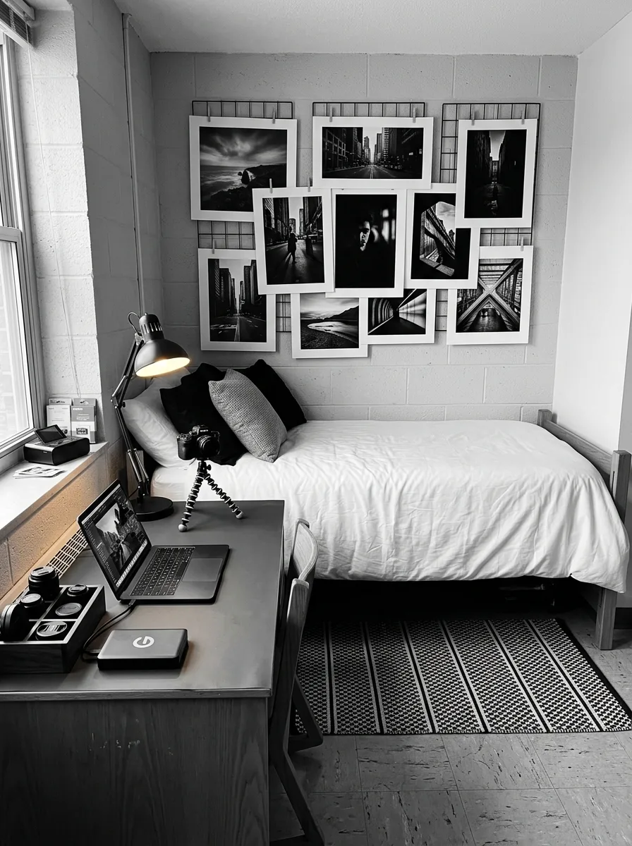
Mount two square wire grid panels side by side on the wall directly behind the bed. The panels — typically sold as closet organisers or desk panels — come in black metal wire and create a modular hanging system that doesn’t require a single nail in the wall if you use the right freestanding leg system or adhesive mounting strips.
Print your photos at home or at a print shop on standard matte paper. Size them consistently: 5×7 or 8×10. Print with a white border — minimum half an inch on each side. This border does the work of a frame, creating clean visual separation between images and the wall behind them.
Clip each print to the wire grid with small binder clips or wooden mini clothespins. Overlap at the corners, tilt slightly, vary the horizontal and vertical orientations. The goal is an organic arrangement that still reads as controlled. Everything in black and white, regardless of the original subject matter.
The desk runs dark and flat: a charcoal or dark wood surface, a moveable architect lamp positioned at the left side, camera equipment arranged intentionally rather than stacked. The camera itself can sit on a small Joby-style flexible tripod on the desk, positioned as an object as much as a tool.
The bed goes white duvet, black pillows. The rug goes low-contrast black and white stripe. The room’s palette has exactly three values: black, white, and grey. Nothing else is needed.
The Outdoorsman Room Where the Grand Teton Map Is the Whole Statement
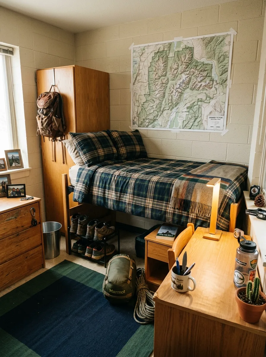
Tape a large-format topographic or cartographic map directly to the wall above the bed using painter’s tape on all four corners. The map should be large — at minimum 24 by 36 inches, preferably larger. Source the official cartographic edition from the US Geological Survey or the national park’s official store. The detail and authenticity of a real topographic map reads completely differently from a decorative print.
The bedding goes in a bold plaid flannel — forest green, navy, and gold or tan on a dark base. Source a proper flannel duvet or thick cotton quilt rather than a thin poly comforter. The weight and texture matters. Layer a wool or wool-blend throw in a different plaid scale across the foot of the bed.
A small wooden LED lamp — the kind with a warm amber bulb in a natural wood base — goes on the wooden nightstand beside the bed. The amber glow against the plaid bedding and tan wall creates a warmth that makes the room feel like it exists somewhere in the mountains rather than in a concrete building.
Gear lives visibly: a pack hangs from a hook on the back of the wardrobe door. Hiking boots sit on a low rack under the bed frame. A sleeping bag stays rolled and visible rather than hidden away. This is not clutter. It’s character. The gear belongs to the room’s story.
The desk holds a National Parks mug full of pens, a Nalgene with stickers, a small cactus or succulent. The windowsill gets one framed photo and a pinecone. Everything present is earned.
The Scholar’s Room Built Around a Green Banker’s Lamp and Two Shelves of Books
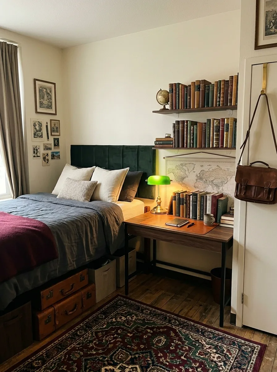
Install two floating shelves side by side directly above the desk, running the full width of that wall section. Use dark walnut or espresso laminate shelves on clean bracket hardware — nothing ornate. The shelves go as close together vertically as possible while still accommodating a standard hardcover without cramping it.
Fill the shelves entirely with books. Not selectively displayed books — books packed spine out, end to end, the way a working library looks. Vary the heights. Let cloth-bound and leather-bound spines mix with paperbacks. Add one small globe between the two rows as the only decorative object on the shelves. Everything else is books or empty space.
The banker’s lamp — green glass shade, brass or antique bronze base — goes on the desk centered below the shelves. Power it from a desk outlet and let it be the primary light source for the work zone. At night, lit alone against the dark wood desk and the row of book spines above, it creates an atmosphere that makes studying feel like a serious activity rather than a chore.
The bed sits low and dressed in slate blue or charcoal. A burgundy or forest green throw across the foot introduces warmth. Under-bed storage uses vintage-style trunk drawers with leather hardware — the kind that look like they’ve traveled somewhere.
A Persian or Turkish rug in deep red, navy, or forest tones anchors the floor. A leather satchel hung on a hook by the door. A world map print hanging small above the bed. The room reads as the space of someone who is genuinely interested in things, and that’s not an aesthetic — it’s just the truth made visible.
The Engineer’s Desk That Made the Bed an Afterthought on Purpose
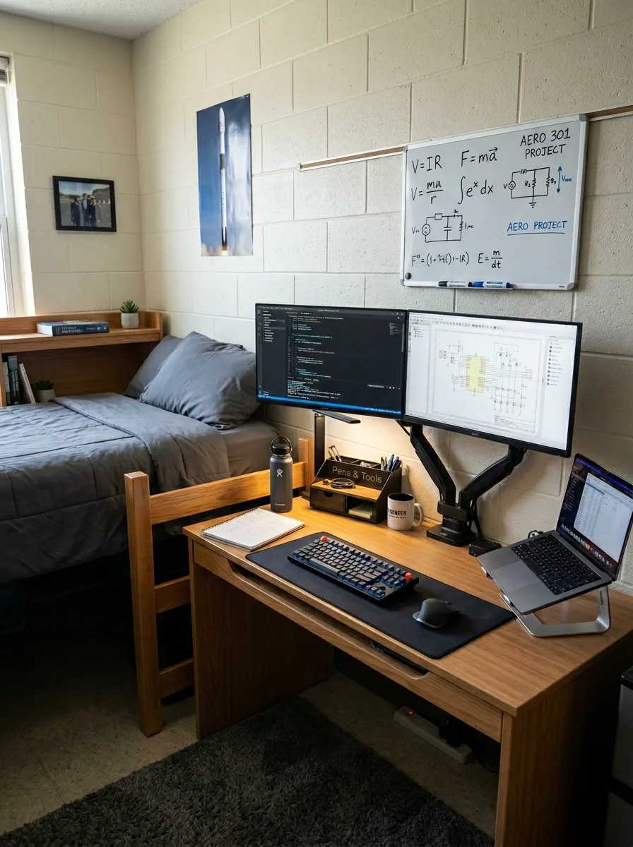
The monitor arm is the foundation. Mount a dual arm to the back edge of the standard-issue dorm desk, swing both monitors to eye level, and the entire desk surface becomes functional workspace below. Everything else is detail.
Source a full-length desk mat in black or charcoal that runs from edge to edge of the desk surface. This defines the work zone, protects the wood, and gives the whole setup a considered look that no amount of individual accessories achieves on its own.
A large framed whiteboard goes on the wall directly above the desk, positioned so you can write on it while seated. Use it for current equations, project notes, diagrams. Keep it active — a whiteboard with live content is part of the room’s energy. A blank whiteboard is just a wall accessory.
The keyboard should be mechanical in a neutral colour. A quality mechanical keyboard looks like equipment. The plastic membrane keyboard that comes in every student pack looks like office furniture. This is not an expensive swap. Entry-level mechanical keyboards start at the same price point.
The bed goes simple: grey comforter, single pillow, no throw. It exists. That’s enough. The desk is the room’s argument. Everything else is support.
The Automotive Design Room That Turned a Collection into a Grid Gallery
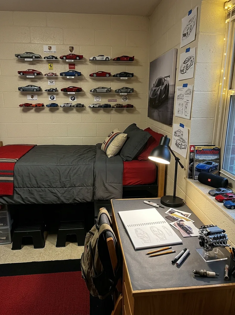
Install five to six rows of thin floating shelves running horizontally across the main wall, parallel and evenly spaced. White or light wood shelves on the cream cinder block wall let the cars carry all the colour. Label each shelf by manufacturer — a small printed brand logo card at the end of each row gives the display a showroom logic.
Space each model car so it has clear air on both sides. Touching models compress the visual and lose the gallery feel. Each car gets its own territory. The collection should read across the wall as a curated body of work, not a pile of objects that ran out of room.
On the adjacent wall, go vertical: a large format photo print of a single car, framed without a mat, hung centered. Below or beside it, tape three to four hand-drawn automotive design sketches from your own sketchbook directly to the wall with painter’s tape, overlapping slightly. These don’t need to be finished. Sketches in progress are better than polished prints.
The desk goes grey with a large drawing mat surface covering most of the top. Technical pencils, markers, and rulers laid out on the right side. An open sketchbook at the center. A miniature engine block display model on the left as the single object that communicates what this room is about before anyone reads a single label on the walls.
Bedding runs graphite grey with a red fitted sheet visible at the edges. The rug picks up the red from the bedding at the floor level. The palette is the same three values as a racing livery — black, grey, red — and nothing else.
The Prep School Lacrosse Room That Committed to Provenance
The vintage lacrosse stick is the hero object. Mount it horizontally on two small hooks at the same height, centered above the bed, as if it’s hanging in a trophy room. Below it, a felt pennant goes slightly off-center — it doesn’t need to be symmetric with the stick. The asymmetry reads as lived-in rather than arranged.
The bedding goes in Black Watch or Blackwatch-adjacent tartan: deep navy, forest green, and black in a classic plaid. Source a proper heavyweight throw or duvet in this pattern. On a white base duvet, it functions as both comforter and statement. Monogrammed if you can swing it — the initials and graduation year stitched in white thread on the throw is one of those details that only registers when someone gets close enough to ask.
The desk gets a green leather blotter covering the top surface. Not a full leather desk pad, but a traditional rectangular blotter in forest green. A brass desk lamp, adjustable arm, warm bulb. A fountain pen on the blotter. A stacked set of actual books — the kind you’re actually reading — not arranged for aesthetics but piled in the order you’ve gotten to them.
The windowsill is for life. A succulent in a terracotta pot. A framed team photo. A pair of leather boat shoes. A small travel mug with your school’s initials. The windowsill tells the truth about who lives here in a way the wall arrangement never quite manages.
Shelves on the wall above hold the helmet and extra equipment. They’re not hidden. The gear is part of the room’s identity, and a room that hides what it’s actually for is a room that doesn’t know what it’s for.
The Vinyl Room with Wooden Crates and Amber Light That Felt Like a Record Shop
Stack two wooden crates vertically as the primary bedside unit. These are untreated pine crates, available cheaply from craft and hardware stores. Stacked, they reach a workable nightstand height. The turntable goes on top. Records stand upright inside the upper crate, spines facing out so you can flip through them without moving anything. The lower crate stores more records, lying flat.
A second crate beside the bed functions as additional record storage and a surface for the bedside lamp. Use a small Edison-bulb lamp in a simple black or bronze base. Keep the bulb visible rather than shaded — the filament glow at that height and scale creates exactly the amber warmth the room needs.
Bedding runs in warm tones: burnt orange pillowcases, a mustard and cream stripe duvet, a dark forest green knit throw. These are not common dorm colours and that’s precisely why they work. Most dorm rooms go navy or grey. Going warm and earthy creates immediate distinction.
A kilim-style rug in rust, brown, and amber goes in the center of the floor. It needs to have enough visual presence to anchor the room — thin jute won’t do it. A proper vintage-style kilim or even a good print-on-fabric version gives the floor the depth the warm-toned room requires.
String lights with amber-tinted Edison bulbs run along the wall above the window and across the ceiling line toward the door. These run from evening through the night. The overhead fluorescent does not come on. Ever. In this room particularly, fluorescent lighting would be an act of violence against the atmosphere.
The Navy and Storage Room That Got Utility Right Without Apologising For It
Raise the bed to maximum loft height. This is the room’s one structural decision, and it is more important than every aesthetic choice that follows. A bed at full loft height creates roughly two feet of clear vertical space below — enough for six to eight stackable storage drawers arranged in two rows.
Source matching drawers. This matters more than it seems. Six identical grey or black stackable bins under a bed look organised. Six mismatched bins from different stores look like chaos that got hidden under furniture. Matching containers, aligned in a clean grid, turns the under-bed zone into visible, functional architecture.
The bedding goes single-colour, solid navy. No pattern, no throw, no decorative pillow. Navy on white walls reads as intentional even with nothing else in the room. It’s the simplest design decision you can make and one of the most effective ones.
The windowsill becomes the room’s softening element. Two or three small terracotta pots with succulents or low-maintenance plants. They catch the natural light and add the only organic texture in an otherwise hard-surfaced room.
The desk lamp clips to the back edge of the desk so the surface stays completely clear. Laptop on a riser. Keyboard flat in front. Nothing else on the desk that doesn’t belong there at the moment you sit down to work.
The Gym Room Where the Fitness Infrastructure Became the Design Plan
Loft the bed to maximum height and use every inch of the underside. A hanging mesh organiser hooks over the bed frame rail to hold the foam roller, jump rope, and resistance bands — exercise equipment that would otherwise take floor space it doesn’t have. A shoe rack under the front edge holds training shoes organised by use.
The door becomes functional. Install an over-door hook rack rated for the weight of a gym bag. The bag hangs here. A resistance band anchored to the top hinge creates a pull-down attachment point. The door does real work.
The desk hutch shelf becomes the nutrition station. Supplements, protein containers, and pre-workout in a neat line, labels facing forward. This is not a negative aesthetic choice — it’s honest. If this is what the room is for, the room should look like it.
Motivation posters go on the wall in a clean, aligned pair. Not taped haphazardly — use proper poster frames or mount them flush with even margins from the ceiling line. A workout schedule printed cleanly and framed beside them completes the wall. These are functional objects. Treat them like it.
The rug goes charcoal and dark — low contrast, low pile, easy to wipe down after a workout. The room smells clean. That’s the one element no photograph captures but every visitor notices.
The Founder’s Hustle Room That Took Its Own Ambitions Seriously
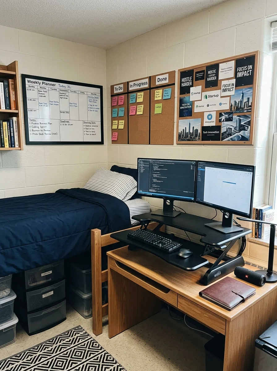
The stand-up desk converter is the investment that changes how the desk functions. Place it on the back third of the standard dorm desk, set it to the correct standing height, and mount both monitors on the riser arms. The standard desk below becomes keyboard space and a surface for the essentials — leather notebook, JBL speaker, a good pen.
The wall above the desk is the room’s operational brain. A large whiteboard in a dark frame takes the left third. Hang a three-column cork board in the center for the kanban system — to do, in progress, done — with sticky notes that actually move. A framed vision board fills the right third. All three are in matching frames. The frames unify what would otherwise look like an office supply store exploded on a cinder block wall.
The bed goes simple navy and stripe, lofted to create storage below. Plastic stackable drawers under the bed and plastic bins on the side — clear ones so you can see the contents without opening them. The rest of the room prioritises the work zone.
Books on the shelves above should be business, technology, and biography. Not textbooks. Books someone chose because they wanted to read them. The shelf shouldn’t look like a required reading list. It should look like an education you’re giving yourself on top of the one you’re paying for.
The All-Black Dorm Room That Needed Nothing Else
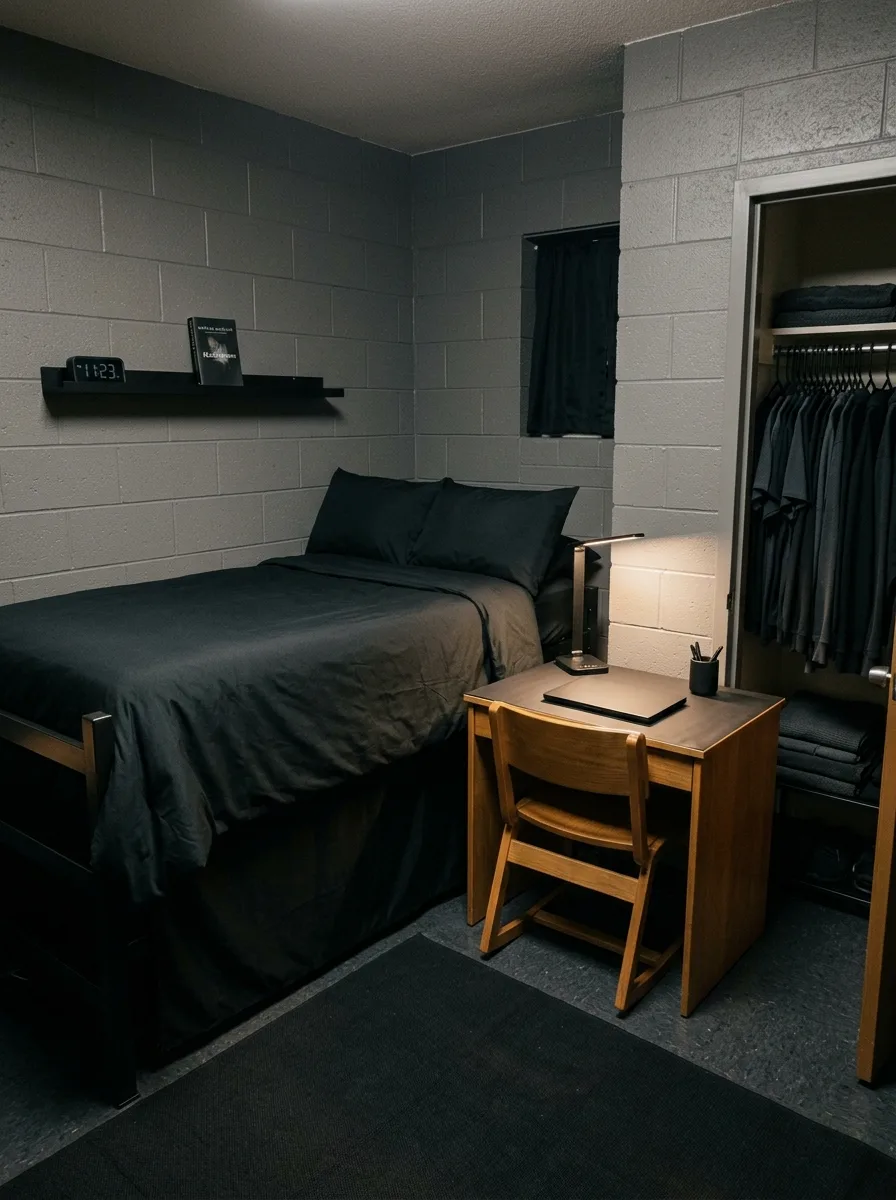
Start with the bedding and refuse to hedge. Full black duvet. Black fitted sheet. Black pillowcases. If you’re worried it reads too stark, consider a very dark charcoal for the duvet and pure black for the pillows — the slight variation in tone creates depth without introducing another colour. No throw, no decorative pillow, no accent.
The rug goes black as well. A low-pile solid rug or a very low-contrast dark geometric in black-on-charcoal. The floor and the bed exist in the same dark register. The cinder block wall, painted or unpainted grey, becomes the room’s only lightness.
One floating shelf, painted or wrapped to match the wall. A digital clock at one end. One book at the other. Nothing in between. The shelf is not decoration — it’s punctuation. It says the room was considered.
The desk lamp is the only warm element. A thin, articulated LED task lamp with a warm setting — set to its warmest, lowest output for evenings, brighter for work hours. It is the room’s only light source after dark. The overhead fluorescent gets a dark blackout panel or simply never gets turned on.
The closet, if open, runs in one colour family. All darks. Arranged by type. This is not the result of vanity. It’s the discipline the room asks of you. If everything else is stripped away, the things that remain should be chosen, not leftover.
The Surf and Coastal Room That Leaned Into the Cliché and Won Anyway
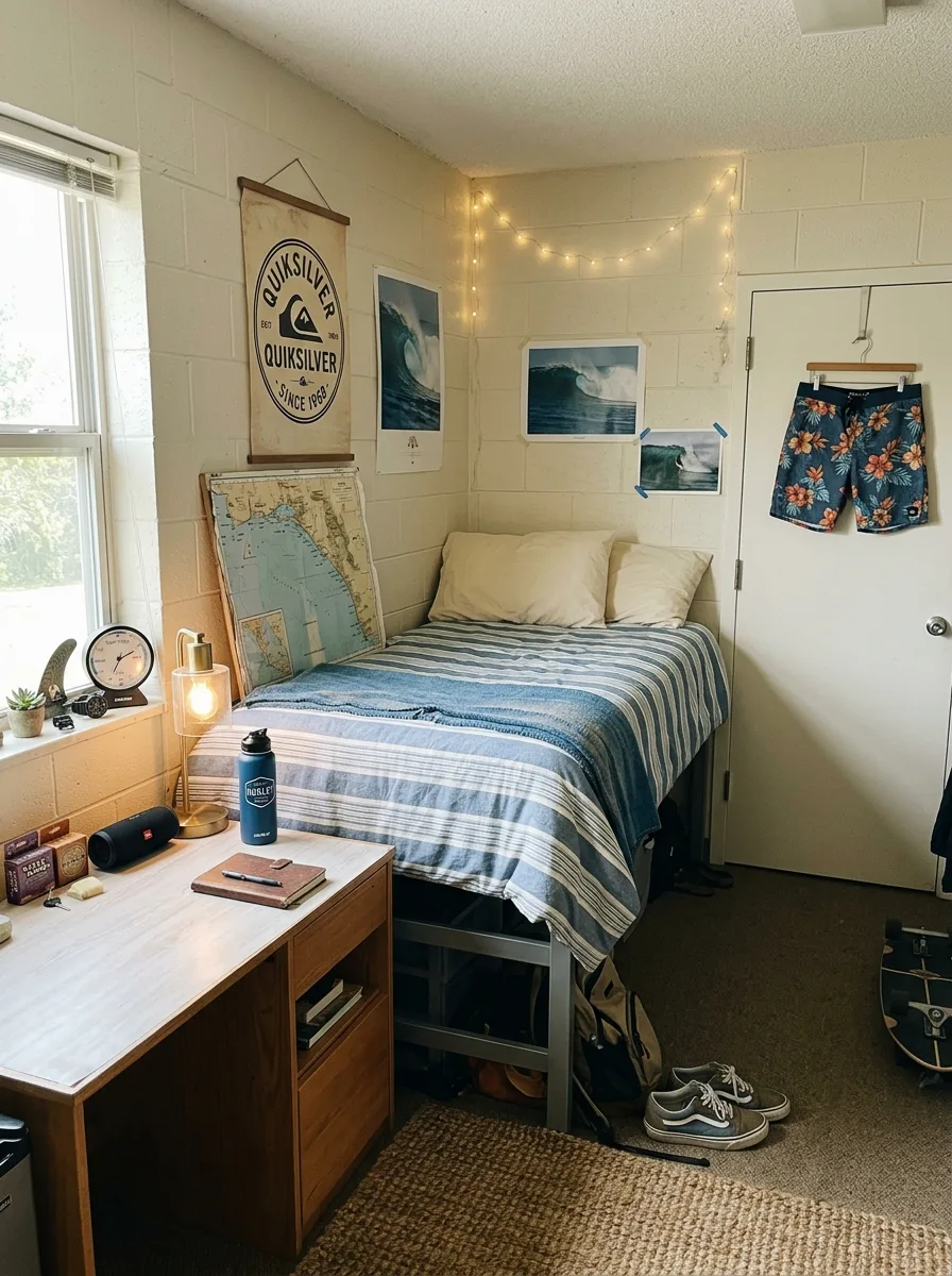
The canvas hanging banner on a wooden dowel goes above the desk — not above the bed. Hanging it above the desk is the move that prevents it from reading as a poster someone slapped up in a hurry. Positioned at desk wall height, it becomes a vertical element that gives the workspace a backdrop and makes the desk feel like a deliberate zone.
The bedding runs blue and white horizontal stripe. Wide stripes, not narrow ones. Source a duvet or comforter in a washed cotton or linen-cotton blend so the fabric drapes loosely rather than puffing into a dome. Coastal bedding should look relaxed, not inflated.
Ocean photography prints go directly on the wall behind the bed. Tape them flat to the cinder block with painter’s tape on the corners. A coastal nautical map leans against the wall rather than hanging — the lean creates informality and gives the wall a layered depth that flat-hanging everything never achieves. The leaning map becomes the room’s casual centerpiece.
Warm fairy lights run loose along the top of the wall above the bed, not in a tight line but in a gentle arc. Plug them into a timer so they come on at dusk automatically.
A surfboard fin propped on the windowsill. A jute or sisal rug on the floor. A brass or gold-toned lamp on the desk. The scent of something salt-adjacent if you have a diffuser. The room should feel like you just got out of the water and everything dried while you were studying.
The Full Motorsport Room with a Model Collection and a Designer’s Desk
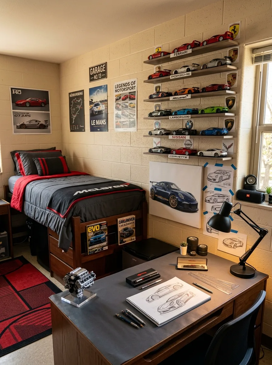
Run five rows of floating shelves down the right-hand wall, each shelf in white or light wood against the cinder block. Space the rows evenly — roughly eight inches of vertical clearance between each — and run them from approximately hip height up to the ceiling. Label each row with the manufacturer name in a clean printed card at the far edge: Ferrari at the top, then Porsche, McLaren, Lamborghini, Nissan, Corvette downward.
Each model car sits with consistent orientation — all pointing the same direction, evenly spaced, with clear air between them. The consistency is what makes it a collection rather than accumulation. One identical display rule applied across sixty objects creates something that looks like it was installed, not placed.
On the adjacent wall, mount four to five motorsport event posters in a clean horizontal line at eye level. No frames, painter’s tape on the corners, perfectly aligned tops. A Le Mans poster, a Nürburgring track map, an F40 photo print, a GT3RS specification sheet. These are not decoration — they are the research wall of someone who is genuinely serious about this subject.
The desk surface gets a grey technical mat running the full top. Set a scaled engine block model at the left edge as the single three-dimensional object. Centre an open sketchbook — with actual work-in-progress automotive sketches — in the middle. Technical pens and rulers to the right. A black desk lamp positioned above the right side of the surface.
The bedding goes graphite grey with a red undershirt visible at the duvet fold. The rug is red and black in a grid or racing livery pattern. The room commits to a palette and never breaks it: black, grey, red. Every object in the room either fits that palette or earns its exception. Almost nothing earns an exception.
Final Thoughts
Every room in this collection is the expression of something real. Not a design concept. Not a Pinterest mood board executed faithfully. Something the person living in it actually cares about.
That’s the thing the dorm room gives you that most people never fully use. It’s twelve feet by twelve feet of total authority. No one else’s taste, no one else’s furniture, no compromise. The rooms that feel like something — like a place rather than a box — are the ones where someone made a decision and held to it.
The decision doesn’t have to be sophisticated. It has to be genuine. A Grand Teton map is a genuine decision. A row of sneakers on invisible shelves is a genuine decision. All-black everything is a genuine decision.
Start there. The rest is just shopping.