
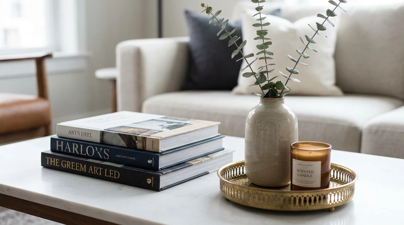
A home can be filled with nice furniture and still look cheap. The problem usually isn’t the furniture. It’s the little things around it.
Curtains that stop too high. A rug that’s too small for the seating. Five tiny decorations fighting for attention on one table. Harsh ceiling light washing out the room at night. Random finishes that make every purchase look unrelated.
Those details are easy to overlook because none of them seem serious on their own. Together, they make a room feel unfinished.
Learning How to Make Your Home Look More Expensive on a Budget is really about fixing those visual mistakes before spending money on more stuff. A better layout, stronger proportions, cleaner surfaces, and a few carefully chosen materials can do more than an expensive shopping haul.
What Actually Makes a Home Look Expensive?
The expensive look usually comes from a handful of visual choices working together. Use this quick comparison before changing anything.
How to Make Your Home Look More Expensive on a Budget Ideas
Integrate Vertical Gardens for Natural Luxury
A blank hallway can quickly feel cold and lifeless when left completely bare. Layering in a vertical garden installation immediately changes the mood by adding organic warmth and unexpected depth.
Combine climbing architectural elements with floating shelves to give plants a deliberate home. Soft, integrated backlighting makes the greenery glow, creating an upscale boutique hotel feel without the boutique price tag.
Keep the arrangement balanced. Let plants cascade naturally while maintaining clean lines around the base to keep the hallway looking intentional rather than cluttered.
Hang Curtains High and Wide to Frame the Whole Room
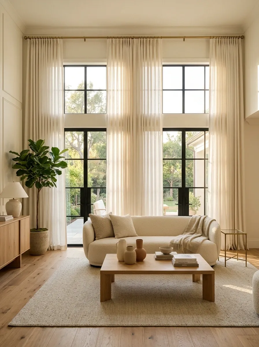
Short curtains make even a nice room feel oddly unfinished.
Mount the curtain rod several inches above the window and extend it well past both sides. Let the fabric reach the floor without pooling into a messy pile.
For a cleaner result:
- Choose panels that reach the floor.
- Keep the rod wider than the window.
- Use fuller panels instead of thin, skimpy fabric.
The extra fabric also makes the window feel larger, which changes the proportions of the entire wall.
Anchor Console Tables With Organic Symmetry
A floating shelf or console table needs more than just random objects scattered across its surface to look high-end. Grouping items of varying heights creates an instant sense of proportion and polish.
Pair a striking round mirror with sleek vertical paneling to draw the eye upward. Fill a textured vase with delicate branches to add height and softness against the clean geometry of the walls.
Stick to a cohesive, neutral color palette. Restraint is the secret to making simple decor look expensive and carefully curated.
Replace Tiny Art With One Oversized Statement Piece
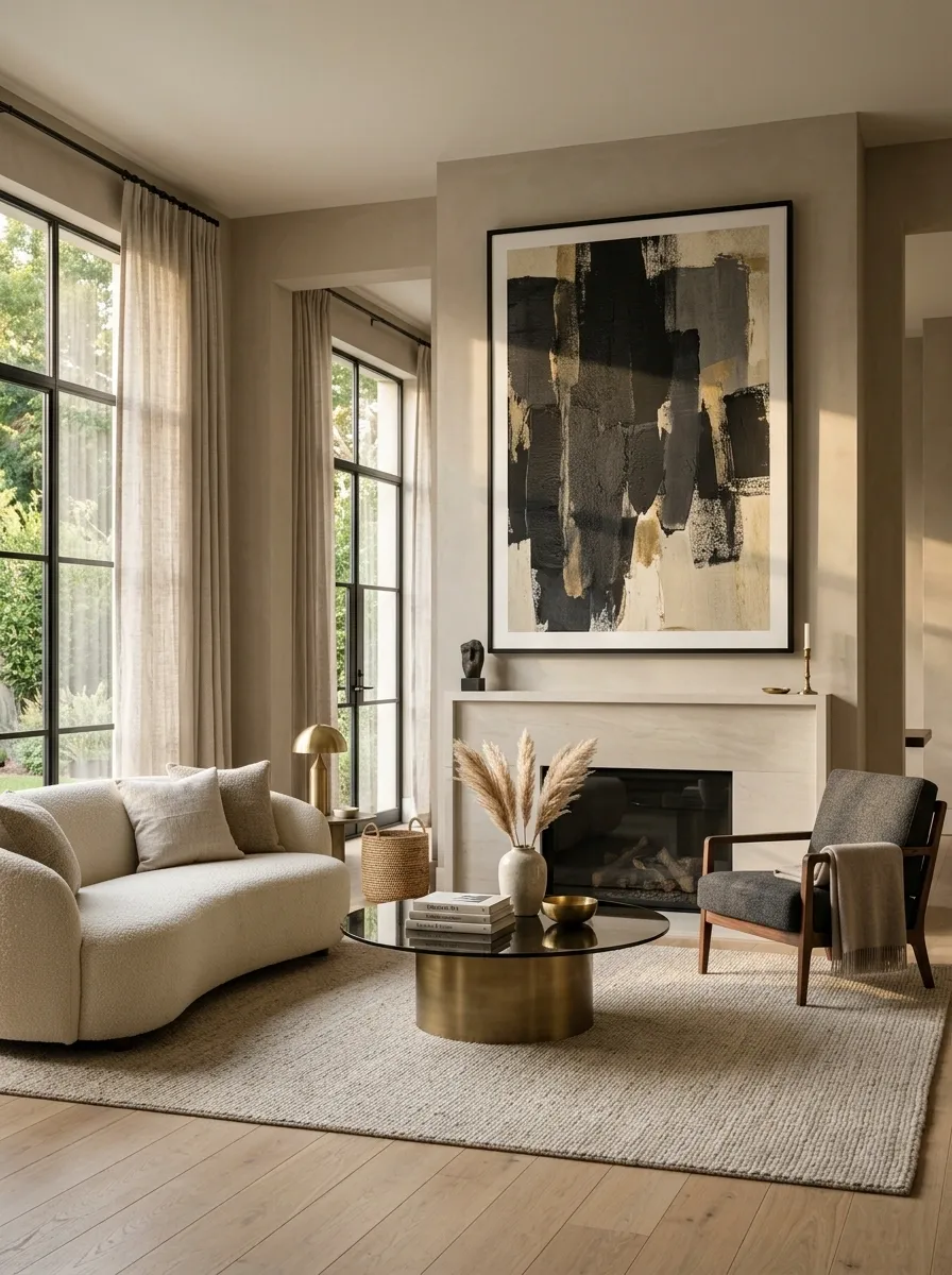
A wall covered in little frames can quickly look like a collection of leftovers.
One larger piece creates a stronger focal point and gives the wall breathing room. The artwork doesn’t need to be expensive. It just needs enough visual weight to hold the wall.
A simple print in a large frame often looks more considered than several small pieces competing for attention.
Quick swap: combine small prints into one oversized frame rather than spreading them across the wall.
Cluster Asymmetric Mirrors to Elevate Blank Walls
Standard rectangular mirrors often blend into the background, missing an opportunity to act as true art pieces. Organic, asymmetrical shapes bring unexpected movement and modern flair to an empty corner.
Group three distinct mirrors together to form a cohesive gallery installation that fills the wall space naturally. Pair the display with a textured bench and cozy textiles to ground the arrangement.
Leave enough breathing room around the frames. Letting the wall peek through keeps the vignette feeling light, sophisticated, and completely intentional.
Layer Two or Three Textures Instead of Buying More Decor
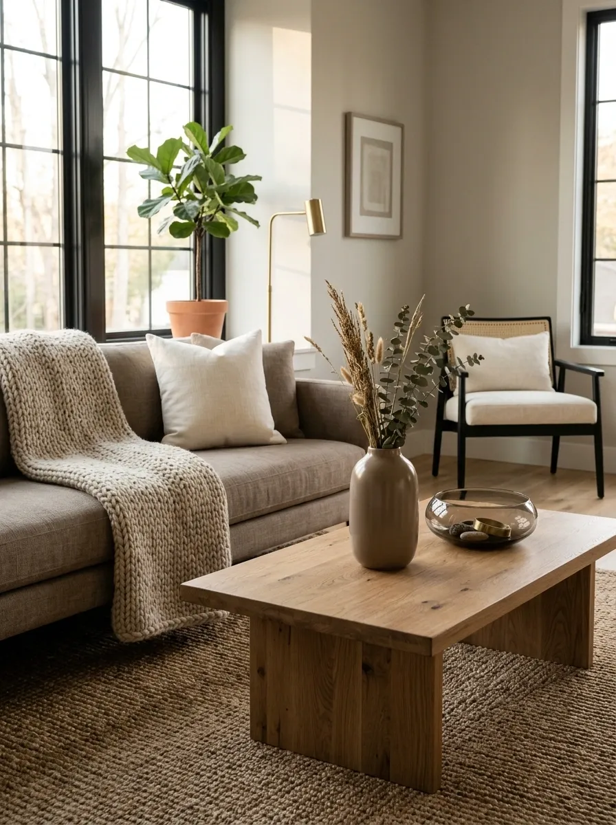
The room doesn’t need another vase. It needs contrast.
Pair smooth surfaces with something soft, rough, woven, or slightly imperfect. A linen cushion next to a chunky knit throw works because the materials don’t compete.
Keep the mix controlled.
- Smooth: glass, polished wood, ceramic
- Soft: linen, cotton, boucle
- Natural: rattan, stone, unfinished wood
Three strong textures beat ten random accessories every time.
Ground the Room With an Arched Statement Mirror
A small mirror in the corner of a room often feels like an afterthought. Leaning a grand, architectural arched mirror against the wall instantly expands the space and adds a layer of classic elegance.
Choose a frame with a bold black finish to create contrast against neutral walls. Complement the mirror with a textural ceramic vase and a minimalist boucle stool for a layered, designer look.
Keep surrounding accessories minimal. The mirror should serve as the undisputed star of the corner without needing extra clutter to support it.
Clear Surfaces Until Only the Useful Pieces Remain
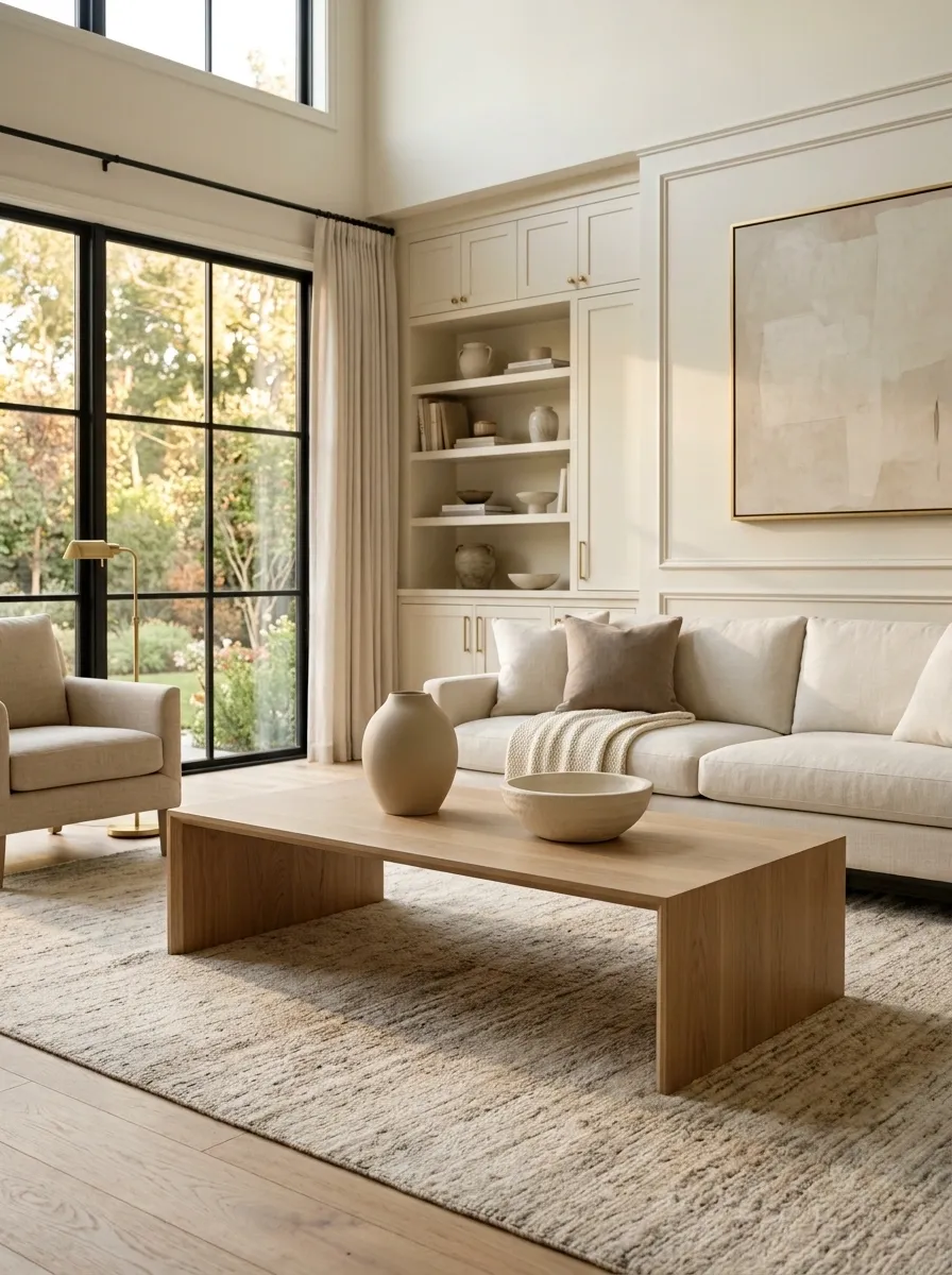
A crowded room rarely looks expensive, even when the individual pieces are nice.
Start with the coffee table, kitchen counters, bedside tables, and bathroom vanity. Remove anything that’s there simply because an empty spot felt uncomfortable.
Keep only the pieces that serve a purpose or create a clear focal point.
Fast edit: remove everything from one surface, then return only the best two or three pieces.
Style Floating Shelves With Purposeful Restraint
Open shelving can quickly slide from stylish to chaotic if every inch is covered in random trinkets. Treating each shelf like a miniature gallery display changes the entire dynamic of the room.
Anchor the shelves with a mix of matte black finishes and warm metallic rails. Alternate between functional items like plush rolled towels and decorative touches like framed signage and greenery.
Leave some negative space on each shelf. Breathing room allows the eye to appreciate the individual textures without feeling overwhelmed by the accessories.
Swap Builder-Grade Hardware for Weighty Finishes
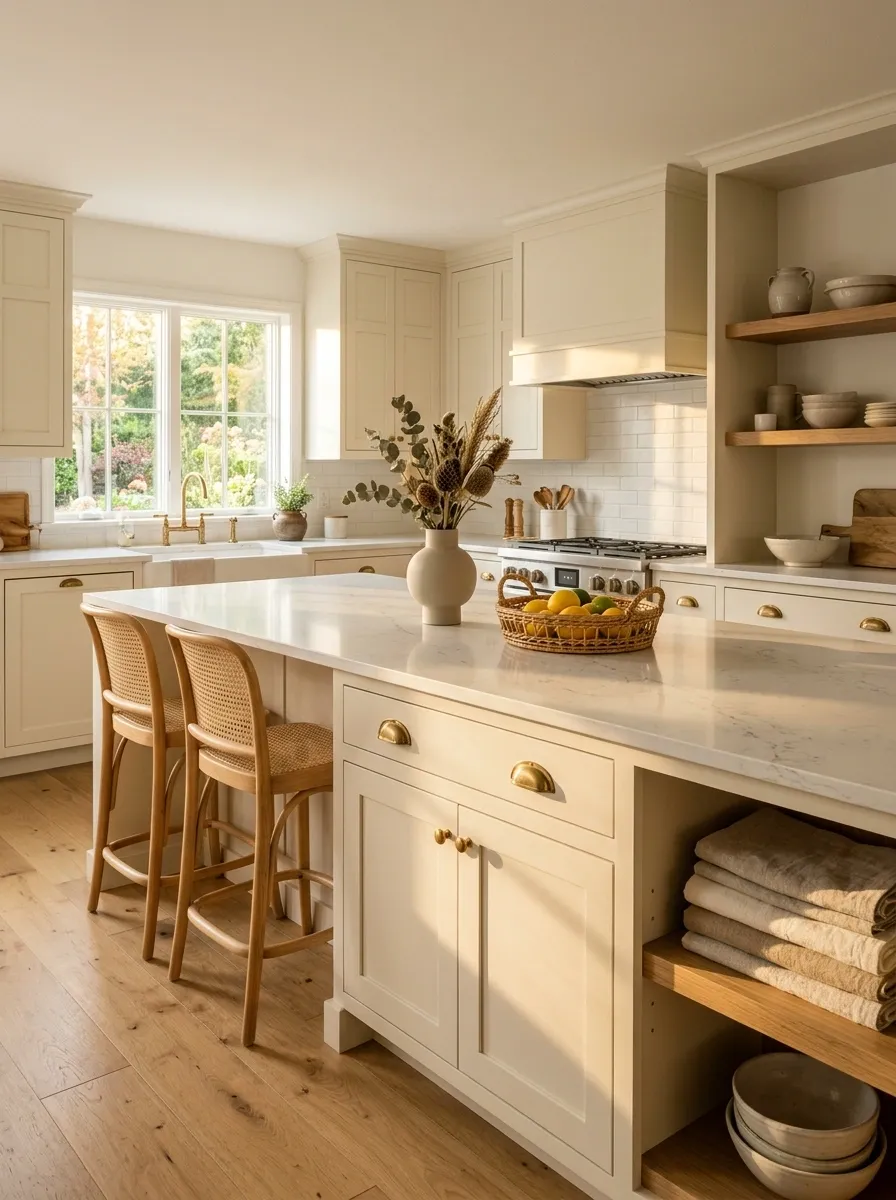
Tiny plastic knobs and thin generic pulls can make an otherwise solid piece of furniture look cheaper than it is.
Hardware has an outsized visual effect because it’s repeated across cabinets, drawers, and doors.
Look for simple finishes with some visual weight. A warm bronze, aged brass, matte black, or brushed metal can work, as long as the finish fits the rest of the room.
Keep the shapes simple. Fancy hardware rarely looks more expensive.
Use Matching Hangers to Make Closets Look Custom
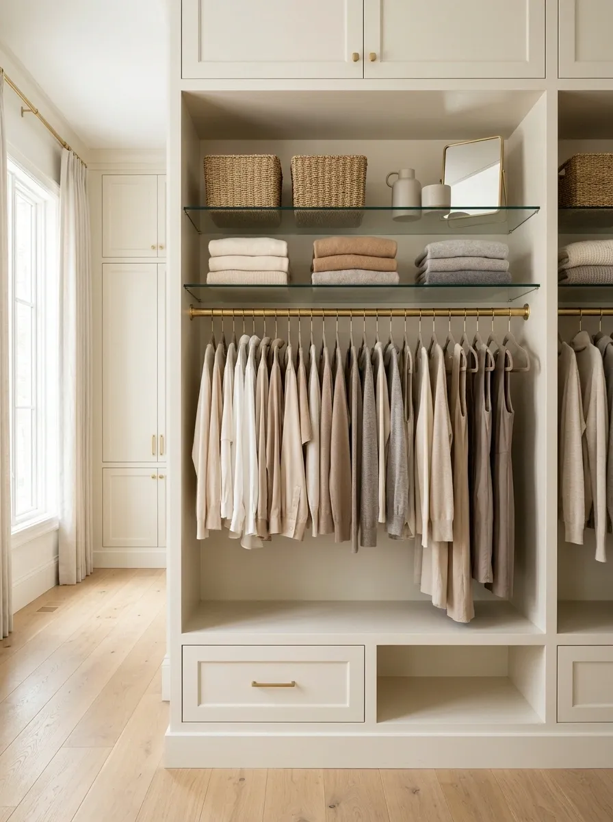
A messy closet can undo the polished look of the rest of the home.
Matching hangers create one clean visual line, so clothing becomes the focus instead of a pile of different plastic shapes. Slim hangers also free up more rail space without adding another storage system.
Choose one hanger finish and stick with it throughout the closet.
Best detail: Turn every hanger in the same direction. That tiny bit of order makes the whole wardrobe look intentional.
Layer Table Lamps, Floor Lamps, and Ceiling Light
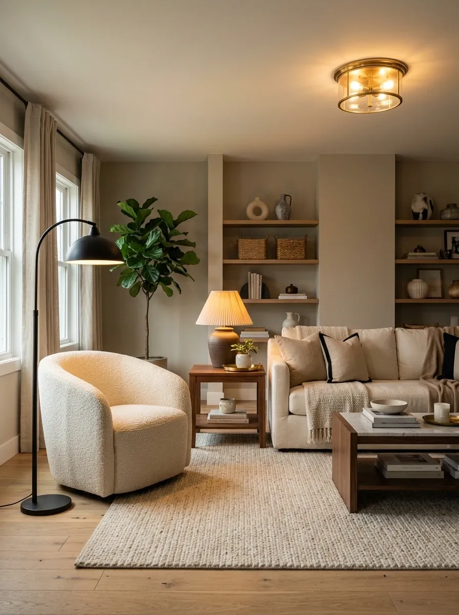
One overhead light flattens a room.
Better rooms have light at different heights. A ceiling fixture handles general light, a floor lamp fills a darker corner, and a table lamp creates a softer pool near seating or a bed.
The goal isn’t more brightness. It’s more control over where the eye lands.
A dimmer lamp beside a sofa can make that corner feel finished even when the rest of the room stays simple.
Repeat One Metal Finish Around the Room
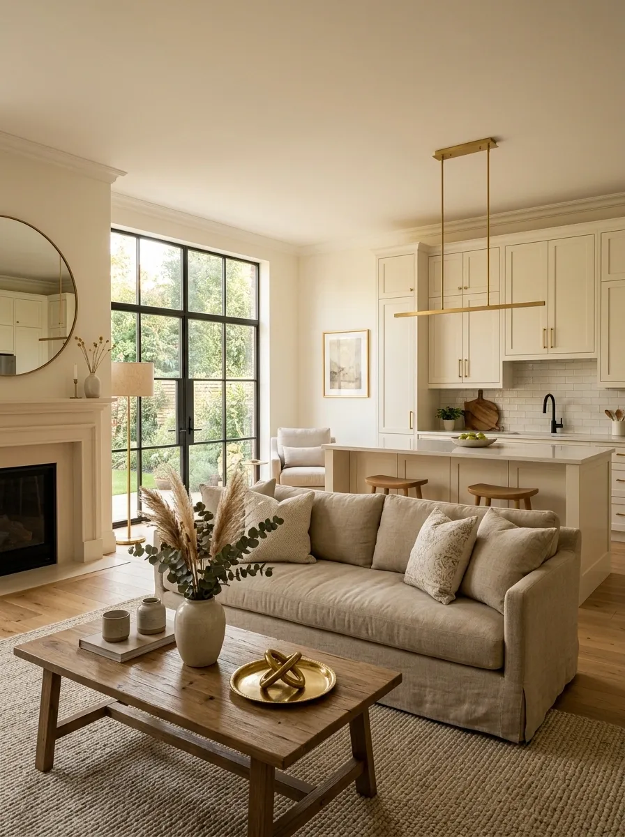
Mixed metals can work, but random metals don’t.
A brass mirror beside chrome lighting, brushed nickel handles, and black shelf brackets can make a room feel like every purchase happened separately.
Pick one dominant metal and repeat it in visible places. Cabinet hardware, lighting, frames, mirrors, and small accessories don’t need to match perfectly, but they should feel related.
Simple rule: let one finish do most of the work, then use other metals sparingly as supporting details.
Make the Bed Look Like a Boutique Hotel Bed
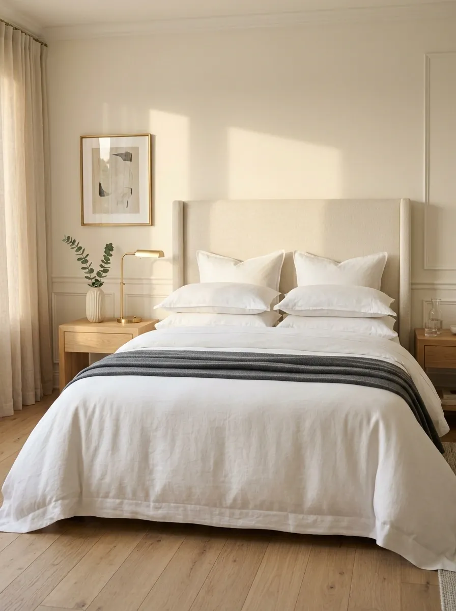
The bed takes up a huge amount of visual space, so it can’t look like an afterthought.
Start with a fitted sheet, then add a clean duvet or coverlet. Finish with a few pillows that have enough volume to hold their shape.
Don’t pile on every decorative pillow available. That creates bulk without making the bed look better.
A folded throw across the lower third adds structure and gives the eye one obvious finishing detail.
Use a Large Rug to Anchor the Furniture
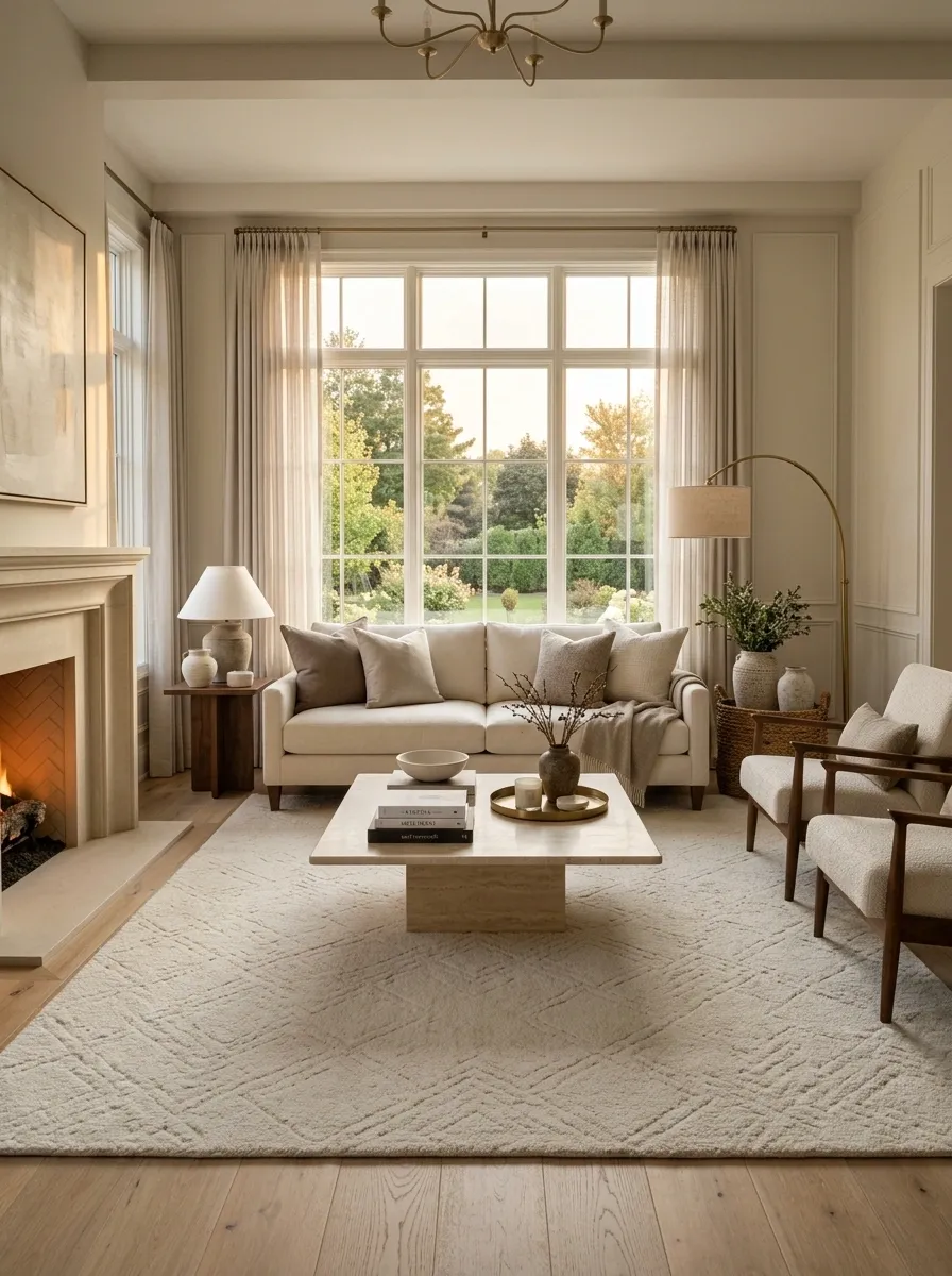
A tiny rug floating under the coffee table makes expensive furniture look disconnected.
The rug needs enough size to visually pull the main furniture pieces into one group. In a living room, the front legs of the seating should sit on the rug rather than hovering just outside it.
A larger neutral rug often makes a room look calmer immediately.
Budget fix: keep the existing furniture and upgrade only the rug size. The change can make the whole layout feel more substantial.
Decant Bathroom and Kitchen Products
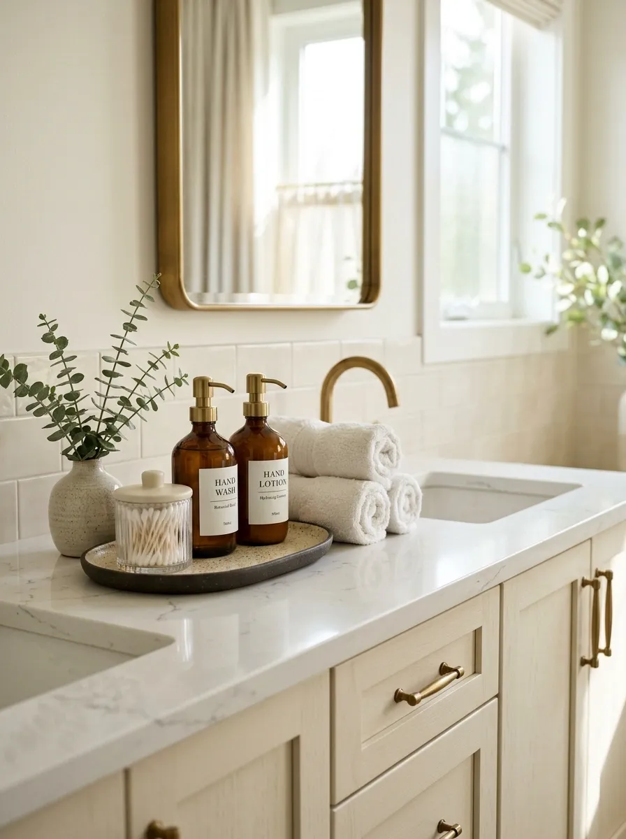
The original packaging is often the fastest way to make a room look cluttered.
Soap bottles, cotton swabs, dish soap, and other daily-use products look far more organized when the containers follow one visual direction. Clear, amber, white, or simple ceramic containers work because they remove loud labels from the room.
Don’t decant everything. Focus on the products that stay visible.
Best targets: hand soap, lotion, dish soap, bath salts, cotton swabs, and laundry essentials.
Choose One Large Plant Instead of Several Tiny Ones
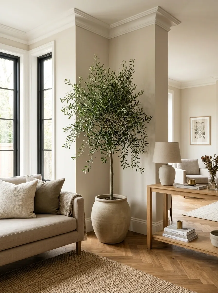
Five tiny plants scattered around a room create visual noise.
One substantial plant has more presence and gives an empty corner a clear purpose. A tall olive-style plant, rubber plant, palm, or another full indoor variety can work beside a sofa, console, or empty window.
The planter matters too. Skip the flimsy nursery pot and use a simple container with enough weight for the plant’s size.
Placement rule: give the plant room around it. Crowding it between furniture makes even a large plant feel accidental.
Keep the Color Palette Tight and Let Texture Carry It
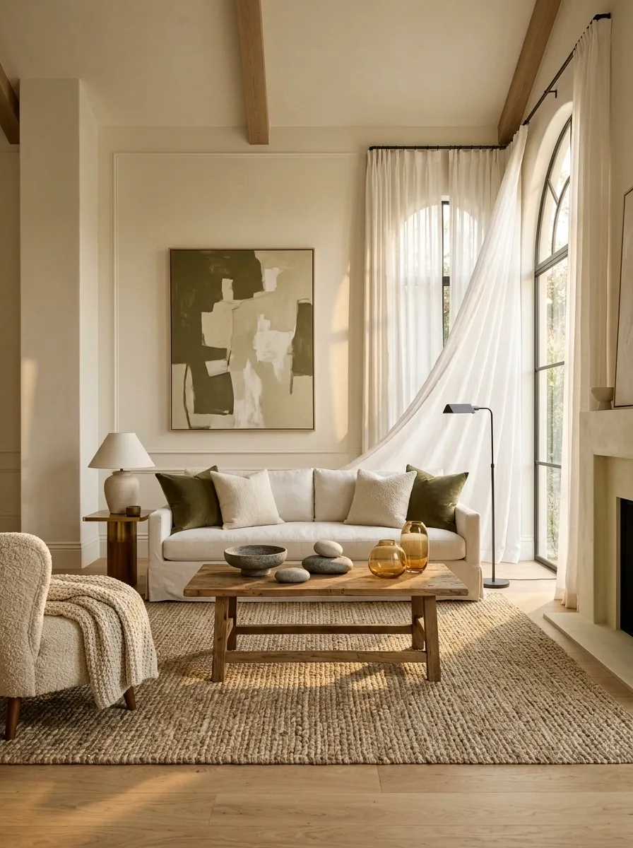
Too many colors make budget pieces look disconnected.
A tighter palette gives inexpensive furniture and accessories a more unified appearance. Start with a main neutral, add one supporting color, then let wood, fabric, stone, glass, and woven materials create the variety.
The trick is resisting the urge to solve every dull corner with another color.
Strong formula: neutral base + one muted accent + several textures.
Hide Cords, Remotes, and Tech Clutter From Sight
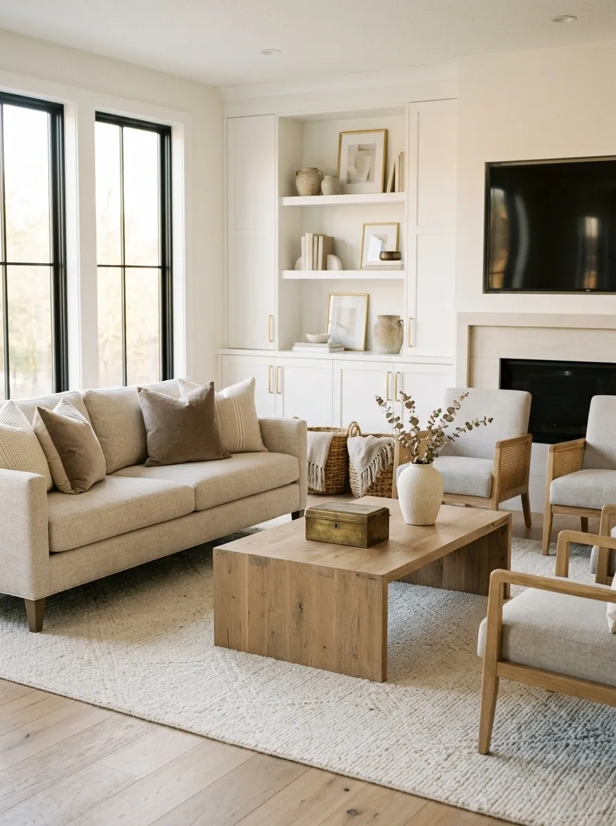
A beautiful room loses its polish when cables snake across the floor or a pile of remotes sits on the coffee table.
Tech should work quietly in the background.
Use cord clips along furniture legs, a cable box for power strips, and a small tray or lidded box for remotes. Keep charging cables in one designated spot instead of leaving them beside every seat.
Best rule: anything used every day still needs a home that isn’t visually loud.
Switch to Warm, Layered Lighting
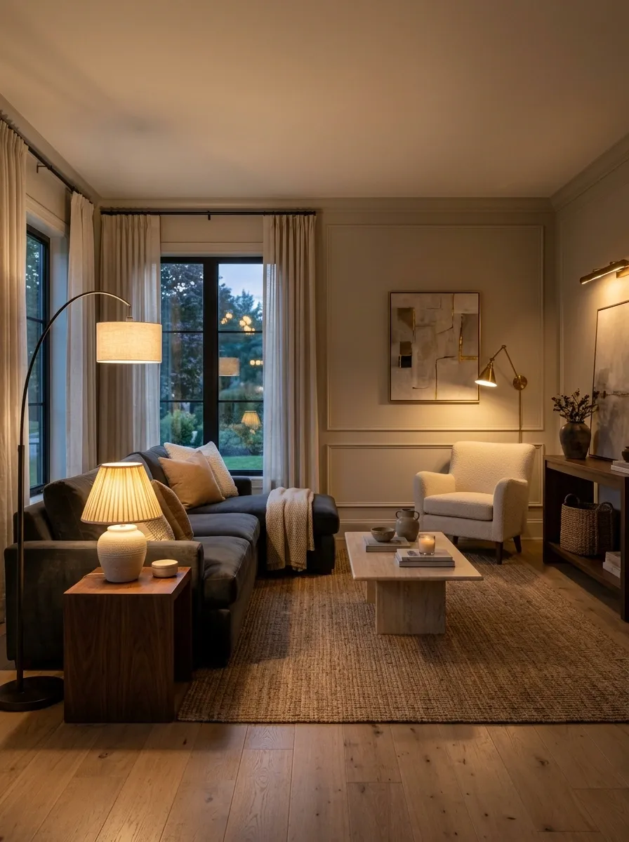
Cool, flat lighting makes even good furniture look ordinary.
Warm bulbs create a softer evening atmosphere, but the bulb isn’t the whole answer. The room needs several light sources so it doesn’t depend on one bright fixture in the center.
Use a floor lamp in a dark corner, a table lamp near seating, and focused lighting where tasks happen.
The result feels more polished because the light creates depth instead of washing every surface evenly.
Style the Entryway Like It Matters
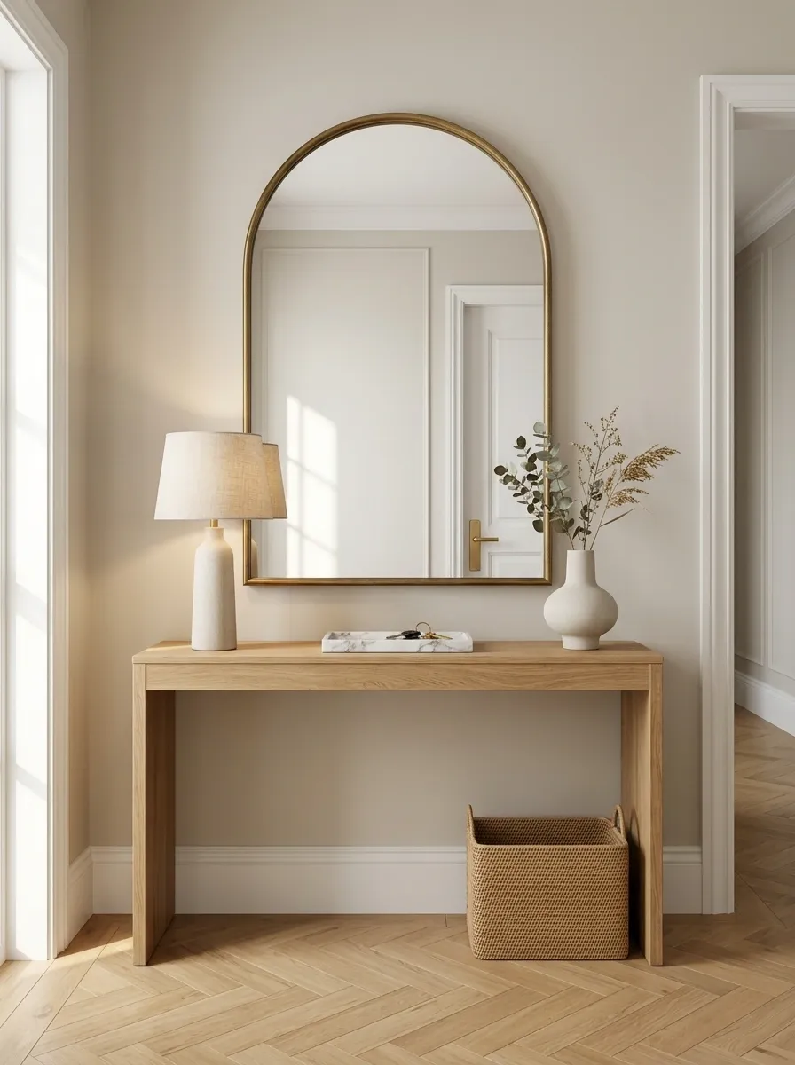
The entryway sets the tone before anyone sees the rest of the home.
A small console, a mirror, one useful tray, and a clean place for shoes can make this area feel far more considered than a pile of coats and shopping bags.
Don’t overload it. The entryway needs one clear focal point and enough empty space to feel easy to use.
High-impact move: place a mirror above the console and keep the surface limited to a lamp, tray, and one decorative object.
Group Small Objects on a Tray
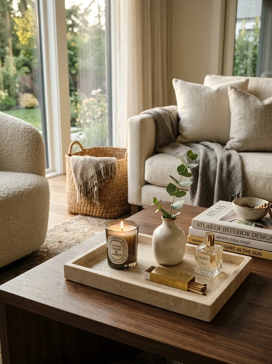
Small objects look random when they’re scattered.
A tray fixes that by giving separate pieces a visual boundary. Put candles, a small vase, matches, perfume bottles, or everyday keys inside one tray instead of spreading them across a surface.
The tray itself should be simple. Wood, stone, metal, or a matte finish usually works better than something covered in decoration.
This trick works especially well on coffee tables, bathroom counters, kitchen islands, and entry consoles.
Use Fuller Pillow Inserts and Larger Covers
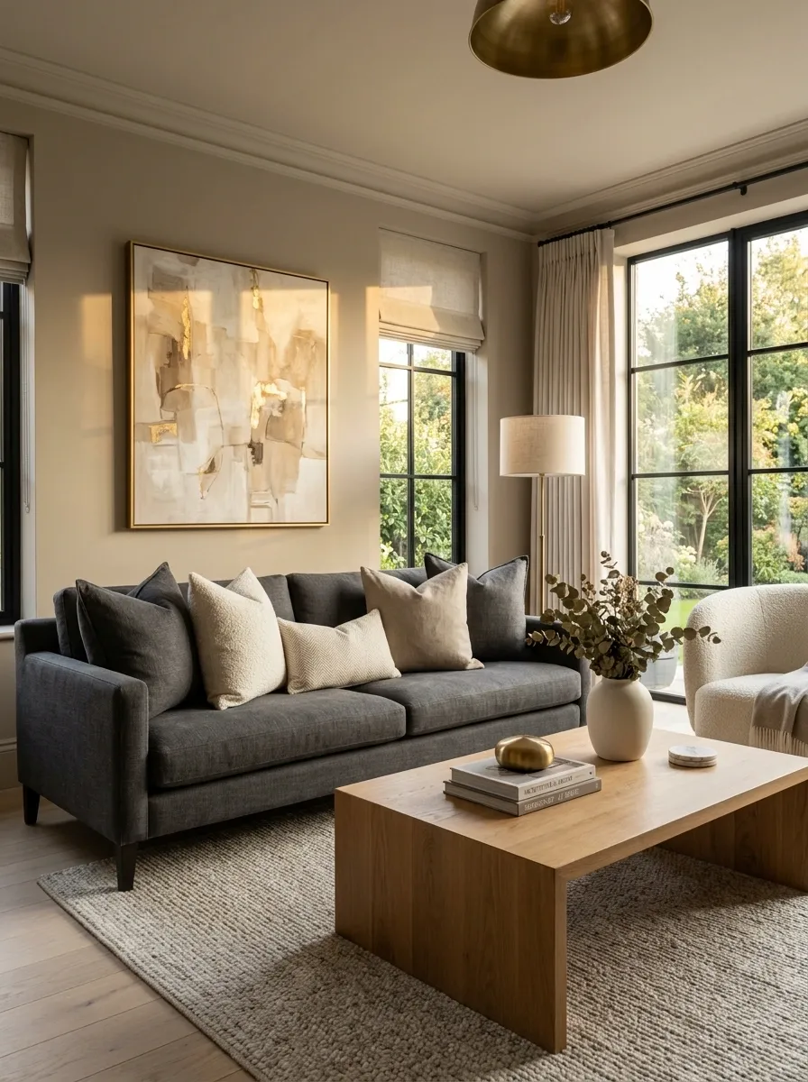
Flat throw pillows make a sofa look tired, even when the sofa itself is fine.
The fix doesn’t require replacing every cushion. Use inserts that fill the corners properly, then choose covers with enough room for the insert to sit naturally.
Mix a couple of larger pillows with one smaller accent instead of filling the sofa with a row of identical squares.
The visual rule: full shapes look intentional. Sagging, undersized cushions look temporary.
Give the Coffee Table One Clear Focal Point
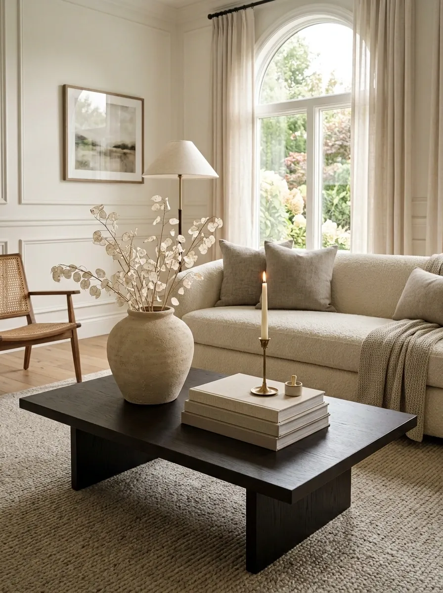
A coffee table doesn’t need to display everything that looks nice.
Start with one dominant object, such as a substantial vase, bowl, book stack, or sculptural piece. Then add one or two smaller objects around it.
Keep practical items contained in a tray or moved to a nearby drawer. The surface should read as a composition, not a storage area.
Easy formula: one anchor + one low piece + one small functional item.
Repeat One Natural Material Across Several Rooms
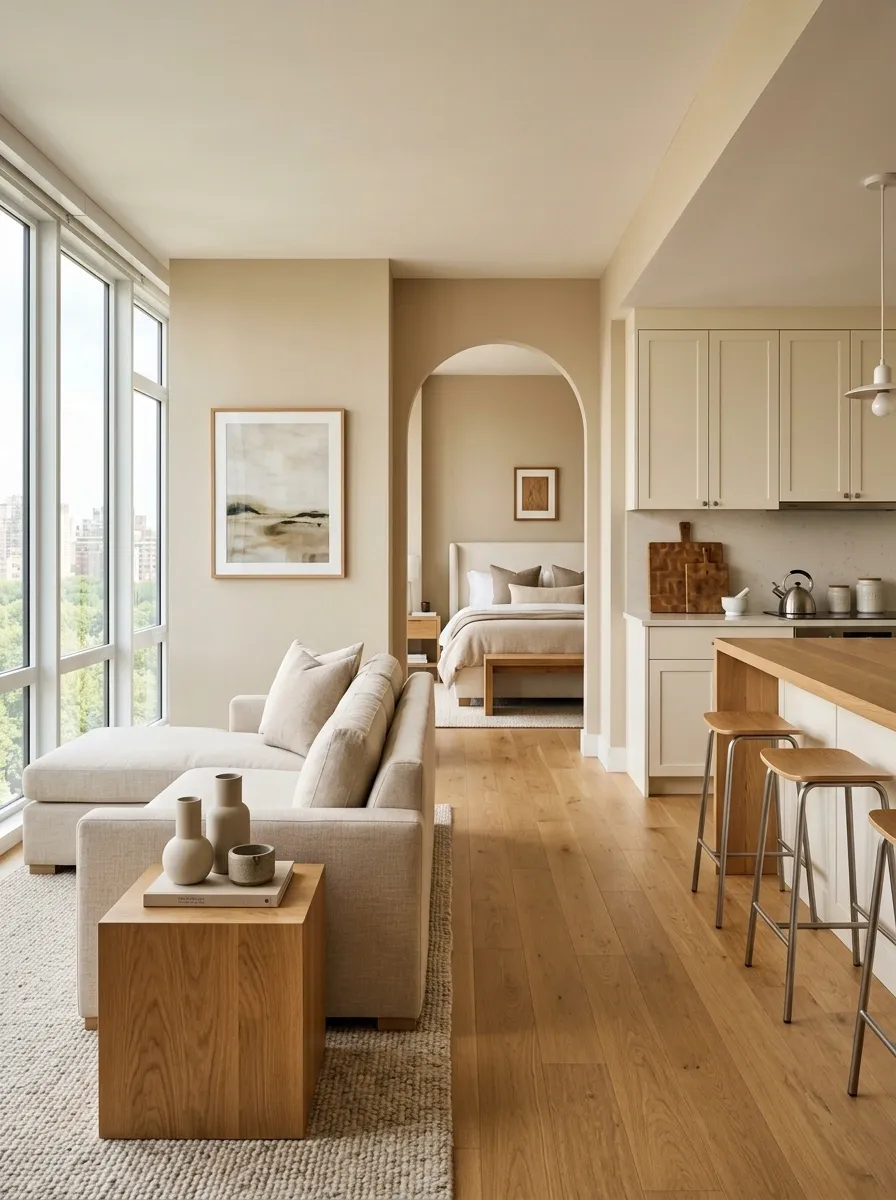
Consistency doesn’t mean every room needs the same furniture.
A repeated natural material can quietly connect the home. Warm wood can appear in a living-room frame, a bedroom bench, and a kitchen cutting board. Woven fibers can show up in baskets, lampshades, and planters.
The repetition creates a visual thread without making the rooms look copied.
Pick one: warm wood, woven fiber, stone, linen, or another material already present in the home.
Remove Decor That Doesn’t Earn Its Place
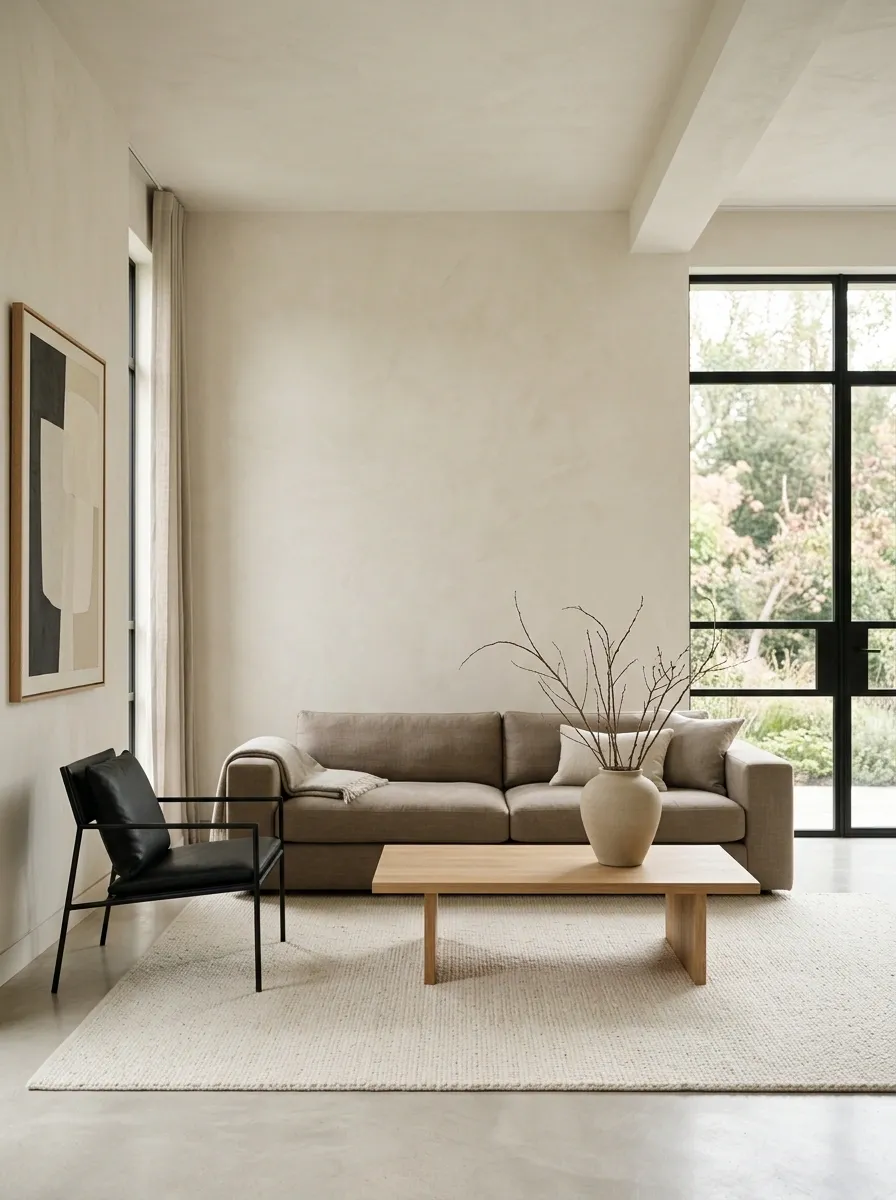
More decoration isn’t the answer when a room feels flat.
Often, the problem is that too many small pieces are fighting for attention. Remove the objects that block useful surfaces, repeat something already represented, or exist only because the space looked empty.
Then step back.
The strongest rooms usually have a few deliberate focal points and plenty of quiet space around them.
Finish Each Room With One Deliberate Luxury Detail
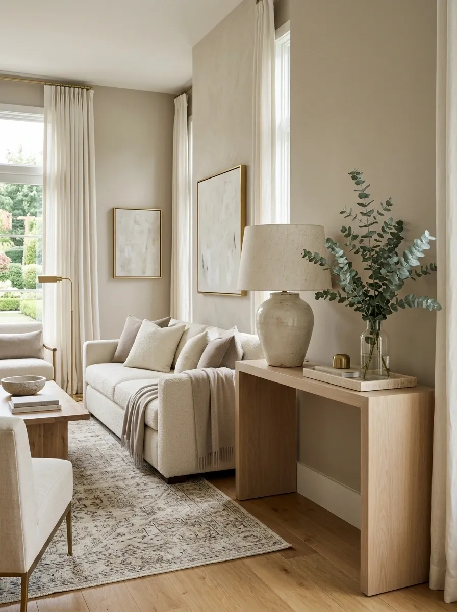
The final detail shouldn’t be expensive. It should simply look like it was chosen on purpose.
That could mean a substantial lamp in the living room, a framed print over a nightstand, a stone tray in the bathroom, upgraded drawer pulls, or a simple bouquet on the dining table.
The trick is choosing one finishing detail instead of adding five smaller ones.
A single strong element gives the room a stopping point. That’s what makes the space feel finished rather than merely decorated.
A More Expensive-Looking Home Starts With Editing
A polished home doesn’t come from making every room fuller. It comes from making every visible choice stronger.
The curtains need better height. The rug needs enough size. The artwork needs enough weight. The lighting needs layers. The surfaces need breathing room. The finishes need to relate to one another.
Most of those changes don’t require replacing the furniture.
That’s what makes How to Make Your Home Look More Expensive on a Budget so practical. The biggest improvement often comes from correcting proportion, reducing visual noise, and giving ordinary pieces a more intentional setting.
Start with the room that bothers you most. Fix the obvious mistakes first, then add only what the space actually needs.
Save this list on Pinterest for the next decorating refresh, especially when the goal is a polished home without a major spending spree.