
You’ve spent considerable money and effort on your sofa. You’ve agonized over throw pillows. You have opinions about grout color. And yet the light switch — the thing every single person touches every single day, the thing that lives at perfect eye level in every room — is a beige plastic rectangle you have never once thought about.
That’s not neutral. That’s a missed opportunity you’re flipping on and off twelve times a day.
The switch plate is the smallest canvas in your home and also, it turns out, one of the most forgiving. Most of what you’re about to see cost under twenty dollars. Some of it cost nothing but a tube of acrylic paint and an afternoon. All of it is reversible. There is no good excuse left.
Light Switch Styling Ideas
Painted Red Apple Switch
Paint the entire switch plate in glossy signal red — two coats of enamel or acrylic with a gloss seal. While still wet, blend a slightly darker crimson tone at the centre to suggest the rounded three-dimensional form of an apple. Allow the plate to dry fully.
On the wall directly above the plate, paint two large green leaves emerging from the top centre in dark forest green acrylic. Add a thin curved brown stem between the leaves. Stick an actual fruit sticker — a PLU sticker from a real apple, complete with variety name and orchard code — to the upper right of the plate surface. The switch toggle remains in the red paint. The entire result is a life-size apple rendered in trompe l’oeil, complete with the detail that only makes sense when you’re close enough to read it.
This belongs in a kitchen with a sense of humour. Or a child’s room. Anywhere that takes itself too seriously would be diminished by it.
Climbing Rose Vine Mural
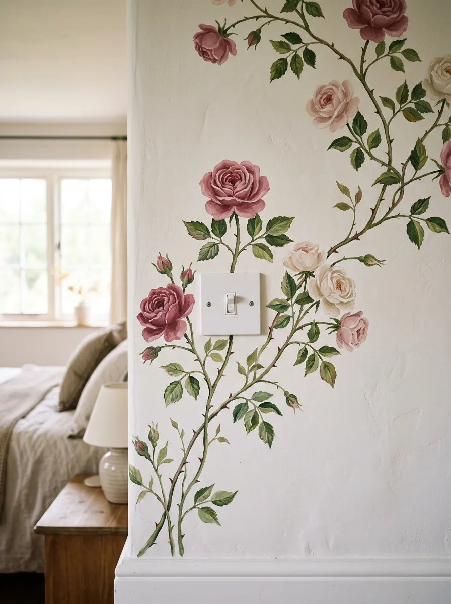
Start by sketching the main stem in pencil directly on the wall — one continuous line that begins at the baseboard or skirting board and travels upward past the switch plate, branching as it goes. The switch plate stays as-is; the roses grow around it, not over it, which makes the hardware feel intentional rather than overlooked. Use acrylic craft paint in three rose tones — deep dusty pink, blush, and aged ivory — and paint each bloom as a loose spiral rather than a precise botanical illustration.
The leaves go in a flat medium green, painted quickly and slightly imperfect. Add thorns on the stem with a fine liner brush. Extend the vine past the top of the wall toward the ceiling so the composition doesn’t feel cropped. The key is that the roses vary in size and stage — some fully open, some in bud, some mid-bloom — so the wall reads as alive rather than printed.
The bedroom behind this should stay quiet and linen-toned. The mural earns the room’s entire decorative budget without spending it.
Groovy Daisy Duo Plates
Source two switch plates — one double, one triple — and paint both with the same retro daisy pattern: overlapping petal-burst flowers in orange, yellow, burnt orange, and dusty rose on a cream background, with small coloured dot accents in the gaps between petals.
The daisies should be loose and gestural rather than precise, with petals that taper to a point at the outer edge. Paint both plates simultaneously so the colour mixes stay consistent across them. Mount them side by side with standard screws. Against the deep cranberry red textured wall, the cream and warm-toned plates read as vintage and deliberate — a 1970s ceramic reference in a room that has committed fully to colour.
The two plates must match in pattern and palette but the different gang configurations mean the flowers will land differently on each one. That variation, rather than being a problem, makes them feel hand-painted and original.
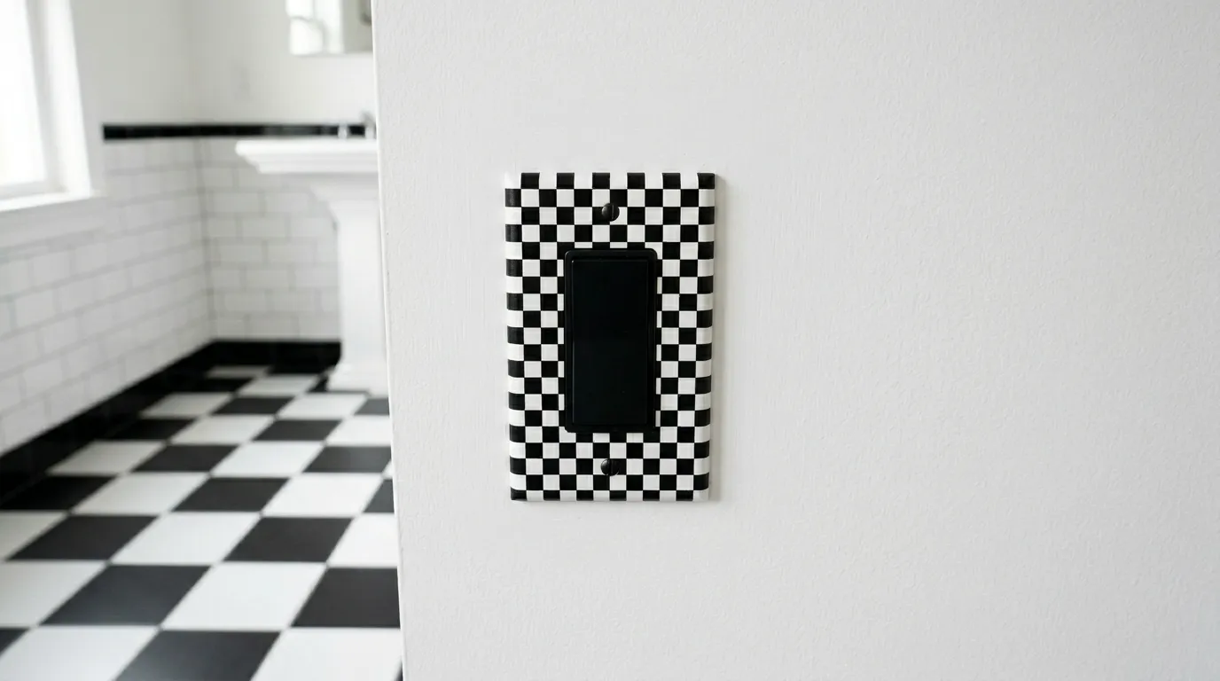
Black And White Checkerboard Plate
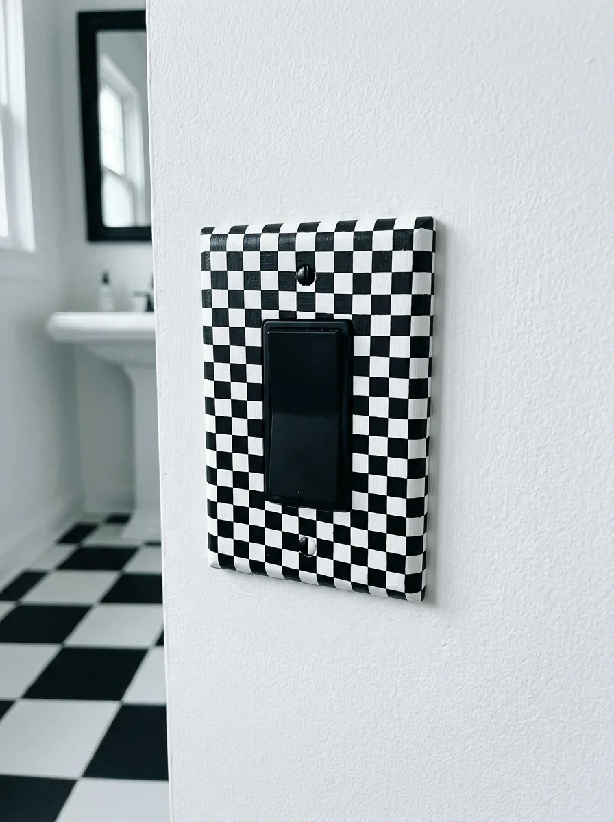
Paint a standard rocker switch plate — not a toggle, a rocker with the wider paddle surface — in flat white as a base coat. Allow it to fully cure for 24 hours. Using a fine brush and matte black acrylic paint, draw a grid across the entire surface in evenly spaced lines, then fill in alternating squares to create a hand-painted checkerboard.
The squares will be small — roughly 5mm each — so a very fine flat brush and steady hand are required. Alternatively, apply a printed vinyl wrap cut to size for a cleaner, faster result. The black rocker paddle replaces the standard white switch mechanism. Against the white bathroom wall with black-and-white hex tile floor, the plate becomes the room’s third pattern element — floor, plate, and the mirror frame make a complete set without being matchy.
The size of the checkerboard squares matters enormously. Too large and it reads as a chess board. The small-scale version reads as a textile pattern, which is exactly the right effect.
Hand-Painted Monstera Vine
Using a medium round brush and a flat forest green acrylic paint, paint monstera leaf shapes directly on the wall around the switch plate. These are the familiar split-leaf philodendron shapes — lobed leaves with deep cuts radiating from a central vein. Paint them in varying sizes from palm-width down to thumbnail, connected by curling vine tendrils that loop and spiral between them.
The vine should feel spontaneous and growing rather than symmetrical or arranged. Let tendrils curl in on themselves into loose spirals at the tips. The switch plate stays completely standard white. The leaves partially overlap the edges of the plate on two or three sides so the hardware appears to be embedded in the vine rather than surrounded by it. Keep the style graphic and flat rather than shaded or realistic — solid green, no highlights — so the illustration reads as a pattern element rather than a painting.
This works in rentals if you use removable wall paint or paint pens rated for wall surfaces and tested for clean removal. A small test patch in an inconspicuous area is worth the ten minutes before you commit to the full installation.
Dead Winter Tree Trunk Switch
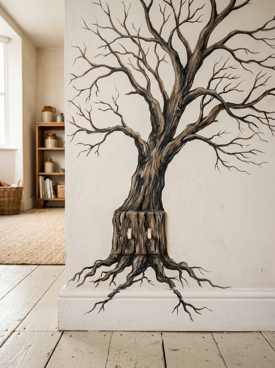
Map the composition before you paint anything. The double switch plate becomes the tree trunk base — the painting grows up from and around it so the hardware appears to emerge from the wall rather than sitting on it. Paint the trunk in three tones of brown and grey-black, using a dry-brush technique to create the texture of bark. Pull the paint outward from centre in horizontal strokes to suggest the grain of old wood.
The roots extend below the plate toward the baseboard in gnarled, organic lines. The branches spread upward and outward across the full wall surface, getting progressively thinner as they go, ending in fine hairline strokes at the tips. Use the same three-tone blending on the primary branches, then switch to a single dark liner colour for the secondary and tertiary growth. The white plaster wall and white-painted floor below are essential — this only works against a pale, clean backdrop.
The bare winter tree silhouette is doing a lot of emotional work. It reads as architectural and dramatic without a single piece of purchased art.
Henna Mandala Terracotta Plate
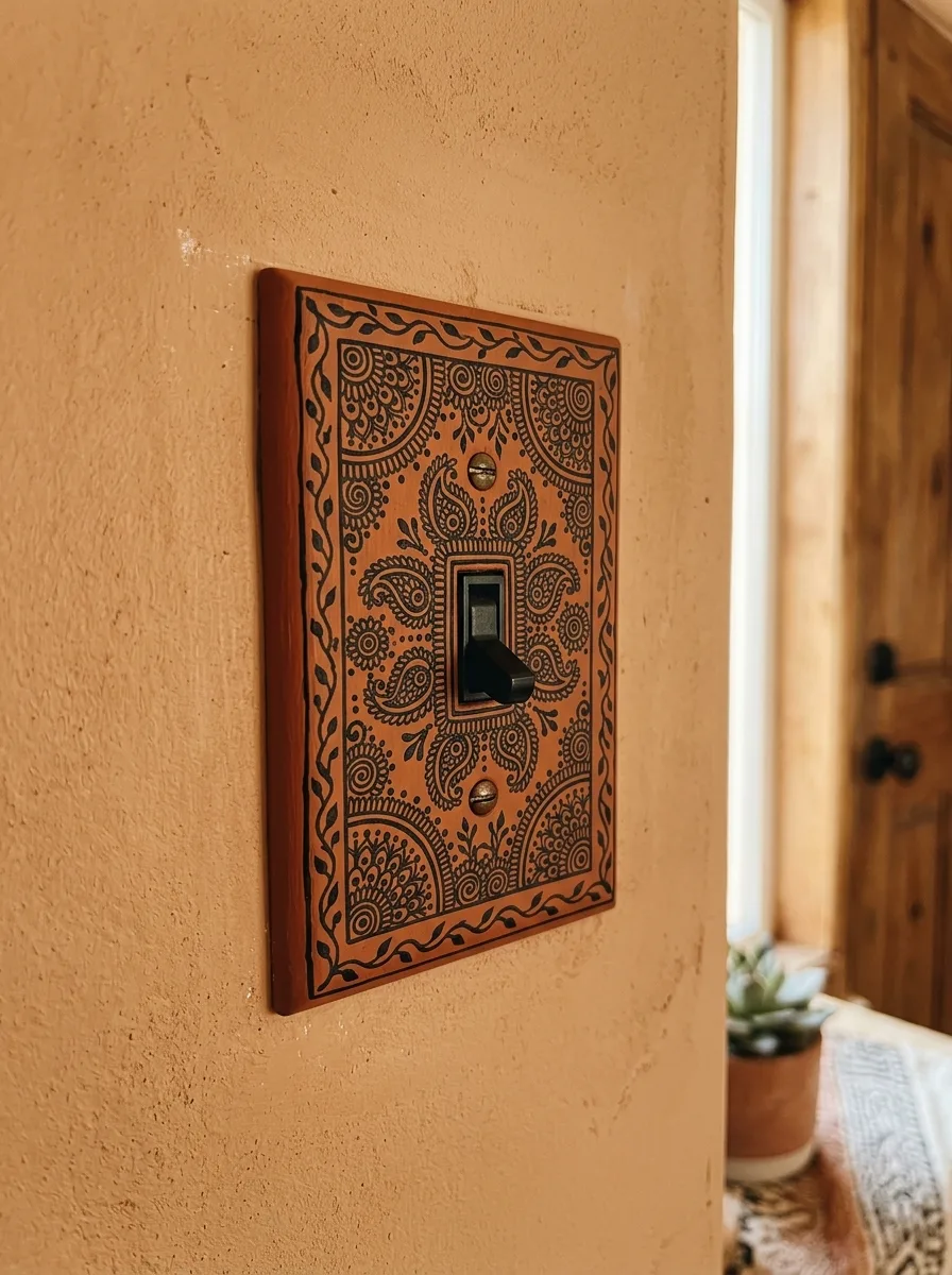
Source or make a switch plate from a terracotta-toned material — a flat piece of air-dry clay pressed to the right dimensions, allowed to dry, then sanded smooth works well. Alternatively, paint a standard plastic plate in a warm sienna or rust tone using chalk paint for grip. Once the base is fully dry and sealed, use a black acrylic paint pen to draw the mandala pattern directly onto the plate surface.
Work from the centre outward, starting with the section immediately around the switch aperture and building paisley, teardrop, and scrollwork motifs concentrically. Add a vine border around the perimeter edge. The pattern does not need to be perfect — imperfection is what makes it read as handmade rather than printed. Seal with a matte varnish. Install with the standard screws and add a second, coordinating screw cover in an aged brass finish to replace the plastic originals.
Against the warm textured adobe-effect wall in this hallway, the plate reads as an architectural detail rather than a switch cover. The black switch toggle gets swapped for a dark bronze or matte black finish to finish the look.
Botanical Print Gallery With Climbing Pothos
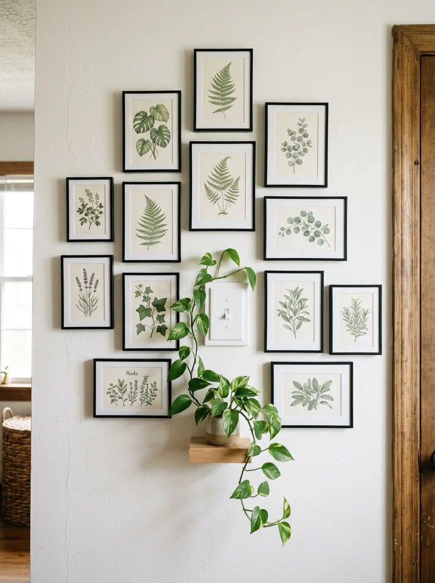
Install eleven to thirteen botanical prints in matching thin black frames in a loose irregular cluster across the wall. Do not align them to a grid — stagger the heights and the gaps between frames so the composition feels collected over time rather than hung in an afternoon. The frames vary in size from small to medium but never exceed a proportion that would dwarf the others.
Position the light switch at the centre of the composition so it lands between frames rather than behind one. A small floating shelf goes at the lower centre of the cluster, directly below the switch, and holds a single terracotta pot with a trailing pothos. The plant’s vines extend downward and slightly outward, adding a living element to an otherwise flat arrangement. The ivy-printed frame that surrounds the switch specifically ties the botanical prints to the switch itself, making the plate feel like part of the collection.
The prints should all be of the same botanical family — ferns, herbs, wildflowers — but not identical. Variation within a consistent theme is what makes a gallery wall feel curated rather than themed.
Ivy Frame Decoupage Switch
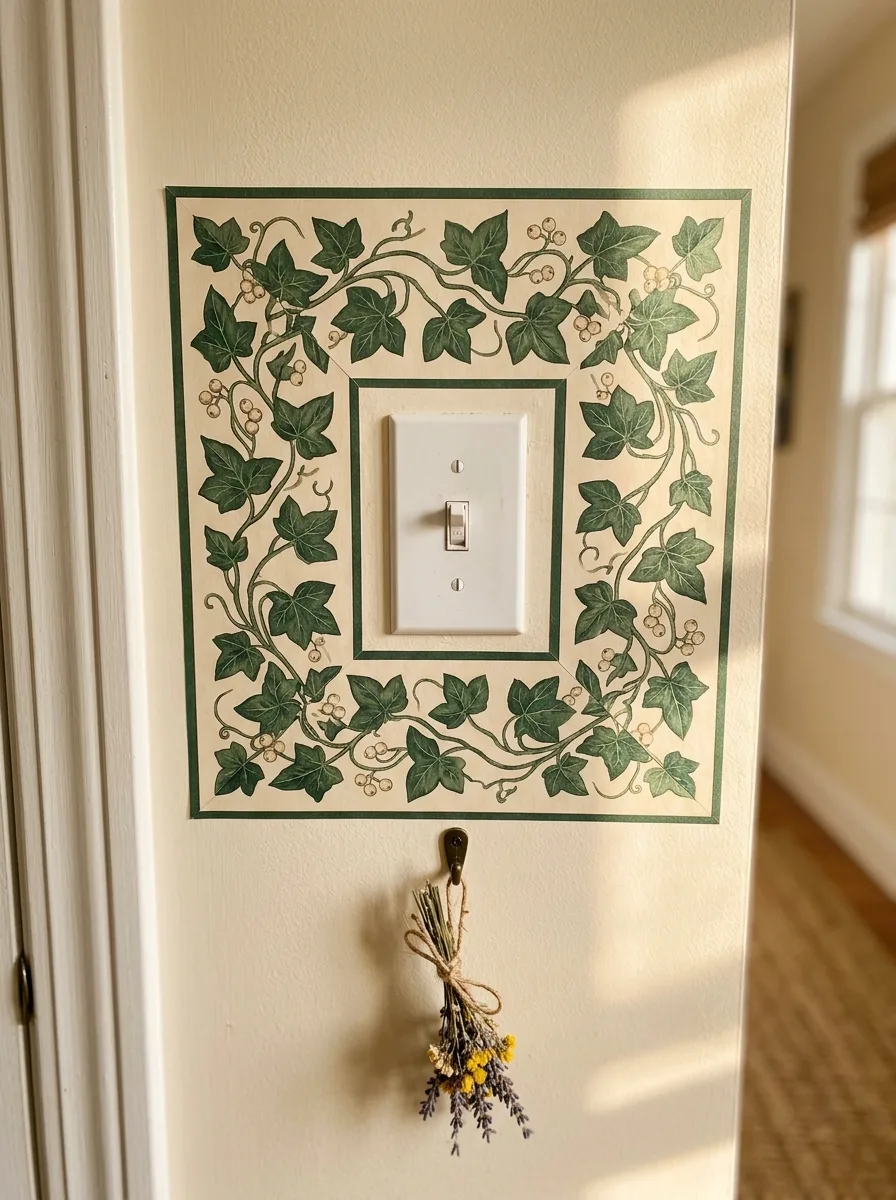
Source a botanical illustration of ivy — from a vintage seed catalogue, a secondhand gardening book, or a printable digital file — and use it to decoupage a frame directly onto the wall around the switch plate. Print the ivy border illustration at approximately A3 size and cut it into four sections that form the sides of a square frame.
Apply each section to the wall using decoupage medium, smoothing carefully from the centre outward to avoid bubbling. Seal with two coats of matte decoupage medium. Add a painted double-line border in forest green just inside and outside the printed frame using a fine brush and a ruler. Below the switch, install a small brass cup hook and hang a small bunch of dried lavender tied with jute. The switch plate stays standard white — the frame transforms it.
The border lines are critical to making this look finished. Without them the decoupage image floats. With them the whole composition reads as intentional architectural detail.
Zellige Tile Kitchen Column
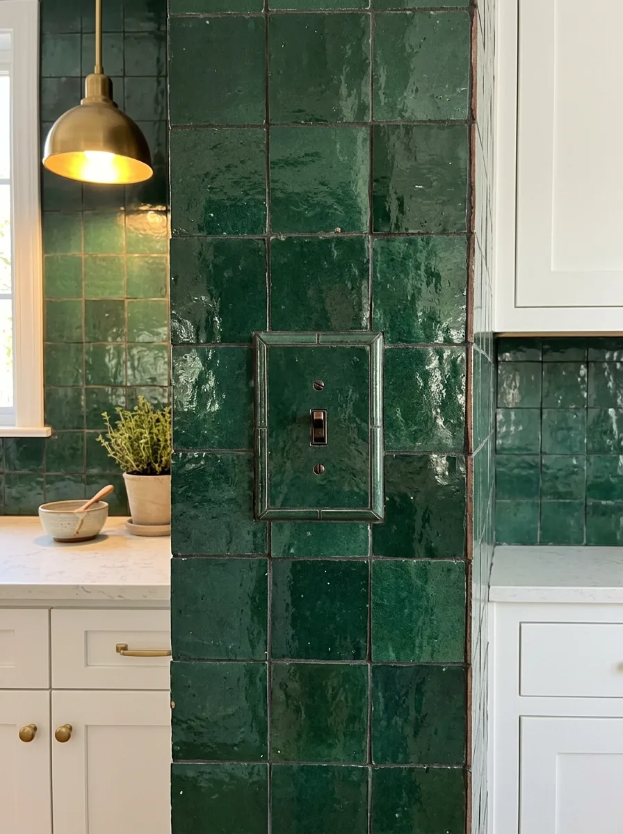
Tile the full surface of the kitchen column — not just the backsplash area, the entire structural column from counter height to ceiling — in handmade zellige tiles in deep forest green. Zellige is distinguished from standard ceramic tile by its deliberately irregular surface: the glaze pools unevenly, the colour varies from tile to tile, and each piece is slightly different in thickness. These imperfections are the point.
Set the tiles in a simple stack bond pattern rather than a running bond so the variation in the tile surfaces does the decorative work. The switch plate on the column face gets a custom frame made from the same tile — cut pieces of zellige are set around the aperture with dark grout matching the column grout. The switch toggle itself is replaced with a dark bronze or oil-rubbed finish mechanism. The overall effect is that the switch disappears into the architecture.
Against white shaker cabinets and brass hardware, the dark green column reads as a bold design element. The tiles earn the column its moment.
Dried Wildflower Burst
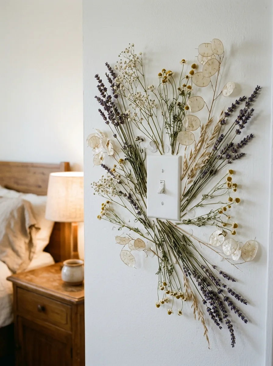
Gather or purchase dried botanicals in a range of textures and heights: lavender stems, lunaria seed pods, chamomile heads, dried wheat, baby’s breath, and grasses. Arrange them into a loose starburst composition on the wall before committing to attachment. The stems should radiate outward from behind the switch plate from a central gathering point, with the switch plate sitting at the hub of the arrangement.
Attach the stems to the wall using small clear Command adhesive strips or dots placed under each stem at intervals, pressing firmly. The arrangement should extend at least 30cm in every direction from the plate. Use the heavier stems — lavender, wheat — in the lower half for visual weight, and let the lighter lunaria pods and baby’s breath extend upward and outward to the tips. The switch plate stays standard white. Nothing needs to be changed on the plate itself because the botanical arrangement transforms the entire wall zone.
This setup works best in a bedroom or hallway rather than a kitchen or bathroom where humidity would damage the dried flowers over time.
Five Mixed Mirror Vignette
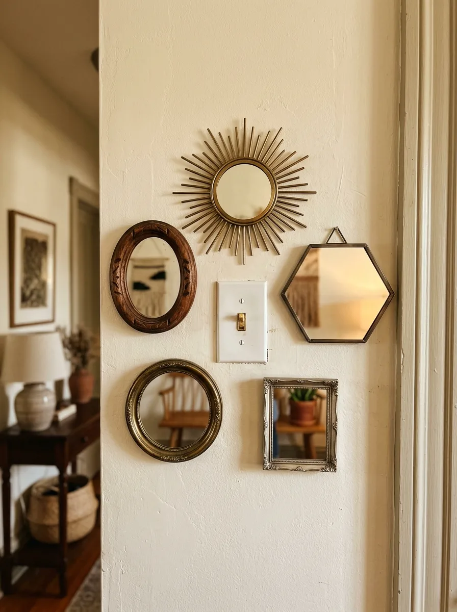
Source five small mirrors in five different shapes and frame finishes: a brass starburst, a walnut oval with carved frame, a thin brass hexagon hung from a leather strap, a large round gold circle, and a small ornate silver rectangle. These are available in charity shops, at flea markets, and from home goods retailers at low price points because they’re odd sizes nobody knows what to do with.
Position the five mirrors around the switch plate in a loose pentagon arrangement — two above, one on each side, one below and to one side, with the plate occupying the central axis but not the exact centre. No mirror should touch the plate or touch another mirror. The gaps between them should be uneven. The starburst mirror goes at the top, slightly off-centre, because it has the most visual reach and anchors the arrangement upward. The result is a mirror cluster that doubles the perceived light in the hallway and makes the switch look intentional.
The single most important rule here: all frames must be metallic — brass, bronze, gold, silver — because mixed shapes only work within a unified material language. Wood and metal together create a different effect that requires a different approach.
Encaustic Tile Stencil Panel
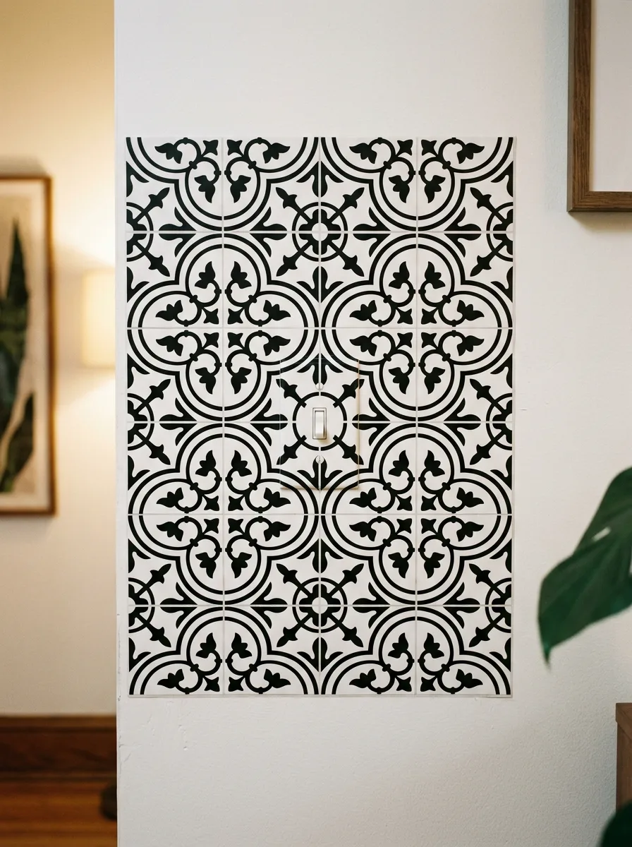
Select a cement tile stencil with a quatrefoil or Moroccan repeating pattern and apply it to the wall in a panel format around the switch. Mark out a rectangle approximately 40cm by 55cm on the wall, centred on the switch plate. Apply the stencil in repeating applications, aligning each placement to the previous section so the pattern tiles seamlessly. Use a small foam roller and matte black acrylic paint for a clean transfer.
Work from top to bottom and allow each section to fully dry before moving the stencil to prevent smearing. When the panel is complete, add a thin painted border in the same black paint around the outer edge of the rectangle to give the panel a defined boundary. The switch plate within it becomes a design element rather than an interruption — the pattern simply continues around it.
The stencil panel is completely removable with a single coat of paint if you change your mind. It is the most versatile idea on this list.
Morris-Style Wallpaper With Colour-Matched Plate
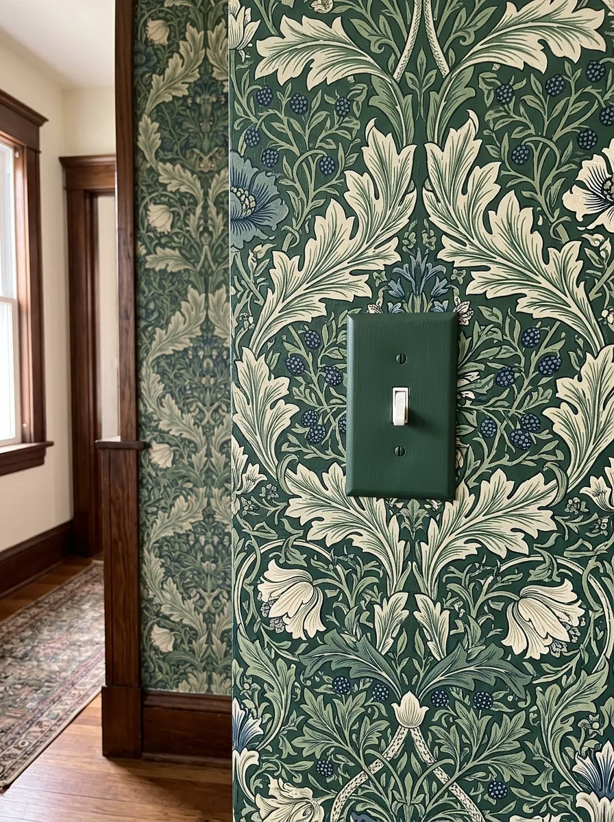
Apply a large-scale botanical wallpaper in a dark forest green ground across the full wall surface — this is not an accent panel, it is a wallpapered room. The wallpaper pattern in this example features oversized acanthus leaves and berries in sage, cream, and dusty blue against the deep green field.
Once the wallpaper is fully hung and dry, remove the switch plate and paint it with chalk paint in the exact background colour of the wallpaper — the same deep forest green — using two thin coats. Reassemble with the standard toggle mechanism. The plate now disappears into the wallpaper, which is the intention. The toggle remains visible but the plate border vanishes entirely, making the switch feel like it was always part of the room rather than installed in it.
The wood trim in this hallway — dark stained oak — is the third element that holds the composition together. Green wallpaper against white trim reads differently than against dark wood. The dark wood is load-bearing to the overall warmth of the space.
Washi Tape Geometric Frame
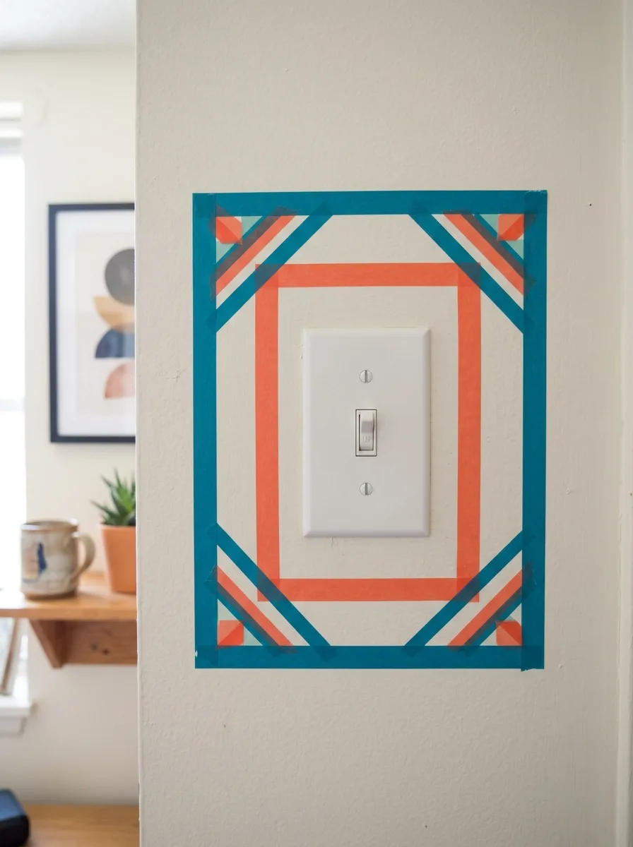
Choose two rolls of washi tape in two colours that relate to the existing room palette — here, teal and coral against a white wall. Decide on a rectangular frame shape and the geometric treatment you want to apply to it, which in this case is a series of concentric frames with mitered corners and diagonal accent stripes at each corner.
Start by laying the outermost teal frame, cutting the corners at 45 degrees for a clean miter. Add the coral inner frame in the same way. Fill the corner intersections with additional diagonal tape strips in both colours, creating a diamond accent at each corner. The innermost frame goes as close to the plate as the tape can reach. Total cost: two rolls of tape. Total time: twenty minutes. Total removal time: thirty seconds.
This approach works particularly well in rentals where painting and wallpaper are not permitted. The entire design peels off cleanly without damaging the wall surface underneath.
Botanical Illustration Plate Print
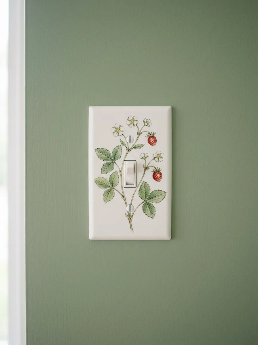
Source a botanical illustration of strawberry plant — the kind found in Victorian gardening manuals, with berries, blossoms, and leaves all shown simultaneously on one stem — and scale it to fit the dimensions of a standard single switch plate. Print it on photo paper and trim to fit, then laminate it or apply it to the plate surface using decoupage medium and seal with two additional coats.
Alternatively, have the design custom-printed directly onto a white ceramic switch plate through one of several online custom printing services. The sage green wall behind the plate is the critical element here — it pulls the botanical illustration outward into the room and makes the plate feel like an extension of the wall colour rather than a hardware interruption.
Mount with the standard screws. Replace the standard cream screws with small ones painted in matching sage green for a truly seamless result.
Fairy Door Switch Plate
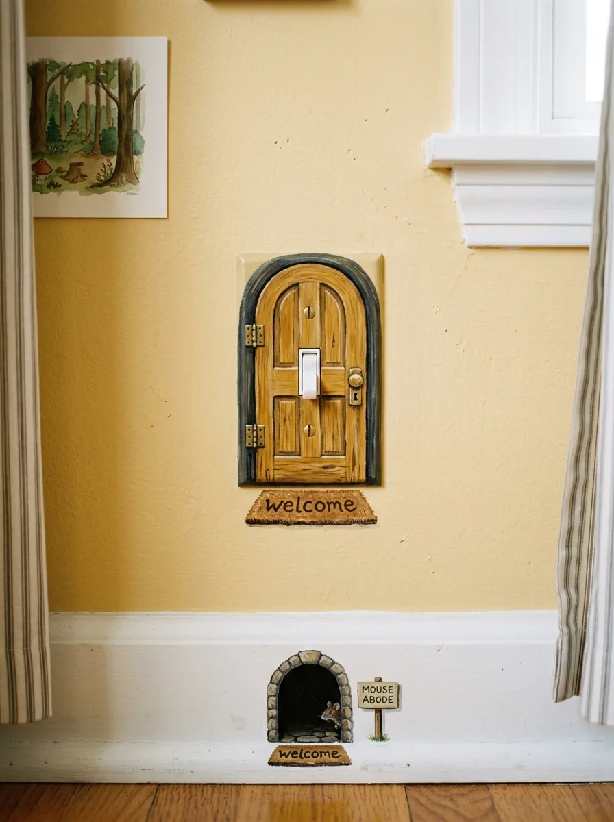
Paint the switch plate to look like a small arched wooden door: the body of the plate in honey oak wood grain tones using a dry-brush technique with amber, gold and raw sienna, the arch detail at the top in a deep grey-brown to suggest stone, a tiny painted brass doorknob to the right of the switch toggle, and small painted hinge details on the left side.
Below the plate on the baseboard, paint or apply a vinyl decal of a small round mouse-hole arch with its own miniature welcome mat, a tiny sign, and a small illustrated mouse entering it. The switch is now a fairy’s front door, and the mouse-hole is its ground-floor neighbour. This only works in a room where the concept extends into the rest of the decoration — a children’s room with woodland prints, warm yellow walls, and forest storybook energy.
The welcome mat decal below the switch plate is the detail that makes children understand what they’re looking at. Without it, the door is charming. With it, the whole wall becomes a story.
Gold Leaf Dark Powder Room Plate
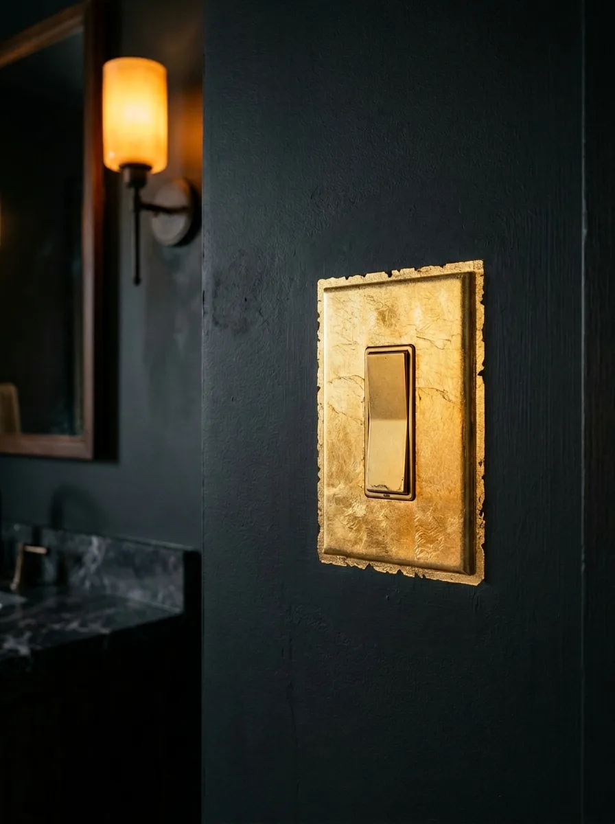
Paint the bathroom walls in a deep charcoal or near-black — a colour with enough depth that the metal of the faucets and sconces reads as warm against it. Replace the standard rocker plate with a flat plate in the same plastic or metal base.
Apply gold leaf to the plate surface using gold leaf adhesive: brush the adhesive onto the plate, allow it to become tacky over approximately twenty minutes, then lay sheets of gold leaf onto the surface and press gently with a soft brush to adhere. The gold leaf will crinkle and overlap in a deliberately uneven way — this is the texture that distinguishes real gold leaf from gold paint. Don’t try to cover the surface uniformly. Let the leaf break and gap slightly at the edges. Seal with a clear matte varnish to prevent flaking. Replace the standard white rocker paddle with a polished gold or champagne bronze mechanism to match.
Against the dark wall with a candle sconce glowing amber in the background, the gold leaf plate is the moment the room announces it’s serious about itself.
Dark Green Accent Plate In White Kitchen
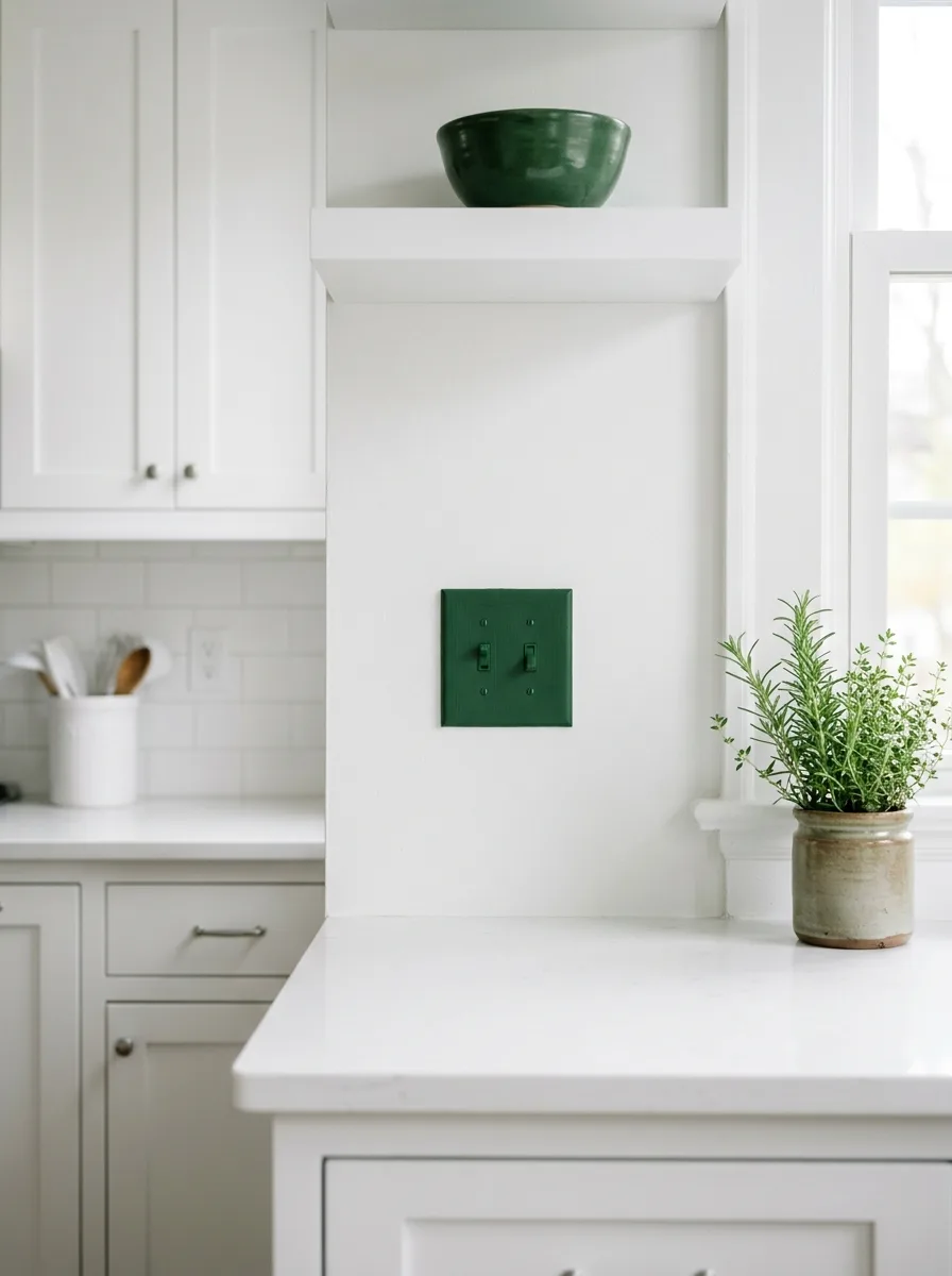
Buy a standard twin switch plate. Paint it in the same deep hunter green as the accent bowl on the shelf above. Use chalk paint for coverage in two coats, sanded lightly between applications, then finished with a furniture wax for a slightly soft sheen rather than a plastic gloss. Screw it back in place with the standard screws, which disappear into the dark paint.
Place a ceramic pot of fresh rosemary on the counter nearby so the green of the herbs echoes the green of the plate and the bowl. The plate is not the focal point. It is a colour beat in a room that has decided to use one accent colour consistently and well. In an all-white kitchen, a single dark green switch plate is not subtle. It is the whole design decision of the room.
The herb pot on the counter is not decorating. It is colour coordination. Everything matters at this scale.
Victorian Lantern Trompe-L’oeil
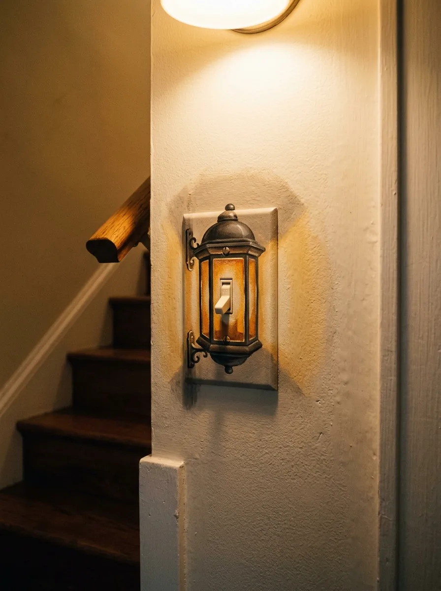
Paint the switch plate to appear as an ornate cast iron wall lantern: the body of the lantern in aged pewter and dark bronze, with arched amber panes of glass painted between the vertical ribs, a domed cap at the top with a finial, and decorative scrollwork brackets at the base supporting the lantern from the wall. The switch toggle sits at the centre of the lantern body and reads as the light source glowing within.
Apply the painting to both the plate itself and the surrounding wall surface so the bracket elements appear to attach directly to the plaster. Use a limited palette of charcoal, bronze, amber, and cream to keep the illusion coherent. At the top of the plate, allow the ambient light from the ceiling fixture above to cast a real glow that merges with the painted amber panes — the painted light and the real light become one.
At the base of a staircase with dark wood banisters and warm amber ceiling light, this switch makes the entire stairwell feel like the foyer of a much more interesting house.
Final Thoughts
The light switch has been the default version of itself in every house you’ve ever been in. Plain plate, plain toggle, invisible in the way that only very boring things manage to be.
What every idea here understood is that the switch is at eye level, in a fixed position, in a high-traffic zone. That’s not a liability. That’s the brief for a piece of art. You know exactly where it is, you know exactly who will see it, and you know it will never get rearranged, rehung, or accidentally blocked by a piece of furniture.
The only question left is which version of you gets to live there.