
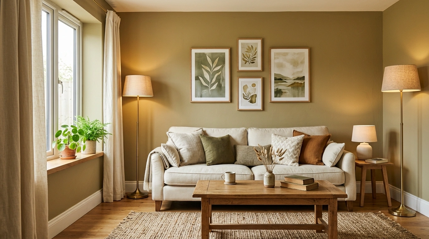
Choosing a living room paint color gets surprisingly difficult once the walls have to coexist with everything else. A shade can look gorgeous on a tiny paint chip and completely different once it’s covering an entire room beside a brown sofa, warm flooring, dark windows, or a fireplace that already has opinions.
That’s why isolated color swatches aren’t enough.
The interesting part isn’t simply whether a wall is green, blue, beige, pink, or gray. It’s what happens when that color meets the furniture, flooring, lighting, architecture, and textures already competing for attention.
Living Room Paint Color Ideas
Moody Navy Living Room With Hot Pink and Gold
Deep navy walls envelop this living room in dramatic shadow, creating the ultimate stage for a vibrant magenta velvet sofa and matching abstract art. A cobalt blue accent chair, polished gold coffee table, and shimmering brass shelving keep the rich color story feeling high-energy and utterly fearless.
The gold accents do the heavy lifting here, bouncing light off the dark walls to keep the space from feeling like a cave. The shock of hot pink upholstery adds an unexpected dose of glamour, while the plush velvet textures soften the architectural formality of the dark paneling.
This daring palette is tailor-made for rooms that lean into nocturnal sophistication. Keep the metallics polished and the colors saturated. If you are going to commit to the drama of a dark room, you might as well throw a party in it.
Classic Navy Living Room With Warm White Trim and Leather
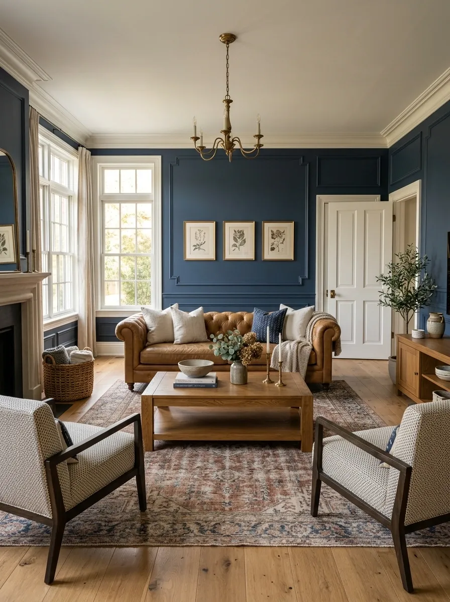
Rich navy walls give this living room a strong architectural frame, especially around the warm white trim, paneled doors, and traditional molding. A camel leather sofa, patterned accent chairs, medium oak furniture, and a faded rug keep the room from becoming too formal.
The warm white trim matters here because it creates a clean break between the dark walls and the architectural details. Camel leather adds another warm note, while oak keeps the overall palette from getting overly heavy.
This direction shines in rooms with interesting trim, fireplaces, or older architectural details. Let the navy stay rich and slightly muted. Then keep the rest of the room relaxed. Otherwise the space starts looking like a law office that discovered Pinterest.
Dusty Rose Living Room With Olive and Natural Wood
Soft dusty rose walls give this living room a gentle, warm ambiance without drifting into overly saccharine territory. An olive green upholstered sofa, rustic wooden side table, cream textiles, and lush trailing plants provide an earthy balance to the rosy backdrop.
The dusty rose works because it is tempered by grounding greens and organic wood tones. Olive acts as the perfect earthy anchor, while the filtered daylight streaming through sheer white curtains keeps the composition feeling airy rather than stuffy.
This harmonious setup excels in cozy spaces that receive plenty of natural sunlight. Keep the pink muted and dusty to maintain a sophisticated edge. A overly bright pink would instantly ruin the calm sanctuary vibe you worked so hard to curate.
Soft Butter Yellow Living Room With Olive and Natural Wood
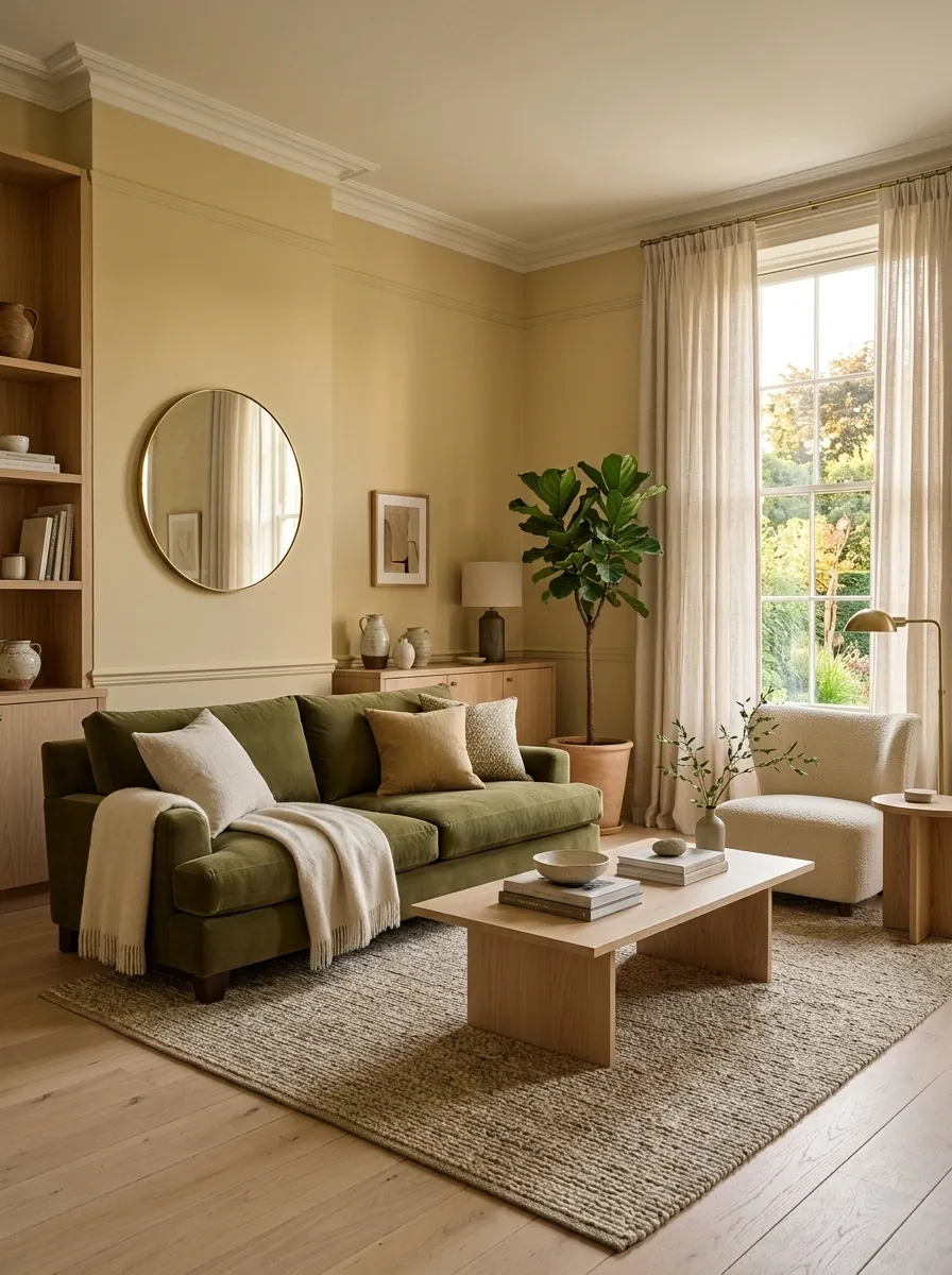
Soft butter yellow takes this living room in a sunnier direction without turning the walls into a bowl of custard. Olive upholstery, pale oak furniture, cream textiles, linen curtains, and filtered daylight give the color enough restraint to feel grown-up.
The yellow works because it isn’t surrounded by a bunch of competing brights. Olive gives it a grounded companion, while natural wood adds another warm element without making the room feel overly coordinated.
This palette works especially well when the room already gets plenty of daylight. Keep the yellow soft and slightly dusty. A more saturated yellow would push the composition into a completely different territory, and nobody asked for a living room that looks permanently stuck on maximum brightness.
Rich Burgundy Living Room With Emerald and Brass
Deep burgundy walls wrap this living room in luxurious warmth, contrasted sharply by a lush emerald green velvet sofa and layered patterned rugs. Classic botanical prints, a traditional mirror, and dark wood furniture complete the richly textured, jewel-toned sanctuary.
The emerald green acts as a brilliant visual foil to the burgundy walls, creating a classic high-contrast pairing that feels both timeless and bold. The rich velvet and vintage rugs introduce layers of history and comfort without cluttering the space.
This opulent direction is ideal for traditional spaces with strong architectural presence and abundant personality. Keep the contrasting tones deep and saturated rather than pastel. After all, a jewel-toned room deserves to be worn proudly, not whispered.
Blue-Gray Living Room With Walnut and Aged Brass
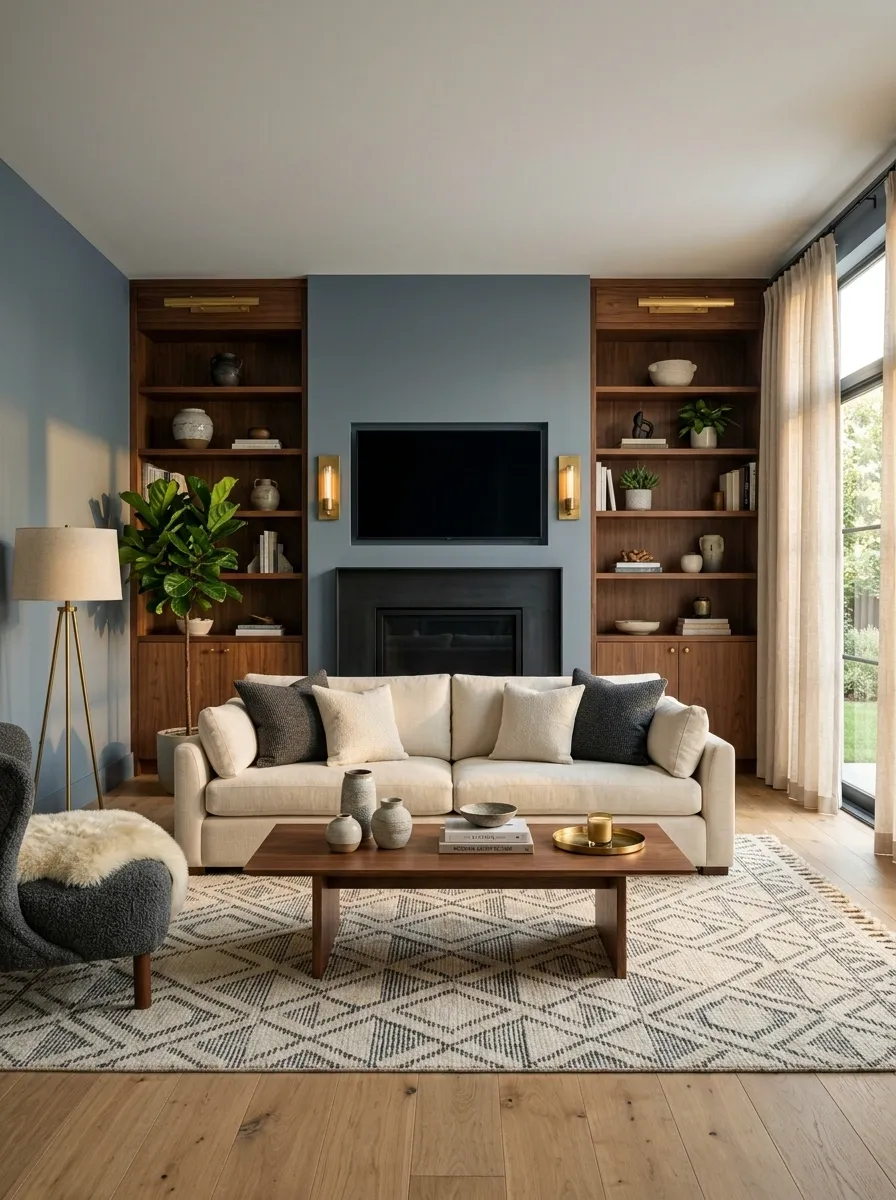
Blue-gray walls create a quieter, cooler backdrop for this living room, while walnut built-ins bring in a much warmer visual note. A cream sofa, aged brass lighting, charcoal accents, and a restrained geometric rug complete the composition.
The walnut is doing serious diplomatic work here. It pulls warmth into the room without forcing the blue-gray to become beige. Aged brass adds a little glow, while the cream upholstery keeps the center of the room from becoming too dark.
This combination suits contemporary rooms with clean lines and strong built-ins. Keep the blue-gray subdued rather than overly blue. The point is a soft architectural color, not a swimming pool trying to become a wall.
Monochromatic Mauve Living Room With Art and Velvet
Muted mauve walls set a sophisticated, understated tone for this living room, while a plush matching sofa and purple accent chairs create a cohesive tonal experience. A striking abstract canvas, sleek console table, and patterned area rug tie the monochromatic look together seamlessly.
The tonal approach works because varying textures prevent the single color family from feeling flat or monotonous. The metallic touches in the artwork and furniture legs provide just enough reflection to lift the room’s overall luminosity.
This scheme thrives in contemporary spaces that appreciate a curated, design-forward color story. Keep the purple undertones muted and sophisticated rather than loud. The goal is a serene enveloping environment, not a sudden tribute to a vintage pop star.
Warm White Living Room With Black Fireplace and Checkerboard Floor
Warm white walls keep this living room bright, but a black fireplace creates a strong architectural focal point. Oak furniture, cream upholstery, an oversized pale rug, and a subtle checkerboard floor add contrast without making the space feel busy.
The fireplace is intentionally the darkest major element. That gives the eye one obvious place to land while the rest of the room stays light. The checkerboard flooring adds another graphic note, but because its tones remain restrained, it supports the architecture instead of fighting it.
This is a useful direction for homes with an existing fireplace or strong architectural feature. Keep the accessories quieter than the architecture. The fireplace already has enough confidence for everyone.
Serene Sage Living Room With Cream and Wood
Soothing sage green walls give this living room an effortless connection to nature, complemented by a tailored light gray sofa and layered green throw pillows. Crisp white curtains, a round marble-topped coffee table, and a large fiddle-leaf fig complete the tranquil, breezy escape.
The sage acts as a neutral chameleon, allowing the natural light from the expansive windows to bounce softly around the room. The abundance of soft textiles and organic wood elements prevents the cool green tones from feeling clinical or stark.
This refreshing palette is practically mandatory for spaces designed for ultimate relaxation and unwinding. Keep the green soft and botanical rather than heavily grayed. You want the room to feel like a walk in the woods, not an interrogation room.
Earthy Clay-Pink Living Room With Cream and Chestnut
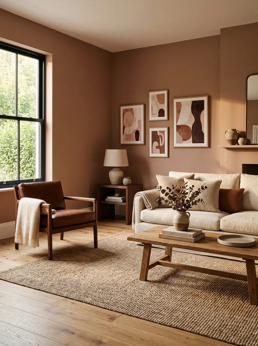
Clay-pink gives this living room warmth without drifting into sugary territory. The walls are paired with a cream sofa, chestnut leather chair, dark wood side table, woven rug, and softly colored artwork that keeps the palette earthy.
The difference between clay-pink and a brighter pink is everything here. The muted, brownish undertone makes the color work with wood and leather rather than competing with them. Cream keeps the room light, while chestnut adds enough depth to stop the pink from becoming too soft.
This design is especially strong when the room has older furniture or natural wood already in place. Let those materials stay visible. Covering every warm surface with another pastel would remove the character that makes this palette interesting.
Dark Forest Green Living Room With Cognac and Marble
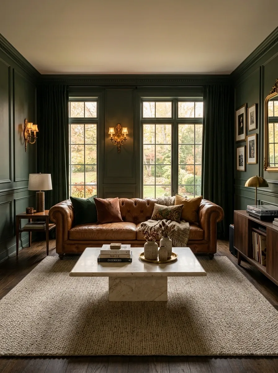
Dark forest green gives this living room a rich architectural backdrop, while a cognac sofa, dark walnut furniture, creamy stone coffee table, and antique brass lighting keep the palette warm. The room feels dramatic without turning every surface into a dark rectangle.
The lighter stone is the quiet hero here. It interrupts the deep green and brown, giving the eye a place to reset. Cognac adds another warm layer, but because it appears mainly in the seating, the room still feels controlled.
This direction suits spaces with decent natural light, especially rooms with larger windows or interesting architectural details. Keep the green deep and slightly muted. A brighter green would completely change the story, and nobody invited a tropical resort into this living room.
Soft Taupe Living Room With Cream Sofas and Textured Stone
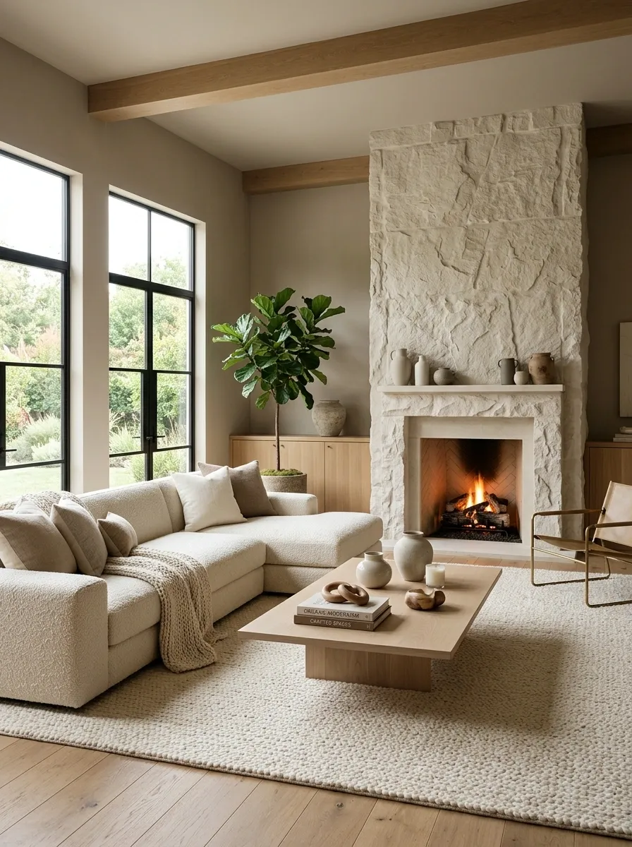
Soft taupe creates an understated backdrop for an oversized cream sectional, limestone-style fireplace, pale wood, woven rug, and natural ceramics. The room gets its personality from texture rather than strong color shifts.
The matte walls sit quietly behind the stone and upholstery, while the fireplace adds a rougher surface that gives the composition some architecture. Pale wood brings just enough warmth to stop the taupe from drifting gray.
This approach works beautifully when the room already has simple architectural lines and plenty of daylight. Don’t compensate for the neutral walls by adding every textured accessory in the store. The stone, rug, upholstery, and wood already have a conversation going. More guests aren’t necessarily needed.
Muted Teal Living Room With Warm Oak and Oatmeal
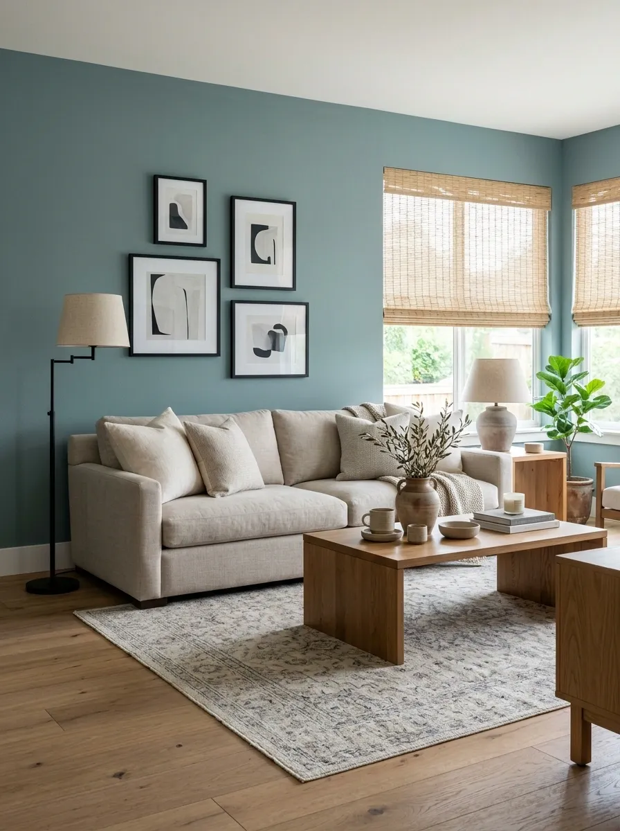
Muted teal changes the energy of this living room without becoming the loudest thing in it. Oatmeal seating, warm oak furniture, woven shades, a softly patterned rug, and a few restrained black details create a balanced composition around the colored walls.
The teal works because it has low saturation. Its slightly softened quality lets the wood and oatmeal upholstery stay visible rather than turning the room into a giant color statement.
Warm oak is especially useful here because it pushes against the cooler wall tone without making the palette feel deliberately “complementary.” Keep the supporting fabrics natural and textured. Add too many bright blue accessories and the walls will start looking like they have discovered a new personality and refuse to stop talking about it.
Soft Black Living Room With Ivory Seating and Honey Oak
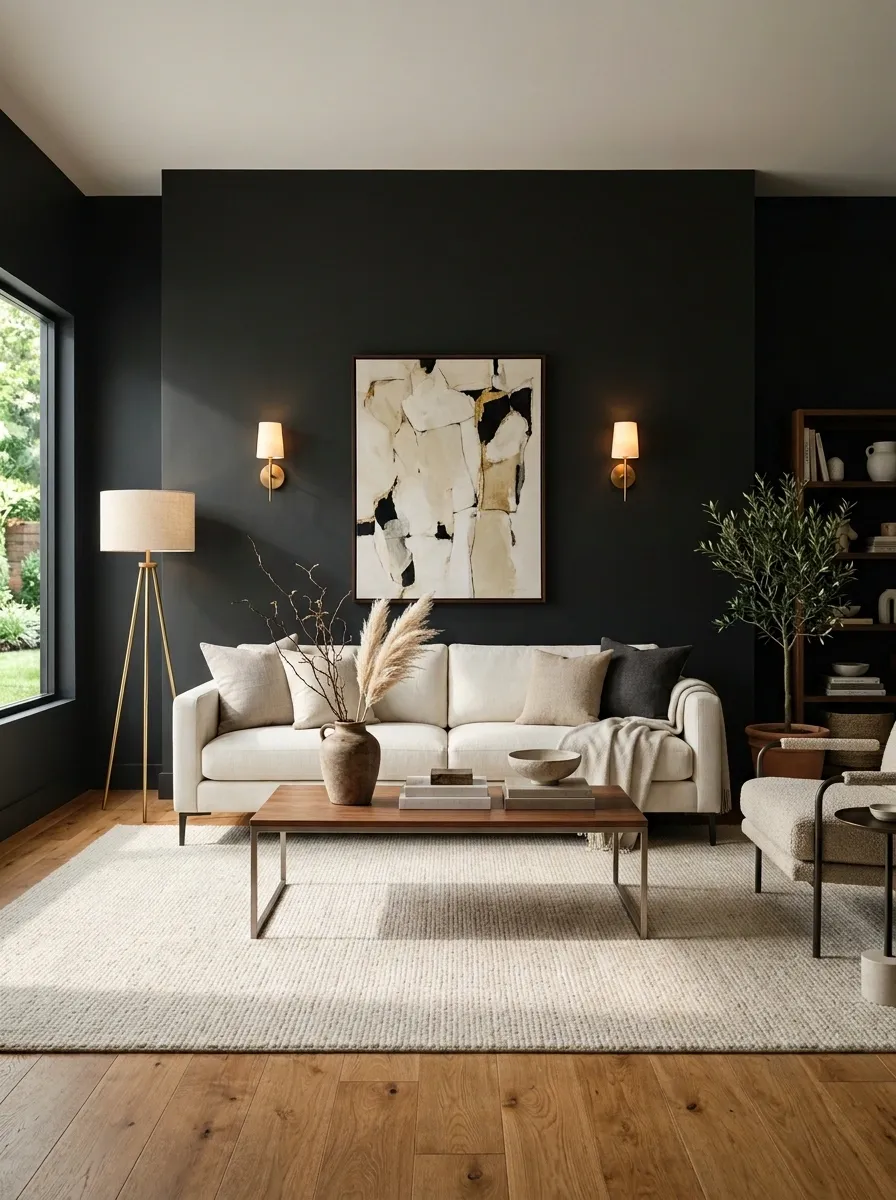
A near-black wall color gives this living room a dramatic shell, but ivory seating, honey-oak flooring, a pale rug, and warm brass lighting keep the composition open. The dark walls become part of the architecture rather than simply a bold paint choice.
The light furniture matters because it creates a strong visual break against the walls. Honey oak adds another warm note, and the pale rug prevents the lower half of the room from disappearing into the darkness.
This look can feel incredibly sophisticated when the room has enough natural or layered artificial light. Keep the furniture silhouettes fairly simple so the dark walls remain the statement. Otherwise the room risks looking like a furniture showroom after closing time.
Pale Celery Green Living Room With Vintage Wood and Linen
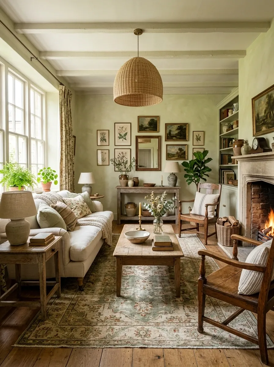
Pale celery green brings a gentle color wash to this living room, where antique wood furniture, a linen sofa, faded floral textiles, and a natural woven light fixture create a relaxed vintage composition.
The green is intentionally soft and slightly muted. That lets older wood finishes look rich rather than heavy, while linen gives the palette a lighter modern counterpoint. The faded rug adds pattern without introducing a completely unrelated color family.
This design suits rooms where the furniture already has some history or character. Let the wood grain and worn finishes remain visible instead of sanding the personality out of everything. A room like this doesn’t need to look brand new. Honestly, that would be missing the point.
Warm Gray Living Room With Burgundy Chairs and Oak
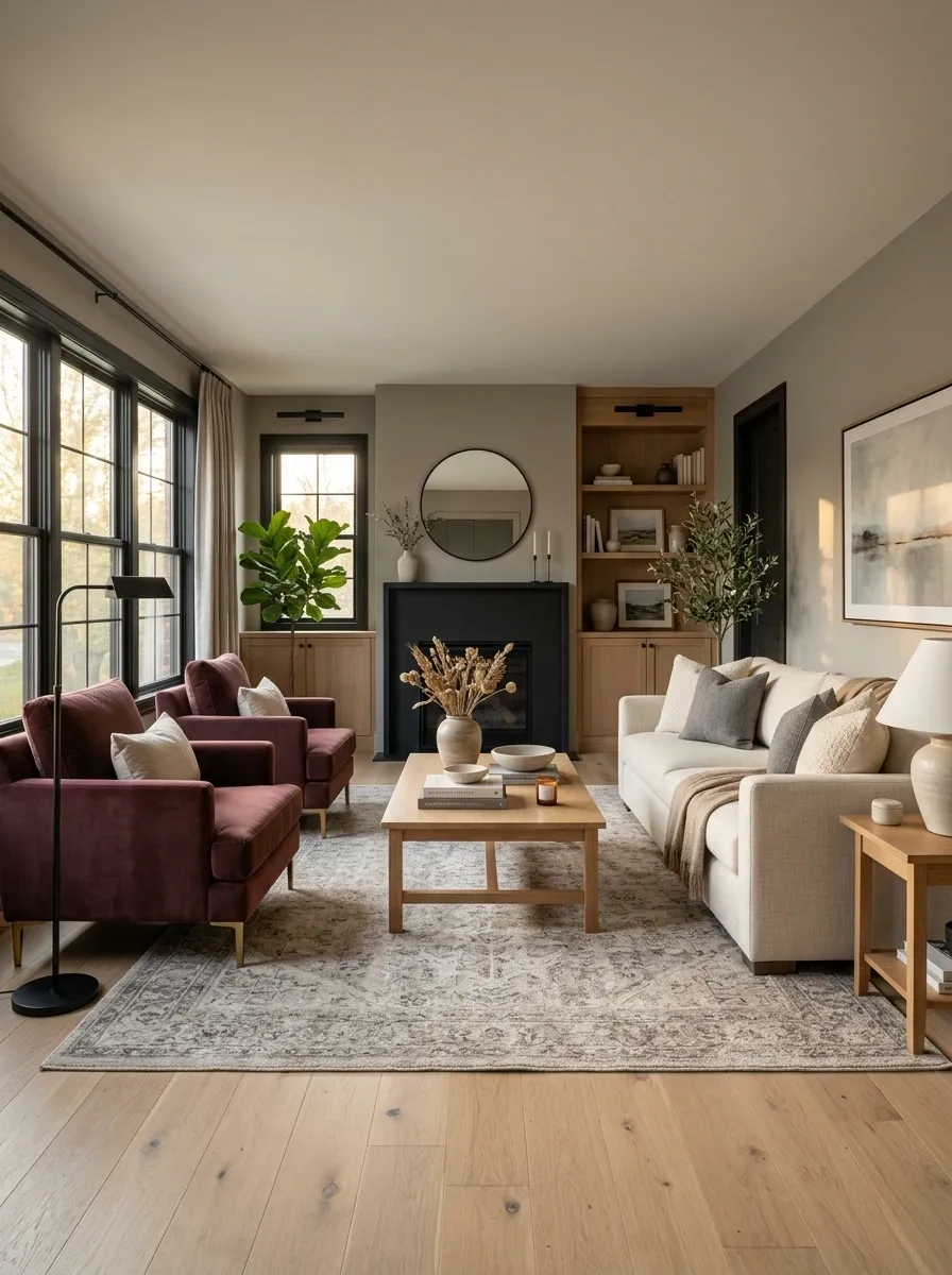
Warm gray walls give this living room a calm foundation, but deep burgundy chairs stop the palette from becoming forgettable. A cream sofa, oak coffee table, restrained black details, and a softly patterned rug fill out the room without competing with the saturated seating.
The burgundy works because it appears in concentrated doses rather than across every surface. Warm gray handles the larger wall area, cream keeps the seating zone light, and oak adds a natural middle tone between them.
This composition is particularly useful when the room needs some color but doesn’t call for brightly painted walls. Keep the burgundy deep and slightly dusty. Go too red and suddenly the room is giving restaurant booth, and nobody ordered that.
Creamy Peach Living Room With Walnut and Soft Gray
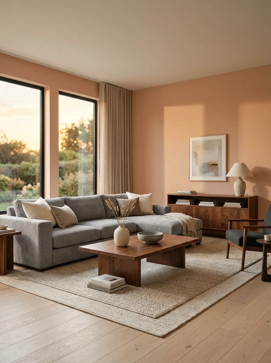
Muted peach walls give this living room a warm glow without making it feel overly sweet. Walnut furniture adds depth, a soft gray sofa introduces a cooler note, and ivory flooring and textiles keep the overall composition light.
The interesting part is the temperature shift. Peach and walnut naturally lean warm, so the gray upholstery gives the eye a cooler resting point. That stops the room from feeling like every surface was selected from the same warm paint aisle.
This works best when the peach is dusty and restrained rather than bright. Let the walnut remain fairly substantial and keep the gray soft. A screaming-white sofa would be too harsh here. The whole room is trying to have a civilized conversation.
Muted Lavender-Gray Living Room With Cream and Dark Oak
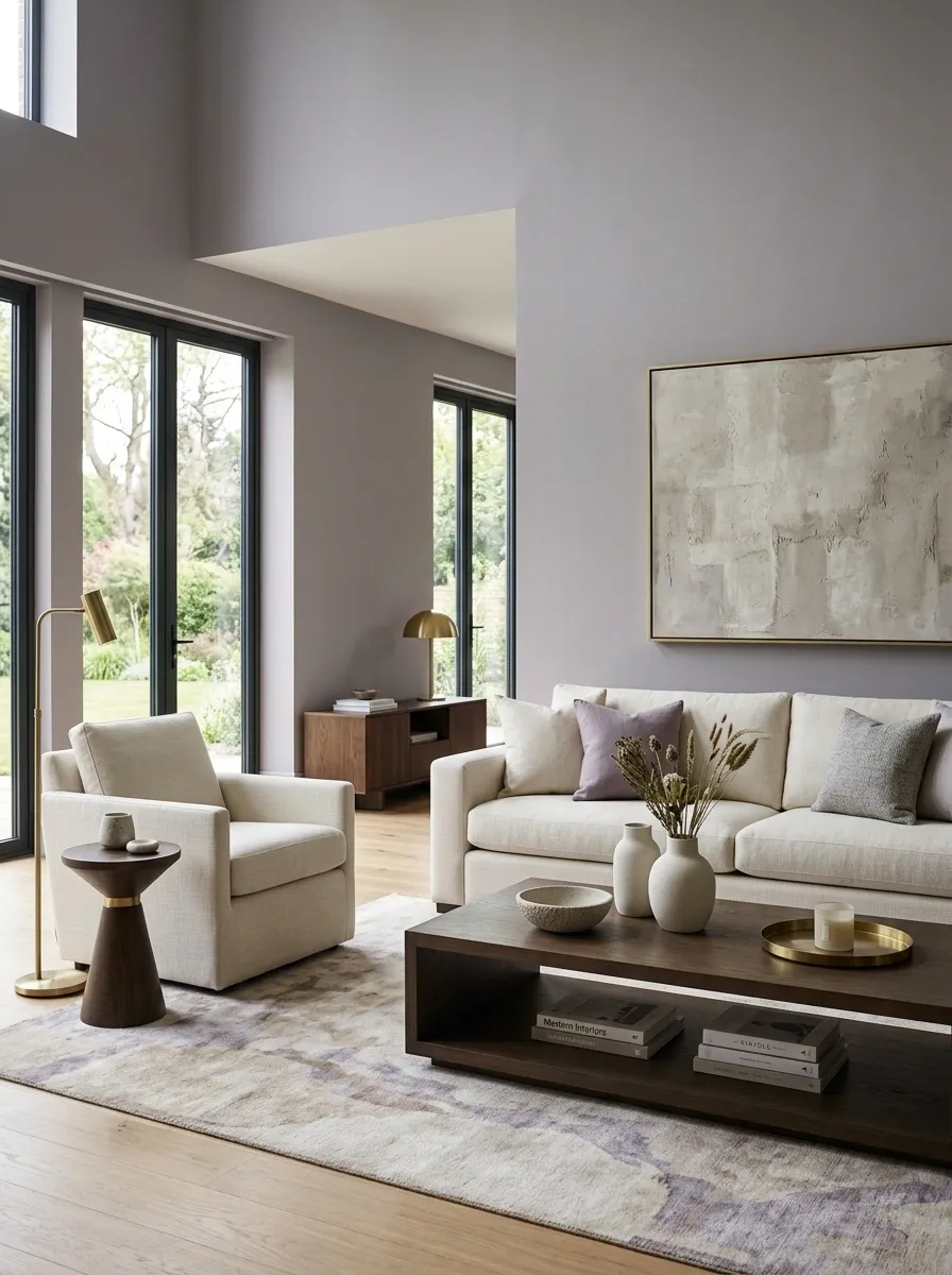
Muted lavender-gray creates a subtle change from standard neutral walls, especially when paired with cream seating, dark oak, brushed metal lighting, and a quiet abstract rug. The color is noticeable, but only after the rest of the room has settled down.
Its success comes from restraint. The gray keeps the lavender from becoming sugary, while dark oak adds enough weight to make the pale wall color feel grounded. Cream upholstery then softens the contrast between the wall and furniture.
This is a good direction for a room that needs something a little different without committing to an obvious statement color. Keep the lavender dusty rather than purple. Otherwise the room may start auditioning for a teen makeover show it was never cast in.
Golden Ochre Living Room With Deep Brown and Linen
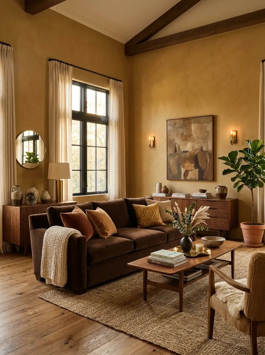
Golden ochre gives this living room a richer, sun-baked character, especially against a deep brown sofa, natural linen curtains, walnut furniture, and aged brass lighting. The color is bold enough to shape the room but muted enough to avoid looking cartoonishly yellow.
The deep brown seating acts as the visual anchor, while linen breaks up the stronger tones. Walnut reinforces the earthy direction, and brass adds a little glow without introducing another loud color.
This look suits rooms where warmer materials already make sense, especially spaces with natural wood flooring. Keep the ochre relatively dusty and let the lighter textiles create breathing room. Otherwise the room risks becoming one giant autumn filter, and Instagram already has enough of those.
Soft White Living Room With Brick Fireplace and Sage Seating
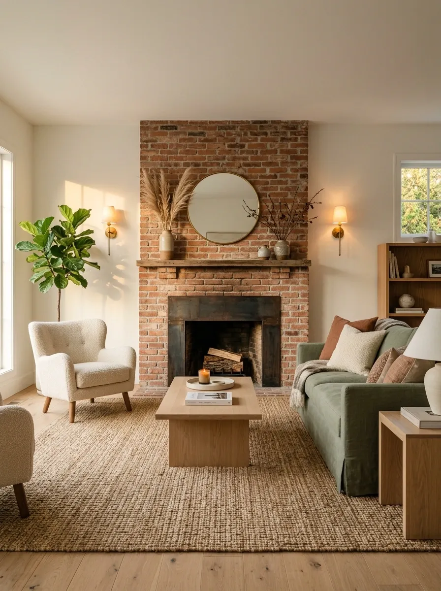
Soft white walls create a clean backdrop for an exposed brick fireplace, sage sofa, natural oak furniture, woven rug, and vintage-inspired lighting. Rather than relying on painted walls for all the visual interest, the room lets texture and architecture take over.
The brick is what gives the white room its character. Its irregular surface creates enough variation that the walls can stay quiet. Sage seating then introduces a controlled dose of color, while oak adds warmth without competing with the fireplace.
This direction works especially well when an existing brick feature is already part of the room. Don’t cover every remaining surface with decorative objects just because the walls are white. The brick has already brought receipts.
Muted Burgundy Living Room With Blush, Walnut, and Cream
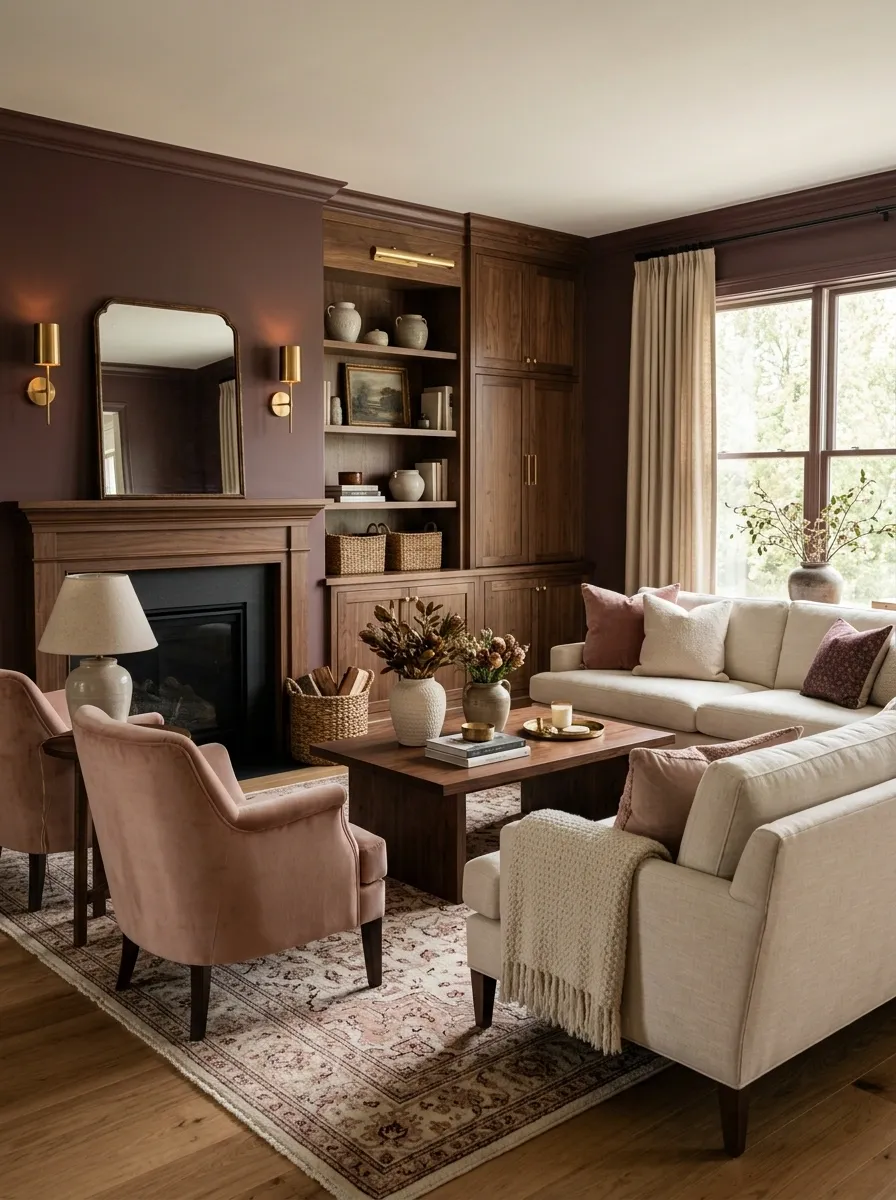
Muted burgundy walls give this living room a rich backdrop without turning it into a theatrical red box. Blush-toned chairs, a cream sofa, walnut cabinetry, and warm lighting soften the deeper wall color while keeping the room visually interesting.
The relationship between burgundy and blush is what makes the palette work. They belong to the same color family, but the lighter upholstery keeps the darker wall from swallowing the room. Walnut adds another deep tone, giving the composition a grounded middle layer.
This look suits rooms with traditional details, darker furniture, or warm evening lighting. Keep the burgundy desaturated rather than bright. Otherwise the walls may start acting like they’re hosting an awards ceremony.
Pale Powder Blue Living Room With Natural Oak and Chocolate Brown
Pale powder blue gives this living room an airy backdrop, but natural oak and chocolate-brown seating make sure it doesn’t become overly delicate. Cream curtains, a light rug, and simple furniture silhouettes keep the composition relaxed.
The brown is the important contrast. Instead of using black to sharpen the blue, chocolate adds warmth and depth while keeping the overall room softer. Natural oak bridges the two, making the palette feel connected to the floor and furniture.
This direction is especially convincing in bright rooms where the pale blue can interact with daylight. Keep the blue slightly softened and the brown rich rather than reddish. Add too many cool gray accessories and the warmth disappears faster than a “five-minute” furniture assembly project.
Warm Sand Living Room With Coastal Stone and Deep Blue
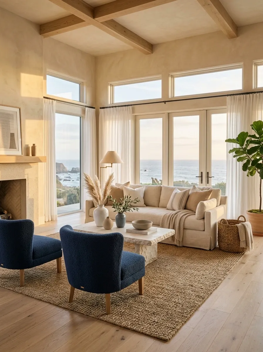
Warm sand walls create the soft foundation for this coastal-inspired living room, where pale wood, chalky stone, cream linen seating, woven textures, and a few deep-blue chairs provide contrast.
The important part is the restraint. Sand covers the largest visual field, so the room already feels warm and light. Deep blue appears only in selected furniture, giving the eye a stronger color to notice without turning the room into nautical-theme central.
Stone and pale wood add natural variation without demanding another color family. This works particularly well in bright rooms where the warmer wall tone can shift gently throughout the day.
Keep the blue concentrated and the accessories simple. Nobody needs an anchor hanging on the wall to understand the coastal reference.
Dark Chocolate Living Room With Cream Bouclé and Brass
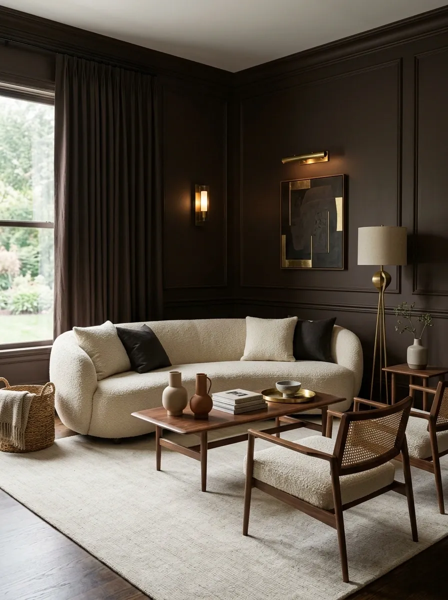
Deep chocolate walls make this living room feel enveloping, but oversized cream bouclé seating keeps the center of the space bright. Walnut furniture, a pale rug, and brass lighting reinforce the warmth without turning the room into one giant brown gradient.
The cream seating is essential because it carries the strongest contrast against the walls. Brass adds small points of reflected light, while the pale rug creates another break near the floor.
This is a dramatic palette that still feels livable because the darkest color is concentrated on the architecture while the main seating remains light. Keep the furniture shapes simple and the lighting warm. Add dark curtains, dark seating, and a dark rug too, and congratulations, the living room has entered witness protection.
Soft Neutral Living Room With Two-Tone Painted Walls and Built-Ins
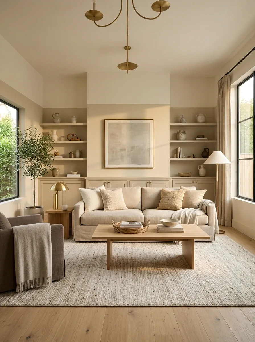
This final direction takes a quieter route by using two related wall colors instead of one. A warmer neutral covers the lower wall area while a lighter tone continues upward, creating a subtle architectural shift around built-in cabinetry. Oatmeal seating, oak flooring, understated artwork, and simple lighting keep the room cohesive.
The two-tone treatment gives the walls more structure without introducing a dramatic accent color. The lower shade adds visual weight around the furniture, while the lighter upper section keeps the room feeling taller and brighter.
This approach works particularly well in rooms with built-ins, paneling, chair rails, or awkward wall proportions. Keep the two neutrals close enough to read as one composition. The goal is “interesting wall treatment,” not “the painter ran out of paint halfway up.”
Let the Whole Room Make the Decision
A paint color can look completely different once it stops being a little square on a screen and becomes six meters of wall sitting beside a sofa, a floor, a window, and whatever furniture has somehow survived three different decorating phases.
That is why the strongest reference isn’t necessarily the room with the prettiest wall. It’s the one where the entire combination makes sense. The color, wood, upholstery, lighting, architecture, and contrast all seem to belong to the same room.
Before committing to a shade, save a few complete rooms that have the same light, furniture direction, or architectural character as the space being painted. Compare the whole compositions, not just the walls. That’s where the useful part of the inspiration starts.