
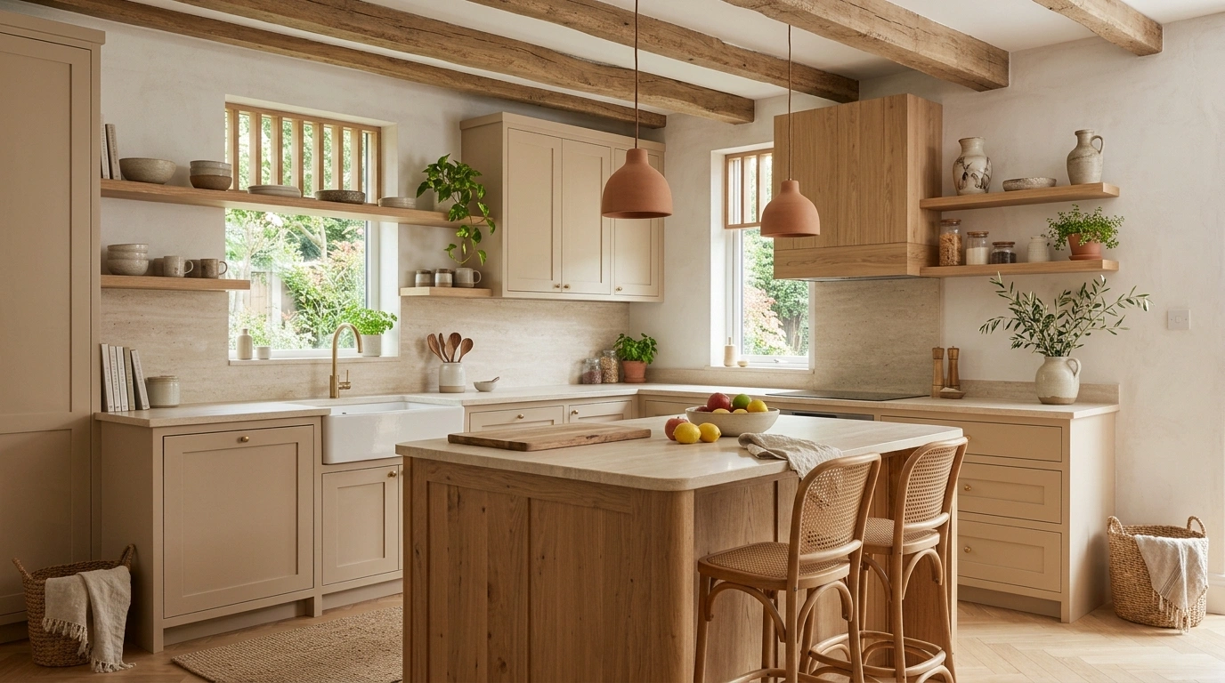
The fastest way to make a modern kitchen feel cold is to make everything match.
Same white. Same flat cabinets. Same shiny surfaces. Same little bowl of lemons sitting there like it has been assigned a full-time job.
Organic modern kitchens work because they break that showroom perfection with warmer materials, natural texture, softer colors, and a few pieces that look like they belong to an actual home. The cabinetry can stay clean. The appliances can stay modern. The layout can still be practical. It just needs enough contrast to stop looking like a kitchen showroom waiting for someone to move in.
The trick is knowing where to add warmth and where to stop.
Natural wood, stone, muted greens, linen, aged metal, handmade ceramics, and warm lighting all have a place here. But throwing every organic material into one room isn’t the answer either. That’s how a calm kitchen suddenly starts looking like it has a Pinterest identity crisis.
The Organic Modern Look Needs a Little Tension
The prettiest kitchens in this style aren’t completely smooth, completely rustic, or completely minimal.
They sit somewhere in the middle.
Pair polished surfaces with something that looks naturally imperfect
A perfectly smooth cabinet looks better beside a surface with visible variation.
That could mean warm oak cabinetry beside honed stone, a smooth island beside handmade tile, or sleek hardware against a textured plaster wall.
The contrast keeps the room from looking flat.
Keep the palette quiet, then let materials create the interest
Organic modern doesn’t need a rainbow.
Warm whites, cream, muted sage, olive, beige, mushroom, soft gray, walnut, oak, and natural stone can create plenty of depth without relying on loud color.
The materials should do the talking.
Don’t decorate every empty surface
An empty stretch of counter isn’t automatically a problem.
Sometimes it’s exactly what makes the good stuff noticeable.
The kitchen needs functional pieces, of course. It just doesn’t need a decorative object every six inches because someone online decided empty space was suspicious.
Modern Kitchen Ideas
Ground dark cabinetry with rich wood
Matte black cabinets can easily feel stark if they aren’t balanced by the right textures. Pairing them with a continuous wood backsplash and matching countertops instantly warms up the entire perimeter.
The trick lies in keeping the wood grain organic and tactile. It brings depth to the moody base cabinets without fighting for attention against the minimalist range hood.
Layer in simple ceramics and warm under-cabinet lighting to make the dark tones feel approachable rather than intimidating.
Pair warm wood with a quiet countertop
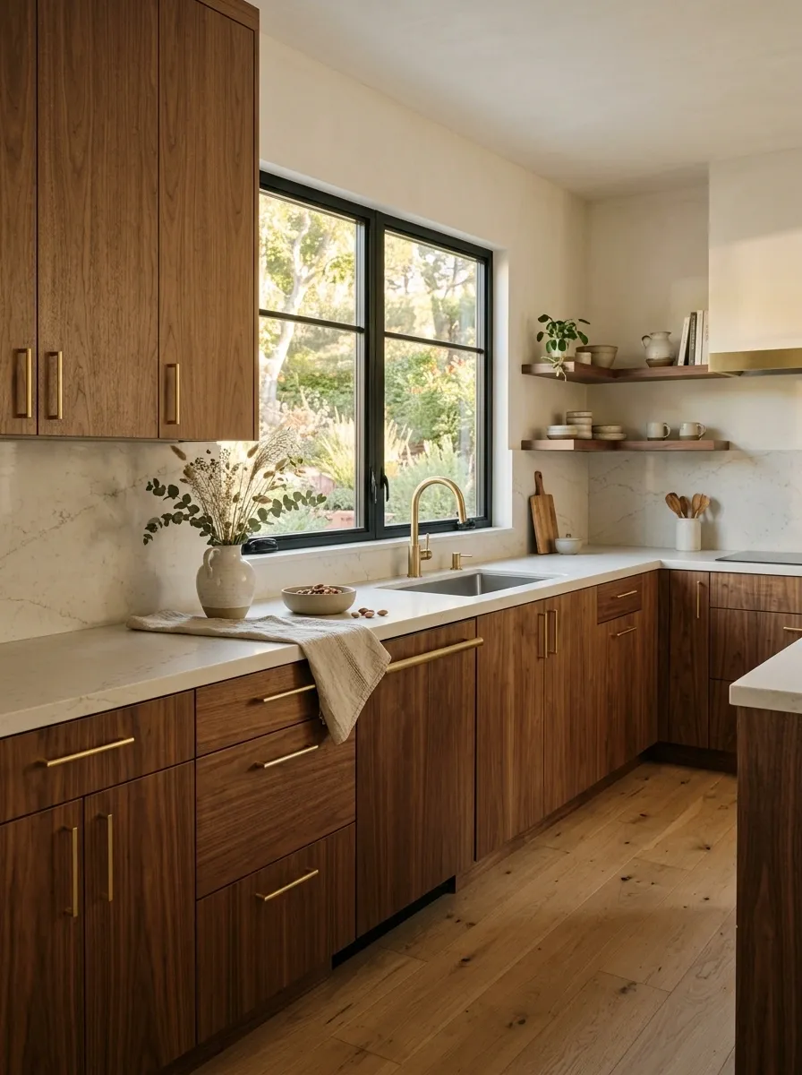
Warm wood immediately softens a kitchen filled with straight lines and hard surfaces.
Oak, walnut, ash, and other natural wood finishes work especially well when the countertop stays visually restrained. A pale stone surface beside warm cabinetry creates enough contrast without turning the room into a collection of competing finishes.
Keep the grain visible. That’s part of the point.
The wood doesn’t need elaborate carving or rustic distressing. Clean cabinetry with beautiful natural grain already does plenty.
Mix crisp white with vertical wood slats
White perimeter cabinets get an immediate organic upgrade when paired with natural fluted wood detailing. The vertical grain draws the eye upward while adding subtle texture to an otherwise smooth kitchen.
Extending the warm wood tones into the upper box framing anchors the clean white surfaces. It creates a seamless transition that feels architectural and deeply intentional.
Keep the countertop clean and let the natural wood slats do the heavy lifting for the room’s personality.
Bring in olive or sage cabinetry instead of another white kitchen
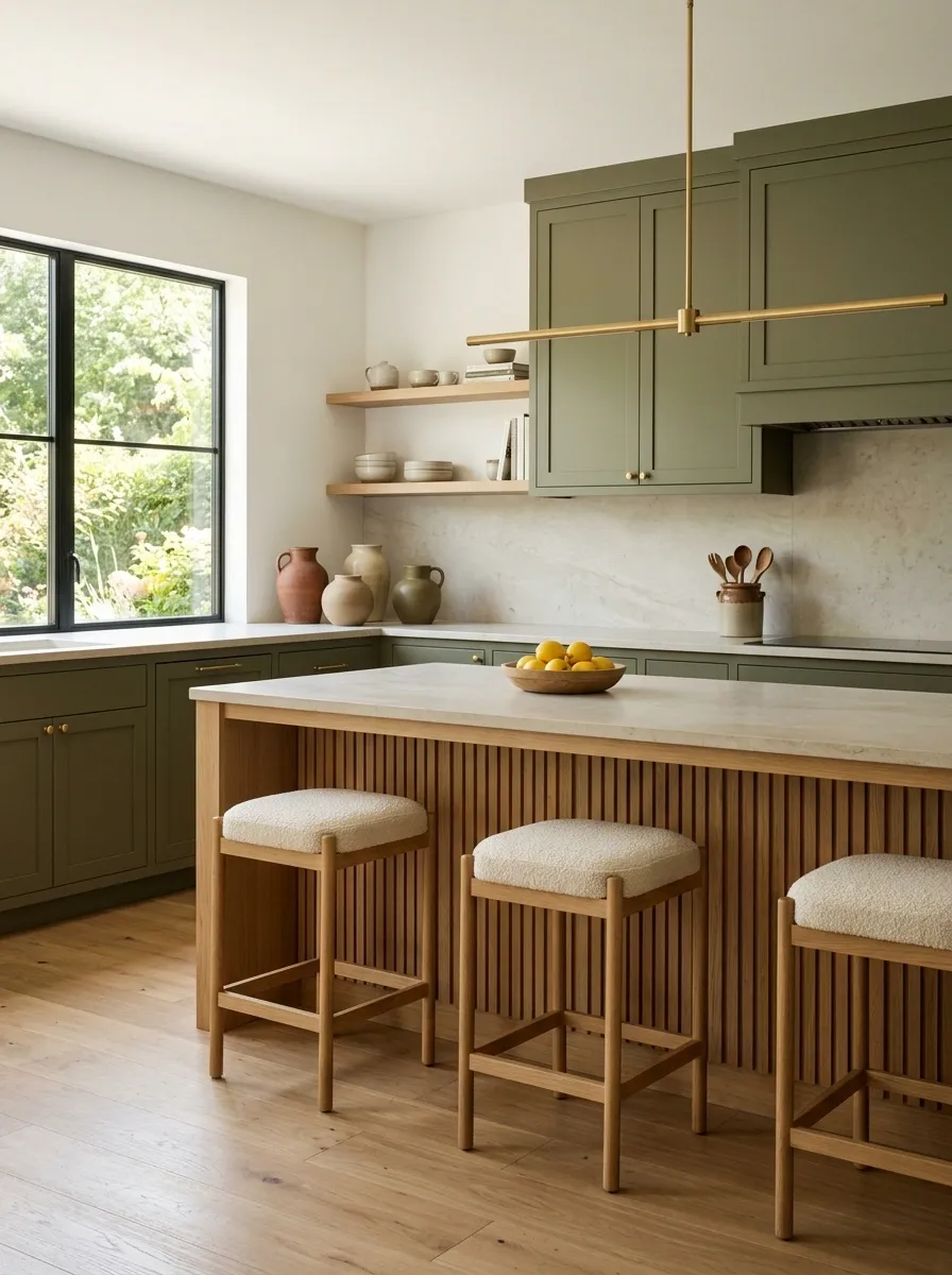
White cabinetry works. Nobody needs to call the cabinet police.
But muted green gives an organic modern kitchen much more personality while still keeping the palette calm. Sage works beautifully with pale stone and oak, while deeper olive shades create more contrast against warm brass or natural wood.
Keep the surrounding materials quiet. Green cabinetry already has enough presence to carry the room.
Anchor the space with a live-edge island
A moody industrial kitchen needs a heavy dose of nature to keep it from feeling cold. A live-edge wood island base acts as the ultimate grounding element against dark textured surfaces.
Pairing sleek modern appliances with raw wood textures creates that coveted tension between polished and organic. Even a simple wooden tree stump stool adds functional warmth to the corner.
Let the natural imperfections of the wood shine through so the kitchen feels lived-in rather than showroom-sterile.
Run the stone all the way up the range wall
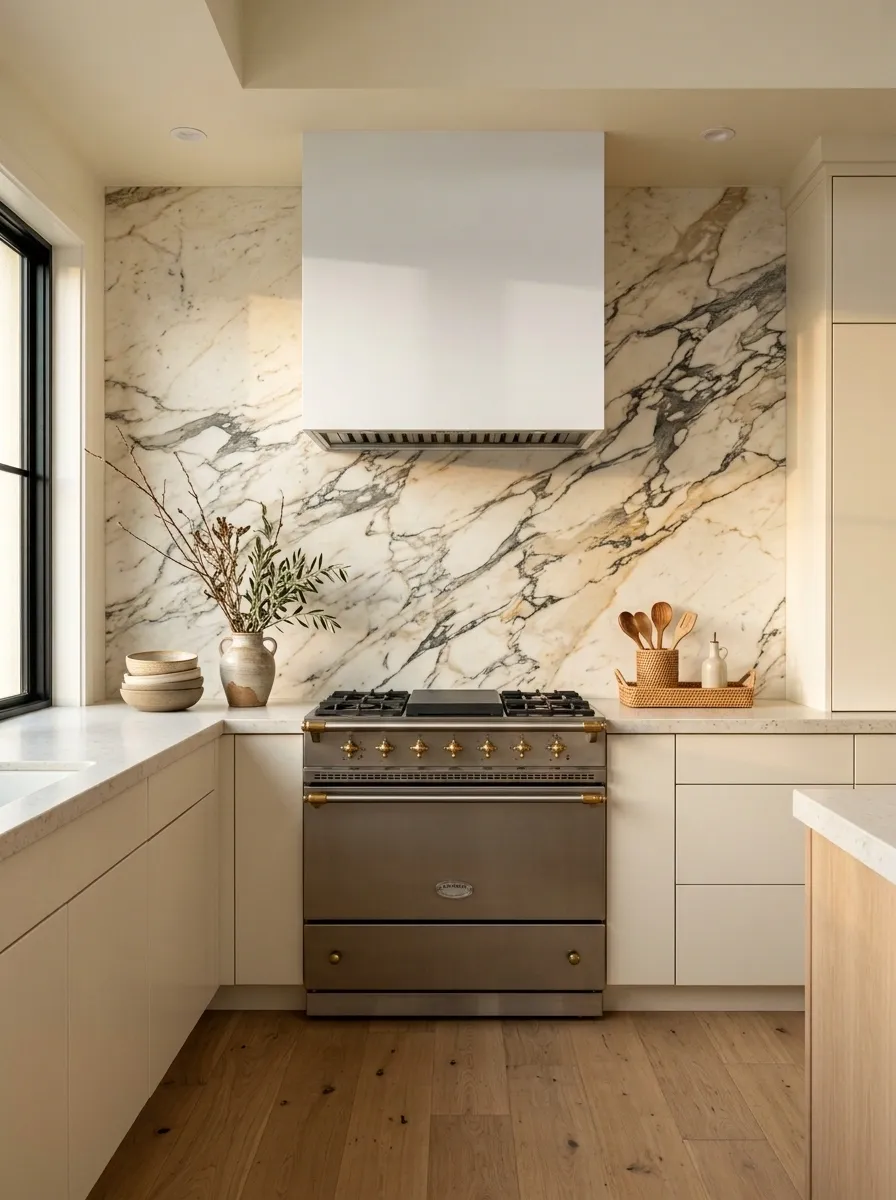
A beautiful slab deserves better than a tiny backsplash strip.
Taking the stone higher creates a strong architectural moment while keeping the rest of the kitchen relatively simple. The uninterrupted surface also works especially well behind a minimalist hood.
Choose a stone with movement you actually want to see. Then let it be the star.
Let organic wood movement steal the show
When working with a stark black backdrop, a single slab of dramatic wood grain transforms a simple backsplash into functional art. The swirling patterns mimic nature in a way that flat tile simply cannot replicate.
Floating shelves styled with muted pottery maintain the quiet, curated vibe. They provide storage without breaking up the stunning natural focal point on the wall.
Keep surrounding details minimal to ensure the natural wood remains the undisputed star of the room.
Hang one oversized matte pendant above the island
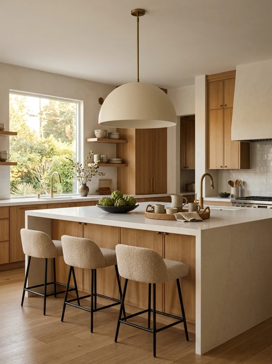
A tiny pendant floating above a huge island usually looks like the lighting budget gave up halfway through.
A larger matte pendant gives the island a visual anchor while adding another soft shape to the room. Black, cream, aged brass, plaster, or natural woven materials can all work depending on the rest of the palette.
Choose one strong fixture rather than several unrelated decorative lights.
Bring the outdoors inside with a glass roof
An organic modern kitchen thrives on natural light, and nothing beats looking straight up at the tree canopy while cooking. A glass ceiling structure blurs the boundary between indoor living and the landscape outside.
Pairing a glass roof with rustic stone walls and dark cabinetry creates a moody, sheltered greenhouse feel. It makes everyday meal prep feel like an immersive retreat in nature.
Keep the remaining finishes grounded in earthy tones, stone, and abundant greenery to complete the woodland aesthetic.
Repeat one leading wood tone instead of collecting five
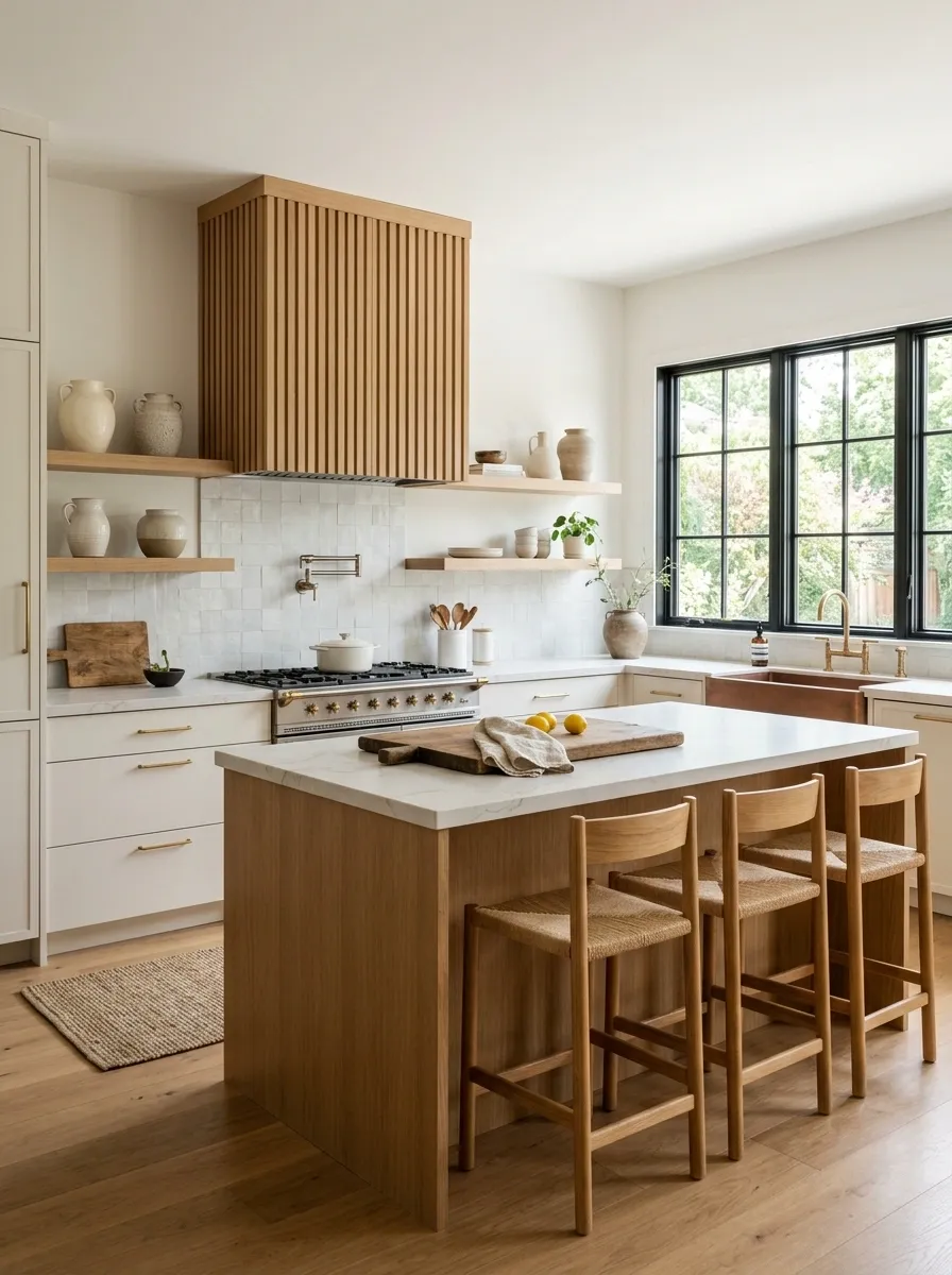
Organic doesn’t mean every shade of brown gets an invitation.
Choose one main wood tone and repeat it through the cabinetry, stools, shelves, hood detail, or furniture. A secondary wood can work, but it should look intentional rather than accidental.
Warm oak everywhere creates a different feeling from deep walnut everywhere. Both can work. The problem starts when the kitchen contains oak, walnut, reddish wood, gray wood, and something described as “weathered.”
Use a plaster-look hood to soften a hard-working range wall
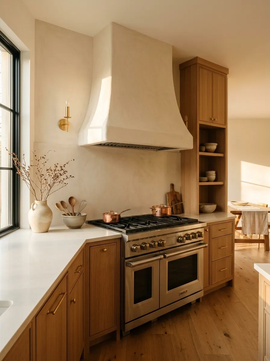
A hood doesn’t have to look like another appliance.
A plaster-finished or softly shaped hood creates a more architectural focal point and introduces subtle texture without requiring another complicated pattern.
Keep its silhouette simple. The appeal comes from the material and shape, not decorative trim.
A soft cream hood against warm wood cabinetry is particularly effective because the contrast stays gentle.
Add handmade tile where the room needs a little irregularity
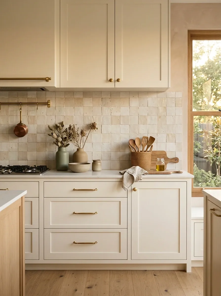
Perfectly uniform tile can look too polished when every other surface is already smooth.
Handmade-look tile brings tiny variations in tone and surface that make the backsplash feel more tactile. Keep the color restrained so the texture does the work.
Soft cream, chalky white, muted green, and earthy neutrals work especially well with natural wood.
Use open shelving only where the objects deserve to be seen
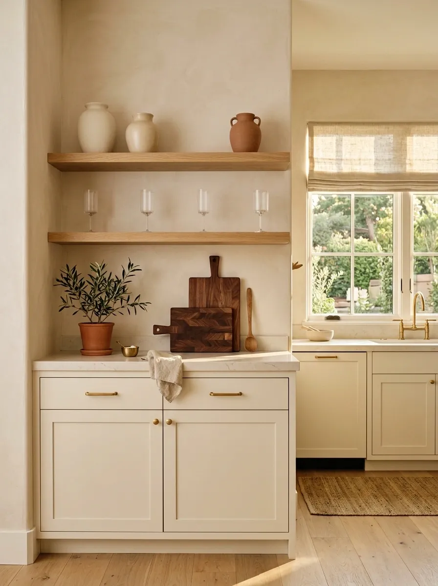
Open shelves aren’t automatically cozy.
If they’re packed with random mugs, five appliances, and the emergency container collection nobody wants to discuss, they become visual clutter with excellent lighting.
Use one or two shelves for things that actually contribute to the kitchen: handmade ceramics, attractive bowls, wooden boards, glassware, or a few useful everyday pieces.
The shelf should look useful first and decorative second.
Choose a soft cream instead of stark bright white
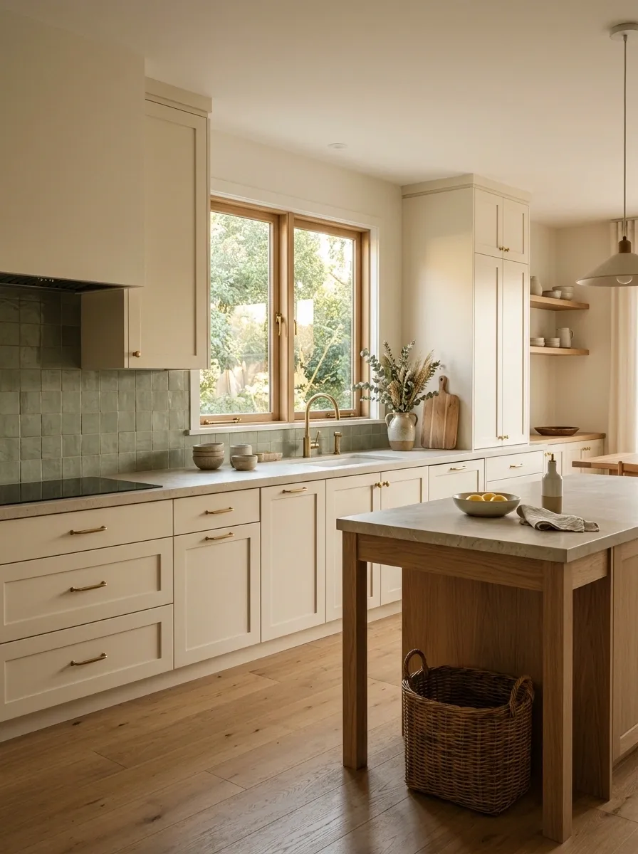
Pure white cabinets can make an organic kitchen feel oddly sharp, especially beside pale stone and cool daylight. Soft cream keeps the clean look but takes the edge off.
Choose a shade with a warm, quiet undertone rather than a yellow-heavy ivory. It should look relaxed beside oak, walnut, limestone, or muted green.
The difference is subtle, which is exactly why it works. The kitchen doesn’t need to announce, “HELLO, I AM BEIGE.” It just needs to stop looking fluorescent.
Mix smooth cabinetry with a rougher stone surface
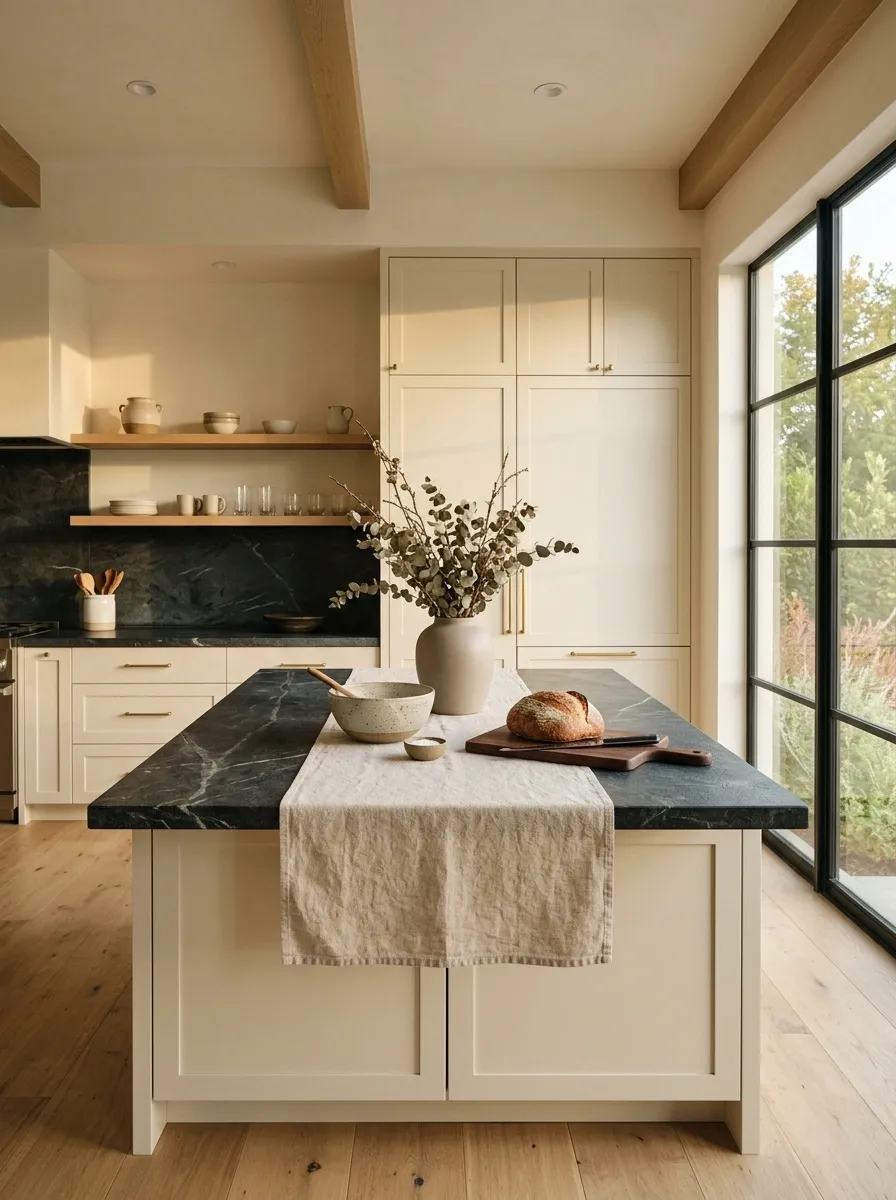
A polished kitchen needs something with a little visual grit.
Pair flat-front cabinets with honed stone, soapstone, limestone, travertine, or another surface that has visible variation. The contrast gives the eye somewhere to land.
Keep the cabinetry simple. Once the stone brings texture, there is no reason for the cabinet doors to start performing too.
Keep the backsplash quiet so the materials can speak
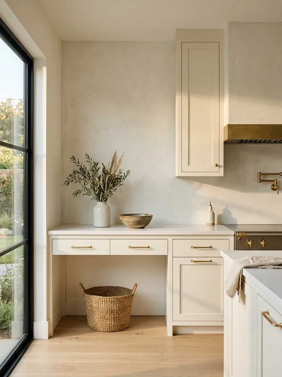
Not every kitchen wall needs a pattern.
A restrained backsplash lets the wood, stone, lighting, and cabinet shape do the visual work. Large-format tile, plaster-like finishes, simple slab backsplashes, or quiet stone all keep the room from becoming visually noisy.
This matters even more when the kitchen already has grainy wood or dramatic stone. Adding another bold pattern usually isn’t “layered.” It’s just three people talking at once.
Use a dark natural wood accent to ground a light kitchen
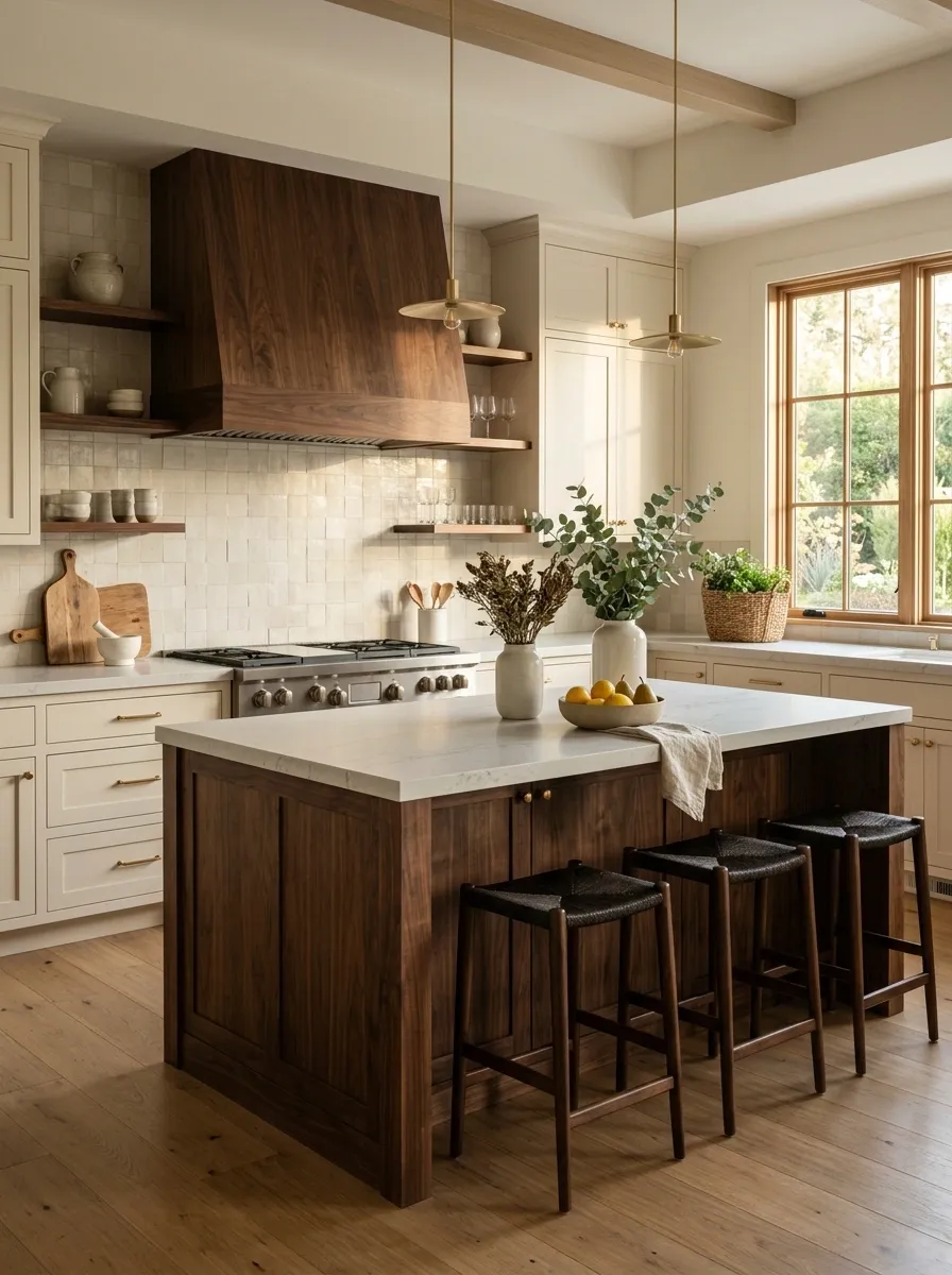
A pale kitchen can look beautiful and still feel like it’s floating.
Bring in one deeper wood element, such as a walnut island base, dark stool seats, a furniture-style cabinet, or a rich wood hood. The darker tone creates a visual anchor without needing black everywhere.
Keep the accent concentrated. One substantial dark wood feature has more impact than six tiny brown accessories trying to recreate the same effect.
Install warm under-cabinet lighting for evening depth
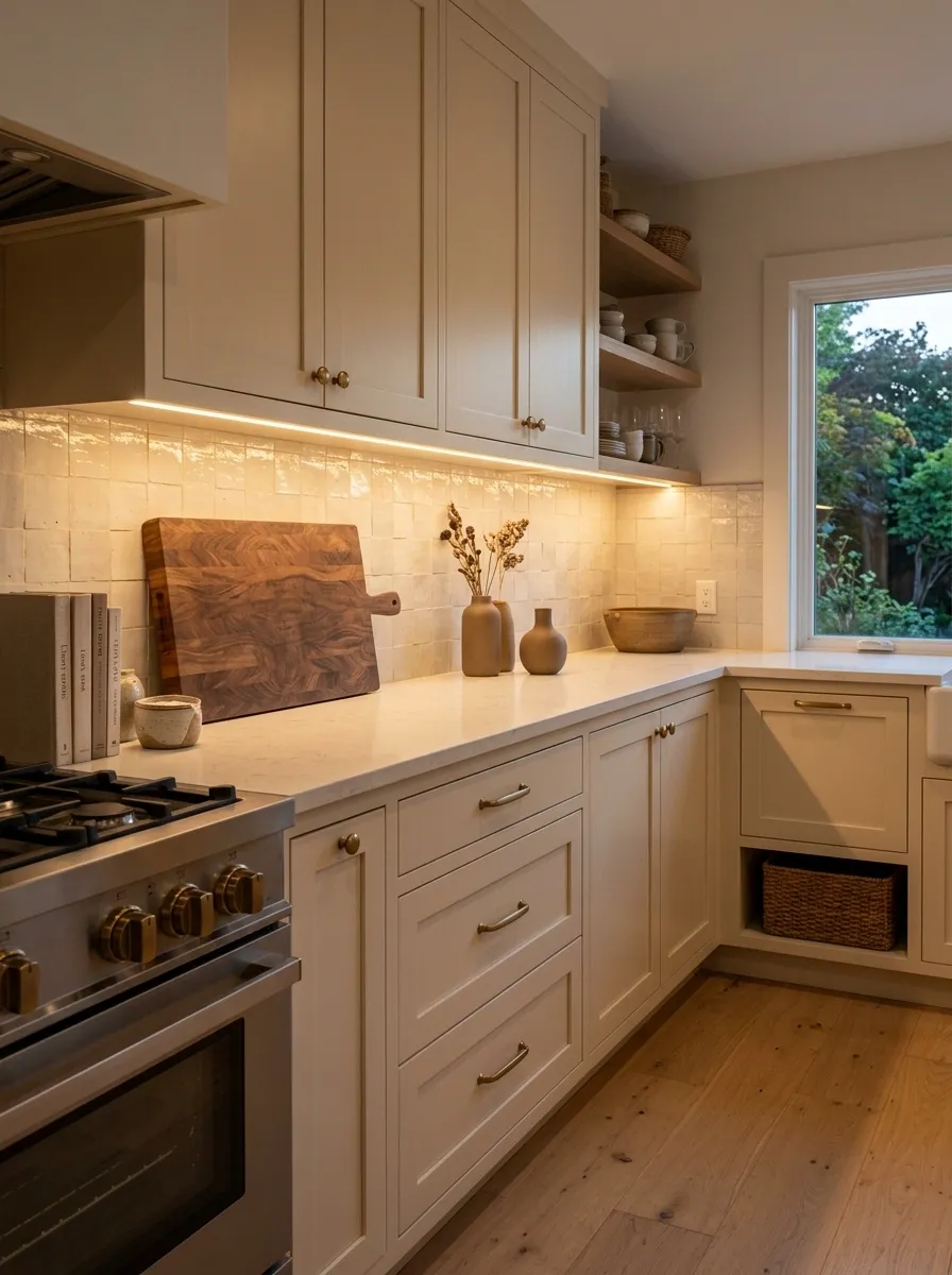
A kitchen that only looks good at noon has entered its daylight-only era.
Warm under-cabinet lighting fills in the shadows beneath upper cabinets and gives the stone, wood, and backsplash a softer evening appearance. It also makes the work surfaces easier to read without blasting the entire room with ceiling light.
Use concealed lighting with a clean, continuous appearance. Visible strips and random bright spots ruin the whole point.
Choose a simple farmhouse-style sink without going full farmhouse
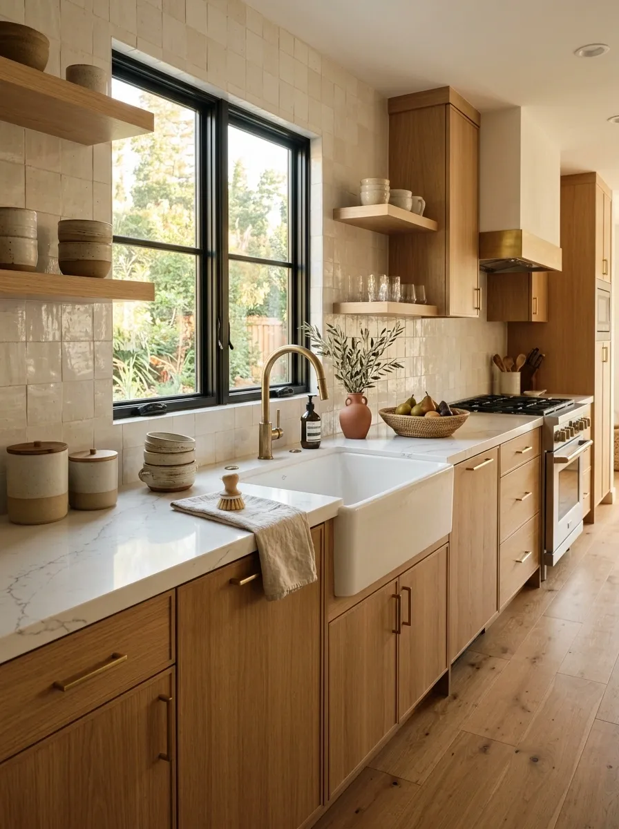
The sink can bring a little old-world character without dragging the entire kitchen into farmhouse territory.
Choose a clean apron-front sink with a simple shape, then keep the surrounding cabinetry modern. Flat fronts, restrained hardware, and natural stone stop the sink from looking like it belongs under a giant “Farm Fresh Eggs” sign.
The trick is restraint. One traditional shape adds contrast. Five more would turn the kitchen into a costume party.
Add a freestanding wood piece instead of more built-ins
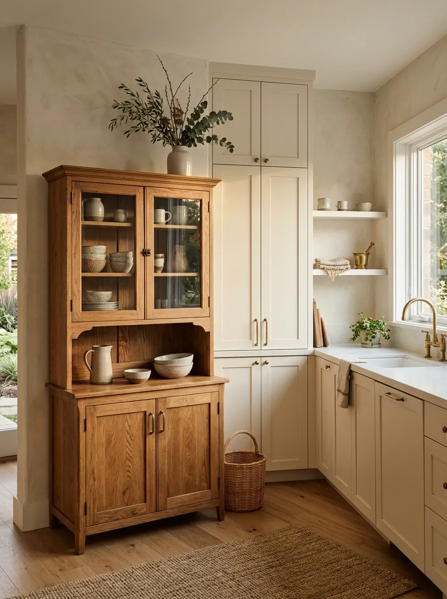
Not every empty corner needs another cabinet.
A freestanding wood hutch, narrow console, antique-style cupboard, or simple butcher-block piece can break up a wall of matching cabinetry and make the kitchen feel collected rather than ordered as one giant package.
Choose a piece with a straightforward silhouette. Visible wood grain is enough. The furniture should look useful, not like someone parked a dining-room cabinet in the kitchen because there was nowhere else to put it.
Use linen or woven shades at the kitchen windows
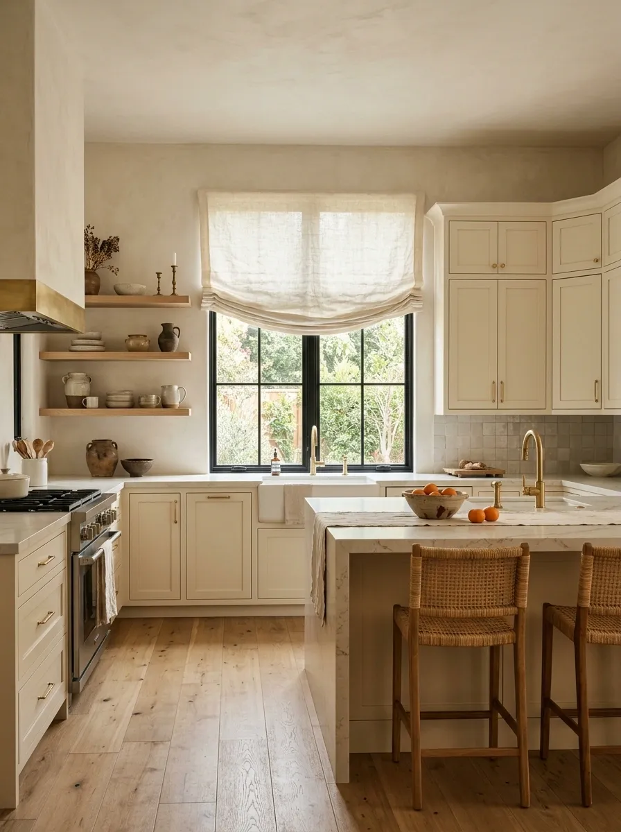
Hard cabinets and stone surfaces can make a kitchen feel visually rigid. A soft window treatment breaks that up instantly.
Linen shades bring a slightly rumpled texture that works with wood, plaster tones, and natural stone. Woven shades add more visible texture when the rest of the room is especially smooth.
Keep the color close to the wall or cabinetry. A loud window treatment steals attention from the kitchen’s better features.
Make the range wall the quiet focal point
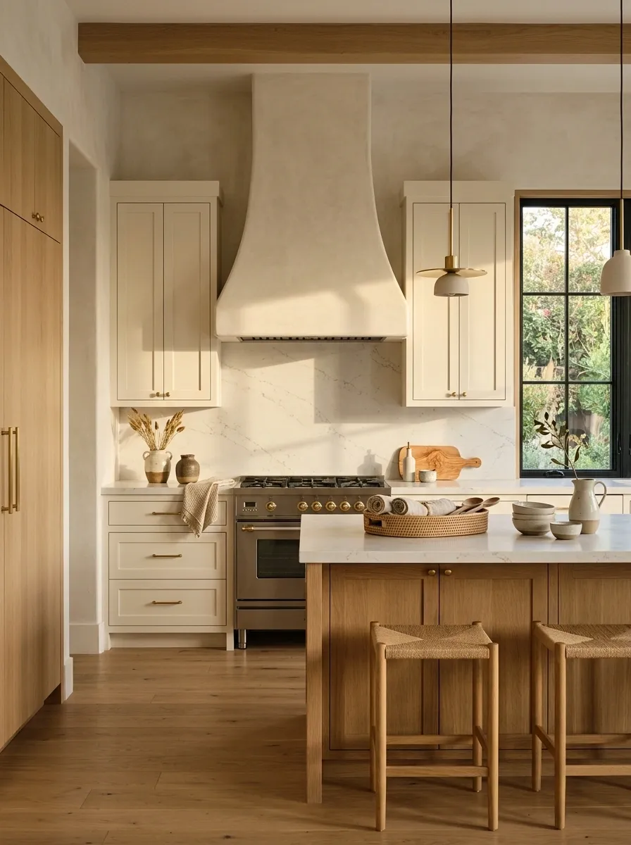
A strong kitchen doesn’t need a focal point in every corner.
Give the range wall the job instead. A simple hood, continuous stone, warm wood, or a slightly darker cabinet color can create enough visual interest without adding decorative clutter.
Then deliberately calm the surrounding areas. The island, pantry wall, and open shelves don’t need to compete.
Mix black accents into an otherwise soft material palette
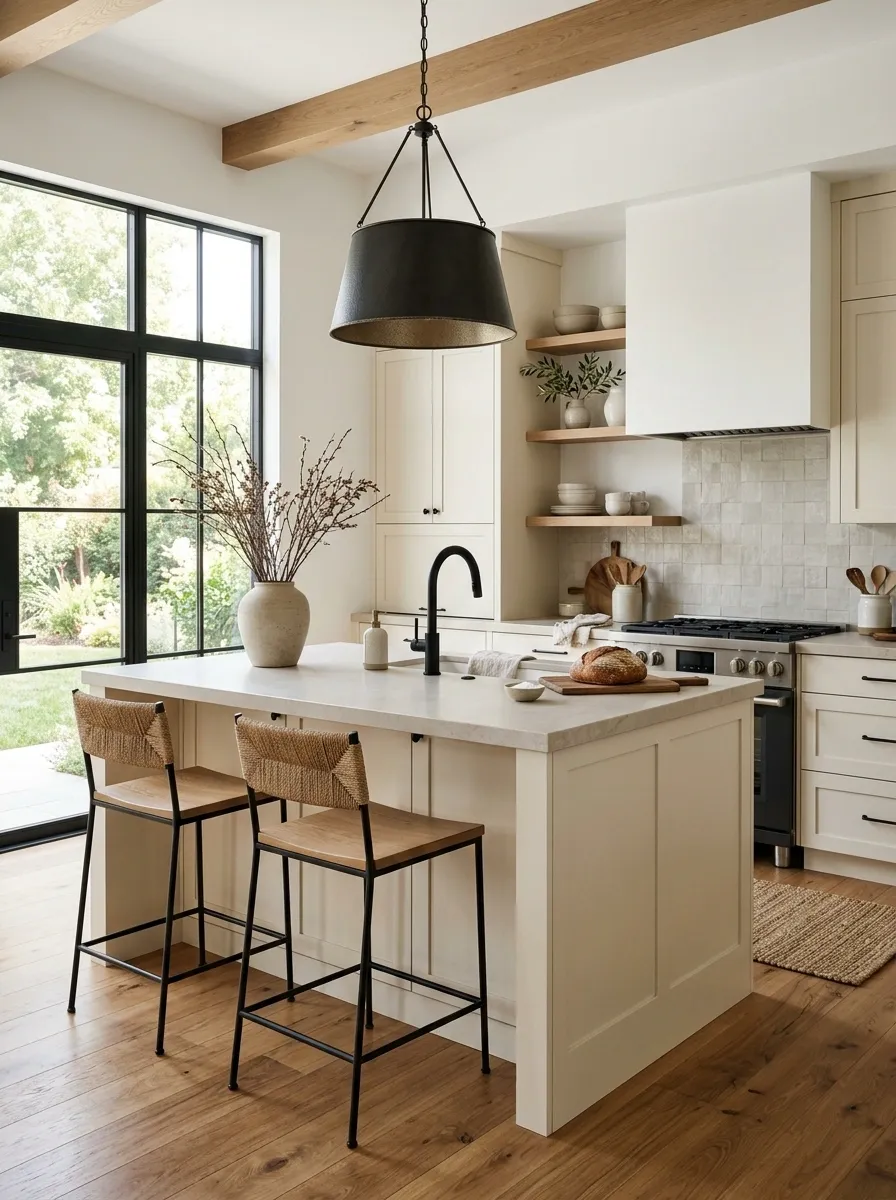
Black gives a pale organic kitchen enough contrast to keep everything from blending into one giant bowl of oatmeal.
Use it where it helps define the architecture: a slim window frame, pendant, faucet, stool base, or a few cabinet pulls. Repeat the accent so it feels connected.
Don’t scatter black objects around just to tick the contrast box. A black vase, black cutting board, black tray, and black toaster can quickly become a very committed theme.
Choose long, simple cabinet pulls for a cleaner line
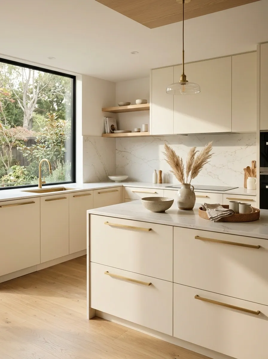
Tiny knobs can make a kitchen feel visually busy, especially when the cabinetry already has lots of doors and drawers.
Long, simple pulls create stronger horizontal lines and make flat-front cabinets feel more architectural. Choose one understated finish and repeat it across the room.
The trick is proportion. Pulls shouldn’t be so oversized that they become decorative bars. The cabinet should still be the thing people notice.
Add greenery sparingly instead of turning the kitchen into a jungle
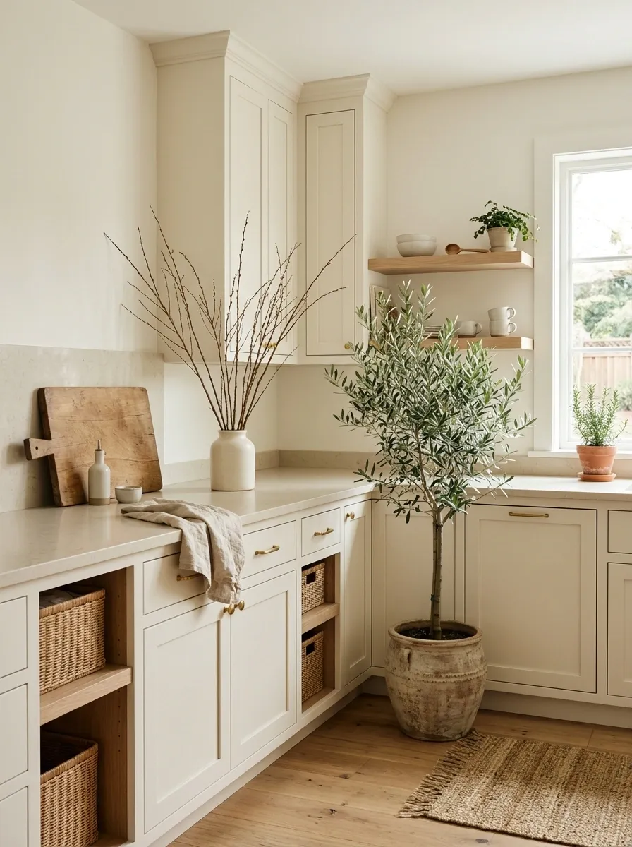
A little greenery softens all the hard surfaces. A lot of greenery makes the kitchen look like it has been taken over by a very enthusiastic plant account.
Choose one substantial plant near a window, a small herb grouping, or a simple branch arrangement in a ceramic vessel. Give it room around the leaves so the shape stays visible.
The best placement usually fills an awkward edge or adds height where the cabinetry stops. That’s more useful than putting plants everywhere because the countertop looked lonely.
Let natural stone be slightly imperfect
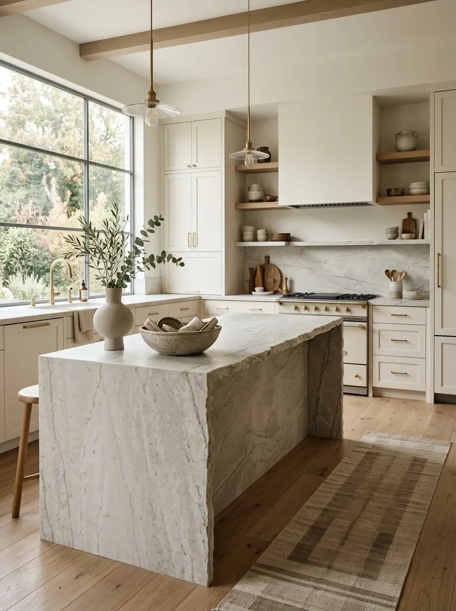
The organic look falls apart when every surface is too uniform.
Natural stone with subtle variation gives the kitchen depth that perfectly repetitive materials can’t fake. Look for gentle veining, tonal shifts, small mineral details, or an edge that feels less machine-perfect.
This works especially well with simple cabinetry because the stone gets to provide the personality. Nobody needs six different patterns competing for attention. One honest material can carry the whole room.
Keep everyday appliances visually contained
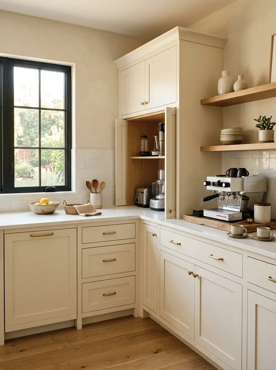
Nothing destroys a carefully planned kitchen faster than six appliances permanently camping on the countertop.
Create one designated zone for the things used every day. A coffee station, appliance garage, deep drawer, pantry shelf, or dedicated counter section keeps the visual clutter from spreading.
The goal isn’t an empty kitchen. It’s a kitchen where the useful stuff has somewhere to live.
Finish the kitchen with one strong organic focal detail
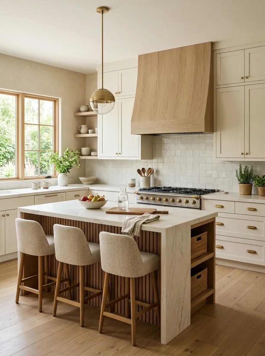
The final layer shouldn’t be another pile of accessories.
Choose one detail that gives the eye a reason to stop: a sculptural pendant, a beautiful stone slab, a large ceramic vessel, a wood hood, an oversized branch arrangement, or a striking piece of furniture.
Then stop.
That last part matters. Organic modern kitchens look expensive because the materials have room to breathe. Once the room already has enough texture, another decorative object isn’t finishing the design. It’s filing an unnecessary appeal.
The Kitchen Should Look Good Before the Styling Tray Arrives
That’s the part worth remembering.
Organic modern kitchens don’t need to be stuffed with baskets, cutting boards, plants, pottery, cookbooks, and decorative bowls to look finished. The architecture and materials should already be doing most of the work.
Warm wood creates softness. Natural stone adds variation. Muted green brings color. Simple hardware keeps the cabinetry clean. Linen and woven textures stop the room from feeling overly hard. Warm lighting changes the entire mood once the sun disappears.
Then there should be enough restraint to let those choices actually register.
The best result isn’t a kitchen that looks untouched. It’s a kitchen that looks like someone lives there and happens to have very good taste.
Save this list for the next time the kitchen starts looking a little too cold, too matching, or suspiciously close to a showroom.