
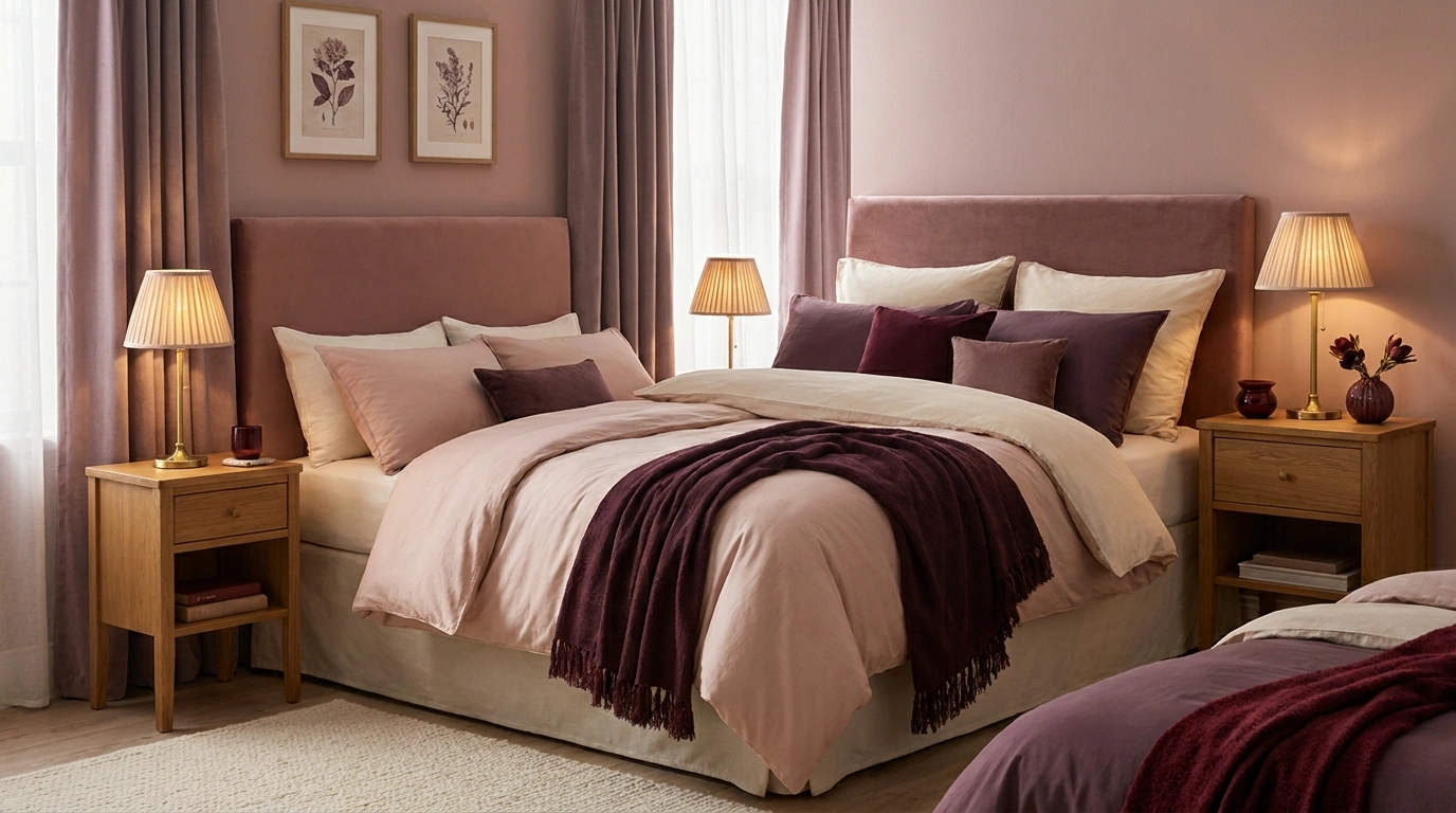
Romantic rooms have been unfairly represented by heart-shaped cushions.
The real thing is more interesting: a wine-colored wall after sunset, peach curtains filtering afternoon light, the warmth of old brass against a chalky neutral. Color can make an ordinary room feel intimate without turning it into a honeymoon package.
Pick the version of romance you like. Some of us want a candlelit library. Some want a sunlit apartment with flowers on the table. Others would quite reasonably prefer a room that doesn’t look aggressively cheerful before coffee.
The palettes below are starting points, not paint matches. Screens, materials, and room light change color, so compare physical samples beside the finishes you are keeping.
Candlelit and Slightly Dramatic
Rosewood, Parchment, and a Trace of Ink

Rosewood has the softness of pink with enough brown to avoid looking sugary. Parchment gives it breathing room; ink supplies definition.
Imagine a rosewood sofa against parchment walls, with an ink-colored lampshade or thin picture frame. That small dark detail matters. Without it, the warmer colors can become a little indistinct.
Use the rosewood generously in one place rather than distributing pink accessories around the room like party favors.
Claret and Pale Biscuit
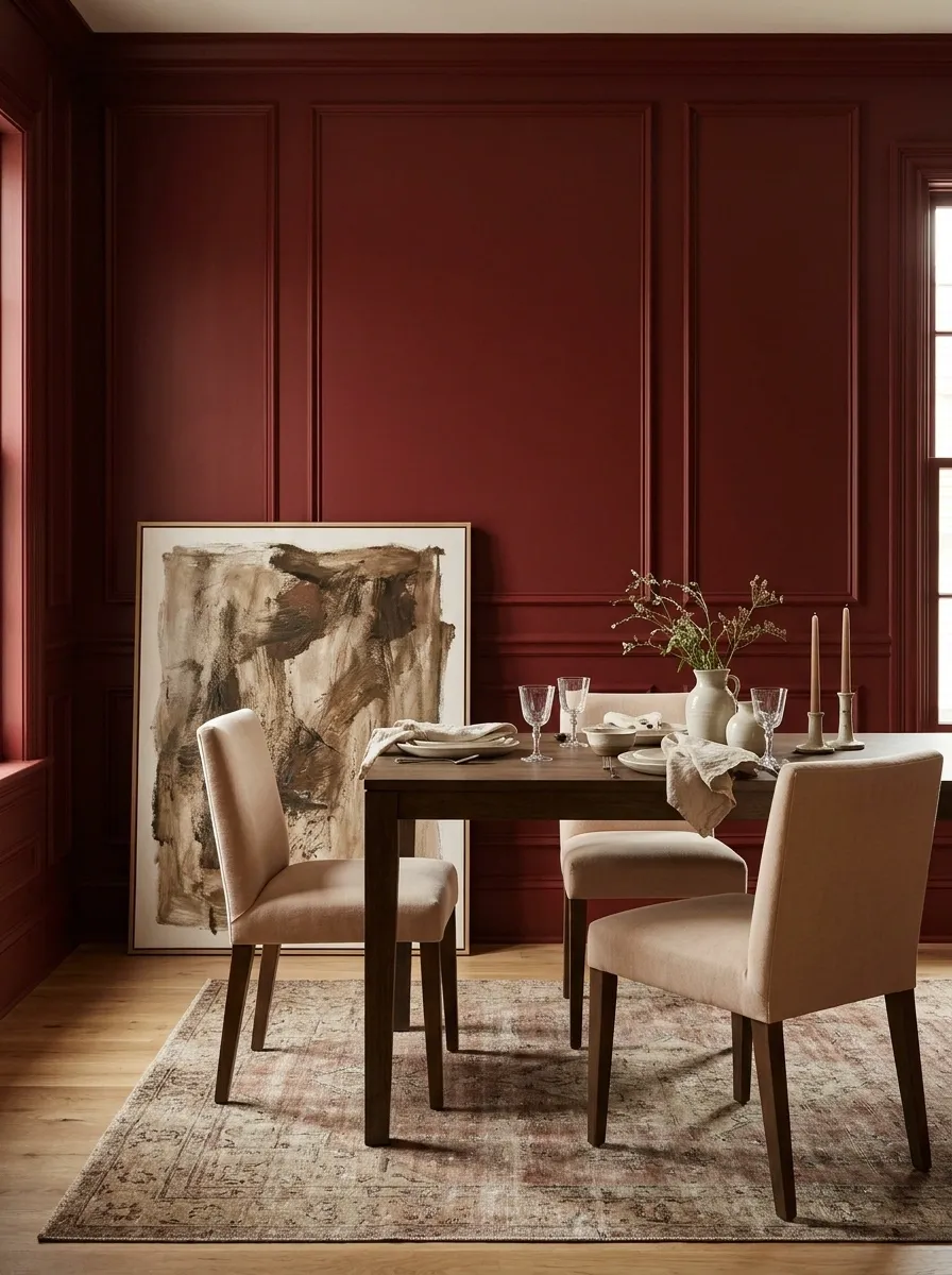
A claret dining nook feels intimate without requiring a formal dining room. Put the deeper color on the wall behind the table and use biscuit-colored upholstery to soften the seating.
Choose plain fabrics if the wall color is already doing the talking. One patterned shade or a worn rug is plenty of extra conversation.
| At the table | Around the table |
|---|---|
| Biscuit upholstery | Claret backdrop |
| Simple pottery | Dark, quietly finished wood |
| Clear tabletop space | One expressive artwork |
Mulberry and Aged Bronze
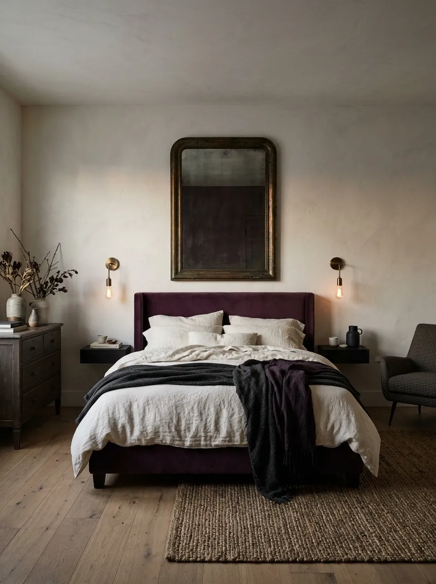
This is the palette for someone who likes their rooms a little mysterious.
Mulberry velvet, a bronze mirror, and warm off-white plaster create depth through different surfaces. Keep the metal aged or brushed. Shiny gold pushes the mood toward celebration; bronze feels more like the party has ended and the interesting conversation is finally starting.
Material cue: Let fabric absorb light while metal catches it. The difference creates more richness than adding another color.
Fig, Dove Gray, and Warm Wood
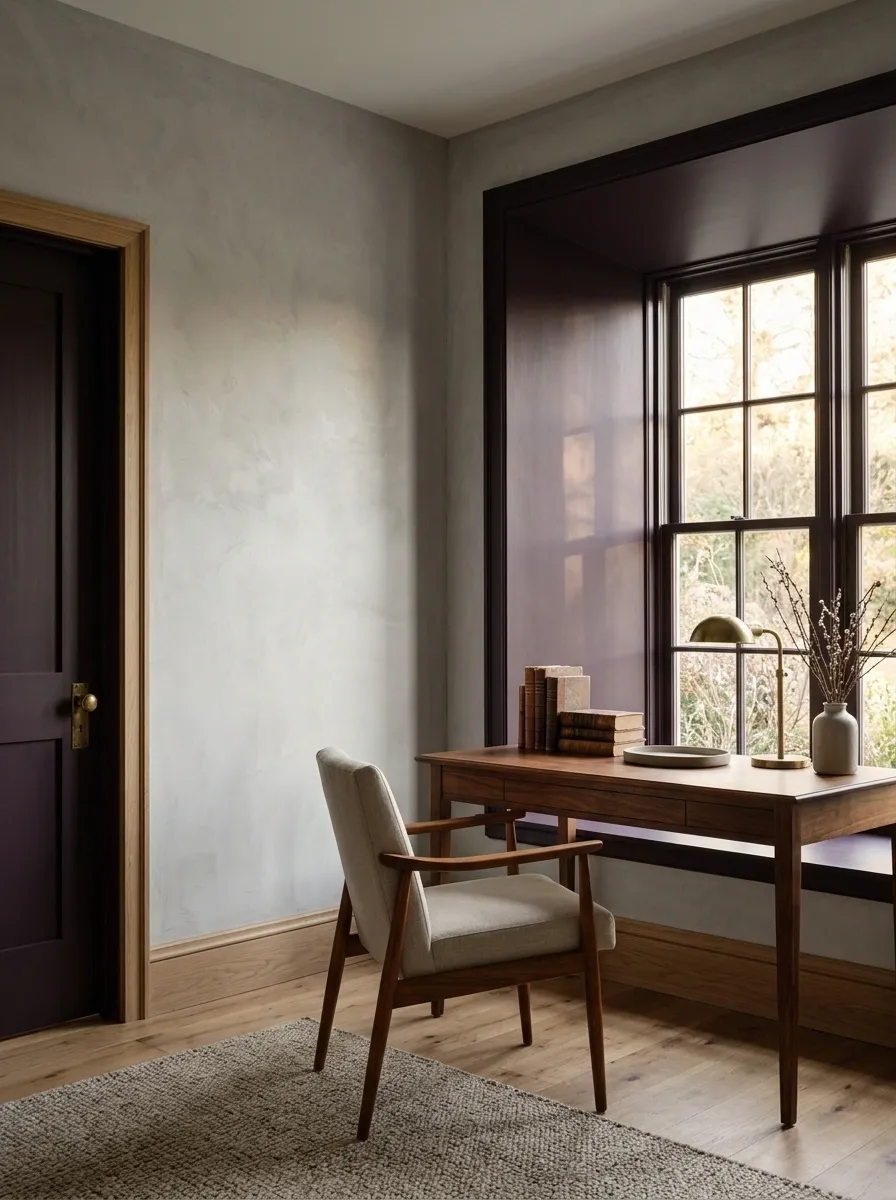
Fig is beautiful on a room’s smaller architectural elements: a door, built-in cupboard, or deep window reveal. Dove-gray walls keep the darker color from taking over.
Bring warmth through timber rather than another pinkish accent. This helps the combination feel composed, especially in an office or living room where a fully upholstered, plum-colored world might be a bit much.
Put the depth inside the opening
Dove-gray wall · fig-colored reveal · timber below
Midnight Blue and Copper Rose
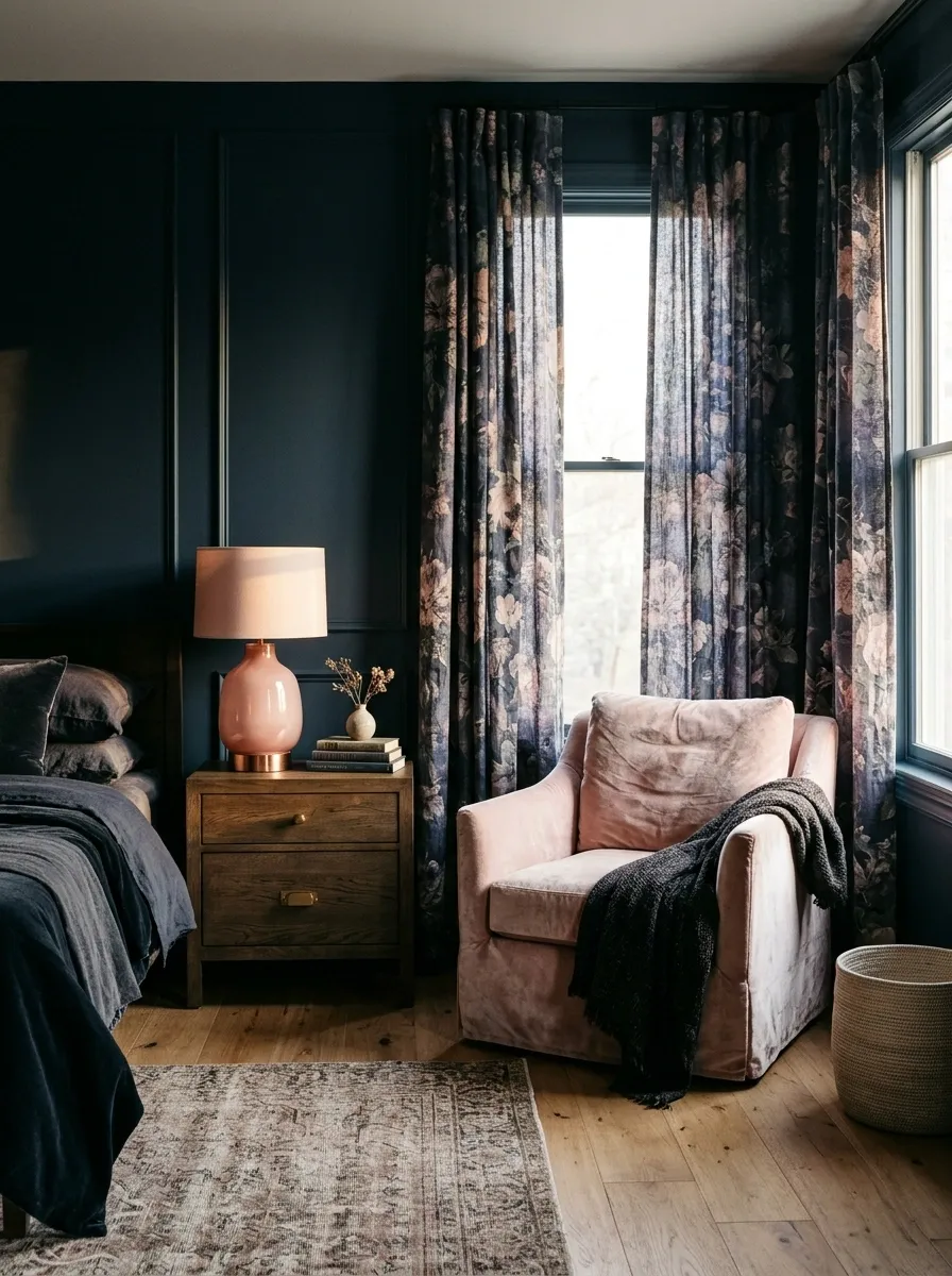
Midnight blue can make coppery pink feel quietly luminous. Use the blue behind a pale pink chair, a dusky floral curtain, or a rosy ceramic lamp.
The pink needs enough warmth to relate to the metal. An icy pink next to copper can look accidentally mismatched.
Keep: dark blue, a copper-rose emphasis, a warm neutral.
Remove: unrelated bright accents that break the atmosphere every time your eye reaches them.
Romance in Daylight
Apricot and Chalky White
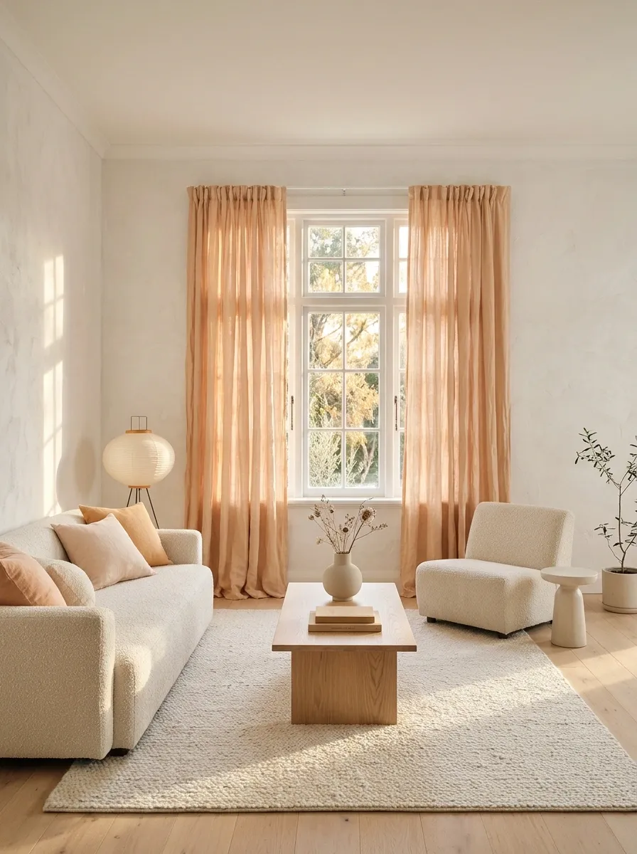
Apricot curtains can make a pale room feel softer even when the furniture is quite simple. Let the fabric be the large colored surface, with chalky walls and oak or beech nearby.
Avoid matching the walls exactly to the curtains. A little separation helps the fabric look intentional instead of as though the room has been dipped in one enormous peach yogurt.
Frame the light with apricot
Shell Pink and Pale Celadon
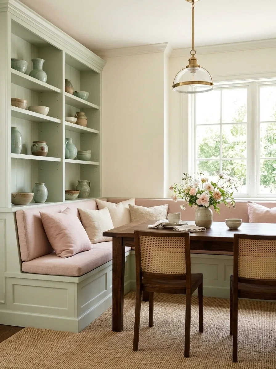
Shell pink and celadon suit a room that wants freshness without a cold finish. Use them through curtains, painted furniture, or a small breakfast corner.
Give one color a slightly stronger presence. Equal amounts of equally pale colors can disappear into a general pastel fog.
| Lead with | Support with | Ground it using |
|---|---|---|
| Shell-pink upholstery | Celadon ceramics | A dark wooden table |
| Celadon joinery | Shell-pink linen | Natural woven flooring |
Honey and Lavender Gray
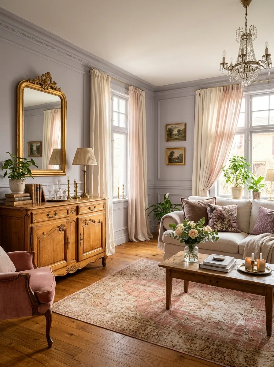
Honey-colored wood makes lavender gray feel warmer and less formal. This combination can work beautifully in a living room with an older wooden cabinet or amber-toned flooring.
Use lavender gray on the walls or the largest fabric. Keep supporting whites warm, and resist adding a matching purple collection. The wood is already doing half the color work.
Use what exists: If the room already contains warm timber, treat it as the honey component before buying another object.
Petal Pink and Oyster
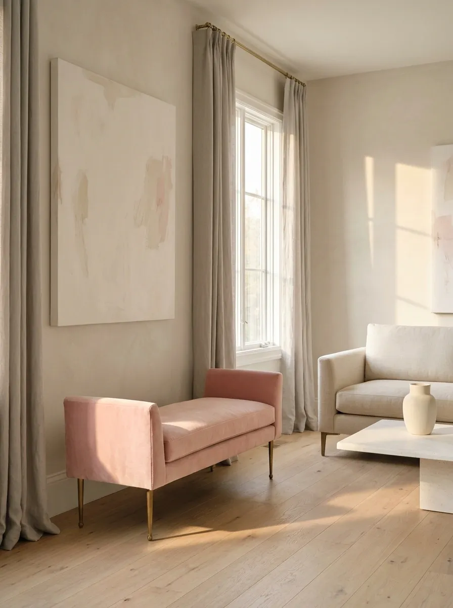
Oyster is useful when you like pink but do not want a noticeably pink room.
Keep the room mostly oyster, then let petal pink appear in a wide cushion, a small upholstered bench, or a piece of art with plenty of blank space. The effect is quieter when the pink arrives in a generous shape rather than lots of decorative dots.
A petal-colored seat in an oyster room
Let nearby walls, flooring, and curtains stay tonal.
Earthy Rooms With Soft Edges
Eucalyptus and Blushed Clay
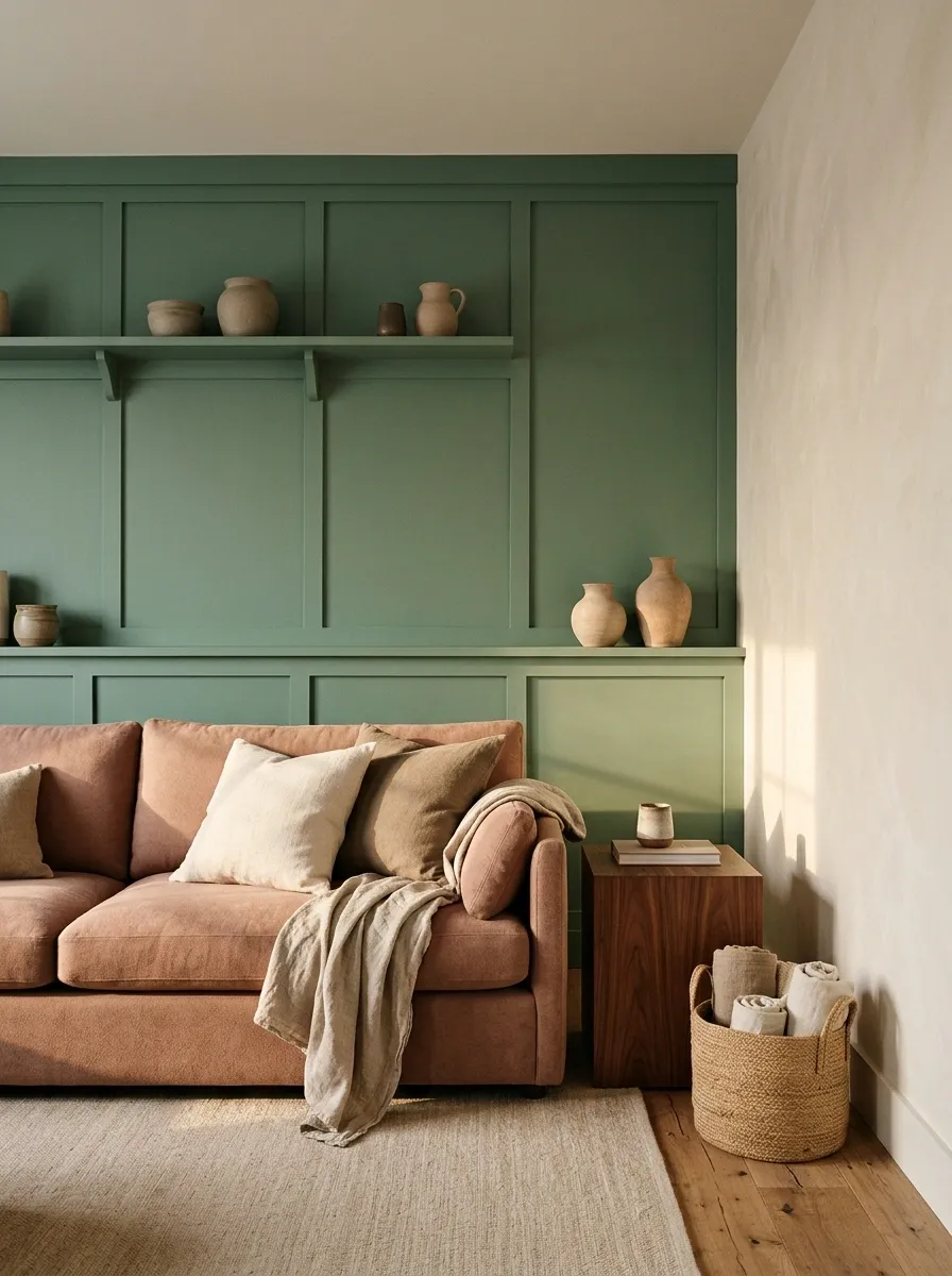
Eucalyptus green and blushed clay feel romantic in an unshowy way. Neither color needs to be particularly pale.
Use eucalyptus for a painted wall or cupboard, with clay-colored fabric nearby. Off-white and brown provide useful supporting tones. Skip excessive foliage prints: the palette already suggests the garden without needing to label every cushion as botanical.
| Room element | Color role |
|---|---|
| Painted joinery | Eucalyptus anchor |
| Curtains or seat pad | Blushed-clay softness |
| Larger background | Off-white pause |
Tobacco and Warm Porcelain
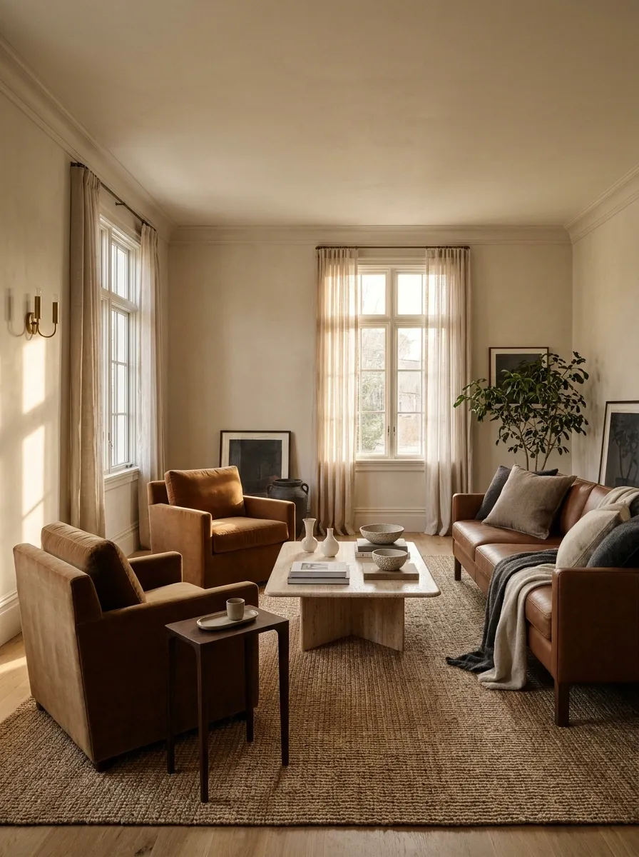
Romance can be almost neutral.
Tobacco leather or velvet against porcelain-colored walls has an intimate, collected quality. Start with low, comfortable seating, then change the visual weight of what sits beside it:
- A narrow lamp stem.
- A small glass vase.
- A delicate line drawing.
Those finer details stop substantial upholstery from becoming one solid block of brown furniture.
Contrast to seek: sturdy upholstery beside a delicate object; warm brown beside a clear light surface.
Sand and Dusty Coral
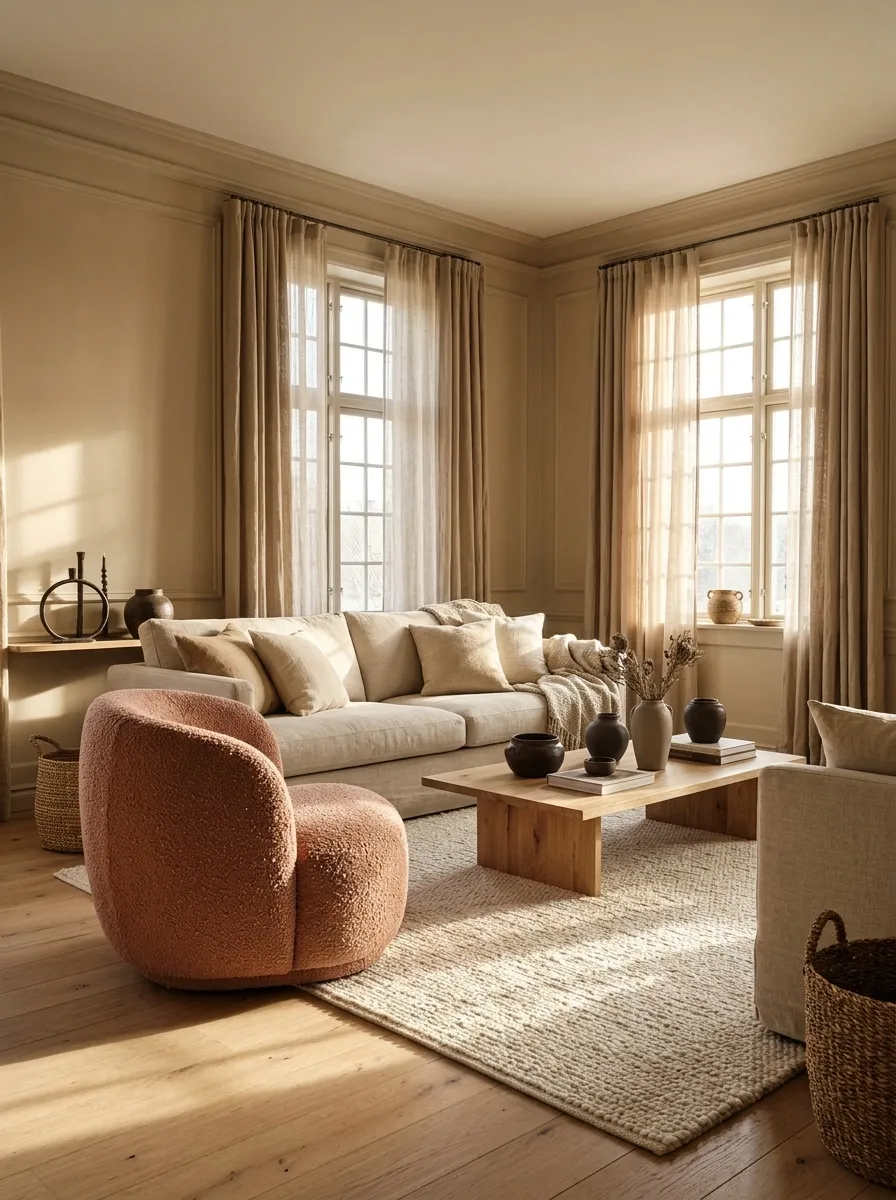
Sand and coral work well in rooms that need warmth but already receive strong light.
Keep the coral muted and the sand slightly varied across fabrics. A pale rug, deeper linen curtains, and a coral accent chair create more depth than matching beige everywhere. Small dark-brown details keep the room from becoming visually weightless.
Start here: Keep the walls sandy; introduce coral through something you can move.
Romantic Without Pink
Peacock Blue and Champagne
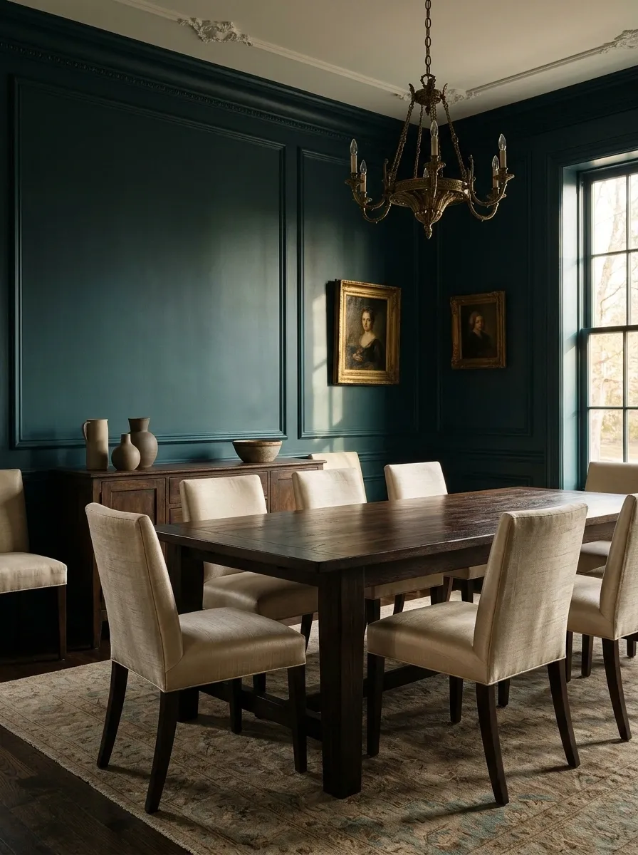
Peacock blue can feel luxurious in a dining room or sitting room, especially when champagne-colored fabric catches the light beside it.
Use champagne as a fabric tone rather than a command to buy shiny things. Linen, silk-like texture, and pale textured upholstery can all contribute. A darker wooden table gives the palette enough substance to avoid floating into occasion-only territory.
Deep blue-green, softened by pale fabric
grounding detail
Bitter Chocolate and Pale Gold
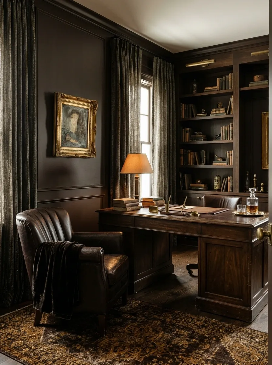
This palette belongs to intimate rooms with a little visual weight: a study, a reading room, a bedroom with substantial furniture.
Let pale gold appear in a curtain weave, a lampshade lining, or an aged frame. It should catch your attention occasionally rather than sparkle at you from every direction.
| Richness comes from | It does not require |
|---|---|
| Deep brown surfaces | A completely dark room |
| Restrained golden details | Shiny upholstery |
| Layers of texture | A matched accessory set |
Smoky Jade and Silvered Beige
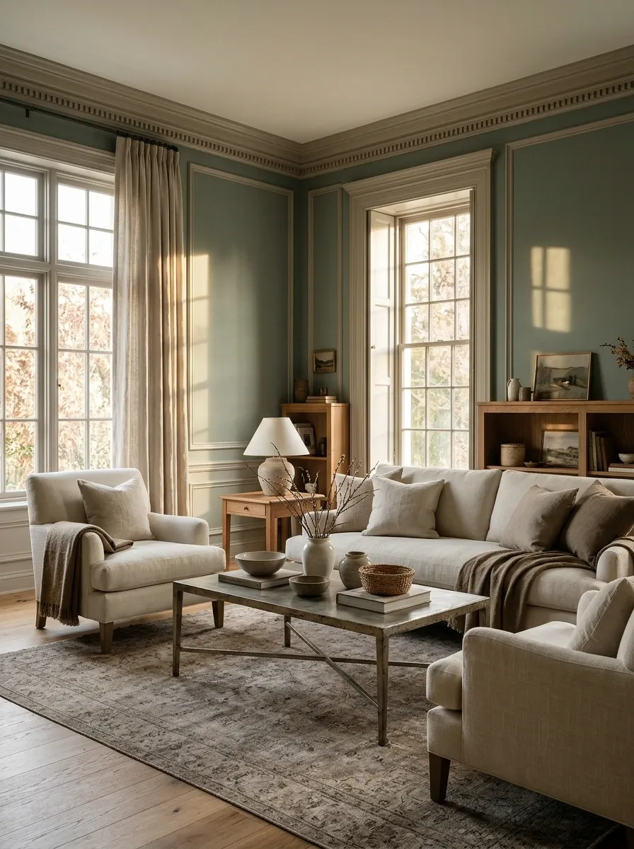
Smoky jade has a cool softness that works particularly well with silvered beige, pale upholstery, and aged nickel.
Keep the green slightly muted and introduce a warmer wood if the room starts to feel chilly. This is a good choice for someone who enjoys a restful palette but finds pink and peach too obviously decorative.
Room adjustment: Add warm timber before adding another cool metal. The palette needs a little temperature variation.
Aubergine and Pale Pistachio
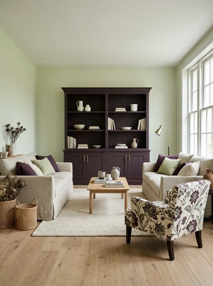
Pale pistachio makes aubergine feel fresher and less solemn. Use the green as a light background and the purple in a substantial textile or a painted cabinet.
This pairing can carry pattern well, provided the pattern includes both colors and leaves some open ground. Let the patterned piece be the bridge rather than introducing unrelated prints.
Let one textile connect the room
Olive Black and Pale Linen
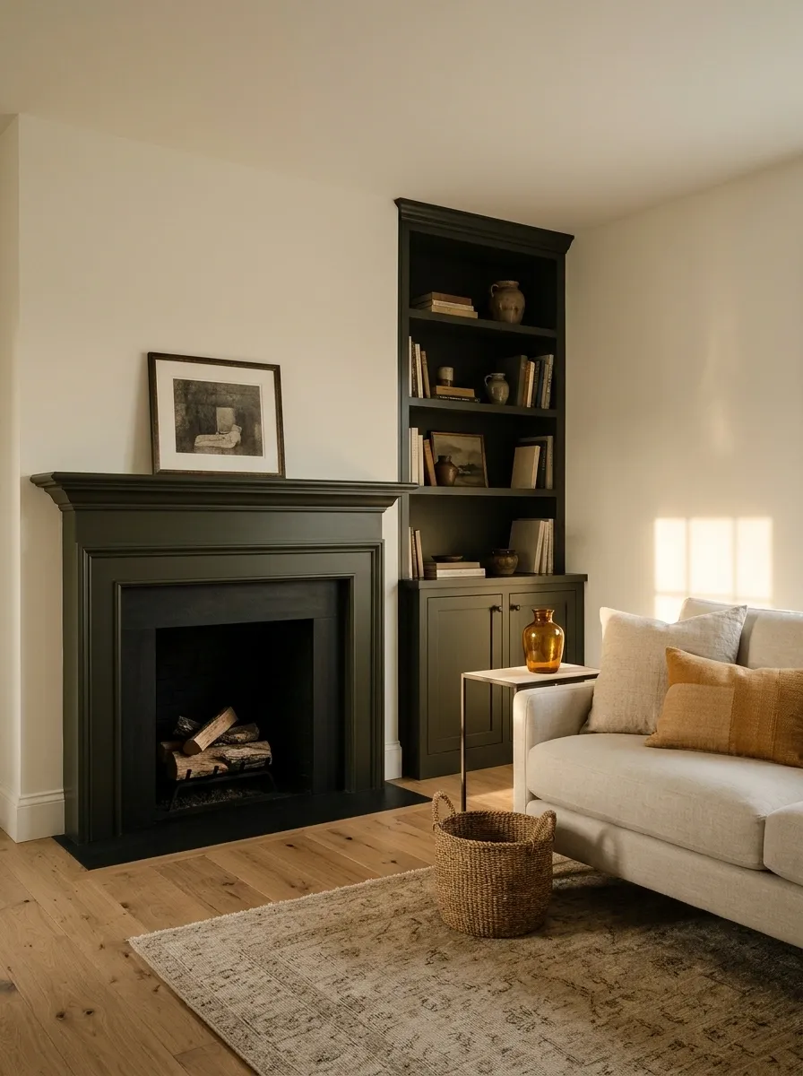
Olive black is especially attractive beside linen because its green undertone keeps the contrast from feeling purely graphic.
Use it on a small room’s door, a built-in cabinet, or a fireplace surround where the material and finish are suitable. Pale linen upholstery and simple cream walls provide balance. The effect feels private and settled rather than theatrically dark.
Finishing detail: One warm metal or amber glass object is enough to soften the darkest area.
Palettes That Welcome Pattern and Personal Things
Raspberry and Faded Flax
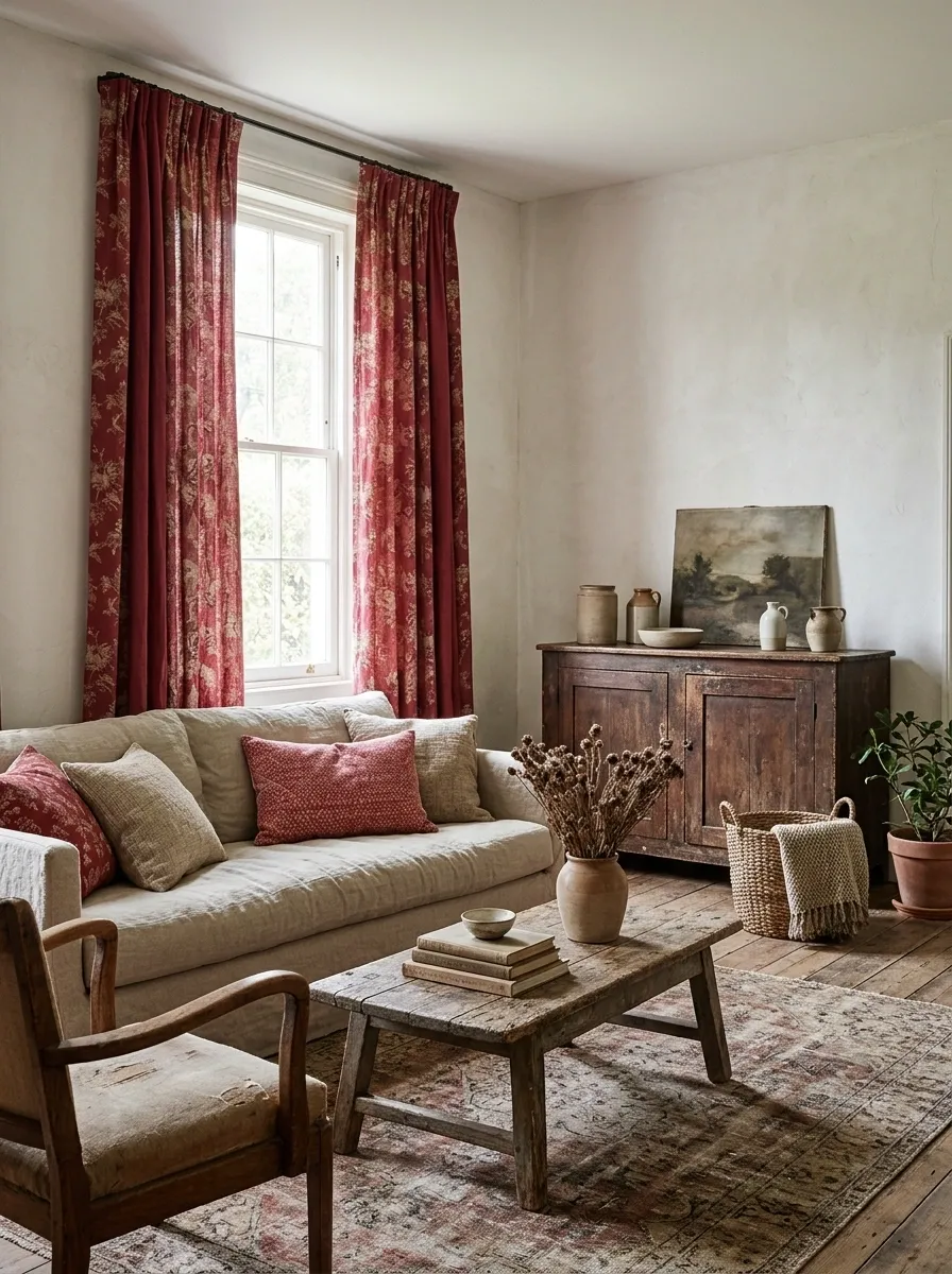
Raspberry looks less polished—and more appealing—when flax linen surrounds it.
A raspberry floral curtain, plain flax sofa, and old wooden table make a convincing combination. Keep the print from spreading to every fabric. The curtain can tell the story; the cushions do not all need speaking parts.
One expressive surface, quiet company
Faded Denim and Cherrywood
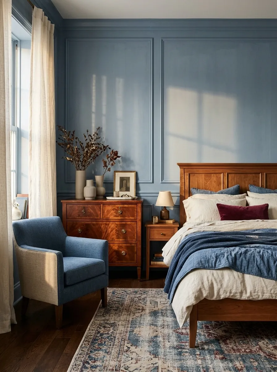
Cherrywood can be difficult to pair if you treat its red undertone as a problem. Faded denim makes it look intentional.
Try blue upholstery or curtains near the wood, supported by cream and a small burgundy detail. Avoid choosing a blue so pale that the furniture overwhelms it. A medium, softened shade gives the wood a proper partner.
| Already own | Try beside it |
|---|---|
| Cherrywood dresser | Denim-blue wall or curtain |
| Red-toned dining table | Faded-blue upholstery |
| Warm wooden bed | Blue bedding with cream sheets |
Warm Gray and Rose-Red Florals
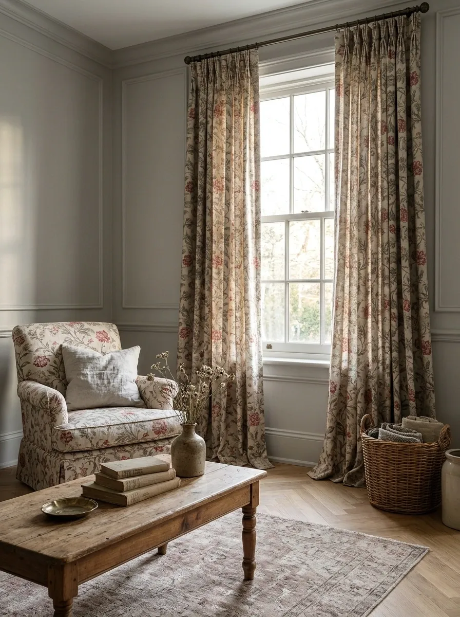
A gray room does not need to abandon its existing furniture to feel romantic. Bring in a floral with a rose-red emphasis and a warm neutral background.
Use the floral once at a useful scale: curtains, an upholstered chair, or a bedspread. Check that its background relates to the room’s gray. A bright white ground can make the existing finishes look unexpectedly muddy.
Before buying: Compare the print’s background against the wall and sofa. The quieter color often determines whether the whole pattern works.
Juniper and Cream With a Plum Accent
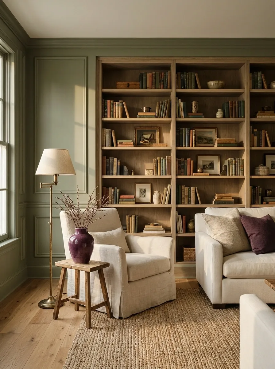
Juniper and cream create an easy foundation for mixed personal objects. The plum accent gives the room a slightly less expected edge.
Keep plum concentrated in one cushion, artwork, or ceramic piece. This is especially useful in a room with books and collections, where the palette should connect the contents rather than demand that every object be replaced.
Café au Lait and Antique Pink
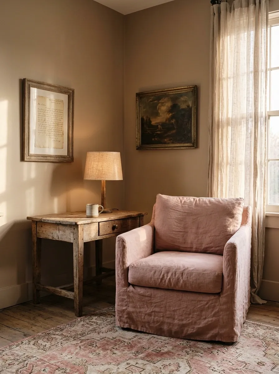
Antique pink brings tenderness to café-au-lait walls without making the room feel fragile.
For the pink, choose something that ages gracefully: washed linen, a softly patterned rug, an upholstered chair.
Then bring in a piece with a bit of history.
A repaired table. A framed letter. The lamp you have moved between homes. Romance becomes more convincing when something in the room actually means something.
Leave space for: a color you love, a useful object, and a little imperfection.
The Part a Palette Cannot Supply
A room can be perfectly coordinated and still feel strangely impersonal.
Keep the mug you like, the slightly odd painting, the chair that is comfortable enough to sit in for hours. Let your colors connect those things. A romantic room should invite you to stay, not make you nervous about disturbing the arrangement.