
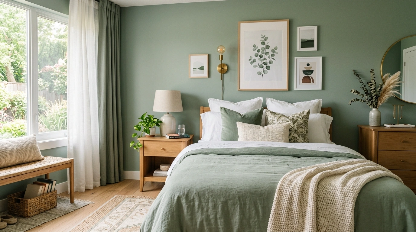
Sage green has an annoying habit of exposing bad design decisions. Pair it with cold white and the room can feel washed out. Add too much beige and everything starts looking muddy. Throw green onto every surface and the bedroom loses the calm quality that made sage appealing in the first place.
The color itself isn’t the problem. The problem is what surrounds it.
The best sage green bedroom ideas use the shade as a foundation, then build contrast with wood, warmth with aged metal, softness with fabric, and interest with carefully chosen patterns. The room doesn’t need a dozen matching accessories. It needs a few strong decisions that work together.
That means the bed matters. The curtains matter. Even the empty space on a nightstand matters.
The Sage Green Bedroom Formula
Sage works best when the room has a clear hierarchy. The green sets the mood, warmer materials give it structure, and a small amount of contrast keeps the whole space from looking washed out.
That balance gives the ideas below a clear direction. Each one solves a different part of the formula.
Anchor Sage With Matching Furniture
Monochromatic design can sometimes feel flat if every surface uses the exact same shade. Sage painted cabinetry prevents this by relying on built-in dimension and matching finishes.
A matching vanity and wardrobe setup makes the green feel purposeful rather than accidental. It creates a continuous visual flow along the wall.
Keep the hardware simple and dark to ground the lighter green tones. A pale stool or bench softens the grouping without introducing competing colors.
Pair Sage Walls With Warm White Instead of Stark White
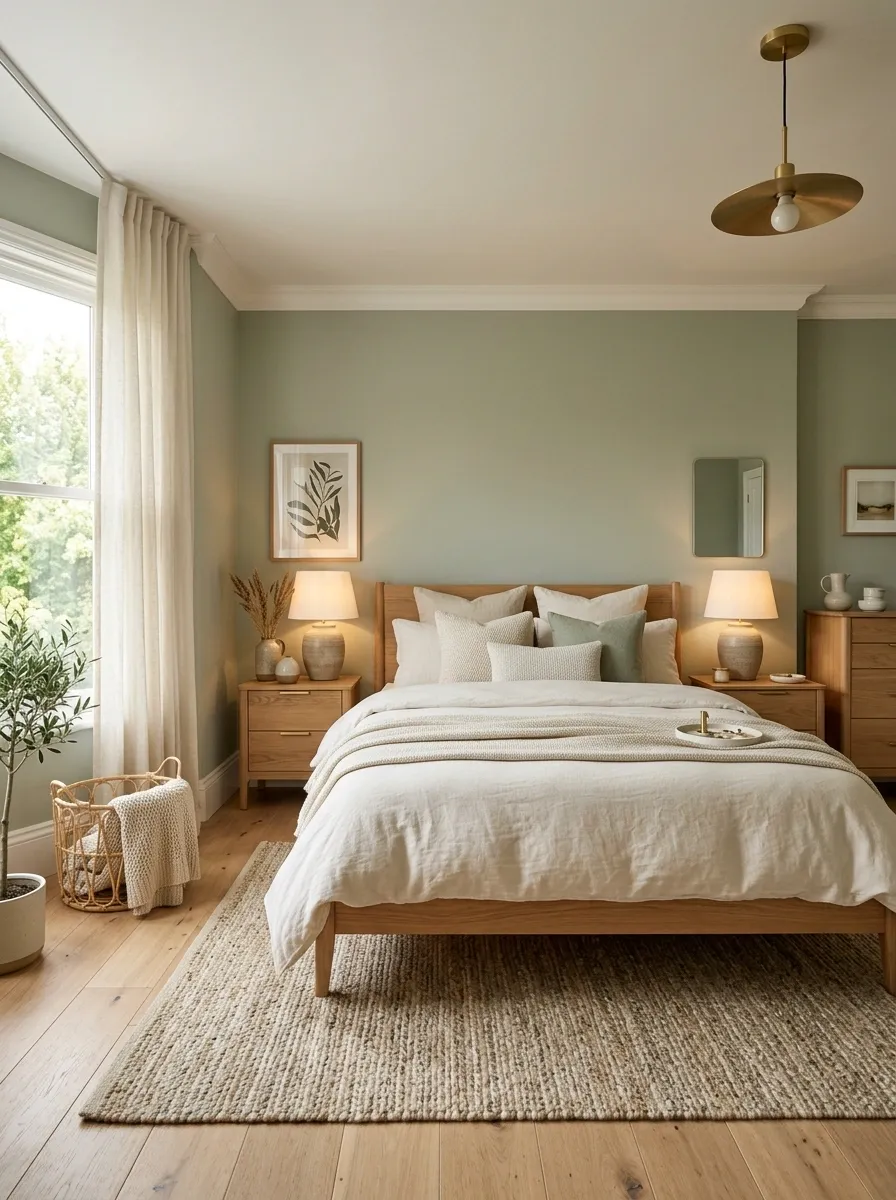
Stark white makes sage look colder than it needs to.
Warm white does the opposite. It pulls out the earthy side of the green and keeps the bedroom from looking like two unrelated colors were thrown together.
Use warm white on bedding, lampshades, trim, or curtains rather than introducing another competing shade.
Best pairing: soft sage + warm white + natural wood.
The result reads warmer before any accessories are added.
Style an Organic Gallery Wall
Sage walls provide a natural backdrop for botanical prints and earthy artwork. White frames keep the pieces crisp and distinct against the muted green background.
Symmetrical framing helps structured gallery arrangements look calm rather than cluttered. Keep the spacing even to maintain a serene bedroom atmosphere.
Pair the wall art with a scalloped mirror to break up harsh lines. The gentle curves add a touch of softness near the vanity area.
Use a Walnut Bed to Give Soft Sage Some Weight
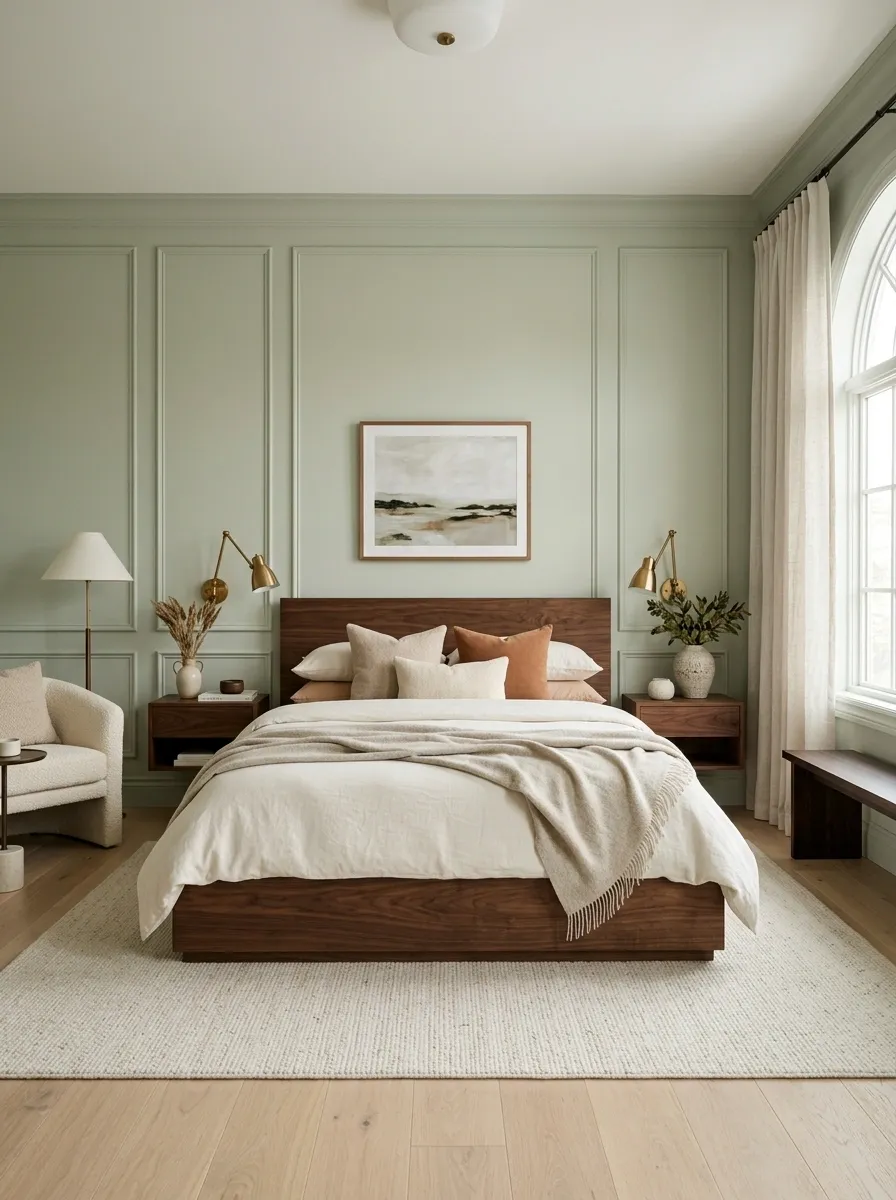
Pale sage can look a little weightless, especially in a bedroom filled with cream and linen.
A walnut bed fixes that immediately. Its deeper brown tone gives the eye something substantial to land on, while the green keeps the dark wood from feeling overly formal.
The combination works especially well when the floor and bedding stay light.
Build the contrast in this order:
- Sage wall
- Walnut bed
- Cream bedding
- Small brass details
The key is restraint. One substantial walnut piece does more than five small dark accessories scattered around the room.
Embrace Rustic Wood Textures
Exposed wooden beams and wood-paneled walls elevate a sage bedroom into a cozy rustic retreat. Natural wood grains bring warmth that balances out the cooler undertones of green.
Vertical paneling draws the eye upward, making the ceiling feel taller and the room more expansive. Paint the paneling in a soft, muted sage to keep the space feeling cohesive.
Layer in textured textiles like a chunky knit throw to complement the rustic architecture. The combination makes the entire room feel grounded and intentional.
Build a Tonal Sage Bedding Layer
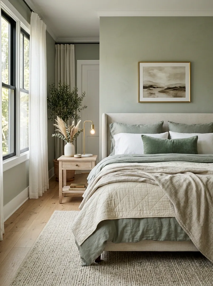
A sage wall doesn’t need another unrelated color competing with it.
Instead, let the bed move through several versions of the same family. Use a muted green sheet, a lighter quilt, an ivory layer, then one deeper throw or lumbar pillow.
The bed becomes dimensional without looking decorated to death.
Layer from quiet to strong: light → medium → texture → deeper accent.
The tonal approach also makes mismatched furniture easier to pull together because the bed already carries a strong visual relationship with the walls.
Create Symmetry With Botanical Art
Matching botanical prints hung in a neat row bring instant balance to a sage feature wall. The natural motifs reinforce the earthy quality of the green paint.
Keep the matting and frames uniform to let the subtle artwork stand out without overwhelming the space. This approach keeps the bedroom looking curated and calm.
Anchor the art above a classic wooden bed frame with neutral linens. The minimalist styling lets the color palette do the talking.
Add Aged Brass Where the Room Needs More Warmth
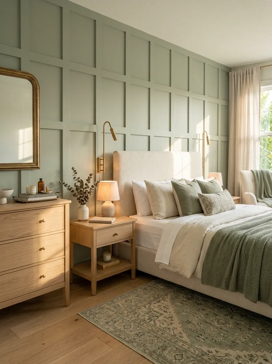
Too much green isn’t the only problem. A bedroom can also feel unfinished when every metal finish is silver, chrome, or black.
Aged brass brings in a warmer note without making the room look flashy.
Don’t scatter it everywhere. Repeat it in two or three spots so the eye notices the relationship.
Use brass on: bedside lighting, drawer pulls, a mirror frame, or one small decorative detail.
Design rule: Brass should repeat. It shouldn’t dominate.
The finish should look slightly aged rather than bright yellow. That keeps the bedroom grounded.
Layer Textures With a Statement Rug
A patterned rug with a muted, traditional motif adds subtle complexity to a sage bedroom. It breaks up solid flooring and ties together the surrounding green and neutral tones.
Keep the furniture light and airy to let the patterned rug remain the focal point of the floor plan. A round rug also helps soften the sharp corners of the room.
Incorporate warm bedside lighting to cast a soft glow over the textures. The right lighting brings out the depth in both the rug and the walls.
Let Cream Curtains Soften a Full Sage Wall
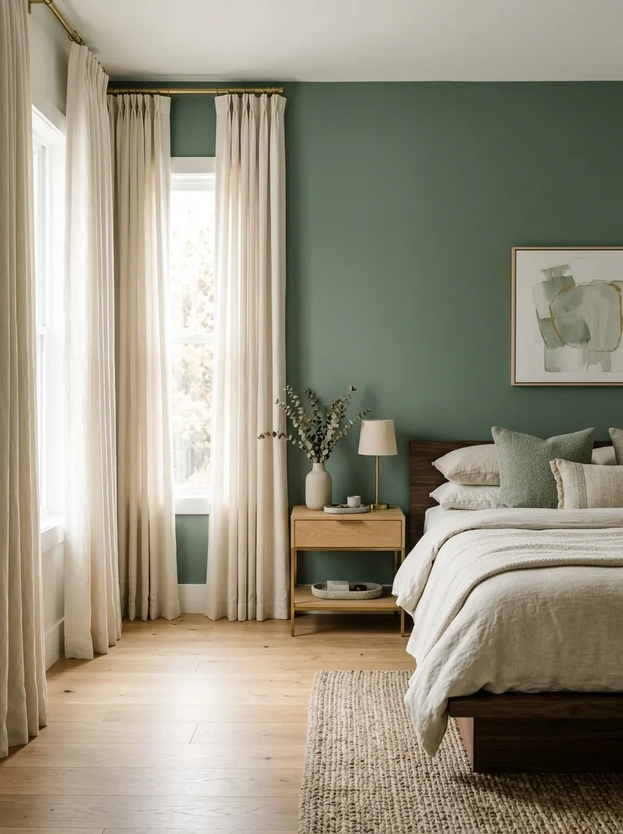
A full sage wall can feel visually dense when the room has no large pale element to break it up.
Cream curtains solve that problem from floor to ceiling. They create a vertical light zone beside the green and make the entire wall feel less heavy.
Mount the curtain rod high and let the fabric fall generously. Skinny curtains sitting just over the window won’t create enough visual softness.
Creates a taller visual line.
Softens the wall from ceiling toward floor.
Keeps the palette warm instead of stark.
That simple curtain change can make a painted bedroom wall feel much more intentional, especially when the bed and flooring already have darker tones.
Ground Pale Sage With a Natural Jute Rug
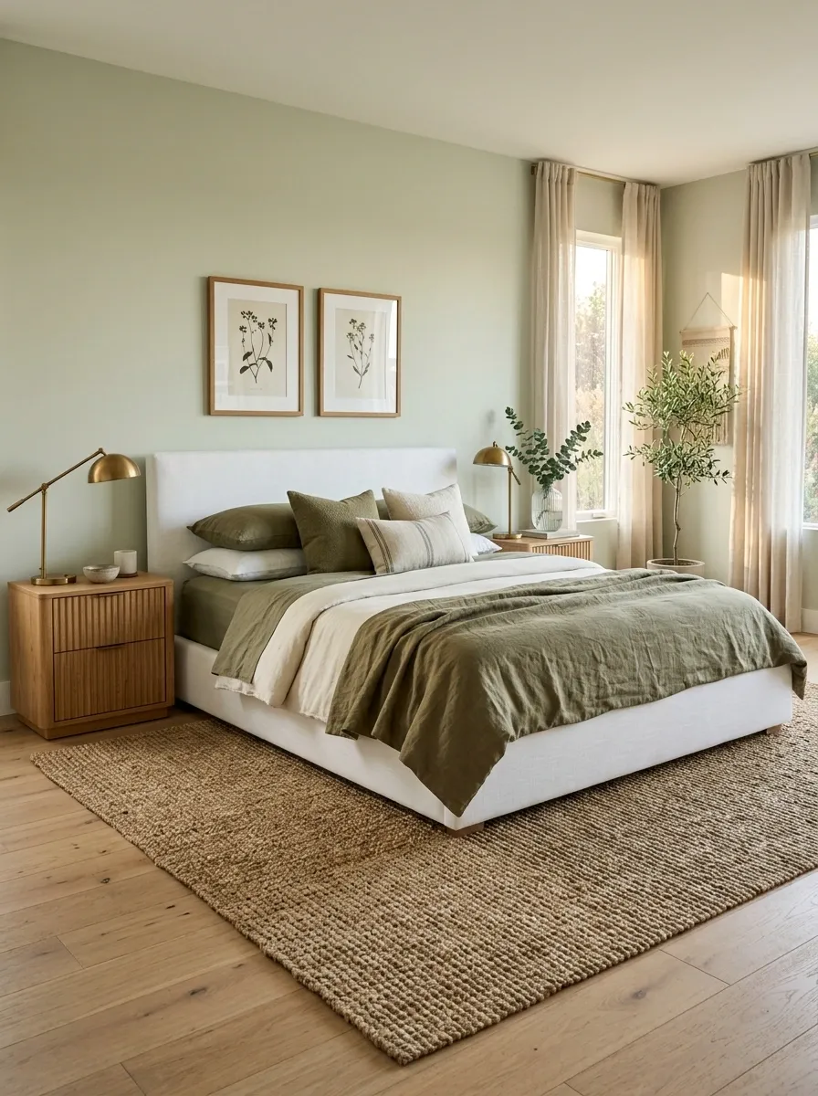
Pale sage needs something earthy underneath it. A natural jute rug does the job without adding another strong color to the room.
Place the rug far enough under the bed that it visually connects the bed, nightstands, and lower half of the room. A tiny rug floating in front of the bed breaks that connection.
Use this placement
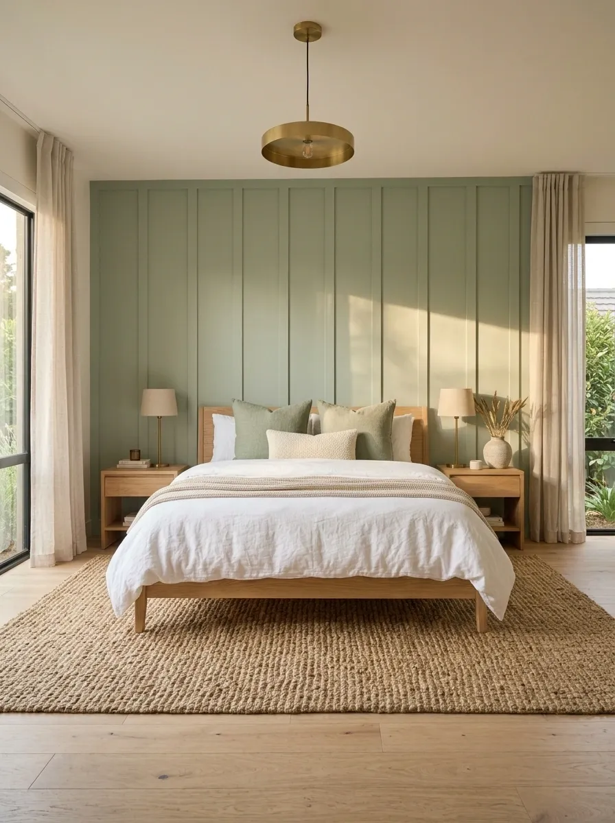
Jute also introduces visible texture, which matters when the rest of the palette is soft and matte.
Paint the Ceiling a Lighter Sage for a Wrapped-In Feel
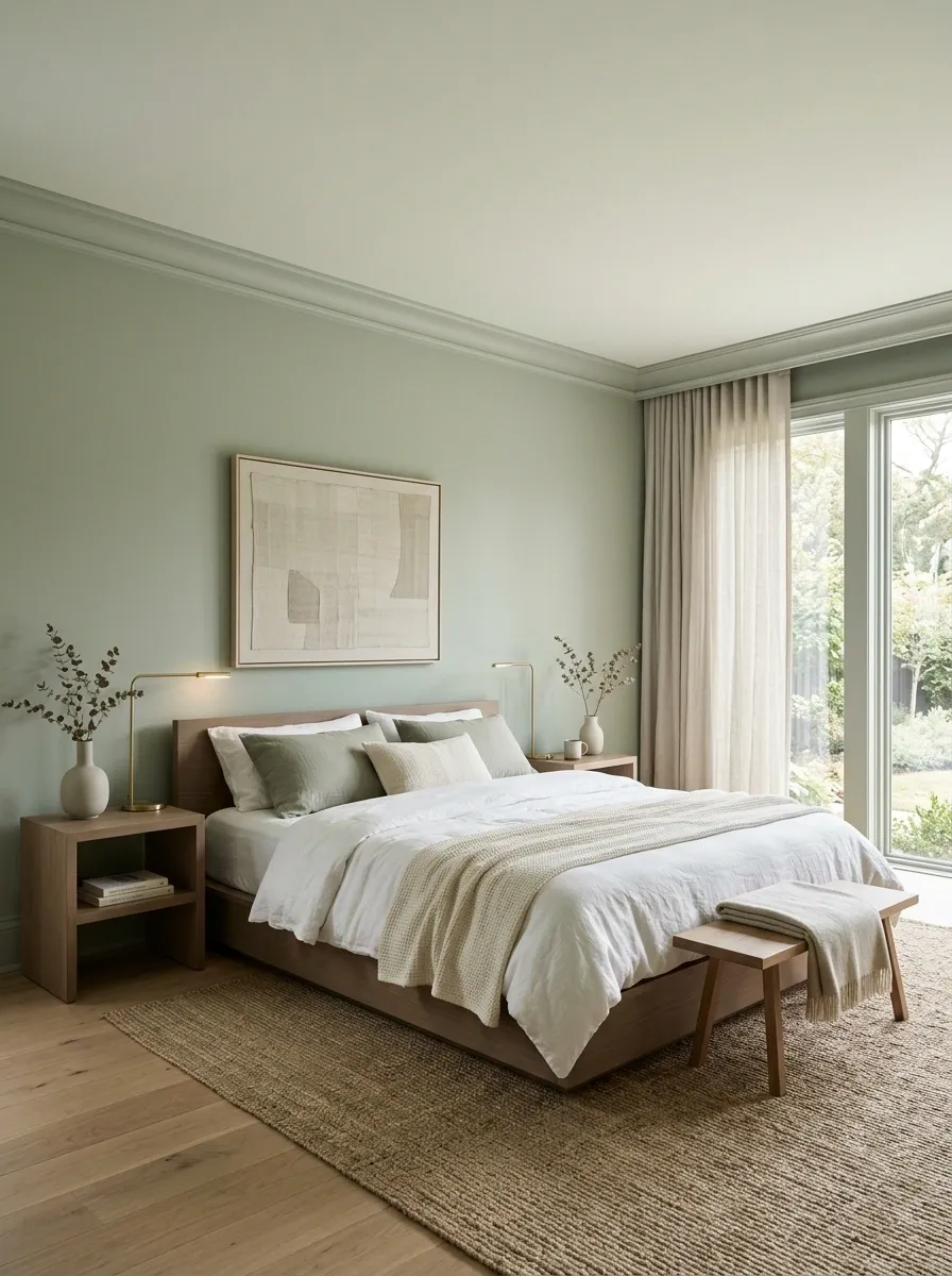
A ceiling doesn’t always need to stay white.
A much paler version of the wall color can make a sage bedroom feel enveloping instead of chopped into separate surfaces. Keep the ceiling noticeably lighter than the walls so the room still has an upward visual lift.
This works best when the furniture remains simple.
Very light sage
Main sage tone
Deeper grounding tone
The lighter ceiling keeps the room from feeling like one giant block of green.
Mix Sage With Chocolate Brown for a Moodier Bedroom
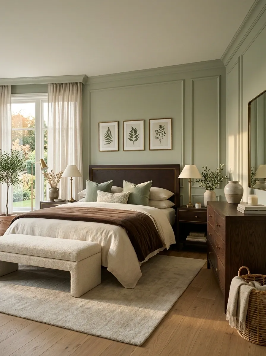
Chocolate brown is far more useful with sage than plain black.
Black creates sharp contrast. Chocolate creates depth. That difference matters in a bedroom where the goal is warmth rather than drama.
Use brown on the bed, dresser, bench, or picture frames, then let cream and sage occupy the larger surfaces.
| Combination | What it does | Best use |
|---|---|---|
| Sage + chocolate | Warm, earthy contrast | Beds, dressers, frames |
| Sage + black | Sharper, stronger contrast | Lighting and small hardware |
| Sage + pale oak | Airier and softer | Small or low-light bedrooms |
Chocolate brown works especially well in larger furniture because the color has enough visual weight to anchor pale sage without overpowering it.
Use Botanical Art Without Turning the Room Into a Theme
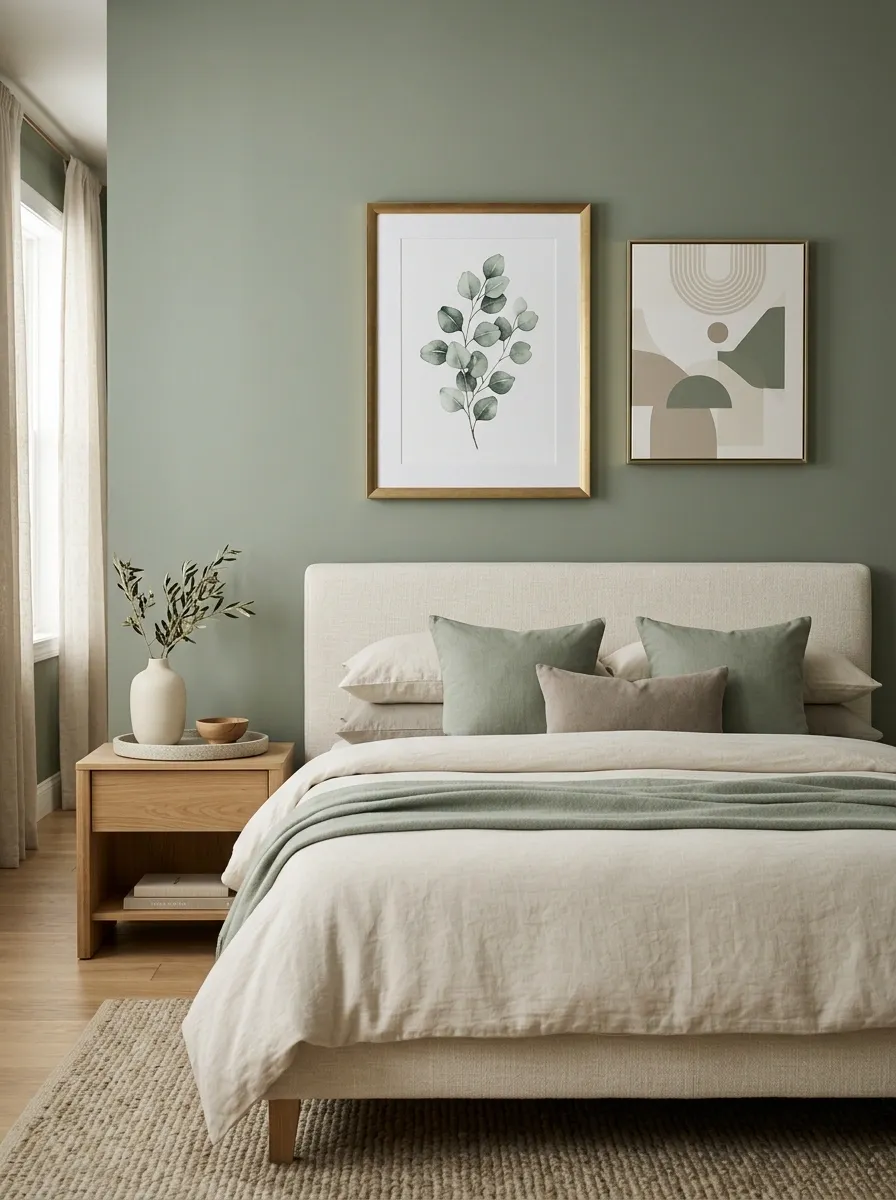
Botanical art works with sage because the colors already share an earthy relationship.
The mistake is using a matching leaf print on the walls, bedding, curtains, pillows, and rug. Suddenly the room looks themed instead of layered.
Choose one botanical focal point, then let the rest of the room stay quiet.
SHAPE
The artwork should echo the room’s colors, not repeat its exact patterns.
Keep the Nightstands Simple and Let the Walls Work
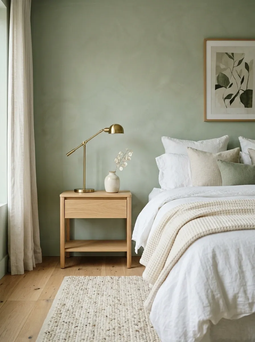
A sage bedroom doesn’t need decorative clutter on every horizontal surface.
Nightstands are where rooms get overloaded fastest. A lamp, one useful object, and a little breathing room usually look stronger than a pile of candles, books, trays, and tiny accessories.
Spot the difference
The empty space is part of the design. It gives the sage backdrop room to breathe and keeps the bedside area functional rather than fussy.
Bring in Linen Texture When the Palette Feels Too Smooth
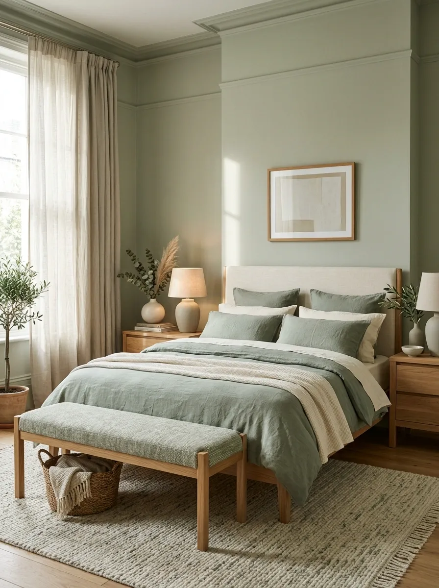
Sage, cream, and wood can look beautiful together, but the room still needs tactile contrast.
Linen is the easy answer. Its loose weave gives the eye something to read, especially when the larger surfaces are painted walls and smooth furniture.
Use it on the duvet, pillow covers, curtains, or a relaxed bench cushion. Don’t add five different fabrics just to create texture. Two or three distinct materials are enough.
That combination feels layered without making the bedroom look overloaded with accessories.
Choose a Sculptural Lamp Instead of More Decorations
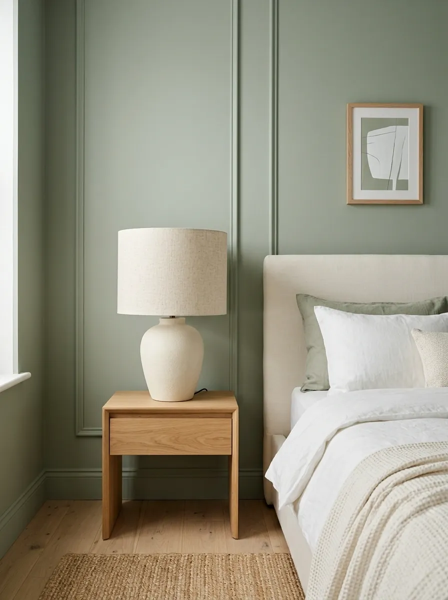
When a bedside corner feels empty, the instinct is usually to add more objects.
That’s backwards.
A strong lamp can fill the visual role of several small decorations while still being useful. Look for a rounded ceramic base, oversized shade, ribbed glass, or another distinct silhouette that can hold its own beside the bed.
Keep the tabletop simple underneath it.
Let one object carry the corner
The lamp becomes the punctuation mark. Everything else can stay quiet.
Use Dusty Rose Bedding to Break Up Cooler Sage
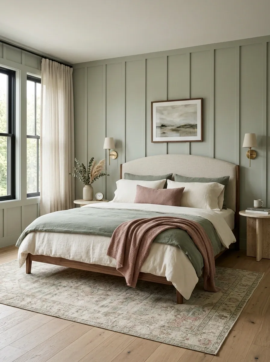
Sage sometimes leans cooler than expected, particularly in rooms with cool gray finishes.
Dusty rose warms it without destroying the calm palette.
The trick is scale. Keep sage on the larger surfaces and use dusty rose on one or two bedding layers rather than turning the bed pink.
A dusty rose lumbar pillow or folded throw is usually enough to create the temperature shift.
Create a Small Reading Corner With One Statement Chair
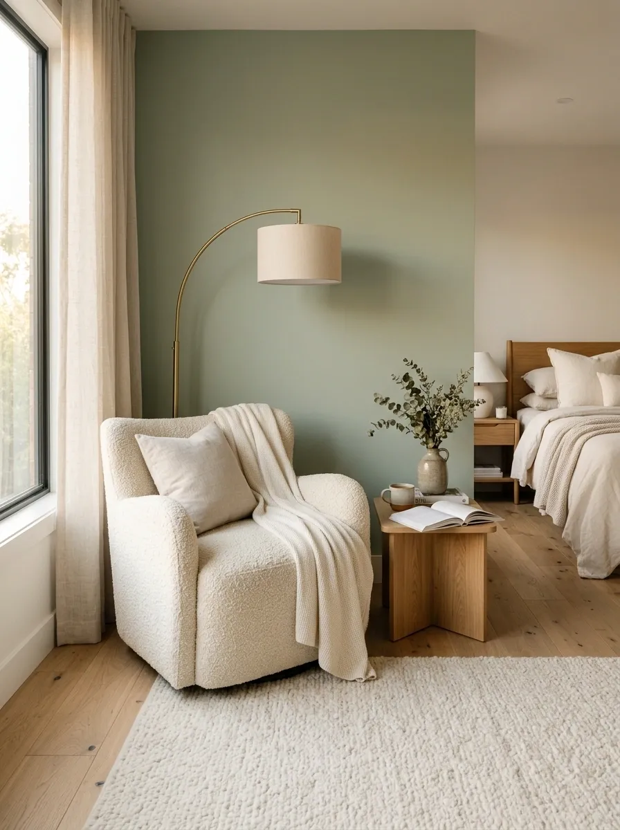
A bedroom reading corner doesn’t need a whole furniture collection.
One substantial chair, one floor lamp, and a tiny side table can create a complete secondary zone. The key is leaving a clean path between the bed and the chair.
Choose a chair with enough visual character to look intentional against the sage wall.
Quick setup checklist
Boucle, leather, or textured upholstery gives the corner a clear identity.
A slim floor lamp fills the upper half of the corner without bulky furniture.
A compact table is enough for a book and a drink.
That corner gives the bedroom another purpose without stealing attention from the bed.
Use Striped Bedding for a More Relaxed, Collected Look
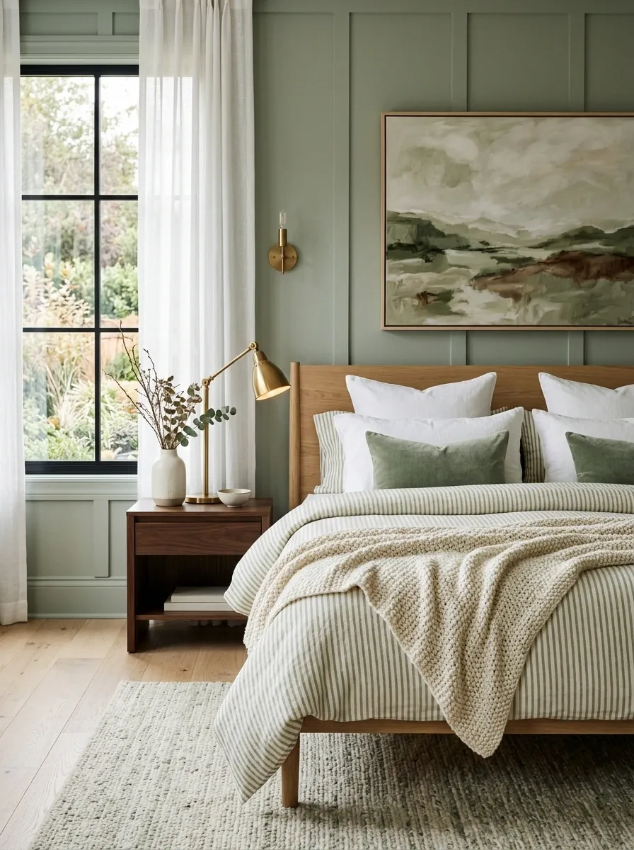
Sage bedrooms can become overly soft when every fabric is solid.
A simple stripe breaks that softness without introducing another complicated pattern. Keep the stripe narrow and relaxed rather than going for a bold graphic pattern. Cream with muted sage is the safest combination, while a faded brown stripe works when the furniture is darker.
The goal isn’t to make the bed busy. It’s to give the eye one clean rhythm.
That small shift is enough to make a plain bed feel more relaxed and lived-in.
Add a Vintage Dresser Instead of Matching Every Piece
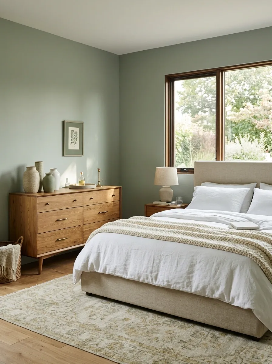
Matching bedroom furniture can make sage walls feel strangely flat because every object has the same visual weight.
A vintage dresser introduces a different wood tone, silhouette, and surface texture. That’s exactly what a muted green room needs.
Look for a dresser with visible grain, tapered legs, aged hardware, or a slightly weathered finish. It doesn’t need to match the bed. It needs to relate to it.
The furniture mix should feel collected
The pieces don’t need identical finishes. A shared material or repeated undertone is enough to make the mix feel deliberate.
Keep Small Bedrooms Light With One Dominant Sage Surface
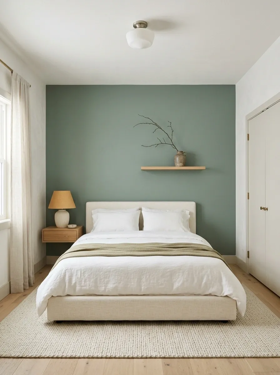
Small bedrooms don’t need sage on every wall, the ceiling, the doors, and the furniture.
That much color can visually compress the room.
Pick one dominant sage surface and keep the other major planes light. The wall behind the bed is usually the strongest candidate because it naturally becomes the room’s focal plane.
The room will still feel green. It just won’t feel swallowed by the color.
Layer Sheer and Blackout Curtains for Better Day-to-Night Balance
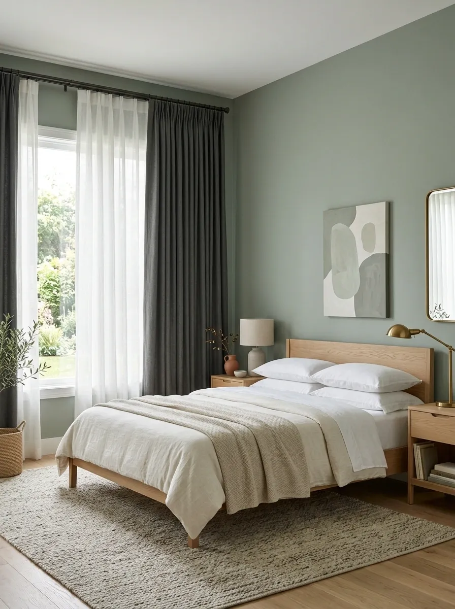
One curtain panel often has to do too many jobs.
Sheers handle daylight and privacy while blackout panels handle sleep and visual weight. Together, they also create more depth around the window, which is valuable in a bedroom with relatively simple furniture.
Use the lighter fabric closest to the window and the heavier panel farther out.
Keeps daytime light soft.
Adds privacy and stronger visual framing.
Creates a fuller, more finished window.
That layered window treatment adds softness without needing another decorative object.
Bring Sage Into a White Bedroom With Smaller Repeating Accents
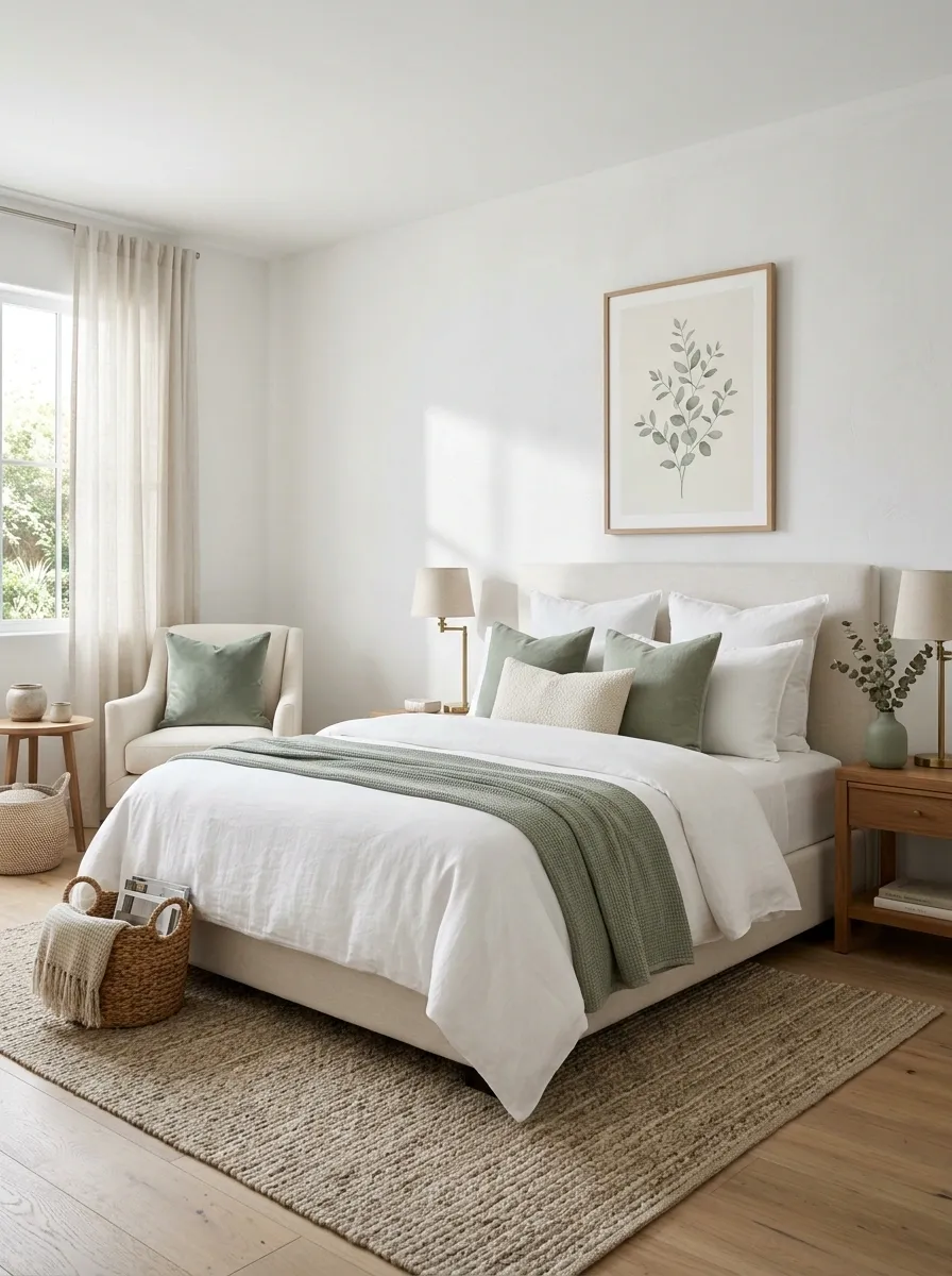
A full sage bedroom isn’t the only way to use the color.
White walls can actually make sage accents look fresher because the green gets room to repeat. The trick is repetition. A sage pillow alone looks random. Sage appearing on the throw, artwork, and one small accessory feels intentional.
Repeat the color across the room
This approach is especially useful for renters or anyone who wants sage without repainting the bedroom.
Use Terracotta Sparingly Against Muted Sage
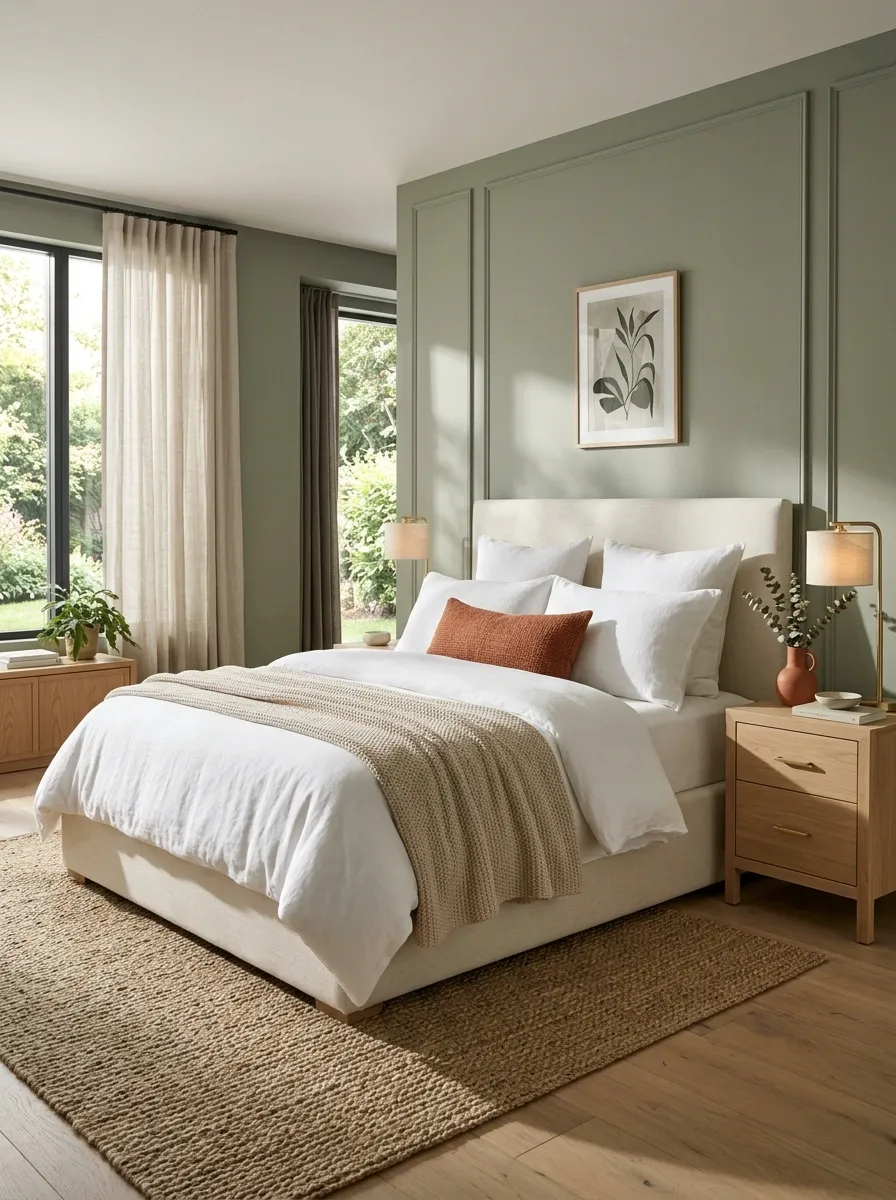
Terracotta is powerful beside sage, which is exactly why too much of it ruins the balance.
A single terracotta pillow, ceramic vase, woven throw, or small artwork detail can warm the room immediately. Three or four large terracotta pieces start competing with the green.
Keep the warm color low in the visual hierarchy. Sage should still own the room.
Don’t replace it.
Main visual field
One or two visible accents
The safest places for terracotta are lower-impact pieces where it can be removed or swapped without changing the whole room.
Frame the Bed With Matching Wall-Mounted Lights
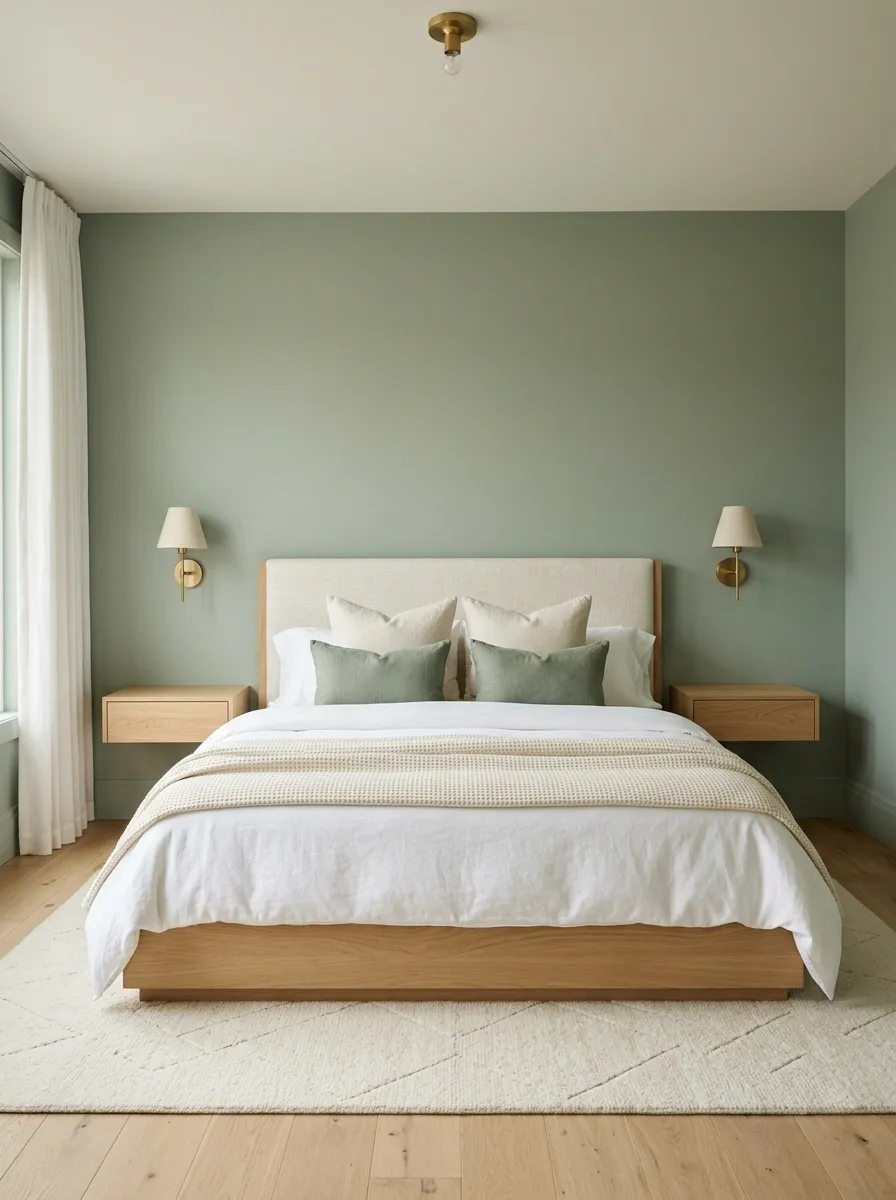
Bedside lighting doesn’t need two chunky lamps sitting on two bulky nightstands.
Wall-mounted lights free up those surfaces and create a clean frame around the bed. The symmetry is especially effective against sage because the green wall becomes part of the composition rather than empty background.
Choose fixtures with warm metal, matte ceramic, or a simple dark finish.
Build the frame from the center outward
The payoff is more than saved nightstand space. The wall itself becomes the bedroom’s architectural backdrop.
Mix Plaid, Floral, and Solids Without Making Sage Feel Busy
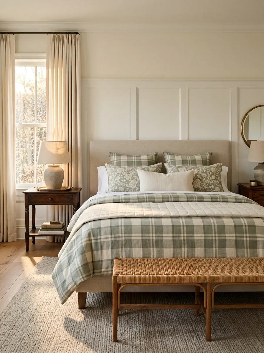
Three patterns can work together, but only when they have different jobs.
Let one pattern lead, one pattern support, and one layer remain solid. Keep the colors within the same muted family so the patterns feel related even when their shapes are different.
A tiny floral shouldn’t compete with a large plaid. Scale matters as much as color.
The pattern rule is simple: different scales, related colors, clear hierarchy.
Finish the Room With Aged Wood and Soft Ivory Accessories
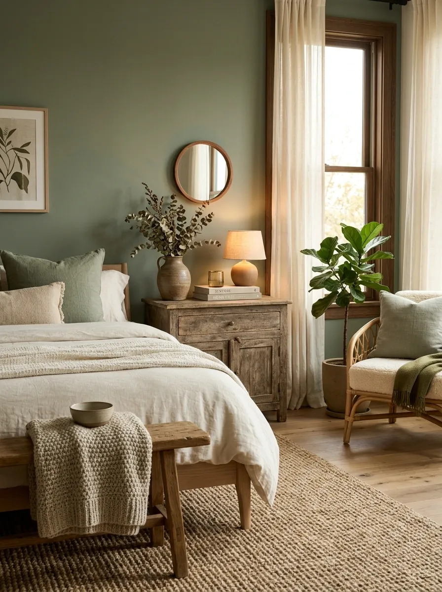
The last layer shouldn’t introduce a completely new design language.
Aged wood, ivory ceramics, linen, and woven materials reinforce the earthy quality that made sage work in the first place. These details are quiet, but they stop the room from feeling like it was assembled from a single shopping trip.
Use accessories that have slightly imperfect surfaces rather than everything being glossy and identical.
These materials give the room character without pulling it away from its original palette.
Make Sage Green the Background, Not the Entire Story
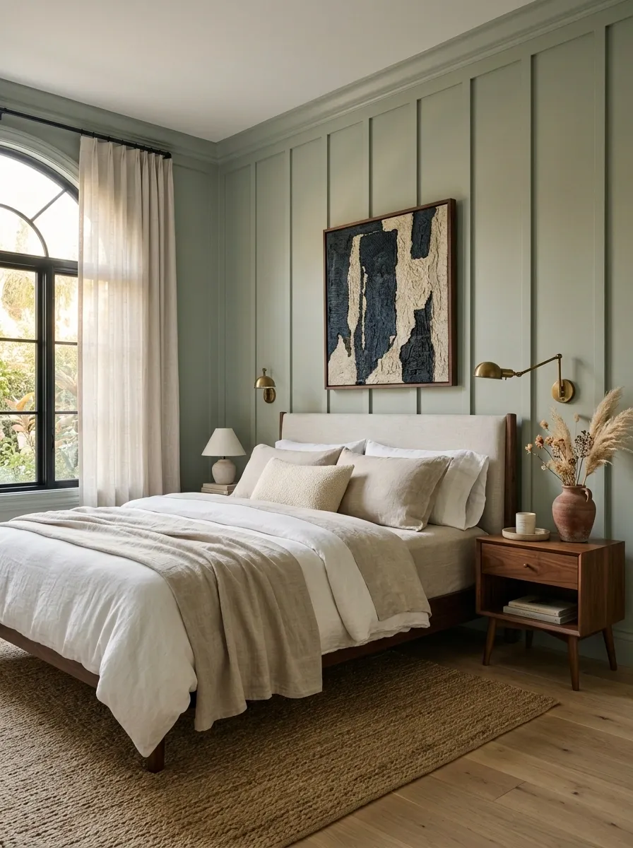
The strongest sage bedrooms aren’t green from floor to ceiling.
They use sage as the backdrop for warmer wood, quiet fabrics, contrasting art, useful lighting, and a few pieces with personality. That’s what keeps the room calm without making it bland.
Before adding another green object, check whether the room needs contrast, texture, warmth, or simply empty space instead.
Add aged brass, walnut, or terracotta.
Bring in linen, jute, boucle, or rough wood.
Use dark wood, deeper art, or stronger silhouettes.
Remove an object before adding another.
That’s the difference between a bedroom that’s simply painted sage and one where the color actually feels intentional. Save this list for the next bedroom refresh, especially when the room needs softness without drifting into bland or overly coordinated territory.