
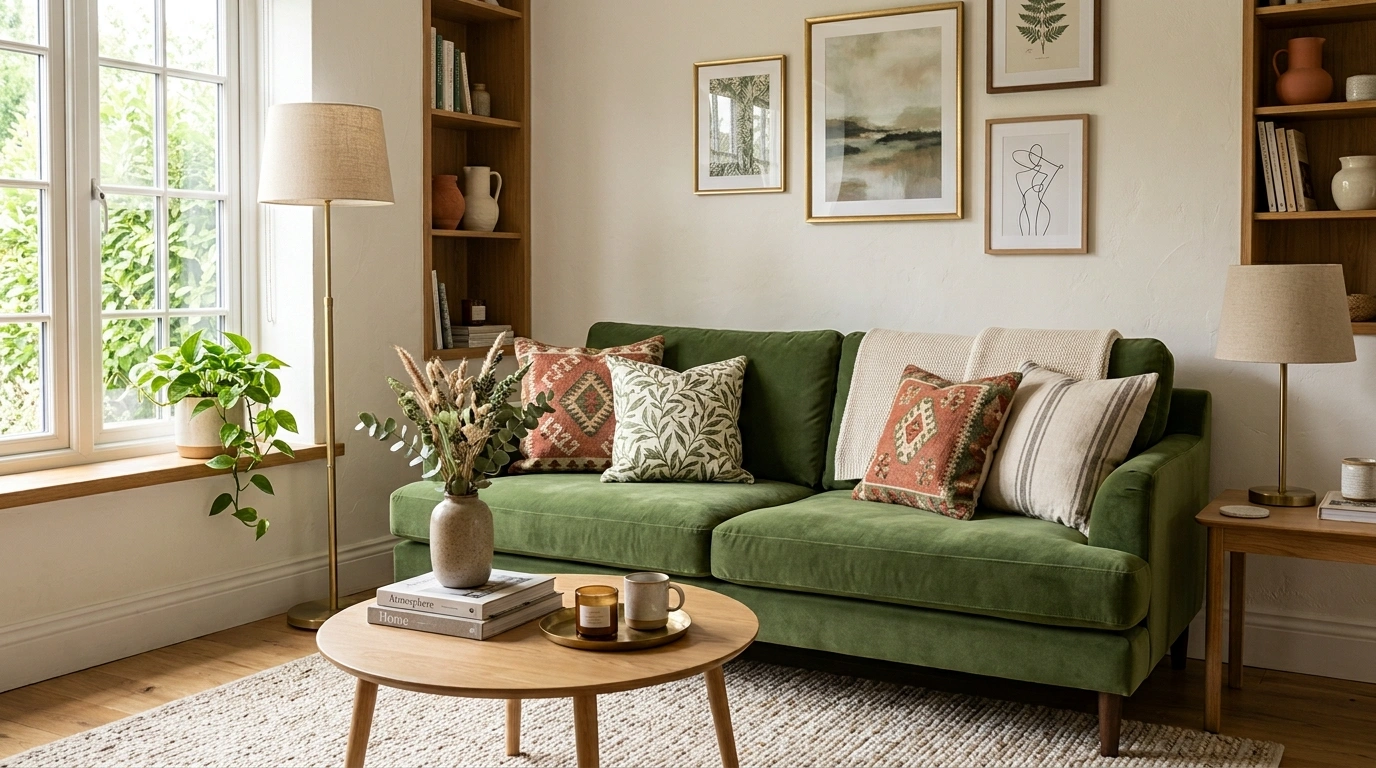
Some rooms don’t need a makeover. They need a better decision.
Maybe the sofa is fine, the rug is fine, the paint is fine, and yet the whole room still looks a little… off. The furniture may be too small for the space. The wall may be painfully empty.
The lighting may be doing the room absolutely no favors. Or there may simply be too many little things competing for attention while none of the important pieces have enough visual weight.
And this is usually where decorating goes sideways. One small problem turns into a shopping trip. Then the shopping trip turns into seven baskets, three cushions, a tray, a vase, and a decorative object that nobody can explain but apparently “needed” to be there.
The better approach is to fix the composition first.
These changes focus on scale, placement, lighting, contrast, texture, visual weight, and the awkward little decisions that can make an otherwise decent room look unfinished.
Some cost almost nothing. Some involve buying one genuinely useful piece. A few involve removing something, which is occasionally the most satisfying decorating decision of all.
The Room Probably Isn’t Ugly. It’s Just Doing Too Much, Too Little, or Both.
A room can have perfectly decent furniture and still look strangely underwhelming. Usually, the problem isn’t that it needs another basket, another candle, or a decorative object nervously sitting on the coffee table. It needs better visual priorities.
When everything is small, nothing feels important. When everything is competing, nothing looks intentional. And when every piece is pushed against a wall, the middle of the room tends to become one large patch of unused real estate.
Before buying anything, diagnose what is actually wrong. The fastest improvements usually come from changing scale, placement, lighting, contrast, or visual weight. In other words, the room may not need more stuff. It may just need someone to tell the stuff who’s in charge.
Things That Can Make a Room Look Better
Give the Room One Strong Focal Point
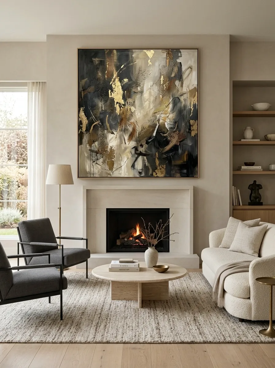
If every part of the room is asking for attention, the eye basically gives up. Pick one feature to lead the composition, then let everything else support it.
In a living room, that might mean centering the seating around a fireplace, a large piece of art, or a particularly good view instead of arranging furniture simply because there happens to be a wall there. Keep nearby accessories quieter so the main feature actually gets to look important.
The difference is surprisingly obvious. A room with one visual leader feels intentional. A room with seven visual leaders feels like everyone arrived at the meeting with a PowerPoint.
Replace Tiny Artwork With One Larger Statement Piece
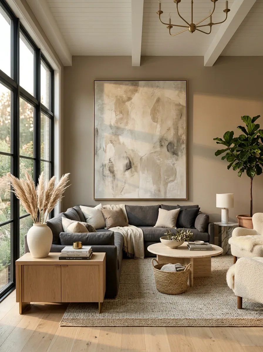
A large wall with tiny artwork usually looks less “collected” and more “the frames were bought one at a time.” Scale matters.
Choose one substantial piece that relates to the furniture beneath it and give it enough breathing room to register as a deliberate feature. The artwork doesn’t need to be loud. It needs enough physical presence to hold its own against the wall and the furniture.
This works especially well above sofas, consoles, beds, and dining sideboards where the wall area is large enough to swallow smaller pieces.
Hang Curtains High and Wide Around the Windows
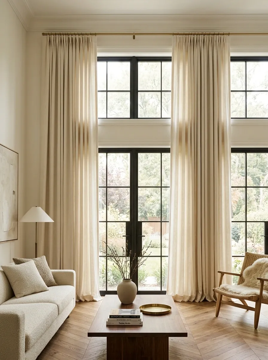
Curtains hung directly above the window can make the window look smaller and the ceiling feel lower. Mounting the rod higher and extending it beyond the window frame gives the whole wall more vertical structure.
Use full-length panels whenever the room allows it, and let them fall cleanly to the floor. The goal isn’t to hide the window. It’s to make the window treatment feel like part of the architecture instead of an afterthought attached to a rectangle of glass.
This is one of those changes that looks suspiciously expensive for something that mostly involves moving a curtain rod.
Use a Larger Rug to Connect the Furniture
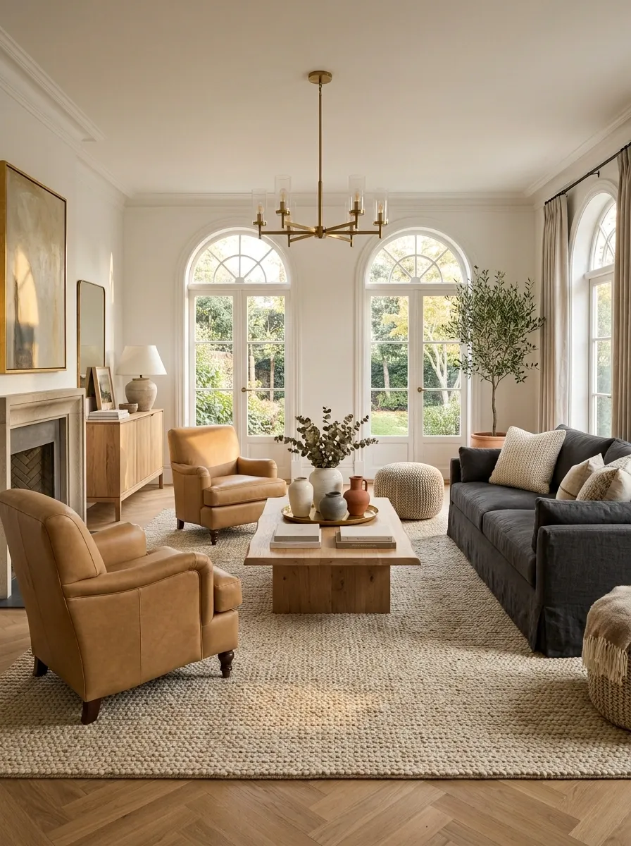
A rug that barely fits under the coffee table can make every piece of furniture look stranded. A larger rug pulls the seating group into one visual zone and makes the arrangement feel considerably more deliberate.
Center the rug around the furniture rather than treating it like a small decorative island. In a living room, the main seating should visually relate to the rug, while walking paths remain clear around the arrangement.
This is particularly useful when a room feels scattered despite having perfectly decent furniture. Sometimes the furniture isn’t fighting. The rug simply isn’t doing enough to make them a team.
Move the Furniture Away From the Walls
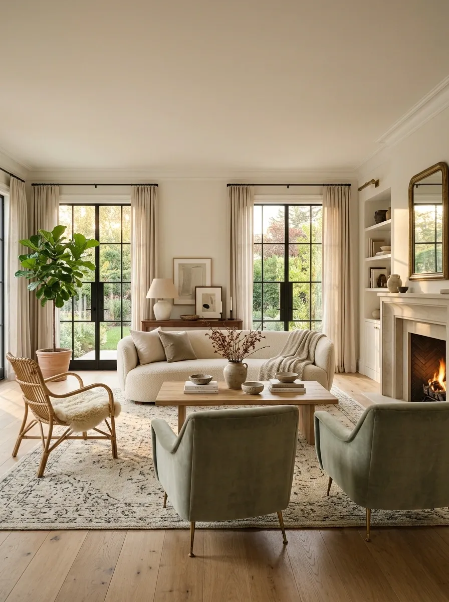
Pushing every chair, sofa, and cabinet against a wall can make a room feel oddly empty in the middle and strangely cramped around the edges. The furniture technically fits. The composition just isn’t doing anything interesting.
Pull the main seating group slightly inward and let it form a conversation zone. Keep enough space for people to walk comfortably around it, especially near doors and major pathways. The goal isn’t to create an obstacle course. It’s to stop treating the walls like mandatory parking spaces.
A little breathing room can make the furniture look more substantial and the whole room more deliberately arranged.
Replace a Tiny Ceiling Light With a Fixture That Has Some Backbone
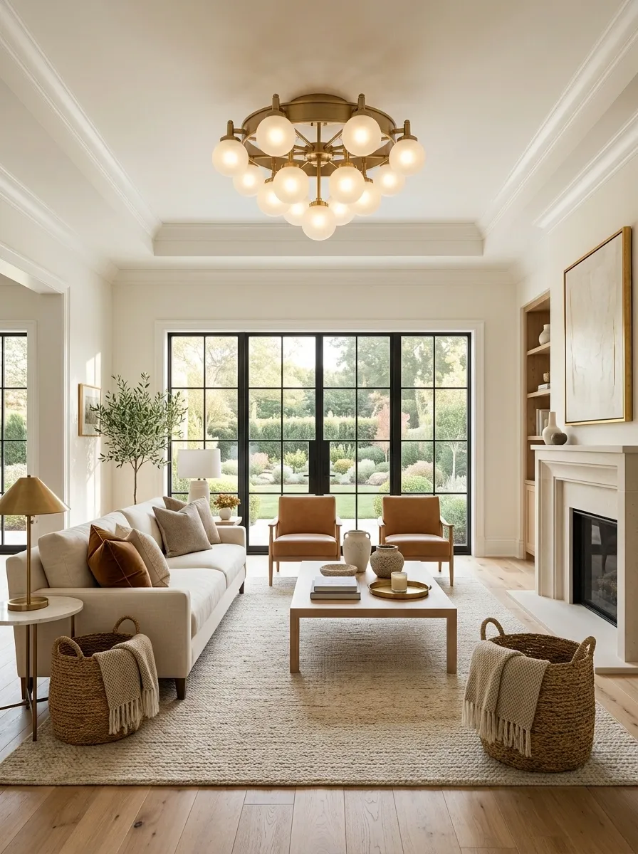
A ceiling fixture that looks like it belongs in a hallway can make an otherwise well-furnished room feel strangely unfinished. The solution isn’t necessarily an elaborate chandelier. It simply needs enough visual presence to relate to the size of the room and the furniture below it.
In a dining room, scale the fixture to the table. In a living room, use the seating area or overall room footprint as the visual reference. Keep the fixture high enough for comfortable movement, but let it occupy enough space that the ceiling doesn’t disappear from the composition.
A tiny light isn’t understated when the room is swallowing it. It’s just losing the fight.
Give the Coffee Table Enough Scale to Hold the Seating Together
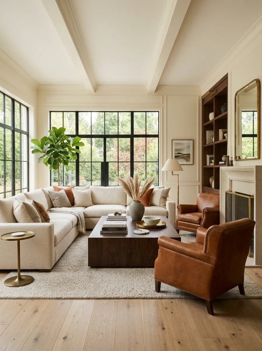
A coffee table that is too small can make a decent sofa arrangement look unfinished. The eye reads the table as the center of the seating group, so when it barely occupies the space, the whole composition feels disconnected.
Choose a shape and size that relate to the sofa and surrounding chairs while leaving practical room to walk around it. A rectangular table can reinforce a long sofa, while a round or oval option can soften a room filled with straight lines.
The coffee table doesn’t need to dominate. It just needs to stop looking like someone accidentally put a side table in the middle of the room.
Add One Warm Natural Material to a Flat Room
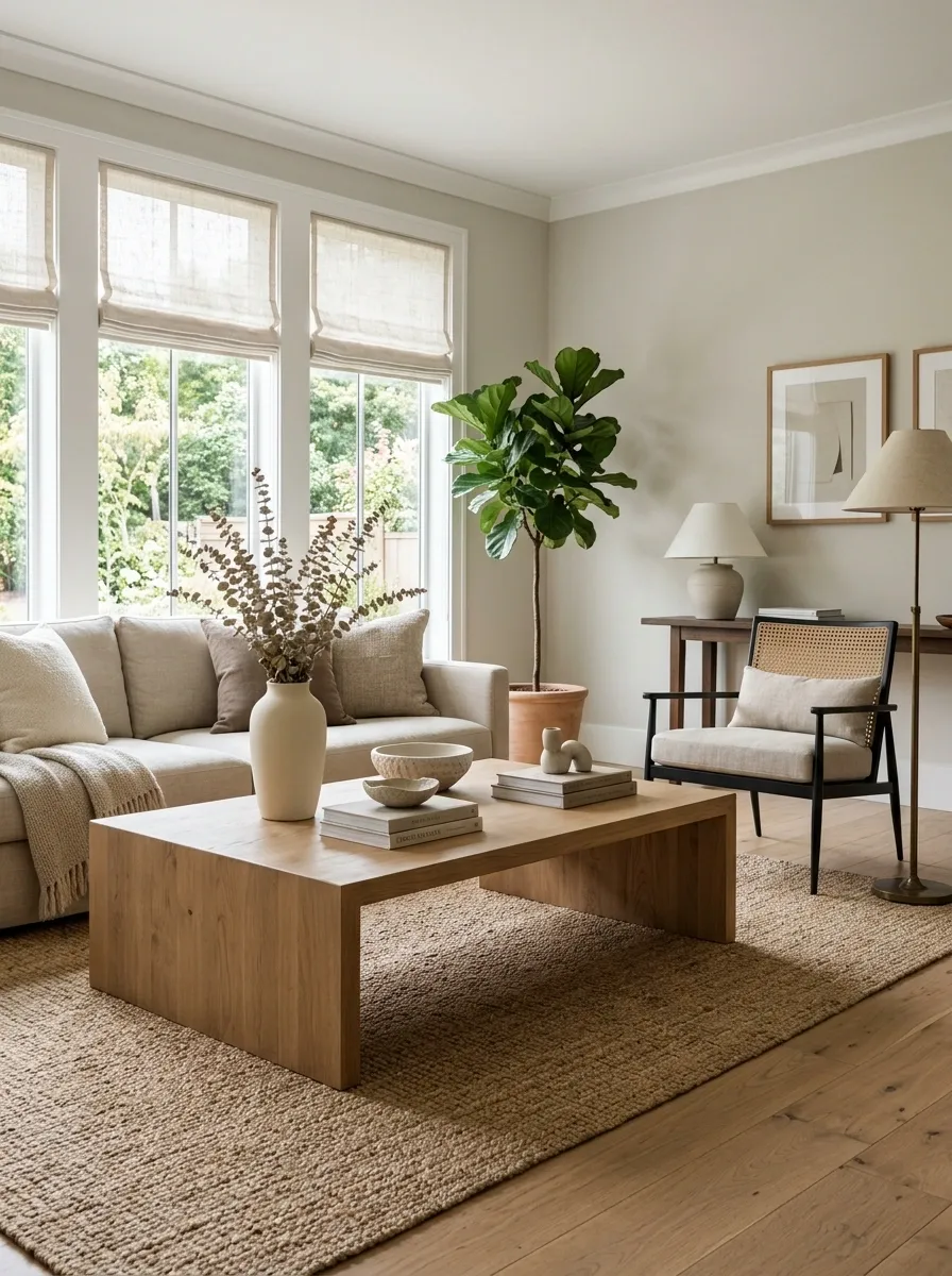
A room doesn’t always need more color to feel richer. Sometimes it needs a material with a different temperature and texture.
Warm wood, woven fibers, linen, cane, aged finishes, and similar natural materials can interrupt an overly smooth or cool composition. Add them where they can actually be noticed, such as a coffee table, window shade, bench, cabinet, or substantial accessory.
The important part is restraint. One or two strong material changes can give a neutral room considerably more dimension. Covering every surface in rattan because the room looked “a little boring” is a different problem entirely.
Give the Room a Smaller, More Disciplined Color Palette
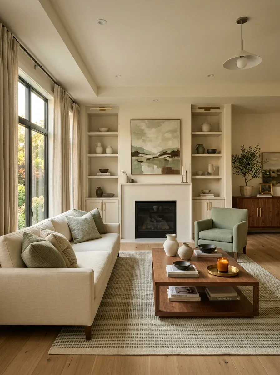
A room can have plenty of attractive colors and still look disorganized. The issue is usually repetition. If each color appears once, the eye doesn’t know how the pieces relate.
Choose a dominant neutral and two supporting colors, then repeat them across larger and smaller elements. A wall color can connect to upholstery, artwork can pick up the rug, and a wood tone can recur in several pieces.
That repetition makes separate purchases look like they were part of one plan. Which, frankly, is useful when they weren’t.
Add a Darker Anchor to a Sea of Pale Furniture
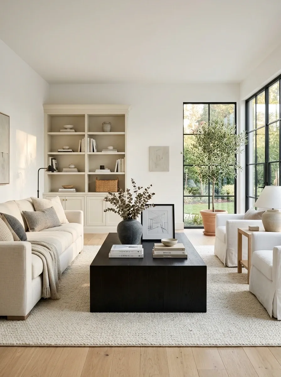
A room filled with pale upholstery, light wood, soft rugs, and white walls can be pleasant while still looking like it hasn’t quite finished loading.
Add one darker element with enough size to ground the composition. A dark wood coffee table, charcoal armchair, deep-toned console, or substantial black-framed artwork can do the job. Keep the darker tone repeated in at least one or two smaller places so it looks intentional rather than like a random object that got lost on the way home.
The room doesn’t need to become dramatically darker. It just needs somewhere for the eye to stop.
Clear Off the Surface That Has Started Looking Nervous
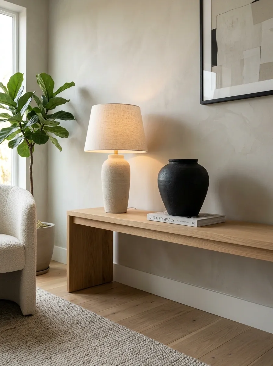
There comes a point where a console table stops looking styled and starts looking like it is storing evidence.
Choose one surface that has accumulated random objects and remove the weakest pieces first. Keep only items that contribute scale, function, texture, or a meaningful visual connection to the rest of the room. A lamp, one substantial object, and a little breathing room will usually carry more weight than nine tiny things lined up shoulder to shoulder.
This is particularly effective on media consoles, dressers, kitchen counters, bathroom vanities, and entry tables.
Sometimes the fastest way to make a room look better is to stop decorating it.
Trade the Cluster of Tiny Accessories for One Serious Object
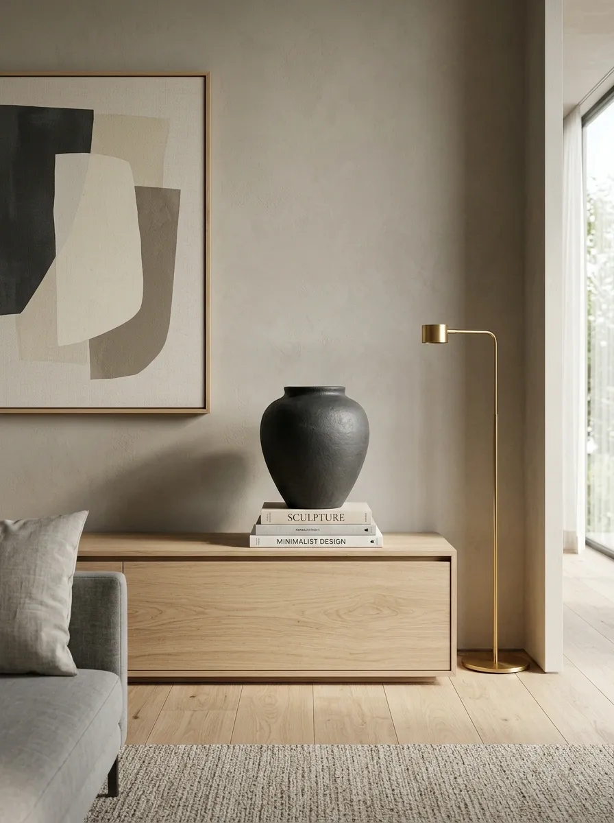
A collection of tiny decorative objects can fill a surface without giving it enough visual weight. Replace several of them with one larger vessel, lamp, sculptural piece, bowl, or substantial arrangement.
Scale is doing the work here. One large object creates a clear shape that the eye can understand immediately. Ten tiny objects create ten little interruptions and often make the room feel busier rather than better.
This doesn’t mean every surface needs one giant decorative object. It means the strongest piece should actually have enough presence to matter.
Use a Large Mirror Where the Room Needs More Depth
A mirror is useful when it solves a visual problem, not because every empty wall is apparently begging for one.
Place a substantial mirror where it can reflect natural light, an attractive view, or another strong part of the room. A large mirror can also give an awkward wall enough visual weight to feel intentional. Avoid placing it where all it reflects is a blank wall, a pile of laundry, or the television from a terrible angle. That would technically be a mirror, but not exactly a victory.
Choose the size based on the wall and furniture around it. A tiny mirror on a broad wall usually just emphasizes how much wall is still sitting there.
Frame an Empty Wall Instead of Filling Every Inch of It
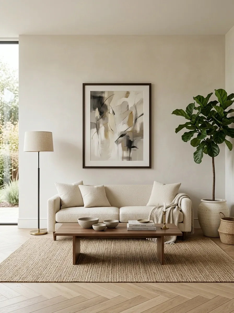
A large blank wall doesn’t always need a giant gallery wall. Sometimes the better move is to create a strong central composition and use two taller elements to visually frame it.
Place the main feature where the eye naturally lands, then add vertical elements such as tall lamps, cabinets, plants, or substantial furniture at the sides when the room allows. The resulting composition connects the floor to the wall and makes the empty space look intentional rather than forgotten.
Negative space is useful. The goal isn’t to eliminate every blank patch. It’s to make the blank space look like it was allowed to exist on purpose.
FOCUS
Hide the Everyday Stuff That Makes a Room Look Messy
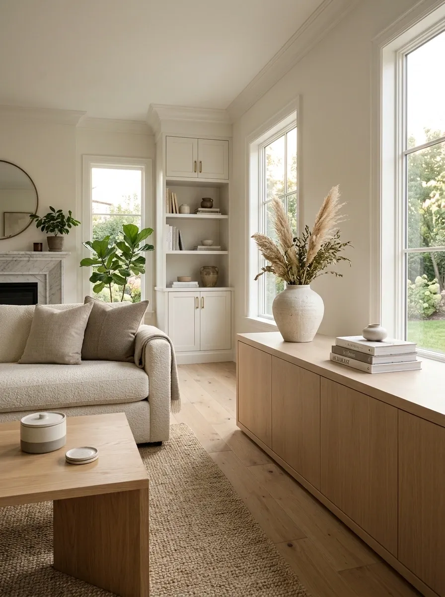
A room can be perfectly clean and still look cluttered. The usual suspects are the things that don’t have a visual home: charging cables, remotes, paperwork, toiletries, toys, pet supplies, and the mysterious collection of objects that somehow migrates onto every flat surface.
Give those items an actual storage zone, then keep the surfaces that matter visually much quieter. Closed baskets, drawers, cabinets, and lidded containers work especially well for things that need to stay accessible but don’t need to be part of the room’s visual story.
The goal isn’t showroom living. It’s making the necessary stuff stop shouting for attention.
Layer the Lighting Instead of Asking One Fixture to Do Everything
One overhead light is expected to illuminate the room, create atmosphere, highlight artwork, and somehow make everyone look good. That’s a lot to ask from one ceiling fixture.
Layer the room with different light sources. Use the main fixture for overall illumination, then add a floor lamp, table lamp, wall light, or accent light where the room needs another pool of brightness. This creates depth and gives the eye several levels to move through.
A room with layered lighting can look substantially more finished without changing a single piece of furniture. It also stops every evening from feeling like a dentist appointment.
ceiling
floor
table or wall
Give the Dead Corner an Actual Job
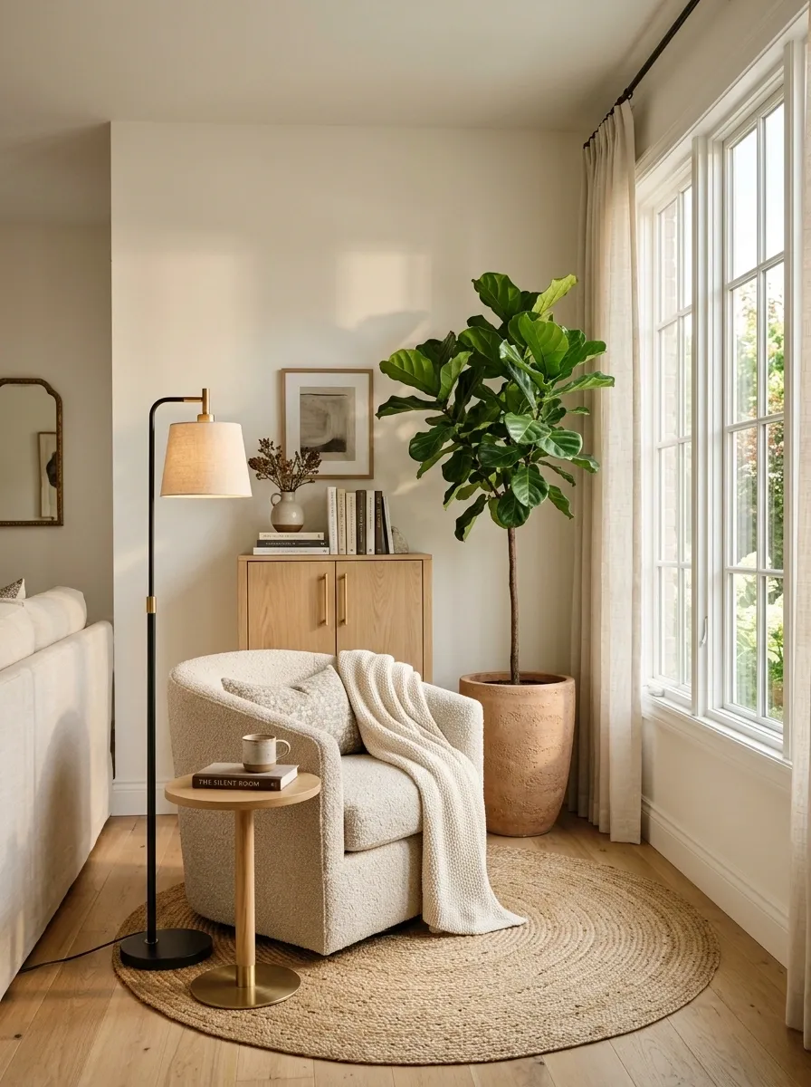
That empty corner isn’t necessarily waiting for another random piece of furniture. It needs a reason to exist.
A tall floor lamp can turn a dark corner into a useful light source. A compact reading chair can create a secondary seating zone. A narrow cabinet can add storage without swallowing the floor. Even a substantial plant can provide vertical weight when the room needs it.
Choose the solution based on what the room is missing, not on which object happens to be available. Otherwise, the corner gets a decorative chair nobody sits in, and the room acquires a new problem.
Use lighting.
Add seating or storage.
Use a strong vertical element.
Make the Bed Wall Look Bigger Than the Bed
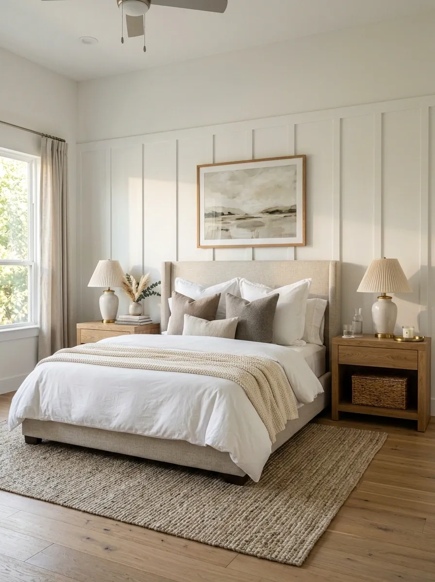
A small bed can look particularly lost when it sits on a large empty wall. The answer isn’t always buying a larger bed. Give the wall behind it more visual authority.
A wide upholstered headboard, substantial wood headboard, architectural wall treatment, or carefully scaled artwork can expand the visual footprint of the bed. Pair that with bedside furniture that isn’t comically undersized and the bed starts reading as the center of the room rather than a small object floating in a sea of wall.
The mattress hasn’t changed. The perception has.
Use Bedding With Enough Volume to Give the Bed Presence
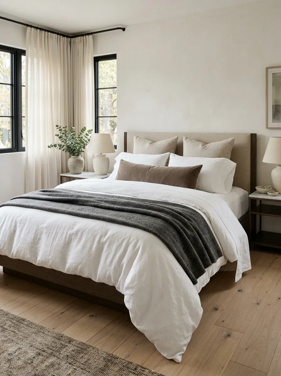
A bedroom can have good furniture and still look unfinished when the bed itself looks thin, flat, or undersized. Bedding is one of the easiest ways to change that visual weight.
Use a substantial duvet or coverlet with a deliberate drape, then add a restrained combination of pillows and one folded textile at the foot. The goal isn’t hotel-level pillow engineering. It is giving the largest object in the room enough texture and volume to hold its position visually.
Skip the mountain of decorative cushions. Once the bed starts resembling a furniture showroom display, the original problem has been replaced by another one.
substantial cover
layered pillows
simple foot layer
Give the Nightstands Enough Presence to Match the Bed
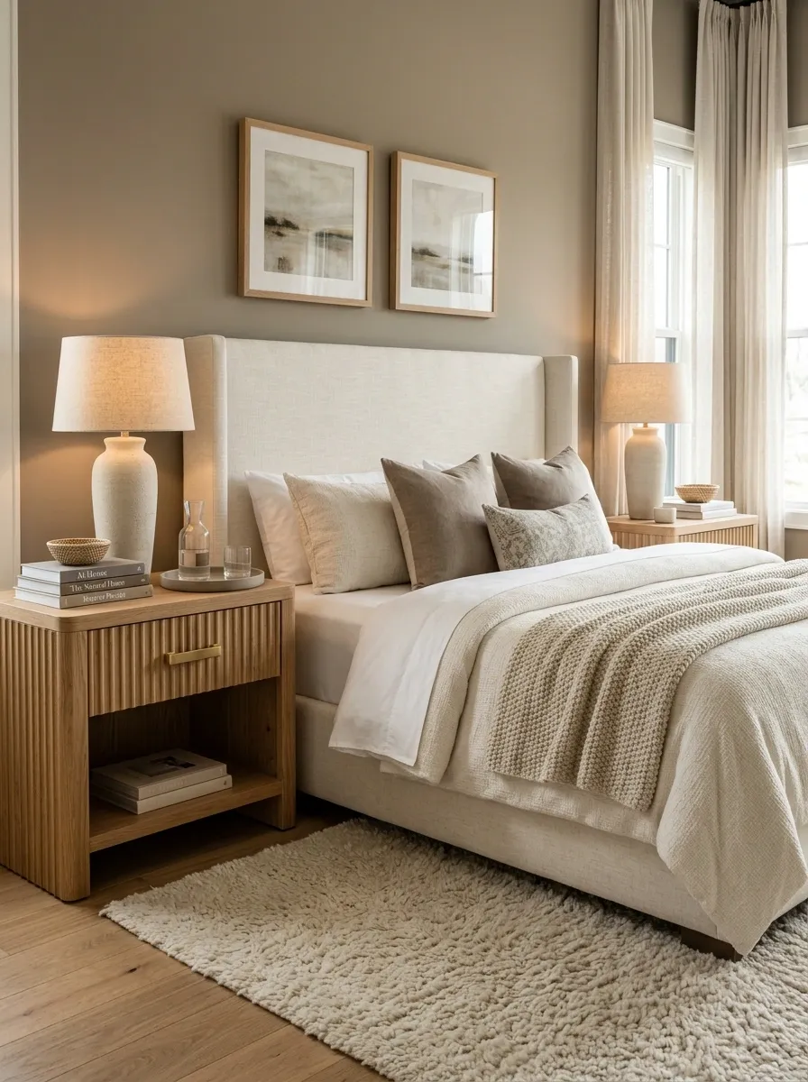
A bed can look substantial while the furniture beside it looks like two tiny stools. That imbalance makes the entire bedroom feel less finished.
Choose bedside pieces with enough width, height, and storage to visually support the mattress. They don’t need to match exactly, but their scale should make sense with the bed. Then add lamps with enough height to complete the composition without dominating it.
This also improves function. A bedside surface that can actually hold a lamp, phone, book, and glass of water is considerably more useful than a tiny table selected solely because it technically fits.
Use the Ceiling to Pull the Eye Up
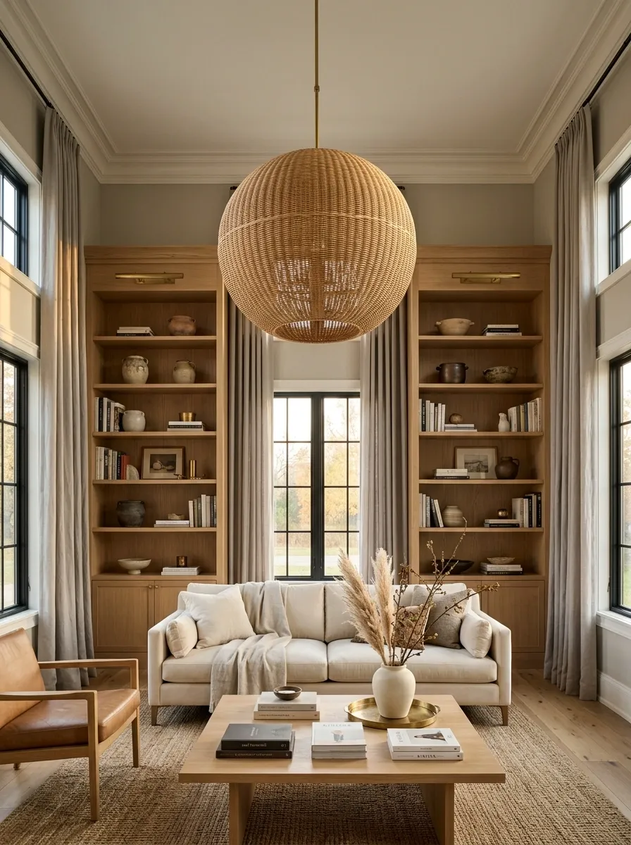
Most rooms spend almost all their visual energy at floor level. Furniture, rugs, baskets, tables, and accessories keep the eye low while the ceiling contributes approximately nothing. No wonder the room can feel shorter and flatter than it actually is.
Give the upper part of the room some authority. A substantial pendant, full-height curtains, subtle ceiling color, architectural trim, or another strong vertical feature can create a clearer path from floor to ceiling.
This doesn’t require turning the ceiling into a theatrical event. It simply means the room gets to use all of its available height instead of pretending the top third doesn’t exist.
Repeat One Finish Until the Room Starts Making Sense
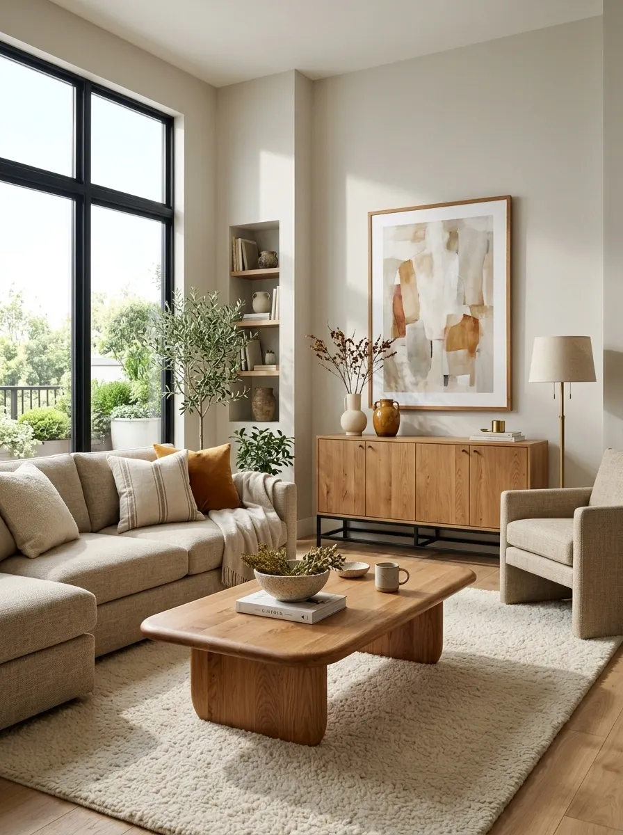
A room can contain perfectly good furniture and still feel like several unrelated purchases accidentally ended up in the same address. Repetition fixes a surprising amount of that.
Choose one finish and use it in at least a few places. Warm wood might appear on the coffee table, a cabinet, and a frame. Black might repeat through a light fixture, hardware, and artwork. Brass might connect lighting with a mirror or small accent.
The pieces don’t need to match. They simply need to speak the same visual language often enough for the room to stop feeling random.
table
cabinet
frame
Mix Soft Furniture With Something Structured
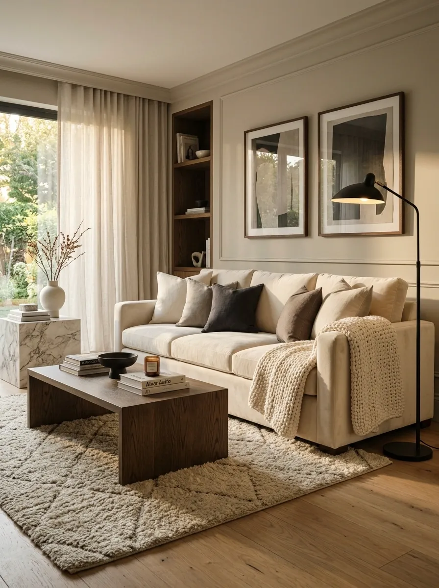
Too many soft surfaces can make a room feel visually blurry. Upholstery, cushions, curtains, rugs, and blankets all have their place, but they need something firmer and more defined around them.
Bring in wood, stone, metal, glass, or crisp architectural lines through tables, shelving, lighting, or furniture. The contrast gives the softer pieces something to stand against.
This works particularly well in bedrooms and living rooms where textile-heavy styling can quickly become a sea of similar shapes. Softness feels richer when it has a little structure nearby.
Give the Largest Wall a Proper Composition
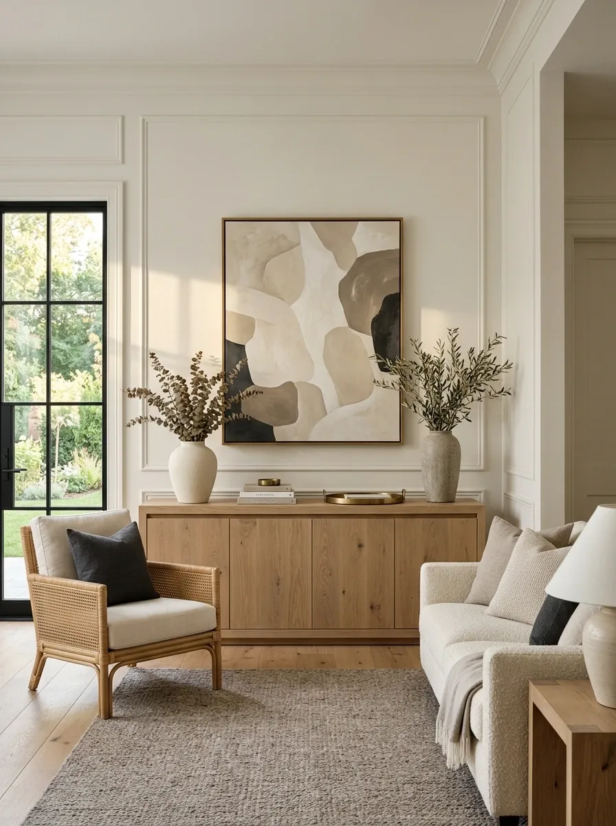
One enormous blank wall can make an otherwise finished room look strangely incomplete. It often becomes the first thing noticed because the eye has so much uninterrupted space to stare at.
Don’t automatically fill it with dozens of frames. Give the wall one coherent composition instead. A substantial console with large artwork, a broad mirror, a well-scaled furniture grouping, or one dominant architectural treatment can provide the weight the wall is missing.
The trick is proportion. A small decorative object against a huge wall isn’t subtle. It’s getting eaten alive.
around the main feature
Turn the Furniture Toward the Best Sightline
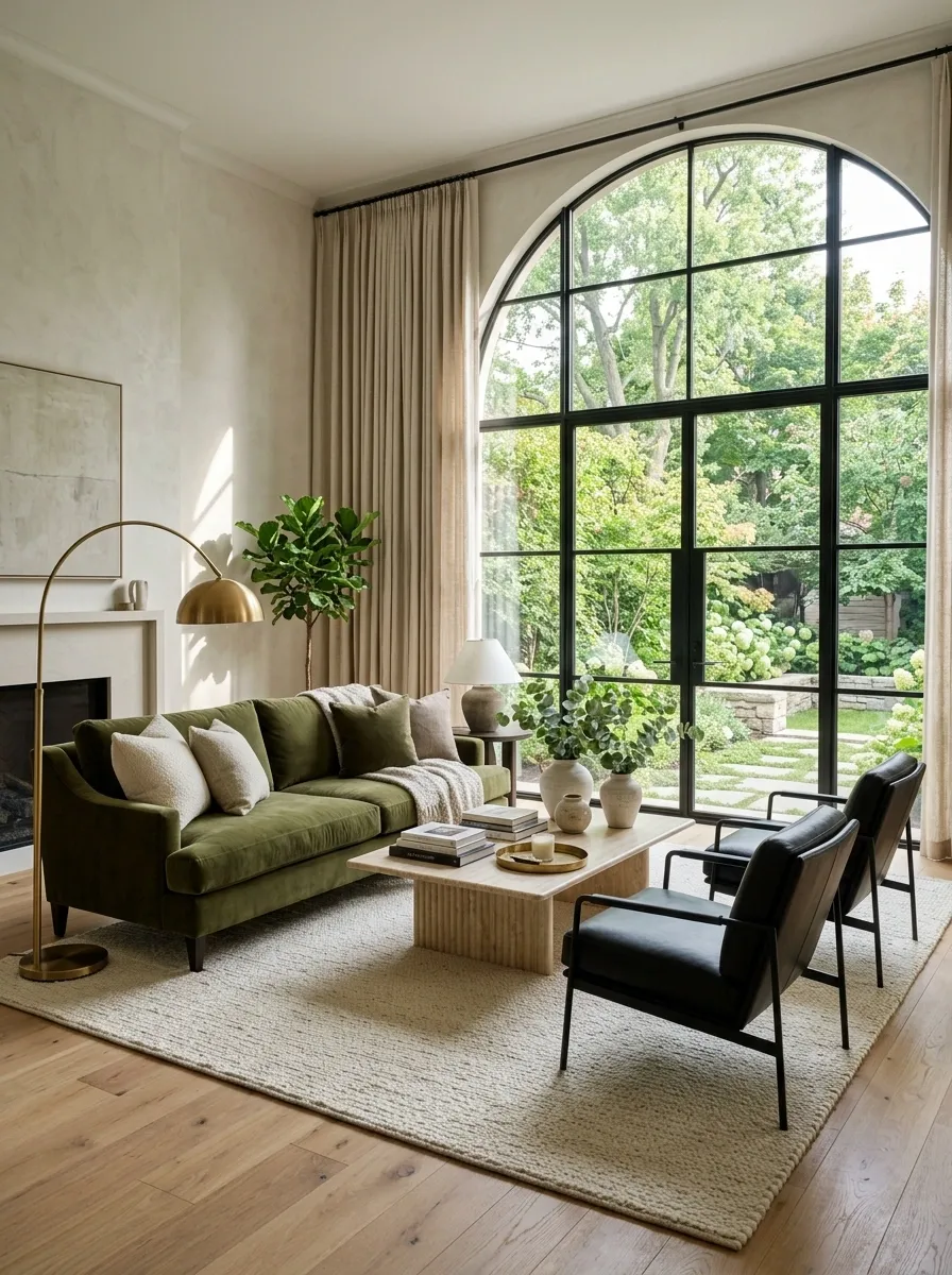
A room can have the right furniture and still feel wrong because everything points toward the least interesting part of the room.
Look at what a person sees when entering. Then look at what the main seating faces. If the strongest architectural feature, view, artwork, or fireplace sits somewhere else, shift the furniture so the room’s visual axis makes more sense.
This doesn’t mean ignoring windows, doors, outlets, or practical circulation. It means stopping the furniture from behaving as though the only available rule is “put the sofa against that wall.”
Give an Empty Foot-of-Bed Area Some Structure
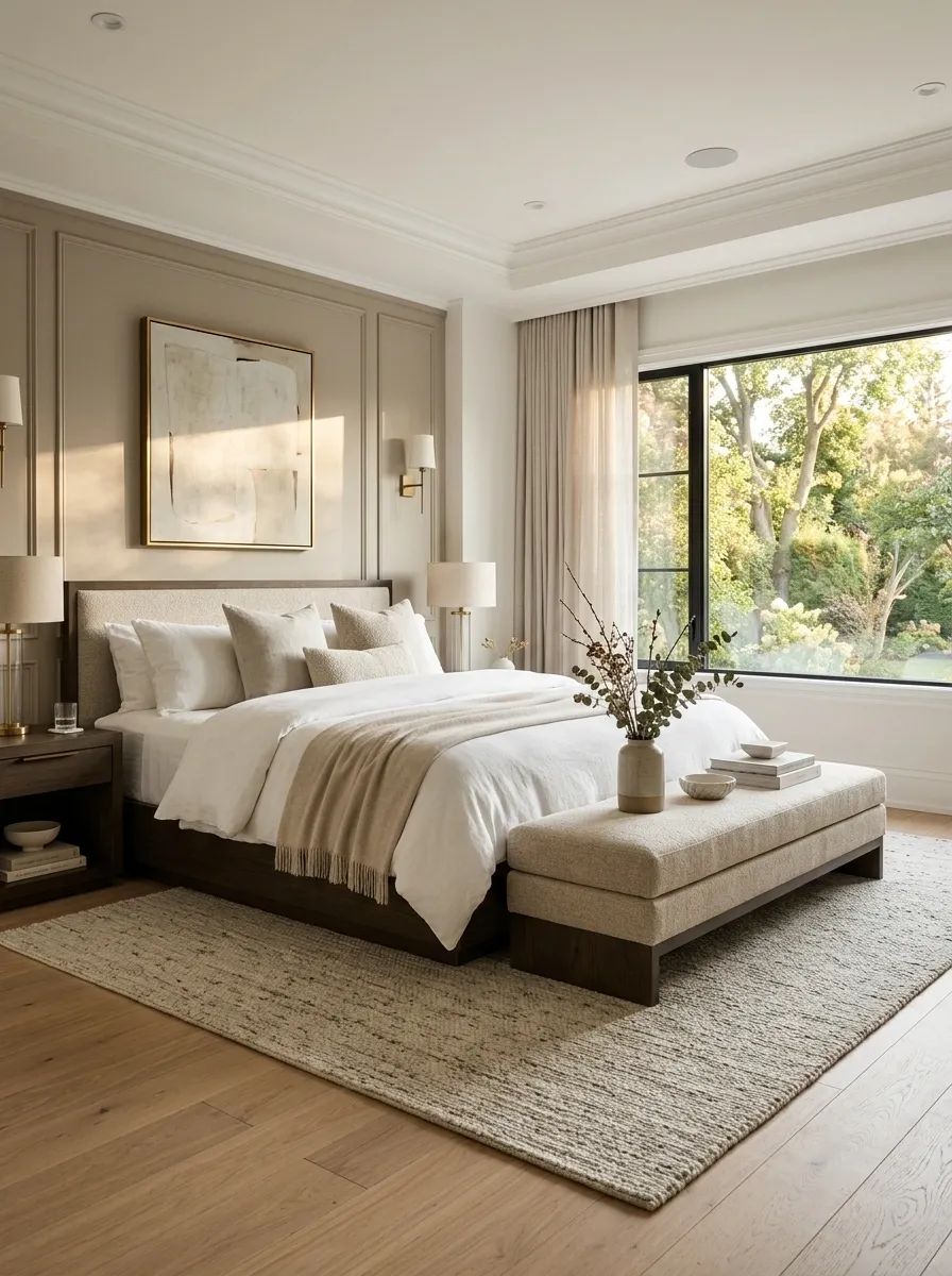
A large bedroom can have an awkward amount of open space around the foot of the bed. Filling it with a bulky cabinet is usually overkill. A bench can provide enough horizontal weight to balance the bed while keeping the room practical.
Choose a bench that is narrower than the bed and shallow enough to preserve circulation. Upholstered styles soften a room, while wood adds structure. Avoid filling the bench with decorative pillows that exist purely to be moved every night.
The point is to give the empty area a visual purpose without turning the bedroom into a furniture showroom.
Make the Window Treatment Part of the Room Instead of a Separate Event
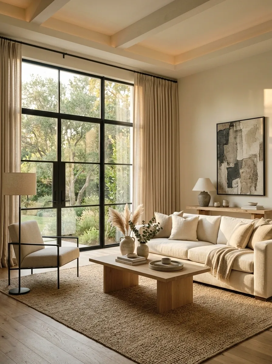
A window can look disconnected when its curtains, shade, or blinds have nothing to do with the furniture around it. Bring the treatment into the room’s visual conversation.
Repeat a color, texture, or material already present in the space. A linen curtain can echo upholstered seating. A warm woven shade can relate to wood furniture. A darker treatment can reinforce artwork or another anchor color.
The window doesn’t need to become the star. It simply needs to stop looking like it was decorated by a completely different committee.
Remove the Furniture That Is Doing Absolutely Nothing
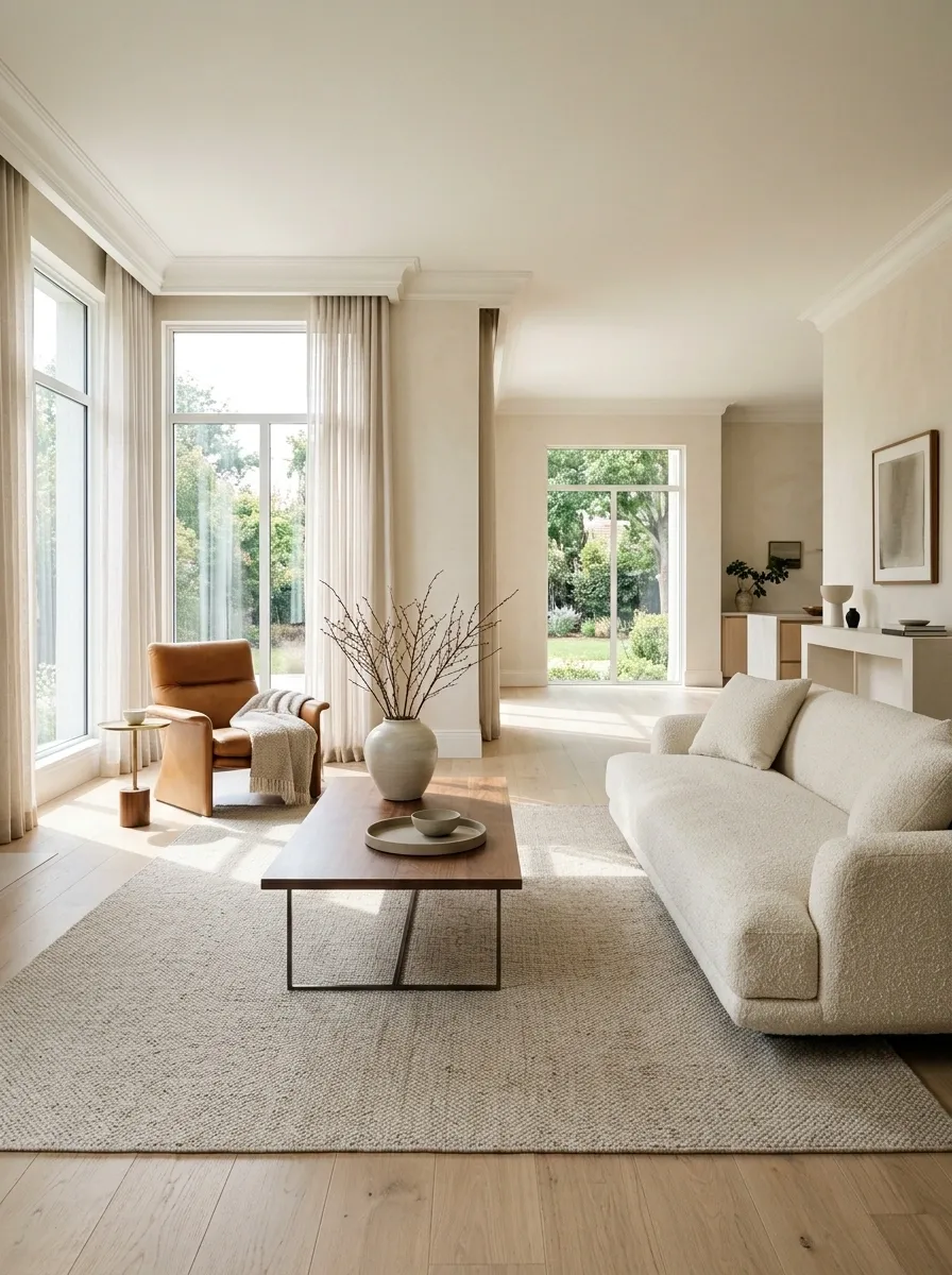
Adding furniture is easy. Admitting that one piece doesn’t belong there is the part nobody enjoys.
Take out the chair nobody uses, the narrow table that blocks circulation, the cabinet that creates a weird dead zone, or the extra piece that exists only because there was an empty corner. Then reassess the room with the remaining furniture.
More floor space can make existing pieces look larger, improve sightlines, and make the room easier to move through. A room doesn’t become more finished by passing the furniture census.
Add One Final Layer That Actually Connects the Room
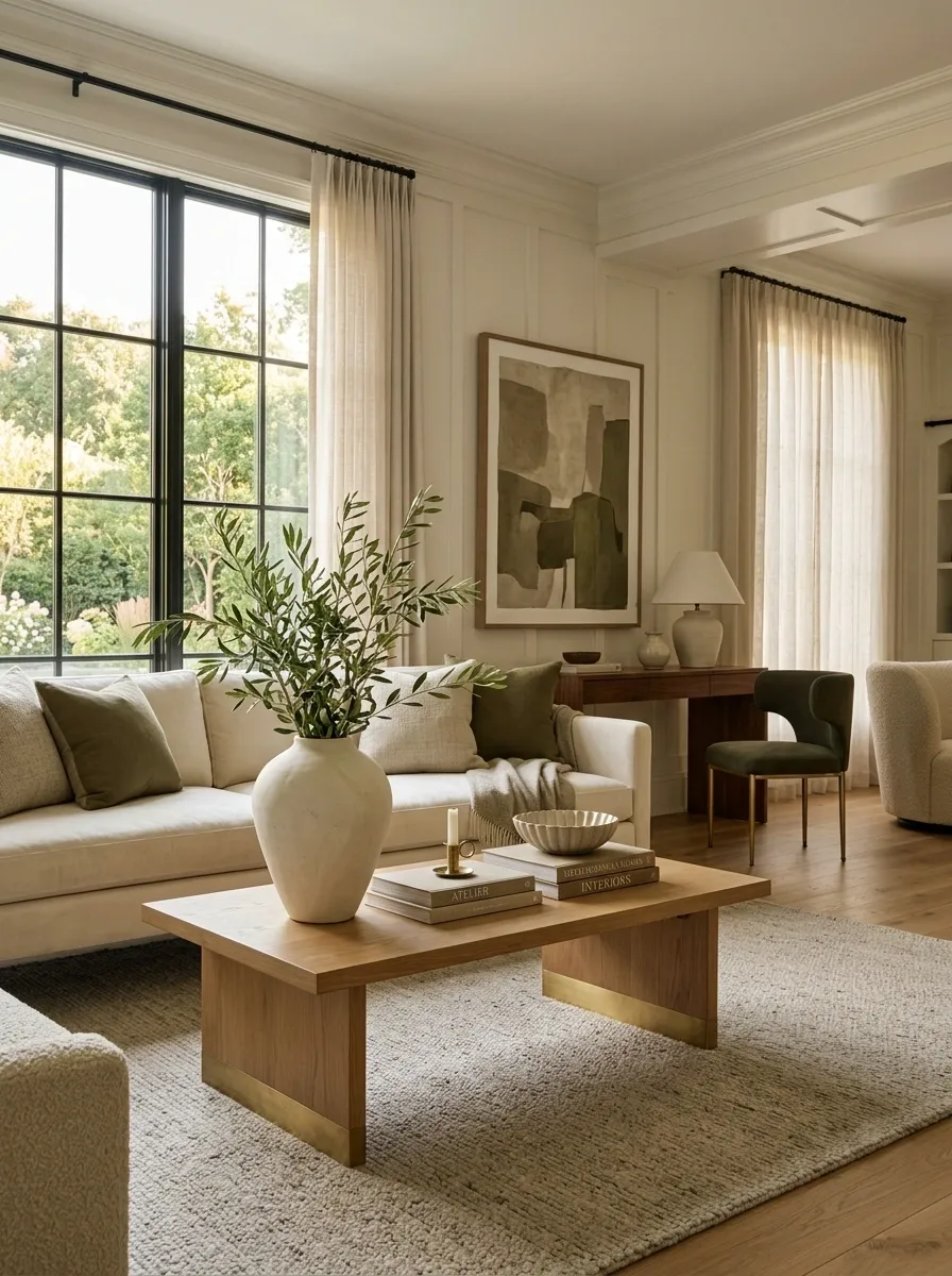
The best finishing move is often surprisingly small. Once the furniture, lighting, rugs, and major wall elements are working, look for the missing connection.
Maybe the artwork needs one color repeated in the textile. Maybe the warm wood needs another echo. Maybe the room needs one organic shape to soften all the straight lines. Maybe one substantial piece of greenery needs to balance a heavy corner.
The final layer should connect what already exists, not start an entirely new decorating subplot. That’s the difference between finishing a room and continuing to buy things for it forever.