
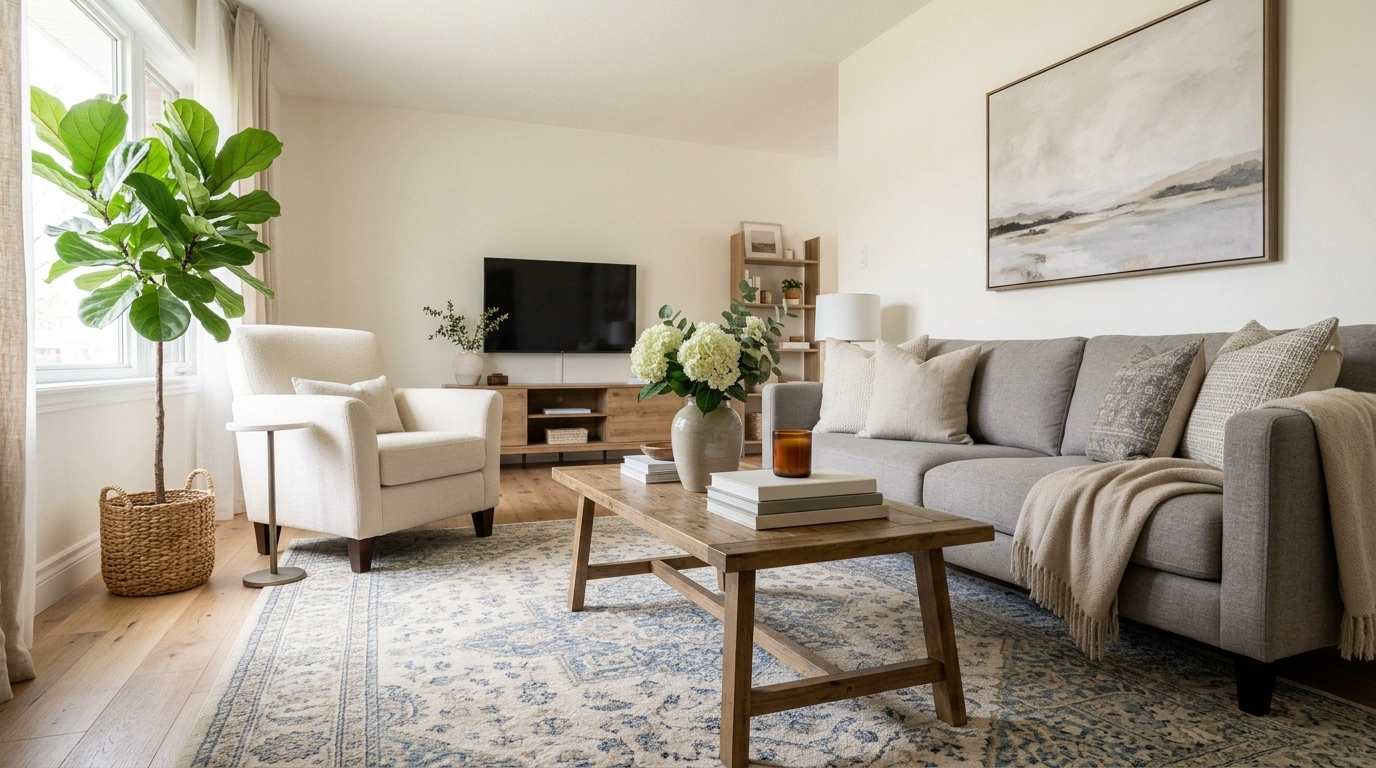
A room can have good furniture, decent finishes, and absolutely nothing technically wrong with it, yet still look like it stopped decorating somewhere around the year everyone discovered matching furniture sets.
That usually isn’t because the room needs a complete renovation. It’s because several visual decisions are quietly dating each other. The tiny rug makes the furniture look disconnected.
The heavy curtains make the windows look smaller. The matching tables make the room feel packaged. Then there are the twelve little objects on the console, all apparently determined to prove the house contains things.
The fix is less dramatic than many decorating makeovers suggest. Keep the pieces that still work. Remove the choices that are carrying too much visual weight. Change the scale, simplify the composition, introduce a little contrast, and stop asking every object to be the star.
Some rooms have one of these problems. Others have collected the complete set. Either way, the fixes below focus on the choices that actually change how a room reads.
Your Room Probably Isn’t “Old.” It’s Just Doing Too Much of This.
Decorating Mistakes
Extend Curtains High to Make Windows Breathe
A window treatment can instantly make a room feel smaller when it stops right at the frame. Hanging curtains too low chops up the wall and makes the opening feel disconnected from the architecture around it.
Mounting the hardware closer to the ceiling and letting the fabric fall all the way to the floor changes everything. The vertical lines stretch the visual boundaries of the space, creating a much grander and more intentional atmosphere.
The goal is to frame the light gracefully rather than cutting off the wall. The room immediately feels taller, brighter, and effortlessly polished.
Why it works: stretching the fabric upward tricks the eye into seeing a much more expansive window, instantly elevating the entire room’s proportions.
Replace the Matching Furniture Set With a More Collected Mix
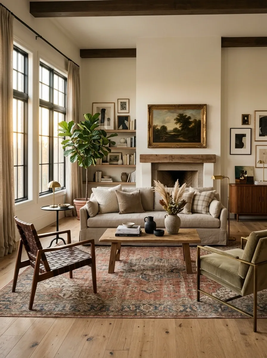
Nothing dates a room faster than furniture that looks like it was ordered from page 47 and delivered in one truck. A matching sofa, loveseat, chair, coffee table, and side tables may once have felt wonderfully coordinated. Now the set often reads as one giant furniture-shaped object.
Keep the strongest pieces and break up the repetition. Pair the main sofa with chairs in a different silhouette. Bring in a wood coffee table if the upholstery is heavy. Use side tables that don’t match each other exactly.
The goal isn’t random furniture. It’s related furniture with different jobs. The room should feel assembled over time, not selected by checking one box on a showroom floor.
Why it works: varied shapes and materials give the eye somewhere to move, which immediately makes the room feel less locked into one decorating period.
Same finish
Same visual weight
Connected colors
Mixed materials
Float Your Media Console for Instant Openness
Placing a heavy media console directly on the floor can sometimes anchor a room too heavily, making the entire wall feel pinned down and visually weighed down by furniture.
Lifting that same console off the ground creates an immediate sense of lightness. The uninterrupted floor space underneath allows the eye to travel freely, making even a compact living area feel remarkably more expansive.
Keep the styling clean and let the floating line do the heavy lifting. The transition from floor to wall becomes seamless and modern.
Why it works: exposing the flooring beneath the furniture reduces visual bulk and gives the room a sophisticated, airy momentum.
Use Full-Height Curtains to Stop Heavy Windows From Taking Over
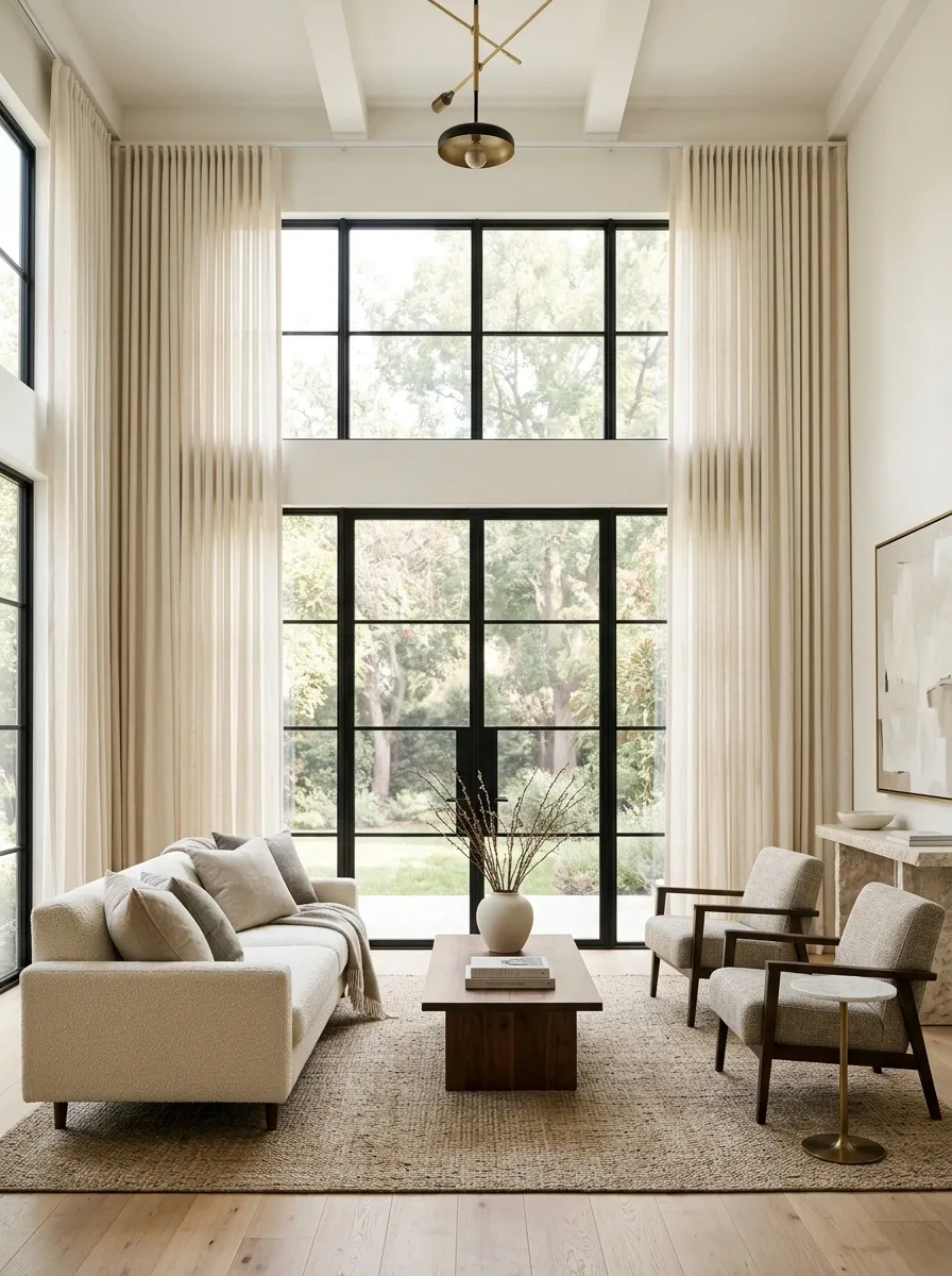
A window treatment can make a room look older before anyone has noticed the sofa. Short curtains, decorative valances, and fussy layers chop up the wall and make the window feel oddly separate from the rest of the room.
Hang curtains high and let them run close to the floor. Keep the fabric simple, especially when the room already has patterned furniture or traditional details. The goal is to frame the architecture, not create another elaborate feature competing with it.
The full-height treatment also gives the wall more vertical continuity. Suddenly the room looks taller, calmer, and much less committed to the decorating choices of a decade ago.
Why it works: the eye reads the entire window wall as one vertical composition instead of a collection of separate decorative parts.
Scale Your Wall Art to Match the Sofa
A tiny piece of art centered above a generous sofa often looks adrift and completely accidental. It creates a peculiar gap where the wall feels entirely unsure of its purpose.
Artwork needs to relate to the furniture anchoring it below. A substantial sofa calls for a wide piece or a curated grouping that commands a similar visual footprint, bridging the gap between furniture and wall.
Choose pieces that span a generous portion of the seating width to create a unified focal point. The arrangement instantly feels grounded and thoughtfully composed.
Why it works: proper sizing establishes visual harmony, ensuring the wall art supports the furniture instead of shrinking away from it.
Give the Room Lighting That Can Actually Compete With the Room
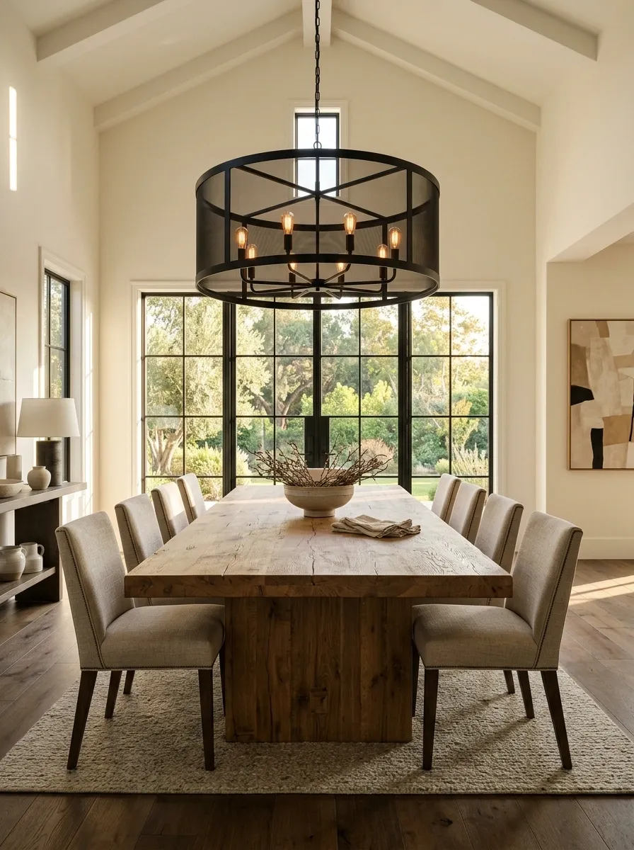
An enormous dining table beneath a tiny ceiling fixture is not “delicate.” It’s a scale problem wearing a nice outfit.
Lighting needs to relate to the furniture beneath it and the size of the room around it. A substantial dining table needs a fixture with enough presence to anchor it. A generous living room can handle a larger chandelier, pendant, or sculptural fixture than a small bedroom can.
The same rule applies to floor and table lamps. A tiny lamp beside an oversized sofa tends to look accidental. Scale it up and the furniture suddenly makes more sense.
Choose fixtures for proportion first, style second. A trendy light in the wrong size is still the wrong light.
Why it works: appropriately scaled lighting restores visual balance and stops the ceiling from looking like an afterthought.
Anchor the Bedroom With a Generous Rug
A bedroom rug that barely peeks out from beneath the bed can leave the room feeling disjointed and oddly interrupted. It chops up the flooring instead of uniting the furniture.
Pulling a properly proportioned rug out to frame both the bed and the nightstands creates a soft, cohesive foundation. The entire sleeping zone suddenly feels intentionally designated and luxurious.
Let the edges extend generously past the furniture pieces to establish a warm border. The bedroom transitions from a collection of isolated items into a unified sanctuary.
Why it works: a correctly sized rug grounds the primary furniture group, bringing warmth and balance to the entire floor plan.
Stop Using the Same Wood Finish on Every Single Thing
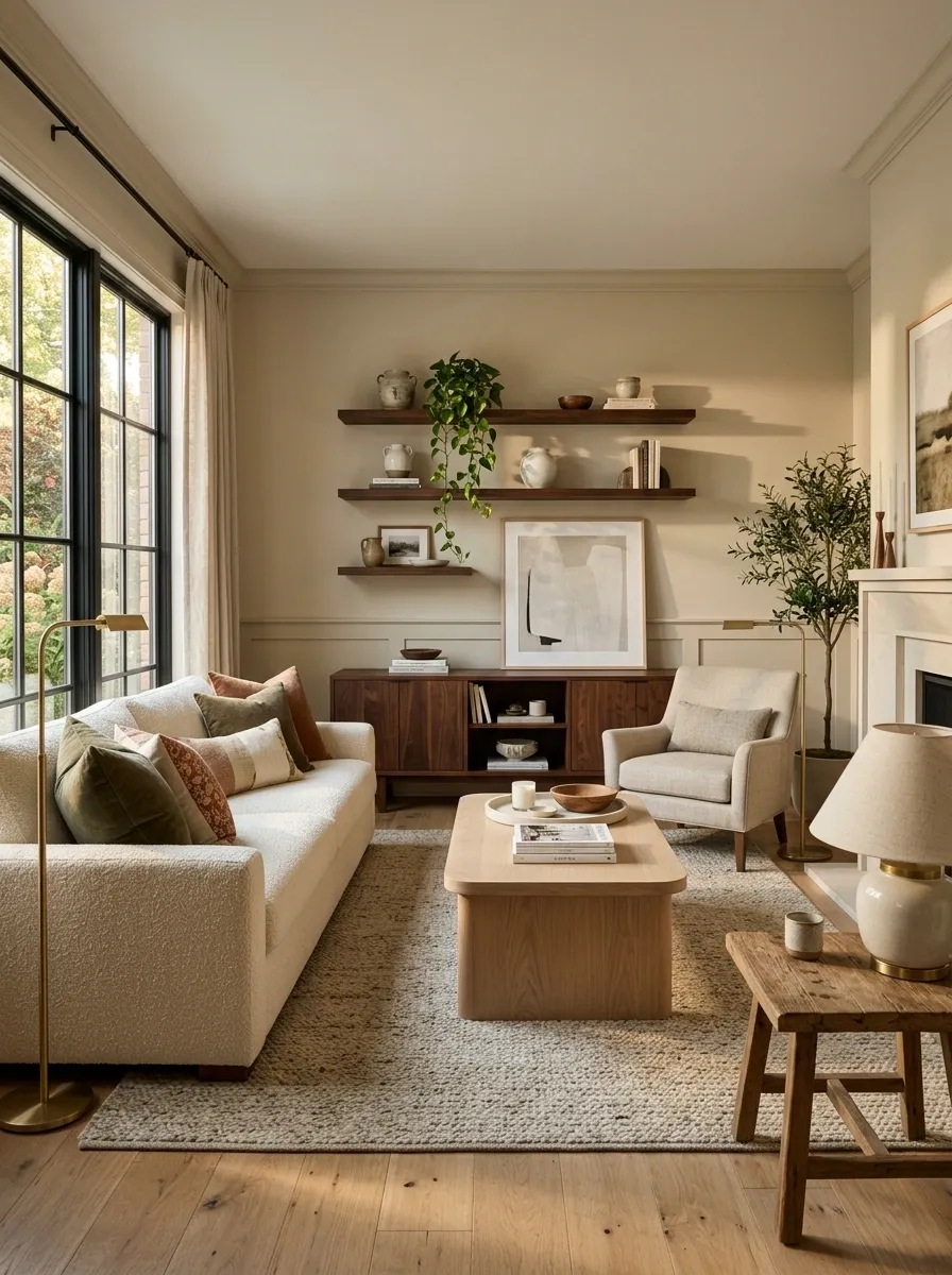
Nothing says “this room arrived as a package” quite like the same dark wood finish appearing on the coffee table, side tables, media console, dining furniture, shelves, cabinet, and approximately every other horizontal surface.
One dominant wood tone is fine. Using it everywhere is where the room starts feeling heavy and visually stuck.
Keep the strongest wood piece and introduce another tone with restraint. Medium oak beside walnut can work. A dark vintage cabinet can sit comfortably with lighter contemporary furniture. Wood flooring doesn’t need to match every other wood surface in the room like they’re related by blood.
Why it works: small differences in wood tone create hierarchy. The room gains variation without losing cohesion.
Upgrade to a Wall-Hung Toilet for Modern Flow
A traditional floor-mounted toilet often brings unnecessary visual clutter to a compact powder room, breaking up the clean lines of the floor and surrounding cabinetry.
Switching to a wall-hung model clears the floor entirely, creating a streamlined, architectural look that feels remarkably high-end and wonderfully easy to clean around.
The unbroken expanse of flooring makes the space feel larger and far more considered. It turns a purely utilitarian fixture into a sleek design element.
Why it works: concealing the tank and lifting the bowl removes awkward visual obstacles, delivering a crisp and modern aesthetic.
Edit the Decorative Clutter Instead of Adding More Stuff
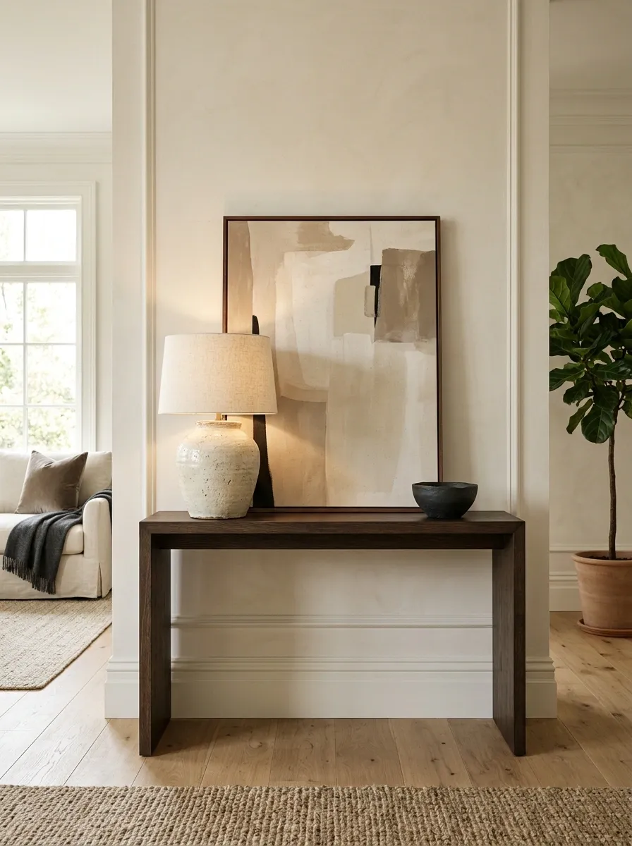
A dated room often has a strange relationship with empty surfaces. Every shelf needs something. Every corner needs something. Every tabletop appears personally offended by the concept of negative space.
The answer isn’t buying prettier objects. Start removing things.
A console table might need one substantial lamp, one piece of artwork, and one smaller object. A coffee table can usually survive without six decorative accessories forming a miniature village in the center. Leave some surface visible. Let the furniture itself have a presence.
Large objects also give the eye clearer stopping points, while tiny collections create visual static.
Why it works: editing restores hierarchy. The room starts showing what matters instead of announcing that every object in the house has been promoted to “decor.”
Replace a Busy Gallery of Tiny Frames With One Large Piece of Art
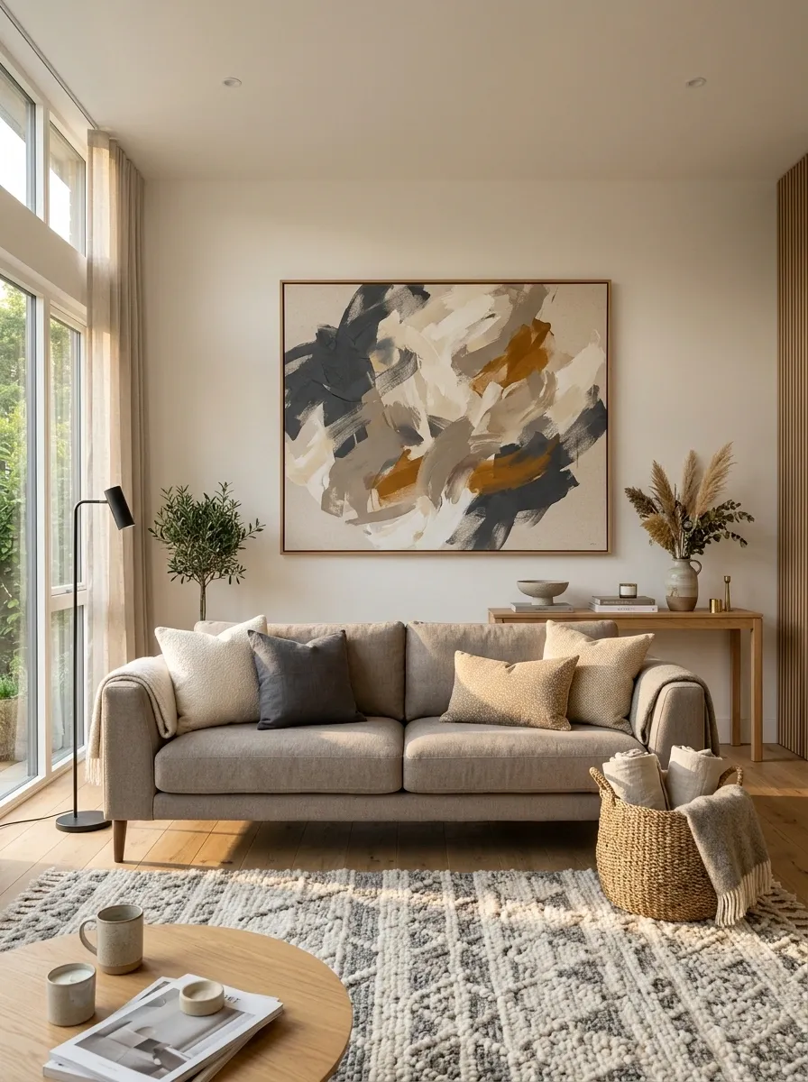
A wall covered in little frames can look charming. It can also look like every family photograph, random print, and souvenir ever purchased was told to report for duty at the same time.
When a large wall feels fragmented, give it one substantial focal point instead. A wide artwork above the sofa, a large canvas over a console, or one oversized framed piece can fill the wall without filling it with visual noise.
The artwork doesn’t need to match the sofa, rug, and curtains exactly. In fact, that usually makes the room look even more coordinated in the wrong way.
Why it works: one substantial piece gives the wall a clear visual anchor, making the surrounding furniture feel more intentional and proportionate.
Trade the Ornate Rug for a Quieter Foundation
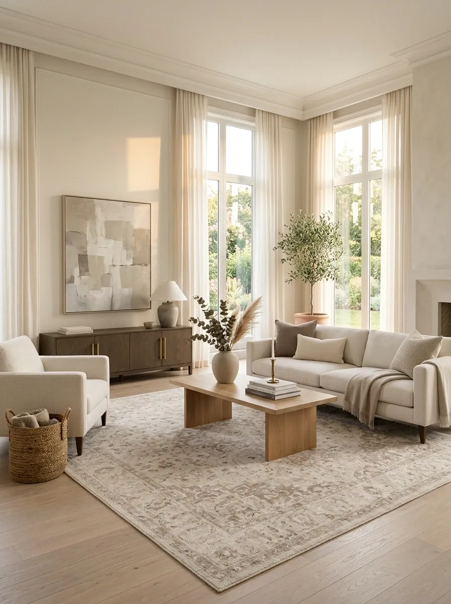
A busy traditional rug isn’t automatically a problem. The trouble starts when it has to compete with patterned curtains, decorative furniture, elaborate artwork, and a collection of pillows that apparently never met a pattern they didn’t like.
Let the rug become the quiet foundation instead. Choose a larger, lower-contrast pattern or a restrained texture that supports the furniture rather than announcing itself first.
This doesn’t mean every room needs a plain beige rug. It means the floor shouldn’t be fighting the sofa for top billing.
Why it works: reducing pattern competition makes the larger furniture and architectural details easier to see. The room feels edited instead of visually crowded.
Break the “Everything Matches” Color Scheme
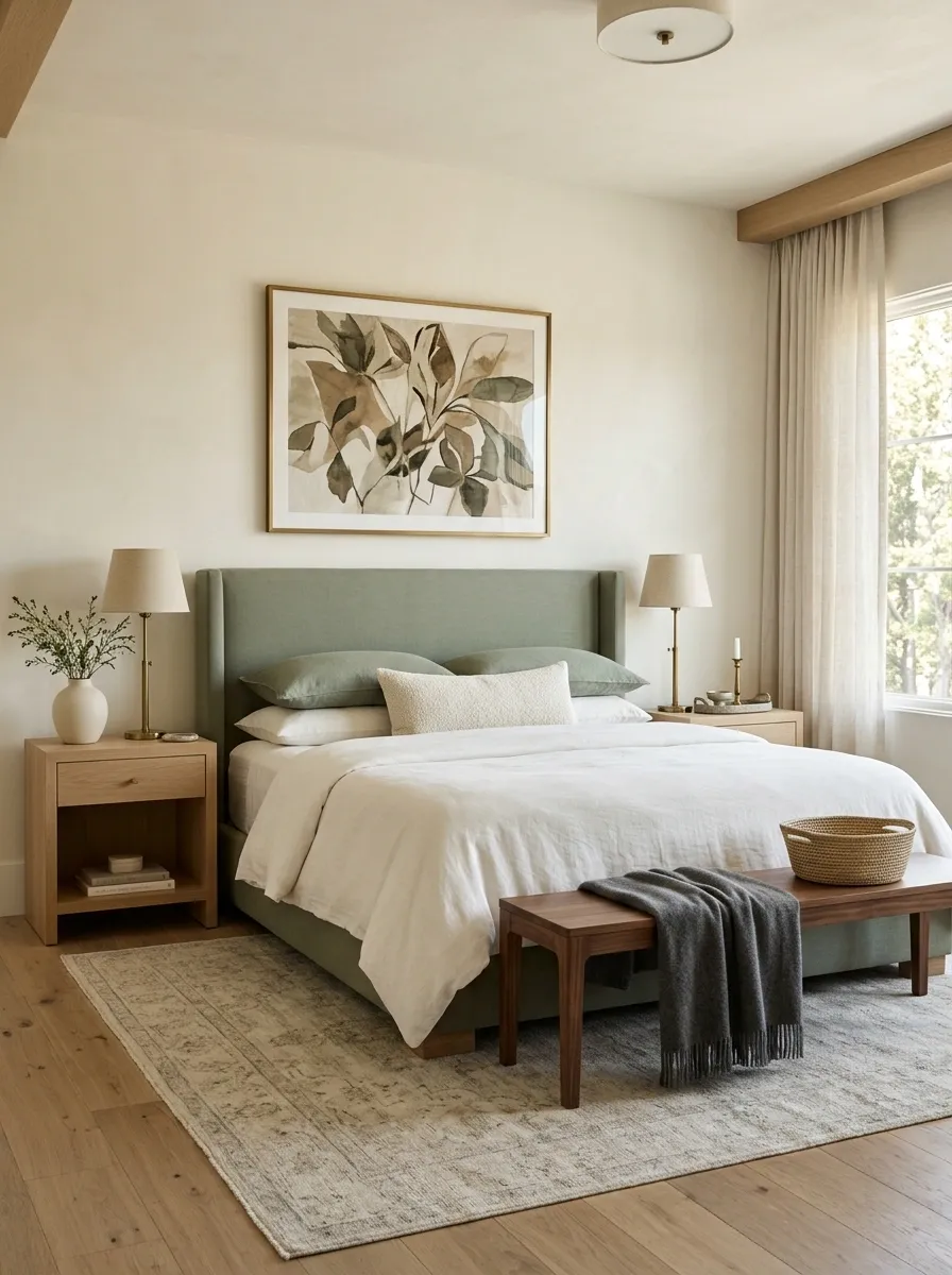
When the curtains match the pillows, the pillows match the rug, the rug echoes the chair, and the artwork obediently repeats all three colors, the room can start looking like a coordinated package instead of a home.
Keep a clear color relationship, but stop repeating the exact same shades everywhere. Use neighboring tones, natural materials, and one darker or deeper accent to give the palette some breathing room.
A bedroom, for example, can combine creamy walls, warm white bedding, muted green upholstery, natural wood, and a small amount of charcoal without turning into a color experiment.
Why it works: related colors create cohesion. Exact repetition creates visual predictability. There is a difference.
Replace the Pillow Pile With Fewer, Larger Textural Layers
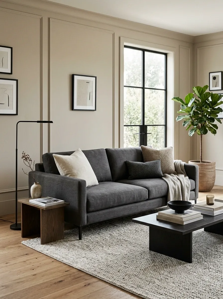
A sofa shouldn’t require a pillow census before anyone is allowed to sit down.
If the cushions are small, overly coordinated, and covered in several competing patterns, remove most of them. Keep a few larger pieces with noticeably different textures. Add one substantial throw if the sofa needs softness, then stop.
The upholstery should still be visible. That matters more than people think. A strong sofa shape gets buried when every inch of it is covered with decorative accessories.
Think in terms of texture and proportion rather than quantity. A large linen cushion beside a nubby textile and one lumbar pillow can do far more than eight tiny patterned cushions.
Why it works: larger layers create deliberate visual weight, while fewer accessories let the furniture retain its shape.
Calm a Dated Wall Color Without Turning the Entire Room White
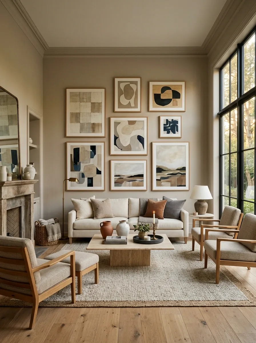
Some rooms aren’t suffering from too much color. They’re suffering from a wall color that has been doing all the talking for fifteen years.
Yellow-beige, overly saturated tan, muddy peach, and certain dark accent colors can dominate everything around them. The fix doesn’t have to be stark white. A softer warm neutral can create a cleaner background while still working with wood, brass, stone, and upholstered furniture.
Keep some contrast in the room. The wall should support the furniture rather than flatten every other decision.
And no, the answer isn’t automatically another shade of greige with a slightly more complicated name.
Why it works: a calmer wall tone creates a flexible visual envelope, allowing furniture, art, texture, and architectural details to carry more weight.
Give Heavy Furniture Some Breathing Room
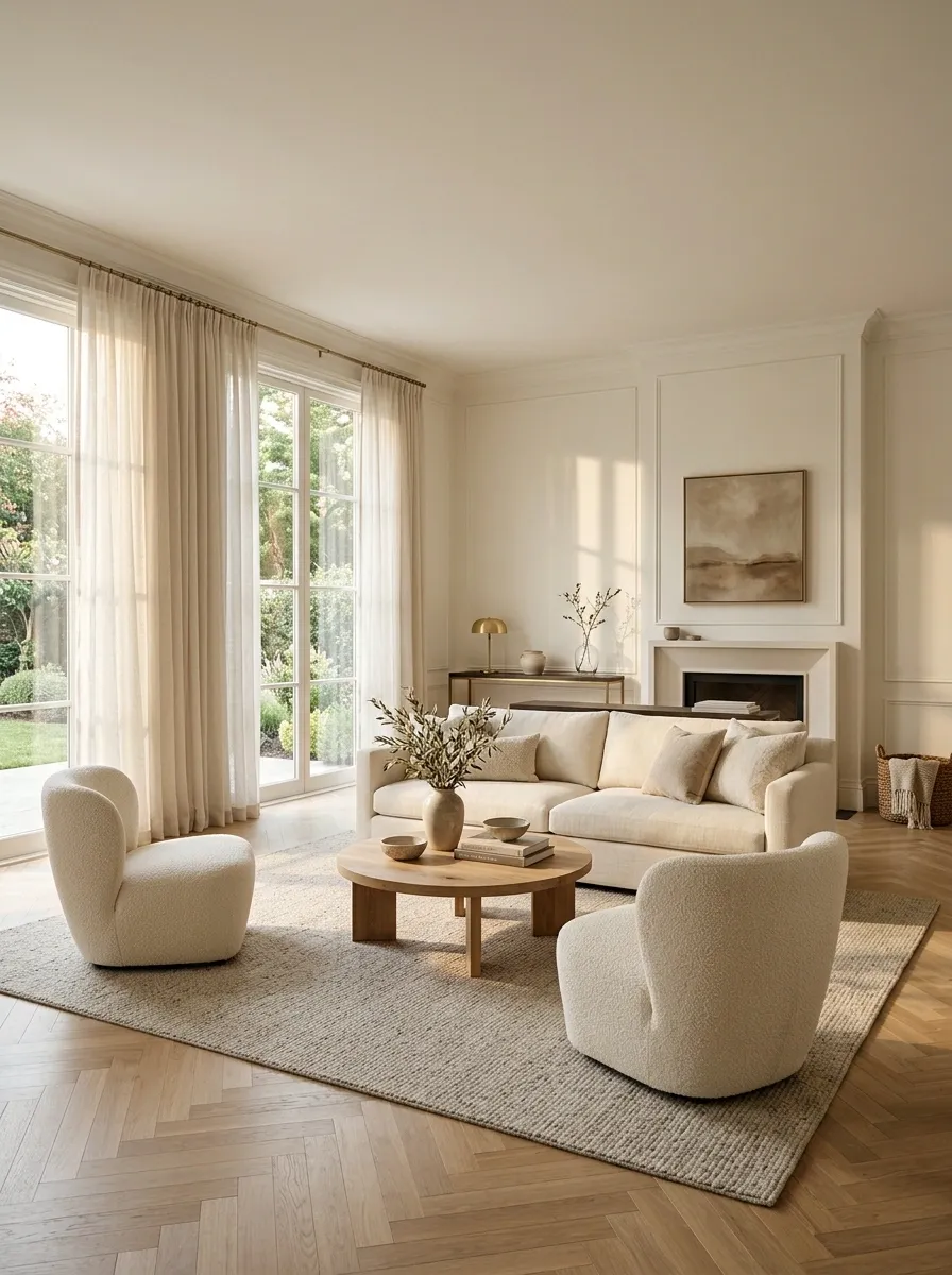
A room can have perfectly decent furniture and still look dated because every large piece has been shoved against a wall like it’s waiting for inspection.
Pull the sofa slightly forward when the room allows it. Give chairs enough space to form an actual conversation area. Let a console stand where it has a purpose instead of automatically filling the nearest empty wall.
The objective isn’t to create a giant empty center. It’s to make the furniture feel intentionally arranged rather than permanently parked.
Keep the walkways clear and respect door swings, windows, and traffic patterns. The room should work before it tries to look clever.
Why it works: open space around furniture makes the room feel lighter, while a deliberate seating arrangement creates a stronger sense of structure.
Keep One Strong Vintage Piece Instead of an Entire Traditional Set
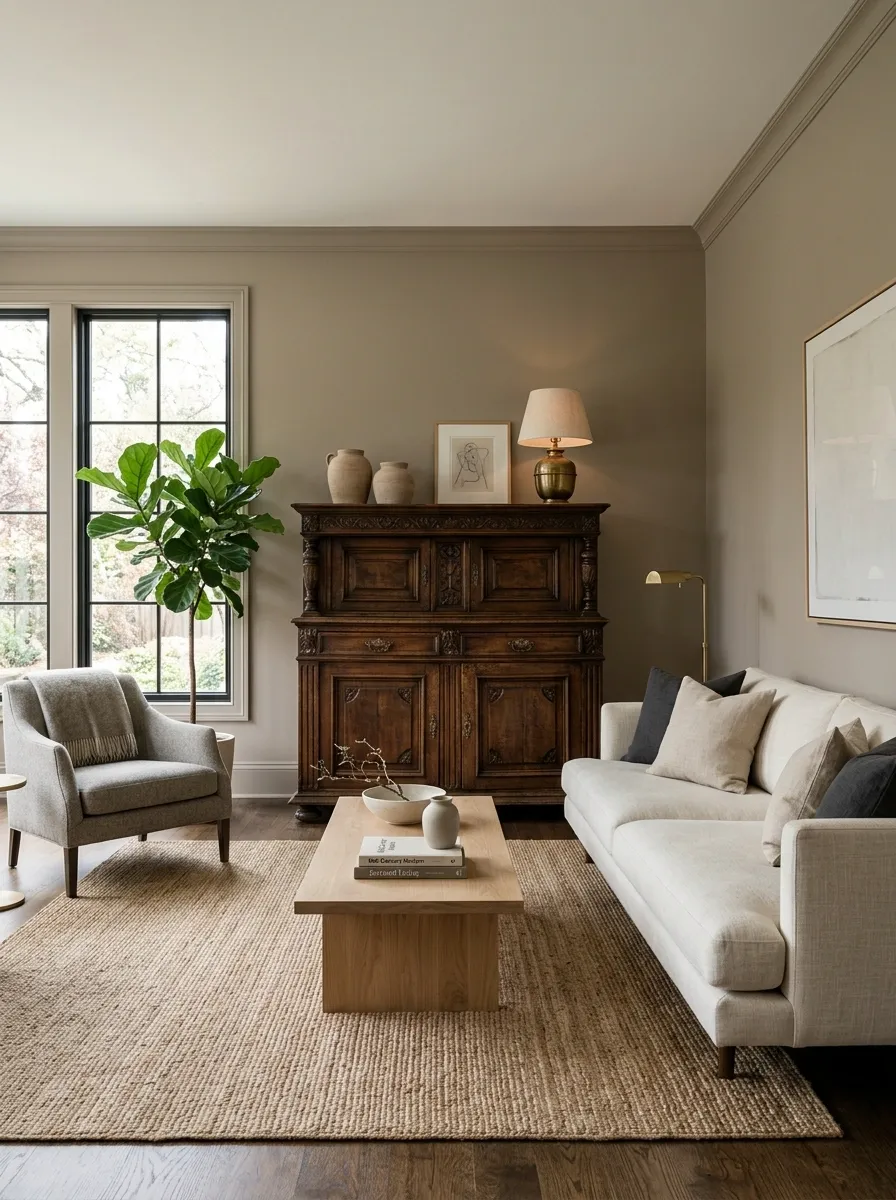
Traditional furniture isn’t the problem. A room where every major piece looks like it inherited the same decorative vocabulary is.
Keep the handsome antique cabinet. Keep the old wooden table. Keep the chair with the shape that would be impossible to replace today. Then quiet down the pieces around it.
A single older piece surrounded by simpler furniture looks intentional and layered. Five matching traditional pieces can start looking like the showroom has been sealed in amber.
This approach is especially useful when replacing everything isn’t practical. One strong heritage piece can become the character of the room while newer shapes keep the overall composition from becoming heavy.
Why it works: contrast gives older pieces importance without allowing them to dictate the entire room.
Give the Mirror a Simpler Shape and Let the Architecture Show
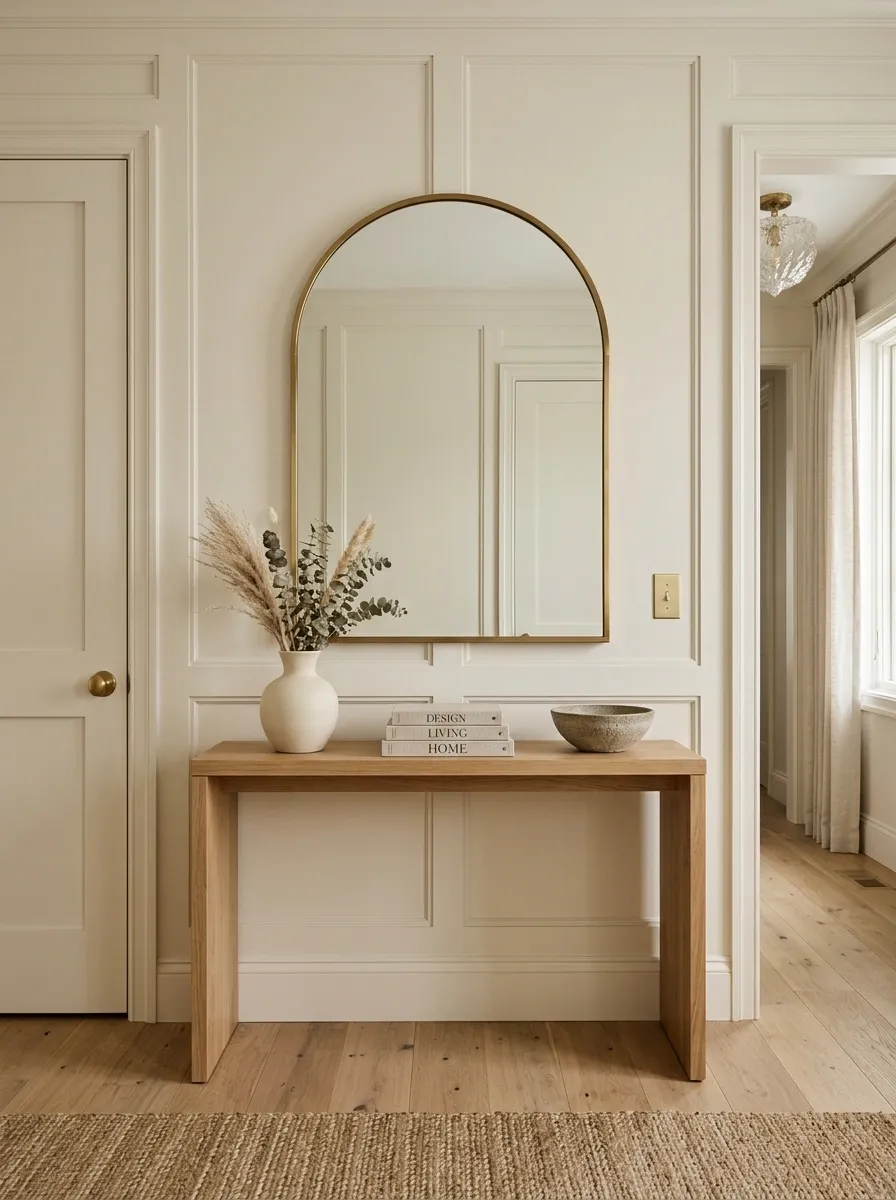
A giant ornate mirror can make a room feel older before anyone has noticed the furniture.
That doesn’t mean every mirror needs to be a black rectangle. Rounded shapes, clean arches, simple wood frames, and restrained metal frames can still have personality without bringing an entire decorative era along for the ride.
In an entryway, choose a mirror large enough to relate to the console beneath it. In a living room, make sure its scale supports the wall rather than creating another tiny decorative interruption.
Keep the frame intentional. Keep the surrounding styling quieter. The mirror should provide structure, not become a costume piece.
Why it works: simpler geometry creates visual clarity while still giving the room a strong architectural shape.
Stop Treating the Walls Like a Parking Lot
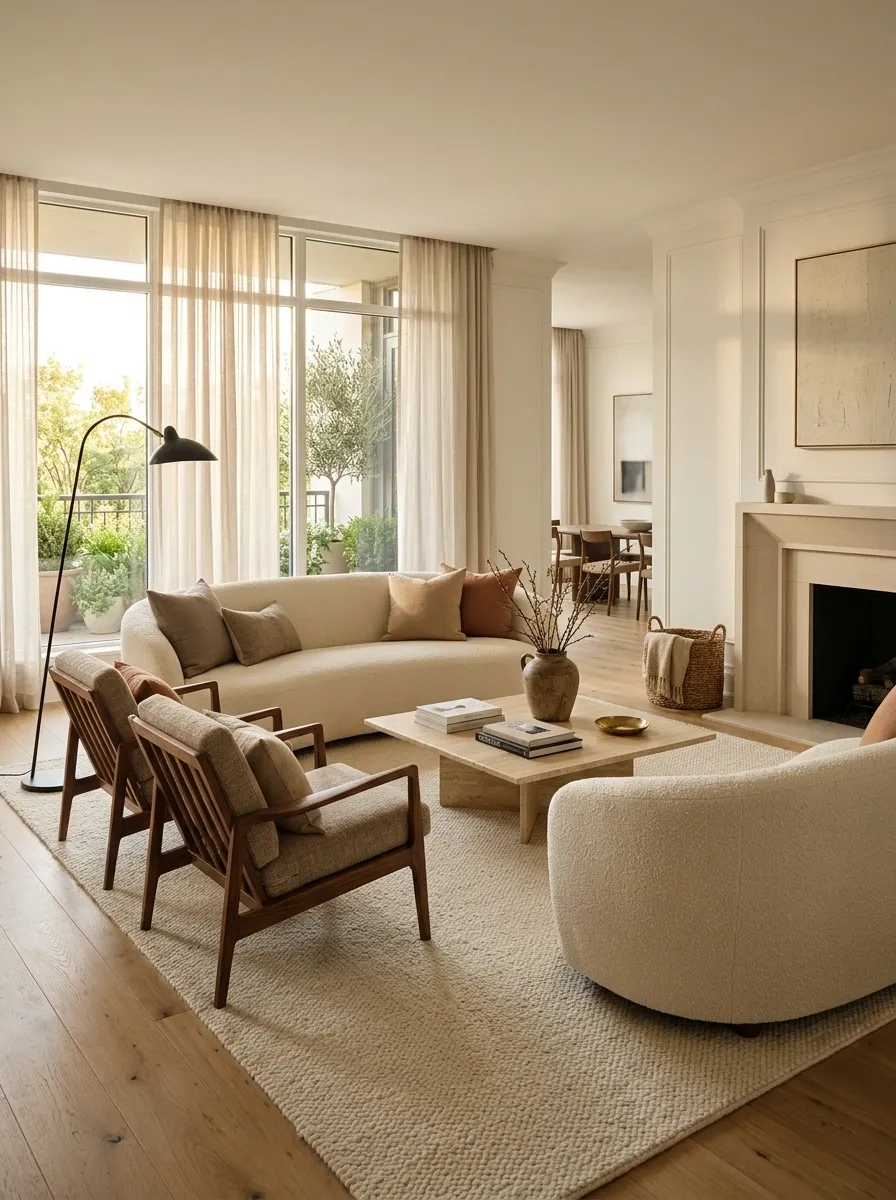
When every sofa, chair, cabinet, and table has its back pressed firmly against a wall, the room can feel strangely institutional. The furniture is present, but it isn’t actually having a conversation.
Create a seating arrangement around the people who use the room. Pull the sofa forward when there is enough clearance. Angle chairs toward each other. Center the coffee table within the seating group rather than within the room itself.
A little separation from the wall can make a room feel more deliberate without requiring one new piece of furniture.
Of course, don’t block doors, vents, radiators, windows, or important circulation. This is furniture arrangement, not an obstacle course.
Why it works: arranging furniture around relationships rather than walls creates a stronger center and makes the room feel more current.
Stop Matching Every Lamp and Start Layering the Lighting
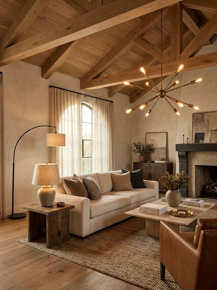
Matching lamps on every table may feel safe. It can also make the room look like it came with a lighting starter pack.
Mix the sources instead. Use an overhead fixture for general illumination, a floor lamp for height, a table lamp where task lighting is needed, and accent lighting where the architecture or artwork deserves emphasis.
The fixtures don’t have to match. They should simply belong to the same visual conversation.
A pair of matching lamps still makes sense when symmetry is useful, especially on bedside tables or a formal console. Just don’t assume symmetry is a requirement for every light source in the room.
Why it works: different lighting heights create depth and stop the ceiling fixture from carrying the entire visual load.
Break Up a Wall of Dark Wood Before It Swallows the Room
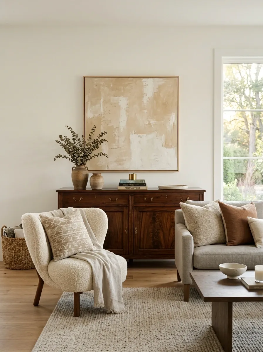
Dark wood can look rich and substantial. A whole room full of it can look like the inside of a 1990s catalog that never got the cancellation notice.
The problem gets worse when dark cabinetry, dark floors, dark tables, dark shelving, and dark trim all occupy large visual areas. Instead of replacing every wooden piece, reduce the amount of darkness in the biggest vertical surfaces first.
Keep a handsome cabinet. Pair it with lighter walls, upholstery, artwork, or flooring. Leave some visual breathing room around the piece so it reads as furniture rather than part of one enormous brown wall.
Why it works: large dark surfaces carry enormous visual weight. Lightening the surrounding planes changes the balance without erasing the warmth of the wood.
Remove the Window Treatment Layers That No Longer Earn Their Keep
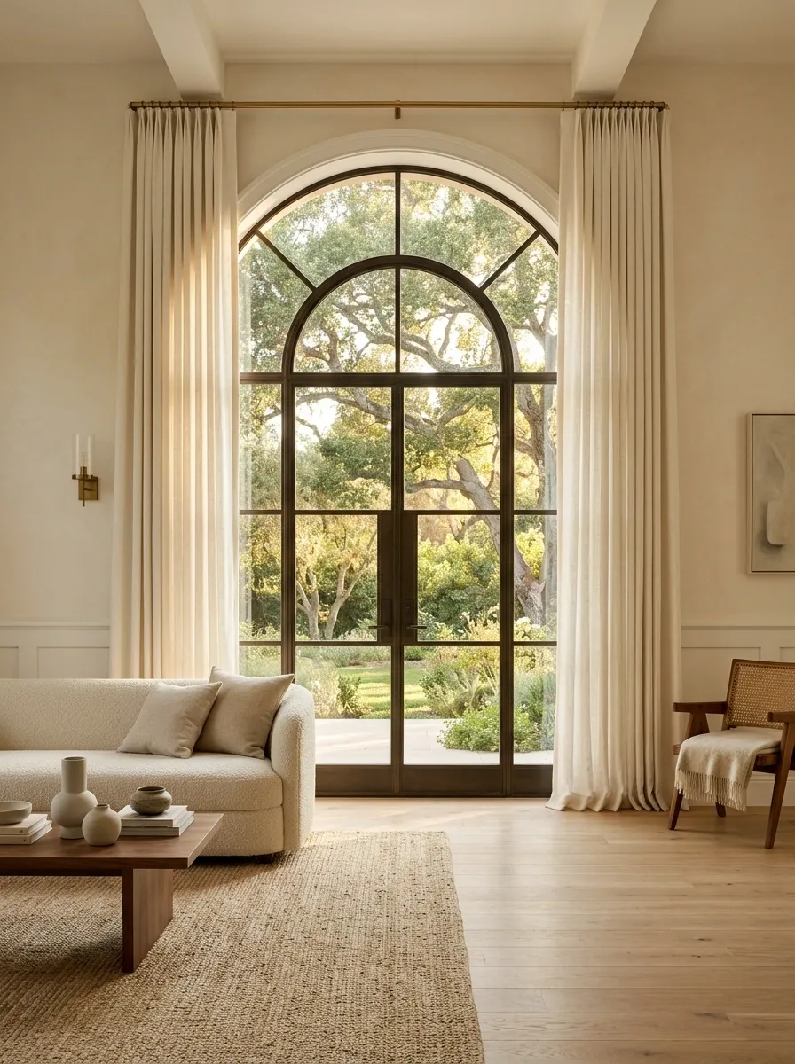
Valances, sheers, swags, decorative panels, and multiple layers of fabric can turn a perfectly decent window into a theatrical production.
Start by asking what the treatment actually needs to do. Privacy? Light control? Softening the wall? Frame the window and stop there.
A simple full-height curtain can often handle the job without making the window the busiest feature in the room. This is especially effective when the architecture itself is attractive.
If privacy requires additional coverage, use it. Just don’t add decorative layers simply because the window looks “unfinished” without them.
Why it works: removing unnecessary layers exposes more of the architecture and gives the room cleaner vertical lines.
Make the Rug Big Enough to Actually Connect the Furniture
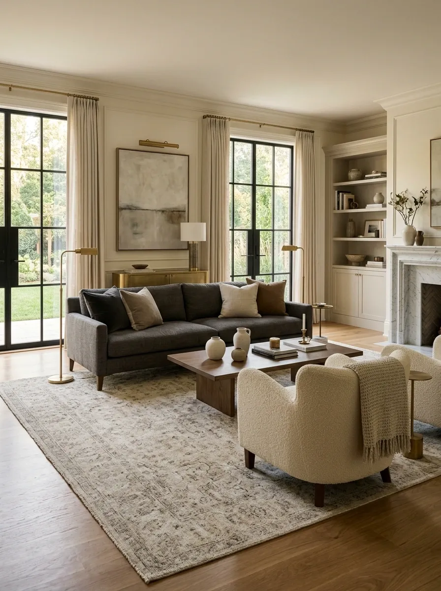
There is a particular kind of decorating mistake where a giant room contains a tiny rug sitting politely underneath the coffee table while the sofa and chairs remain completely outside its jurisdiction.
That arrangement disconnects the furniture.
Choose a rug large enough to anchor the main seating group. Ideally, the front legs of the major pieces can sit on it, creating one visual zone rather than several unrelated objects orbiting a small rectangle.
The rug doesn’t need to fill the entire room. It needs to be large enough to make the furniture look like it belongs together.
Why it works: scale turns separate furniture pieces into one composition.
Stop Making One Accent Wall Carry the Entire Personality of the Room
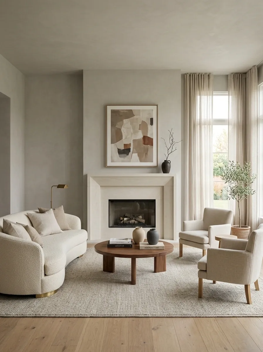
One dramatic wall was once considered the easiest way to create a “feature.” The trouble is that many accent walls now compete with fireplaces, artwork, curtains, furniture, and every other object trying to be the star.
Instead of making one wall dramatically different, consider creating a more continuous background and giving one actual element the focal-point role.
That might be a fireplace, large artwork, architectural feature, sculptural light, or substantial bed.
The wall doesn’t need to perform circus tricks. Sometimes it just needs to stop interrupting everything else.
Why it works: a continuous background gives the eye a calmer field and makes the genuinely important element more noticeable.
Stop Filling Large Surfaces With Tiny Decorative Objects
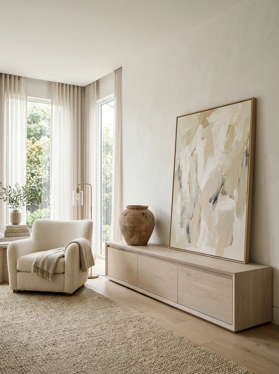
A long dresser, console, shelf, or media unit can become a graveyard for small accessories. The more tiny things added, the more unfinished the surface somehow looks.
Scale is the missing ingredient.
Replace several little objects with one substantial lamp, a large vessel, oversized artwork, a broad bowl, or another piece that can visually hold the space.
The trick is not simply “buy bigger decor.” Large pieces need room around them. A substantial object jammed between six others isn’t sophisticated. It’s just a bigger traffic jam.
Why it works: scale establishes hierarchy. Large surfaces need objects that can hold their own visually.
Stop Making Beige the Entire Color Palette
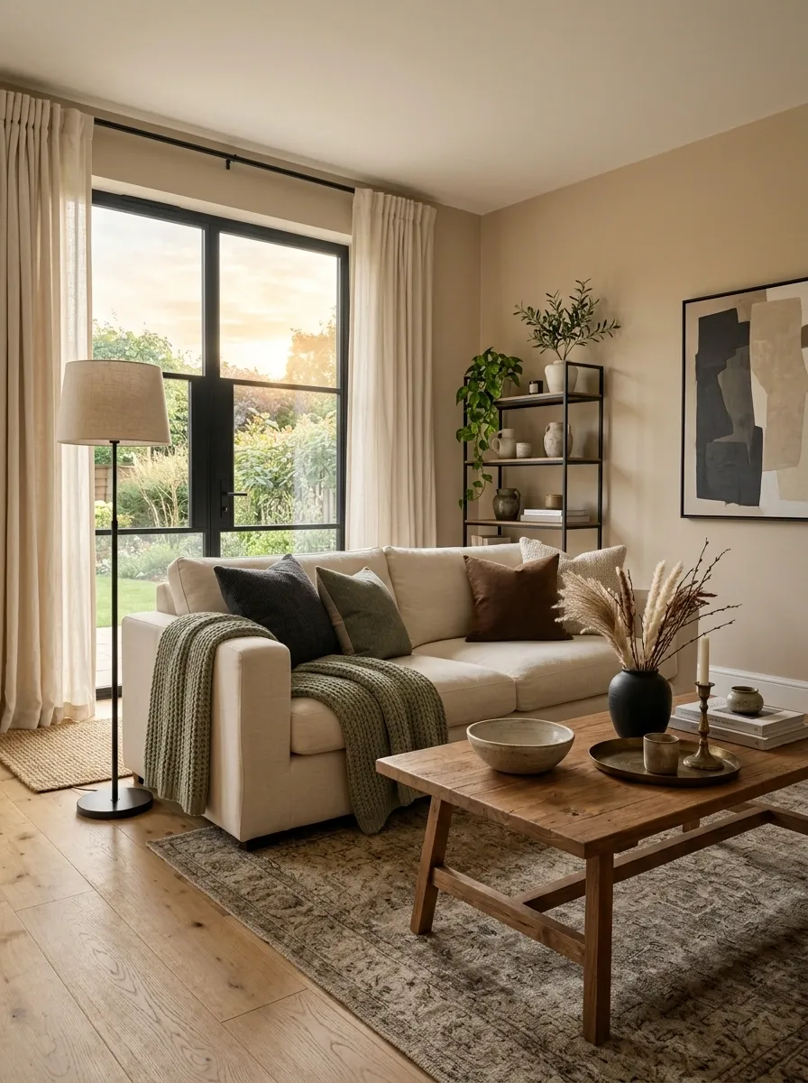
Beige isn’t dated. Beige covering absolutely everything can be.
When walls, upholstery, rugs, curtains, pillows, lamps, and accessories all sit within the same narrow beige family, the room loses contrast and starts looking visually flat. Then someone adds another beige pillow to solve the problem.
Don’t.
Keep beige as the foundation and introduce controlled contrast. Warm wood, muted green, charcoal, cream, brown, black, aged metal, or deeper earthy tones can all give the room structure without turning it into a color circus.
Why it works: neutral rooms still need hierarchy. Contrast helps the eye understand where to look.
Use Better Hardware to Give Older Cabinets a Fresh Visual Language
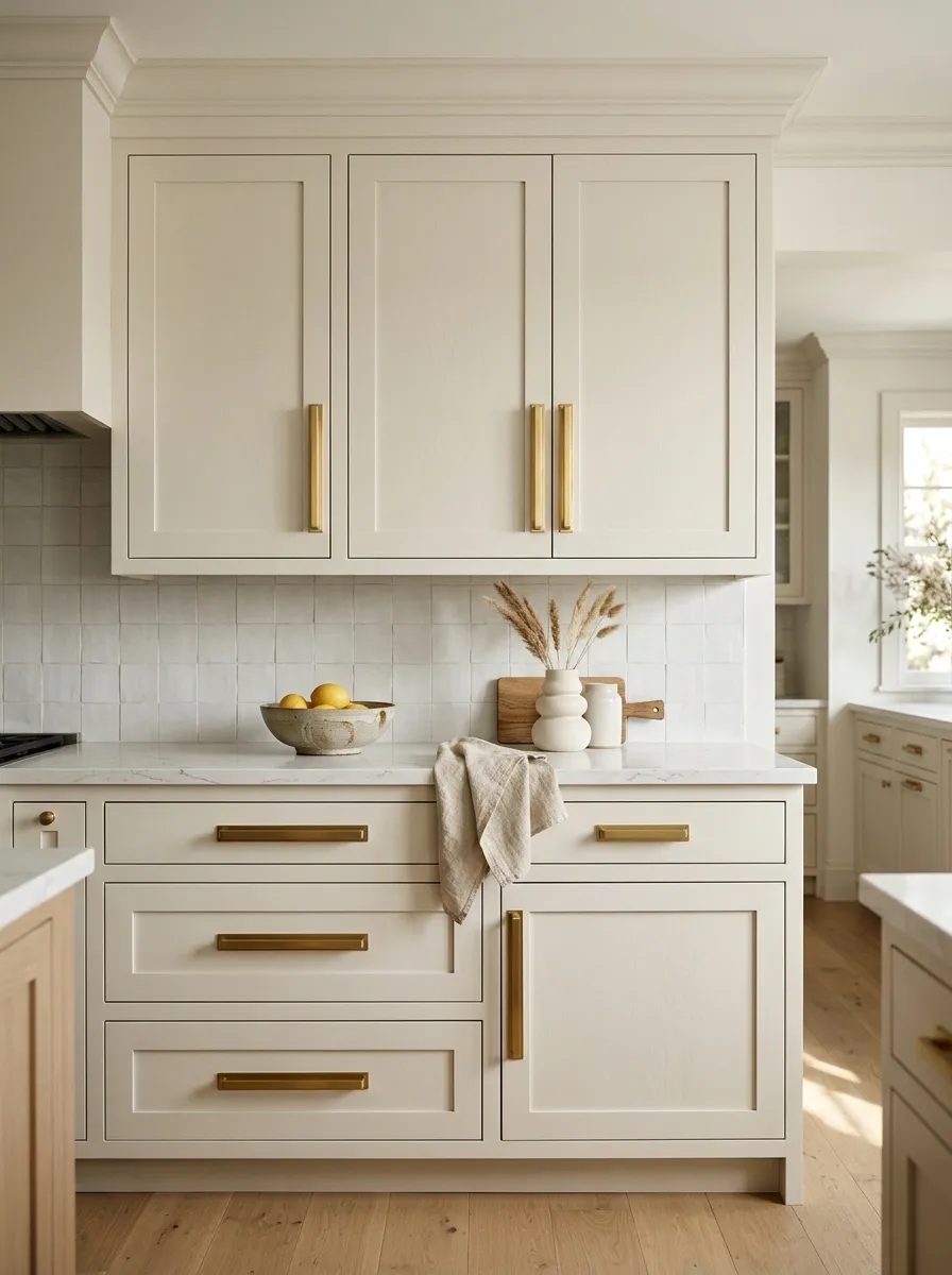
Cabinets don’t always need replacing. Sometimes the hardware is doing a remarkable amount of work to keep them trapped in the past.
Tiny decorative knobs, shiny dated pulls, ornate shapes, and hardware that disappears against the cabinet can make otherwise solid cabinetry look tired. Replace them with simpler hardware in a scale that relates properly to the doors and drawers.
Longer pulls can give plain cabinetry a more substantial appearance. Dark metal can create definition against lighter cabinets, while softer aged finishes can work well with warmer materials.
The goal isn’t to make perfectly serviceable cabinets look brand new. It’s to stop the hardware from announcing their age quite so loudly.
Why it works: hardware sits at eye level and gets repeated across an entire kitchen or bathroom, so even a small visual change can affect the whole composition.
Break Up the Matching Bedroom Set
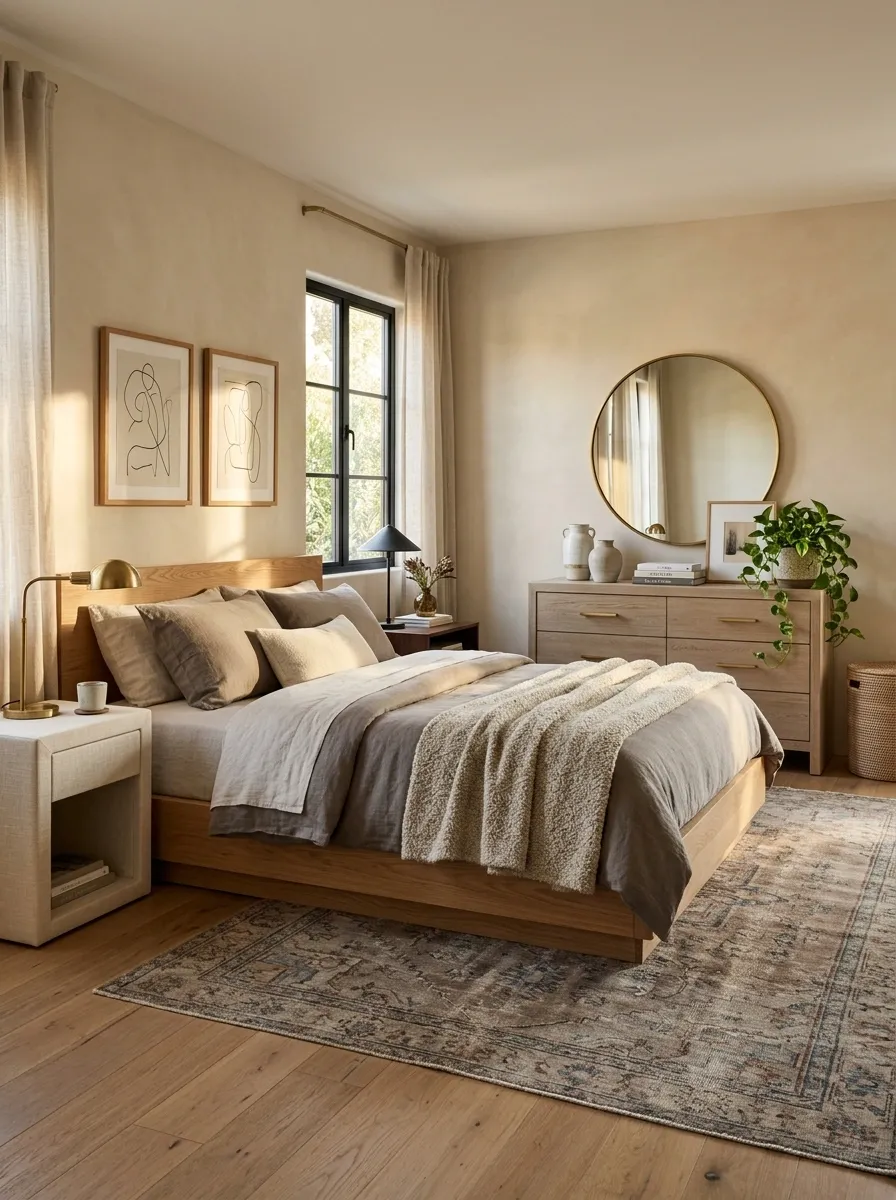
A matching bed, two nightstands, dresser, chest, and mirror can make a bedroom look as though someone simply clicked “complete collection” and moved on.
Keep the pieces that have the best proportions or strongest material. Then introduce variation.
A wood bed can work with upholstered nightstands. A substantial dresser can sit opposite a simpler bed. One nightstand doesn’t have to be the exact twin of the other when the layout allows for a more collected approach.
The bedding can then provide the thread that ties the different pieces together. Use related tones and textures rather than forcing every furniture finish to match.
Why it works: variation makes the bedroom feel assembled and personal rather than delivered as a single package.
Let One Material Lead Instead of Giving Every Finish Equal Attention
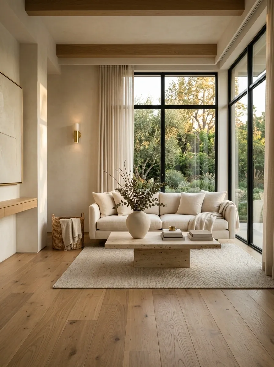
A room starts looking dated when every surface has a different idea.
Wood, stone, glossy metal, distressed paint, decorative tile, patterned fabric, mirrored accents, and another wood tone can all be good individually. Together, they can become a visual roll call.
Choose one material to lead. Let the others support it.
In a kitchen, warm wood might carry the room while stone and metal remain quieter. In a living room, natural wood can anchor the furniture while textiles and metal simply reinforce it.
A strong material hierarchy makes a room feel considered rather than accumulated.
Why it works: the eye understands a dominant material quickly. Everything else can then play a supporting role instead of competing for equal importance.
Replace an Ornate Ceiling Fan With a Cleaner Fixture That Fits the Room
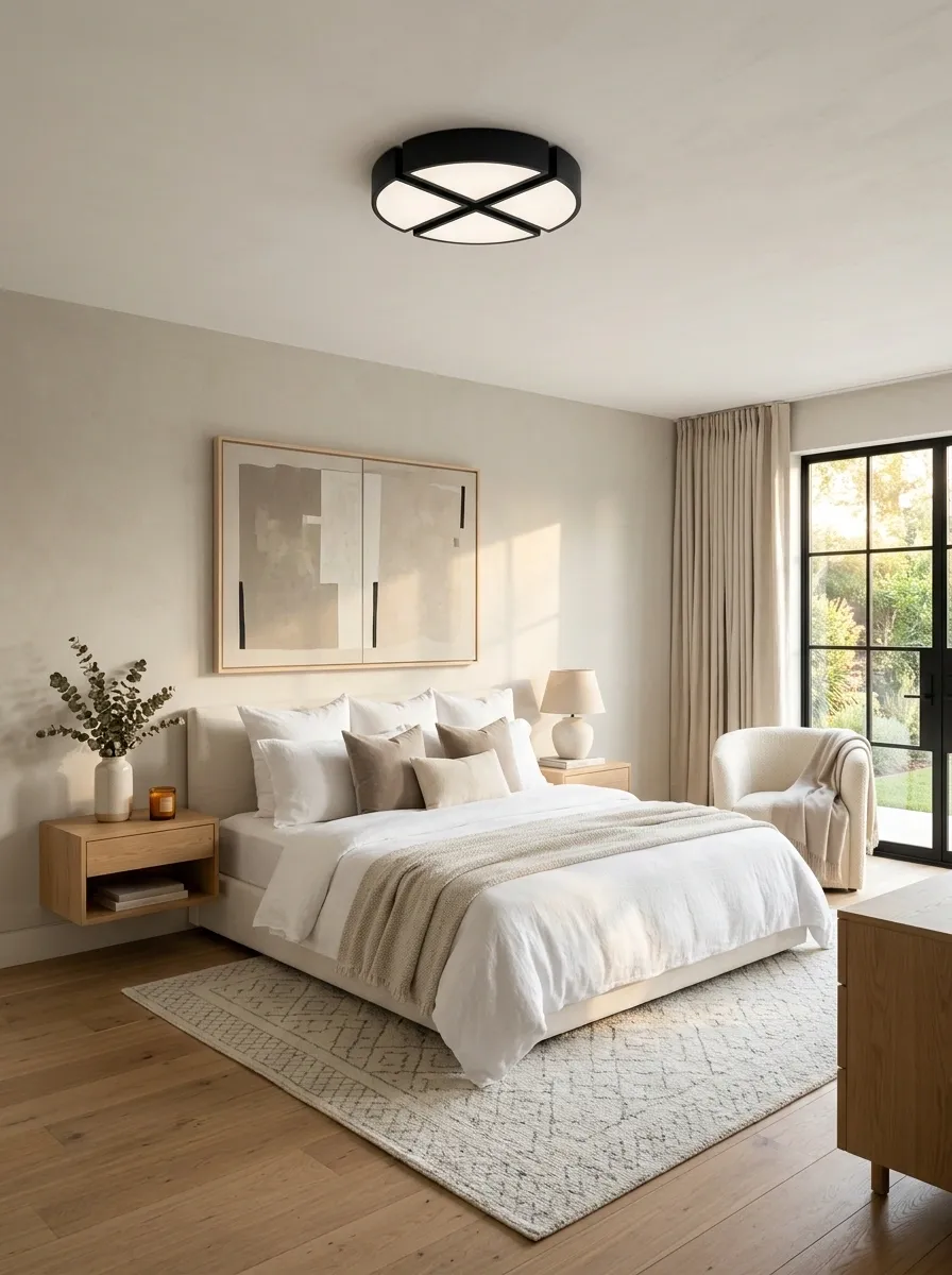
The ceiling is not exempt from editing.
Large decorative ceiling fans, overly ornate chandeliers, and bulky fixtures can keep a bedroom or living room visually anchored in an older decorating style even after the rest of the room has changed.
Choose a simpler shape that respects the ceiling height and room size. In a bedroom, the fixture should relate to the bed and surrounding furniture. In a living room, it should support the architecture rather than become an unrelated centerpiece.
A simpler fixture also gives stronger bedding, artwork, or furniture an opportunity to become the actual focal point.
Why it works: overhead fixtures are unusually visible from across the room. Their shape sets the visual tone before the eye reaches the furniture.
Stop Using Shiny Gold on Every Available Surface
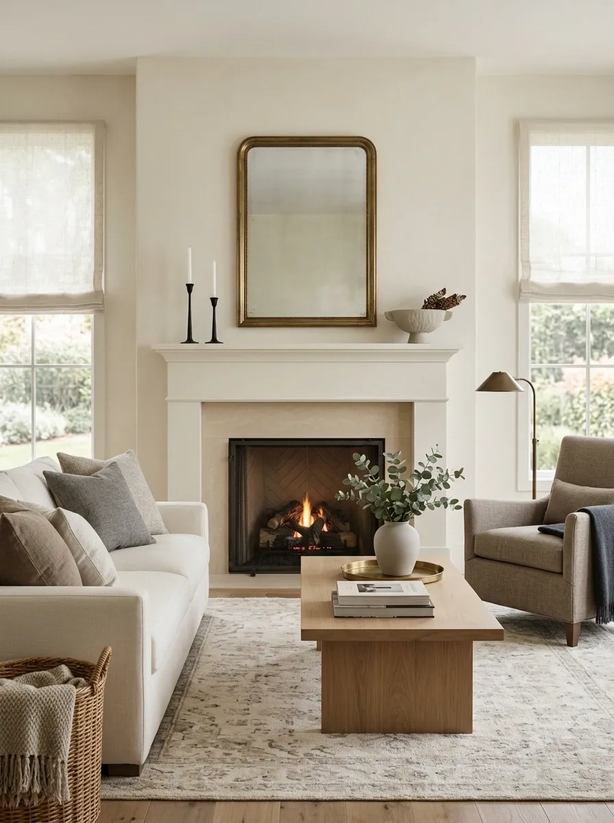
A little warm metal can add richness. Gold hardware, gold lighting, gold frames, gold mirrors, gold legs, gold accessories, and perhaps a gold decorative bowl for moral support can push the room straight into trend overload.
The fix isn’t banning gold. Use it with restraint.
Introduce a darker metal or quieter finish to create contrast. Black, bronze, aged metal, and even simple painted elements can give shiny brass somewhere to sit without making every surface sparkle.
Keep the warm metallic pieces that actually suit the room. Just stop making them audition for the same role.
Why it works: contrast gives metallic finishes more impact. When every object has the same shine, nothing feels important.
Remove Furniture That Exists Only Because the Corner Felt Empty
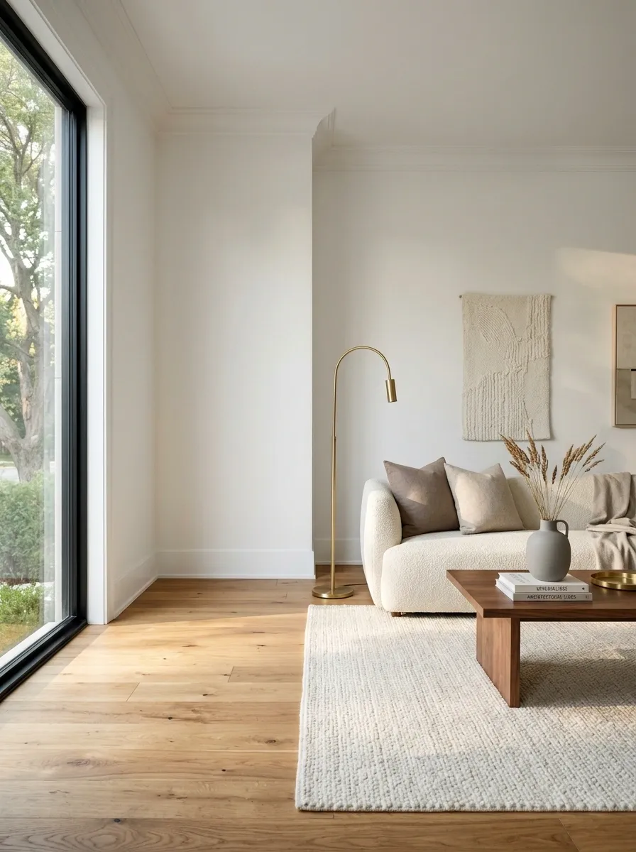
Not every empty corner is asking for a chair.
Small plant stands, occasional tables, unused cabinets, decorative stools, narrow shelving, and lonely accent pieces tend to multiply over the years because an empty area somehow feels like a decorating emergency.
Sometimes the strongest update is removing the furniture and leaving the corner alone.
Use the space when it has a genuine function. Add seating when someone will actually sit there. Add storage when the room needs storage. Otherwise, let the architecture breathe.
Why it works: negative space gives important furniture more visual authority and makes circulation easier to understand.
Give the Room One Clear Focal Point
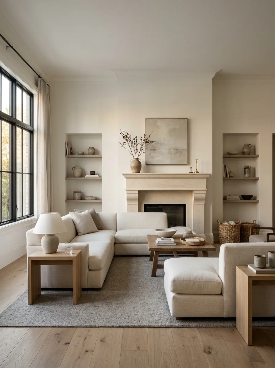
A room can look dated simply because everything is trying to be important.
The fireplace competes with the television. The television competes with the gallery wall. The chandelier competes with the mirror. The mirror competes with the artwork. Suddenly nobody knows where to look, so the room just looks busy.
Choose one primary focal point. Then make the surrounding elements support it rather than compete with it.
A fireplace can lead the living room. A large artwork can lead a dining room. In a bedroom, the bed can become the visual anchor. Secondary details should frame the star, not audition against it.
Why it works: visual hierarchy makes a room easier to read. One strong anchor makes everything around it feel more deliberate.
FOCUS
Add Texture Instead of Throwing More Pattern at the Problem
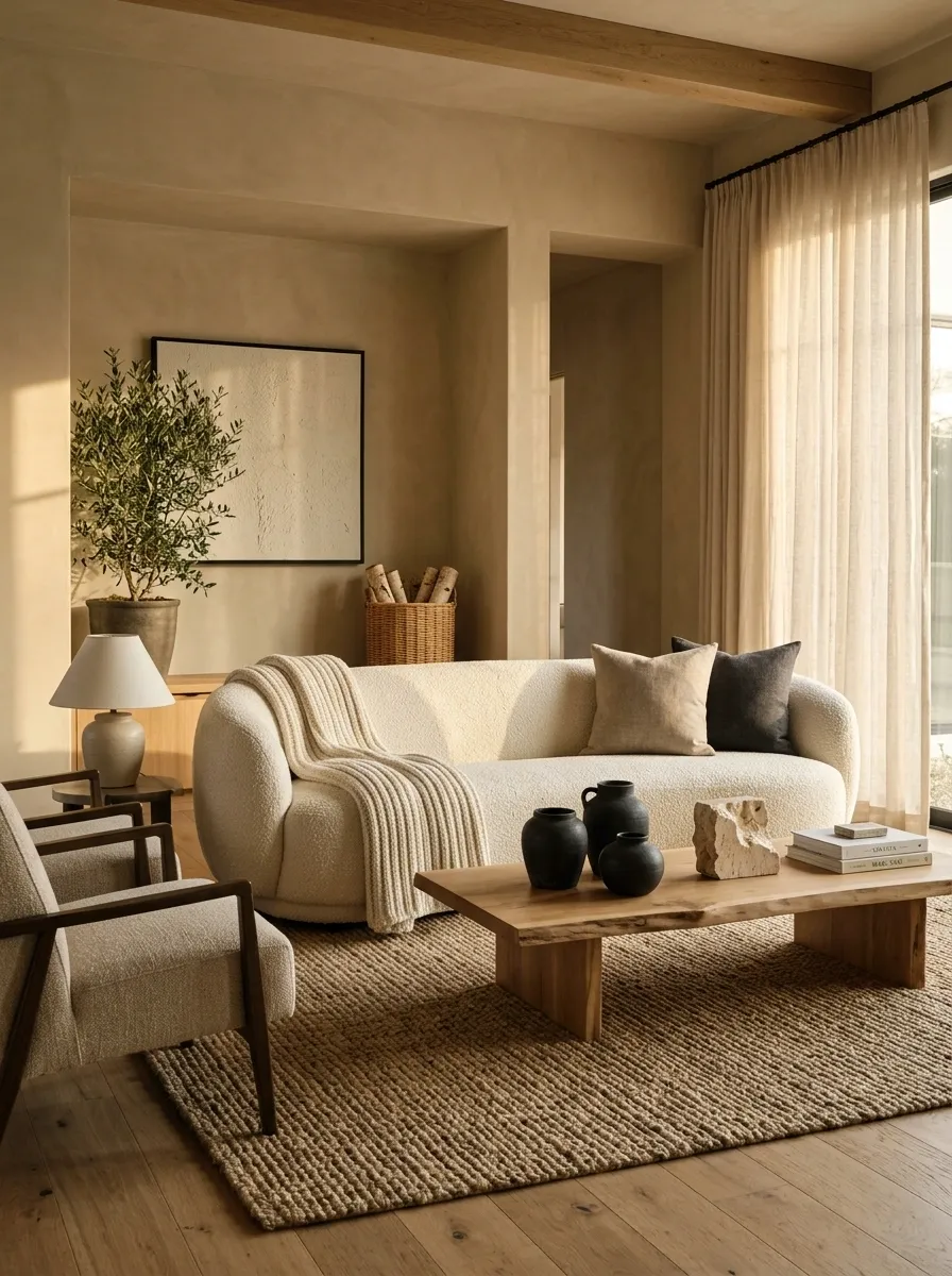
When a room feels flat, the instinct is often to add another print.
Another pillow. Another patterned chair. Another dramatic curtain. Another rug that needs its own diplomatic relations.
Texture is usually a smarter way to create depth when the room already has enough pattern.
Layer linen, wool, woven materials, natural wood, stone, matte ceramics, boucle-like upholstery, or softly textured bedding. Keep the colors related while allowing the surfaces to feel different.
Why it works: texture adds visual depth without creating the same level of visual noise as competing patterns.
Stop Tweaking the Room and Edit It Properly
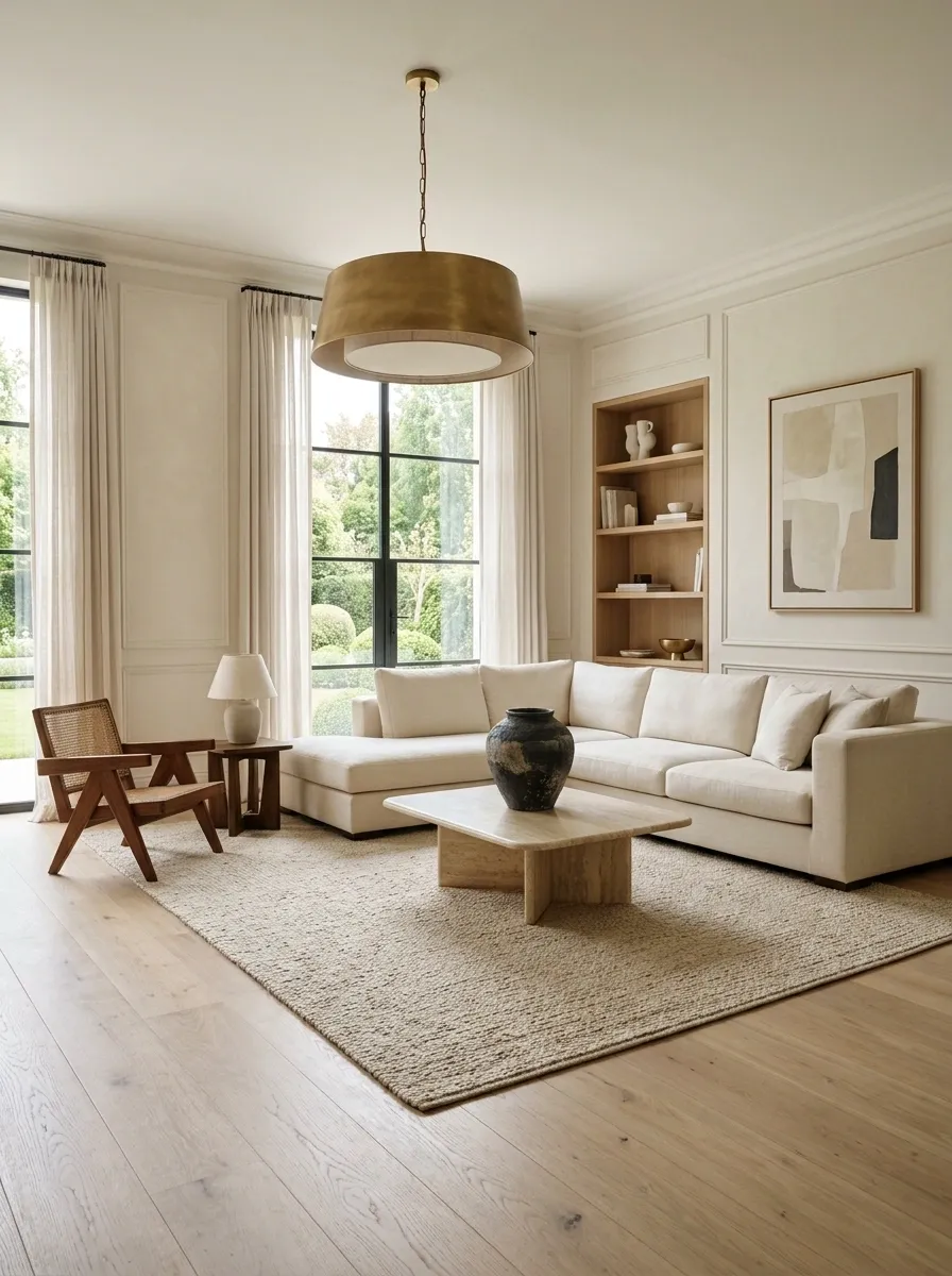
Sometimes a dated room doesn’t need another small update. It needs a ruthless edit.
Step back and identify the pieces carrying the most visual weight. Keep the furniture with good proportions, useful function, strong materials, or genuine character. Change the elements that are visibly aging the composition. Remove the pieces that have no job beyond occupying space.
Then rebuild around what remains.
This is where the earlier fixes start working together. Better scale, fewer accessories, stronger lighting, clearer focal points, varied furniture, controlled materials, and more breathing room can completely change the way a room reads without requiring a total renovation.
The room doesn’t need more decorating. It needs better decisions.
Why it works: visual improvement comes from hierarchy. Once the weakest and loudest choices are removed, the good pieces finally have room to work.
Useful pieces
Real character
Window treatments
Hardware
Large visual surfaces
Unused furniture
Visual repetition
Competing focal points
The Room Doesn’t Need a New Personality
A home doesn’t suddenly look current because every old piece has been replaced. In fact, stripping out everything with history can leave a room looking just as generic as the dated version.
The better move is to figure out what is making the room feel stuck. Sometimes it’s the tiny rug. Sometimes it’s the wall of matching furniture. Sometimes it’s the chandelier that is three sizes too small and somehow still convinced it’s the star.
Start with the most visually dominant problem and fix that first. Then step back. Give the room a little breathing room before buying anything else.
The goal isn’t to make the space look like it belongs to one particular year. It is to make the room feel considered now.