
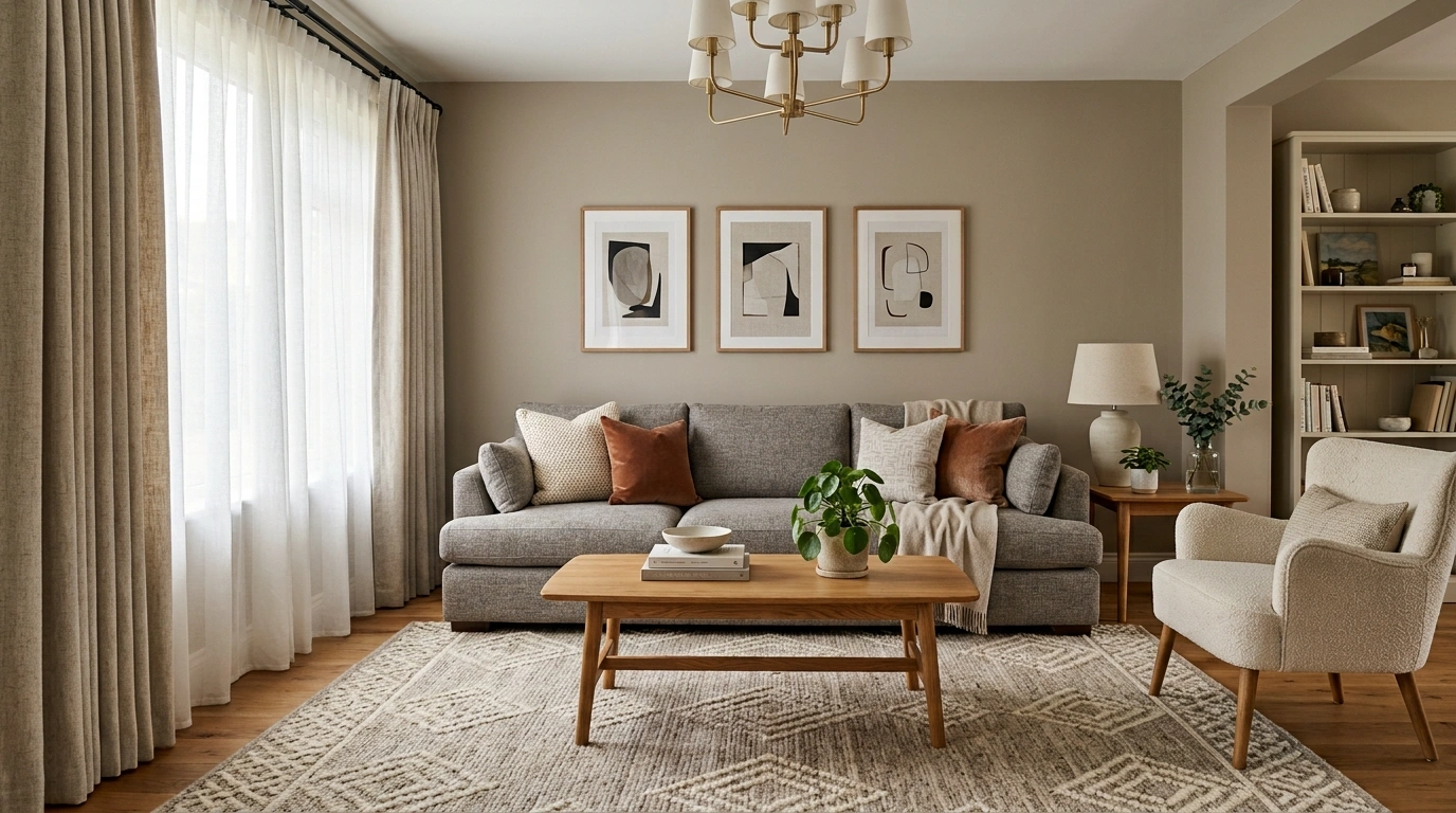
A room can contain perfectly decent furniture and still look like it was assembled five minutes before the guests arrived. The sofa is fine. The rug is fine. The artwork is fine. Somehow, the whole thing still feels underwhelming.
That’s usually a composition problem, not a money problem.
Tiny rugs floating underneath oversized furniture, art that is far too small for the wall, a ceiling fixture doing all the lighting work, furniture pushed against every available wall, and surfaces covered in little decorative objects can make an otherwise decent room look surprisingly cheap.
The fix isn’t to replace everything. It isn’t even to buy more.
The smartest upgrades change the way the existing room is seen. Better scale, stronger focal points, layered lighting, controlled color, useful negative space, repeated finishes, and a little ruthless editing can make an ordinary room feel much more considered.
Clear focal point
Layered lighting
Repeated finishes
Enough empty space
Random art with random spacing
One ceiling light doing everything
Furniture glued to every wall
Seventeen objects on one table
Ways to Make a Room Look More Expensive
Turn Ordinary Walls Into a Grand Gallery
A stark staircase wall can easily feel like wasted real estate, but treating it as a canvas for a collected gallery display changes the entire atmosphere of the entry. Mix frames of varying sizes and metallic finishes to create rich visual texture that feels curated over time rather than purchased in a single afternoon.
The secret to making a gallery wall look expensive lies in cohesion through contrast. Pair striking dark wall paint with gleaming gold frames and traditional artwork so the arrangement commands attention without feeling cluttered or chaotic.
Why it works: Vertical gallery installations draw the eye upward, making standard architectural spaces feel taller, more intentional, and inherently more luxurious.
Give the Room One Strong Focal Point Instead of Several Small Ones
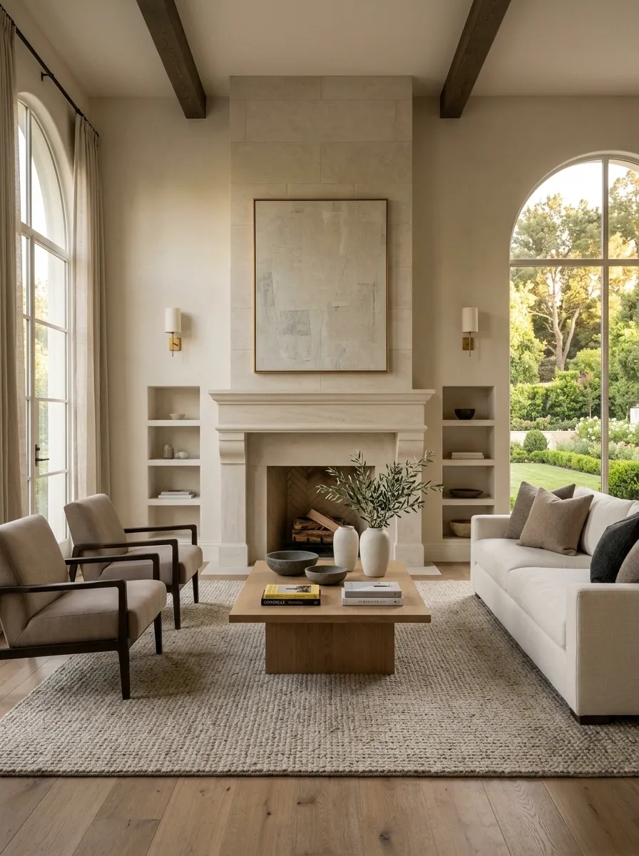
A room starts looking more expensive when the eye knows where to land. Choose the strongest feature, whether that’s the sofa wall, fireplace, bed, dining area, or one large artwork grouping, and let everything else support it.
The mistake is giving every wall and surface equal importance. A room full of competing little moments doesn’t look collected. It looks busy.
Keep the main furniture arrangement centered around one visual anchor, then quiet down the surrounding pieces. The result should feel deliberate, not like every object was asked to audition for the starring role.
Why it works: Visual hierarchy makes ordinary furnishings feel more intentional because the room has a clear order.
One obvious lead.
SUPPORTING: furniture and lighting that reinforce it
QUIET: everything that doesn’t need to compete
Elevate Utility Zones With Moody Finishes
Mudrooms and entryways often get bogged down by everyday clutter, but coating the paneling in a rich, moody hue instantly transforms a functional utility space into a sophisticated destination. Dark tones give simple wooden paneling serious weight and undeniable character.
Instead of hiding your everyday items, make them part of the design by using coordinated leather bags, woven baskets, and uniform hangers. When utilitarian gear shares a disciplined color palette, the entire drop zone looks purposely styled.
Why it works: Deep, saturated paint colors absorb light and blur awkward corners, making hardworking practical spaces feel custom-built and high-end.
Replace Several Small Decorative Pieces With One Substantial Statement
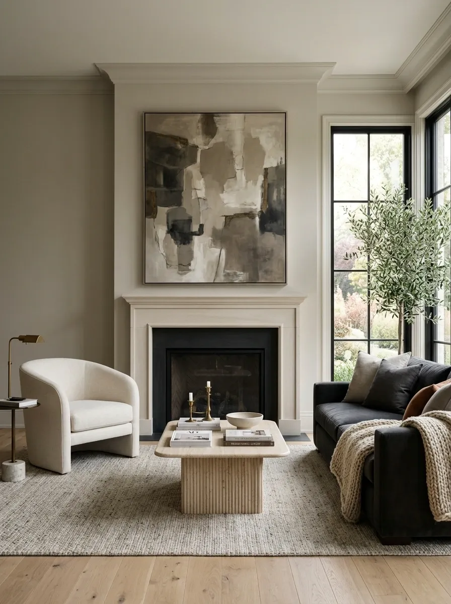
A collection of tiny accessories rarely makes a room feel richer. More often, it makes the surfaces look nervous.
Remove several small pieces and give the space one substantial element instead. That might be a large artwork grouping, a broader mirror, a sizeable lamp, or one architectural-looking object that has enough visual weight to hold the area.
The trick is scale. A substantial feature creates breathing room around itself, which makes everything nearby look more considered.
Why it works: Bigger visual anchors create confidence. The room stops looking like it is trying very hard to look decorated.
Frame Architectural Features With Statement Plates
An arched alcove is already a gorgeous architectural detail, but filling that curve with a curated arrangement of decorative plates takes the space to an entirely different level of design. Varying the plate sizes and patterns creates a stunning medallion effect that dances across the wall.
Flanking the display with classic wall sconces adds symmetrical balance and casts a warm evening glow over the collection, making the entire vignette feel like a boutique hotel feature.
Why it works: Grouping unexpected objects in a formal geometric pattern adds instant vintage charm and sophistication without requiring major construction.
Make the Curtains Look Architectural
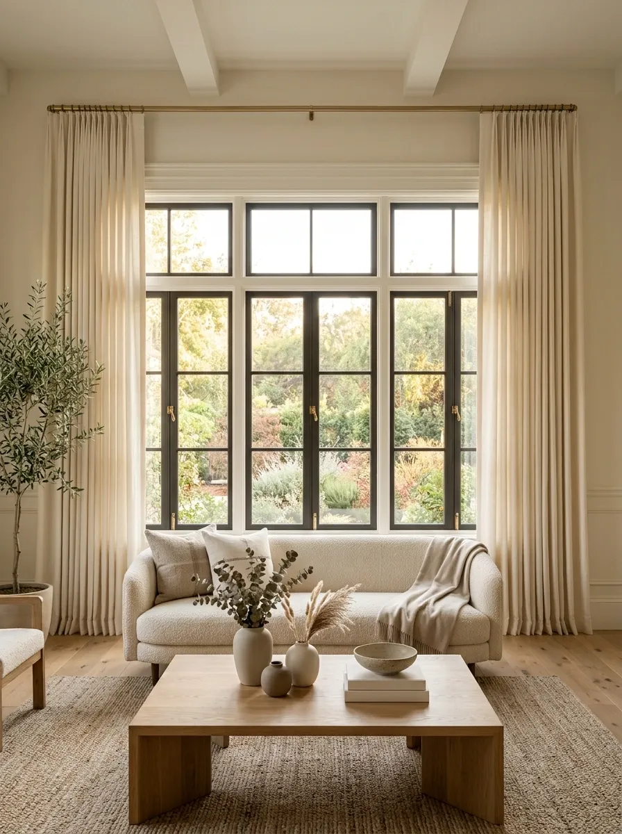
A basic window can look far more substantial when the curtain treatment is handled properly. Mount the rod higher, extend it beyond the window opening, and use full-length panels that reach the floor.
This is especially useful when the windows themselves are small or visually underwhelming. The fabric creates a larger vertical frame and gives the entire wall more presence.
Skip short curtains that stop awkwardly above the floor. They tend to make the room look like the window treatment was an afterthought, which is not exactly the luxury effect.
Why it works: Full-height fabric adds visual scale and creates a stronger relationship between the window and the rest of the room.
wide
full-length
Layer Textures for a Sophisticated Study
A home workspace should inspire focus, and nothing ruins that mood faster than a cold, sterile desk floating awkwardly in a corner. Ground the area with a classic wooden writing table, a supportive spindle chair, and a warm brass lamp that brings instant polish to the layout.
Lean into the richness of layered materials by combining framed vintage artwork, a ceramic jug filled with dried botanicals, and a tailored neutral pillow for effortless comfort. Every object should feel like it belongs in a timeless library.
Why it works: Mixing warm woods, aged brass, and organic botanicals creates tactile depth that makes even a simple corner look exceptionally well-traveled and expensive.
Use a Larger Rug to Give the Furniture a More Established Relationship
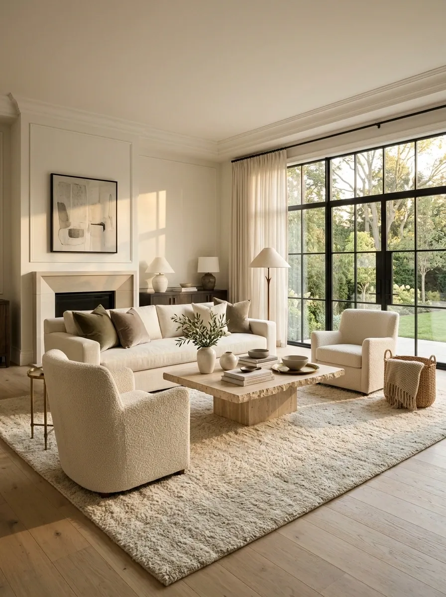
A too-small rug can make a good room look surprisingly flimsy. If the sofa is substantial but the rug is barely large enough for the coffee table, the furniture appears disconnected from itself.
Use a rug that visually links the main seating pieces so the sofa, chairs, and table read as one conversation area. The room immediately feels more grounded.
This doesn’t mean covering every inch of floor. It means giving the furniture a clear territory instead of letting each piece float around like it missed the group invitation.
Why it works: A connected seating zone feels intentional, while undersized rugs exaggerate awkward gaps and mismatched furniture scale.
Upgrade the Lighting Composition, Not Just the Light Fixture
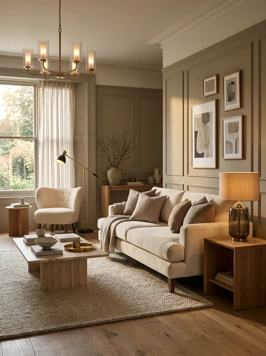
Replacing one ceiling fixture can help, but it won’t solve a room where every light source comes from the ceiling. A better-looking room usually has light at different heights.
Combine the overhead fixture with a floor lamp, table lamp, or other practical source so the eye gets several softer points of illumination. Put the lower lights near areas that actually need them, such as seating, reading corners, or side tables.
And yes, that means the ceiling light can finally stop carrying the entire room on its back.
Why it works: Multiple light levels create depth and keep the room from looking flat under one uniform source.
Create a More Expensive-Looking Color Envelope
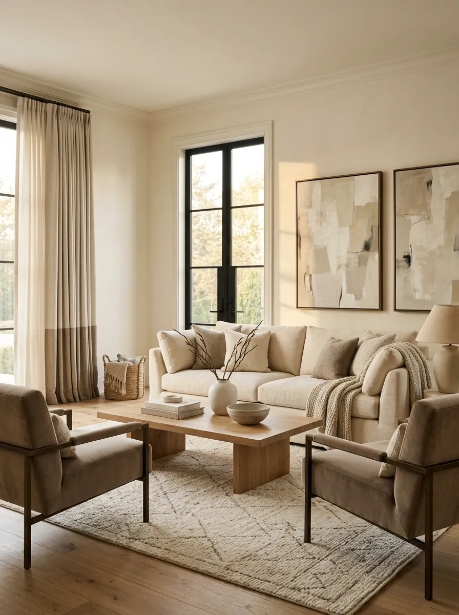
A room doesn’t need more colors. It usually needs fewer of them behaving better.
Choose a restrained base and repeat related tones across the walls, upholstery, curtains, artwork, and accessories. Warm cream with taupe and natural wood can look far more considered than six unrelated shades competing across the room.
The important part is repetition. When the same few tones appear in different places, inexpensive pieces stop looking like random purchases and start looking like part of a deliberate scheme.
Why it works: Color continuity creates visual order, and visual order tends to make a room feel more finished.
Make the Furniture Arrangement Look Deliberate
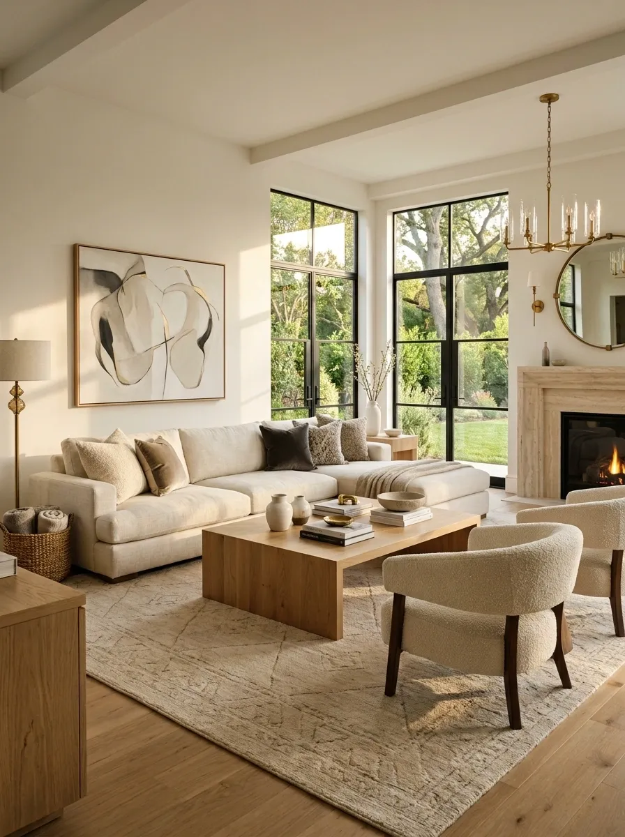
Pushing every piece of furniture against a wall isn’t automatically a good layout. Sometimes it just leaves a giant empty middle and makes the room feel like a waiting area.
Pull the major pieces into purposeful relationships. In a living room, that can mean arranging seating around a coffee table instead of lining everything up along the perimeter. In a bedroom, it might mean centering the bed and balancing the surrounding pieces rather than squeezing furniture wherever a gap happens to exist.
Keep clear walking paths, but let the furniture belong to a defined zone.
Why it works: A deliberate furniture arrangement makes the room feel planned, even when the furniture itself isn’t particularly expensive.
SEATING
SURFACE
SEATING
Give the TV Wall a More Finished Composition
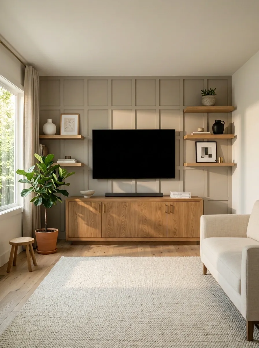
A television doesn’t need to disappear. It needs to stop looking like it was slapped onto the wall five minutes before guests arrived.
Build some visual weight around it. A substantial console, balanced cabinetry, artwork, shelving, or a strong wall treatment can make the screen feel like part of the room instead of the only thing happening on the wall.
Keep the composition restrained. Turning the TV wall into an electronics shrine isn’t an upgrade either.
Why it works: The surrounding elements balance the visual dominance of the screen and make the entire wall feel intentional.
Make Cheap Furniture Look Intentional Through Better Surroundings
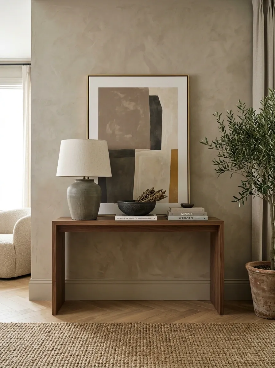
A basic dresser, console, or sideboard can look perfectly respectable when everything around it has enough visual weight.
Pair a simple piece with a substantial lamp, good artwork, a restrained surface arrangement, and materials that introduce contrast. A plain wood cabinet surrounded by quality-looking textures can read very differently from the exact same cabinet shoved against an empty wall.
Don’t pile expensive-looking accessories on top and call it done. Context matters more than costume jewelry for furniture.
Why it works: The eye judges individual pieces partly through their surroundings, so stronger context can make ordinary furniture feel more considered.
weak lighting
random accessories
better lighting
restrained styling
Upgrade Hardware Where the Hardware Is Visually Prominent
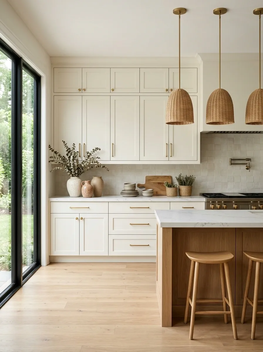
Cabinet pulls and knobs are small, but repeated small details have a way of announcing themselves.
When dated hardware sits across a large kitchen, bathroom vanity, dresser, or built-in, replacing it can sharpen the entire piece without changing the cabinetry itself. Keep the new hardware consistent with the room’s other finishes rather than introducing yet another unrelated metal.
The trick is to upgrade where the hardware is actually visible. Replacing hidden hinges won’t make the room look more expensive. Nobody is admiring those.
Why it works: Repeated details become part of the visual identity of a larger piece, especially across broad cabinetry or furniture fronts.
Use a Full-Width Artwork Grouping Instead of Random Wall Decor
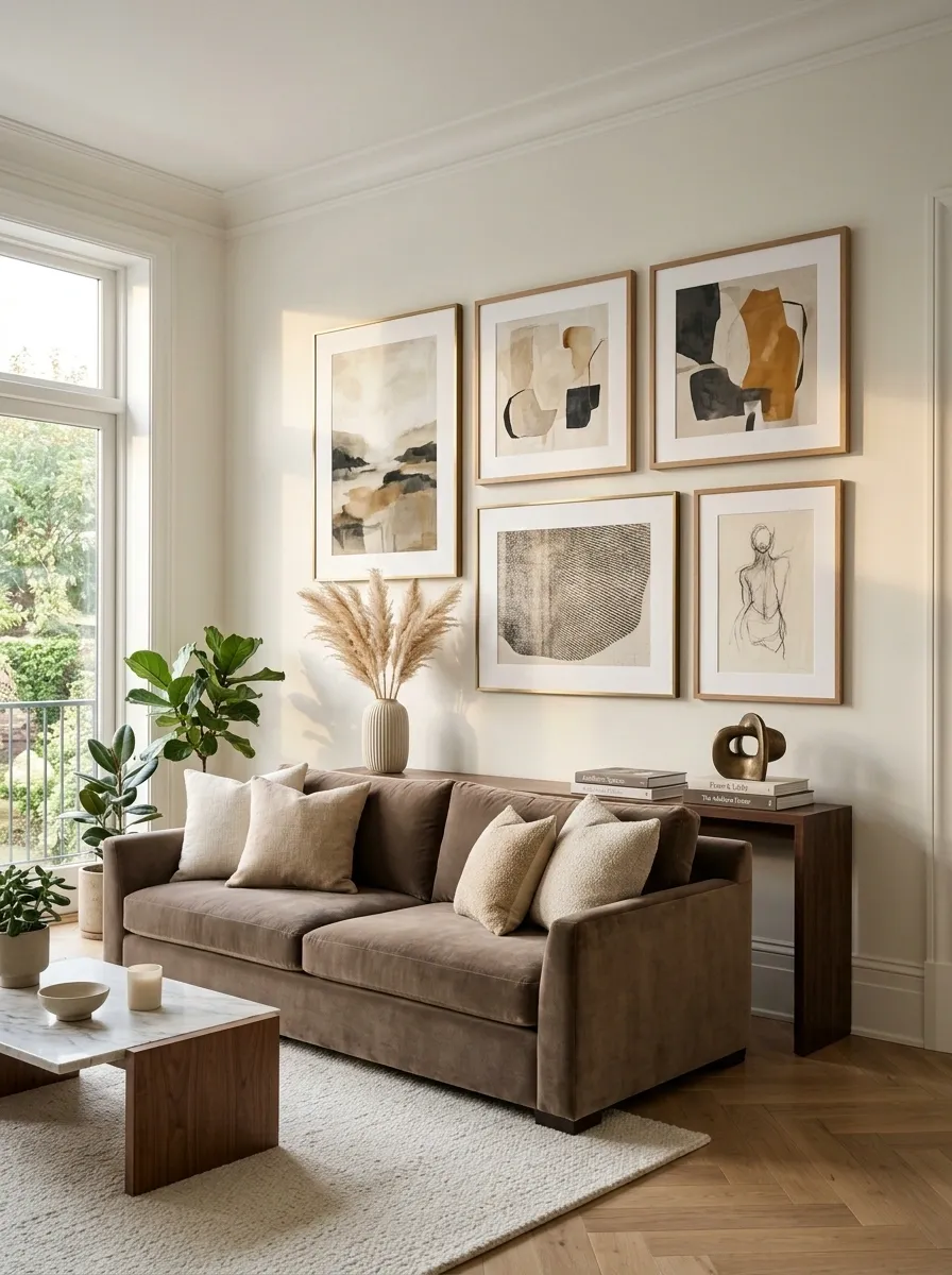
A huge wall with three tiny frames floating in the middle doesn’t look minimalist. It looks like the art budget ran out halfway through the wall.
Build one stronger artwork composition that relates to the furniture below it. A broad arrangement over a sofa, bed, console, or dining table gives the wall enough visual weight to balance the furniture.
The frames don’t have to match perfectly, but they should share some relationship through color, subject, frame finish, or spacing. Random is rarely as sophisticated as Pinterest would have everyone believe.
Why it works: Artwork with enough scale visually connects the wall to the furniture and makes the entire arrangement feel intentional.
Add One Natural Material That Gives the Room Depth
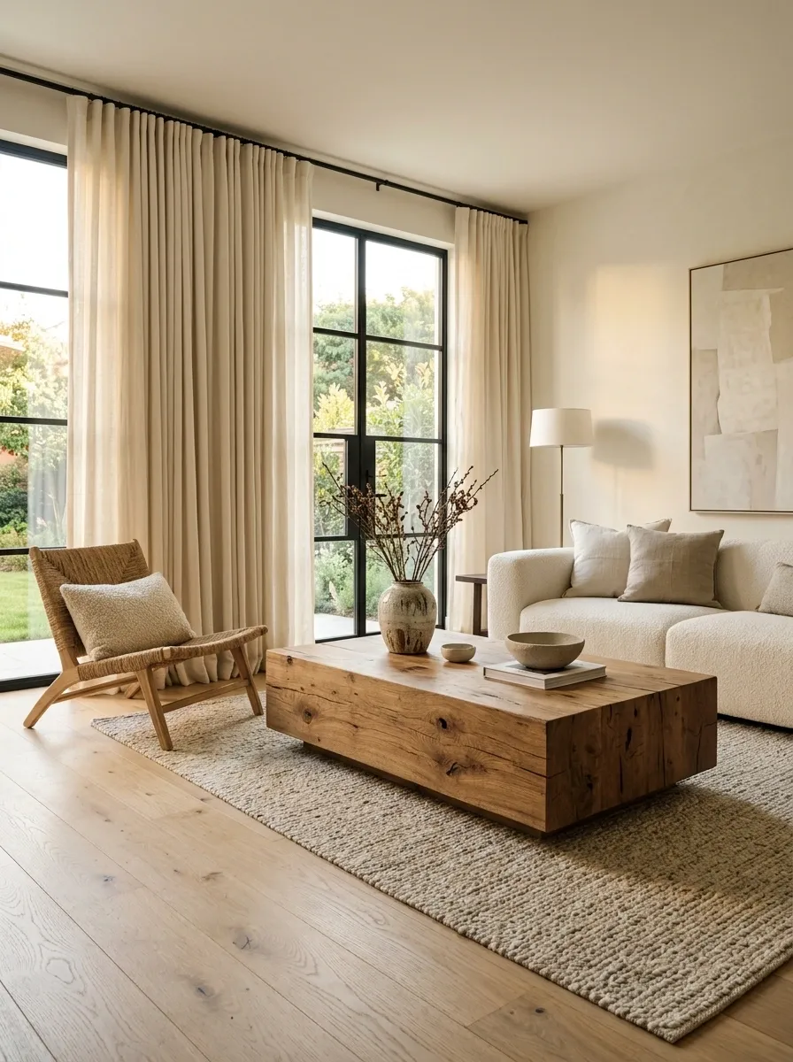
Rooms filled with painted MDF, glossy finishes, synthetic upholstery, and flat surfaces can start looking strangely two-dimensional.
Introduce one substantial natural material and let it do some of the heavy lifting. Warm wood, linen, wool, woven fiber, stone, or another tactile surface can interrupt all that sameness without requiring a renovation.
A wood coffee table, linen curtains, woven chair, or natural-texture bench can be enough. The goal isn’t to turn the room into a rustic gift shop. One or two convincing material shifts are usually more effective.
Why it works: Natural materials introduce texture, variation, and visual depth that flat manufactured surfaces often lack.
Give the Main Furniture the Scale It Deserves
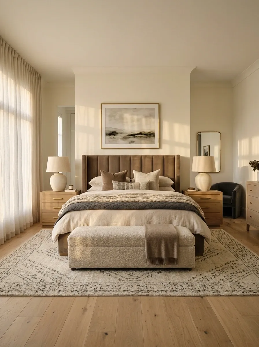
A room can have genuinely good furniture and still look oddly cheap when the hero piece is too small for the space.
A tiny bed in a generous bedroom, a narrow sofa against a broad wall, or a miniature coffee table surrounded by oversized seating creates a scale problem that decorative accessories won’t rescue.
Strengthen the main furniture grouping instead. A wider headboard, fuller upholstery, larger bedside pieces, or a more substantial center table can make the room feel properly anchored.
Why it works: When the largest visual elements have believable proportions, the entire room feels more settled.
Use Symmetry When the Room Needs More Order
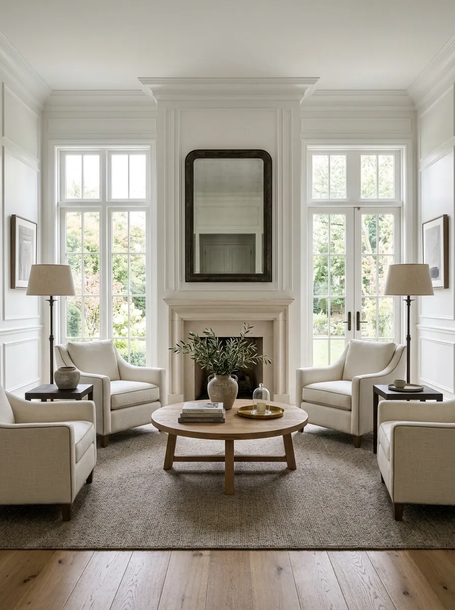
Symmetry can make a room feel unusually polished without requiring unusually expensive furniture.
A centered bed with matching side tables, two lamps framing a console, or balanced seating around a central table creates an instant sense of order. This works best when the architecture already gives the room a strong central axis.
Don’t force symmetry where the room clearly doesn’t support it. A badly forced pair is still badly forced, no matter how expensive the lamps are.
Why it works: Repeated shapes and balanced visual weight create a calm composition that makes the surrounding details easier to read.
Let One Wall Color Do More Work
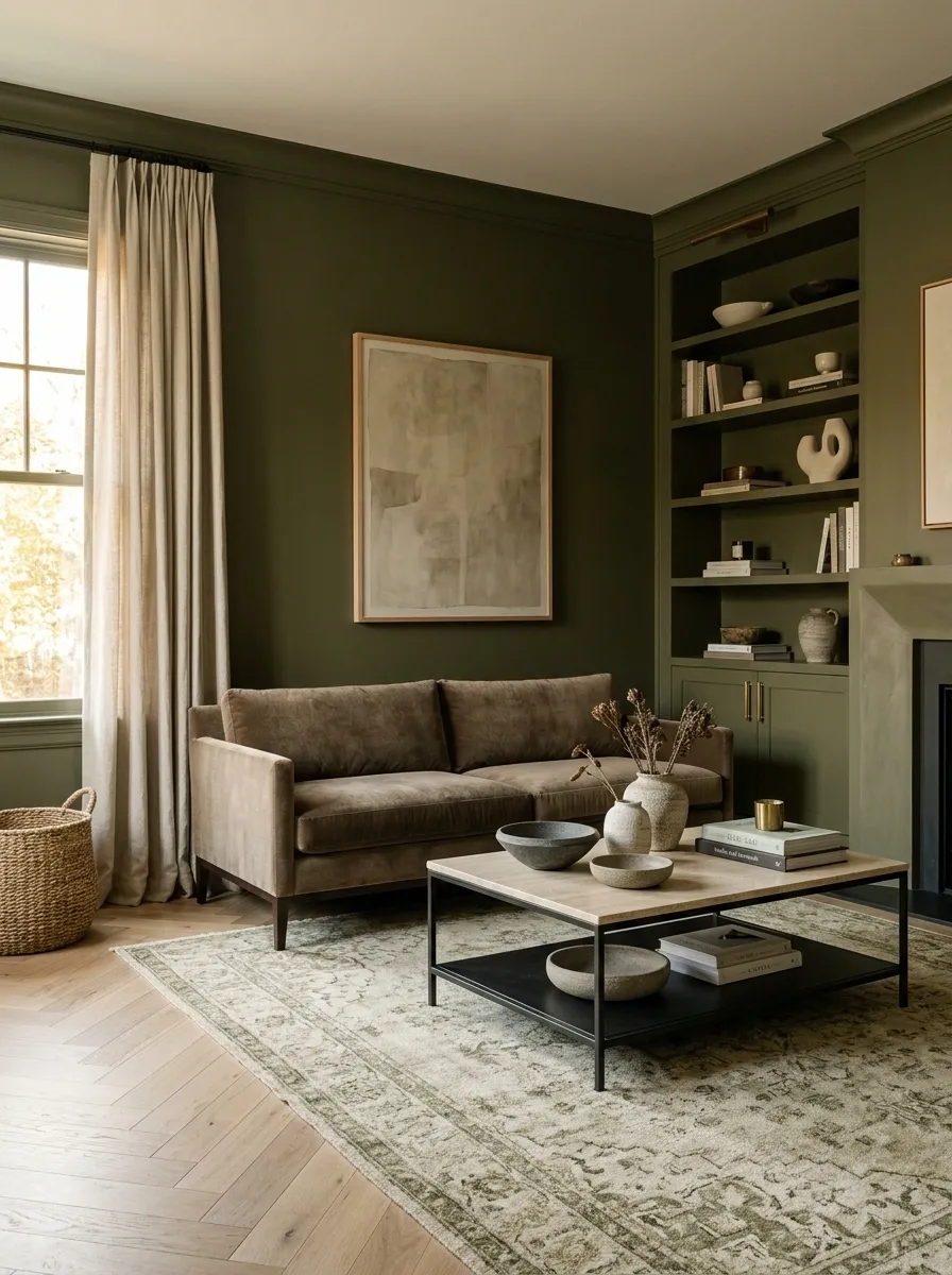
Painting a room isn’t a renovation in the structural sense, and it can dramatically change how disconnected furniture is perceived.
Instead of treating every wall as a separate decorating opportunity, use color to create a continuous visual envelope around the part of the room that matters most. A dining nook, bedroom wall, or built-in area can feel much more intentional when the color relates directly to the furniture and textiles.
The biggest mistake is choosing a color simply because it looks good on a swatch. It needs to solve a visual problem in the actual room.
Why it works: A continuous color field can visually connect separate elements and make awkward architectural breaks feel more deliberate.
Give Open Shelving More Negative Space
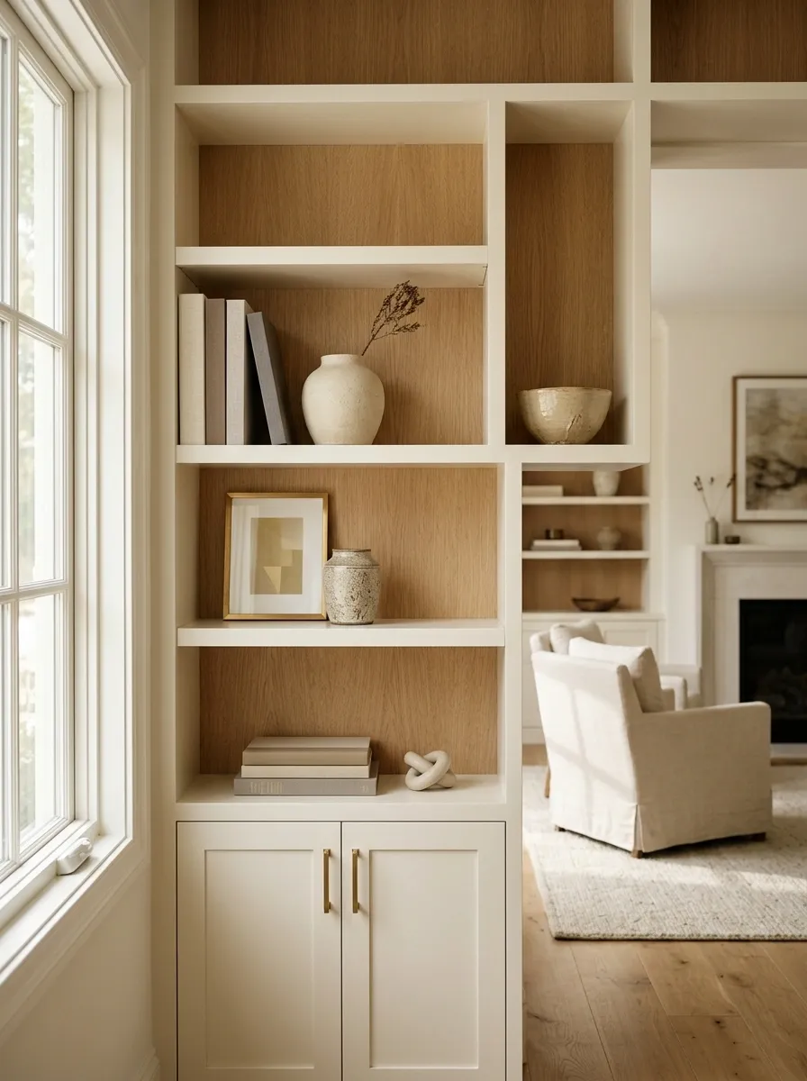
Open shelves become expensive-looking when the shelves can actually breathe.
Remove enough objects to create empty areas around the pieces that deserve attention. Mix books with ceramics, framed artwork, or a few meaningful objects, but stop before every horizontal surface becomes occupied.
The usual mistake is treating empty shelf space as wasted space. It isn’t. Without it, the eye has nowhere to pause.
Why it works: Negative space gives individual pieces more visual importance and makes the entire shelving unit feel edited rather than stuffed.
Build a More Layered Textile Composition
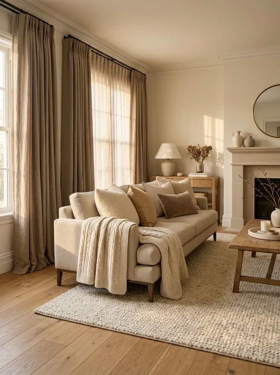
A room with one rug and one set of curtains can look surprisingly flat, especially when the furniture itself is visually simple.
Layer textiles with different weights instead of adding more patterns. A substantial rug, full curtains, textured cushions, and one throw can give the room depth without making it fussy.
Keep the palette connected. The point is variation in texture and weight, not a textile department having an argument in the living room.
Why it works: Different textile surfaces catch light differently and create visual depth around otherwise simple furniture.
Rug
Curtains
Cushions
Throw or woven accent
Use Mirrors to Improve the Room’s Visual Depth
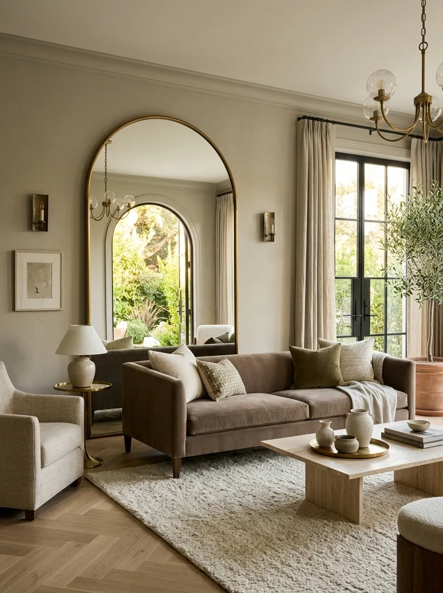
A mirror is useful when it reflects something worth seeing.
Place it where it can catch daylight, reflect attractive architecture, extend the view into another part of the room, or bounce light toward a darker area. Hanging one randomly above a console just because there is an empty wall isn’t a strategy.
A generous mirror can be especially effective in dining rooms, entries, and smaller living spaces where the reflection adds another layer to the composition.
Why it works: The reflected view becomes part of the room’s visual field, making the space feel deeper and more connected.
Make the Entry or First View More Intentional
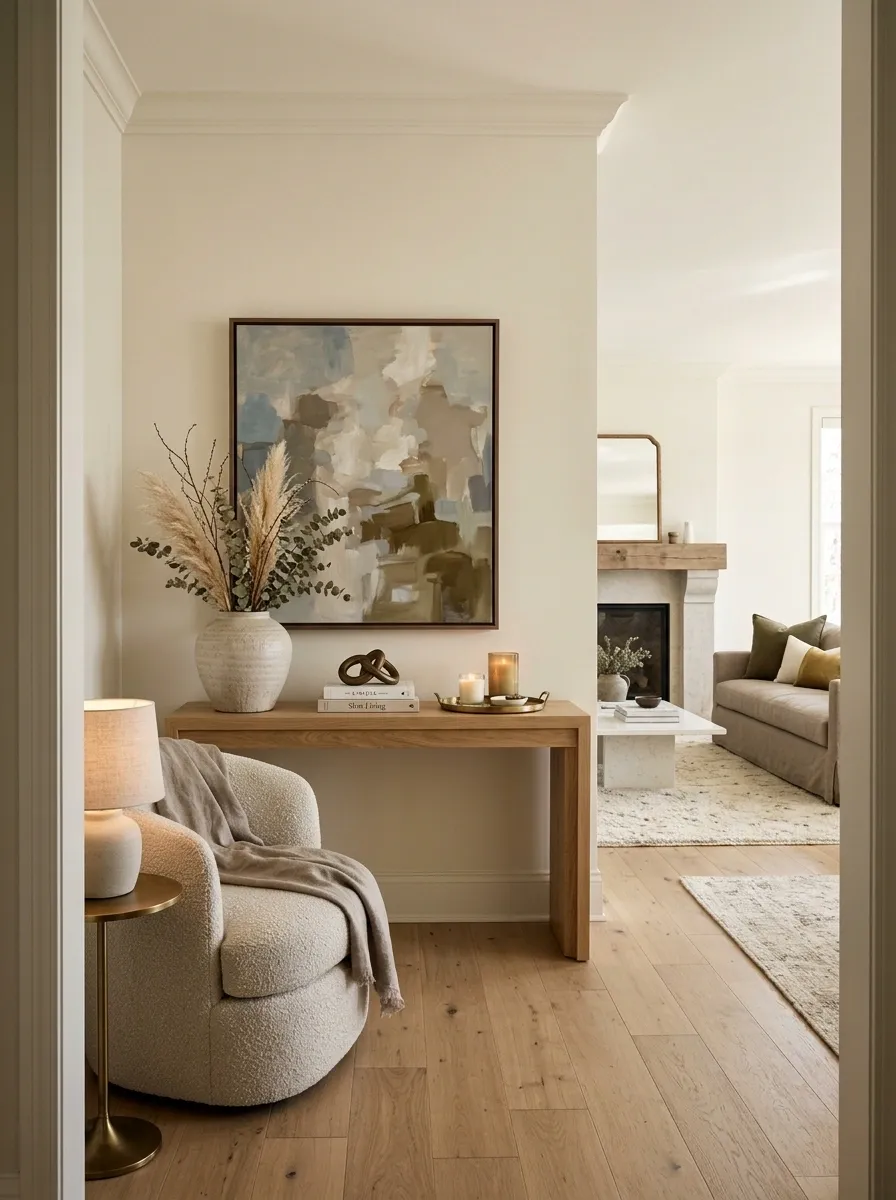
The first view into a room deserves more attention than a random corner nobody notices.
Stand at the doorway and identify the first thing the eye sees. That’s where the strongest artwork, best furniture arrangement, cleanest sightline, or most deliberate styling should go.
This doesn’t mean creating a hotel lobby in every doorway. It means removing distractions from the first visual frame and making the destination of the eye feel intentional.
Why it works: A strong first impression establishes visual order before the eye moves deeper into the room.
Use Repetition to Make Mismatched Pieces Feel Related
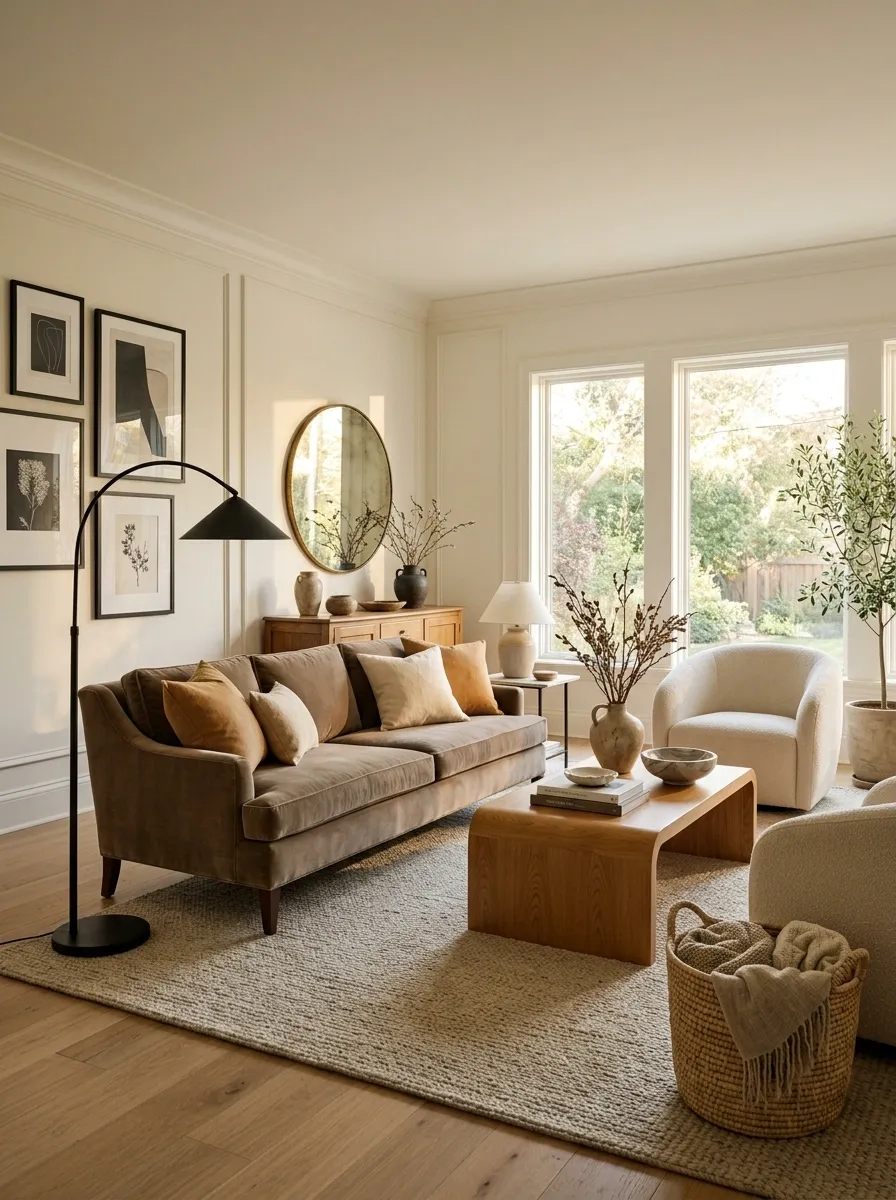
A room doesn’t need matching furniture. It needs a few visual threads connecting the furniture it already has.
Repeat a finish, shape, fabric tone, wood color, or metal detail in several places. A black lamp base can quietly relate to picture frames. Warm wood can appear again in a coffee table and a frame. Rounded forms can repeat between a chair, mirror, and lighting.
This is especially useful when the furniture was collected at different times, because apparently not every household waits for a perfectly coordinated furniture delivery.
Why it works: Repetition creates visual relationships between unrelated pieces, making the room feel assembled rather than accidental.
The pieces don’t need to match. They need something to agree on.
Make the Coffee Table or Center Surface Look Edited
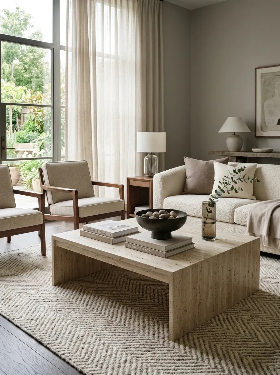
Coffee tables are excellent at exposing a room’s lack of editing. Put too little on one and it can feel forgotten. Put everything on it and suddenly the room has acquired a small indoor junk drawer.
Use one substantial anchor, one secondary object, and enough empty surface to let both breathe. A book stack, tray, bowl, sculptural object, or low arrangement can work, provided the composition has different heights and isn’t blocking the useful part of the table.
The goal is a surface that looks used, not abandoned or overdecorated.
Why it works: A controlled center composition gives the seating area a finished focal point without adding visual clutter.
Improve the Relationship Between Art and Furniture Height
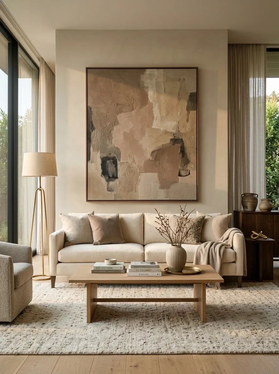
Good artwork can still look wrong when it floats several inches too high above the furniture.
Treat the artwork and the piece below it as one composition. A sofa, console, bed, or dining table should visually connect to the artwork above it instead of appearing to belong to another room.
Use the furniture’s width as a starting point for judging the artwork zone, then adjust for the actual wall, ceiling height, and surrounding architecture. The exact placement depends on the room, but the principle doesn’t: the art should feel attached to the furniture relationship.
Why it works: Correct vertical relationships make the wall and furniture read as one organized unit.
The relationship matters more than an arbitrary number.
Use a Darker Element to Add Visual Weight
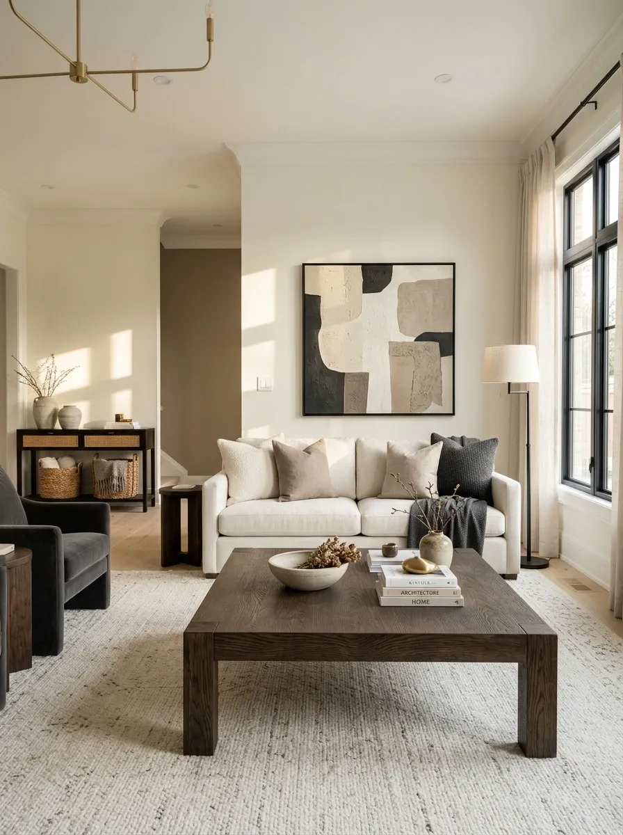
An all-pale room can look refined, but it can also look strangely weightless when every surface sits in the same soft tonal range.
Introduce one darker element to anchor the composition. A dark wood table, black-framed artwork, deeper chair, or darker lamp can give the room definition without changing the whole palette.
Keep the darker tone intentional and repeat it in small places if needed. One anchor often does more than sprinkling dark accessories everywhere like visual pepper.
Why it works: Contrast gives the eye something to register and helps lighter furniture and walls feel more dimensional.
Make the Floor Feel More Connected to the Furniture
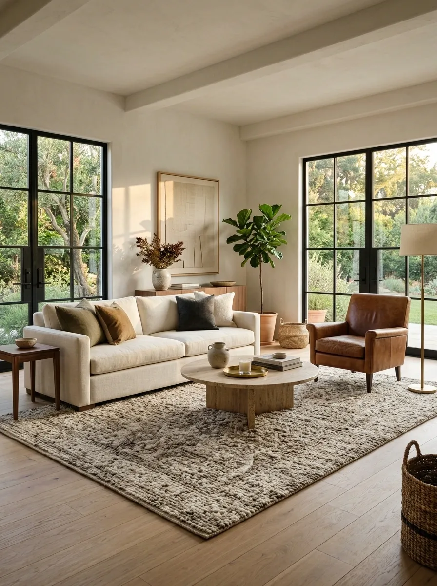
Furniture can look oddly scattered when every piece has a different relationship with the floor.
A rug, wood tone, furniture leg finish, and lower textile layer can help create a visual base that ties the seating or bedroom grouping together. The trick isn’t matching everything. It’s creating enough continuity that the furniture doesn’t look like separate objects dropped onto the floor.
This is particularly useful in rooms where the furniture itself comes from several sources. A shared grounding layer can make the mix feel deliberate without pretending it came from one showroom.
Why it works: A cohesive base visually connects furniture to the room instead of letting each piece float independently.
Use Lighting to Highlight the Room’s Best Feature
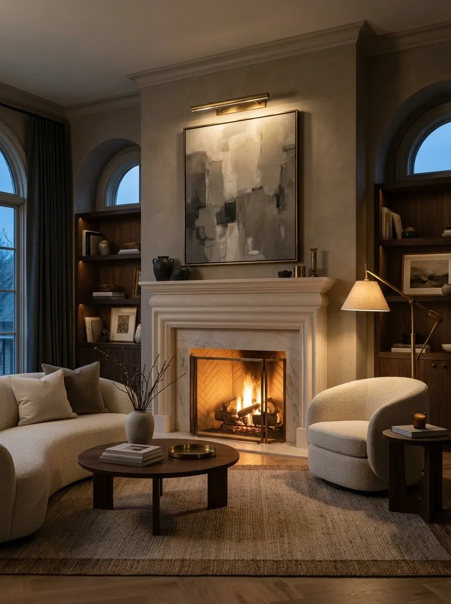
Good lighting shouldn’t treat every corner of the room like it’s equally important.
Aim a lamp, reposition an existing light, or add a practical source so the room’s strongest feature gets attention. That might be artwork, a fireplace, a dining table, an architectural detail, or a particularly good piece of furniture.
The rest of the room can stay quieter. In fact, it should. Lighting everything equally is a reliable way to make everything look equally unimportant.
Why it works: Light directs attention. When the best feature gets the strongest visual emphasis, the room gains hierarchy without adding much at all.
Remove Pieces That Are Too Small for the Room
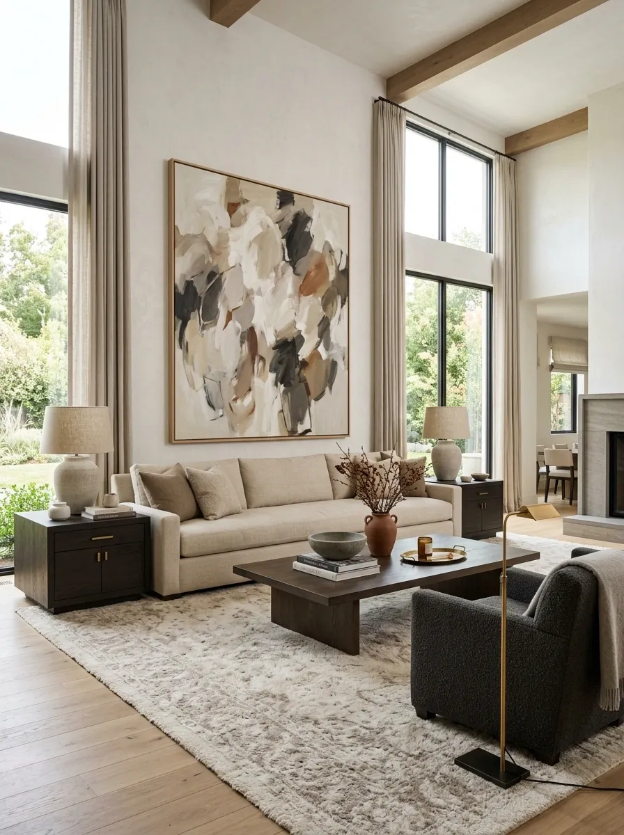
Sometimes the cheapest-looking thing in a room isn’t cheap at all. It’s simply too small.
Tiny lamps on broad nightstands, miniature artwork over a large sofa, a little accent chair floating in a generous room, or a postage-stamp rug under substantial furniture can all make the space feel visually timid.
Remove the weakest undersized pieces before adding anything. One correctly scaled replacement can solve more than a pile of decorative upgrades.
Why it works: Better proportion gives the room confidence. Small objects have their place, but they shouldn’t be responsible for carrying a large space.
Style Around the Architecture Instead of Fighting It
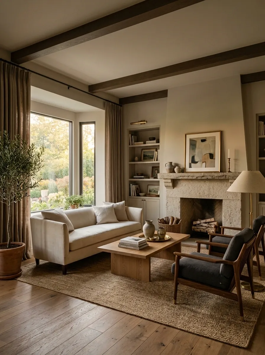
Awkward windows, doors, fireplaces, niches, columns, and wall breaks aren’t going anywhere just because they are inconvenient.
Instead of pretending they don’t exist, build the room around them. Center the furniture where the architecture allows it, use curtains to frame an awkward window, turn a niche into a useful display zone, or let an architectural interruption become part of the composition.
The worst move is usually forcing furniture into a technically symmetrical arrangement that ignores how people actually move through the room.
Why it works: When the room’s existing architecture is treated as part of the design, awkward features stop reading as mistakes and start reading as intentional constraints.
window, doorway, niche, fireplace
furniture, curtain, color, sightline
a composition that looks deliberate
Finish the Room by Editing Everything at the Same Time
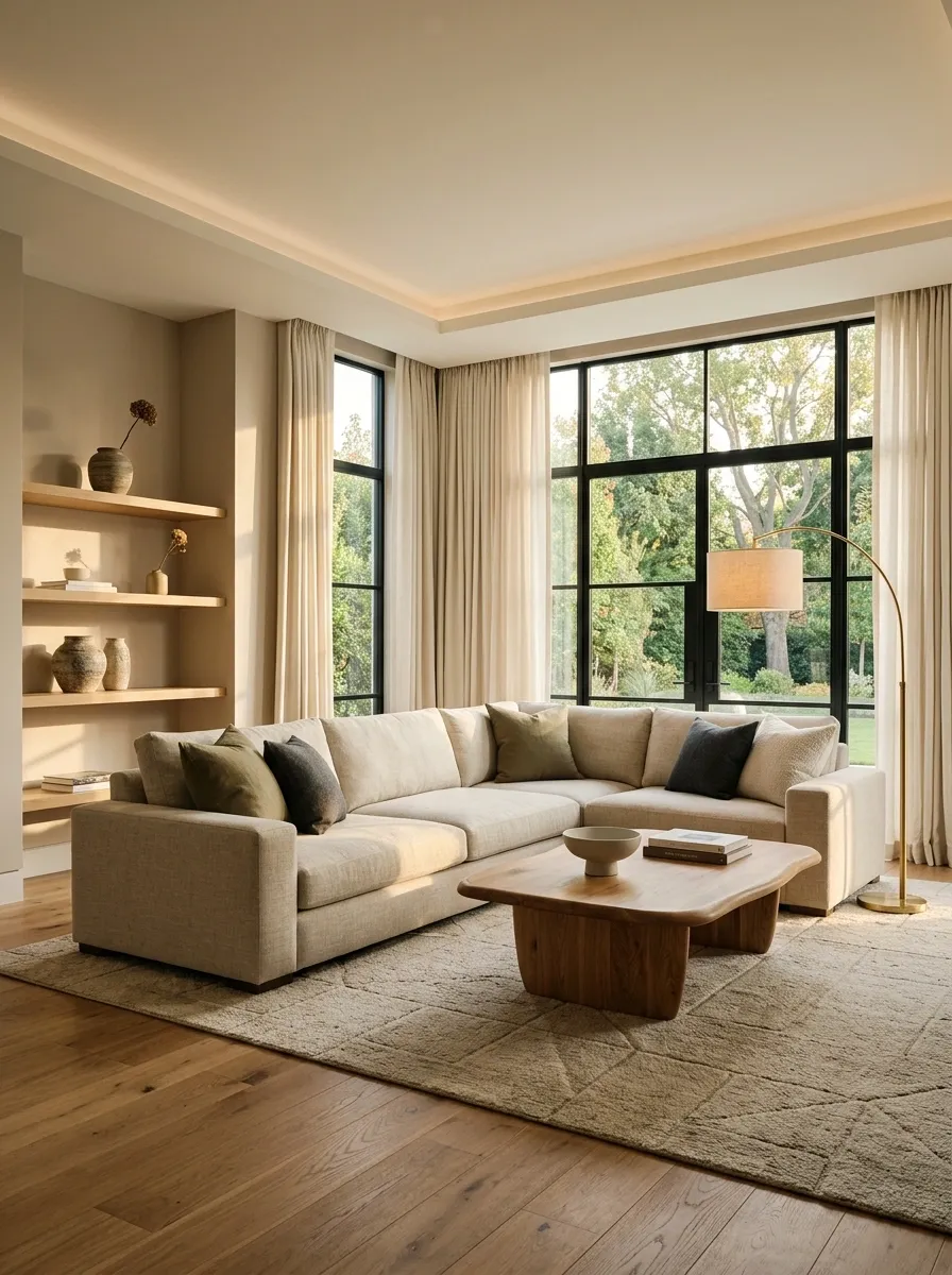
The final upgrade isn’t one more accessory. It’s stepping back and judging the room as one composition.
Check the furniture scale. Then the sightlines. Then the lighting. Then the rug, textiles, artwork, color repetition, clutter, and empty space. A room can have good pieces and still look unfinished because each decision was made in isolation.
This is where the expensive-looking effect usually comes together. Remove what competes, strengthen what matters, and stop adding things simply because a surface happens to be empty.
Why it works: A room feels finished when the individual decisions support one another instead of merely existing beside one another.
Ask, “What is making the room look less finished?”
The Room Doesn’t Need to Look Expensive. It Needs to Look Intentional.
That distinction matters.
An expensive room can still look awkward, cluttered, poorly lit, or strangely proportioned. Meanwhile, a room built from modest furniture can look remarkably polished when the scale is right, the lighting has layers, the colors relate, and every major piece seems to know why it’s there.
Start with the thing that looks most wrong from the doorway. Don’t buy around it. Fix it.
Move the furniture. Edit the shelf. Change the lighting. Raise the curtains. Enlarge the visual anchor. Remove the tiny pieces that are making everything else look smaller. Then step back and look at the room again before adding anything else.
The goal isn’t to make the space look like a showroom. It is to make it look like someone made thoughtful decisions.
Save these ideas before the next decor-shopping spiral starts.