
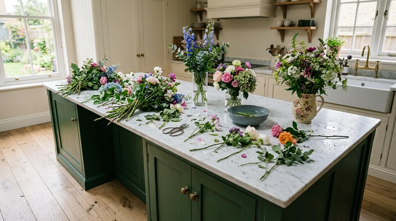
A kitchen island doesn’t need much to look styled. It needs a few right things, arranged with actual thought, instead of a dozen things arranged with none.
Most counters fail for the same reason: everything on them is roughly the same height, the same material, and the same level of importance. A bowl. A plant. Maybe a candle. Nothing is doing more visual work than anything else, so nothing registers at all.
The vignettes that actually photograph well, and more importantly actually feel good to walk past every day, are built like small still lifes. There’s a tall element, a low element, something with texture, something with use. That’s not an accident. It’s a formula, repeated with different materials across dozens of otherwise unrelated kitchens.
Kitchen Island Styling Ideas
Brass Vase Floral Arrangement
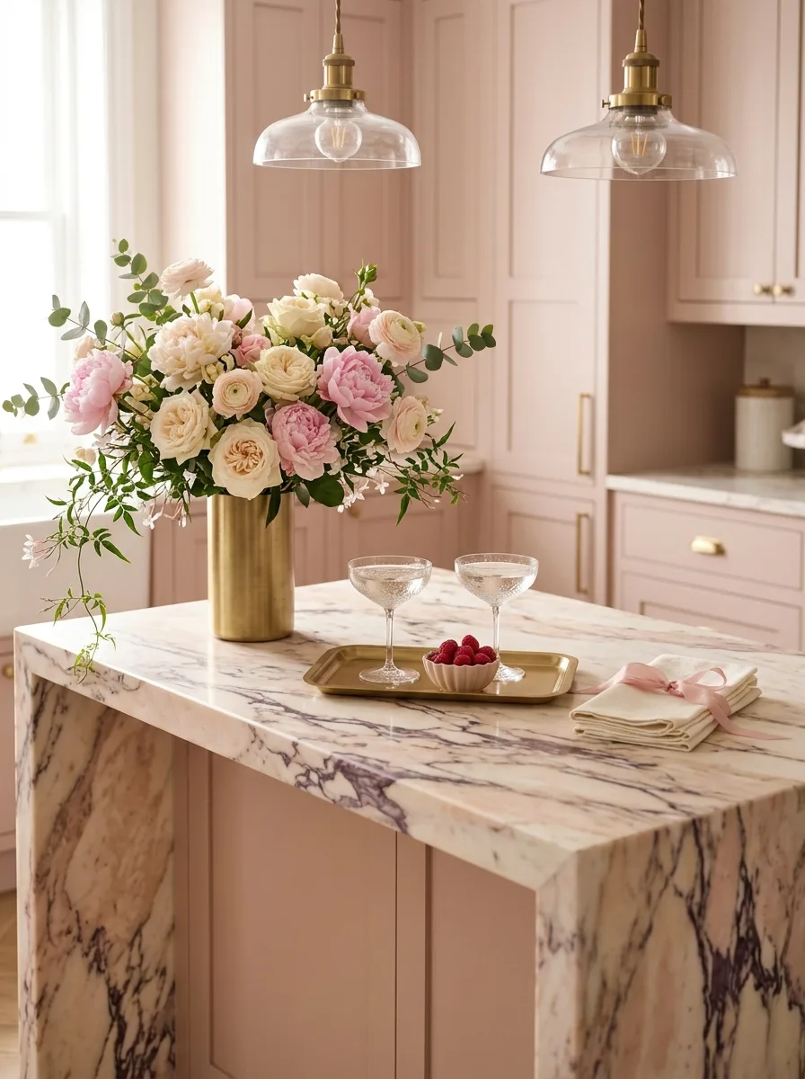
Source a tall, simple brass cylinder vase, and fill it with a loose, slightly oversized floral mix — garden roses, ranunculus, peonies, a few trailing stems left long rather than trimmed to match.
Place a small brass tray beside it holding two glasses and a small bowl of something bite-sized, like berries, so the vignette reads as mid-conversation rather than purely decorative.
Keep the vase off-center and let the trailing greenery spill slightly past the counter’s edge. A perfectly contained arrangement looks florist-bought; one with a little overflow looks gathered.
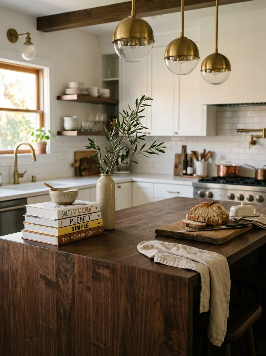
Cookbook Stack Brass Tray
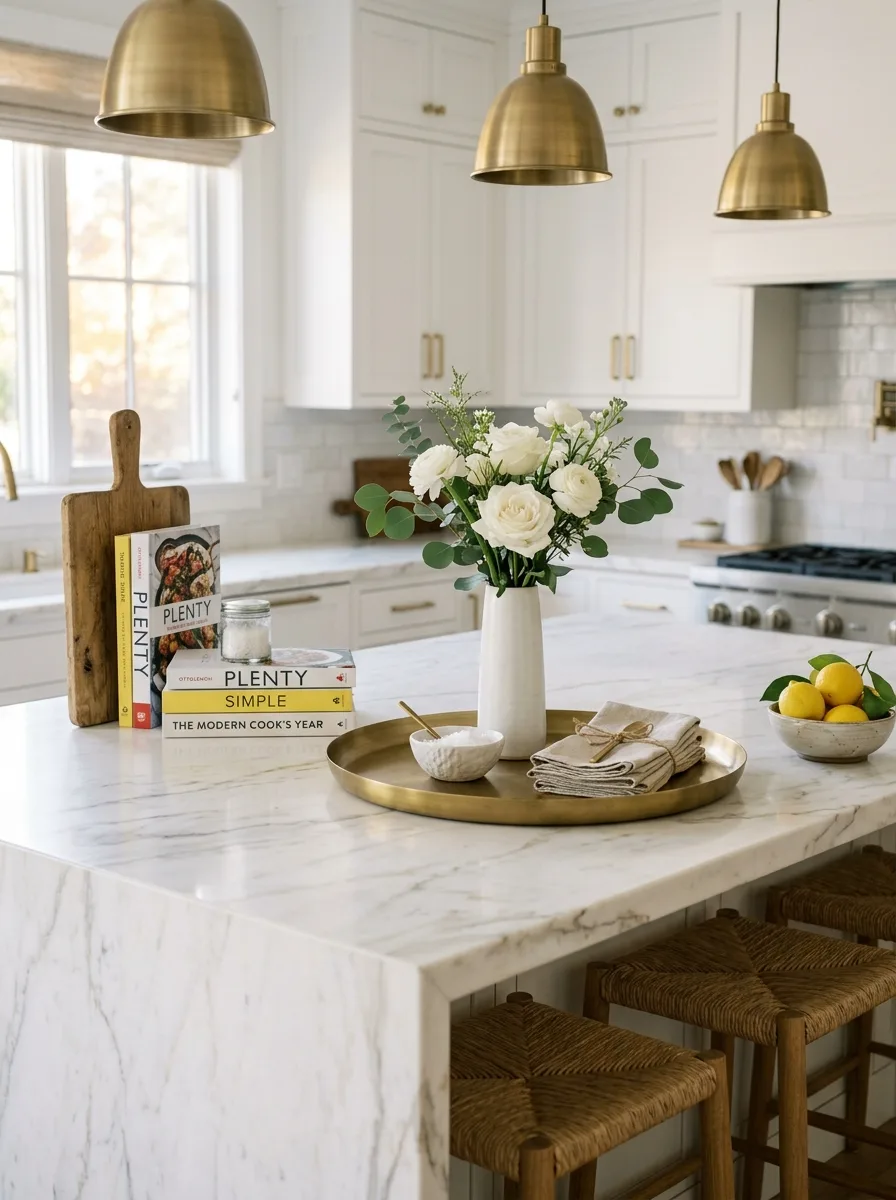
Stack three or four well-loved cookbooks horizontally, spines facing out, and lean a wooden cutting board against the stack at a slight angle rather than laying it flat.
Set a round brass or metal tray nearby holding a simple white vase with all-white blooms, a small bowl, and folded linen napkins tied with plain twine or ribbon.
Choose books with genuinely varied spine colors and well-worn covers. A pristine, color-coordinated stack reads as a prop; a slightly creased one reads as a kitchen that gets used.
Layered Potted Herb Display
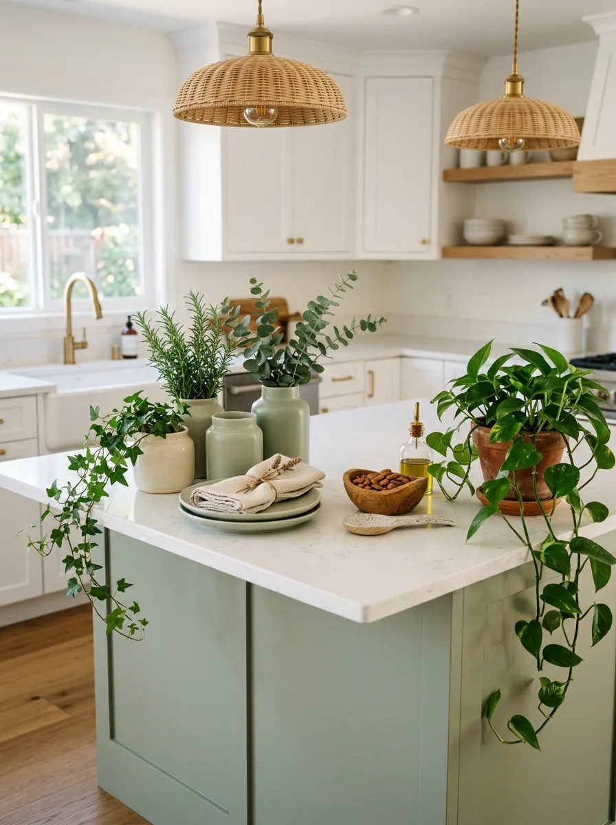
Cluster three or four small potted plants directly on the counter — a mix of trailing ivy, an upright rosemary or herb, and one leafy houseplant — in mismatched ceramic and terracotta pots of varying heights.
Add one low, flat object nearby, like a stack of plates or a small dish, to give the eye a place to land below the cluster of greenery.
Let at least one trailing plant spill over the counter’s edge toward the floor. The drape is what keeps the grouping feeling alive rather than like a row of potted inventory.
Single Branch Olive Sprig
Choose one tall, simple ceramic vase in a matte neutral glaze, and place a single olive branch or other sculptural greenery stem inside it, rather than a full bouquet.
Pair it with a low stack of cookbooks on one side and a casual food moment on the other — sliced bread on a board, a small dish with butter — so the vignette spans the full counter without feeling crowded.
This works because of restraint. Resist adding a second floral element; the single branch’s negative space against the vase is the entire point.
Wicker Tray Terracotta Jugs
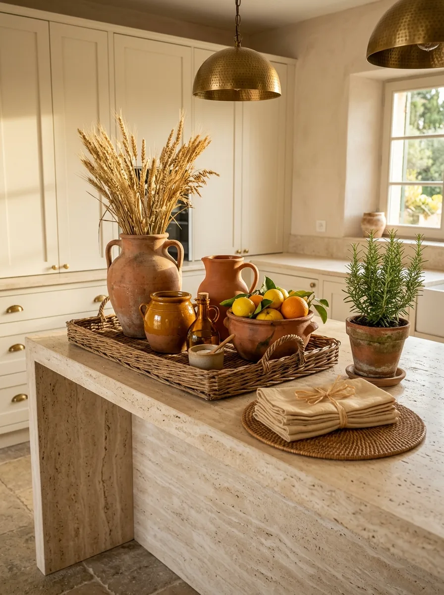
Source a generously sized woven tray, and group two or three different-sized terracotta jugs and crocks on top, filled with dried wheat stalks or other tall dried grasses rather than fresh flowers.
Add a bowl of citrus directly in or beside the terracotta grouping, and place a small stack of folded linens on a woven placemat just outside the tray’s edge.
Keep every material in this grouping unglazed and matte — terracotta, raw wicker, raw linen — so the warmth comes from texture rather than color, letting one fresh green plant be the only living contrast.
Single White Orchid Stem
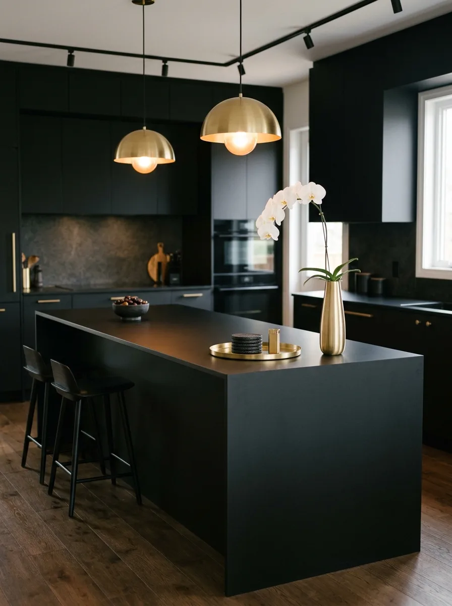
Choose a tall, slender brass or metal vase, and place a single potted orchid stem inside so the blooms arch naturally over the vase’s rim rather than standing rigidly upright.
Set a small round tray nearby with two or three matching dark ceramic coasters and a low bowl of olives or nuts, keeping the rest of the grouping deliberately minimal.
This pairing depends on a dark, dramatic counter as the backdrop. Against a pale counter, the same grouping will read as sparse rather than intentional; against black or charcoal stone, it reads as edited.
Crock Utensil Holder Cluster
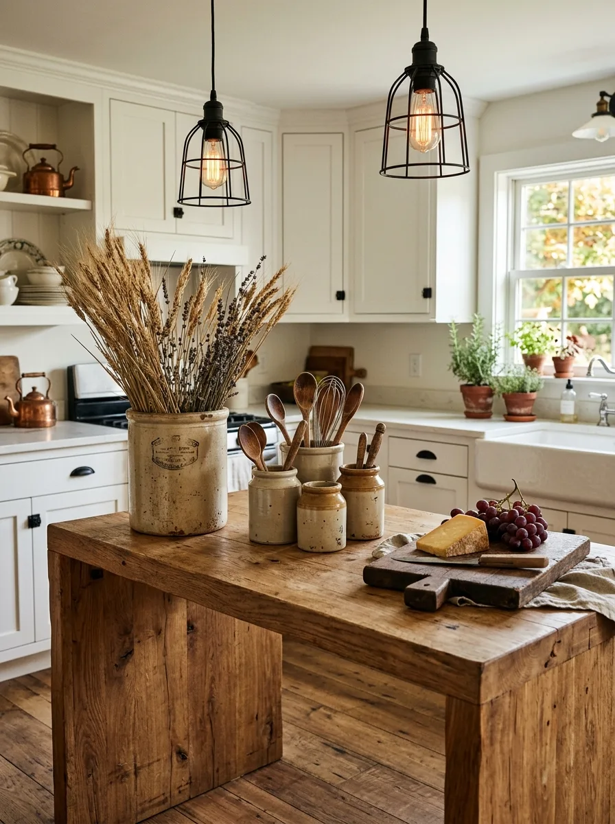
Group two or three antique-style stoneware crocks of varying heights together, filling each one with a different cluster of wooden cooking utensils rather than putting all utensils in a single holder.
Add one larger crock filled with dried wheat or lavender stems as the tallest element in the group, positioned slightly behind the utensil crocks so it reads as a backdrop rather than competing with them.
Finish the grouping with a wedge of cheese and a small cluster of grapes on a worn wooden board nearby, so the vignette reads as a kitchen mid-use rather than a still life.
Oversized Pampas Grass Vase
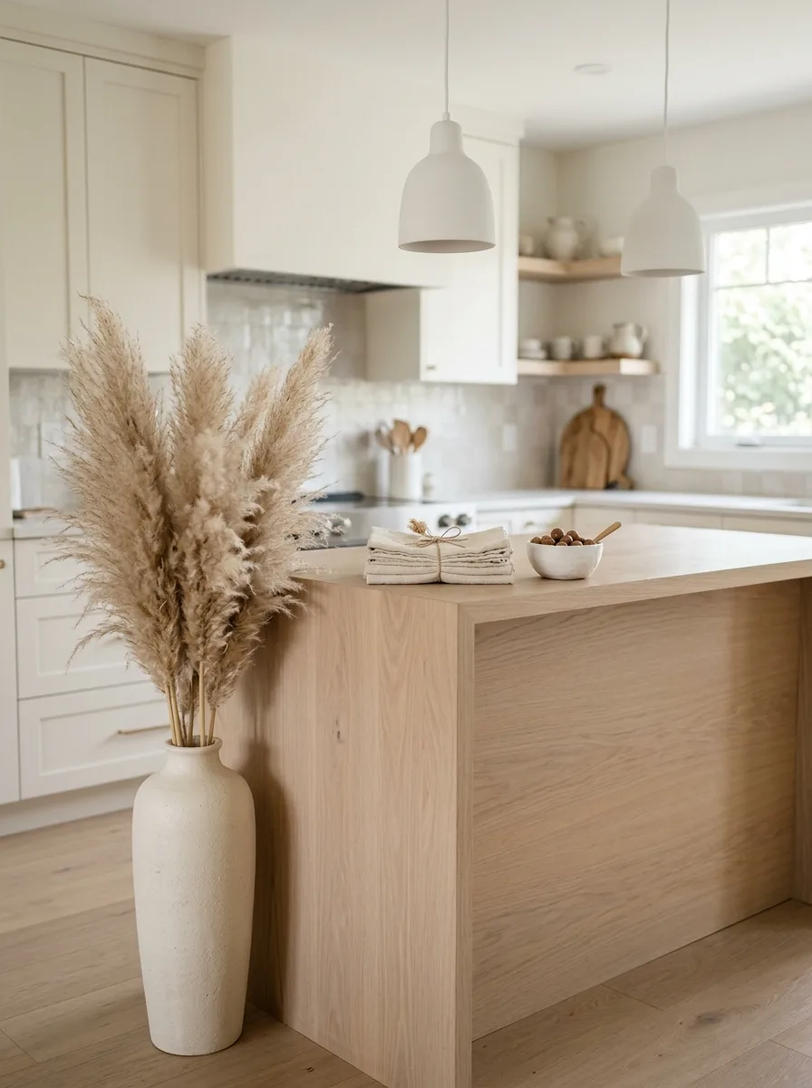
Source one large, heavily textured ceramic floor vase, sized taller than the surrounding cabinetry’s lower shelf line, and fill it generously with dried pampas grass stems left at varying heights.
Place it directly at the end of the island, almost as if it doesn’t belong to the counter grouping at all, rather than centered among the other styled objects.
Keep everything else on the counter low and quiet — a small bowl, a folded napkin — so the oversized vase has no visual competition for scale.
Macrame Table Runner Layer
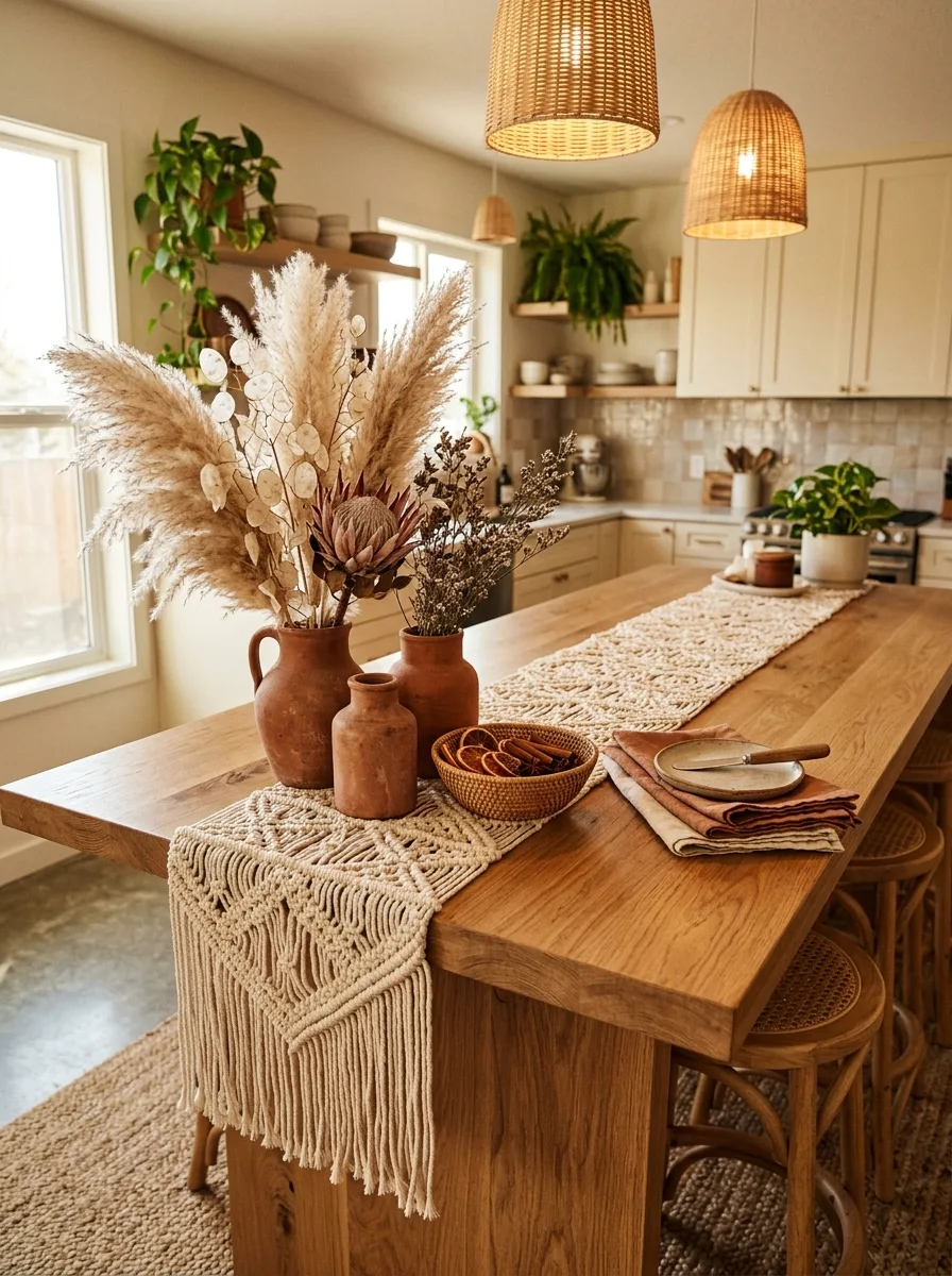
Lay a textured macrame or woven table runner down the length of the island first, before adding any objects, so every subsequent piece sits on a layer of texture rather than bare stone or wood.
Group two or three small terracotta vessels with dried botanicals — pampas grass, dried eucalyptus, a single dried protea — at one end of the runner, and a woven bowl of something edible, like dried citrus slices or cinnamon sticks, at the other.
Add a folded textile in a warm, muted tone nearby. The runner is what unifies an otherwise eclectic mix of vessel shapes and materials into one coherent layer.
Citrus-Filled Woven Basket Tray
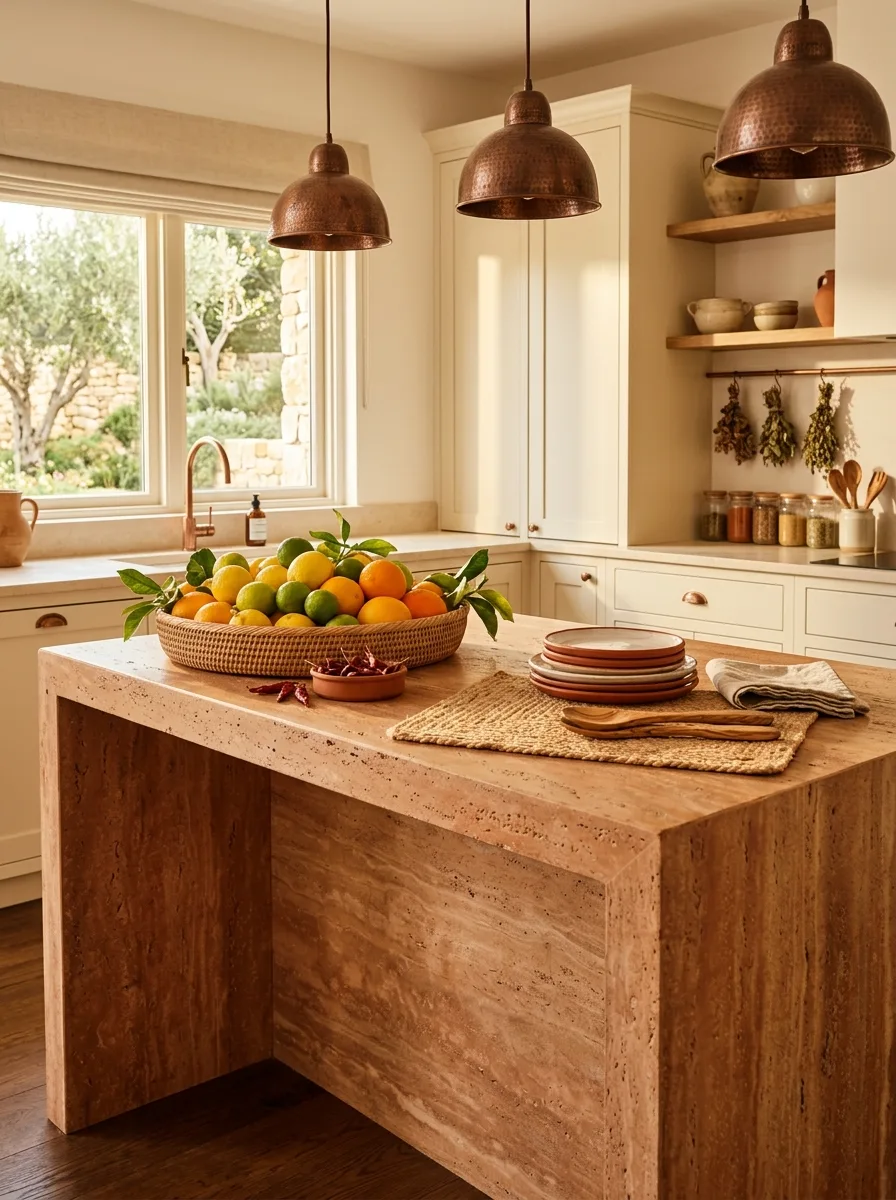
Fill a wide, shallow woven basket generously with whole citrus, mixing lemons, limes, and oranges with a few leaves still attached rather than using stemless fruit from a bag.
Place a small terracotta dish of something with color contrast, like dried chilies, directly beside the basket, and stack a few rustic ceramic plates nearby on a woven placemat.
Let the citrus pile slightly over the basket’s rim instead of arranging it in a tidy single layer. A slightly overfull basket reads as abundant; a precisely arranged one reads as styled for a shoot.
Sculptural Abstract Ceramic Vase
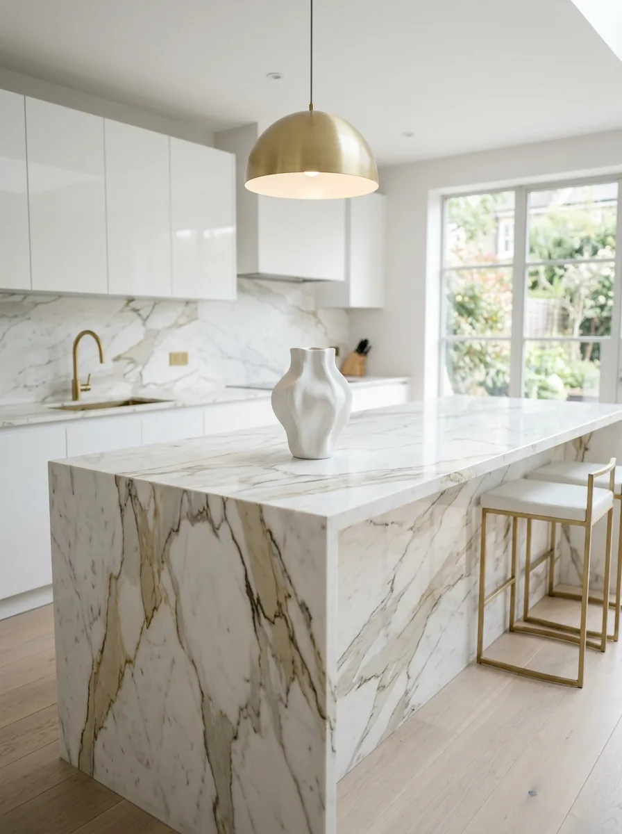
Choose a single ceramic vase with a deliberately irregular, sculptural silhouette rather than a classic symmetrical shape, and leave it completely empty rather than filling it with flowers.
Place it alone on a large stone island with significant clear space on all sides, resisting the urge to add any supporting objects nearby.
This is the rare vignette built entirely on restraint and material drama. It only works on a counter with enough natural pattern or veining in the stone itself to share the visual interest with the single object.
Crystal Decanter Silver Tray
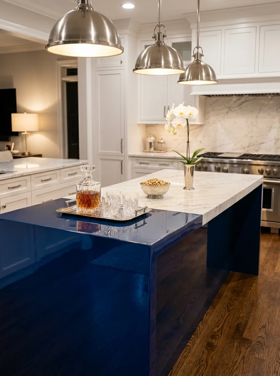
Set a cut crystal decanter and a small set of matching glasses on a polished silver or chrome tray, positioned at one end of the island rather than centered.
Add a low bowl of something simple, like nuts, on the same tray, and place a single tall flower stem in a slim metal vase just outside the tray’s edge for height contrast.
Keep the surrounding metal finishes consistent: silver tray, chrome accents, nickel fixtures nearby. Mixing in brass here will undercut the cohesive, formal mood this combination is going for.
Walnut Bowl Botanical Display
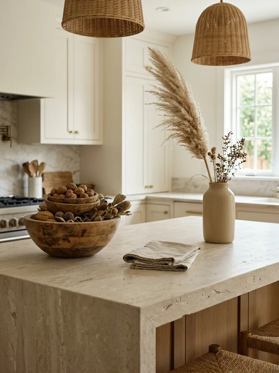
Nest two or three turned wooden bowls of different sizes together, filling them with a mix of whole walnuts, dried seed pods, and other small dried botanicals rather than a single uniform filling.
Pair the bowls with a tall ceramic vase holding dried pampas grass and seed-head stems, positioned just behind the bowl grouping so the height builds naturally from front to back.
Add one folded linen napkin in a neutral tone beside the bowls. Its flatness gives the eye a resting point against the textural density of the nested bowls and dried botanicals.
Brass Candlestick Trio Display
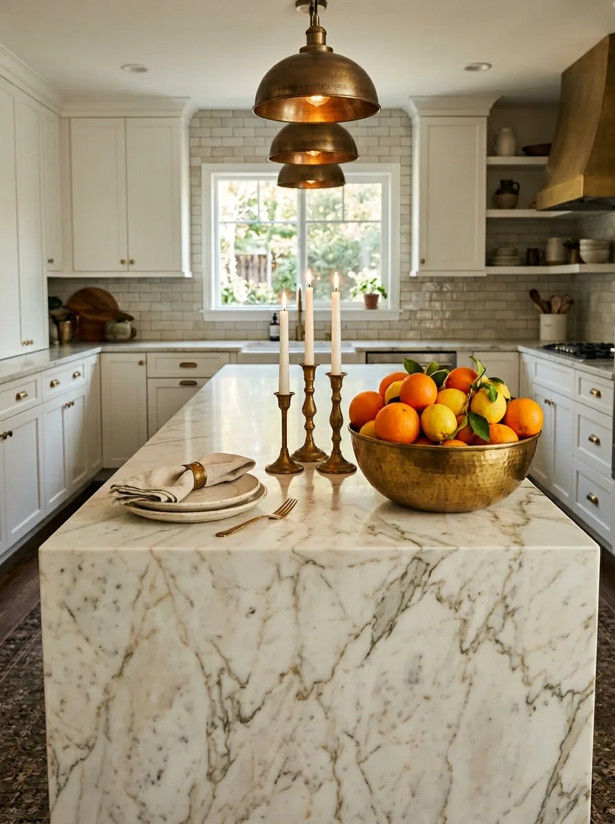
Group three brass candlesticks of slightly varying heights together, fitted with white taper candles, and place them just beside a large brass bowl piled generously with citrus.
Add a stack of two or three rustic ceramic plates with a linen napkin secured in a brass napkin ring on top, positioned at the opposite end of the grouping for balance.
Keep every metal finish in this vignette the same aged brass tone, including any visible hardware nearby. A mismatched silver or chrome piece here will read as an error rather than a deliberate mix.
Antique Candelabra Persian Runner
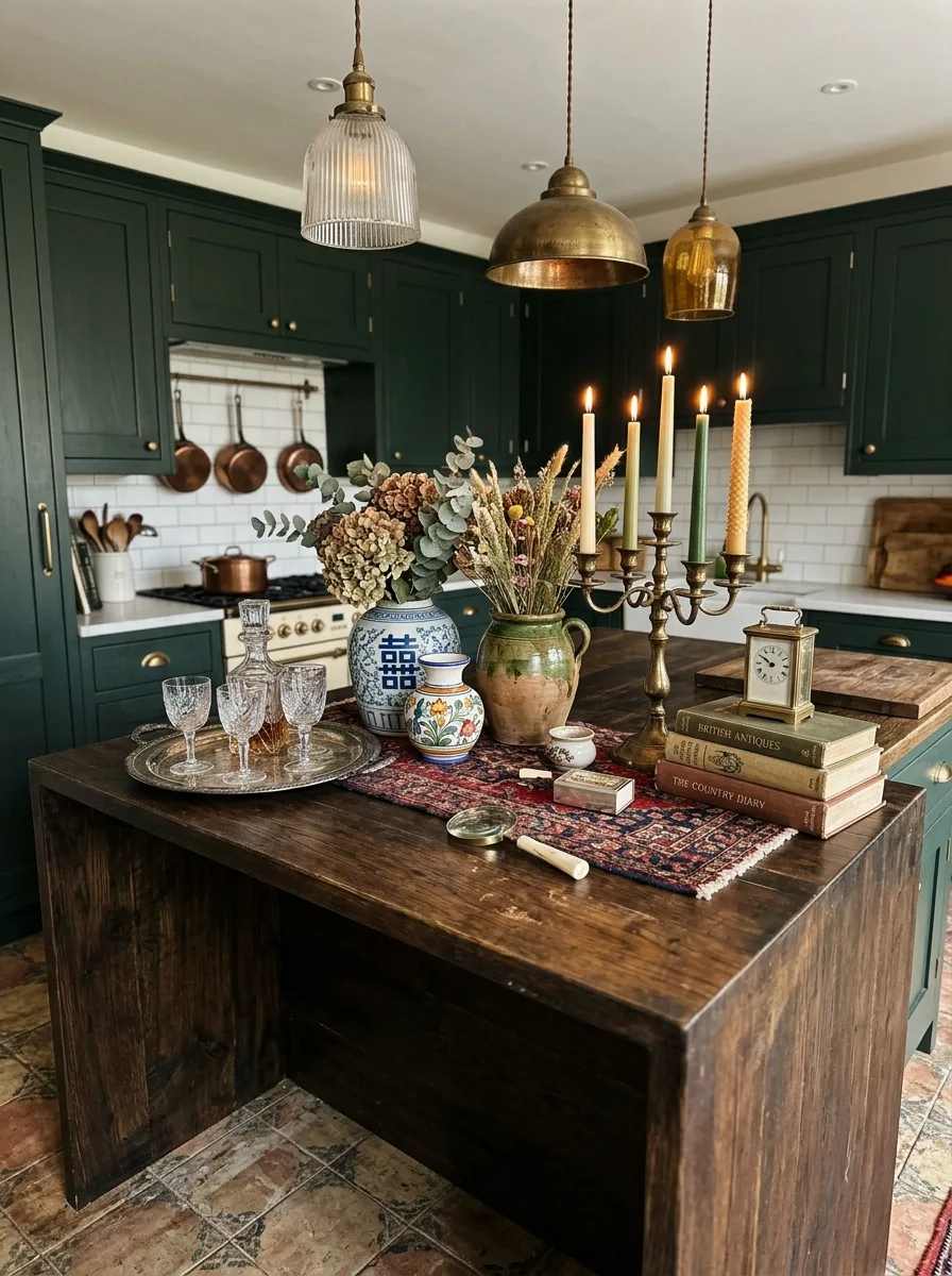
Lay a worn, richly patterned antique rug runner down the center of a dark wood island, and set a tarnished brass candelabra fitted with mismatched candle colors directly on top.
Surround it with a loose collection of genuinely old objects — a stack of antique books, a small carriage clock, an ornate ceramic ginger jar with dried hydrangea — rather than anything new or matched.
This vignette depends on real patina. Skip anything with a clean, factory-fresh finish; every object here should look like it has a story, even if assembled recently.
Black Marble Citrus Bowl
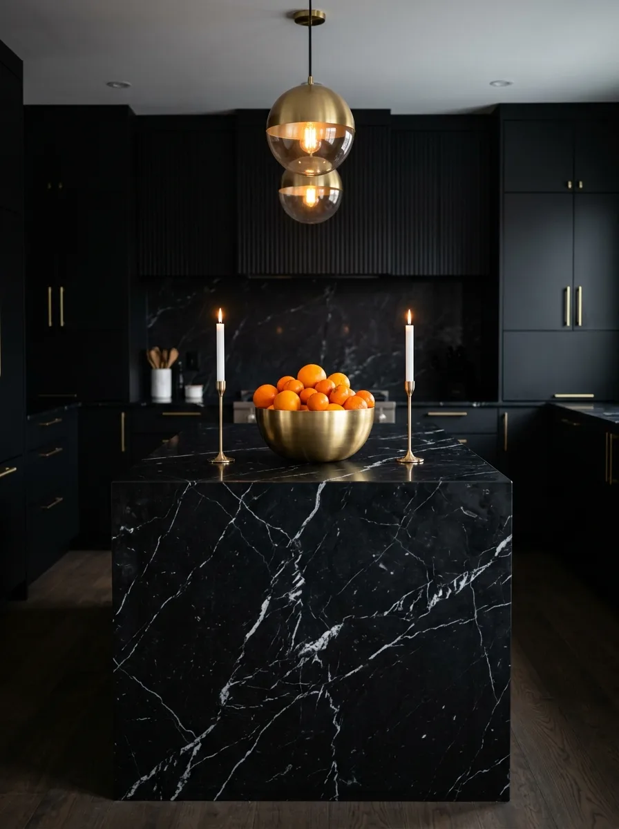
Pile a single large brass or hammered metal bowl generously with vibrant orange citrus, and set it as the sole large object on a dramatic, heavily veined black marble island.
Flank it with two simple brass candlesticks holding white taper candles, spaced evenly on either side, positioned closer to the bowl than to the counter’s edges.
Keep this vignette to exactly three objects. Black marble with bold veining is already a strong visual statement, and additional clutter will compete with the stone rather than complement it.
Nested Mixing Bowl Stack
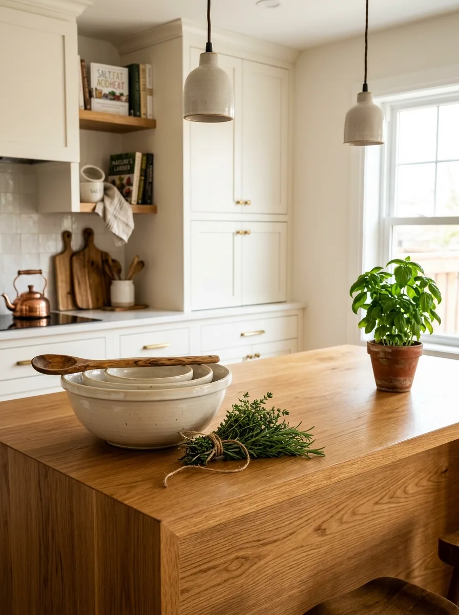
Stack three ceramic mixing bowls of descending size inside one another, and rest a single wooden spoon diagonally across the top bowl’s rim, as though paused mid-recipe.
Place a small bundle of fresh herbs, tied simply with kitchen twine, directly beside the bowls, along with one potted herb plant nearby for a second note of green.
Choose bowls in a soft, matte, slightly imperfect glaze rather than a glossy uniform set. The handmade quality of the bowls is what makes this read as a real kitchen moment rather than staged cookware.
Seashell-Filled Ceramic Bowl
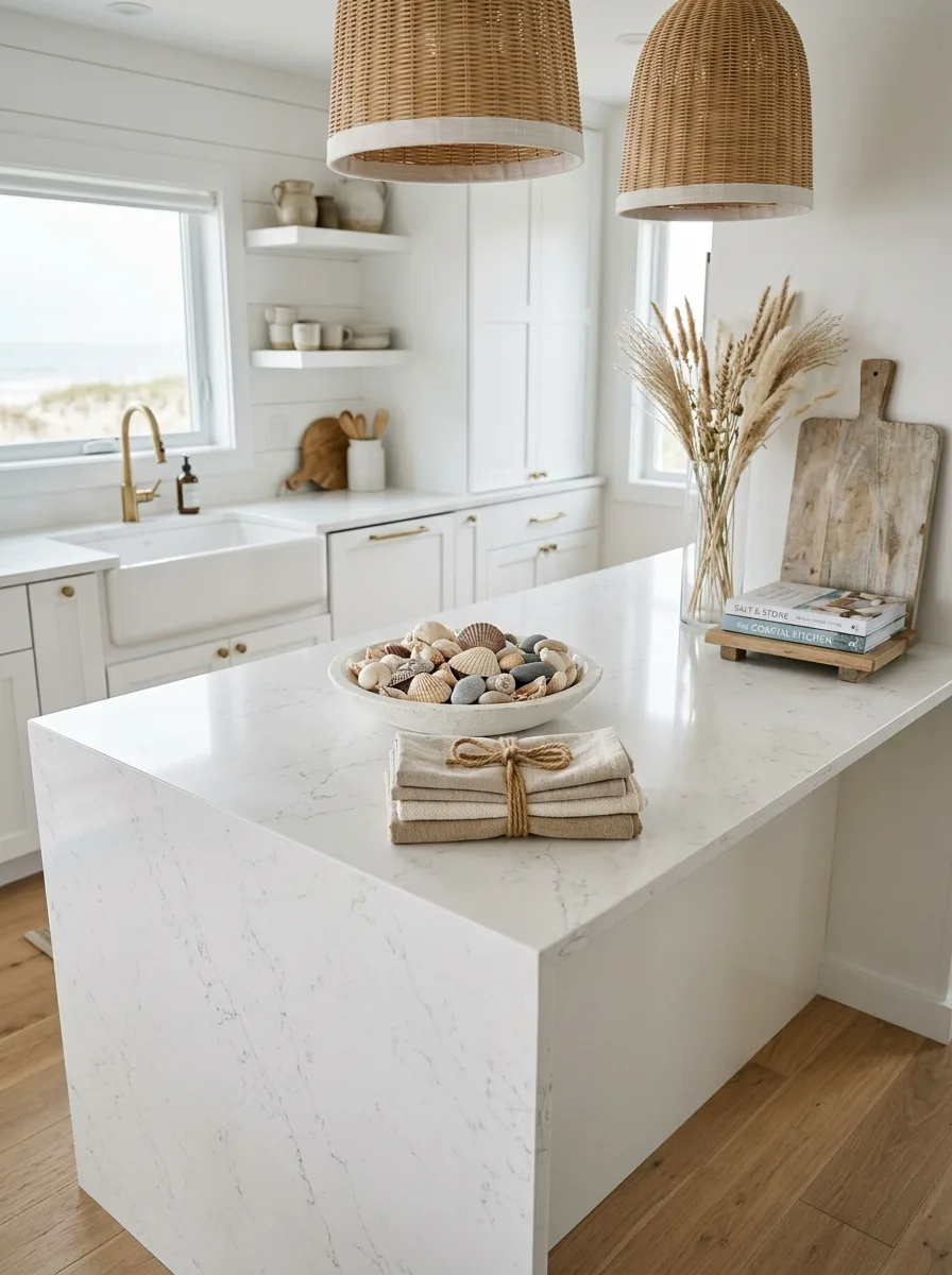
Fill a wide, shallow ceramic or stone bowl with a genuine mixed collection of seashells and smooth beach stones, rather than a uniform, single-type shell display.
Place a tall glass vase of dried pampas grass beside it, and stack two coastal-themed cookbooks against a small weathered wood board at the opposite end of the island.
Tie a small stack of linen napkins with plain jute twine rather than ribbon. The slightly undone, natural cordage keeps the coastal theme from tipping into anything overly polished.
Cherry Blossom Branch Vase
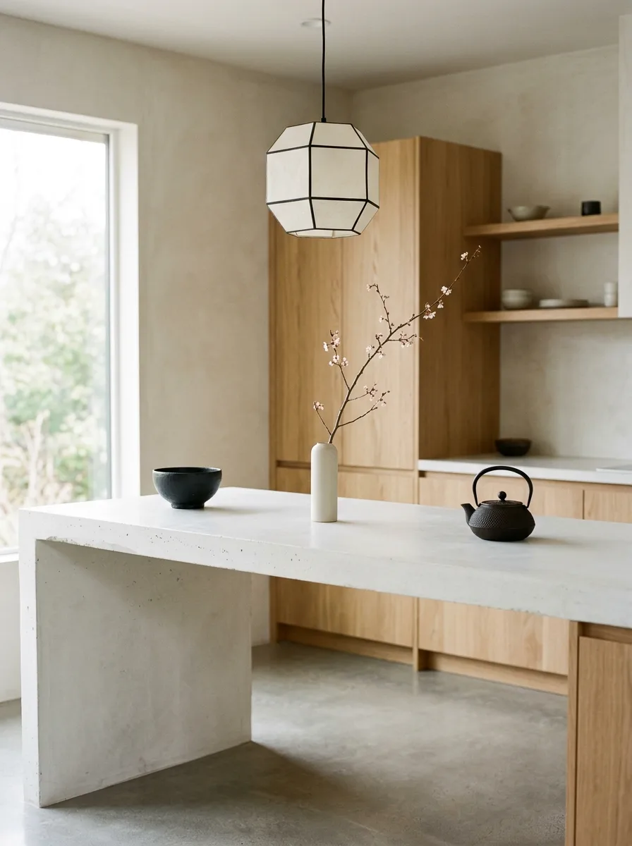
Choose one tall, simple matte white vase, and place a single flowering branch inside, letting its natural irregular shape determine the arrangement rather than trimming it into symmetry.
Pair it with one small, deep-toned ceramic bowl and one cast iron or matte ceramic teapot, spaced with generous gaps between each object rather than clustered together.
This vignette is built entirely on negative space and restraint. Resist adding a fourth object; three pieces with real distance between them is the whole composition.
Matte Gray Bud Vases
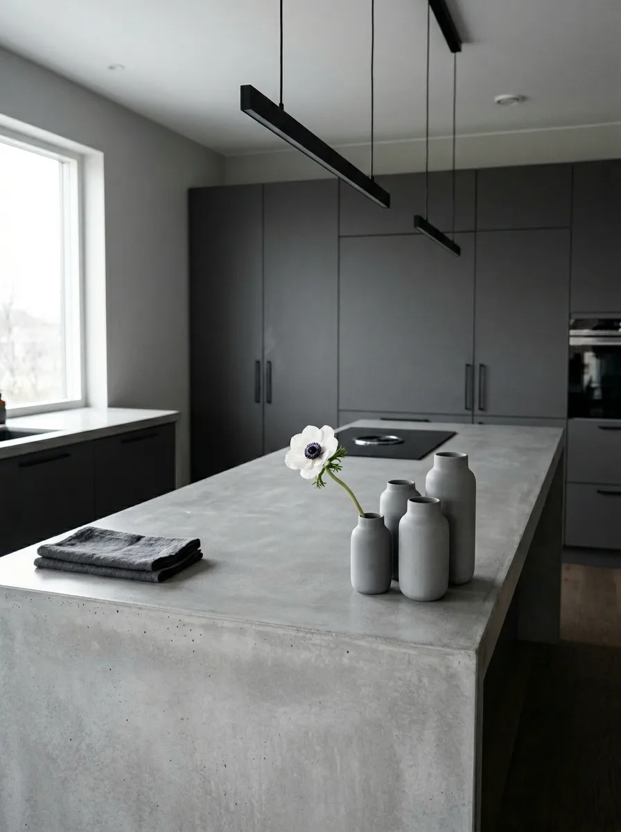
Cluster four or five small matte ceramic bud vases together in slightly varying heights, and place a single flower stem in only one of them, leaving the rest empty.
Set a single folded linen napkin in a matching muted tone beside the cluster, with significant bare counter on either side of the whole grouping.
Keep the color palette monochrome throughout — vases, napkin, and counter all in the same muted gray family — so the single flower stem becomes the only point of visual interest in the entire vignette.
Final Thoughts
None of these counters are doing anything complicated. They’re doing three or four simple things, at different heights, in deliberately limited numbers, with real negative space left around them.
That’s the whole trick, repeated twenty different ways with twenty different material palettes. A tall thing. A low thing. Something textural. Something that’s actually about to get used. Everything else is just variation on that same four-part structure.
Most overcrowded counters aren’t missing a better object. They’re missing the discipline to stop adding things once the formula is already complete.
Pick your anchor, find your height contrast, and then put the rest of your stuff away.