
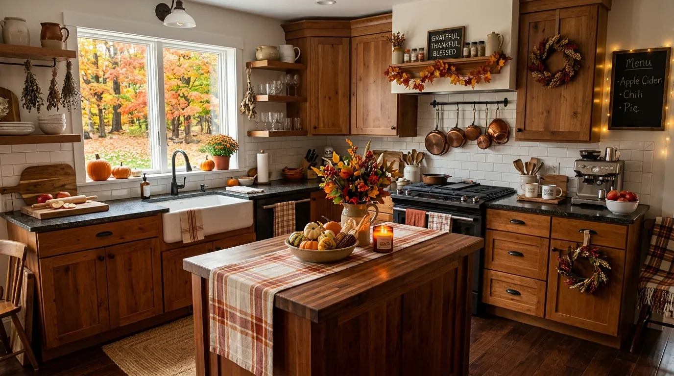
A single pumpkin on the counter is not a fall kitchen. It’s a pumpkin on a counter, quietly waiting for someone to notice nothing else has changed since July.
Somehow this keeps happening every October. People buy the pumpkin, place it with real ceremony, and call the job finished. Meanwhile the actual kitchens that pull this off have committed to something far bigger — metal finishes, dried botanicals, food itself doing decorative work.
None of that happens by accident. Every genuinely cozy fall kitchen is running the same handful of moves underneath all that warm light.
Fall Kitchen Must-Haves
Layered Pumpkin Candle Tray
Pick a low, wide woven tray and load it with a mix of pillar candles at different heights, a scatter of small white and orange pumpkins, and a few sprigs of dried foliage tucked between them.
Keep the candles unscented or lightly spiced rather than heavily perfumed — this tray usually sits near food prep, and an overpowering scent will fight with whatever’s actually cooking.
Group everything close together rather than spacing it out. The visual density is what reads as abundant instead of sparse, and it means the tray still looks intentional even after a few candles burn down unevenly.
Fairy Light Leaf Garland
Drape a faux leaf garland with embedded warm-white fairy lights along the top of a window or across an open shelf, letting it sag slightly between anchor points instead of pulling it taut.
Choose a garland with mixed leaf tones — rust, ochre, deep green — rather than a single uniform color, so it reads as gathered from an actual autumn walk instead of manufactured for a display.
Plug it into a timer rather than remembering to switch it on each evening. The kitchens that keep this look going all season are the ones where the lights come on automatically at dusk.
Oversized Faux Maple Leaf Stems
Choose stems with large, deeply lobed leaves in genuine autumn colors — burnt orange, deep red, gold — rather than the smaller, more muted varieties.
Arrange them in a single substantial vase on an island or counter where they’ll be the first thing anyone sees entering the room. A modest arrangement gets lost; a dramatic, oversized one becomes the room’s actual focal point.
Trim the stems at varying lengths before arranging so the leaves fall at different heights. Uniform height reads as artificial no matter how realistic the individual leaves look.
Vintage Coffee Nook Signage
Dedicate one small stretch of counter or shelving entirely to coffee, and anchor it with a piece of decorative lettering or signage that names the space clearly.
Layer in pumpkin-shaped teapots, small ceramic creamers, and a canister or two in warm gold and cream tones, keeping the palette consistent with the rest of the kitchen rather than introducing new colors here.
Add under-shelf lighting if you can. A coffee nook photographs and functions completely differently once it’s lit from within rather than relying on the room’s overhead light.
Dried Pampas Grass Bundle
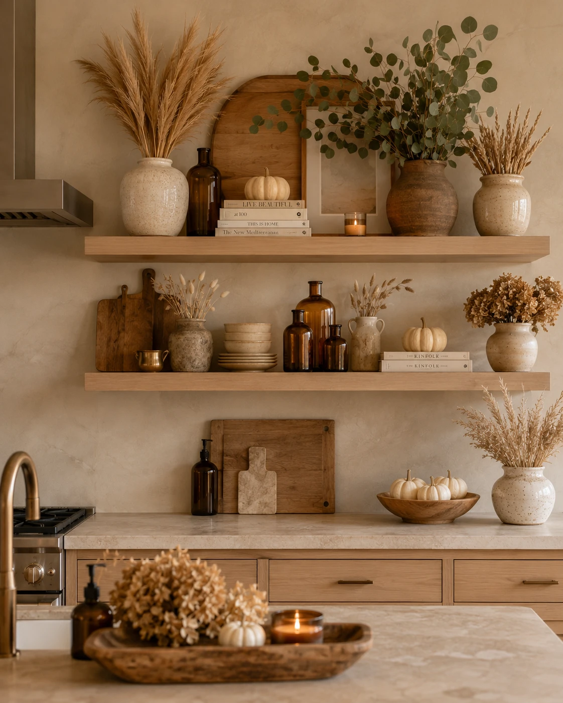
Choose stems with full, feathery plumes rather than sparse or immature ones — pampas grass earns its keep by volume, and a thin bundle looks more like leftover stems than an actual arrangement.
Place it in a textured ceramic or stoneware vase rather than glass. The matte, earthy vessel keeps the pale plumes from looking stark against a warm kitchen palette.
Let it stand taller than everything else on the shelf. Pampas grass works because it draws the eye upward, breaking up what would otherwise be a flat horizontal line of jars and dishware.
Plaid Table Runner
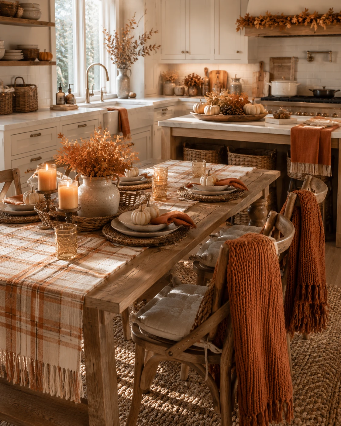
Choose a runner in a muted rust, cream, and brown plaid rather than a bright or saturated pattern — the goal is a base layer that supports the tablescape, not one that competes with the centerpiece.
Let the fringe on each end hang naturally over the table’s edge instead of tucking it under. That loose, slightly undone fringe is what keeps the runner from looking like a stiff, pressed rental linen.
Layer plates, woven chargers, and mismatched glassware directly on top rather than using a second tablecloth underneath. One textured layer is enough; two starts to look overdressed.
Rustic Pie Cooling Rack
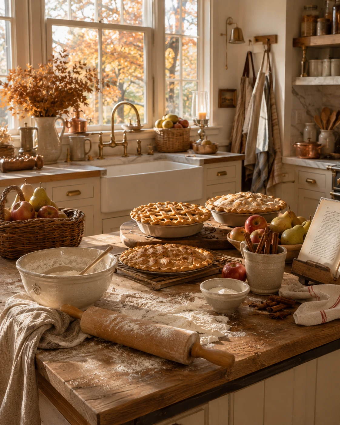
Set out a wire cooling rack directly on a flour-dusted section of counter, and let at least one pie sit there mid-cool with visible steam or a slightly imperfect lattice top.
Surround it with the actual ingredients still in use — a bowl of apples and pears, a jar of cinnamon sticks, a rolling pin resting at an angle rather than put away.
Resist the urge to clean up the flour dust before styling the scene. The mess is doing real work here; a spotless counter next to a pie looks staged in a way flour-dusted wood never does.
Brass Taper Candlestick Collection
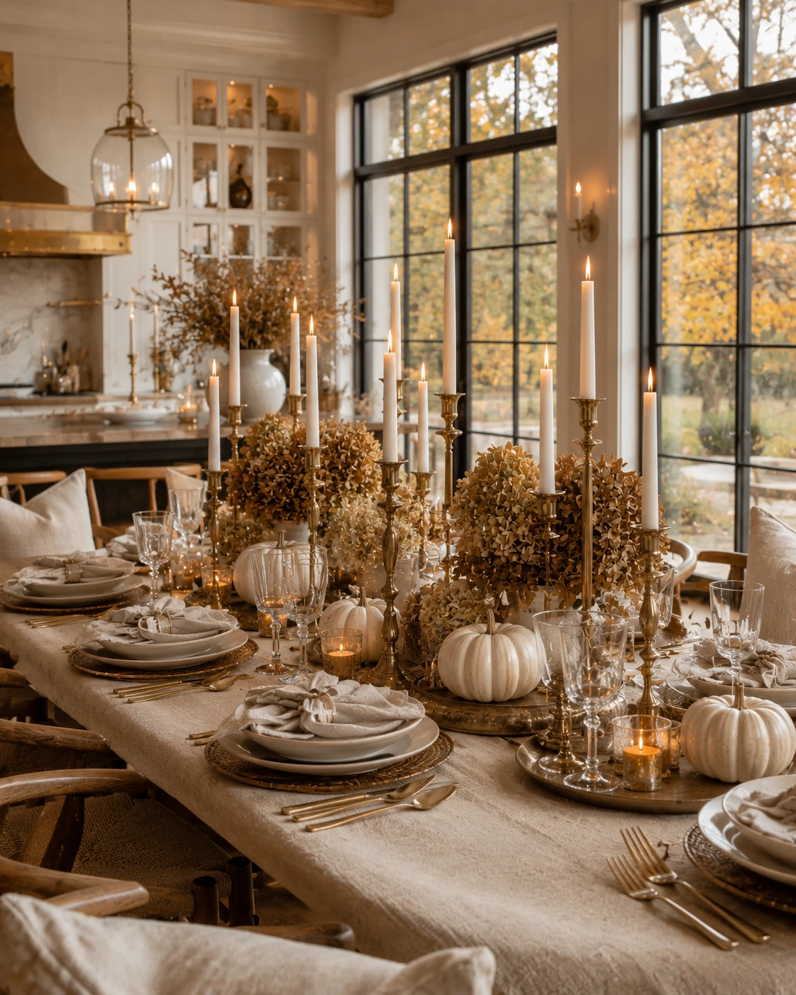
Mix candlestick heights deliberately — some short, some dramatically tall — rather than lining up a matching set at a single height. The variation is what makes a large tablescape feel gathered over time instead of bought as a kit.
Choose brass or aged gold finishes over silver or chrome. Warm metal candlesticks hold candlelight in a way cool metals simply don’t, and the difference is obvious the moment the sun goes down.
Cluster several together near a dried floral centerpiece rather than spacing them evenly down the table. Density here reads as celebratory; even spacing reads as a rental company’s standard setup.
Copper Tea Kettle
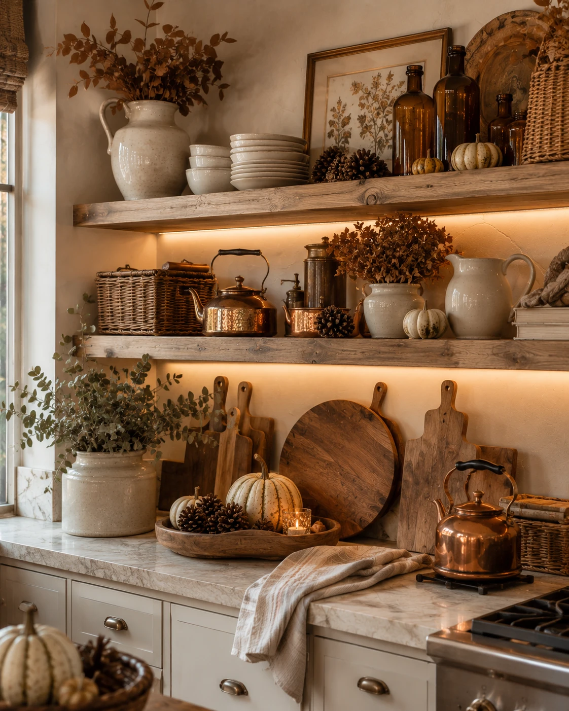
Choose a kettle with a visibly hammered or dented surface over a flawless, mirror-polished one. The texture catches candlelight in dozens of small reflections instead of one flat glare.
Keep it on the stovetop rather than in a cabinet, even when it’s not in use. A kettle only earns its place as a fall must-have if it looks like it’s actually being reached for.
Pair it with one or two smaller copper pieces nearby — a creamer, a small pot — so the kettle doesn’t read as an isolated accent but part of a deliberate metal palette running through the room.
Antique Wood Hutch Display
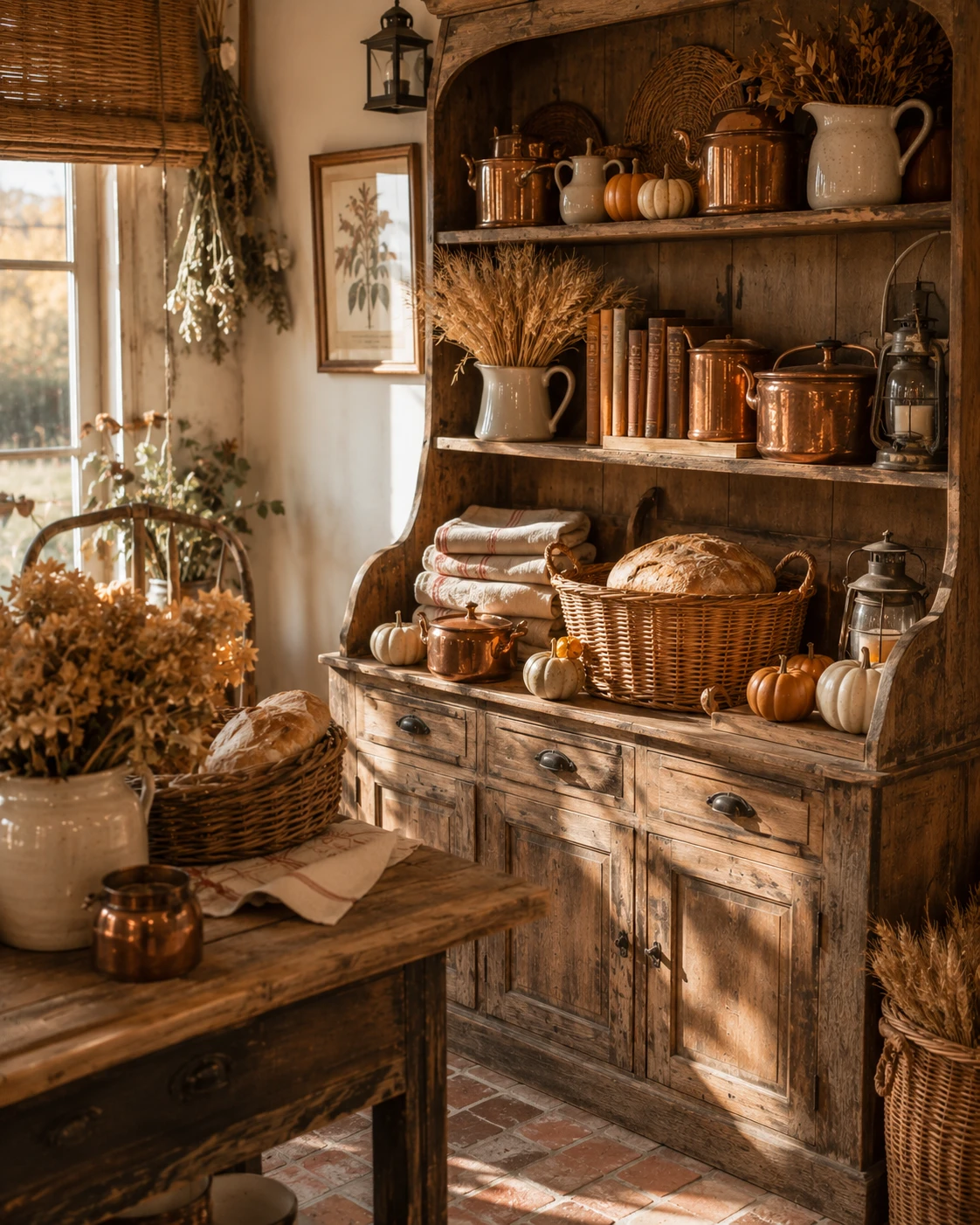
Choose a hutch with real age on it — worn edges, slightly mismatched hardware — rather than a new piece distressed to look old. Genuine wear reads differently than manufactured wear, even from across the room.
Fill the open shelves unevenly: stacked books leaning at an angle, a pitcher slightly off-center, baskets that don’t match each other. A hutch styled with mathematical precision loses the lived-in quality that makes it work.
Leave the lower cabinets slightly ajar or use them for real storage — linens, extra dishware — so the piece keeps functioning as furniture and not just as a display case.
Oversized Dried Floral Arrangement
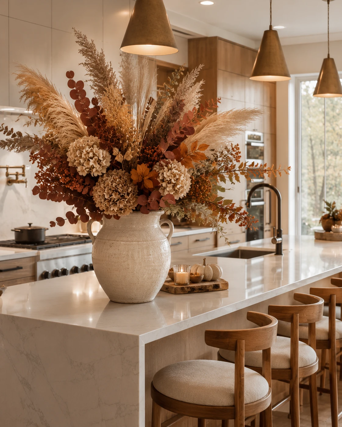
Choose a single large stoneware or ceramic jug rather than a delicate vase — the arrangement’s scale needs a base heavy enough to visually anchor it, especially once the stems start leaning outward in every direction.
Mix pampas, dried hydrangea, and trailing eucalyptus together rather than sticking to one plant type. The contrast between fluffy plumes, dense blooms, and delicate leaves is what keeps a monochrome palette from reading as flat.
Position it at the end of an island or counter where it has room to spread. This arrangement fails in a tight corner — it needs open space on at least two sides to actually read as dramatic rather than crowded.
Wooden Dough Bowl Fruit Display
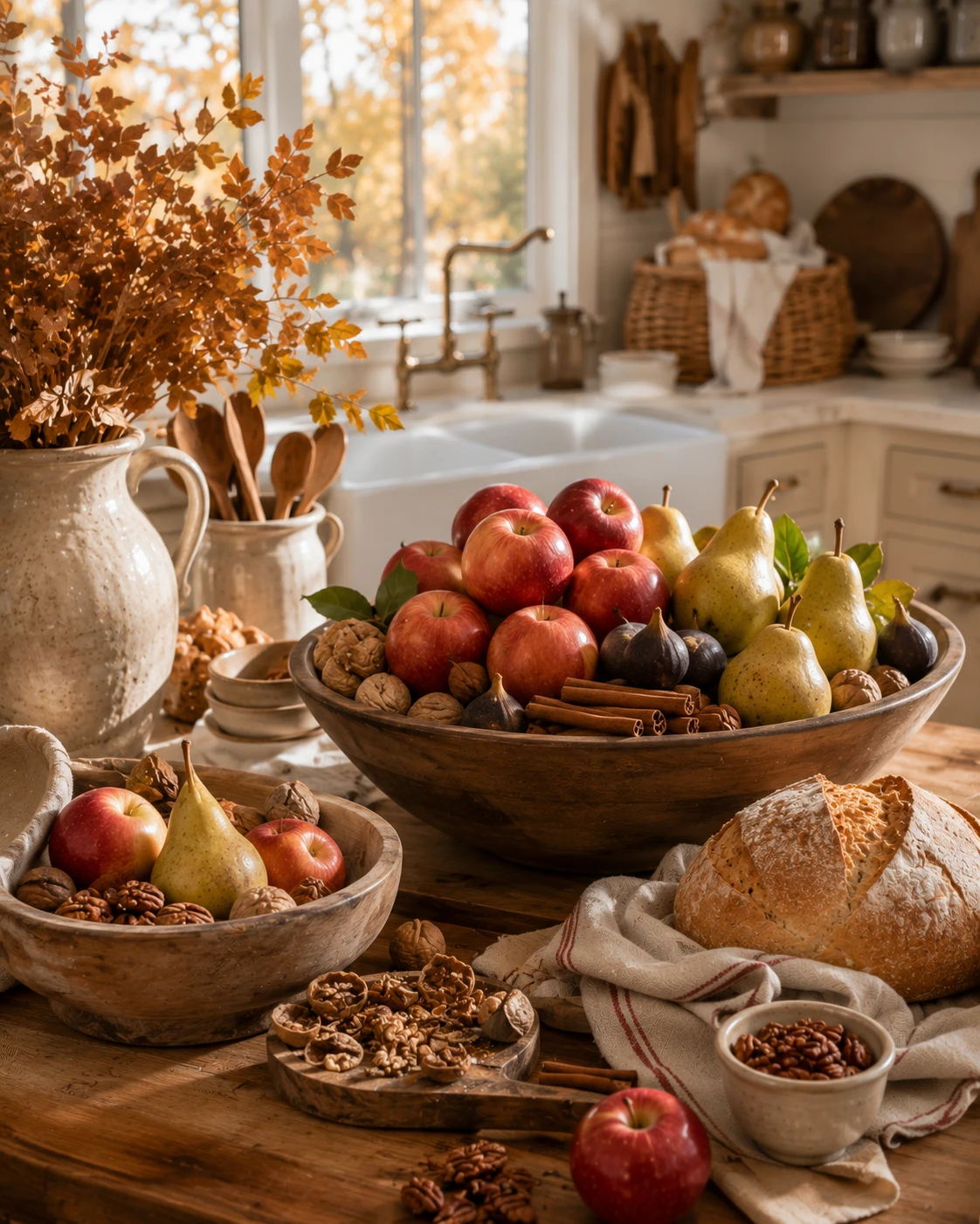
Choose a well-worn wooden bowl with visible grain and age over a smooth, new one — the texture is doing as much work here as the fruit itself.
Fill it generously with apples, pears, walnuts still in their shells, and a few cinnamon sticks tucked between the fruit rather than laid on top. Restraint makes this look sparse; abundance is the entire point.
Let a few pieces spill just slightly over the bowl’s edge onto the counter. A perfectly contained bowl looks staged; a slight overflow looks like fruit that was actually just brought in from the market.
Glass Hurricane Lantern Cluster
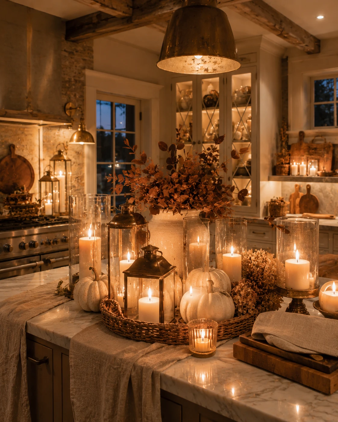
Group lanterns of varying heights together rather than spacing single ones around the room. A cluster of three or more creates the kind of concentrated glow that a single scattered candle never achieves.
Choose clear glass hurricanes over frosted or colored ones, so the candlelight inside stays visible and bright rather than diffused into a dull glow.
Tuck small white pumpkins and a few dried hydrangea blooms into the gaps between lanterns. The candlelight will catch the pumpkins’ texture in a way that flat daylight never quite manages.
Eucalyptus Range Hood Garland
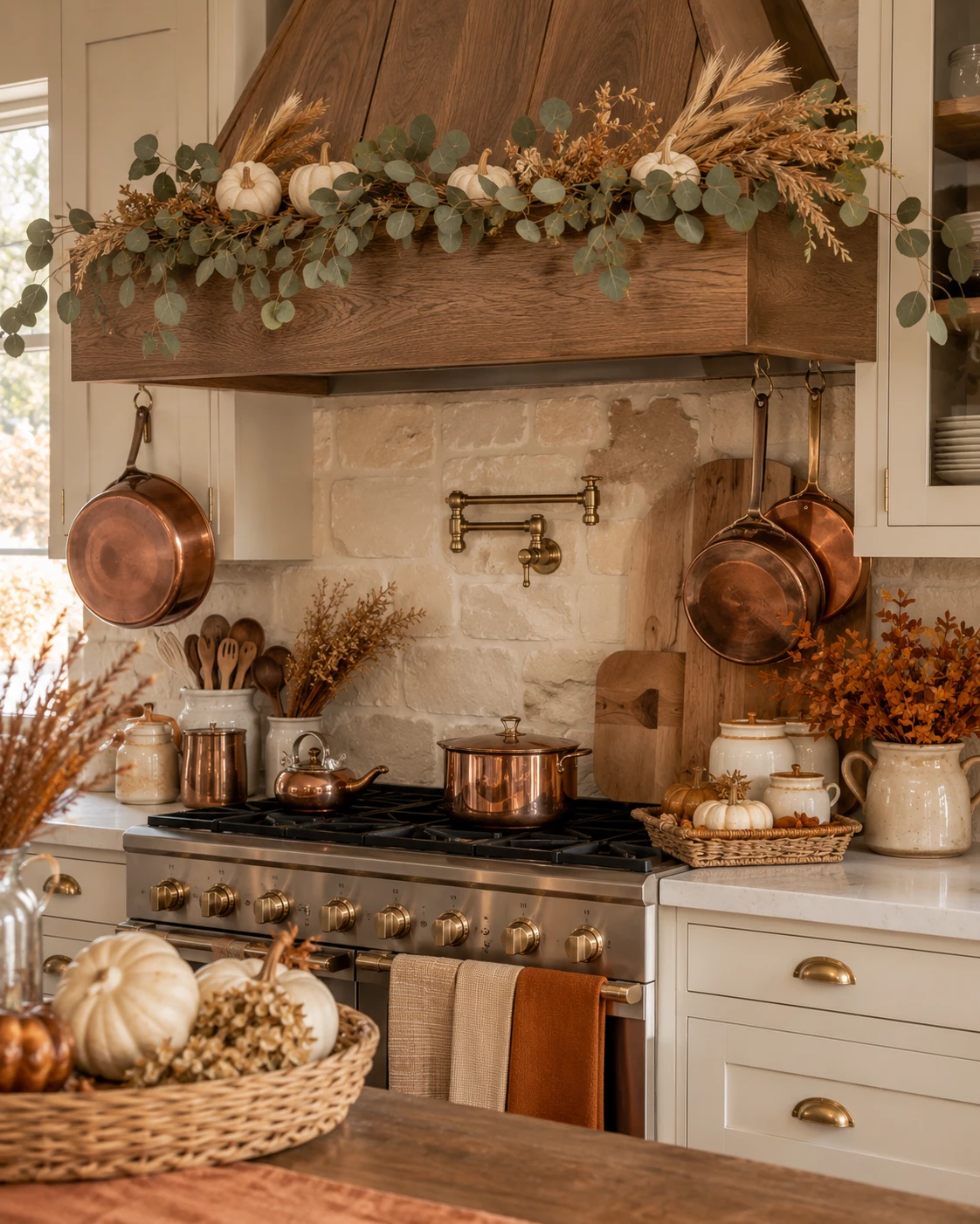
Drape a mixed garland of eucalyptus, dried wheat, and small white pumpkins along the top edge of a range hood, letting it extend slightly past both sides rather than stopping exactly at the hood’s width.
Choose fresh or preserved eucalyptus over silk if you can manage the upkeep — the real thing releases a faint scent as it warms near the stove, which does more for the room’s atmosphere than any candle nearby.
Hang copper pots directly beneath the garland on either side. The contrast between the garland’s soft greenery and the pots’ hard metal is what keeps this vignette from reading as one-note.
Plaid Throw Blanket
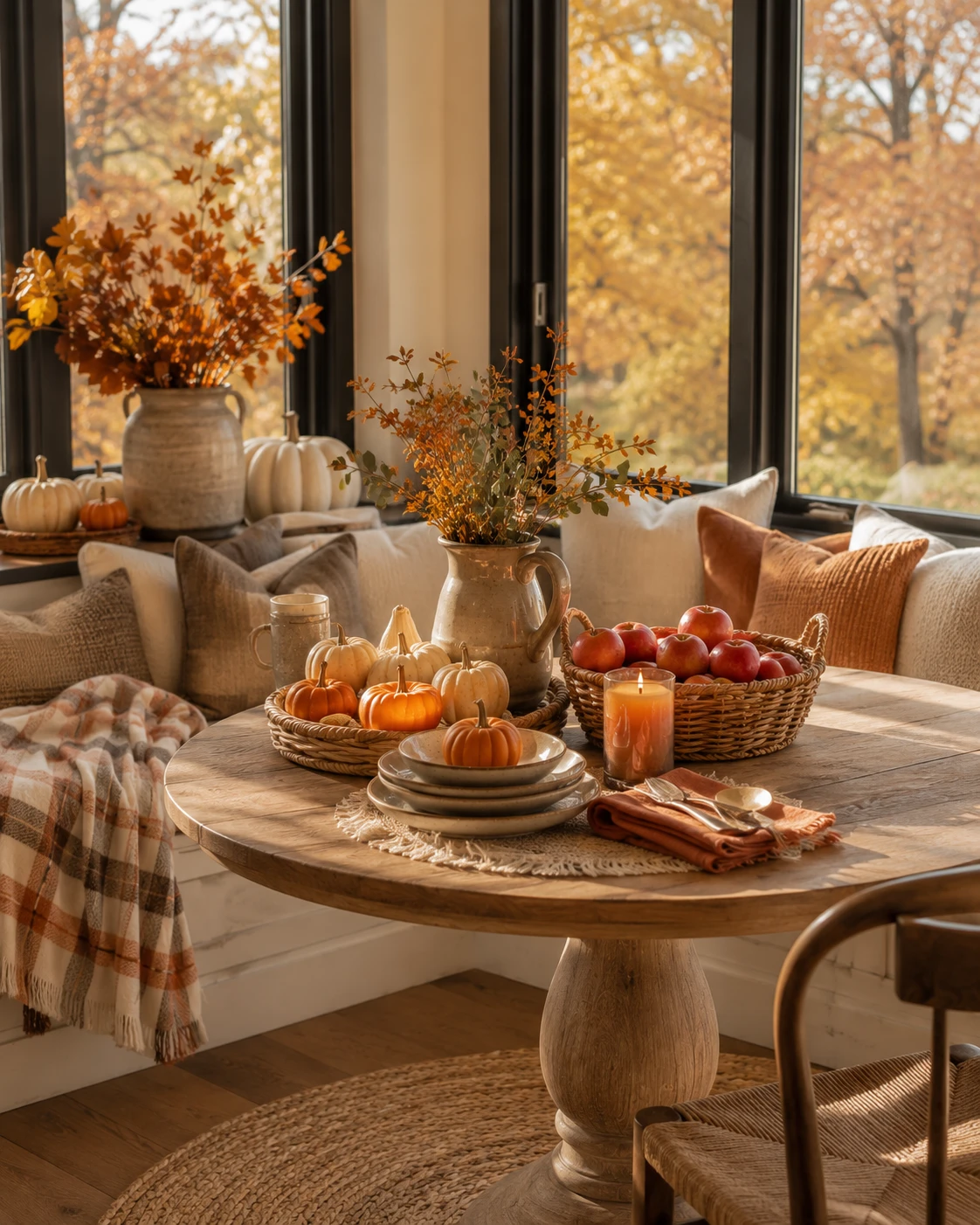
Choose a throw in a muted rust and cream plaid rather than a saturated, primary-colored pattern — the goal is something that reads as autumn without shouting it.
Drape it loosely over a window seat or bench back rather than folding it into a tight square. A folded throw looks stored; a draped one looks like it was actually used an hour ago.
Let one corner trail slightly onto the seat or floor. That small bit of asymmetry is what separates a throw that looks lived-in from one that looks like a styling prop nobody’s touched.
Labeled Glass Pantry Jars
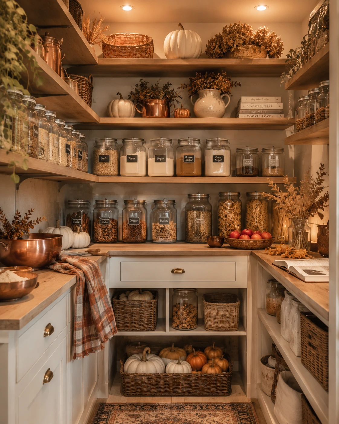
Choose uniform glass jars across your dry goods — flour, sugar, oats, pasta — so the pantry reads as one cohesive system rather than a mismatched collection of whatever containers were on hand.
Label each jar with simple black lettering rather than elaborate script. Legibility matters more than decoration here; the labels need to actually help you find things at a glance.
Mix in a few pumpkins and dried stems on the open shelves above the jars. Even a purely functional pantry benefits from one seasonal gesture that keeps it from feeling entirely utilitarian.
Amber Glass Apothecary Bottles
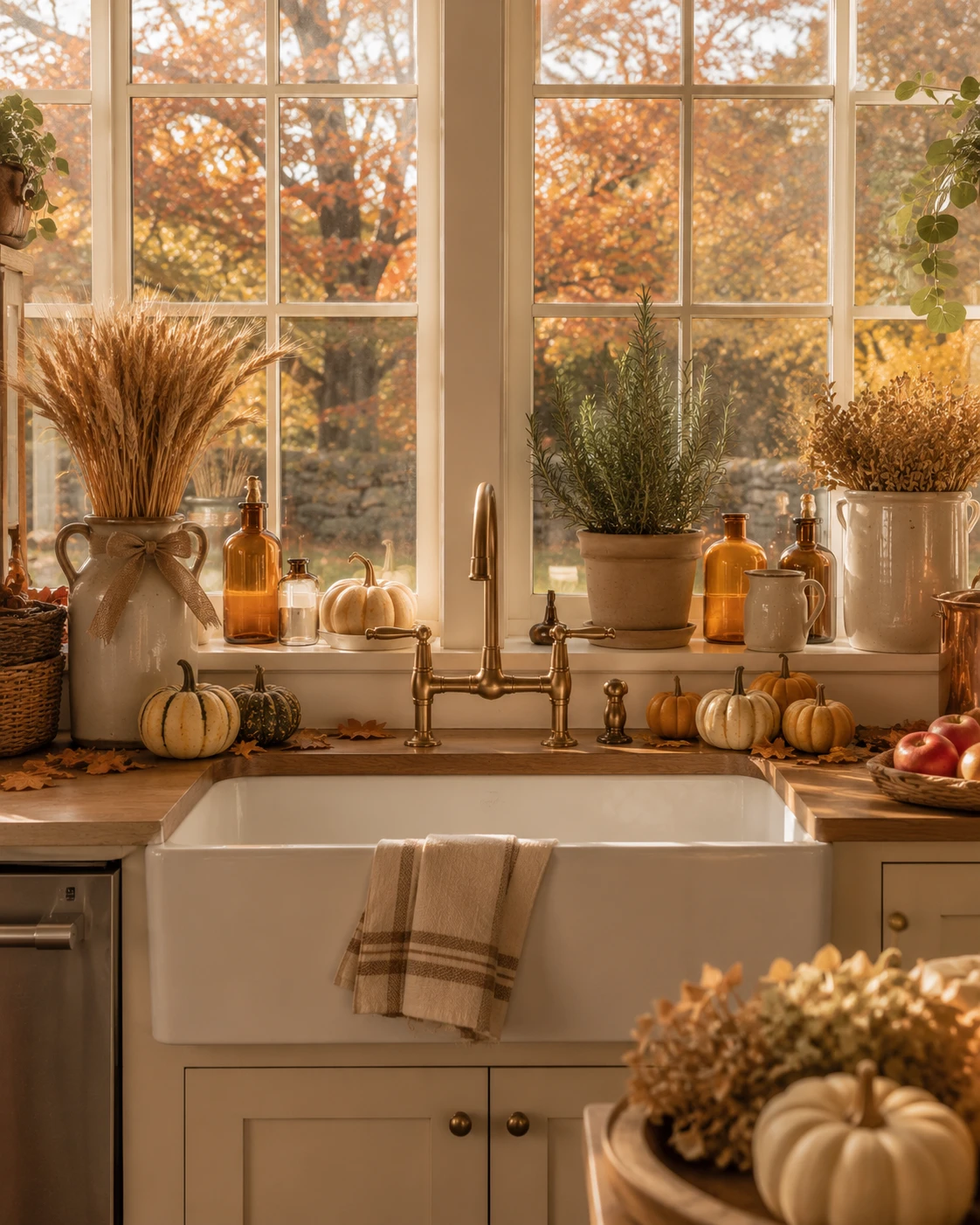
Choose bottles in varying heights and widths rather than a matching set — the collected, mismatched look is what makes them read as vintage finds instead of a single purchased set.
Cluster them along a windowsill where afternoon light can pass directly through the amber glass. The color only really does its job when there’s light behind it to catch.
Mix in small potted herbs like rosemary between the bottles. The living green against the amber glass keeps the vignette from reading as purely decorative and nothing else.
Hanging Copper Pot Rack
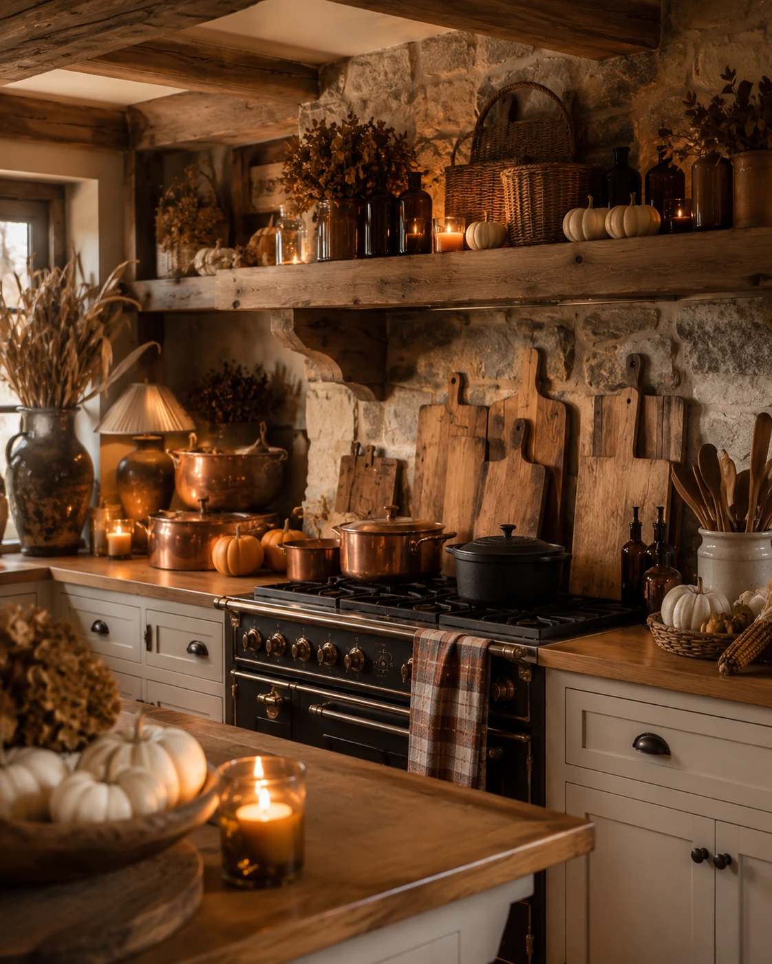
Mount hooks directly beneath a range hood or open shelf and hang your most-used copper pots and pans there rather than storing them in a cabinet.
Let the pots vary slightly in size and style rather than matching a boxed set. A rack of mismatched, well-used copper looks collected over years; a matching set looks like it arrived last week.
Position the rack somewhere it’ll catch the stove’s ambient light or nearby candlelight. Hanging copper does almost nothing for a room that’s lit flatly overhead — it needs some warmth bouncing off it to actually shine.
Woven Storage Basket Collection
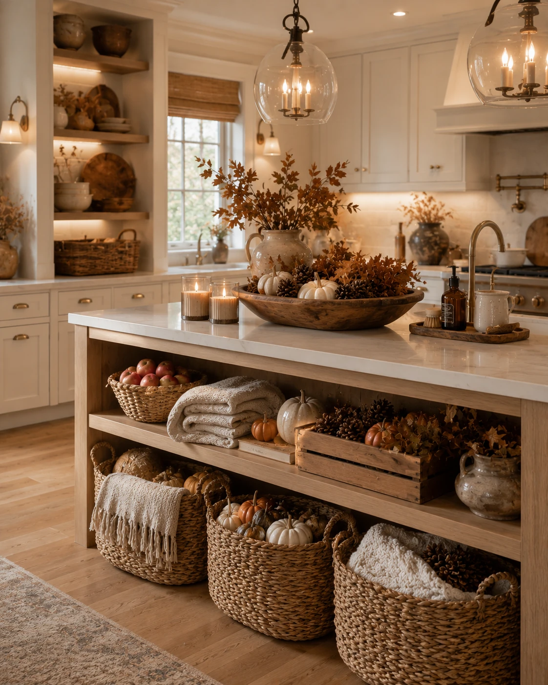
Choose baskets in a range of sizes rather than a matching nested set, and use them for real storage — throws, extra linens, spare gourds — rather than leaving them empty for show.
Tuck a few pumpkins or dried stems into the tops of one or two baskets so they read as styled rather than purely functional, without doing this to every single one.
Place them at varying heights, some on open shelving and some directly on the floor. The height variation keeps a wall of storage from reading as one flat, repetitive row.
Final Thoughts
None of these items work in isolation. A copper kettle by itself is just a kettle. Dried pampas grass alone is just a plant that stopped growing.
What actually makes a fall kitchen convincing is the layering — metal catching candlelight, texture sitting next to texture, real food doing the job store-bought decor usually gets credit for.
The pumpkin was never the point. It was just the easiest thing to grab first.
Start with the metal and the light instead, and the pumpkin will finally have something worth sitting next to.