
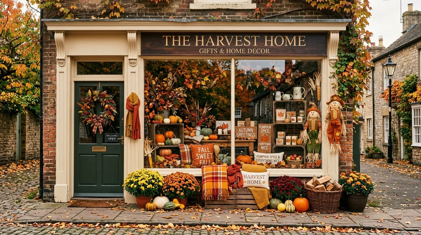
A pile of pumpkins is not a retail concept.
That sounds obvious, but seasonal displays go wrong in exactly this way. A window gets filled with leaves, crates, signs, pumpkins, and orange fabric, while the actual merchandise gets pushed somewhere behind the decorations. The store looks “fall” for about three seconds, then it just looks busy.
The better approach is to design the entire scene. Think about the backdrop, product placement, lighting, materials, color, height, empty space, and the story customers understand before they even step inside.
A strong seasonal display doesn’t need more stuff. It needs better relationships between the things already there.
Finished Fall Retail Ideas
Classic Storybook Façade
Deep forest green woodwork anchors this charming neighborhood bookstore, setting a literary mood that practically begs for crisp autumn air and cozy afternoons inside. Warm golden interior light spills across overflowing shelves and window displays filled with seasonal mums.
Outside, a simple wooden table and chair invite passersby to pause, while rustic planters and autumnal floral arrangements soften the storefront edges without crowding the classic architecture. The exterior lighting does heavy lifting here, turning the shop into a glowing beacon on the sidewalk.
This approach works wonderfully for independent shops, cafes, and boutiques where atmosphere is part of the inventory. Let the natural charm of the building lead the design, keeping seasonal accents classic rather than loud.
Autumn Market Window
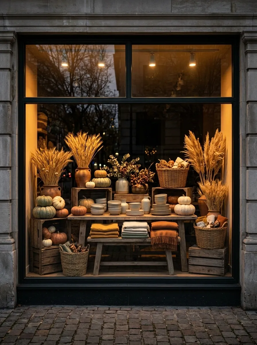
The storefront becomes a polished little autumn market, with weathered timber crates, woven baskets, muted pumpkins, dried wheat, and carefully arranged merchandise. Nothing feels randomly dropped into place.
Use different heights across the window, but keep the visual center relatively calm. A low display table or crate grouping can anchor the merchandise while taller dried stems create a soft frame around it.
The trick is keeping the produce and props slightly imperfect without making the whole thing look messy. Real markets have variation. They don’t have visual chaos.
Warm amber lighting helps the display read especially well late in the day, when a darker storefront can actually become an advantage.
Textured Pillow Haven
Open shelving takes a cozy turn when layered entirely with embroidered fall textiles, creating a visual wall of neutral creams, rich ambers, and rustic textures. The grid display keeps dozens of patterned pillows looking orderly rather than overwhelming.
Every pillow features subtle seasonal motifs like pumpkins, acorns, and autumn foliage, but the restrained color palette prevents the wall from reading like a holiday explosion. Simple wooden risers and woven baskets anchor the lower levels, grounding the floating shelves above.
This merchandising concept thrives in home goods stores and lifestyle boutiques during the transition months. When product variety is high, strict organization is the only way to keep a dense display feeling expensive and intentional.
Moody Charcoal and Burnt Orange
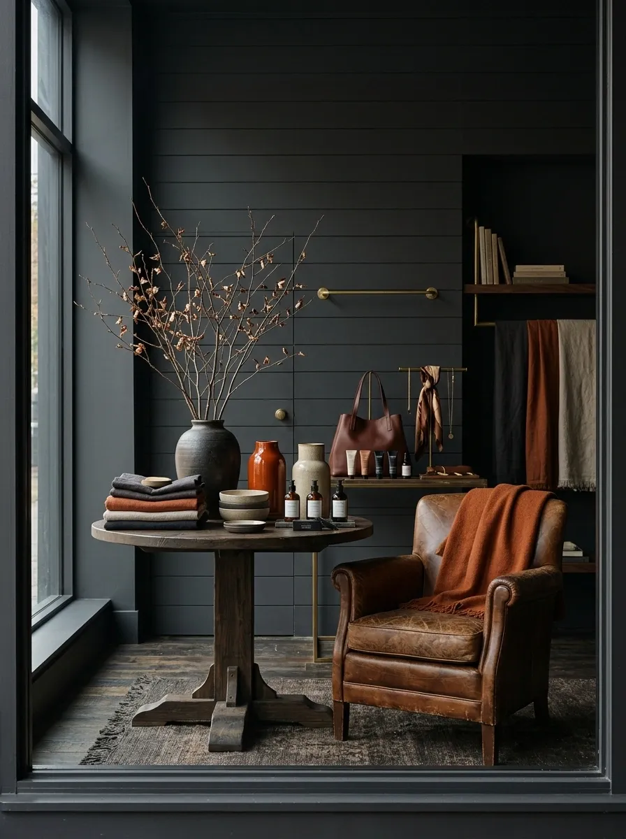
Forget the predictable bright pumpkin-orange window. This version uses charcoal as the architectural backdrop, then lets burnt orange merchandise, tobacco leather, aged brass, and dark timber do the seasonal work.
The darker shell is important because it makes the warm products look richer. A few dried branches can add height, but keep them sparse. The display should feel edited.
This direction works especially well for fashion, accessories, beauty, and lifestyle retailers where the products already carry strong color or texture. The wall doesn’t need to compete with them.
I’d also keep the signage simple. Large seasonal graphics would flatten the whole composition.
Literary Autumn Haven
Rich red brick and vibrant autumn foliage create an unmistakable seasonal postcard for this neighborhood bookstore. A dark green storefront frames glowing windows packed with books, while a welcoming wooden bench and a scattering of pumpkins invite lingering.
Fallen leaves pool naturally along the sidewalk, bridging the gap between the urban streetscape and the warm interior display. The scene feels entirely organic, as though the shop simply woke up looking like October overnight.
This style relies on letting nature do the heavy lifting. Instead of over-decorating, complement the existing architecture with a few well-placed pumpkins and warm lighting that makes the interior merchandise irresistible from the street.
Harvest Tabletop Grocery Scene
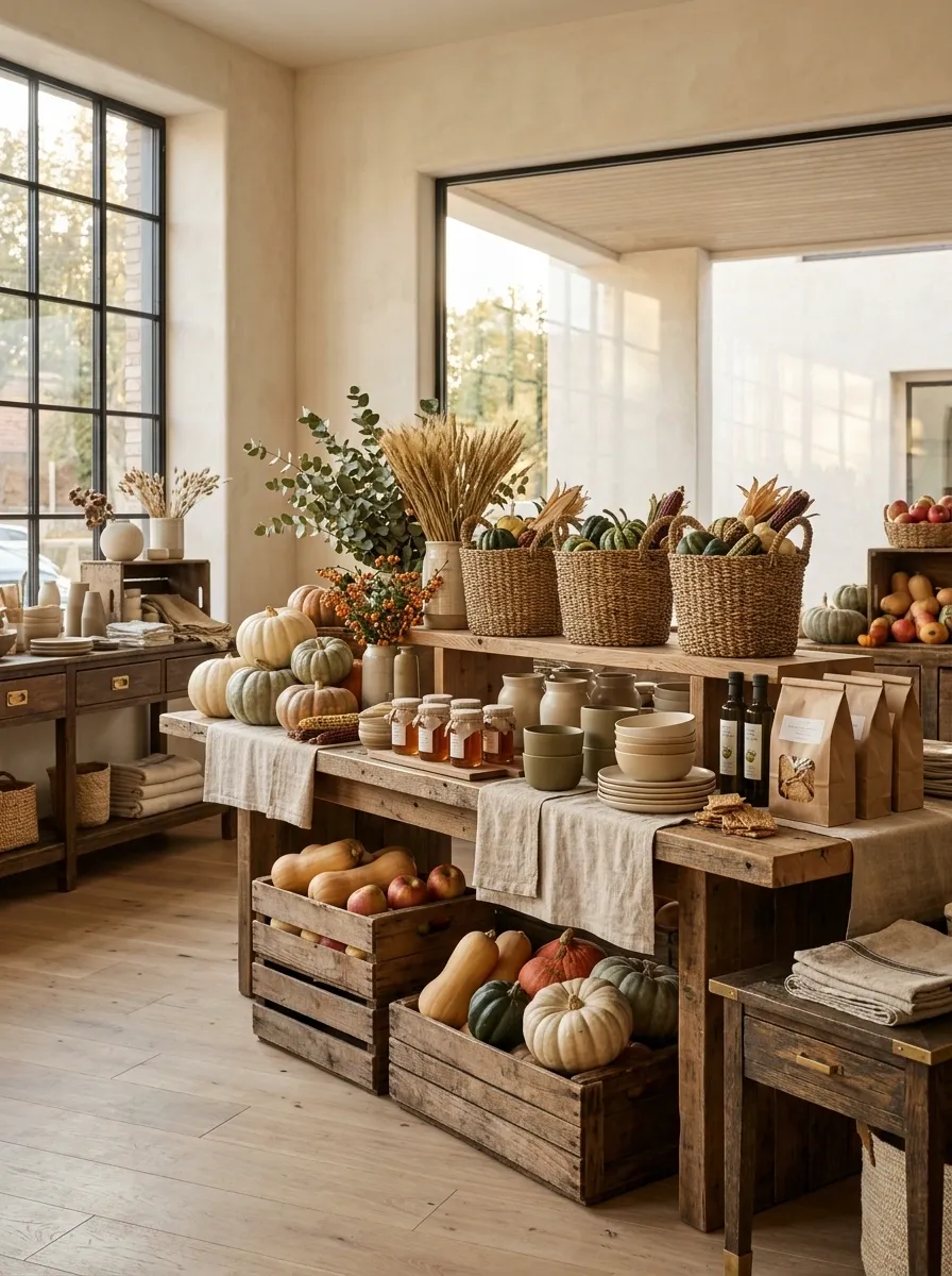
A long central table gives this display its identity. Instead of scattering products around the floor, build one strong merchandising island using wooden risers, baskets, linen cloths, seasonal produce, and a few carefully chosen pumpkins.
The height changes should feel deliberate. Put the most important products at comfortable viewing height, then use lower baskets and crates to create visual rhythm around them.
This is one of those displays where repetition helps. Three similar baskets look intentional. Nine different containers look like a yard sale.
The seasonal elements should also support the store’s actual inventory. A food shop can lean heavily into produce. A lifestyle store can use the same structure with ceramics, textiles, candles, or tabletop goods.
Harvest Bakery Window
A moody charcoal storefront frames a mouthwatering display of baked goods, all illuminated by soft interior amber lighting that highlights every tier of pastries. Outside, an abundance of heirloom pumpkins and rustic baskets overflowing with fall foliage completes the harvest scene.
The deep exterior color makes the golden pastries and warm wood tones pop, creating a striking contrast against the grey pavement and fallen leaves. It feels like stepping into a European bakery on a chilly morning.
Food shops and artisanal bakeries can lean heavily into this look by combining edible inventory with classic seasonal produce. Keep the exterior props slightly varied in size and height to maintain that effortless, market-fresh feel.
Vintage General Store
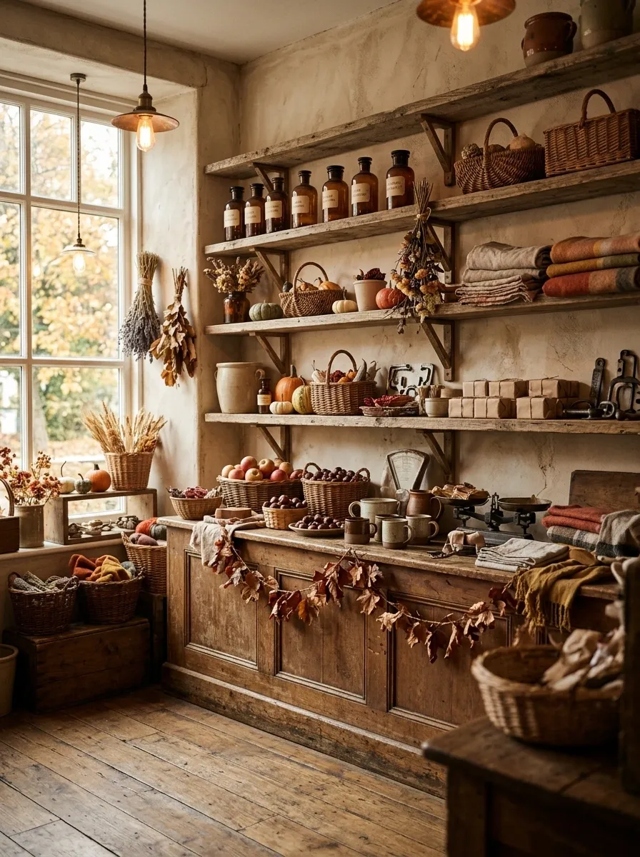
This one feels collected rather than decorated. Reclaimed timber shelving, amber glass, aged metal, cream paper labels, woven baskets, faded textiles, and dried botanicals create the feeling of an old shop that has been there for decades.
That sense of age is what separates it from a generic rustic display. Don’t make everything distressed. A few genuinely worn-looking elements are more convincing than an entire room of faux antique finishes.
The merchandise can sit within the scene instead of being arranged in perfect retail rows. Slightly varied heights and grouped objects make the display feel more like a functioning store.
Keep the palette warm and dusty. Bright orange would break the illusion immediately.
Minimalist Pumpkin Window
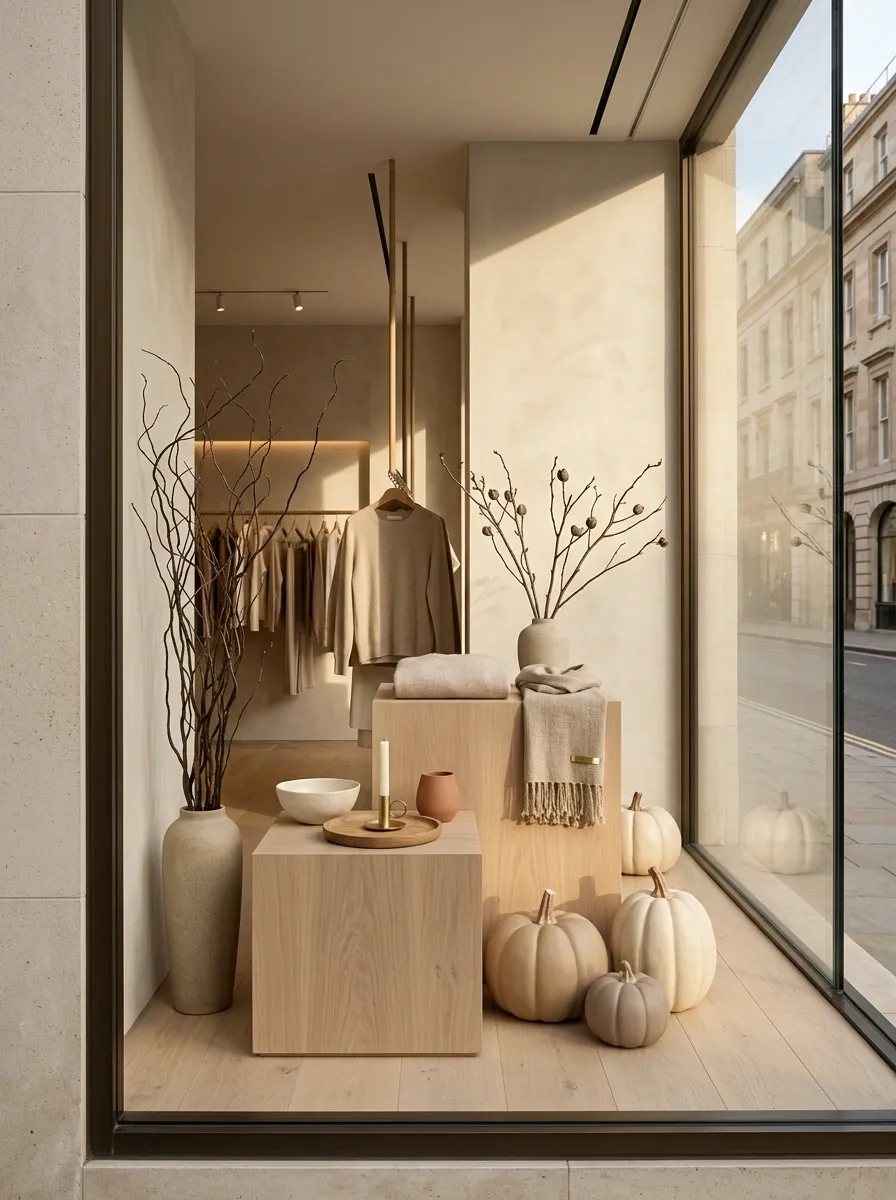
The restraint is the whole point here.
Use an airy cream or soft stone-colored storefront, pale oak plinths, oversized neutral pumpkins, a small number of sculptural branches, and a tightly edited product arrangement. Then stop.
The empty space is what makes the display feel expensive. A common mistake is trying to fill every visible inch because fall feels like it should be abundant. This concept works better when the abundance comes from scale rather than quantity.
A few giant forms can create more impact than twenty small decorations. The merchandise should sit in front of or beside those forms, not disappear behind them.
This is especially strong for contemporary clothing, beauty, furniture, and home retailers that already have a clean visual identity.
Candlelit Apothecary
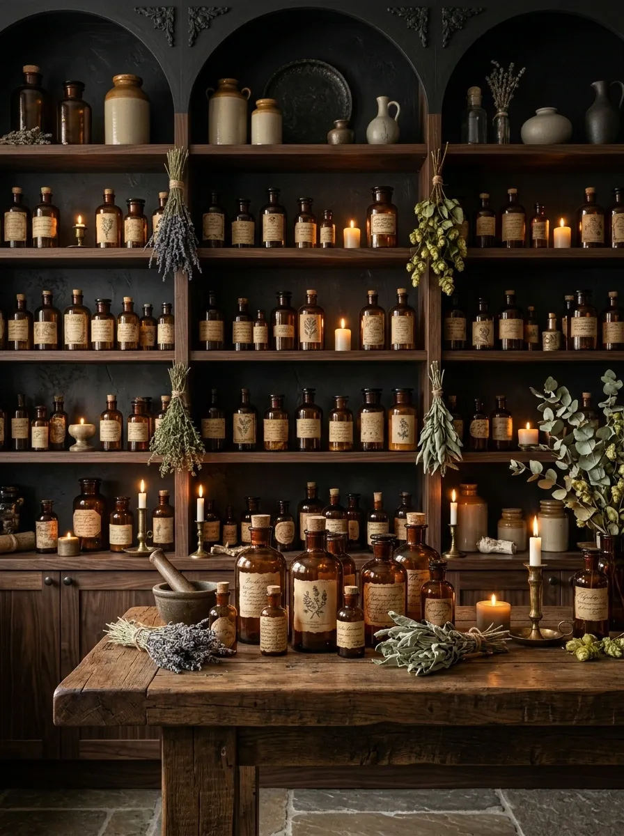
Dark walnut shelving, amber bottles, parchment labels, dried herbs, and small pools of candlelight turn this retail corner into something closer to an old apothecary than a standard seasonal display.
The merchandise should be arranged in tight groups, with a few taller vessels breaking the horizontal shelf lines. Keep the backdrop dark enough that the amber glass actually glows. A pale background would kill the mood.
This concept is especially strong for fragrance, skincare, candles, specialty foods, or small gift products. The fall connection comes from the warmth, texture, and lighting rather than obvious pumpkins.
The important restraint is at shelf level. Every product doesn’t need its own decoration. Leave some surfaces deliberately quiet so the eye has somewhere to rest.
Woodland Cabin Merchandising
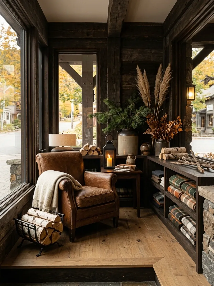
This display feels like a finished mountain cabin that happens to sell things.
Dark timber walls anchor the scene. A wool throw is casually folded over a leather chair, stacks of blankets sit beside low wooden shelving, and a few lanterns provide pools of warm light. Merchandise is integrated into the room rather than presented on anonymous retail fixtures.
The seasonal elements should stay natural: pine branches, dried grasses, firewood, stone, wool, leather. Skip the plastic-looking fall decorations. They would break the entire illusion.
The composition works because the materials carry the story. You don’t need a giant autumn sign telling shoppers what season it is.
Soft Cream and Copper
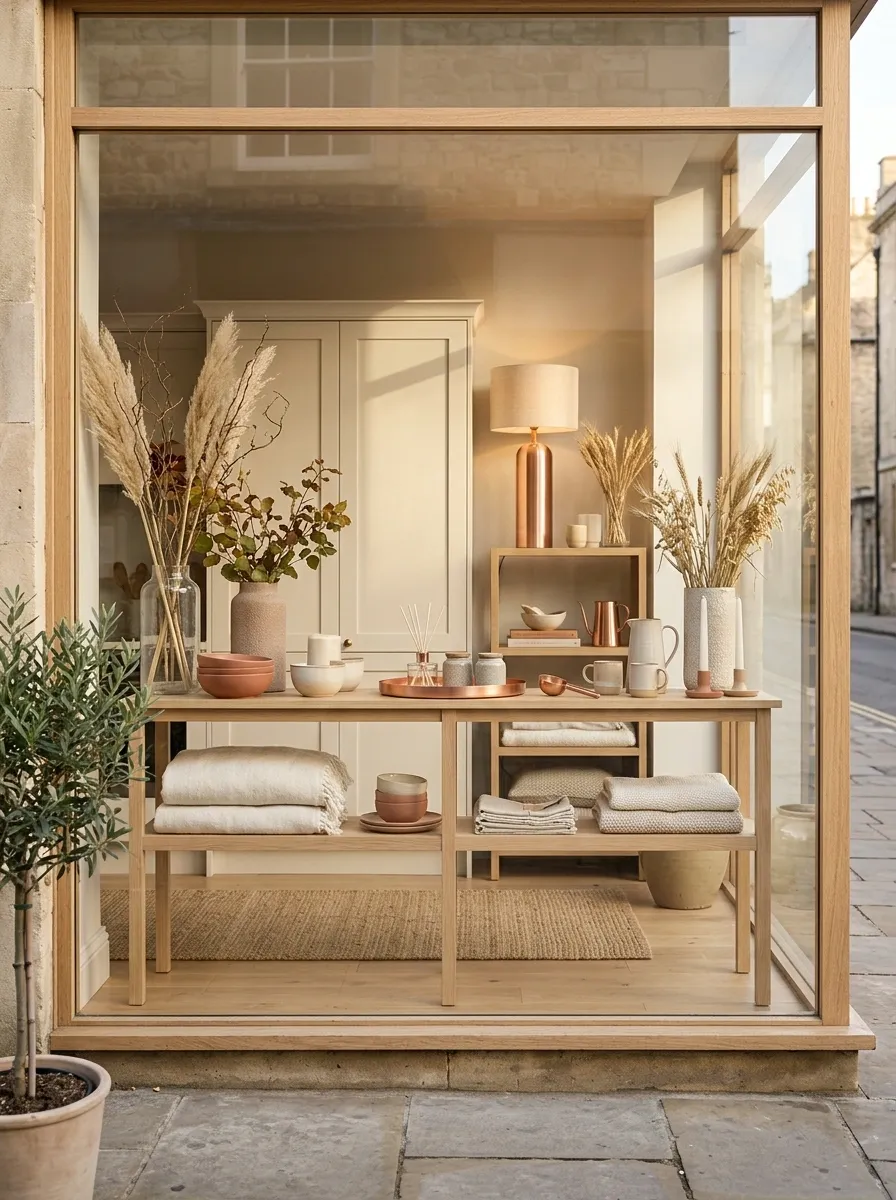
Fall gets much quieter here. The entire display runs through creamy textiles, pale wood, soft terracotta, copper details, dried grasses, and warm glass.
The lighter palette gives the merchandise more breathing room, so this direction works particularly well for home goods, clothing, ceramics, or beauty products with neutral packaging.
Copper should appear in selected places rather than everywhere. One tray, lamp, vessel, or structural detail is enough to catch the light. Pairing copper with cream gives you a fall reference without turning the display into a standard orange-and-brown setup.
I’d keep the botanical styling tall and loose. Dense flower arrangements would make the space feel too formal.
Old European Market Stall
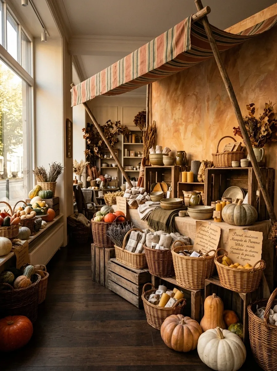
This one should feel almost theatrical, like a little street market has been moved inside the shop.
Use a plaster-like backdrop, striped fabric overhead, wooden boxes, baskets, vintage paper signage, and piles of merchandise arranged at different levels. Seasonal produce can sit beside the actual products, making the entire scene feel like one environment.
The important thing is repetition. Repeat the same basket shape, crate material, or stripe detail so the display has a visual rhythm. Random props don’t create atmosphere. Repetition does.
This direction has enough personality for a large storefront or interior feature zone. Keep the central path open so shoppers can actually approach the merchandise instead of admiring it from behind a barricade of decoration.
Black, Olive, and Rust
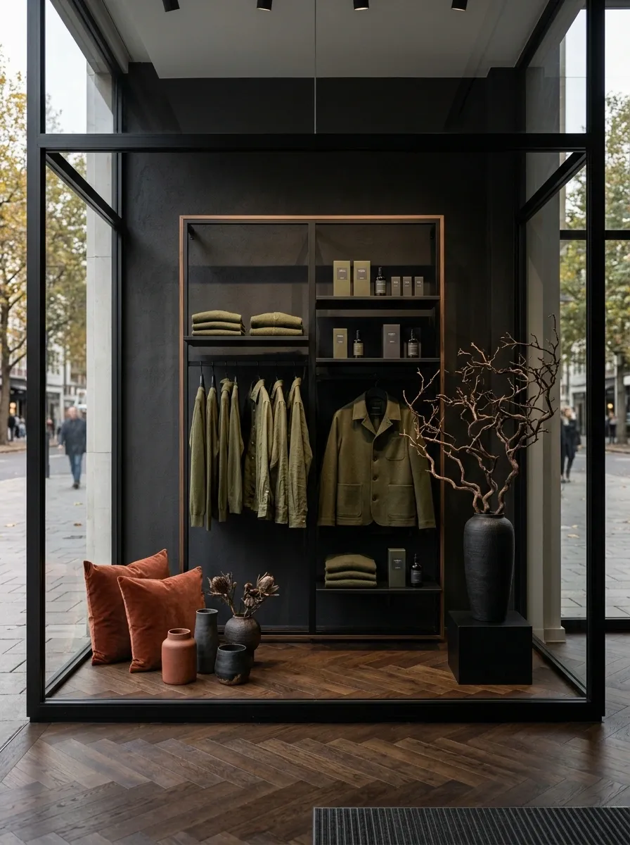
A black retail frame gives this display a sharper edge, while olive green merchandise and rust-colored textiles carry the autumn color story.
Use matte black shelving, dark flooring, olive garments or product packaging, and a few rust accents on cushions, vessels, signage, or textiles. Add one sculptural dried branch arrangement rather than a wall of foliage.
The palette has enough contrast to feel contemporary, but it still reads immediately as fall. That balance is useful for brands that don’t want their seasonal merchandising to look rustic.
The biggest mistake here would be adding too many warm accessories. The black and olive already provide enough visual weight. Let the rust appear as an accent, not another background.
Modern Harvest Counter
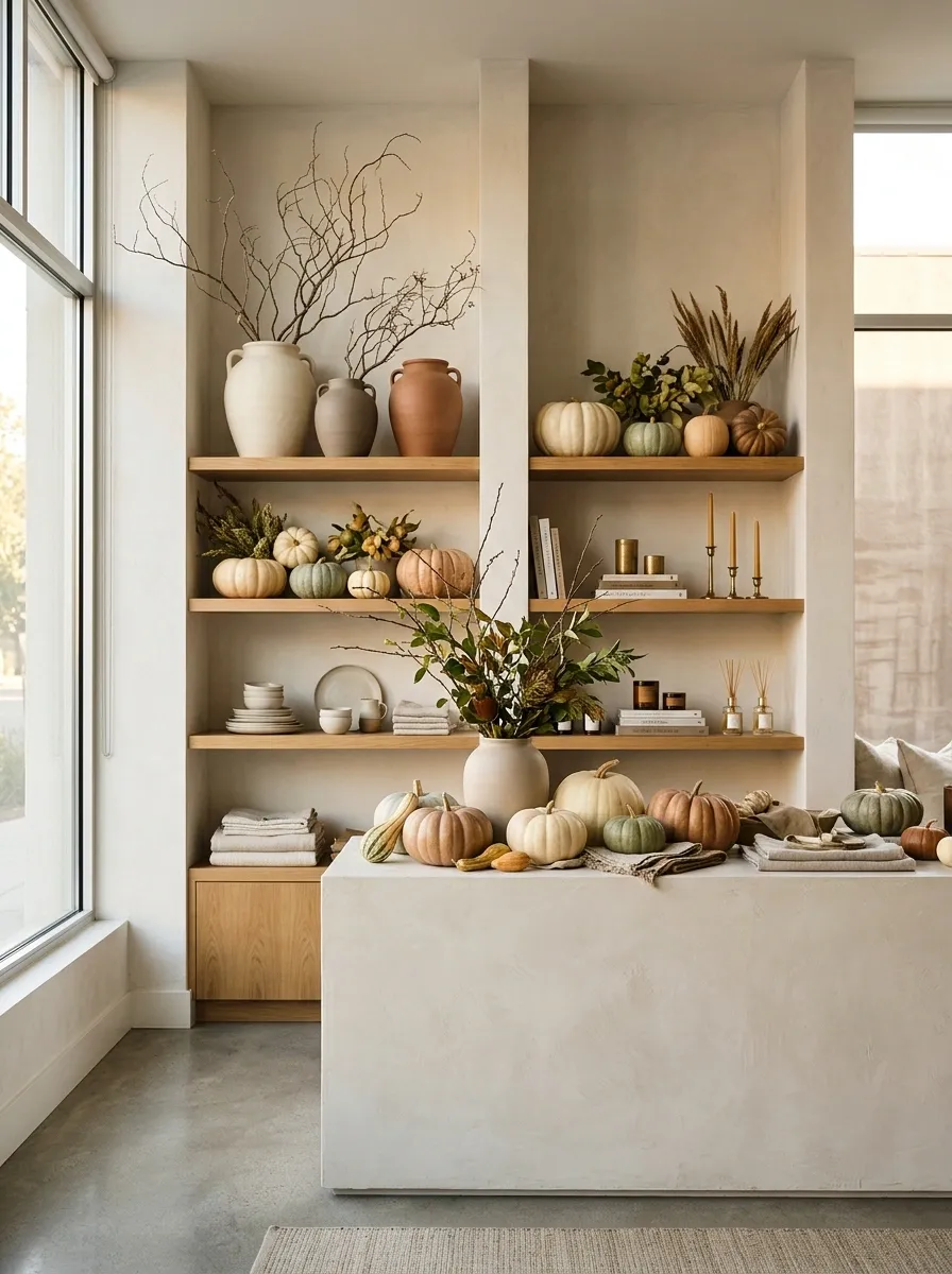
This display takes the familiar harvest table and strips away most of the rustic clutter.
Use a pale limestone or plaster-look counter, warm oak shelving, large ceramic vessels, a few sculptural branches, muted pumpkins, and neatly grouped merchandise. The architecture should feel clean enough that the seasonal styling reads as intentional rather than themed.
The best part is the contrast between organic shapes and straight architectural lines. Round pumpkins and branches soften the counter, while the shelves and merchandise keep the composition disciplined.
Don’t add a dozen little signs. One strong piece of typography is enough. The display already has a story.
Terracotta Botanical Shop
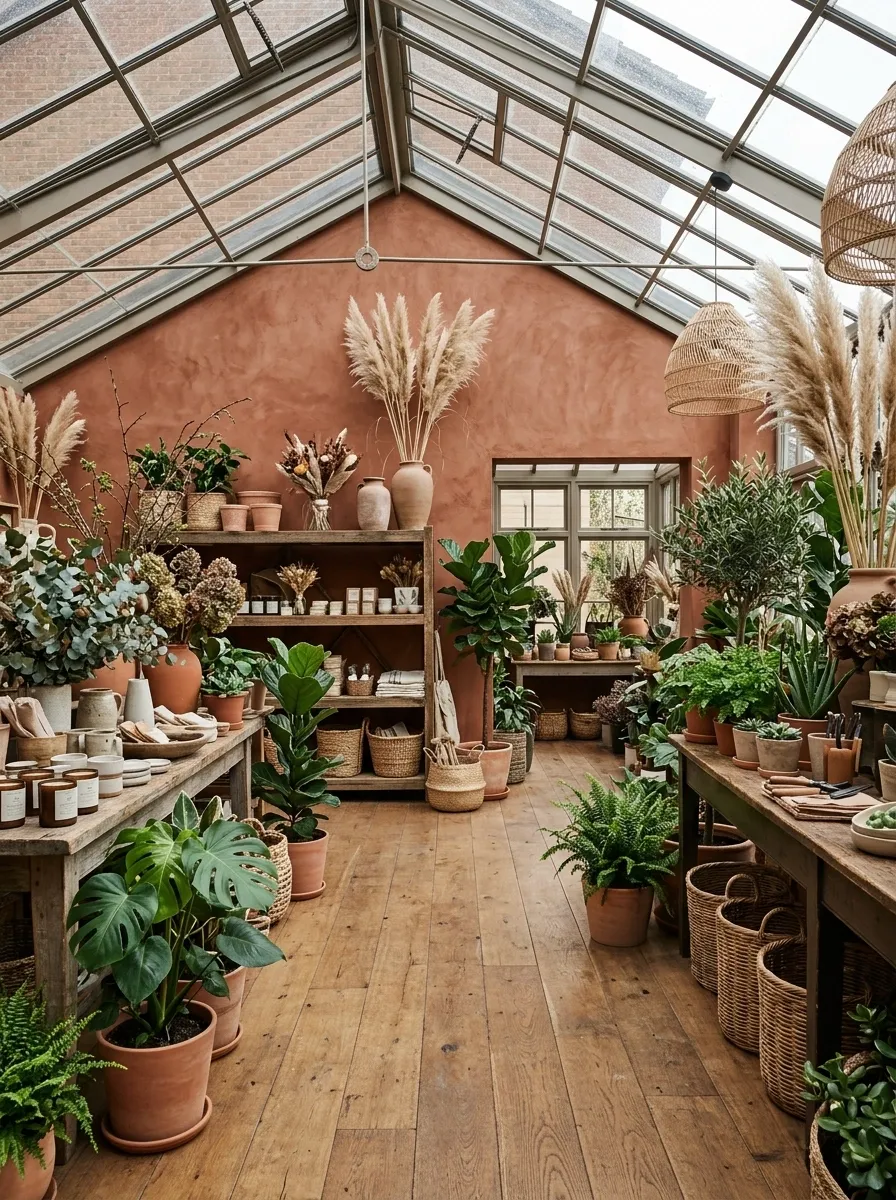
The entire shop becomes a warm autumn greenhouse.
Terracotta-colored walls create the background, while green plants, dried grasses, clay vessels, woven baskets, and warm timber fill the scene. Products sit among the plants instead of being separated into a sterile merchandise zone.
The color relationship is what makes this concept work. Green gives the display life, while terracotta supplies the seasonal warmth. Dried foliage bridges the two.
This would work especially well for florists, garden retailers, plant shops, home stores, and lifestyle brands. The space should feel abundant, but not crowded. Give larger plants room to breathe and use smaller products to fill the lower visual layers.
Dramatic Black Window With One Focal Installation
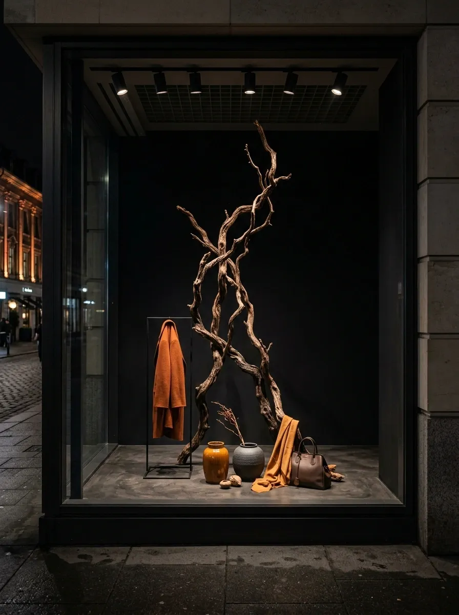
This storefront does almost the opposite of a traditional fall window.
Paint or visually frame the background in deep black, then build one large sculptural installation in the center, such as twisted dried branches rising above a low product arrangement. A few rust, amber, or ochre pieces can sit underneath it.
That’s it.
The empty space around the focal installation is what makes the window memorable. The merchandise becomes easier to notice because nothing else is competing for attention.
This approach is especially useful for brands with strong packaging or fashion pieces. When the product already has a visual identity, the seasonal display should give it room rather than covering it up.
Harvest Library
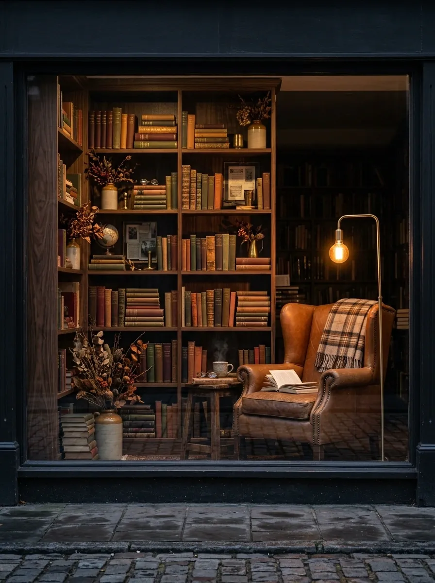
A bookstore or lifestyle shop can turn its fall display into a dark, intimate library.
Use deep shelving, warm wood, leather seating, brass reading lamps, stacks of books, autumn-colored covers, and a few dried botanical arrangements. Merchandise should appear naturally within the scene, as though it belongs to a real reading room.
The furniture matters here because it gives the display human scale. A chair beside a lamp immediately tells shoppers how the space is supposed to feel, while the books and seasonal products reinforce the story.
The fall connection comes through the palette and atmosphere. There doesn’t need to be a pumpkin anywhere.
Industrial Warehouse Fall
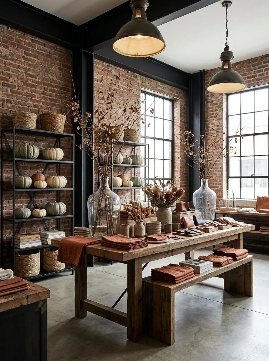
This concept doesn’t hide the architecture. It uses it.
Exposed brick, black steel, reclaimed timber, concrete flooring, and oversized industrial lighting form the base. Autumn styling comes through muted pumpkins, rust-colored textiles, dried branches, and earthy merchandise.
The warehouse setting already has enough personality, so the seasonal additions should be deliberately simple. Let a large timber table carry the main product group. Use metal shelving to create height. Add one or two dramatic branch arrangements instead of filling every corner with leaves.
That balance keeps the display from becoming rustic theater. The building remains visible, which makes the seasonal layer feel like part of the brand rather than a temporary costume.
Candle Shop After Dark
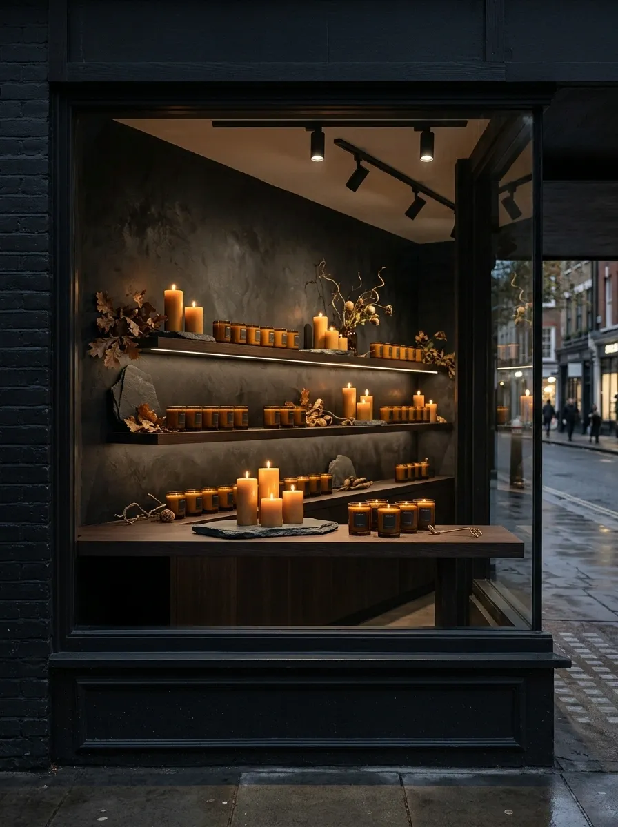
This display should look better once the sun goes down.
Deep brown shelving, amber candle vessels, dark stone, dried foliage, and rows of softly glowing candles create an intimate evening scene. The products themselves provide much of the decoration, which keeps the concept from becoming overloaded.
Use lighting in layers. A few brighter points should identify key products, while softer surrounding light gives the shelves depth. The entire display doesn’t need equal brightness.
This is particularly effective for fragrance, candles, skincare, gift shops, and small luxury goods. It also gives a brand a different kind of fall story. Instead of harvest and daylight, the season becomes about long evenings, warmth, and atmosphere.
The temptation will be to add more candles. Resist it. Once the shelves start glowing, you’ve already made the point.
Scandi Autumn
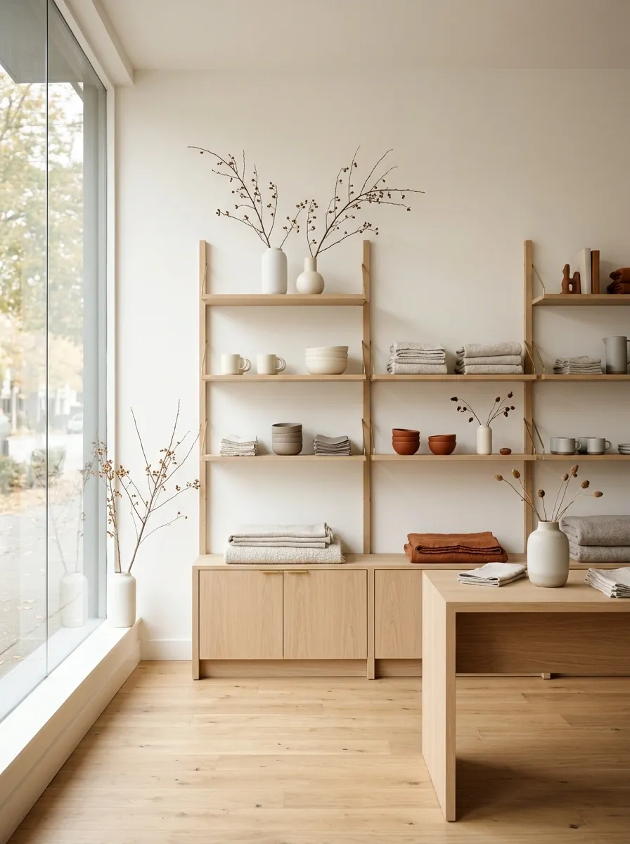
A Scandinavian-inspired fall display works because it refuses to over-explain the season.
Use pale oak, warm white walls, oatmeal textiles, simple ceramics, muted rust accents, and natural branches. Merchandise should be arranged in broad, calm groups with plenty of space between them.
The palette is intentionally restrained. Rust becomes the seasonal punctuation rather than the dominant color. Soft gray, cream, natural wood, and warm taupe keep everything connected.
This direction suits furniture, clothing, home goods, stationery, ceramics, and lifestyle retailers with a minimalist brand identity. It also works in smaller stores because the light palette visually opens the space.
The main mistake would be adding too many “cozy” accessories. The clean lines are part of the design. Keep them.
Antique Booth Display
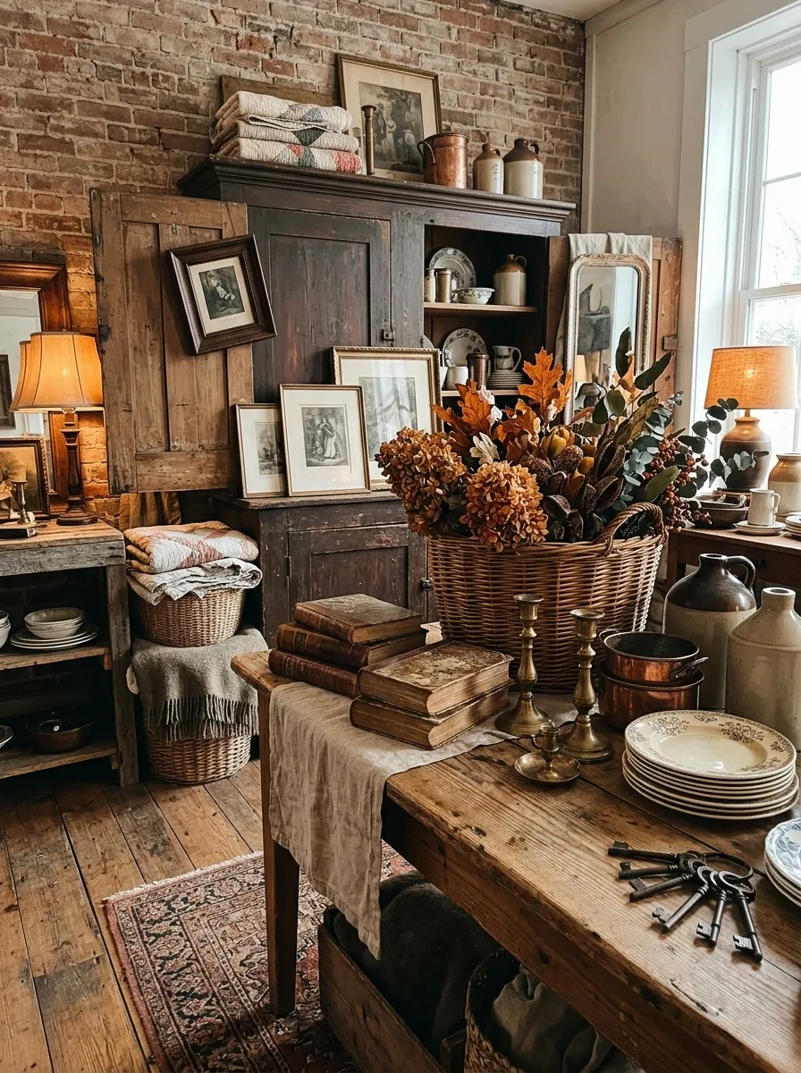
This retail concept feels like stepping into a small antique market stall that somehow got a permanent address.
Use distressed cabinetry, old frames, brass objects, faded textiles, wicker baskets, vintage books, dried flowers, and warm lamps. Products should be layered through the scene rather than arranged in a perfectly symmetrical grid.
The best version isn’t spotless. A slightly crooked frame or overlapping stack can make the display feel collected instead of manufactured.
Still, there needs to be a visual hierarchy. Put larger furniture or cabinetry toward the back, medium objects at eye level, and smaller merchandise in the foreground. That creates depth without requiring a huge floor area.
The display becomes much more convincing when every old-looking object has some relationship to the products being sold.
Pumpkin Architecture
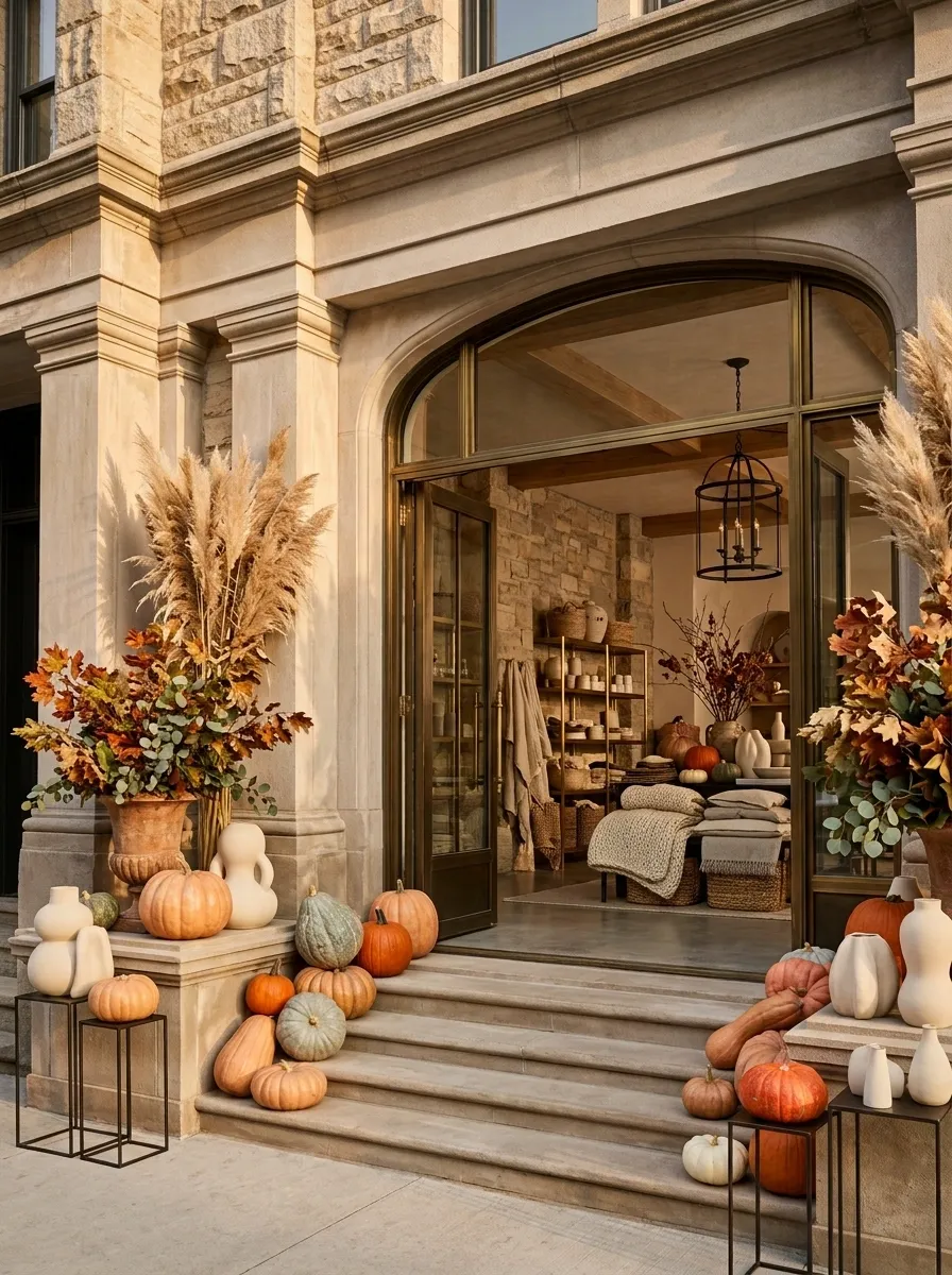
This concept treats the storefront itself as part of the autumn display.
Instead of building a traditional decorated window, use the architecture as a series of platforms, steps, ledges, or framed openings. Place oversized pumpkins, sculptural ceramic forms, or large seasonal objects along those architectural lines, with a small amount of merchandise woven into the composition.
The repetition creates the impact. Similar forms appear at different heights, while the negative space between them keeps the display from becoming crowded.
This works particularly well on storefronts with strong geometry. A staircase, deep window frame, large columns, or long ledge suddenly becomes useful merchandising territory.
The important detail is scale. Tiny pumpkins scattered across a huge storefront will disappear. Large forms give the architecture something to work with.
Rustic Florist Interior
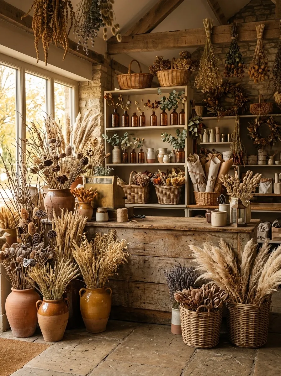
A florist can make autumn feel almost tangible by turning the entire shop into a dried-botanical workshop.
Use a weathered timber counter, bundles of dried grasses, seed heads, branches, ceramic vessels, wicker baskets, linen wraps, and amber glass. Fresh greenery can appear in selected areas, but dried materials should dominate the seasonal story.
Merchandise should sit inside this botanical environment rather than on unrelated shelving. A ceramic vase can hold the display’s tallest arrangement. Wrapped bouquets can form lower layers. Smaller accessories can sit in woven baskets beneath the counter.
The scene becomes richer when the flowers aren’t perfectly controlled. Slight asymmetry makes the shop feel like a working florist instead of a staged photograph.
Luxe Hotel Lobby Retail Display
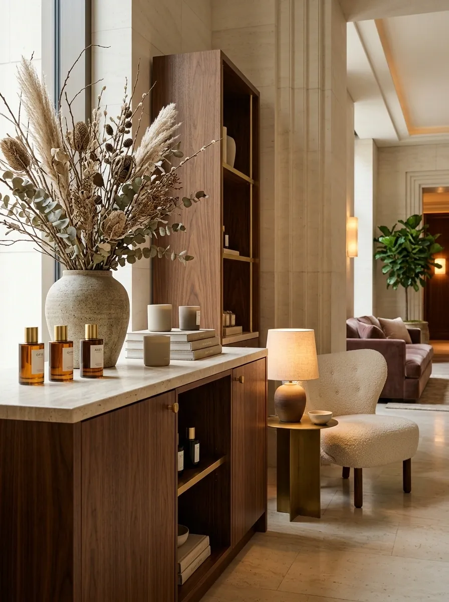
This one borrows the visual discipline of a luxury hotel lobby.
Picture walnut cabinetry, pale stone, sculptural seating, warm brass, oversized dried branches, low lamps, and a very limited number of seasonal products. The merchandise is arranged as though it belongs in a boutique hotel shop rather than a conventional retail aisle.
The materials should do most of the work. Walnut gives the display depth. Stone provides visual calm. Brass catches the warm lighting. Dried branches add height without introducing visual clutter.
The result feels premium because it is edited. There aren’t dozens of competing decorative moments.
This concept makes sense for upscale fashion, home goods, fragrance, jewelry, accessories, or gift retailers where the brand already depends on restraint.
Deep Green and Copper Conservatory
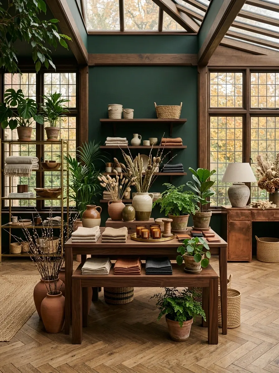
Instead of making fall rustic, make it botanical and architectural.
Deep green walls provide the backdrop. Copper fixtures catch the light. Dark wood frames the merchandise. Terracotta vessels, leafy plants, dried branches, and warm neutral products create the feeling of a sophisticated indoor conservatory in late autumn.
The green gives the display enough visual depth that you don’t need much orange at all. A few rust-toned objects can appear in the lower layers, but the main palette stays green, brown, clay, and copper.
This would be especially effective for plant shops, home stores, garden retailers, fragrance brands, and lifestyle shops.
Keep the plant placement intentional. A giant wall of greenery will turn the display into a greenhouse. The products still need to be visible.
Contemporary Farmers Market
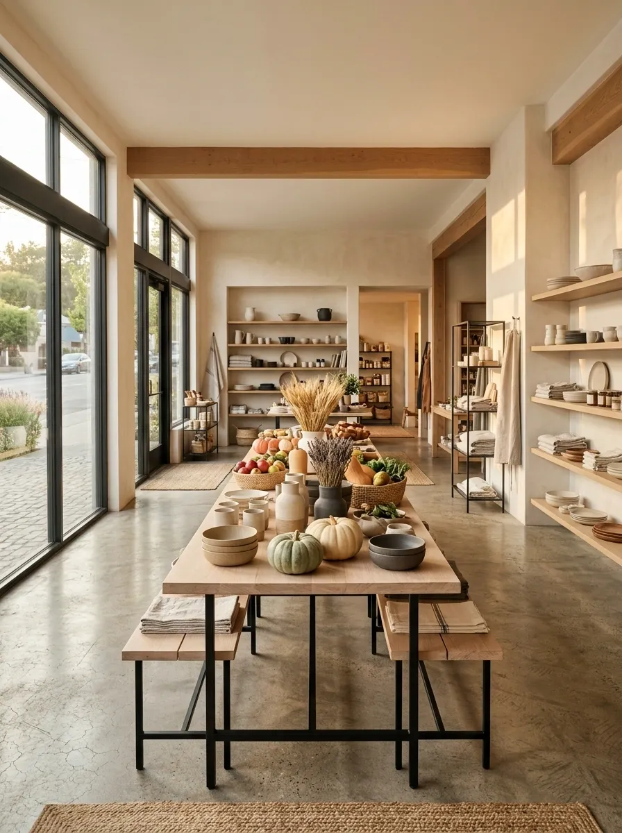
This version takes the market idea and gives it a cleaner architectural frame.
Use pale timber tables, simple black metal supports, linen signage, neutral ceramic vessels, seasonal produce, muted pumpkins, and tightly edited merchandise groups. The structure should feel contemporary while the materials keep it grounded.
A long table can form the central spine, with smaller displays branching from it. This creates a natural customer path and prevents the store from feeling like a collection of disconnected display islands.
Signage should remain straightforward. Large handwritten graphics aren’t necessary when the forms, textures, and products already communicate the market story.
This concept works especially well for food shops, home stores, small makers’ markets, apparel brands, and lifestyle retailers.
The best seasonal displays make the store itself tell the story
A good fall display doesn’t need to shout.
The strongest ones make you understand the season through the way the materials, products, lighting, architecture, and color sit together. A dark walnut apothecary tells a different story from a pale Scandinavian shop, but both can feel unmistakably autumnal without relying on the same props.
That’s the part worth stealing. Not a particular pumpkin arrangement. Not a specific crate. The composition.
Start with the environment you want customers to remember. Decide what deserves the most visual attention, what can stay quiet, and how the merchandise belongs in the scene. Then remove anything that doesn’t help.
The finished display should look like it was designed as one thought, not assembled from twenty seasonal purchases.
Pin the concepts that actually fit your store before you start shopping. A saved visual direction is far more useful than a cart full of decorations.