
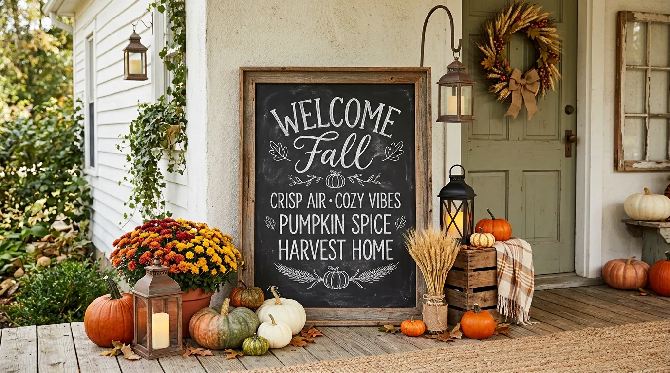
A chalkboard can have lovely lettering and still look like something was simply hung on the wall for the season. What usually makes the difference isn’t the phrase itself. It’s everything the eye sees around it.
A dark board beside a weathered bench creates a completely different impression from the same board above a sleek console. Add dried branches, ceramic pieces, pumpkins, books, candles, or a coffee station, and the chalkboard starts to feel connected to the room instead of sitting apart from it.
That’s the approach behind this collection of fall chalkboard ideas. Each concept is built as a finished scene, with the chalkboard, surrounding materials, furniture, color, and seasonal details working together. Some are rustic and collected. Others are quiet, modern, elegant, playful, or inspired by old shops and woodland landscapes.
The goal isn’t to copy one exact arrangement. It’s to find a complete visual direction that already feels right for your home, then borrow the parts that make that composition work.
Choose the Fall Chalkboard Look That Fits Your Space
| Design Direction | Overall Look | Best Setting |
|---|---|---|
| Warm Farmhouse | Wood, pumpkins, dried foliage | Entryway or porch |
| Elegant Neutral | Cream, taupe, soft botanical detail | Dining room |
| Modern Terracotta | Charcoal, terracotta, clean lettering | Contemporary console |
| Vintage Market | Distressed finishes, produce illustrations | Kitchen or rustic corner |
| Woodland Autumn | Mossy green, acorns, leaves, natural textures | Cottage or nature-inspired room |
Fall Chalkboard Ideas
Warm Farmhouse Entry Chalkboard
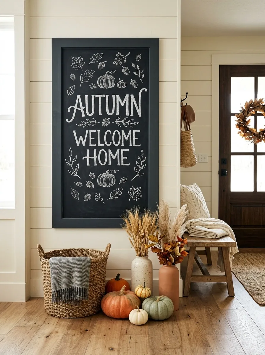
A tall, dark-framed chalkboard sits beside a weathered wood entry bench, with generous hand-lettered autumn wording in the center and small leaf and pumpkin drawings tucked around the edges. Below it, a woven basket holds a folded throw while several pumpkins and dried stems fill the floor area without crowding the walkway.
The strength of this design is its visual weight. The blackboard grounds the lighter wood and cream textiles, while the orange pumpkins give the scene just enough seasonal color. Keep the lettering bold and simple here. Too many decorative flourishes would compete with the layered entryway.
Harvest Market Chalkboard With Hand-Drawn Produce
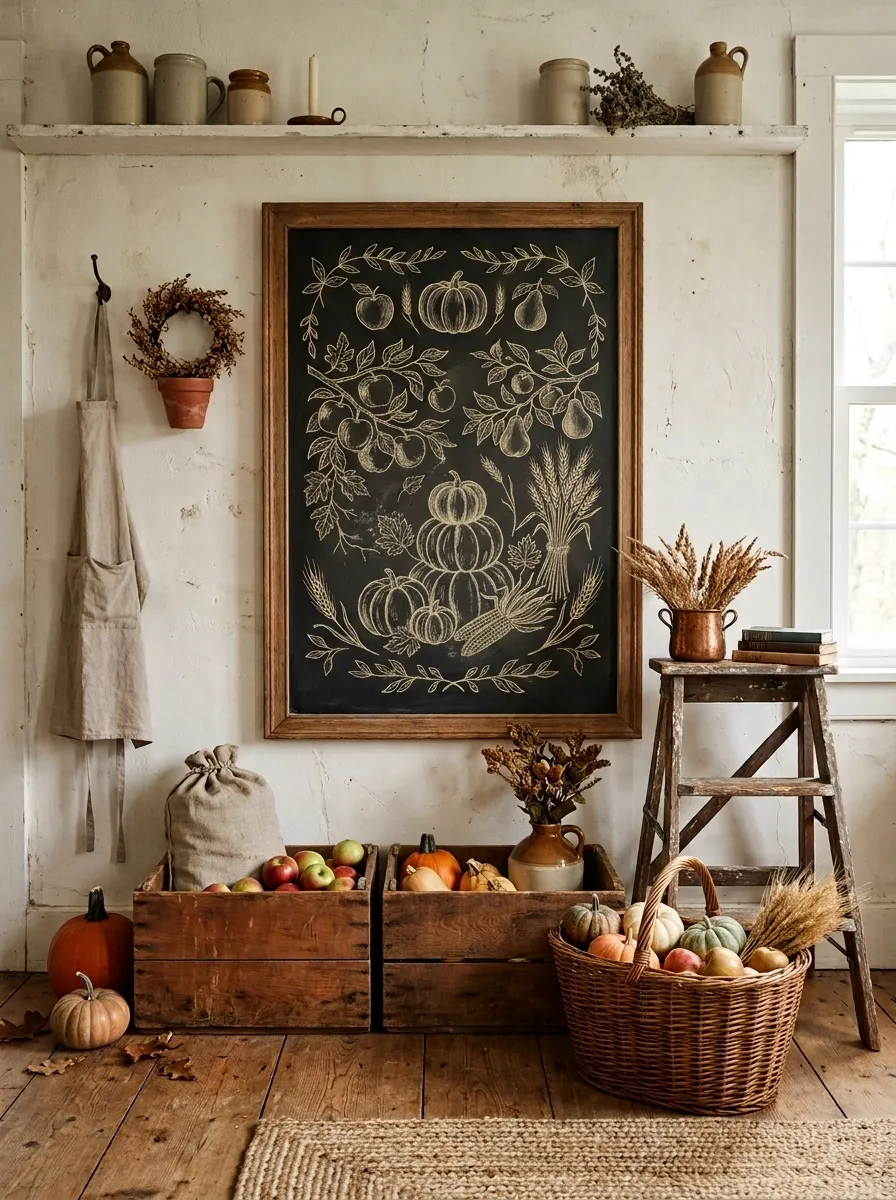
This version feels like a small autumn farmstand brought indoors. The chalkboard carries a vintage market-style heading with hand-drawn apples, pears, pumpkins, wheat, and simple botanical borders. A pair of wooden crates, an old stool, and a woven basket frame the board below.
The muted palette makes the scene feel collected rather than themed. Warm brown wood, faded green, cream chalk, and restrained orange work especially well together. The illustrations should look slightly imperfect, as though they were drawn by hand over time. That bit of irregularity gives the whole display character.
Minimal Blackboard With Oversized Autumn Lettering
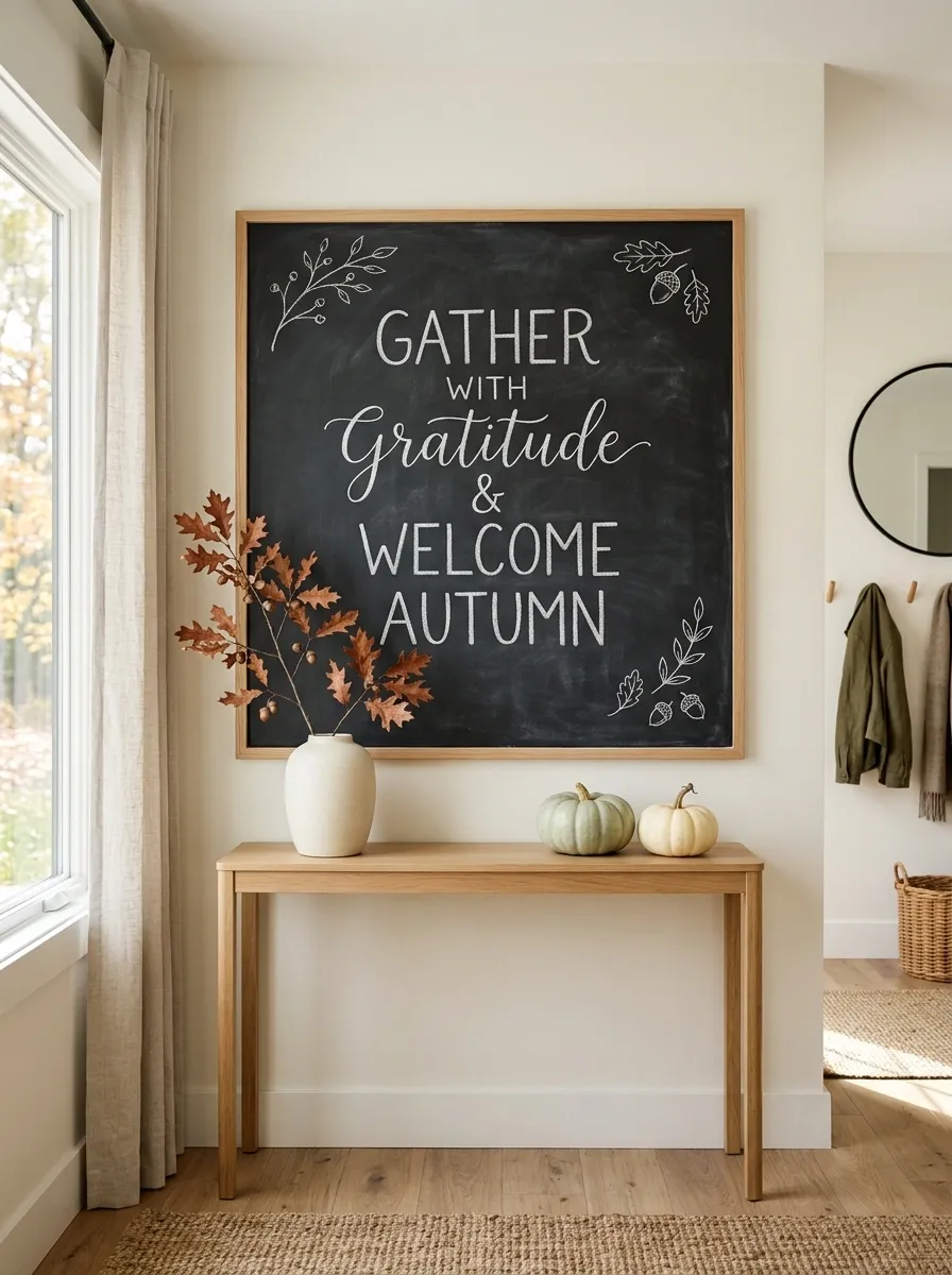
The board becomes the focal point in this cleaner composition. A large charcoal surface carries one oversized seasonal phrase in expressive white lettering, with only a few tiny leaf sketches near the corners. It hangs above a slim wood console holding a ceramic vase, a single branch of dried foliage, and two small pumpkins.
The generous negative space is what makes this design work. Nothing around the board tries to compete with the lettering. This direction suits modern homes where a dense farmhouse arrangement would feel out of place. Keep the surrounding styling low and simple so the large typography remains the first thing the eye sees.
Cozy Kitchen Coffee Station Chalkboard
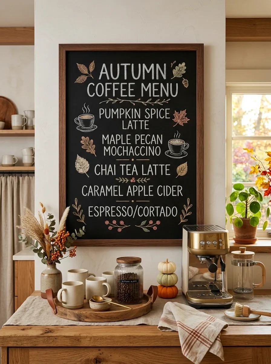
A framed chalkboard anchors a complete coffee nook, styled like a little autumn café. The board displays a handwritten seasonal drink menu with small cup and leaf illustrations, while the counter below holds ceramic mugs, a wooden tray, a glass jar, and a few miniature pumpkins. Dried stems add height without taking over the workspace.
The seasonal details feel more natural because they belong to an area already used every day. Warm wood and cream ceramics keep the palette relaxed, while the blackboard gives the setup enough contrast to feel defined. Leave clear space around the coffee equipment so the display still works as a real station.
Vintage General Store Autumn Chalkboard
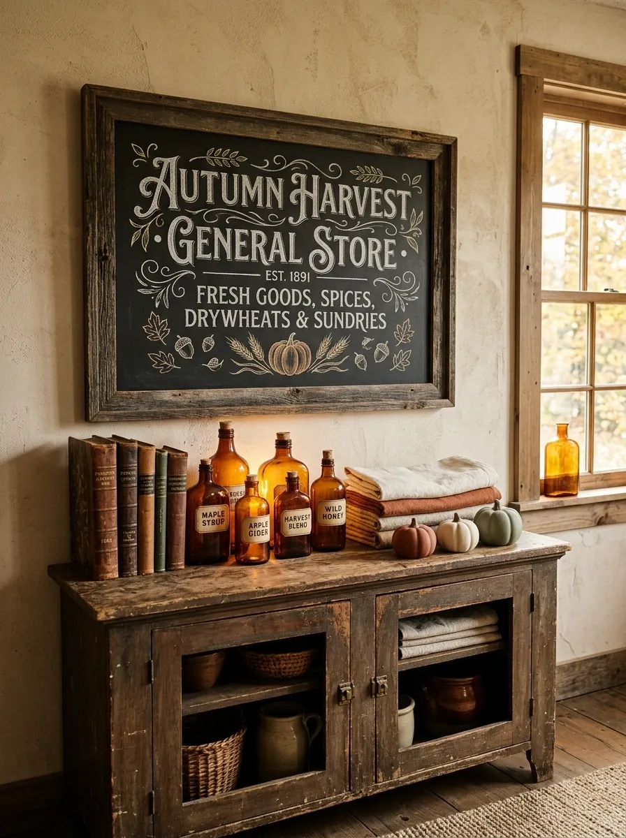
A distressed chalkboard hangs against a warm plaster wall above an antique-style cabinet filled with old books, amber glass bottles, folded linens, and a few small ceramic pumpkins. The board uses old-fashioned lettering with delicate flourishes and tiny illustrations of leaves, jars, and harvest goods.
This composition gets its personality from the surrounding objects as much as the chalk art. Nothing looks newly bought as a matching set. The mix of aged wood, warm glass, and imperfect finishes creates the feeling of a display that has been assembled over years. Keep the chalk colors restrained so the vintage materials remain the visual focus.
Elegant Neutral Fall Dining Chalkboard
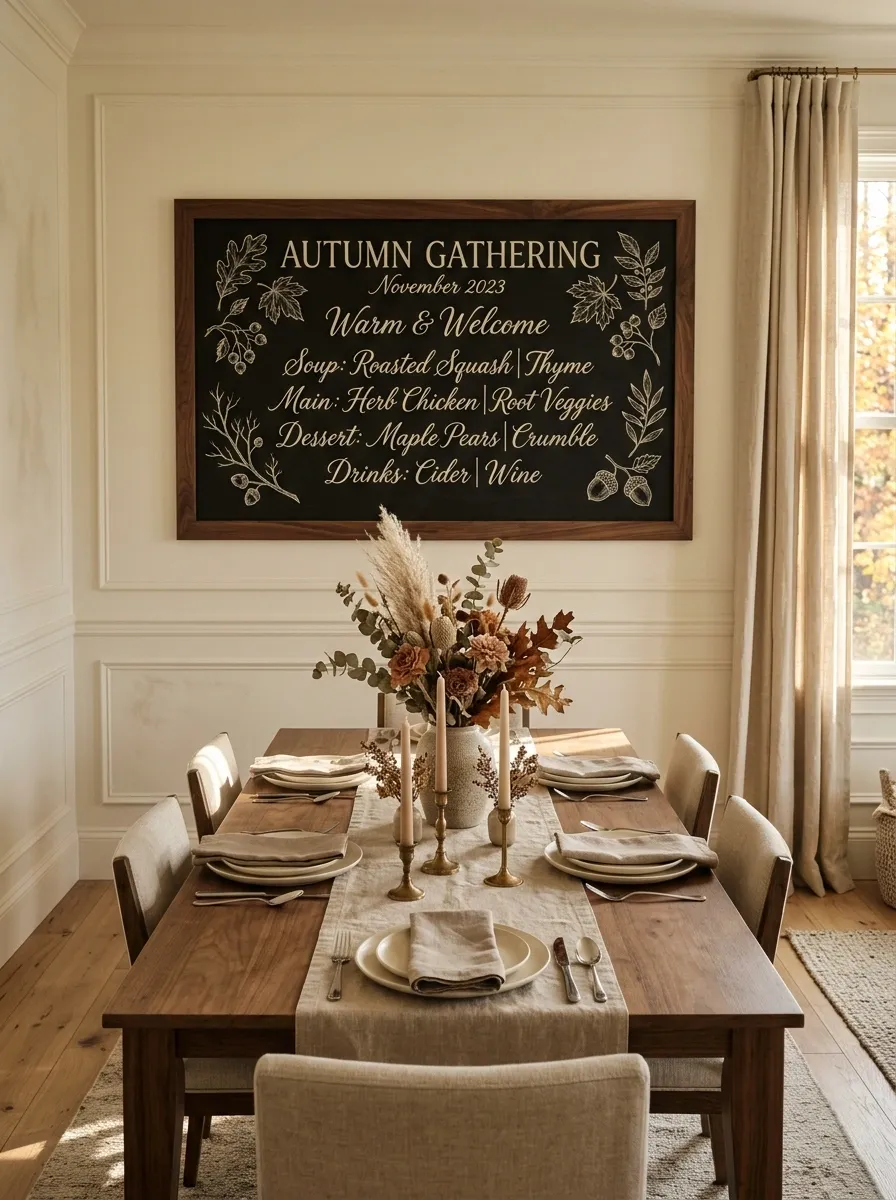
A large framed chalkboard anchors one end of a dining room dressed in warm ivory, taupe, walnut, and muted terracotta. The lettering is creamy white with thin botanical sketches around the edges, while a long dining table below carries linen napkins, ceramic plates, taper candles, and a restrained dried centerpiece.
The appeal comes from restraint. There are enough autumn references to make the season obvious, but nothing feels overly themed. The chalkboard should echo the softness of the table rather than compete with it. Skip bright orange pumpkins here and choose faded clay or cream instead.
Front Porch Welcome Chalkboard Vignette
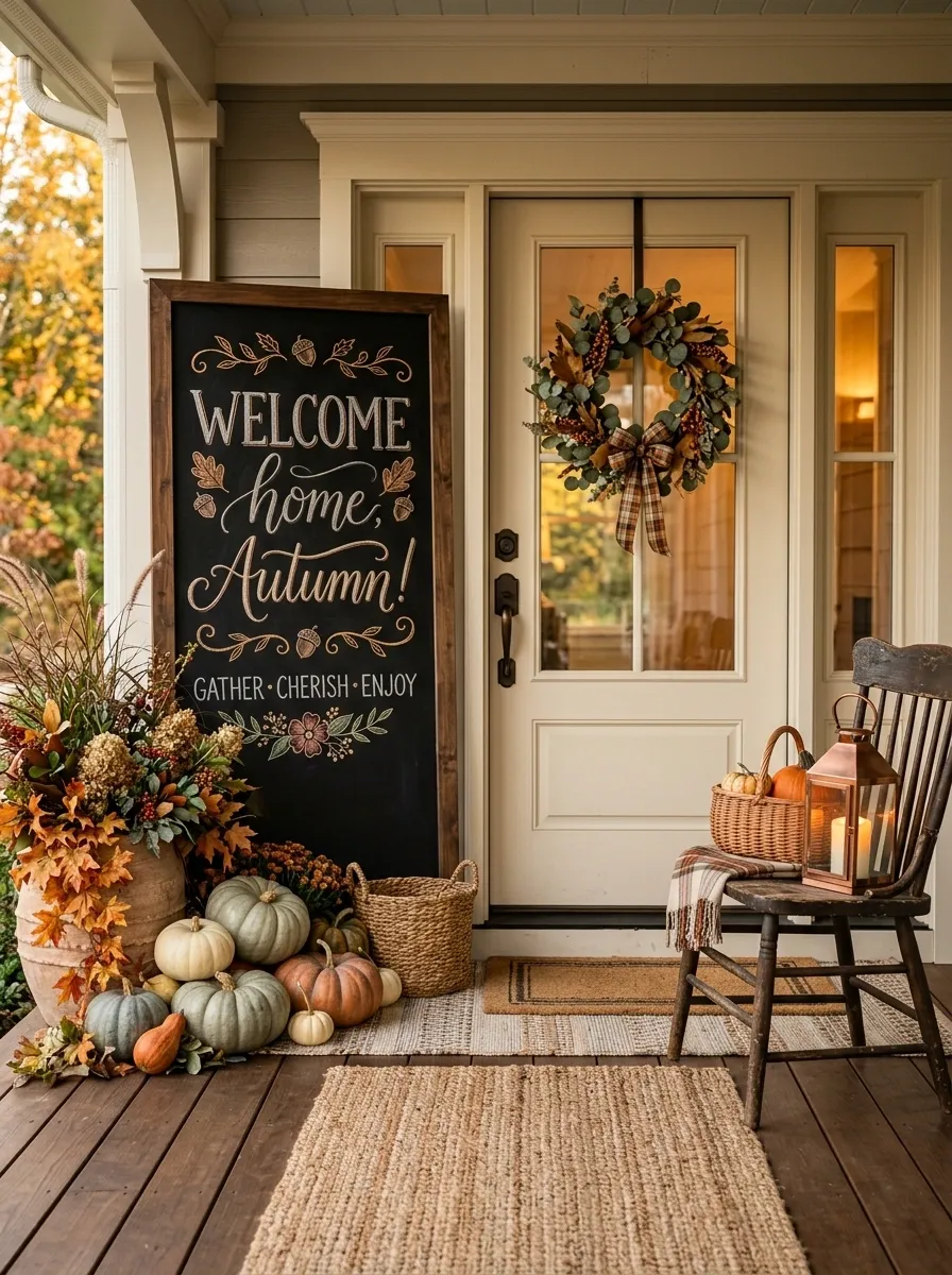
A tall chalkboard stands beside the front door, framed by layered planters, pumpkins, a woven mat, and a weathered wooden chair. The message is large and welcoming, with a few sweeping leaves drawn around the lettering so the artwork remains readable from the street.
This design works because the board becomes part of the porch architecture instead of floating on its own. Keep the tallest elements toward the outer edge and leave the doorway visually open. A restrained grouping of pumpkins looks more intentional than covering the entire porch with them.
Moody Autumn Chalkboard Wall
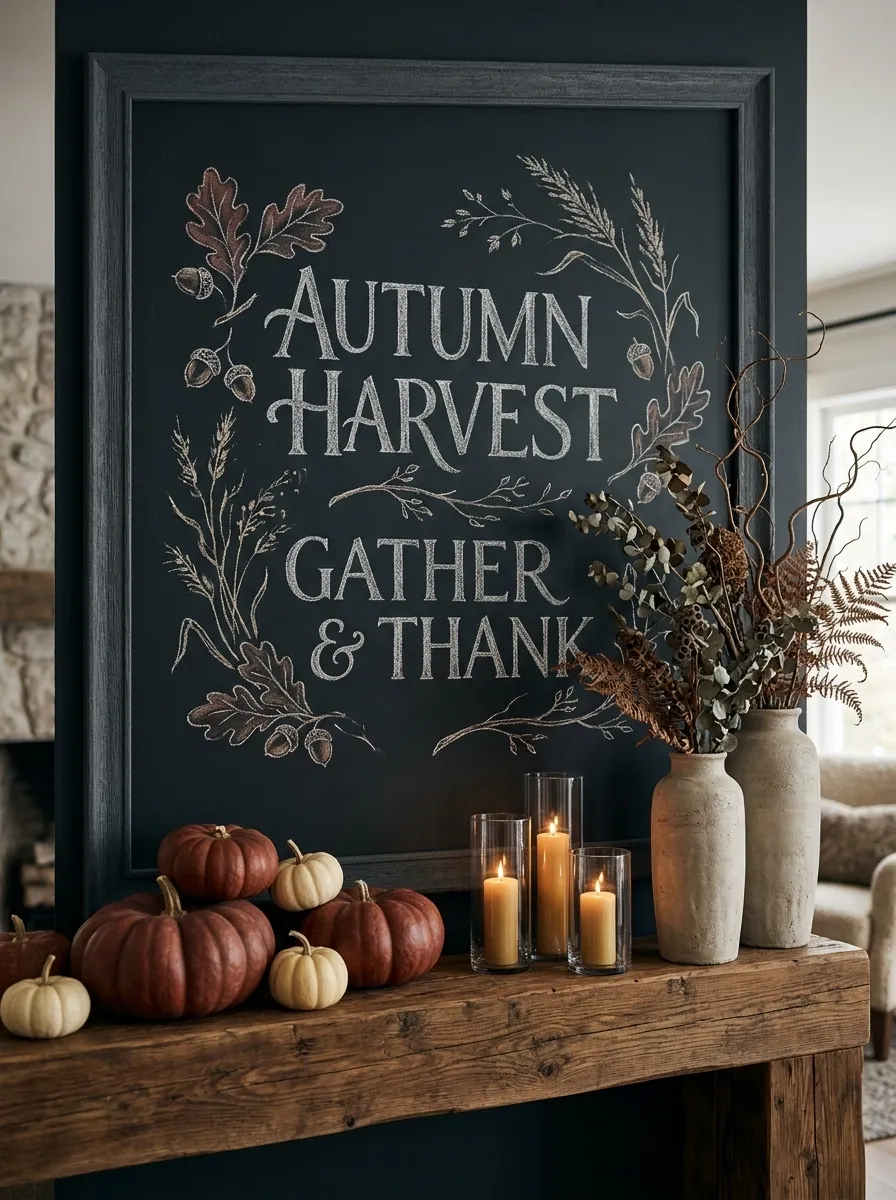
This dramatic setup uses a nearly black wall, a substantial charcoal-framed board, deep rust pumpkins, dried branches, and candlelight. The chalk artwork is intentionally expressive, mixing large hand-lettered words with loose botanical drawings rather than trying to fill every corner.
The darker environment gives the seasonal colors more impact. Warm rust and cream stand out against the charcoal background, while a few natural textures keep the scene from becoming flat. Avoid adding lots of shiny accessories. Matte finishes suit this composition much better.
Botanical Fall Chalkboard With Realistic Leaf Illustrations
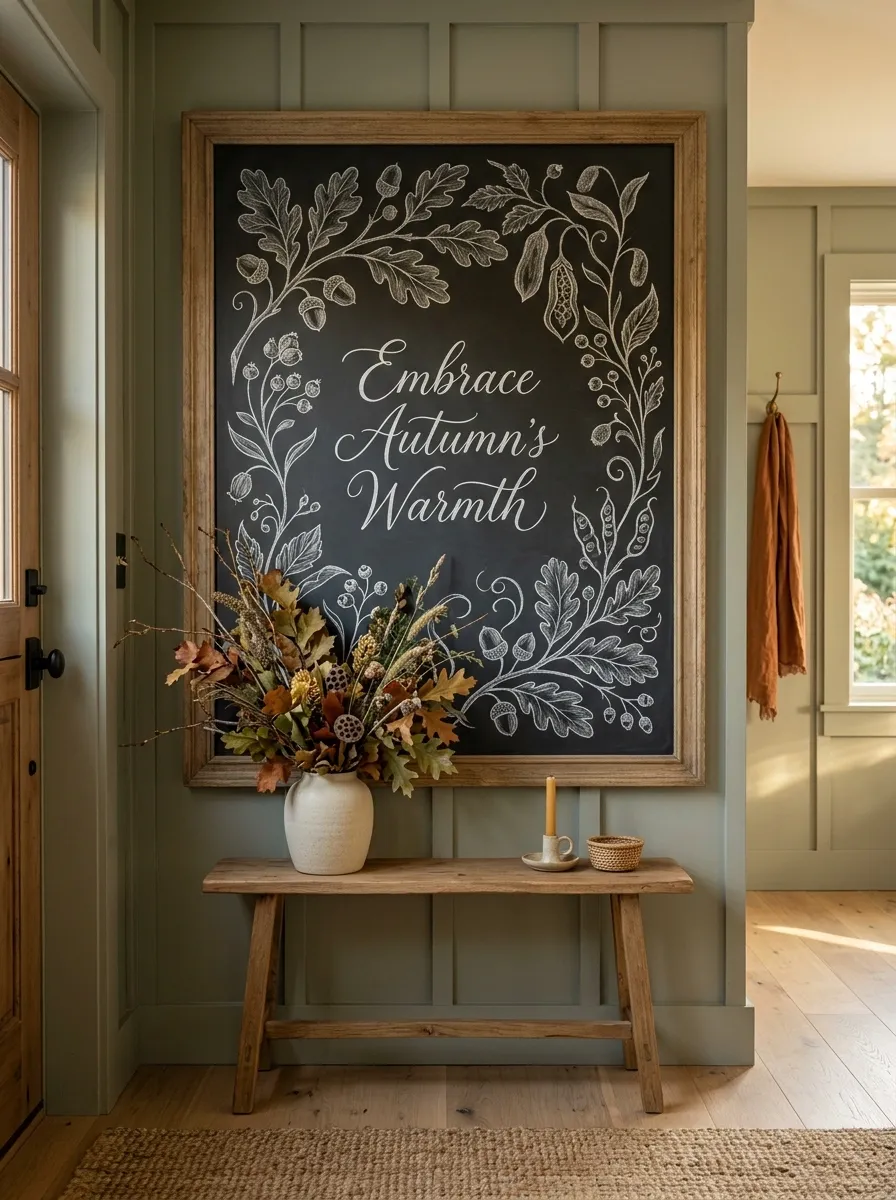
Here the chalkboard behaves almost like artwork. Fine hand-drawn branches sweep inward from the corners, with detailed oak leaves, acorns, seed pods, and curling stems surrounding a central seasonal phrase. Beneath it, a narrow wood table holds a ceramic vessel filled with real dried foliage.
The combination works because the drawn botanicals continue into the real arrangement below. That creates a visual bridge between the board and the room. Keep the illustrations concentrated near the perimeter and leave the middle relatively open so the main lettering doesn’t disappear into the artwork.
Small Apartment Fall Chalkboard Corner
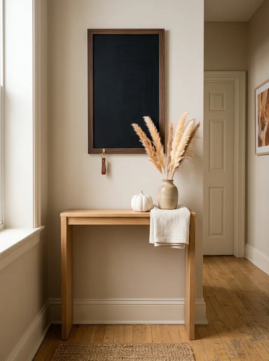
This compact composition is built around a narrow chalkboard placed above a slim console that barely projects into the room. A tiny ceramic pumpkin, one small vase of dried stems, and a folded textile provide the seasonal layer without stealing floor space.
The design succeeds because every piece has a clear job. The board supplies the largest visual element, the vase adds vertical height, and the small pumpkin introduces the strongest autumn color. Nothing extends into the walkway. Measure the available clearance before copying the look so the display remains practical.
Oversized Chalkboard Calendar for October
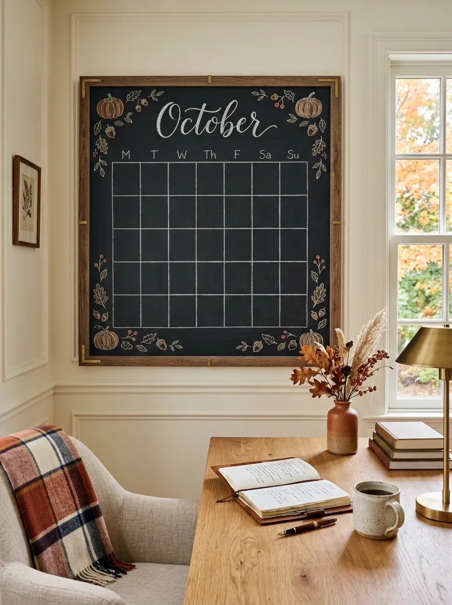
An oversized framed chalkboard turns an ordinary home office corner into a seasonal planning wall. The upper section carries a hand-lettered October heading, while the rest is divided into clean date rows with tiny pumpkins, leaves, and acorns placed sparingly around the edges. A warm wood desk sits beneath it with a notebook, ceramic mug, and small vase of dried stems.
The important detail is the balance between function and decoration. The calendar remains easy to read because the illustrations stay outside the main writing areas. Use larger lettering for the month and smaller marks for the decorative details so the board doesn’t become visually crowded.
Rustic Farmstand Chalkboard Display
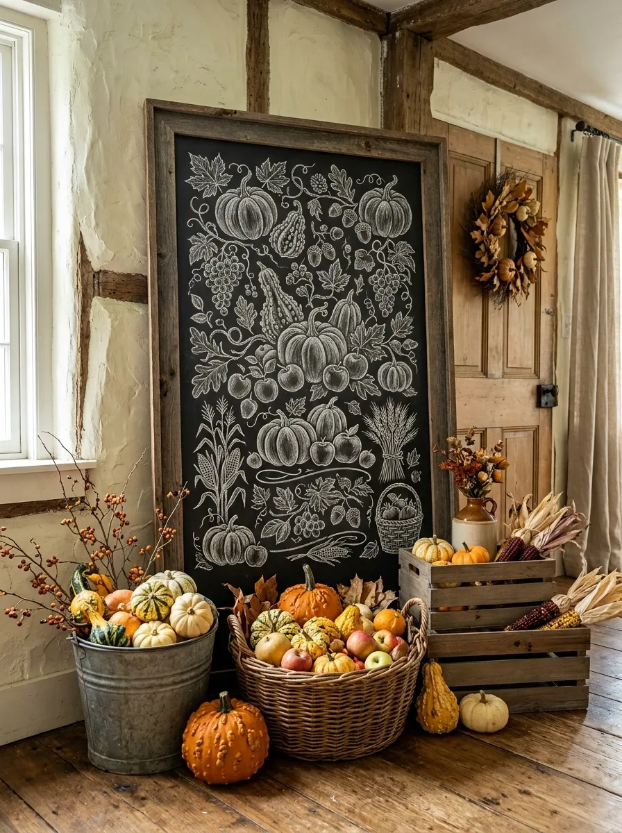
A broad chalkboard leans against a textured wall instead of hanging neatly above furniture, immediately giving the arrangement a relaxed farmstand character. Hand-lettered harvest wording fills the upper half, while the lower area features loose drawings of pumpkins, apples, corn, and wheat. Wooden crates, a galvanized bucket, and a basket of gourds surround the base.
The leaning placement makes the composition feel more casual than a formal wall display. Build the arrangement from the floor upward, using different heights so the board remains dominant while the surrounding objects create depth. Avoid placing every pumpkin directly in front of the board.
Cottage Kitchen Recipe Chalkboard
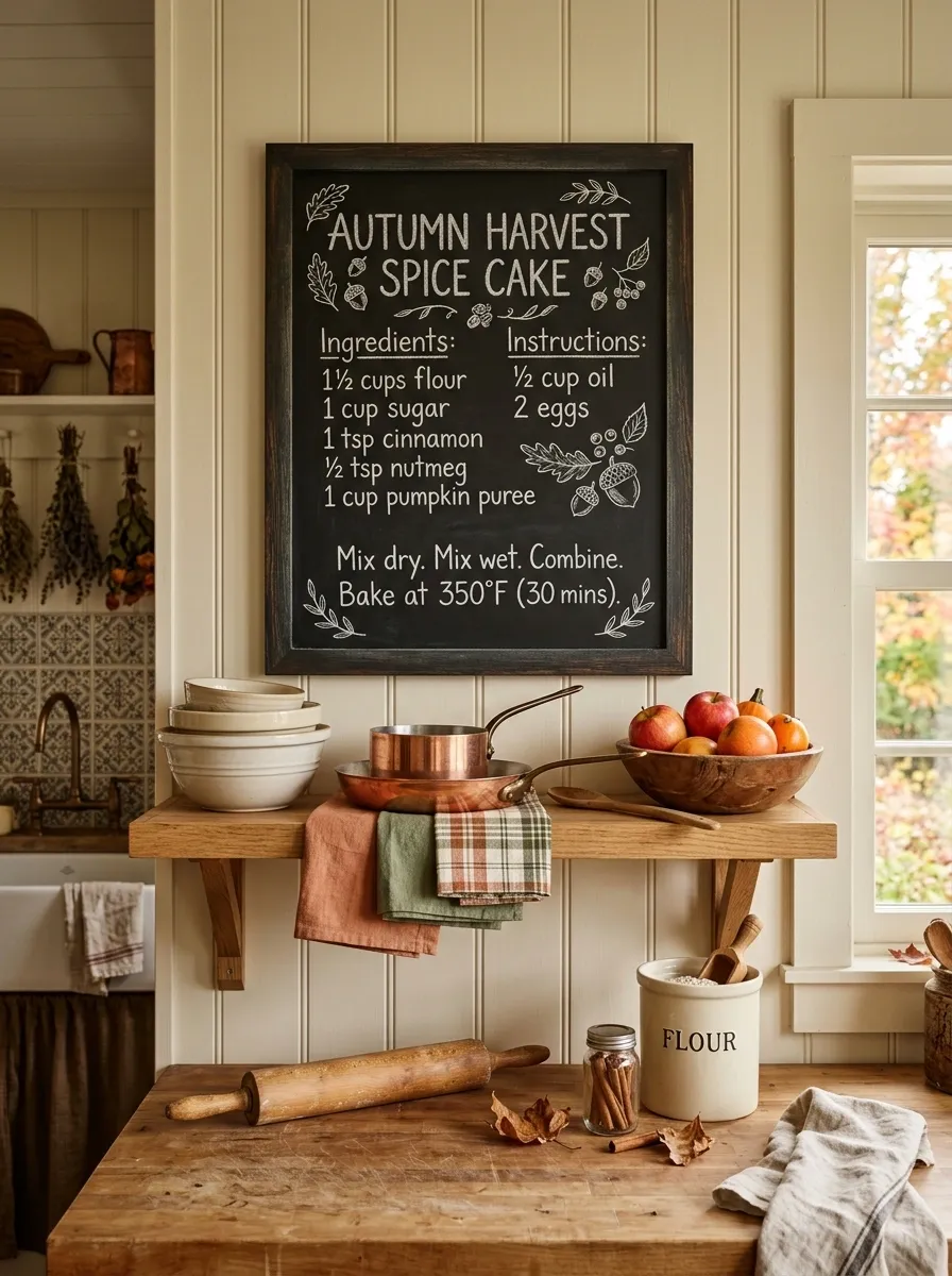
A chalkboard hangs inside a warm cottage kitchen and displays a handwritten autumn recipe, complete with a small ingredient list and a simple botanical border. Below it, an open wooden shelf holds cream pottery, copper cookware, linen towels, and a bowl of apples. A rolling pin and flour container rest nearby, making the board feel connected to an actual baking routine.
The charm comes from making the chalkboard useful rather than purely decorative. The soft kitchen finishes allow the darker board to stand out without feeling harsh. Keep the recipe lettering casual and leave enough empty space around the ingredients so the board still reads from across the room.
Warm spices
Brown sugar
Copper
Natural wood
French Country Fall Chalkboard Composition
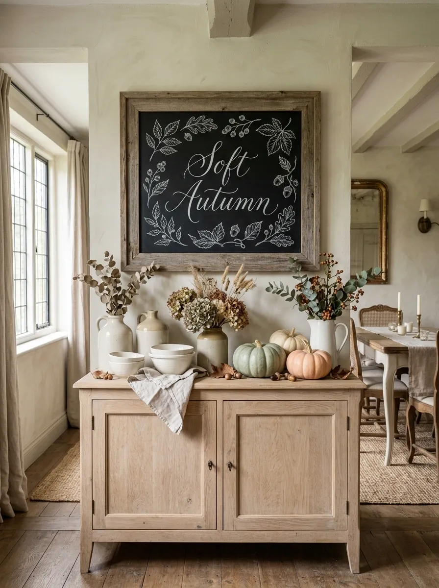
This arrangement takes autumn in a softer direction. A weathered chalkboard with graceful white lettering hangs above a pale oak sideboard, surrounded by cream ceramics, faded florals, linen textiles, and a handful of dusty-toned pumpkins. Instead of bold seasonal graphics, the board carries fine leaf sketches and elegant curved lettering.
The French country feeling comes from the muted materials and uneven textures. Avoid turning the arrangement into a perfectly matched set. Slightly worn wood, imperfect ceramics, and casually gathered branches give the display the relaxed quality it needs.
Playful Family Fall Chalkboard Station
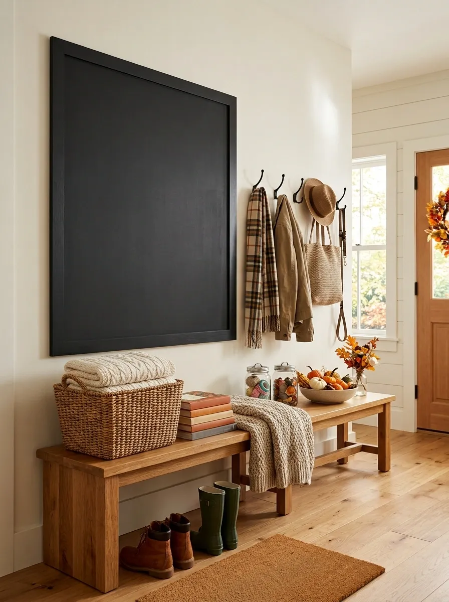
A large blackboard anchors a cheerful family corner with chunky hand lettering, simple pumpkin faces, falling leaves, and a small area for handwritten notes. A nearby wooden bench holds a basket of blankets and seasonal books, while a low table contains craft supplies and a bowl of miniature pumpkins.
The design feels lively without becoming cluttered because the playful chalk graphics are concentrated in one area. Keep the furniture simple and let the board carry the personality. Rounded lettering and larger illustrations work better here than intricate botanical drawings.
Black and Terracotta Modern Fall Display
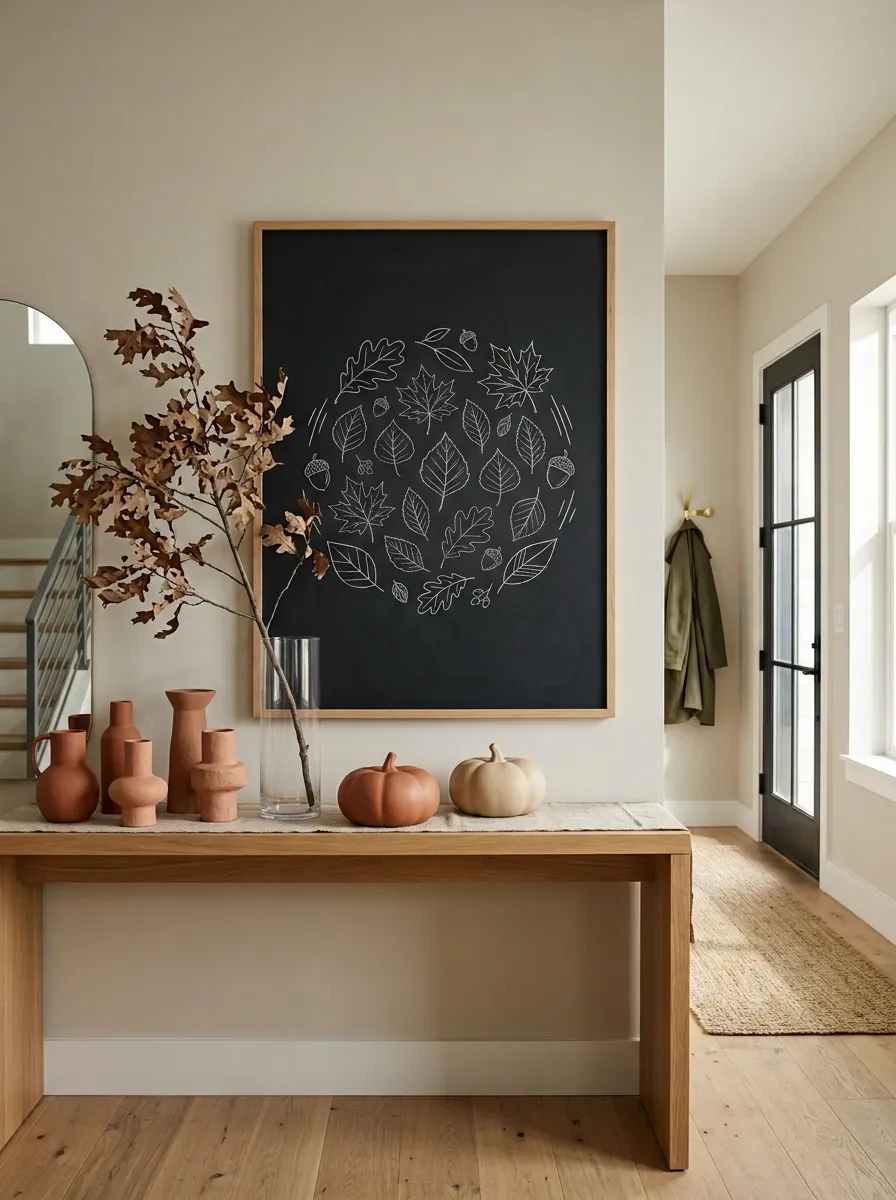
A sleek charcoal chalkboard anchors a contemporary console, with clean seasonal lettering in the center and only a few geometric leaf sketches around it. Below, sculptural terracotta vessels, one oversized dried branch, and two low-profile pumpkins create a warm autumn layer without making the arrangement feel rustic.
The contrast between the dark board and earthy pottery gives this design its identity. The rest of the room should stay relatively quiet, especially if the furniture already has a strong shape. Choose matte surfaces rather than glossy accessories so the composition keeps its modern character.
Autumn Baking Station With Chalkboard Menu
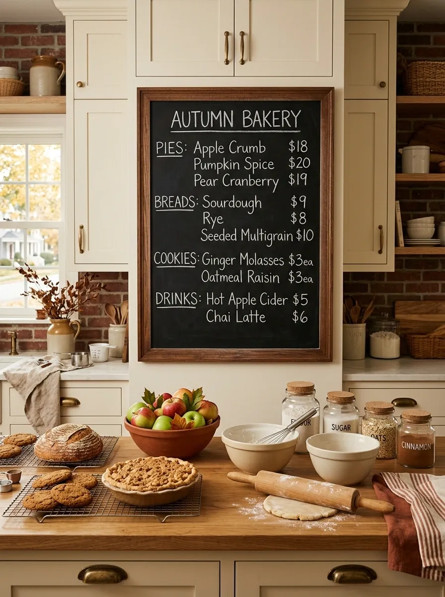
This kitchen setup feels like a small neighborhood bakery prepared for October. A framed chalkboard lists pies, breads, cookies, and seasonal drinks in casual handwritten lettering. Below it, a wood counter holds cooling racks, ceramic mixing bowls, a rolling pin, glass ingredient jars, and a bowl of apples.
The board works because the surrounding scene supports its story. It isn’t simply a menu hanging in a kitchen. The baking tools make the seasonal message believable. Keep the countertop organized into small working groups so the arrangement looks useful rather than staged.
Layered Porch Chalkboard With Vertical Lettering
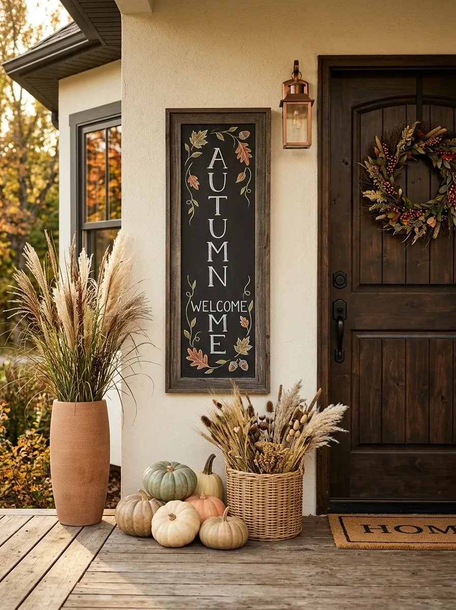
A narrow vertical chalkboard fills the awkward strip of wall between a front door and a large planter. The seasonal phrase runs vertically down the board, framed by small leaves and curling stems. Below, muted pumpkins cluster beside a woven basket, while a tall planter adds a second vertical line to balance the board.
This is a useful composition when a porch has more height than width. The vertical lettering makes the board feel intentionally designed for its location rather than squeezed into an available space. Keep the doorway clear and let the planter and chalkboard create the two strongest vertical elements.
Woodland Fall Chalkboard Scene
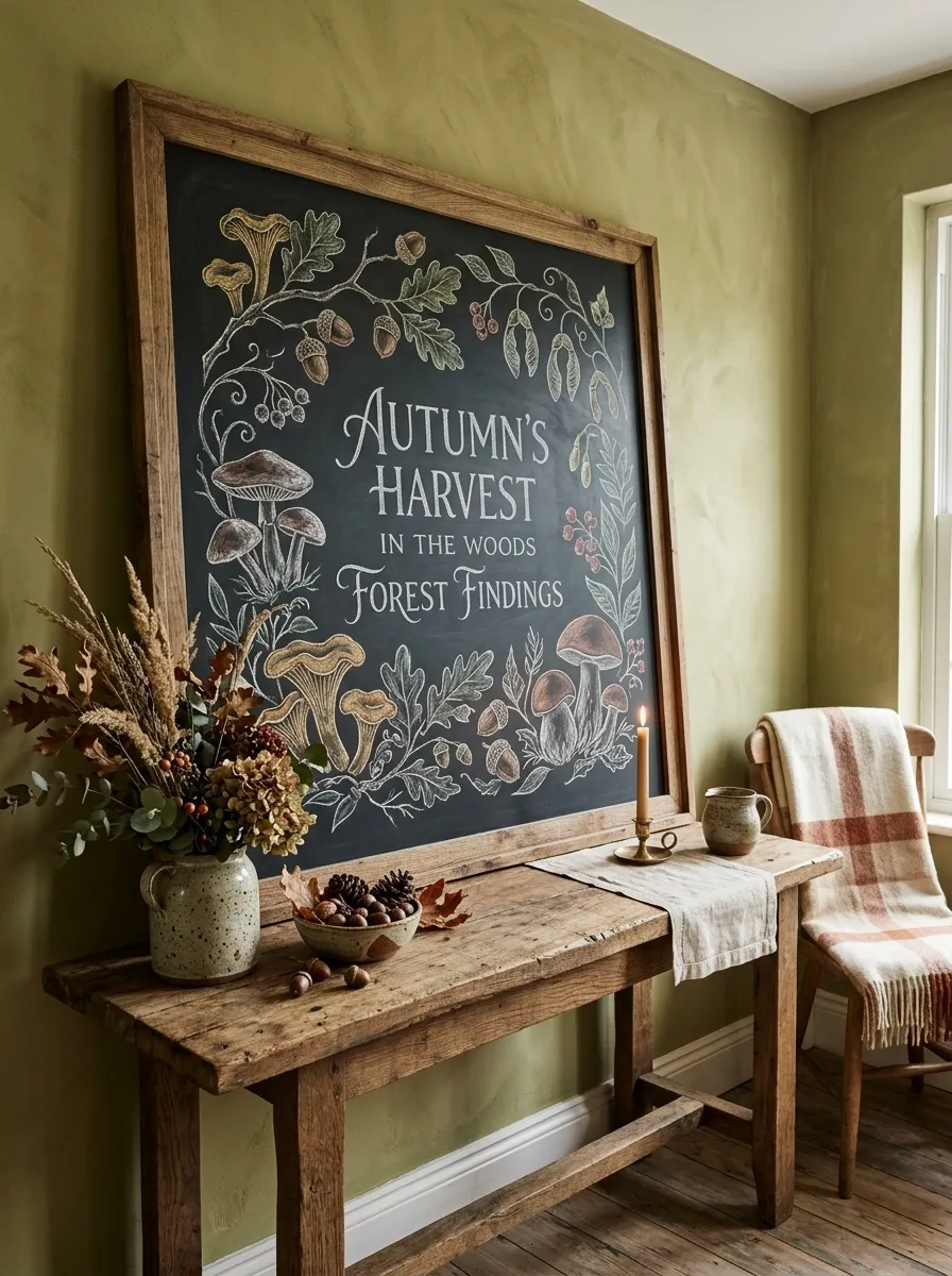
Instead of the usual pumpkin-heavy autumn theme, this board takes inspiration from a forest floor. The chalk artwork features mushrooms, acorns, oak leaves, curling branches, and delicate seed pods around a small seasonal phrase. The board rests against a moss-toned wall near natural wood furniture, stoneware vessels, and a low arrangement of dried greenery.
The palette is deliberately earthy, with olive, brown, cream, and soft rust replacing bright orange. That makes the design feel connected to nature rather than overtly seasonal. Keep synthetic-looking decorations out of this scene. Rough wood, stoneware, and dried botanicals reinforce the woodland direction.
Elegant Thanksgiving Dining Chalkboard
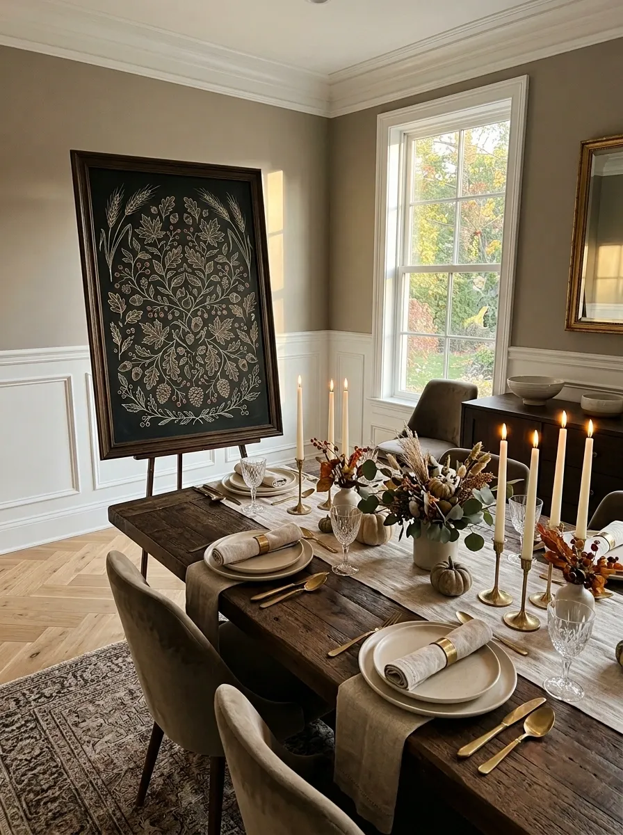
A tall chalkboard stands near the end of a long dining table, carrying graceful Thanksgiving lettering and fine drawings of wheat, leaves, and tiny berries. The table below is dressed with linen napkins, warm stoneware, taper candles, and a low foliage centerpiece that allows guests to see across the table.
This concept feels formal without becoming precious. The chalkboard acts almost like a menu board for the gathering, while the table styling gives it context. Keep the centerpiece low and avoid oversized pumpkins here. The whole arrangement benefits from quiet, elongated shapes.
Old-School Diner Autumn Chalkboard
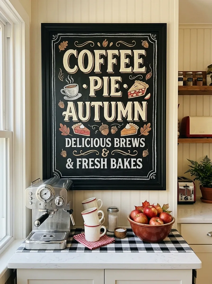
A retro chalkboard brings a completely different mood to the collection. The board features chunky cream lettering, hand-drawn pie slices, steaming coffee cups, and small seasonal specials. It hangs above a compact counter styled with vintage-inspired dishes, a chrome coffee maker, red-brown accents, and a checker-patterned runner.
The design feels playful because the chalk art borrows from classic diner signage instead of farmhouse lettering. Keep the surrounding colors limited so the graphics remain legible. A few strong shapes are enough. Too many retro details would push the display toward a themed restaurant set.
Neutral Scandinavian Fall Chalkboard Corner
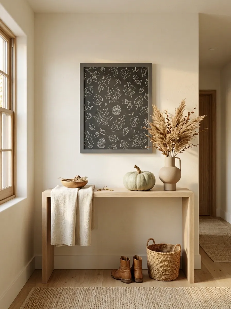
A pale wood console, soft cream walls, and a simple charcoal chalkboard create a restrained Scandinavian autumn scene. The board contains thin white lettering and tiny leaf drawings, while dried grasses, a ceramic vase, one pale pumpkin, and a folded textured throw complete the corner.
The design works through proportion rather than decoration. Every object has room around it, and nothing is oversized enough to dominate the arrangement. This is a good direction when the room already has clean furniture and you want autumn to feel like a subtle seasonal layer instead of a visual reset.
Plenty of wall space
No competing seasonal colors
Autumn Gathering Chalkboard Party Display
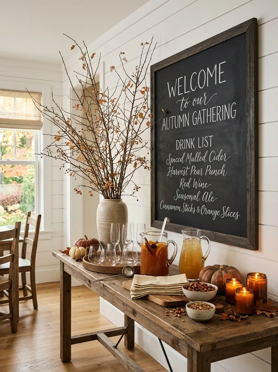
This chalkboard becomes the anchor for a full fall entertaining station. The board carries a large handwritten welcome message and a short drink list, while a nearby console holds glasses, pitchers, folded napkins, bowls of snacks, candles, and a few small pumpkins. A tall arrangement of branches rises behind the setup.
The scene feels ready for guests without looking like a party supply display. Keep the tallest decoration behind the serving area and use the chalkboard as the visual anchor. Warm cream, wood, charcoal, and restrained rust keep the event styling sophisticated.
Traditional Pumpkin Patch Chalkboard Scene
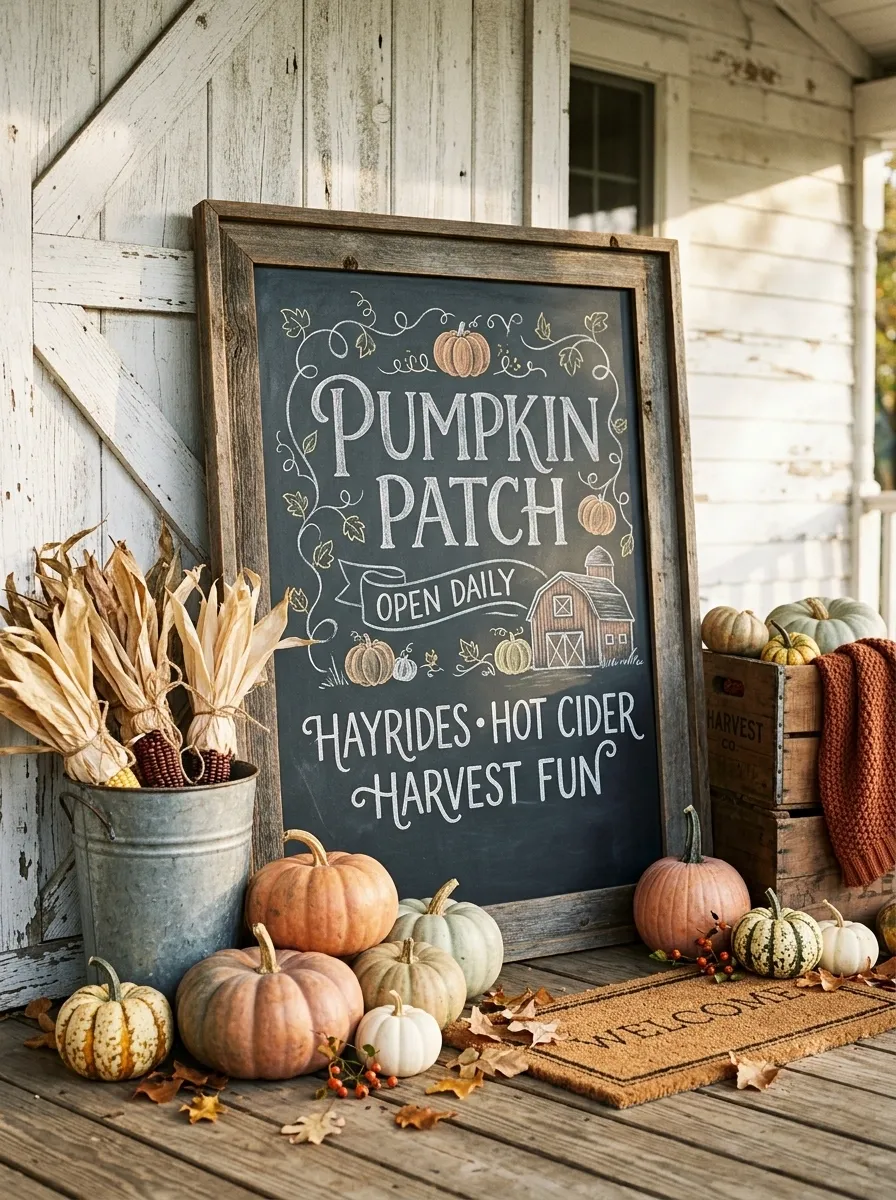
This is the classic autumn version, but the finished setting keeps it from feeling generic. A large chalkboard carries bold hand-lettering surrounded by illustrated pumpkins, curling vines, leaves, and a farm-style message. Around the base, real pumpkins are arranged at several heights with a galvanized bucket, dried corn stalks, and a weathered wooden crate.
The key is giving the familiar pumpkin theme architectural context. The board should lean against a porch wall, barn-style door, or rustic exterior rather than floating against an empty background. Vary pumpkin sizes and leave visible gaps so the display looks gathered rather than stacked.
Collected Vintage Fall Chalkboard Gallery Wall
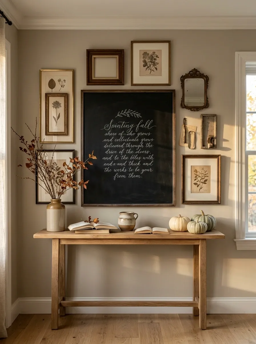
The chalkboard becomes part of a larger wall composition. A substantial blackboard carries the main seasonal lettering while antique frames, botanical prints, a small mirror, dried branches, and weathered objects surround it. A narrow console below adds books, a ceramic vessel, and a few understated pumpkins.
This arrangement feels collected because the chalkboard isn’t expected to do all the work. It becomes the darkest and most graphic element in a gallery of softer textures. Keep the surrounding frames varied but related in tone. The goal is an intentional wall, not a perfectly symmetrical grid.
CHALKBOARD
Make the Chalkboard Part of the Room
The most convincing seasonal displays don’t treat the chalkboard as a separate decoration. They let it pick up something already happening in the room.
In a kitchen, that might be the warmth of wood and ceramics. In a dining room, it could echo the table linens and candlelight. On a porch, the connection may come from planters, weathered wood, and the colors of the fall foliage outside.
That’s also why a simpler board can sometimes look more finished than a heavily decorated one. Once the furniture, materials, and surrounding objects are doing some of the visual work, the chalk lettering doesn’t have to carry the whole scene.
Look at the complete arrangement before deciding what words or drawings belong on the board. The room should still make sense if you cover the lettering for a moment. The chalkboard is part of the composition, not the entire composition.
What Makes These Designs Feel Different
The strongest options in this collection don’t differ only because one has orange pumpkins and another has cream ones. Their structure changes too.
A farmhouse entry relies on layered textures and earthy materials. A modern console uses contrast and negative space. A bakery-inspired kitchen makes the chalkboard functional. A woodland version changes the subject matter completely. A gallery wall makes the board one piece within a larger collection.
That difference matters because it gives you a real starting point. You’re choosing a visual language, not swapping accessories around until something finally looks seasonal.
Conclusion
The best chalkboard displays usually become memorable for reasons that have very little to do with the actual words written across the board. It’s the relationship between the dark surface, the frame, the furniture beneath it, the amount of empty space, and the small seasonal details surrounding it.
Start with the setting you already have. Decide whether it feels more natural with warm wood, muted neutrals, dark contrast, vintage materials, or something more playful. Then let the chalkboard follow that direction instead of forcing the whole room to follow the sign.
Save the designs that feel closest to your home, especially the ones you can already picture in your own entryway, kitchen, dining room, or porch. Those are usually the ideas worth coming back to when the autumn decorating begins.