
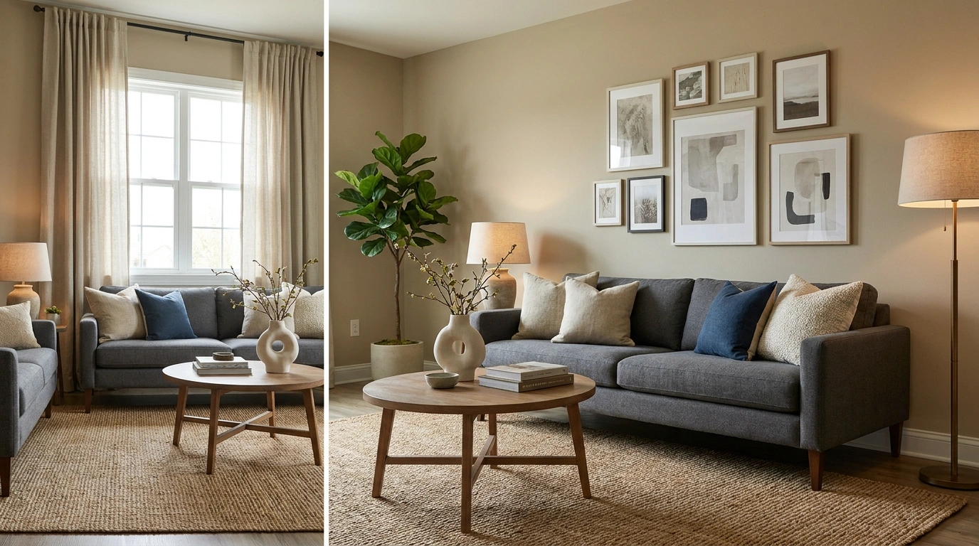
Sometimes the room doesn’t need another decorative object. It needs the rug to stop looking lost, the curtains to reach the floor, and the coffee table to stop hosting a convention of tiny accessories.
A home can contain beautiful furniture and still feel strangely unfinished. The problem is often a collection of small decisions that don’t work together: competing colors, awkward proportions, flat lighting, and surfaces so crowded that the actual furniture barely gets a speaking role.
Learning how to make your home look more designer starts with seeing the room as a whole. The furniture, colors, materials, lighting, and empty space should support each other instead of competing for attention.
And no, the solution isn’t buying an entirely new living room because an influencer’s apartment looks better on camera. Start with what already exists, fix what’s visibly wrong, and spend money only where it makes a real difference.
The Designer Home Reality Check
Decorating Ideas That Make Your Home Look More Designer
Choose One Dominant Color and Build the Room Around It
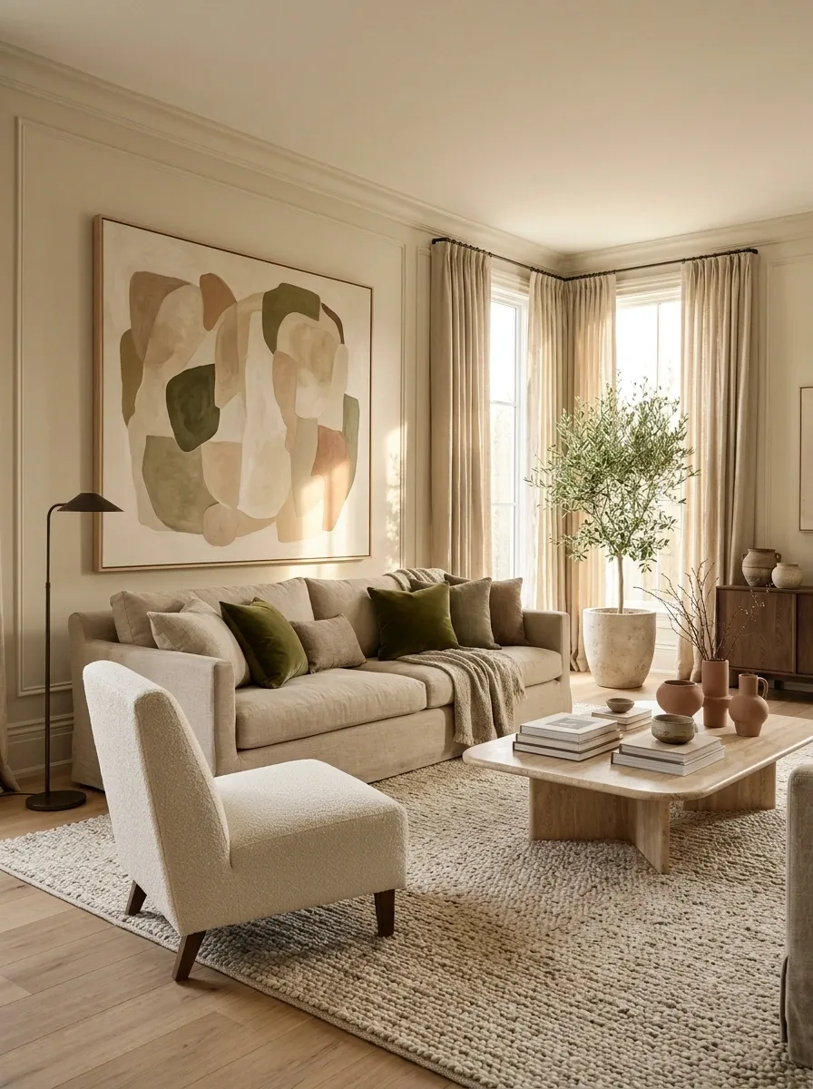
The fastest way to make a room feel visually chaotic is to let every color fight for the lead role. A room needs a clear color story, not an argument between the sofa, curtains, rug, and seventeen throw pillows.
Choose one dominant shade, then support it with a couple of related colors. A warm neutral room can use olive green for depth and muted terracotta for a smaller accent.
The colors don’t need to match exactly. They need to look like they’ve met before.
Give every color a job.
A coordinated room doesn’t need fewer colors. It needs fewer colors competing for attention.
Use it on the largest surfaces, such as walls, a sofa, or the main rug.
Repeat it through cushions, curtains, artwork, or an occasional chair.
Bring in a smaller contrasting shade through ceramics, books, or art.
Designer trick: take a photo of the room. If one color dominates for no good reason, edit the palette before buying anything else.
Remove the Small Decorations That Make Surfaces Look Busy
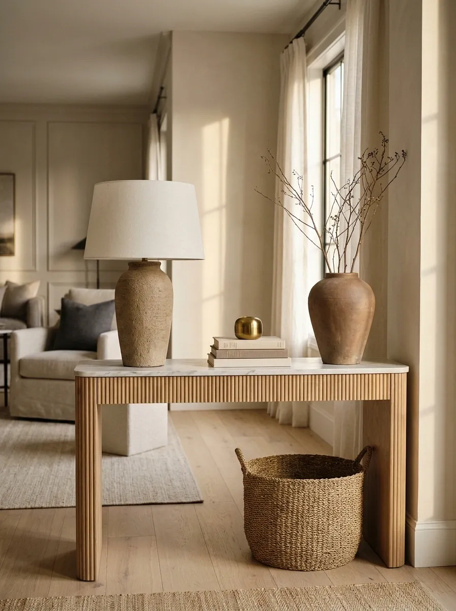
A console table shouldn’t look like a lost-property department for candles, tiny bowls, fake books, and souvenirs. Individual pieces can be lovely and still look terrible in a crowd.
Clear one surface completely. Put back only the pieces that add height, texture, meaning, or useful function.
A lamp, a substantial vase, and a small stack of books will usually read better than a dozen unrelated trinkets.
Keep what earns its place.
Keep one piece with real height, such as a lamp or tall vase.
Group smaller pieces on a tray to make them feel intentional.
Remove anything that blocks daily use or looks like a filler purchase.
The test: can the table still be used without moving half the display? If not, the decor has become a part-time obstacle course.
Arrange Furniture So the Room Has Space to Breathe
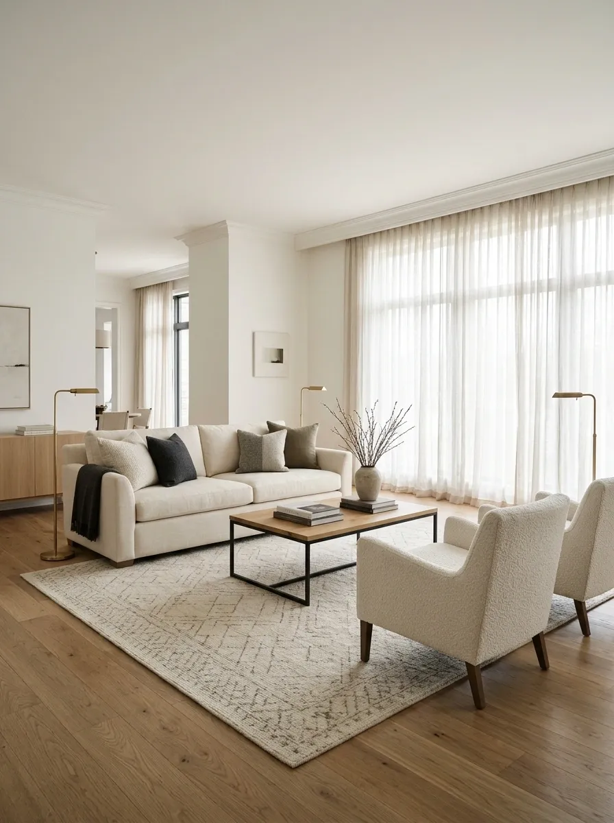
Pushing every piece of furniture against a wall doesn’t automatically make a room feel bigger. Sometimes it just leaves an awkward empty island in the middle and a sofa clinging to the perimeter for dear life.
Start by deciding what the room is for. In a living room, the seating should feel connected enough for conversation, with clear paths to doors and frequently used areas.
Pull furniture slightly inward when the room allows it, and don’t squeeze a side table into a gap where nobody can reach it.
Three zones. No furniture traffic jam.
A thoughtful layout lets people sit, talk, and walk through the room without performing an obstacle course.
Arrange the main sofa and chairs around conversation, a view, or a focal point.
Keep the routes between entrances and frequently used furniture easy to follow.
Fit in side tables, floor lamps, and accent chairs only after the main arrangement works.
Quick reality check: walk through the room carrying a laundry basket. If you have to turn sideways or move a chair, the layout needs editing.
Hang Curtains Higher to Make Windows Feel Larger
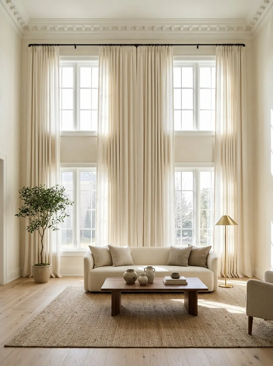
Curtains hung just above the window frame can make the whole wall look shorter. The window isn’t necessarily the problem. The curtain rod is giving it absolutely no support.
Move the rod closer to the ceiling and extend it beyond the sides of the window where the wall space allows. That gives the panels room to sit beside the glass instead of blocking it.
Choose panels that reach the floor neatly. Curtains that hover awkwardly above it look like they ordered the wrong size and hoped nobody would notice.
Higher rod. Wider opening. Full-length panels.
Mount the rod high, extend it beyond the window, and let the panels fall close to the floor.
A rod squeezed against the window frame, narrow panels, and fabric that stops several inches too soon.
Before drilling: check the available wall space, curtain length, and where the panels will sit when open. Even beautiful fabric can’t negotiate with a badly placed rod.
Pick a Rug That Connects the Furniture Instead of Floating Under It
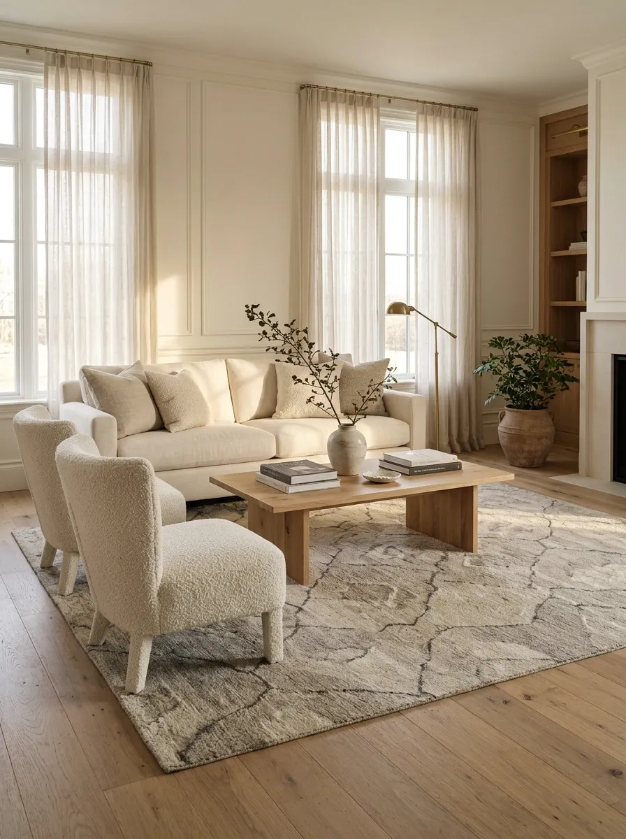
A rug should connect the seating, not sit under the coffee table while the sofa and chairs conduct separate lives.
A rug that’s too small is one of the easiest ways to make a living room look poorly planned. It chops the arrangement into unrelated pieces and makes the furniture feel heavier than it needs to.
Measure the seating area first. Aim for a rug that reaches under the front legs of the main seating pieces, or one large enough to hold the arrangement when the room allows it.
The rug should connect the room, not abandon the sofa.
Compare how the rug sits in relation to the furniture, not just how it looks on its own.
The tiny island
The rug sits beneath the coffee table while the seating looks disconnected from it.
The connected zone
The larger rug reaches beneath the seating, helping the sofa, chairs, and table read as one arrangement.
Before ordering: measure the furniture grouping and check the rug dimensions. A product photo can be persuasive. It cannot measure your living room for you.
Use Larger Artwork Instead of Scattering Tiny Frames Everywhere
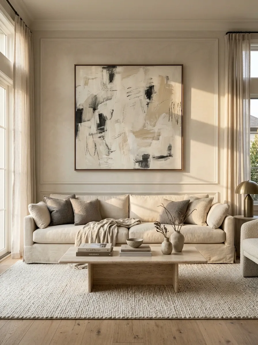
Artwork should have enough presence to hold its own on the wall. A cluster of tiny frames scattered above a large sofa can look like the wall is waiting for the actual decorating to begin.
Choose one substantial piece for a large blank wall, or build a gallery wall with a clear arrangement and consistent spacing. Keep the artwork connected to the furniture beneath it instead of hanging it so high that everyone has to admire it from a different time zone.
Quick rule: use painter’s tape to mark the intended frame dimensions on the wall before buying anything.
Match the scale to the wall.
| Wall situation | Better art arrangement |
|---|---|
| Large wall above a sofa | One substantial print or a balanced gallery grouping |
| Narrow hallway | A vertical piece or a neat sequence of smaller frames |
| Small wall between doors | One carefully sized print with breathing room |
Before hanging: check the wall width, furniture width, and viewing distance. Art should feel connected to the room, not stranded in its own little universe.
Replace Mismatched Bulbs With a Consistent Light Temperature
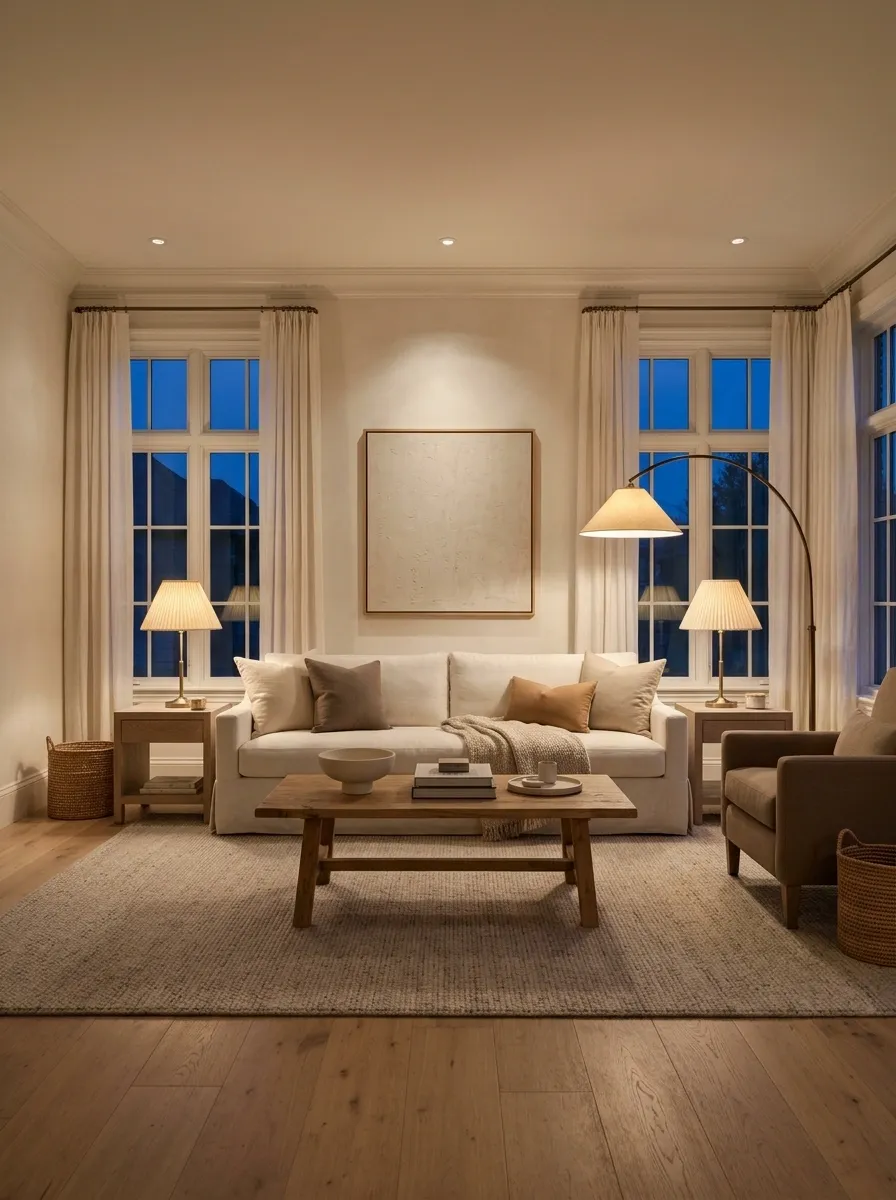
A room can have lovely furniture and still look oddly disjointed if one corner glows yellow, another looks icy blue, and the ceiling light brings office-break-room energy.
Check the color temperature printed on the bulb packaging. For a relaxed living room, warm white lighting is usually the easiest place to start.
The important part is consistency within the same visual area. Bulbs don’t have to be identical throughout the entire house, but neighboring lights shouldn’t look like they’re operating in completely different time zones.
Check the packaging before blaming the paint.
A relaxed look for living rooms, bedrooms, and evening corners.
A balanced choice for rooms where clear visibility matters alongside comfort.
A crisper appearance that may suit focused work areas, depending on the setting.
Quick check: compare bulbs in the same room after dark, when daylight isn’t changing the appearance. Check the actual Kelvin rating rather than relying on vague marketing words.
Repeat Two or Three Finishes Throughout the Room
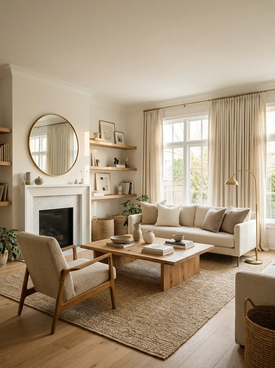
A room doesn’t need matching furniture sets to look coordinated. In fact, matching everything exactly can make it feel like the showroom display was purchased in one nervous transaction.
Instead, repeat a small selection of finishes. Warm wood on a coffee table can relate to a picture frame, while brushed brass hardware can connect to a lamp or mirror.
The trick is to repeat each finish with intention, not to scatter every metal and wood tone in the furniture store across the same room.
Give different pieces a few things in common.
Repeated materials make an eclectic room feel intentional, even when the furniture comes from different places.
Repeat it in a side table, a frame, or shelving.
Bring linen, cotton, or woven fibers into cushions and curtains.
Repeat brass or bronze in lighting, cabinet hardware, or a mirror frame.
Keep it natural: a finish can vary slightly from one object to another. The connection should feel deliberate, not like every item was ordered as a bundle.
Upgrade Cabinet Knobs and Handles Before Replacing the Cabinets
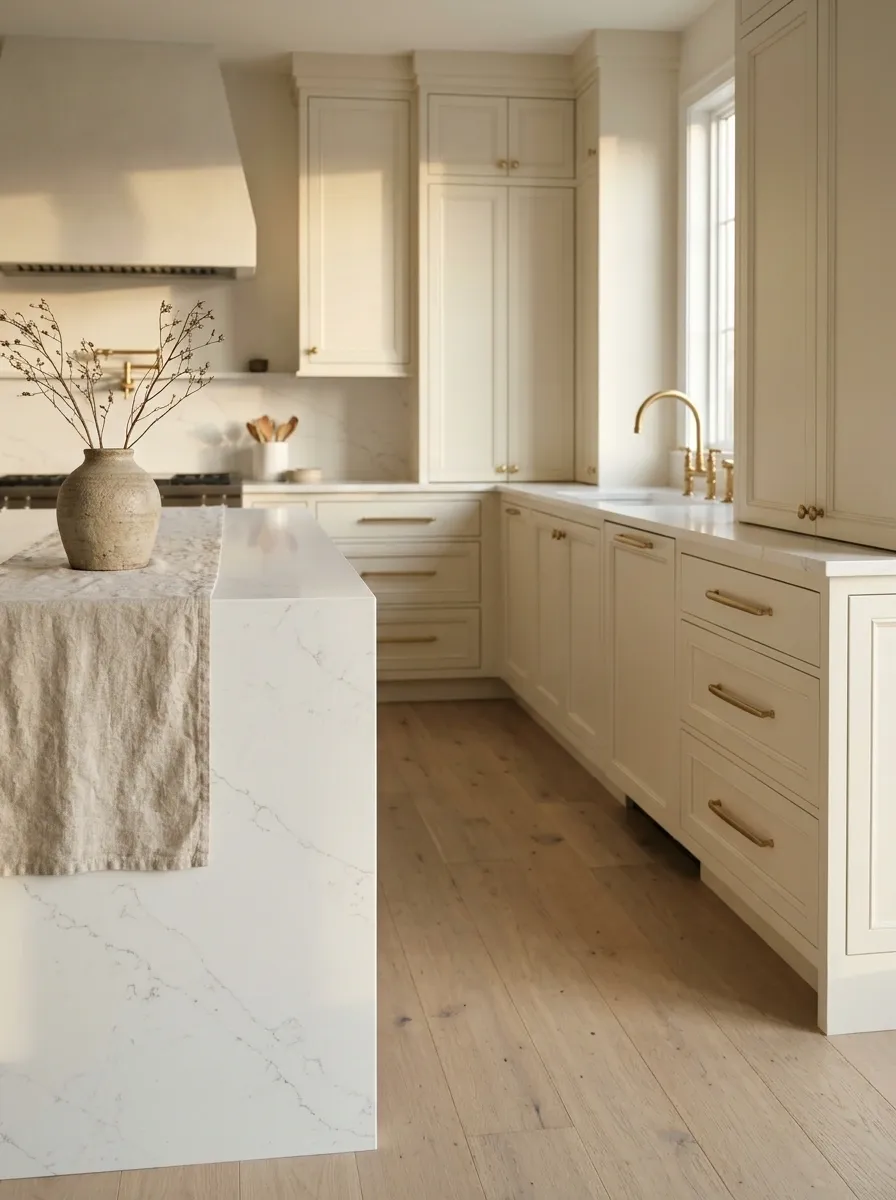
Sometimes the cabinets aren’t ugly. Their hardware is just making them look more dated than they really are.
Swapping basic knobs for a better finish can sharpen the look of a kitchen, bathroom vanity, or dresser without turning the project into a renovation. Matte black, brushed brass, and understated nickel each create a different effect.
Before ordering, check the hole spacing on existing handles and the thickness of the cabinet fronts. A small upgrade is supposed to be simple, not a surprise trip into hardware-measurement misery.
Fix the visible details first.
Replace worn, mismatched, or overly decorative knobs and handles with a cleaner finish that suits the room.
Clean the cabinet fronts, adjust crooked doors, and remove residue before judging the final result.
Measure twice: confirm screw-hole spacing, screw length, and the finish in the room’s actual lighting. Cute hardware that doesn’t fit is just an expensive paperweight.
Style the Sofa With a Deliberate Pillow Arrangement
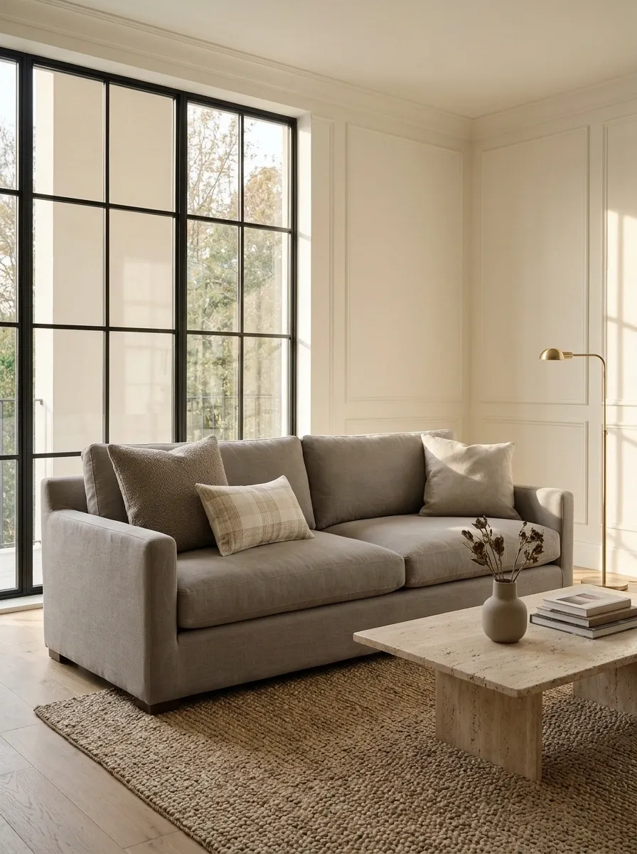
A sofa piled with random cushions can look less luxurious than one with just a few well-chosen pillows. More pillows don’t automatically mean better styling. Sometimes they just mean nobody can sit down without launching a cushion onto the floor.
Start with a limited palette and mix sizes or textures instead of buying several nearly identical pillows. A larger pillow at the back, a smaller one in front, and a contrasting texture create depth without making the sofa feel overcrowded.
Choose inserts that fill their covers properly, too. Flat, sagging cushions can make even an expensive sofa look tired.
Mix shape, scale, and texture. Leave the cushion avalanche to someone else.
A balanced arrangement has enough variation to look styled without swallowing the sofa.
Use a larger cushion at the back to establish the arrangement and anchor the color.
Mix a woven, nubby, or subtly patterned cover with smoother fabrics for depth.
Add a smaller pillow for contrast, then stop before the seating disappears.
The comfort test: leave enough room to sit without moving every cushion. A sofa is furniture, not a pillow display with a seating subscription.
Mix Textures Instead of Buying Everything in the Same Fabric
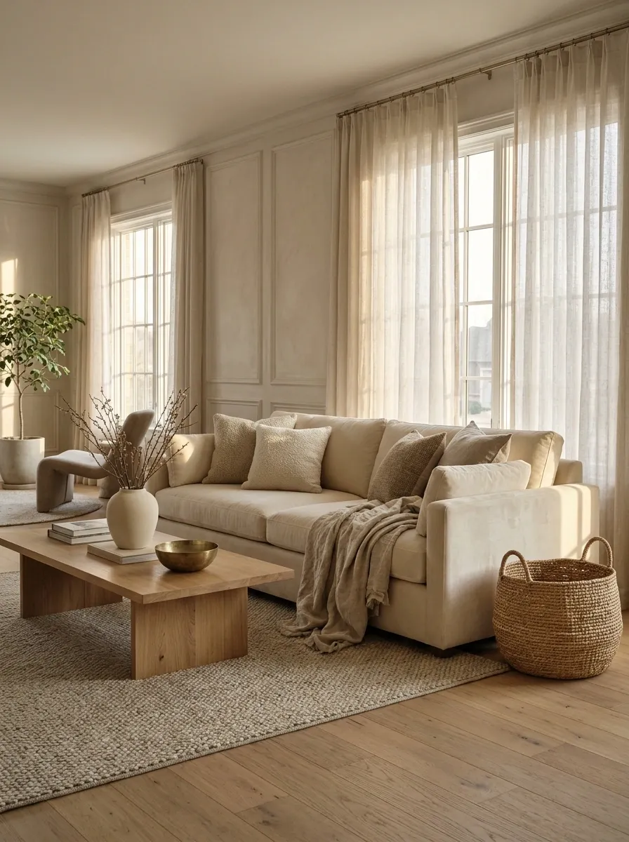
A room can have a beautiful color palette and still feel flat when every surface has the same smooth finish. Matching colors won’t create much depth if the curtains, cushions, upholstery, and accessories all look and feel alike.
Bring together contrasting materials instead. Linen works well beside velvet, woven baskets soften hard furniture edges, and a matte ceramic vase can break up a glossy tabletop.
The point isn’t to collect every texture available. Choose a few that complement each other and repeat them naturally around the room.
Same color family. Different surfaces.
Linen curtains paired with a velvet cushion or upholstered chair.
A woven basket beside smooth wood furniture or a glazed ceramic vase.
Matte pottery beside a subtle metal accent or a framed mirror.
Keep the balance: let one or two textures lead. If every object is trying to be the most interesting thing in the room, the room loses the plot.
Create a Clear Focal Point in Every Main Room
A room needs somewhere for the eye to land. Without a clear focal point, attention jumps from the TV to the window, then to the crowded shelf, and finally to the pile of things waiting to be put away.
Choose one feature to lead the room. It could be a fireplace, a large piece of artwork, a strong headboard, a dining table, or a window with an attractive view.
Arrange the surrounding furniture and accessories to support it rather than compete with it. A focal point doesn’t have to be expensive. It just needs to be clear.
Pick the star. Let everything else support the cast.
Different rooms have different natural anchors. The design works best when the other choices feel connected to the main feature.
Arrange seating toward the anchor, then use lighting and restrained accessories to reinforce it.
Give the bed a balanced backdrop with appropriate bedside lighting and artwork scaled to the wall.
Use a proportionate centerpiece and suitable lighting to make the eating area feel deliberate.
The editing question: what should someone notice first when entering the room? If five things are competing for that job, choose one and quieten the rest.
Use Mirrors Where They Actually Improve the Room
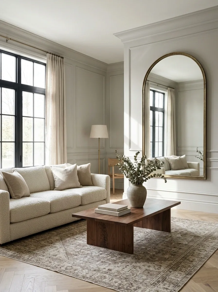
A mirror isn’t automatically useful just because it reflects something. A mirror facing a cluttered corner gives that clutter a second appearance. Congratulations, now there are two.
Place mirrors where they reflect something worth seeing, such as a window, an attractive light source, or an open part of the room. In a darker hallway, a carefully positioned mirror can help bounce available light around.
Check the reflection from the main doorway before hanging it. The view matters just as much as the frame.
Reflect the good stuff.
Reflect daylight. Position the mirror to catch a window’s light without creating uncomfortable glare.
Extend the view. Use a mirror to give a narrow hallway or compact room more visual depth.
Does it reflect an attractive view?
Is the size right for the wall?
Will the mounting support its weight securely?
One last check: look at the reflection from the doorway and the main seating position. Nobody needs a beautifully framed view of a laundry pile.
Make Open Shelves Look Collected, Not Crammed
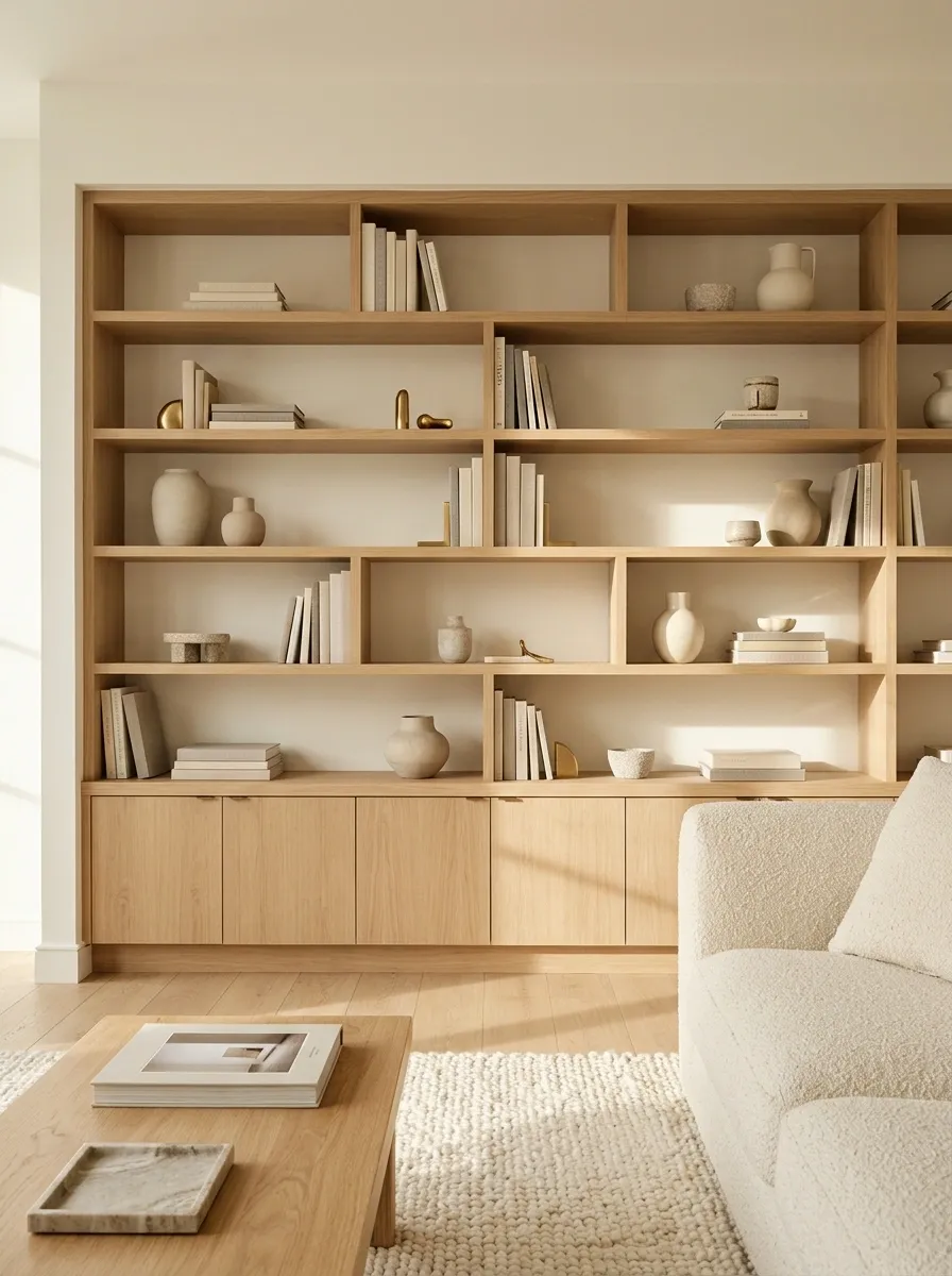
Open shelving is not a challenge to display every object in the house. The best-looking shelves have a mix of books, a few meaningful pieces, and enough empty space for the arrangement to feel considered.
Group smaller items instead of spreading them across every shelf. Vary the height of objects, mix horizontal and upright book stacks, and leave some sections partially empty.
Don’t force every shelf to be symmetrical. Aim for visual balance, not a row of identical displays that look like they came with the flat-pack instructions.
Make each shelf feel intentional, not fully booked.
Use a varied mix of heights, shapes, and empty space. The little gaps are part of the arrangement, not unfinished business.
The arrangement mixes vertical books, a larger accent, a horizontal stack, and clear breathing room.
Start with the larger objects and book groups.
Fill the gaps with a few objects that vary in height and shape.
Remove anything that makes the shelf feel crowded or repetitive.
The shelf rule: if every inch is occupied, the display has nowhere to breathe. Leave a few gaps and let the strongest pieces do the talking.
Leave Breathing Room Around Your Favorite Objects
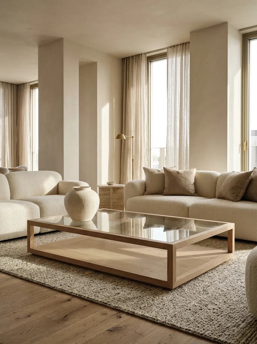
The expensive candle doesn’t need to sit beside three smaller candles, two decorative bowls, a tiny sculpture, and a decorative object whose entire purpose is being decorative. At some point, the display starts looking less like styling and more like an inventory report.
Give standout objects room around them. On a coffee table, group a few items on a tray and leave the rest of the surface open. On a dresser, let a lamp or substantial vase take the lead without surrounding it with a crowd.
Empty space is part of the design. It isn’t a decorating emergency.
Not every empty spot needs a decorative object.
Every object competes for attention, and the surface barely functions.
Fewer objects make each piece more noticeable and leave room for everyday use.
The editing test: remove a third of the small accessories temporarily. The result may look better before anything new gets purchased.
Choose Side Tables and Coffee Tables That Match the Scale of the Seating
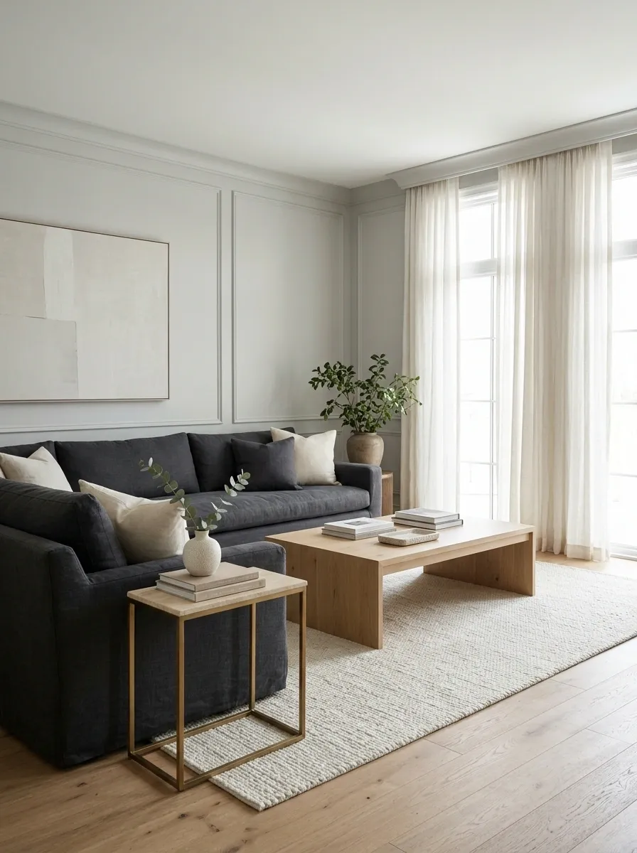
A gorgeous coffee table can still look wrong if it’s too small for the sofa or so bulky that everyone has to maneuver around it. Proportion is the difference between a room that feels considered and one that looks like furniture was ordered for three different houses.
Match the table’s size to the seating, leave enough room to move comfortably, and check whether people can actually reach the tabletop from their seats. Side tables should serve the nearby chairs or sofa without sticking out awkwardly.
Don’t buy a tiny table just because the product photograph makes it look elegant. Product photography doesn’t have to walk around it.
The table needs to fit the furniture, not just the shopping cart.
Use the sofa and chairs as your reference points. These simple proportions help prevent common sizing mistakes.
Choose a table that suits the seating length and leaves comfortable clearance around its edges.
Check the tabletop height against the seat and armrest so drinks, books, and lamps are easy to access.
Leave enough clearance for people to pass without bumping knees or shuffling furniture.
Before checkout: mark the table footprint on the floor with tape. Walk around it and sit on the sofa. The real-life test beats guessing from a product listing.
Make the Dining Table Look Finished Even on Ordinary Days
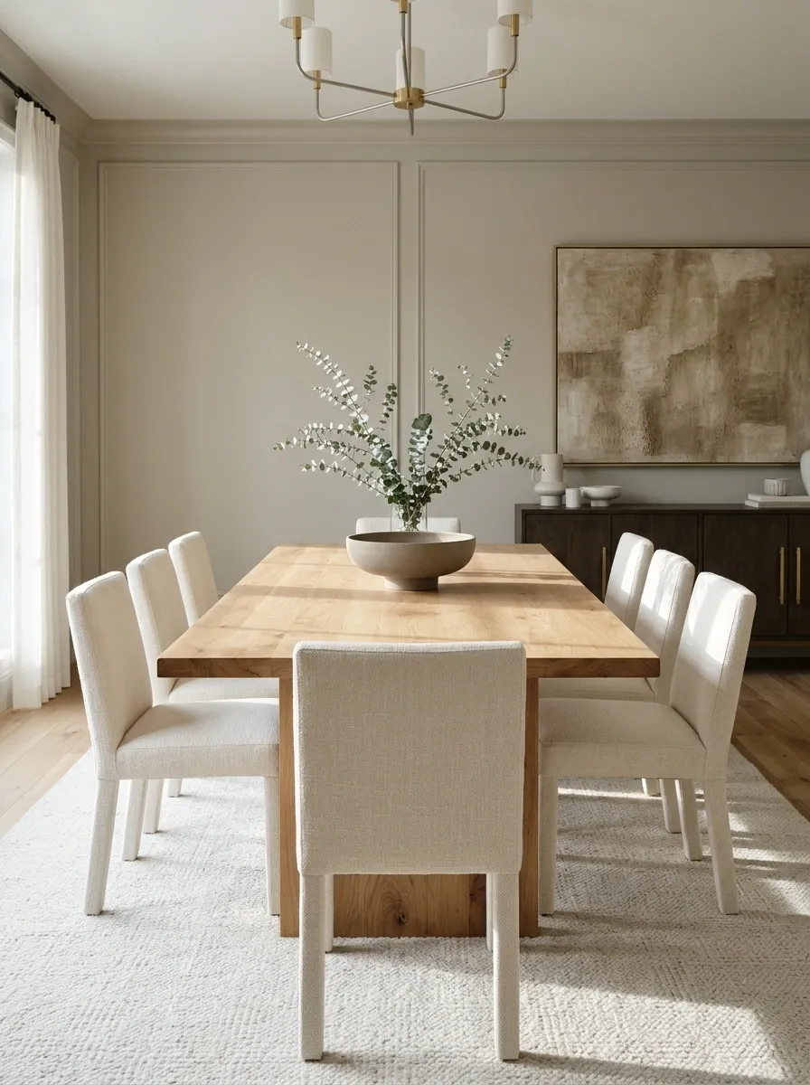
A dining table shouldn’t need a holiday, dinner party, or visiting royalty to look considered. But it also shouldn’t be covered in decorative objects that have to be removed every single time someone wants lunch.
Start with one centerpiece that suits the table’s size. A low vase, a simple branch arrangement, or a shallow bowl can establish a focal point without blocking conversation.
The everyday setup should be easy to maintain. If styling the table becomes another chore, the arrangement needs editing.
Styled enough to look finished. Clear enough to eat dinner.
The best everyday table has a clear focal point and plenty of usable surface around it.
Use a centerpiece that suits the table’s shape and height.
Repeat one material or color through placemats, ceramics, or a runner.
Keep enough open space for plates, serving dishes, and comfortable use.
Everyday rule: choose a centerpiece that can be moved in seconds. A dining table is allowed to be pretty without requiring a full relocation project before breakfast.
Give Your Entryway One Clear Job and a Defined Landing Spot
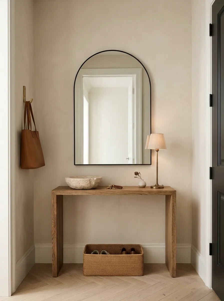
The entryway sets the tone for the rest of the home, which is unfortunate when it’s currently hosting loose shoes, random bags, unopened mail, and keys that have apparently developed a disappearing act.
Give the space a clear purpose. Add a tray or bowl for keys, a hook or closet for bags, and a shoe solution that fits the household’s actual routine.
Keep the setup proportional to the available space. A narrow entrance doesn’t need a massive console table with a side of daily frustration.
Give every daily essential a place to land.
Keys and small essentials: use a bowl, tray, or wall-mounted organizer near the entrance.
Bags and coats: install sturdy hooks or use existing closet space.
Shoes: choose a rack, cabinet, or basket that keeps walkways clear.
Add a mirror to check the view before heading out.
Use a small lamp if a surface and outlet are available.
Keep the floor and door swing free of obstacles.
The everyday test: walk in carrying groceries. If there’s nowhere to put the bags or nowhere to step, fix the routine before adding another decorative object.
Upgrade the Small Details People Notice Up Close
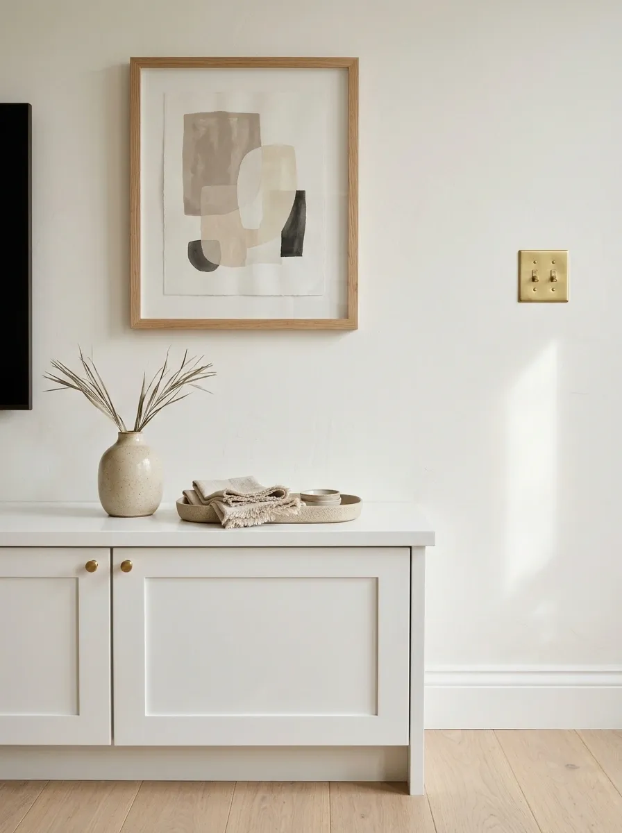
Rooms are made up of more than sofas and statement pieces. Crooked picture frames, chipped switch plates, tangled cords, worn cabinet handles, and dusty lampshades can quietly drag down the whole look.
These aren’t glamorous upgrades, which explains why they often get ignored. But fixing a handful of visible details can make a room feel better maintained without replacing the big-ticket items.
Walk through the room and look at everything from normal eye level. Tighten loose hardware, straighten frames, conceal exposed cables where safe, and clean the surfaces that collect dust.
The small stuff is small until it ruins the entire view.
Check the everyday details that make a home feel cared for. Start with fixes that are inexpensive, visible, and easy to maintain.
Align crooked artwork, clean dusty frames, and repair obvious wall scuffs where possible.
Tighten handles, clean switches and cabinet fronts, and replace visibly damaged fittings.
Manage exposed cords, put away loose packaging, and remove items that don’t belong on display.
The five-minute scan: look at the room from the doorway, then sit where guests would sit. The details that catch the eye from those positions deserve attention first.
Make Your Bedroom Look Finished With Balanced Bedding Layers
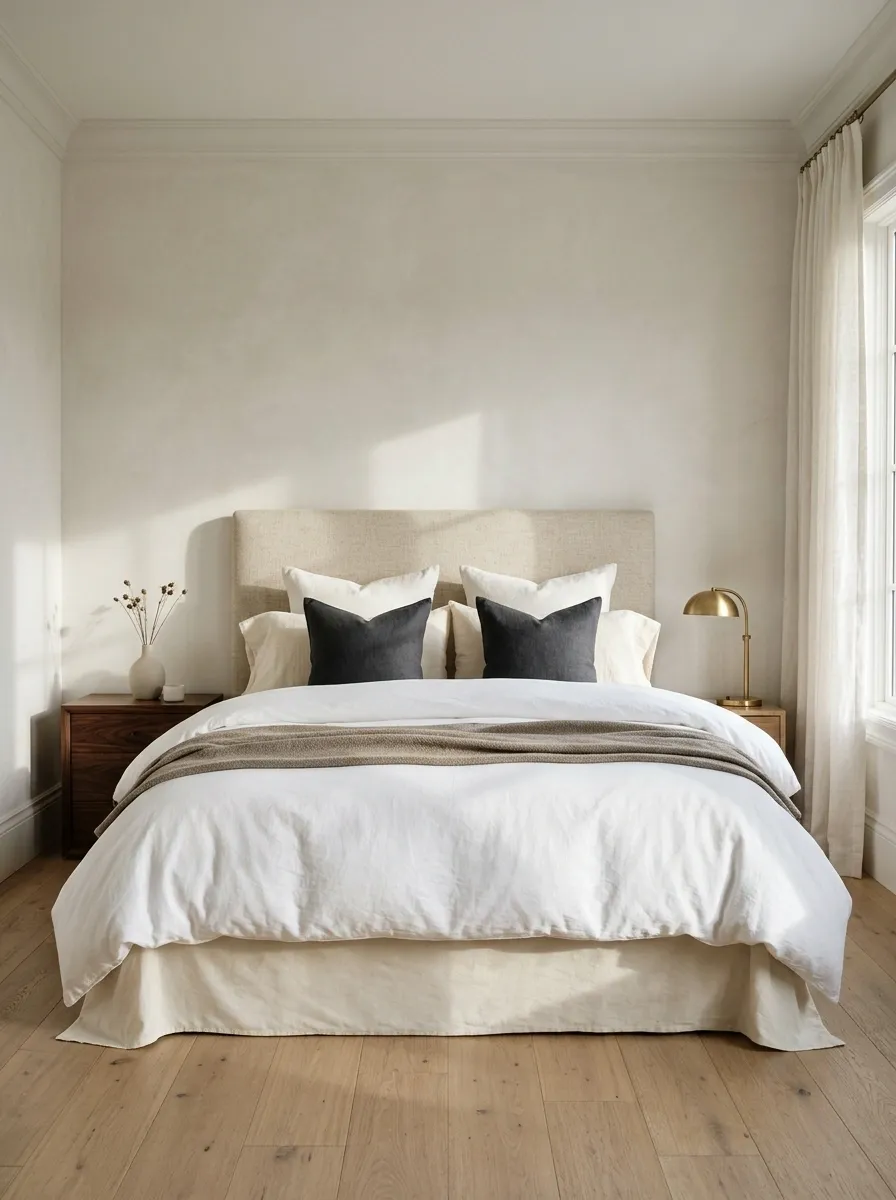
A bedroom can have a lovely bed frame and still look unfinished when the bedding is flat, the pillows are scattered, and the duvet barely covers the mattress. The bed takes up a lot of visual space, so its styling has an outsized effect on the whole room.
Start with clean, well-fitted bedding in a restrained color palette. Add a duvet or comforter with enough volume, arrange the sleeping pillows neatly, and finish with a folded throw or a small number of decorative cushions.
The goal is a composed bed, not a display that needs a dedicated morning crew.
Build a finished bed without burying it in pillows.
Fitted sheets
Start with smooth, properly sized bedding.
Duvet or comforter
Arrange it evenly so the bed looks balanced.
Sleeping pillows
Stand or stack them neatly against the headboard.
One finishing layer
Add a folded throw or a few contrasting cushions.
Use a light base, a supporting neutral, and a deeper accent. Repeat the accent elsewhere in the bedroom to connect the look.
Reality check: choose bedding that feels good to sleep in and can be washed without drama. A bed that looks impressive but makes bedtime annoying has missed the assignment.
Finish Each Room by Removing One More Unnecessary Thing
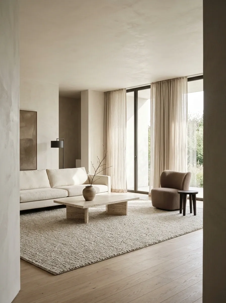
The final step isn’t always buying the missing accessory. Sometimes the room already has everything it needs, and one more object will only make it harder to see what works.
Stand in the doorway and scan the room as a whole. Look for repeated decorations, furniture that blocks movement, colors that don’t connect, and objects that keep collecting dust without adding anything useful.
Then check the room in daylight and after dark. A thoughtful space should work in real life, not just from one flattering camera angle.
Before buying anything else, give the room one honest review.
A few deliberate edits can make existing furniture and decor look more considered. Work through the room in this order.
Take away unnecessary accessories, visible packaging, and items that have no useful place.
Straighten artwork, adjust the furniture, tidy cables, and make sure the rug connects the seating.
Identify a real gap in lighting, function, color, or scale before making a shopping list.
A room doesn’t look more designer because it contains more things. It looks more considered when the proportions work, the materials connect, and every visible piece has a reason to be there.
A Designer-Looking Home Starts With Better Choices
A room doesn’t need to be filled with expensive purchases to feel finished. It needs furniture that fits, colors that connect, lighting that works after sunset, and enough breathing room to let the best pieces stand out.
Start with the changes that cost nothing. Clear the surfaces, rearrange the seating, straighten the artwork, and look at the room from the doorway. Those simple edits often reveal exactly what’s missing, and what never needed to be there in the first place.
When a purchase is necessary, make it solve a visible problem. A properly sized rug, well-fitted curtains, or a useful lamp can do more for a room than a shopping bag full of accessories.
Save these ideas on Pinterest for the next time a room feels unfinished. Before buying more decor, give the furniture, lighting, and details a chance to work together.