
A small bathroom doesn’t need more decorations. It needs one good design decision that makes everything else look intentional. A tired wall behind the sink, a cramped vanity, or a room full of mismatched finishes can make even expensive fixtures look surprisingly underwhelming.
The right accent wall changes that. Sage beadboard can bring cottage character, deep emerald tile can create a dramatic jewel-box effect, and a simple painted arch can give an ordinary vanity the architectural treatment it deserves. The trick is choosing a complete look rather than falling in love with a tile sample and hoping the rest of the bathroom figures itself out.
These designs take different approaches to color, texture, pattern, and proportion. Some are dramatic, some are restrained, and a few have absolutely no interest in being subtle.
The common thread is that each wall belongs to a finished bathroom, not a collection of decorating decisions that happened to occur on the same afternoon.
The Small Bathroom Group Chat
Your accent wall can be the main character. The vanity doesn’t need a solo career.
Small bathrooms have a group-chat problem. The wallpaper wants attention, the tiles are doing the absolute most, and suddenly the mirror has a personality disorder. Everyone needs to calm down a little.
Let one thing shine.
A dramatic tile wall or oversized botanical print can carry the room. It doesn’t need three competing patterns fighting for custody of the bathroom.
Give it some peace.
Pair the statement wall with quieter flooring, simpler fixtures, or an understated vanity. Not every surface needs its own origin story.
Read the room.
A wall behind the sink has different practical demands from a shower wall. Choose moisture-suitable materials and finishes, not just something that looks incredible in a saved pin.
The rule?
One main character. A few excellent supporting actors. Absolutely no unnecessary drama.
Small Bathroom Accent Wall Ideas
Vertical Wood Slat Accent Wall
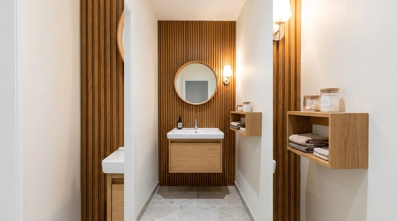
Vertical wood slats transform a narrow bathroom corner into an architectural moment without cluttering the floor plan. The linear grain draws the eye upward behind the fixtures, while a round brass mirror and soft textures bring in a layer of warmth.
Keep the adjacent surfaces neutral and let the natural wood do the heavy lifting. The combination feels modern and polished without turning the small space into an overwhelming maze of competing finishes.
Skip the chaotic clutter of extra decorative objects on every surface. The slat wall already brings plenty of structure, so letting it breathe is the real design secret.
For practical powder rooms, ensure any wood elements near water are properly sealed and rated to withstand everyday humidity without warping.
Sage Green Beadboard Wall With a Classic White Vanity
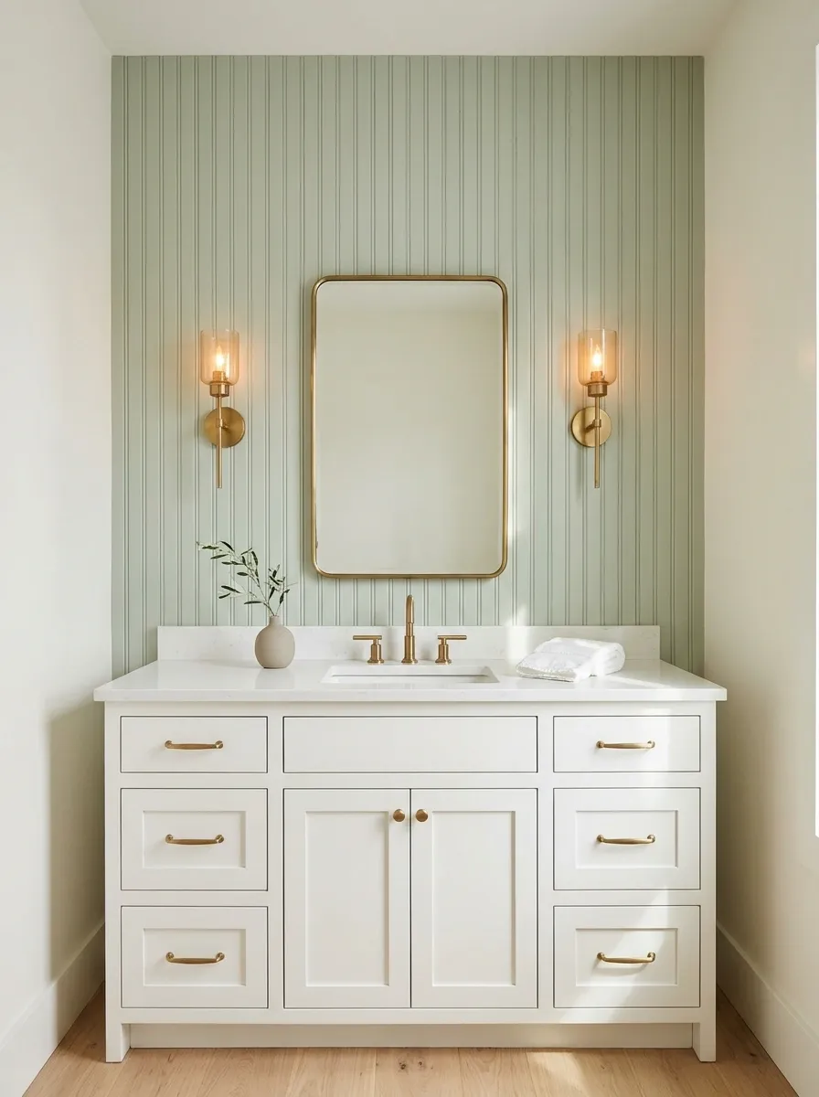
Pale sage beadboard gives this bathroom its character without turning the walls into a full-blown color festival. The vertical grooves add structure behind a classic white vanity, while a brass-framed mirror and warm wall sconce bring in just enough contrast.
Keep the surrounding walls creamy white and the flooring light oak or pale stone. The combination feels traditional without looking like a time capsule from a country inn.
Decorative baskets, floral curtains, patterned floors, and several competing metals aren’t necessary. The beadboard already has a job, and it’s doing it.
For real bathrooms, choose a moisture-suitable wall finish and keep ordinary wood trim away from persistent direct water exposure unless it’s specifically designed for that use.
The color story
A little green. A lot of breathing room.
Sage
Accent wall
Warm white
Vanity and walls
Oak
Natural warmth
Brass
Metal details
Keep the floor relatively quiet. A second bold pattern would be an unnecessary plot twist.
Two-Tone Dark Wainscoting
Dark wainscoting brings a moody sophistication that plain white drywall simply cannot achieve. A rich, charcoal-toned lower paneling grounds the room, while bright upper walls and crisp fixtures keep the compact space feeling open and airy.
The contrasting elements balance each other seamlessly. Dark tones add instant character, while the crisp white background and light flooring give the design enough breathing room to stand out without shrinking the space.
Resist the urge to scatter matching dark accessories across every available inch. The walls have already made the bold statement, so keeping the styling restrained feels much more deliberate.
Choose durable, moisture-resistant paint finishes for paneling in high-traffic or high-humidity areas to ensure the rich color stays pristine through everyday use.
Terracotta Textured Wall With a Floating Oak Vanity
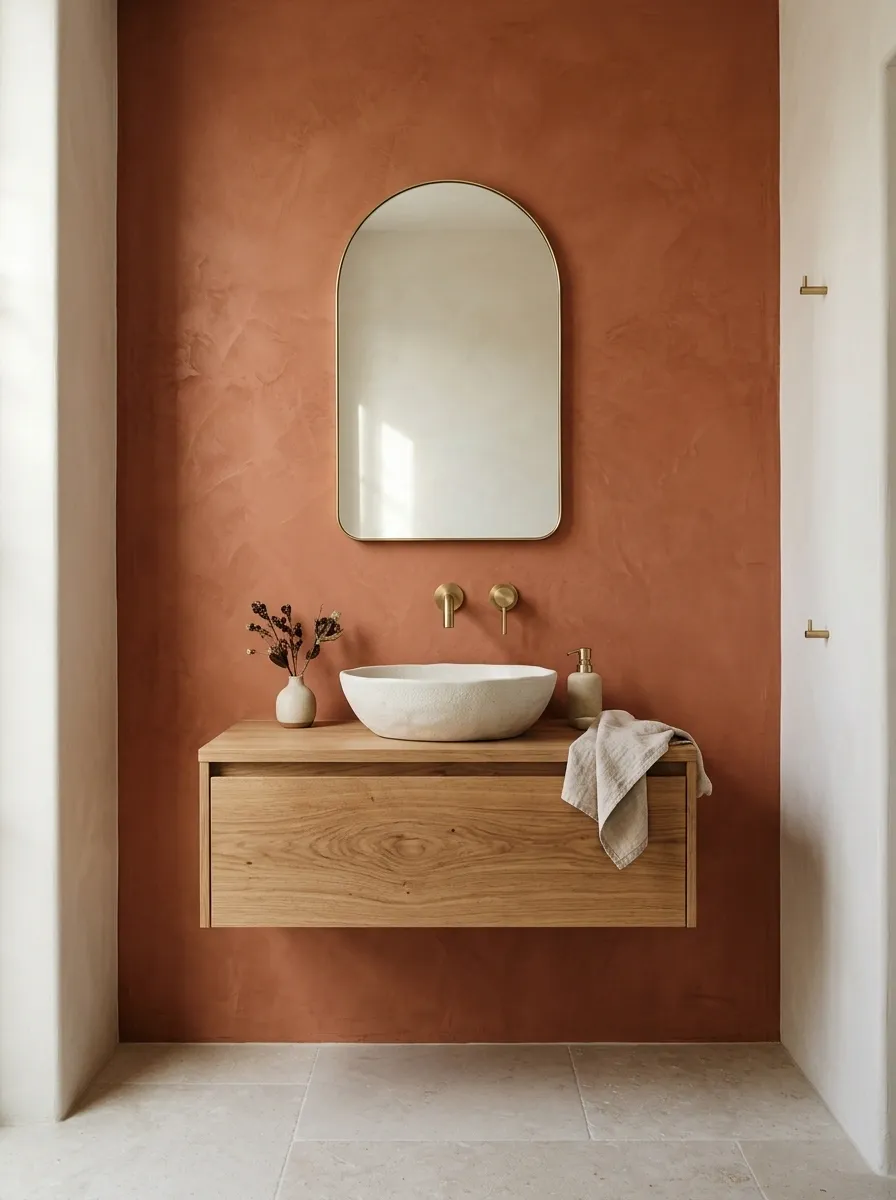
Terracotta brings warmth that plain beige walls simply can’t fake. A soft clay-colored, textured finish behind a floating oak vanity creates a warm focal point, especially when paired with an off-white basin, rounded mirror, and pale stone flooring.
The materials feel related without matching too perfectly. Oak adds natural grain, terracotta introduces color, and pale surfaces give both enough room to stand out.
Skip the orange-red accessories scattered around the room. The wall has already made the color statement, so repeating the same shade everywhere starts to look less intentional and more like a very committed pottery collection.
Use a finish rated for its intended bathroom location. Decorative wall finishes are not substitutes for waterproofing systems in areas that require them.
Material chemistry
Rough. Smooth. Warm.
Clay
Matte color and tactile depth.
Oak
Visible grain and natural warmth.
Stone
A light, grounded counterpoint.
Design verdict: Let the wall carry the color. Let the oak carry the warmth. Let the stone stop everybody from getting carried away.
Dark Wood Slat Powder Room
Dark wood slats turn a compact water closet into a dramatic jewel box. Rich vertical paneling behind the toilet creates an intimate backdrop, especially when paired with a slim floating shelf, warm brass accents, and an illuminated mirror.
The moody finishes feel related without matching too heavily. Dark wainscoting frames the room, rich wood adds natural texture, and soft lighting gives the deep tones enough warmth to feel inviting rather than cavernous.
Skip the overly bright, clashing wall art that competes with the striking slat wall. The architecture is the main event here, so letting the textures speak for themselves is the smartest move.
Use proper waterproofing and ventilation behind dark wood features in enclosed spaces to keep the materials looking flawless for years to come.
Mediterranean Blue-and-White Tile Behind a Compact Vanity
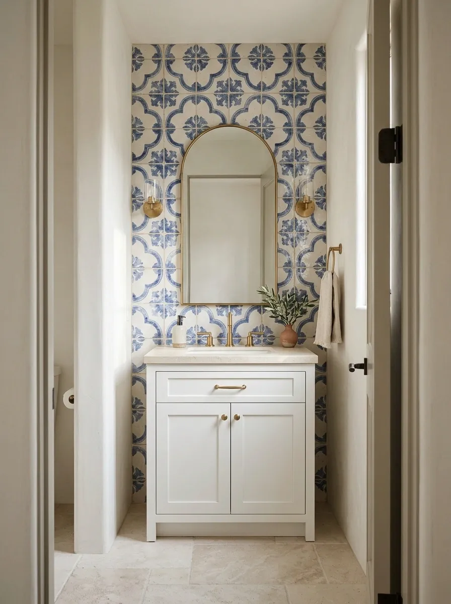
Blue-and-white patterned tile delivers an instant focal point, even in a bathroom with very little floor space. Traditional Mediterranean motifs bring movement to the vanity wall, while a simple white cabinet, brass fittings, and pale stone floor keep the room from becoming visually crowded.
An arched mirror softens the tile’s geometry, creating a useful contrast between the crisp pattern and the rounded silhouette. Keep other walls relatively plain so the tile reads as a deliberate feature rather than the beginning of an extremely competitive wallpaper convention.
Pattern scale matters here. Smaller motifs create a busier surface, while larger repeats can make the composition easier to read from the doorway.
Choose a grout color that supports the pattern rather than outlining every tile like it’s been called to testify.
Pattern control
The tile gets the attention. Everything else gets a supporting role.
Illustrative color rhythm, not a tile installation pattern.
Patterned wall
The hero surface.
Plain vanity
The visual reset.
Warm metal
The small contrast that ties it together.
Three competing patterns are not a Mediterranean requirement. The tile can carry the room without a committee.
Dramatic Dark Marble Accent Wall
Richly veined dark marble delivers an instant focal point, even in a powder room with minimal square footage. Dramatic stone motifs bring organic movement to the primary wall, while a simple floating basin and discreet metallic fixtures keep the room from feeling crowded.
A warm integrated light source softens the stone’s bold geometry, creating a striking contrast between the deep marble tones and the surrounding pale walls. Keep adjacent surfaces relatively plain so the marble reads as a deliberate feature.
Scale and placement matter significantly with natural stone. A continuous slab behind the fixtures makes a much stronger statement than a patchwork of smaller pieces.
Choose professional installation and proper sealing for marble surfaces in splash zones to preserve the intricate veining and luxurious finish.
Oversized Botanical Wallpaper With a Minimal Vanity
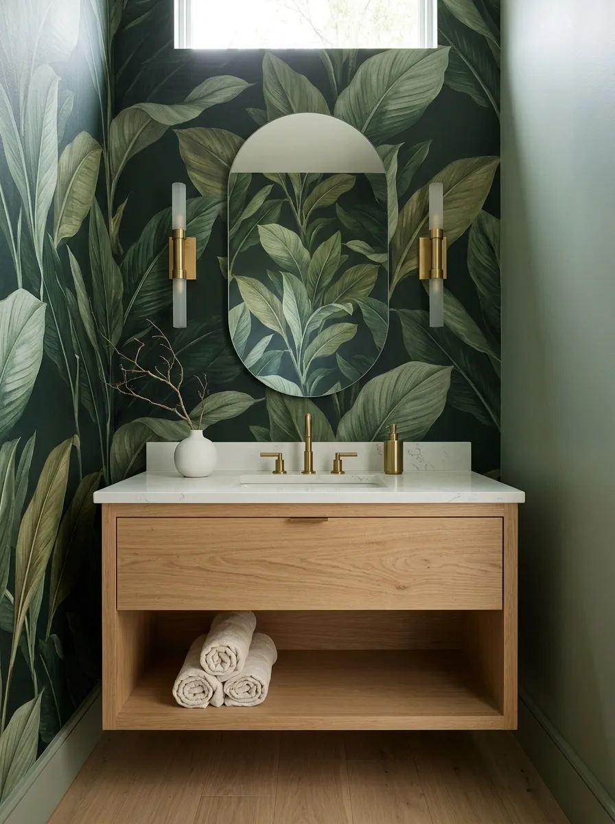
Oversized botanical wallpaper makes a small bathroom feel deliberate rather than decorated by default. Broad leaves create a dramatic backdrop behind a simple vanity, while an oval mirror and restrained brass lighting interrupt the pattern without competing with it.
A print with a deep green background can feel intimate and dramatic. A cream-based print with softer foliage produces a brighter, more relaxed result. Both work best when the surrounding finishes pull colors from the paper instead of introducing an entirely unrelated palette.
Placement is the practical decision that matters most. A vanity wall away from direct splashing is generally a more suitable candidate than a shower wall.
Choose wallpaper and adhesive suitable for the expected humidity. The bathroom doesn’t need to test whether decorative paper can develop waterproofing powers through positive thinking.
Wallpaper placement
Choose the wall. Check the splash zone.
Botanical paper needs a clear boundary and the right environment. Keep the dramatic print on an appropriate dry wall, rather than expecting wallpaper to survive a daily shower out of sheer determination.
Deep botanical
More drama, stronger contrast.
Light botanical
Softer contrast, brighter overall feel.
Continuous Woodland Toile Wallpaper
Continuous woodland toile wallpaper makes a powder room feel entirely intentional rather than decorated by default. Detailed foliage creates an immersive backdrop around the vanity, while a sleek black-framed mirror and classic brass fittings interrupt the pattern without competing with it.
A rich green print feels intimate and layered, producing a sophisticated result that works best when surrounding fixtures complement the palette instead of introducing an unrelated color scheme.
Placement is the practical decision that matters most here. A vanity wall away from direct splashing is generally a more suitable candidate than a high-moisture shower enclosure.
Choose wallpaper and adhesive suitable for bathroom humidity conditions so the intricate woodland scenery stays crisp and secure over time.
Blush Microcement Wall With Seamless Contemporary Fixtures
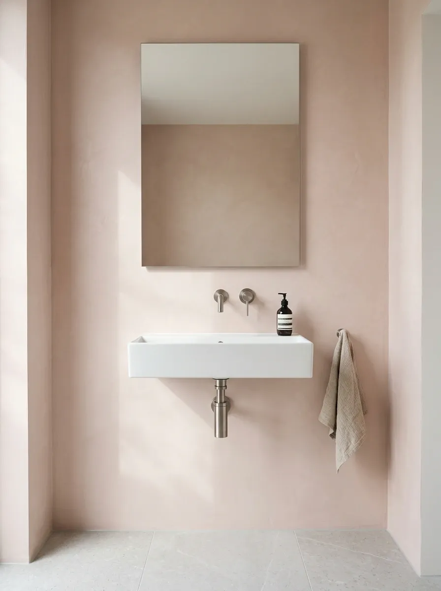
Blush doesn’t need flowers, scalloped mirrors, and pink accessories scattered across every available surface to justify its existence. A muted pink mineral finish behind a streamlined basin creates a softer, more architectural look.
The uninterrupted wall gives the eye somewhere to rest, while a frameless mirror, brushed nickel fittings, and pale grey flooring keep the palette contemporary. The absence of busy patterns is the point. Texture and subtle color shifts provide enough interest without filling the room with decorative extras.
The finish needs to be suitable for bathroom conditions and the specific exposure of the wall. Microcement systems vary, and their preparation, sealing, and installation requirements matter just as much as the color sample.
This design suits anyone who wants color without visual noise. Minimalism doesn’t have to mean living in a room that resembles an unfinished rental listing.
The tonal edit
Soft color. Clean lines. No decorative identity crisis.
Blush
The focal color
Warm stone
The transition
Soft white
The breathing room
Cool metal
The contrast
The finish should have subtle depth, not a high-gloss shine that makes every surface compete for the spotlight.
Vertical Fluted Tile Wall With a Floating Vanity
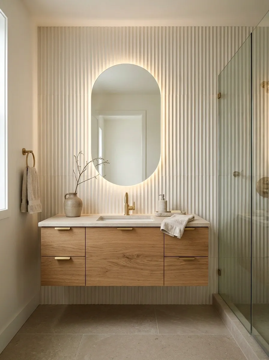
A wall with actual texture can make a small bathroom feel far more considered than a flat painted surface. Vertical fluted tiles give the vanity wall architectural depth without demanding a bold color or complicated pattern.
Pale ivory tiles create a clean composition behind a floating oak vanity, while a rounded mirror softens the repeated lines. Warm lighting along the mirror or vanity adds depth without turning the room into a nightclub with plumbing.
The vertical grooves draw attention upward. Keep the floor relatively smooth so the room doesn’t become a texture convention where every surface insists on being invited.
Choose fluted porcelain suitable for the wall’s location, particularly around splash zones. Deep grooves can collect residue, so an overly complicated profile may look better in a showroom than during actual cleaning day.
Texture, not clutter
The wall does the decorating.
Ribbed porcelain
Creates light and shadow.
Natural oak
Stops the palette feeling cold.
Plain stone
Gives the eye somewhere to rest.
Align the tile grooves with the vanity’s overall composition instead of letting every edge do its own thing.
Sea-Glass Zellige Wall With Light Oak and White Ceramics
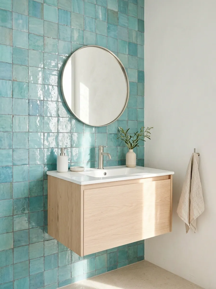
That blue-green tile that looks slightly different in every light? That’s the whole point.
Sea-glass zellige-style tiles bring subtle color variation, irregular edges, and small reflective shifts to a compact bathroom. Against a pale oak vanity and white basin, the turquoise feels fresh without looking like the entire room has been sponsored by a swimming pool.
Keep the surrounding walls warm white and the floor quiet. Chrome or brushed nickel fittings suit the cooler palette, while oak adds enough warmth to stop the bathroom feeling icy.
Handcrafted-looking tiles can vary considerably in texture and shade, so sample boards are worth checking under the bathroom’s actual lighting. Specify tiles, grout, and installation materials appropriate for the intended location.
The coastal color edit
Sea-glass color without the souvenir-shop energy.
Keep the blue-green
Let the tile remain the strongest color.
Warm up the edges
Oak and creamy stone soften the cooler palette.
Adding turquoise towels, aqua accessories, and a blue floor can take the look from sophisticated coast to aggressively themed beach rental.
Black-and-Ivory Geometric Tile With a Simple Pedestal Basin
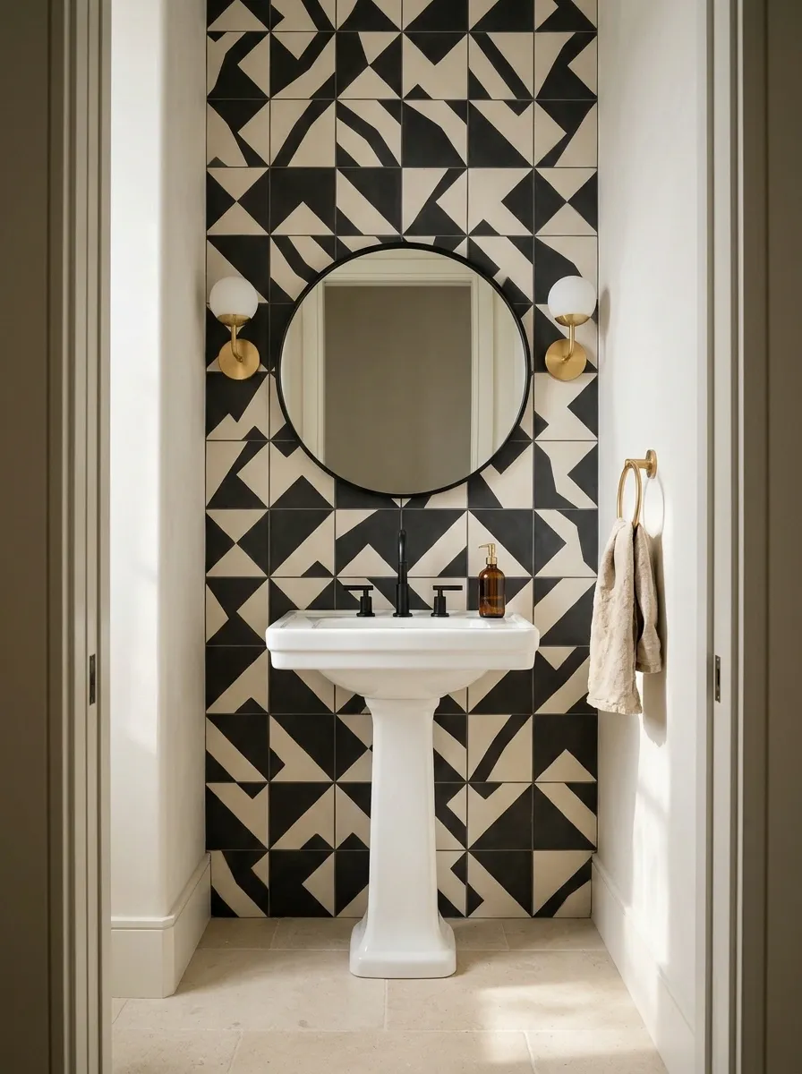
Some bathrooms need a little drama. Others need a therapist. This one gets the drama under control with a very deliberate black-and-ivory geometric wall.
The pattern creates movement behind a classic pedestal basin, while a black-framed mirror and restrained fittings tie the palette together. Keeping the remaining walls light allows the geometric surface to feel like an architectural feature rather than visual noise.
This treatment works particularly well in compact powder rooms, where a strong vanity wall can carry the entire design. In a bathroom with a shower, the tile and grout specification must suit the exposure and be installed over an appropriate substrate and waterproofing system where required.
Oversized geometry reads boldly from the doorway, while small repeated motifs feel busier up close. Choose the scale based on the actual wall, not just the close-up tile photograph that looked irresistible online.
Pattern versus breathing room
Contrast is great. Visual gridlock is not.
A simple pattern diagram, not a prescribed tile layout.
Patterned wall
High contrast and the visual anchor.
Plain pedestal basin
A simple silhouette against the pattern.
Unpatterned floor
A necessary pause for the eyes.
The pattern can be bold. The surrounding surfaces do not need to prove they have personalities too.
Dramatic Veined Marble Wall With an Integrated Basin
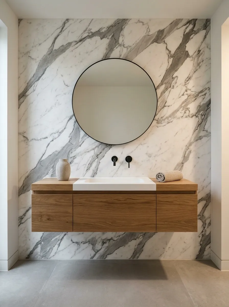
A dramatic marble wall can make a small bathroom feel considered and expensive without adding a long list of decorative details. Large-format marble or marble-look porcelain creates broad, sweeping veins behind a floating vanity, giving the eye one continuous composition rather than a grid of competing grout lines.
Keep the basin streamlined, the fixtures understated, and the floor comparatively quiet. If the wall has strong charcoal veining, repeating that contrast in a few small details is enough.
A black faucet, black mirror frame, and black accessories on every surface would be overkill. The marble has already secured the lead role.
Plan the direction of the veining and the position of visible joints before installation. Large slabs and porcelain panels have different handling, support, and installation requirements, so professional planning is especially important.
The stonework plan
Let the veining flow. Nobody needs a random stone interruption.
This is a visual planning sketch, not a slab-cutting diagram. Confirm the actual slab pattern, dimensions, and seams before committing to the layout.
Warm Wood-Look Slat Wall With a Minimal Spa Vanity
This is the bathroom equivalent of turning down the background music so the good parts become noticeable.
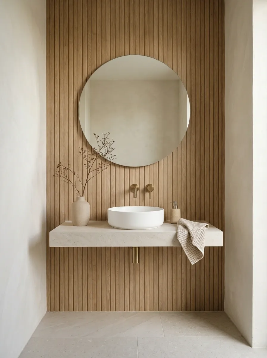
Vertical wood-look porcelain slats introduce warmth and rhythm, while a pale stone floor, simple white basin, and minimal mirror keep the room quiet. The combination borrows from Japandi interiors, where natural-looking materials and clean forms do most of the work.
A natural oak or muted honey finish pairs well with ivory walls and pale stone. Dark hardware can introduce definition, but it isn’t mandatory. Sometimes the smartest move is to let a few materials work together without inserting a dramatic black accent every six inches.
Wood-look porcelain also avoids some of the moisture concerns associated with untreated timber in bathrooms. The exact product, grout joints, installation method, and cleaning requirements still matter, particularly in areas exposed to regular splashing.
The Japandi edit
Less stuff. Better materials. Zero decorative panic.
Vertical grain
Adds rhythm and warmth.
Simple ceramics
Keep the composition calm.
Keep in mind: Use a bathroom-suitable wood-look product for the intended location. Actual timber slats need appropriate moisture protection and careful detailing.
Charcoal Concrete-Look Wall With Industrial Black Fixtures
Dark walls in small bathrooms get blamed for making everything feel smaller. Sometimes the real problem is poor lighting, a bulky vanity, and enough accessories to open a small hardware store.
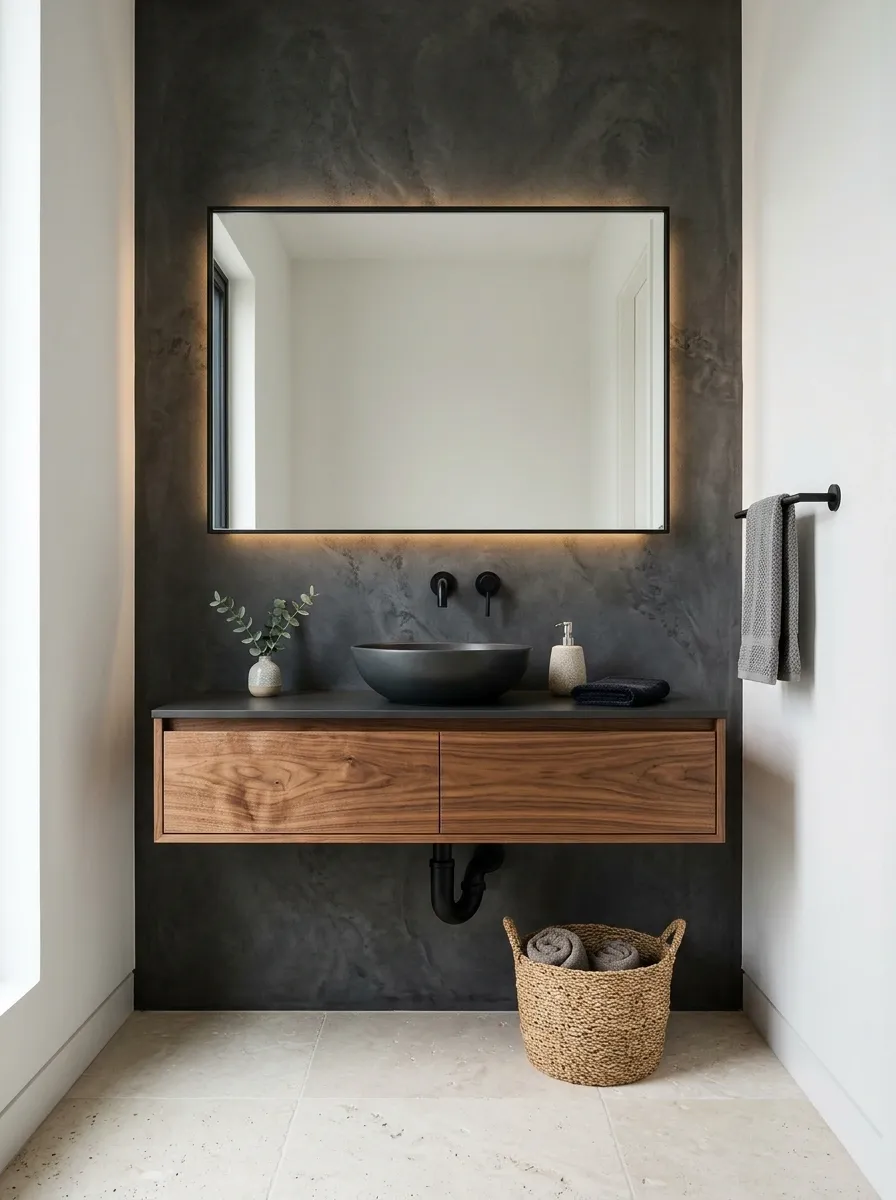
A charcoal concrete-look wall creates a strong architectural backdrop for a floating walnut vanity, matte black faucet, and simple rectangular mirror. The wood introduces warmth, while a lighter floor keeps the whole room from collapsing into one dark rectangle.
A subtle mineral variation gives the surface depth without introducing a busy pattern. Keep the remaining walls simple and choose lighting that illuminates the mirror and basin properly.
Dark finishes do show water spots, dust, and residue more readily than some lighter alternatives. Matte black fixtures look fantastic, but they aren’t exempt from cleaning just because the Pinterest photo forgot to mention housekeeping.
The dark-room equation
Moody doesn’t have to mean murky.
Charcoal
Sets the architectural mood.
Walnut
Adds warmth and natural grain.
Pale stone
Stops the palette feeling heavy.
Layered light
Keeps the vanity usable.
The goal is intentional contrast, not making the bathroom look like a power outage with excellent taste.
Terrazzo Feature Wall With Pale Oak Cabinetry
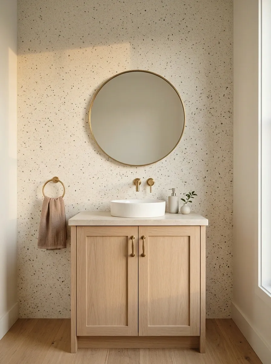
Terrazzo is the design equivalent of having several colors in the room without needing to coordinate a complicated collection of separate patterns.
A fine-speckled terrazzo wall gives the vanity area movement, with pale oak cabinetry and a simple white basin grounding the composition. Tiny flecks of rust, grey, sage, or muted pink can inform the rest of the bathroom’s palette, making the design feel connected rather than randomly assembled.
Small, subtle chips create a quieter surface, while larger, colorful aggregates make a stronger statement. In a particularly compact bathroom, a restrained pattern often has more staying power than a wall that resembles confetti at a very expensive party.
If terrazzo continues onto the floor, check that the two surfaces coordinate instead of competing. Using the same material everywhere can work, but the pattern scale and visual contrast need careful consideration.
Inside the terrazzo palette
The tiny flecks are doing more work than they look.
Illustrative aggregate and color placement
Dominant tone
Warm ivory or pale sand
Supporting flecks
Muted green, grey, and clay
Finishing partner
Plain oak or quiet white ceramics
Pull one or two colors from the terrazzo into the accessories. All five fleck colors do not need a separate towel, soap dispenser, and decorative object. This isn’t a roll call.
Art Deco Scalloped Tile Wall With Brass Details
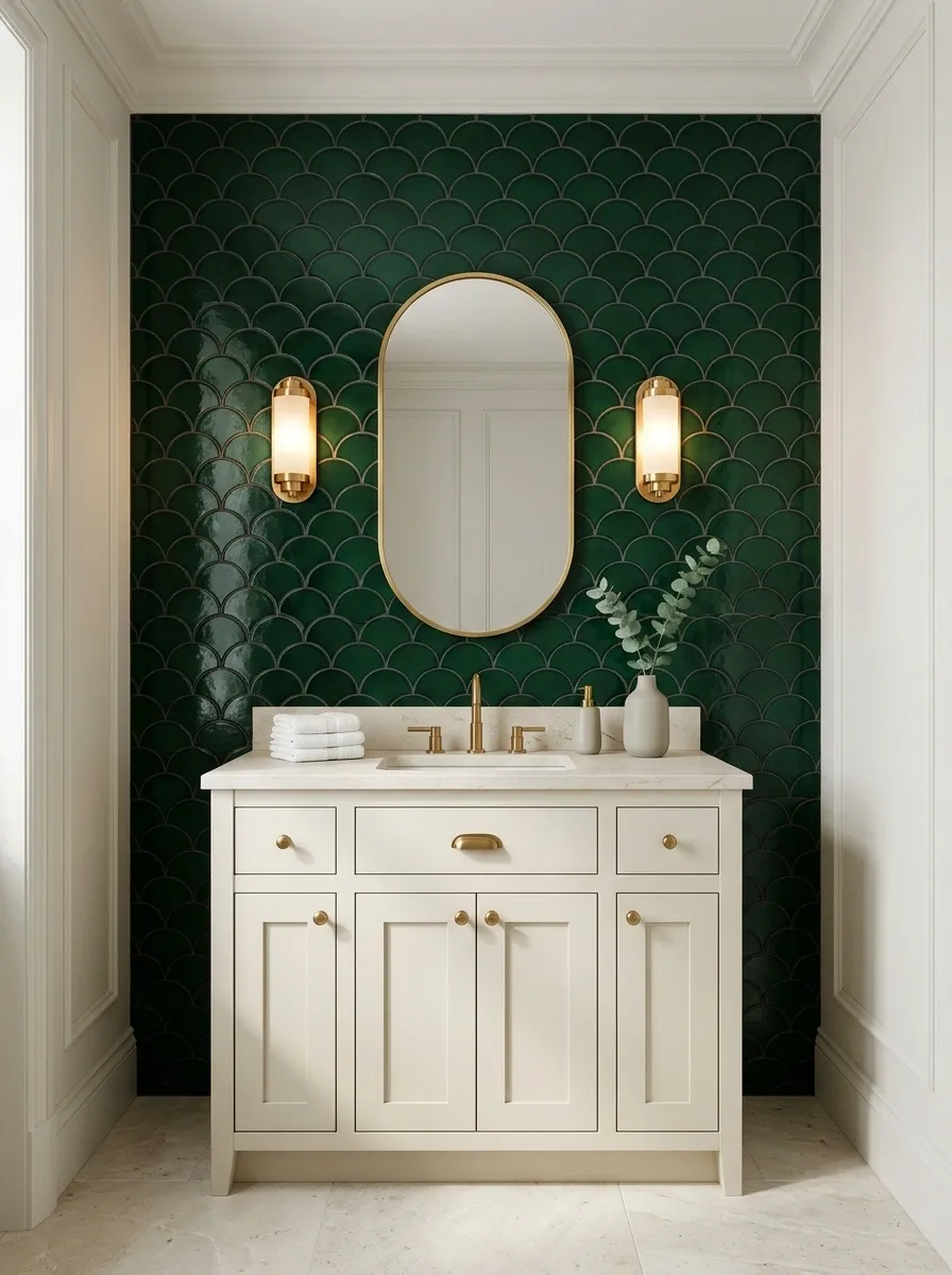
Straight subway tiles have had their moment. Scalloped tiles arrive with curves, a little vintage glamour, and absolutely no interest in pretending the bathroom is boring.
Deep green fan-shaped tiles create a dramatic focal wall behind a cream vanity. An oval brass mirror echoes the curved tile pattern, while warm sconces and a pale stone floor prevent the room from feeling too dark or ornate.
The scalloped edges already introduce plenty of movement, so the remaining shapes should be simpler. A rounded mirror is enough. Adding an ornate light fixture, a heavily patterned floor, and decorative wallpaper on another wall might result in a bathroom with more plotlines than a streaming drama.
Tile orientation changes the overall effect. Fans arranged consistently create rhythm, while a carefully planned border can make the wall appear more tailored. Decide on the layout before installation, especially around outlets, mirrors, and vanity edges.
A little Art Deco logic
Repeat the curve. Don’t repeat every decoration in the antique shop.
Illustrative repeating fan motif
Curved tile
Creates the decorative rhythm.
Oval mirror
Repeats the shape without copying the pattern.
Brass accents
Add warmth without adding another motif.
Plan the cuts around the mirror and vanity instead of leaving awkward slivers to ruin the grand entrance.
Vintage Floral Wallpaper Above White Wainscoting
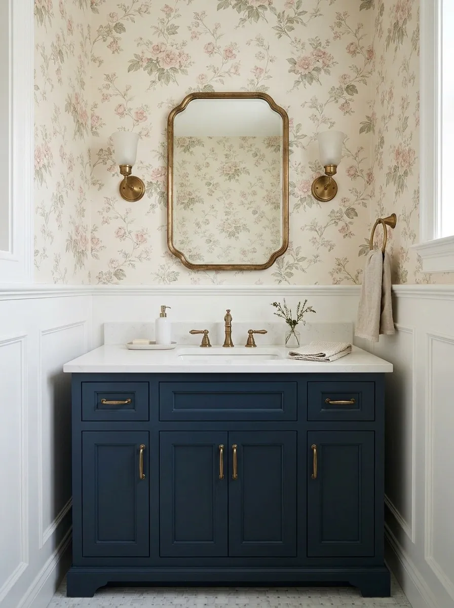
Floral wallpaper can make a small bathroom feel charming and collected, rather than like every finish was chosen during one exhausted shopping trip. The secret is giving the print a clear boundary.
Delicate flowers cover the upper wall, while white wainscoting creates a simple lower section. A navy vanity grounds the palette, and antique brass details introduce a little age and warmth.
The division between wallpaper and wainscoting breaks up the wall, prevents the print from dominating every sightline, and makes the room feel more architectural. Aligning the division with the vanity and surrounding trim helps it appear intentional.
Choose wallpaper rated for the room’s humidity and keep it away from direct water exposure unless the product and installation system are specifically designed for that location. Pretty flowers are not a waterproofing strategy.
The wall division
A floral print with boundaries. What a concept.
This is a conceptual wall-section illustration, not a fixed installation dimension. Set the boundary according to the room’s proportions, existing trim, and vanity height.
Emerald Green Square Tile With a Dark Vanity
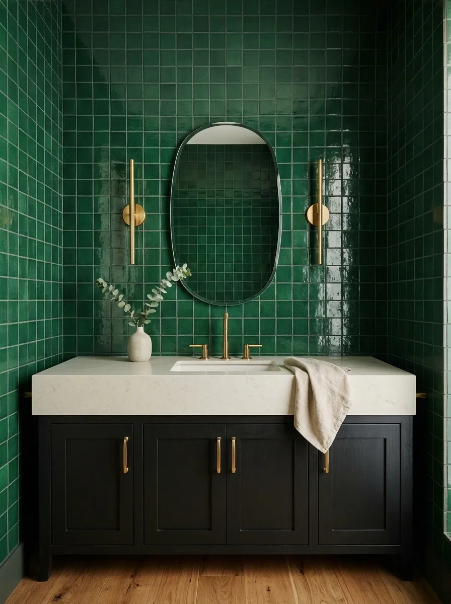
Emerald green square tiles bring serious character to a small bathroom. Paired with a near-black vanity, warm brass hardware, and carefully placed lighting, they create a rich jewel-box effect without relying on elaborate decoration.
A glossy finish catches reflections and adds movement, while a softer finish produces a more restrained, velvety look. Square tiles also have a satisfying visual rhythm, particularly when the grout color complements the green instead of outlining each tile in high contrast.
The trick with this dark palette is to maintain a readable focal area around the basin and mirror. Warm light and a pale countertop can prevent the vanity from disappearing into the wall.
A dramatic photograph is nice. Finding a contact lens in a dim bathroom is an entirely different design brief.
The jewel-box palette
Rich color. Warm light. A vanity that hasn’t vanished.
Emerald
The dramatic focal surface.
Dark cabinetry
Creates visual weight.
Brass
Adds a warm contrast.
Pale stone
Keeps the basin visible.
Don’t light the room with one tiny ceiling fixture and call it atmospheric. The mirror area still needs useful, flattering illumination.
Cream and Espresso Checkerboard Wall With a Pedestal Sink
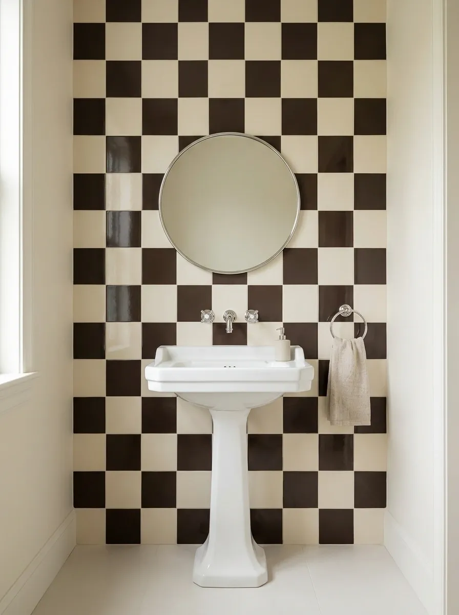
Checkerboard has a talent for making a small bathroom look intentional without requiring an entire design committee. Cream and espresso brown feel warmer and more sophisticated than stark black and white, particularly alongside traditional porcelain fixtures and polished chrome.
A checkerboard vanity wall creates a clear focal point, while a pedestal sink preserves visual space below the basin. A rounded mirror softens the rigid geometry, and simple cream walls stop the pattern from spreading into every available corner.
Large squares create a bold graphic effect, while smaller squares introduce a busier, vintage feel. Both can work, but the surrounding finishes should stay relatively quiet.
Pay attention to where the pattern meets the edges of the mirror and sink. Awkward partial tiles can make an otherwise good idea look like the installer ran out of patience.
The retro pattern edit
Two colors. One very clear point of view.
Espresso brown
Adds depth without the starkness of black.
Warm cream
Keeps the graphic contrast inviting.
Let the wall do the pattern work. A plain floor and uncomplicated mirror are not boring choices here. They’re the reason the checkerboard works.
Olive Textured Wall With a Limestone Lower Section
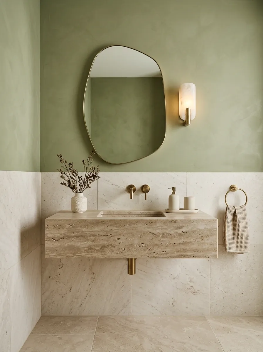
Olive green has a quieter personality than emerald, but it can bring just as much character to a small bathroom. A softly textured upper wall paired with pale limestone creates a layered composition that feels connected to natural materials rather than decorative trends.
The lower stone section gives the wall a visual foundation, while a floating travertine-look vanity and warm brass fittings reinforce the earthy palette. Cream ceramics prevent the olive from appearing too muddy, especially in bathrooms that receive limited natural light.
A clean horizontal transition creates structure, making the room feel more architectural than a single uninterrupted painted surface. Align the transition with the vanity, mirror, or existing architectural details where practical.
Actual limewash products vary in suitability for bathrooms, so the specified system and any protective treatment must match the intended location.
The material transition
Olive above. Limestone below. Drama kept on a leash.
UPPER WALL / OLIVE TEXTURE
LOWER SECTION / PALE STONE
The transition is a design decision, not an excuse to create a random stripe. Plan its height and finish details around the actual bathroom architecture.
Olive
Adds depth and earthy color.
Limestone
Lightens the composition and adds mineral texture.
Antique Mirror Tile Behind a Compact Pedestal Basin
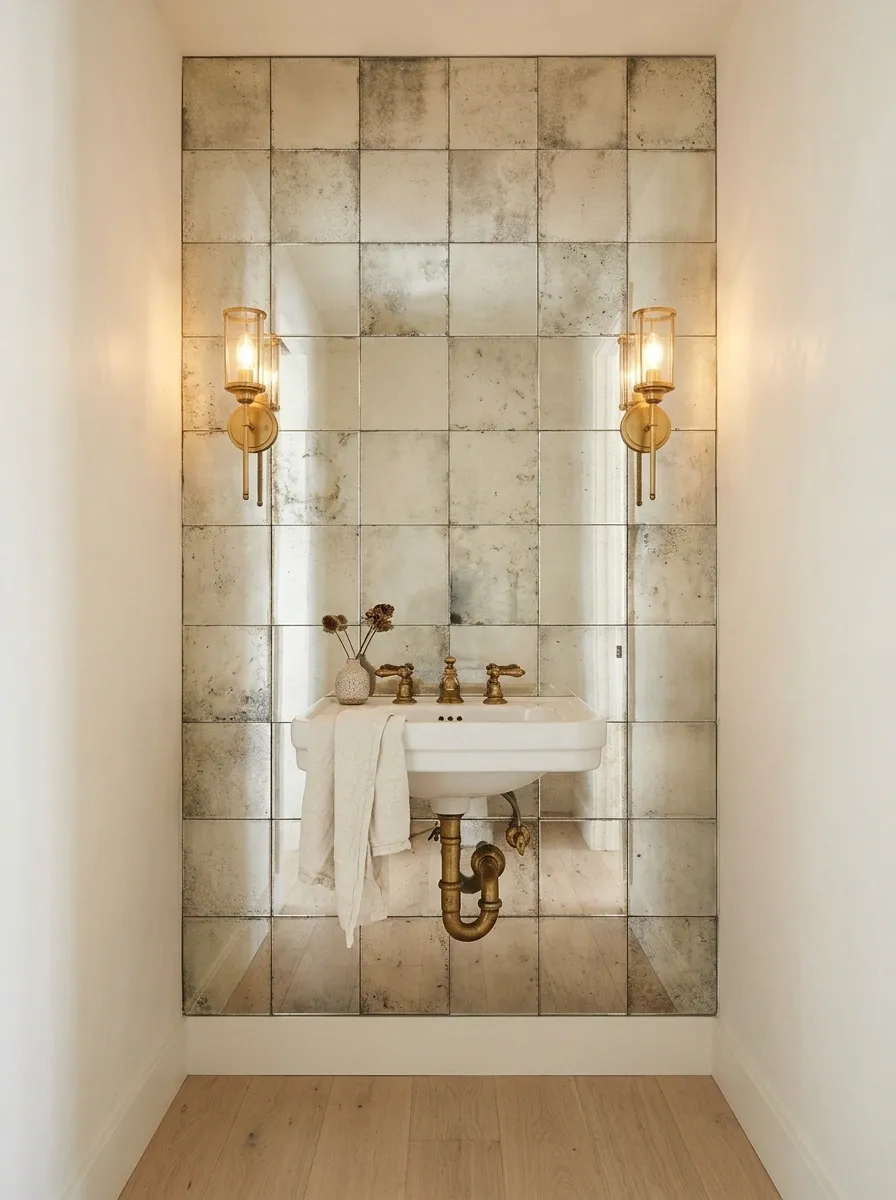
Ordinary mirrors are functional. Antiqued mirror tiles bring a little theatricality to the wall, with softened reflections that feel more like a vintage hotel than a standard bathroom renovation.
The reflective surface works particularly well behind a white pedestal basin, where it offsets the simple porcelain silhouette. Warm sconces and aged brass fittings introduce a golden tone, while ivory walls and pale flooring prevent the room from becoming too dark.
This design relies on reflection rather than a strong painted color or printed pattern. The mirror tiles catch light in irregular ways, adding depth without introducing another visual motif.
Placement is worth planning carefully. Multiple reflected light sources, visible seams, and awkward mirror cuts can quickly spoil the effect. Check what appears in the reflection from the doorway and basin, not just how the tiles look straight on.
The reflective-wall plan
A little reflection. A little patina. No funhouse surprises.
AGED SILVER
WARM PATINA
SOFT REFLECTION
Light placement
Use flattering illumination around the mirror and basin.
Tile alignment
Plan joints and edges before installation.
The aim is softened reflection, not a wall that accidentally turns the bathroom into a hall of mirrors.
Painted Sand-Colored Arch Framing the Vanity
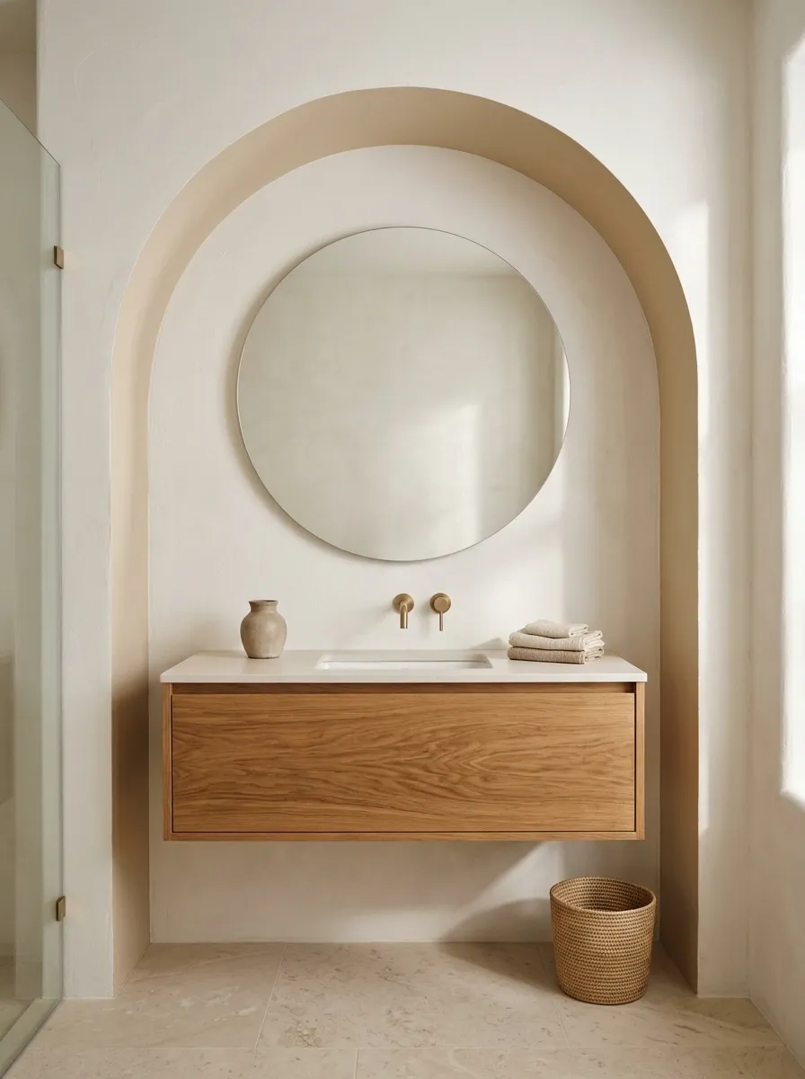
Not every accent wall needs tile, wallpaper, or an elaborate installation. Sometimes a precisely placed area of paint gives the room exactly the structure it needs.
A broad sand-colored arch frames the mirror and basin, creating a focal point against warm white walls. A floating oak vanity and pale limestone floor reinforce the natural palette, while the curved outline introduces softness without filling the wall with additional objects.
The effect depends on proportion. An arch that is too narrow can make the mirror and basin feel cramped, while one that extends too far beyond the vanity may look disconnected from the rest of the room.
This is also an accessible option for renters or budget-conscious updates, provided painting is permitted and the existing wall is in suitable condition. A well-planned shape can deliver a distinct visual change without introducing a new material at every turn.
The painted-arch study
A little geometry can do the job of ten accessories.
Concept sketch showing relationships, not installation dimensions.
Arch width
Relate it to the vanity and mirror.
Paint contrast
Use enough color difference for the shape to remain visible.
Empty space
Give the arch room to read as an architectural gesture.
The paint line needs a steady hand and a properly planned outline. Crooked curves are an accidental design style nobody requested.
Oxblood Stacked Tile With a Pale Basin
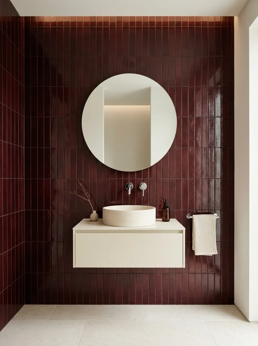
Burgundy is for bathrooms that have absolutely no interest in being forgettable. Deep oxblood tiles bring a rich, almost wine-colored intensity to the vanity wall, while a pale basin and light stone floor keep the composition from becoming too heavy.
The vertical stacking introduces a clean architectural rhythm. Instead of relying on a decorative motif, the wall gets its character from color, proportion, and repeating grout lines. Chrome fixtures provide a cooler contrast that stops the red-brown palette from feeling overly traditional.
Keep the vanity simple. A slim ivory cabinet or pale oak unit provides enough contrast without competing with the wall.
Adding red rugs, burgundy towels, and matching accessories everywhere would be like explaining a joke three times. The point has already been made.
The oxblood edit
One deep color. A very clean supporting cast.
Oxblood tile
The defining visual feature.
Pale ivory
Keeps the basin distinct.
Cool chrome
Offsets the warmth of the tile.
Vertical alignment gives the wall structure. Clean cuts around the mirror and basin keep it looking intentional rather than improvised.
Butter-Yellow Striped Wall With White Cottage Fixtures
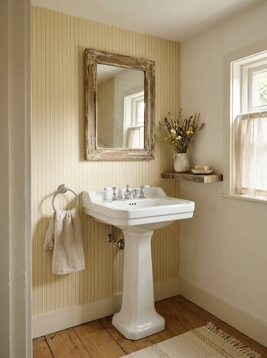
Butter yellow gives a small bathroom warmth without the intensity of mustard or the sweetness of bubblegum pink. Fine cream-and-yellow stripes create a gentle vertical rhythm behind a white pedestal basin, while a vintage mirror and simple chrome fixtures keep the design rooted in traditional cottage style.
The best version uses a muted yellow with a creamy undertone. A harsh, highlighter-yellow stripe would turn the bathroom into a school-supply aisle, which is not the nostalgic reference anyone requested.
Keep the stripe pattern to one main wall and avoid introducing another busy print. The visual rhythm is enough.
If wallpaper is used, choose a product and adhesive appropriate for bathroom humidity, and keep it away from direct splashing unless rated for that exposure.
The sunshine study
Yellow, but make it a grown-up decision.
Fine stripes
Introduce height and gentle pattern.
White porcelain
Keeps the cottage scheme crisp.
Muted wood
Adds a natural finish without extra pattern.
Sample the yellow in daylight and under artificial lighting. A small wallpaper swatch can behave very differently from an entire wall.
Muted Lavender Tile With Cool Contemporary Fixtures
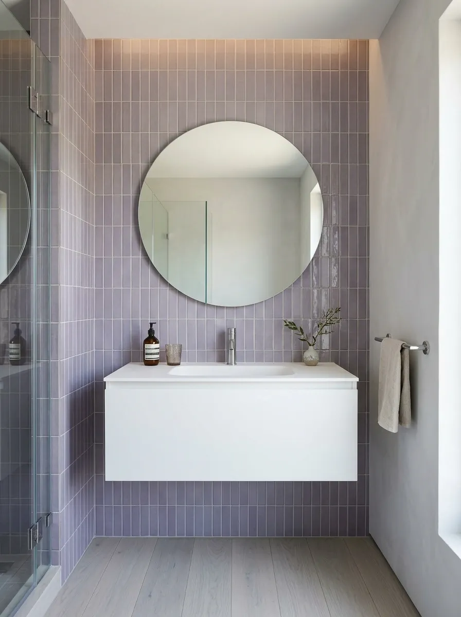
Lavender brings color into a bathroom without the visual weight of emerald, burgundy, or deep navy. Muted lilac tiles behind a white floating vanity create a softer contemporary look, particularly when paired with pale grey flooring, chrome fixtures, and a generously sized round mirror.
A dusty lavender feels restrained and architectural, while a brighter purple can push the room toward a more playful direction. The undertones need to make sense with the lighting and surrounding finishes.
A subtle variation in tile glaze can add depth without requiring an additional pattern. Let the tiles provide the color, and keep the remaining surfaces simple.
For a small bathroom with limited daylight, examine the sample in both natural and artificial light. Cool lighting can make lavender feel noticeably bluer, while warmer bulbs can pull it toward pink.
The lavender palette
Color with a softer voice.
Dusty lavender
Creates a distinct but subdued focal wall.
Soft white
Balances the colored surface.
Cool grey
Connects the tile to chrome fittings.
If the lavender already reads clearly as the focal color, stop there. A matching purple countertop would be a commitment worthy of a much longer conversation.
Brick-Effect Porcelain Wall With Loft-Inspired Finishes
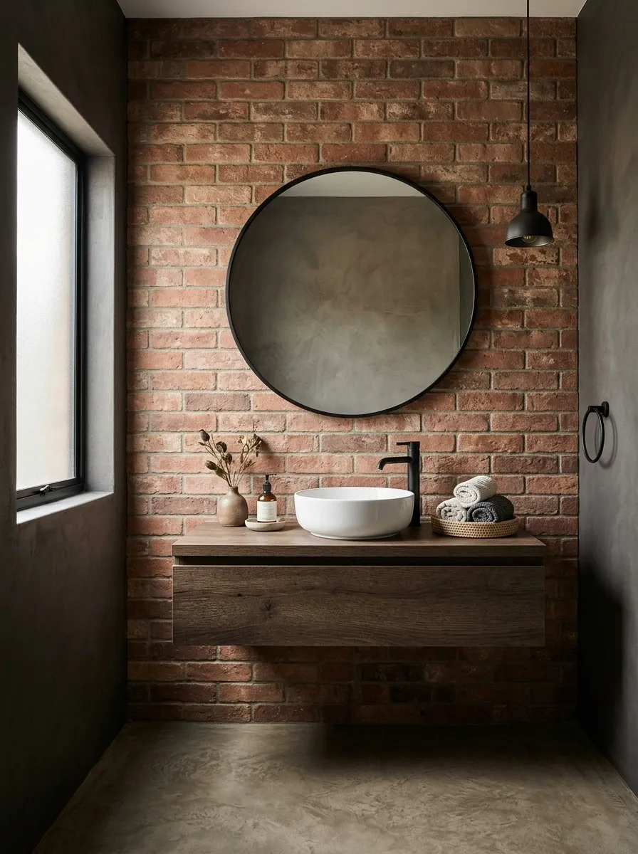
Exposed brick has plenty of character, but actual porous masonry isn’t automatically the smartest choice for a humid bathroom. Brick-effect porcelain offers a similar visual language with a surface intended for easier cleaning when the right product is selected.
A warm red-brown brick feature wall creates an industrial backdrop for a floating dark-wood vanity, black-framed mirror, and white basin. A concrete-look floor reinforces the loft aesthetic, while pale sanitaryware creates contrast against the textured surface.
The design looks best when the brick has natural variation without exaggerated orange tones or artificial-looking grout. Keep the vanity simple and resist adding distressed signs, oversized factory pendants, and every black metal accessory available.
Grout color and joint depth strongly influence the result. Confirm that the tile, substrate, grout, and waterproofing details suit the intended wall location.
The loft material study
Industrial character. Bathroom-appropriate materials.
BRICK EFFECT
CONCRETE LOOK
BLACK METAL
Porcelain wall
Provides a brick-like appearance with a cleanable tile surface.
Minimal fixtures
Keep the rougher visual texture from overwhelming the room.
Actual exposed brick and brick-effect porcelain are different materials with different moisture-management requirements. Similar appearance, different installation rules.
Ivory Wave-Relief Wall With Soft Side Lighting
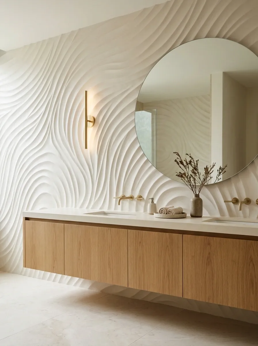
The final design proves that a bathroom doesn’t need a bold color or complicated pattern to make a statement. An ivory wave-relief wall creates movement through light and shadow, giving the vanity area a sculptural quality while preserving a restrained palette.
The raised surface becomes more noticeable when light travels across it from the side. A floating oak vanity introduces warmth, a rounded mirror softens the geometry, and a pale stone floor keeps the room visually connected.
This is a subtler approach than the patterned or dark-tile designs, but it isn’t visually flat. The texture does the work that color would normally handle.
Lighting placement matters more than usual. Direct, carefully positioned light can emphasize the relief, while uniform frontal lighting may flatten the surface. A very deep profile can also collect dust or residue, so the tile shape should be chosen with cleaning in mind.
The sculptural wall study
No loud pattern. Just excellent shadows.
Illustrative relief and shadow pattern.
Side lighting
Reveals the depth of each raised curve.
Ivory finish
Keeps the overall palette quiet.
Simple vanity
Allows the textured wall to remain the focal point.
Sample the tile with the intended lighting before installation. Texture that looks gorgeous under a side light may appear almost flat under ordinary overhead lighting.
Make the Accent Wall Work With the Whole Bathroom
An accent wall can be dramatic, colorful, textured, or almost invisible until the light hits it. What matters is how it relates to the rest of the room.
Sage beadboard and butter-yellow stripes bring cottage character. Emerald tile and charcoal concrete create a more dramatic atmosphere. Terracotta, olive, and warm wood establish an earthy palette, while sculptural ivory tile makes a statement without relying on saturated color.
Before settling on a finish, check the practical details. Consider water exposure, cleaning, lighting, grout, fixture placement, and how the wall meets the vanity and floor.
Those decisions might not be as exciting as choosing the tile, but they’re what help the finished design look intentional rather than hastily assembled.
Choose a complete look that suits the actual bathroom, then save the colors, material combinations, and layout for reference. The goal isn’t to make every surface interesting. It’s to make the whole room work