
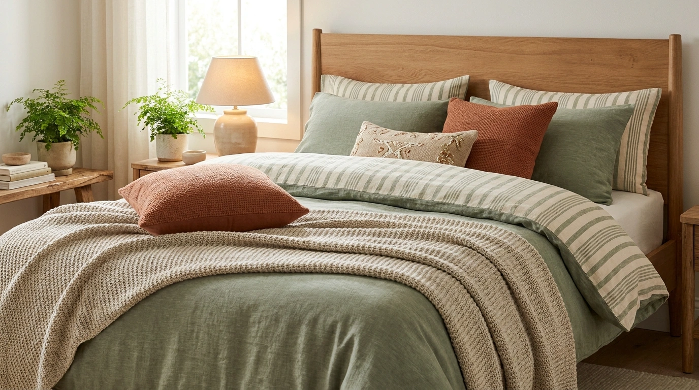
Striped bedding can look incredibly polished on its own and surprisingly chaotic once the rest of the bedroom joins the party. The duvet has stripes, the curtains have florals, the pillows have geometric patterns, and suddenly the bed looks like every fabric in the house got dressed in the dark.
The fix isn’t necessarily buying a different duvet. It’s choosing the right relationship between the bedding, furniture, wall color, lighting, and surrounding textures.
Blue-and-white stripes can make a bedroom feel crisp and relaxed. Burgundy bands bring depth to traditional furniture, while sage, cream, and natural wood create a softer, more understated look. Bold black stripes can even make a minimalist bedroom feel architectural rather than empty.
The Striped Bedding Reality Check
Striped bedding can look like a designer dream or like the bedding aisle lost a fight. Here’s what separates the two.
THE BEDROOM STYLE CHECK
STRIPES AREN’T THE PROBLEM.THE STYLING MIGHT BE.
A striped duvet can look like a designer dream or like the bedding aisle lost a fight. Here’s what separates the two.
Tiny stripes, calmer room.
Fine pinstripes work with textured throws, understated furniture, and even a subtle second print. Everything doesn’t need to audition for the lead role.
Wide stripes have main-character energy.
Give bold bands some breathing room with solid pillows, quieter walls, and simple furniture. The curtains don’t need a competing monologue.
Repeat a color, not the entire bedding set.
Pick one shade from the stripes and echo it in the artwork, rug, or curtains. Matching every single thing is a decor decision, not a legal requirement.
THE ACTUAL SECRET
Let the bedding set the tone. Let the rest of the bedroom support it. A room needs coordination, not a group project where every object insists on presenting.
Striped Bedding Ideas for Every Bedroom Style
Emerald Stripes With Unexpected Pink
Deep emerald green and white striped bedding makes a wonderfully confident statement, especially when paired with a rustic wooden headboard and crisp white sheets. The strong graphic pattern commands attention without needing a crowded room to back it up.
The real genius here is the unexpected addition of rich velvet and textured pink accents. Instead of playing it safe with matching green accessories, a touch of plush pink and deep jewel tones brings a playful warmth that keeps the scheme from feeling too severe.
Keep the surrounding decor simple so the bold stripes and contrasting cushions remain the undisputed star of the space. A neutral backdrop lets the vibrant color play unfold naturally without turning the bedroom into a circus.
Classic Blue and White Stripes With Natural Oak Furniture
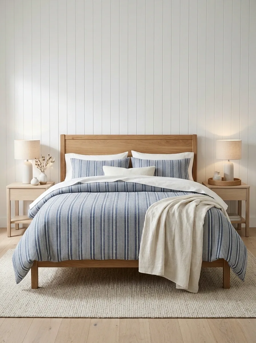
Blue-and-white striped bedding is a classic for a reason. Against white paneled walls and a natural oak bed frame, it creates a crisp look that feels tailored without becoming stiff.
White sheets, a cream throw, woven bedside accents, and simple lamps bring enough softness to stop the room from feeling like a very expensive sailing uniform.
The trick is to keep the blue consistent without turning the entire bedroom into a nautical gift shop. Skip the decorative anchors and boat-shaped accessories. The stripes already have the coastal-adjacent look covered, and nobody needs the theme explained with props.
This combination works especially well in bright bedrooms with pale wood flooring and uncomplicated furniture. The oak adds warmth, the white gives the pattern room to breathe, and the blue keeps everything from fading into one giant beige blur.
The color recipe
THE CLASSIC COMBINATION
Blue, white, and warm oak
Denim blue
The bedding pattern
Warm white
Walls and sheets
Natural oak
Furniture and warmth
Olive Pinstripes in Quiet Neutrals
Delicate olive-green pinstripes on soft cream linen offer a relaxed, earthy take on pattern that feels instantly grounding. Set against a warm neutral wall and paired with a cozy textured throw, the bed becomes a quiet sanctuary rather than a visual distraction.
The key to nailing this understated look lies in layering organic textures like raw wood and woven rugs. When the pattern is this subtle, mixing tactile elements prevents the neutral palette from reading as flat or uninspired.
Stick to a restrained color palette by keeping accent pillows close to the olive and sage family. A single vase with delicate greenery finishes the scene effortlessly, proving that tranquility often requires very little fuss.
Cherry Red Stripes for Cozy Mornings
Vibrant cherry-red striped bedding injects an undeniable burst of energy into a sunlit bedroom, pairing delightfully with casual white sheets and effortless everyday styling. The cheerful pattern feels fresh and modern rather than overly traditional.
Balancing the striking red requires keeping the surrounding walls simple and letting natural light wash across the textiles. A laptop or a quiet book left on the bed enhances the lived-in, approachable charm that makes this look so inviting.
Resist the urge to add matching red decor everywhere else in the room. Let the duvet hold the spotlight while neutral walls and warm wood tones provide a steady, calming foundation for the eye to rest.
Pink and Sage Stripes With English Country Florals
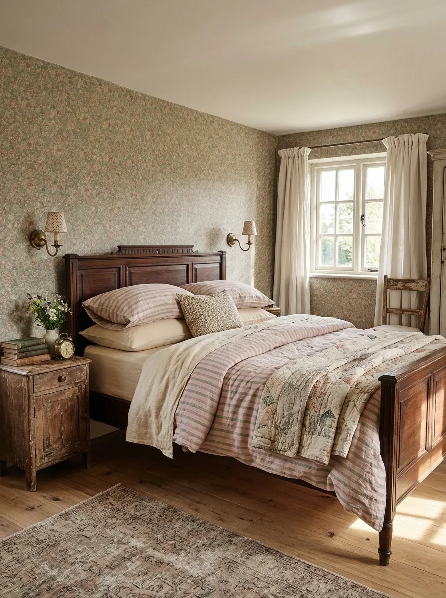
Pink-and-sage striped bedding brings a gentle dose of color to an English country bedroom, especially when paired with small-scale floral wallpaper, an antique wooden bed, and softly aged brass lighting. The palette feels collected and slightly nostalgic rather than sugary because the green tempers the pink.
A floral cushion or a faded quilt folded at the end of the bed adds another layer of pattern. The important part is scale. Let the stripes read clearly across the bed, then choose a smaller floral print for the surrounding textiles.
Large florals beside equally wide stripes can quickly make the room feel like every surface is trying to win an argument.
Warm cream sheets and muted wall colors help the different patterns settle into one composition. A room like this benefits from a little imperfection, so vintage wood and softly worn finishes feel more convincing than a collection of pristine matching furniture.
The pattern balance
THE ENGLISH COUNTRY MIX
Three patterns. One shared palette.
The visual reset
Use plain cream sheets or a solid throw between the patterns. Even a maximalist bedroom needs somewhere for the eyes to sit down.
Classic Monochrome Stripes With Graphic Art
High-contrast black-and-white broad stripes deliver a striking, architectural punch to a bedroom when paired with gallery walls, warm bedside lighting, and natural wood accents. The bold pattern creates a tailored focal point that immediately anchors the entire space.
The secret to making this graphic combination work is layering soft, textured blankets over the crisp duvet. A quilted or waffle-weave throw tempers the sharp lines, ensuring the bed looks comfortable and inviting rather than stark.
Maintain a curated aesthetic by sticking to a strict black, white, and natural wood color palette. When the foundational stripes do this much heavy lifting, the rest of the room simply needs to support the vision with quiet confidence.
Bold Black and Ivory Stripes in a Dark Modern Bedroom
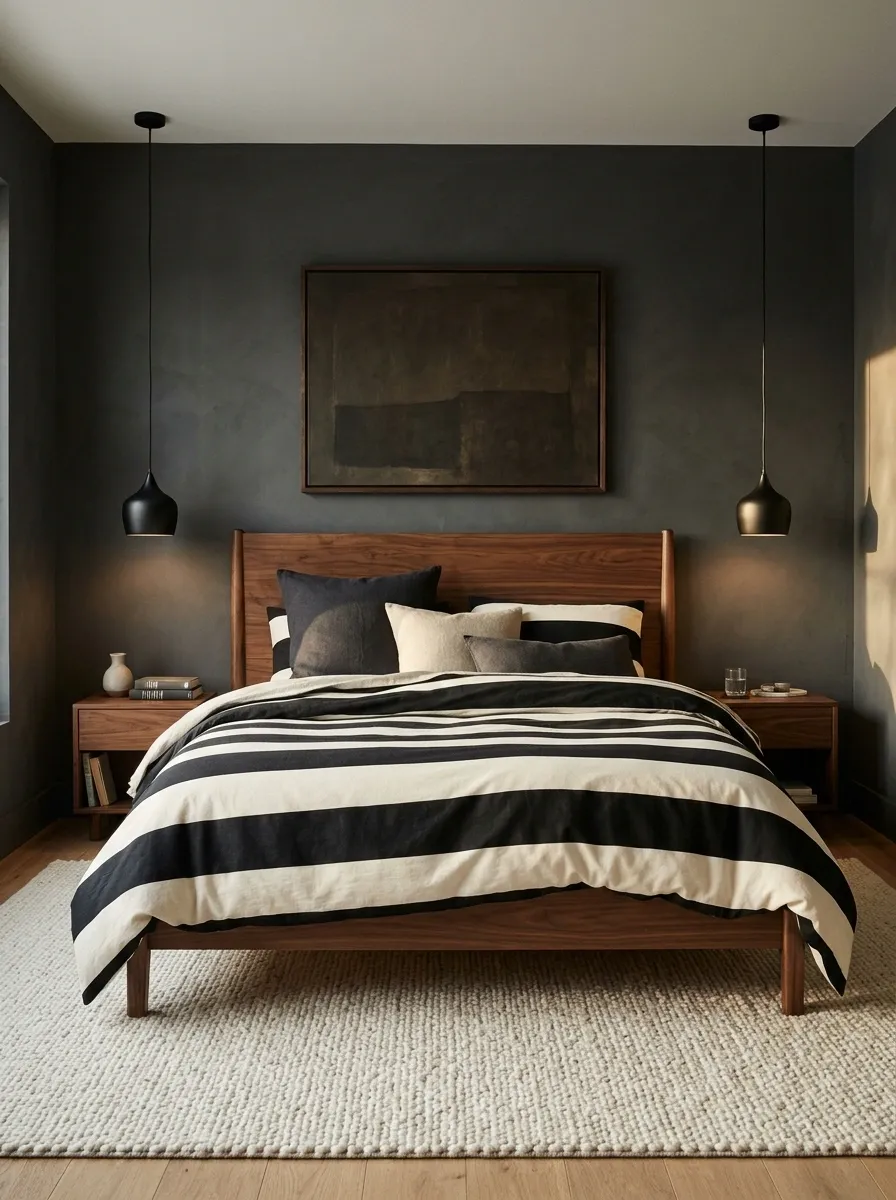
Broad black-and-ivory stripes give this modern bedroom a strong architectural focal point. A low walnut bed, charcoal walls, sculptural pendant lights, and simple bedside furniture make the pattern feel intentional rather than theatrical.
The ivory bands keep the bedding visible against the darker surroundings, while the warm timber stops the palette from becoming too cold.
The best part of this design is its restraint. The duvet already provides the graphic contrast, so solid cushions and a quiet rug work better than additional geometric prints. A little texture from linen or wool adds softness without making the bed look overly decorated.
This look works especially well with clean-lined furniture and uncluttered surfaces. Make sure the room has enough variation between dark and light finishes. Otherwise, the beautiful striped duvet can disappear into the room’s collection of black rectangles.
The contrast formula
DARK ROOM, CLEAR FOCAL POINT
Let the bedding break up the darkness.
Charcoal walls
Create the moody backdrop.
Ivory stripes
Keep the bed visually defined.
Walnut wood
Adds warmth to the contrast.
Grey Ruffled Linen in Soft Harmony
Subtle grey striped linen accented with dramatic black ruffled edges brings a romantic yet relaxed sensibility to a neutral bedroom. The delicate texture of the fabric softens the structured pattern, creating a deeply touchable and inviting surface.
Pile on extra pillows in matching tones and let a casual book rest on the duvet to emphasize the comfortable, lived-in aesthetic. The contrast between the soft grey body and the dark ruffles adds just enough definition to keep things interesting.
Keep the surrounding walls and decor in a restrained palette of chalky whites and warm creams. This allows the subtle variations in the linen to take center stage without competing with any unnecessary visual clutter.
Faded Blue Stripes in a Relaxed Coastal Bedroom
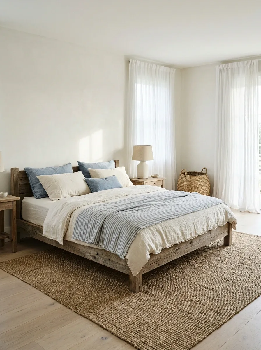
Washed blue stripes, rumpled ivory linen, pale timber, and breezy curtains create a coastal bedroom that feels relaxed rather than themed. The blue should look slightly faded, as though the palette has softened over time, instead of appearing so bright that the bed becomes the room’s only point of interest.
A weathered wood bed frame and a jute rug bring natural texture into the composition. Keep the nightstands simple, use white or warm ivory sheets, and let the curtains filter daylight across the room.
A single woven basket or a ceramic lamp is enough to finish the setting without making it resemble a beach rental staged for a brochure.
This design works particularly well with natural light and pale flooring. In darker bedrooms, introduce warmer whites and slightly deeper blue stripes so the entire arrangement doesn’t turn into one washed-out blur.
The sun-washed palette
Burgundy and Cream Stripes in a Parisian-Inspired Bedroom
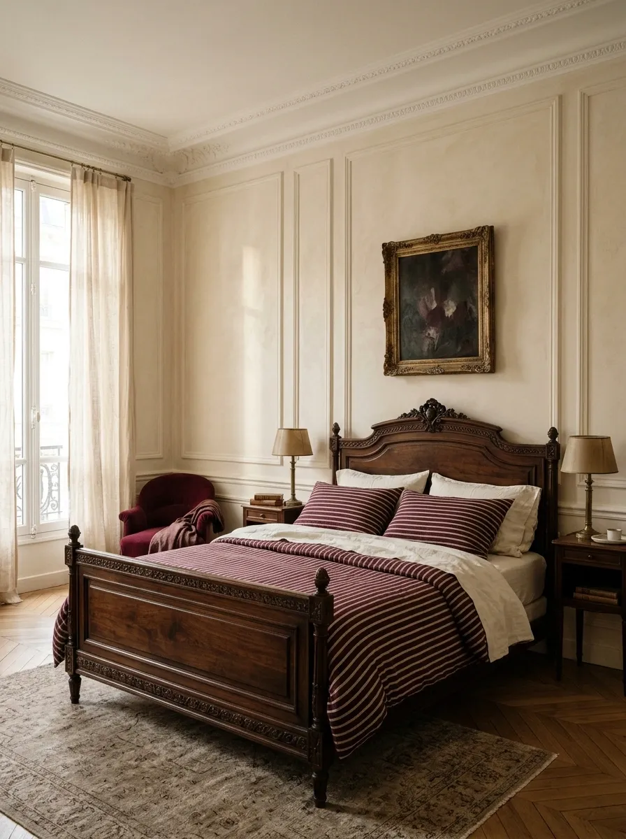
Burgundy-and-cream striped bedding gives a Parisian-inspired bedroom a richer, more collected look. Pair it with a carved antique bed, warm plaster walls, herringbone flooring, and aged brass bedside lamps.
A vintage painting above the bed completes the composition without making the room feel like a furniture showroom pretending to be an old European apartment.
The burgundy should be deep enough to stand apart from the creamy background. Repeat a little of that color in the artwork or a small upholstered accent, then leave the remaining surfaces relatively quiet. Dark timber already brings considerable visual weight, so there’s no need to add more dramatic finishes just because the mood board looks exciting.
This scheme works especially well in bedrooms with traditional architectural details, but simpler rooms can borrow the palette too. A walnut bed and warm white walls provide enough structure when ornate molding isn’t part of the rental agreement.
The color relationship
A RICHER BEDROOM PALETTE
Burgundy does the talking.
Burgundy
Bedding and one repeated accent.
Cream
Sheets, walls, and visual breathing room.
Dark timber
Furniture and architectural depth.
Keep the supporting colors warm. Stark white can make the burgundy look harsher than intended.
Fine Charcoal Pinstripes on a Minimalist Platform Bed
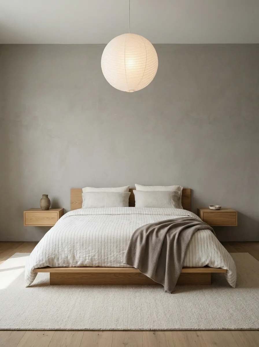
Fine charcoal pinstripes add just enough definition to an off-white duvet without disturbing the calm of a minimalist bedroom. Set the bed on a low oak platform, place it against a textured plaster wall, and use a simple paper pendant with one or two carefully chosen bedside objects.
The result feels considered rather than unfinished.
The key is proportion. Delicate stripes complement low-profile furniture and uninterrupted surfaces because neither element tries to dominate the room. A chunky patterned rug or a wall covered in busy artwork would undermine that balance pretty quickly.
Warm oak also matters here. Without it, the charcoal and off-white combination can lean cold, especially beneath cool artificial lighting. A wool throw in a solid taupe shade adds softness without introducing another pattern that needs its own personal space.
The proportion check
THE MINIMAL BEDROOM FORMULA
Small pattern. Low profile. Open space.
Fine pinstripes
Introduce pattern without visual noise.
Low furniture
Keeps the room’s silhouette horizontal.
Open wall space
Gives the bedding room to stand out.
Terracotta Stripes With Mid-Century Walnut Furniture
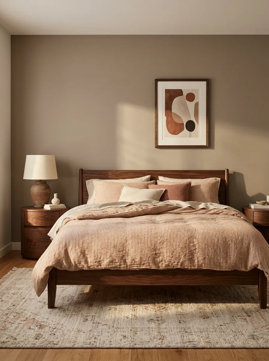
Terracotta-and-cream striped bedding brings warmth and a little retro personality to a bedroom furnished with walnut wood, rounded bedside tables, and vintage-inspired ceramic lamps. A muted clay wall color ties the scheme together, while a geometric rug introduces a second design element without competing directly with the duvet.
The palette works because each material plays a different role. The terracotta adds color, the cream softens it, and the dark walnut provides visual weight. Rounded furniture shapes reinforce the mid-century influence, so the room feels connected rather than assembled from a dozen unrelated shopping carts.
Keep the accessories restrained. A sculptural lamp or one framed print is more effective than filling every surface with retro collectibles. The goal is a finished bedroom with character, not a museum exhibit where the furniture has to explain its historical significance.
The warm-to-light color sequence
RETRO, WITHOUT THE COSTUME
Build warmth in three layers.
Clay stripes
The main color feature.
Cream textiles
Keep the palette light.
Walnut furniture
Ground the warmer shades.
Best supporting accent: muted olive or dusty rust in a small rug detail or piece of artwork. More orange everywhere is not a design strategy.
Narrow Vertical Stripes in a Small Apartment Bedroom
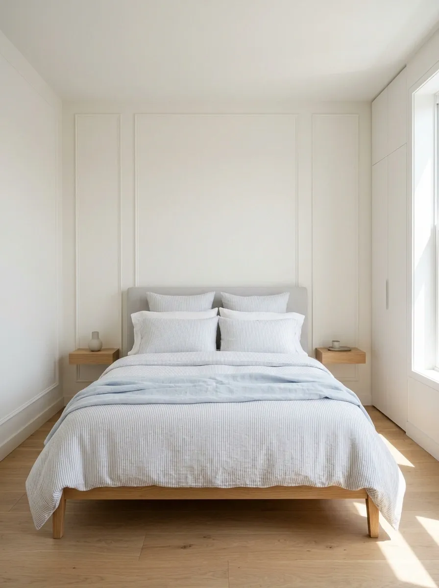
Narrow vertical stripes give a compact bedroom a crisp, orderly look without requiring bold colors or oversized furniture. Pale blue and white bedding works especially well with a slim upholstered headboard, light walls, and a bed frame that leaves as much usable floor space as possible.
Wall-mounted bedside ledges replace bulky nightstands, while a single pendant or wall light frees up the surface below. If the room also needs to accommodate a wardrobe or desk, keep the bedding pattern subtle and let the furniture layout do the heavy lifting.
Stripes can change the visual rhythm, but they cannot negotiate with a badly placed dresser.
This design is strongest when the bed remains easy to access on the sides that need to be used. A carefully planned small room will always feel more comfortable than one packed with mini furniture that somehow takes up all the available space.
The small-bedroom layout study
SMALL ROOM, BETTER FLOW
Give the floor space a job.
Prioritize the real measurements.
Measure the bed, door swing, wardrobe access, and walking route before buying furniture. A pretty layout that blocks a drawer is just a very photogenic inconvenience.
Forest Green Stripes With Cream Upholstery and Dark Wood
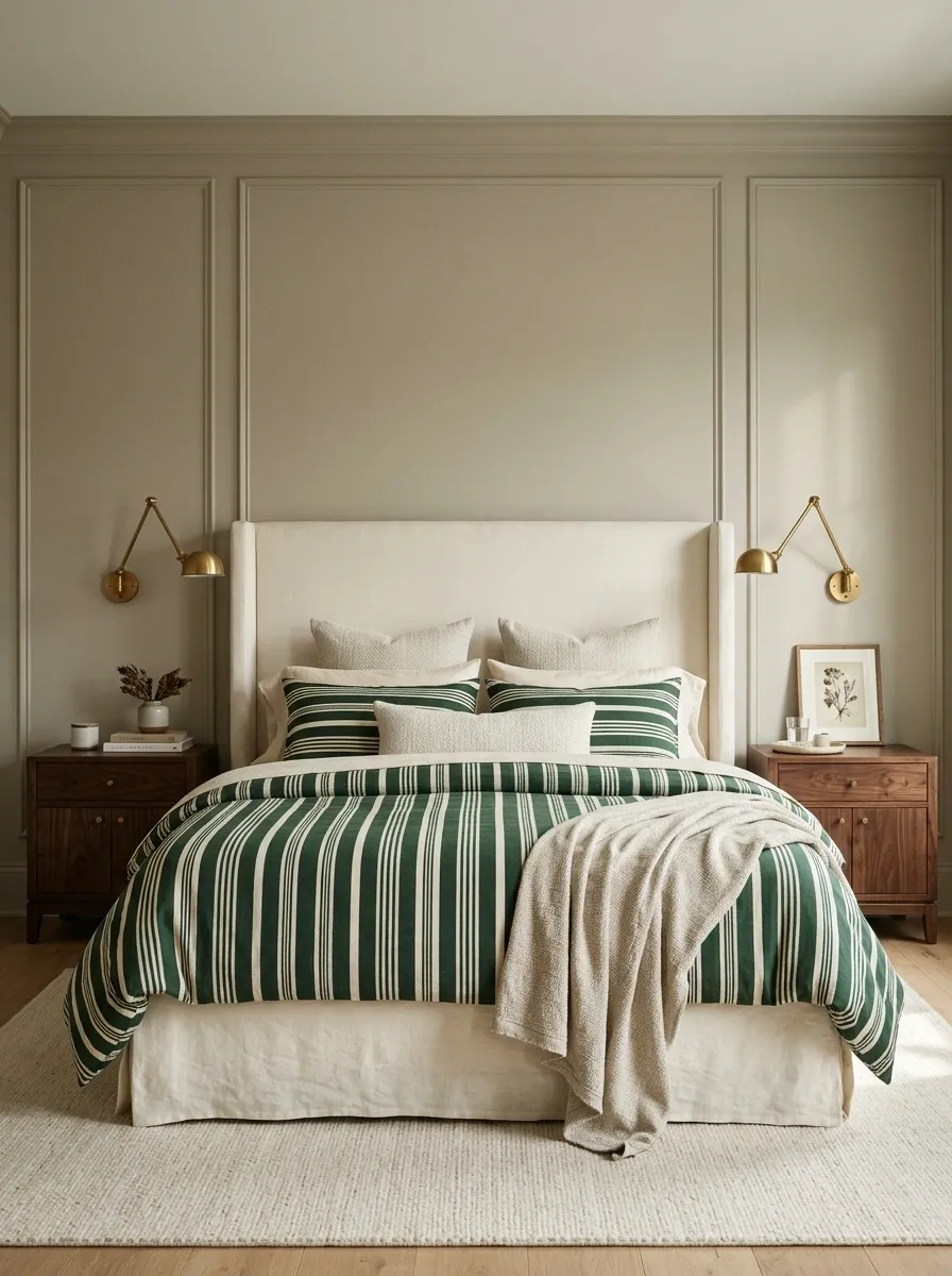
Forest-green stripes make a strong statement against a cream upholstered headboard, particularly when the bed is framed by dark walnut nightstands and warm brass reading lights. Muted wall colors let the green remain the main feature, while cream sheets soften its depth and keep the bedding from appearing too heavy.
The combination feels particularly balanced when the green appears in a concentrated area rather than spreading across every surface. A textured throw in a warm neutral adds another layer, and a small framed print can repeat a hint of green without creating a matchy-matchy situation.
This palette suits bedrooms that need a little more visual weight but still benefit from a light, upholstered focal point. The cream headboard creates a clear transition between the saturated bedding and the surrounding walls.
Without it, dark wood and green can become one uninterrupted block.
The light-to-dark balance
THE GREEN BEDROOM EDIT
One rich color. Two grounding finishes.
Forest green
Concentrated in the bedding and one small accent.
Cream upholstery
Separates the bed from the darker elements.
Dark walnut
Adds definition at the sides of the bed.
Keep the walls quieter than the duvet. The bedding is the focal point, not an invitation to paint the entire room the same shade of forest.
Multicolor Retro Stripes in an Eclectic Bedroom
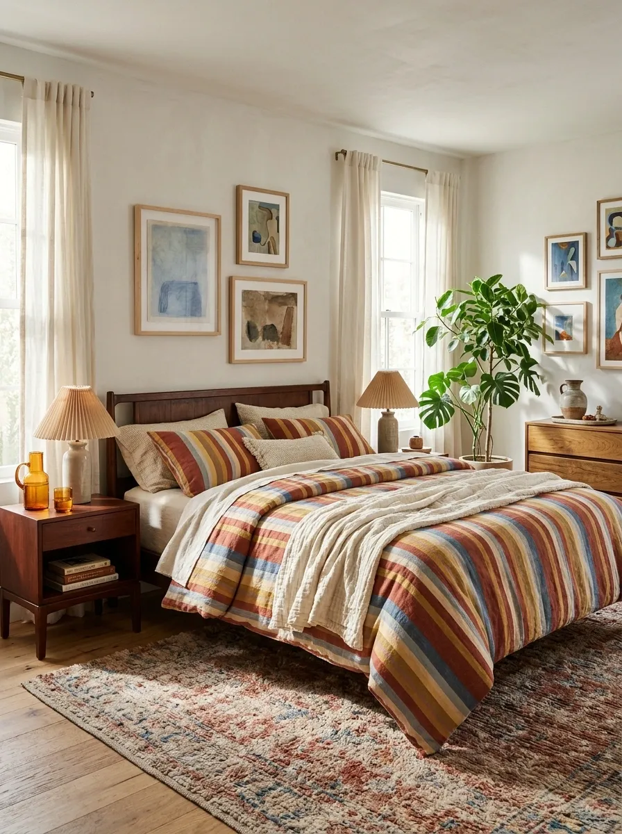
Warm red, golden yellow, faded blue, and cream stripes turn the bed into the star of an eclectic bedroom. Pair the duvet with vintage wooden furniture, colorful framed artwork, and a rug that repeats just two or three of the bedding’s colors.
The result feels collected and expressive without making every surface compete for attention.
The trick is choosing a clear color hierarchy. Let the duvet carry the full mix, then repeat selected shades elsewhere. A blue detail in the artwork and a little rust in the rug are enough. The entire bedroom doesn’t need to dress in matching stripes like it’s attending a very specific family reunion.
Vintage furniture adds character, while simple wall finishes give the pattern room to breathe. This is the kind of bedroom where color feels intentional instead of looking like a shopping cart with no adult supervision.
The color-pulling rule
THE ECLECTIC COLOR EDIT
Repeat a few colors. Not all of them.
The supporting cast
Choose two colors for artwork or rug details. Keep the larger furniture pieces in wood or another quiet finish so the bedding remains the strongest visual feature.
Design rule: the bedding gets the full rainbow. Everything else can show a little restraint.
Lavender and Ivory Stripes in a French Country Bedroom
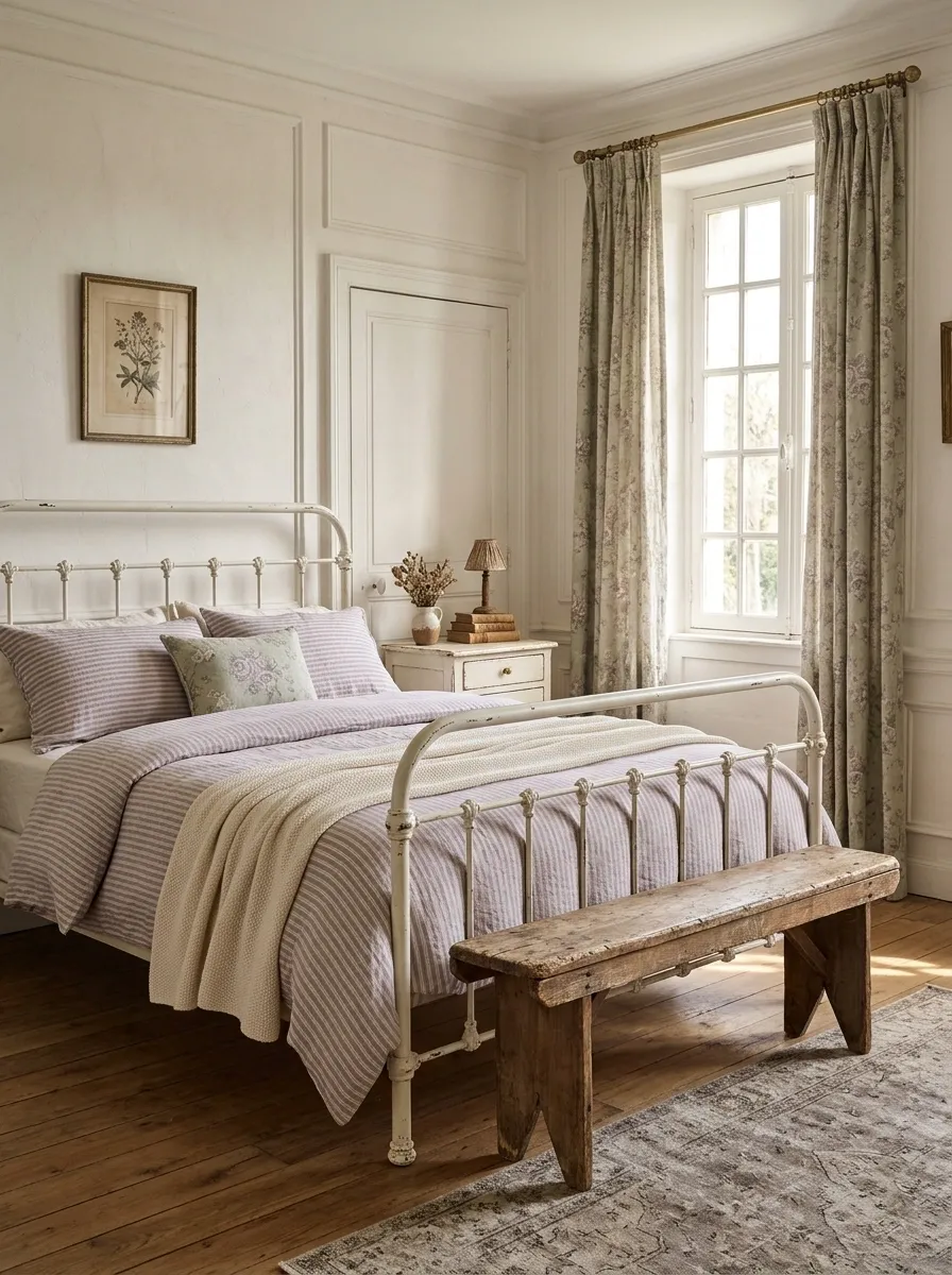
Lavender-and-ivory striped bedding gives a French country bedroom a gentle wash of color. An antique white iron bed, faded floral curtains, a painted bedside table, and warm natural flooring bring in the traditional details without making the room look like a display dedicated to doilies.
Choose a dusty lavender rather than a bright, sugary purple. The muted color works naturally with ivory fabrics and slightly aged furniture finishes. A floral cushion can introduce another pattern, but its scale should be smaller than the stripes so the bed remains visually organized.
Warm lighting and a simple cream throw help the lavender feel soft instead of cold. Keep metallic finishes understated, too. A little aged brass works beautifully, while highly polished silver can shift the room toward a different, more formal style.
The lavender layering plan
THE FRENCH COUNTRY PALETTE
Muted color, aged finishes.
Lavender stripes
The main color statement.
Ivory and sage
Soft supporting colors.
Aged wood
Keeps the room grounded.
Let the furniture look gently worn, not artificially distressed. The room is a bedroom, not an audition for a haunted château.
Navy and Tan Stripes in a Tailored Contemporary Bedroom
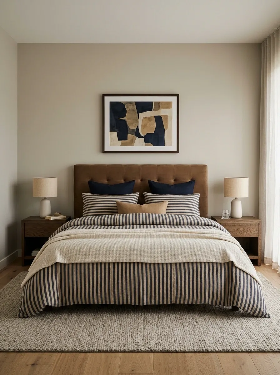
Navy-and-tan striped bedding gives a contemporary bedroom a structured, understated appearance. Pair it with a warm brown upholstered headboard, dark oak nightstands, neutral walls, and a solid textured throw.
The navy creates definition, while the tan softens the contrast and links the bedding to the wood and upholstery.
The combination feels particularly balanced when the stripes are medium-width rather than extremely fine. The pattern remains visible from across the room but doesn’t dominate every other detail. Simple bedside lighting and one restrained artwork piece complete the look.
Avoid repeating the navy on every available surface. A dark cushion, dark rug, dark curtains, and dark furniture can quickly drain the warmth from the tan. The point is contrast, not a bedroom where all the colors have apparently decided to stop speaking.
The contrast breakdown
THE TAILORED BEDROOM
Deep blue meets warm neutrals.
Butter Yellow Stripes in a Charming Cottage Bedroom
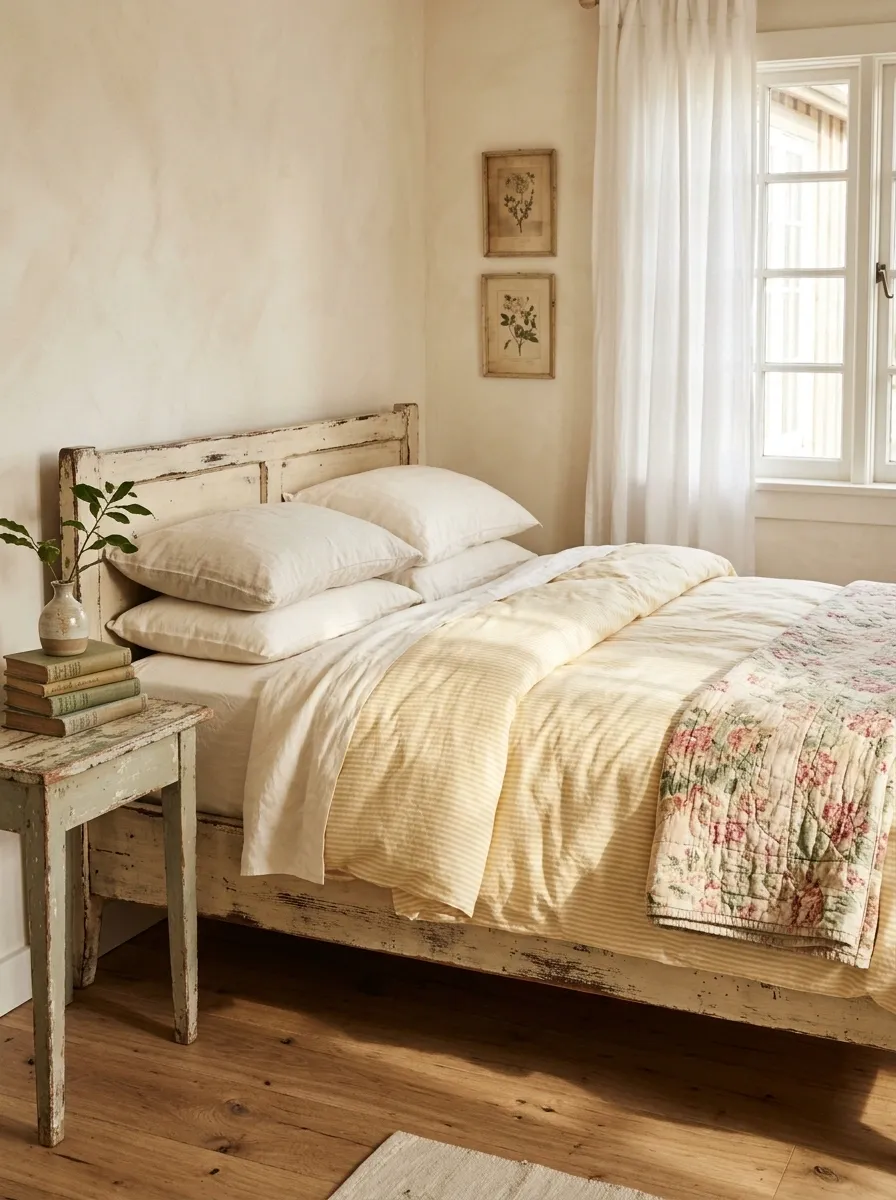
Butter-yellow-and-white stripes bring a gentle, cheerful color to a cottage bedroom. A painted wooden bed, faded floral quilt, vintage bedside table, and simple white curtains create a layered setting that feels relaxed instead of overly coordinated.
A pale yellow works best here because it adds warmth without becoming visually loud. Place a floral quilt at the foot of the bed and let its smaller pattern contrast with the stripes. The quilt can borrow a little of the yellow, but it doesn’t need to repeat every color in the room.
Natural wood, worn paint, and soft fabrics provide the cottage character. A few well-chosen accessories are enough; filling every surface with vintage trinkets makes the room look less collected and more like the contents of an antique shop fell off a shelf.
The cottage pattern guide
THE COTTAGE BEDROOM EDIT
Sunny stripes, quieter florals.
The balancing layer
Use plain ivory sheets between the two patterns. Let painted furniture and natural wood provide the remaining texture instead of adding yet another print.
Deep Charcoal and Wine Stripes in a Moody Bedroom
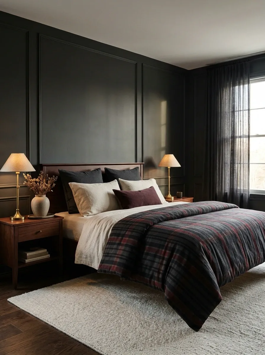
Deep charcoal stripes crossed with restrained wine-colored bands create a moody bedroom with plenty of visual depth. Pair the bedding with dark painted walls, mahogany furniture, warm bedside lamps, and a softly textured rug.
The combination feels intimate and layered because the warm red undertone breaks up the cooler charcoal.
Lighting matters more than the number of dark accessories. A pair of warm lamps can reveal the bedding’s texture and keep the darkest finishes from merging into one flat background. Choose sheets in muted ivory or a soft mushroom shade if the bed needs a little separation from the duvet.
The mistake to avoid is using the exact same near-black shade on everything. The room needs subtle differences in tone, texture, and reflectivity. Otherwise, the result is less sophisticated bedroom and more an elaborate tribute to darkness.
The dark-room balance
THE MOODY BEDROOM PALETTE
Dark doesn’t have to mean flat.
Wine-colored stripes
Bring warmth to the charcoal background.
Soft ivory sheets
Reveal the bed’s outline and layering.
Warm light and wood
Stop the darker palette from feeling lifeless.
Muted Olive Stripes in a Scandinavian Bedroom
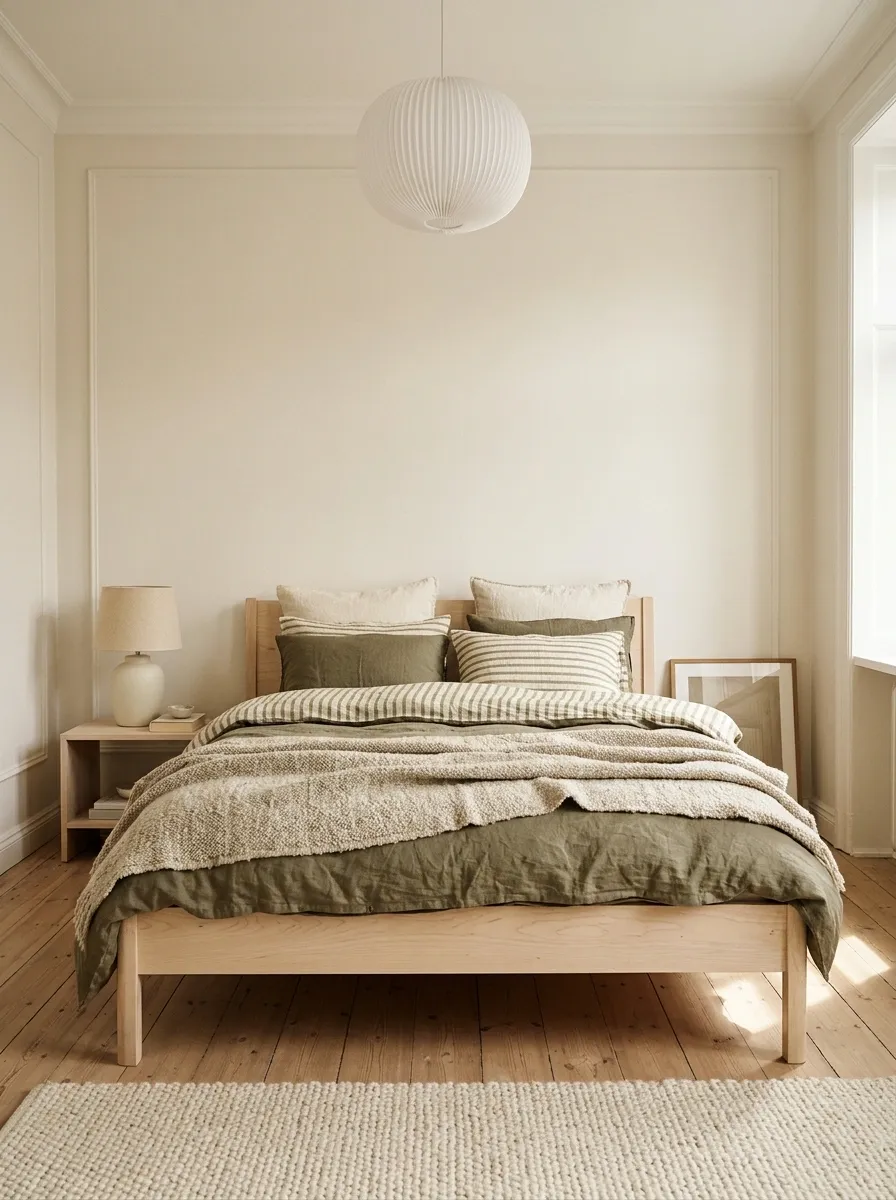
Muted olive-and-cream stripes bring a little color to a Scandinavian bedroom without interrupting its clean, relaxed character. Pair the bedding with pale birch furniture, white walls, a simple pendant, and a chunky wool throw in a warm neutral.
The olive adds depth, while the lighter stripe keeps the duvet from looking too heavy against the pale surroundings.
The furniture should have straightforward shapes and visible natural grain. A plain oak or birch bed frame works better here than an ornate headboard, which would introduce an entirely different design language. Keep accessories functional and limited, but don’t strip away every trace of personality.
A ceramic lamp, textured rug, or framed print can make the room feel lived-in without creating clutter.
Olive is particularly effective when the surrounding neutrals lean warm rather than icy white. That small temperature difference helps the bedroom feel comfortable instead of resembling a furniture catalog that has never encountered a human.
The Scandinavian material balance
THE NATURAL BEDROOM EDIT
Soft color. Honest materials.
Olive and cream bedding
Introduces gentle color without overwhelming the room.
Pale timber
Adds warmth and keeps the furniture visually light.
Wool and woven textures
Provide depth without adding another busy pattern.
Red and Ivory Stripes on a Traditional Four-Poster Bed
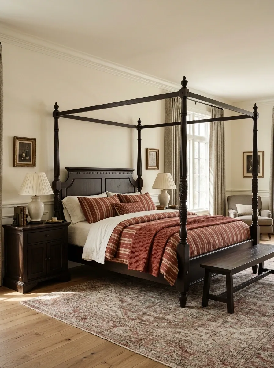
Red-and-ivory striped bedding gives a traditional four-poster bed a striking focal point. The strong timber frame already establishes the room’s character, so the stripes can bring in a fresher layer without requiring the rest of the decor to compete.
Add cream sheets, classic bedside lamps, substantial curtains, and a muted patterned rug to complete the composition.
The red should feel rich rather than fluorescent. A brick or softened crimson shade sits comfortably beside dark wood, whereas a very bright red can make the whole setup feel theatrical. Keep the curtain pattern more subdued than the duvet, particularly when the bed frame has carved details.
This design suits bedrooms with generous proportions and traditional furniture, but it can also work in a simpler room with a wooden four-poster frame. Let the shape of the bed supply the drama. The accessories can stop trying so hard.
The visual hierarchy
THE TRADITIONAL BEDROOM
Give the bed its moment.
The order matters: architectural frame first, bedding second, supporting patterns third. Three leading actors would make for a very exhausting bedroom.
Oversized Blush Stripes With Sculptural Modern Furniture
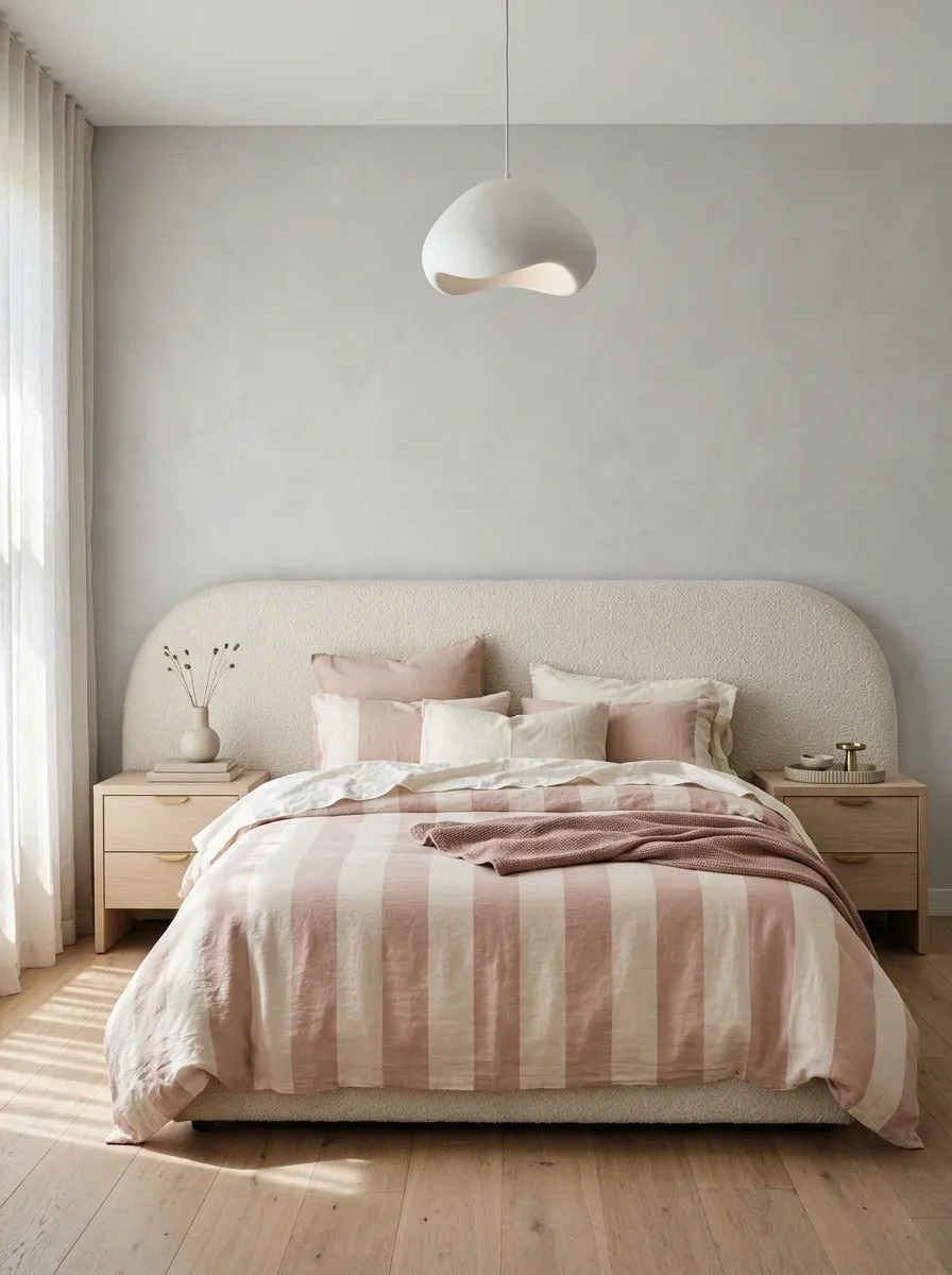
Wide blush-and-cream stripes make a contemporary bedroom feel graphic and soft at the same time. A curved upholstered headboard, pale oak bedside tables, and a sculptural pendant balance the straight lines of the duvet.
Instead of leaning into ornate pink accessories, the room uses shape and material to create interest.
The broad bands are important. Tiny pink stripes would make the bedding appear delicate, while oversized stripes give it a bolder, more architectural presence. Keep the sheets cream and add a solid taupe or muted rose throw only if another layer is needed.
Rounded furniture works particularly well because its curves interrupt the repeated lines across the bed. A simple wall finish completes the look without introducing another major pattern.
The stripe-to-shape relationship
THE SOFT-GEOMETRIC BEDROOM
Straight stripes. Rounded silhouettes.
Why the combination works
The duvet supplies repetition, while curved upholstery and softly shaped furniture interrupt that rhythm. Contrast in shape is more interesting than adding yet another print.
Black and Chalk Stripes in an Industrial Loft Bedroom
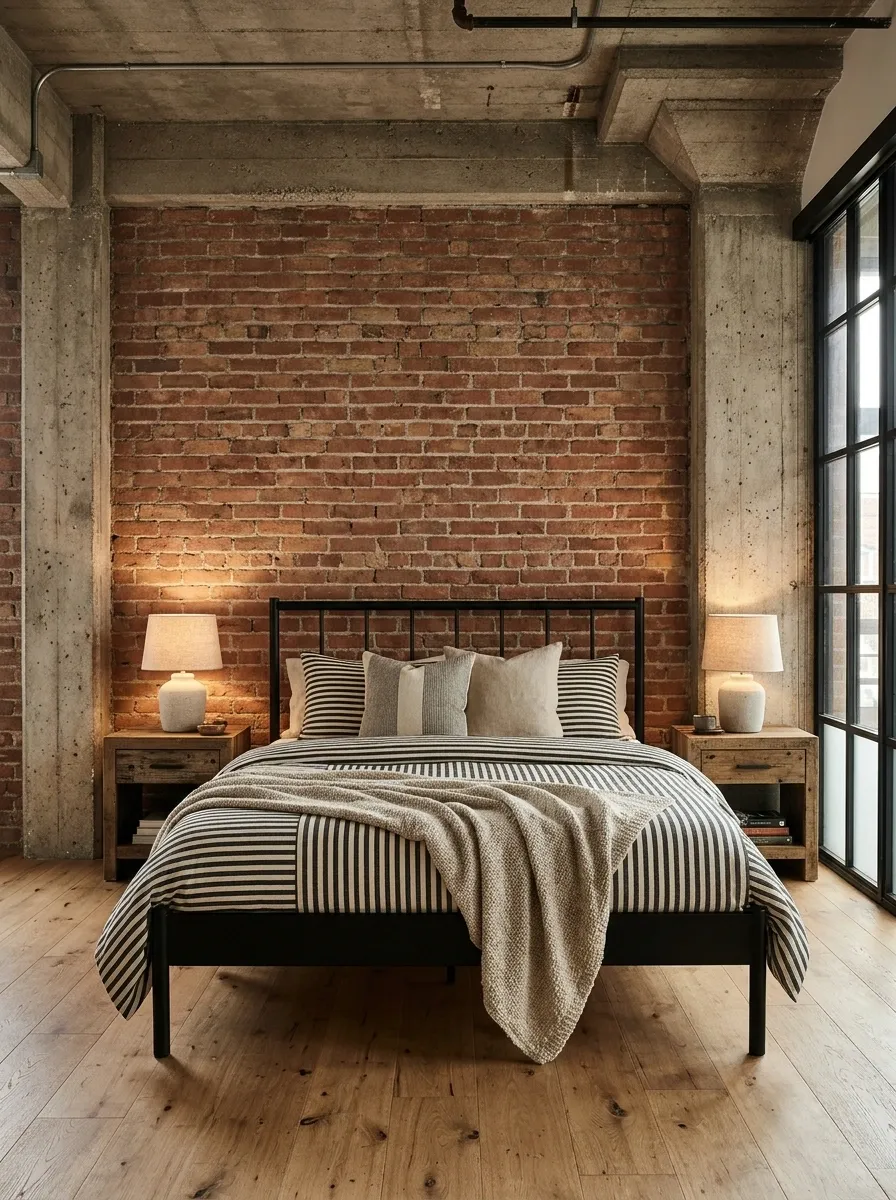
Black-and-chalk striped bedding brings a clean graphic element into a loft bedroom with exposed brick, concrete-textured walls, and a simple black metal bed frame. Reclaimed wood nightstands warm up the harder finishes, while soft lighting stops the room from looking like an unfinished commercial property.
The contrast between the regular stripes and rough architectural materials is what makes this design interesting. A textured throw or solid cushion in a warm neutral can soften the bed without introducing a competing print. Keep the surrounding furniture straightforward, and allow the brick or concrete to remain visible.
This style works best when industrial materials are balanced with things that actually feel comfortable. Too much metal, black paint, and bare concrete can make a bedroom feel cold.
The material contrast
THE LOFT BEDROOM EDIT
Hard finishes need soft counterpoints.
Pale Blue and Beige Stripes in a Fresh Guest Bedroom
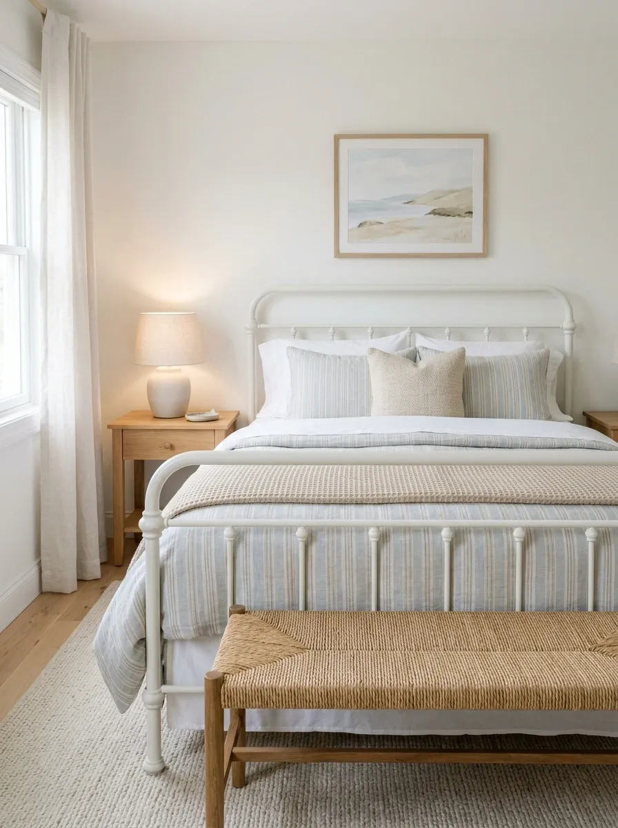
Pale blue-and-beige striped bedding gives a guest bedroom a finished appearance without making it feel overly formal. A white iron bed, simple wood furniture, a woven bench, and light curtains provide enough character while leaving the palette easy to live with.
Layer the duvet over plain white sheets and add a single beige throw at the foot of the bed. The contrast between crisp cotton and woven texture makes the arrangement feel thoughtful without turning the bed into a pillow showroom.
A framed landscape or understated artwork can tie in the blue, while a warm bedside lamp keeps the beige from looking flat.
This is a particularly useful design direction for rooms that serve multiple purposes. The bedding can make the space feel welcoming when guests arrive, but the furniture and restrained colors won’t fight with a desk, storage cabinet, or occasional work setup.
The guest-bed layering guide
THE GUEST BEDROOM FORMULA
Three layers. No pillow mountain.
Top: striped duvet
Middle: crisp white sheets
Finish: one textured beige throw
Keep the bedside surface useful, the lighting comfortable, and a little room available for a guest’s belongings. Styling looks considerably less impressive when there’s nowhere to put a phone.
Rust and Charcoal Stripes in an Earthy Japanese-Inspired Bedroom
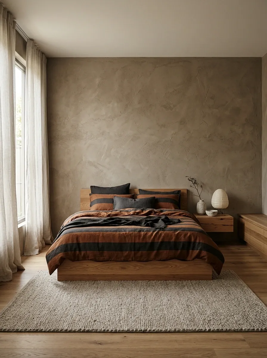
Rust-and-charcoal striped bedding creates a grounded, architectural look when paired with a low timber platform bed, an earthy plaster wall, and simple linen curtains. The rust introduces warmth, while charcoal adds definition without making the entire space feel dark.
A few understated ceramic objects and a softly textured rug complete the setting.
The key is to keep the furniture low and the surfaces relatively uncluttered. The horizontal lines of the bed reinforce the stripes, while the natural grain of the wood adds an irregular texture that keeps the composition from looking too rigid. Warm lighting brings out the earthy tones after sunset.
Skip the pile of decorative accessories. This design relies on the relationship between material, shape, and negative space. Filling every empty surface would defeat the point, and the bedside table doesn’t need a collection of objects to prove it’s employed.
The horizontal composition
THE EARTHY BEDROOM EDIT
Low lines. Warm materials. Less clutter.
Rust stripes
Provide earthy color and visual warmth.
Low timber bed
Reinforces the horizontal silhouette.
Open surfaces
Keep attention on the materials.
Keep the lighting warm and the accessories limited. The bedside table is allowed to have a peaceful existence.
Striped Bedding Layered With Florals in a Maximalist Bedroom
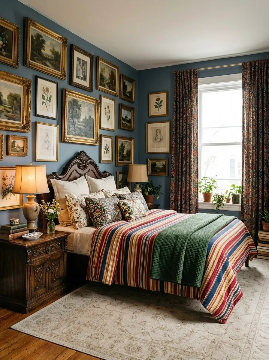
A striped duvet can anchor a maximalist bedroom filled with floral cushions, patterned curtains, vintage furniture, and colorful artwork. Red, blue, golden yellow, and cream create a useful shared palette, allowing different prints to coexist without competing at full volume.
Start with one dominant stripe pattern across the bed. Add florals in smaller areas, then use a solid-colored pillow or folded throw to break up the pattern. The room should have variety in scale, not five equally bold prints all shouting over each other.
Vintage wood and collected artwork reinforce the relaxed, layered character. Keep an eye on the rug, though. If the curtains, cushions, and bedding already contain strong patterns, a more restrained rug gives the room somewhere to settle.
Maximalism can be expressive without becoming a group chat where everyone types at once.
The pattern hierarchy
THE MAXIMALIST PATTERN MIX
Let one pattern lead the conversation.
The visual breathing space
Use solid cream or muted tan between the bold prints. Repeat only a few colors elsewhere so the bedroom feels connected.
Sage and Cream Stripes in a Relaxed Teen Bedroom
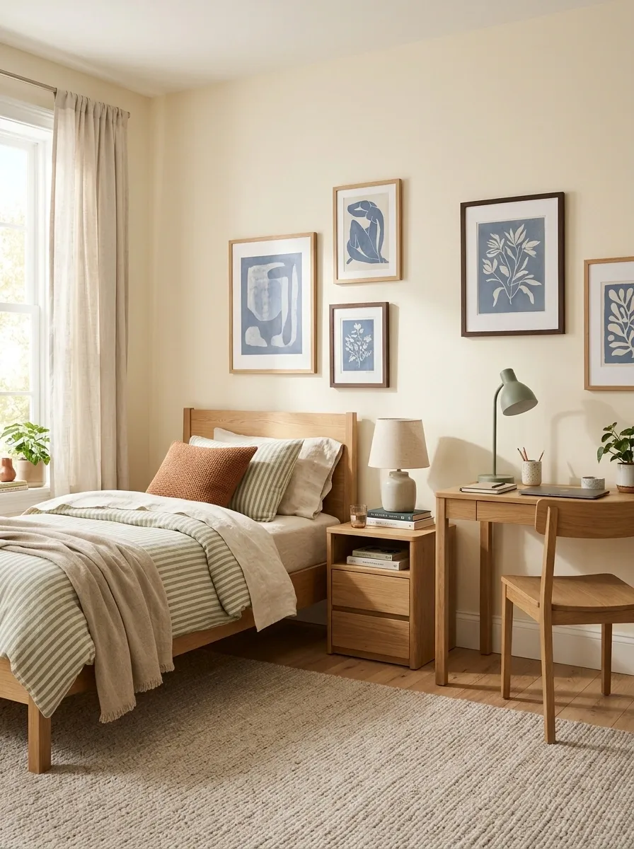
Sage-and-cream striped bedding gives a teen bedroom a defined color scheme without making the space feel too grown-up or overly themed. A simple wooden bed, a compact study desk, colorful artwork, and a soft rug create a balanced room that can evolve as tastes change.
Sage works particularly well because it sits comfortably beside warm wood, cream fabrics, and a range of accent colors. Add a rust-colored cushion, a muted blue print, or a favorite poster without needing to replace the entire bedding set. The stripes provide the foundation while personal details supply the character.
Keep the desk and bedside storage practical. A bedroom needs to handle sleeping, studying, charging devices, and the occasional laundry situation that has somehow become a floor feature.
The adaptable color plan
THE FLEXIBLE BEDROOM PALETTE
Keep the bedding. Change the accents.
The permanent foundation
Sage stripes, cream sheets, and natural wood establish a flexible base.
Swap artwork, cushions, or desk accessories when tastes change. The entire bedroom doesn’t need a rebrand every time a new favorite color appears.
Wide Taupe Stripes in a Refined Hotel-Inspired Bedroom
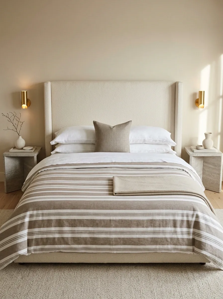
Wide taupe-and-white stripes give a hotel-inspired bedroom a strong, tidy focal point. Pair them with a tall upholstered headboard, neatly layered white sheets, stone-look bedside tables, and warm wall sconces. The wide bands create a clear pattern, while the white layers break up the taupe and keep the bed from feeling too heavy.
Choose a warm taupe rather than a flat gray if the room has beige walls or natural wood flooring. The undertones matter: a cooler gray can make warm finishes look disconnected, while a coordinated taupe helps the materials sit comfortably together.
The bed should look layered, not overstuffed. Two sleeping pillows, a restrained decorative cushion arrangement, and a neatly folded throw are enough to create that polished effect. A mountain of cushions might photograph well, but it tends to become a daily obstacle course.
The hotel-bed proportions
THE HOTEL-INSPIRED BED
Layered, not overloaded.
White sheet layer
Creates a clean break between stripes and pillows.
Striped duvet
Provides the main graphic structure.
Simple throw
Finishes the foot of the bed without adding clutter.
Let the headboard and bedding do most of the work. Decorative pillows are accents, not a home renovation project.
Faded Ticking Stripes in a Collected Vintage Cottage Bedroom
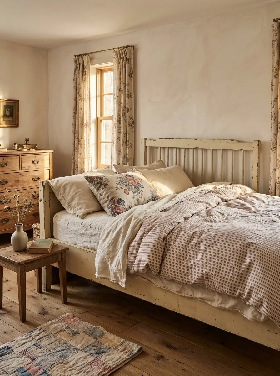
Faded red and blue ticking stripes create a relaxed vintage bedroom when paired with an aged painted bed, soft cream sheets, floral curtains, and a worn wooden dresser. The colors should feel softened rather than freshly saturated, giving the room the collected character of pieces that have gradually found their way together.
Layer the striped duvet with a floral cushion or a faded quilt, then keep the wall color warm and simple. Subtle variations in the wood and painted finishes add depth, while natural linen and cotton help balance the busier details.
Avoid buying every accessory with a chipped-paint finish just because the style calls for vintage charm. A few authentic-looking details have more impact than an entire room full of furniture that appears to have been dragged behind a truck for decorative purposes.
The vintage finish guide
THE COLLECTED COTTAGE LOOK
Aged, layered, and not overly coordinated.
What makes the mix work
Keep the colors softened and vary the scale of the patterns. The bedding can be the strongest print while the curtains and quilt provide quieter layers.
Make the Stripes Work for the Whole Bedroom
Striped bedding looks most convincing when it belongs to the room rather than sitting on top of an unrelated collection of furniture and accessories. Start with a stripe pattern that suits the mood, then connect it to the headboard, wall color, lighting, and a few carefully selected textures.
There’s no need to match every fabric or fill every empty surface. Giving the main pattern some breathing room often makes the finished bedroom feel more deliberate.
Whether the look leans toward quiet neutrals, bold contrast, vintage florals, or warm earthy colors, consistency matters more than buying more decor.
Before choosing a duvet, save a few complete bedroom references and compare the furniture, lighting, and surrounding finishes as well as the stripes themselves. A good bedding choice should make the whole room feel more connected, not leave a dozen new decorating problems in its wake.
Save these striped bedding ideas to your Pinterest boards so the best color combinations and complete bedroom looks are easy to revisit when it’s time to refresh the room.