
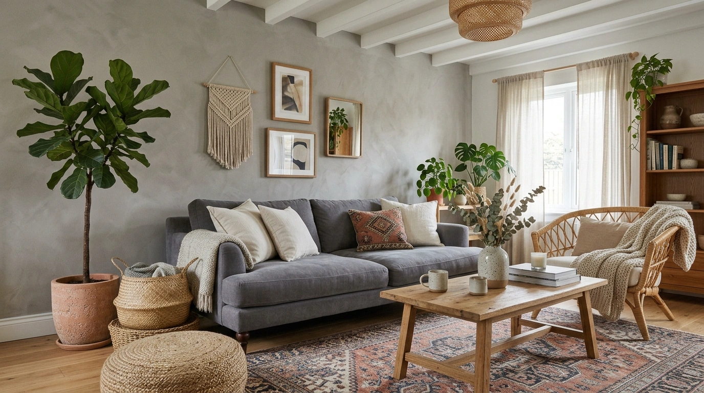
A grey sofa isn’t boring. A room that gives the grey sofa nothing to work against is boring.
That’s the mistake hiding in a lot of so-called boho living rooms. Everything starts with good intentions: a soft grey sectional, some beige cushions, a woven basket, maybe a plant or two. Then the room gets photographed and somehow it still feels cold, flat, and oddly unfinished.
The missing piece is rarely another decoration.
It’s contrast.
A beautiful grey boho room has tension between opposites. Soft upholstery against rough wood. Pale grey against deep charcoal. A perfectly straight sofa beside a curved mirror. Clean walls underneath a wildly textured pendant. Something old beside something simple. Something warm beside something cool.
Once those relationships are right, even a restrained room starts looking layered and expensive.
The Grey Boho Design Equation
Grey Boho Living Room Ideas
Hang Floating Shelves for Height
Empty walls can leave a grey sofa feeling untethered and small. A long floating wood shelf instantly draws the eye upward and introduces much-needed vertical dimension.
Style it with a balanced mix of framed botanical prints, trailing greenery, and small ceramics to echo the natural boho vibe.
Keep the wood tone warm to counteract the cool undertones of the surrounding walls and furniture.
Anchor the Sofa With an Oversized Cream Rug
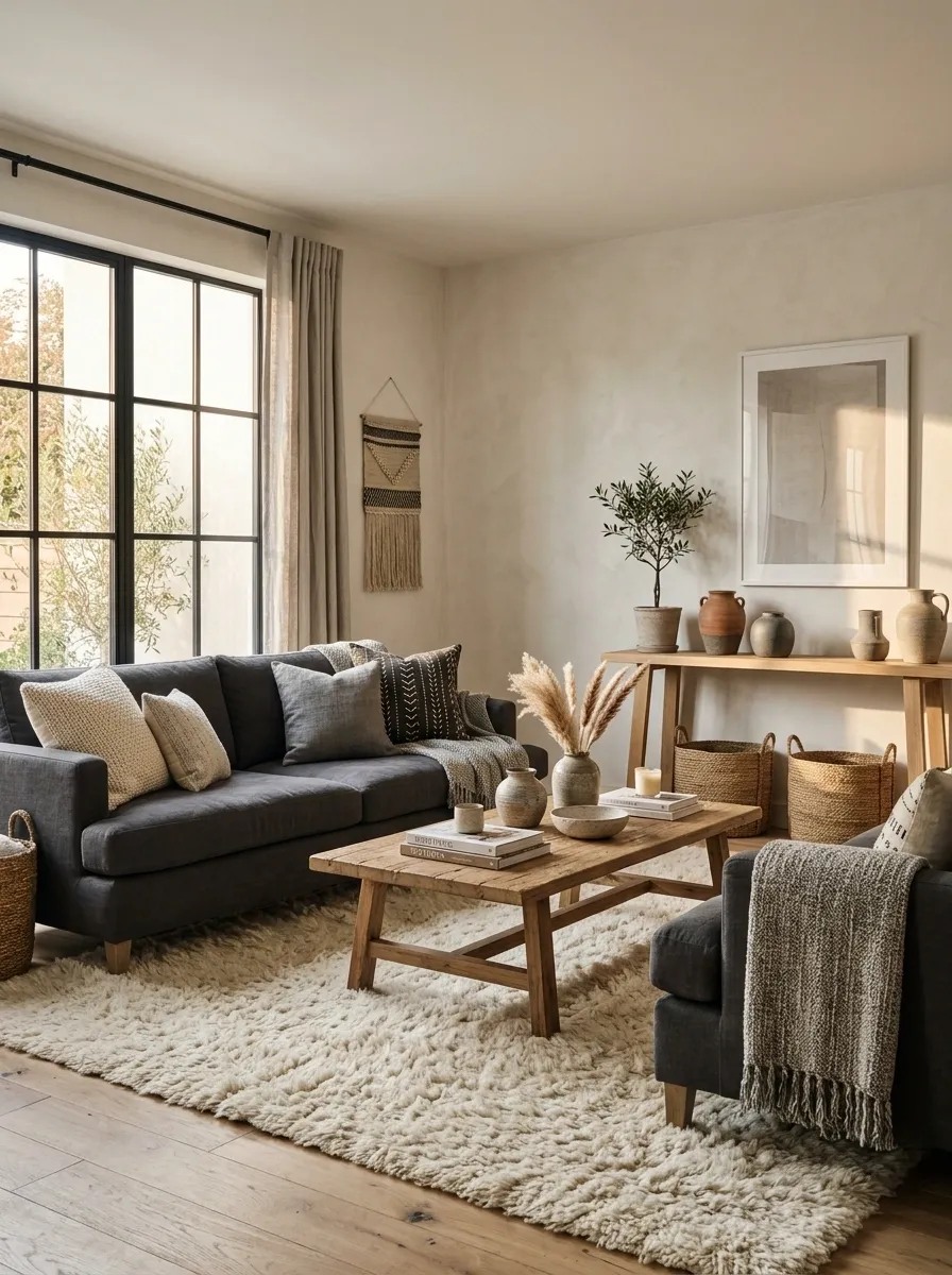
A small rug makes a grey sofa look stranded. A larger cream rug pulls the entire seating group together and gives the grey somewhere softer to sit.
Choose a rug large enough to reach beneath the front legs of the sofa and chairs.
reach the seating.
Cluster Warm Candles on Display
Grey spaces can easily lean cold without a deliberate push toward ambient lighting. A low wooden tray loaded with pillar candles creates an immediate focal point on the coffee table.
Vary the heights of the candles and keep them grouped tightly together so the arrangement feels intentional rather than cluttered.
Light them in the evening to cast a soft glow that dances off the neutral textiles and softens the entire room.
Pair Cool Grey With Warm Walnut Wood
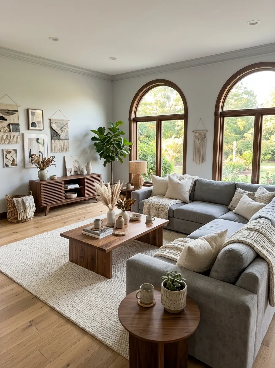
Grey needs a temperature shift. Walnut brings it immediately, especially when the wood has a visible grain instead of a glossy factory finish.
Use it where the eye naturally lands: a coffee table, media console, side table, or shelving.
Best pairing: cool grey upholstery + medium or deep walnut + cream textiles.
Layer Rust Accent Pillows
A neutral chair needs an injection of warmth to break up a monochromatic color scheme. A rich rust-colored pillow brings an earthy punch that instantly shifts the mood.
Pair it with a cream textured throw draped casually over the arm to add depth and an inviting tactile element.
Ground the corner with a woven rattan floor lamp and a leafy plant in a seagrass basket to complete the relaxed look.
Build the Sofa With Three Levels of Texture
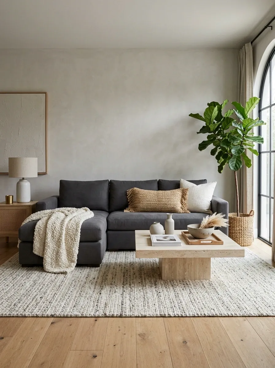
The sofa doesn’t need ten cushions. It needs different tactile weights.
Start with a smooth base, add something visibly woven, then finish with one piece that looks soft enough to sink into.
- Smooth linen or cotton
- Chunky woven cushion
- Loosely draped textured throw
Use a Soft Greige Wall Instead of Stark White
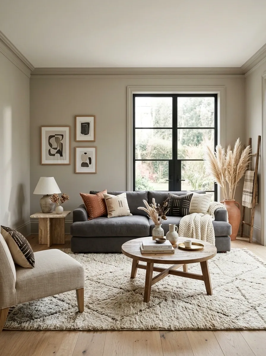
A bright white wall can make cool grey furniture look even cooler. Greige gives the background just enough warmth to connect the sofa, rug, and wood tones.
Keep the wall quiet. The furniture should still be the main event.
Let One Oversized Plant Break Up the Grey
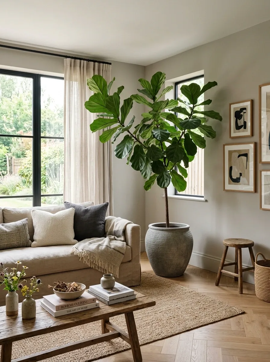
A tiny plant disappears in a large living room. One tall, substantial plant gives the grey backdrop a strong vertical shape and introduces an organic silhouette.
Place it beside the sofa or in an empty corner where the room currently drops off visually.
Hang a Woven Pendant Low Over the Seating Area
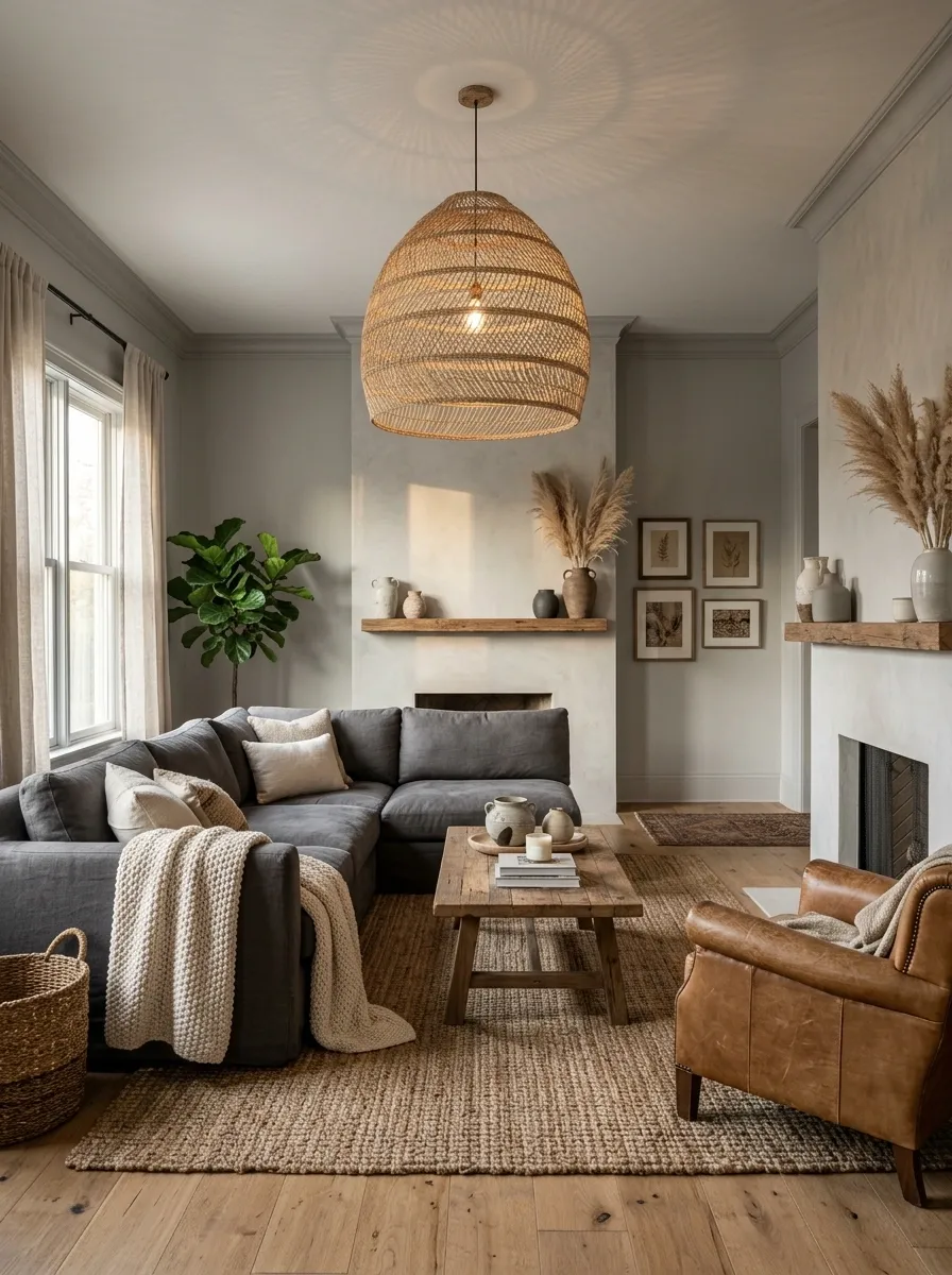
A grey room often looks finished in daylight and strangely lifeless at night. The fix isn’t another lamp on a side table. A woven pendant adds a large tactile shape overhead and casts softer, patterned light across the seating area.
Hang it low enough to feel connected to the furniture, but high enough to keep sightlines clear.
Mix Charcoal and Pale Grey Instead of Matching Everything
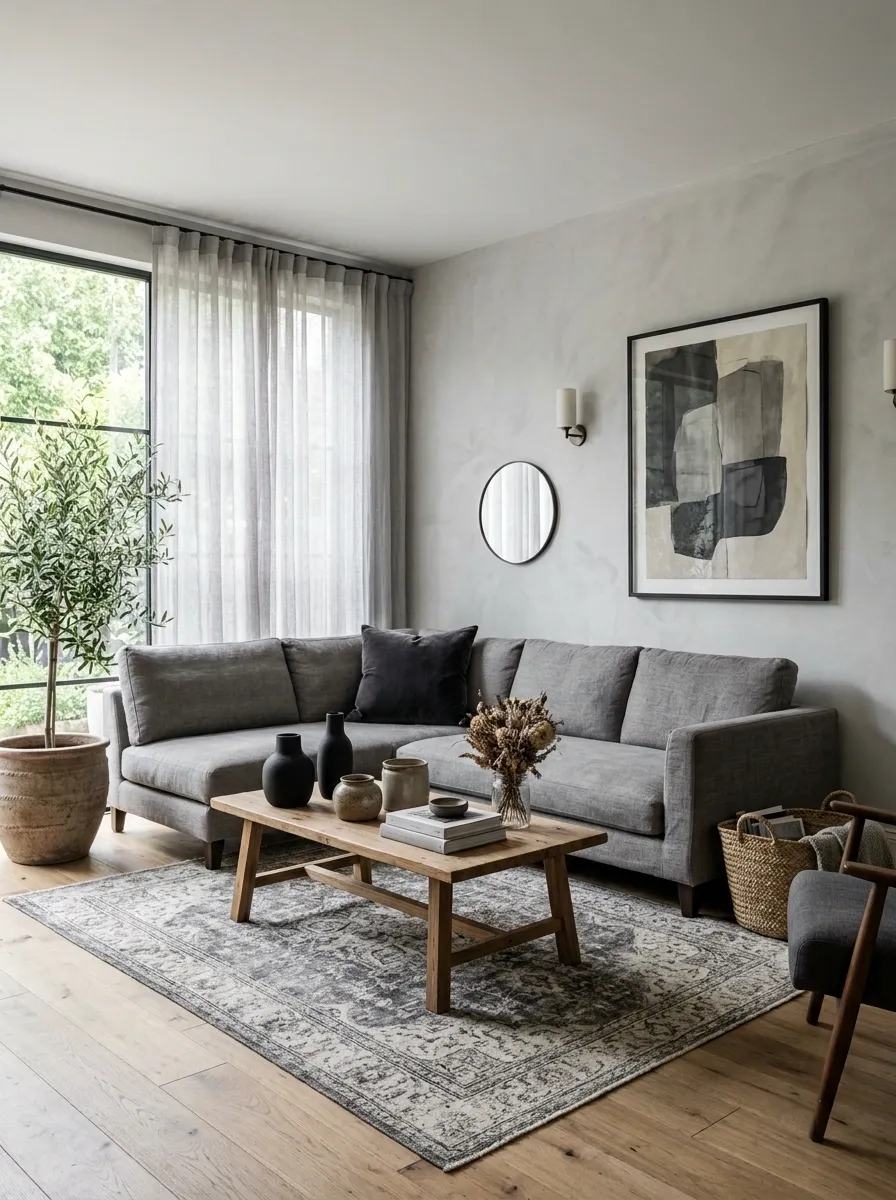
Matching grey shades across every piece makes the room look strangely unfinished. Contrast gives the eye somewhere to land.
Use pale grey on larger surfaces, then bring in charcoal on smaller pieces such as cushions, artwork, ceramics, or a single chair.
Give the Coffee Table a Rough, Organic Finish
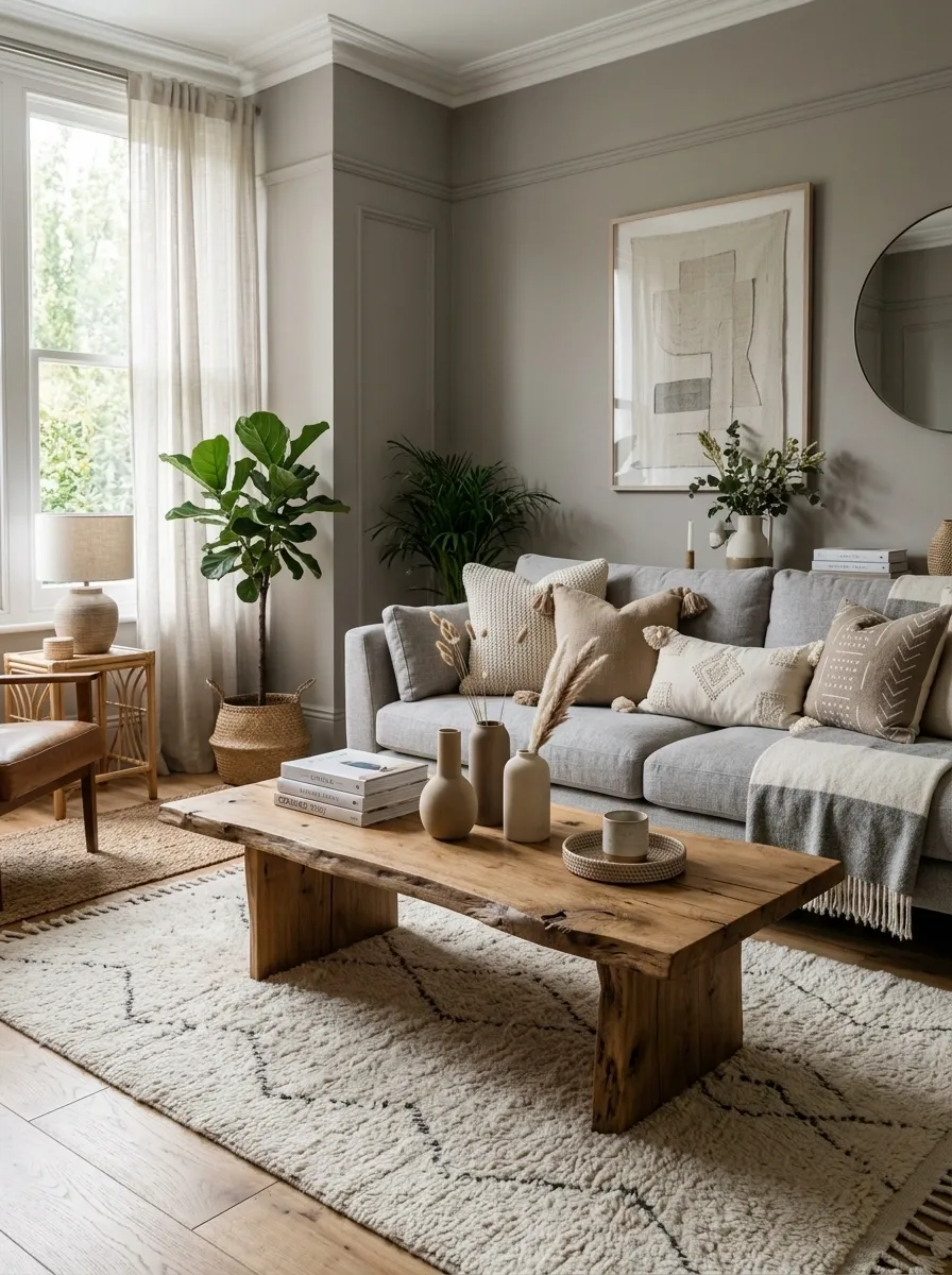
A perfectly smooth glass or glossy white table can make an otherwise relaxed room feel too polished. A rough wood slab, travertine-style surface, or handmade ceramic finish brings back the earthy side of boho design.
The key is restraint. One tactile coffee table is enough.
Quick checklist
- Rough or visibly natural surface
- Matte finish
- Rounded or irregular edges
- Enough surface area for everyday use
- Low enough to keep the sofa visually dominant
Layer a Vintage Rug Over a Larger Neutral Base
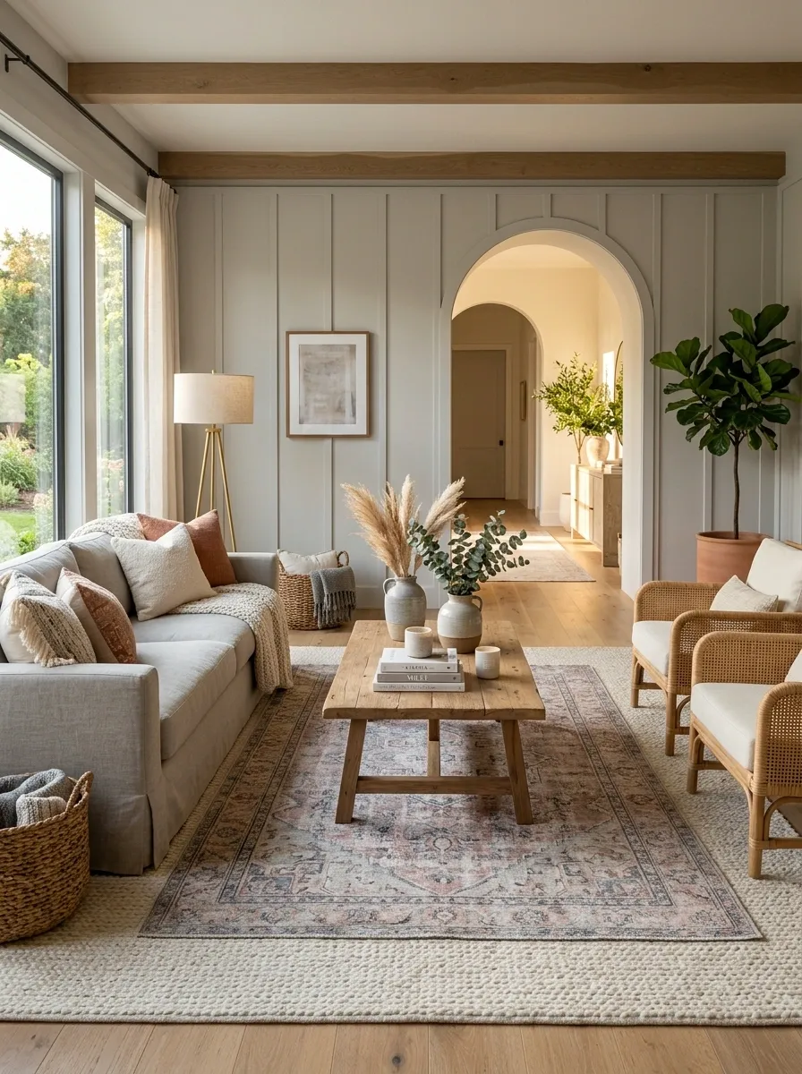
One rug can define the room. Two rugs can define the character.
Start with a large neutral foundation, then place a smaller faded vintage-style rug over it so the pattern stays contained instead of taking over the whole seating area.
Bring in Cane Through One Strong Furniture Piece
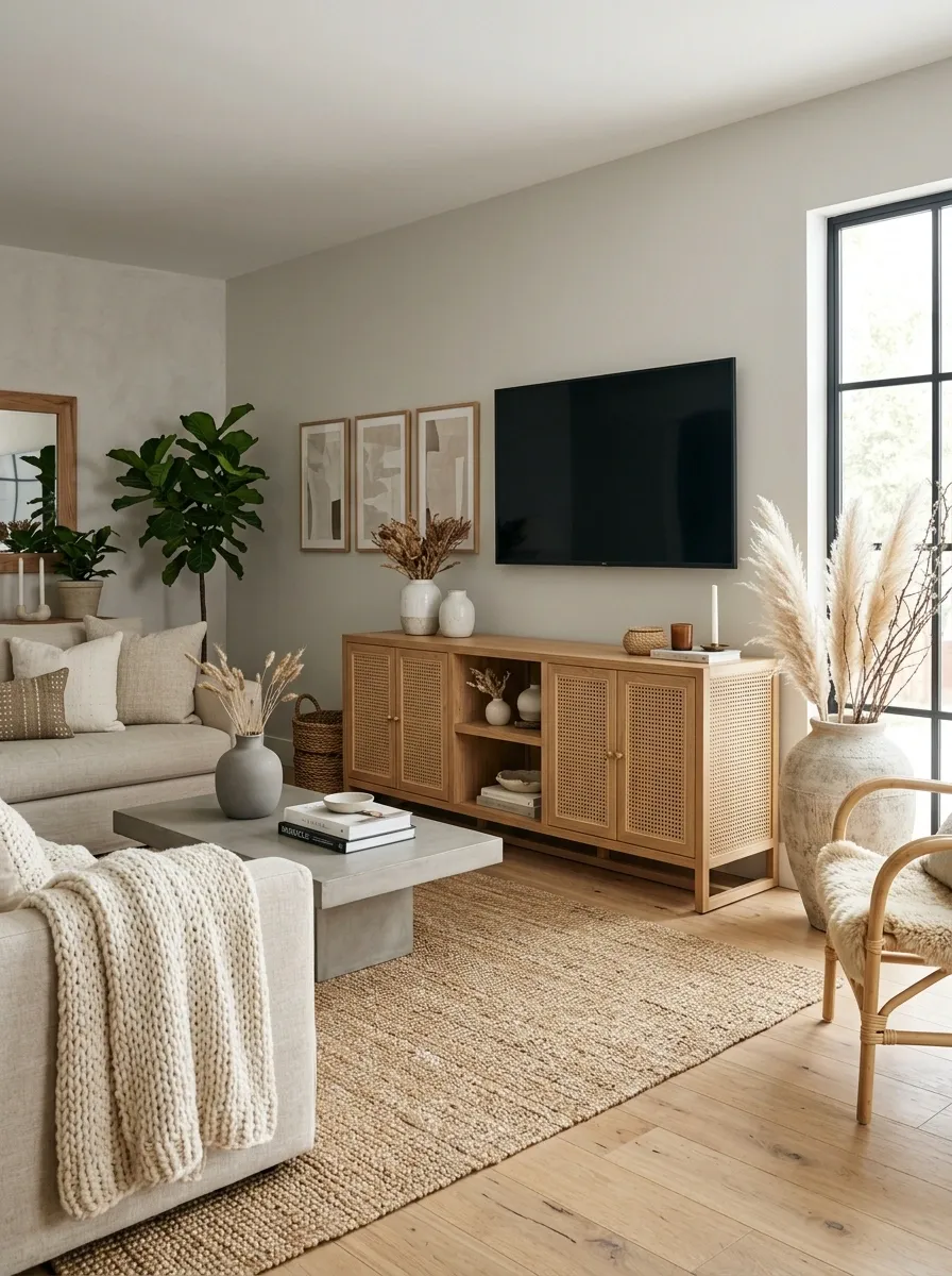
Cane works best when it has a job.
A cane-front media console, cabinet, or accent chair gives the room a recognizable boho material without turning every surface into woven texture. One substantial piece reads intentional. Five pieces start competing.
| Keep | Skip |
|---|---|
| One large cane furniture piece | Cane on every chair |
| Natural or warm wood frame | Multiple matching sets |
| Simple silhouette | Fussy carved details |
| Matte finish | High-gloss coating |
Warm Up Grey Furniture With Low, Layered Lighting
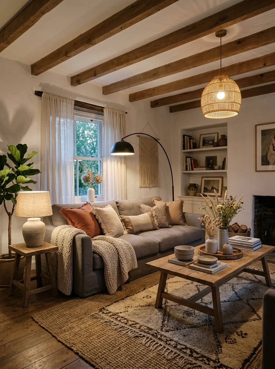
A grey sofa can look soft at noon and harsh at 9 p.m. The difference is usually lighting, not furniture.
Skip relying on one ceiling fixture. Build light at different heights so the room still has depth after sunset.
Style the TV Wall With Floating Wood Shelves
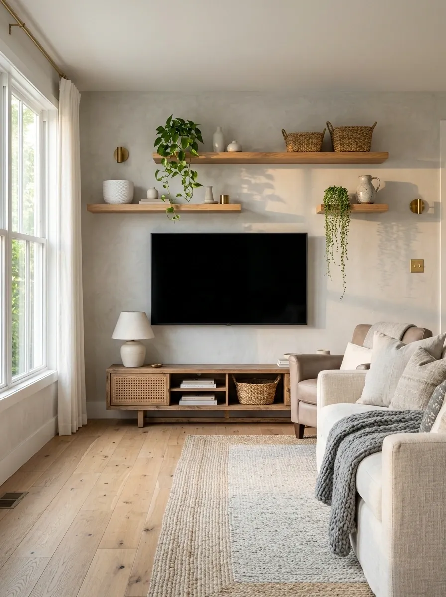
The television already creates a large dark rectangle. Don’t add another bulky cabinet directly underneath it and call the problem solved.
Floating wood shelves can break up that heavy shape while bringing the warm material higher into the room.
Keep the shelves uneven. One long shelf and two shorter ones usually feel more relaxed than a perfectly symmetrical grid.
Choose Linen Curtains That Sit Close to the Floor
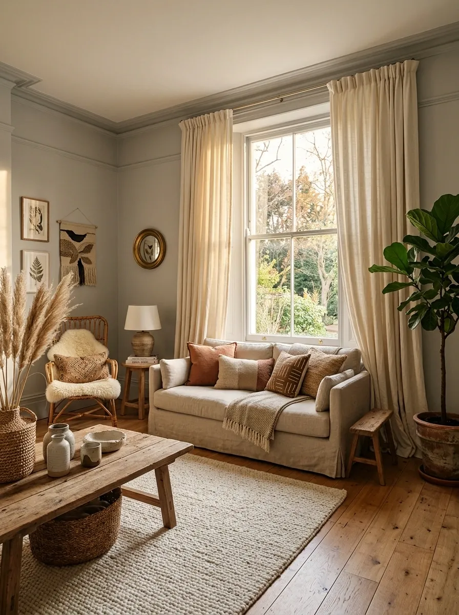
Curtains have a surprisingly big effect on a grey living room. Thin, short panels make the windows look disconnected from the rest of the space.
Use floor-length linen or linen-look curtains in warm ivory, oatmeal, or soft beige.
- Hang the rod higher than the window frame.
- Extend it beyond the window on both sides.
- Let the fabric skim or lightly pool near the floor.
- Keep the weave visible.
Add Aged Brass Without Making the Room Glamorous
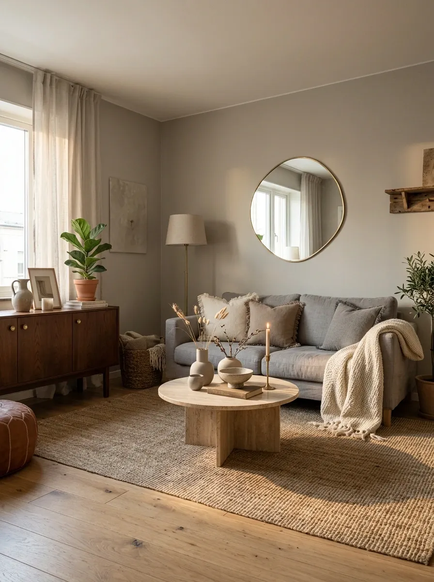
Boho rooms don’t need shiny gold everywhere. Aged brass is quieter. It brings warmth to grey without fighting the natural materials.
The secret is placement. Put small touches of brass where they catch light naturally, such as a lamp stem, mirror edge, candle holder, or cabinet hardware.
Break Up a Grey Sectional With a Camel Accent Chair
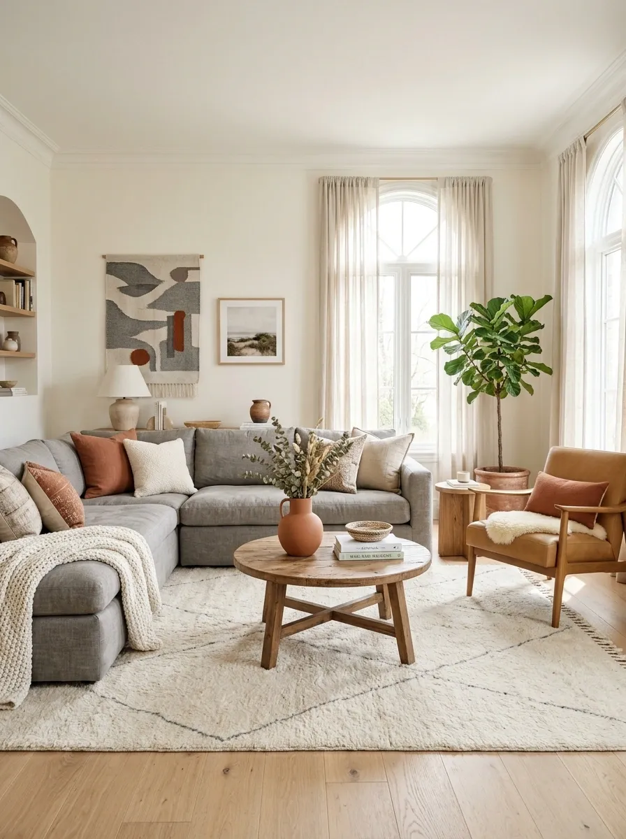
A large grey sectional creates a wide horizontal block. A camel chair interrupts that line and gives the seating arrangement another visual destination.
Place the chair slightly away from the sectional rather than pushing it flush against the arm. That small gap makes the arrangement feel designed instead of packed together.
| Sectional | Camel Chair |
|---|---|
| Large visual anchor | Smaller counterpoint |
| Cool neutral | Warm earthy tone |
| Horizontal shape | More vertical presence |
| Soft upholstery | Leather, boucle, or woven texture |
SECTIONAL
CHAIR
Create a Low, Layered Gallery Wall Above the Sofa
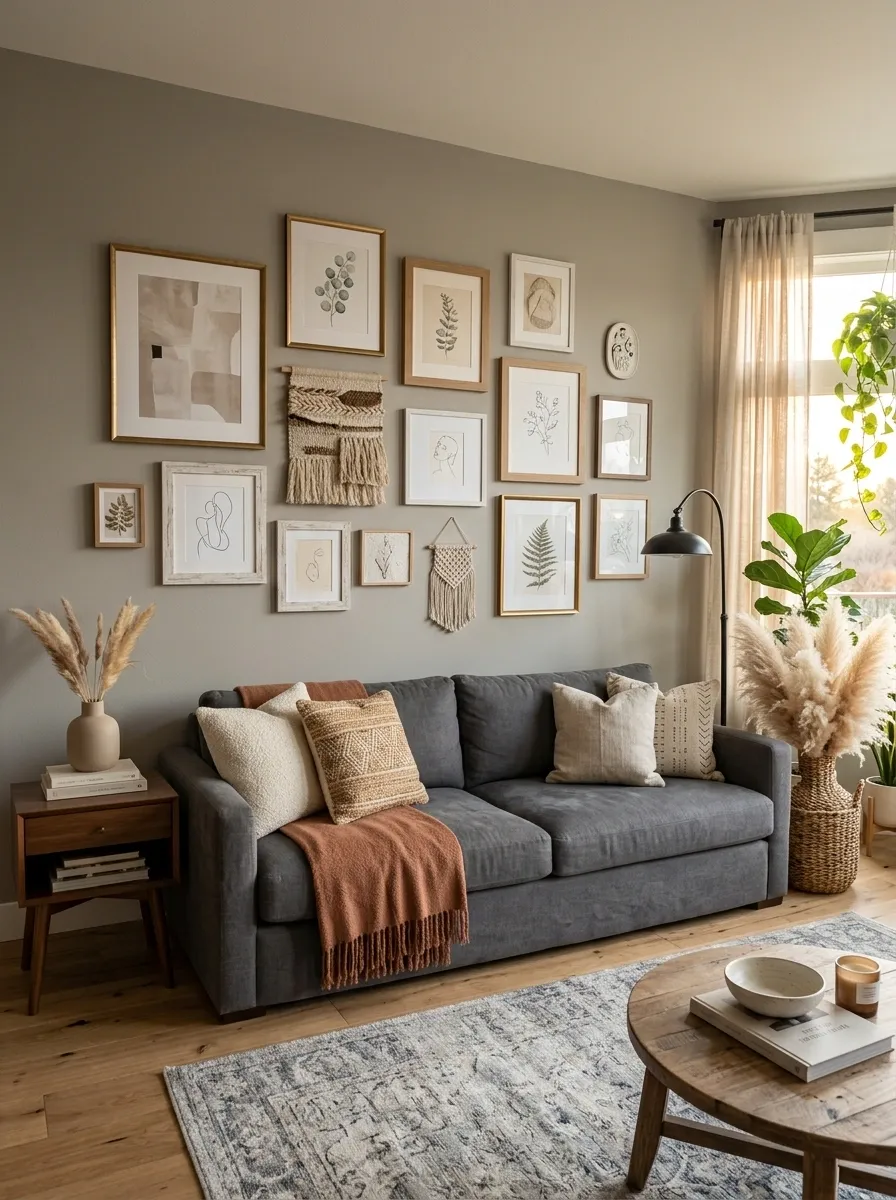
The biggest mistake with a gallery wall is treating every frame as equally important. A boho arrangement looks better when the composition has rhythm, gaps, and a mix of visual weights.
Keep the overall arrangement wider than it is tall so it follows the sofa instead of fighting its shape.
Swap Tiny Decor for One Oversized Ceramic Piece
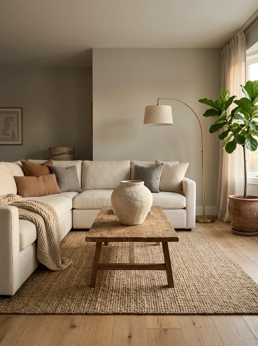
A coffee table covered with tiny objects usually looks busy without looking interesting. One oversized handmade-looking ceramic vessel has more presence and leaves the surface easier to live with.
Choose something with an uneven silhouette, matte finish, or visible earthy texture.
The visual difference is simple: fewer objects, stronger shape.
Mix Bouclé, Linen, Jute, and Woven Fibers
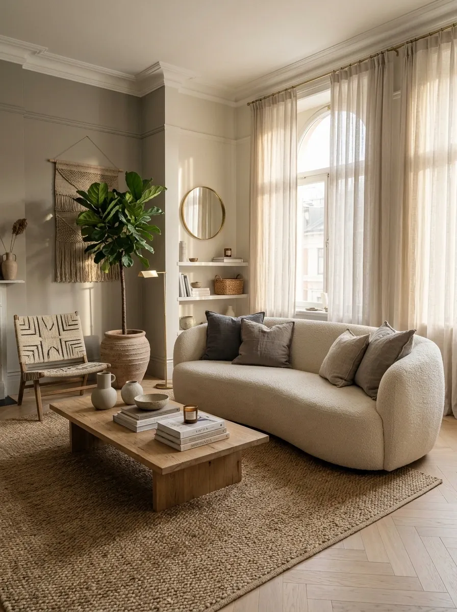
Boho texture isn’t about picking one “boho” fabric and repeating it. The room gets its depth from surfaces that react differently to light and touch.
Build the mix across furniture, soft furnishings, and floor pieces.
Keep the Coffee Table Decor Low and Asymmetric
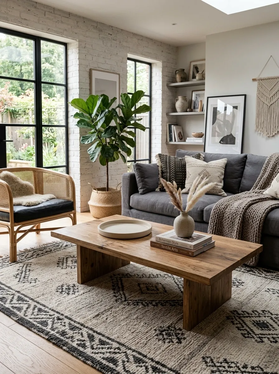
The coffee table shouldn’t become a miniature centerpiece display that blocks conversation. Keep the tallest object low, move the visual weight off-center, and leave a clear section for everyday things.
An asymmetric arrangement also works beautifully with the relaxed lines of boho furniture.
Use a Curved Mirror to Soften Boxy Grey Furniture
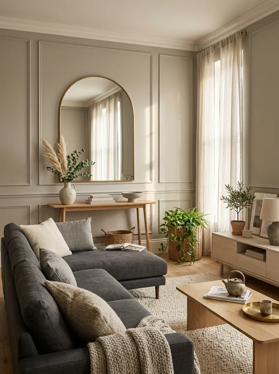
Grey sofas and rectangular media units can give a living room too many straight lines. A round or softly arched mirror breaks that repetition without adding another color.
Put the curved shape near a square piece of furniture. The contrast is what makes both shapes more noticeable.
Best placement: above a narrow console, beside a sectional, or opposite a major window.
Repeat One Earthy Accent Color Across the Room
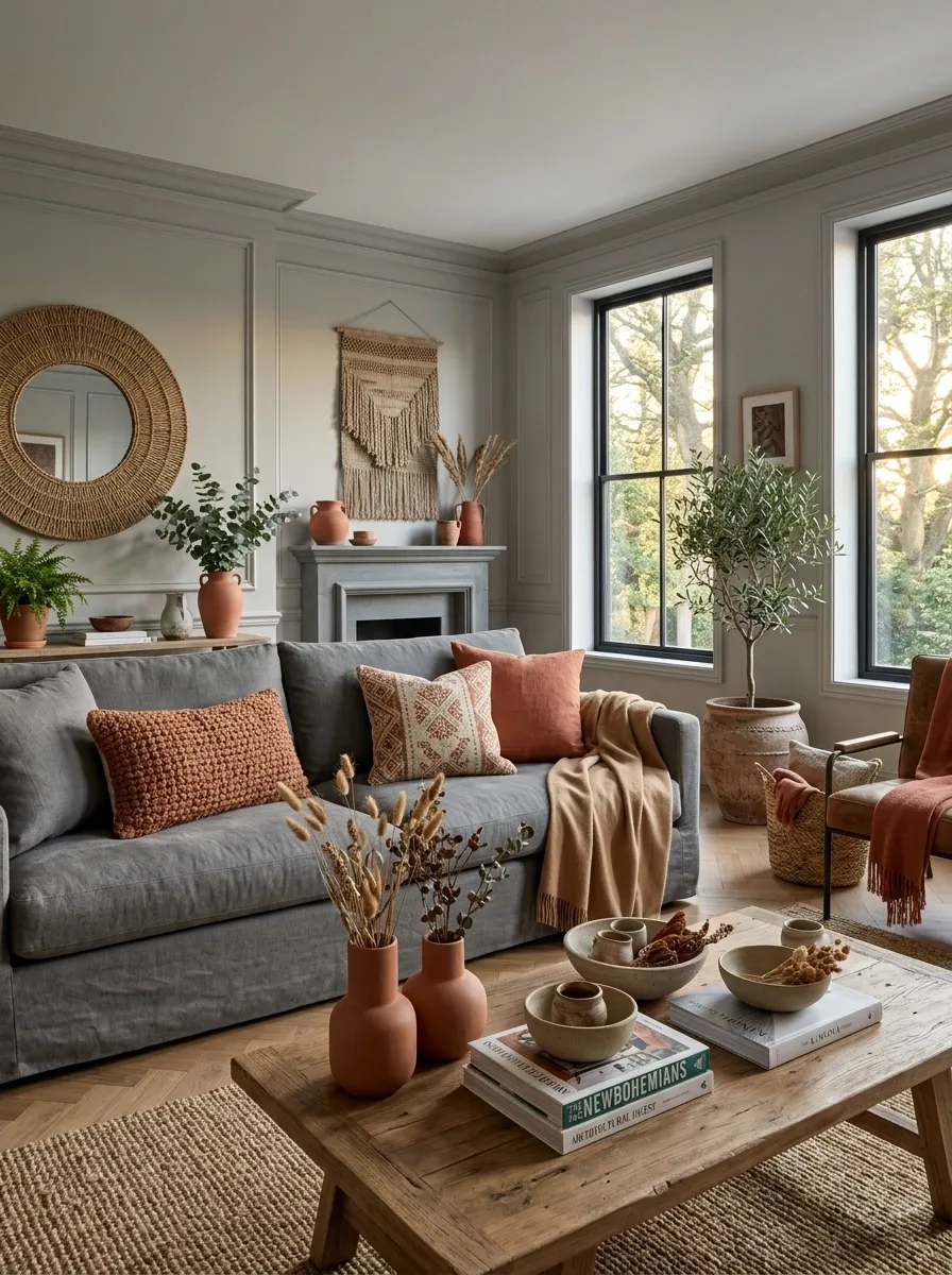
A single earthy accent becomes much more effective when it appears in several places. Don’t scatter a rainbow of boho colors across the room. Pick one supporting shade and repeat it quietly.
Camel, clay, terracotta, tobacco, or muted rust can all work beautifully with grey.
tone.
Make a Reading Corner With a Woven Chair and Lamp
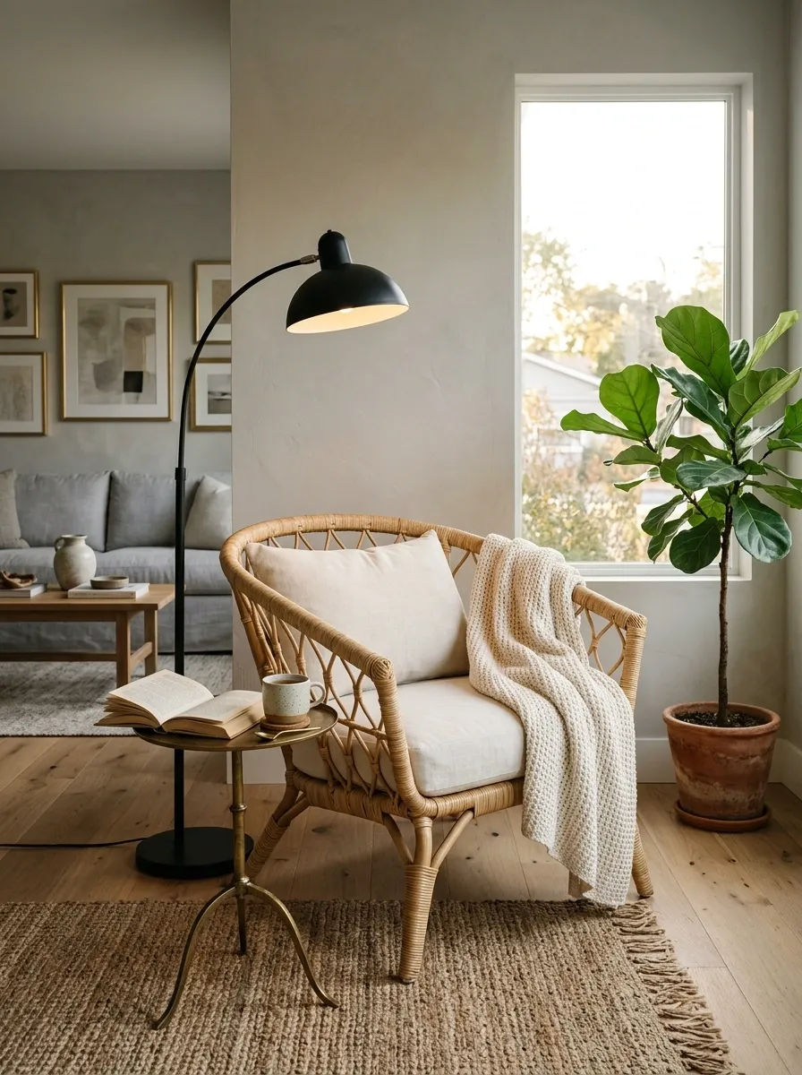
A grey living room feels more lived-in when there’s a small destination beyond the main sofa.
Create a reading corner with three ingredients: a textured chair, a floor lamp, and a small surface for a book or drink.
Quick setup
- Angle the chair slightly toward the room.
- Place the lamp just behind the shoulder.
- Keep a small table within easy reach.
- Add one soft throw, not a pile of them.
Let Natural Wood Become the Room’s Visual Counterweight
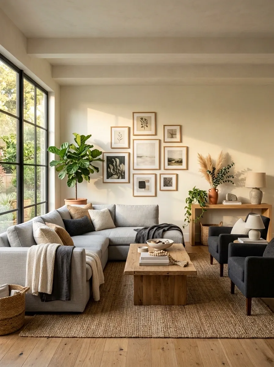
Grey can dominate simply because upholstered furniture takes up so much surface area. Natural wood counters that visual weight with harder edges, visible grain, and warmer color.
Spread the wood through the room rather than concentrating it in one corner. A console, coffee table, frame, or side table can create a connected thread.
Wood gives it bones.
Finish With Soft Lighting Instead of More Accessories
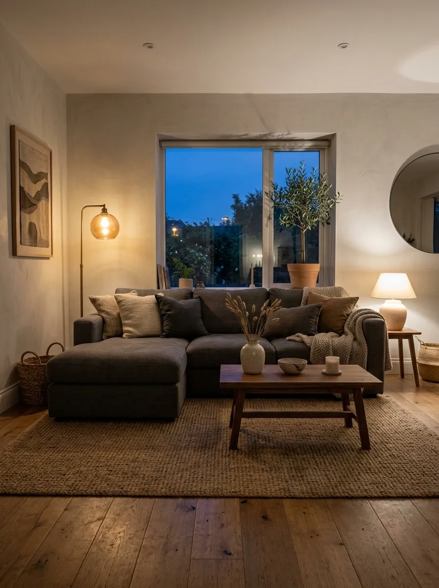
The room doesn’t need another basket, cushion, vase, or piece of wall art.
Once the furniture, texture, wood, and earthy accents are working, the final layer should be light. Warm pools of illumination make the grey upholstery look deeper, the wood look richer, and the woven textures easier to notice after dark.
Evening finish
- Turn off the harsh overhead source.
- Light the floor lamp.
- Add a small table lamp near the sofa.
- Let one corner stay slightly darker.
- Keep the room’s brightest glow near the seating zone.
The Look That Pulls Everything Together
The best grey boho rooms aren’t created by filling every empty surface.
They’re created by knowing what doesn’t need to be filled.
A cool grey sofa gets warmth from walnut. A plain wall gets personality from texture instead of clutter. A long sectional gets balance from a curved chair or mirror. A hard-edged media wall gets softened by woven material. A quiet room gets atmosphere from lighting rather than another decorative object.
That restraint matters.
Start with the big visual decisions first. Get the rug right. Build the seating around it. Introduce natural wood. Add texture in different weights. Bring in one earthy accent and repeat it with purpose. Then light the room properly.
That’s how grey stops looking cold.
That’s how boho stops looking cluttered.
And that’s how a neutral living room starts feeling like a room people actually want to stay in.
Save these ideas before the next living room refresh so the good details don’t get lost when it’s time to rearrange, shop, or rethink the space.