
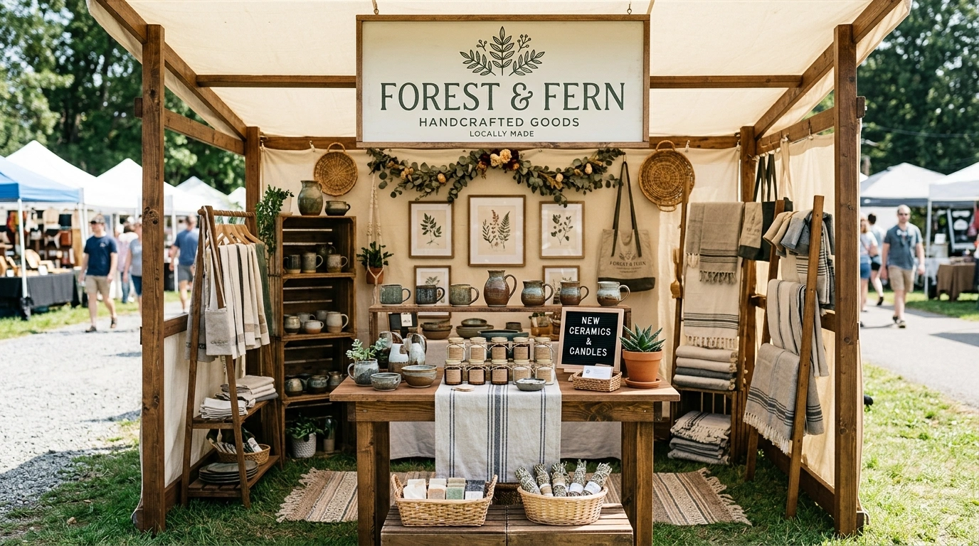
A vendor booth has a nasty habit of exposing bad decorating decisions.
At home, a random basket can hide in a corner. An extra shelf can disappear into the background. At a booth, every object is suddenly on display, surrounded by dozens of strangers walking past and deciding in seconds whether the setup is worth stopping for.
That is why the best vendor booth display ideas don’t start with a shopping list. They start with a finished scene. The backdrop, shelving, furniture, lighting, signage, merchandise, colors, and empty space all need to look like they were chosen for the same reason.
A booth doesn’t need to be enormous or expensive to make an impression. It needs a point of view. The designs below treat the booth as a tiny interior rather than a temporary pile of inventory, with distinct layouts and visual personalities that can actually be pictured in a real event space.
Your Booth Has About Three Seconds to Prove It Isn’t Just a Table With Stuff on It
People don’t walk up to a booth thinking, “Wow, excellent use of a folding table.”
They notice the whole composition first. The strongest booths usually have four things working together: a recognizable backdrop, one obvious focal point, a clear product hierarchy, and enough open space that the displays can actually breathe.
“Wow, excellent use of a folding table.”
Vendor Booth Display Ideas
Warm Minimal Booth With Oak Slat Walls and Cream Shelving
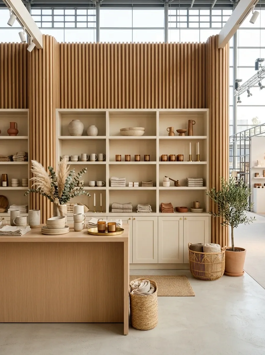
This booth takes the showroom approach without requiring an actual showroom. A warm oak slat wall creates the architectural backdrop, while cream shelving, a pale wood counter, woven accents, and softly grouped products keep the palette light and controlled. The open front matters just as much as the displays because it lets the entire composition read from the aisle.
The oak adds enough warmth to keep the cream surfaces from feeling clinical. Keep the merchandise grouped by height rather than scattering every item across every shelf. A little restraint goes a long way here. The booth should look like a tiny design studio, not a storage unit that discovered retail.
Arched Boutique Booth With Painted Plaster Backdrop
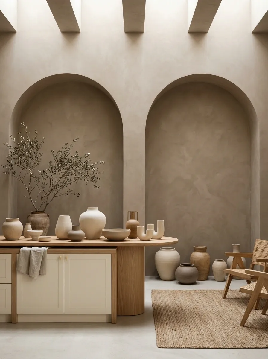
Architecture does a lot of the work here, which is convenient because nobody needs another booth where ten signs are competing for custody of the customer’s attention. Two oversized arches create the backdrop, with a warm plaster finish, cream cabinetry, curved display tables, and products arranged inside and around the openings.
Repeating the curved shape in the furniture makes the booth feel designed rather than decorated. The palette stays quiet so the arches remain memorable. This direction works especially well when the products already have strong color or interesting shapes because the booth provides a calm frame instead of trying to become the product itself.
Moody Charcoal Booth With Walnut and Brass
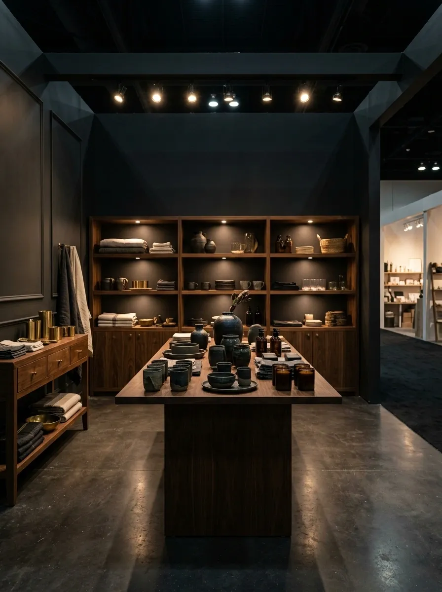
For products that need a little drama, the pale-and-airy booth approach can start looking suspiciously like every other market display. This version goes in the opposite direction with charcoal walls, walnut shelving, aged brass details, dark furniture, and tightly controlled warm lighting.
The darker shell gives small products more visual importance because each illuminated area becomes a deliberate focal point. Brass prevents the palette from becoming flat, while walnut adds warmth without introducing another competing color. The key is resisting the urge to light everything equally. A dark booth covered in uniform bright lighting loses the entire point almost immediately.
Scandinavian Market Booth With Pale Wood and Soft Gray
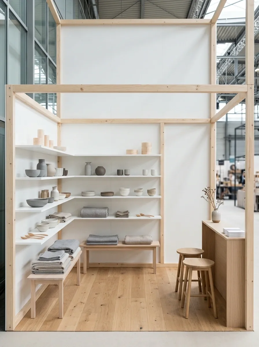
This one proves a booth doesn’t need visual theatrics to stand out. Pale timber framing, matte white shelving, soft gray textiles, simple stools, light flooring, and generous empty space create a calm Scandinavian-style setup that feels more like a tiny retail studio than an event table.
The important detail is the amount of space left between displays. Products should have room around them instead of being packed together simply because an empty shelf feels somehow illegal. Low furniture keeps the booth visually open, while the pale wood gives enough warmth to stop the white surfaces from feeling sterile. A few strong product groupings beat a forest of tiny arrangements.
Collected Vintage Booth With Painted Furniture and Antique Details
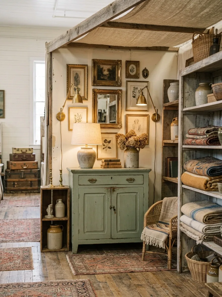
A vintage-inspired booth works best when it feels collected rather than costume-like. A painted cabinet anchors the composition, mismatched but related shelving adds height, aged frames fill the wall, brass lighting warms the scene, and patterned textiles soften the harder furniture surfaces.
The trick is giving the pieces a shared visual language. Similar warm undertones can make different furniture styles look like they belong together. Too many unrelated finishes, on the other hand, turn “collected” into “someone lost control in an antiques warehouse.” Keep the largest pieces simple and let the smaller details supply the personality.
Organic Modern Booth With Stone, Oak, and Linen
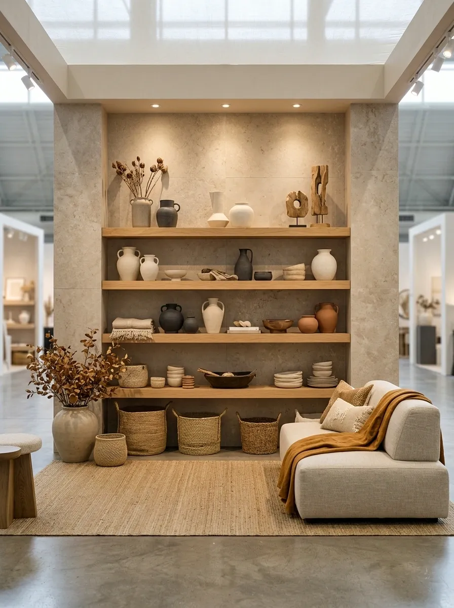
This booth leans into the kind of restrained material mix that makes a temporary space feel surprisingly permanent. Limestone-look panels establish a mineral backdrop, thick oak shelves warm things up, and linen-covered seating softens the harder surfaces. Sculptural ceramics and earthy merchandise complete the composition without turning it into a showroom cliché.
The material hierarchy matters. Stone works best as the visual foundation, oak carries the middle of the composition, and linen keeps the seating and accessories from feeling too rigid. Stick with a narrow color range and let texture provide the variation. Throwing five unrelated finishes into the mix would only prove that subtlety is apparently not invited.
Tiny Booth With One Dramatic Feature Wall
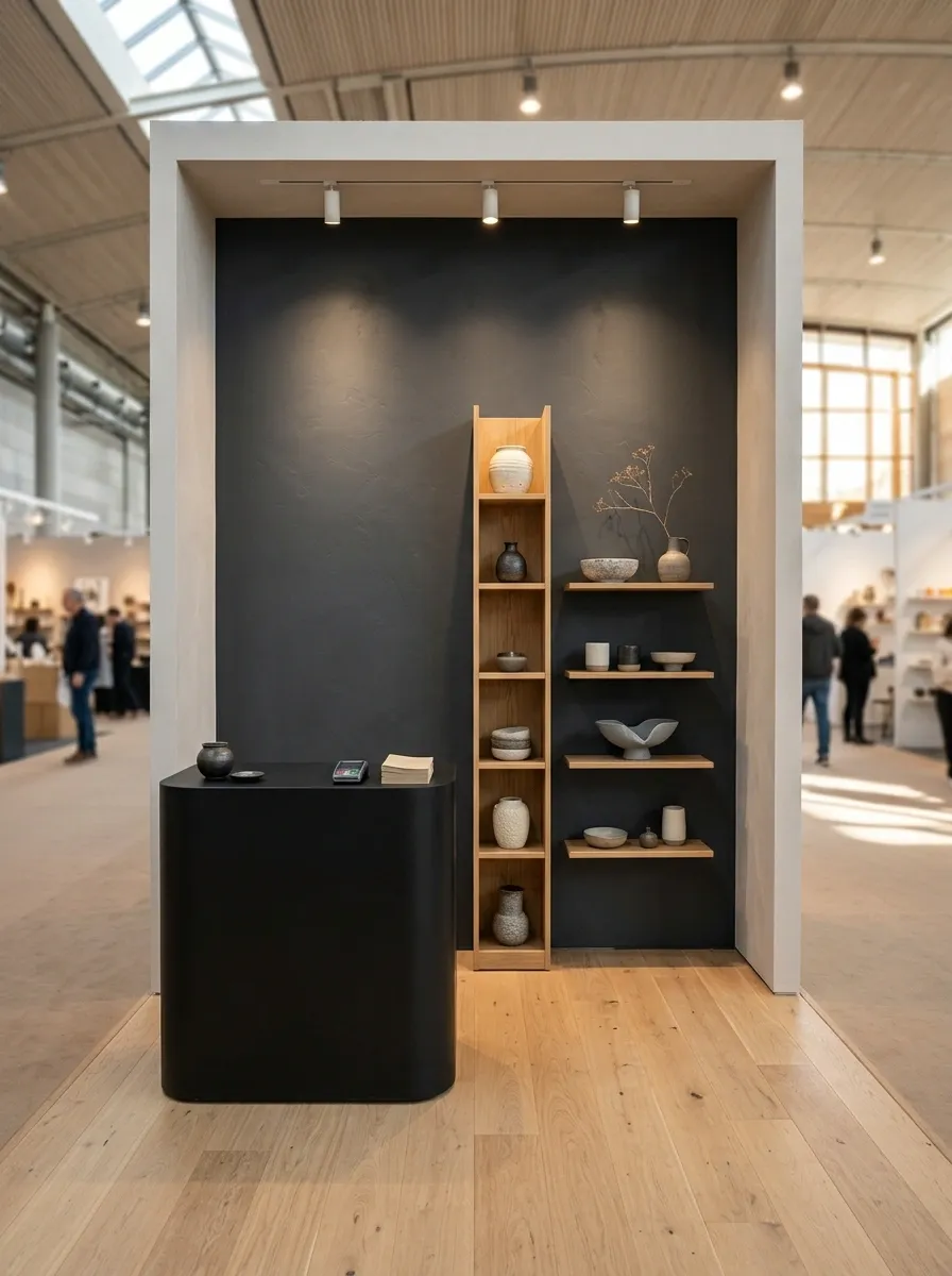
Small booths often make the same mistake: trying to prove they contain enough merchandise by covering every available surface. This concept does the opposite. One oversized painted wall becomes the visual anchor, while a sculptural counter, a narrow vertical shelving unit, and a carefully edited product collection do the rest.
The empty floor area is intentional. It gives customers somewhere to stand without immediately bumping into a table, chair, or display tower. The result feels more like a tiny boutique than a cramped booth. Choose one strong wall treatment and let it carry the identity. Trying to squeeze three “focal points” into a tiny footprint isn’t ambition. It’s a traffic problem.
Everything else gets out of the way.
Soft Terracotta Booth With Arched Shelving
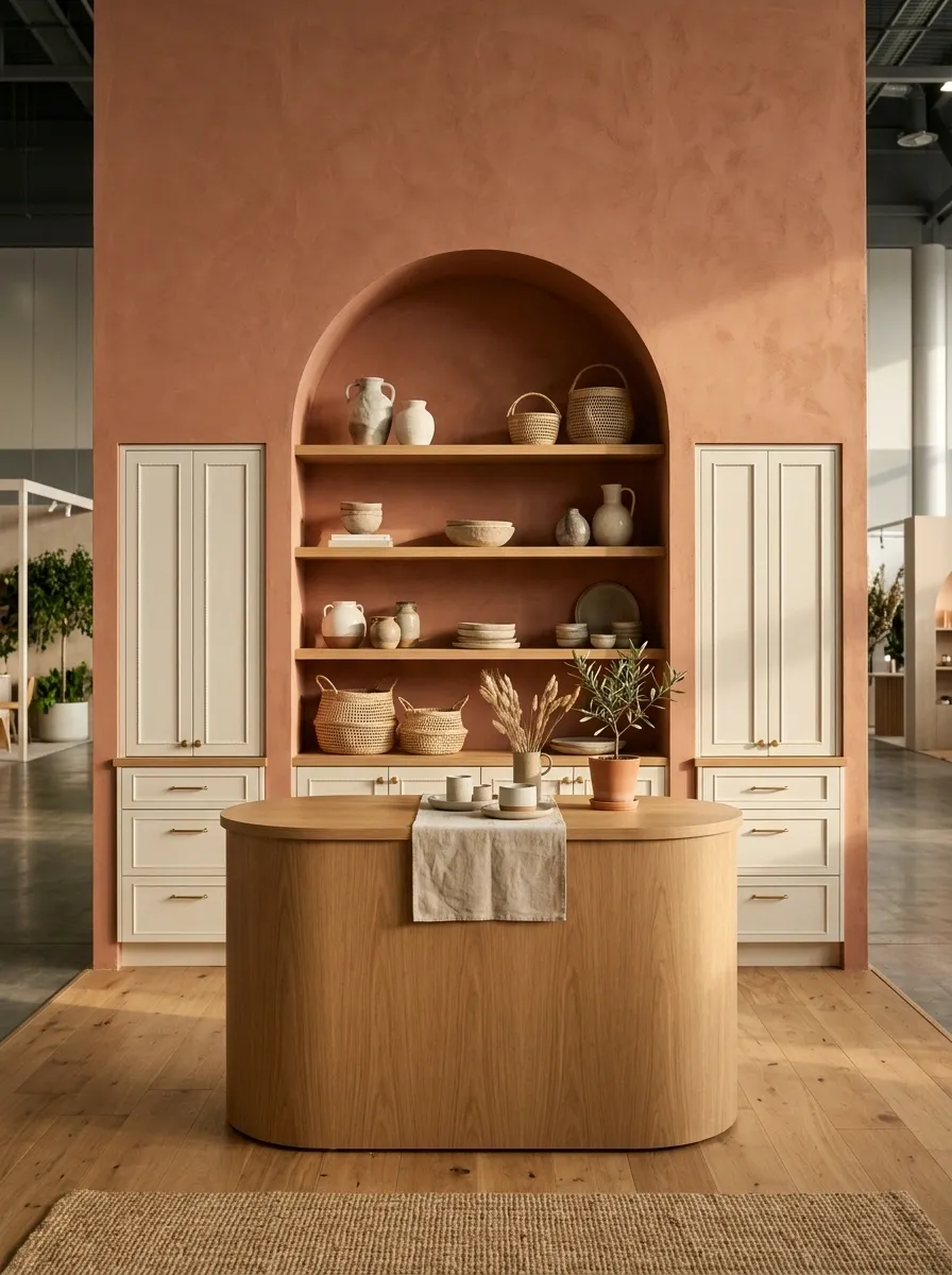
A dusty terracotta wall gives this booth instant visual recognition, especially when paired with cream cabinetry, warm oak, and soft arches. Built-in-looking niches provide natural display zones, so the products don’t have to fight with a pile of signs and miscellaneous decorations for attention.
The best part is how little color is actually needed. Terracotta carries most of the identity, while cream keeps it light and oak supplies warmth. Repeating the arch shape through shelving or a rounded counter ties the composition together. The result feels deliberate without looking like every surface received a Pinterest makeover at the same time.
Elevated Home-Shop Booth With Sofa and Console
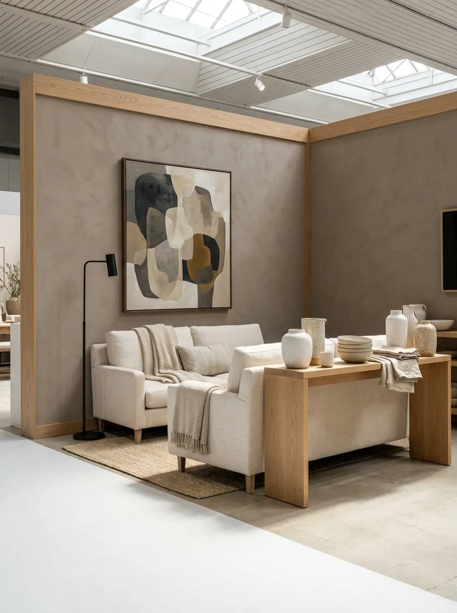
A small sofa changes the entire reading of this booth. Instead of looking like merchandise arranged for inspection, the setup begins to resemble a real living space. A narrow console runs behind the seating, a floor lamp establishes height, artwork gives the wall a focal point, and selected products are worked naturally into the furniture.
That distinction matters. Shoppers can understand the products in context instead of trying to imagine what they might look like at home. Keep the furniture appropriately scaled for the footprint and leave the aisle open. A booth is not improved by forcing a full living room into six feet of space. At some point, the sofa becomes an obstacle course.
Black-and-Ivory Editorial Booth With Oversized Typography
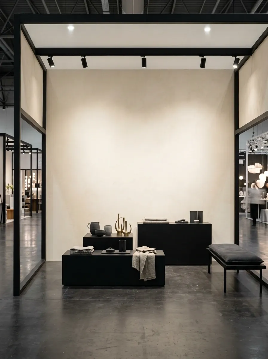
Some booths need color. This one needs restraint and a very large opinion about typography.
An ivory backdrop creates a clean gallery shell, while black architectural framing, oversized lettering, low plinths, and sculptural product groupings give the booth an editorial feel. The trick is letting the typography function as part of the architecture instead of plastering promotional copy across every available surface.
Use one dominant phrase or brand name rather than six competing messages. Keep the furniture low so the lettering remains visible from the aisle. A few carefully positioned objects will look far more intentional than a packed display. The whole concept works because the booth knows when to stop.
STRONG
MESSAGE
Cottage-Inspired Booth With Shaker Cabinetry and Floral Textiles
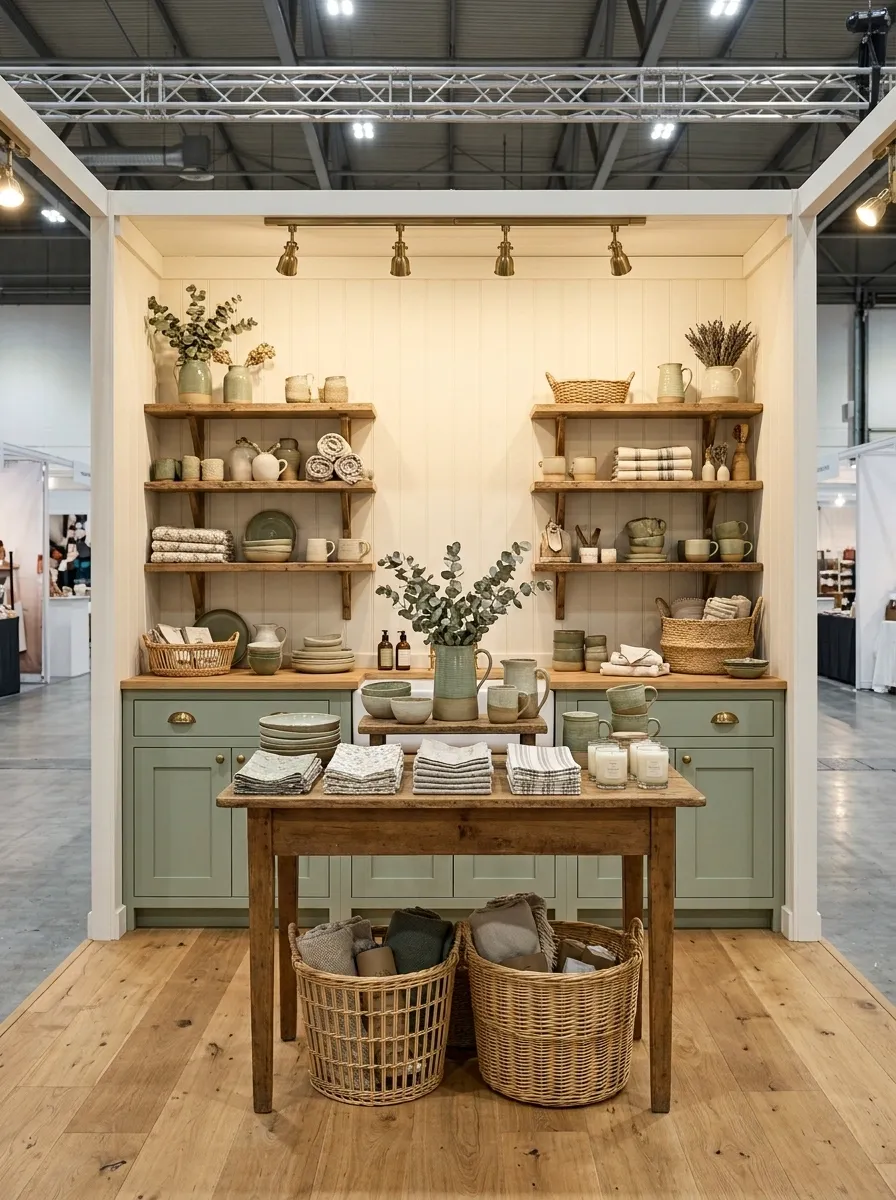
This booth looks like a tiny country shop dropped into a crowded event hall, which is considerably more memorable than another banner stretched over a table.
Soft painted cabinetry provides the foundation, while open shelving, floral textiles, woven baskets, a narrow worktable, and warm lighting create a collected cottage composition. The palette should stay disciplined so the patterned textiles add character without making the booth look like a fabric store lost a fight.
Shaker-style cabinet doors give the lower half of the booth visual weight, while open shelving keeps products visible above. Keep the floral pattern limited to selected textiles or small accents. Covering every surface in competing patterns would destroy the calm quality that makes this concept work.
Industrial Booth With Steel Framing and Reclaimed Wood
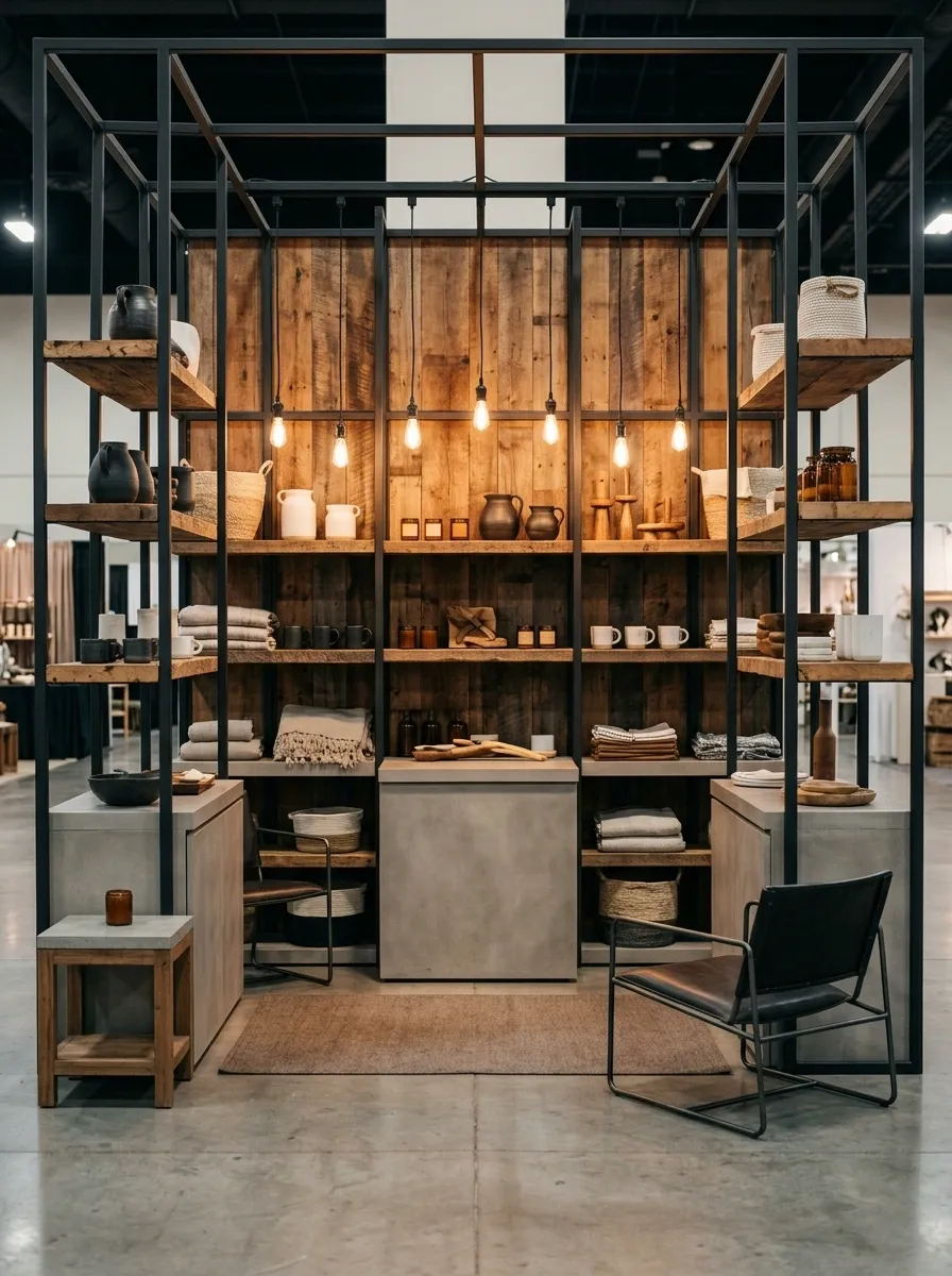
Raw materials can look polished when the structure is disciplined. This booth pairs slim dark steel framing with reclaimed timber shelves, concrete-toned surfaces, utilitarian furniture, and warm task lighting. The result feels architectural without drifting into warehouse cosplay.
The steel provides the visual skeleton. Reclaimed wood supplies warmth and texture. Keeping the merchandise on clean horizontal shelves prevents the rustic materials from making everything look dusty, busy, or accidentally unfinished.
The important distinction is between industrial and unfinished. Exposed materials should look intentional. Anything that looks like it was forgotten during setup should probably not become part of the design.
Monochromatic Sage Booth With Layered Green Tones
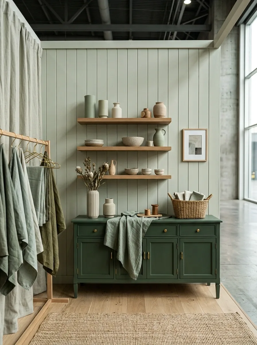
A monochromatic booth has a built-in advantage: everything already belongs to the same color family. The danger is turning it into one flat block of green and hoping the products somehow rescue it.
This version uses pale sage walls, deeper painted furniture, muted green textiles, natural wood, and slightly darker shelving. The different values create depth while the shared hue keeps the booth visually unified. Natural timber acts as the neutral break, so the color story doesn’t become exhausting.
The smartest move here is varying lightness, not collecting every shade in the paint aisle. Three or four related values can create plenty of dimension without making the booth look like a color chart.
Compact Gallery Booth With White Walls and Floating Ledges
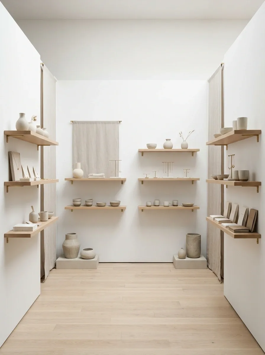
This setup takes the gallery approach seriously. White walls form an uninterrupted background, slim floating ledges provide just enough display surface, and merchandise is separated by deliberate pockets of empty space.
There is no giant counter consuming the middle of the booth. No decorative ladder pretending to be useful. No twenty-item arrangement squeezed onto one shelf because the shelf was technically available.
The restraint is the point. Products become the focal elements because the environment refuses to compete with them. This concept works especially well for small objects, art, ceramics, stationery, jewelry, and other products that benefit from isolated presentation rather than dense merchandising.
Mediterranean-Inspired Booth With Limewash and Natural Texture
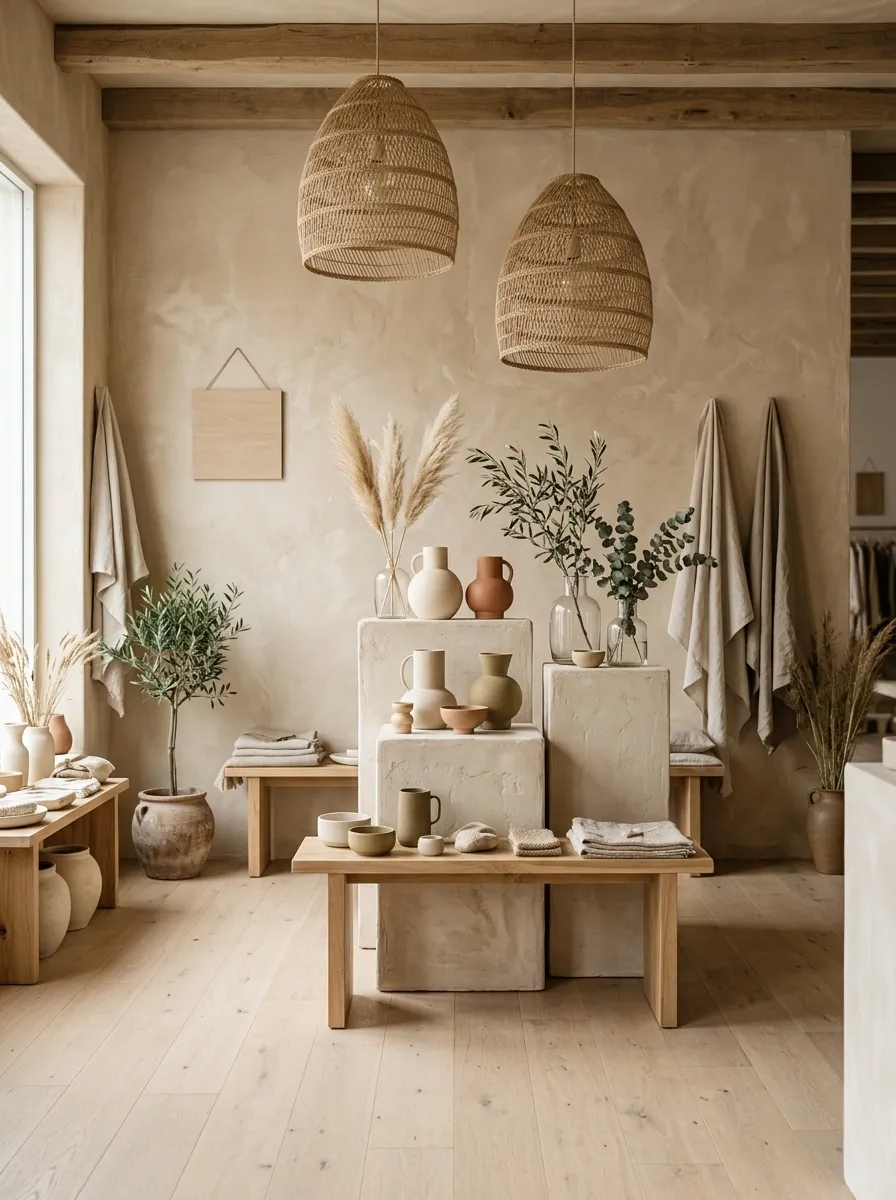
This booth borrows the relaxed material language of a sun-washed Mediterranean interior without turning into a vacation-themed gift shop. Warm limewash walls create the backdrop, pale wood provides structure, woven lighting adds texture, and plaster-look blocks create varied display heights.
The palette stays deliberately sandy, with small touches of muted greenery or earthy product colors. Texture does the interesting work here. Rough walls, woven fibers, smooth ceramics, and natural timber give the eye plenty to explore without requiring decorative clutter.
Keep the signage simple and let the architecture establish the mood. If every surface gets another basket, vase, tassel, and decorative branch, the Mediterranean fantasy quickly becomes a very confused storage closet.
Jewel-Tone Boutique Booth With Deep Blue and Rust
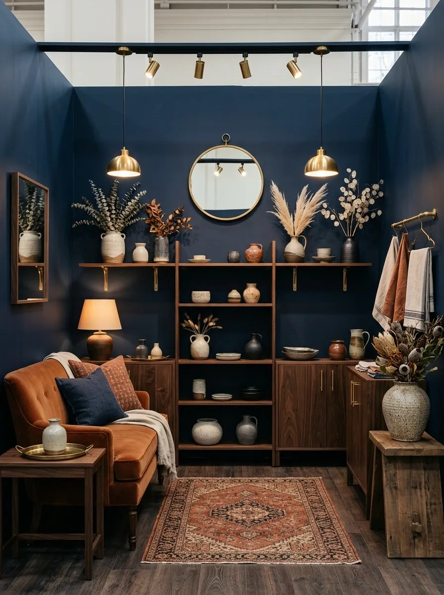
For a booth that needs to feel richer and more dramatic, deep blue and rust make a considerably stronger pairing than throwing six unrelated “luxury” colors into the mix.
Deep blue walls create the visual shell. Rust upholstery or textile accents provide warmth, while dark wood and restrained brass details keep the composition grounded. Warm lighting becomes especially important because cool overhead lighting can flatten the entire palette.
Keep the strongest color concentrated on the architecture and one or two larger objects. The products don’t all need to match. They just need enough neutral space around them that the booth’s color story remains visible.
Architecture and dominant backdrop
Warm focal accent
Visual grounding
Small reflective detail
Neutral Japandi Booth With Low Furniture and Textured Walls
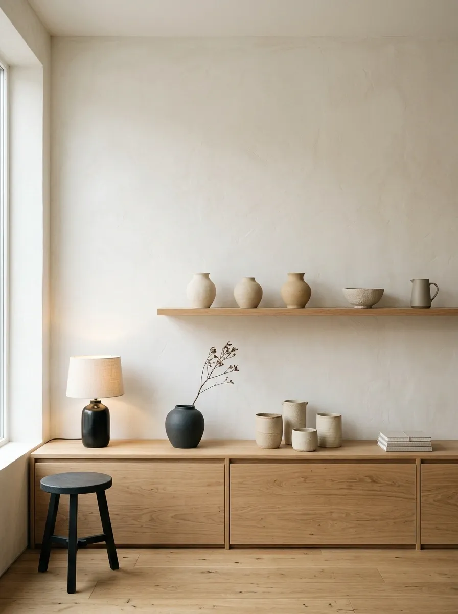
Low furniture instantly changes how a small booth feels. This concept uses warm off-white textured walls, low oak cabinetry, sparse shelving, dark accents, and carefully selected ceramics to create a quiet Japandi-inspired environment.
The lower visual center of gravity leaves more wall space visible, which makes the booth feel calmer and more architectural. Dark accents should be used sparingly, perhaps through a single stool, lamp, or frame, rather than scattered through every product grouping.
This is a design that rewards editing. Remove the least convincing objects and the whole booth improves. Add five more because there is “still room,” and the calm disappears faster than a decent parking spot at a weekend market.
Let the wall do the breathing.
Black Cottage Booth With Warm Wood and Brass Lighting
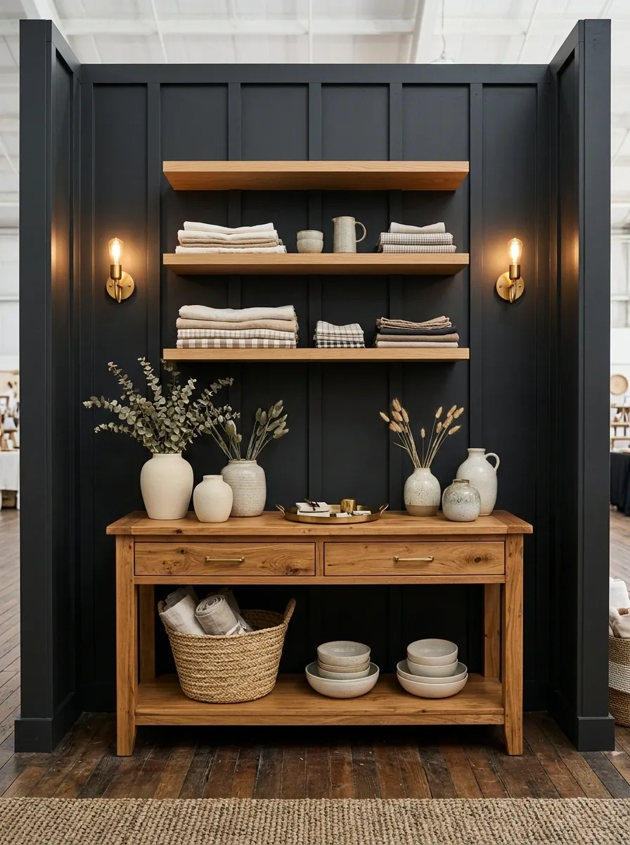
Painting the booth black does not automatically make it sophisticated, despite what certain inspirational photos would like to imply. The surrounding materials have to do some work too.
Here, nearly black walls frame warm timber furniture, brass sconces, patterned textiles, and open shelving. The dark architecture becomes the backdrop instead of the entire personality of the booth. Warm wood introduces contrast, while brass adds small points of reflected light.
The products should remain relatively light or warm in tone so they don’t disappear against the walls. Keep the lighting focused and warm. Cold white lighting against a dark cottage-inspired booth would be the fastest possible route from “moody boutique” to “hardware store after closing.”
Contemporary Cream Booth With Curved Plinths
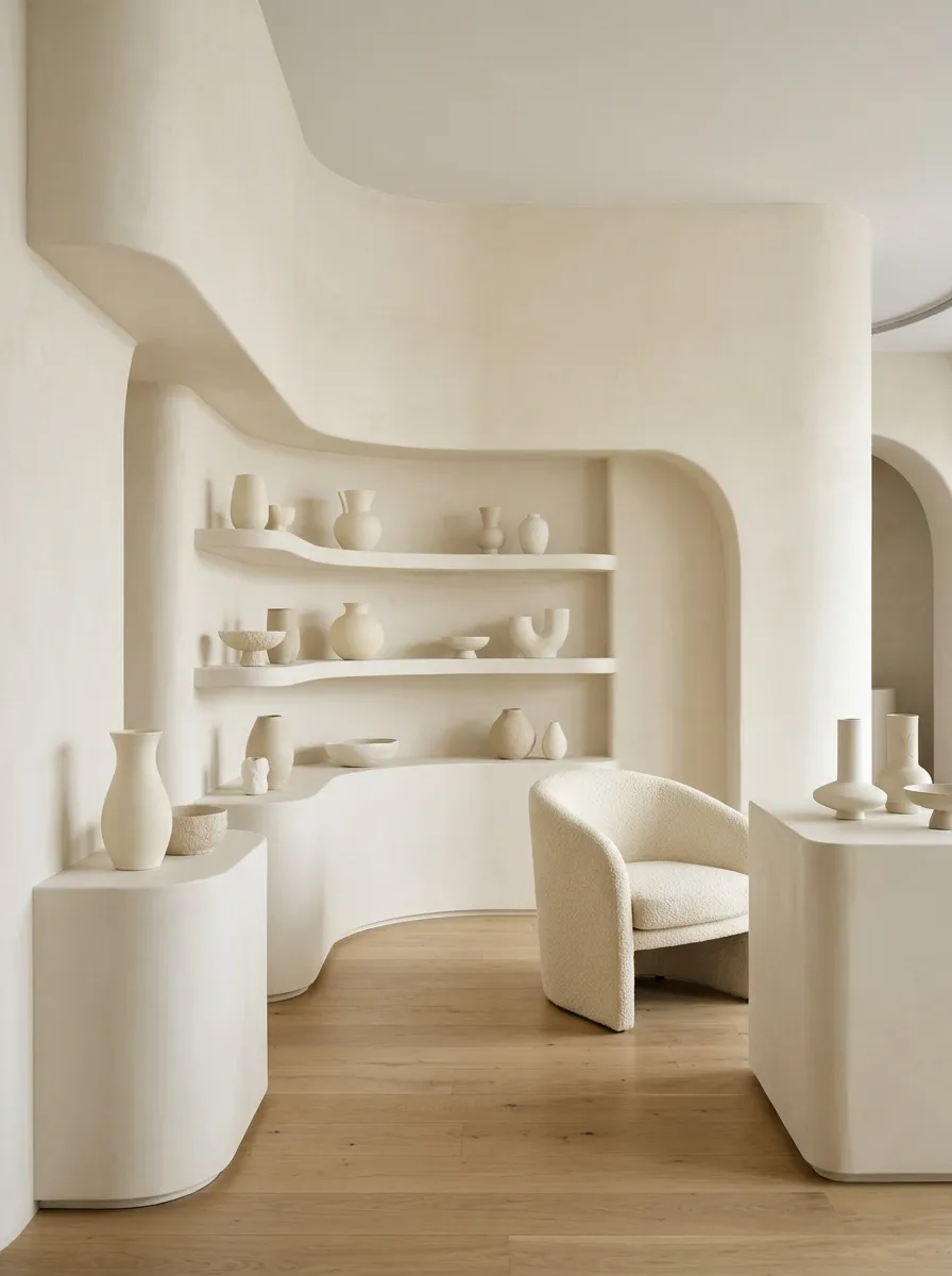
This booth is almost aggressively simple, which is exactly why it works. Cream walls create one continuous shell, while curved plinths, rounded shelving, sculptural furniture, and tonal merchandise introduce shape without adding visual noise.
The repeated curves matter more than any individual display. A rounded plinth beside a straight rectangular shelf would make the composition feel disjointed. Here, the softened forms repeat often enough to establish a clear design language.
Keep the palette restrained and let the silhouettes carry the visual interest. There is no need to fill the booth with decorative objects when the furniture itself already has something to say.
Rustic European Booth With Weathered Timber and Linen
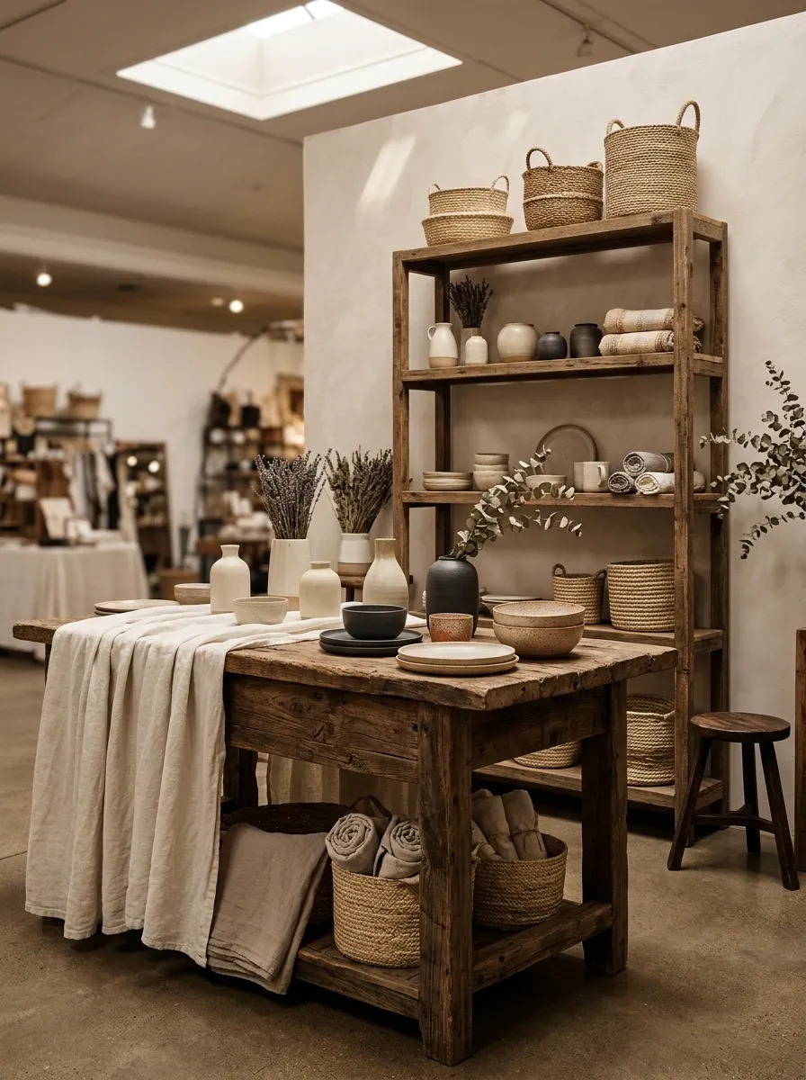
Weathered timber can make a booth feel warm and established, but only when it looks intentional. This concept pairs aged-looking wood with washed linen, simple ceramic displays, woven baskets, and warm lighting to create the atmosphere of a small European shop.
The booth doesn’t need fake rustic props scattered everywhere. The material finish already supplies the character. Keep the furniture substantial but uncomplicated, and use linen to soften the harder wood surfaces.
A restrained palette of weathered brown, cream, muted beige, and natural fiber lets the materials remain the feature. The fastest way to ruin this design is adding enough faux-vintage signage to make the booth look like a theme restaurant.
Contemporary Apartment-Style Booth With Small Living Room Layout
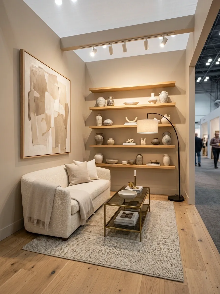
This setup turns a vendor booth into a believable slice of an apartment. A compact sofa anchors one side, a narrow coffee table establishes the center, wall-mounted shelving handles product display, and a floor lamp adds height. Artwork ties the pieces together so the booth reads as one room rather than several unrelated displays.
This approach works particularly well when the merchandise belongs in the home because customers see it in an actual lifestyle context. The furniture should stay compact enough to preserve circulation around the booth. A full-size sectional may technically fit, but “technically” has never been a particularly useful interior design principle.
Warm Cream-and-Caramel Booth With Boutique Hotel Styling
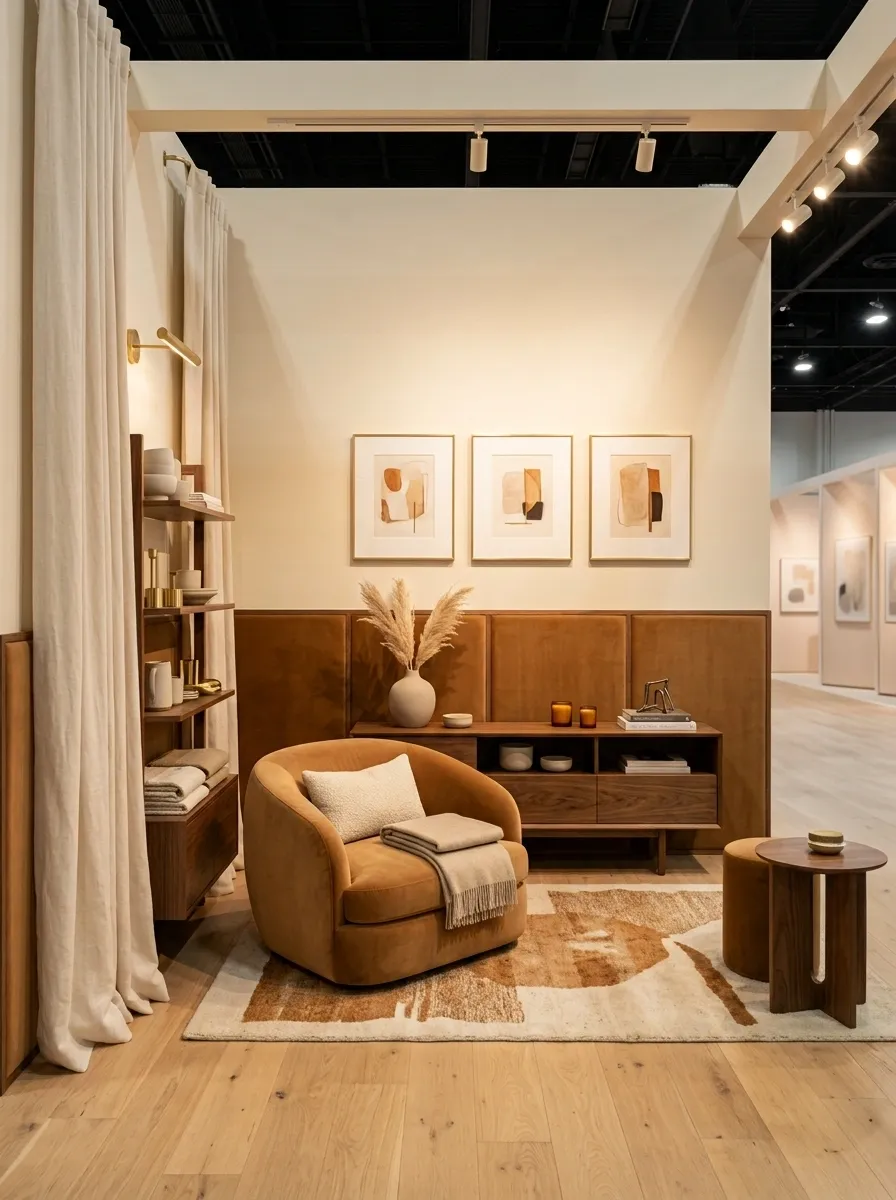
There is a difference between a booth that looks expensive and one that simply contains too much gold. This concept takes the boutique-hotel route with warm cream walls, caramel upholstery, walnut furniture, restrained metal lighting, framed art, and layered textiles.
The deeper caramel and walnut tones anchor the lower half of the booth while the cream architecture keeps everything visually open. Artwork and lighting supply vertical interest without competing with the merchandise.
This direction works especially well for elevated home goods, textiles, accessories, candles, small furnishings, or lifestyle products that benefit from a hospitality-inspired setting. Keep metallic finishes subtle. The goal is understated richness, not a booth that appears to be auditioning for a casino lobby.
Playful Color-Block Booth With Distinct Display Zones
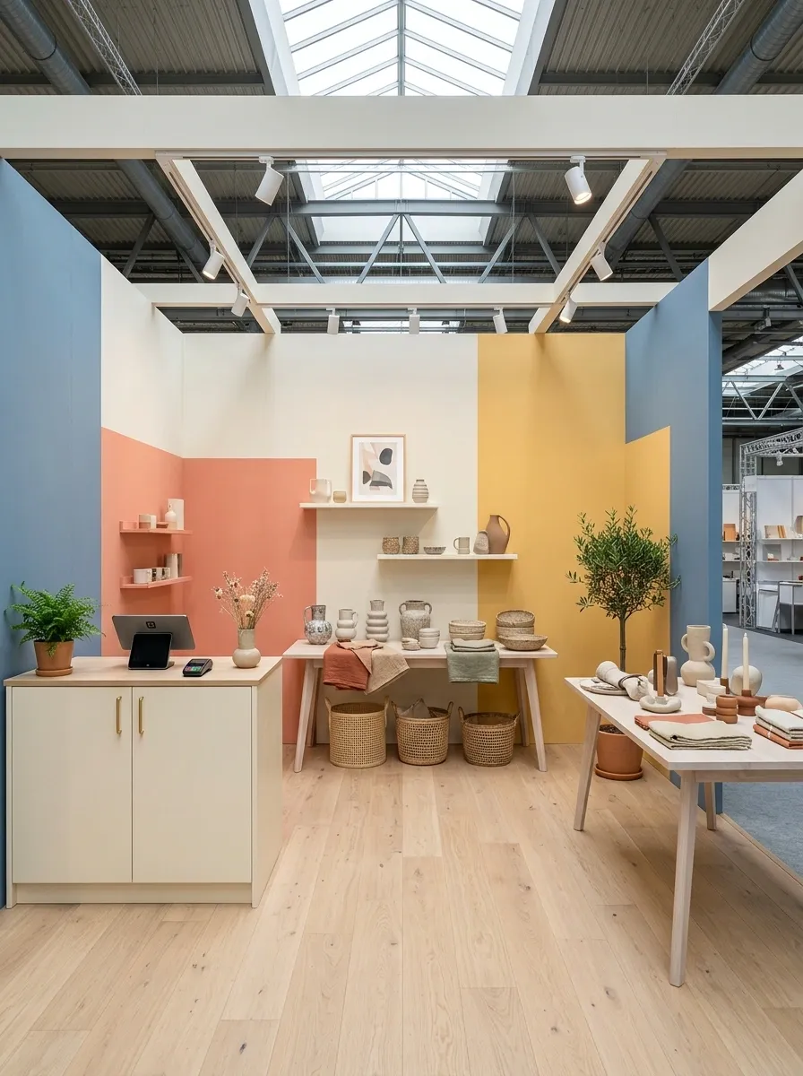
A color-blocked booth can look wonderfully intentional or like a paint store exploded. The difference is planning.
This concept uses muted blue, coral, cream, and warm yellow to divide the booth into distinct visual zones. The architecture stays simple, while each color occupies a meaningful area rather than appearing as random decorative accents. One section might hold a product collection, another a checkout area, and another a feature display.
The colors provide organization before the shopper even reads a sign. That makes the booth easier to understand from a distance. Keep the shapes large and simple. Tiny patches of five different colors scattered across the booth will look less like thoughtful blocking and more like indecision with a paintbrush.
Slim Linear Booth With Full-Height Shelving
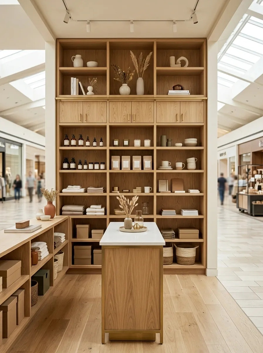
A narrow booth doesn’t need to apologize for being narrow. It just needs to stop wasting its walls.
This concept uses one long, full-height shelving wall as the primary display surface, with a slim central counter and a completely open front. Merchandise is organized vertically rather than spread across a collection of tables. That keeps the floor clear and gives the booth a strong silhouette from the aisle.
The shelving should have visible changes in height and density so it doesn’t become a giant rectangle of identical products. Reserve the eye-level zone for the most important pieces, then use the upper and lower shelves for supporting merchandise. The floor doesn’t need three tables just because three tables technically fit.
Craftsman-Inspired Booth With Built-In Cabinetry and Warm Lighting
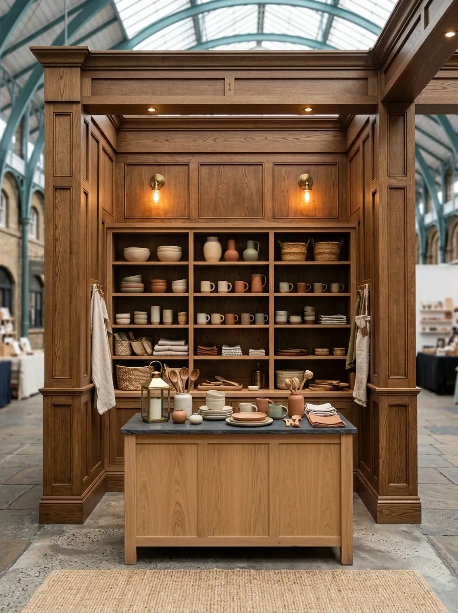
This booth is designed to look less like an event setup and more like a tiny custom-built shop. Stained oak cabinetry creates a substantial base, framed wall paneling adds architectural detail, open shelving displays the products, and warm brass lighting provides a polished finishing layer.
The proportions are what sell the concept. The lower cabinetry gives the booth weight, the middle zone handles merchandise, and the upper architectural framing creates a finished ceiling-to-floor relationship. That makes the booth feel permanent even though the entire thing may exist for a weekend.
Keep the cabinetry straightforward. The point isn’t to build the world’s most elaborate booth. It’s to make the temporary structure look like someone actually thought about it.
finish
Soft Blush Boutique Booth With Ivory and Light Oak
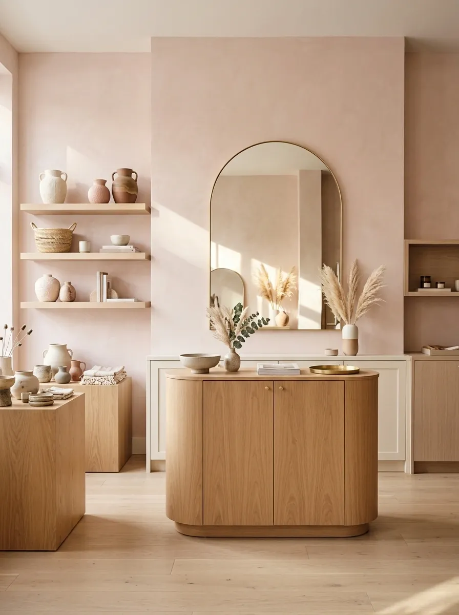
Soft blush can look sophisticated when it stays architectural. It can also become a very enthusiastic pile of pink objects surprisingly quickly.
This version keeps blush mostly on the walls, while ivory cabinetry, pale oak furniture, curved shapes, and restrained metallic details create a softer boutique setting. The color feels intentional because it occupies a large area instead of appearing randomly on every product and accessory.
Use the lighter materials to handle most of the furniture and display surfaces. Then let the blush wall become the visual backdrop. A single curved counter or rounded mirror can reinforce the softer geometry without turning the whole booth into a collection of circles.
Architectural Neutral Booth With Oversized Framing and Sculptural Displays
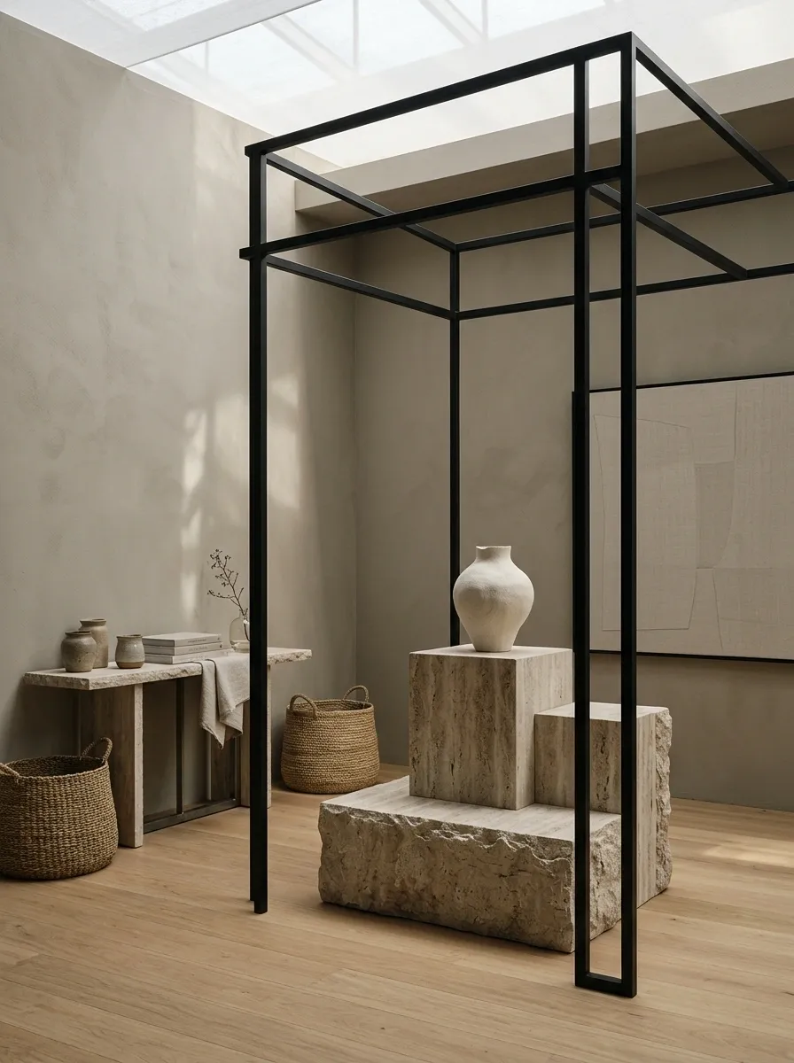
The final concept goes fully architectural. Instead of building the booth around a table, it builds the booth around a large structural frame. Warm greige walls provide the shell, stone-look plinths create varied display heights, sculptural furniture establishes the focal points, and generous negative space keeps the entire installation visually calm.
This approach makes sense when the brand needs to look more like a design studio, gallery, or premium interiors label than a conventional market vendor. The oversized frame gives the booth an unmistakable silhouette from across the aisle.
The temptation here is to keep adding things because there is so much open space. Don’t. That empty area is the expensive-looking part. Fill it up and suddenly the grand architectural gesture becomes a slightly fancy storage shed.
Choose one focal object.
Leave the rest alone.
The Booth Should Look Designed Before Anyone Reads the Sign
The strongest booth isn’t necessarily the one with the biggest backdrop, the most furniture, or the most elaborate display pieces.
It is the one where the visual decisions make sense together.
A dark architectural setup needs different supporting elements than a pale Scandinavian booth. A tiny footprint needs different priorities than an open corner. A colorful product collection may need a quieter environment, while simple merchandise can benefit from a stronger architectural setting.
Start with the complete scene instead of shopping for individual booth pieces. Decide what someone should see from the aisle, establish the dominant visual element, create a clear place for the products, and then add the supporting details. That order matters.
Otherwise, the booth becomes the familiar pile of “good ideas” that somehow looks terrible when everything is standing next to everything else.
Save the designs that actually fit the brand, the footprint, and the products. The goal isn’t to recreate every concept. It’s to find one complete direction and make the whole booth commit to it.