
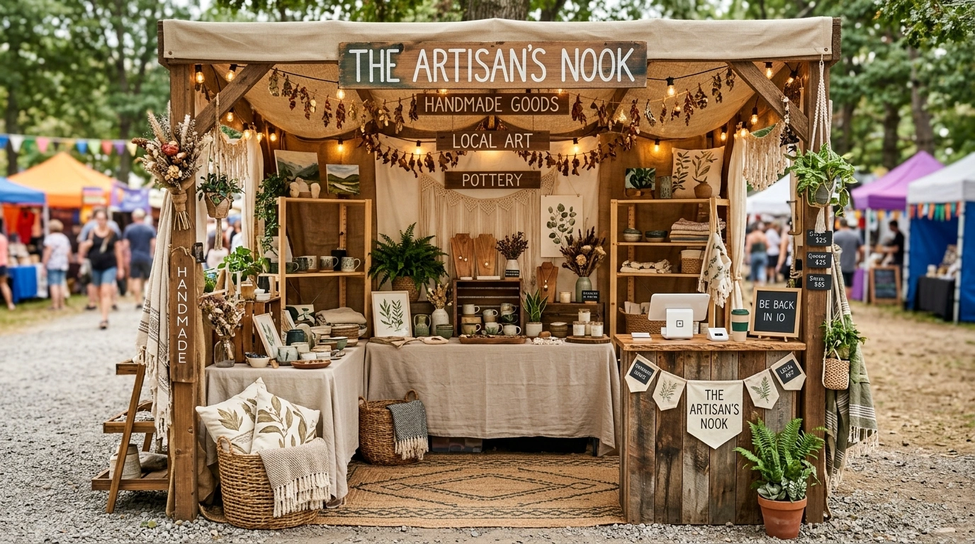
A vendor booth has about three seconds to make someone slow down, and that doesn’t leave much room for a decorating identity crisis.
The easiest mistake is treating the booth like a blank table that needs to be filled. So the sign goes up, then the baskets, then the flowers, then the little wooden risers, then another sign because the first sign suddenly feels lonely. By the time everything is in place, the products are somewhere underneath it all wondering what happened.
A stronger booth starts with the finished picture in mind. The backdrop, furniture, colors, signage, merchandise, lighting, and display heights should feel like parts of the same little world. That’s what makes a setup memorable from across a crowded market.
These cute vendor booth ideas take that approach from the start. Some are soft and cottage-inspired. Others are colorful, moody, vintage, minimalist, rustic, or polished enough to look like tiny permanent shops. The common thread is simple: each setup feels like a complete design rather than a table wearing a collection of accessories.
Why Some Vendor Booths Look Expensive and Others Look Like a Folding Table Had a Bad Day
A cute booth doesn’t need more stuff. It needs more control.
The best setups usually have one obvious visual idea, a limited palette, clear product groupings, and enough breathing room that shoppers can actually see what is being sold. The backdrop should support the products, not start a completely unrelated decorating argument.
That sounds simple until someone adds six signs, three baskets, artificial flowers, a giant chalkboard, random bunting, and a tablecloth that belongs to an entirely different color scheme.
The gallery below takes the opposite approach. Each booth is treated as a complete visual composition, so the furniture, backdrop, merchandise, signage, and styling work together instead of showing up like strangers at the same party.
A vendor booth can have pretty signs, baskets, flowers, shelves, bunting, and approximately 47 adorable little things. That doesn’t automatically make it look good. When every element is trying to be the star, the booth starts looking less like a brand and more like a craft store lost control of the situation.
Cute Vendor Booth Ideas
Bright Retro Market Booth
A cheerful pink backdrop sets an energetic tone, while red-and-white checkered tablecloths and whimsical display stands bring vintage corner-store charm to life. The setup makes brilliant use of height, balancing tall shelving units with neatly organized flat displays on tabletops.
The secret here is leaning entirely into the nostalgic theme without letting the space feel overcrowded. Coordinated signage instantly brands the booth, while clear separation between the stationery and lifestyle items keeps everything accessible for browsing shoppers.
Keep the color story tight by repeating the signature red and pink accents across every display element. A playful environment invites customers to linger longer, turning a standard market table into a destination they simply cannot walk past.
Warm Cottage Market Booth With Painted Wood and Soft Florals
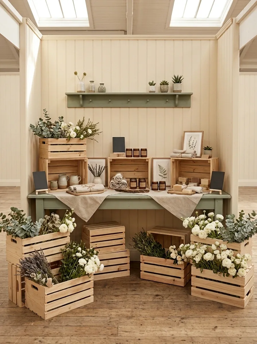
Warm cream walls, muted sage furniture, natural wood crates, loose flowers, linen accents, and hand-lettered signage turn this booth into a tiny countryside shop. The display uses different heights, with products arranged on the tabletop, inside open crates, and on a narrow rear shelf.
The important part is the restraint. The flowers soften the booth without swallowing it, while the painted furniture gives the whole setup a recognizable color story. Keep the center relatively open so shoppers don’t have to perform an obstacle course just to reach the products. The booth should feel collected, not stuffed.
Dreamy Pastel Grid Booth
Soft pink grid panels, whimsical floating signage, and charming botanical accents give this booth a dreamy, ethereal aesthetic that draws people in from across the room. The layout relies on organized vertical hanging space to showcase an extensive collection of colorful accessories.
The key to this design is maximizing wall space without making the display look chaotic. Grouping items by color family and packaging style creates a clean, intentional presentation that feels both curated and abundant.
Integrate subtle lighting and nature-inspired garlands to soften the grid structure and add organic warmth. A cohesive visual identity makes the merchandise pop, proving that vertical organization can be both highly functional and utterly delightful.
Playful Peach and Coral Booth With a Bold Scalloped Backdrop
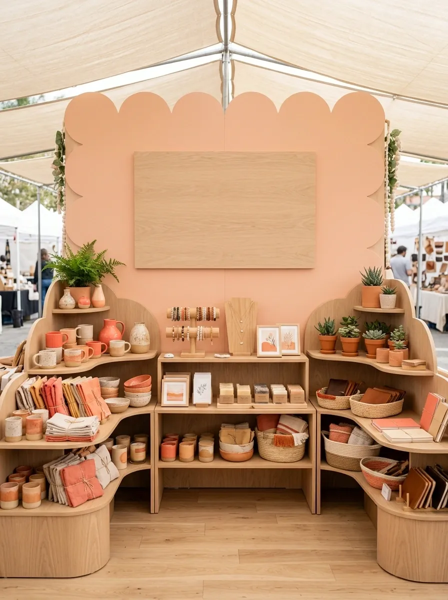
A peach-and-coral backdrop gives this booth its personality immediately, while pale wood shelves and rounded display pieces keep the look from becoming too sugary. A large central sign anchors the setup, and colorful products are grouped instead of scattered across every available surface.
The scalloped backdrop does enough visual work that the rest of the booth can calm down. That’s useful because a market display doesn’t need twelve separate attention seekers. Repeat the curved shape in the shelving or sign for a subtle sense of continuity, then let the merchandise provide the smaller bursts of color.
Peach creates the background, coral supplies the visual punch, and pale wood gives the eye somewhere quieter to land. The merchandise can add smaller color moments without starting a full-scale color rebellion.
Chic Pastel Glassware Booth
A bold pink circular sign anchors this welcoming setup, sitting above light wood display tables and carefully arranged glassware collections. The products are showcased with plenty of breathing room, allowing the intricate designs and pastel hues to truly stand out.
This booth succeeds through thoughtful merchandising and a commitment to a clean, inviting color palette. Elevating select pieces on small risers adds visual dimension, while clearly marked pricing builds immediate trust with potential buyers.
Keep the surrounding surfaces uncluttered so the handcrafted drinkware remains the undisputed star of the show. A polished presentation turns casual onlookers into eager customers who appreciate the craftsmanship on display.
Organic Linen Booth With Rattan, Oak, and Dried Botanicals
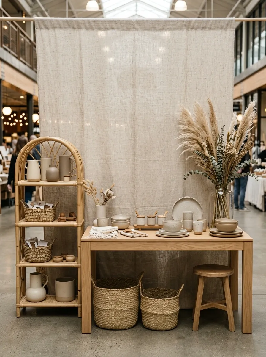
This booth trades bright color for texture. An oatmeal linen backdrop sits behind light oak tables, rattan shelving, woven baskets, ceramic vessels, and dried grasses. Products are grouped in small clusters, leaving enough exposed surface to make the materials part of the design.
The result feels natural because the palette is quiet while the textures do the talking. That’s the difference between a restrained booth and a boring one. Use the same warm family of materials across the setup, but vary their texture and shape so everything doesn’t blur into one beige rectangle.
Vibrant General Store Setup
Bright yellow shelving units, classic checkered tablecloths, and a playful checkerboard floor pattern transform this double booth into an immersive vintage general store experience. The space utilizes varying display heights and clever structural elements to create distinct shopping zones.
The magic lies in architectural framing and deliberate color blocking that guides the shopper’s eye naturally through the entire collection. Stacking brightly colored storage crates creates sturdy, cost-effective shelving that doubles as structural decor.
Balance the high-energy patterns by leaving small pockets of breathing room across the lower tables. A joyful, well-executed theme makes the entire booth feel like a joyful retail destination rather than just a temporary market stall.
Tiny Boutique Booth With a Built-In Shopfront Feel
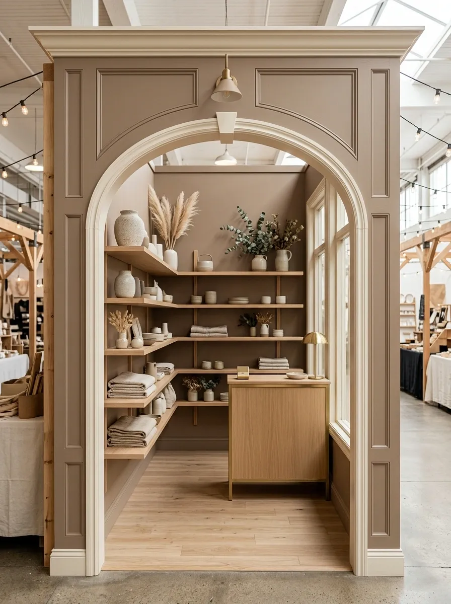
A narrow booth becomes much more memorable when it looks like a tiny storefront instead of a table parked in an aisle. This version uses a painted facade, a framed opening, slim shelving, a compact counter, and a defined entrance that naturally guides shoppers inward.
The trick is architectural focus. The facade establishes the brand before anyone gets close enough to read the products. Keep the furniture shallow so the booth doesn’t eat up its own floor space, and use the vertical backdrop for shelving rather than covering the entire footprint with more tables.
The booth feels larger when the shopper can understand where to enter, where to look, and where to finish without squeezing around a collection of unrelated furniture.
Vintage Parisian Market Booth With Cream, Black, and Brass
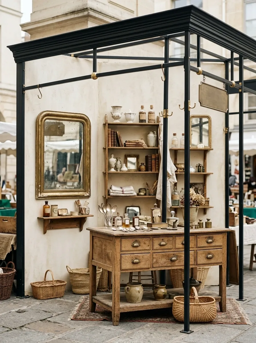
An aged cream backdrop, slim black framing, antique-style mirrors, warm brass details, and vintage furniture give this booth the character of a tiny European shop. Products are grouped tightly enough to feel collected, but the shelves aren’t overloaded.
The palette keeps the vintage styling from drifting into costume territory. Black gives the lighter pieces structure, while brass adds small flashes of warmth. The vintage furniture should carry most of the personality, so there’s no need to cover every surface with decorative clutter. Otherwise the booth starts auditioning for a period drama.
Colorful Candy-Shop Booth With Layered Pastels
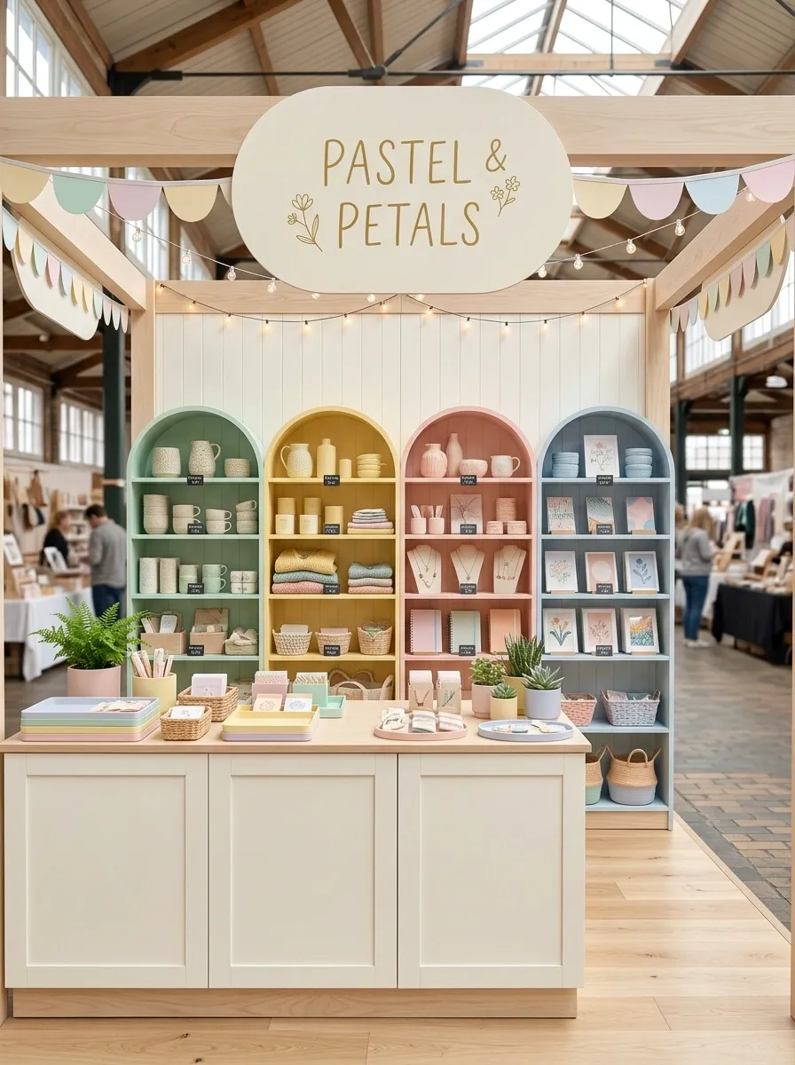
Mint, butter yellow, blush pink, powder blue, and creamy white turn this booth into a cheerful little market shop. Rounded shelving softens the structure, while products are grouped by color instead of scattered wherever there happens to be an empty inch.
The trick is giving the pastel palette a quiet base. Cream and pale wood keep the setup from looking like a birthday party discovered retail therapy. Use one large sign, repeat the rounded shapes in a few places, and let the products provide the smaller bursts of color.
Moody Forest Green Booth With Dark Wood and Warm Lighting
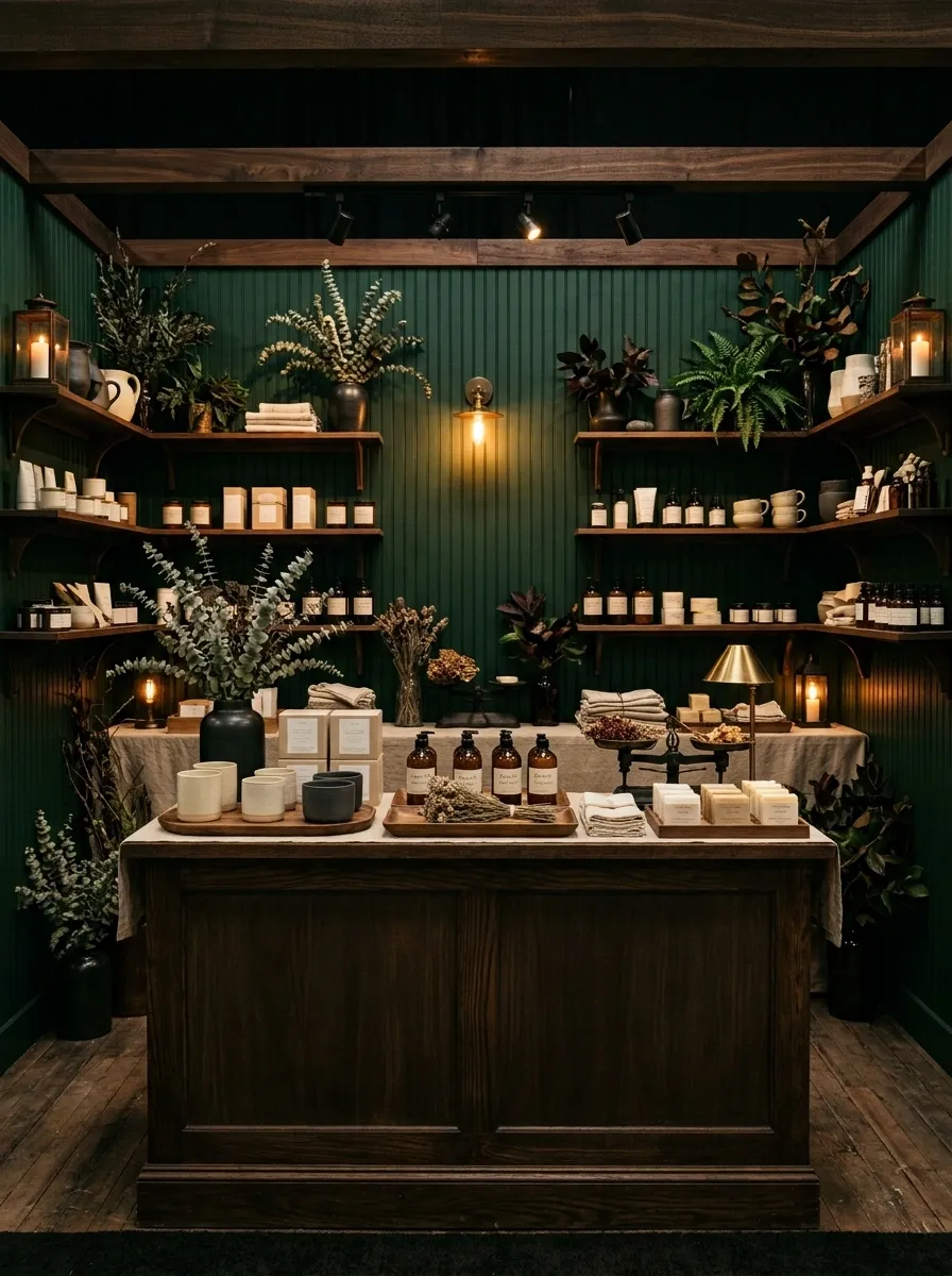
Deep forest green walls, dark wood furniture, amber lighting, natural foliage, and restrained brass details create a booth with considerably more drama than the average market table. Lighter products stand out against the dark background, making the merchandise part of the visual composition.
This works especially well when the products themselves have pale packaging, warm labels, or natural finishes. The lighting matters here, because a dark booth without enough illumination doesn’t look sophisticated. It just looks like the electricity bill won.
Keep the brightest light near the products and allow the outer edges of the booth to remain slightly quieter.
Secondary glow: nearby shelving and tabletop.
Softest zone: outer edges of the booth.
Feminine Blush Booth With Arched Shelving and Cream Furniture
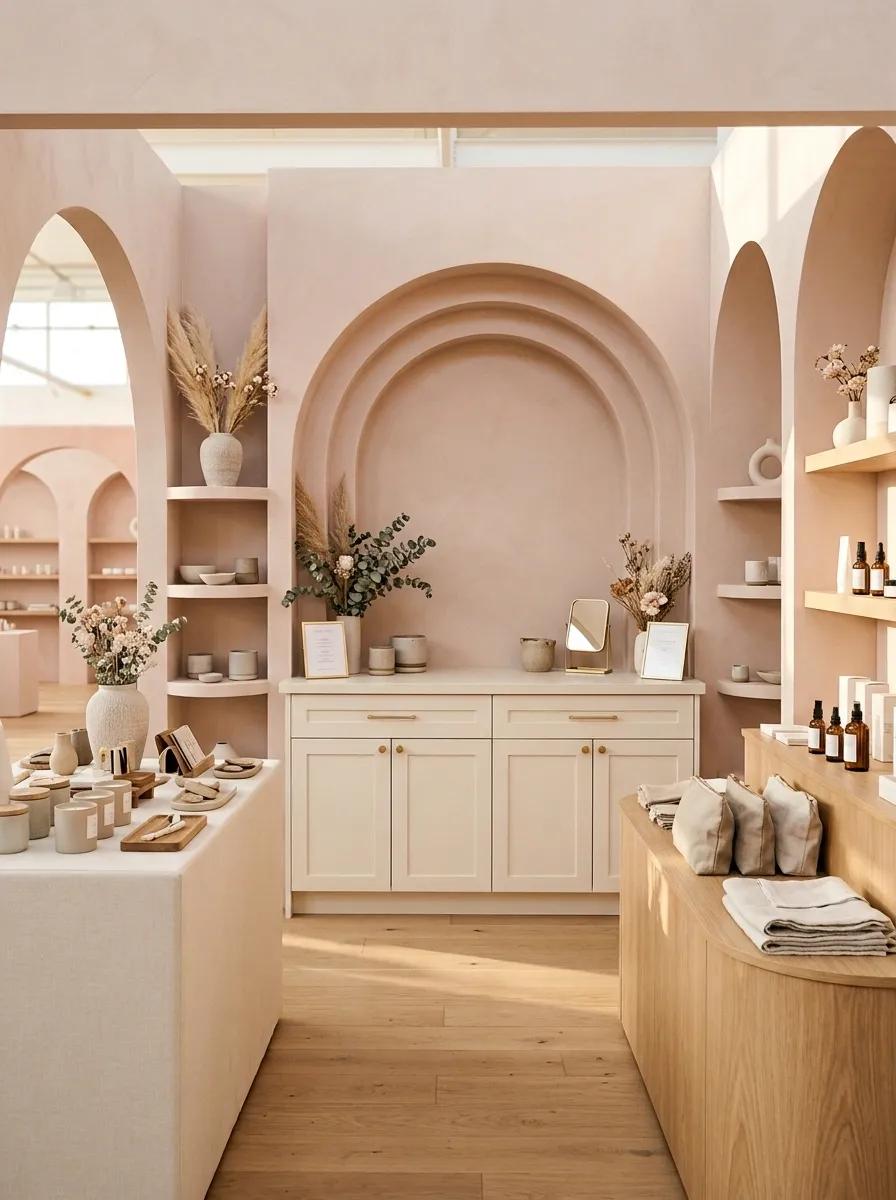
Soft blush walls, cream furniture, curved shelving, delicate floral styling, and subtle warm metallic details give this booth a polished feminine character without drowning it in decoration. The repeated arches create a visual rhythm that makes the booth feel custom-designed.
The furniture should do most of the styling work here. That’s important because adding flowers, ribbons, frames, signs, and decorative objects to every shelf would quickly erase the clean look. Keep the products in tidy groups and allow the curved architecture to remain visible.
A booth like this benefits from a restrained backdrop because the arches already provide plenty of personality.
Rustic Farmstand Booth With Wood Crates and Canvas Signage
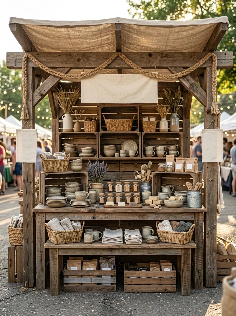
Chunky wood, canvas signage, woven baskets, galvanized accents, and stacked crates give this booth the feel of a tiny farmstand dropped into a busy market. The display feels abundant without becoming visually messy because the products are grouped by type and height.
The wood creates the strongest visual foundation, while the canvas keeps the signage soft and approachable. Use the crates as actual display architecture rather than decoration. A stack should raise products, frame an opening, or create a useful transition between levels.
And yes, there can be baskets. Just not enough baskets to make the booth look like it is preparing for a wicker shortage.
Best for hero products and the clearest brand message.
Main browsing zone and strongest product grouping.
Useful for larger items, overflow, and supporting displays.
Minimal White Booth With One Strong Signature Color
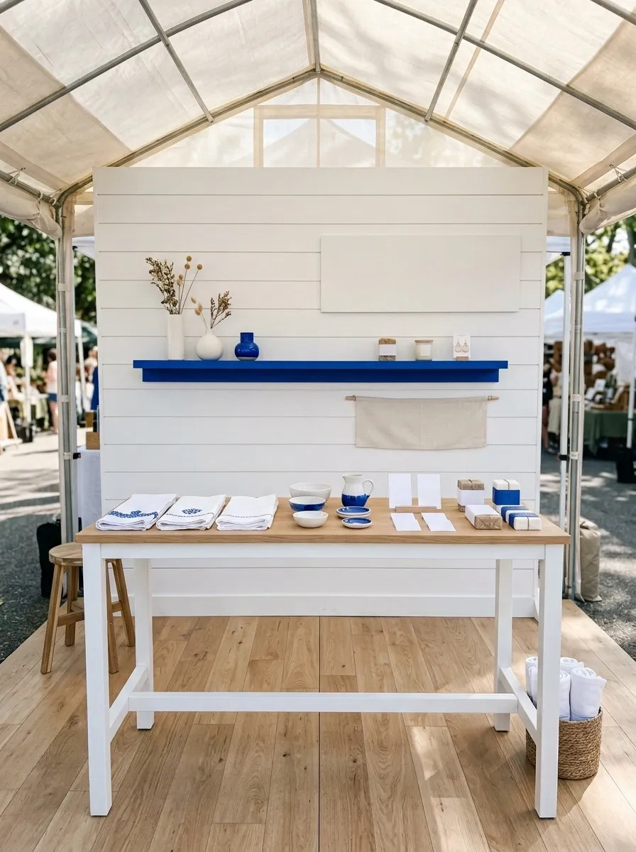
A white backdrop, simple furniture, restrained signage, and one bold brand color create a booth that looks polished without trying too hard. The merchandise provides the visual interest while the white structure keeps everything easy to read from across the market aisle.
This design works because the accent color appears with purpose. It might show up on packaging, one painted shelf, the logo, or a small set of display objects, but it doesn’t need to colonize every available surface.
The empty space is part of the composition. Without it, the clean aesthetic disappears very quickly.
Flower-Market-Inspired Booth With Soft Green and Natural Wood
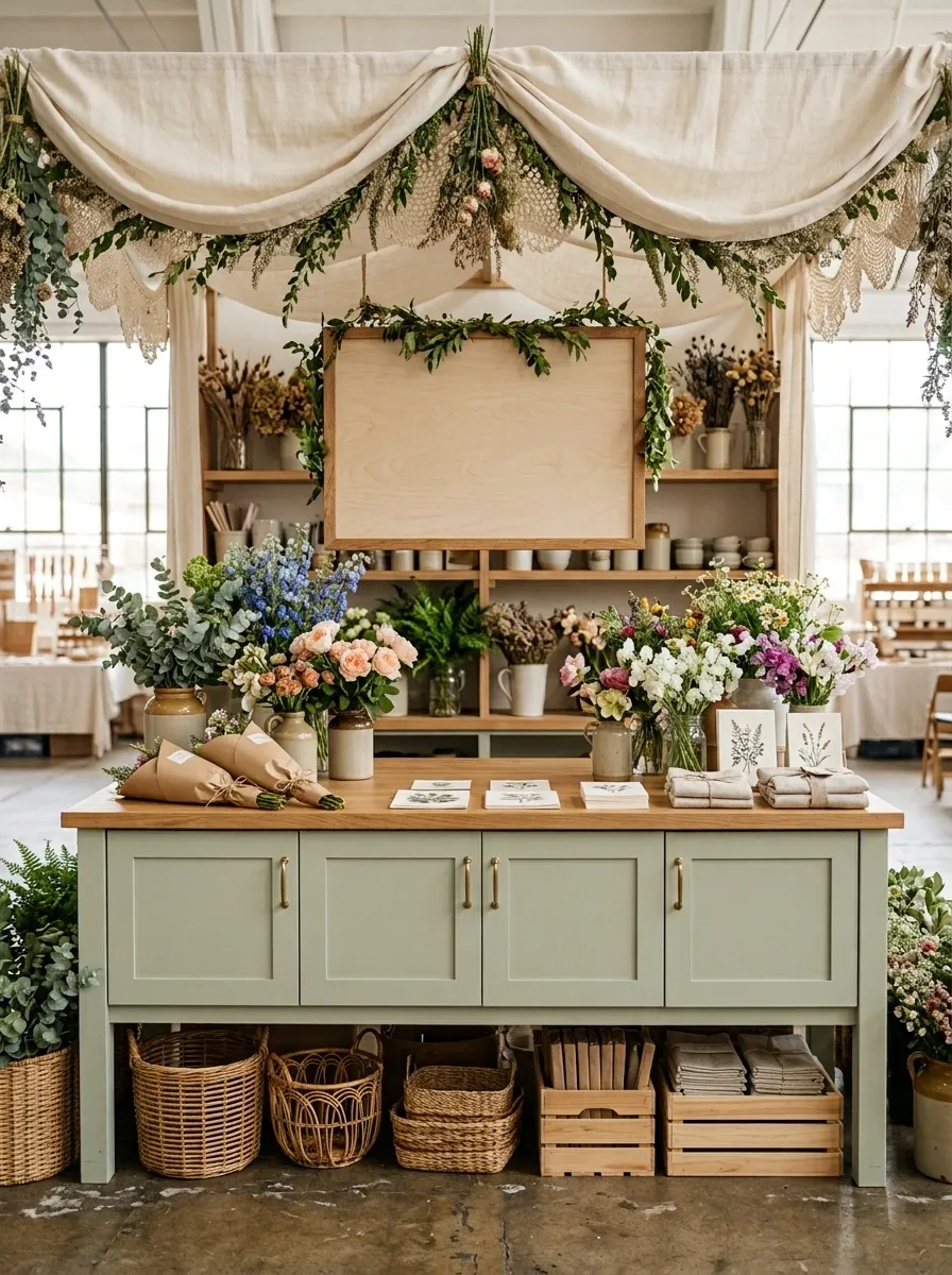
Pale green cabinetry, natural wood counters, loose flower bunches, botanical signage, paper-wrapped products, and soft fabric overhead turn this setup into a tiny flower shop with a market-day footprint.
The booth feels especially convincing because the botanical theme is built into the whole composition rather than sprinkled around as decoration. The cabinetry establishes the color, the wood keeps it grounded, and the flowers add movement at different heights.
Keep the center counter relatively clean. A flower-inspired booth already has plenty of visual texture, so covering every surface with extra greenery would be less “garden market” and more “the plants have staged a coup.”
Scandinavian-Inspired Booth With Pale Wood and Warm White
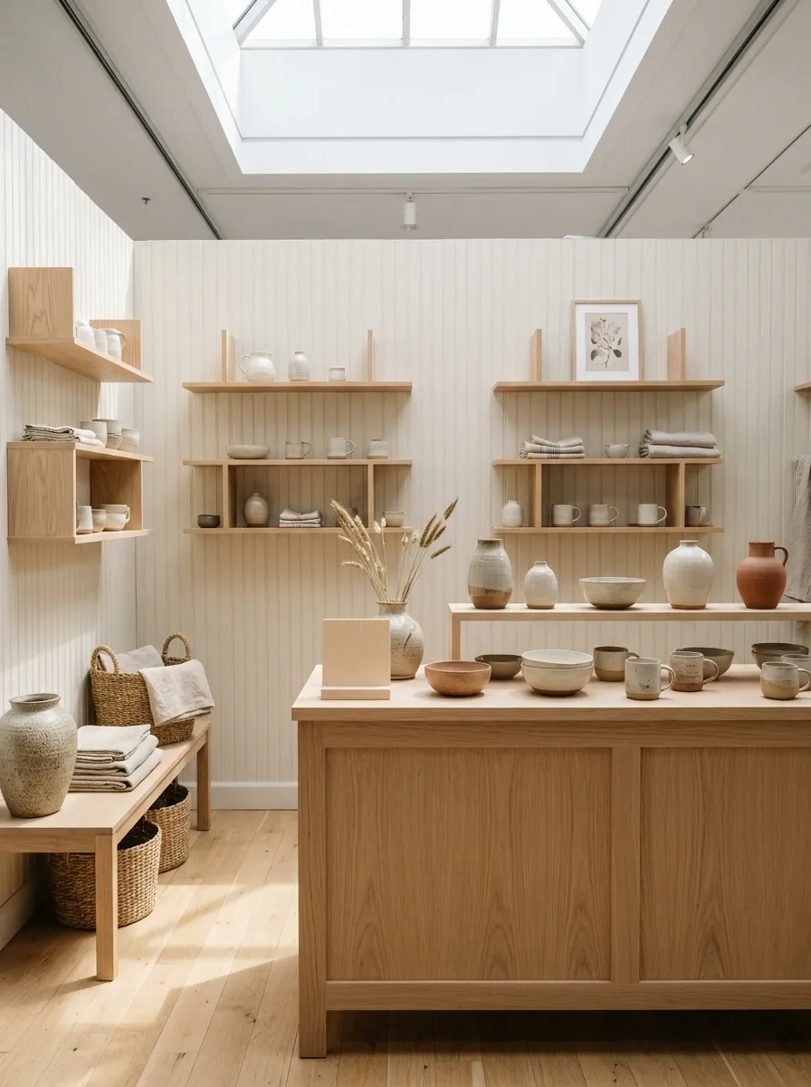
Pale oak, warm white walls, simple geometric shelving, woven baskets, restrained signage, and carefully spaced products create a booth that feels calm without becoming bland.
The simplicity comes from limiting the number of visual ideas. The furniture stays light, the backdrop stays quiet, and the merchandise gets enough room to actually be noticed. There is no need for six decorative signs explaining how charming the booth is. The booth should make that case on its own.
Use subtle differences in wood grain, fabric, and product shape to create interest. In a restrained booth, small material changes matter much more.
Retro Checkerboard Booth With Soft Modern Colors
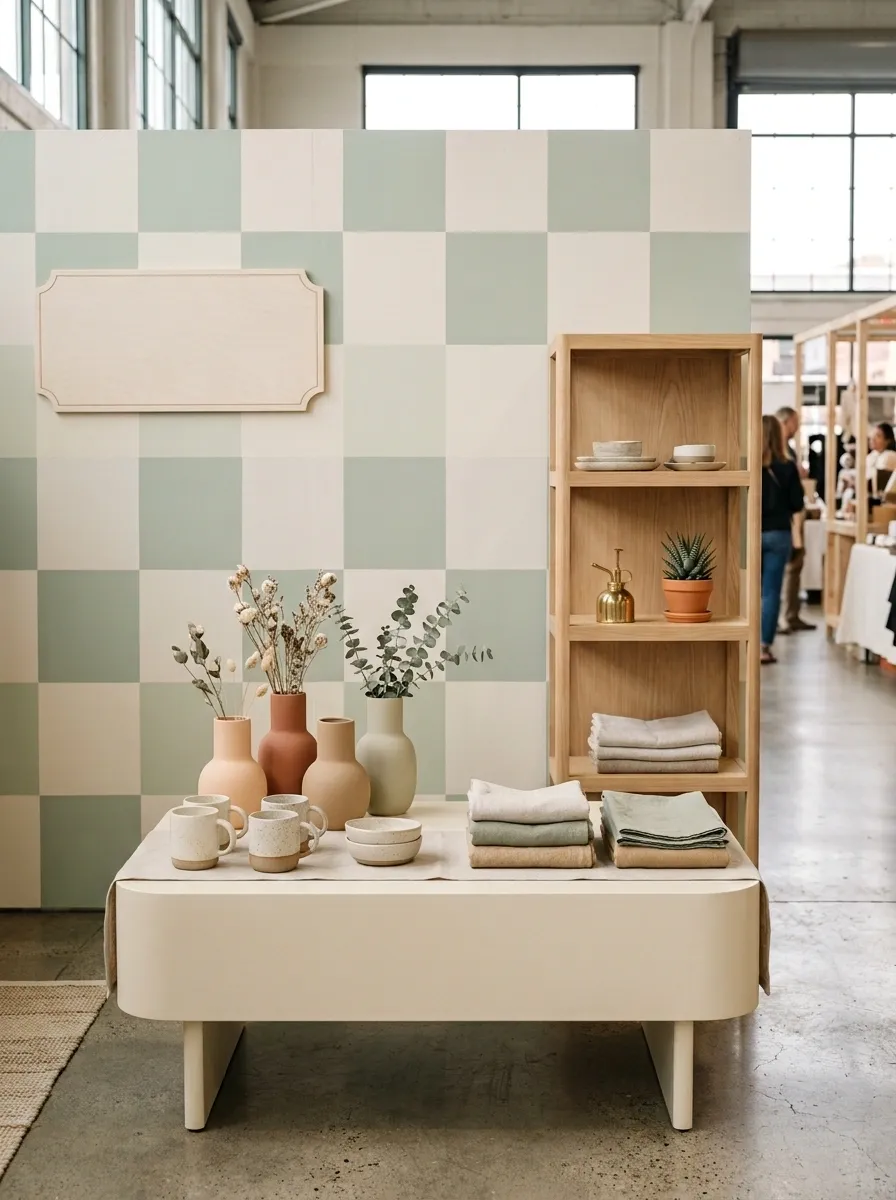
A muted checkerboard backdrop gives this booth a recognizable retro identity, while rounded furniture, pastel merchandise, vintage-style lettering, and carefully selected accessories keep it playful rather than theatrical.
The key is making the pattern the main graphic. Everything else should support it. Use simple furniture silhouettes and a relatively quiet product arrangement so the checkerboard has room to read.
This is the kind of booth where restraint matters even more than usual. Add too many competing patterns and the finished result goes from charming retro shop to visual migraine surprisingly fast.
Keep furniture silhouettes simple, use smaller color accents, and avoid stacking multiple competing patterns. One strong graphic is enough to establish the theme.
Tiny Black-and-Cream Boutique Booth With Graphic Signage
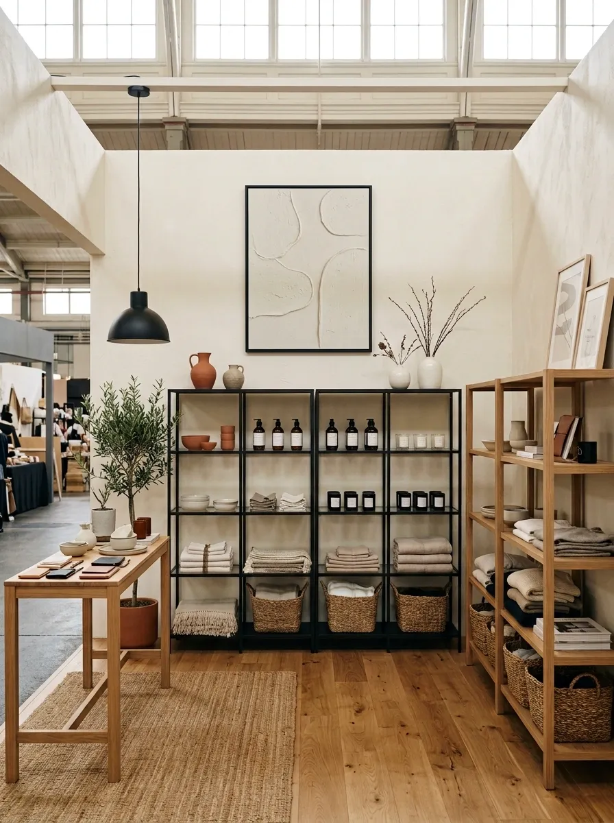
Cream walls, black-framed furniture, bold typography, warm wood touches, and neatly arranged merchandise make this tiny booth feel more like a deliberately branded storefront than a temporary market setup.
The strongest feature is the contrast. Black provides structure while cream keeps the footprint from feeling visually heavy. Small wood accents soften the graphic quality and prevent the booth from looking like an office display.
This composition works particularly well when the business already has a strong logo or recognizable typography. Let the branding become part of the architecture instead of shrinking it onto a tiny sign that disappears behind the products.
Whimsical Garden Party Booth With Canopy and Bunting
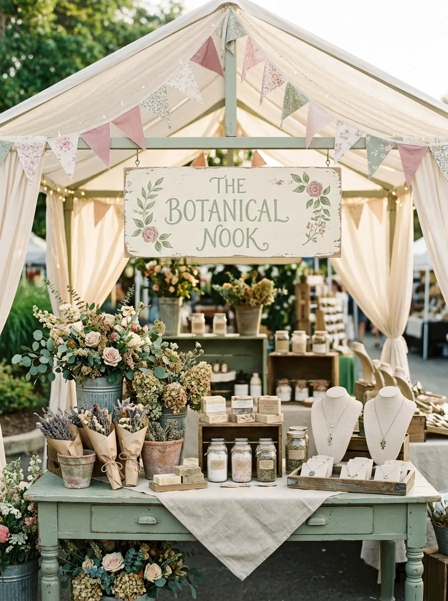
A fabric canopy, soft bunting, floral arrangements, painted furniture, vintage containers, and a welcoming central sign make this booth feel like a little garden party rather than another folding-table setup.
The canopy establishes the silhouette from a distance, which is useful in a crowded market. Once shoppers get closer, the lower display carries the detail through flowers, containers, and carefully grouped products.
The trick is keeping the overhead treatment lighter than the merchandise. The canopy should frame the booth, not block it. And yes, bunting can be cute. It just shouldn’t look like it survived three birthday parties and refused to go home.
Modern Market Booth With Terracotta, Cream, and Walnut
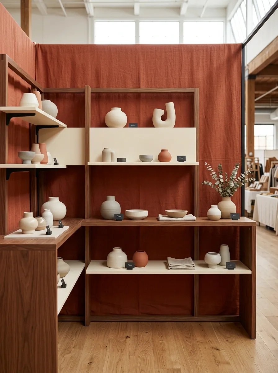
Terracotta fabric, warm walnut furniture, creamy shelving, sculptural pottery, and restrained black lettering give this booth a modern market look without making it feel like a furniture showroom. The earthy palette provides enough character that the products don’t need a pile of decorative props fighting for attention.
Walnut carries visual weight, so keep the larger furniture pieces simple and let the cream surfaces create breaks between darker elements. The terracotta should act as the backdrop or strongest color field, while black stays limited to typography and small structural details.
The result feels deliberate, warm, and grown-up. Basically, a booth that knows what it came here to do.
Soft Coastal Booth With Sand, Pale Blue, and White
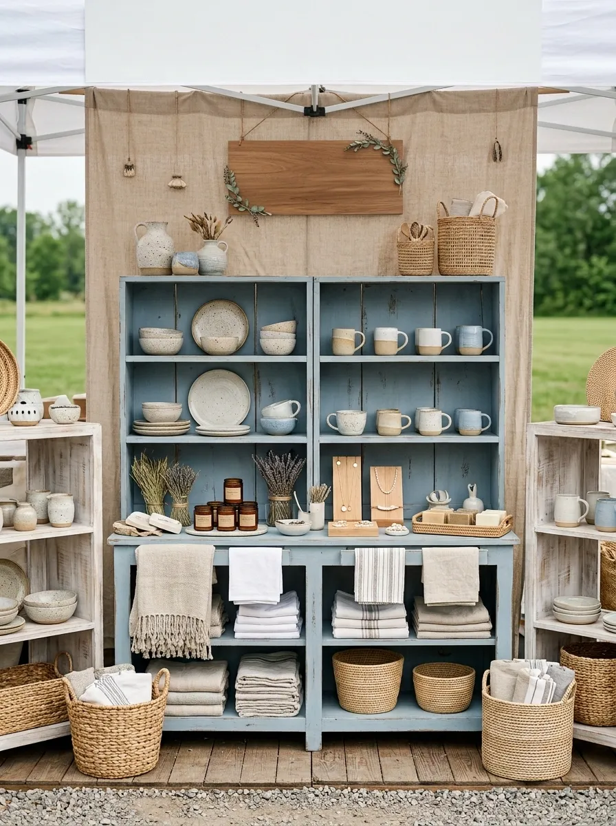
A sandy beige backdrop, pale blue furniture, whitewashed wood, woven baskets, airy signage, and carefully spaced products create a coastal-inspired booth without resorting to seashells on every available surface.
The palette does the thematic work. Sand gives the booth warmth, pale blue adds a cooler note, and white keeps the whole composition open. Natural woven materials provide texture without competing with the products.
This concept works especially well for brands that sell handmade goods, textiles, artwork, accessories, or other products that benefit from an airy presentation. Keep the nautical references subtle. Nobody needs a decorative anchor shouting across the aisle.
Handmade Craft Booth With Pegboard Walls and Natural Wood
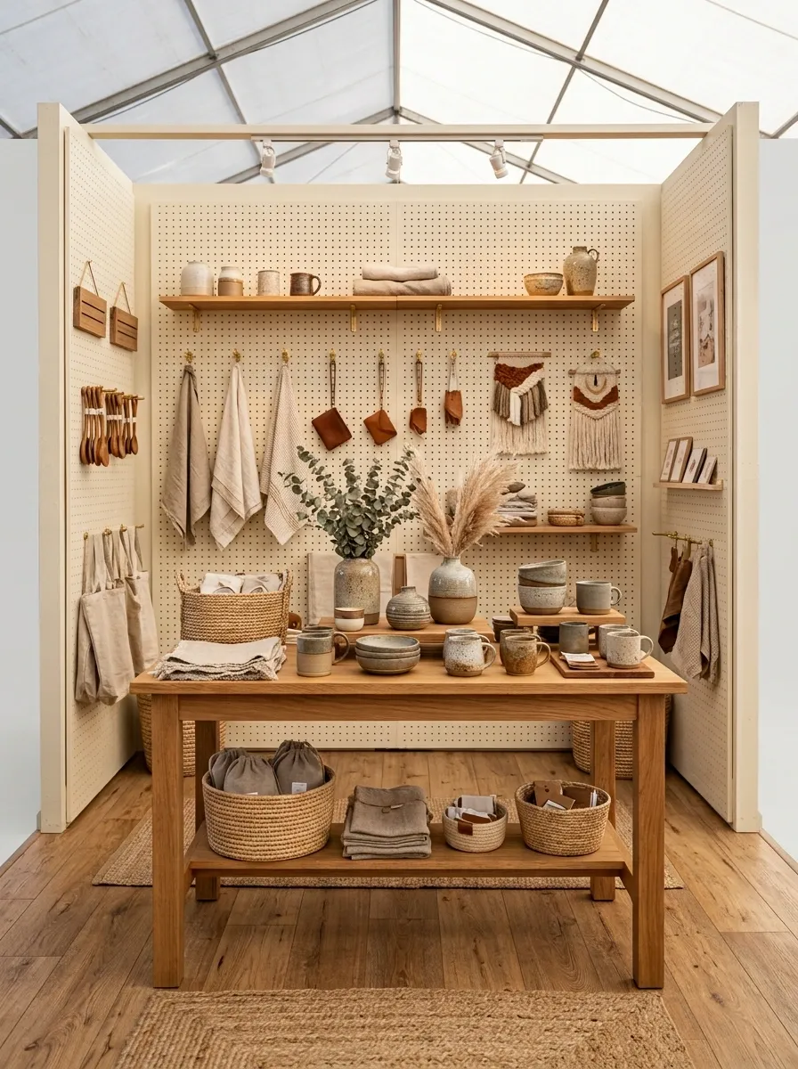
A painted pegboard backdrop turns organization into part of the design. Natural wood tables, floating shelves, hooks, small framed signs, and neatly arranged handmade products create a booth that feels useful without looking like a workshop exploded into a public place.
The pegboard provides vertical merchandising space, which matters when floor space is limited. Small products can hang at eye level, while larger pieces sit on shelves or the tabletop. Keep the arrangement grouped by product type so shoppers can understand the display at a glance.
The beauty here is that almost every structural element earns its floor space. Decorative filler isn’t invited.
Romantic Dusty Rose Booth With Vintage Furniture
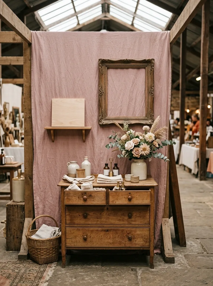
Dusty rose fabric, aged wood, vintage drawers, antique-style frames, delicate flowers, and muted neutral products create a romantic booth with personality. The furniture provides the character, so the accessories can stay restrained.
An old sideboard or narrow dresser works particularly well here because its drawers and shelves create natural display levels. Pair that with one simple sign and a loose cluster of flowers rather than filling the booth with tiny decorative details.
The finished effect feels collected instead of manufactured. Nothing needs to scream “romantic.” The furniture already got the memo.
Let an aged cabinet, narrow dresser, or vintage table establish the character. Use florals and framed details as accents rather than trying to manufacture romance on every surface.
Bright Lemon Market Booth With White and Natural Wood
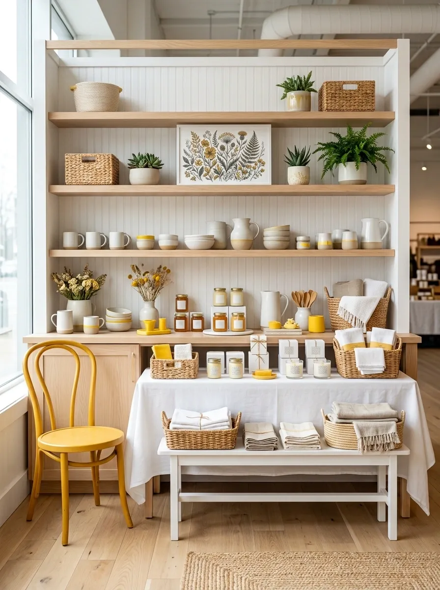
Warm yellow accents, crisp white surfaces, pale wood fixtures, playful signage, and neatly organized products give this booth an immediate burst of energy. The yellow is lively without taking over the entire setup because the surrounding furniture stays neutral.
The strongest move is using the same yellow in several strategic locations rather than creating one enormous yellow focal point. A painted sign, selected packaging, one chair, and a few small display pieces can create enough repetition to make the palette feel intentional.
White keeps the booth fresh, while natural wood stops the yellow from becoming visually harsh. Cheerful, yes. Highlighter aisle at the office-supply store, thankfully no.
Moody Plum Booth With Velvet, Walnut, and Soft Lighting
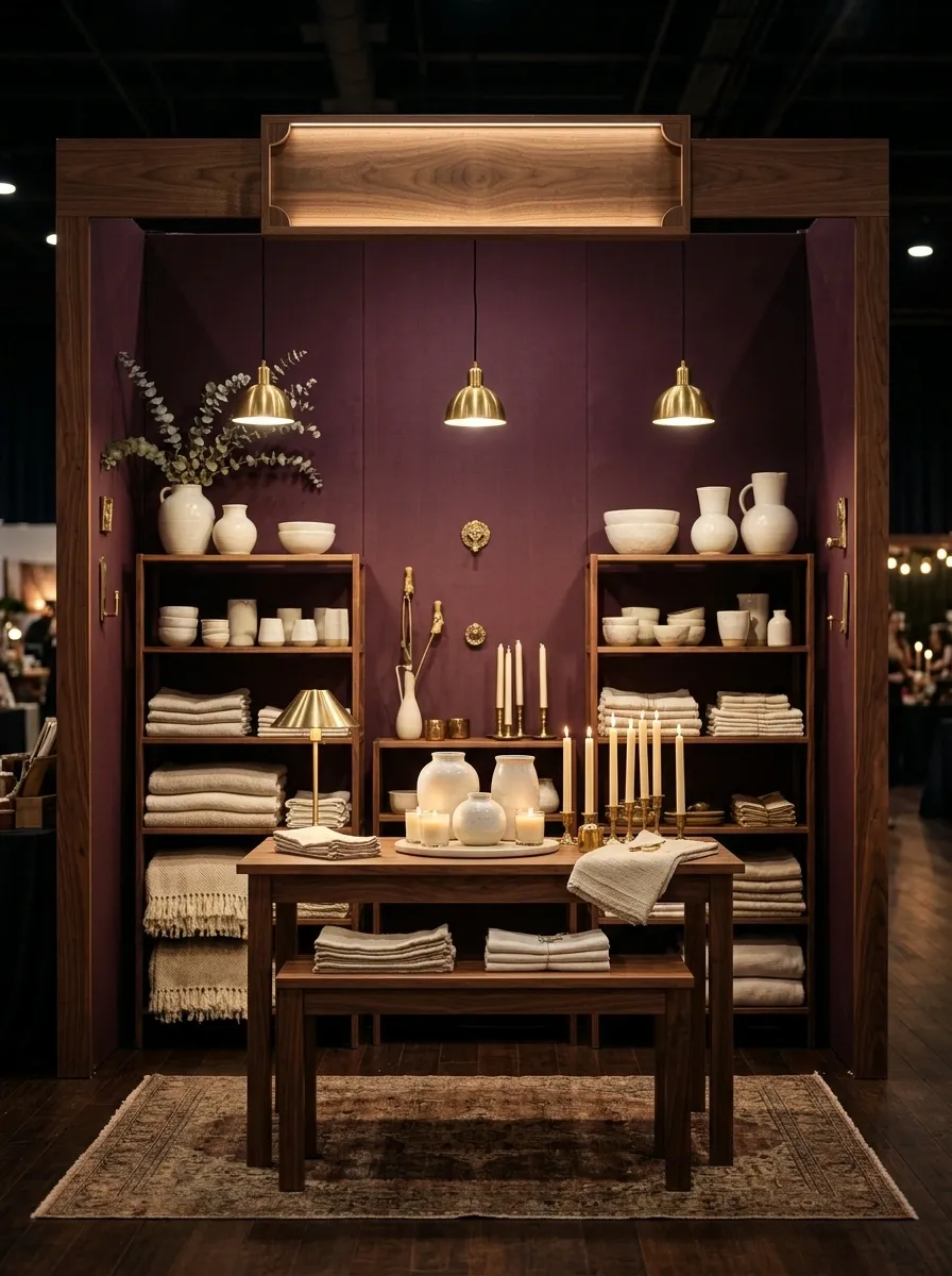
Deep plum fabric, walnut tables, warm lamps, muted metallic details, and tightly edited product groupings give this booth an intimate boutique feel. The darker palette creates a strong backdrop for lighter packaging, pale ceramics, candles, textiles, or other products that need contrast.
Lighting is what keeps the idea from becoming unnecessarily gloomy. Place the brightest illumination around the main products and sign, while allowing the outer edges to fall slightly darker. That creates depth instead of lighting the entire booth like a supermarket freezer aisle.
Keep the metallic details small. A little warmth from brass or antique gold is enough. Once every object starts reflecting, the booth loses the calm, rich quality that makes this concept work.
Secondary glow: nearby shelving and tabletop.
Softest zone: outer edges of the booth.
Playful Balloon-Shop-Inspired Booth With Rounded Forms
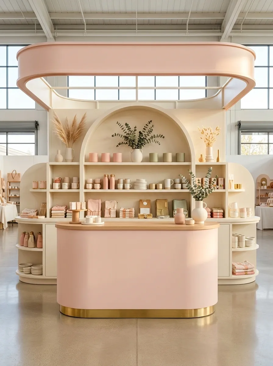
Rounded shelving, curved counters, soft pastel colors, playful typography, and merchandise arranged in tidy clusters make this booth feel cheerful from every angle. The rounded furniture gives the design its personality, so there is no need to pile on novelty props.
The smartest detail is repetition. A curved sign can echo the shape of the counter, which can echo the shelving, creating a visual language that makes the booth feel designed rather than decorated.
Keep the product groups relatively straight and organized against all those curves. Some visual discipline is useful here. Otherwise the whole thing risks looking like an inflatable playground wandered into the market.
Old-World Apothecary Booth With Glass Jars and Dark Shelving
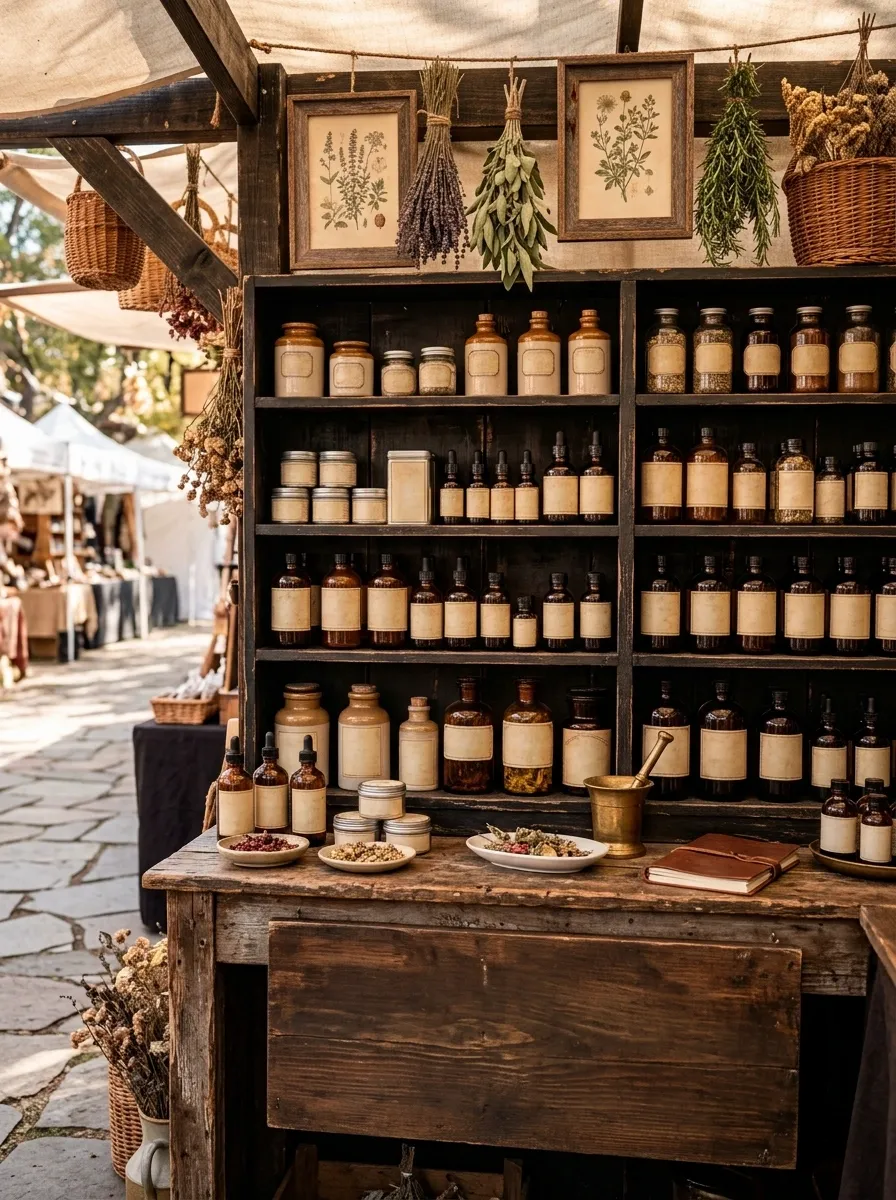
Dark painted shelves, amber glass containers, cream labels, aged wood, botanical illustrations, and warm lighting turn this booth into a little old-world apothecary. The shelves create strong horizontal lines, while the glass containers add small points of reflection and color.
The design feels convincing because the theme is built into the storage and merchandising itself. Products become part of the setting instead of being surrounded by unrelated props.
Keep labels consistent in size and style. That small decision makes a huge difference when several shelves are visible at once. A wall full of mismatched labels would destroy the old-world effect in about thirty seconds.
Make the brand message easy to spot first. Let the shelving establish the structure, then allow the product groupings and smaller botanical details to reward a closer look.
Neutral Minimal Booth With Sculptural Display Furniture
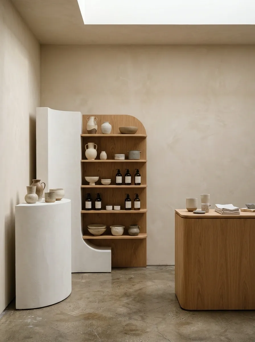
Warm beige walls, curved plinths, sculptural shelving, soft lighting, and generous empty space create a booth where the products become part of the architecture. Nothing is fighting for attention, which is exactly why individual pieces become easier to notice.
The furniture should have enough shape to prevent the neutral palette from feeling flat. A curved pedestal, unusual shelf profile, or asymmetric counter can provide the visual interest that colorful decoration normally supplies.
This is a particularly strong direction for brands with distinctive packaging or high-quality handmade pieces. When the merchandise already has something to say, the booth doesn’t need to yell over it.
Cheerful Strawberry-Inspired Booth With Red, Pink, and Cream
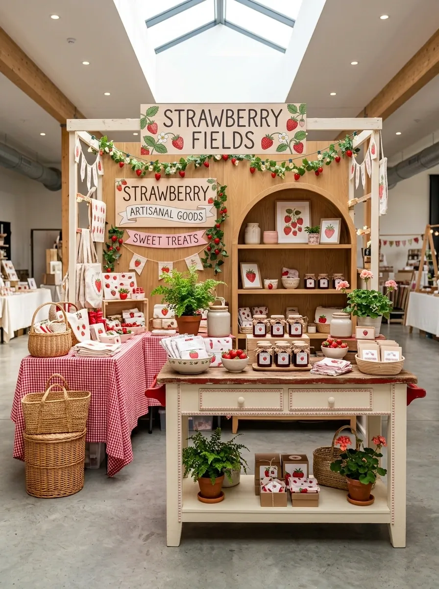
Strawberry red, soft pink, creamy white, gingham textiles, rounded furniture, illustrated signage, and carefully edited market styling create a playful booth with a strong visual identity. It feels themed, but the neutral cream base keeps it from becoming an aggressively literal interpretation.
The secret is choosing where the strawberry reference appears. A sign, one fabric pattern, selective packaging, and a few red accents can establish the idea without putting strawberries on every single object.
The booth should suggest the theme before it announces it. Subtlety is doing some surprisingly heavy lifting here.
Rustic European Cart Booth With Awning and Wood Counters
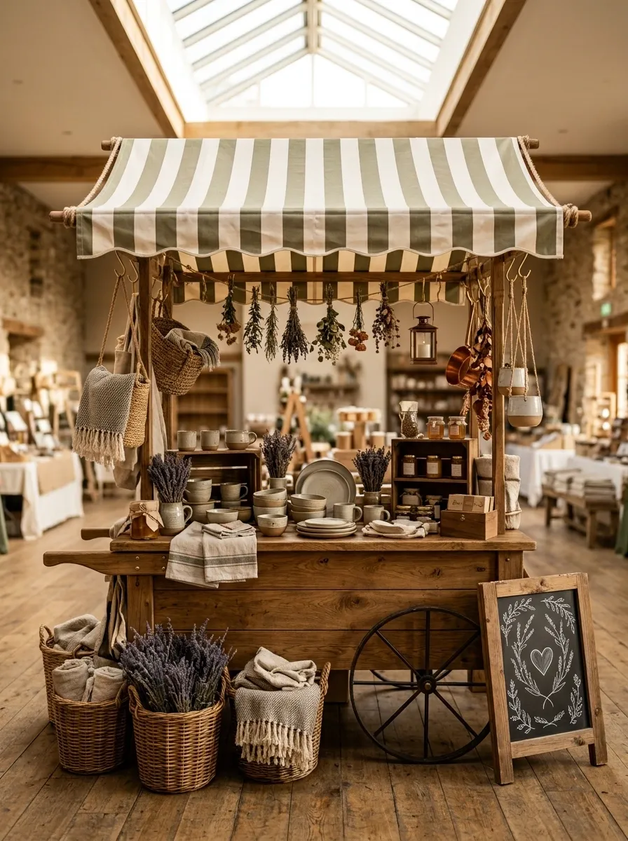
A striped awning, timber counter, chalkboard-style signage, woven baskets, hanging products, and warm natural materials make this booth resemble a tiny European market cart. The structure itself does most of the visual work, which means the merchandise can stay relatively simple.
The awning gives the booth a strong silhouette from a distance, while the counter creates an obvious browsing point up close. Keep the hanging products limited to a few deliberate areas so the upper half doesn’t become a wall of dangling objects.
This concept works because the booth looks like a little place, not merely a place where things happen to be placed. That’s a surprisingly important distinction.
Soft Blue Boutique Booth With Curved Cabinetry
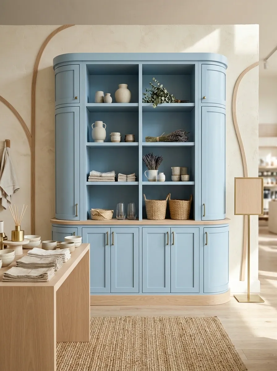
Powder-blue cabinetry, creamy walls, curved built-ins, light oak accents, understated signage, and carefully edited product groupings give this booth the feel of a custom mini boutique.
The cabinetry is the star here, so everything else should support it. The curved forms soften the small footprint, while pale oak keeps the blue from becoming overly sweet. Use open shelving where products need to be browsed and closed cabinetry below for supplies or extra inventory.
A custom-looking booth doesn’t require a custom-sized budget for every detail. One convincing architectural element can carry the entire concept while simpler furniture handles the practical work.
Eclectic Vintage Booth With Collected Furniture Pieces
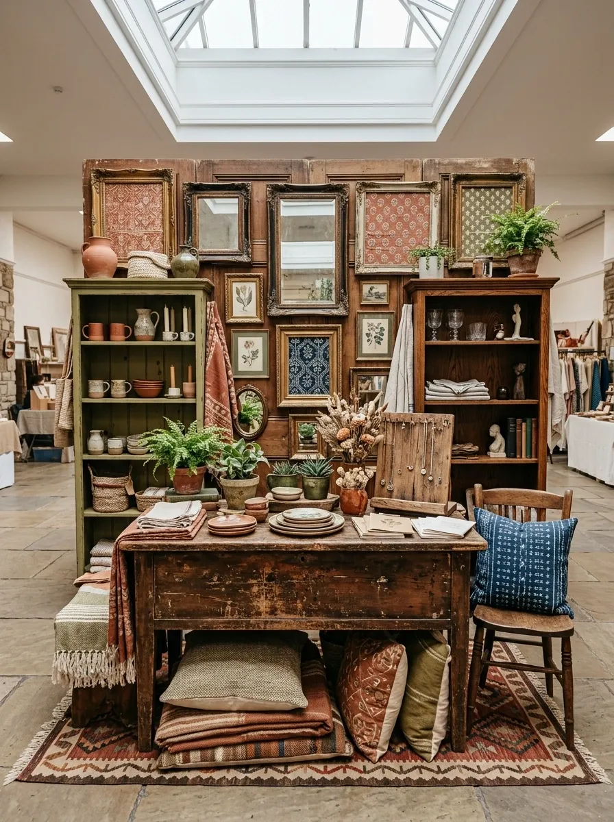
An antique table, mismatched shelving, vintage frames, patterned textiles, aged wood, and carefully coordinated products give this booth a collected look rather than a matching furniture-set feel.
The important part is that the mismatched pieces still share something. A consistent color palette, repeated wood tones, similar aged finishes, or a common shape language keeps the combination intentional.
This is a good direction for brands that don’t want their booth to look freshly pulled from a catalog. The furniture can have scratches, odd proportions, and a little personality. Just give it enough visual relationships to prove that the mismatch was deliberate.
Sunset-Toned Booth With Rust, Peach, and Natural Canvas
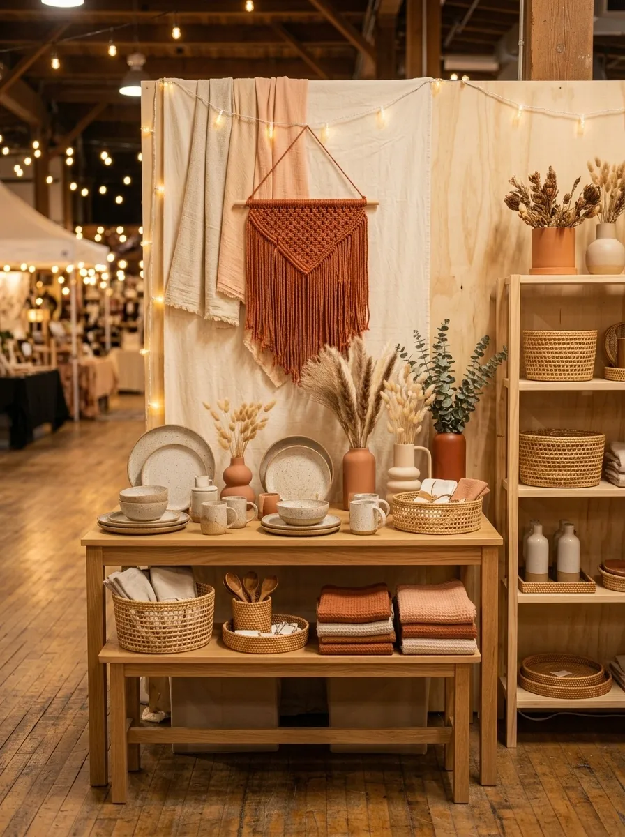
Rust, peach, clay, creamy canvas, natural wood, woven details, and soft ambient lighting give this booth a warm identity that looks especially good in evening or indoor market settings.
The color progression matters. The light canvas forms the background, peach adds a middle tone, and rust provides the strongest visual punctuation. Natural wood bridges the colors and stops the palette from feeling overly saturated.
Products should sit mostly within the quieter portions of the display so they remain readable against the warmer surroundings. Otherwise the entire booth becomes one giant block of orange, and nobody needs that much commitment to a single color family.
lightest field Peach
middle tone Rust
visual punch Wood
grounding note
Tiny Luxury Boutique Booth With Cream, Walnut, and Brass
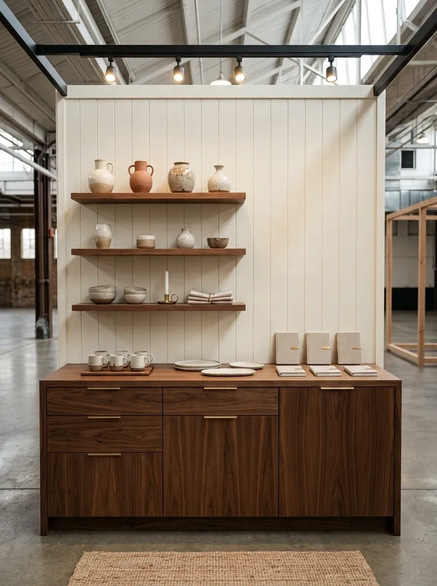
Cream walls, walnut cabinetry, slim brass details, refined signage, architectural lighting, and tightly edited merchandise make this final concept feel polished without becoming overly formal.
The luxury comes from proportion and restraint rather than from simply adding more expensive-looking objects. A clean counter, strong sign placement, consistent shelving, and a few carefully selected brass details do more than a booth covered in decorative accessories ever could.
Keep the products grouped by category and leave visible breathing room between displays. The whole setup should feel edited. That’s the point. Luxury and “everything from the storage bin made it onto the table” are not exactly close relatives.
Keep cream dominant, use walnut on substantial furniture, and reserve brass for small structural or branding details. The restrained ratio is what makes the booth feel refined rather than decorated for the sake of looking expensive.
The Best Booth Is the One With a Point of View
A market booth doesn’t need to look expensive, elaborate, or packed to the ceiling with charming little objects. It needs to look intentional.
The strongest setups in this collection all make one decision and commit to it. The cottage booth leans into painted wood and soft florals. The moody versions use darkness and warm lighting. The playful ones rely on color and shape. The minimal designs let negative space do the work.
That’s the part worth stealing. Not every table needs the same furniture, the same backdrop, or the same decorating style. What matters is choosing a complete visual direction before buying another basket, sign, riser, or decorative object.
Start with the booth you want shoppers to remember. Then make the rest of the setup support it.
Save the designs that actually make you stop scrolling, because the best booth idea is usually the one that’s easy to recognize before anyone gets close enough to read the sign.