
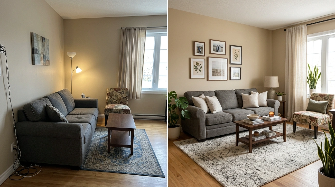
Your living room doesn’t have to be ugly to feel wrong.
Sometimes the sofa is perfectly decent, the color palette is fine, the artwork is attractive, and the room still has that irritating feeling that something isn’t quite landing. The furniture seems too far apart. The rug looks strangely timid. One side of the room feels heavy while the other looks forgotten. The walls are either shouting for attention or staring back completely blank.
Usually, the problem isn’t a lack of decoration. It’s the relationship between the things already in the room.
A sofa can be attractive and still be the wrong scale. A beautiful rug can make the entire seating arrangement look disconnected if it is too small. A carefully styled coffee table can still feel ridiculous when it’s the size of a breakfast tray in front of a huge sectional.
That is what makes these rooms frustrating. Nothing looks obviously terrible on its own.
The fix is to stop judging each object separately and start looking at the room as one composition. Once the biggest visual mistake is identified, the rest gets much easier.
So… Why Does This Room Feel Wrong?
Living Room Mistakes
Pull the Furniture Into a Proper Conversation Group
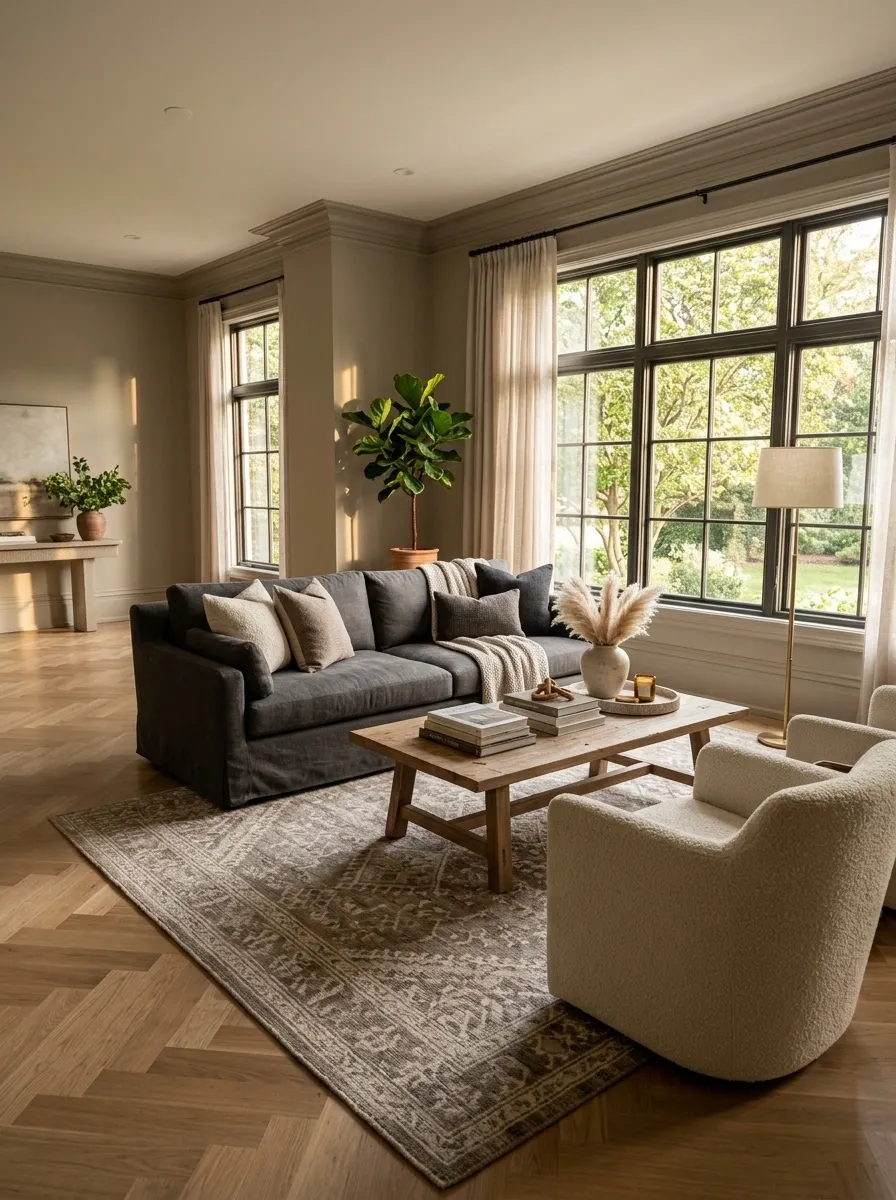
A living room feels scattered when the seating is parked around the perimeter with a giant empty center. Pull the sofa and chairs toward a shared center point, then let the rug and coffee table reinforce that grouping.
The goal isn’t to make the room cramped. Keep a clear walking route around the seating so people can move through the space without performing a minor obstacle course every time they need to cross it.
This works because furniture begins reading as one composition instead of several unrelated objects. The center becomes useful, the seating feels more intentional, and the room stops looking like everyone was told to stand in different corners.
Scale the Rug to the Furniture Instead of the Room
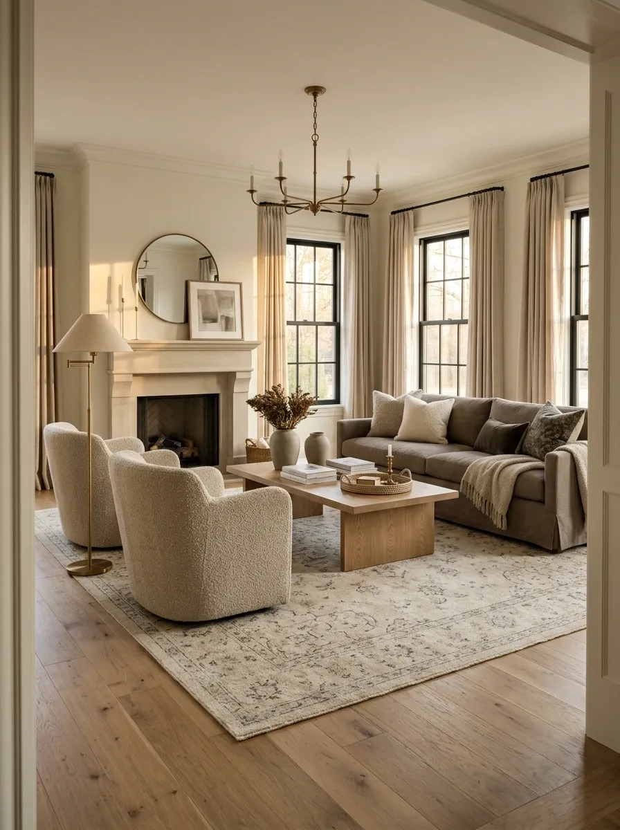
One of the fastest ways to make a living room feel oddly assembled is to put a tiny rug in the middle of a large seating arrangement. It creates little islands instead of one connected group.
Choose a rug large enough to visually gather the main seating. Ideally, the sofa sits substantially on the rug, with the chairs participating in the same zone rather than floating around its edges.
The exact size depends on the room and furniture, but the design principle stays simple: the rug should connect the seating, not sit underneath the coffee table like an expensive coaster.
Give a Tiny Sofa More Visual Weight
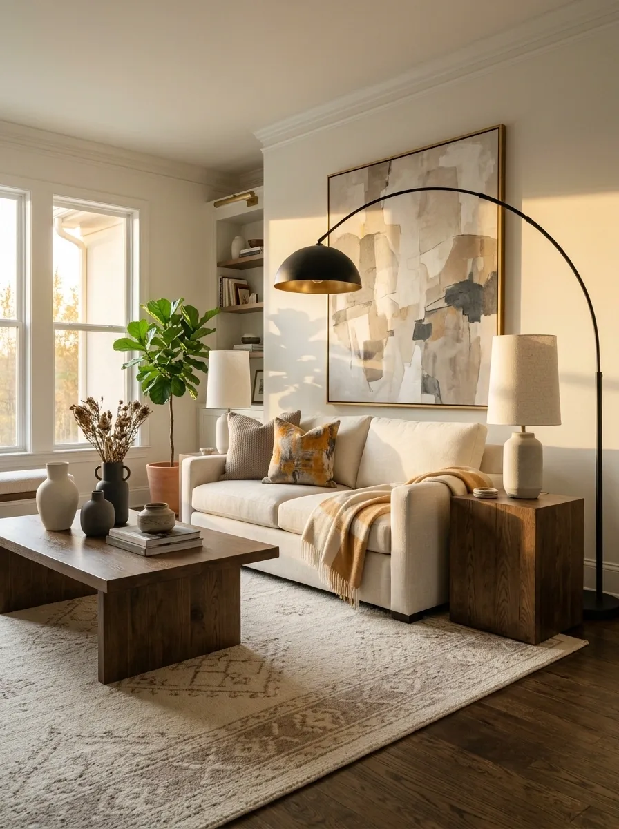
A small sofa isn’t automatically a mistake. Making it look lost in a large room is.
When the seating footprint is modest, compensate with surrounding scale. A substantial rug, wider artwork, larger side tables, a tall floor lamp, and a strong coffee table can give a compact sofa enough visual company to hold its ground.
The important part is restraint. The goal isn’t to bury a small sofa under oversized furniture. It’s to stop the surrounding pieces from making it look accidentally miniature.
This strategy works especially well in rooms where the sofa cannot be replaced because of budget, rental restrictions, or awkward dimensions.
sofa
vertical height
light
rug
side piece
texture
Stop Pushing Every Piece Against the Wall
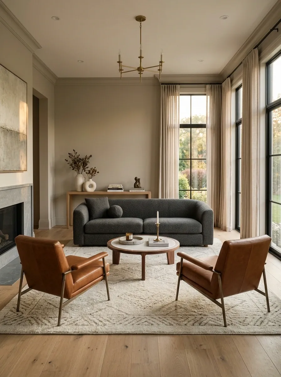
There is a persistent decorating habit of shoving every sofa, chair, table, and cabinet against the walls and calling the middle “open space.”
Sometimes that works. Often it just makes the room feel oddly hollow.
Pull the main seating forward when the room allows it. Even a modest gap behind a sofa can make the arrangement feel more deliberate, especially when a slim console or narrow table gives that empty strip a purpose.
Keep doors, windows, vents, and major walking paths clear. The point isn’t to create a furniture obstacle course. It’s to stop treating every wall like a mandatory parking space.
Create One Clear Focal Point
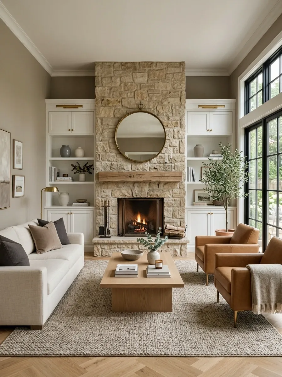
A room starts feeling chaotic when everything is competing for attention. The TV is demanding attention. The fireplace wants attention. Three pieces of bold art want attention. Then the oversized coffee table joins the argument.
Choose one dominant focal point and make the other elements support it.
That could be a fireplace, a large artwork, an architectural feature, or a media wall. Once the main destination is clear, scale the surrounding pieces down or simplify them. The room immediately becomes easier to read.
This doesn’t mean everything else has to be boring. It means every interesting thing doesn’t need to shout at the same time.
Match Visual Weight on Opposite Sides of the Room
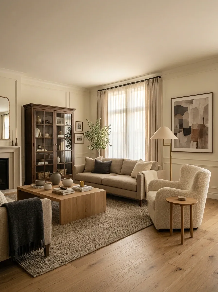
A living room can have perfectly decent furniture and still feel like it is leaning to one side. A bulky sectional, dark bookcase, or heavy fireplace can visually outweigh a collection of tiny chairs and delicate tables across the room.
Balance doesn’t require identical furniture. It requires comparable visual weight.
Place substantial pieces where the room needs more grounding, then counter them with another meaningful element across the space. A large chair, tall lamp, dark cabinet, or generous artwork can often do more than a pile of tiny accessories.
The goal is for the room to feel stable without looking suspiciously symmetrical.
Replace the Tiny Coffee Table With a Properly Scaled Centerpiece
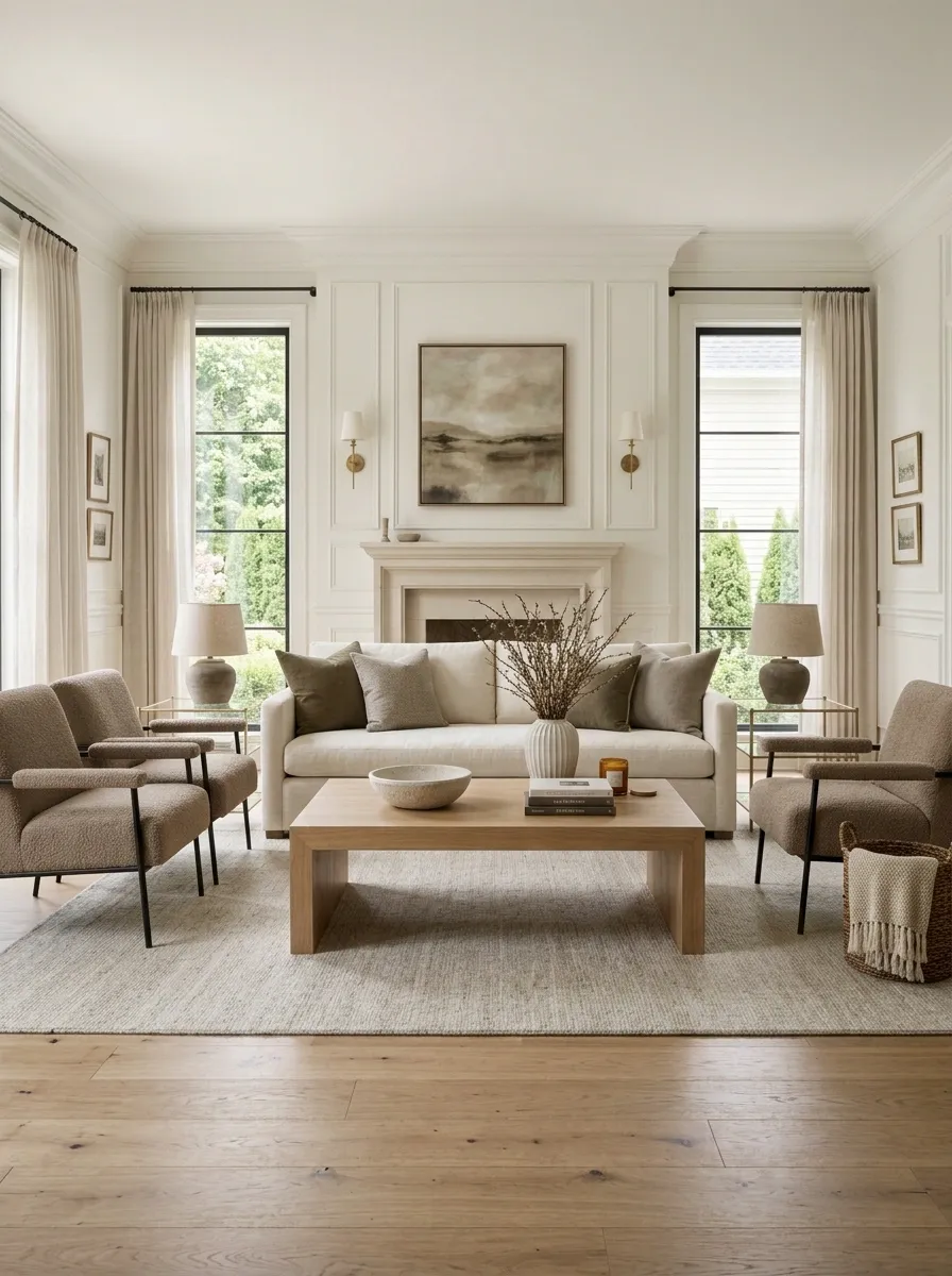
A coffee table that is too small makes a generously furnished living room look oddly unfinished. There is simply too much empty space between the seating and the table, so the furniture never forms a convincing group.
Choose a table with enough presence to relate to the sofa and surrounding chairs. That doesn’t mean buying the largest table possible. It means giving the center of the room enough visual weight to hold the seating arrangement together.
A generous rectangular table usually works well with a long sofa, while a round or oval shape can soften tighter arrangements or rooms with lots of hard corners.
The middle of the room deserves more than a decorative afterthought.
Raise the Curtain Hardware Instead of Cutting the Room in Half
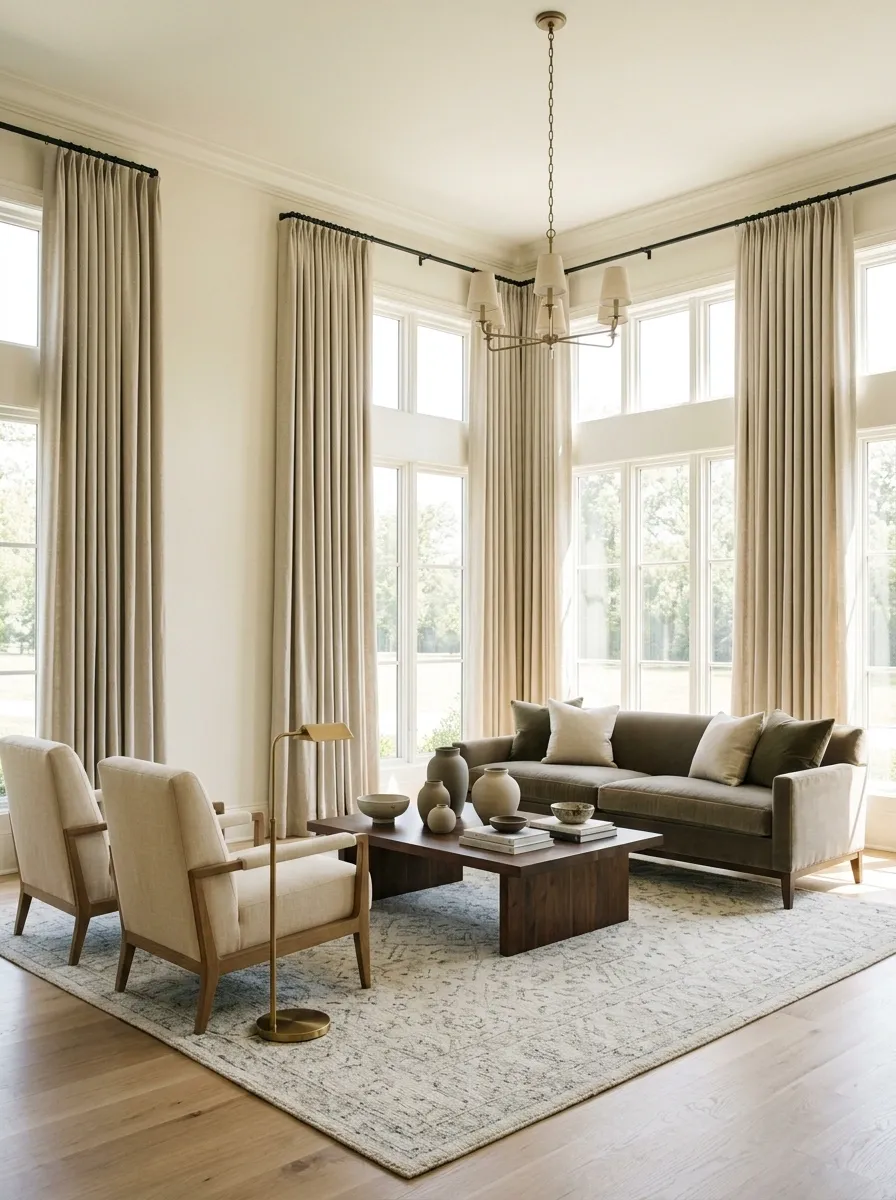
Curtains mounted just above the window frame can make an otherwise generous living room look shorter and more chopped up. The problem becomes worse when the curtains barely reach the floor.
Mount the hardware higher and let the fabric fall close to the floor. The taller vertical line connects the window to the ceiling and gives the room a stronger sense of height.
This is especially useful when the windows are awkwardly proportioned or sit lower than expected. Instead of disguising the architecture with more decor, use the window treatment to create a cleaner vertical composition.
Just don’t let the fabric drag dramatically on the floor. That turns a proportion fix into a cleaning project.
Fill the Vertical Space Above Low Furniture
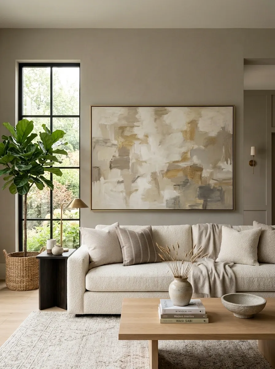
A sofa, console, or low media cabinet can leave an enormous blank patch of wall above it. Then a tiny frame gets placed in the middle because the wall “needed something.”
No. The wall needed something appropriately sized.
Scale the artwork or wall composition to the furniture beneath it. A wide sofa usually needs a substantial horizontal piece or a composition with enough width to visually connect the furniture to the wall.
The artwork doesn’t have to fill every inch. It just needs enough presence to stop the furniture from looking stranded beneath an empty wall.
Connect Disconnected Colors With Repeated Materials
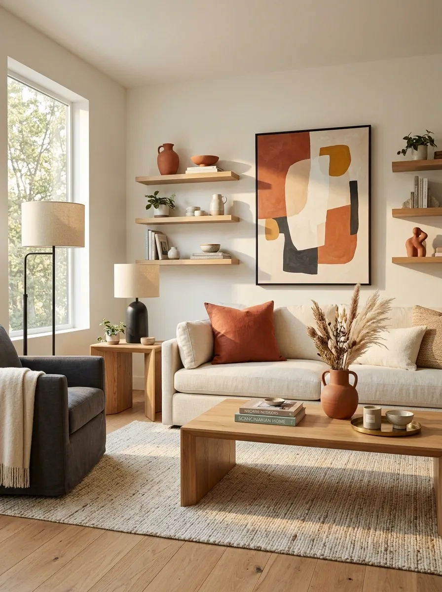
A living room can contain attractive colors and still look like several decorating decisions happened independently.
The fix isn’t necessarily fewer colors. It’s repetition.
Take the strongest secondary color or material and repeat it in a few meaningful places. Wood might appear in the coffee table, side table, and shelving. A warm terracotta note might appear in artwork, a cushion, and a ceramic accent. Black can travel through lighting, frames, and furniture details.
The repetition creates a visual thread. Suddenly the room looks coordinated rather than accidentally assembled from unrelated shopping trips.
accent
cushion
or furniture detail
Use One Dominant Color Instead of Making Every Accent Compete
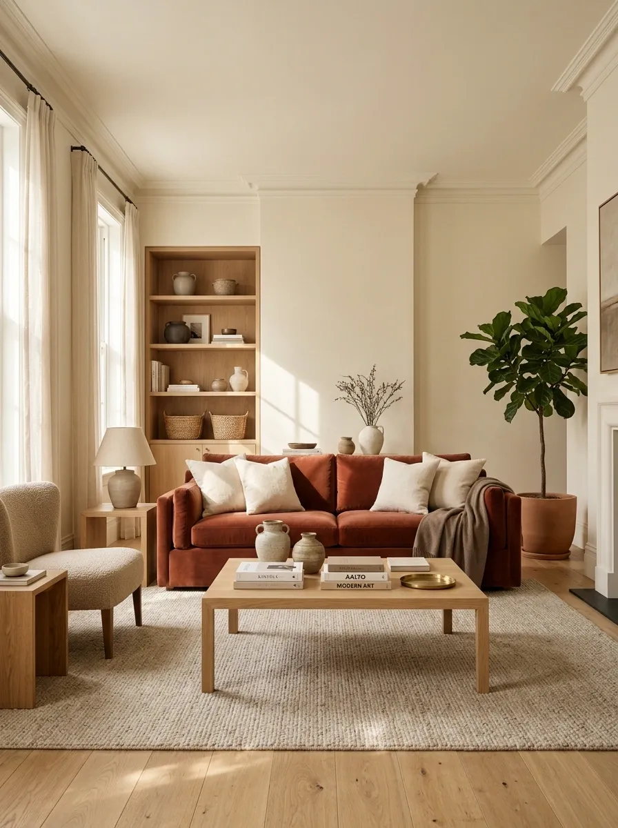
A living room can contain perfectly reasonable colors and still look like a committee made the decisions.
The problem usually appears when several accent colors are given equal visual importance. Blue pillows, orange artwork, green chairs, brass accessories, patterned curtains, and a red vase don’t become sophisticated simply because each one was technically intentional.
Choose one dominant color family, then let the supporting colors stay quieter. A warm neutral room might give terracotta the starring role while wood, cream, and muted brown do the supporting work.
The room immediately becomes easier to read because the eye knows which color matters most.
background family
secondary
anchor
accent
Give the Sofa Wall More Than One Layer of Depth
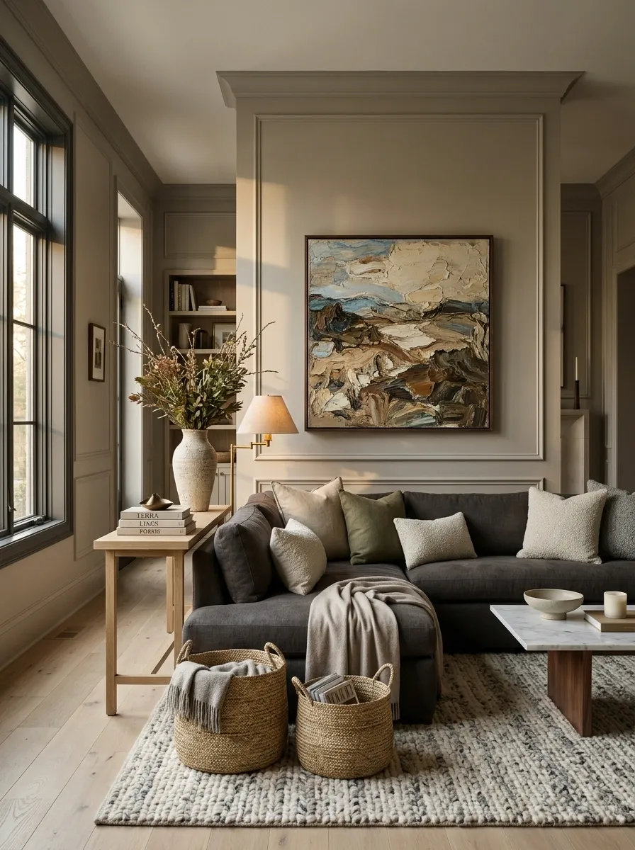
A sofa pushed against a blank wall can make the entire room feel flat, especially when the only thing above it is one small frame floating in a giant rectangle of paint.
Build depth around the sofa instead. A substantial artwork piece, slim console, wall lighting, architectural detail, or layered textiles can connect the furniture to the wall behind it.
The trick is not to cover every inch. The wall needs enough visual depth to feel related to the sofa, while some negative space keeps the composition from becoming cluttered.
A sofa should look like part of the architecture of the room, not like someone temporarily parked it there.
Replace the One-Source Lighting With Several Levels of Light
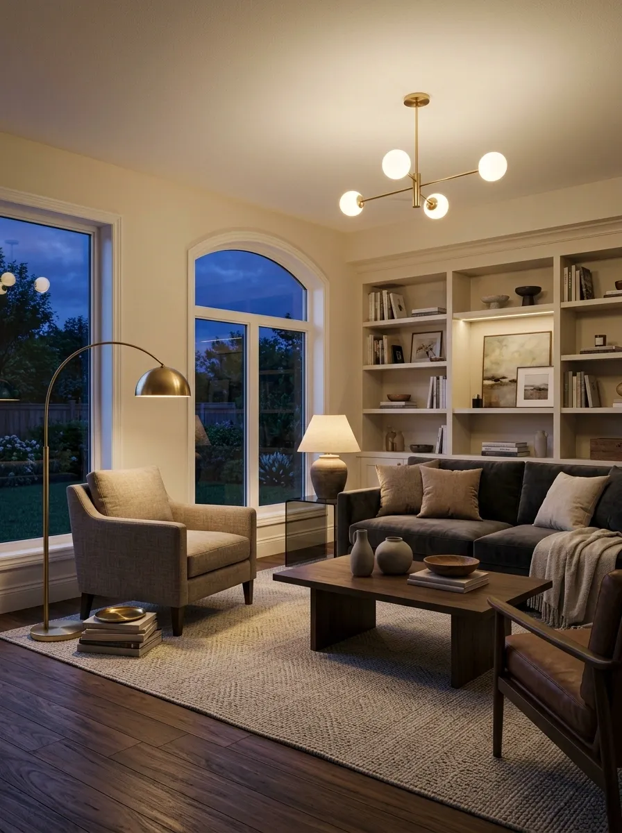
A living room can look perfectly fine in daylight and strangely unpleasant at night. Usually the culprit is one ceiling fixture doing absolutely everything.
Layer the lighting instead. Keep the main fixture for overall illumination, then add floor or table lamps at seating height. A softer secondary source can give corners and furniture more depth after dark.
The room shouldn’t look like a supermarket aisle whenever the sun goes down.
Different light sources also help define zones. A floor lamp beside a reading chair, a table lamp near the sofa, and a ceiling fixture overhead can make one open room feel more intentional without adding more furniture.
Match the Side Tables to the Sofa’s Scale
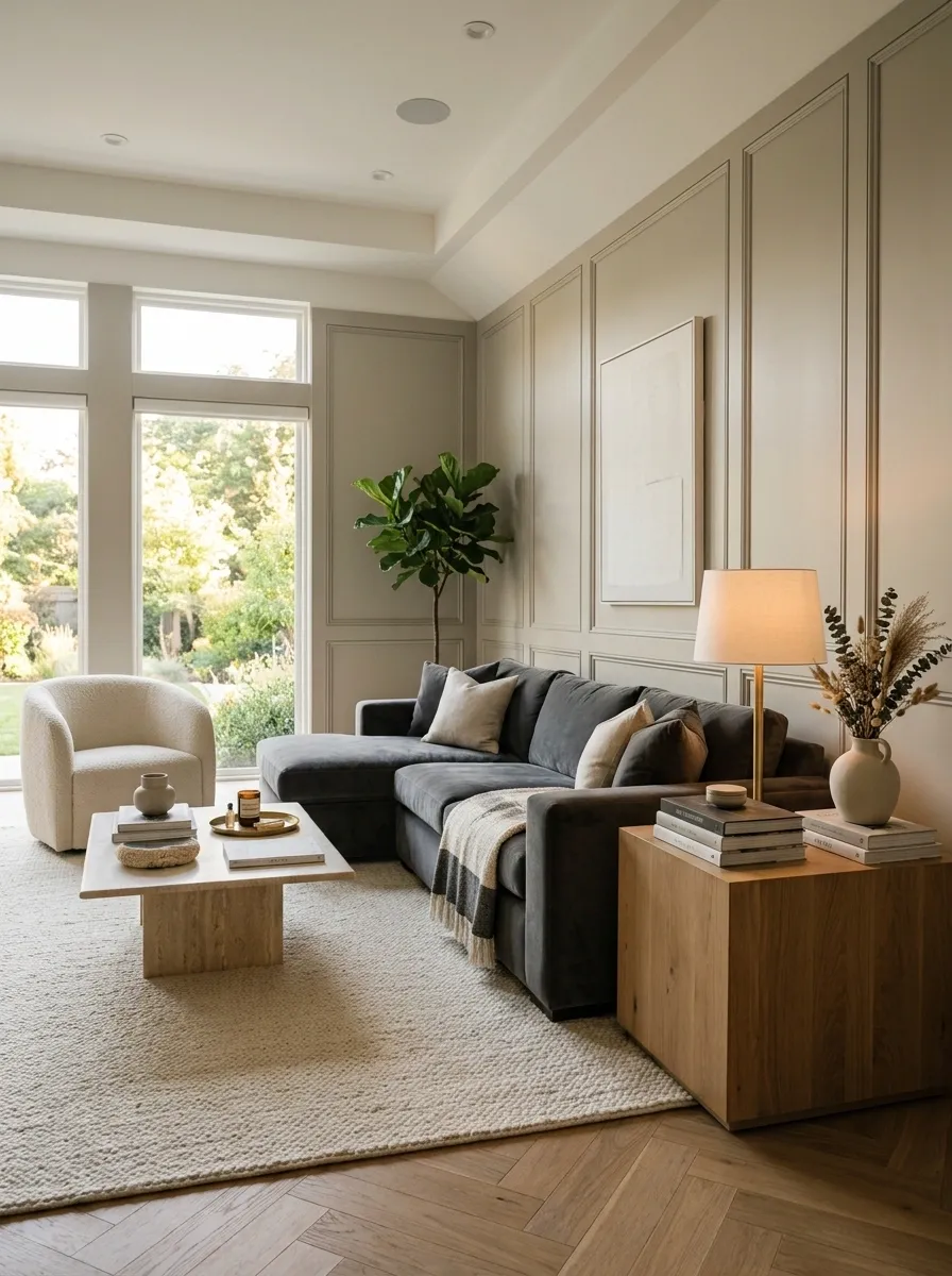
Tiny side tables beside a substantial sofa are a surprisingly effective way to make the entire seating arrangement feel off.
The problem isn’t that the table is small. It’s that the relationship is wrong. A narrow little table beside a deep sofa can look accidental, while an oversized table can crowd the arm and circulation.
Choose a side table with enough width and visual weight to hold its place beside the sofa. Keep its height practical too. The surface shouldn’t sit awkwardly far below or above the sofa arm.
Then use the table to support the lighting and everyday objects the seating area actually needs. Form and function can finally stop arguing.
visually disappears beside the sofa.
enough presence to hold a lamp and daily essentials.
Use One Larger Artwork Piece Instead of Filling the Wall With Tiny Ones
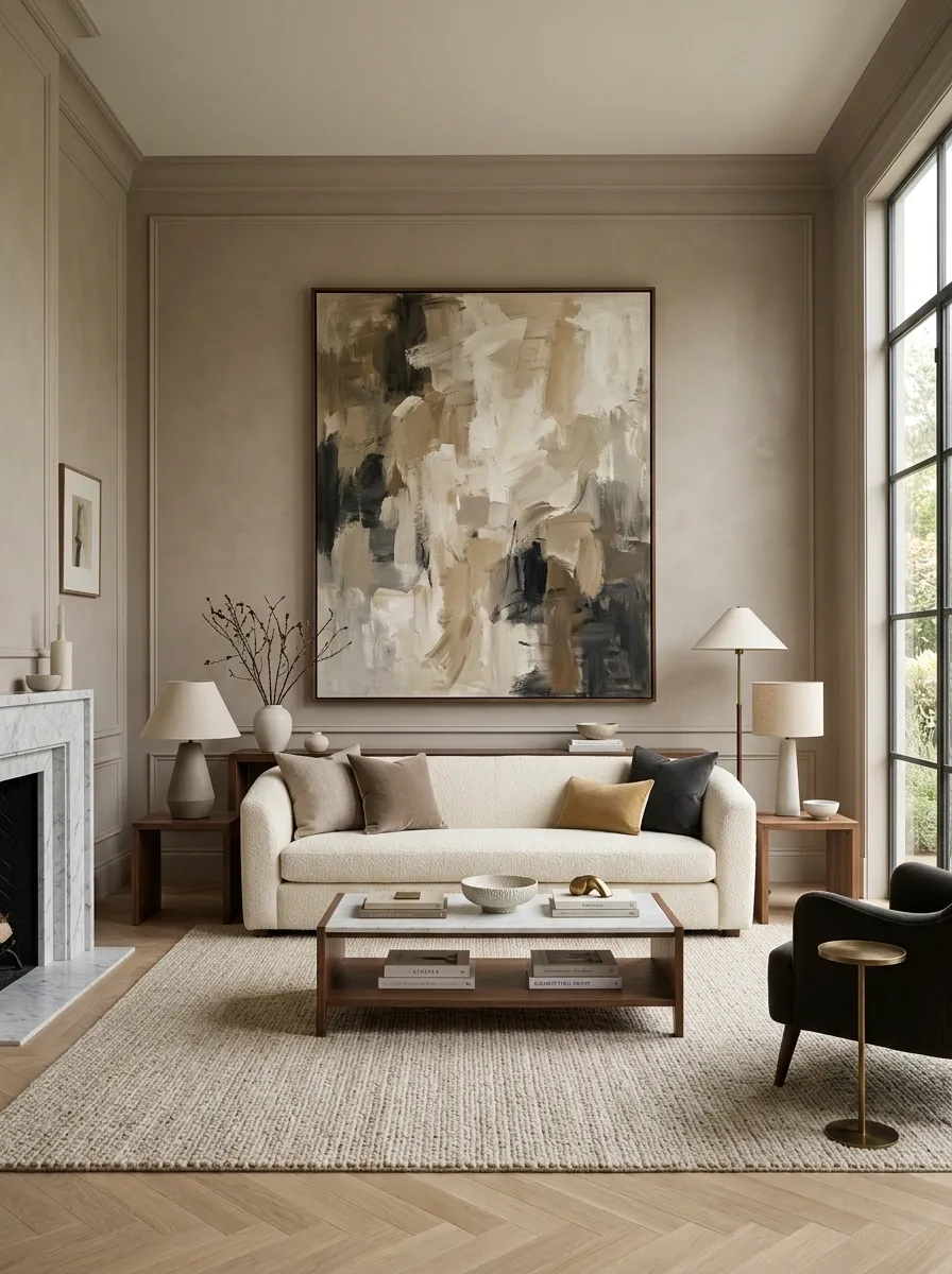
A wall above a sofa can become visually messy when it gets decorated one small frame at a time. The pieces may all be attractive individually, yet the composition still looks nervous and fragmented.
A larger artwork piece can give the wall a stronger anchor. It provides one visual statement that relates directly to the sofa beneath it, instead of forcing the eye to hop between several unrelated little rectangles.
This doesn’t mean every wall needs one enormous painting. A well-composed gallery arrangement can work beautifully too. The important part is scale and grouping. The wall should read as one intentional composition, not a collection of souvenirs that slowly migrated upward.
Break Up a Long Empty Wall With a Purposeful Furniture Anchor
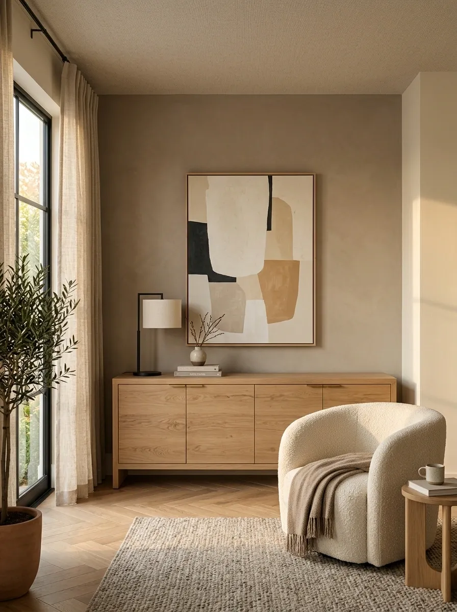
A long blank wall can make an otherwise furnished living room feel strangely unfinished. The usual response is to buy a handful of small decorations and scatter them across the wall.
That rarely fixes the problem.
Give the wall a stronger anchor instead. A substantial console, cabinet, bookcase, or long low piece can create a clear visual endpoint while leaving deliberate breathing room around it. Add artwork or lighting that belongs to that furniture rather than treating the wall like a giant canvas that must be filled.
The important distinction is between using the wall and covering the wall. One creates structure. The other creates clutter.
Correct the Coffee Table-to-Sofa Spacing
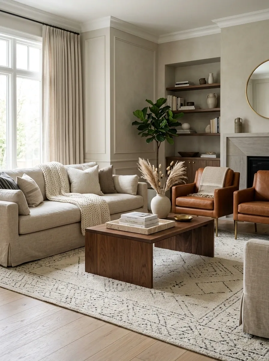
A coffee table can be the right size and still make a room feel wrong if it sits in the wrong place.
Push it too close and the seating area becomes awkward to use. Move it too far away and the table stops connecting the seating group. Suddenly everyone has to lean forward like they’re reaching for something across a moat.
Position the table so it comfortably relates to the sofa and chairs while preserving a clear path around the seating. The exact clearance depends on the room, furniture depth, and circulation, so the useful test is functional: can someone sit down, stand up, reach the table, and walk around the arrangement without squeezing sideways?
When the answer is yes, the whole composition usually feels more relaxed.
Give an Empty Corner a Real Function
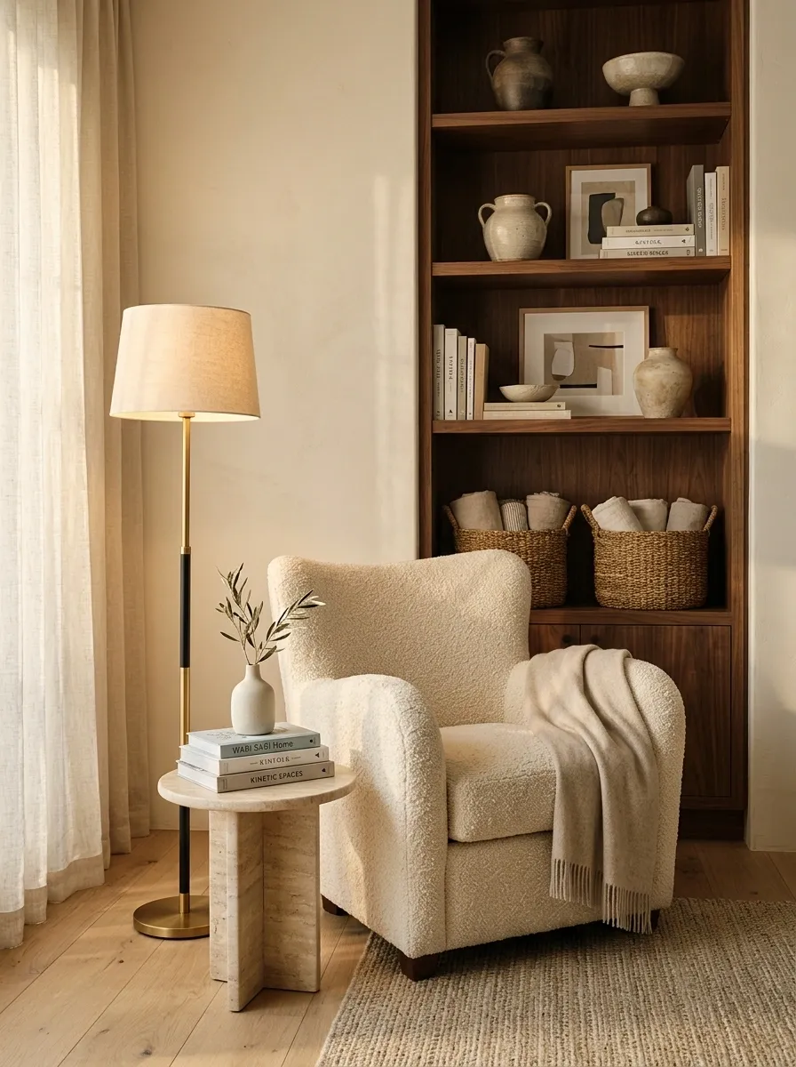
A lonely corner often gets a plant because the corner was empty and plants are apparently the universal answer.
A plant can work, but a living room corner should earn its footprint when the room has a genuine need. Turn it into a reading spot, add useful storage, create a compact display zone, or use a substantial floor lamp to strengthen the seating area.
The right answer depends on what the room lacks.
A chair can solve the need for another seat. A cabinet can solve storage. A tall lamp can solve a dark corner. A large plant can soften a hard architectural edge.
The corner should look like it belongs there because it does something.
Use the Wall Behind the Sofa to Balance the Room
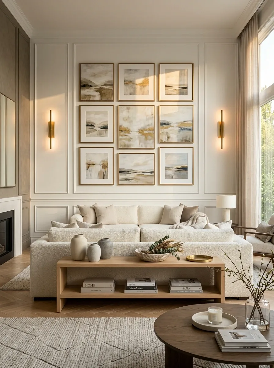
Sometimes the sofa isn’t the real problem. The wall behind it is.
A sofa can look oddly isolated when the architecture above and around it contributes nothing. This is especially noticeable when the sofa is large, the wall is wide, or the room has strong architectural features elsewhere.
Give the sofa wall enough presence to participate in the composition. A substantial artwork arrangement, slim console, wall lighting, molding, shelving, or another architectural element can connect the sofa to its surroundings.
The important part is scale. A wide sofa usually needs a wall treatment with enough width and presence to keep it from looking like a lonely rectangle parked beneath a giant ceiling.
Choose One Furniture Shape Language and Repeat It
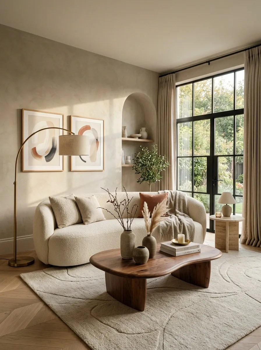
A living room can feel strangely disjointed when every piece has a completely different shape. A boxy sofa sits beside a spindly metal table, which sits beside a sculptural chair, which sits beneath a collection of sharp-edged artwork.
Contrast is useful. Randomness is not.
Choose a dominant shape language and let it repeat. Clean-lined furniture creates a more architectural room. Rounded pieces soften a harder space. A mix can work too, but there should be a reason for the contrast.
The room starts feeling more connected when the same visual language appears across several pieces.
And no, that doesn’t mean buying a matching furniture set. That would simply replace one problem with another.
Warm a Cold Room With Material Contrast, Not More Decor
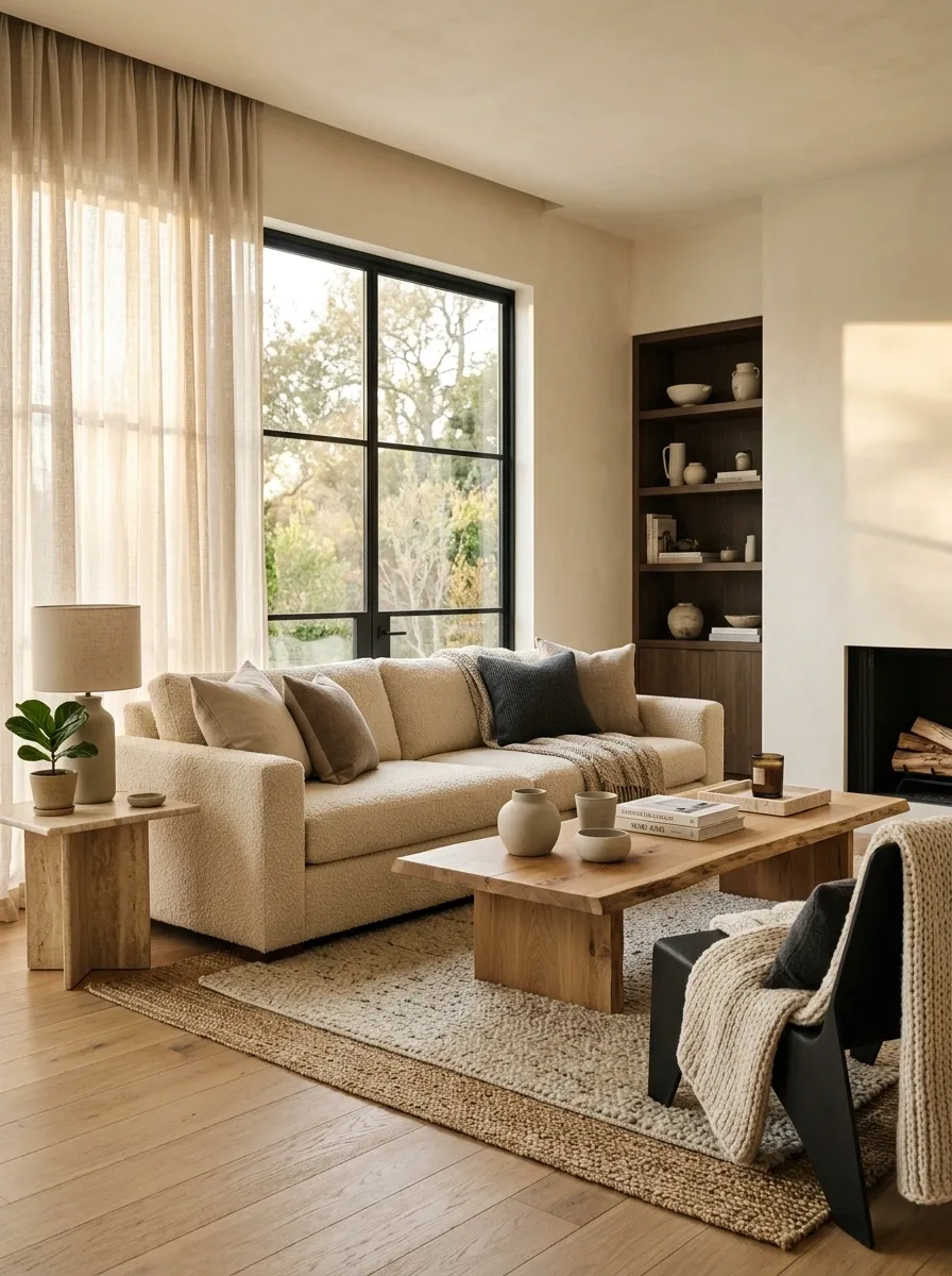
A living room can contain enough furniture and still feel strangely sterile. Adding another vase or another decorative object rarely solves that.
Look at the materials instead.
Hard surfaces become more inviting when they are balanced with wood, woven textures, upholstery, natural-looking fibers, or softer finishes. The point isn’t to turn the room into a texture museum. It is to give the eye different surfaces to move across.
A neutral palette becomes much more interesting when the materials carry some of the contrast. Wood against upholstery. Matte surfaces against subtle sheen. Smooth walls against woven textiles.
The room gains depth without gaining another pile of stuff.
Remove Furniture That Blocks the Room’s Natural Path
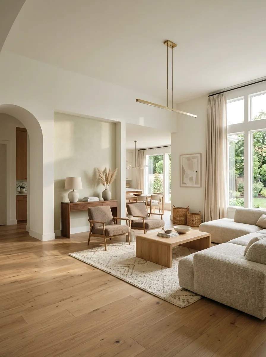
A beautiful sofa placed directly across a major walking route is still a badly placed sofa.
Living rooms need circulation. People need to reach doors, windows, adjoining rooms, seating, storage, and sometimes the television without weaving through furniture like they are completing an obstacle course.
Start by identifying the main path through the room. Then move pieces that interrupt it, even if that means leaving a little more empty space than expected.
A slightly less crowded arrangement often feels much more spacious because the eye can understand how the room is supposed to work.
Function isn’t the boring part of decorating. Function is what keeps the pretty part from becoming ridiculous.
Make the Largest Piece Match the Room’s Architecture
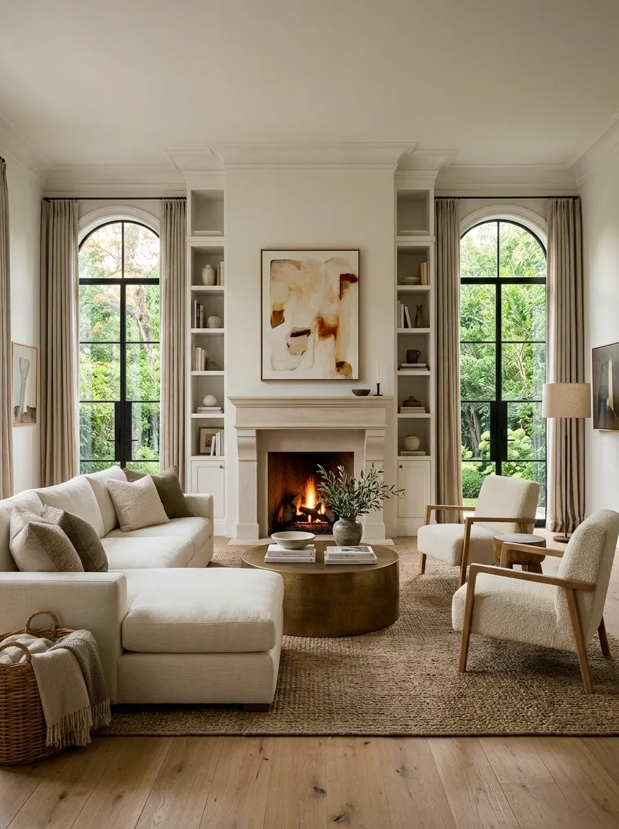
Furniture and architecture should look like they belong to the same room.
When a sofa, cabinet, or media unit ignores the windows, fireplace, doors, built-ins, or major wall lines around it, the composition can feel subtly wrong even when the furniture itself looks great.
Use those architectural features as anchors. Center furniture where the architecture calls for centering. Align edges when that creates a cleaner line. Preserve important windows instead of blocking them for the sake of symmetry.
This is one of the least glamorous fixes because it involves measuring, moving, and occasionally accepting that a favorite piece simply doesn’t belong in that particular spot.
The room will thank you for the honesty.
centerline
alignment
balance
Keep the Same Visual Temperature Across the Main Materials
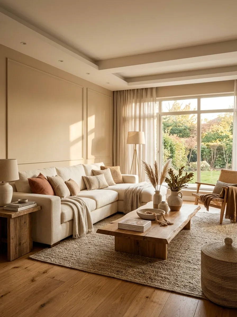
Sometimes the problem isn’t color itself. It’s that the undertones are arguing.
A cool gray sofa can look strange beside very yellow wood. Warm beige walls can fight blue-gray upholstery. Cool daylight combined with strongly warm bulbs can make the room change character depending on the hour.
Choose a general temperature for the major materials and let the smaller contrasts happen around it.
Warm rooms can use warmer woods, creams, muted browns, and softer metals. Cooler rooms can lean into grayer materials and cleaner finishes. Mixed temperatures can work, but one family should usually dominate.
Otherwise the room starts looking less “layered” and more like everyone arrived with a different paint sample.
Give the Room a Stronger Center Instead of Decorating Every Edge
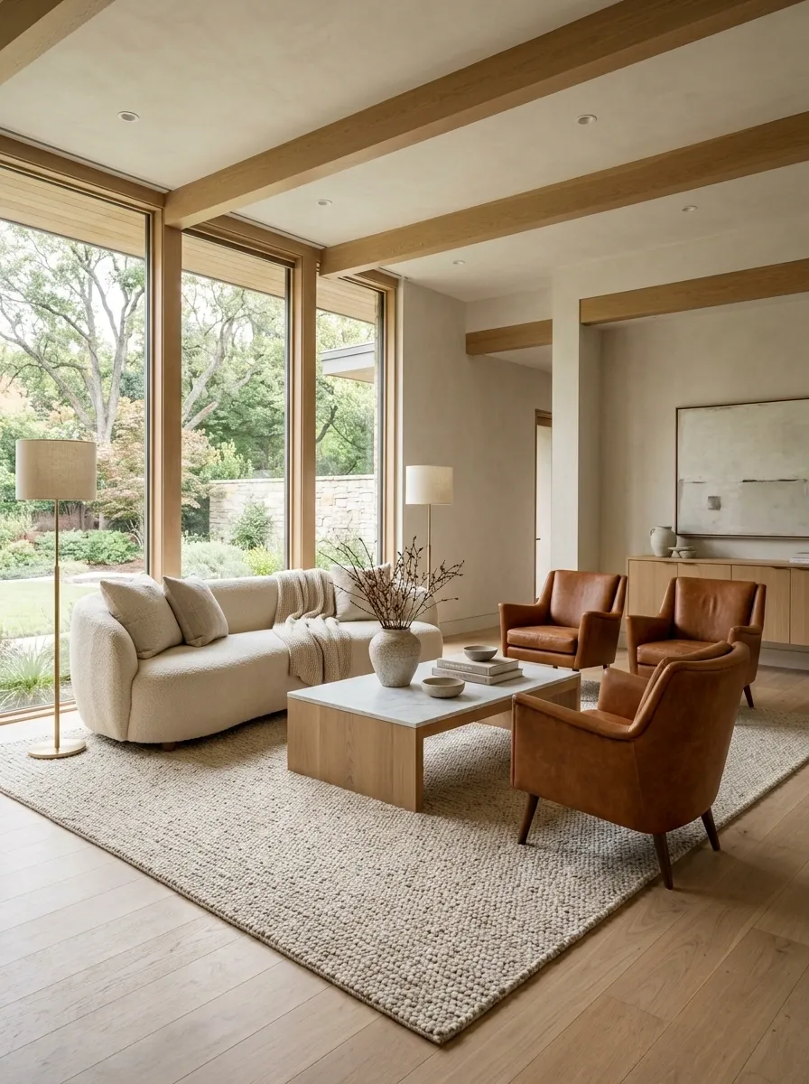
A living room can have plenty of furniture and still feel strangely empty. The problem is often that all the visual activity is happening around the perimeter.
Artwork is scattered along the walls. Plants occupy corners. Cabinets fill the edges. Meanwhile, the center is barely doing anything.
Bring some of that visual importance inward. A substantial rug, properly scaled coffee table, central ottoman, or stronger seating arrangement can make the middle of the room feel like the heart of the composition.
This doesn’t mean filling the center with furniture until everyone has to crawl sideways. It means giving the room a clear center of gravity.
A room needs breathing space, but it also needs a reason for the eye to come back toward the middle.
Use Symmetry Where the Room Needs Calm
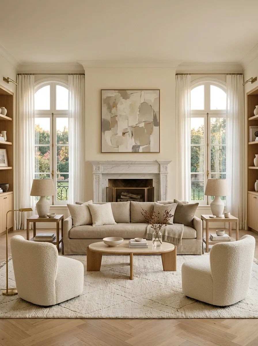
Not every living room needs perfect symmetry, but some rooms desperately need more of it.
If the furniture is scattered, the architecture is formal, or the room already has strong visual lines, symmetry can clean things up quickly. Center the sofa beneath the main architectural feature. Pair substantial side pieces. Align artwork with the furniture below it.
Symmetry is especially useful when the room feels restless rather than interesting. It gives the eye fewer decisions to make.
The trick is not to duplicate every object. Match the major visual relationships and let smaller details differ naturally.
Otherwise the living room starts looking less like a home and more like the furniture department of a hotel.
Use Deliberate Asymmetry Where Symmetry Feels Too Rigid
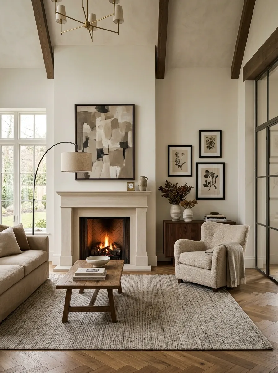
The opposite problem is just as real. A room can be technically balanced and still feel stiff because every side mirrors the other.
This is where deliberate asymmetry helps.
Use different objects with similar visual weight. A floor lamp can balance a tall plant. A large chair can balance a lower cabinet. One oversized artwork can balance a cluster of smaller pieces.
The trick is to make the difference intentional. Random placement isn’t asymmetry. It’s random placement.
Start with the room’s strongest axis, then allow one side to break the pattern while maintaining enough visual weight to keep the composition stable.
That little bit of imbalance can make the room feel far more natural.
same visual authority
similar visual weight
Edit the Small Decor Before Adding More
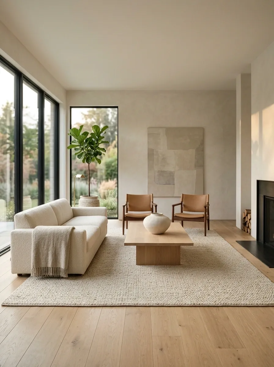
Sometimes the room feels “off” because there are simply too many things trying to be noticed.
Tiny frames. Small vases. Decorative books. Mini plants. Candles. Random bowls. Little objects filling every available surface.
Individually, none of them is offensive. Together, they create visual static.
Remove the weakest pieces first. Keep the larger, more meaningful objects and give them space. A clean coffee table with one substantial centerpiece often looks more intentional than a table covered in twelve tiny things.
This is one of the cheapest fixes in the entire article because the solution is mostly subtraction.
And thankfully, subtraction doesn’t require another shopping trip.
Fix the Biggest Mismatch Instead of Redecorating the Entire Room
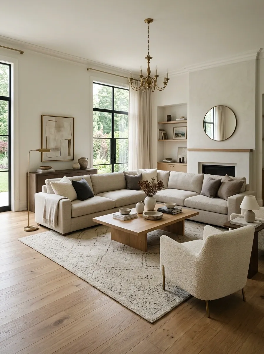
Not every “off” living room needs a makeover.
Sometimes one glaring mismatch is making everything around it look worse.
The sofa may be too small for the room. The rug may be undersized. The coffee table may disappear between the seating. The TV may overpower the wall. The lighting may be completely wrong after dark.
Find the biggest mismatch and fix that first.
Then step back.
A single correction can change how the rest of the room reads because design problems are connected. Once the largest proportion or visual-weight issue is corrected, smaller imperfections often become much less noticeable.
There is no prize for replacing everything when moving one badly scaled piece would have done the job.
Before You Buy Anything Else
Stand in the doorway and look at the room without trying to improve it.
That’s important.
Don’t mentally replace the sofa. Don’t start shopping for a bigger rug. Don’t decide the wall needs new art. Just look.
What grabs the eye first? Does the furniture feel connected or scattered? Is one side visibly heavier? Does the center of the room have enough presence? Can the eye move comfortably around the space? Does anything look strangely miniature beside something much larger?
Start there.
A room that feels “off” usually gives away its biggest mistake once the individual objects stop distracting you. The fix might be surprisingly small. Moving the furniture, changing the scale of one piece, removing a handful of clutter, or giving a neglected wall some structure can change the entire composition.
The expensive part is often not the solution. It’s buying five new things before figuring out what was wrong in the first place.