
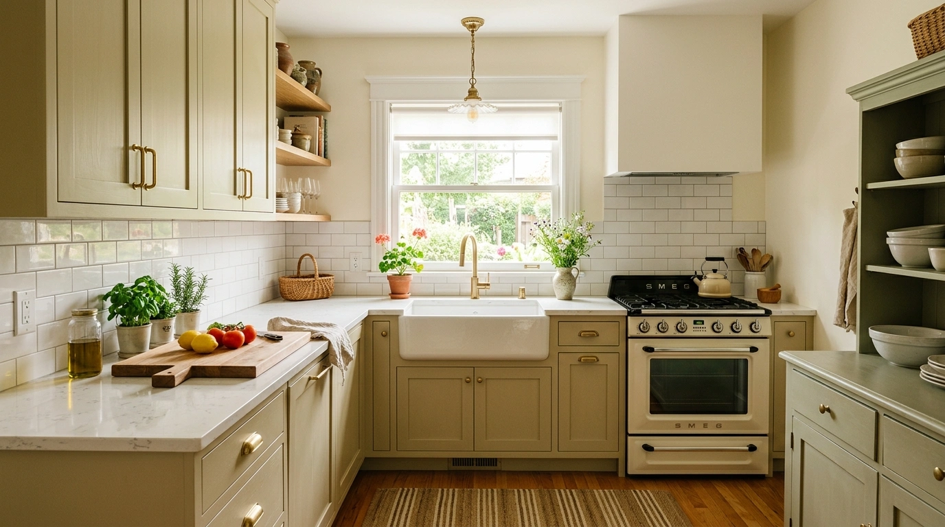
An older kitchen can be perfectly functional and still look like it got stuck somewhere around the year everyone was obsessed with the same cabinet knobs, the same shiny tile, and the same suspiciously beige everything.
The annoying part is that a dated-looking kitchen is rarely caused by one terrible thing. Usually, it’s a pileup. The cabinets are heavy. The lighting is tired. The backsplash is busy.
The hardware has been replaced three times and none of it agrees. Then there are all the little things that quietly accumulate on the counters until the kitchen looks less like a room and more like a storage area with plumbing.
That doesn’t automatically mean the cabinets need to go or that the room needs to be gutted.
The smarter approach is to figure out what is carrying the most visual weight and fix that first. Sometimes it’s the cabinet color. Sometimes it’s the lighting. Sometimes the countertop is perfectly usable and simply needs better company.
Before Blaming the Cabinets, Check What’s Actually Making the Kitchen Look Old
Kitchen Ideas for Making an Older Kitchen Look Fresh
Embrace Autumn Kitchen Decor
A thoughtful display of seasonal elements can entirely transform an older kitchen counter without requiring any permanent updates. Swapping in rich autumnal tones and natural textures brings an immediate sense of warmth to the space.
Arrange rustic cutting boards, a ceramic crock brimming with wooden spoons, and a collection of varied pumpkins to create an inviting focal point. A glowing candle adds an extra layer of coziness that makes the entire room feel lived-in and loved.
The trick is to group items with intention so they feel collected rather than cluttered. Let the natural materials speak for themselves against your existing countertops.
Paint the Cabinets a Softer, More Current Color
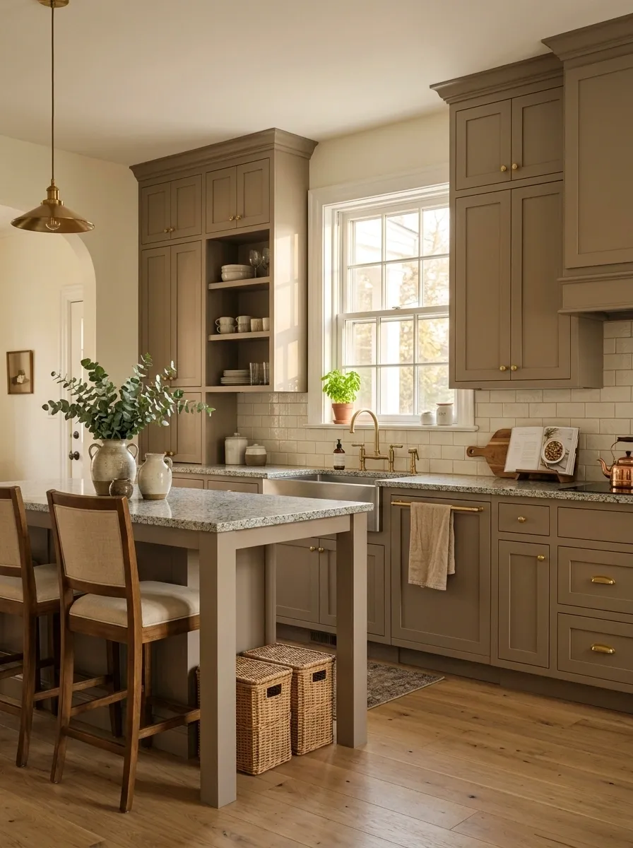
Cabinet color has an enormous effect on how old a kitchen feels. If the existing cabinets are orange-toned oak, yellowed cream, dark cherry, or another finish that dominates the room, changing the color can do more than a dozen little accessories ever will.
Use a color that works with the existing countertop instead of pretending the countertop doesn’t exist. Soft warm white, muted taupe, dusty green, mushroom, or a restrained mid-tone can calm a dated kitchen without making it look like a brand-new showroom dropped into an old house.
Keep the original layout. Keep useful cabinetry. Let the paint do the heavy lifting.
The goal isn’t to erase every trace of age. It’s to make the cabinetry stop shouting about it.
Create a Cozy Glow
Atmospheric lighting is often the missing ingredient in making a compact or older kitchen feel truly special. Instead of relying on a single overhead source, layering warm accent lights changes the entire mood of the room.
Under-cabinet strip lighting paired with a textured pendant lamp draws the eye and highlights everyday surfaces in the best possible way. Open shelving styled with jars and greenery benefits immensely from this soft, ambient illumination.
This approach proves that you don’t need a massive footprint to achieve high style. Thoughtful lighting choices turn even the smallest corner into a welcoming retreat.
Replace Dated Hardware With Substantial, Cohesive Pulls
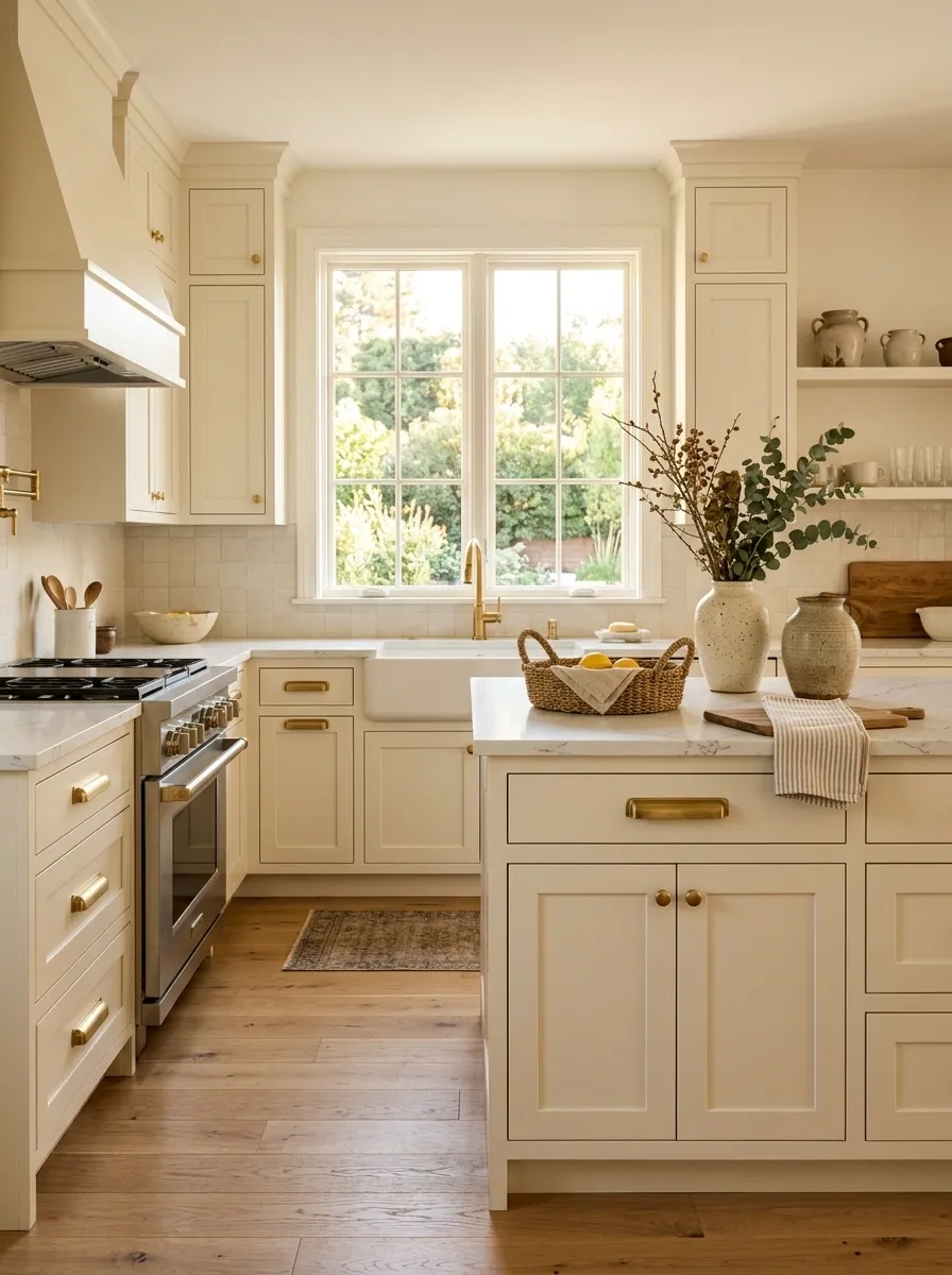
Sometimes the cabinets aren’t the real problem. The tiny brass knobs, ornate cup pulls, mismatched handles, or undersized hardware are making perfectly usable doors look stuck in a time capsule.
Replace the hardware across the kitchen with one coherent shape and finish. Longer pulls usually give cabinet doors and drawers more visual weight, while simple profiles feel cleaner without making the room aggressively modern.
Pay attention to proportion. Oversized hardware on narrow doors looks just as awkward as tiny hardware on wide drawers. The hardware should look like it belongs to the cabinetry, not like it wandered in from a different kitchen.
This is one of the cheaper ways to make an older kitchen feel deliberate instead of accidentally dated.
Style with Greenery and Wood
There is something magical about filling an older kitchen with an abundance of trailing plants and natural wood accents. It breaks up heavy cabinetry and brings an organic, living element indoors that feels effortlessly charming.
Suspending green vines above open shelving and framing a doorway with lush foliage softens harsh lines and adds instant character. Paired with a warm vintage runner and wooden countertops, the space feels deeply personal.
Don’t be afraid to let nature take over a little bit. The result is a vibrant, breathing kitchen that celebrates its own unique architecture.
Give the Kitchen Better Lighting Instead of Blaming Every Surface
Bad lighting has a remarkable talent for making decent kitchens look terrible.
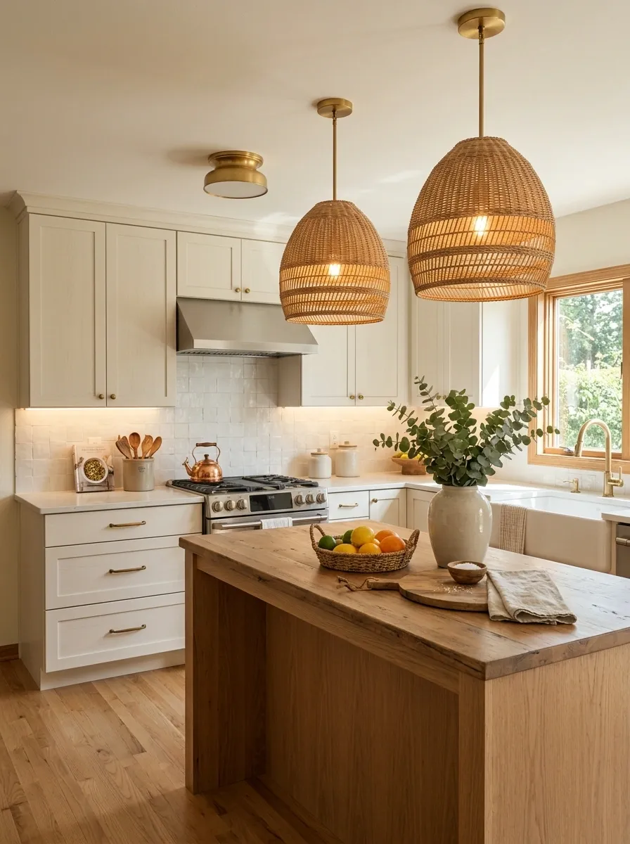
A dated ceiling fixture, weak task lighting, or harsh bulbs can flatten the room and make every old finish more obvious. Replace the main fixture with something simpler and properly scaled, then add focused light where food preparation actually happens.
Under-cabinet lighting is especially useful because it brightens the work surface and gives the backsplash more depth. Over an island, a pair of substantial pendants can create a stronger focal point than a tiny decorative fixture ever could.
The kitchen doesn’t need to sparkle like a jewelry store. It needs layers of useful light that make the existing materials look intentional.
Bring the Outdoors In
A connection to nature can breathe new life into a traditional kitchen layout, making the entire space feel fresh and revitalized. Cascading plants positioned at the top of cabinetry create a dramatic yet organic framing effect.
Surrounding the dining area with warm wood furniture and soft textiles balances out the harder surfaces of appliances and counters. A neutral rug anchors the room while echoing the relaxed, earthy palette.
This style relies on repetition and flow to make the greenery look intentional rather than out of place. It is a simple way to elevate your everyday cooking environment.
Replace the Backsplash That Is Dating the Entire Kitchen
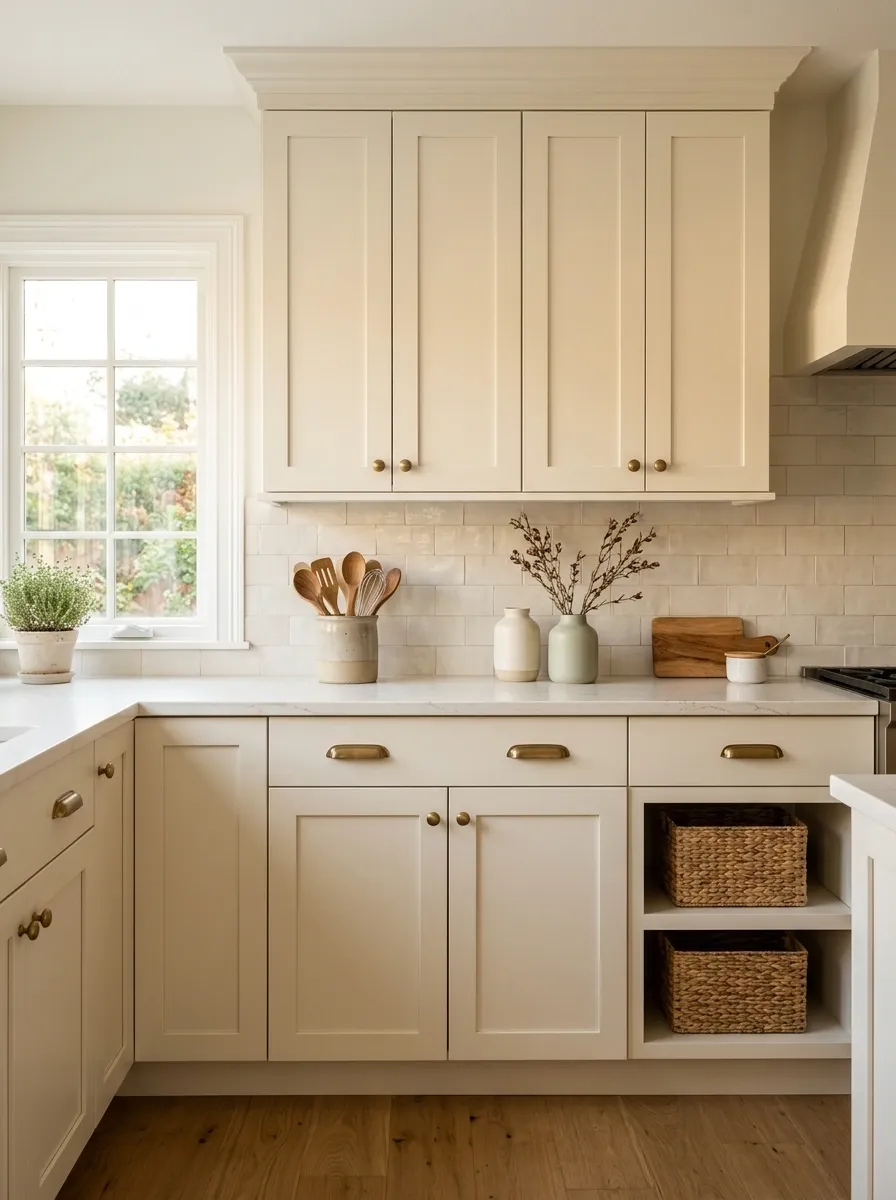
A backsplash can quietly become the loudest evidence that a kitchen hasn’t been updated in years.
If the tile has a busy pattern, dated color combination, overly shiny finish, or decorative border that pulls attention immediately, replacing it can reset the room without touching the cabinets. Keep the new material calmer than the feature it’s replacing.
A simple tile with a good shape and restrained grout can make older cabinets feel far more current. The trick is resisting the urge to replace one dated focal point with an even louder one.
Let the cabinetry, countertop, and backsplash have different jobs. They don’t all need to audition for the lead role.
Style Open Shelving Calmly
Open shelving offers a wonderful opportunity to display everyday objects as art, provided you keep the styling restrained and cohesive. A curated mix of ceramics, glassware, and natural wood elements creates visual interest without overwhelming the room.
Stick to a unified color palette, such as warm neutrals and muted earthy tones, so the shelves complement your countertops instead of competing with them. Subtly integrated jars and greenery add texture and life.
The key is leaving enough breathing room between items so the display feels light and curated. Let your favorite functional pieces do the decorating for you.
Warm an Older Kitchen With Natural Wood Accents
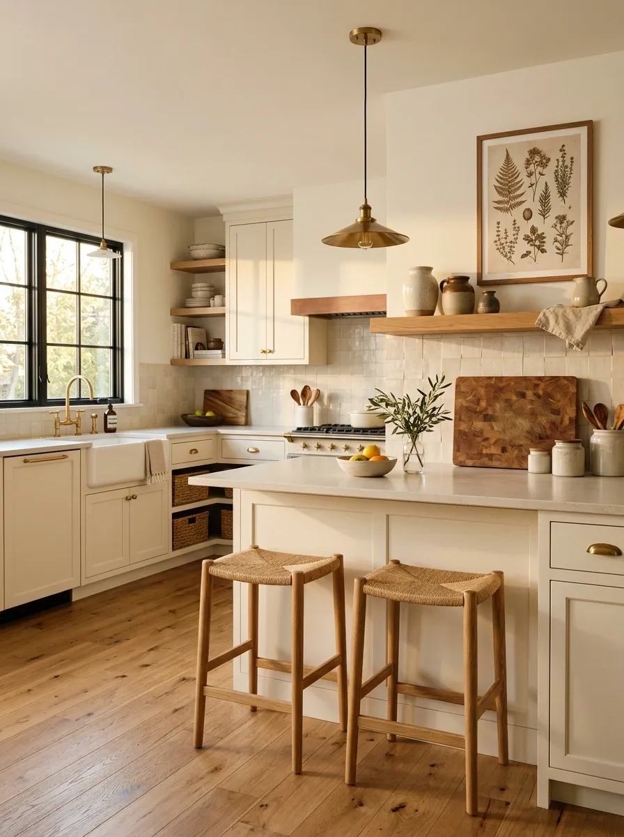
Older kitchens can look strangely cold after a refresh because everything gets pushed toward paint, stone, tile, and metal. Natural wood brings back the visual warmth without making the room look rustic by default.
Use it selectively. A pair of oak stools, a simple wood shelf, a substantial cutting board, or a wood-framed piece of art can give the kitchen a softer counterweight to painted cabinetry and hard surfaces.
The important part is repetition. One random wood object can look accidental. A few related wood elements spread through the room create a visual thread.
This works especially well when the existing kitchen already has some wood worth keeping. Instead of fighting the material, give it better company.
Make the Countertops Look More Current Through What Surrounds Them
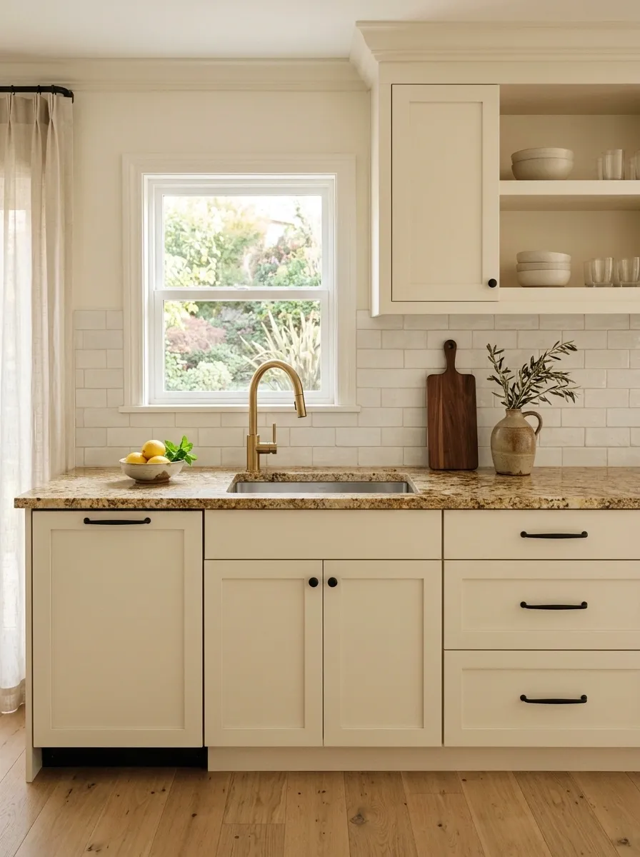
An older countertop can look surprisingly decent when everything around it stops fighting with it. The expensive move is replacement. The smarter move is often changing the supporting cast.
Pair the existing counter with cleaner hardware, a simpler backsplash, a more current faucet, and less countertop clutter. If the counter has warm undertones, don’t surround it with icy gray accessories and chrome just because they’re supposedly “modern.” That combination usually makes the old surface look even older.
The countertop doesn’t have to become the star. It just needs to stop looking like the kitchen was designed by several committees who never met.
Swap the Faucet for a Cleaner, More Architectural Shape
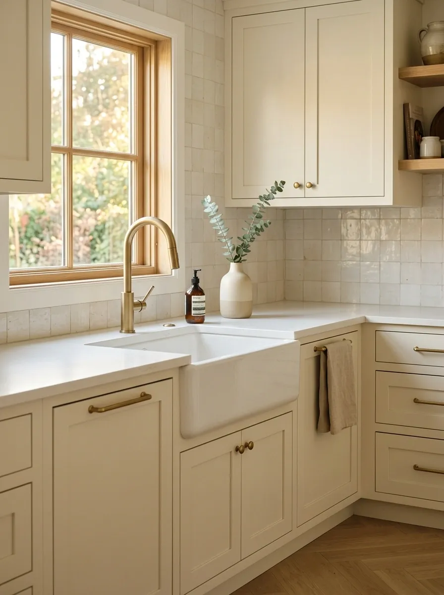
The faucet occupies a surprisingly important spot in an older kitchen because it sits directly in the main working zone. A dated, overly ornate, or undersized faucet can make the sink area feel behind even after other updates.
Choose a simpler silhouette with enough height and reach for the sink. Match its finish to the hardware or another intentional metal detail so it looks connected to the rest of the room.
Don’t replace the faucet just because a particular shape is trending. The better question is whether the new silhouette makes the sink wall look cleaner and more proportionate.
A kitchen doesn’t need futuristic plumbing. It just needs a faucet that isn’t visually stuck in 1998.
Clear the Countertops Until the Kitchen Can Breathe
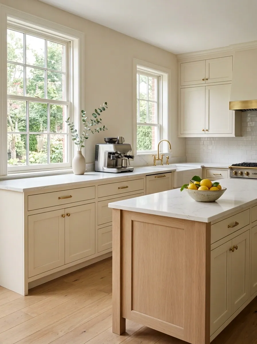
Some kitchens aren’t actually suffering from dated finishes. They’re suffering from accumulated stuff.
A toaster, coffee machine, knife block, utensil crock, cutting boards, oils, decorative signs, small appliances, and assorted containers can turn a workable counter into a permanent yard sale. The effect is especially rough in an older kitchen because visual clutter makes every existing dated detail more noticeable.
Keep the things used daily. Move occasional items into cabinets or a nearby storage zone. Then leave enough uninterrupted counter space for the eye to register the actual materials.
The goal isn’t an empty kitchen. It’s a kitchen where every visible object looks like it has a reason to be there.
Use One Consistent Metal Finish to Connect Mismatched Updates
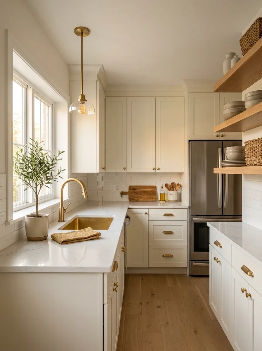
Older kitchens often accumulate metal finishes one purchase at a time. Chrome faucet. Brass knobs. Stainless appliance. Black light fixture. Suddenly the room has developed a small identity crisis.
Choose one dominant metal for the elements most visible at eye level and repeat it. That could mean coordinating the cabinet hardware, faucet, and lighting details while allowing appliances to remain whatever they already are.
Perfect matching isn’t necessary. Consistency is.
A repeated finish gives the eye a pattern to follow and makes newer pieces look like part of one design decision instead of evidence of several unrelated shopping trips.
Take Heavy Upper Cabinets Visually Lighter
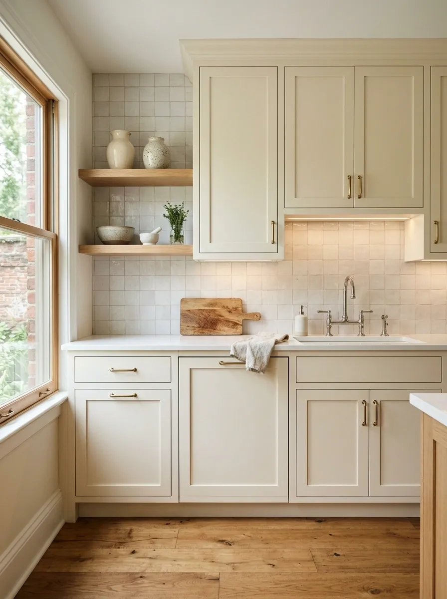
A bank of dark or overly bulky upper cabinets can make an older kitchen feel compressed, especially when the backsplash and counters are equally strong.
The answer isn’t always removing cabinets. Start by reducing their visual weight. A lighter cabinet color, quieter backsplash, brighter wall, or better under-cabinet lighting can make the upper half of the kitchen recede.
If some open shelving already exists, keep it purposeful rather than filling it with twenty decorative objects just because there is suddenly somewhere to put them.
The kitchen should have enough storage to function. It doesn’t need every vertical inch visually occupied.
Add Under-Cabinet Lighting Where the Kitchen Feels Flat
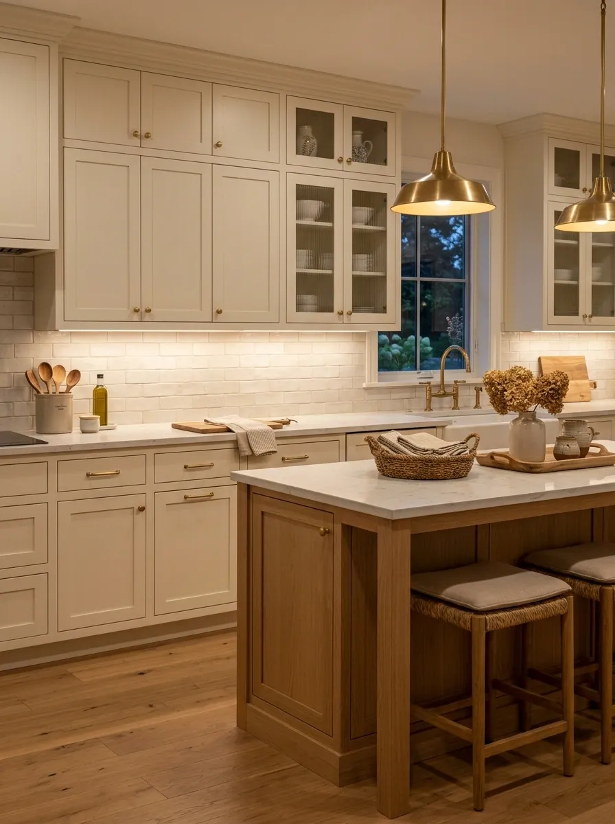
Under-cabinet lighting can make an older kitchen look substantially more considered without changing a single cabinet door.
Place task lighting where it actually illuminates the work surface rather than simply creating a decorative glow. The light should wash across the counter and backsplash, reducing harsh shadows and giving the materials some depth.
Warm, comfortable illumination generally works better for a lived-in kitchen than lighting that makes everything look like a medical examination room.
This is also one of the rare updates that improves both the appearance of the kitchen and the way the space functions after dark.
mount light underneath counter
receive the useful light
Give the Sink Wall a More Intentional Composition
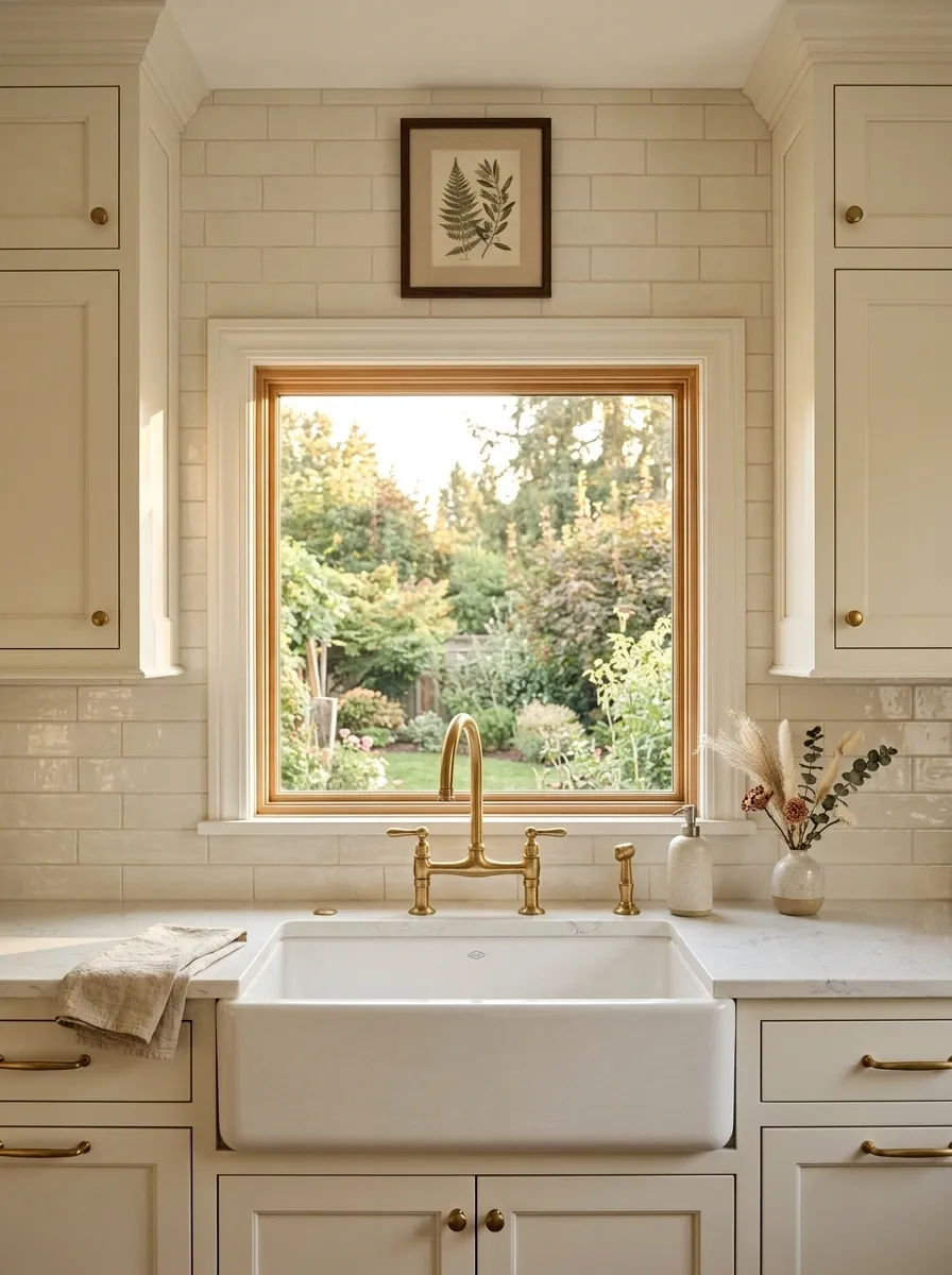
The sink wall is often where an older kitchen gives itself away. The faucet, window, upper cabinets, counter clutter, and miscellaneous accessories all compete in one relatively small area.
Treat that wall as a composition rather than a collection of necessities. Keep the faucet visually clean, simplify whatever sits on the counter, and make the window treatment or surrounding wall detail support the sink rather than compete with it.
A modest piece of artwork can work if there is usable wall space. A window can become the natural focal point. The important part is deciding what should attract attention first.
Even a perfectly functional sink area benefits from having an obvious visual hierarchy.
Replace a Dated Window Treatment With Something Simpler
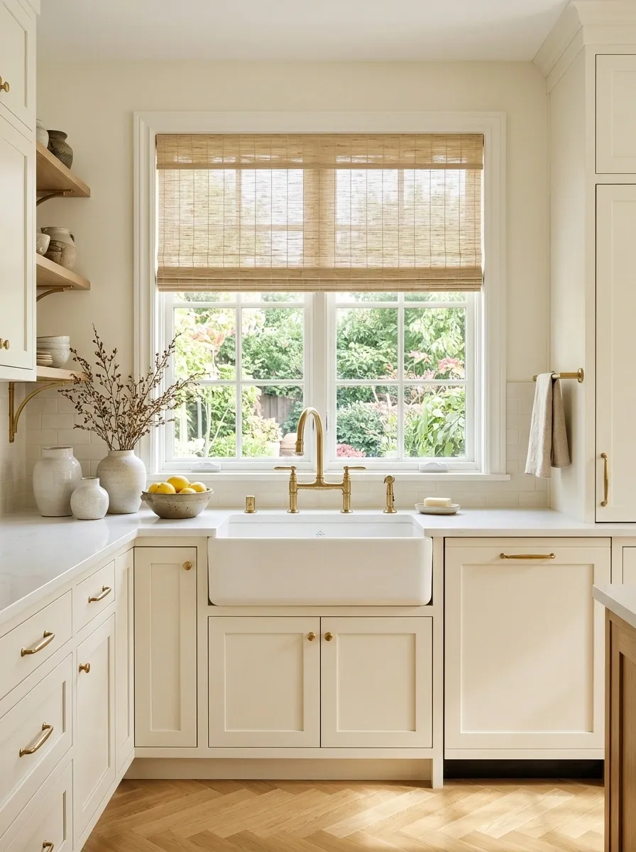
A kitchen can have perfectly decent cabinets and still look dated because the window treatment is doing entirely too much.
Swap heavy fabric valances, ornate curtains, or overly decorative blinds for a cleaner treatment that lets natural light do more of the work. A simple woven shade, relaxed fabric panel, or understated blind can soften the window without turning it into a second focal point.
Keep the treatment practical for the kitchen. It should tolerate the realities of cooking, cleaning, splashes, and daily use.
The goal is not an empty window. It’s a window that frames the room instead of announcing itself from across the house.
window becomes the entire story
light and privacy become the problem
natural light stays prominent, treatment stays quiet
Use a Larger Runner to Make the Kitchen Feel More Finished
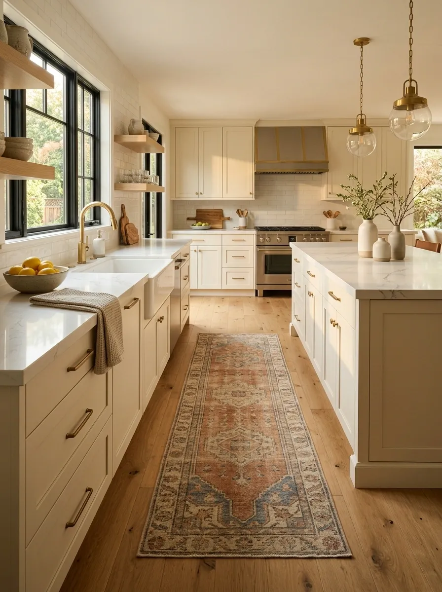
A tiny rug floating awkwardly in the middle of a kitchen rarely helps. It tends to make the room look more pieced together, not more finished.
A properly scaled runner can connect the cabinets, appliances, and walking path while adding texture and warmth. Choose a length that relates to the main working zone and a width that leaves sensible clearance around the edges.
A washable, low-profile material makes more sense than something delicate that becomes a hostage to the first spilled sauce.
The runner should visually connect the room, not become another random rectangle demanding attention.
looks dropped in Better:
relates to the working run
Style Open Shelving With Fewer, Larger Pieces
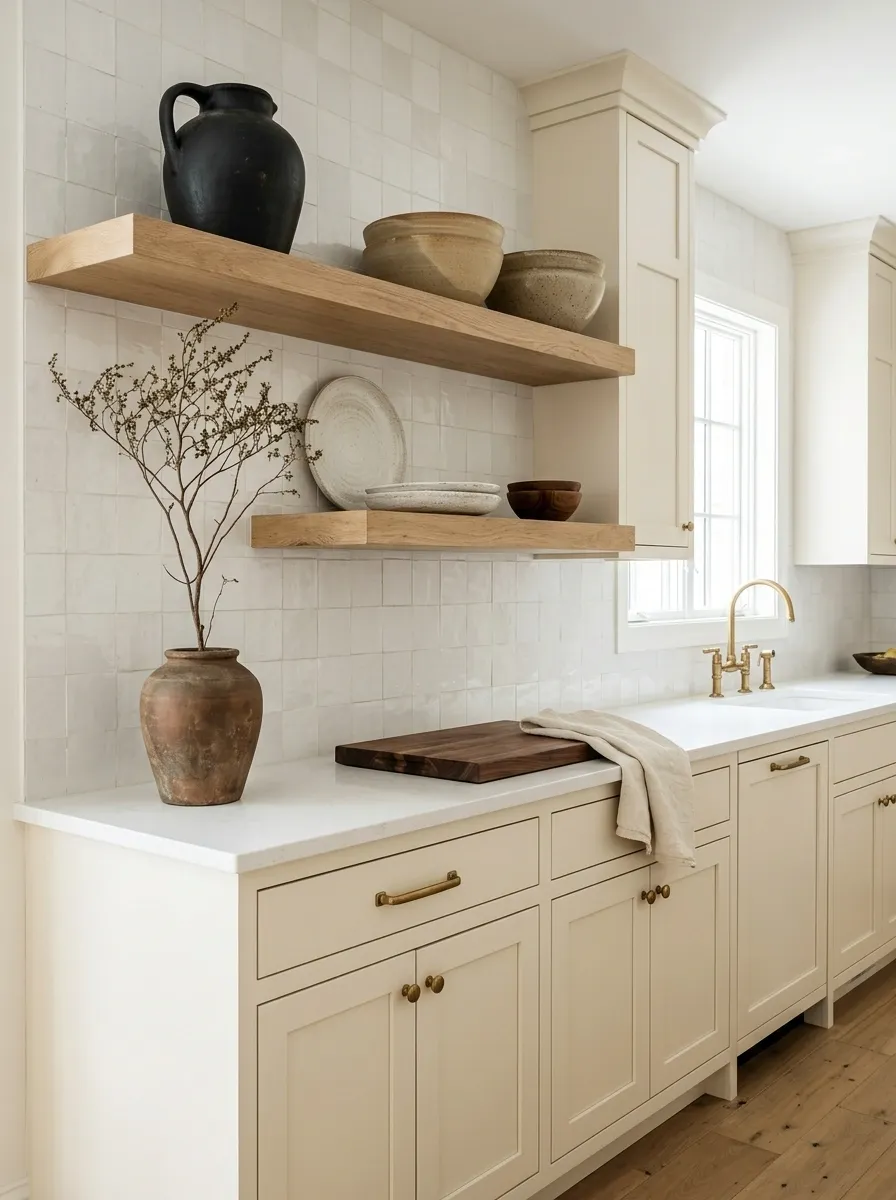
Open shelving can make an older kitchen look fresher, but only when it creates breathing room. Fill every shelf with tiny bowls, signs, jars, plants, mugs, and decorative objects and suddenly the kitchen has become a flea market with plumbing.
Choose fewer pieces with more visual presence. Group similar materials, vary heights, and leave intentional empty space between collections.
Useful objects can stay visible. The point is to make the shelves read as part of the room rather than a storage overflow zone.
The best shelves usually look edited, not empty and not stuffed.
Make the Refrigerator Zone Look Deliberate
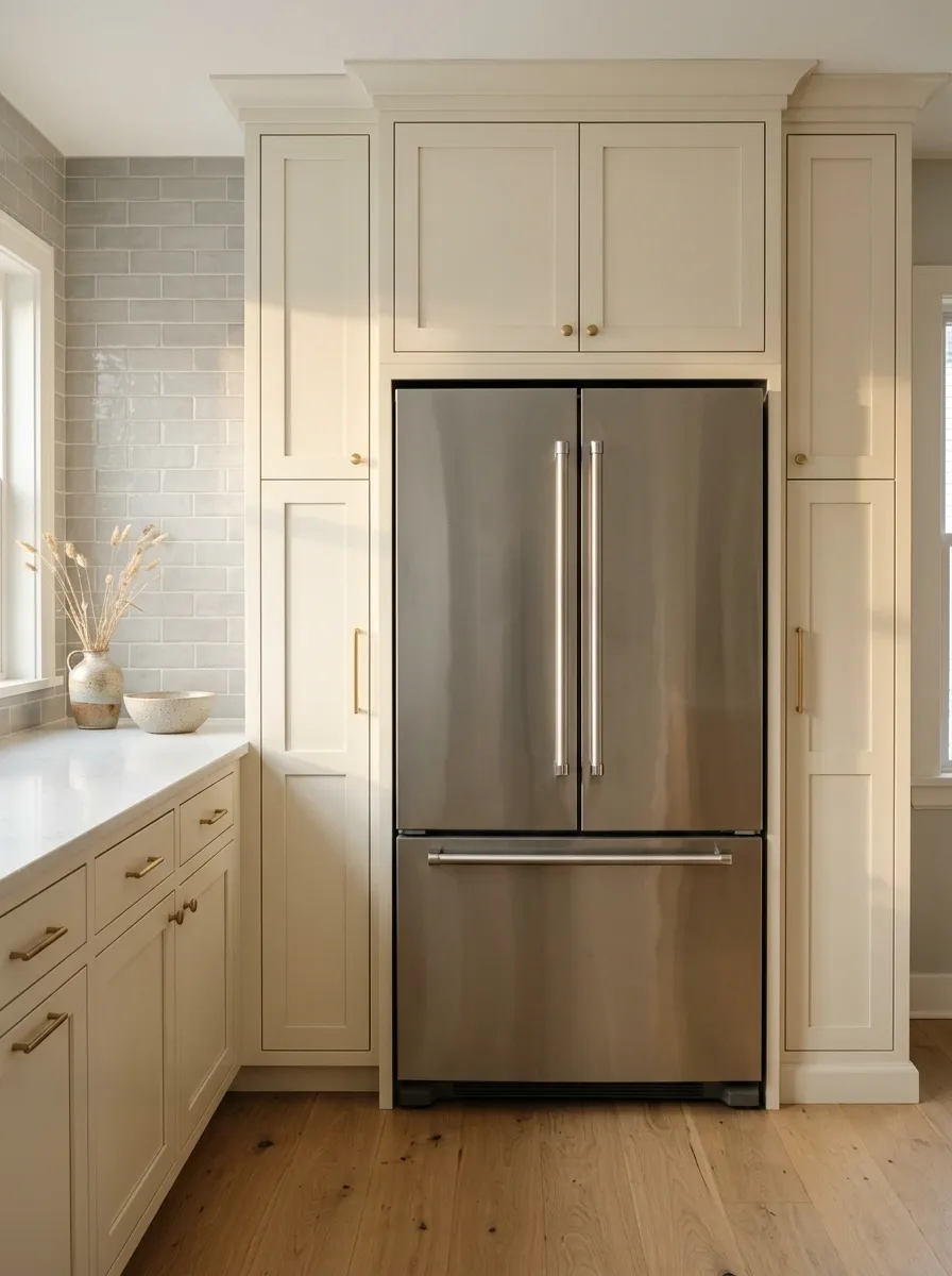
The refrigerator is usually one of the biggest visual objects in the kitchen, yet it often gets treated like an appliance that simply landed wherever the contractor had room for it.
Give the surrounding area some structure. Keep the adjacent counter clear, repeat the cabinet finish around it where possible, and avoid piling random baskets, papers, and small appliances beside the refrigerator. When the appliance sits at the end of a cabinet run, let that endpoint feel intentional rather than accidental.
This matters even more in smaller kitchens. A messy refrigerator zone can make the whole room feel chaotic before anyone has noticed the cabinets.
Keep the adjacent counter visually quiet.
Let cabinetry or wall color create a clean visual boundary.
Keep magnets, papers, and visual clutter under control.
Introduce One Current Material Without Replacing Everything
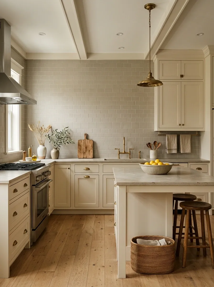
An older kitchen doesn’t need six new finishes to feel refreshed. One carefully selected material can be enough to give the room a new visual reference point.
Choose something that connects naturally with what already exists. A matte ceramic backsplash, a restrained wood element, a softly finished stone surface, or a woven textile can introduce a different texture without creating another competing layer.
The important word is one. Adding a contemporary material works because it creates contrast with the older elements. Add five unrelated modern materials and the room starts looking like a sample board exploded.
Let the new material appear in a few meaningful places so it feels repeated rather than random.
+ one current material
+ repeated twice
Give the Walls a Fresh Color Envelope
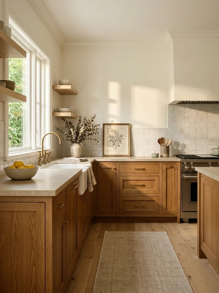
Sometimes the cabinetry gets all the blame when the real problem is the color surrounding it.
An old kitchen can feel remarkably different when the walls, trim, and adjacent surfaces are brought into a more cohesive color family. The trick is choosing a background that works with the kitchen’s fixed elements instead of forcing those elements to compete with a new wall color.
Warm whites, soft neutrals, muted greens, earthy taupes, and other restrained tones can change how older cabinetry reads. The right wall color can make yellowed wood feel intentional, soften strong countertops, or give white cabinets a warmer backdrop.
Think of the wall as the frame around the kitchen. A dated frame can make everything inside look worse.
cabinet / wall
counter / textile
art / decor
Change the Bar or Island Seating to Update the Whole Room
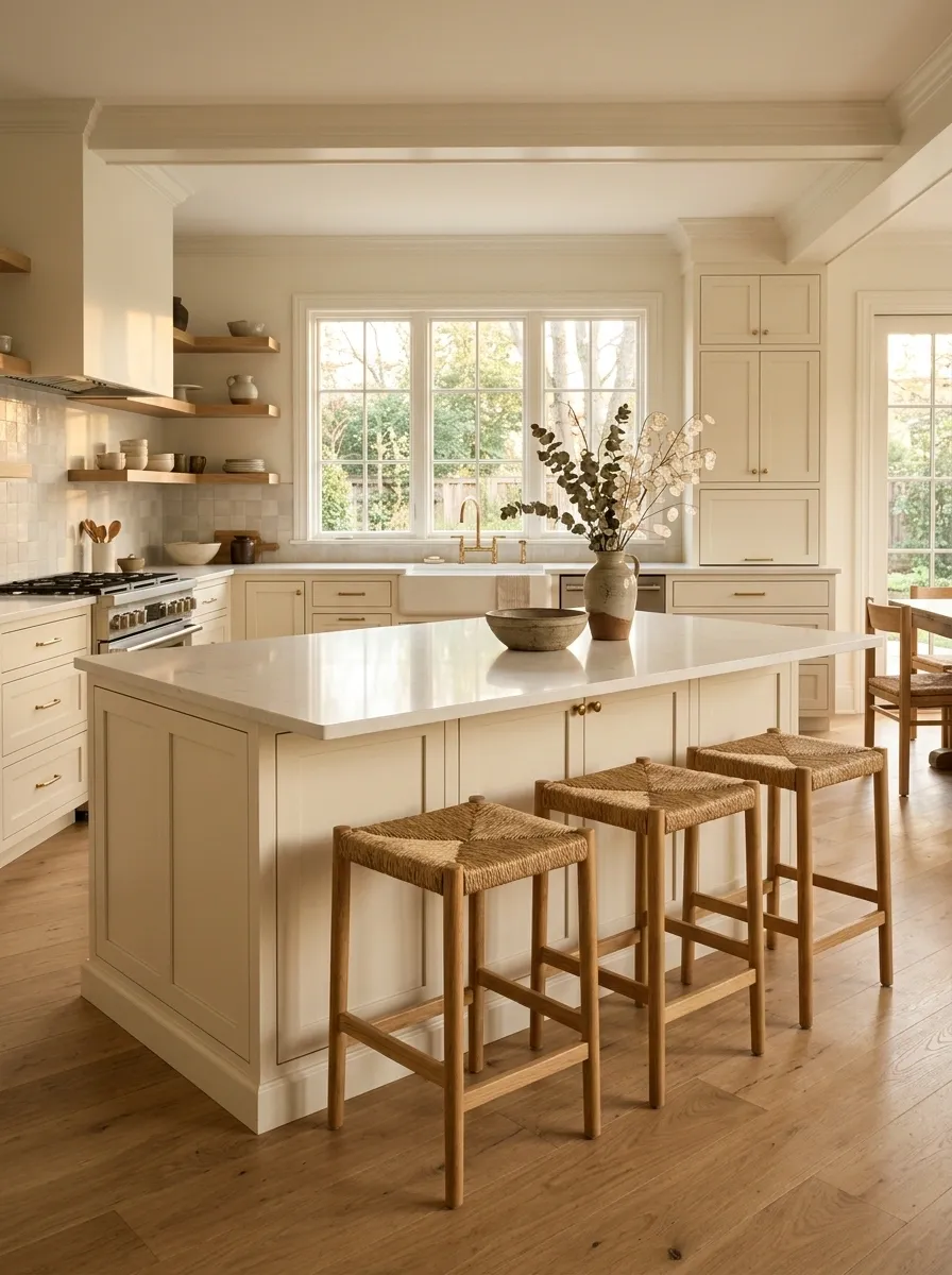
Kitchen stools are easy to underestimate because they seem like a small detail. They aren’t.
When an island sits in the center of an older kitchen, its seating becomes part of the room’s visual mass. Replace undersized, fussy, or overly ornate stools with pieces that have cleaner proportions and enough presence to balance the island.
The new seating should suit the counter height, leave adequate room for movement, and connect with another material already present in the kitchen. Wood works well against painted cabinetry. Simple upholstered seating can soften a hard-surface room.
Nobody needs a showroom stool collection. Two or three well-scaled seats can do far more than six tiny ones crammed together.
Use One Larger Piece of Art Instead of Lots of Small Kitchen Decor
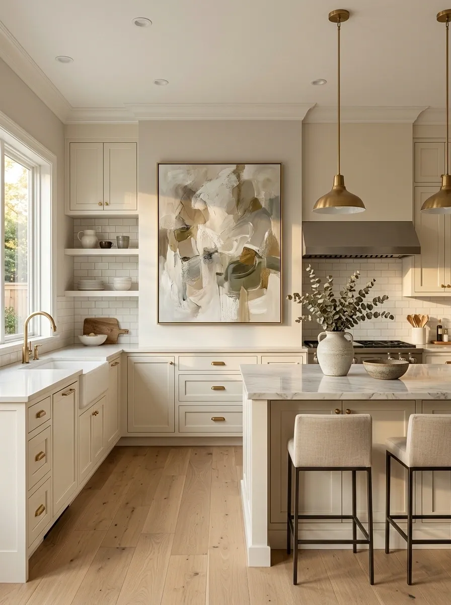
Older kitchens often get decorated to death in an attempt to make them look more finished. The result is usually the opposite.
Instead of filling every empty wall with tiny prints, signs, baskets, and decorative objects, use one appropriately scaled piece of art where the architecture gives it room.
A larger piece creates a clear focal point and gives the eye somewhere to settle. Choose artwork that relates to the kitchen’s colors without literally matching every finish.
The piece should support the room, not announce that someone has recently discovered the concept of wall decor.
Let Existing Wood Cabinets Become the Warm Feature
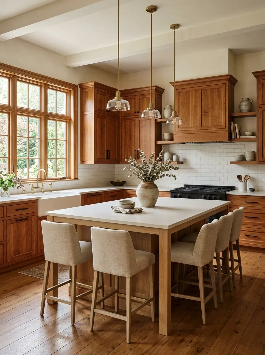
Not every wood kitchen needs to be painted.
If the cabinets have good grain, solid construction, or attractive detailing, the fresher move can be to stop treating the wood as a problem. Give it a cleaner supporting cast instead.
Pair warm wood cabinets with simpler hardware, lighter walls, restrained counters, and contemporary lighting. Remove surrounding accessories that compete with the grain. Let the natural wood become the room’s warm visual anchor.
This approach works especially well in older homes where the cabinetry is part of the character. Covering every original surface in paint can sometimes make the kitchen look newer while making the house look less like itself.
Modernize the Dining or Breakfast Corner Beside the Kitchen
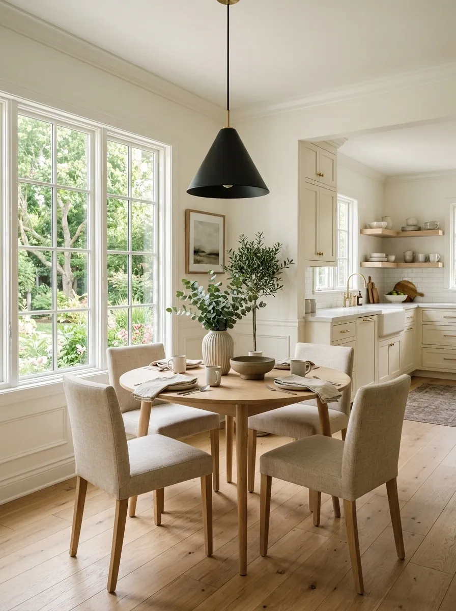
A kitchen rarely exists in isolation. An outdated breakfast nook or dining corner can make the entire kitchen feel older, even after the cabinets and lighting have been refreshed.
Bring that adjacent area into the same visual conversation. A simpler table, better-scaled chairs, one current light fixture, and textiles that repeat the kitchen’s colors can make the transition feel deliberate.
The goal isn’t to create a matching furniture showroom. The kitchen and eating area simply need to look like they belong to the same house.
Sometimes the kitchen isn’t the problem. It’s the room standing six feet away judging it.
BRIDGE
AREA
Simplify the Backsplash Styling Instead of Replacing the Tile
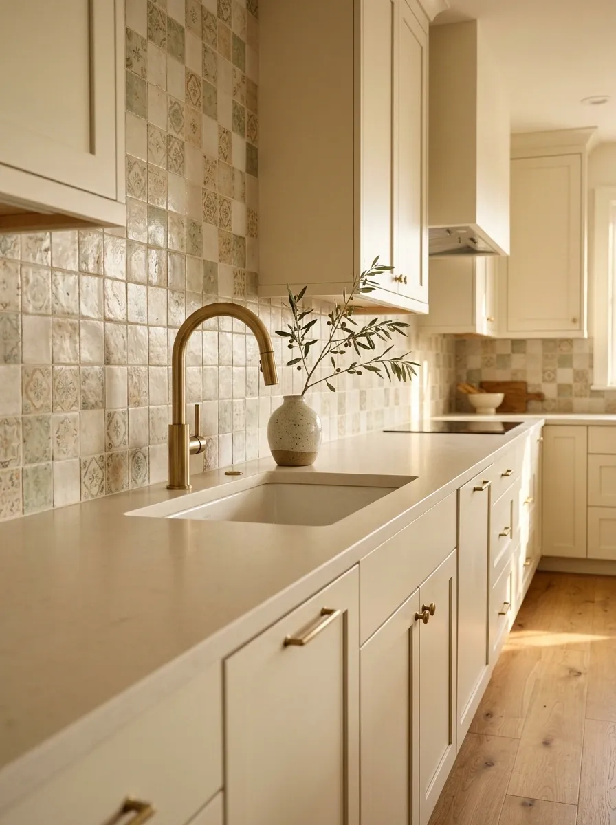
Replacing backsplash tile isn’t always necessary. Sometimes the tile is fine. The clutter around it is not.
Clear the counter, reduce decorative objects, simplify the faucet zone, and let the existing backsplash become a supporting surface instead of a background for twenty competing objects.
If the tile has some age but isn’t damaged, better lighting can also change how it reads. A calmer countertop allows its pattern and color to settle into the overall composition.
Before ripping out perfectly serviceable tile, give the poor thing a chance to exist without being buried under appliances, signs, jars, and decorative clutter.
− counter clutter
+ better light
= calmer backdrop
Use Large-Scale Pendants to Give an Old Layout a New Focal Point
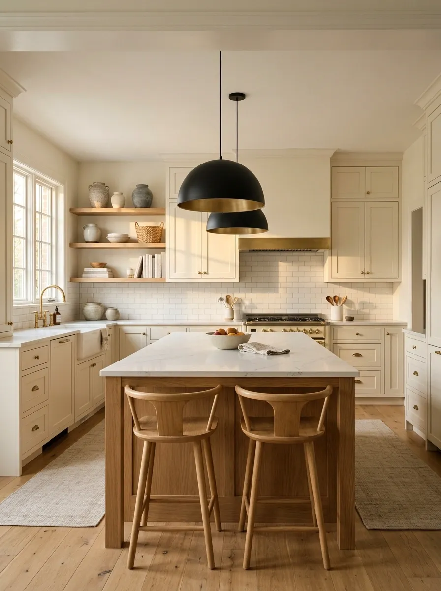
If the kitchen has an island or peninsula, the lighting above it can redirect the entire room’s visual attention.
Replace tiny decorative fixtures with pendants that have enough scale to anchor the island. Keep their shape relatively simple and let the rest of the kitchen stay quiet around them.
The point isn’t to install the largest fixture available because bigger is supposedly better. It is to create one confident focal point where the kitchen already naturally gathers attention.
A strong fixture can make an old layout feel more deliberate without changing the layout at all.
Upgrade the Pantry or Open Storage Zone Instead of the Whole Kitchen
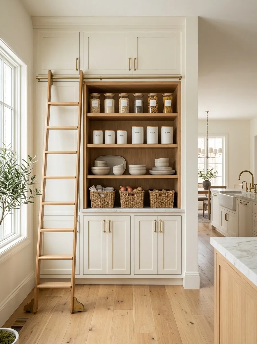
A chaotic pantry can make an otherwise decent kitchen feel unfinished. It also creates the irritating situation where everything appears to have a place until someone actually needs to find something.
Refresh the storage zone with a simpler organization scheme. Group similar items, keep everyday supplies accessible, and use containers only where they genuinely improve visibility or function.
If pantry doors are visible from the main kitchen, updating their hardware or giving them a cleaner finish can make the storage area part of the design rather than a neglected side character.
Functional storage is a design feature when it is visible. It doesn’t need to look like a laboratory to work.
Break Up a Hard, Flat Kitchen With More Texture
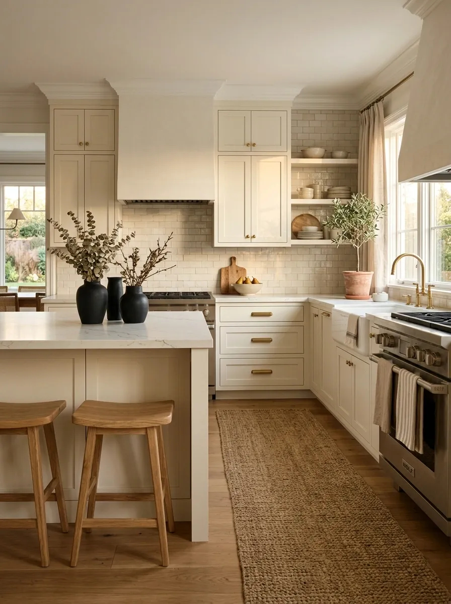
An older kitchen can feel dated even when its colors are perfectly fine because every surface is smooth, hard, and visually similar. Cabinets, counters, tile, appliances, and flooring can all start blending into one giant slab of practical nothingness.
Add texture instead of adding more decoration. A woven runner, natural wood stools, matte ceramics, linen-style textiles, or a few pieces with visible grain can give the room depth without turning it into a craft store.
Texture works best when it is spread across the kitchen rather than concentrated in one corner. The eye should discover small differences as it moves around the room.
The kitchen doesn’t need more stuff. It needs more variation in how the existing stuff looks and feels.
Replace the One Dated Feature That Is Doing All the Damage
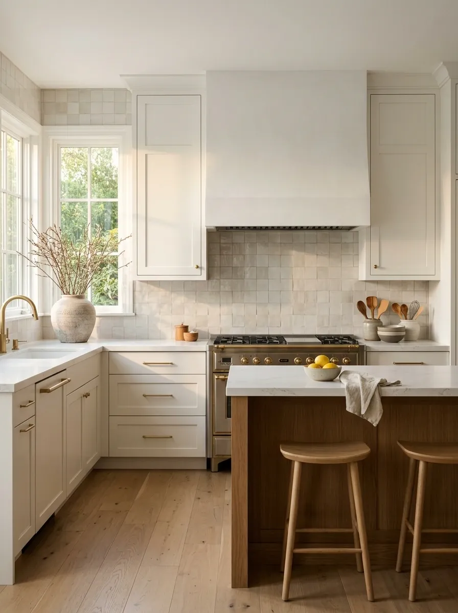
Sometimes an older kitchen has one feature that instantly announces its age. It might be an ornate range hood, a busy backsplash, an oversized decorative cabinet detail, an old light fixture, or a very specific architectural finish.
Don’t remodel the entire kitchen because one element has become the visual spokesperson for another decade.
Find the feature that catches attention first, then replace or simplify that one element. Keep the surrounding finishes quiet so the change has room to work.
This strategy is especially useful when the budget is limited. Fix the thing that carries the most visual weight before spending money on details nobody notices.
Use Tone-on-Tone Styling to Make Mixed Old Finishes Feel Intentional
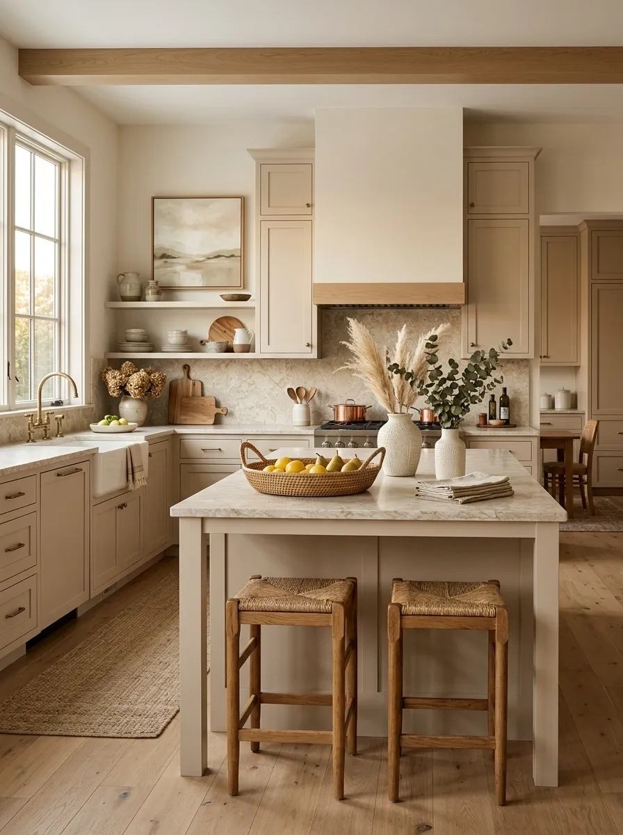
Older kitchens rarely come with a perfectly coordinated set of finishes. There may be warm cabinets, a patterned counter, pale walls, stainless appliances, and a floor from an entirely different chapter of the house.
Trying to make every element match can make the problem worse.
Instead, work within one restrained color family and vary the materials. Warm beige can connect wood, stone, woven pieces, and painted surfaces. Soft green can link cabinetry, ceramics, textiles, and artwork without making every item the exact same shade.
The room starts feeling connected because the colors relate, even when the materials don’t.
Match the mood, not every object.
cabinet / wall
counter / textile
art / decor
Change the Bar or Island Seating to Update the Whole Room
Kitchen stools are easy to underestimate because they seem like a small detail. They aren’t.
When an island sits in the center of an older kitchen, its seating becomes part of the room’s visual mass. Replace undersized, fussy, or overly ornate stools with pieces that have cleaner proportions and enough presence to balance the island.
The new seating should suit the counter height, leave adequate room for movement, and connect with another material already present in the kitchen. Wood works well against painted cabinetry. Simple upholstered seating can soften a hard-surface room.
Nobody needs a showroom stool collection. Two or three well-scaled seats can do far more than six tiny ones crammed together.
Use One Larger Piece of Art Instead of Lots of Small Kitchen Decor
Older kitchens often get decorated to death in an attempt to make them look more finished. The result is usually the opposite.
Instead of filling every empty wall with tiny prints, signs, baskets, and decorative objects, use one appropriately scaled piece of art where the architecture gives it room.
A larger piece creates a clear focal point and gives the eye somewhere to settle. Choose artwork that relates to the kitchen’s colors without literally matching every finish.
The piece should support the room, not announce that someone has recently discovered the concept of wall decor.
Let Existing Wood Cabinets Become the Warm Feature
Not every wood kitchen needs to be painted.
If the cabinets have good grain, solid construction, or attractive detailing, the fresher move can be to stop treating the wood as a problem. Give it a cleaner supporting cast instead.
Pair warm wood cabinets with simpler hardware, lighter walls, restrained counters, and contemporary lighting. Remove surrounding accessories that compete with the grain. Let the natural wood become the room’s warm visual anchor.
This approach works especially well in older homes where the cabinetry is part of the character. Covering every original surface in paint can sometimes make the kitchen look newer while making the house look less like itself.
Modernize the Dining or Breakfast Corner Beside the Kitchen
A kitchen rarely exists in isolation. An outdated breakfast nook or dining corner can make the entire kitchen feel older, even after the cabinets and lighting have been refreshed.
Bring that adjacent area into the same visual conversation. A simpler table, better-scaled chairs, one current light fixture, and textiles that repeat the kitchen’s colors can make the transition feel deliberate.
The goal isn’t to create a matching furniture showroom. The kitchen and eating area simply need to look like they belong to the same house.
Sometimes the kitchen isn’t the problem. It’s the room standing six feet away judging it.
BRIDGE
AREA
Simplify the Backsplash Styling Instead of Replacing the Tile
Replacing backsplash tile isn’t always necessary. Sometimes the tile is fine. The clutter around it is not.
Clear the counter, reduce decorative objects, simplify the faucet zone, and let the existing backsplash become a supporting surface instead of a background for twenty competing objects.
If the tile has some age but isn’t damaged, better lighting can also change how it reads. A calmer countertop allows its pattern and color to settle into the overall composition.
Before ripping out perfectly serviceable tile, give the poor thing a chance to exist without being buried under appliances, signs, jars, and decorative clutter.
− counter clutter
+ better light
= calmer backdrop
Use Large-Scale Pendants to Give an Old Layout a New Focal Point
If the kitchen has an island or peninsula, the lighting above it can redirect the entire room’s visual attention.
Replace tiny decorative fixtures with pendants that have enough scale to anchor the island. Keep their shape relatively simple and let the rest of the kitchen stay quiet around them.
The point isn’t to install the largest fixture available because bigger is supposedly better. It is to create one confident focal point where the kitchen already naturally gathers attention.
A strong fixture can make an old layout feel more deliberate without changing the layout at all.
Upgrade the Pantry or Open Storage Zone Instead of the Whole Kitchen
A chaotic pantry can make an otherwise decent kitchen feel unfinished. It also creates the irritating situation where everything appears to have a place until someone actually needs to find something.
Refresh the storage zone with a simpler organization scheme. Group similar items, keep everyday supplies accessible, and use containers only where they genuinely improve visibility or function.
If pantry doors are visible from the main kitchen, updating their hardware or giving them a cleaner finish can make the storage area part of the design rather than a neglected side character.
Functional storage is a design feature when it is visible. It doesn’t need to look like a laboratory to work.
Break Up a Hard, Flat Kitchen With More Texture
An older kitchen can feel dated even when its colors are perfectly fine because every surface is smooth, hard, and visually similar. Cabinets, counters, tile, appliances, and flooring can all start blending into one giant slab of practical nothingness.
Add texture instead of adding more decoration. A woven runner, natural wood stools, matte ceramics, linen-style textiles, or a few pieces with visible grain can give the room depth without turning it into a craft store.
Texture works best when it is spread across the kitchen rather than concentrated in one corner. The eye should discover small differences as it moves around the room.
The kitchen doesn’t need more stuff. It needs more variation in how the existing stuff looks and feels.
Replace the One Dated Feature That Is Doing All the Damage
Sometimes an older kitchen has one feature that instantly announces its age. It might be an ornate range hood, a busy backsplash, an oversized decorative cabinet detail, an old light fixture, or a very specific architectural finish.
Don’t remodel the entire kitchen because one element has become the visual spokesperson for another decade.
Find the feature that catches attention first, then replace or simplify that one element. Keep the surrounding finishes quiet so the change has room to work.
This strategy is especially useful when the budget is limited. Fix the thing that carries the most visual weight before spending money on details nobody notices.
Use Tone-on-Tone Styling to Make Mixed Old Finishes Feel Intentional
Older kitchens rarely come with a perfectly coordinated set of finishes. There may be warm cabinets, a patterned counter, pale walls, stainless appliances, and a floor from an entirely different chapter of the house.
Trying to make every element match can make the problem worse.
Instead, work within one restrained color family and vary the materials. Warm beige can connect wood, stone, woven pieces, and painted surfaces. Soft green can link cabinetry, ceramics, textiles, and artwork without making every item the exact same shade.
The room starts feeling connected because the colors relate, even when the materials don’t.
Match the mood, not every object.
cabinet / wall
counter / textile
art / decor
Change the Bar or Island Seating to Update the Whole Room
Kitchen stools are easy to underestimate because they seem like a small detail. They aren’t.
When an island sits in the center of an older kitchen, its seating becomes part of the room’s visual mass. Replace undersized, fussy, or overly ornate stools with pieces that have cleaner proportions and enough presence to balance the island.
The new seating should suit the counter height, leave adequate room for movement, and connect with another material already present in the kitchen. Wood works well against painted cabinetry. Simple upholstered seating can soften a hard-surface room.
Nobody needs a showroom stool collection. Two or three well-scaled seats can do far more than six tiny ones crammed together.
Use One Larger Piece of Art Instead of Lots of Small Kitchen Decor
Older kitchens often get decorated to death in an attempt to make them look more finished. The result is usually the opposite.
Instead of filling every empty wall with tiny prints, signs, baskets, and decorative objects, use one appropriately scaled piece of art where the architecture gives it room.
A larger piece creates a clear focal point and gives the eye somewhere to settle. Choose artwork that relates to the kitchen’s colors without literally matching every finish.
The piece should support the room, not announce that someone has recently discovered the concept of wall decor.
Let Existing Wood Cabinets Become the Warm Feature
Not every wood kitchen needs to be painted.
If the cabinets have good grain, solid construction, or attractive detailing, the fresher move can be to stop treating the wood as a problem. Give it a cleaner supporting cast instead.
Pair warm wood cabinets with simpler hardware, lighter walls, restrained counters, and contemporary lighting. Remove surrounding accessories that compete with the grain. Let the natural wood become the room’s warm visual anchor.
This approach works especially well in older homes where the cabinetry is part of the character. Covering every original surface in paint can sometimes make the kitchen look newer while making the house look less like itself.
Modernize the Dining or Breakfast Corner Beside the Kitchen
A kitchen rarely exists in isolation. An outdated breakfast nook or dining corner can make the entire kitchen feel older, even after the cabinets and lighting have been refreshed.
Bring that adjacent area into the same visual conversation. A simpler table, better-scaled chairs, one current light fixture, and textiles that repeat the kitchen’s colors can make the transition feel deliberate.
The goal isn’t to create a matching furniture showroom. The kitchen and eating area simply need to look like they belong to the same house.
Sometimes the kitchen isn’t the problem. It’s the room standing six feet away judging it.
BRIDGE
AREA
Simplify the Backsplash Styling Instead of Replacing the Tile
Replacing backsplash tile isn’t always necessary. Sometimes the tile is fine. The clutter around it is not.
Clear the counter, reduce decorative objects, simplify the faucet zone, and let the existing backsplash become a supporting surface instead of a background for twenty competing objects.
If the tile has some age but isn’t damaged, better lighting can also change how it reads. A calmer countertop allows its pattern and color to settle into the overall composition.
Before ripping out perfectly serviceable tile, give the poor thing a chance to exist without being buried under appliances, signs, jars, and decorative clutter.
− counter clutter
+ better light
= calmer backdrop
Use Large-Scale Pendants to Give an Old Layout a New Focal Point
If the kitchen has an island or peninsula, the lighting above it can redirect the entire room’s visual attention.
Replace tiny decorative fixtures with pendants that have enough scale to anchor the island. Keep their shape relatively simple and let the rest of the kitchen stay quiet around them.
The point isn’t to install the largest fixture available because bigger is supposedly better. It is to create one confident focal point where the kitchen already naturally gathers attention.
A strong fixture can make an old layout feel more deliberate without changing the layout at all.
Upgrade the Pantry or Open Storage Zone Instead of the Whole Kitchen
A chaotic pantry can make an otherwise decent kitchen feel unfinished. It also creates the irritating situation where everything appears to have a place until someone actually needs to find something.
Refresh the storage zone with a simpler organization scheme. Group similar items, keep everyday supplies accessible, and use containers only where they genuinely improve visibility or function.
If pantry doors are visible from the main kitchen, updating their hardware or giving them a cleaner finish can make the storage area part of the design rather than a neglected side character.
Functional storage is a design feature when it is visible. It doesn’t need to look like a laboratory to work.
Break Up a Hard, Flat Kitchen With More Texture
An older kitchen can feel dated even when its colors are perfectly fine because every surface is smooth, hard, and visually similar. Cabinets, counters, tile, appliances, and flooring can all start blending into one giant slab of practical nothingness.
Add texture instead of adding more decoration. A woven runner, natural wood stools, matte ceramics, linen-style textiles, or a few pieces with visible grain can give the room depth without turning it into a craft store.
Texture works best when it is spread across the kitchen rather than concentrated in one corner. The eye should discover small differences as it moves around the room.
The kitchen doesn’t need more stuff. It needs more variation in how the existing stuff looks and feels.