
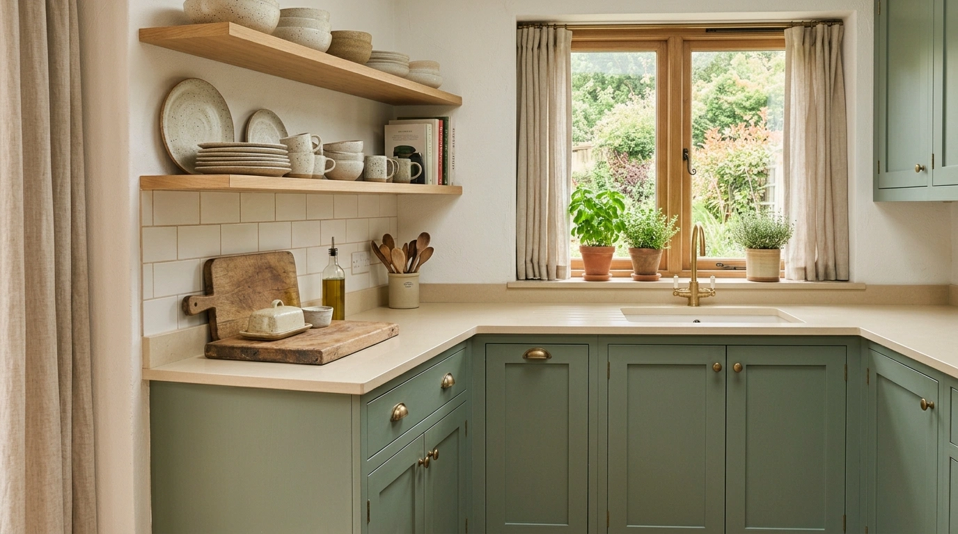
Green kitchens have one very specific problem: the color is rarely the issue. The problem is what happens after someone falls in love with the paint swatch and decides absolutely everything needs to match it.
Cabinets go green. Then the backsplash gets green. Then there are green stools, green curtains, green ceramics, and somehow a tiny green vase has entered the group chat too. Suddenly the kitchen isn’t layered. It’s just very committed.
Good green kitchen ideas work differently. They give the color a clear job, then surround it with materials that make the shade look intentional. Warm wood can make deep green feel richer. Cream can soften a cooler sage. Black can sharpen it. Brass can make it warmer without turning the room into a shiny showroom.
The best part is that green doesn’t have to mean one specific look. It can be quiet and earthy, dramatic and moody, traditional, modern, vintage, or surprisingly minimal.
The trick is knowing where to stop.
Green Kitchen Ideas
Let the Outside In With Forest Green and Timber
Deep green cabinetry paired with raw wooden shelving creates a seamless transition when your kitchen window opens up to a lush, leafy backyard.
Stacking open wood shelves above dark lower cabinets prevents the heavy forest tones from feeling too enclosed, especially when accented with trailing houseplants.
Keep your countertops sleek and dark to anchor the space, letting the natural grain of the wood and the vibrant outdoor views do all the talking.
Paint the Lower Cabinets Green and Keep the Uppers Quiet
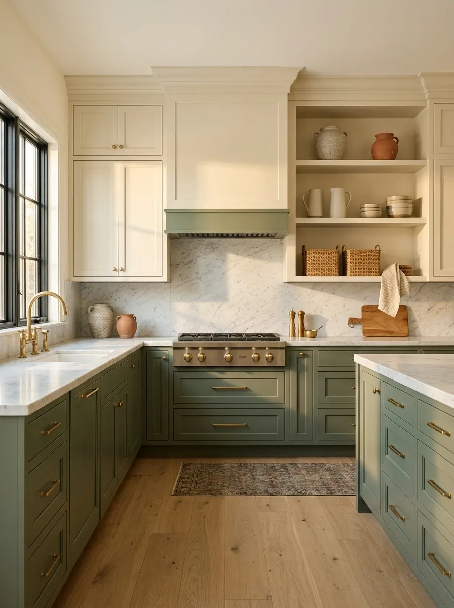
Painting every cabinet green isn’t automatically bold. Sometimes it’s just a lot of green.
Keeping the upper cabinets cream, white, or another quiet neutral gives the lower half of the kitchen a strong color block without making the entire room feel enclosed.
It also works beautifully in smaller kitchens because the lighter upper half keeps the eye moving upward.
The basic split:
The result feels intentional because the color has a boundary. That’s often all a strong cabinet color needs.
Embrace Total Moody Elegance With Matte Black and Green
Monochromatic dark kitchens can easily veer into cave territory unless you introduce the right contrast of textures and warm lighting.
Matte dark green cabinets paired with charcoal stone surfaces and warm pendant lighting create an intimate, sophisticated atmosphere that feels deliberate rather than accidental.
Break up the moody expanse with natural wooden cutting boards and fresh potted greens to give the eye a cozy place to land.
Use Sage Green With Warm White Instead of Stark White
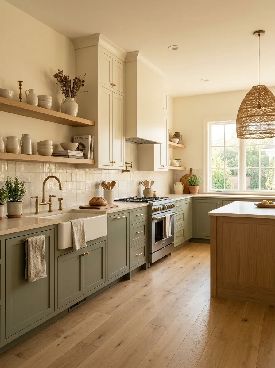
Sage green and icy white can make a kitchen feel colder than expected.
Warm white changes the entire relationship. Creamy walls, counters, tile, or upper cabinets soften the green and make the room feel more settled.
Keep the white slightly warm rather than choosing something that looks blue under artificial lighting.
The pairing works particularly well with oak, limestone, brushed metal, and woven textures.
Go All In With Green Marble and Velvet
If you are going to commit to a saturated emerald palette, wrapping your island in continuous green marble takes the design from nice to unforgettable.
Velvet barstools in a matching deep green soften the hard edges of the stone while adding a luxurious, touchable layer to the room.
Keep the metallic accents minimal and let the dramatic veining of the stone act as the absolute star of the show.
Turn a Small Kitchen Green Without Making It Feel Smaller
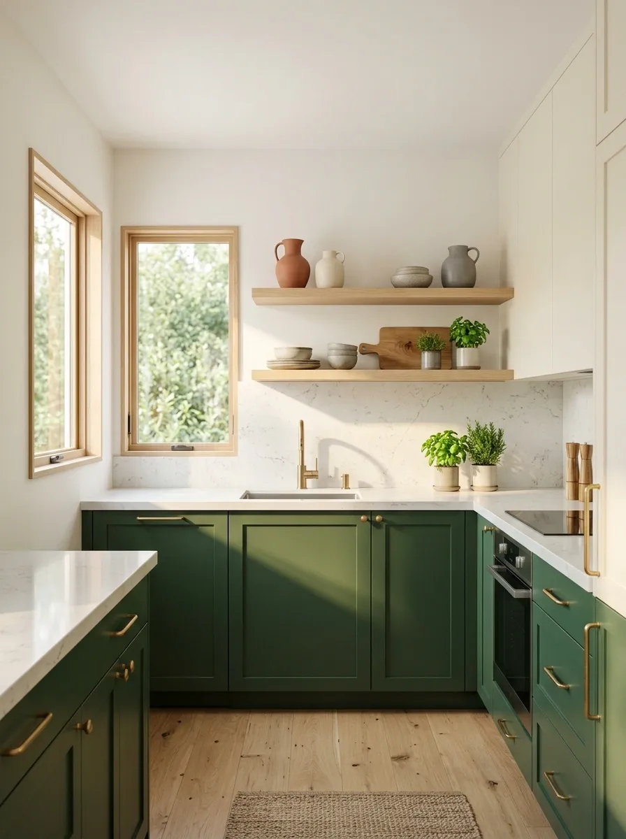
Small kitchens don’t need to avoid green. They need better color placement.
Use the strongest green below eye level, keep the upper area light, and avoid chopping the walls into too many competing sections.
A lighter green can also work across a larger surface when the room gets good natural light.
The goal isn’t making the green disappear. It’s making the room feel larger than the cabinet footprint suggests.
Mix Soft Mint With Playful Striped Seating
Pale mint cabinetry offers a breath of fresh air, especially when paired with crisp white tiling and warm light wood flooring.
Striped fabric barstools add a playful, tailored touch that keeps the soft green from feeling too pastel or juvenile.
Anchor the airy color scheme with sleek modern lighting and simple open shelving to maintain an effortless, sunlit atmosphere.
Let Natural Wood Break Up a Deep Green Kitchen
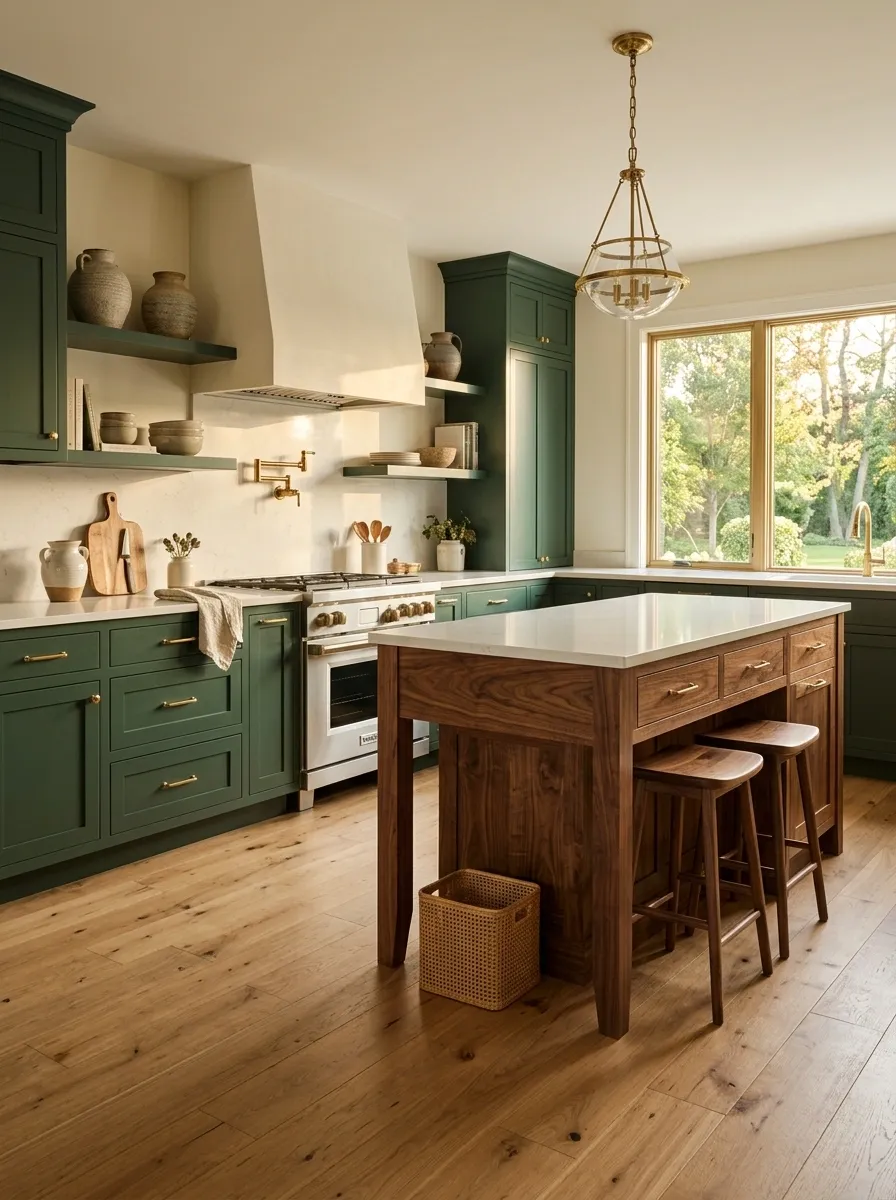
Deep green gets dramatically better when natural wood enters the room.
An oak shelf, walnut island, wood stool, or visible butcher-block section gives the eye a warm surface between all that saturated color.
Don’t cover the wood with a heavy stain if the grain is one of the reasons it works. The natural variation is doing useful visual work.
The combination feels grounded because the wood interrupts the large green surfaces without fighting them.
Use Olive Green When You Want More Depth Than Sage Gives
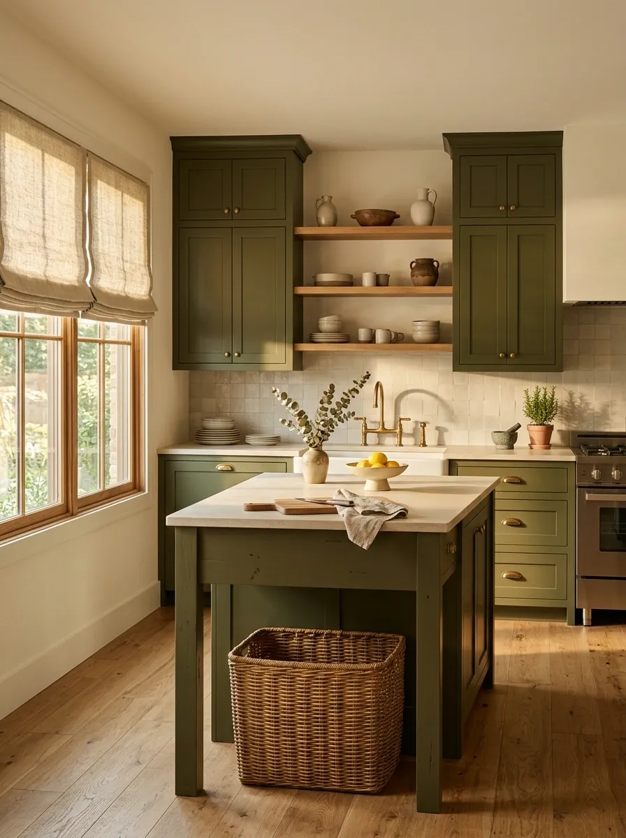
Sage is soft. Olive has more attitude.
Olive green works especially well beside warm flooring, natural wood, creamy counters, and aged metals. It has enough earthy depth to make a kitchen feel substantial without going as dark as forest green.
If sage feels too pale and forest green feels too dramatic, olive sits right in that useful middle ground.
Olive works particularly well with:
Olive is also forgiving when a kitchen has several existing warm finishes that aren’t going anywhere.
Wrap the Island in Green Instead of Painting Every Cabinet
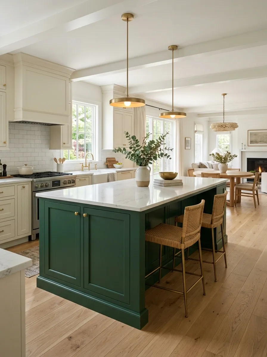
A green island gives the kitchen a focal point without forcing every cabinet into the same color story.
Keep perimeter cabinets cream, natural wood, or another restrained finish, then let the island carry the green.
This is especially effective when the island sits in the center of an open kitchen because the color naturally becomes the visual anchor.
The island becomes the color moment. Everything else gets to relax.
Pair Green Cabinets With Aged Brass, Not Shiny Gold
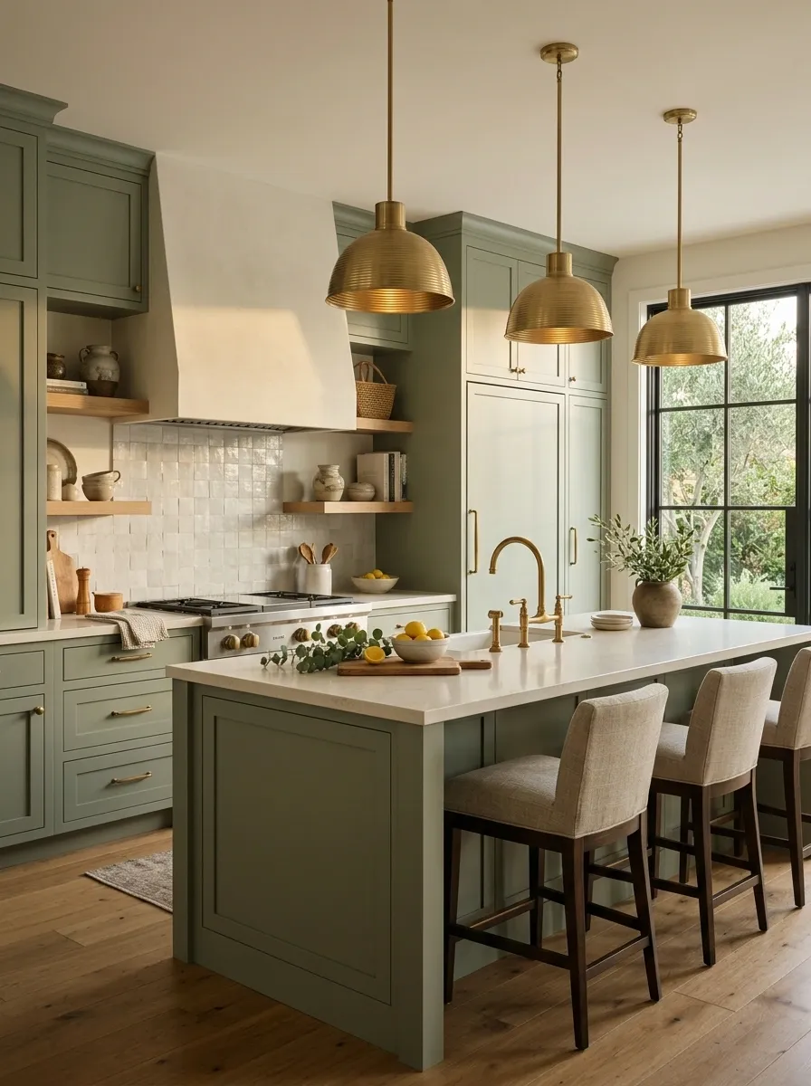
Green and brass work beautifully, but the finish matters.
Aged brass has warmth and a slightly softened surface that sits naturally with earthy green. Highly polished gold can look much louder, especially beside saturated cabinetry.
Use the metal repeatedly in small doses rather than putting it on every possible fixture.
The softer finish lets the green remain the star.
Bring Green Into the Backsplash Without Matching the Cabinets Exactly
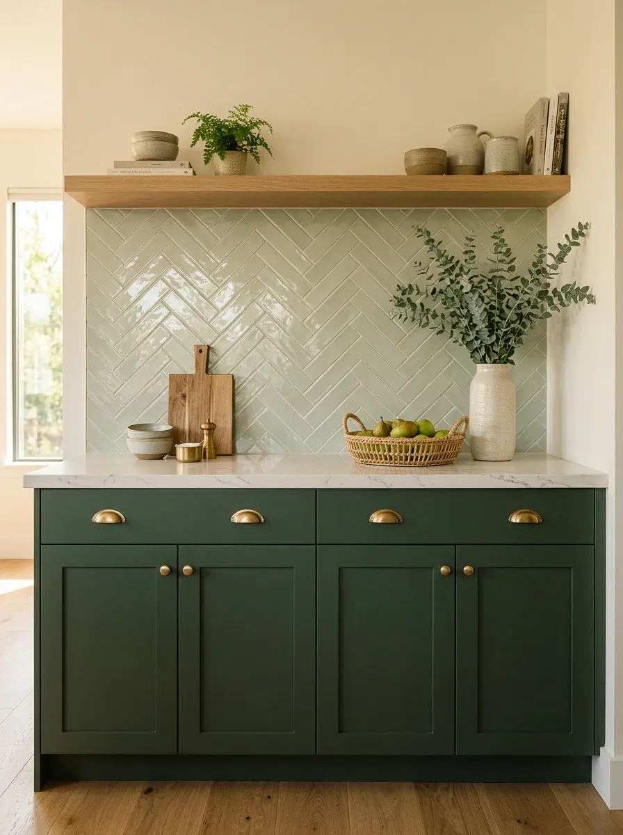
Matching the cabinets and backsplash perfectly can flatten the room.
Instead, keep them in the same color family but change the value, texture, or exact shade. A muted green cabinet can sit beside a slightly deeper tile. A dark green cabinet can work with a washed, pale green backsplash.
The contrast doesn’t need to be dramatic. It just needs to exist.
Perfect matching is overrated anyway. Kitchens need layers, not a color-code competition.
Use Dark Green on a Single Wall to Anchor an Open Kitchen
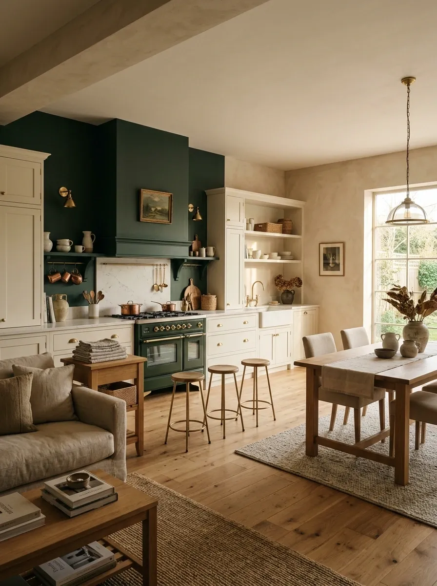
Open-plan kitchens need something that visually says, “This is the kitchen.”
A single dark green wall can do exactly that without requiring every cabinet and surface to become colorful.
Use it behind a dining area, pantry wall, range wall, or another naturally defined section. Keep adjacent finishes quieter so the dark color has room to work.
This is especially useful when there aren’t enough architectural boundaries between the kitchen and the rest of the living space.
Choose Creamy Counters When the Green Feels Too Cool
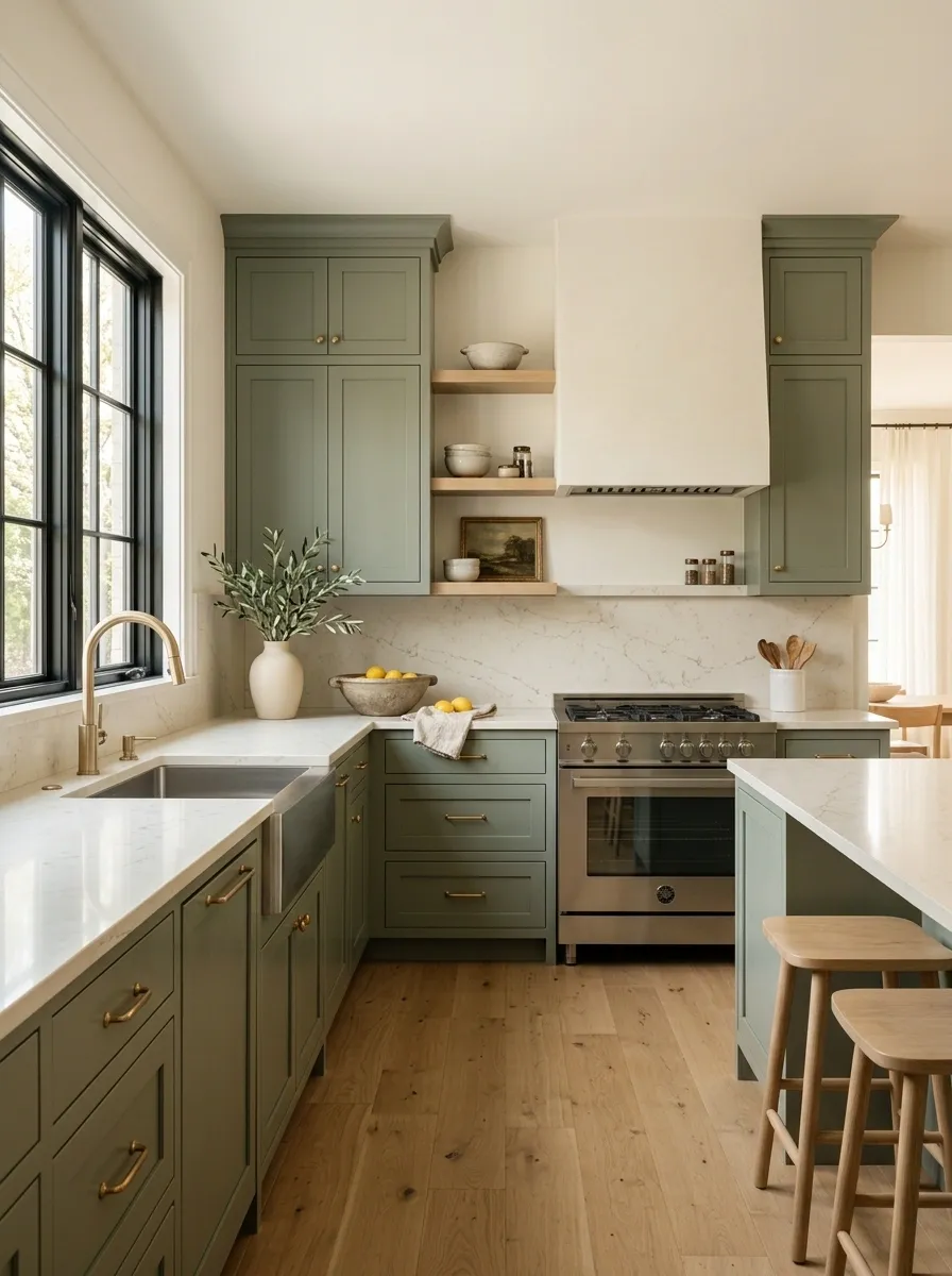
A green kitchen can look completely different depending on what sits directly above the cabinets.
Cool gray counters can push certain greens toward a colder look. Creamy stone creates a warmer transition and works especially well with sage, olive, and muted forest tones.
Skip overly aggressive veining if the cabinets already have strong color. The counter doesn’t need to audition for the lead role.
The simplest rule is this: if the green is doing a lot, let the counter calm things down.
Make Green Shaker Cabinets Feel Modern With Simple Hardware
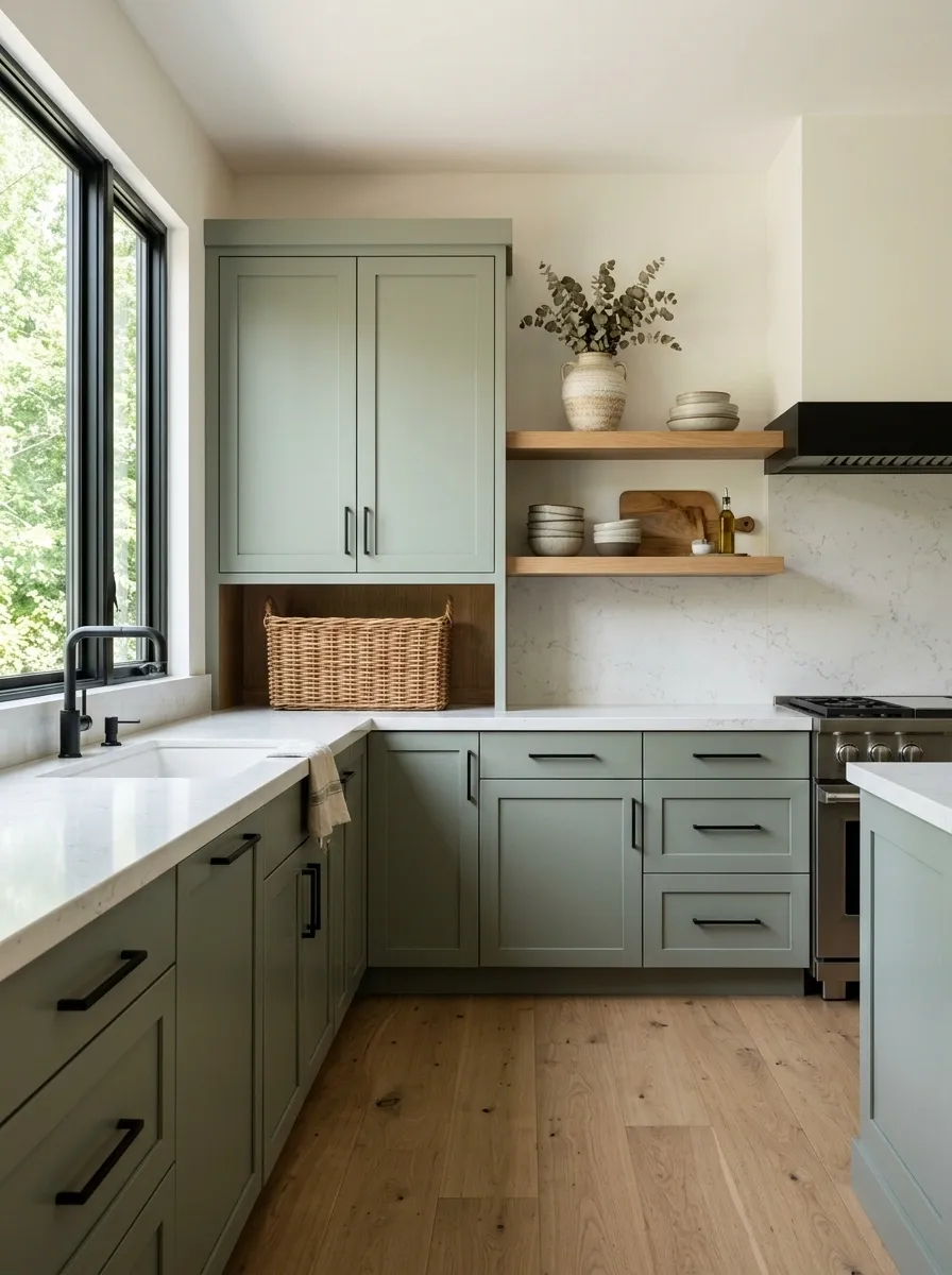
Shaker cabinets already have plenty going on with their recessed frames. Add oversized decorative pulls and suddenly the kitchen is trying very hard to make a statement.
Keep the hardware slim and clean. Black bar pulls sharpen muted green. Small aged-brass knobs make the same cabinets feel warmer.
The goal is simple: let the cabinet color carry the personality and let the hardware handle the practical job.
Try a Dusty Green Instead of Bright Green for a Softer Kitchen
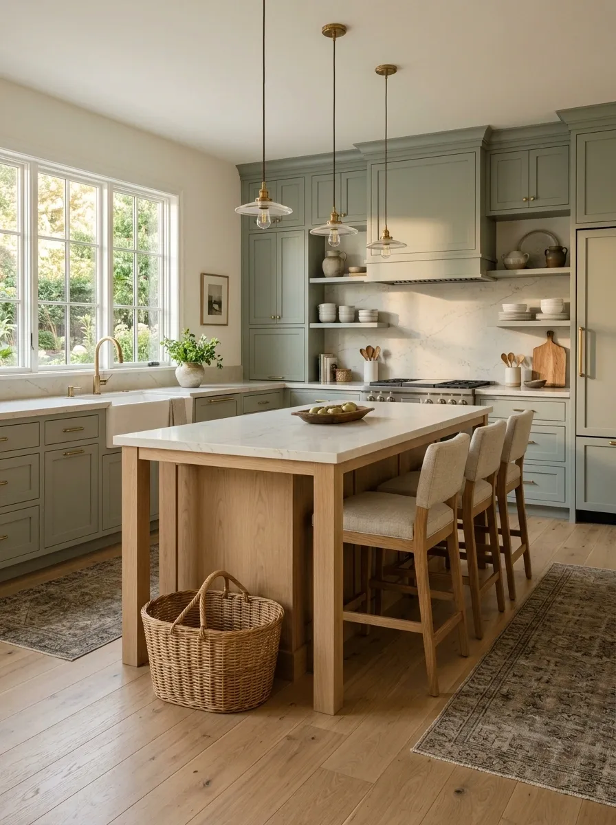
Bright green looks exciting on a tiny paint card. On twenty cabinet doors, the excitement can become a hostage situation.
Dusty green has gray or muted undertones that make the color easier to live with. It also pairs cleanly with cream, natural wood, and stone.
Use it on full cabinetry when the goal is a calm kitchen rather than a dramatic feature.
The beauty of dusty green is that it doesn’t demand constant attention. That’s useful in a room where appliances, counters, dishes, and groceries are already doing plenty.
Use Green Only on the Pantry or Tall Cabinets
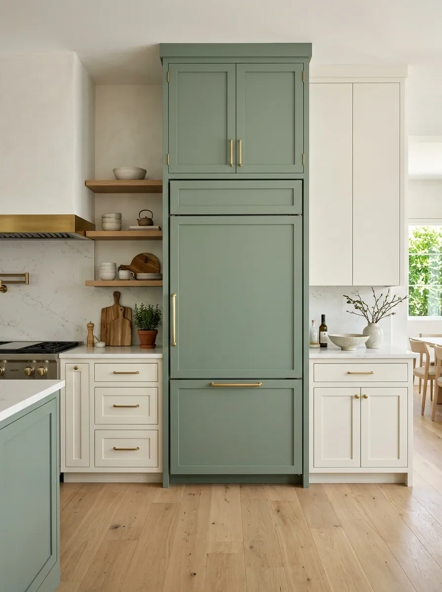
A wall of tall cabinets can feel visually heavy, especially when it sits beside a run of lighter cabinetry. That’s exactly where green earns its keep.
Paint the pantry tower, refrigerator surround, or other tall storage units green. Leave the lower cabinets lighter so the darker color feels concentrated rather than scattered.
It also creates a strong vertical anchor, which makes the kitchen look more architectural.
Use the tall zone as the color block:
This move is especially useful when the kitchen already has a natural focal wall. The green simply makes the architecture harder to ignore.
Use Green Tile for a Kitchen That Needs More Texture
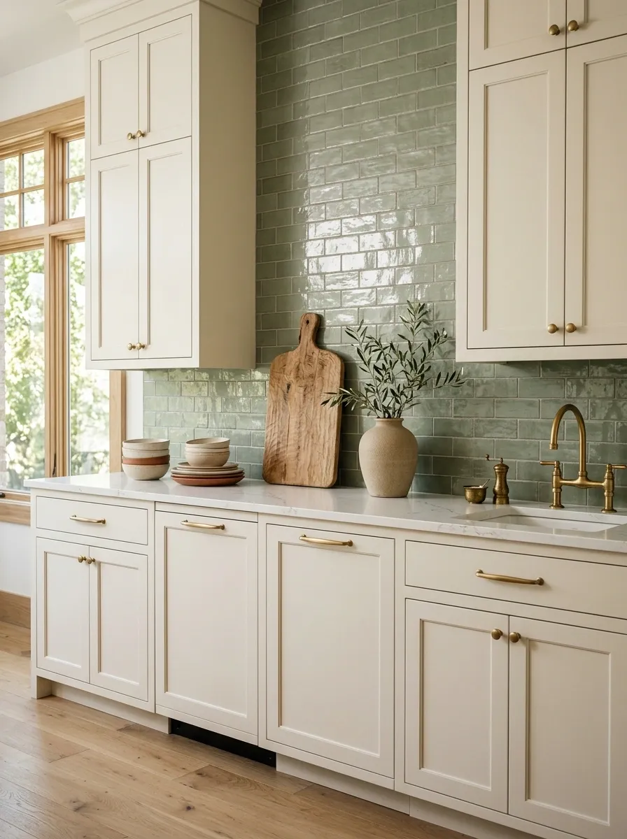
Sometimes the cabinets aren’t the problem. The kitchen just looks too flat.
Green tile adds variation without requiring another major color. A softly glazed subway tile, slightly irregular square tile, or narrow vertical tile can give the backsplash enough texture to catch light throughout the day.
Keep the cabinets calmer when the tile has a noticeable surface. Otherwise, the backsplash and cabinetry start competing like two people talking over each other.
A green tile backsplash also works when painted cabinetry feels too permanent. The color gets the attention without turning the cabinets into a giant commitment.
Pair Forest Green With Warm Walnut for a Richer Finish
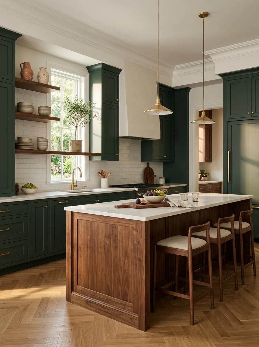
Forest green and walnut have the kind of contrast that makes a kitchen look collected rather than color-matched.
Use deep green on the cabinetry and bring walnut through an island, stools, open shelving, or a butcher-block section. The wood keeps the dark green from looking flat and gives the room a warmer center.
The key is letting the walnut stay visible. Hiding every bit of natural grain defeats the point.
The balance should feel intentional:
Island tops, stools, shelving, or one defined counter zone.
Mixing several unrelated wood tones across the same sightline.
The combination feels especially good with warm stone and restrained hardware. It has enough depth to carry a larger kitchen without needing a pile of decorative filler.
Keep Open Shelves Simple in a Green Kitchen
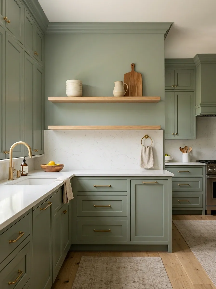
Green cabinetry already creates a strong visual block. Open shelving shouldn’t become a second storage showcase.
Put only useful or attractive pieces on the shelves: a few everyday bowls, a cutting board, a ceramic pitcher, or neatly stacked mugs. Leave actual breathing room between them.
Otherwise the shelves become a tiny indoor flea market, and the beautiful green cabinetry disappears behind stuff.
The shelf editing test:
- Daily-use dishes
- One or two textured pieces
- A visible wood accent
- Repeated colors
- Duplicate decor
- Anything rarely used
- Some empty shelf space
- Clear sightlines
- The green visible behind it all
The shelf should frame the kitchen color, not hide it. A little restraint here makes the entire room look more expensive.
Use Two Green Tones Instead of Forcing One Shade Everywhere
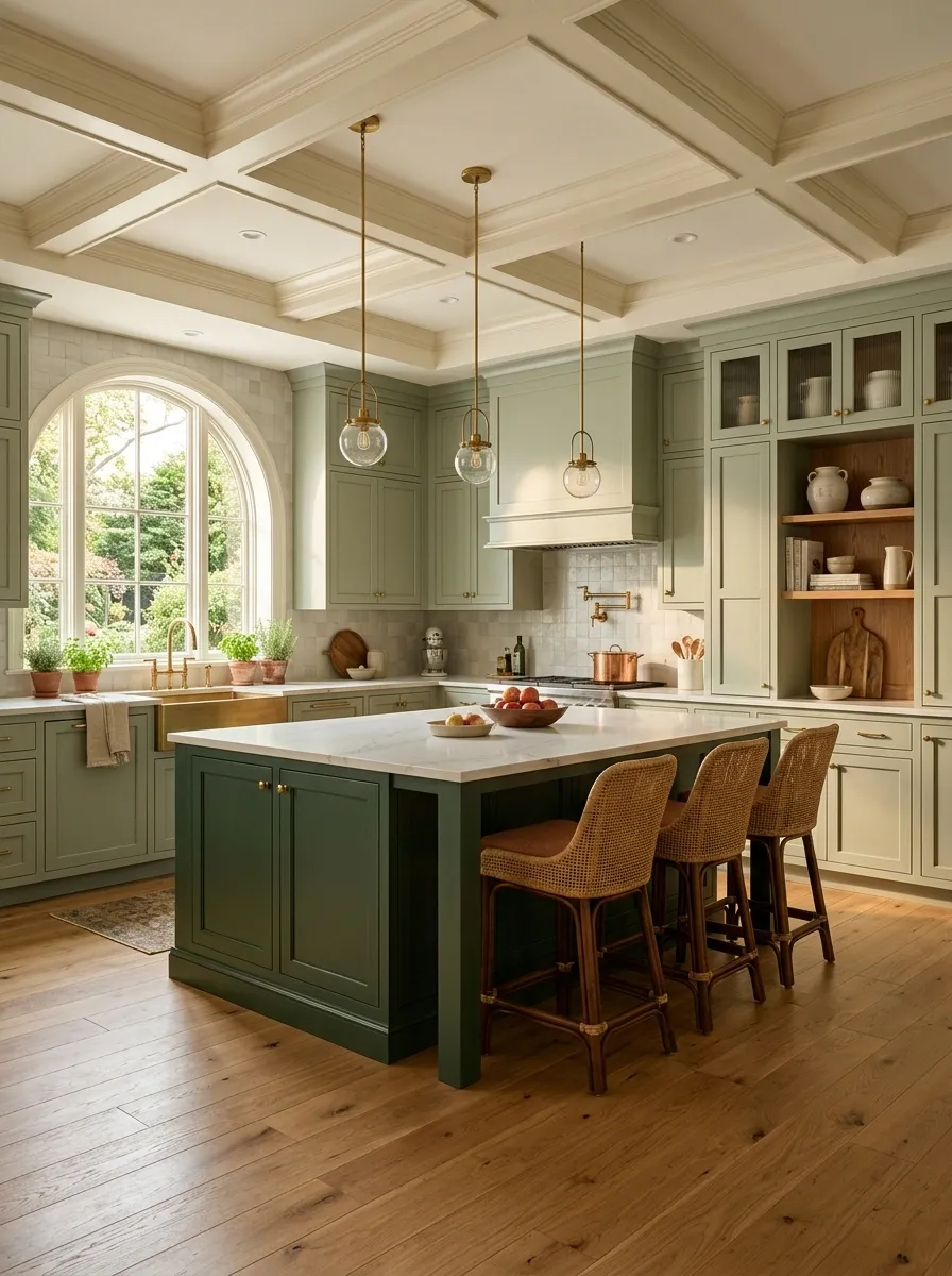
Using two greens can create far more depth than trying to find one magical shade that works on every surface.
Keep the stronger color on the main cabinetry and use a softer or darker variation on the island, pantry wall, or lower cabinets.
The colors should clearly belong together without looking identical. Matching them too closely just creates a paint-matching headache for absolutely no reason.
Two greens work when the hierarchy is obvious. One shade leads, the other supports. That’s all the kitchen needs.
Add Green Through Curtains, Stools, and Small Accents
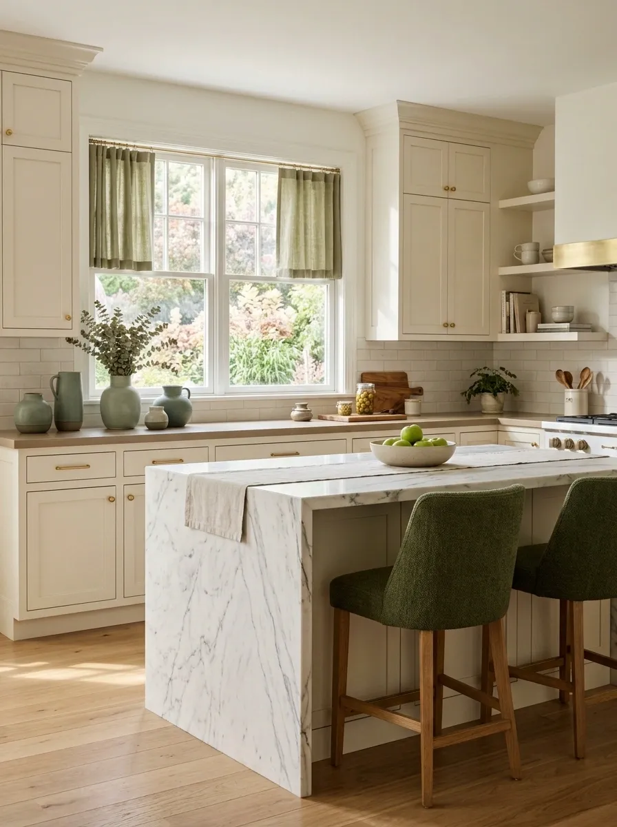
Not every green kitchen needs painted cabinetry.
For renters or anyone testing the color, use green on the pieces that are easiest to replace. A linen café curtain, two counter stools, a runner, or a set of ceramic pieces can introduce the color without turning the project into a renovation.
Keep the green concentrated around one zone rather than scattering tiny green objects everywhere.
This is the easiest route when the kitchen already works but needs a little more personality. No cabinet paint. No renovation drama. Just enough color to make the room feel considered.
Use Muted Green in a Rental Without Touching the Cabinets
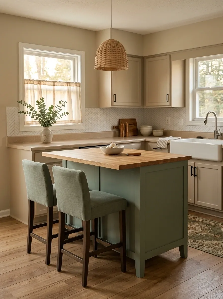
Rental kitchens aren’t doomed to beige forever.
Bring in muted green through a fabric café curtain, removable backsplash panels, a washable runner, or a pair of upholstered stools. The color gets a real presence without leaving a landlord speech on the voicemail.
Keep the green concentrated around one work zone. A small kitchen doesn’t need green accents scattered across every shelf like decorative evidence.
This works best with a soft olive, eucalyptus, or dusty sage rather than a screaming emerald. Muted green looks intentional even when the permanent finishes weren’t your choice.
Let Cream, Green, and Terracotta Warm Up a Flat Kitchen
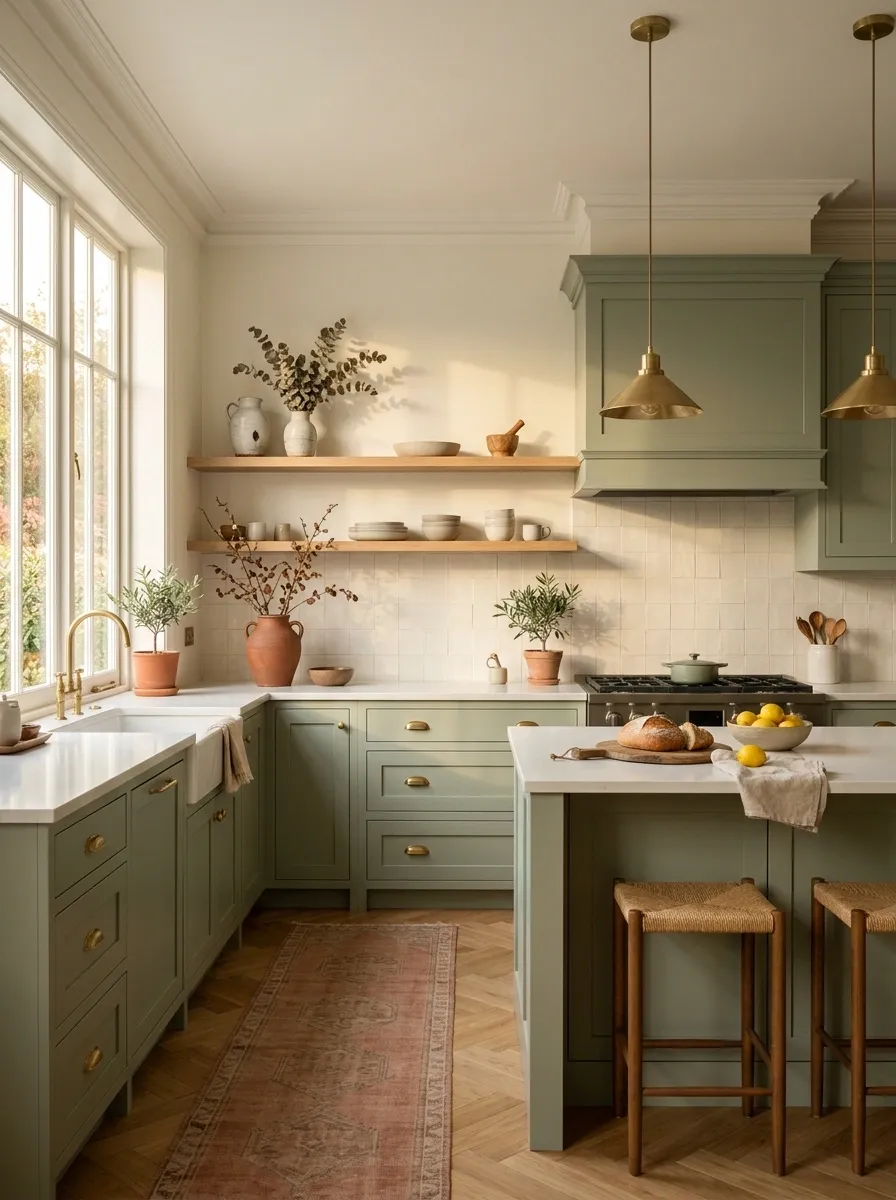
Some green kitchens have plenty of color but still feel cold. The missing piece is usually warmth.
Bring in creamy white through ceramics or walls, then add small amounts of terracotta through planters, pottery, a runner, or a couple of earthy accessories. The terracotta gives green a warm counterpoint without introducing an entirely new design language.
Keep it controlled. The goal is earthy balance, not turning the kitchen into a ceramics showroom.
Cream does the quiet work. Green gets the attention. Terracotta stops the whole palette from feeling chilly.
Use Glossy Green Tile Against Matte Cabinets for Contrast
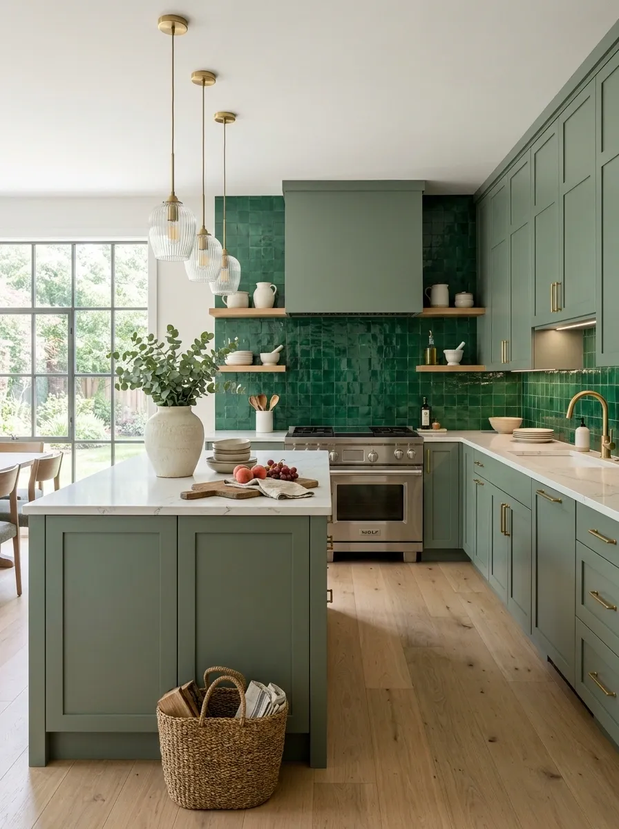
Green doesn’t need to contrast with another color to look interesting. It can contrast with finish.
Put matte green on the cabinets and a glossy green tile behind the range or sink. The same color family suddenly has two different personalities because the light reacts differently across the surfaces.
That little bit of shine also helps a darker kitchen feel less visually dense.
This is a smart move for kitchens that need more visual interest without adding more colors. Sometimes the finish just needed to stop being the wallflower.
Make an All-Green Kitchen Work by Repeating One Supporting Material
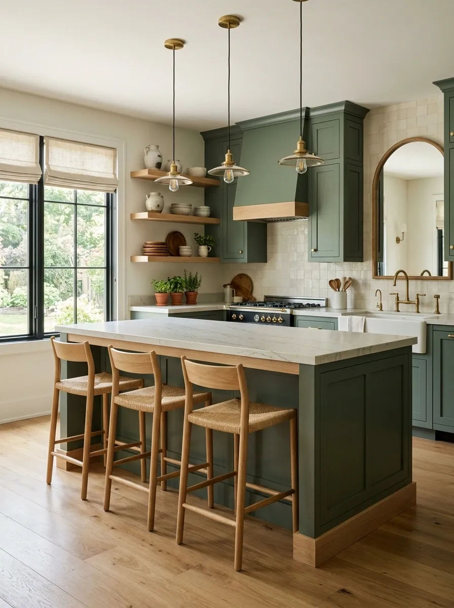
An all-green kitchen needs something strong enough to interrupt the color without fighting it.
Natural wood is one of the easiest answers. Repeat the same wood tone on two or three major elements, such as shelving and stools or flooring and an island accent. That repetition gives the eye a pattern to follow.
The result feels layered instead of like every surface was handed the same paint brush.
Choose one wood tone and repeat it clearly. The green can then cover more of the kitchen without making the room feel visually one-note.
The Green Kitchen Rule That Makes All of This Easier
The strongest green kitchens aren’t the ones with the most green.
They’re the ones where the color has a clear job.
Maybe it grounds the island. Maybe it warms up a wall. Maybe it gives ordinary shaker cabinets some personality. Maybe it only appears in the backsplash and a pair of stools because the rest of the kitchen is already doing enough.
That’s the part worth stealing from these ideas. Don’t start by asking where more green can go. Start by asking where the kitchen actually needs visual weight, warmth, contrast, or texture.
Then put the green there and stop.
Save this list for the next time a green paint sample starts looking suspiciously like a full kitchen renovation.