
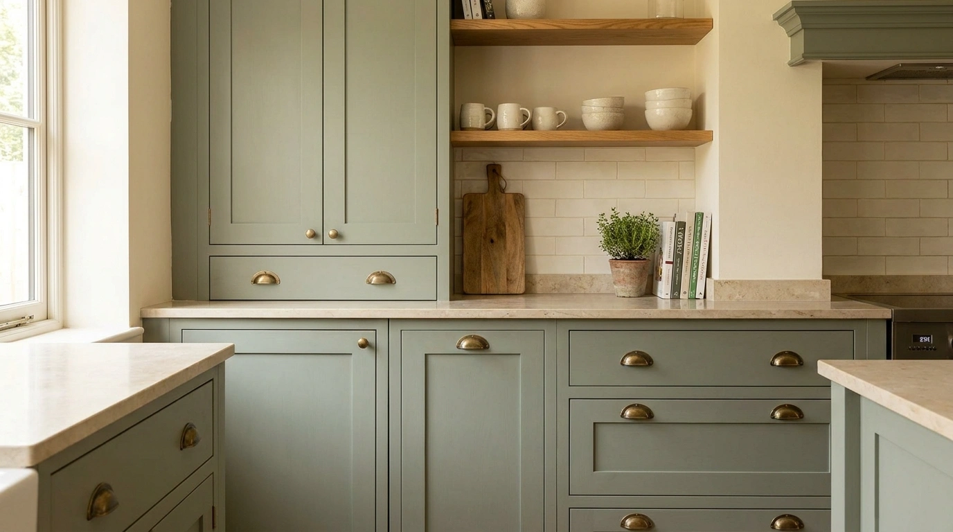
A green kitchen can look rich, timeless, and completely at home in the room. It can also look like the cabinets were painted first and everyone simply hoped the rest would sort itself out. That is usually where the trouble starts.
The color isn’t working on its own. It sits beside the floor, countertop, backsplash, walls, appliances, lighting, wood tones, hardware, and whatever architectural quirks the kitchen already has. Change one of those, and the same shade of green can suddenly feel completely different.
That makes complete rooms much more useful than isolated decorating tips. A cabinet sample tells only part of the story. A finished kitchen shows how the color behaves when it has to live beside everything else.
Green Kitchen Cabinets Ideas
Deep Forest Green Kitchen With Warm White Walls and Walnut Details
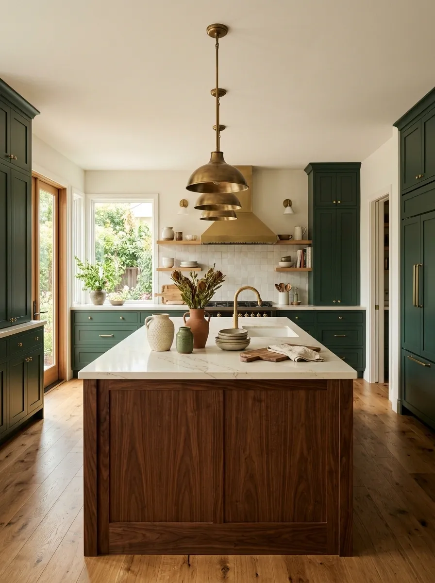
Deep forest green cabinetry gives this kitchen its whole personality, while warm white walls keep the room from becoming visually heavy. A substantial walnut island sits at the center, paired with creamy stone counters and aged brass lighting. The flooring stays quiet and natural, letting the darker cabinets and wood do the interesting work.
The trick is the temperature of the materials. Cool white would make the green feel harsher, while warm white and walnut soften it without making the room look overly rustic. The brass adds another warm note, but only where it matters.
This is the kind of kitchen that looks polished without looking like nobody is allowed to actually cook in it.
Muted Sage Green Kitchen With Natural Oak and Soft Limestone
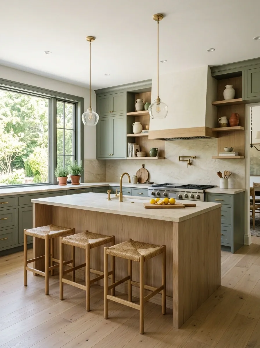
Muted sage gives this kitchen a calmer starting point, but the room doesn’t drift into bland territory because the materials have enough texture to keep it alive. Pale oak wraps the island and lower accents, while soft limestone runs across the counters and backsplash. Woven stools, simple hardware, and filtered daylight finish the composition.
The important part is that nothing is trying to outshine the cabinets. The oak brings warmth, the limestone gives the room visual softness, and the sage sits comfortably between them.
It feels relaxed without looking like the kitchen has been put on airplane mode.
Olive Green Shaker Kitchen With Cream Cabinets Above
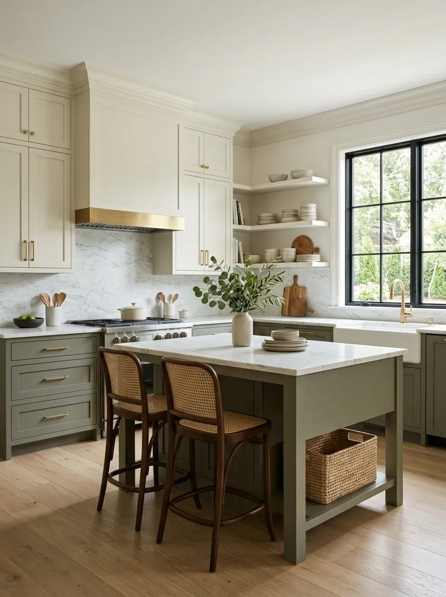
Olive green lower cabinets give this kitchen a grounded base, while creamy upper cabinets keep the walls feeling open. Warm oak flooring continues the softer palette, and marble counters bridge the two cabinet colors without introducing another strong color.
The result feels classic, but not frozen in some imaginary “dream kitchen” decade. The olive has enough gray in it to sit comfortably beside cream, while the wood floor stops the room from becoming too pale.
This two-tone arrangement also gives the kitchen more visual structure. The darker color stays low, where it feels substantial, and the lighter upper cabinets keep the eye moving upward.
Basically, the lower cabinets are doing the heavy lifting so the upper half doesn’t have to.
Dark Green Kitchen With Veined Marble and Aged Brass
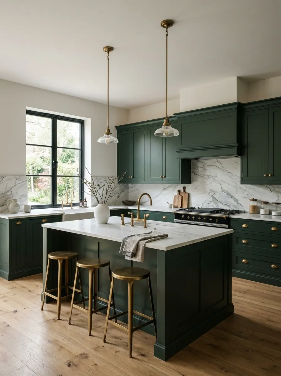
This kitchen leans into drama with deep green cabinetry, a large-scale marble backsplash, and warm aged brass fixtures. The island is substantial enough to anchor the room, while the rest of the finishes stay relatively quiet so the stone and cabinetry have room to breathe.
The marble should have visible movement, but not so much that it turns the backsplash into the loudest thing in the room. The green provides the solid visual mass, and the brass works as a smaller warm detail that catches light.
Strong materials can coexist when each one has a different job. The green brings depth. The marble brings movement. The brass brings warmth.
Three stars. One kitchen. No cabinet color committee required.
Soft Eucalyptus Green Kitchen in a Small Apartment
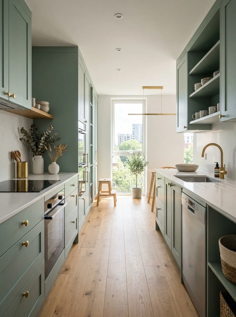
A compact galley kitchen can handle green beautifully when the color stays light and the layout remains visually open. Here, soft eucalyptus cabinets run along the walls with integrated appliances, pale counters, simple oak accents, and bright daylight coming from the end of the room.
The design relies on continuity. Matching cabinet fronts reduce visual interruptions, while the pale worktops keep the narrow room from feeling boxed in. The oak adds enough warmth to stop the space from looking overly clinical.
There is no oversized island trying to squeeze into a walkway that clearly did not ask for one. The layout leaves breathing room where it matters, which makes the kitchen feel larger without pretending the apartment suddenly grew another room.
Vintage Moss Green Kitchen With Checkerboard Flooring
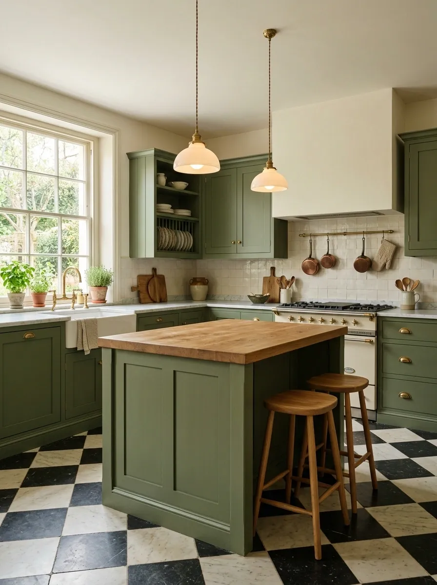
Moss green cabinets, creamy walls, and a black-and-ivory checkerboard floor give this kitchen its vintage character without turning it into a themed restaurant. The cabinetry has a slightly furniture-like feel, with simple aged hardware and a freestanding island that looks as though it actually belongs in the room.
The floor brings pattern underfoot, so the backsplash stays quiet and the walls avoid competing with it. Warm wood stools and a few old-fashioned lighting details finish the room without piling on retro accessories from every decade at once.
The secret is restraint. The checkerboard already has opinions. It doesn’t need ten more decorative objects joining the argument.
Modern Emerald Green Kitchen With Concrete and Matte Black
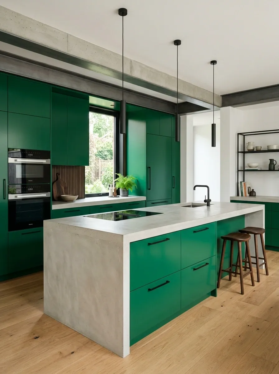
Saturated emerald cabinets give this kitchen a stronger, more graphic identity, while concrete counters and matte black details push it toward a modern architectural look. The doors stay clean and flat, appliances are integrated where possible, and the island has a simple rectangular form that doesn’t compete with the color.
This combination works because each material has a clear role. Emerald supplies the color. Concrete brings a pale mineral texture. Black adds structure through lighting, fixtures, and small architectural details.
It is bold without needing twelve statement pieces. Once the cabinets are this green, the room doesn’t exactly need help getting noticed.
Pale Pistachio Kitchen With Warm Brass and Curved Cabinetry
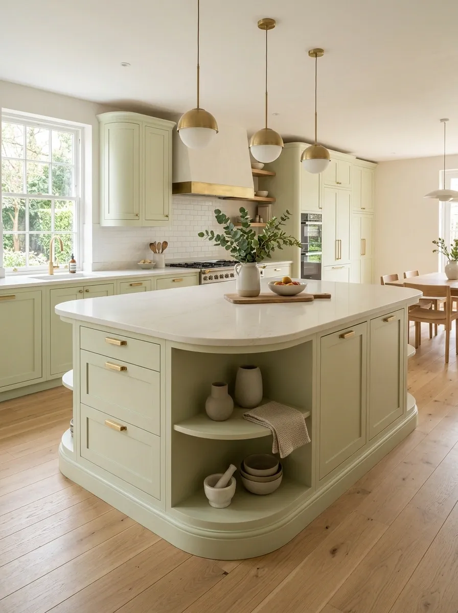
Pale pistachio cabinetry gives this kitchen a softer personality, while curved edges bring a subtle architectural detail that changes the whole silhouette. The island has rounded corners, the counters stay creamy and simple, and warm brass appears in the lighting and hardware rather than taking over every surface.
The rounded island is especially useful because it softens a kitchen filled with hard cabinet lines. Pale oak flooring keeps the lower half warm, while the light walls give the color room to breathe.
The result feels playful without looking like a children’s playroom accidentally received a kitchen budget.
Traditional Hunter Green Kitchen With Cream Marble and Oak Floors
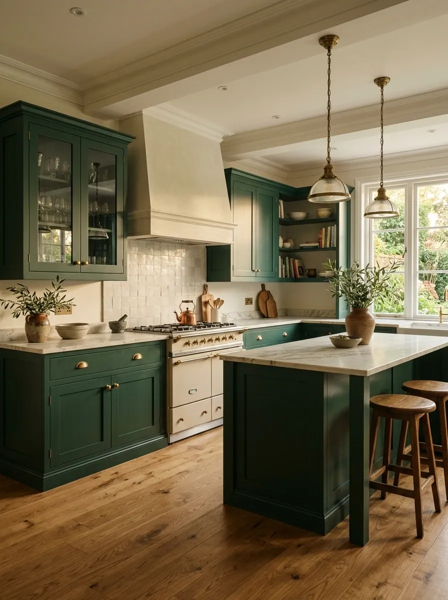
Hunter green cabinetry gives this traditional kitchen a strong base, while creamy marble counters and oak flooring stop it from becoming overly formal. Paneled doors, classic lighting, and understated brass hardware reinforce the traditional architecture without covering every surface in decorative details.
The green works especially well here because the room has enough natural material variation around it. Oak provides grain, marble introduces movement, and the cream tone keeps the darker cabinets from visually closing in the kitchen.
There is a lot going on, but it still reads as one composition. That’s the difference between layered and just… very busy.
Two-Tone Green Kitchen With a Painted Island and Natural Cabinets
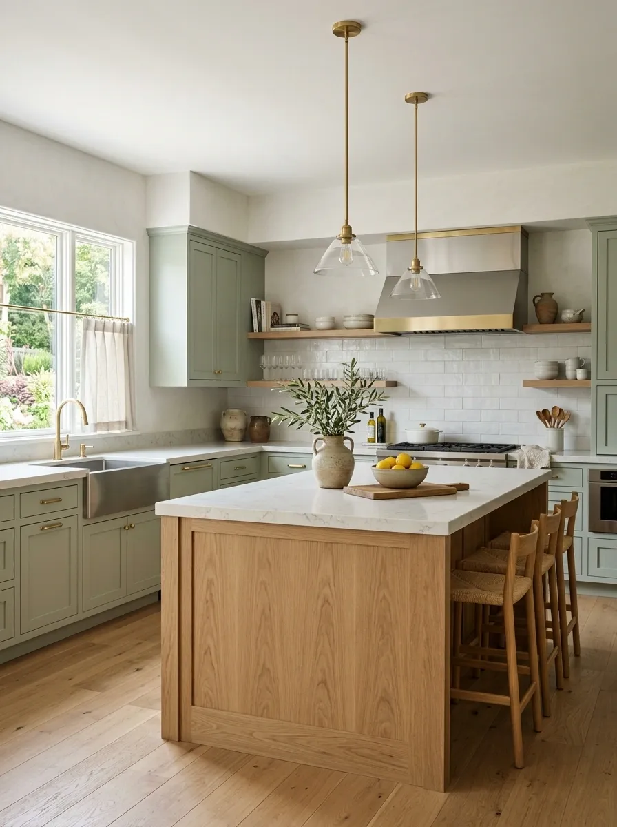
This kitchen uses two different cabinet finishes to create a clear center without making the room feel chopped into separate zones. Soft green cabinets line the perimeter, while a natural wood island becomes the warmer centerpiece. Pale stone counters run through both areas, tying the materials together.
The contrast comes from material rather than a second loud paint color. That keeps the room interesting while preserving a calm overall palette. Simple lighting and quiet walls give the island enough breathing room to read as furniture instead of another wall of cabinetry.
It has the visual effect of a custom kitchen without requiring every surface to make a dramatic entrance.
Moody Green Kitchen With Charcoal Walls and Brass Lighting
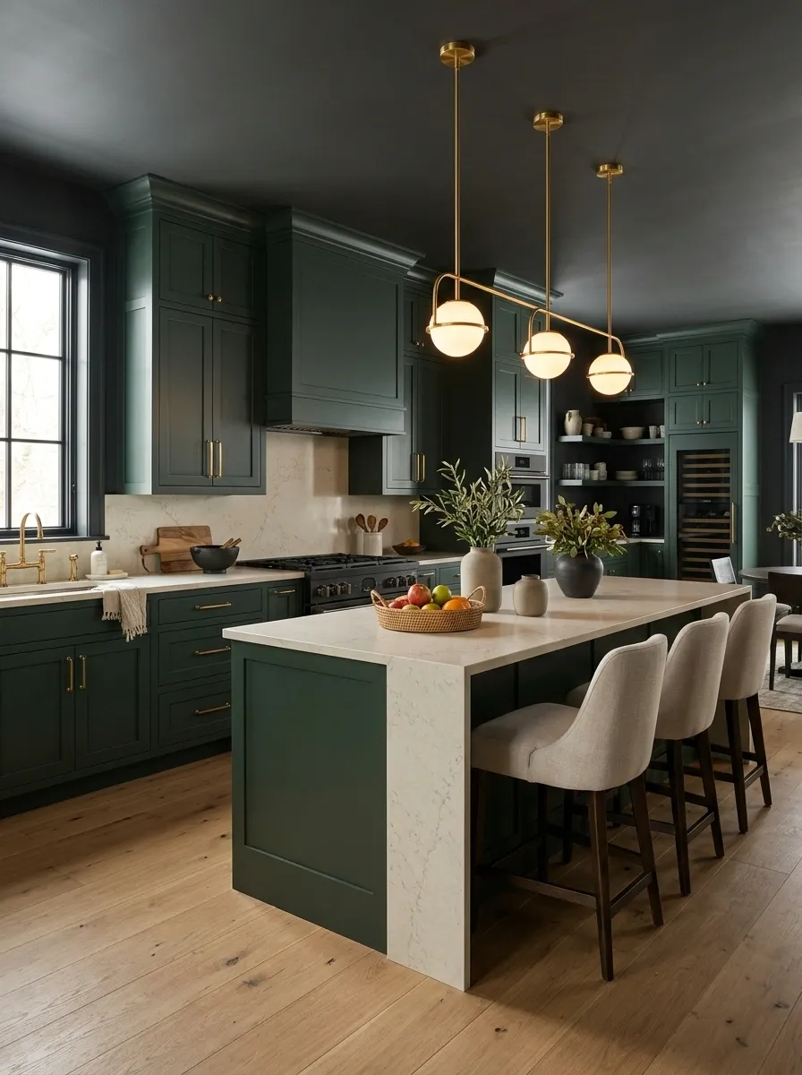
Deep green cabinets meet charcoal walls in this moody kitchen, but the room avoids becoming one giant dark cave by bringing in pale stone counters and warm lighting. The cabinet fronts have a classic profile, while the island keeps a simple shape so the darker palette feels deliberate rather than crowded.
The pale countertop is doing more work than it looks. It breaks the dark wall-and-cabinet combination and gives the eye somewhere to rest. Brass lighting then adds a warm glow above the island without turning the entire kitchen into a brass showroom.
This look needs good daylight or strong layered lighting. Otherwise the kitchen may start giving “please bring a flashlight” instead of sophisticated.
cabinet depth
architectural mood
visual breathing room
Coastal Sage Kitchen With White Oak and Handmade Tile
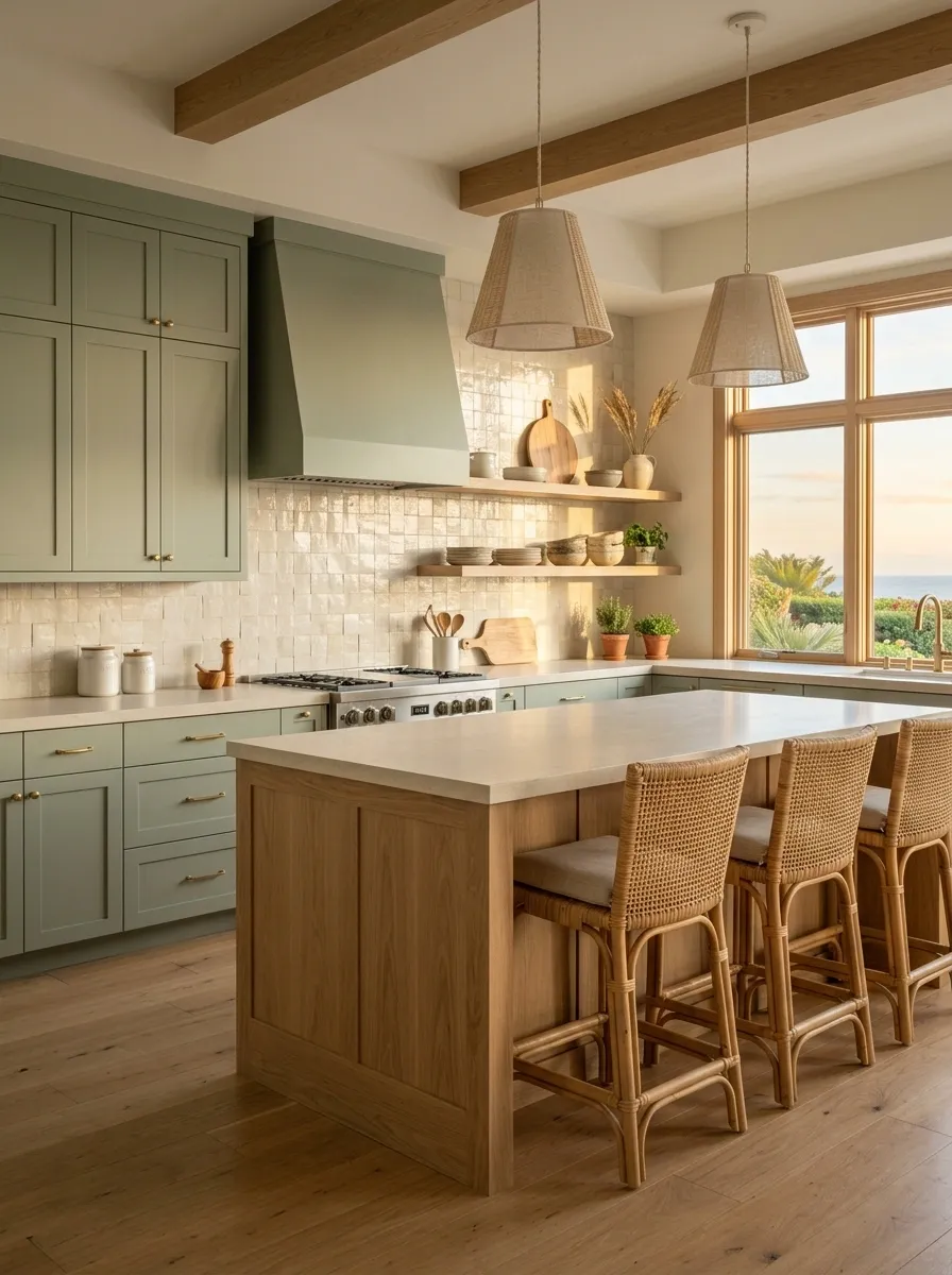
Soft sage cabinets bring a coastal feeling to this kitchen without resorting to a beach-themed decorating marathon. White oak appears on the island and selected details, while a creamy handmade tile backsplash adds subtle variation across the wall. The counters stay light and uncomplicated.
The palette feels natural because none of the materials are overly glossy or sharp. The handmade tile introduces tiny irregularities, the oak brings grain, and the sage ties everything together.
Woven seating and simple lighting finish the room, but the architecture remains the star. There are no seashells required to make the point.
cabinetry
tile
Green Kitchen With a Full Slab Stone Backsplash
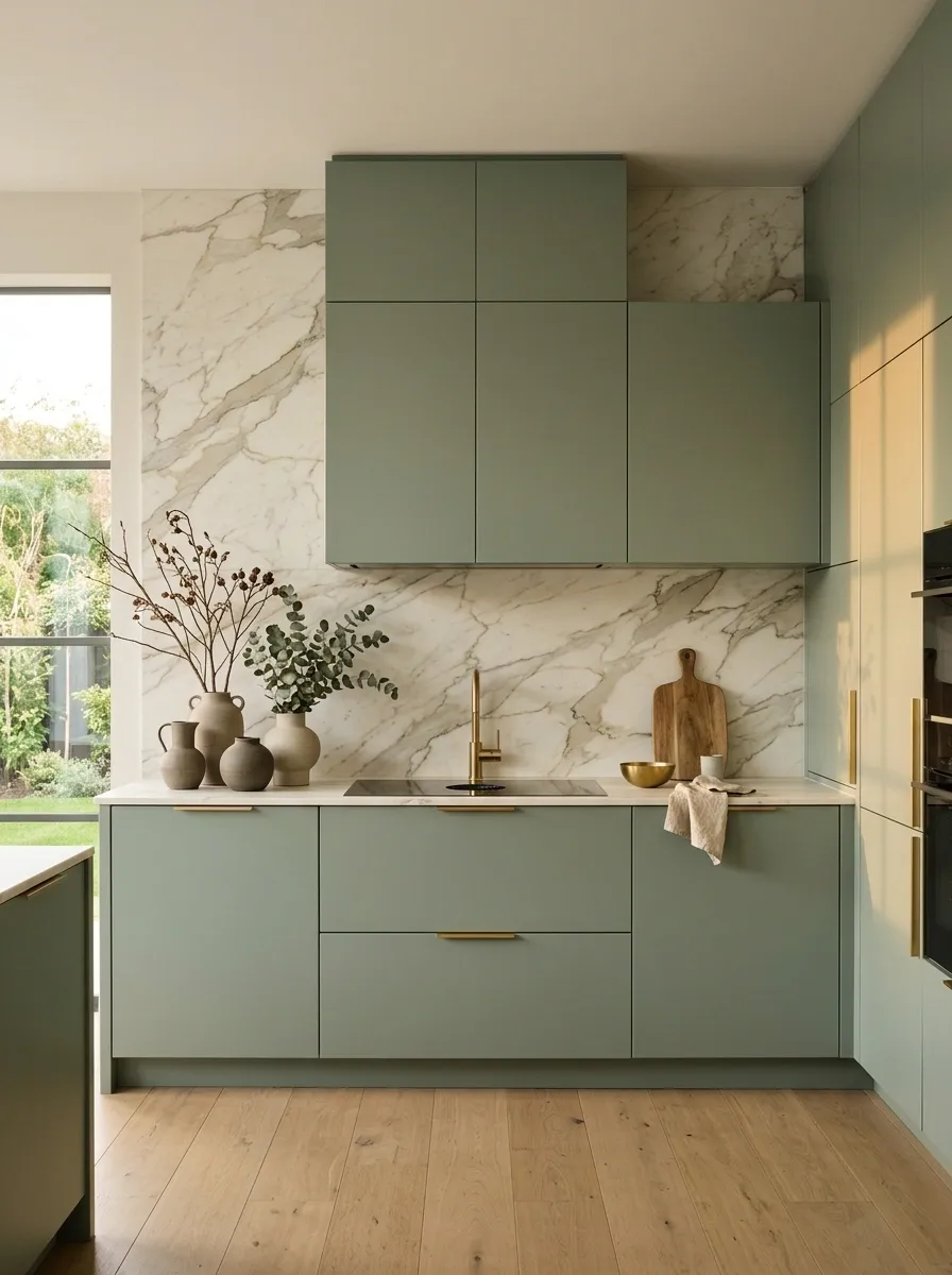
A muted green kitchen becomes much more architectural when a single slab of stone runs from the counter to the upper wall instead of breaking into a busy tile pattern. Flat-front green cabinetry keeps the lower half crisp, while the continuous stone surface creates one large backdrop behind the cooking zone.
This is a strong choice when the cabinet color needs a refined setting rather than more decoration. The stone provides movement, but because it stays on one uninterrupted plane, the room still feels controlled.
Hardware remains minimal, and integrated appliances help preserve the clean lines. The stone gets to be interesting without being forced to audition for every other visual element.
Classic English-Inspired Green Kitchen With a Freestanding Island
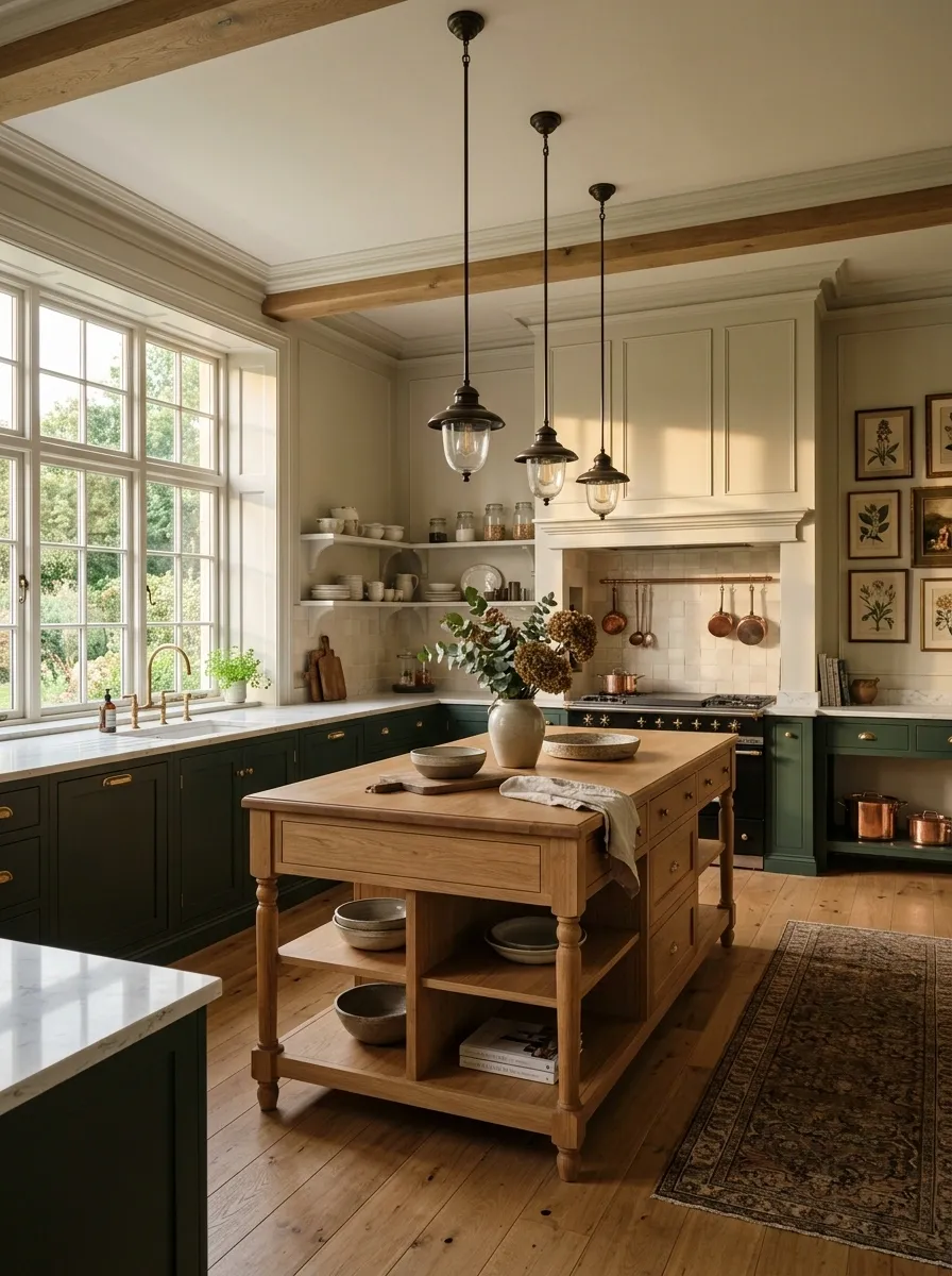
This kitchen borrows from classic English interiors with deep green cabinetry, a furniture-like island, warm wood accents, framed artwork, and traditional pendant lights. The island feels deliberately separate from the perimeter cabinets, almost like a substantial piece of furniture brought into the room.
That distinction gives the kitchen more character than a wall-to-wall cabinet installation. The green provides continuity around the room, while the island breaks that rhythm with its shape and warmer material details.
The styling stays edited. A few useful objects can sit on open surfaces, but there is no need to cover every shelf with decorative clutter. The room already has a personality.
And thankfully, nobody has written “farmhouse” on a wooden sign.
Bright Fern Green Kitchen With Terracotta Flooring
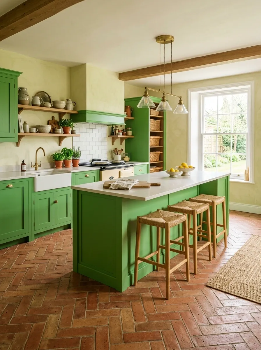
Fern green cabinets bring a fresh, lively color to this kitchen, while terracotta flooring adds enough warmth to keep the palette grounded. Creamy plaster walls soften the transition between the two, and natural wood appears through stools, shelving, and small architectural details.
The green is brighter than the muted shades used elsewhere in the collection, so the rest of the room needs discipline. The flooring provides warmth and personality, but the walls and counters stay quiet enough to prevent the room from becoming a color competition.
This is a kitchen for someone who actually wants the cabinets noticed. The color isn’t hiding in the corner pretending to be beige.
Minimalist Gray-Green Kitchen With Pale Stone and Oak
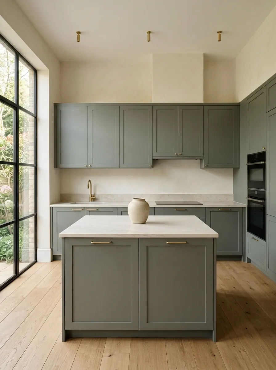
Gray-green cabinets give this kitchen a muted, almost architectural quality. Pale stone counters, warm oak flooring, integrated appliances, and one long run of simple cabinetry keep the room visually quiet without making it lifeless.
The palette is restrained, but the materials prevent it from feeling flat. Oak adds grain underfoot, the stone catches changing daylight, and the green keeps all that pale color from drifting into generic white-kitchen territory.
There is almost no decorative clutter here, which means every finish has to earn its place. That is exactly why the design works. Nothing is screaming for attention, and somehow the kitchen still has more personality than the room with seventeen matching signs about coffee.
Cottage Green Kitchen With Open Shelving and Warm Wood
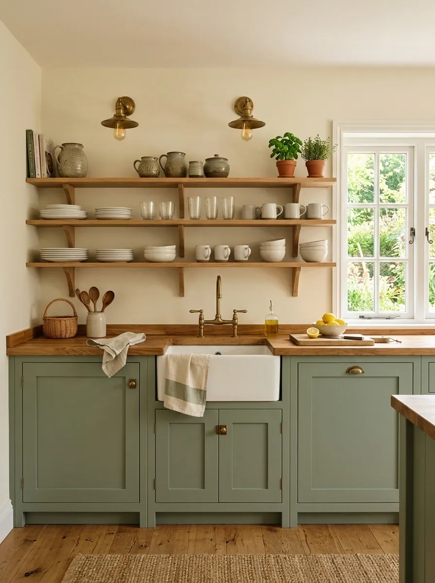
Muted green cabinets form the lower half of this cottage kitchen, while open oak shelving keeps the upper wall lighter and more relaxed. Cream walls, butcher-block accents, and traditional lighting reinforce the warm character without turning the room into a collection of farmhouse clichés.
The open shelves matter because they change the visual rhythm. Solid cabinetry below feels substantial, while the open section above creates breathing room and gives everyday dishes somewhere to live.
Keep the display practical. A few stacks of plates, glasses, and useful pottery feel believable. Twenty decorative jars arranged by height start looking like someone staged the kitchen for a catalog shoot and then forgot to leave.
Black and Green Kitchen With Checkerboard Marble Floor
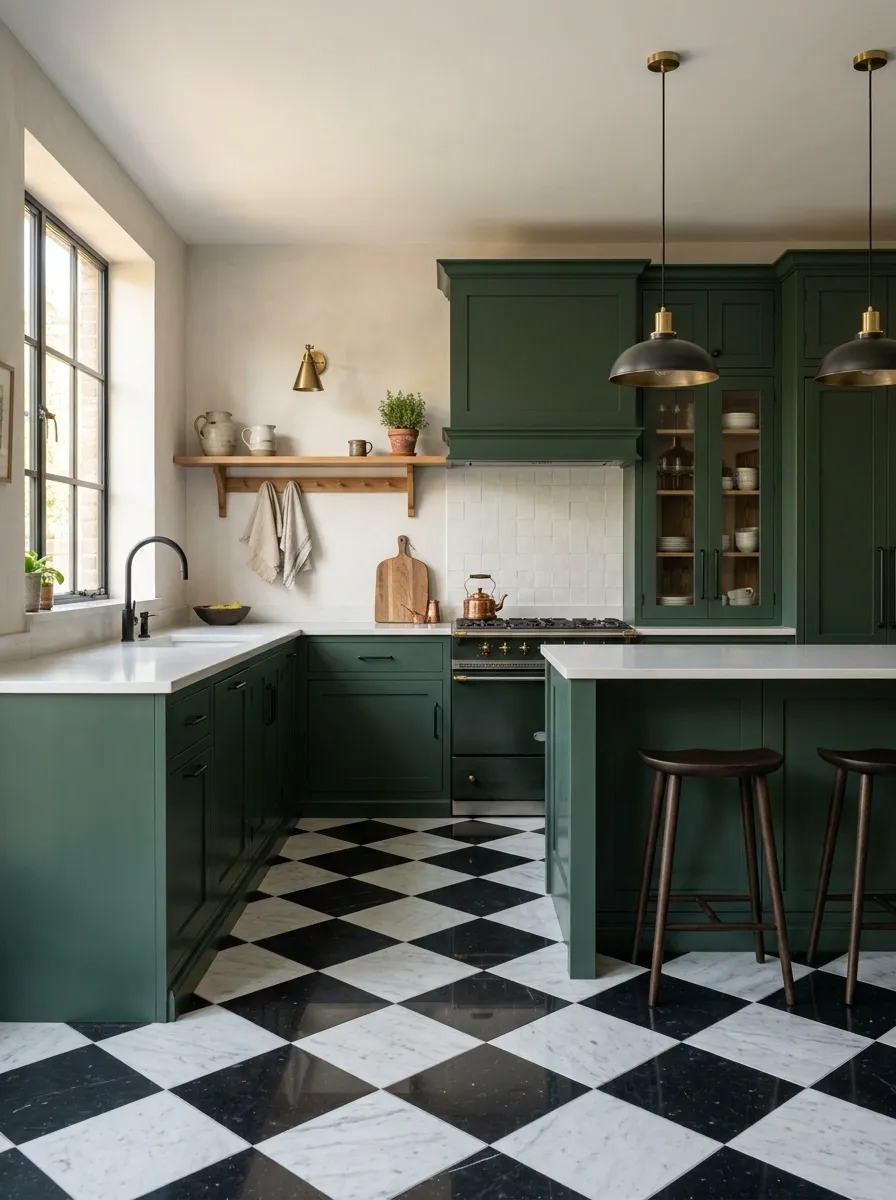
Deep green cabinets meet black fixtures and a graphic black-and-white marble floor in this bolder composition. The walls remain light and the counters stay pale, giving the stronger colors enough contrast to feel deliberate.
The floor is the unusual move here. Instead of using a patterned backsplash to create interest, the pattern lives underfoot. That leaves the cabinetry clean and lets the room’s strongest details sit in separate visual zones.
Because both black and green already carry plenty of weight, the rest of the finishes should stay simple. Otherwise the room starts collecting statements like Instagram comments under a celebrity home tour.
Warm Pistachio Kitchen With Creamy Travertine and Dark Wood
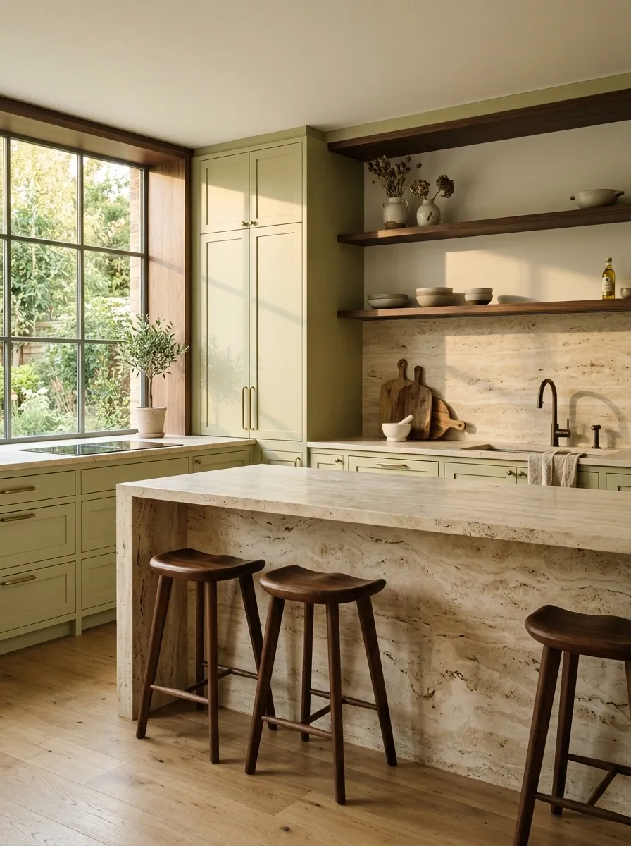
Warm pistachio cabinets take on a richer look when paired with creamy travertine and dark walnut details. The island has a substantial stone surface, while dark wood appears through stools, open shelving, and selected architectural accents.
This isn’t the cool, pale pistachio that can sometimes disappear into a very white room. The warmer undertone works with the creamy stone, while the dark wood gives the kitchen enough contrast to feel grounded.
Travertine also brings natural variation, so the room doesn’t need a busy backsplash or a wall full of decorative objects. Let the materials carry the composition.
The kitchen is already doing enough. It doesn’t need a motivational quote above the coffee maker.
Deep Teal-Green Kitchen With White Quartz and Oak
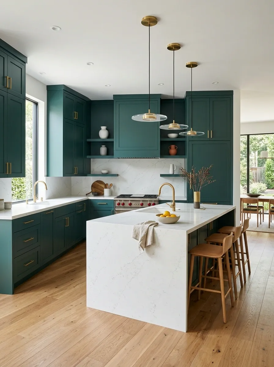
Deep teal-green cabinetry gives this contemporary kitchen a cooler, richer character than traditional forest or olive shades. Crisp white quartz counters brighten the work surfaces, while oak flooring adds warmth beneath the saturated cabinets.
The color contrast is what makes the room memorable. The cabinetry has depth, the counters provide a clean break, and the oak keeps the lower half from feeling too cold. Simple contemporary lighting and integrated appliances preserve the streamlined shape.
This works especially well when the kitchen has enough natural light to reveal the difference between blue and green in the cabinet finish. Under flat lighting, teal can lose some of that character, and suddenly the whole room is just sitting there looking undecided.
deep color
bright interruption
warm finish
Farmhouse Green Kitchen With Exposed Beams and Soapstone
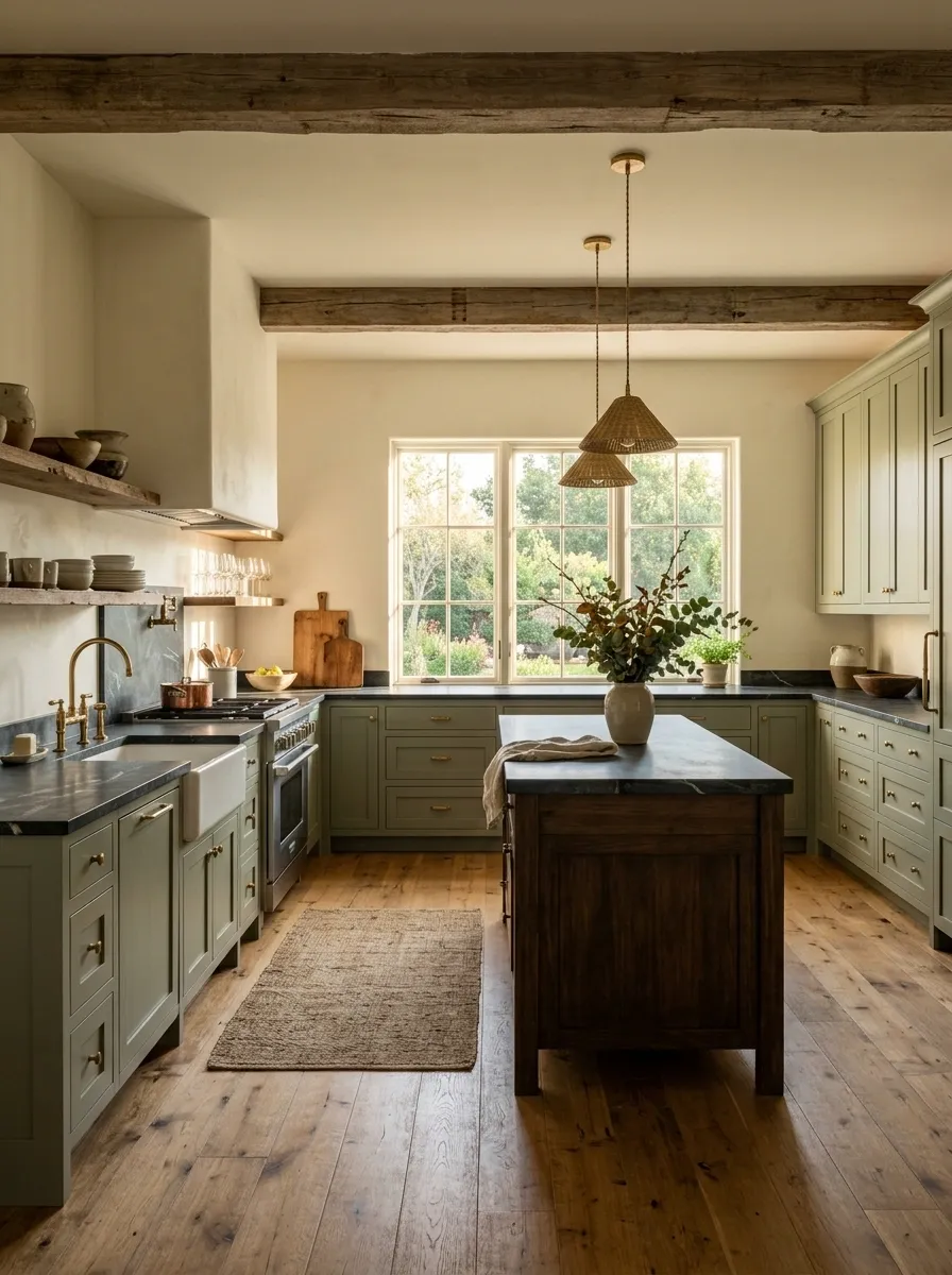
Muted green cabinetry gives this farmhouse kitchen a grounded look, while exposed wood beams bring the architecture into the color story. Dark soapstone counters add another layer of depth, and wide-plank flooring keeps the room warm underfoot. The island stays simple, with enough workspace to feel useful rather than decorative.
What makes this composition work is the relationship between the fixed architectural elements. The green cabinets connect visually with the darker counter, while the beams and floor bring out the warmer side of the room.
There is character everywhere, but nothing feels randomly added.
The ceiling beams already understood the assignment.
Soft Celadon Green Kitchen With Blush and Cream Accents
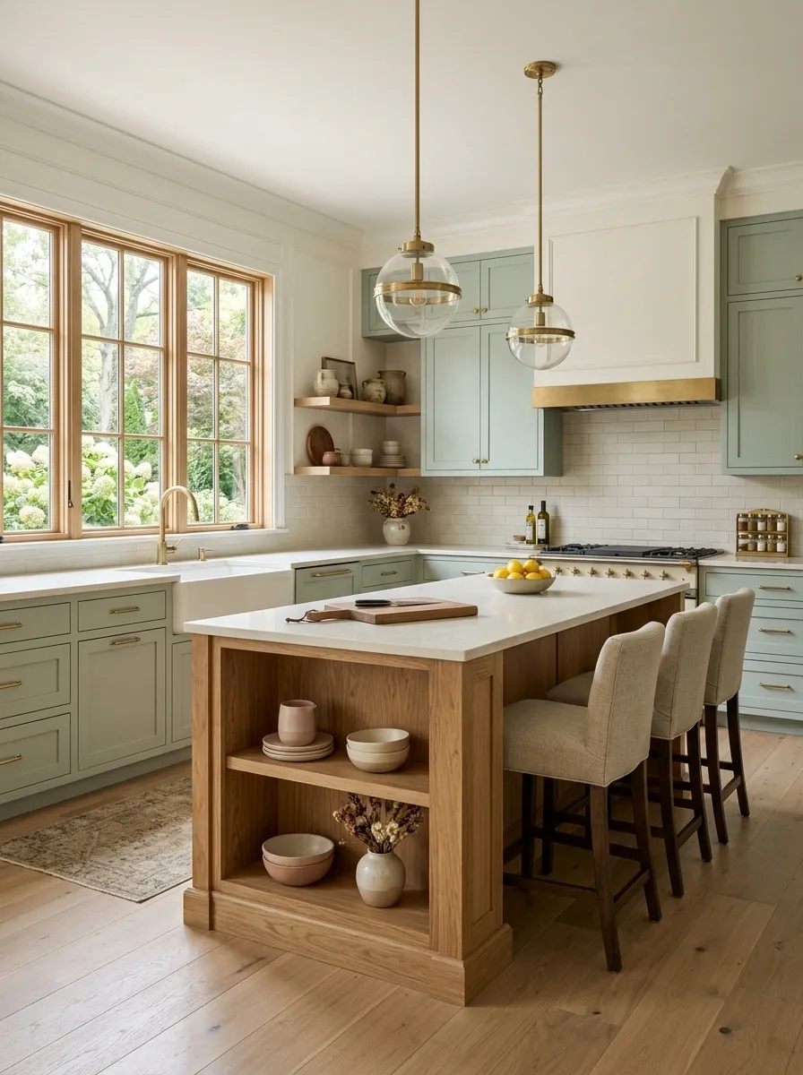
Celadon green gives this kitchen a gentle color base, while cream counters, pale oak, and restrained blush accents keep it from becoming overly sweet. The cabinetry has a soft finish, and the backsplash stays quiet so the subtle color combination remains the focus.
Blush works here because it is treated as a secondary note rather than a competing cabinet color. A warm wood island and creamy walls provide enough neutral space between the two shades.
The result is softer than most green kitchens without slipping into pastel overload.
There is a very fine line between “editorial color palette” and “someone spilled a box of macarons.” This stays on the right side.
dominant field
small warm note
visual breathing room
Industrial Green Kitchen With Brick and Reclaimed Wood
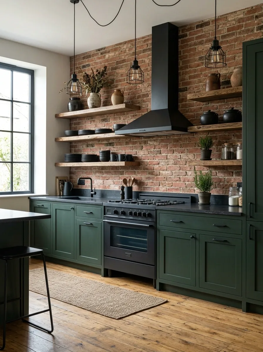
Dark green cabinets bring an unexpected softness to this industrial kitchen, where exposed brick, reclaimed wood, black steel, and utilitarian lighting establish the rougher side of the room. The cabinet fronts stay relatively clean, which gives the green an important role: it connects the hard materials without making the kitchen feel cold.
The brick provides texture, the wood introduces warmth, and black steel creates the structural linework. Green sits between those materials and keeps the palette from becoming a predictable black-and-brown combination.
The industrial style is already loud enough. There is no need to add a fake “gather” sign and call it finished.
French-Inspired Green Kitchen With Aged Limestone and Antique Brass
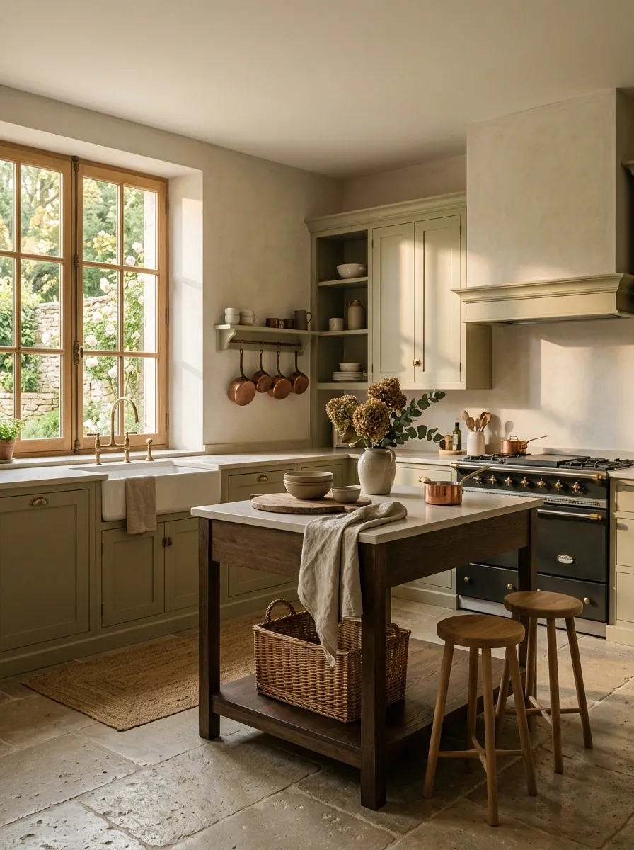
Pale olive cabinets set a softer tone in this French-inspired kitchen, where aged limestone floors, antique brass fixtures, plaster walls, and furniture-style details create a layered finish. The cabinetry has enough detail to feel traditional, but the room avoids excessive ornament.
The limestone brings an imperfect mineral surface that works especially well beside the softened green. Antique brass adds warmth, while the plaster walls keep the background quiet and slightly textural.
This kitchen has character without needing everything to look antique. That’s important. Otherwise the room starts looking less “old-world kitchen” and more “estate sale speedrun.”
Compact L-Shaped Green Kitchen With a Banquette Dining Area
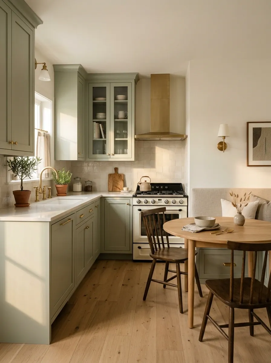
This compact L-shaped kitchen makes green cabinetry work harder by extending the room’s function beyond cooking. Soft green cabinets follow two walls, while a small banquette dining area fits into the adjacent corner. Pale counters, warm oak, and built-in storage keep the footprint visually organized.
The important decision is the layout. The dining area does not compete with the main work zone because it occupies an otherwise awkward edge of the room. The cabinetry creates continuity, while the banquette turns dead space into a useful destination.
This is the kind of small kitchen that understands square footage is not a personality trait. Every section has a job.
keeps the main work zone continuous
turns a corner into usable dining space
protects circulation
Dramatic Black-Green Kitchen With a Statement Range Wall
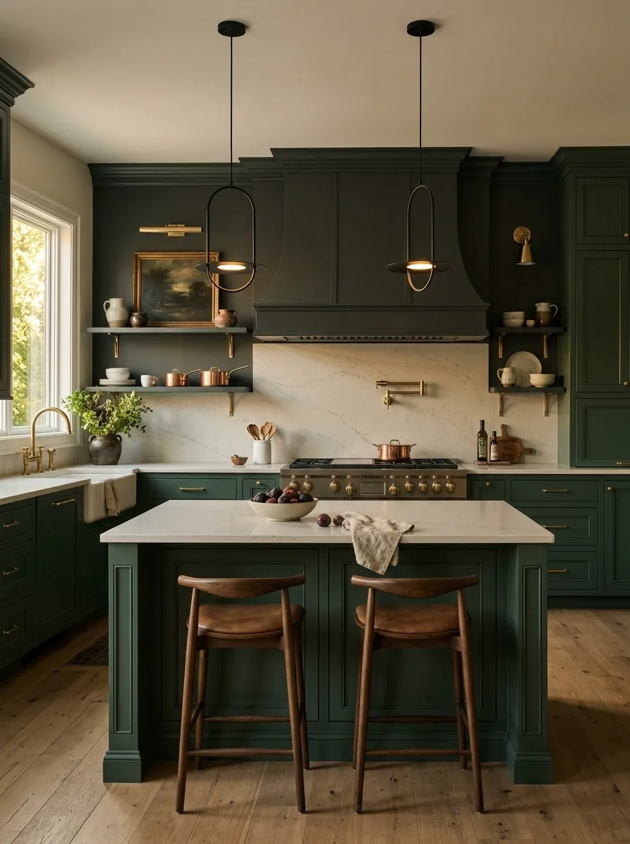
A rich green cabinetry palette frames a darker range wall in this dramatic kitchen, creating a strong focal axis from the entrance through the island to the cooking area. Pale stone counters provide just enough contrast, while sculptural lighting hangs over the island without interrupting the clean sightline.
The range wall is intentionally darker than the surrounding cabinets, which gives the kitchen depth without needing multiple competing finishes. The island stays simple so it supports the architecture instead of becoming another focal point.
This is a design built around one big visual moment.
Because apparently the backsplash needed a lead role too.
focal point
visual break
Natural Green Kitchen With Rattan, Oak, and Handmade Ceramic Tile
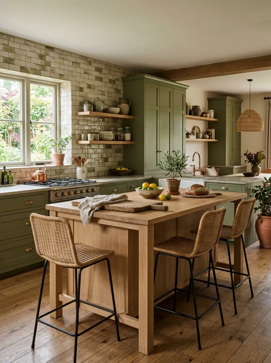
Medium olive-green cabinetry sets the base for this organic kitchen, where pale oak, woven rattan seating, and handmade ceramic tile create a layered but relaxed composition. The tile has slight variation from piece to piece, while the oak adds visible grain and warmth across the island.
The green acts as the connector between all those natural textures. It is solid enough to calm the irregular tile and woven surfaces without making the room feel overly polished.
The styling stays deliberately simple. A wooden cutting board, a few ceramics, and everyday kitchen objects are enough to make the space believable.
The handmade tile can have imperfections. That’s the point. Nobody needs twelve rows of identical squares behaving like they’ve been assigned seating.
smooth color
visible grain
irregular surface
soft weave
Retro Avocado Green Kitchen With Cream Appliances and Walnut
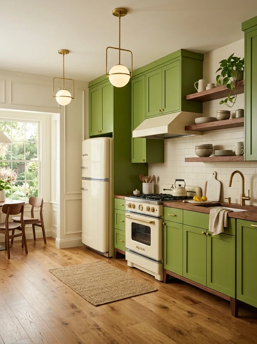
Avocado green cabinetry brings a clear mid-century influence to this kitchen, but cream appliances and walnut details keep the color from becoming cartoonish. Simple geometric lighting, warm flooring, and furniture-inspired cabinet proportions complete the retro composition.
The strongest move is keeping the palette limited. Avocado already has enough personality, so the cream and walnut tones act as supporting players rather than competing colors. The appliances become part of the visual story instead of disappearing behind matching cabinetry.
The look feels nostalgic without requiring a museum’s worth of vintage accessories.
A little avocado is fun. An avocado kitchen, avocado toaster, avocado mixer, and avocado everything starts looking like the 1970s filed a claim on the property.
Saturated Green Kitchen With Warm Pink Stone and Brass
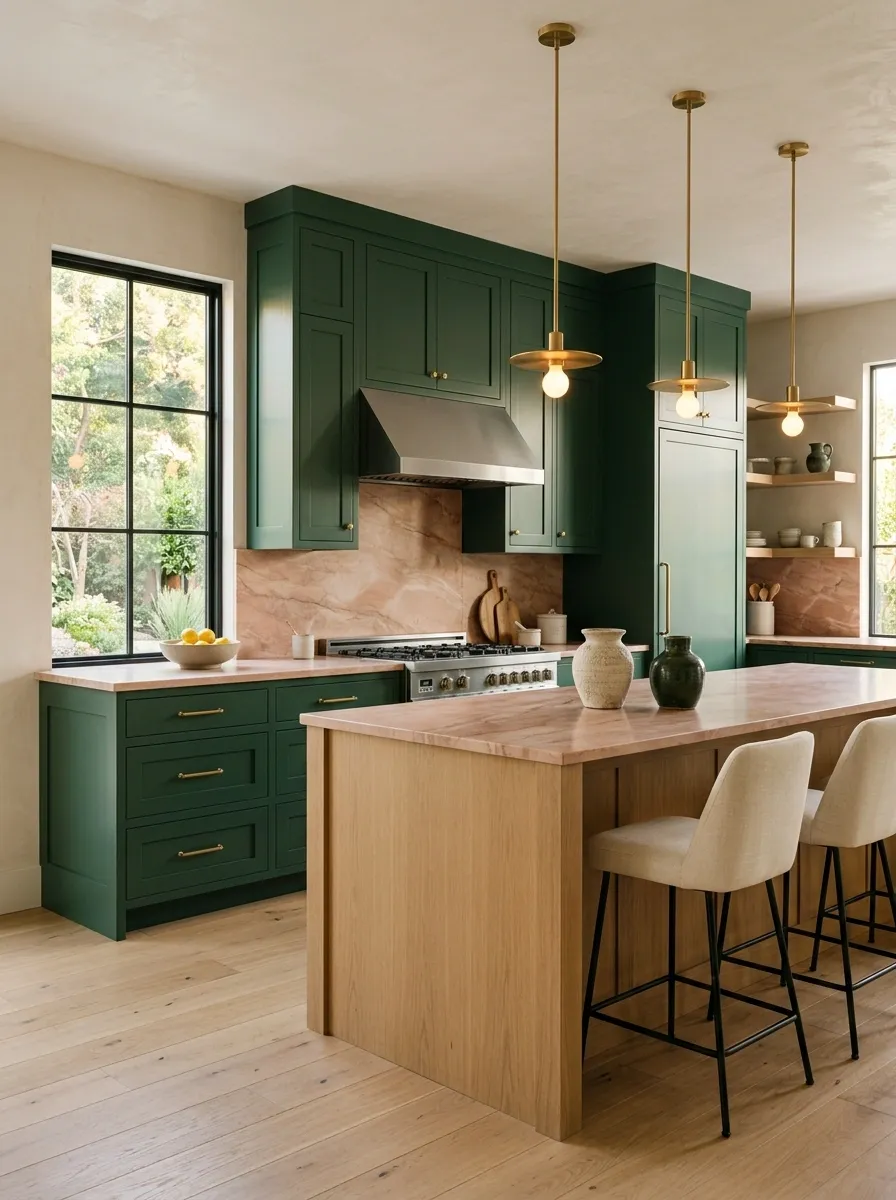
Saturated green cabinets meet warm pink-toned stone in one of the boldest palettes in the collection. The stone extends across the counters and selected backsplash areas, while pale walls provide enough empty space for the two stronger colors to breathe. Brass hardware and lighting add a small warm metallic layer.
The success of this kitchen depends on proportion. Green occupies the largest visual field, pink stone gets enough presence to matter, and brass stays comparatively small. That hierarchy keeps the palette dramatic without becoming chaotic.
This is for a kitchen that is comfortable being noticed.
The room has already chosen a personality. No additional personality tests required.
dominant field
secondary statement
small warm detail
Soft Forest Green Kitchen With a Large Window and Garden Views
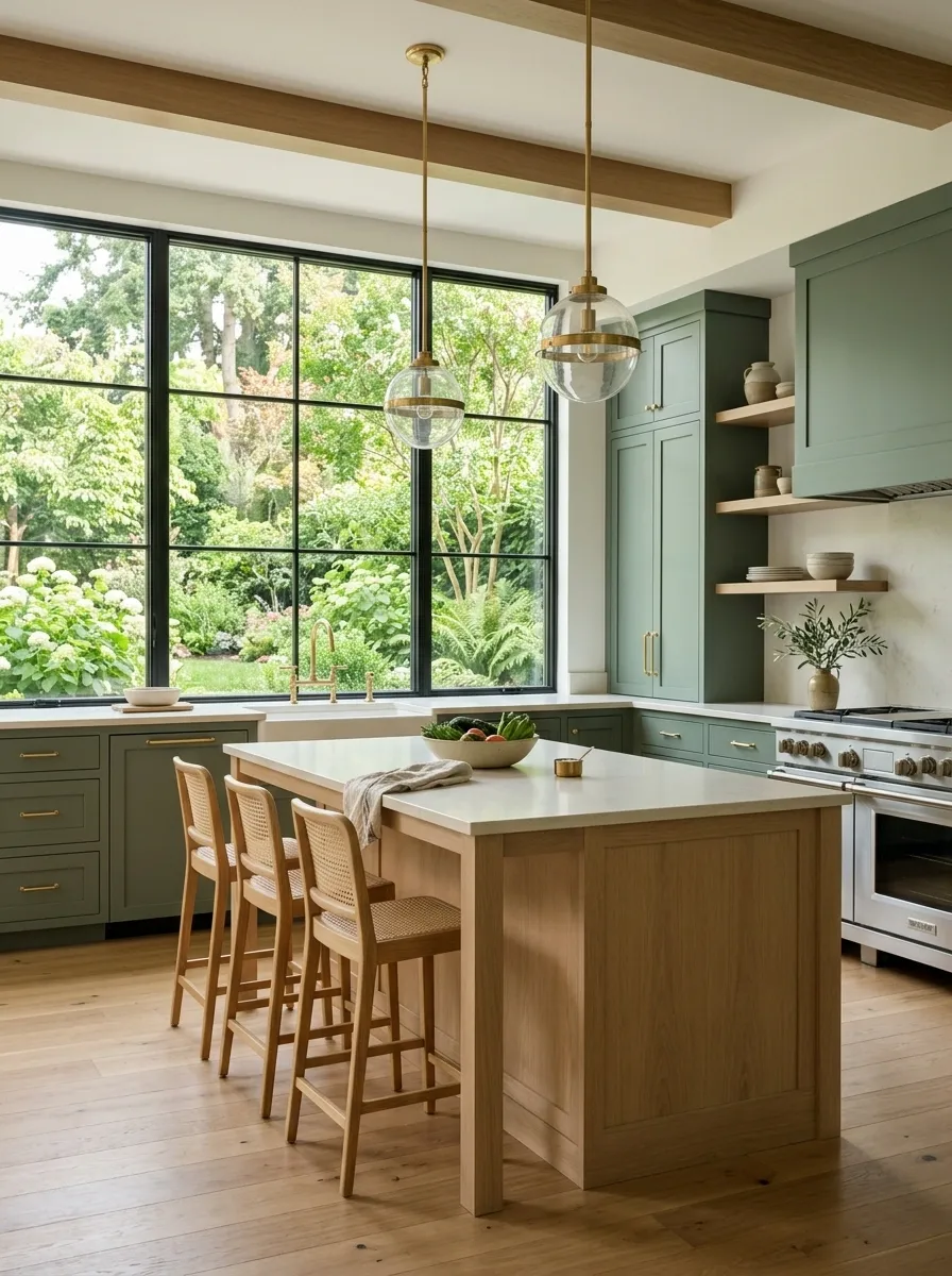
Soft forest green cabinets give this bright kitchen a grounded center, while a large window fills the room with daylight and brings the garden directly into the visual composition. Pale oak appears across the floor and island, creamy counters keep the work surfaces light, and simple seating lets the view remain part of the design.
The greenery outside matters here because it creates a natural continuation of the cabinet color. Instead of green stopping at the cabinet doors, the eye picks up the same family of color beyond the glass.
The rest of the room stays deliberately quiet.
Sometimes the smartest kitchen decor is simply not arguing with the giant window.
WINDOW
Let the Green Lead Without Letting It Take Over
The most memorable green kitchens usually aren’t memorable because the cabinet paint is unusual. They’re memorable because the entire room agrees with it.
A dark green cabinet can feel warm beside walnut and cream. The same green can feel severe beside cold white and harsh black. Sage can look soft beside limestone and oak, then suddenly lifeless when everything around it is the same pale beige. A saturated green can be incredibly strong when the floor, walls, counters, and lighting know when to stay quiet.
That is the useful part of looking at finished kitchens. The relationships become obvious. Instead of choosing a green in isolation and hoping for the best, the whole composition can be considered at once.
Save the kitchens that feel closest to the room you actually want, then use the full combination as the reference. The cabinet color is only one piece of the picture, and honestly, it has enough drama already.