
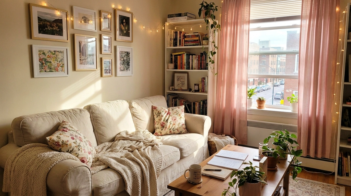
Apartment decorating gets awkward when the room looks fine from one angle but somehow falls apart the second everything has to work together.
A sofa can look great on its own, the dining table can look great on its own, and that beautiful rug can look great in a saved post, yet the finished room can still feel like several different Pinterest boards had a disagreement.
The Design Details That Actually Change the Finished Apartment
Warm Scandinavian Apartment With Pale Oak and Soft Curves
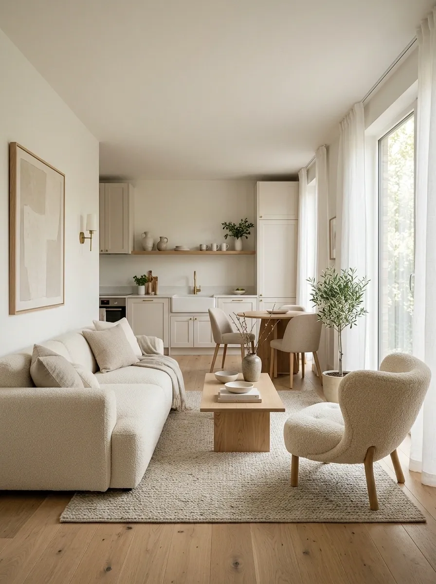
Pale oak, warm white walls, soft upholstery, and rounded furniture create a Scandinavian-inspired apartment that feels calm without becoming completely beige. The living room centers on a generously sized cream sofa, a low oak coffee table, and a curved lounge chair positioned toward the window.
The kitchen continues the same language through pale cabinetry and simple surfaces, while a compact dining table creates a natural transition between the two spaces. Soft curtains filter the daylight without hiding the windows.
The important detail is restraint. The furniture has enough shape and texture to keep the neutral palette interesting, so there is no need to fill every shelf with accessories. The room feels finished because the major pieces already agree with each other. A surprisingly rare achievement on the internet.
Modern European Apartment With Tall Curtains and Natural Stone
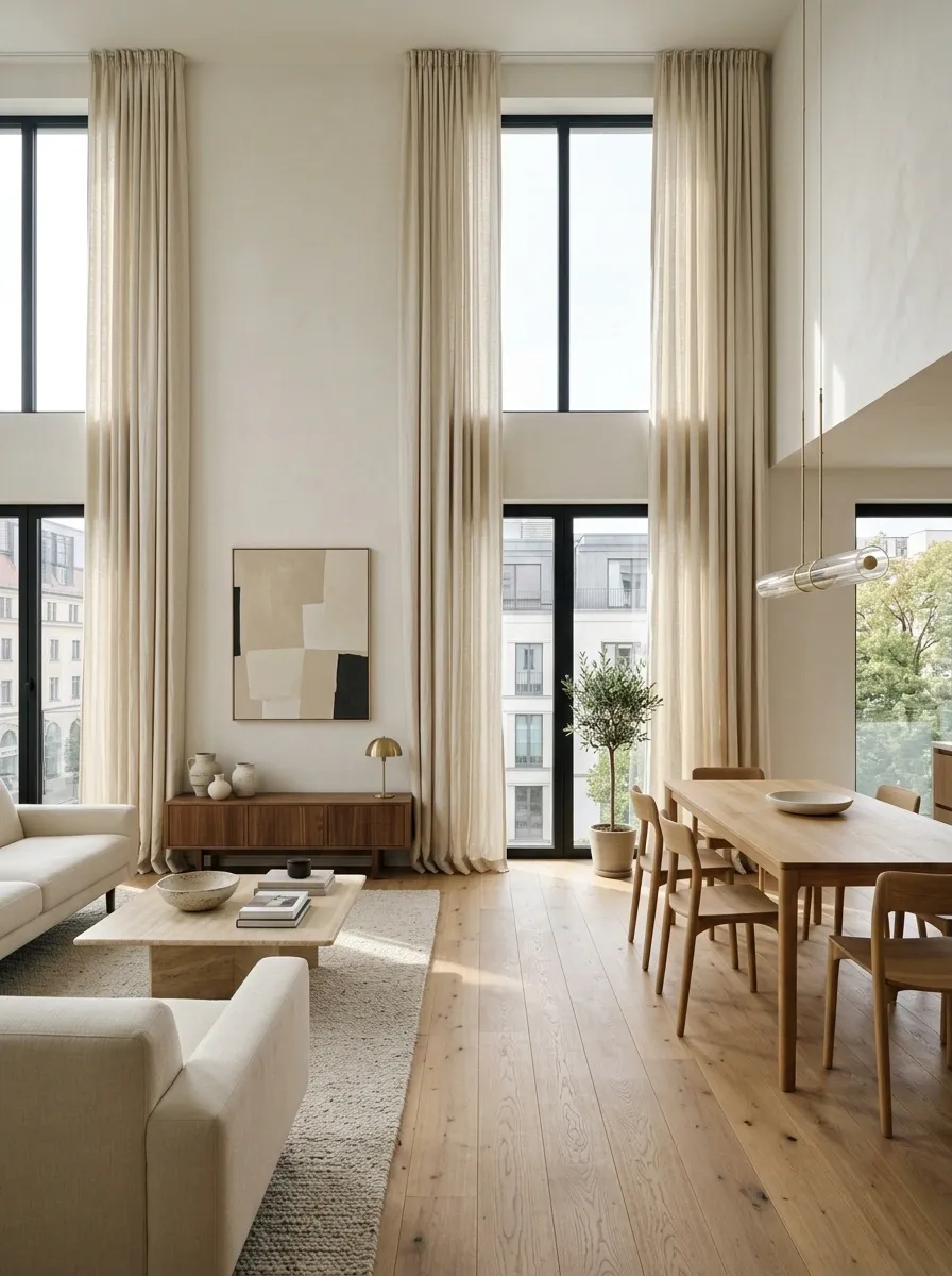
Tall windows, long curtains, warm stone, and restrained furniture give this apartment an elegant architectural quality without relying on excessive decoration. The curtains begin close to the ceiling and fall all the way to the floor, emphasizing height. A pale stone coffee table, warm wood console, and soft cream seating keep the room from becoming too formal.
The dining area continues the same material story with a simple wooden table and sculptural chairs. Artwork stays large and sparse rather than spreading across every available wall.
That’s important here. Once the architecture is doing the heavy lifting, covering every surface with decor starts to feel like the walls lost a bet.
Soft Feminine Apartment With Dusty Rose and Walnut
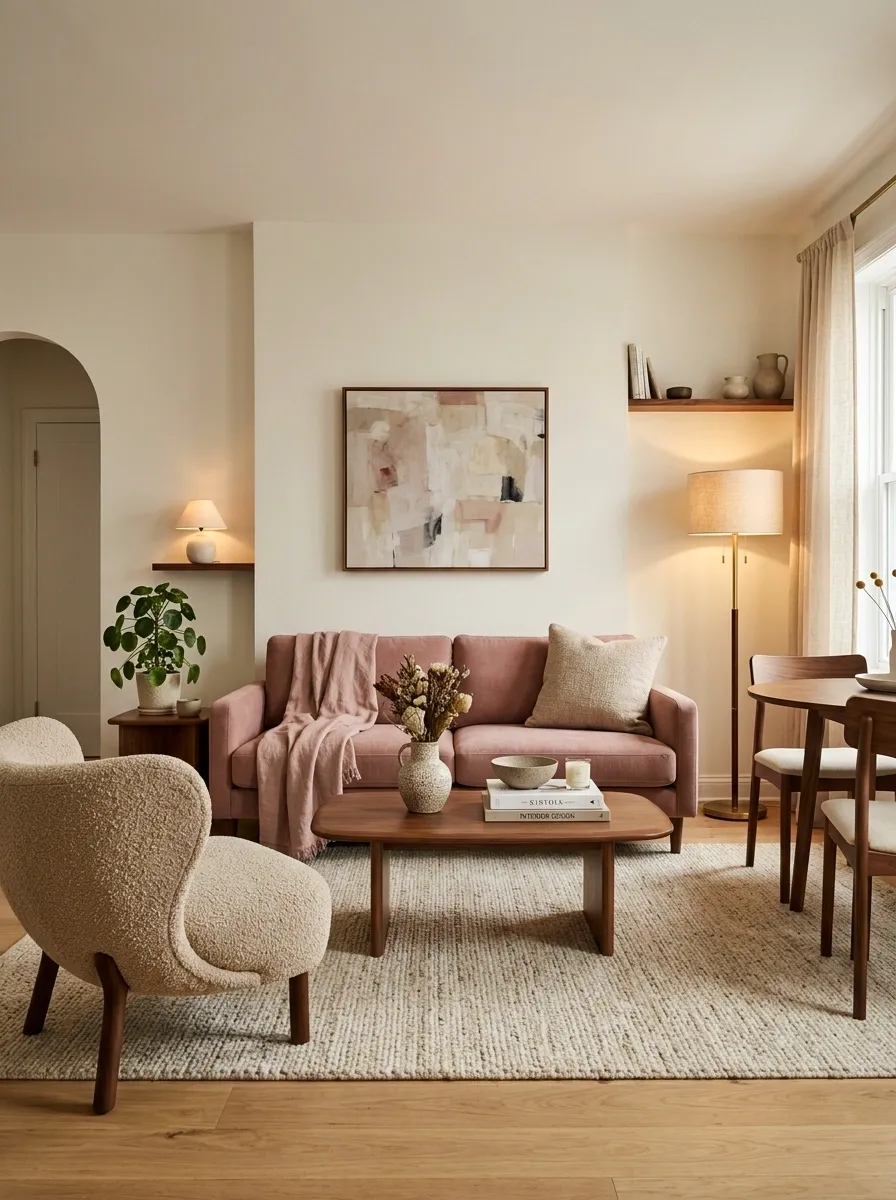
Dusty rose becomes the defining color in this apartment, but it stays sophisticated because walnut and warm neutrals surround it. A dusty rose sofa sits against a creamy wall, paired with a walnut coffee table and a curved lounge chair in a soft beige fabric. The dining space repeats the walnut while keeping its upholstery neutral.
The color appears again in a small textile and one piece of artwork, enough to connect the rooms without making every object blush. Rounded furniture softens the darker wood, while warm lighting keeps the palette rich after sunset.
The overall result feels feminine because of proportion, color, and softness, not because every object apparently went shopping for a ruffle.
Industrial Apartment With Soft Furniture and Warm Lighting
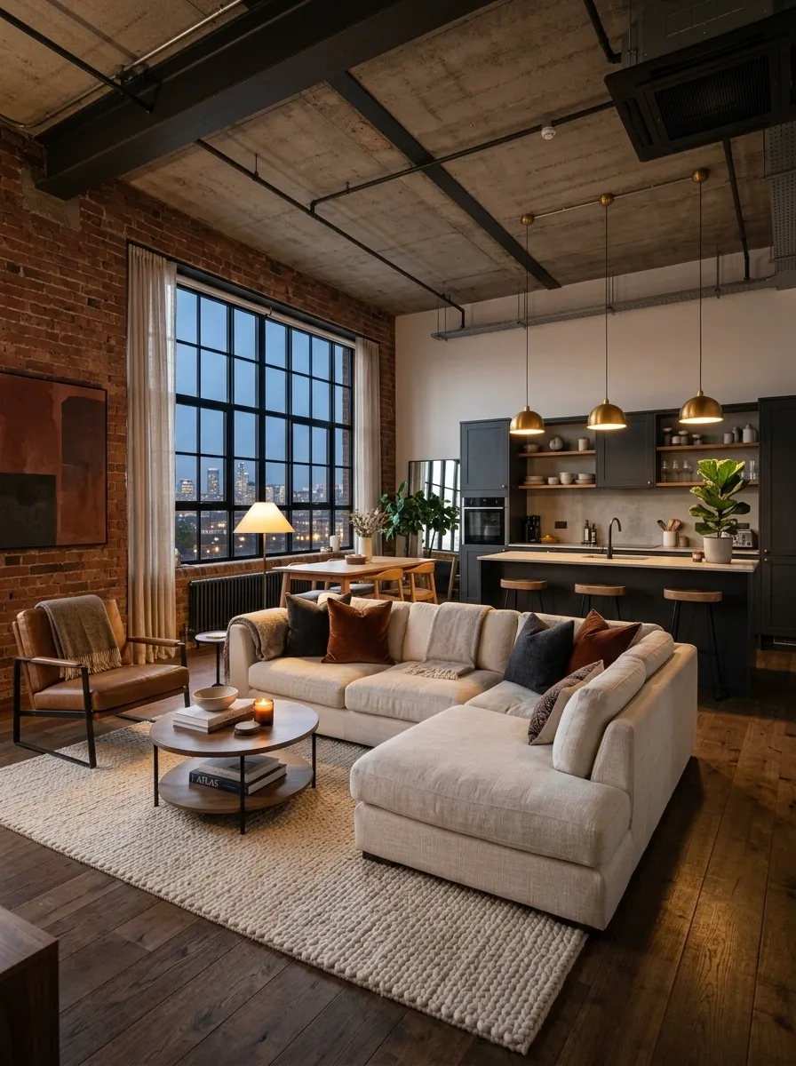
Exposed brick, black steel window frames, concrete-toned surfaces, and dark wood establish the industrial shell. Then the furniture deliberately pushes in the opposite direction. A large upholstered sofa, thick rug, linen curtains, and soft lounge chair introduce comfort without hiding the architecture that makes the apartment interesting.
The kitchen continues with dark cabinetry and simple metal details, while warm pendant lights soften the harder surfaces after sunset. Keep the palette fairly restrained so the textures remain visible.
Brick, concrete, steel, and wood already bring plenty to the table. Adding six competing finishes would turn industrial character into a materials convention.
Tiny Apartment With a Continuous Built-In Storage Wall
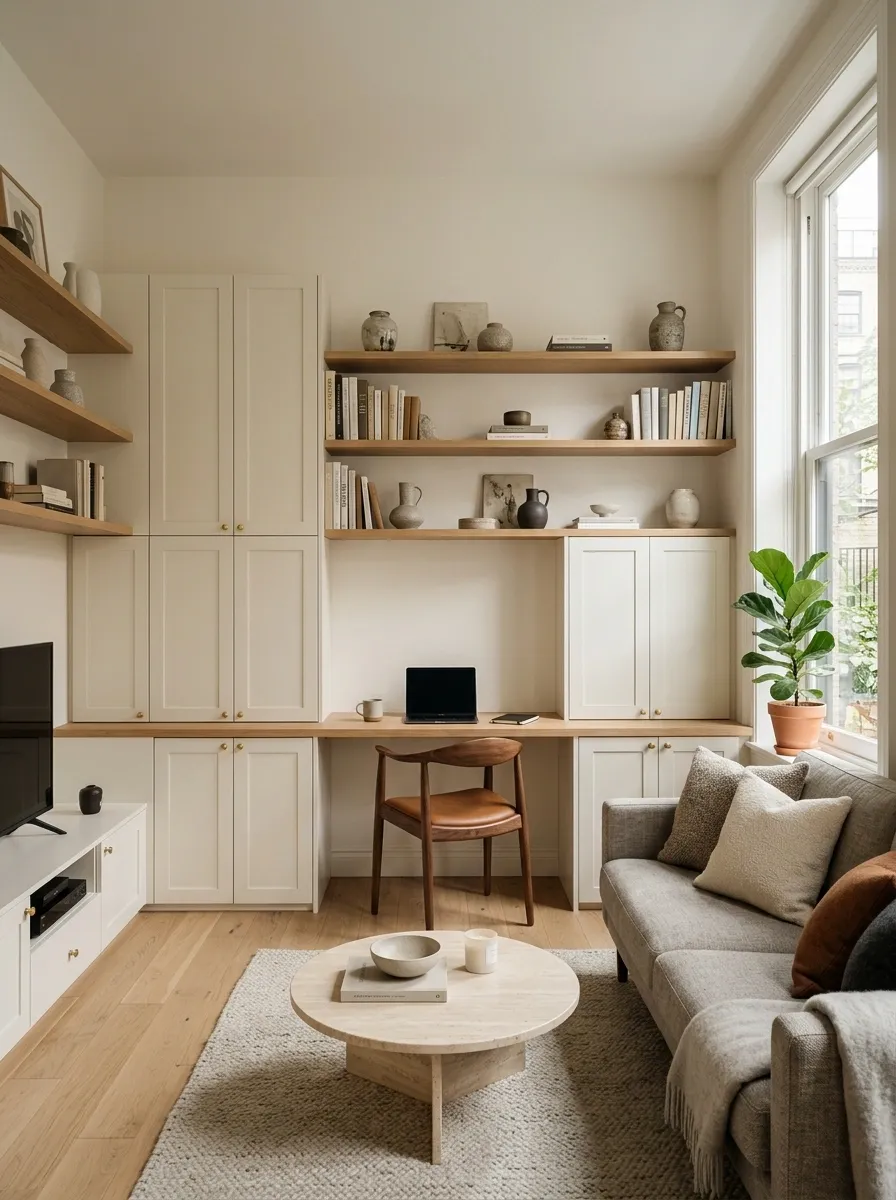
One long built-in wall organizes this small apartment without forcing storage furniture into every corner. The lower section combines closed cabinets and a media unit, while a central section creates a compact desk and upper shelves hold a small collection of books and objects. Everything else stays comparatively low and simple.
This approach works because storage becomes part of the architecture instead of appearing as a lineup of unrelated cabinets. Use one finish across most of the wall so it reads as a single element. Open shelving should remain selective.
Filling every shelf because there are shelves available is how a calm apartment becomes a marketplace.
Keeps the main living wall visually organized.
Hides everyday clutter rather than decorating around it.
Turns an otherwise wasted section into useful workspace.
Reserved for the few things worth actually looking at.
Small Open-Plan Apartment With a Curved Sofa as the Anchor
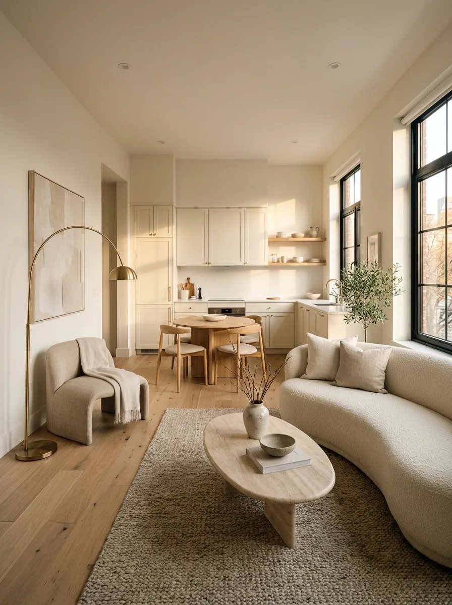
A curved sofa gives this open-plan apartment a softer center and quietly separates the living area from the kitchen without blocking the room. The seating faces a low oval coffee table, while a compact round dining table sits beyond it, creating two distinct zones with no bulky divider in sight.
The rest of the furniture follows the softer geometry without going full circle factory. A rounded floor lamp and a curved occasional chair are enough. Keep the kitchen cabinetry simple and let the sofa remain the main visual anchor.
The open walkway around it is just as important as the seating itself. A beautiful layout that requires everyone to walk sideways is still a bad layout.
Coastal Apartment With Sand, Soft Blue, and Light Oak
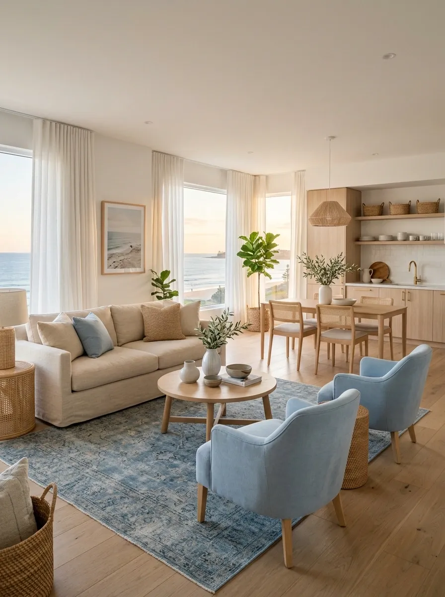
Forget the seashell collection and the giant anchor hanging over the sofa. This coastal apartment gets the idea across through color, texture, and light instead. Pale oak flooring runs through the space, paired with a sandy cream sofa, soft blue occasional chairs, and loose linen curtains that let daylight stay prominent.
The kitchen keeps the same restrained language with light wood cabinetry, pale counters, and a few woven accents. A faded blue rug connects the living area to the dining space without making the apartment feel themed.
Nothing needs to announce that it’s coastal. The soft blue, pale wood, natural fabrics, and generous daylight already did the job.
Modern Apartment With a Statement Stone Kitchen and Quiet Living Room
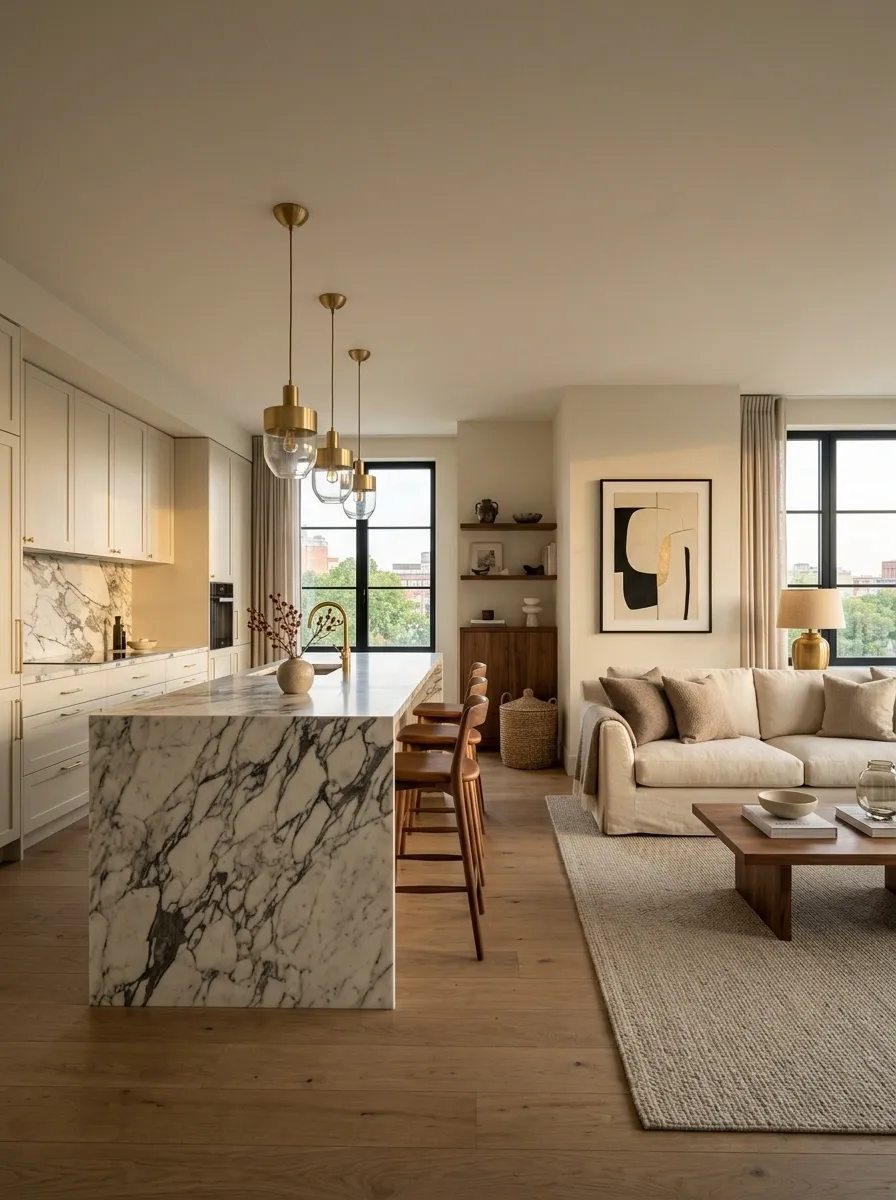
Here, the kitchen gets the dramatic moment. A large stone island with pronounced veining becomes the visual centerpiece of the open-plan apartment, while the living room deliberately steps back with a soft neutral sofa, simple walnut table, and understated artwork.
That contrast keeps the apartment from feeling like every zone is competing for the same Instagram post. The kitchen has the pattern and movement. The living room provides calm.
Pendant lighting above the island reinforces the focal point, while softer lamps around the seating area create a different mood. The stone should have enough surrounding restraint to read as architecture rather than just another busy surface.
Stronger pendant presence
More visual movement
Warm Minimal Apartment With Almost No Decorative Clutter
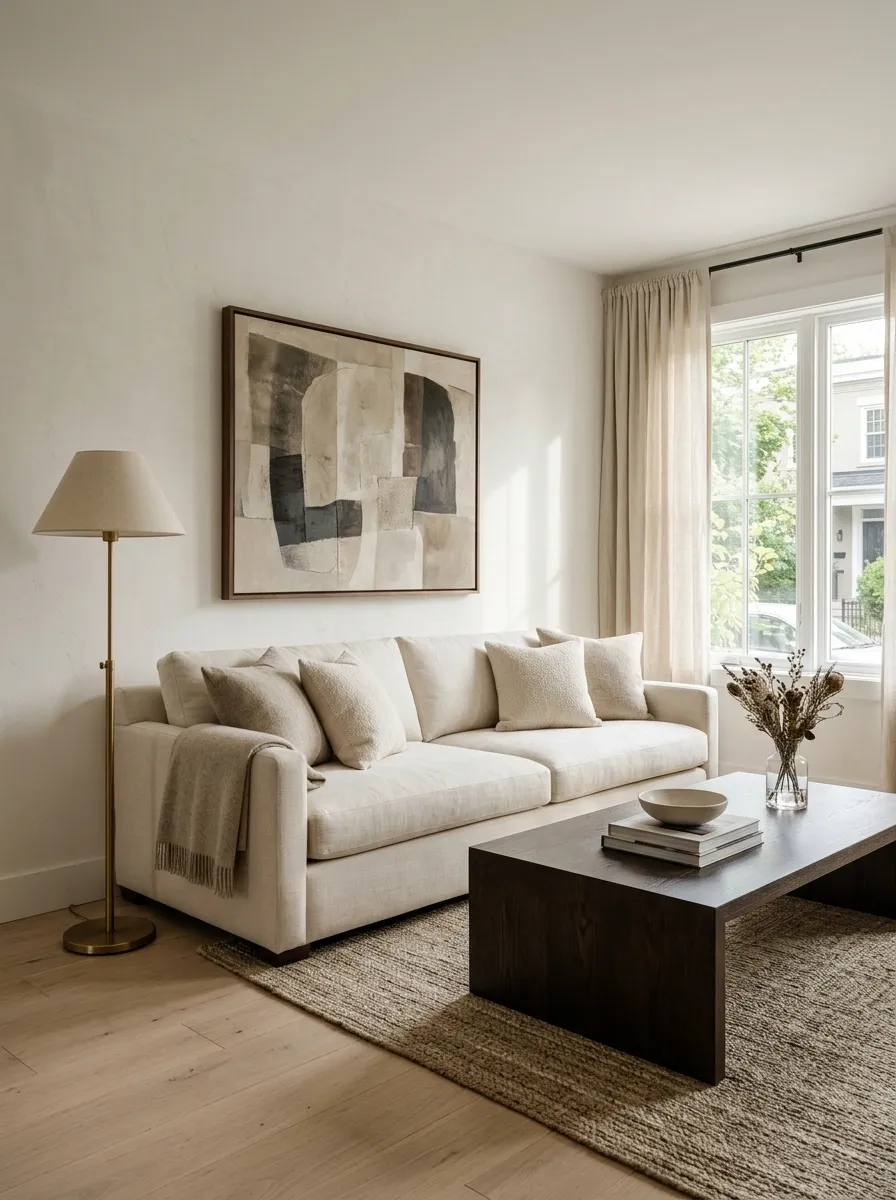
This apartment makes a surprisingly strong case for leaving things alone. Warm white walls, a large neutral sofa, pale oak flooring, one substantial coffee table, and carefully positioned lamps create the entire foundation. There isn’t a decorative object auditioning for attention on every shelf.
The visual interest comes from scale and proportion. The sofa is generous, but the surrounding floor stays open. The coffee table has enough presence to balance it without becoming oversized. A single large artwork gives the main wall a focal point instead of a scatter of tiny frames.
The room feels finished because every piece has enough space around it. Sometimes the missing decor is the decor.
Eclectic Apartment With One Unified Color Thread
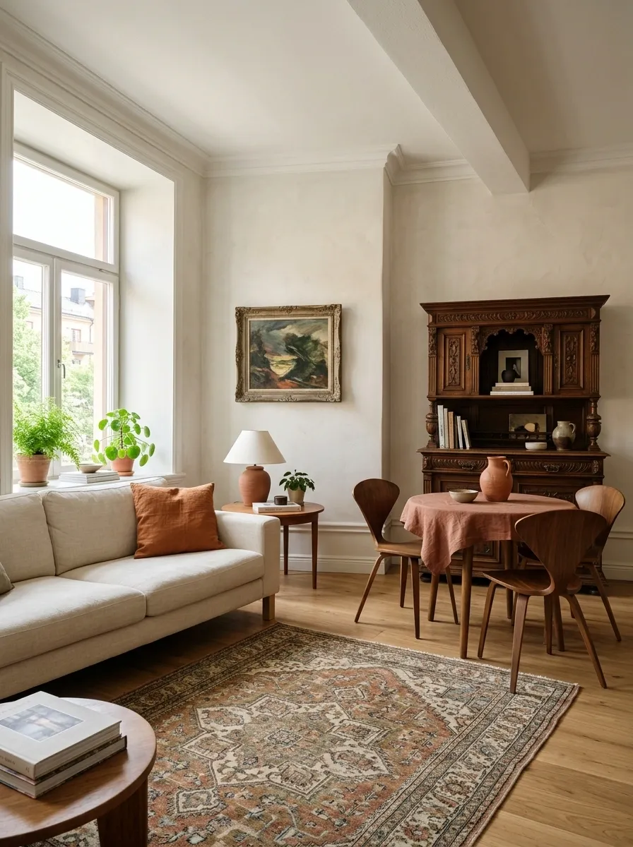
This apartment mixes furniture from different eras without looking like a furniture warehouse after closing time. A contemporary cream sofa sits beside a vintage wooden cabinet, sculptural dining chairs, an older framed artwork, and a patterned rug.
The unifying element is a muted rust-orange tone that appears in several rooms. A rust cushion echoes the artwork. A dining textile picks up the same note. A small ceramic piece repeats it near the kitchen.
The furniture doesn’t need to match because the color quietly connects the composition. Keep the remaining colors restrained and let the different shapes and materials provide the personality. That’s what makes the apartment feel collected rather than chaotic.
Rust cushion + patterned rug
Rust textile + warm wood
Small rust ceramic accent
Compact Apartment With a Dining Nook Built Into the Kitchen
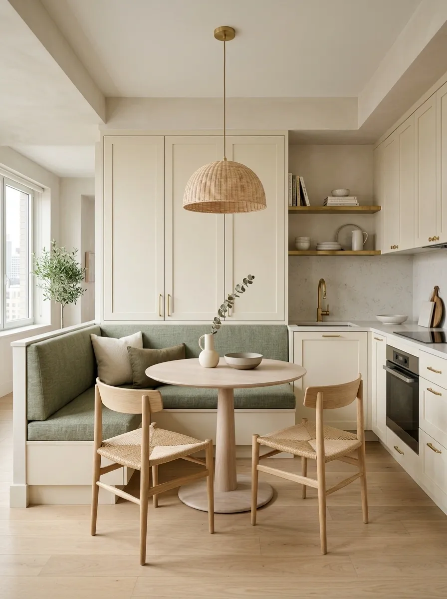
A compact dining nook makes better use of the apartment than squeezing a full dining table into the main living area. A built-in banquette runs along one kitchen wall, paired with a small round table and two light chairs. Because the banquette hugs the wall, the center of the room stays open for movement.
The kitchen uses warm cream cabinetry, pale wood, and simple stone surfaces, while the dining nook adds a muted fabric color for separation. A small pendant hangs directly over the table, giving the nook its own identity without visually closing it off.
This is the kind of layout that proves square footage isn’t the only thing doing the math. Placement matters too.
Round table: easier movement around the edges
Center floor: left open for circulation
Apartment With a Soft Archway Between Living and Dining Areas
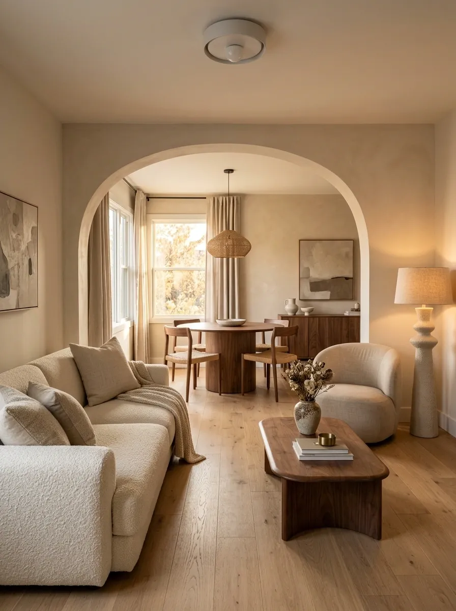
The architecture becomes the star in this apartment through a broad archway connecting the living and dining areas. The opening gives the two rooms a sense of connection while still creating a clear change of space. A cream sofa and walnut coffee table occupy the living room, while a rounded wood dining table sits beyond the arch.
Curves repeat lightly through the furniture, but the room avoids turning into a showroom for circular objects. One curved chair and a rounded lamp are enough.
Keep the flooring consistent between both spaces so the arch feels like a transition rather than a dividing line. The result has character before a single decorative object enters the picture, which is frankly more efficient than buying 37 little things for the same job.
Different furniture establishes each zone.
Repeated curves quietly connect the architecture to the furniture.
Moody Bedroom-Led Apartment With Deep Brown Walls and Walnut
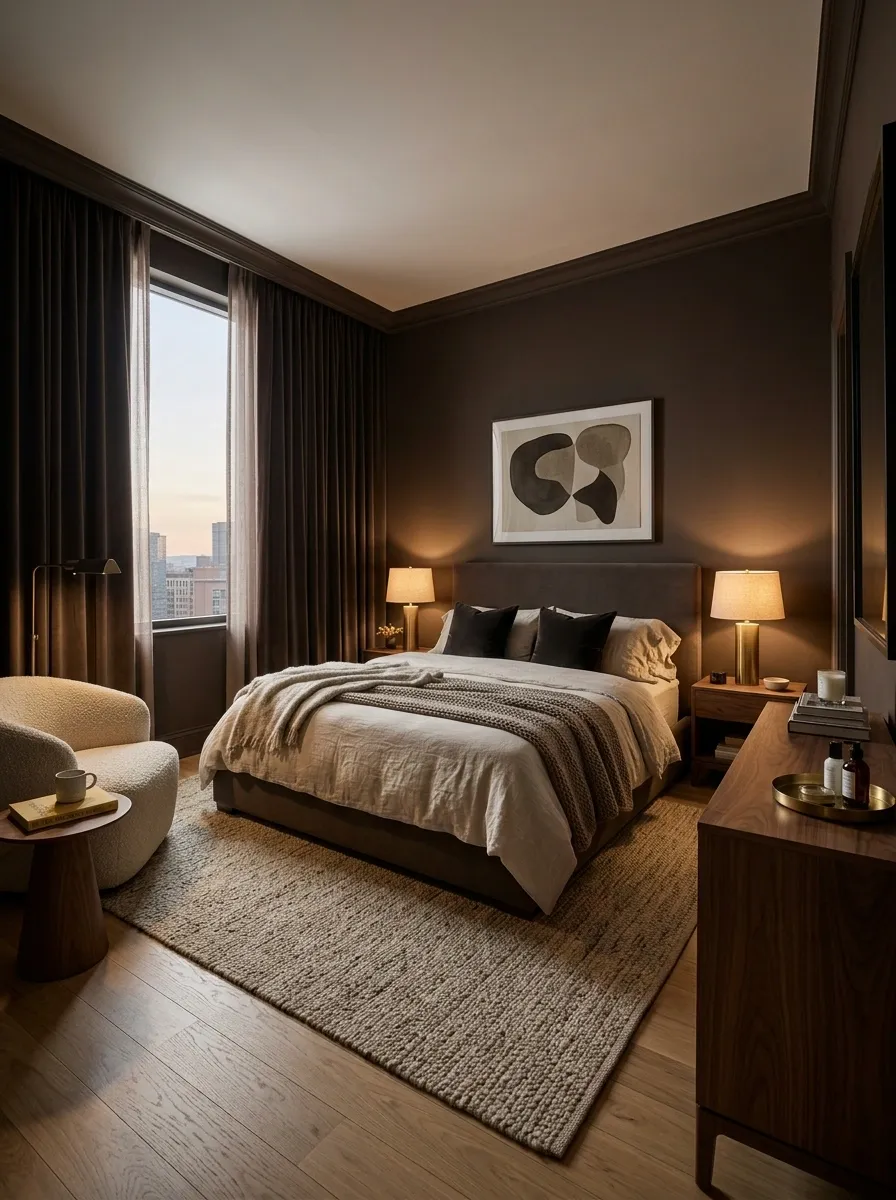
This apartment lets the bedroom carry the mood while the rest of the home stays comparatively lighter. Deep brown walls frame a low upholstered bed with walnut bedside tables, soft bedding, and heavy curtains. A compact reading chair sits near the window, creating a second layer within the room instead of leaving the corners dead.
Warm bedside lamps provide a softer glow than a single overhead fixture, while the bedding stays mostly cream and oatmeal so the darker walls don’t swallow the room.
The living area outside the bedroom uses warm beige and walnut to create continuity without copying the bedroom exactly. A little mood is good. Turning the entire apartment into a cave is where things get ambitious.
Floor lamp gives the reading corner its own purpose.
Ambient room light stays softer so the darker walls remain rich rather than harsh.
Renter-Friendly Apartment With Freestanding Layers and Warm Lighting
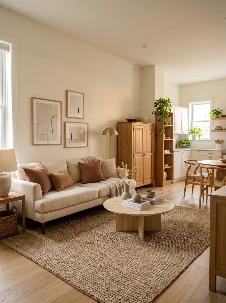
This apartment looks settled without depending on built-ins or major construction. A large rug anchors the living room, a freestanding wood cabinet provides storage, and a narrow bookshelf creates a visual division near the dining area. Artwork sits on walls without overwhelming them, while table and floor lamps create multiple points of light.
The furniture all feels permanent even though the arrangement could move with the lease. That’s the sweet spot.
Warm cream upholstery, natural wood, and muted rust textiles establish a cohesive palette, while the kitchen remains simple in the background. The room doesn’t scream “rental,” which is usually the emotional goal after looking at a blank white apartment wall for approximately twelve minutes.
Small Apartment With a Daybed Living Room Instead of a Standard Sofa
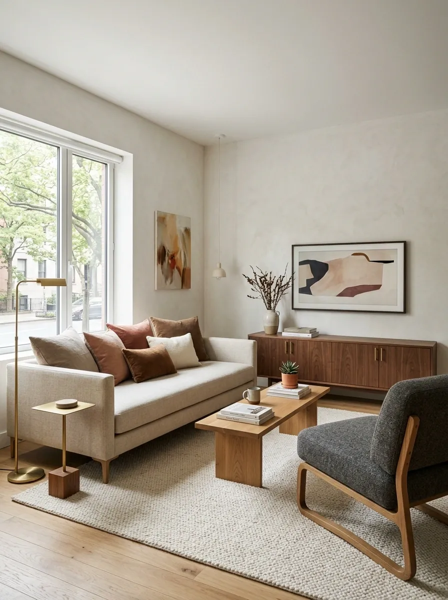
A tailored daybed changes the entire proportion of this compact living room. Instead of a deep traditional sofa taking up most of the room, the daybed offers generous seating while keeping the visual footprint lighter. A narrow coffee table sits in front, with a compact lounge chair opposite and a slim cabinet along the back wall.
The daybed’s upholstery stays neutral, while a few layered cushions bring in muted clay and brown tones. A large rug visually gathers the furniture so the room still feels complete despite its smaller footprint.
Keep the table narrow enough to preserve a comfortable route around the seating. Tiny room, yes. Tiny circulation path, absolutely not.
Narrow table: leaves more room around the seating
Lounge chair: adds a second seating position without filling another wall
Large rug: makes the smaller arrangement read as one finished zone
Warm Black and Honey Oak Apartment With Graphic Contrast
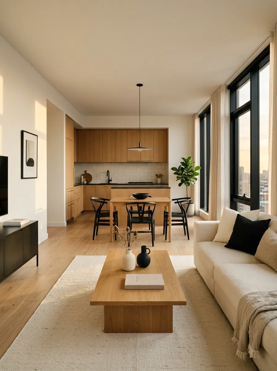
Matte black gives this apartment its structure, while honey oak keeps the darker elements from feeling severe. Black appears in the window frames, a slim media cabinet, dining chairs, and a few lighting details. Honey oak runs through the flooring, kitchen cabinetry, and coffee table, creating a much warmer visual rhythm than an all-black scheme.
Cream upholstery breaks up the contrast and gives the living room some breathing room. The kitchen stays fairly clean so the black and wood combination can remain the main story.
This works because the dark elements feel intentional and connected rather than sprinkled around at random. Black is great in moderation. Use too much of it and the apartment starts looking like it has been legally assigned a goth phase.
Apartment With a Soft Traditional Living Room and Modern Kitchen
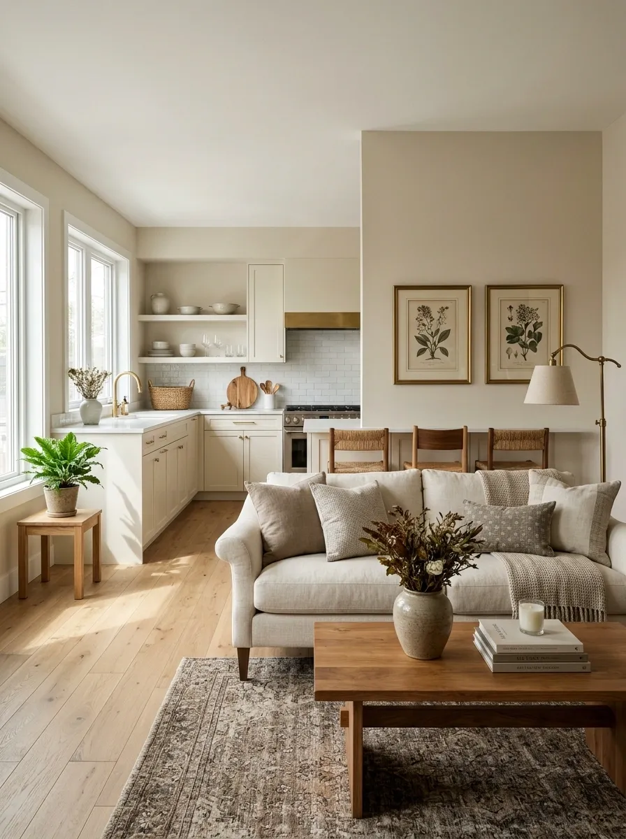
The living room takes a softer traditional approach, with a comfortably shaped sofa, framed artwork, warm wood furniture, and a classic floor lamp. Just beyond it, the kitchen switches to cleaner contemporary cabinetry and simpler hardware. The two styles are different, but they share warm wood, cream, and restrained metal finishes.
That contrast gives the apartment more personality than making every room follow the same formula. The living room feels layered and established, while the kitchen feels crisp and practical.
Keep the transition visually connected through flooring and wall color. Otherwise the apartment can start looking like two separate listings accidentally uploaded under one address.
Framed artwork
Warm wood furniture
More layered lighting
Simpler hardware
Fewer decorative elements
Same warm material family
Terracotta Apartment With Checkerboard Flooring and Cream Walls
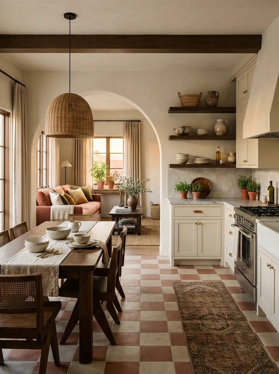
Terracotta becomes the warm thread running through this apartment, but the real character comes from the relationship between the flooring, walls, cabinetry, and furniture. A soft checkerboard floor sets the foundation in the kitchen and dining area, while cream walls keep the room bright. Dark wood dining furniture gives the lighter palette a stronger anchor.
The living room carries terracotta through upholstery and textiles rather than repeating the floor pattern. That distinction keeps the apartment connected without making every room look copied and pasted.
Woven textures and aged metal finishes add another layer, but they stay secondary. The floor already has enough personality to start a small fan club.
Terracotta: repeated in smaller amounts above it.
Dark wood: anchors the furniture.
Cream: keeps the surrounding surfaces calm.
Apartment With a Gallery Wall Anchoring a Large Neutral Sofa
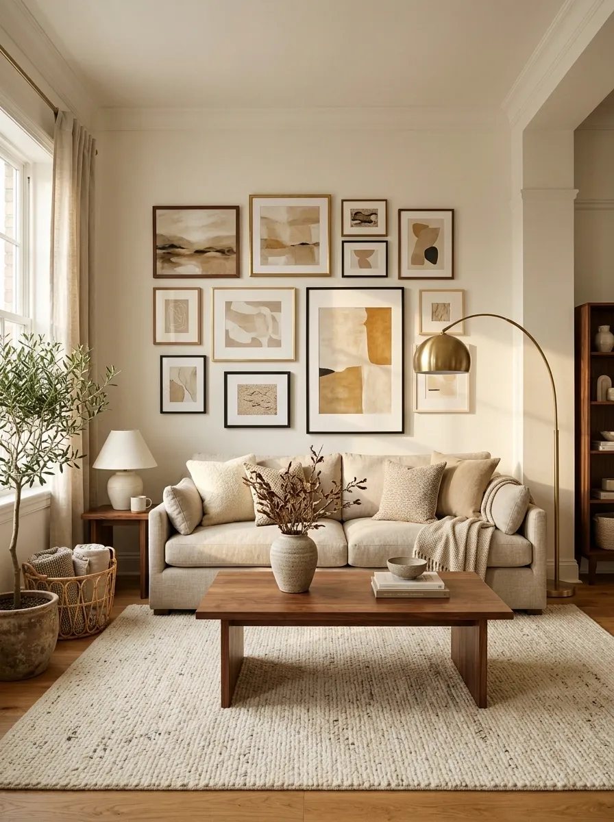
A large neutral sofa gets a much stronger presence when the wall behind it becomes the visual feature. Instead of scattering small artwork around the apartment, this design uses one substantial gallery wall with a mix of frame sizes, artwork scales, and warm neutral tones.
The arrangement stretches wide enough to relate to the sofa while leaving some breathing room around the outer edges. A walnut coffee table, textured rug, and sculptural floor lamp keep the furniture simple so the artwork remains the main event.
The dining area repeats a few of the same frame tones without creating a second gallery wall. One strong art moment is enough. The walls don’t need to open a branch office.
Layered Apartment With a Dark Kitchen, Warm Living Room, and Quiet Bedroom
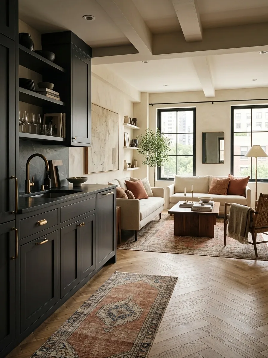
The final concept gives each part of the apartment its own mood while keeping the entire home connected. The kitchen uses dark cabinetry and a stone counter for contrast. The living room shifts warmer with walnut, cream upholstery, and soft terracotta textiles. The bedroom becomes quieter with oatmeal bedding, warm beige walls, and low lighting.
The connection comes from repeated materials rather than identical colors. Walnut appears in more than one room. Warm stone continues the earthy foundation. Cream and beige soften the transitions.
This lets the apartment feel varied without becoming visually random. Every room doesn’t need to tell the same story. They just need to know they’re in the same book.
Let the Apartment Have a Personality
The most memorable apartment isn’t necessarily the one with the most expensive furniture or the most decorated walls. It’s the one where the choices make sense together.
A dark kitchen can sit comfortably beside a soft bedroom. Vintage furniture can work with contemporary pieces. A tiny living room can feel generous when the furniture respects the available floor. Even a rental can develop a strong identity when rugs, lighting, artwork, wood tones, and textiles are treated as parts of the same composition.
The easiest mistake is buying attractive things one at a time and expecting them to magically become an interior. They usually don’t. They become attractive things sitting near each other.
Start with the complete look that feels closest to the apartment’s actual layout and natural light. Then borrow the parts that make that particular design work. That gives the room a direction before the shopping begins, which is considerably less chaotic than discovering the direction somewhere around checkout.