
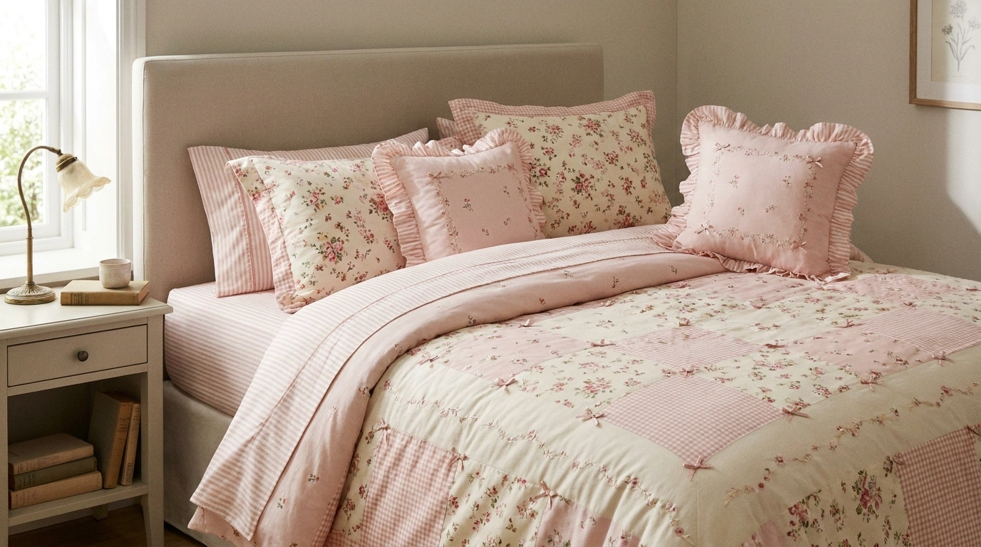
A bedroom can have gorgeous furniture, lovely lighting, and the prettiest walls, yet the bed still looks like someone threw together whatever sheets were clean. And because the bed usually takes up so much visual space, that one detail can make the entire room feel unfinished.
Some bedrooms call for pink gingham and vintage florals. Others look better with lavender cotton, playful fruit prints, soft yellow layers, or rich textures in dusty rose. There isn’t one formula for getting the look right, and thank goodness for that. A bedroom shouldn’t have to follow the same personality test as every other room on Pinterest.
THE BEDDING GROUP CHAT
Cute bedding. Zero fabric-related identity crises.
A bed can have personality without looking like six different Pinterest boards got into a fight.
THE PRINT
Let one pattern be the main character.
Florals, gingham, cherries, and bows are all adorable. All at once? The duvet is filing a noise complaint.
THE BREATHING ROOM
Plain sheets are doing important work.
Give busy prints some white space, simple furniture, and a quieter wall color. Even cute patterns need a day off.
THE TEXTURE
Soft layers. Fewer pillow casualties.
A quilted coverlet, breathable cotton, and a couple of decorative pillows can do more than an entire pillow army.
THE MISSION: Make the bed look intentional, not like a fabric clearance sale.
Cute Bedding Ideas
Black Polka Dot Bedding With Dramatic Ruffles
Polka dots get a moody, high-contrast makeover when paired with midnight black ruffles and soft cream fabrics. A playful dot-patterned duvet creates an inviting, cloud-like texture, while dark ruffled edges ground the design so it feels effortlessly cool rather than overly sweet. Pale walls and warm wood accents keep the space bright and airy without losing that cozy bedroom atmosphere.
The secret is balancing the bold trim with plenty of neutral breathing room. Let the dotted duvet take center stage by keeping the surrounding decor simple, using only a warm bedside lamp and delicate wall art to finish the scene. It is a striking look that proves playful prints can easily embrace a touch of drama.
Pink Gingham Bedding With Soft White Layers
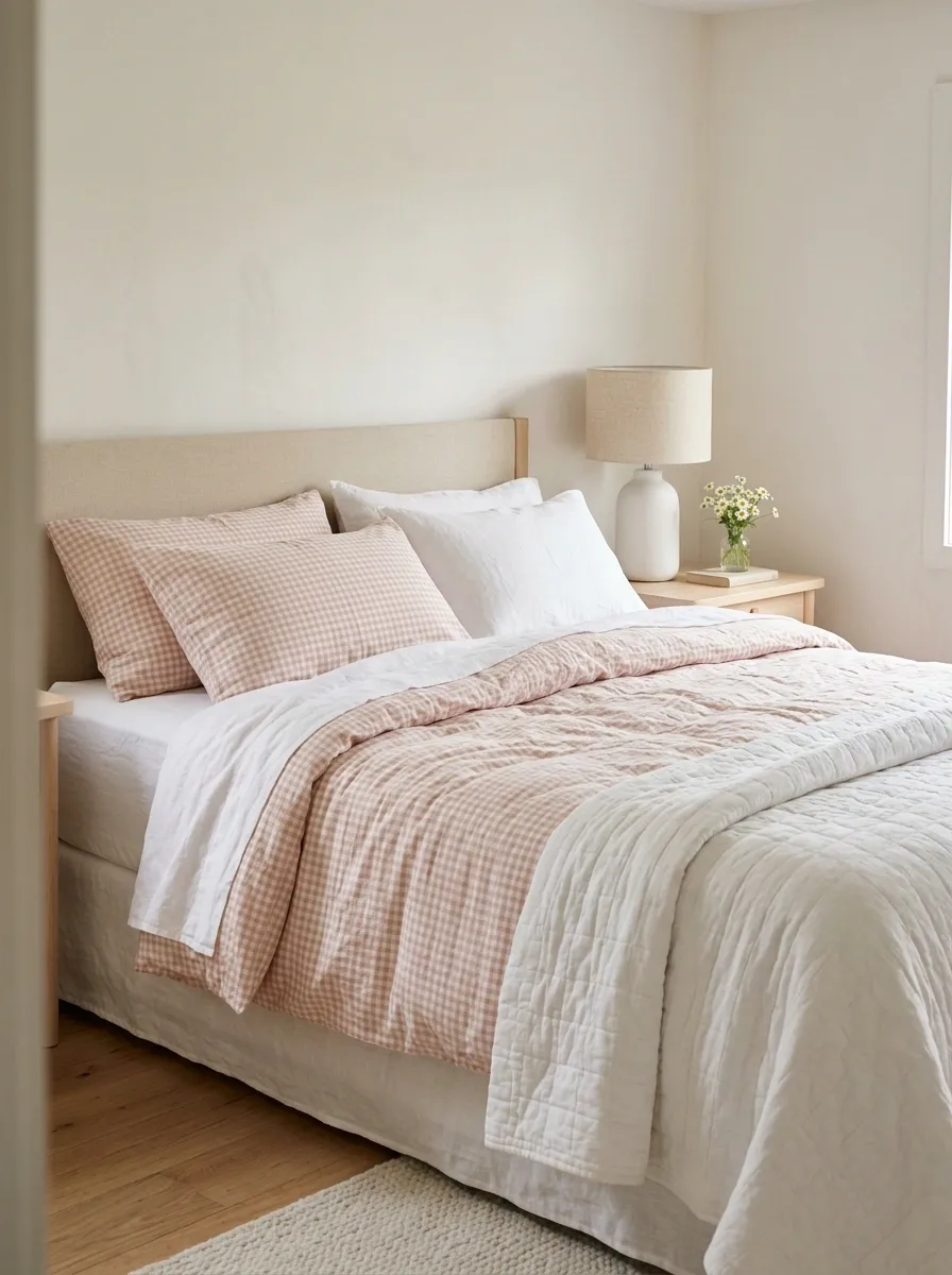
Pink gingham has that sweet, nostalgic charm without needing a single heart-shaped accessory to explain itself. Blush-and-white checks cover the duvet, crisp white sheets soften the pattern, and pale wood furniture keeps the bedroom from drifting into overly sugary territory. A simple ceramic lamp and one small floral arrangement finish the scene without making the nightstand look like a gift shop.
The trick is the scale of the checks. Smaller gingham feels delicate, while larger squares give the bed a bolder country-cottage character. Keep the surrounding fabrics mostly solid, because mixing three more prints into this setup is how a cute bedroom becomes a competitive sport.
THE GINGHAM FORMULA
Sweet checks, quieter surroundings.
Pink gingham
The personality
Clean white
The visual break
Pale wood
The warm finish
Keep the checks on the main bedding, then let plain sheets and natural finishes calm everything down.
Cozy Autumn Pumpkin Bedding In Terracotta Tones
Terracotta walls and autumn-themed pumpkin bedding bring instant warmth to a bedroom long before the leaves even start to drop. A cream duvet scattered with delicate botanical prints and earthy gourds creates a seasonal sanctuary, while textured throw pillows add depth against a rich backdrop. A matching autumn wreath and soft overhead lighting turn the entire room into a storybook retreat.
The key is pairing themed textiles with neutral layering pieces like a classic plaid sheet or a plain knit pillow. Avoid overcrowding every surface with fall decor, and let the printed bedding anchor the seasonal palette. It is a festive, welcoming look that feels genuinely comforting instead of overly costume-like.
Vintage Floral Bedding in a Romantic Cottage Bedroom
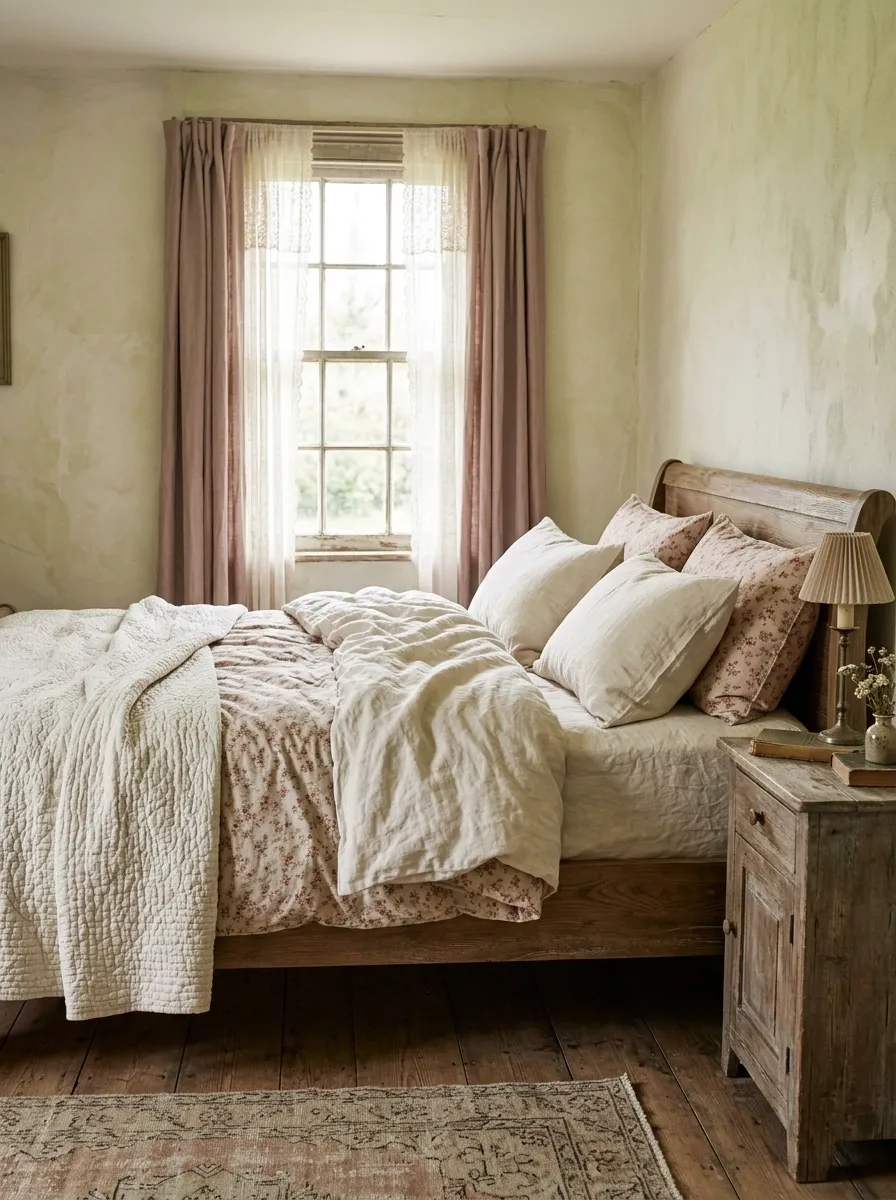
Tiny roses, faded botanical prints, and softly rumpled cream bedding give a bedroom the kind of old-fashioned romance that doesn’t need a filter. A wooden bed frame with a natural or aged finish anchors the florals, while an ivory quilt adds weight and texture. Muted rose curtains or a small vintage-style bedside lamp can reinforce the look without making every object compete for antique status.
Choose a floral print with a little breathing room between the blooms. A dense pattern can work, but it needs a simpler quilt and calmer surroundings. The aim is a collected cottage bedroom, not a floral convention where every surface has shown up wearing the same outfit.
A COTTAGE PRINT, EDITED
Let the flowers breathe.
Fine floral print
Use the small roses or botanicals as the bed’s main pattern.
Muted rose
Repeat sparingly
The supporting fabric
An ivory quilt or plain cotton pillowcases give the pattern a place to rest. The flowers don’t need backup singers.
White Ruffled Bedding With Soft Pink Bow Accents
Sweet pink bows marching down a crisp white duvet turn any ordinary bedroom into a charming fairytale setting. Soft ruffled ribbons add a lovely three-dimensional detail to the simple white bedding, creating a romantic look that feels straight out of a classic romance novel. A warm wooden nightstand and a classic lamp finish the space with understated elegance.
The magic lies in keeping the base textiles completely pristine and letting the bows provide the color. Skip the extra patterns and let the vertical ribbons create visual length across the bed. It is a whimsical style that delivers maximum charm with minimum fuss.
Lavender Bedding With Crisp White and Pale Oak
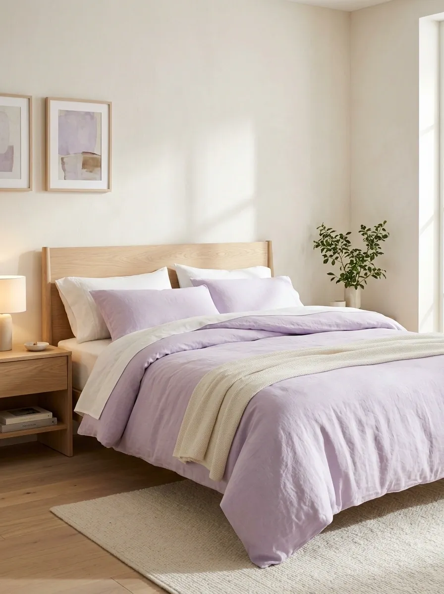
Lavender bedding brings color into a bedroom without the intensity of saturated purple. A soft lilac duvet, bright white pillowcases, and pale oak furniture create a fresh combination that feels playful but still grown-up. Keep the walls warm white or a very light neutral, then use a simple bedside lamp and restrained artwork to make the bed stand out.
The balance depends on choosing the right purple. Dusty lavender feels quieter and more muted, while a clearer pastel shade makes the bedroom feel brighter and more youthful. Either works with white, but adding too many competing pastel colors can muddy the look. Let lavender lead, and keep the supporting cast on a short contract.
A SOFTER SHADE OF PURPLE
Lavender
The bed’s leading color. Choose dusty for a muted mood or pastel for a fresher finish.
Soft white
Pale oak
Keep the bedding light around the face of the bed, where white pillowcases break up the color and prevent one solid lavender mass.
Sunny Butter Yellow Bedding With Crisp White Ruffles
Butter yellow brings a cheerful, sunlit warmth to the bedroom without the eye-straining brightness of a lemon yellow. Soft yellow sheets layered under ruffled white textiles create a dreamy, vintage-inspired aesthetic that feels fresh and inviting. Natural wood furnishings and soft morning light enhance the cheerful glow of the pastel palette.
Achieving this balance means letting the soft yellow lead while the white ruffles provide a clean, framing contrast. Avoid muddying the look with too many competing pastel shades on the surrounding surfaces. A simple, restrained approach ensures the room remains a peaceful morning sanctuary.
Strawberry Print Bedding With Cherry-Red Accents
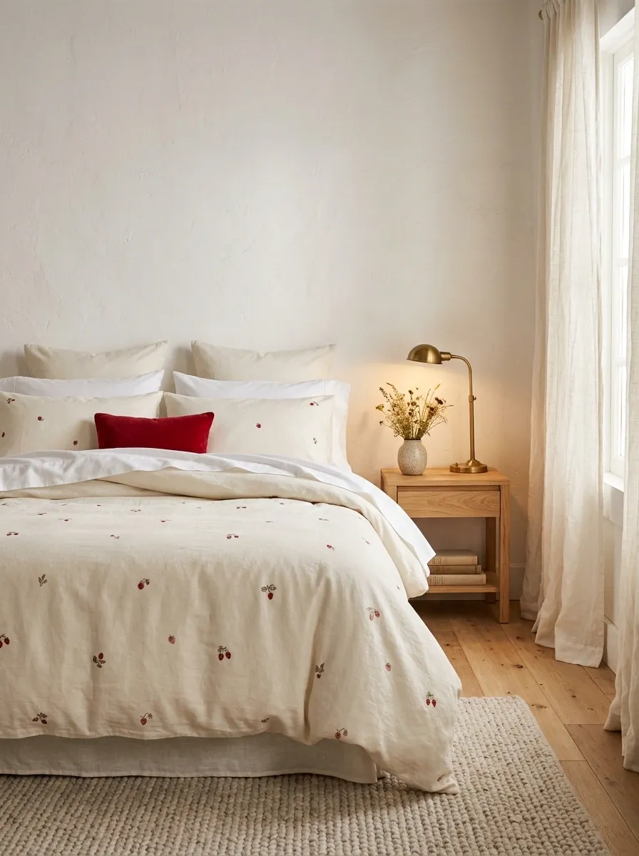
Strawberry bedding brings a playful, almost storybook feel to the bedroom. A cream duvet scattered with red strawberries looks especially good against natural wood, warm white walls, and uncomplicated bedside furniture. Small red accents can pick up the fruit motifs, but they should be selective. One cushion or a little bedside detail is enough to make the color feel intentional.
The print works best when the rest of the room doesn’t try to become a fruit salad. Skip competing cherry, lemon, and floral patterns, and choose a simple sheet color that lets the strawberries read clearly. It’s a fun look with plenty of personality, minus the requirement to turn the entire bedroom into a themed café.
THE STRAWBERRY RULE
RED, BUT MAKE IT RARE.
Cream stays in the background. The red fruit print gets the attention.
One red accent
Repeat the fruit’s red in a small detail, then stop. The duvet already understood the assignment.
Pastel Mint Green And Soft Pink Bedding
Mint green and soft pink make the ultimate dreamy pairing for a bedroom that refuses to take itself too seriously. A pastel green duvet mixed with blush pink pillowcases creates an ice-cream-shop sweetness that feels surprisingly sophisticated against warm white surroundings. Simple bedside decor and natural light keep the color combination light on its feet.
The trick is choosing muted, desaturated tones so the colors complement rather than clash. Keep the walls and furniture neutral to let the dual pastel bedding do all the heavy lifting. It is a fresh, whimsical combination that proves two sweet colors are better than one.
Butter Yellow Bedding With Cream Quilted Layers

Butter yellow makes a bed feel sunny without the sharpness of bright lemon. Use yellow sheets or a soft yellow duvet under a creamy quilt, then bring in white pillows and natural wood for a gentle, layered finish. Warm ivory walls help everything feel connected, while daylight brings out the difference between the yellow fabric and the cream textiles.
Texture matters here because the palette is deliberately simple. A quilted coverlet, smooth cotton sheets, and a slightly crinkled duvet create enough depth without relying on extra patterns. Avoid adding several unrelated pastel colors just because they look cute individually. Butter yellow already brings plenty of personality, and the room doesn’t need to host an entire rainbow reunion.
THE SUNNY BED, LAYER BY LAYER
Three fabrics. One calm color story.
Butter yellow
Sheets or duvet bring the sunshine.
Cream quilting
Adds relief and a soft visual break.
White cotton
Keeps the layers looking fresh, not heavy.
Let texture do the decorating. Adding another loud print would be giving the bed a group project it never asked for.
Rich Chocolate Brown Bedding With Boucle Frame
Chocolate brown bedding brings a rich, grounding luxury to the bedroom, especially when paired with an ultra-textured boucle upholstered bed frame. Deep cocoa tones add instant warmth and sophistication against stark white walls, creating a striking contrast that feels both modern and deeply cozy. A sculptural paper pendant lamp overhead finishes the minimalist space with artistic flair.
This look thrives on a combination of decadent color and touchable textures. Skip unnecessary patterns and let the plush channel-tufted base and velvety duvet create all the visual interest. It is a bold, contemporary design that makes crawling into bed feel like an absolute indulgence.
Coquette Bedding With Blush Bows and Ivory Ruffles
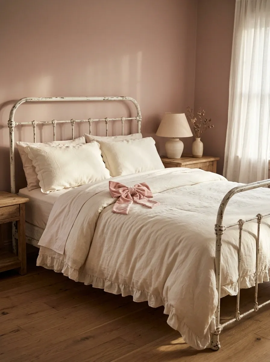
Blush bows, soft ruffles, and creamy bedding bring full coquette energy without requiring the bedroom to look like a life-size jewelry box. An ivory duvet with a gathered edge creates the foundation, while pink ribbon details and delicate pillowcases supply the romance. A vintage-inspired bed frame, muted pink walls, and a softly shaded bedside lamp make the whole composition feel intentional.
The secret is choosing where the frills belong. Let the duvet or pillowcases carry most of the decoration, then keep the remaining fabrics simple. Too many ruffles, bows, lace trims, and floral prints can make the bed look overdressed for absolutely no reason. Cute is the goal. A fabric explosion is not on the mood board.
THE COQUETTE EDIT
One romantic detail can do plenty.
The soft foundation
Ivory bedding, gentle gathers, and smooth cotton.
The signature
A blush bow or scalloped pillow edge.
Pick one prominent decorative detail and let it shine. The bows don’t need a committee.
Blue Striped Bedding With a Relaxed Coastal Feel
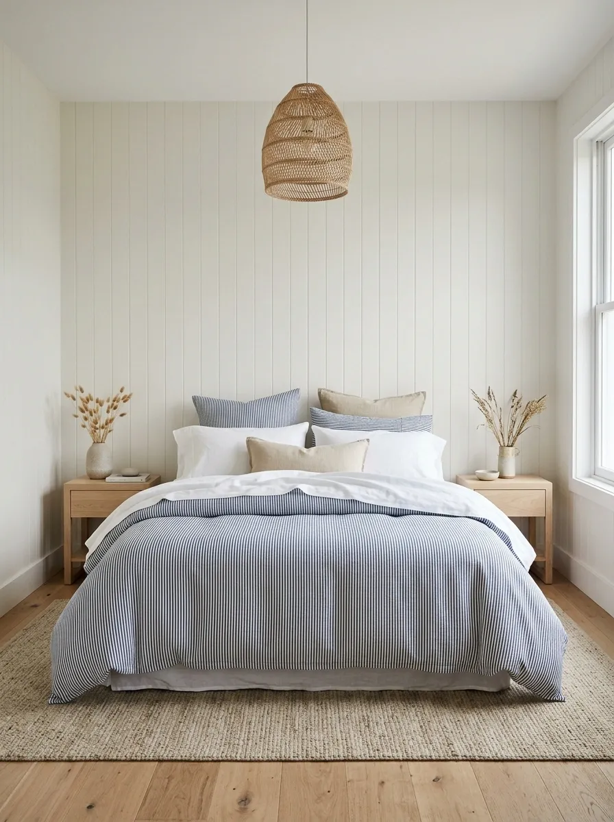
Blue-and-white stripes bring a crisp, breezy feel to the bedroom without forcing every accessory to feature a seashell. Fine ticking stripes on the duvet pair neatly with solid white sheets, plump pillows, and pale oak bedside tables. A woven pendant or natural-texture rug adds warmth, while soft daylight keeps the blues looking fresh rather than cold.
The scale of the stripes changes the whole mood. Narrow lines lean classic and understated, while broad stripes feel bolder and more graphic. Choose one dominant stripe pattern, then leave the other textiles mostly plain. The bed should evoke a relaxed coastal cottage, not look like the entire maritime department got free decorating privileges.
STRIPES SET THE MOOD
Fine lines or bold bands?
Fine ticking stripes
Quiet, classic, and easy to combine with textured neutral bedding.
Wide statement stripes
Graphic, more noticeable, and strongest with simple white layers.
The easy formula: one striped statement, white cotton, pale wood. No anchor-shaped cushions required.
Sage Green Botanical Bedding With Cream Quilting
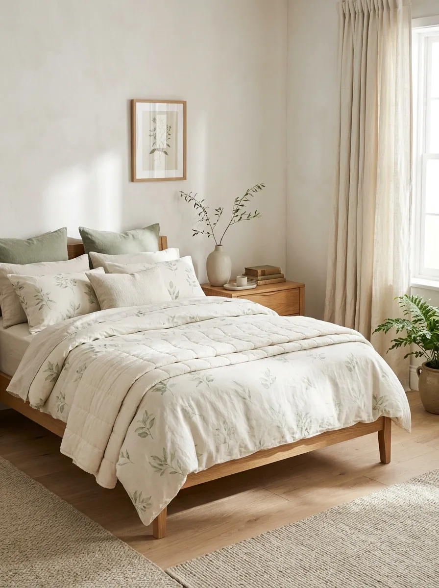
Sage botanical bedding brings a garden-inspired look into the bedroom without turning it into an indoor greenhouse. Picture soft green leaves scattered across an ivory or pale sage duvet, a cream quilt folded across the foot of the bed, and warm wood furniture grounding the palette. A leafy branch in a simple vase can repeat the botanical theme, while plain curtains keep the room feeling open.
Muted sage works especially well with warm cream because the combination feels softer than bright green against stark white. Look for botanical prints with enough background space to let the leaves stand out. If the bedding already has a leafy pattern, skip the matching leafy cushions. Repeating the same motif on every surface isn’t coordination. It’s a very committed plant impersonation.
A BOTANICAL BEDROOM
Green belongs in the mix, not everywhere.
Sage botanical
Leaves and soft color set the theme.
Warm cream
Quilting gives the print a break.
Finish with natural wood.
A warm bedside table or simple wood bed frame connects the botanical palette to the rest of the room.
Retro Pink and Orange Gingham Bedding
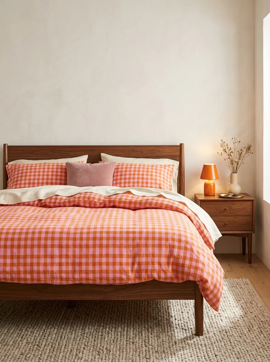
Pink and orange gingham makes a bedroom feel energetic, playful, and a little nostalgic. The warm checks become the star of the bed, while cream sheets, a walnut bed frame, and simple vintage-inspired furnishings give the pattern some grounding. A small orange lamp or dusty pink cushion can pick up the colors without making every corner of the room shout for attention.
This look suits anyone who finds all-neutral bedrooms a bit too polite. The important distinction is between warm and chaotic. Keep the walls relatively quiet and avoid layering additional high-contrast prints over the gingham. The bedding already has personality, and the bedroom doesn’t need to audition for a retro television set.
RETRO, NOT RANDOM
Two warm colors. One clear lead.
Pink checks
Keep them visible and uninterrupted.
Orange accents
Repeat the warmth in small doses.
Cream sheets and walnut furniture bring everything back down to earth. The color palette can have fun without taking over the lease.
White Bedding With Tiny Embroidered Hearts
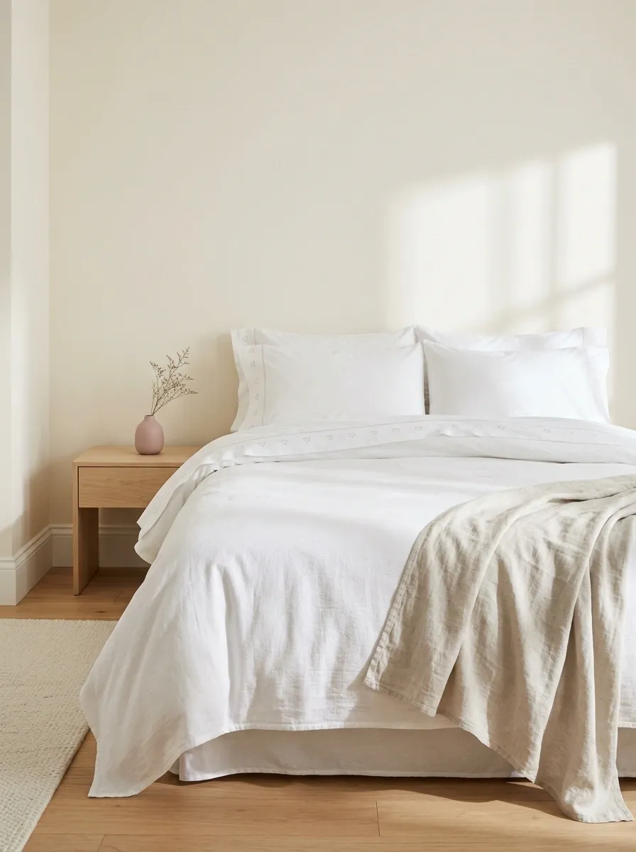
Tiny embroidered hearts add personality to white bedding without covering the entire bed in a print. Crisp cotton sheets, a subtle heart motif on the duvet or pillowcases, and a textured white coverlet make the setup feel clean and quietly playful. Pale wood furniture and warm ivory walls keep the room from feeling too stark, while a single muted pink accessory adds just enough color.
This is the understated choice for anyone who likes cute details but doesn’t want a bedroom that looks permanently ready for Valentine’s Day. Look for embroidery that stands out through texture rather than oversized color. Keep the rest of the bed simple, because small details lose their charm when they have to compete with a dozen other decorations.
THE QUIET CUTE LOOK
White bedding, with a little secret.
♡ ♡ ♡
Tiny embroidered details
Small motifs feel deliberate against a plain cotton background.
Keep the base simple
White sheets and a lightly textured coverlet.
Let details stay small
A muted pink accent is plenty. The hearts have already clocked in.
Peach Bedding With Cream and Warm Wood
Peach bedding brings a soft, warm glow to the bedroom without looking overly pink or sugary. A peach duvet, creamy pillowcases, and a textured ivory coverlet create a gentle layered look, while warm oak furniture gives the room a natural finish. Pale peach walls can tie everything together, but warm white walls work just as well when the bedroom already gets plenty of sunlight.
The secret is keeping the peach tones related rather than identical. A slightly deeper duvet against lighter cream layers creates more depth than a bed where every fabric matches exactly. Add one small ceramic lamp or a natural woven accent, then call it a day. The room is a bedroom, not a peach-themed product launch.
THE PEACH PALETTE
Warm color, softer layers.
Peach duvet
The warm color that gives the bed its identity.
Cream layers
A lighter break between the peach and the room.
Finish with warm oak
Natural wood adds contrast without introducing another competing color.
Daisy Print Bedding in a Cheerful Yellow-and-White Bedroom
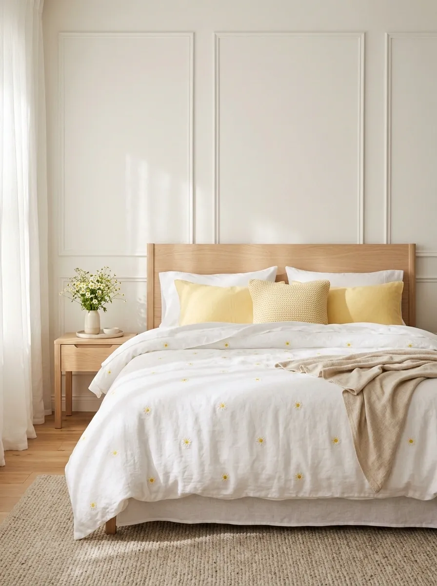
Small daisies scattered across white bedding bring a sunny, playful feel to the entire bedroom. Pair the floral duvet with a few soft yellow pillows, white sheets, and simple pale furniture. Warm sunlight, light curtains, and a small vase of fresh flowers reinforce the cheerful mood without pushing the design into full-on flower-shop territory.
The most important detail is the balance between the print and the solid fabrics. If the daisies are bold and frequent, keep the pillows plain. If the pattern is delicate, a textured yellow cushion can add a little more personality. Let the bedding supply the flowers and the accessories supply the breathing room. Matching every single yellow detail to the duvet is a very committed way to lose the plot.
THE DAISY BEDROOM
A little sunshine goes a long way.
Daisy print
The cheerful focal point.
Solid yellow
A simple color repeat.
Plain white sheets give the flowers space to stand out. More prints are not automatically more personality.
Pastel Pink and Mint Bedding With Clean Color Blocking
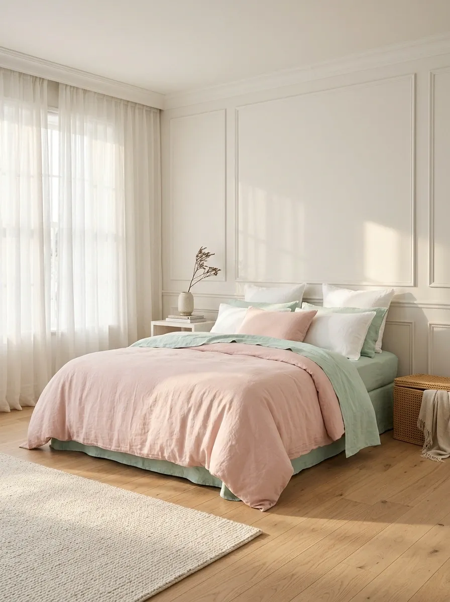
Pink and mint make a refreshing alternative to the usual all-pink bedroom. A soft pink duvet paired with mint sheets, or the reverse, creates a clear two-color composition. White pillows break up the pastel combination, while streamlined furniture in light wood or white keeps the whole room looking contemporary rather than overly sweet.
This design works because the colors are distinct but similarly gentle. Choose one as the dominant bedding color and use the other in a smaller area. Equal amounts can work too, provided the rest of the bedroom stays relatively quiet. Adding lavender, butter yellow, peach, and three different floral prints would turn the palette into a pastel group chat where nobody lets anyone else finish a sentence.
THE TWO-COLOR BED
Pick a lead. Give it a supporting color.
Blush pink
Main bedding color
Soft mint
Secondary color
White creates a clean pause
Use white sheets or pillows between the two pastel colors to keep the bed from looking visually crowded.
Moon and Star Bedding With a Deep Midnight Palette
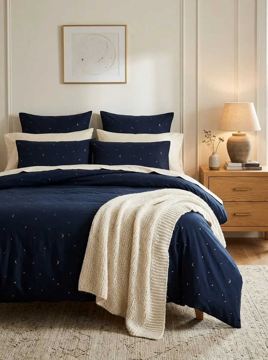
Not every cute bedroom needs to be pale pink. Navy bedding decorated with tiny moons, stars, or celestial motifs creates a dreamy nighttime look with more depth. Cream pillowcases, a soft ivory throw, and warm wood furniture break up the dark color, while bedside lamps cast a gentle glow against the deeper bedding. The result feels whimsical without looking like a child’s bedroom theme set.
Choose a navy base with small, clearly spaced motifs rather than an overwhelmingly busy print. Warm white walls will keep the room from feeling enclosed, especially in a smaller bedroom. A little brass or warm-toned metal can work as a supporting accent, but the celestial theme doesn’t need stars on the lamps, stars on the curtains, and stars on absolutely everything else. The bedding has the night sky covered.
AFTER-DARK BEDDING
Let the navy set the scene.
Midnight navy
Celestial bedding provides the drama and the main pattern.
Warm ivory
Pillows and throws lighten the dark base.
The mood depends on the lighting.
Warm bedside light and natural wood keep navy bedding inviting. Cool, harsh lighting can make the same palette feel flat.
Lilac Floral Bedding With Soft Vintage Details
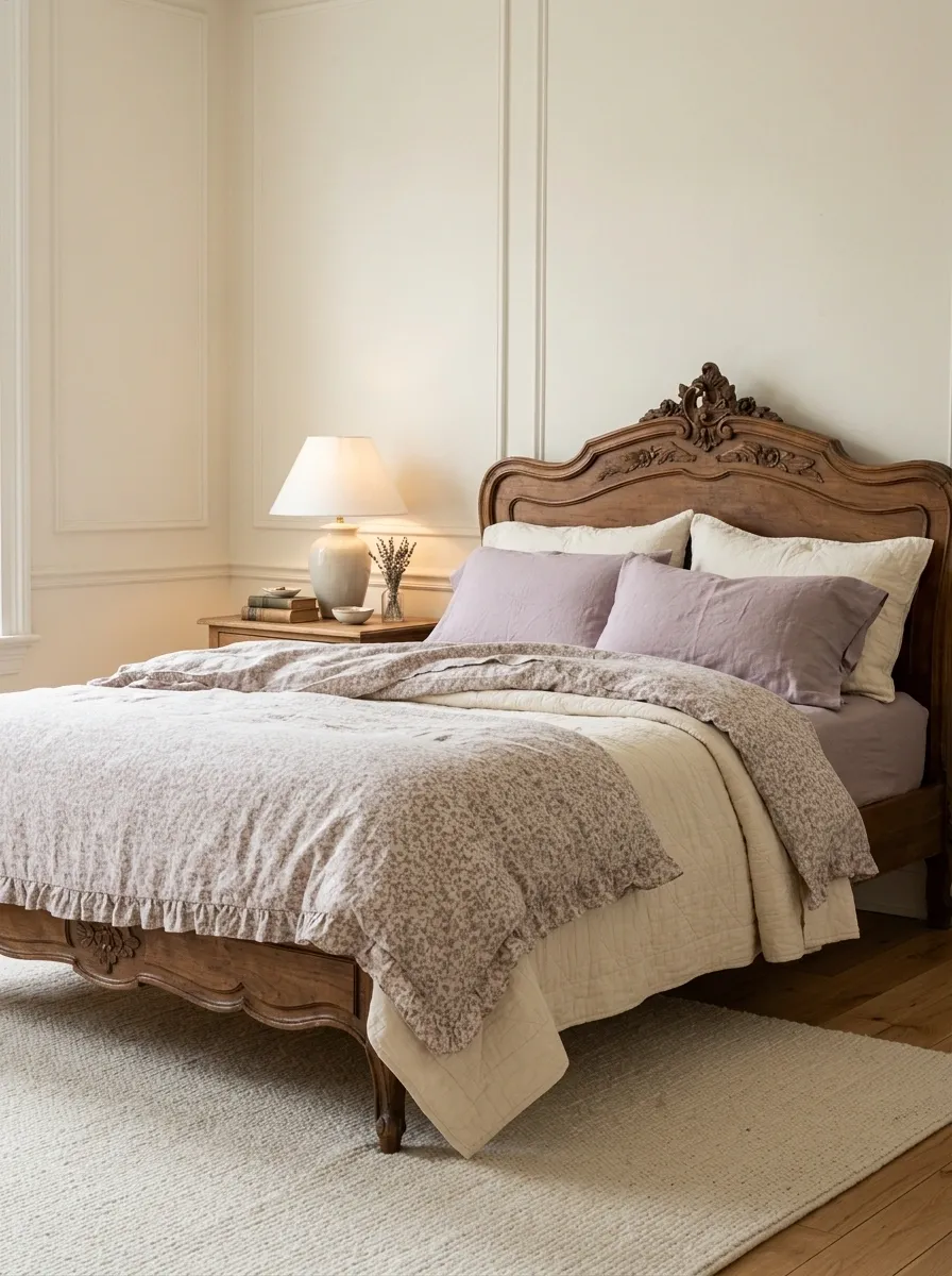
Lilac floral bedding gives a bedroom a romantic vintage mood without relying on the usual blush-pink palette. A small purple floral print, a gently ruffled duvet edge, and plain lilac pillowcases create a layered look against an antique-style wooden bed. Cream walls and soft natural light keep the purple from feeling too heavy, while a simple bedside lamp and a lightly textured rug round out the room.
The most successful versions mix pattern with texture rather than adding more patterns. Let the flowers provide the detail, then use plain fabric and quilting to make the bed feel substantial. Dusty lilac looks especially gentle with warm ivory, while cooler lavender can feel fresher with crisp white. Keep the accessories restrained. The bedroom is aiming for romantic nostalgia, not a period drama with an unlimited costume budget.
THE LILAC LAYER STUDY
Floral pattern, quiet texture.
Lilac florals
A small-scale print gives the bed its vintage character.
Plain lilac
Solid pillows quiet the pattern.
Ivory keeps the finish grounded.
Use cream in the walls, quilt, or curtains. The contrast prevents all the purple layers from blending into one big lilac cloud.
Pastel Patchwork Bedding With a Handmade Cottage Look
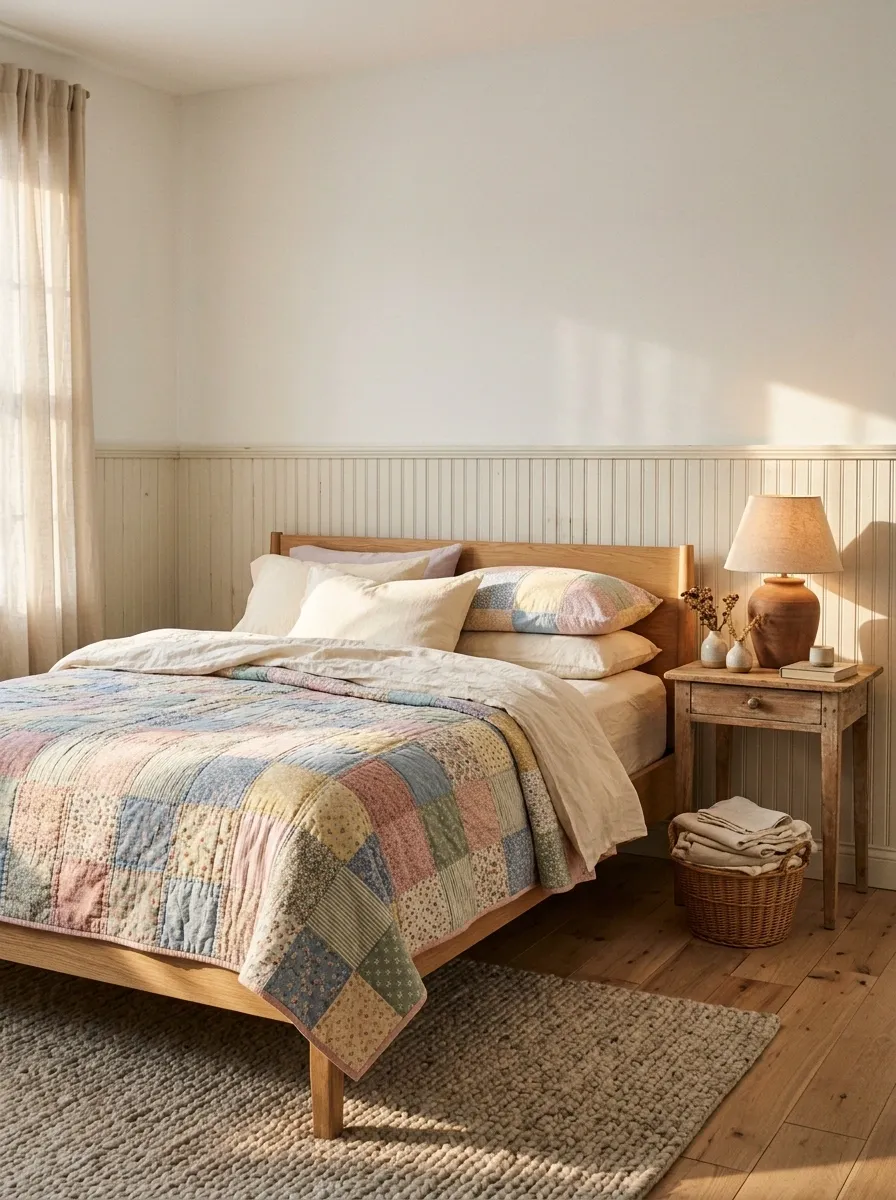
Patchwork bedding brings the charm of a handmade quilt into a bedroom, especially when the squares mix dusty pink, powder blue, butter yellow, and muted green. A soft patchwork coverlet becomes the focal point, while plain cream sheets and a simple wooden bed frame keep the room from feeling too busy. Vintage-inspired bedside tables and a warm table lamp complete the cottage look without making everything look like it came from the same antique shop.
The magic lies in the color balance. Choose a quilt where the shades already feel connected, then repeat just one or two of those colors in the rest of the bedroom. There’s no need to match every square with a different accessory. The quilt has enough going on without the cushions launching their own side quests.
THE PATCHWORK PALETTE
Many little pieces. One connected look.
Let the quilt lead
Use the colors already present in the patchwork rather than introducing unrelated shades.
Keep the sheets quiet
Cream cotton and natural wood give the colorful squares a little breathing room.
Cherry Print Bedding With Crisp White Sheets
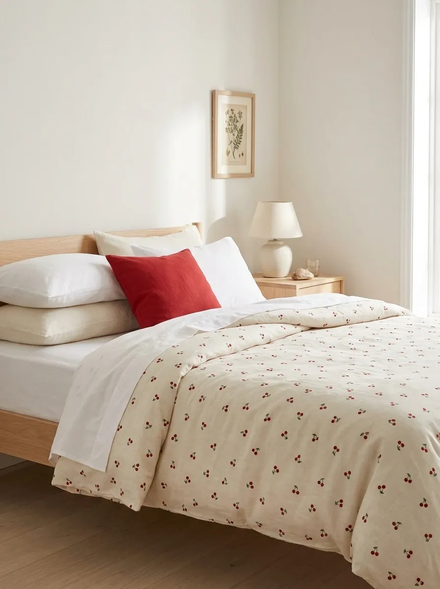
Cherry print bedding has a playful retro charm that feels a little sweeter than ordinary polka dots. Tiny red cherries scattered across a white or cream duvet make the bed the star of the room, while crisp white sheets, pale wood furniture, and a restrained red accent keep the look polished. A simple ceramic lamp or a small framed print can carry the vintage mood without turning the bedroom into a themed diner.
The print works best when red appears elsewhere in small, deliberate doses. A single cushion or a subtle bedside accessory is enough to connect the room. Skip the matching cherry curtains and fruit-shaped decorations unless the goal is to wake up inside a novelty gift shop. The bedding already gets the joke across.
THE CHERRY PRINT RULE
One print. A few smart repeats.
The main act
Cherry motifs on a light duvet keep the pattern fresh and easy to see.
Red accents
Repeat the color once or twice around the room.
White sheets and pale wood are the supporting cast. Nobody needs to wear a cherry costume to make the theme work.
Sky Blue Cloud Bedding in an Airy White Bedroom
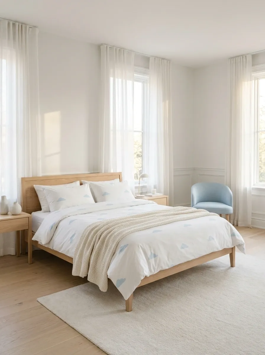
Cloud-print bedding brings a dreamy softness to the bedroom, especially when pale blue motifs float across white cotton. Pair the duvet with white pillowcases, a lightly textured cream throw, and simple white or pale wood furniture. Sheer curtains and natural daylight reinforce the airy look, while a small blue accent elsewhere in the room creates a subtle connection without repeating the cloud pattern everywhere.
The trick is choosing a print that leaves enough white space between the clouds. A crowded design can look juvenile, while spaced-out motifs feel lighter and calmer. Keep the furniture simple and the accessories minimal. The bed can look dreamy without the room becoming a weather forecast with a mattress.
THE AIRY BEDDING EDIT
More breathing room, fewer clouds.
Spaced-out motifs
Small blue clouds with visible white background between them.
White cotton
Keeps the print feeling light.
Warm neutrals
Add softness without another busy pattern.
A little blue goes a long way. The forecast calls for calm, not a 100% chance of decorative clouds.
Dusty Rose Quilted Bedding With Rich Tactile Layers
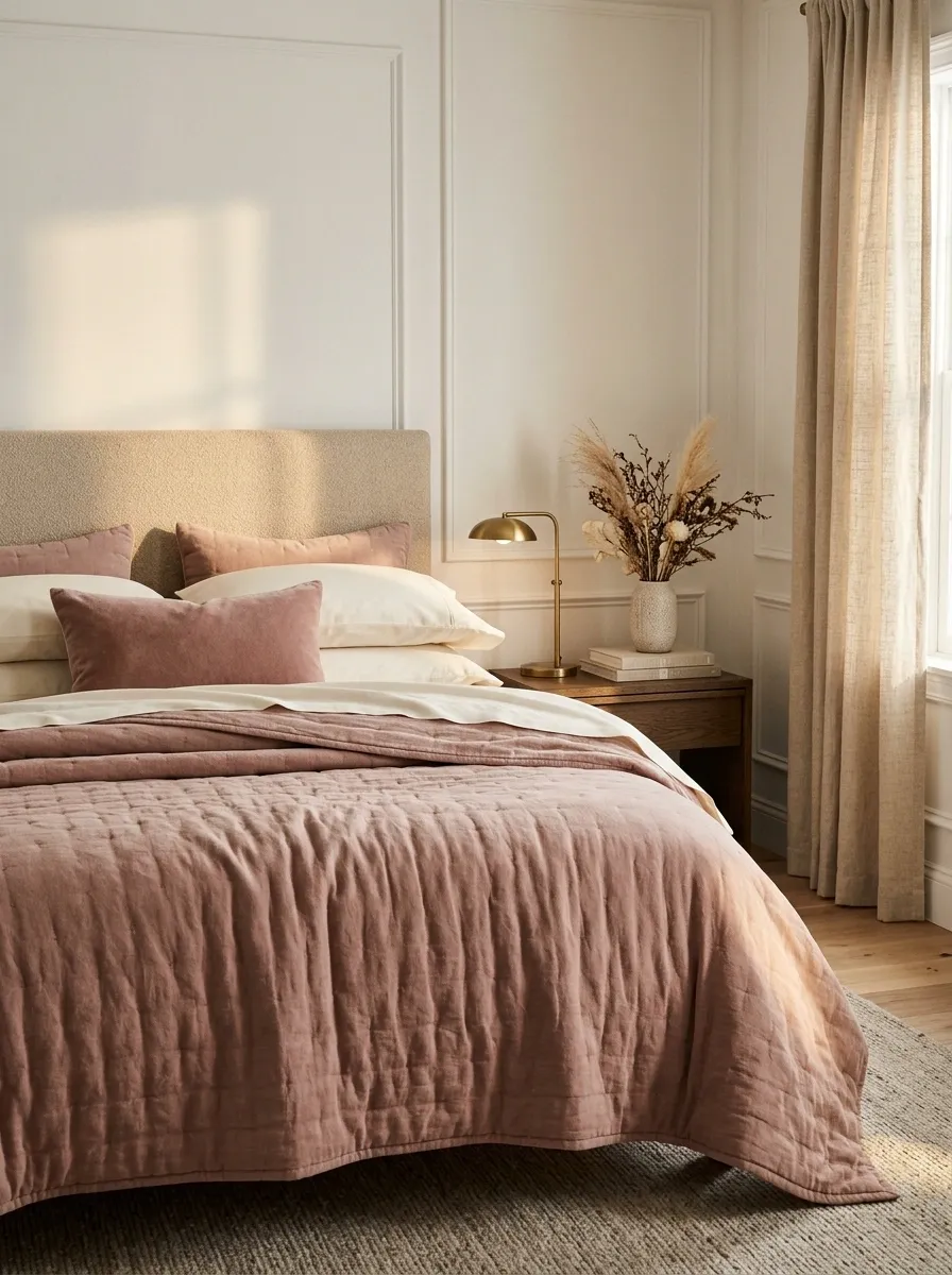
Dusty rose bedding offers a more sophisticated take on cute bedroom styling. A quilted coverlet in muted pink, smooth ivory sheets, and a few softly textured pillows give the bed depth without relying on a loud print. Darker wood furniture adds contrast, while warm white walls and a simple bedside lamp keep the whole composition balanced.
This look depends more on texture than decoration. Quilting creates subtle shadows across the bed, smooth cotton makes a clean contrast, and a velvet-like accent pillow adds a different surface without introducing another color story. Choose dusty rose rather than an overly bright pink if the goal is a relaxed, grown-up finish. The room can be sweet without looking like a cupcake entered the interior design business.
TEXTURE DOES THE TALKING
Same soft palette. Three different surfaces.
Quilted dusty rose
Creates gentle relief and the main color statement.
Smooth ivory cotton
Gives the eye a clean break between textured layers.
Velvety accent
Adds a richer touch without another print.
Teddy Bear Print Bedding With Warm Beige Layers
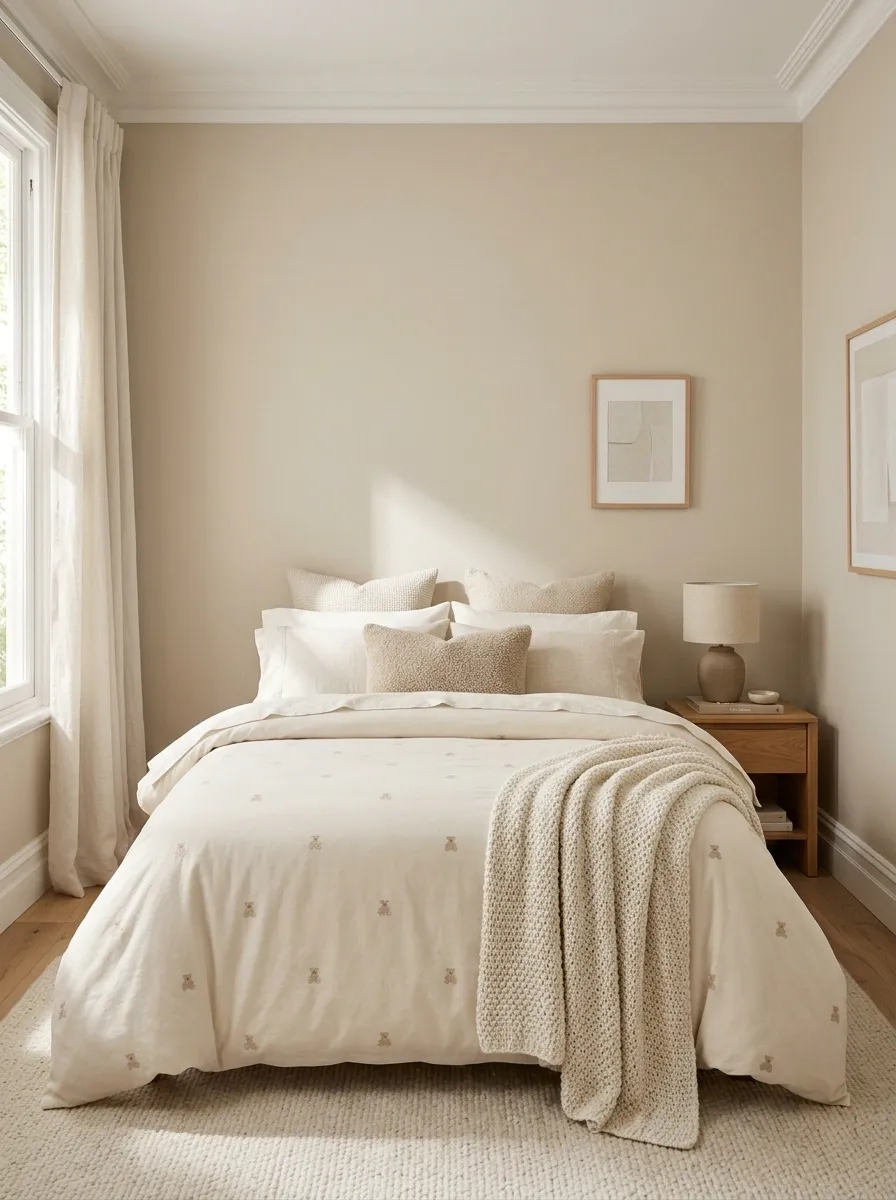
Teddy bear bedding can be playful without making the entire bedroom look like a toy store. Small bear motifs on a beige or cream duvet pair well with plain ivory sheets, warm wood furniture, and soft neutral walls. A textured throw across the foot of the bed adds depth, while one plush cushion can reinforce the theme without competing with the actual bedding.
The key is to keep the colors restrained and the character print relatively small. Beige, oatmeal, and cream create a cohesive backdrop that feels gentle rather than overly childish. If the duvet already features teddy bears, there’s no need to put bears on the curtains, lampshade, and every cushion. The bears have secured the booking. They don’t need the entire bedroom takeover.
THE SOFT CHARACTER LOOK
Cute print. Grown-up color palette.
Beige bear print
Keep the characters small and let the light background show.
Cream layers
Plain sheets and pillows give the print some space.
One plush accent is enough.
Natural wood and soft neutral fabrics make the look feel connected to the whole bedroom. The duvet has already introduced the bears to everyone.
Give Your Favorite Bedding a Bedroom That Matches
The prettiest bedding in the world won’t feel quite right if the rest of the room is pulling in another direction. Before buying more pillows or adding another print, look at the bed as a whole. Choose the color story, decide which fabric deserves the spotlight, and use simpler layers to balance it out. A little contrast in texture often does more than another decorative accessory ever could.
Most importantly, choose a look that makes you happy to see the bedroom at the end of the day. Some people want pink bows and tiny flowers. Others would rather sleep surrounded by crisp stripes or soft neutral layers. There is room for all of it, and thankfully, nobody from the bedding police is coming to inspect the pillow arrangement.