
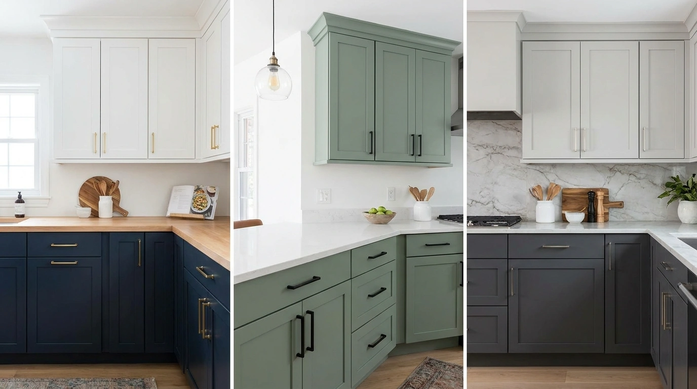
Kitchen cabinet colors rarely look the same across an entire room as they do on a tiny paint chip. A soft green can turn muddy beside the wrong countertop, while a crisp white can make warm wood look oddly orange.
And putting two trendy colors together doesn’t automatically make them friends. Sometimes they just share a kitchen and refuse to speak.
Two colors can look amazing on a swatch and still embarrass themselves in a kitchen.
Kitchen Cabinet Color Combinations
Warm Ivory Uppers With Deep Navy Lower Cabinets
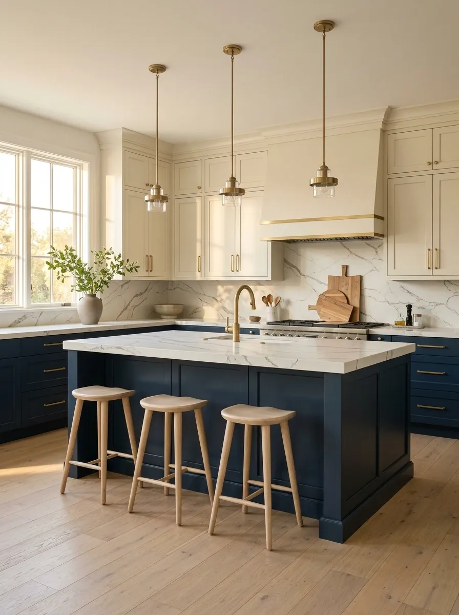
Navy and ivory have the kind of contrast that doesn’t need a dramatic explanation. Warm ivory upper cabinets keep the walls bright, while deep navy lower cabinets give the kitchen a strong foundation. Continue the navy onto a central island to create a connected composition rather than a collection of unrelated cabinets.
Veined marble, brass hardware, and pale flooring soften the dark cabinetry. The result feels traditional without looking like the kitchen has been frozen in a different decade.
This combination works particularly well in kitchens with good natural light, especially when the navy has enough depth to feel rich rather than overly bright. Keep the backsplash relatively quiet. The cabinets have already found their personality.
Sage Green Bases With Warm White Uppers and Oak
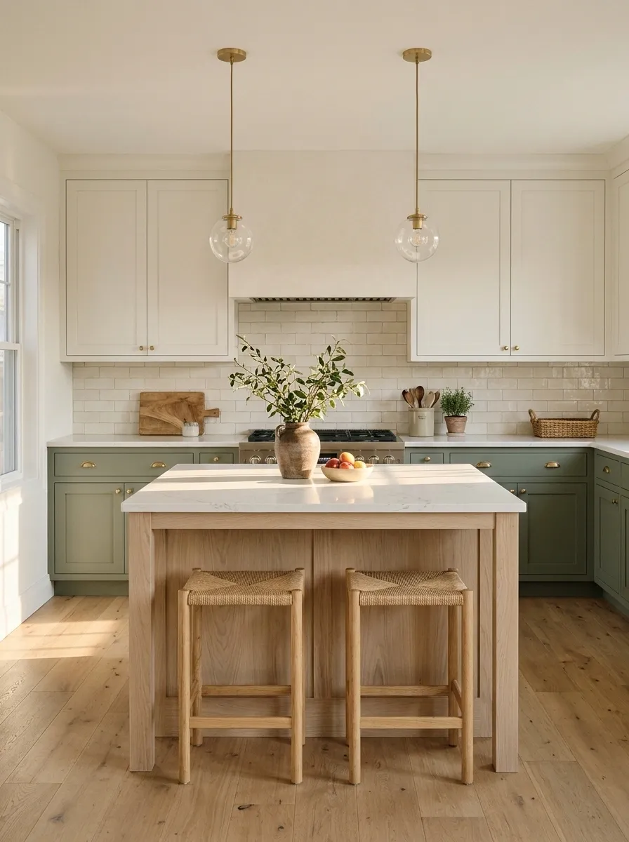
Muted sage green looks especially convincing when it meets natural wood instead of a stack of competing decorative finishes. Sage base cabinets give the working area a grounded color, while warm white uppers stop the room from feeling visually heavy. A pale oak island or oak shelves introduce a grain pattern that makes the painted cabinetry feel less flat.
Finish the composition with handmade-look cream tile, simple pendants, and understated metal hardware. A little variation in the tile surface gives the room character without requiring every corner to become a decorative moment.
The secret is keeping the green muted and the wood warm. Bright green paired with orange-toned timber can become a very different story, and not necessarily one worth pinning.
Forest Green Cabinetry With a Sculptural White Oak Island
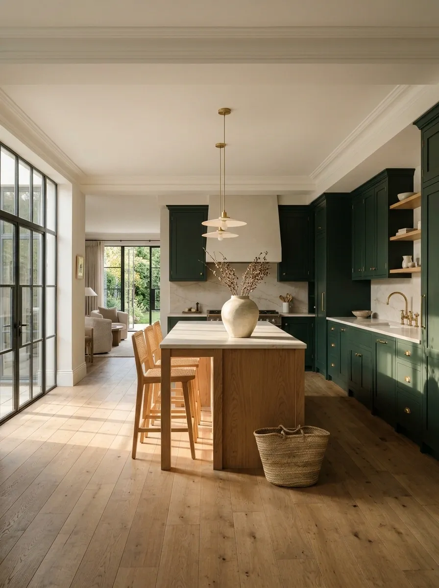
Deep forest green cabinetry gives this kitchen a dramatic perimeter without relying on black. Run the color across the tall pantry cabinets and lower cabinets to create one continuous backdrop. Then introduce a substantial white oak island with a pale stone worktop, so the center of the room feels lighter and more tactile.
The contrast is especially effective in an open-plan kitchen, where the island can connect the cooking area to the dining or living space. Keep the island’s shape simple and allow the wood grain to do its job.
A room this rich doesn’t need a dozen decorative objects. Choose a few useful accessories and give the stone, timber, and cabinetry enough room to speak for themselves.
LIGHT CENTER.
Charcoal Base Cabinets With Bone White Uppers
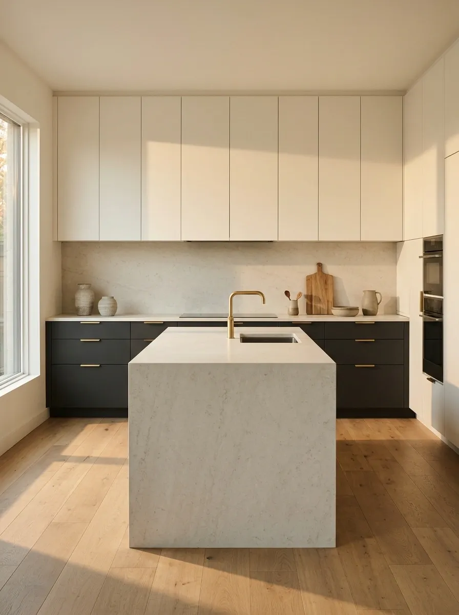
Charcoal and bone white create a sharper, more restrained kitchen than the usual black-and-white combination. Flat-front charcoal base cabinets give the lower half of the room a strong outline. Bone white uppers blend more gently with the walls, while a pale limestone-look island and integrated appliances keep the design visually quiet.
This is a combination that benefits from precise alignment. Continuous cabinet fronts, clean counter edges, and simple hardware matter more than extra decoration. A busy backsplash would interrupt the calm, so a restrained slab or subtle tile finish makes better sense.
The overall effect is crisp without feeling clinical. Warm floorboards or a slightly creamy stone surface can prevent the charcoal from making the room look like it has switched to permanent night mode.
Pale stone connects the dark base to the light upper cabinets.
Dusty Blue Shaker Cabinets With a Cream Island
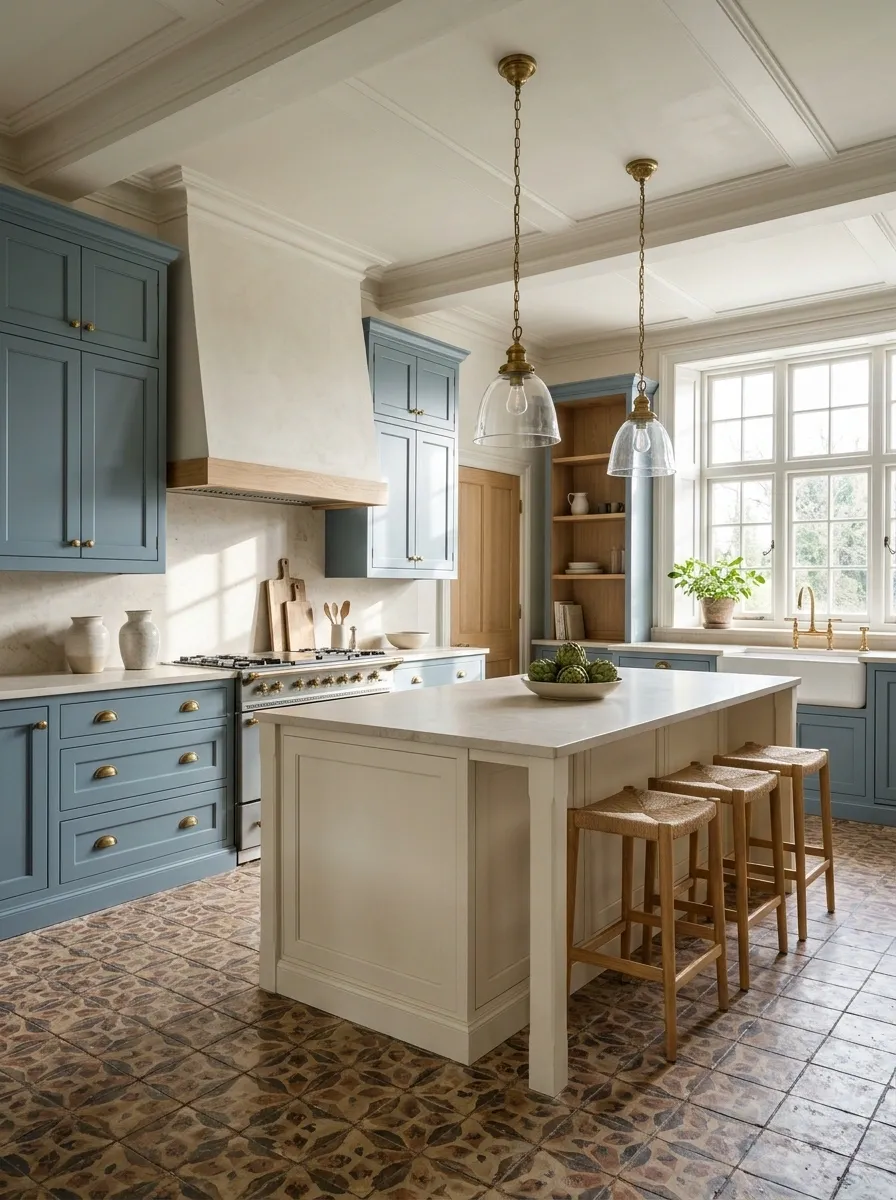
Dusty blue shaker cabinets give the kitchen an established, old-house character without making the room feel dark. The framed cabinet doors bring traditional detail, while a cream island breaks up the blue and creates a lighter center. A warm patterned floor, aged brass hardware, and a pale stone backsplash round out the composition.
The important part is the balance between classic details and quieter surfaces. The shaker doors already provide texture, so the backsplash doesn’t need an elaborate pattern as well. Let the flooring carry any extra visual interest.
This pairing suits kitchens that need a little personality but aren’t trying to look ultra-modern. It also works with traditional windows and simple pendant lights, where the blue cabinetry can feel connected to the rest of the home’s architecture.
Fresh color.
Buttery Yellow Uppers With Deep Olive Green Bases
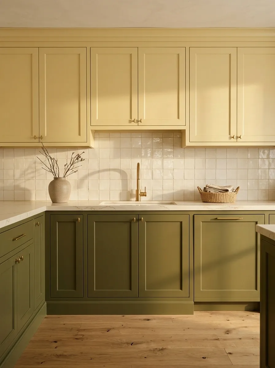
Buttery yellow upper cabinets and deep olive green bases bring color into the kitchen without turning every surface into a paint sample competition. The yellow brightens the wall area, while olive gives the lower cabinets enough depth to anchor the room. Cream backsplash tiles and natural wood flooring keep the two shades connected.
A checked floor and vintage-inspired pendant lights can push the design toward a playful retro look, while simpler flooring and streamlined hardware make it feel more contemporary.
The trick is choosing a softened yellow instead of a sharp lemon shade. The olive should feel earthy, not aggressively green. Otherwise, the kitchen starts looking like a condiment aisle with excellent lighting.
Terracotta Island With Limestone-Colored Perimeter Cabinets
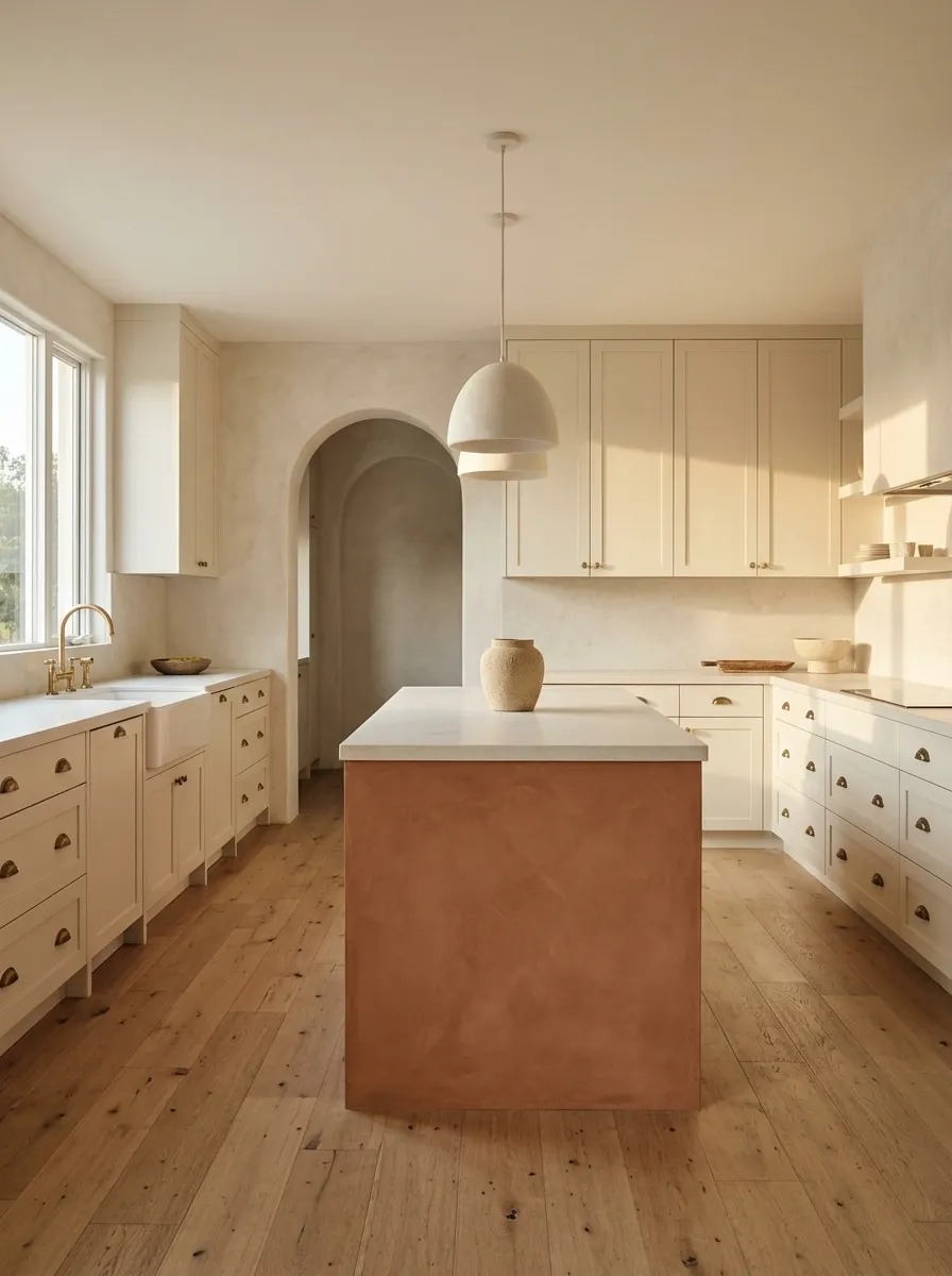
A terracotta island brings the warmth of clay into a kitchen without covering every cabinet in a strong color. Keep the perimeter cabinetry in a soft limestone shade, then repeat natural textures through an oak floor, pale stone countertops, and subtle wood detailing.
The island becomes the natural gathering point, while the quieter perimeter keeps the overall room feeling open. An arched doorway or gently curved pendant can reinforce the Mediterranean character, but the architecture should do the talking. Decorative pottery on every available surface is not a design requirement.
This combination suits homes with warm natural light and materials that lean toward sand, cream, and brown. Choose a muted clay finish rather than an overly bright orange, unless the kitchen has specifically signed up for that level of drama.
Repeat warm, earthy materials around the island so it doesn’t look like an unrelated furniture purchase.
Burgundy Lower Cabinets With Soft Putty Uppers
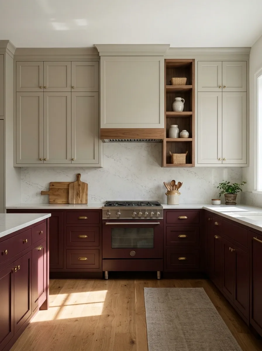
Burgundy cabinetry brings a deep, wine-colored richness that feels distinct from the usual navy or forest green. Place it across the lower cabinets, then use soft putty on the upper cabinets to maintain brightness without introducing a stark white contrast. Walnut details and gently veined stone add texture and a little warmth.
The combination works especially well with traditional cabinet fronts, understated brass hardware, and warm wood floors. In a kitchen with limited natural light, choose a burgundy that has enough warmth to remain inviting instead of reading as nearly black.
Keep other colors restrained. Burgundy already has plenty to say, and it doesn’t need a patterned backsplash trying to finish every sentence for it.
Walnut introduces a warm brown note, while pale stone breaks up the darker cabinetry. Brass hardware adds a restrained finish without turning the kitchen into a jewelry display.
Powder Blue Uppers With Natural Oak Lower Cabinets
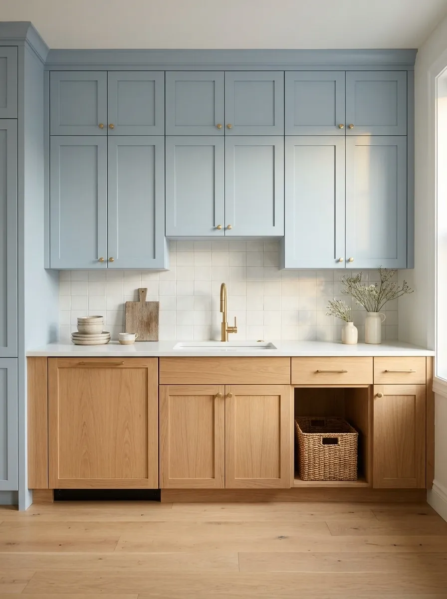
Powder blue upper cabinets paired with natural oak lower cabinets give a kitchen a lighter, more relaxed character than an all-painted scheme. Blue brings a cool note to the wall, while oak introduces visible grain and warmth along the working area. White countertops and a restrained backsplash keep the combination fresh without making it feel overly sweet.
This arrangement is especially useful in an apartment kitchen where a large island isn’t practical. The two finishes create interest along the cabinet run itself, leaving the limited floor area uncluttered.
Choose a subdued blue with a slightly gray undertone and oak that isn’t too orange. The objective is a calm contrast, not a surprise reunion between a nursery and a wooden cabin.
White Oak Base Cabinets With a Charcoal Pantry Wall
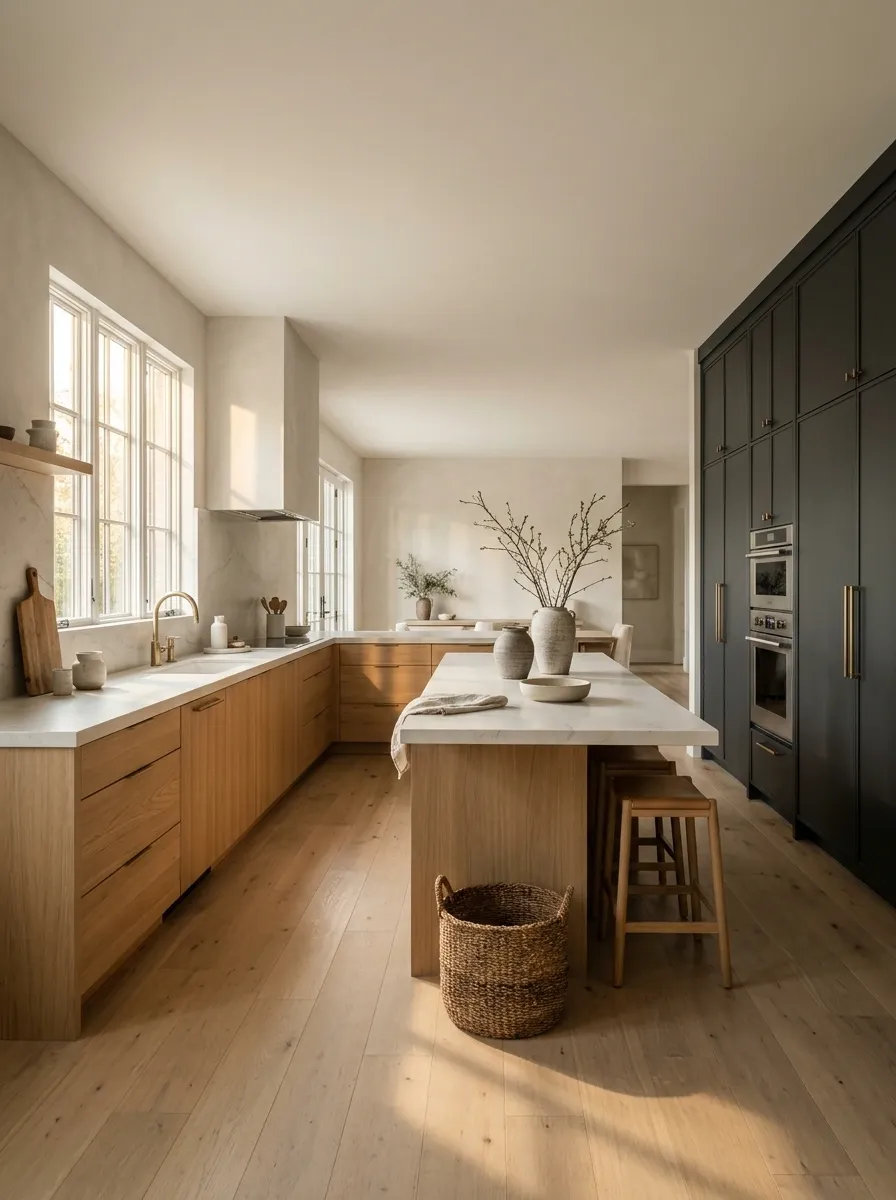
Instead of dividing every cabinet run into two colors, this design concentrates the dark finish in one tall pantry wall. White oak base cabinets carry the main working area, while charcoal storage gives the far side of the kitchen a strong architectural outline. A pale island or light countertop prevents the two zones from feeling disconnected.
The arrangement makes particular sense in an open-plan home. The tall dark cabinetry can define the kitchen without requiring a full wall between the cooking and living areas. It also creates a natural place to group the refrigerator, oven, and pantry storage, depending on the actual layout.
Keep the oak grain consistent and avoid spreading charcoal across every remaining surface. The pantry wall is the statement. Making the entire kitchen dark would defeat the point.
Cream Perimeter Cabinets With an Espresso Island
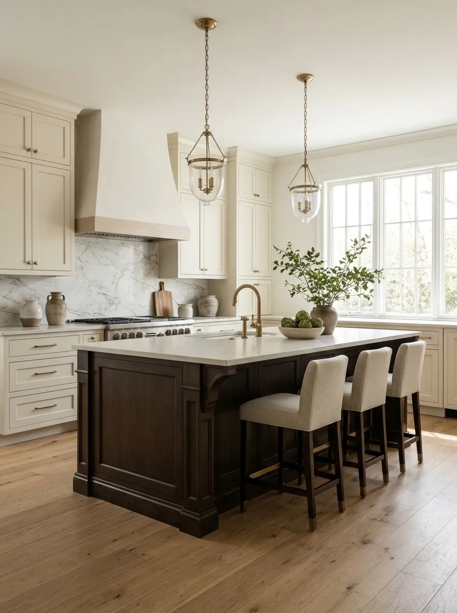
Cream perimeter cabinets and a deep espresso island create the kind of contrast that feels established rather than trendy. The creamy cabinetry keeps the room bright, while the dark island adds visual weight and gives the kitchen a clear center. Warm wood flooring and a veined marble backsplash connect the two tones without introducing another competing color.
Traditional pendant lights, restrained brass hardware, and simple cabinet fronts help the composition feel polished. The island can also take on a furniture-like appearance with decorative end panels and comfortable seating, provided there’s enough room to move around it.
This pairing works best when the espresso reads as a rich brown rather than flat black. The goal is sophisticated contrast, not a kitchen that looks like it has been split into two unrelated properties.
Depth at the center.
Muted Lavender Cabinets With a Walnut Island
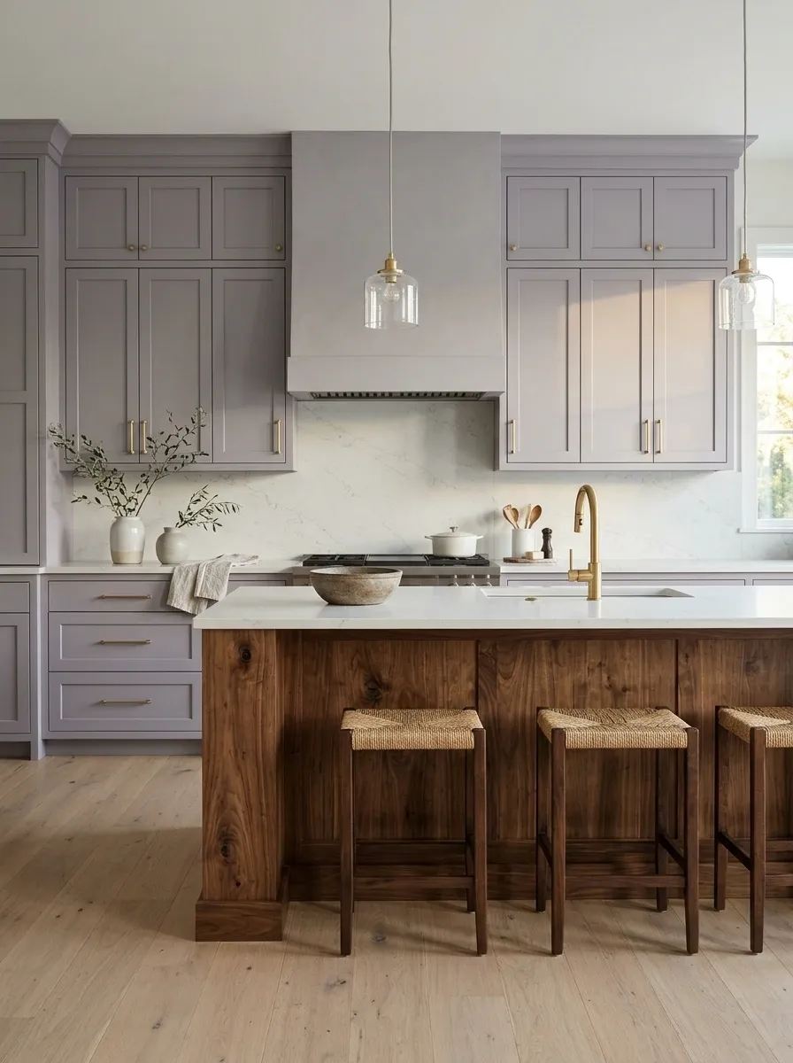
Lavender cabinets don’t need to look like a candy shop had a kitchen renovation budget. The trick is choosing a muted lavender-gray with enough depth to feel sophisticated, then pairing it with a walnut island that brings warmth and natural grain into the room.
Pale stone counters and understated brass fittings create a quiet transition between the cool cabinetry and the richer wood. Simple cabinet fronts keep the unusual color combination grounded, while generous daylight helps reveal the gray undertones in the lavender.
This design suits homeowners who want something more individual than beige but aren’t interested in aggressive color blocking. Keep the surrounding finishes restrained. Lavender, walnut, and stone already make an interesting trio without inviting six more colors to the meeting.
Midnight Blue Cabinets With a Pale Clay Island
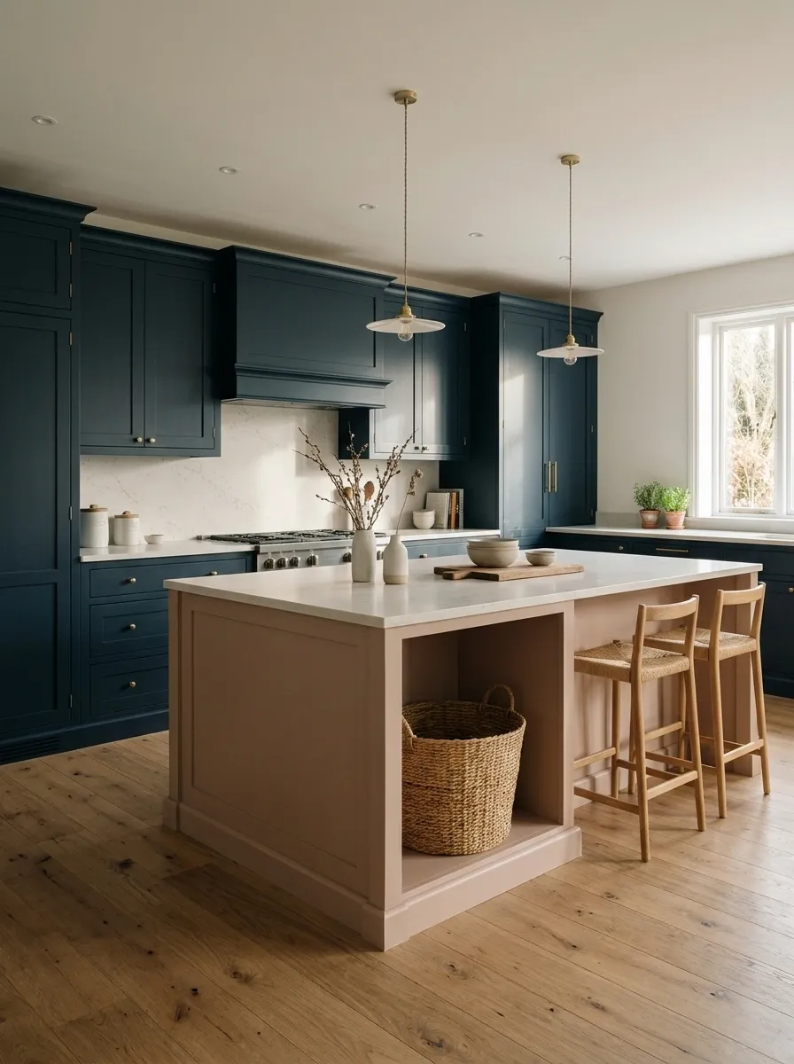
Midnight blue cabinets create a dramatic backdrop, but the pale clay island is what makes this kitchen memorable. Instead of defaulting to a white island, a soft terracotta-pink neutral introduces warmth and gives the center of the room its own identity.
Light oak flooring and understated stone worktops keep the composition from feeling too dark. The perimeter can run across the lower cabinets and tall pantry storage, creating a continuous blue backdrop that makes the island stand out.
The clay finish should be dusty and muted rather than bright peach. That small decision keeps the kitchen contemporary instead of turning it into a color-blocking experiment from a questionable fashion decade. Keep hardware simple so the contrast stays the main attraction.
Warm center.
Warm Cream Bases With Dark Green Upper Cabinets
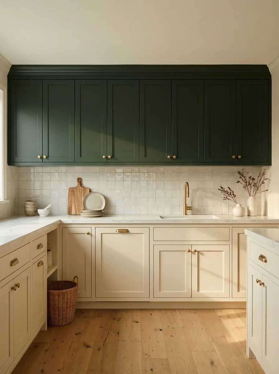
Most two-tone kitchens put the darker color below, so reversing the arrangement instantly gives the room a different feel. Warm cream base cabinets keep the lower half visually light, while dark green upper cabinets form a strong band across the wall.
A pale countertop helps separate the two finishes, and warm wood flooring stops the green from feeling too heavy. The combination works particularly well when the upper cabinets sit against a light backsplash, allowing the dark color to read as a deliberate architectural feature rather than a shadowy patch overhead.
This layout needs a little restraint. Avoid extending dark green onto every nearby wall, especially in a small kitchen with limited daylight. The upper cabinetry already has the attention, and it doesn’t need additional backup dancers.
Warm Taupe Cabinets With an Oxblood Island
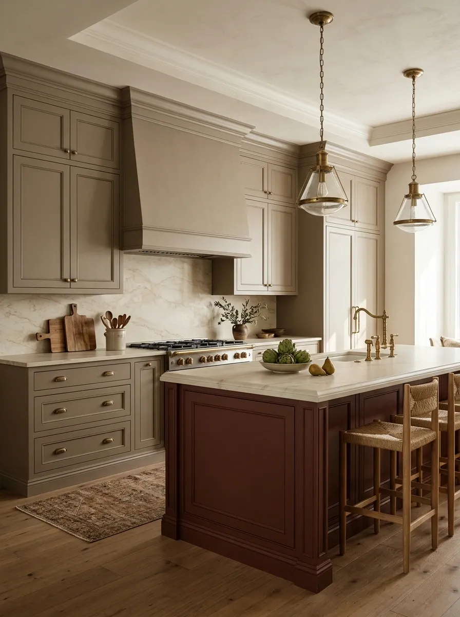
Warm taupe cabinetry creates a quiet foundation for an oxblood island, a deep reddish-brown feature that brings an unexpected richness to a classic kitchen. The perimeter cabinets can use traditional framed doors, while the island introduces a stronger color and a furniture-like presence.
Aged brass hardware, cream stone counters, and oak flooring support the warmer undertones in both cabinet finishes. The island can carry decorative paneling or a substantial stone top, but its shape should remain in proportion to the surrounding cabinetry.
This combination is a strong alternative to the familiar white kitchen with a navy island. It has similar contrast, but the red-brown tone gives the space a more collected, heritage-inspired character. Keep the red subdued. The objective is refined drama, not a kitchen that looks like it lost a bet with a bottle of burgundy paint.
Cobalt Blue Pantry Wall With Oak and Warm White Cabinets
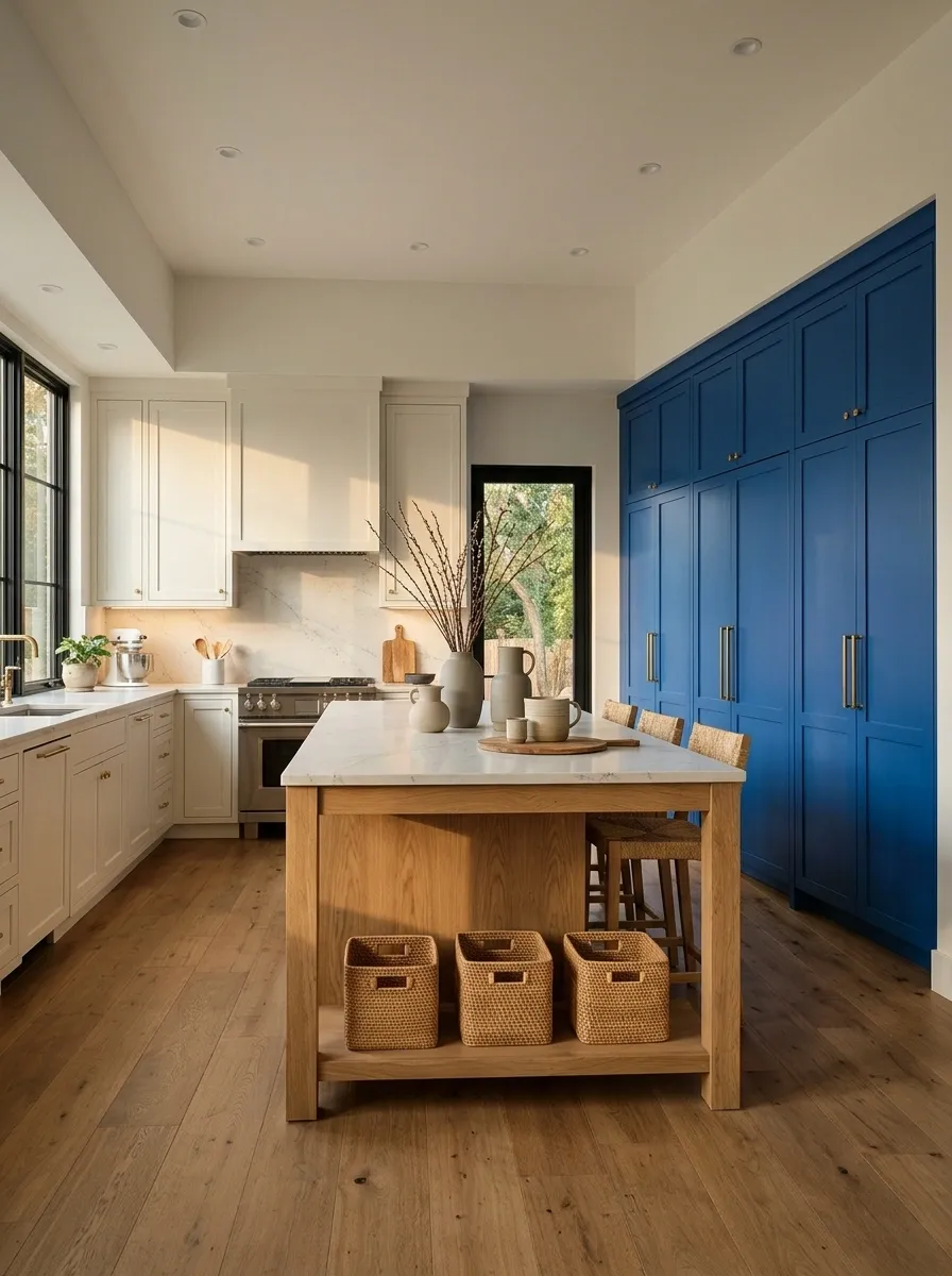
Cobalt blue makes a stronger impression when it’s concentrated in one architectural feature instead of spread across every cabinet. A full-height pantry wall in saturated blue creates a clear focal point, while warm white perimeter cabinets and a natural oak island keep the kitchen from becoming visually overwhelming.
Pale stone countertops provide a quiet transition between the finishes. Integrated appliances help the tall cabinetry read as one continuous surface, and simple lighting keeps the overall composition crisp.
This design suits contemporary homes where a little drama is welcome but an entire room of saturated color feels excessive. Keep the blue concentrated and the surrounding finishes warm. The pantry wall should look like a deliberate design decision, not a blue cupboard that got carried away.
Let the rest breathe.
Dusty Rose Bases With Warm White Uppers and Walnut
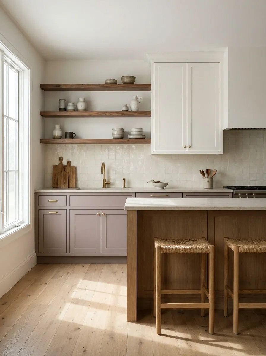
Dusty rose cabinetry introduces pink without making the kitchen feel like a cupcake display. The muted color belongs on the lower cabinets, where warm white uppers keep the walls light and walnut shelves or an oak-toned island add an earthy counterpoint. Cream backsplash tile ties the palette together and keeps the transitions gentle.
Choose a rose with a little brown or gray in its undertone rather than a sugary pastel. That difference gives the cabinetry a more grown-up finish, especially alongside simple hardware and clean cabinet fronts.
This combination suits homes that need color but don’t want another predictable white-and-wood kitchen. Keep the surrounding finishes calm, and let the restrained pink be the unexpected part. There’s no need to add floral wallpaper to make the point.
Cocoa Brown Bases With Off-White Upper Cabinets
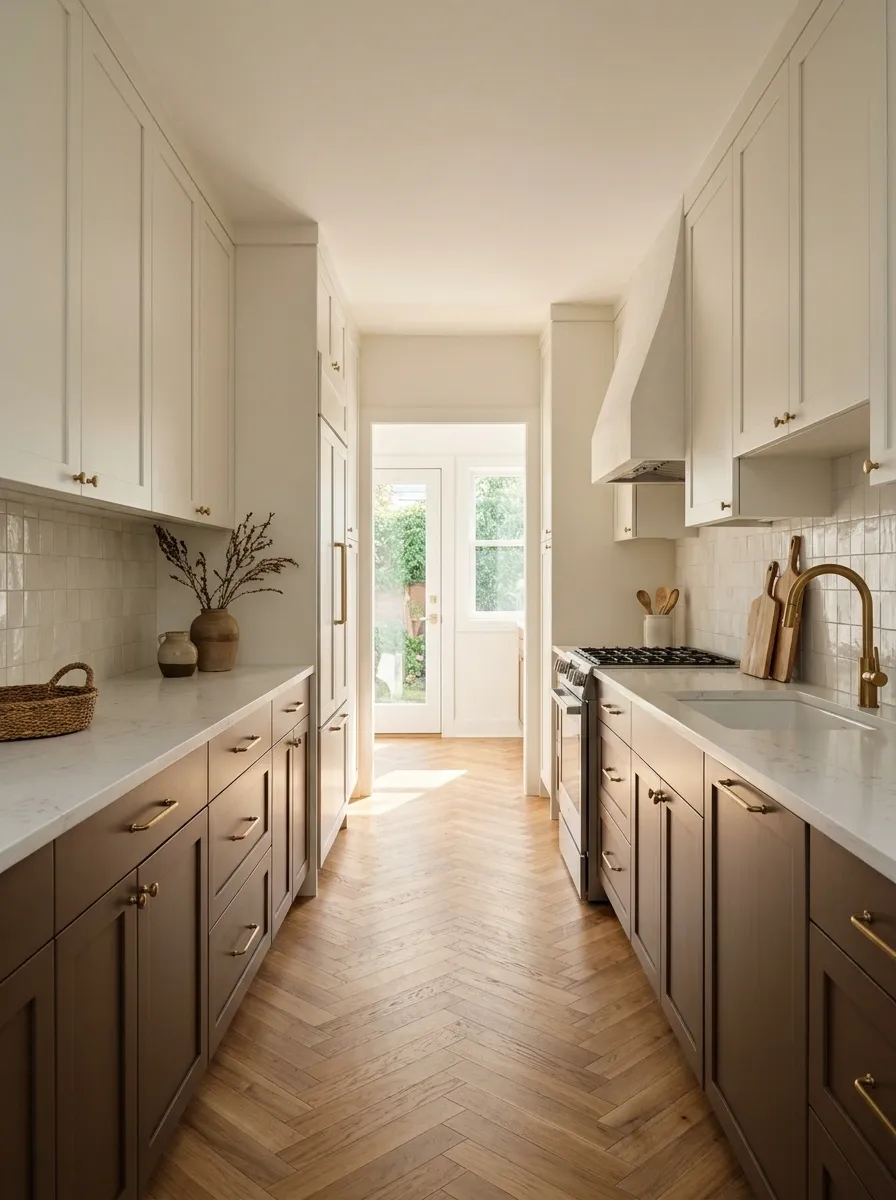
A narrow galley kitchen can benefit from a darker color below, provided the upper half stays visually quiet. Cocoa brown base cabinets create warmth and definition, while off-white uppers blend gently with the walls. A pale counter and a restrained backsplash help the long cabinet runs feel connected instead of turning the walkway into a tunnel.
Natural wood flooring works well here, particularly when its tone complements the brown cabinetry without matching it exactly. Simple fronts and understated hardware keep the design from feeling heavy.
The color split is useful because it gives the kitchen depth without requiring an island or elaborate architectural details. Keep tall dark storage concentrated at one end when possible. A narrow kitchen already has limited space, so the cabinetry doesn’t need to add a visual traffic jam.
Slate Blue Bases With Natural Maple Uppers
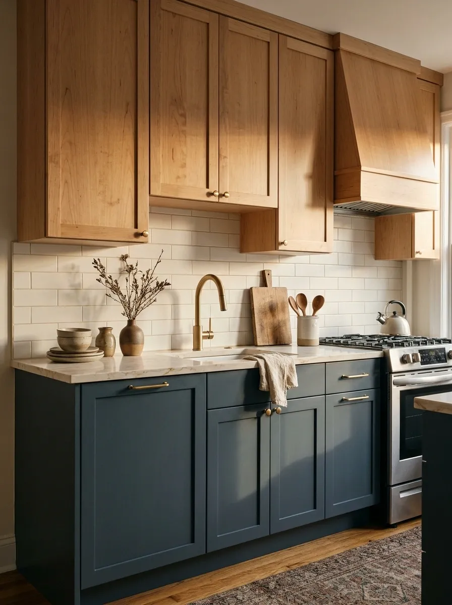
Slate blue and natural maple offer a cleaner, more understated alternative to high-contrast two-tone cabinetry. The blue grounds the lower cabinets, while maple uppers add lightness through their natural grain. Pale stone counters and minimal backsplash tile create a simple transition between the cool painted finish and warm wood.
This pairing works especially well in a small apartment kitchen where a large island would crowd the floor. Instead of relying on extra furniture or decorative objects for interest, the materials themselves create the variation.
Choose a slate blue with a muted, gray undertone and maple that looks natural rather than strongly yellow. The result feels modern but not sterile. A few carefully chosen metal details are enough. The kitchen doesn’t need to accessorize like it’s attending a red-carpet event.
Matte Black Perimeter Cabinets With a Burnt Orange Island
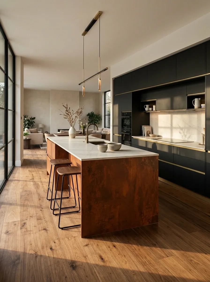
Matte black perimeter cabinets create a strong architectural backdrop for a burnt orange island. The orange introduces warmth and becomes the room’s main focal point, while pale limestone-look counters and walnut flooring soften the contrast. Clean cabinet fronts and discreet hardware keep the composition contemporary rather than industrial.
The island color should lean toward rust or burnt clay, not a bright traffic-cone orange. That warmer, deeper tone sits more comfortably beside black cabinetry and natural materials. A simple pendant arrangement can define the island without filling the ceiling with visual clutter.
This combination suits a kitchen with enough daylight and a fairly open layout. In a compact or dim room, use black selectively and keep more of the surrounding surfaces light. Drama is welcome. Accidentally designing a cave is less useful.
Burnt orange center.
Choosing a Cabinet Palette That Works Beyond the Mood Board
A kitchen palette needs to work under morning sunlight, evening lighting, and the less glamorous reality of everyday cooking. Before settling on a combination, compare large paint samples against the actual countertop, backsplash, and flooring materials.
Check the colors in the room at different times of day. Undertones that seem subtle in a showroom can become much more noticeable beside a large expanse of stone or wood.
The strongest designs don’t make every finish compete for attention. Pick a clear focal point, use supporting colors with purpose, and leave enough visual breathing room around the main features. A kitchen doesn’t need ten statement finishes to have personality. Two well-chosen cabinet colors and the right supporting materials can do considerably more.
Save the combinations that suit the architecture of your home, then use them as references when comparing actual paint samples and finish materials. Future renovation decisions are much easier when the entire kitchen palette has already been thought through, rather than assembled one expensive surprise at a time.