
There’s something incredibly satisfying about seeing a dining room go from blah to brilliant, especially when the transformation doesn’t require tearing down walls or spending a fortune. The before and after dining rooms below prove that strategic design choices, thoughtful furniture swaps, and smart styling can completely change how a space feels and functions. From adding dramatic dark walls to embracing warm vintage vibes, these makeovers show what’s possible when you’re willing to take some risks and trust your vision.
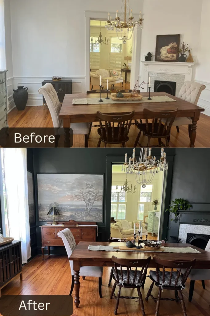
This dining room makeover proves that going dark can actually make a space feel more inviting rather than smaller. u/strider_1456 went with charcoal gray walls that create such a dramatic, sophisticated backdrop—the room went from safe and neutral to bold and intentional. Pairing that deep color with white wainscoting breaks up the darkness while adding architectural interest.
The swap from a traditional farmhouse table to one with cleaner lines and vintage appeal shows how furniture changes can completely shift a room’s style. Those mismatched wooden chairs add character and that collected-over-time aesthetic that feels way more interesting than a matching set. The oversized landscape artwork above the sideboard becomes an absolute focal point against those dark walls. That vintage crystal chandelier was kept but feels completely different now—it reads as glamorous and intentional. The glimpse into the adjoining yellow room creates beautiful color contrast and shows confidence in bold design choices throughout the home.
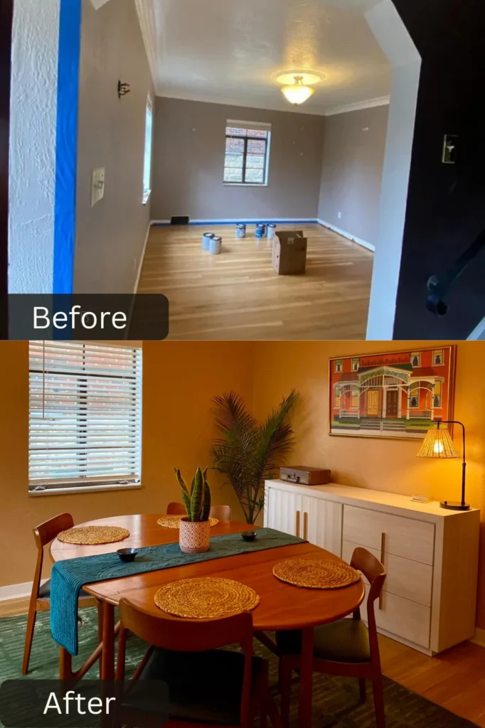
This dining room went from generic rental vibes to curated vintage charm with some seriously smart choices. u/StatisticianWhich461 chose warm golden yellow walls that create such an inviting, sunset-like glow—the space feels cozy and welcoming rather than cold and utilitarian. The round teak dining table is such an upgrade from typical rectangular options, it softens the space and has that perfect mid-century modern feel.
Those mustard yellow woven placemats echo the wall color and add texture, while the teal table runner provides gorgeous complementary color contrast. The mix of plants throughout, especially that statement palm, brings life and organic shapes that balance all the hard edges. The colorful architectural print adds personality and ties together the warm and cool tones beautifully. The white sideboard provides essential storage while keeping things feeling bright. That modern black task lamp adds functional lighting and contemporary edge. This makeover shows how color confidence and thrifted vintage finds can create something truly special on a budget.
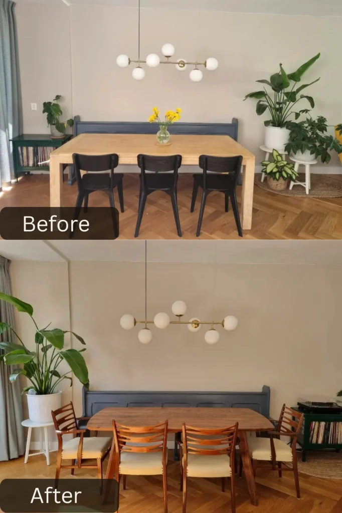
This dining room transformation shows how adding custom elements can completely elevate a space. u/Euphoric_Rough2709 built a charcoal blue bench right into the wall that’s such a smart addition—it provides seating without taking up floor space with chair legs, makes the room feel more finished, and adds a pop of saturated color. The simple horizontal slat detail creates architectural interest where there was none before.
The light wood dining table keeps things feeling modern and Scandinavian, and its clean lines let that custom bench be the star. Mixing the bench with modern black chairs on the opposite side creates visual interest. That modern globe chandelier is such an upgrade, its sculptural quality adds so much personality. The soft blush walls create warmth without being too bold, and they make that blue bench pop even more beautifully. The jute area rug adds natural texture that grounds the space, and those woven placemats echo that organic material palette. The trailing plants bring in greenery at multiple heights. This transformation proves that sometimes one bold custom element can anchor an entire successful redesign.
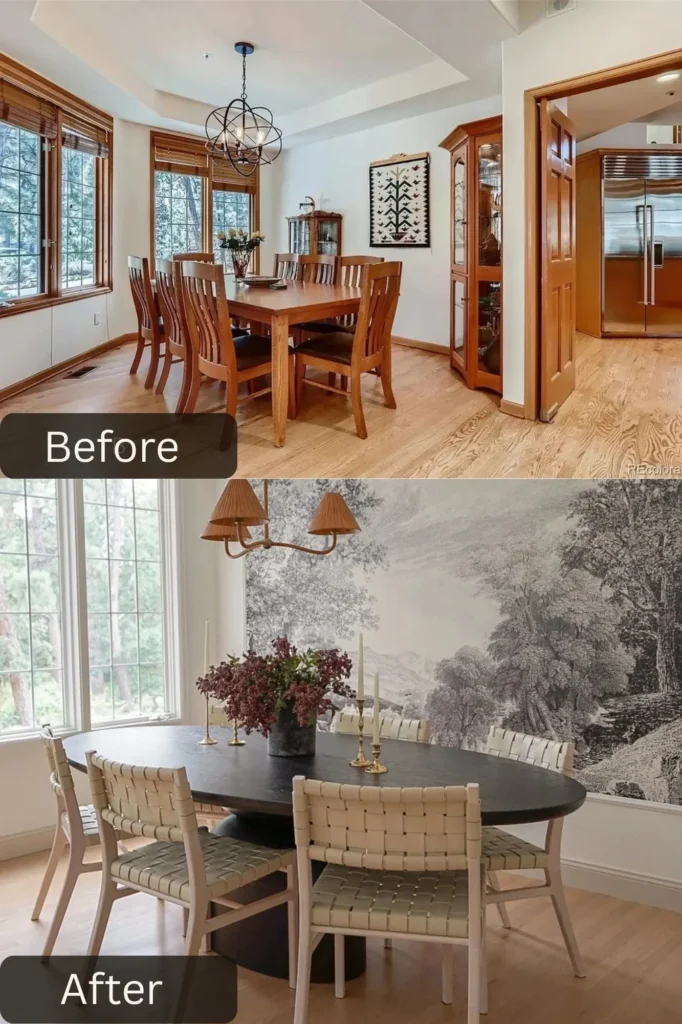
This dining room renovation went absolutely all-in on drama, and the result is museum-worthy. u/Halcyon-Haus created a hand-painted monochromatic landscape mural covering an entire wall that’s just breathtaking—it makes the dining room feel like a curated gallery space. The misty, atmospheric quality adds depth and makes the room feel larger rather than closed in. Pairing that with white painted trim and warm wood floors creates perfect balance.
The round black dining table is such a statement piece with its sculptural base—it feels modern and sophisticated while being organic enough not to feel cold. Those woven leather dining chairs in natural tones are absolutely gorgeous, they add warmth and texture that prevents the black-and-white palette from feeling too stark. The vintage brass candlesticks and natural floral arrangement add organic touches that humanize the dramatic design. The simple wall sconce provides ambient lighting that highlights the mural beautifully. This transformation shows incredible confidence in committing to a vision and proves that murals don’t have to be colorful or whimsical to make major impact.
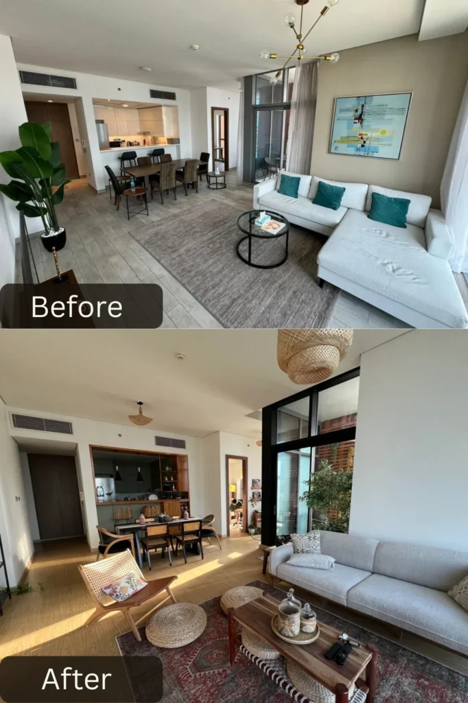
This open-concept transformation shows how to create cohesive flow between living and dining zones. u/Sarahcastic13 shifted from cool gray modern minimalism to warm bohemian layering that completely changed the energy of the space. That vintage Persian rug in rust and cream tones anchors the living area and brings in so much warmth and pattern. The natural woven lounge chair and wood coffee table add organic textures that make the space feel collected and lived-in rather than showroom-perfect.
The dining area keeps the black chairs but adds warmth with woven placemats and natural accessories. The way plants are incorporated throughout at varying heights creates such a lush, alive feeling. The neutral sectional was kept but styled with jewel-toned pillows that pick up colors from that gorgeous rug. The tall natural palm adds drama and connects floor to ceiling visually. This makeover proves that you don’t always need to replace everything—sometimes it’s about adding layers of texture, warmth, and personality through rugs, plants, and accessories that completely shift the vibe.
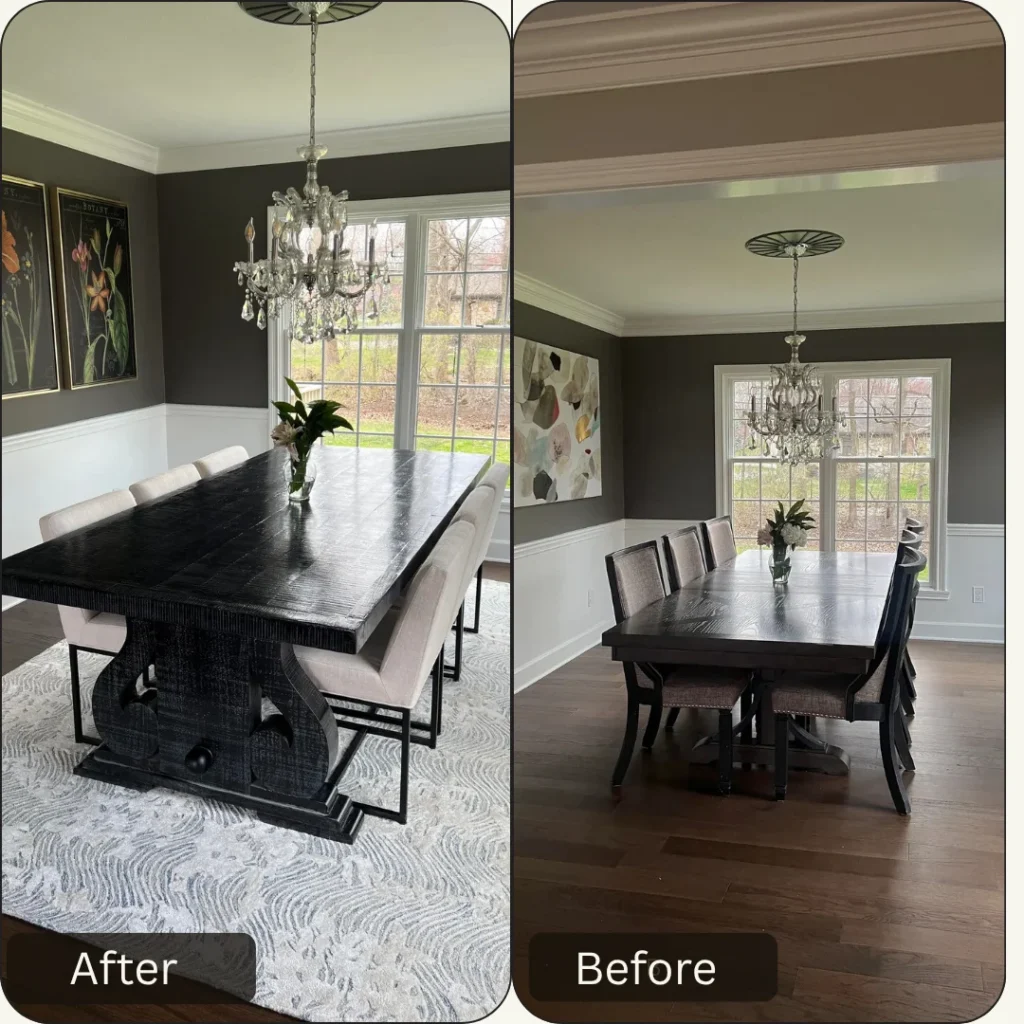
This transformation shows the power of committing to a dramatic furniture piece and building around it. This homo sapien in r/HomeDecorating brought in a sculptural black dining table with a heavily textured base that’s an absolute showstopper—it reads as art furniture and immediately elevates the entire space. The dramatic scale and organic texture create such a focal point that everything else can stay relatively simple. Pairing it with those cream upholstered dining chairs creates beautiful contrast while keeping things sophisticated.
The charcoal gray walls with white wainscoting add architectural detail and create that classic two-tone look that feels both traditional and contemporary. The change from dark wood floors to that gorgeous abstract area rug in grays and creams adds softness underfoot and defines the dining zone beautifully. The vintage crystal chandelier was retained but feels completely refreshed against the new darker walls. The botanical prints on black backgrounds create a gallery wall effect that ties into the moody color palette. This makeover proves that investing in one really incredible statement piece can carry an entire room’s design.
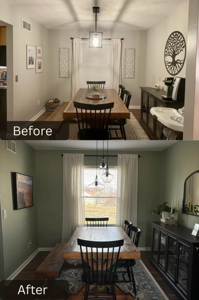
This dining room glow-up shows how the right design choices can completely change a space’s mood. This user in r/HomeDecorating went with soft sage green walls that create such a calming, nature-inspired atmosphere—the dining room feels like a peaceful retreat rather than just a functional eating space. That color works beautifully with the warm wood farmhouse table and brings out the natural tones. The shift from a single pendant to three staggered glass pendants adds so much more visual interest and provides better task lighting for the table.
The marble table runner adds a touch of elegance and modernity that prevents the space from feeling too country-casual. Those black Windsor-style chairs ground the space and add traditional charm without feeling too precious. The vintage Persian rug in muted tones adds pattern and warmth underfoot. The black sideboard provides essential storage and creates a strong horizontal line that anchors the room. The round mirror above adds reflection and light while the framed artwork brings in personality. Removing that large tree of life wall sculpture and replacing it with simpler art made the space feel more grown-up and curated. This transformation proves that sometimes it’s about editing and refining rather than adding more stuff.
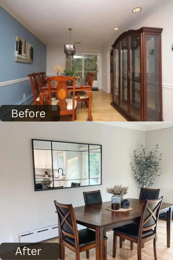
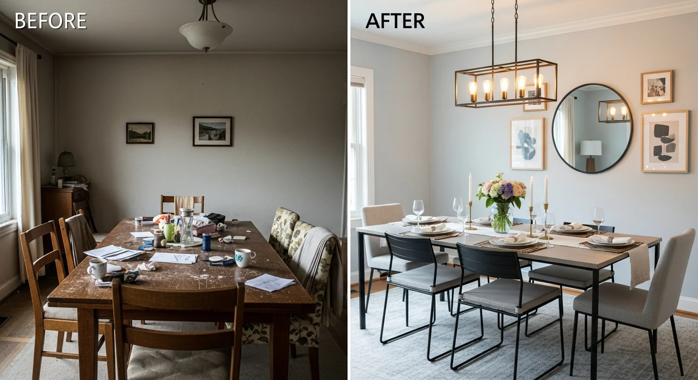
This transformation shows how removing visual clutter can actually make a space feel more interesting. u/bloomfield878 shifted from blue walls with white wainscoting to clean, neutral walls that completely opened up the room and created a more modern, streamlined aesthetic. Removing that massive china cabinet freed up so much visual and physical space, allowing the room to breathe. The simple white low-profile storage cabinet is such a smart swap—it provides function without overwhelming the sightlines.
That oversized black-framed window mirror is absolutely genius, it reflects the adjacent kitchen and creates the illusion of looking into another room while bouncing light around. The square dining table with clean lines feels more contemporary than the traditional round table, and those dark wood chairs with cushioned seats add comfort without fuss. The minimalist styling with just a simple centerpiece arrangement keeps the focus on the clean lines and architectural elements. The neutral beige area rug defines the space without competing for attention. This makeover proves that sometimes the best design move is subtraction rather than addition.
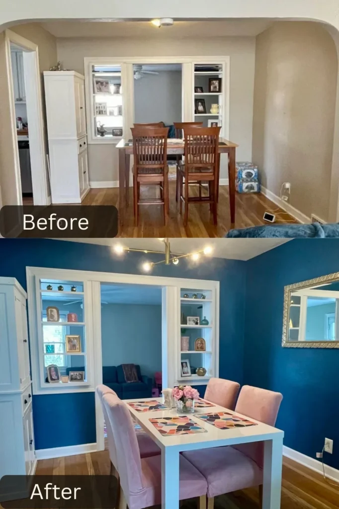
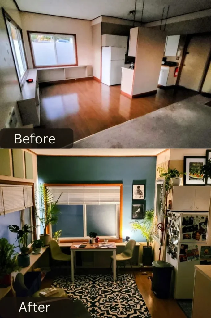
This makeover took a beige pass-through space and turned it into a jewel box dining room with serious personality. u/ktbsquared went with rich peacock blue walls that create such a dramatic, enveloping atmosphere—the energy went from forgettable to memorable. Painting the built-in shelving the same blue makes them feel integrated rather than tacked on, and styling them with personal photos and collected objects adds warmth. That modern track lighting with adjustable heads is such an upgrade from generic overhead fixtures.
The white painted table is a smart neutral choice that lets those gorgeous dusty pink velvet chairs be the stars. The jewel-tone combination of blue walls and pink seating creates such a sophisticated, unexpected color story that feels both bold and elegant. The colorful geometric placemats add pattern and playfulness without overwhelming. The ornate silver mirror adds traditional elegance that plays nicely against the modern color choices. This transformation proves that rental spaces or pass-through dining areas deserve just as much design attention as formal dining rooms, and bold color can work in small spaces when executed with confidence.
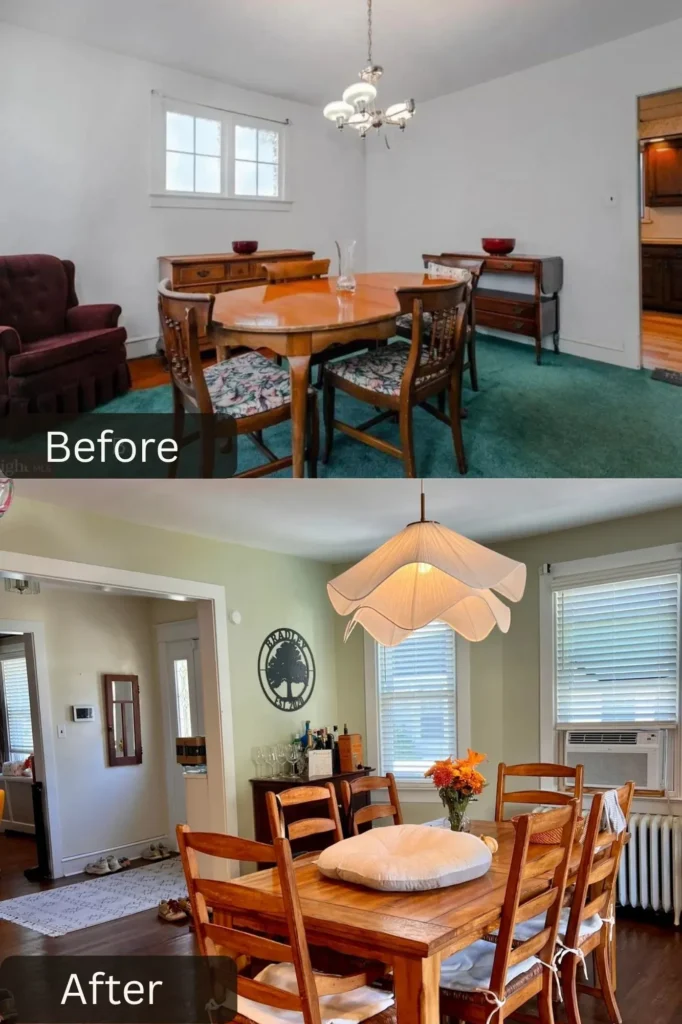
This dining room glow-up shows how strategic updates can completely refresh a space. u/robotdebo chose soft sage green walls that create such a calming, nature-inspired atmosphere. That color works beautifully with the warm wood tones and brings out the natural grain. The swap from a dated chandelier to that stunning white sculptural pendant light is transformative—the organic, petal-like shape adds so much visual interest while feeling contemporary and soft.
The round wooden table was kept but feels completely refreshed in the new context. Those ladder-back dining chairs in warm wood add farmhouse charm without feeling too country. The simple white area rug defines the dining zone and keeps things feeling fresh and clean. The bar cart styled with bottles and glassware adds functionality for entertaining while filling an otherwise empty corner. That circular “Reading is Magical” wall art adds personality and a focal point. This transformation proves that sometimes you don’t need to replace everything, just refresh the context with strategic updates.
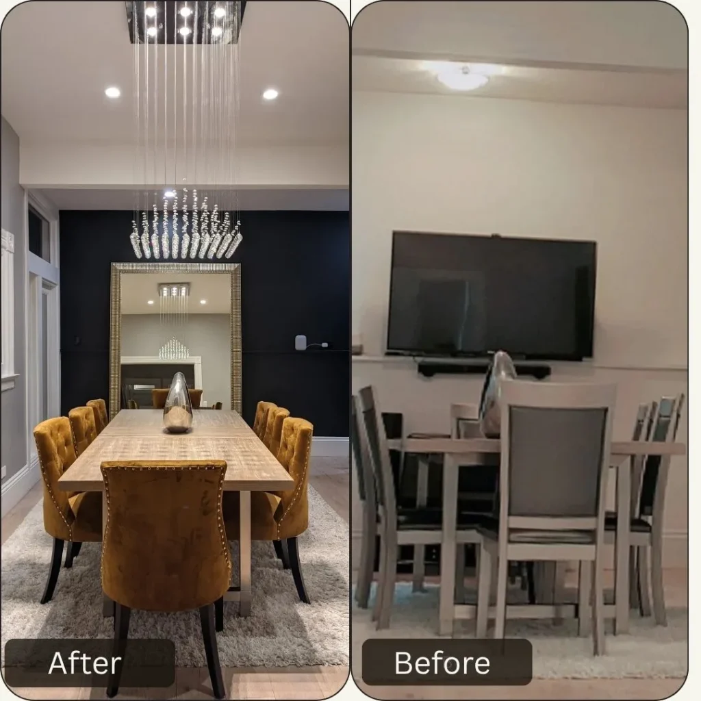
This transformation is pure drama, going from basic builder-grade to Hollywood Regency glam. u/garcelleandsutton went with a matte black accent wall that creates such incredible depth and sophistication—it instantly elevated the space from ordinary to extraordinary. Pairing it with that massive gold-framed mirror creates a focal point that reflects light and makes the room feel twice as large. The mirror-within-mirror effect adds dimension and visual intrigue.
That cascading crystal chandelier is absolutely show-stopping—the way it drops from the ceiling in tiers creates such glamorous, luxurious ambiance. It’s the kind of statement piece that completely transforms a room’s personality. The light wood dining table keeps things from feeling too heavy or dark, and those mustard gold velvet tufted chairs are perfection. The jewel-tone color adds richness while the tufting and nailhead trim bring texture. The plush neutral area rug grounds the space and adds softness that balances all those hard, reflective surfaces. This makeover shows serious design courage, committing to a bold vision and investing in statement pieces.
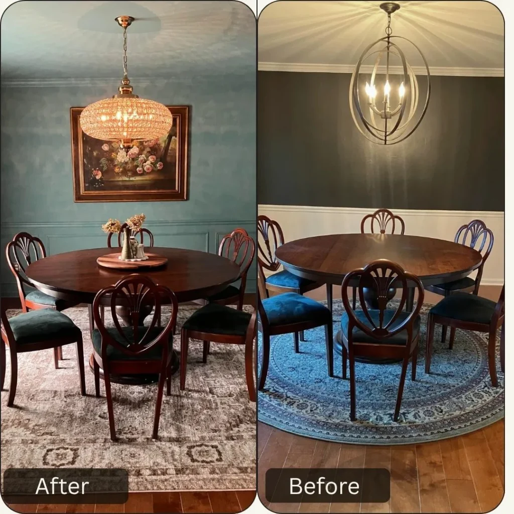
This side-by-side comparison shows how the same dining set can feel completely different with new context. u/kmayellis evolved from lighter teal walls to deeper, moodier teal that creates such a sophisticated, enveloping atmosphere. The darker shade makes the space feel more intimate and intentional, like a designed room rather than just a painted space. The vintage floral oil painting in an ornate frame adds such beautiful traditional elegance against those rich walls.
The swap from a modern orb chandelier to that glamorous crystal bowl chandelier completely shifts the aesthetic from contemporary to vintage-glam. The way light refracts through all those crystals creates magical ambiance. The round wood dining table and shield-back chairs were retained but feel elevated in their new context. The change in area rugs makes a huge difference—moving from a bright blue to a more sophisticated neutral with pattern adds warmth while letting the walls and furniture be the stars. This transformation shows that sometimes evolution rather than revolution creates the most successful makeovers.
This before and after shows what’s possible when you’re willing to embrace color and personality. u/UnfairMicrowave transformed from stark, empty industrial space to vibrant, plant-filled dining area. That rich teal accent wall creates such personality and depth, making the awkward space feel intentional and designed. The way it contrasts with the exposed ceiling and industrial elements creates interesting tension between refined and raw.
The abundance of plants at varying heights brings so much life and organic softness that balances all the hard surfaces. The mix of real and faux plants creates a lush jungle vibe. That bold black and white geometric area rug adds pattern and defines the dining zone, grounding the white table and sage green chairs. The gallery wall of black-framed prints adds personality and visual interest at eye level. The modern green upholstered chairs add comfort and pick up tones from all that greenery. This makeover proves that commitment to color and abundant plants can transform even the most basic spaces.
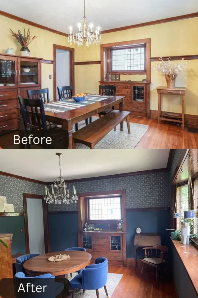
This craftsman dining room went from builder yellow to moody sophisticated, and the result honors the home’s character. u/citresa shifted from bright yellow walls to deep teal with patterned wallpaper on the upper section that creates drama while respecting the traditional two-tone craftsman aesthetic. The dark teal lower walls with that gorgeous William Morris-inspired wallpaper above adds pattern and visual interest while maintaining the chair rail and picture rail details.
The round walnut table was kept but paired with new blue velvet dining chairs that feel both traditional and fresh. The vintage crystal chandelier remains but reads completely differently against the dark walls—now feeling appropriately formal and elegant. The built-in craftsman hutch was retained and works beautifully with the new color scheme. The wooden desk in the corner shows how the space functions for multiple purposes beyond just dining. The vintage rug adds warmth and pattern at floor level. This transformation shows incredible respect for the home’s original character while updating it for contemporary living.
Whether these dining room transformations involved bold color choices, custom built-ins, statement lighting, or just smart furniture swaps, they all prove that these spaces deserve thoughtful design attention. Some went moody and dramatic, others embraced warm vintage vibes, but every single one shows that you don’t need a massive budget or major construction to create a dining room that feels intentional, beautiful, and totally worth showing off.