
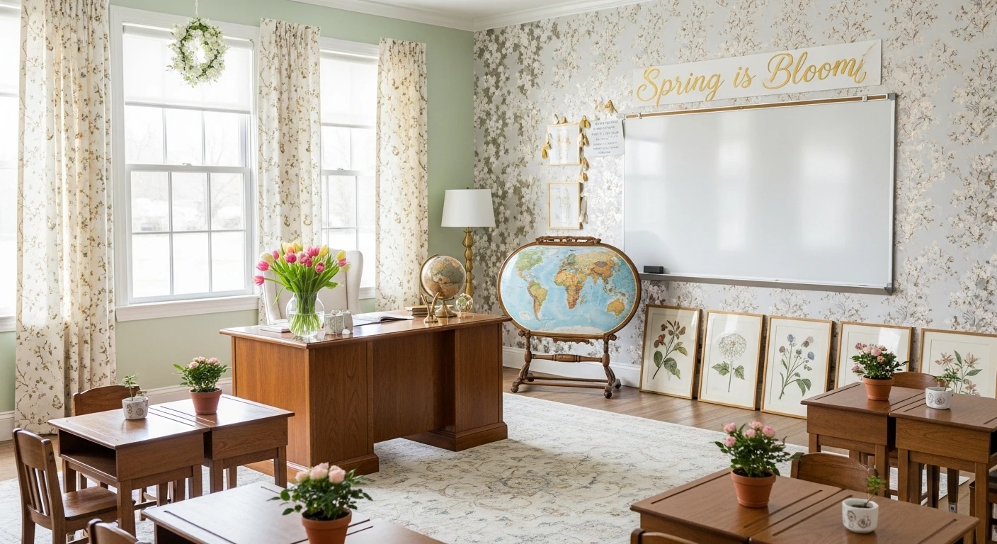
Walk into the average classroom in March and you’ll find one of two things: snowflakes that nobody had the energy to take down, or three paper tulips taped to the board like a seasonal hostage situation. Neither is spring. Neither is acceptable. And yet somehow, every year, teachers across the country look at their beige walls, shrug, and decide that a store-bought “Hello Spring!” banner from the dollar section counts as a seasonal refresh.
It doesn’t. It never did. And your students — who spend more waking hours in your classroom than in their own bedrooms — absolutely notice the difference between a room that was thought about and one that was tolerated into existence.
The good news is that spring is the most generous season for decorators. The color palette basically hands itself to you. The themes write themselves. You don’t need a design background or an unreasonable amount of prep time — you just need to stop treating classroom decor like a checkbox and start treating it like an environment. Environments shape moods. Moods shape learning. And right now, your mood-shaping environment has all the spring energy of a beige filing cabinet.
These six ideas range from five-minute door upgrades to full corner transformations, and every single one of them will make your room feel like a place people actually want to be in — which, given that attendance is always a struggle in April, seems worth the effort.
What Separates Good Classroom Decor from Great Classroom Decor
There’s a reason some decorated classrooms feel genuinely inspiring and others just feel like someone tried. The gap usually comes down to three things that nobody puts in the teacher prep courses.
Dimension beats flat every single time — Paper on a flat wall is the baseline. Paper that sticks out, layers, curls, or casts a shadow is what gets photographed. Your eye is always more interested in something it has to read in three dimensions than something sitting flush against a surface.
Student presence transforms decoration into community — A bulletin board featuring student work, photos, or contributions gets looked at daily. A generic themed display becomes invisible by week two. If your decor includes the people in the room, it earns its wall space permanently.
One strong focal point beats ten scattered ones — Spreading spring energy thinly across every surface produces a room that feels busy but not designed. Pick the door, one bulletin board, and one corner. Make those three things genuinely excellent and leave the rest alone.
The Overgrown Plant Teacher’s Corner
My Classroom
by u/ElTejanoSazonado in interiordecorating
Here’s the thing about piling an antique carved wooden desk with seventeen different species of trailing, climbing, and cascading houseplants directly in front of floor-to-ceiling windows — it should look chaotic and instead it looks like the most intentional design choice in the building. The vintage desk anchors all that green exuberance with genuine weight and character, so instead of reading as “teacher who forgot to throw things away,” it reads as “teacher who clearly has opinions and probably assigns interesting homework.” The dappled sunlight doing its thing across the tile floor isn’t a coincidence either — this setup only works because whoever arranged it understood that natural light is the best styling tool in any room, free of charge. The lace curtain softening the window is the one detail that stops it tipping into greenhouse-catalogue territory. Styling note: This look lives or dies by the quality of the containers — mismatched plastic nursery pots would destroy the whole vibe, so invest in ceramic and terracotta or don’t attempt this at all.
The Motivational Door Quote
“The more you know, the more you grow” has been on approximately forty thousand classroom doors since the beginning of time, and yet somehow this execution manages to not make you immediately tune it out — which is a genuine achievement worth examining. The warm amber background does the unexpected heavy lifting here, because everyone else is working with white or primary colors and this one reads as actually warm and inviting rather than aggressively cheerful. The two-font treatment — bold yellow block letters for the anchor words, playful blue script for the connective tissue — gives the typography enough visual rhythm that your eye reads the whole thing instead of pattern-matching to “motivational poster” and moving on. The paper flower pots at the bottom are doing the grounding work that most door displays completely forget about, giving the composition a visual floor so it doesn’t just float disconnected in the middle of the door. Styling rule: If you’re going to use a quote everyone has seen before, your execution has to be interesting enough that people notice the design before they recognize the words.
The April Showers Door
Navy blue as a background is the first correct decision here — it gives the silver raindrop silhouettes genuine contrast and makes every paper flower color pop at maximum saturation, which a light background simply cannot do. The upside-down umbrella functioning as a vase is the conceptual move that elevates this from “spring door” to “spring door that someone actually thought about,” and the yellow rain boots as flower pots at the bottom close the narrative loop so satisfyingly that the whole thing reads like a finished illustration rather than a collection of themed elements stapled in the same vicinity. Layering the 3D paper flowers at different heights and sizes is what separates this from flat door displays — the dimension makes it look like it took real effort, because it did, and that effort is visible from ten feet away in a crowded hallway. The chalked hand-lettering is what makes this look crafted rather than assembled, and crafted always reads warmer than store-bought in a space meant for children.
The Student Photo Flower Bulletin Board
Putting student photos in the center of paper flowers on a “Watch Us Grow” board is such a straightforward concept that it’s almost embarrassing how much better it performs than everything else competing for wall space — and yet here we are, because obvious ideas executed well always beat clever ideas executed poorly. The rainbow spread of flower colors against sky blue creates the kind of saturated, joyful palette that genuinely belongs in a space designed for children without veering into “we defaulted to primary colors.” More importantly, this is a display that students actively look for themselves in, which means it gets genuine daily attention instead of becoming invisible background noise after the first week of March. The paper butterflies and tiny turtle at the base signal that someone spent real time on this rather than just meeting a decorating requirement — and children notice those details even when they can’t articulate why a display feels cared-for versus merely present. Styling rule: The brown paper pot is doing crucial compositional work at the bottom — without something to anchor it, flowers floating on a blue background is just confusing, so always give your garden something to grow out of.
The 3D Paper Flower Bulletin Board
Most bulletin boards exist to display things. This one exists to be the thing, and that confident shift in purpose is what makes it genuinely striking in a hallway full of flat paper trying to hold attention. The dimensional paper flowers — full peonies, roses, and ranunculus in pink, yellow, white, and mint — are scaled generously enough to read as real design elements rather than craft project additions, which is the line between “cute classroom art” and “actually impressive focal point.” The scalloped teal border against the yellow background is doing classic color theory work, providing contrast that frames the composition without competing with the flowers for dominance. What keeps this from being purely decorative is the grid of pastel sticky-note cards below — functional display space dressed up in the same palette so the whole board reads as one cohesive piece instead of a decorated top half sitting awkwardly above a boring bottom half. Styling note: The paper flowers only work at this scale — attempt this with small flowers on a large board and it’ll look like you ran out of supplies halfway through, which is a very specific kind of sad.
Go Big or Go Home: Floor-to-Ceiling Windows and Daylight Flex

Want to look like you actually care about mood and productivity? Flood your classroom with daylight using absurdly tall windows and slap up sheer linen drapes to soften the glare. Don’t forget the pearl-finished floors—if you’re still rocking standard tile, upgrade to herringbone hardwood for boss-level elegance. Paint huge botanical murals in sage and blush. Built-in oak shelving should show off glass vases packed with whatever blooms are trending. Now, line your ceiling with polished brass task lighting, but for the love of aesthetics, throw in low-glare LED downlights so students don’t fry their retinas. Never let hardware shine harder than your lesson plan, and always hang drapes up to the ceiling to cheat big windows even higher.
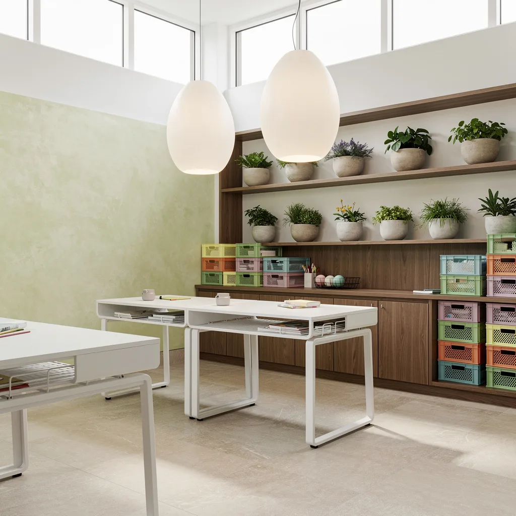
Mint It Up: Terrazzo Floors & Timber Slats for Spring Swagger

Stop pretending terrazzo is just for fancy hotels; pastel inclusions make your classroom cool and springy. Use mint paint to break up rows of timber slats—texture actually matters. Install sliding glass doors and let students spill onto a patio garden for once. Built-in pale birch modular storage means no more ugly baskets or broken bins, plus you can flex with display nooks of artfully arranged foliage. Suspend globe pendants for glow and wall wash your student masterpieces with LED fixtures. Never let storage get cluttered—soft-close hardware saves your sanity.
Blush and Ivy: Pink Plaster and Wildflower Vibes

Want to go bougie without the drama? Drench your classroom in blush Venetian plaster and ribbed white oak panels. Load window ledges with gold-trimmed planters trailing ivy for instant spring cred. Actually use mullioned skylights and recessed fixtures so you’re not squinting in fluorescent haze. White-and-gold modular desks are non-negotiable, and powder blue chairs will make your students feel like legit VIPs. Throw a central rug with pastel wildflowers—anything abstract is less corny. Always make your rug circular in group spaces so you force movement and keep things dynamic.
Go Green or Stay Boring: Bamboo Panels & Living Walls
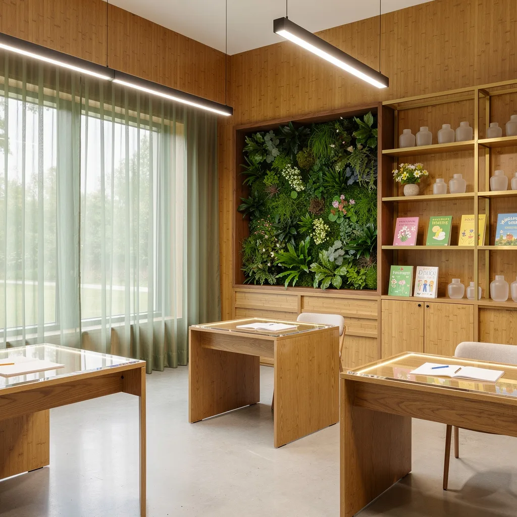
Those old posters aren’t fooling anyone—slap up honey-hued bamboo wall panels and polish your concrete floors for glossy vibes. Frame your corner windows in sage organza for drama, then install a living wall in natural walnut to flex on fake plants. Oak study tables and acrylic writing surfaces scream modern and keep you Instagram-ready. Hang LED pendants but avoid anything blinding. Show off spring materials and frosted glass containers on gold-accented shelves. Never use cheap plastic bins—a little frosted glass goes a long way for style points.
Brick With Benefits: Whitewashed Walls and Moss Rugs

Whitewashed brick walls are your shortcut to spring magic, especially paired with light oak chevron floors that don’t scream ‘janitor chic’. No shame in using generous operable transom windows for airflow and sunshine. Built-in cabinetry with hidden pastel cubbies (robin’s egg blue and pale yellow) is your ticket out of clutter jail. Use no-nail mounting ribbons for seasonal artwork so you don’t destroy the walls every semester. Obsess over moss-green wool rugs for seating—a velvet pile is too extra, but wool is perfect. Style oversized vases with blossoming branches right next to frosted pendant lights for a spring statement. Always display student art at eye level—no one looks up.
Pastel Pistachio: Walls That Actually Feel Like Spring
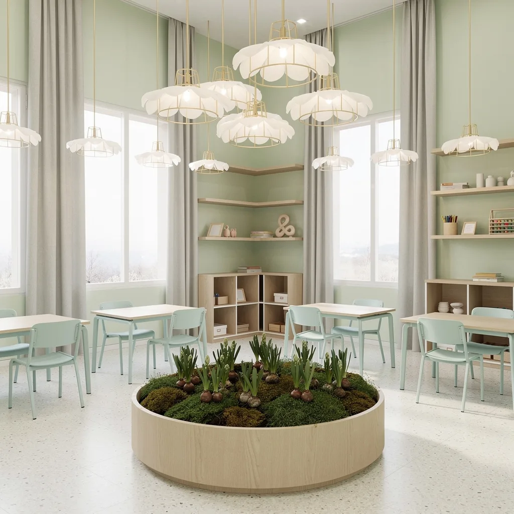
Stop fearing color—pale pistachio walls are your best friend for cheat-code mood lifting. Ivory terrazzo floors bring the drama while staying neutral enough to work with anything. Frame windows in pale grey curtains, floor-length only, and never skimp on floating maple shelves and low modular cubbies so your supplies can breathe. Pair pastel aqua chairs with neutral desks for actual personality. Gold wire-frame pendant lamps with soft shades mimic spring petals without looking like grandma’s parlor. Style a big circular planter full of bulbs and moss right in the middle to keep the vibe living, not fake. Always use plant life as a showstopper—dead corners kill energy.
Ombre Over Ordinary: Pastel Walls and Polished Comfort

If you’re still rocking solid paint, pastel ombre is your escape plan—from pale green to blush, it doesn’t need to match, it just needs to flow. Polished dove grey concrete floors mean easy-clean and subtle luxury. Swing open sliding glass doors to a flower courtyard and act like you’re teaching in a garden. Add acoustic ceiling panels with floral patterns—comfort AND style, shocker. Use custom white laminate desks with terrazzo inlays, and modular storage units that echo your wall ombre. LED strip lighting is mandatory for that soft, not weird, glow. Always throw in pops of lemon and lavender; too much pastel is just washed-out sadness.
Serenity Now: Lacquer Panels and Cloud Vibes

Luxury isn’t a crime—go all-in with white lacquered wall panels and light taupe oak floors. Ribbon clerestory windows diffuse daylight, so nobody’s blinded. Built-in bookcases with frosted glass doors look fancy, especially with brass shelf lighting. Pinboards in cloud gray felt are legit for student expression, and integrated planter boxes full of ferns give you instant ‘living space’ points. Matte white steel furniture and pastel pink accents keep things serene. Adjustable spotlights let you control every corner—never let overhead lights do all the work. Always combine pastel pink with grey for grown-up spring, not kid playroom.
Aqua Dream: Resin Floors and Breezy Panels
If you want a classroom that doesn’t feel like an interrogation room, ditch the basics and use pale aqua resin floors. Add wheat linen wall panels for texture that doesn’t look like carpet remnant. Install an abstract spring bloom mural for flex, and wide casement windows for air and daylight. Streamlined built-in maple desks with gold inline lamps are a must—hard edges belong in kitchens, not classrooms. Style sculptural vases of willow and blossoms on sage wool area rugs, then add sandblasted glass display shelves for a soft glow. Plants belong on surfaces, not just windowsills.
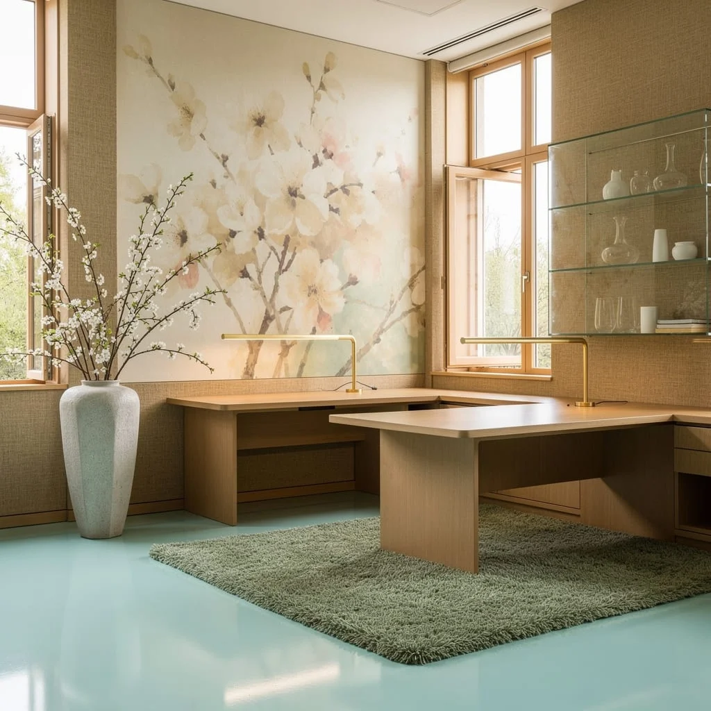
Lavender Luxe: Engineered Floors and Oak Lattice

Nobody’s mad at wide-plank lavender-washed engineered wood floors—they practically whisper ‘spring’. Pair with dove-white plaster walls and cut custom oak latticework for dimension only grown-ups appreciate. Sheer flax curtains floor-to-ceiling are your ticket to light that flatters, not just blinds. Rose gold track lighting is snazzier than chrome and gives you control. Soft blush wool seating is ergonomic, so students can actually focus. Organize everything in ivory benches with pastel inserts and table vases loaded with tulips or daffs. Always match curtain length to window height—short curtains are for bad hotels.
Radiance Rules: White Walls and Limewash Statements
Stress less about ‘perfect’ white walls—grab crisp matte paint, accented with pale lime green limewash, because dull paint is illegal in spring. Go wide-format and sand-colored with porcelain tiles underfoot for actual luxury. Walnut casework and open shelving keep things relevant, especially when you show off greenery in ceramic bowls. White lacquer desks with hidden wire management mean you can lose the messy cables. Hang oversized egg-shaped frosted pendant lights for drama and stack pastel storage crates so spring stays lively. Always hide wire chaos—nothing ruins a good vibe like cords everywhere.
Final Thoughts
Classroom spring decor earns its keep when it does more than signal the season — when it creates an environment that students feel rather than just see. The displays here all share that quality: they’re not wallpaper, they’re atmosphere. And atmosphere is what makes the difference between a room kids shuffle into and one they actually look forward to entering.
None of this requires a craft room, a generous budget, or a free weekend. It requires a concept, commitment to that concept, and the willingness to add dimension where everyone else is settling for flat. Pick one door. Pick one board. Make them genuinely excellent and let the rest of the room follow their lead. Spring only comes around once a year — your classroom might as well act like it.