
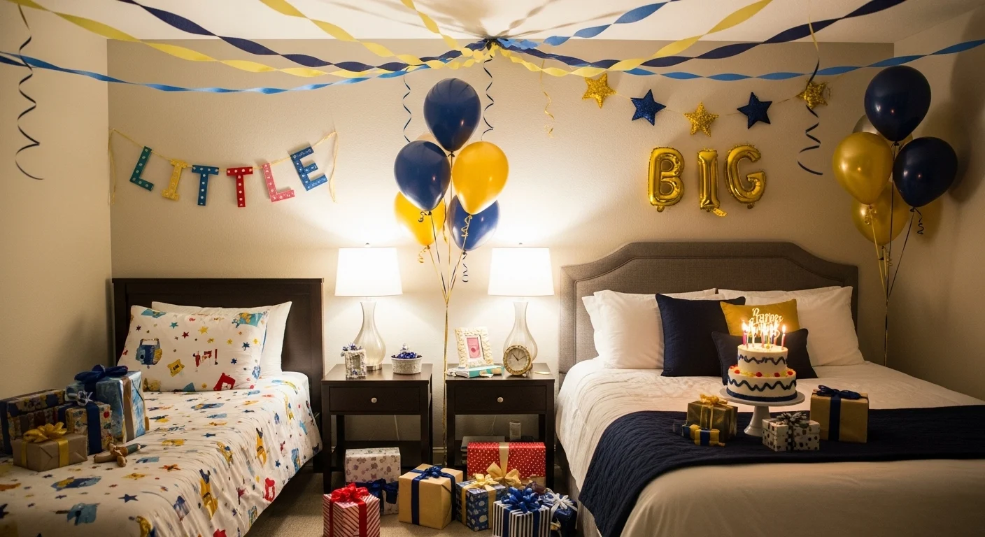
Bid Day is over, your new little has been assigned, and you now have approximately seventy-two hours to transform her dorm room into something that proves you’ve been paying attention to her personality for the past several weeks and not just panic-buying pink things the night before. No pressure. Only her entire first impression of sorority sisterhood riding on your craft skills and balloon budget.
Big little reveal culture has quietly escalated from “leave some gifts on the bed” to full theatrical productions involving custom painted burlap banners, color-coordinated balloon garlands, themed merchandise spreads, and enough personalization to make a new little feel genuinely seen — or alternatively, feel the specific secondhand embarrassment of a banner that misspelled her name. The gap between a reveal that gets screenshotted and shared and one that gets a polite “aww thanks” is entirely in the execution, and execution is exactly what most bigs underestimate until it’s 2am the night before and they’re hot-gluing things they don’t fully understand.
The good news is that big little decor has a formula, and once you understand the formula you can remix it into something that feels personal rather than Pinterest-copied. These eleven setups prove that every sorority’s colors, every little’s personality, and every big’s budget has a version of this that works — and none of them involve the chaotic neutral energy of just throwing confetti on a mattress and hoping for the best.
Why Most Big Little Reveals Miss the Mark
The mistakes aren’t random. Every reveal that lands with a thud instead of happy tears makes the same predictable errors that are entirely avoidable with about twenty minutes of advance thinking.
Generic doesn’t mean safe, it means forgettable — A balloon arch in pink and white is not a reveal, it’s a default. Your little will smile, take a photo, and privately wonder if you Googled “big little decor” at 11pm the night before. Which, if you’re reading this the night before: hello, keep reading, there’s still time.
The banner is the centerpiece and you’re treating it like an afterthought — Every reveal in existence has gifts on the bed. The banner above the bed is what makes it feel personalized versus assembled. A hand-lettered banner with her actual name, a pun based on something specific to her, or your sorority’s visual identity done well — that’s the detail that photographs, gets shared, and gets remembered.
Themes only work if you actually commit — A “strawberry” theme with one strawberry balloon and the rest just pink is not a theme, it’s a suggestion. If you pick a concept, that concept needs to show up in the banner art, the balloon selection, the gift curation, and the color palette simultaneously. Half-committed themes look like the theme changed halfway through shopping.
The Elements That Every Successful Reveal Actually Has
Strip back every great big little setup and the same architecture appears underneath all of them, regardless of sorority, color scheme, or budget level.
A focal point that isn’t just the gifts — The bed full of merchandise is expected. What makes reveals memorable is the element above, behind, or around the gifts that creates a backdrop — a banner, a photo wall, a sequin curtain, hanging decor from the ceiling. The gifts are the content; the backdrop is the composition.
At least one personalized detail that proves you listened — Her name on the banner is the baseline. The good reveals have something that references an inside joke, a shared interest, her major, her hometown, or literally any detail that distinguishes her from any other new member. That one specific thing is what separates “my big worked hard” from “my big actually knows me.”
Vertical and ceiling elements — Reveals that only happen at bed level look flat in photos and feel incomplete in person. Balloon garlands climbing the wall, streamers dropping from the ceiling, tissue pom-poms overhead, or tassel garlands along the top of the headboard — something needs to be happening above the mattress to make the whole setup feel like an environment rather than a pile.
11 Big Little Bedroom Decoration Ideas That Prove You’re Actually Big Material
The “My Little Is Such a Doll” Kappa Delta Setup:
Kraft paper banner with a hand-painted bow at the top, pearl garland detail along the edge, personal name integration, and a color palette of deep pink and blush that runs through every single element from the balloons to the KD branded teddy bear to the glitter letter display — this reveal understood that a theme executed with complete consistency reads as intentional design rather than accumulated purchases. The pearl details are the specific upgrade that makes this feel elevated above standard balloon-and-banner setups, because pearls read as considered rather than grabbed-off-the-shelf, and that distinction registers immediately even if nobody can articulate why. The glitter Greek letter block in the foreground creates a three-dimensional element at bed level that gives the photos visual interest beyond flat merchandise, which is the kind of detail that matters significantly more in the documentation than it sounds on paper. Styling note: the branded trucker hat on the bear is doing double duty as a prop and a gift preview — leading with wearable merch at eye level is always the right move because it shows quantity and thoughtfulness simultaneously.
The “Welcome to the Fam Kate” Alpha Delta Pi T-Shirt Spread:
Covering an entire bed surface with neatly folded and displayed t-shirts from different sorority events, bid days, and years — then framing it with a warm kraft banner and a pink and white balloon garland arching above — is the reveal format that proves legacy and abundance more effectively than any other arrangement, because the visual weight of that many shirts communicates how much history Kate is joining rather than just how much stuff she’s receiving. The balloon garland shape here is important: it arches above the headboard rather than clustering at one side, which frames the entire scene as a composition and makes the banner readable in photos taken from the doorway. The banner lettering in mustard yellow and teal on kraft is warmer and more distinct than the standard white-on-kraft that every other big is attempting, which earns this setup immediate visual separation from the eighty other reveal photos that will appear in the same chapter GroupChat. Practical note: ironing or at least folding the shirts with consistent sizing before displaying them is the unglamorous work that makes the difference between “impressive shirt collection” and “laundry pile with a balloon.”
The Zeta Tau Alpha Pink Balloon Arc:
Rows of uniformly-sized soft pink and white balloons arranged against the headboard in a gentle arc, a pink ribbon tassel garland above, the Greek letters spelled out in white freestanding blocks on the bed, and merchandise in Zeta’s signature pink spread across the comforter — this is the reveal that understands its assignment is the chapter’s brand identity and executes that identity without trying to be clever about it. The leopard print bedding underneath is either a happy coincidence or a deliberately chosen backdrop, but either way it provides texture and visual interest that keeps the pastel palette from reading as flat. The freestanding letter blocks are doing important structural work at bed level — they create height variation among the flat merchandise and give the photo a clear focal point that directs the eye before it wanders across the gift spread. The tissue tassel garland in pink and gold adds ceiling-level interest without requiring balloon infrastructure above the bed, which is the practical solution when the room’s ceiling height makes traditional ceiling installations difficult.
The Alpha Chi Omega Disco Glam Reveal:
Disco balls suspended at varying heights from the ceiling, a sequin panel backdrop, pink and blue balloon cluster at the headboard, pink ceiling streamers, gold-framed mirrors on the side wall, and a “Welcome to the Fam” marquee-style sign — this is the reveal that committed to a complete aesthetic vision rather than just “our chapter’s colors and some balloons,” and the result photographs like a venue rather than a dorm room, which is the highest possible compliment in big little documentation culture. The combination of disco balls and sequin backdrop is doing something specific: it creates ambient light play throughout the room so that every photo taken from any angle catches sparkle and movement, which means every candid shot looks intentional. The mix of pink and blue balloons rather than defaulting to AXO’s red and pink alone suggests someone thought about what photographs well rather than just what’s on-brand, which is a sophistication level that most reveals don’t reach. The ceiling infrastructure takes the most time but delivers the biggest visual return — if you’re doing one thing beyond the standard bed setup, make it the ceiling.
The Photo Wall Welcome:
Covering an entire pinboard with printed photos — candids, event photos, posed shots together — then surrounding the bed with pink and hot pink balloon clusters at varying heights, tissue pom-poms from the ceiling, and a window message spelling out the welcome in addition to the wall display, is the reveal format that will consistently produce the most genuine emotional reaction because it prioritizes evidence of relationship over quantity of merchandise. Photos are the one element that no amount of money can substitute for — they prove time spent, attention paid, and genuine investment in a person, and a wall of them communicates all of that instantly before the little has looked at a single gift. The layering of decor elements here — ceiling poms, wall photos, window message, floor-level balloons — means every surface of the room is participating in the reveal, which creates the immersive feeling that the best setups have and average ones don’t. The practical requirement is obvious but worth stating: print the photos in advance, because a reveal planned around a photo wall that didn’t get to the print shop is a painful situation.
The Delta Gamma Nautical Welcome:
Navy and pink color palette on the anchor-print bed spread, blue and pink balloons in varying shades from pastel to saturated, a wide kraft banner with hand-painted nautical detailing including the anchor symbol, Delta Gamma’s trademark, in the border illustration — this is the reveal that understood the chapter’s existing visual identity well enough to build a room around it rather than just stamping the letters on a generic setup. The banner width here is filling the entire wall above the headboard, which is the correct scale decision — reveals with small banners in large wall spaces look unfinished, and this one fills the frame in every photo taken from the doorway. The anchor-print bed spread beneath the merchandise might seem like a background detail but it’s actually doing identity work — it extends the chapter’s visual theme from the banner down to the bed surface, so the entire vertical plane from ceiling to mattress is telling the same design story. Floor-level balloons around the bed base are the finishing detail that completes the perimeter and makes the installation feel surrounded rather than just fronted.
The Kappa Delta Blue and White Family Welcome:
Kraft banner with bow illustrations and the “welcome to the family” message in white lettering, clustered white and pastel blue balloons at the headboard, blue and white crepe streamers twisted across the ceiling, Kappa Delta merchandise and personalized gifts spread at bed level including a branded tumbler, framed print, and folded clothing — this is the reveal that wins on restraint, because every element is doing its job without competing with anything else for attention. The bow motif on the banner is the current moment in sorority aesthetic — bows read as simultaneously preppy, feminine, and current in a way that competes with nothing and photographs cleanly — and using them in the banner illustration rather than as physical props keeps the setup feeling graphic rather than cluttered. The blue and white streamer ceiling treatment is the lowest-effort highest-return element in the entire setup: two colors of crepe paper twisted together and taped to the ceiling takes twenty minutes and adds a dimension to the reveal that photographs significantly better than a plain ceiling. The XOXO print visible on the bedside table is the personal touch that prevents this from reading as generic despite its relative simplicity.
The Alpha Xi Delta Berry Sweetest Little Part Two:
A second view of the strawberry-themed Alpha Xi Delta setup confirms what the first angle suggested — the coherence of this theme across every element holds up under scrutiny from any direction, which is the test that reveals the difference between a thoughtfully designed setup and one that only works from the one angle in the hero photo. The red and white balloon distribution around the full perimeter of the bed rather than clustered only at the headboard creates the surrounding effect that makes the little feel enveloped rather than just presented with something, which is a meaningfully different experience of walking into the room. The merchandise visibility from this angle — AXD branded cups, snack items, and folded apparel laid out with enough space between items to be individually identified — shows the intentional gift curation that gets lost when everything is piled. Quantity reads as generosity; visible individual items read as thoughtfulness. The best reveals manage both, and the arrangement here demonstrates how spacing on the bed surface rather than stacking makes each item register as a separate considered choice.
The Alpha Chi Omega “With Love” Pink Flood:
Going all-in on a single color — every shade of pink from blush to hot, applied to every object on the bed including the gifts, the packaging, the accessories, and the decorative elements — with a pink and white balloon garland and a “with love, alpha chi” banner in the chapter’s signature aesthetic, is the reveal that decided the visual impact of monochromatic commitment was worth more than the variety of a mixed palette. The logic is sound: when everything is the same color family, the eye reads the entire scene as a unified whole rather than scanning individual items, which makes the total quantity of gifts feel even more impressive because it reads as one abundant gesture rather than separate objects. The collage artwork visible on the side wall in matching pink tones suggests this is a room that was already leaning into the color story, which makes the reveal feel like it belongs to the space rather than being dropped into it. The AXO trucker hat resting on top of the gift pile is the visual anchor that pulls the sorority identity out of the sea of pink and reminds the eye what’s being celebrated.
The Phi Sigma Sigma “Cherry on Top” Gold Star Setup: When You Refuse to Be Basic
Gold star foil balloons at oversized scale flanking a pink background banner with cherry illustrations and the “my little’s the cherry on top” message, gold fringe curtain drops, pink balloons in the mid-range, tissue pom-poms overhead, rhinestone Greek letter block as a prop, and the chapter name in gold letters along the top of the wall — this is the reveal that decided energy and abundance were the message and committed to both completely without apology. The gold star balloons are the element that makes this setup visually distinctive from every other pink-balloon reveal in existence, because their shape and metallic finish create contrast and scale that round balloons simply cannot, regardless of how many you use. The ceiling treatment of gold streamers and pom-poms adds the overhead dimension that transforms the corner of a dorm room into an event space, which is the psychological shift that makes a little feel like she walked into something rather than just found something on her bed. The rhinestone Greek letter prop at bed level closes the loop between the chapter identity elements at ceiling level and the personal gift spread at bed level, connecting the installation vertically in a way that keeps the eye moving through the entire scene.
Final Thoughts
Big little decor is one of those things that looks like it’s about balloons and banners but is actually about telling someone that you noticed them — their name, their personality, their sense of humor, the things they mentioned once that you remembered. The reveals that produce genuine tears and get screenshotted a hundred times aren’t the most expensive or the most elaborate ones. They’re the ones where the little walks in and immediately sees something that could only have been made for her specifically.
Pick a theme that connects to something real about her, execute it across every element with consistency rather than tacking on one themed prop to an otherwise generic setup, make the banner big enough to fill the wall, put something on the ceiling, and don’t pile the gifts so high that nothing individual registers. The rest — the specific sorority colors, the balloon count, the gift curation — is secondary to the basic fact that she should walk in and feel known. That’s the whole assignment, and it’s the one that no amount of balloon budget can buy if you skip it.