
Your front of house is having a conversation with everyone who drives past, and right now it’s saying something deeply uninspiring. Maybe it’s the builder-grade shrubs that haven’t been touched since the previous owners.
Maybe it’s the mulch that’s more gray than brown because nobody remembered to refresh it this decade. Maybe it’s just that general sense of “nobody here made a single decision on purpose” that radiates from homes where landscaping happened to someone rather than being created by them.
The frustrating part is that curb appeal isn’t actually expensive to get right — it’s just specific. The front of house landscapes that make strangers slow down and stare share a handful of very deliberate choices about materials, lighting, plant selection, and the relationship between hardscape and softscape.
None of those choices are complicated. All of them require actually making a decision instead of defaulting to whatever the garden center had in stock on a Saturday afternoon.
Curb Appeal Configurator
Title
Description
Stick around to the end of blog — there’s a quick quiz waiting to see if you actually picked up on what separates “maintained” from “designed.”
The Decisions Most Front of House Landscapes Refuse to Make
Landscaping paralysis is real, and it produces the same result every time: a home exterior that’s technically maintained but not designed, which is its own kind of failure.
Your tree is a statement, not a decoration — A single well-chosen specimen tree placed with intention does more for the front of a house than a dozen miscellaneous shrubs scattered without logic.
Choosing a tree for its form, its seasonal color, and its relationship to the house’s scale is a design decision that the best front of house landscapes get right before anything else goes in the ground.
Mulch color is not neutral — Dark brown or black mulch makes every plant color pop and gives beds a crisp, maintained look that light mulch simply cannot match. It also photographs dramatically better, which matters whether or not you’re planning to sell, because you have to look at your own house every single day.
Lighting is the night shift doing your marketing — A front of house landscape that disappears after dark is half a landscape. Path lights, uplighting on specimen plants, and porch lighting that actually illuminates rather than just suggesting illumination.
What Separates a Landscaped Home from a Designed One
There’s a distinction that most homeowners miss between maintaining plants and actually designing with them — and the gap shows from the street.
Repetition creates cohesion, variety creates chaos — The homes that look expensive aren’t surrounded by variety. They use a limited palette of plants repeated in clusters or patterns, which creates visual rhythm that random mixed plantings can never achieve.
Three of the same boxwood in a row reads as intentional. One boxwood, one azalea, and one ornamental grass reads as indecision.
Hardscape edges are non-negotiable — The line between your bed and your lawn is either a design element or an accident, and it’s always visibly one or the other. Clean edging — whether it’s cut lawn, stone border, or timber — signals maintenance standards to every person who looks at your property before they’ve even reached the door.
The path is architecture, not just pavement — How a walkway is proportioned, what material it’s made from, and how it relates to the entry sequence of the house are architectural decisions that most homeowners never make consciously.
The Intentional Approach
Why your front yard is a design failure, and how to stop choosing boring on purpose.
Scale is misdiagnosed as style
One undersized pot next to a front door is a design failure. Generous-scale plants and bold materials make compact spaces feel intentional. Timid choices make them feel neglected.
The edges are the design
A ragged boundary communicates indifference. A crisp, clean edge between white pebble mulch and green lawn communicates absolute design control before anyone reaches the door.
Vertical elements save small spaces
When ground space is limited, growing upward is the obvious answer. Columnar trees and tall grasses create visual drama without consuming square footage.
Lighting is the night shift
A landscape that disappears after dark is half a landscape. Uplighting on specimen plants extends your investment into the hours when neighbors actually notice.
Front of House Landscaping Ideas
The Japanese Maple Statement:
Thought I would share my front entry landscaping
by u/TheRealJimmyPop in landscaping
Every design principle this front of house landscape uses is in service of a single decision — planting a young Japanese maple as the focal point of an otherwise restrained composition — and the confidence of that single decision is what makes the whole thing work.
The deep burgundy-red foliage against the charcoal siding and white trim creates a color contrast that would be worth the tree alone, but it’s the placement that’s genuinely clever: centered in the mulch bed, aligned with the front door behind it, with a natural stone boulder at its base as a grounding element that stops the bed from looking like it’s just waiting for more plants.
The bordered concrete walkway — inset with a contrasting dark border — elevates what could have been a plain grey path into something that reads as intentional from the street. The surrounding plants are deliberately kept low, quiet, and structural: round shrubs, ornamental grass clumps, and clean mulch that doesn’t compete with the tree’s visual moment.
Styling note: this level of restraint only works if every element that is present is genuinely worth looking at — one mediocre plant would unravel the whole composition, so the selection process here had to be ruthless.
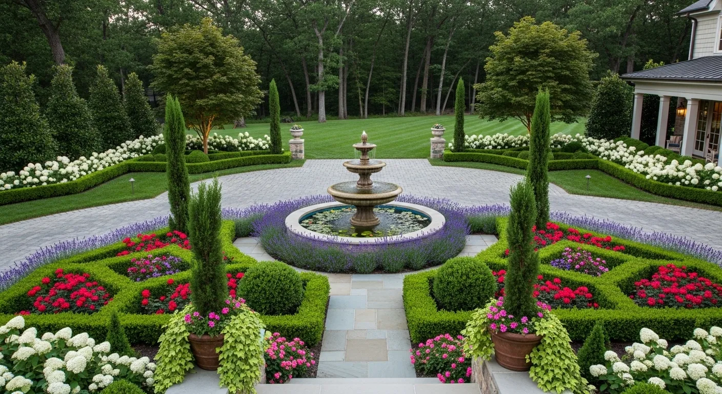
The Black Mulch and Boxwood Curve:
The first thing a professional landscape designer notices about this front of house isn’t the lavender mass planting in the foreground or the stone-clad porch columns — it’s the edge, because that sweeping curved bed edge cut into the lawn is so precisely maintained that it communicates the standard of care for everything else before you’ve looked at a single plant.
Black mulch against that clean edge gives the entire bed composition a graphic quality that turns an otherwise traditional craftsman house into something significantly more contemporary from the street. The boxwood globes are doing calculated work here: their consistent sizing and spacing create a dotted rhythm that leads the eye from the street toward the double front doors without requiring any other structural element to do that job.
The catmint spilling forward in the foreground adds the softness and seasonal color that would be missing if the entire composition were clipped and controlled — that one loose, flowering element stops the landscape from reading as stiff, which is the fine line that separates “beautifully maintained” from “intimidating.”
The stone step pavers embedded in the lawn add a casual secondary path that implies the house is actually lived in, which manicured front of house landscapes sometimes forget to communicate.
The Stone Pillar Lantern Path:
Getting a gravel path flanked by stone pillar lanterns to look genuinely elegant rather than theme-park European requires a level of commitment to proportion that this entry absolutely delivers. The lanterns are substantial — full-scale, proper stone plinths with decorative glass fixtures that cast warm pools of light — not the shepherd’s hook solar lights that would make exactly the same visual gesture and achieve none of the same effect.
The gravel path itself is bordered with brick on both sides, creating a clean contained channel that keeps the loose material looking intentional rather than scattered, and that double border also provides the visual weight needed to balance the substantial height of the flanking lanterns.
Conical topiary alternating with clipped boxwood spheres along both sides creates the formal rhythm that makes a long approach feel like an arrival sequence rather than just a way to get to the door, and the pink hydrangea planted in generous sweeps adds seasonal drama without disrupting the underlying structure.
The evening photograph is the honest test of this entry’s quality: the warm lantern light, the recessed uplighting catching the topiary forms, and the glow from inside the house all layer into an approach that genuinely earns the word atmospheric.
The Lantern Bed Light:
Most front of house lighting plans are conceived as afterthoughts — path lights get added after the landscaping is finished, positioned wherever there’s space rather than where they’ll be most effective. This setup reads differently because the lantern-style path lights feel like they were sized and positioned as part of the original design rather than added after the fact.
Two substantial black lanterns on posts placed within the curved stone-edged bed — not along the concrete path — illuminate the planting from inside rather than casting light across it from outside, which is a lighting principle that produces dramatically better results and almost nobody uses it.
The stone border curves generously from the walkway to the porch, giving the foundation plantings room to build in layers from low annuals at the front through mid-height mixed shrubs to the structural evergreens near the foundation.
The dark mulch under warm lantern light creates exactly the kind of evening atmosphere that makes a neighborhood walk feel genuinely pleasant, and the cobalt front door visible under the porch light provides the color anchor that gives the whole composition somewhere to focus at the end of the path.
The Stacked Stone Retaining Bed:
Slopes at the front of a house are either an obstacle or an opportunity, and this setup treats a modest grade change as the primary design feature rather than a problem to flatten away.
The stacked stone retaining wall curves generously along the front of the house in a shape that echoes the roofline’s angles without copying them exactly, creating a contained raised bed that gives the foundation plantings visual elevation from the street — which is precisely what flat front of house landscapes with the same plants installed at ground level fail to achieve.
Standard-form trees pruned into lollipop shapes planted at intervals provide the vertical structure that holds the composition together from the street, while the mounding shrubs below fill in the middle layer without competing for attention.
Path lights in a traditional lantern style deployed at regular intervals along the bed make the retaining wall itself a nighttime feature rather than something that disappears after dark, and the warm light temperature ties back to the porch fixtures in a way that makes the whole entry read as a coordinated lighting plan rather than a collection of independent fixtures.
The Slate Walkway with Arts and Crafts Lanterns:
Flagstone and slate paths photograph beautifully under any conditions, but under wet conditions and warm light they become genuinely cinematic — which is probably why this image was captured post-rain, when the stone surface reflects the bronze lanterns at double intensity and every plant color reads at maximum saturation.
The Arts and Crafts style bronze stake lanterns are specific enough in their styling that they’re clearly a deliberate choice rather than a default, and their placement — staggered rather than mirrored on both sides of the path — creates the kind of informal rhythm that feels more like a garden and less like a commercial installation.
The planting on both sides uses ornamental grasses for height and movement, pink roses in generous sweeps for color impact, and low groundcover as the transition to the lawn — a three-layer approach that works from every viewing distance.
The stone entry steps and pillared portico give all this pathway drama somewhere worthy to arrive at, which matters because a beautiful approach to an undistinguished entry is a design imbalance that the eye feels even when it can’t articulate it. The evergreen conical trees flanking the entry reinforce the door’s center axis and give the composition a formal vertical punctuation that the horizontal path needs.
Master the Art of Symmetry and Corten Steel
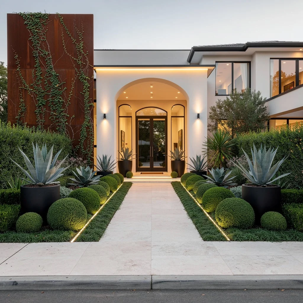
You want elegance? Start by maxing out symmetry—think clipped evergreens in careful order, with sculptural agave in matte black planters for contrast. Roll out pale travertine paving from curb to door and slice in skinny bands of green groundcover so it doesn’t look like a parking lot.
Stash linear LED accent lights front and center on both the walkway and facade, but skip the solar stake lights (yikes, don’t be THAT person). Anchor everything with a massive Corten steel wall—let vines tumble down for texture and drama that feels intentional. Pro tip: Match your hardware finish to your planters or wall feature; that’s how you fake a landscape architect even if you’re winging it.
Urban Luxe: Structure Meets Softness
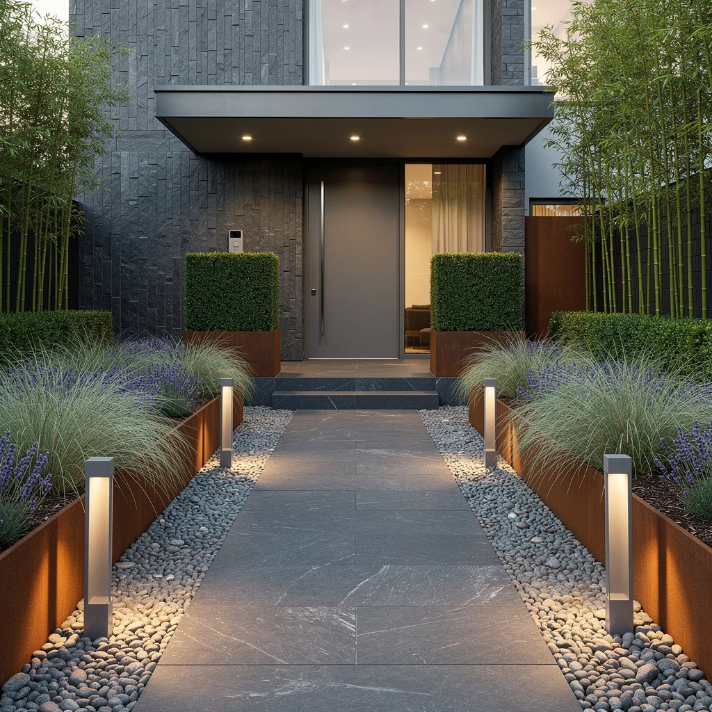
Chase city status with a wide basalt path and let it lead to a sleek, cantilevered entry shelter. Frame your route with corten steel-raised beds brimming with ornamental grass and lavender, then mulch everything with polished pebbles—bonus points if you let a few vertical slate walls break up the field.
Plant cube-shaped topiary boxwoods for that hint of Versailles, without actual royalty. Line everything with slim bollard lights and screen all the chaos from neighbors with tall bamboo at the boundary. The rule here: If you can see your neighbor’s mini-trampoline, you don’t have enough screening. Privacy is luxury; accept nothing less.
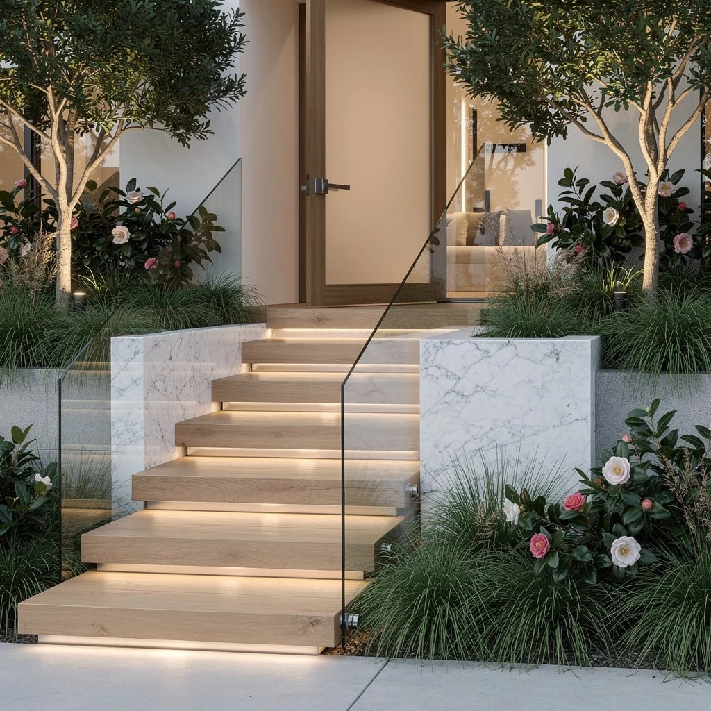
Float That Staircase (No, Really)
Want your house to go full Architectural Digest? Float those stairs in sandblasted marble so every entrance feels like a runway walk. Blanket the base in lush fescue and lay out sharp beds of flowering sage—sage doesn’t just look good, it’s borderline supernatural at surviving neglect.
Drop in oversized rectangular stainless planters with bamboo and magnolias for privacy and drama. Set up downward-facing spots, not floodlights, to avoid your place looking like a car dealership. Toss uplights on driftwood sculptures for an art gallery moment. Rule: Always keep your sightlines clear and airy—chaotic layouts kill the expensive vibe.
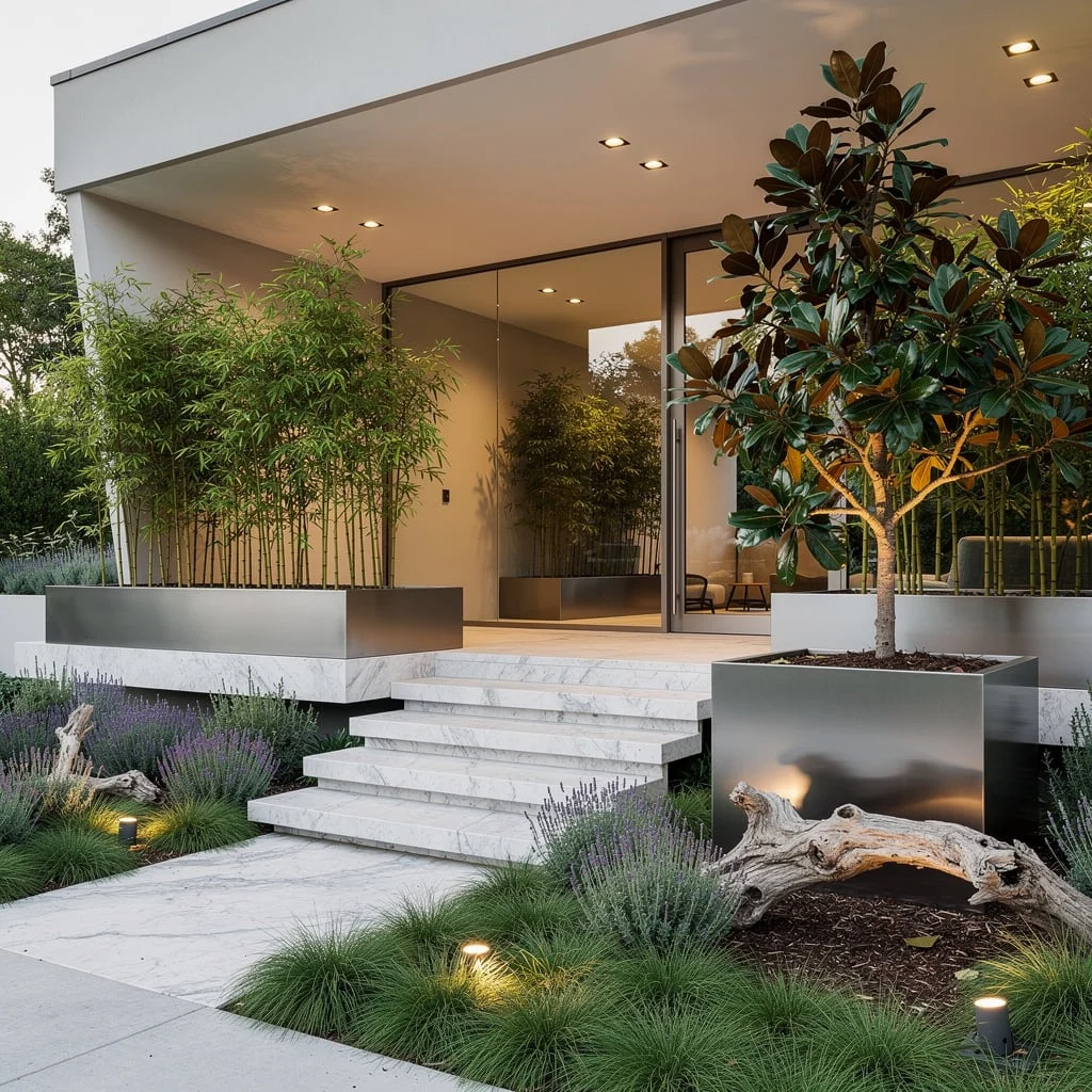
Bold Concrete Walkways Aren’t Extra, They’re the Standard
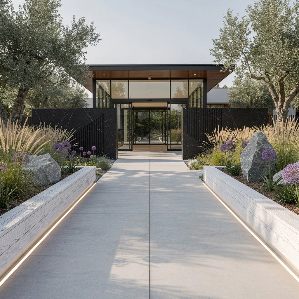
Ditch those dinky garden stones and embrace smooth concrete walkways leading right to your glass-and-steel entry portico. Think broad, seamless, and unashamedly bold. Border your walkway with raised beds clad in whitewashed oak, packed with ornamental grasses, alliums, and the most dramatic rocks you can find.
Plant mature olive trees along the edge—here for the Mediterranean vibes without corny windmills. Integrated strip lights are nonnegotiable for outlining every inch (if you want to trip, use no lights). Fact: If your walkway doesn’t look lit on Instagram, you’re not done yet.
Wave Those Bluestone Steps—Go with Flow
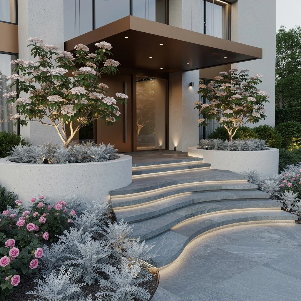
Curves aren’t just for fashion, they’re landscaping power moves. Forge a path with wave-shaped bluestone steps and soften the landing with mounds of silver-leaf Artemisia and pink drift roses for a softer, magazine cover moment. Drop semicircular concrete planters around and plant flowering dogwood trees.
Hold everything together with cantilevered matte bronze canopy panels above the entry, because rain happens and so do bad sunburns. Hide garden lighting under shrubs and along beds—no UFO landing zones, please. Rule: Don’t mess up curves with boxy planters; match the flow or risk the whole vibe flopping.
Double-Height Drama: Go Tall or Go Home
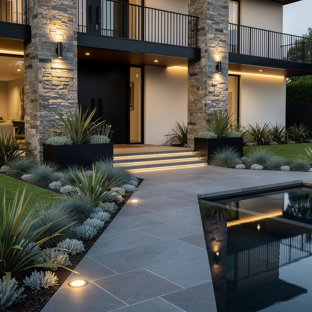
Don’t settle for average—shoot for an entry with stacked ledgestone pillars punching up a double-height front. Run a hefty slate paver path, then fill the borders with evergreen phormium, blue fescue, and silver sedum for wild charisma but zero mess.
Match modern black planters and rails to the facade, and don’t skip the reflecting pool—mirror the architecture, not just the sky. Layer in embedded LED ground and wall wash lights so your entry glows, not glares. Fast rule: Go tall, go textural, and copy NOTHING from the garden center patio zone.
Grid and Gabion: Be Precise, Be Luxurious
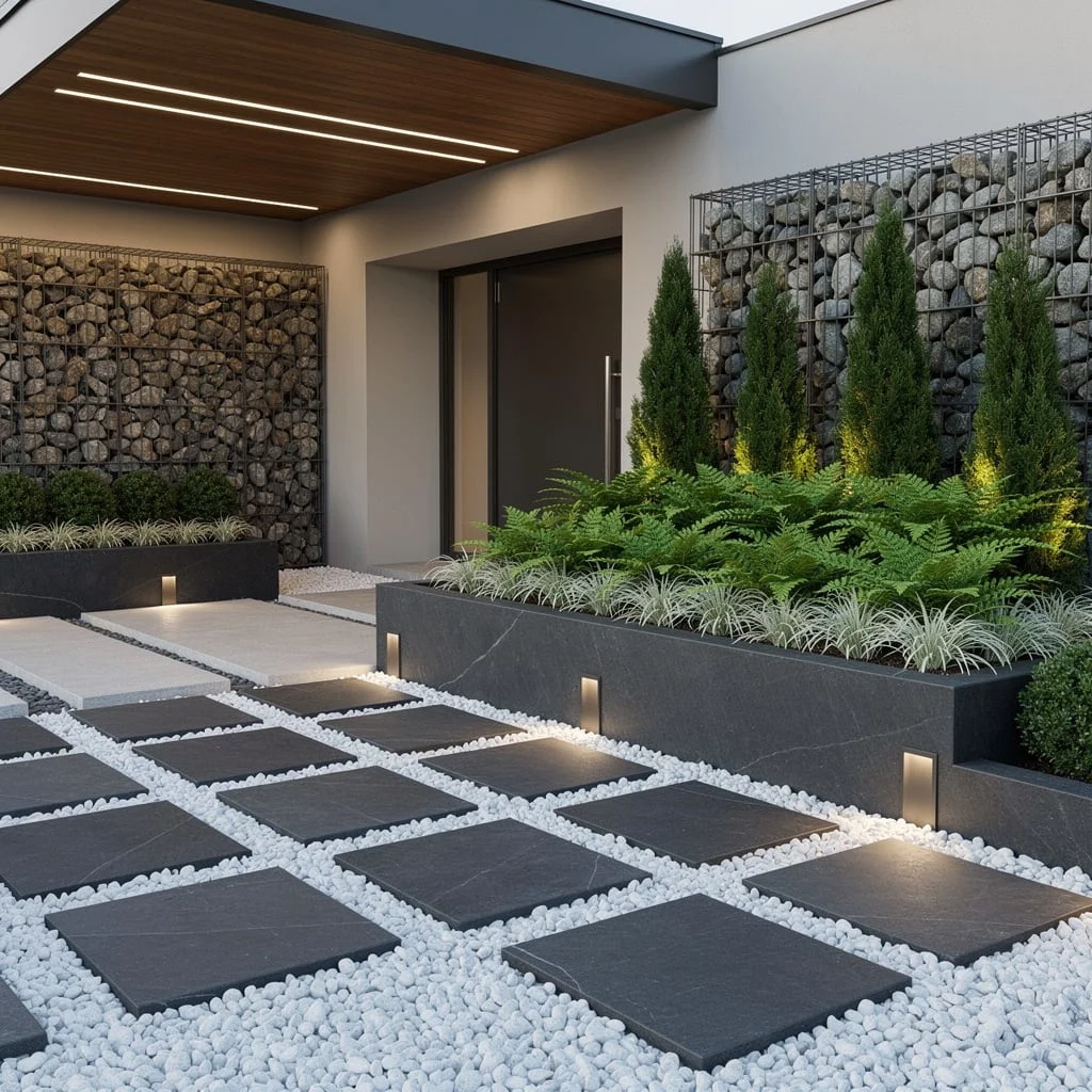
Precision pays—use monolithic charcoal concrete pavers in a geometric grid and fill the gaps with crisp white pebbles for Insta-ready OCD satisfaction. Gabion walls packed with river rocks are mandatory for major textural flex.
Raise beds in swathes nearest the entry; tier with ferns, liriope, and stately columner cypress for strong rhythm (repeat plants, don’t scatter them like confetti). Timber soffits with integrated strip lighting keep the porch glowy. Toss subtle recessed bollards along the walkway. Law: If your lines are fuzzy, so is your taste—keep it crisp at all costs.
Staggered Steps and Glass—The Luxe Welcome
Roll out a sequence of staggered light oak steps and top with glass balustrades to let the landscape flex through. Splash the beds with low-maintenance grasses and sculptural camellias—yes, they bloom, no, you don’t have to baby them. Throw in vertical insets of smooth quartz for that ‘did-a-architect’ moment.
Light each step with subtle recessed LEDs and spotlight your best trees from below (because strangers should think you hired a lighting consultant). Golden rule: Layer your textures and keep the whole setup open but not exposed—privacy, but make it chic.
Angular Entry, Maximum Impact
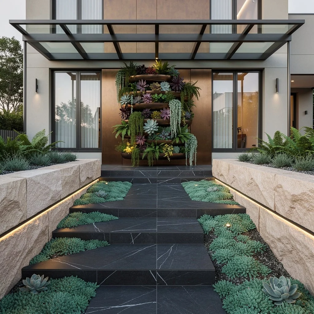
Why blend in? Build a statement with rough-edged charcoal tile steps and pack jade green groundcover all around. Frame the walkway with chunky sandstone retaining walls—these aren’t just boundaries, they’re attention-seekers.
For jaw-drop, split your path around a multi-tiered vertical garden dripping with succulents and ferns. Reflective bronze panels behind amplify drama—bonus points if your porch is canopied in bold, anodized metal. Drop in LED strips under walls and uplight anything textural. Policy: No visible wires, no boring transitions, and always—ALWAYS—take the risk on unique materials. Play it safe, and you’ll lose the game.
Curb Appeal Architect Quiz
Are you designing your landscape, or just maintaining it?
Final Thoughts
Every front of house landscape here is making an argument for something — for the power of a single specimen plant, for the graphic clarity of black mulch, for the way lighting transforms a landscaping investment from a daytime feature into an all-hours one. None of them are trying to do everything simultaneously, which is the single most common mistake in residential front of house design: the belief that more plants, more variety, more features will add up to more impact. They don’t. They add up to visual noise that cancels itself out from the street.
Pick the quality of decision these homes are making, not the specific plants or materials. Decide what your front of house wants to say, choose the materials that say it clearly, and then edit everything else out. The homes that actually stop traffic aren’t the ones with the most happening in front of them — they’re the ones where everything that’s there is exactly right, and nothing else needed to be added.